Repository: Fliggy-Mobile/fbutton
Branch: master
Commit: 2103beae4fd2
Files: 10
Total size: 82.9 KB
Directory structure:
gitextract_8cspt6ck/

├── .gitignore
├── CHANGELOG.md
├── LICENSE
├── README.md
├── README_CN.md
├── example/
│   ├── .gitignore
│   ├── lib/
│   │   └── main.dart
│   └── pubspec.yaml
├── lib/
│   └── fbutton.dart
└── pubspec.yaml
================================================
FILE CONTENTS
================================================
================================================
FILE: .gitignore
================================================
.DS_Store
.dart_tool/
.packages
.pub/
build/
.idea/
.metadata
*.iml
pubspec.lock
android/
ios/
================================================
FILE: CHANGELOG.md
================================================
## 2.0.1
- optimization
## 2.0.0
- Delete the following parameters and use **style** instead:
- `textColor`
- `fontSize`
- `fontStyle`
- `fontHeight`
- `textWeight`
- Delete the following parameters:
- `splashColor`
- `focusNode`
- `autofocus`
- Delete the `effect` parameter
- Delete `disabledTextColor` and use `disableStyle` instead
- **FButtonCorner** changed to **FCorner**
- **FButtonCornerStyle** changed to **FornerStyle**
- Add the `activeMaskColor` parameter. The color of the mask when the button is pressed. Adjust the alpha of the color value to ensure that the view behind can be displayed.
- Add **Hover** support.
- The color in **hover** state can be configured through `hoverColor`.
- `onHover` can help developers perceive **hover** state changes.
- Add `onPressedDown` and `onPressedUp` and `onPressedCancel` to help developers to make corresponding changes when pressing, lifting or canceling the press.
- Add `loadingWidget` parameter, so that developers can define their own loading style
- Add Neumorphism style support.
- Neumorphism style support can be turned on/off through the `isSupportNeumorphism` parameter
- The `highlightShadowColor` parameter can configure the bright shadow color after enabling the Neumorphism style
- The `lightOrientation` parameter can adjust the direction of the light source
- Add `surfaceStyle` parameter to support the definition of surface style.
- Flat
- Convex
- Concave
## 1.1.0
- Add **style** parameter to configure text style. The following parameters will be removed in subsequent versions:
- `textColor`
- `fontSize`
- `fontStyle`
- `fontHeight`
- `textWeight`
- Add the **alignment** parameter to cancel the default centering
- Remove default Padding
- Remove the default background color
- `onPress' is no longer a required parameter
## 1.0.4
- add @immutable to fbutton.dart
- minSDK 2.2
## 1.0.3
- Remove a few bad attributes
- Increase text configurability
================================================
FILE: LICENSE
================================================
Copyright 2020-present Fliggy Android Team <alitrip_android@list.alibaba-inc.com>.
Licensed under the Apache License, Version 2.0 (the "License");
you may not use this file except in compliance with the License.
You may obtain a copy of the License at following link.
http://www.apache.org/licenses/LICENSE-2.0
Unless required by applicable law or agreed to in writing, software
distributed under the License is distributed on an "AS IS" BASIS,
WITHOUT WARRANTIES OR CONDITIONS OF ANY KIND, either express or implied.
See the License for the specific language governing permissions and
limitations under the License.
================================================
FILE: README.md
================================================
<p align="center">
<a href="https://github.com/Fliggy-Mobile">
<img width="200" src="https://gw.alicdn.com/tfs/TB1a288sxD1gK0jSZFKXXcJrVXa-360-360.png">
</a>
</p>
<h1 align="center">FButton</h1>
<div align="center">
<p>From then on, developers only need to master one <strong>Button</strong> component, which is enough.</p>
<p>Support corners, borders, icons, special effects, loading mode, high-quality Neumorphism style.</p>
<p><strong>Author:<a href="https://github.com/chenBingX">Newton</a>(<a href="coorchice.cb@alibaba-inc.com">coorchice.cb@alibaba-inc.com</a>)</strong></p>
<p>
<a href="https://pub.dev/packages/fbutton#-readme-tab-">
<img height="20" src="https://img.shields.io/badge/Version-2.0.0-important.svg">
</a>
<a href="https://github.com/Fliggy-Mobile/fbutton">
<img height="20" src="https://img.shields.io/badge/Build-passing-brightgreen.svg">
</a>
<a href="https://github.com/Fliggy-Mobile">
<img height="20" src="https://img.shields.io/badge/Team-FAT-ffc900.svg">
</a>
<a href="https://www.dartcn.com/">
<img height="20" src="https://img.shields.io/badge/Language-Dart-blue.svg">
</a>
<a href="https://pub.dev/documentation/fbutton/latest/fbutton/fbutton-library.html">
<img height="20" src="https://img.shields.io/badge/API-done-yellowgreen.svg">
</a>
<a href="http://www.apache.org/licenses/LICENSE-2.0.txt">
<img height="20" src="https://img.shields.io/badge/License-Apache--2.0-blueviolet.svg">
</a>
<p>
<p>
<img height="500" src="https://gw.alicdn.com/tfs/TB1okQSNfb2gK0jSZK9XXaEgFXa-1280-703.png">
</div>
**English | [简体中文](https://github.com/Fliggy-Mobile/fbutton/blob/master/README_CN.md)**
> Like it? Please cast your **Star** 🥰 !
# ✨ Features
- Rich **corner** effect
- Exquisite **border** decoration
- **Gradient effect**
- Flexible **icon** support
- Intimate **Loading** mode
- Cool interaction **Special effects**
- More sense of space **Shadow**
- High-quality **Neumorphism** style
# 🛠 Guide
## ⚙️ Parameters
### 🔩 Basic parameters
|Param|Type|Necessary|Default|desc|
|---|---|:---:|---|---|
|onPressed|VoidCallback|true|null|Click callback. If null, FButton will enter an unavailable state|
|onPressedDown|VoidCallback|false|null|Callback when pressed|
|onPressedUp|VoidCallback|false|null|Callback when lifted|
|onPressedCancel|VoidCallback|false|null|Callback when cancel is pressed|
|height|double|false|null|height|
|width|double|false|null|width|
|style|TextStyle|false|null|text style|
|disableStyle|TextStyle|false|null|Unavailable text style|
|alignment|Alignment|false|null|alignment|
|text|String|false|null|button text|
|color|Color|false|null|Button color|
|disabledColor|Color|false|null|Color when FButton is unavailable|
|padding|EdgeInsetsGeometry|false|null|FButton internal spacing|
|corner|FCorner|false|null|Configure corners of Widget|
|cornerStyle|FCornerStyle|false|FCornerStyle.round|Configure the corner style of Widget. round-rounded corners, bevel-beveled|
|strokeColor|Color|false|Colors.black|Border color|
|strokeWidth|double|false|0|Border width. The border will appear when `strokeWidth > 0`|
|gradient|Gradient|false|null|Configure gradient colors. Will override the `color`|
|activeMaskColor|Color|否|Colors.transparent|The color of the mask when pressed|
|surfaceStyle|FSurface|false|FSurface.Flat|Surface style. Default [FSurface.Flat]. See [FSurface] for details|
### 💫 Effect parameters
|Param|Type|Necessary|Default|desc|
|---|---|:---:|---|---|
|clickEffect|bool|false|false|Whether to enable click effects|
|hoverColor|Color|false|null|FButton color when hovering|
|onHover|ValueChanged<bool>|false|null|Callback when the mouse enters/exits the component range|
|highlightColor|Color|false|null|The color of the FButton when touched. `effect:true` required|
### 🔳 Shadow parameters
|Param|Type|Necessary|Default|desc|
|---|---|:---:|---|---|
|shadowColor|Color|false|Colors.grey|Shadow color|
|shadowOffset|Offset|false|Offset.zero|Shadow offset|
|shadowBlur|double|false|1.0|Shadow blur degree, the larger the value, the larger the shadow range|
### 🖼 Icon & Loading parameters
|Param|Type|Necessary|Default|desc|
|---|---|:---:|---|---|
|image|Widget|false|null|An icon can be configured for FButton|
|imageMargin|double|false|6.0|Spacing between icon and text|
|imageAlignment|ImageAlignment|false|ImageAlignment.left|Relative position of icon and text|
|loading|bool|false|false|Whether to enter the Loading state|
|loadingWidget|Widget|false|null|Loading widget in loading state. Will override the default Loading effect|
|clickLoading|bool|false|false|Whether to enter Loading state after clicking FButton|
|loadingColor|Color|false|null|Loading colors|
|loadingStrokeWidth|double|false|4.0|Loading width|
|hideTextOnLoading|bool|false|false|Whether to hide text in the loading state|
|loadingText|String|false|null|Loading text|
|loadingSize|double|false|12|Loading size|
### 🍭 Neumorphism Style
|Param|Type|Necessary|Default|desc|
|---|---|:---:|---|---|
|isSupportNeumorphism|bool|false|false|Whether to support the Neumorphism style. Open this item [highlightColor] will be invalid|
|lightOrientation|FLightOrientation|false|FLightOrientation.LeftTop|Valid when [isSupportNeumorphism] is true. The direction of the light source is divided into four directions: upper left, lower left, upper right, and lower right. Used to control the illumination direction of the light source, which will affect the highlight direction and shadow direction|
|highlightShadowColor|Color|false|null|After the Neumorphism style is turned on, the bright shadow color|
## 📺 Demo
### 🔩 Basic Demo
```dart
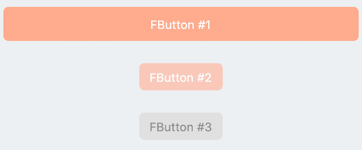
// FButton #1
FButton(
height: 40,
alignment: Alignment.center,
text: "FButton #1",
style: TextStyle(color: Colors.white),
color: Color(0xffffab91),
onPressed: () {},
)
// FButton #2
FButton(
padding: const EdgeInsets.fromLTRB(12, 8, 12, 8),
text: "FButton #2",
style: TextStyle(color: Colors.white),
color: Color(0xffffab91),
corner: FCorner.all(6.0),
)
// FButton #3
FButton(
padding: const EdgeInsets.fromLTRB(12, 8, 12, 8),
text: "FButton #3",
style: TextStyle(color: Colors.white),
disableStyle: TextStyle(color: Colors.black38),
color: Color(0xffF8AD36),
/// set disable Color
disabledColor: Colors.grey[300],
corner: FCorner.all(6.0),
)
```
By simply configuring `text` and` onPressed`, you can construct an available **FButton**.
If `onPressed` is not set, **FButton** will be automatically recognized as not unavailable. At this time, ** FButton ** will have a default unavailable status style.
You can also freely configure the style of **FButton** when it is not available via the `disabledXXX` attribute.
### 🎈 Corner & Stroke
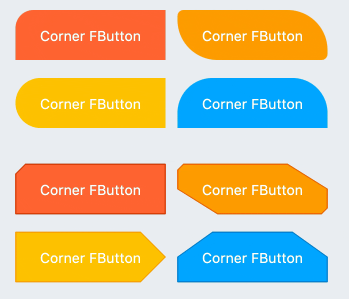
```dart
// #1
FButton(
width: 130,
text: "FButton #1",
style: TextStyle(color: Colors.white),
color: Color(0xffFF7043),
onPressed: () {},
clickEffect: true,
/// 配置边角大小
///
/// set corner size
corner: FCorner.all(25),
),
// #2
FButton(
width: 130,
text: "FButton #2",
style: TextStyle(color: Colors.white),
color: Color(0xffFFA726),
onPressed: () {},
clickEffect: true,
corner: FCorner(
leftBottomCorner: 40,
leftTopCorner: 6,
rightTopCorner: 40,
rightBottomCorner: 6,
),
),
// #3
FButton(
width: 130,
text: "FButton #3",
style: TextStyle(color: Colors.white),
color: Color(0xffFFc900),
onPressed: () {},
clickEffect: true,
corner: FCorner(leftTopCorner: 10),
/// 设置边角风格
///
/// set corner style
cornerStyle: FCornerStyle.bevel,
strokeWidth: 0.5,
strokeColor: Color(0xffF9A825),
),
// #4
FButton(
width: 130,
padding: EdgeInsets.fromLTRB(6, 16, 30, 16),
text: "FButton #4",
style: TextStyle(color: Colors.white),
color: Color(0xff00B0FF),
onPressed: () {},
clickEffect: true,
corner: FCorner(
rightTopCorner: 25,
rightBottomCorner: 25),
cornerStyle: FCornerStyle.bevel,
strokeWidth: 0.5,
strokeColor: Color(0xff000000),
),
```
You can add rounded corners to **FButton** via the `corner` property. You can even control each fillet individually。
By default, the corners of **FButton** are rounded. By setting `cornerStyle: FCornerStyle.bevel`, you can get a bevel effect.
**FButton** supports control borders, provided that `strokeWidth> 0` can get the effect 🥳.
### 🌈 Gradient
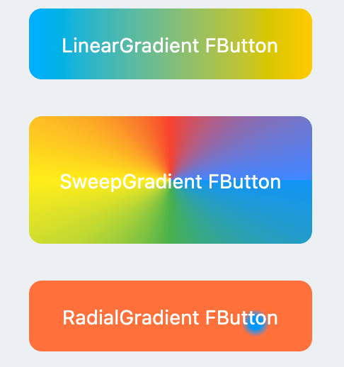
```dart
FButton(
width: 100,
height: 60,
text: "#1",
style: TextStyle(color: Colors.white),
color: Color(0xffFFc900),
/// 配置渐变色
///
/// set gradient
gradient: LinearGradient(colors: [
Color(0xff00B0FF),
Color(0xffFFc900),
]),
onPressed: () {},
clickEffect: true,
corner: FCorner.all(8),
)
```
Through the `gradient` attribute, you can build **FButton** with gradient colors. You can freely build many types of gradient colors.
### 🍭 Icon
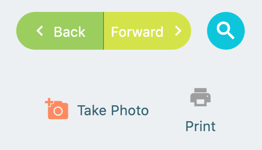
```dart
FButton(
width: 88,
height: 38,
padding: EdgeInsets.all(0),
text: "Back",
style: TextStyle(color: Colors.white),
color: Color(0xffffc900),
onPressed: () {
toast(context, "Back!");
},
clickEffect: true,
corner: FCorner(
leftTopCorner: 25,
leftBottomCorner: 25,),
/// 配置图标
///
/// set icon
image: Icon(
Icons.arrow_back_ios,
color: Colors.white,
size: 12,
),
/// 配置图标与文字的间距
///
/// Configure the spacing between icon and text
imageMargin: 8,
),
FButton(
onPressed: () {},
image: Icon(
Icons.print,
color: Colors.grey,
),
imageMargin: 8,
/// 配置图标与文字相对位置
///
/// Configure the relative position of icons and text
imageAlignment: ImageAlignment.top,
text: "Print",
style: TextStyle(color: textColor),
color: Colors.transparent,
),
```
The `image` property can set an image for **FButton** and you can adjust the position of the image relative to the text, through` imageAlignment`.
If the button does not need a background, just set `color: Colors.transparent`.
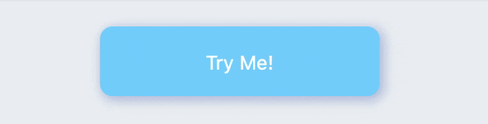
### 🔥 Effect
```dart
FButton(
width: 200,
text: "Try Me!",
style: TextStyle(color: textColor),
color: Color(0xffffc900),
onPressed: () {},
clickEffect: true,
corner: FCorner.all(9),
/// 配置按下时颜色
///
/// set pressed color
highlightColor: Color(0xffE65100).withOpacity(0.20),
/// 配置 hover 状态时颜色
///
/// set hover color
hoverColor: Colors.redAccent.withOpacity(0.16),
),
```
The highlight color of **FButton** can be configured through the `highlightColor` property。
`hoverColor` can configure the color when the mouse moves to the range of **FButton**, which will be used during Web development.
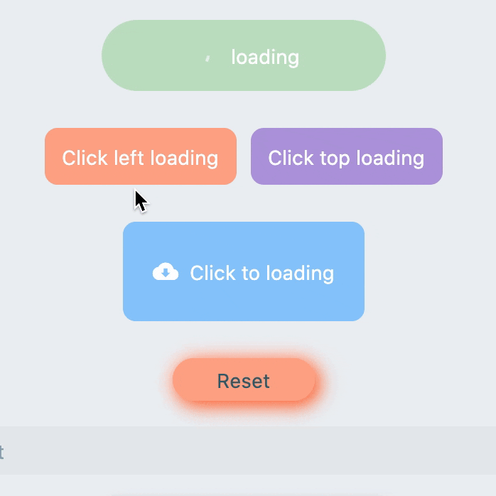
### 🔆 Loading
```dart
FButton(
text: "Click top loading",
style: TextStyle(color: textColor),
color: Color(0xffffc900),
...
/// 配置 loading 大小
///
/// set loading size
loadingSize: 15,
/// 配置 loading 与文本的间距
///
// Configure the spacing between loading and text
imageMargin: 6,
/// 配置 loading 的宽
///
/// set loading width
loadingStrokeWidth: 2,
/// 是否支持点击自动开始 loading
///
/// Whether to support automatic loading by clicking
clickLoading: true,
/// 配置 loading 的颜色
///
/// set loading color
loadingColor: Colors.white,
/// 配置 loading 状态时的文本
///
/// set loading text
loadingText: "Loading...",
/// 配置 loading 与文本的相对位置
///
/// Configure the relative position of loading and text
imageAlignment: ImageAlignment.top,
),
// #2
FButton(
width: 170,
height: 70,
text: "Click to loading",
style: TextStyle(color: textColor),
color: Color(0xffffc900),
onPressed: () { },
...
imageMargin: 8,
loadingSize: 15,
loadingStrokeWidth: 2,
clickLoading: true,
loadingColor: Colors.white,
loadingText: "Loading...",
/// loading 时隐藏文本
///
/// Hide text when loading
hideTextOnLoading: true,
)
FButton(
width: 170,
height: 70,
alignment: Alignment.center,
text: "Click to loading",
style: TextStyle(color: Colors.white),
color: Color(0xff90caf9),
...
imageMargin: 8,
clickLoading: true,
hideTextOnLoading: true,
/// 配置自定义 loading 样式
///
/// Configure custom loading style
loadingWidget: CupertinoActivityIndicator(),
),
```
Through the `loading` attribute, you can configure **Loading** effects for ** FButton **.
When **FButton** is in **Loading** state, **FButton** will enter an unavailable state, onPress will no longer be triggered, and unavailable styles will also be applied.
At the same time `loadingText` will overwrite` text` if it is not **null**.
The click start **Loading** effect can be achieved through the `clickLoading` attribute.
The position of `loading` will be affected by the` imageAlignment` attribute.
When `hideTextOnLoading: true`, if **FButton** is in` loading` state, its text will be hidden.
Through `loadingWidget`, developers can set completely customized loading styles.
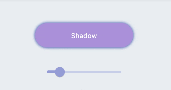
## Shadow
```dart
FButton(
width: 200,
text: "Shadow",
textColor: Colors.white,
color: Color(0xffffc900),
onPressed: () {},
clickEffect: true,
corner: FCorner.all(28),
/// 配置阴影颜色
///
/// set shadow color
shadowColor: Colors.black87,
/// 设置组件高斯与阴影形状卷积的标准偏差。
///
/// Sets the standard deviation of the component's Gaussian convolution with the shadow shape.
shadowBlur: _shadowBlur,
),
```
**FButton** allows you to configure the color, size, and position of the shadow.
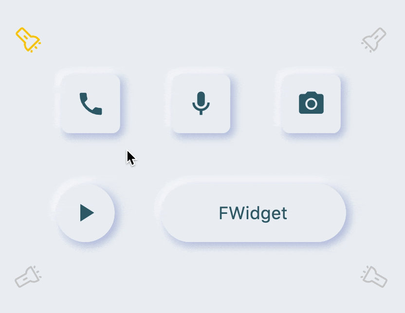
### 🍭 Neumorphism Style
```dart
FButton(
/// 开启 Neumorphism 支持
///
/// Turn on Neumorphism support
isSupportNeumorphism: true,
/// 配置光源方向
///
/// Configure light source direction
lightOrientation: lightOrientation,
/// 配置亮部阴影
///
/// Configure highlight shadow
highlightShadowColor: Colors.white,
/// 配置暗部阴影
///
/// Configure dark shadows
shadowColor: mainShadowColor,
strokeColor: mainBackgroundColor,
strokeWidth: 3.0,
width: 190,
height: 60,
text: "FWidget",
style: TextStyle(
color: mainTextTitleColor, fontSize: neumorphismSize_2_2),
alignment: Alignment.center,
color: mainBackgroundColor,
...
)
```
**FButton** brings an incredible, ultra-high texture **Neumorphism** style to developers.
Developers only need to configure the `isSupportNeumorphism` parameter to enable and disable the **Neumorphism** style.
If you want to adjust the style of **Neumorphism**, you can make subtle adjustments through several attributes related to Shadow, among which:
- shadowColor: configure the shadow of the shadow
- highlightShadowColor: configure highlight shadow
**FButton** also provides `lightOrientation` parameters, and even allows developers to adjust the care angle, and has obtained different **Neumorphism** effects.
# 😃 How to use?
Add dependencies in the project `pubspec.yaml` file:
## 🌐 pub dependency
```
dependencies:
fbutton: ^<version number>
```
> ⚠️ Attention,please go to [**pub**] (https://pub.dev/packages/fbutton) to get the latest version number of **FButton**
## 🖥 git dependencies
```
dependencies:
fbutton:
git:
url: 'git@github.com:Fliggy-Mobile/fbutton.git'
ref: '<Branch number or tag number>'
```
> ⚠️ Attention,please refer to [**FButton**] (https://github.com/Fliggy-Mobile/fbutton) official project for branch number or tag.
# 💡 License
```
Copyright 2020-present Fliggy Android Team <alitrip_android@list.alibaba-inc.com>.
Licensed under the Apache License, Version 2.0 (the "License");
you may not use this file except in compliance with the License.
You may obtain a copy of the License at following link.
http://www.apache.org/licenses/LICENSE-2.0
Unless required by applicable law or agreed to in writing, software
distributed under the License is distributed on an "AS IS" BASIS,
WITHOUT WARRANTIES OR CONDITIONS OF ANY KIND, either express or implied.
See the License for the specific language governing permissions and
limitations under the License.
```
### Like it? Please cast your [**Star**](https://github.com/Fliggy-Mobile/fbutton) 🥰 !
---
# How to run Demo project?
1. **clone** project to local
2. Enter the project `example` directory and run the following command
```
flutter create .
```
3. Run the demo in `example`
================================================
FILE: README_CN.md
================================================
<p align="center">
<a href="https://github.com/Fliggy-Mobile">
<img width="200" src="https://gw.alicdn.com/tfs/TB1a288sxD1gK0jSZFKXXcJrVXa-360-360.png">
</a>
</p>
<h1 align="center">FButton</h1>
<div align="center">
<p>从此开发者只用掌握一种 <strong>Button</strong> 组件,就够了。</p>
<p>支持圆角、边框、图标、特效、Loading 模式、高质感的 Neumorphism 风格。</p>
<p><strong>主理人:<a href="https://github.com/chenBingX">纽特</a>(<a href="coorchice.cb@alibaba-inc.com">coorchice.cb@alibaba-inc.com</a>)</strong></p>
<p>
<a href="https://pub.dev/packages/fbutton#-readme-tab-">
<img height="20" src="https://img.shields.io/badge/Version-2.0.0-important.svg">
</a>
<a href="https://github.com/Fliggy-Mobile/fbutton">
<img height="20" src="https://img.shields.io/badge/Build-passing-brightgreen.svg">
</a>
<a href="https://github.com/Fliggy-Mobile">
<img height="20" src="https://img.shields.io/badge/Team-FAT-ffc900.svg">
</a>
<a href="https://www.dartcn.com/">
<img height="20" src="https://img.shields.io/badge/Language-Dart-blue.svg">
</a>
<a href="https://pub.dev/documentation/fbutton/latest/fbutton/fbutton-library.html">
<img height="20" src="https://img.shields.io/badge/API-done-yellowgreen.svg">
</a>
<a href="http://www.apache.org/licenses/LICENSE-2.0.txt">
<img height="20" src="https://img.shields.io/badge/License-Apache--2.0-blueviolet.svg">
</a>
<p>
<p>
<img height="500" src="https://gw.alicdn.com/tfs/TB1okQSNfb2gK0jSZK9XXaEgFXa-1280-703.png">
</div>
**[English](https://github.com/Fliggy-Mobile/fbutton) | 简体中文**
> 感觉还不错?请投出您的 **Star** 吧 🥰 !
# ✨ 特性
- 丰富的 **边角** 效果
- 精美的 **边框** 装饰
- **渐变效果** 也不在话下
- 灵活的 **图标** 支持
- 贴心的 **Loading** 模式
- 炫酷的交互 **特效**
- 更具空间感的 **阴影**
- 高质感的 **Neumorphism** 风格
# 🛠 使用指南
## ⚙️ 参数
### 🔩 基础参数
|参数|类型|必要|默认值|说明|
|---|---|:---:|---|---|
|onPressed|VoidCallback|是|null|点击回调。如果为 null,FButton 会进入不可用状态|
|onPressedDown|VoidCallback|false|null|按下时会回调|
|onPressedUp|VoidCallback|false|null|抬起时会回调|
|onPressedCancel|VoidCallback|false|null|按下取消时会回调|
|height|double|否|null|高度|
|width|double|否|null|宽度|
|style|TextStyle|false|null|文本样式|
|disableStyle|TextStyle|false|null|不可用文本样式|
|alignment|Alignment|false|null|对齐方式|
|text|String|否|null|按钮文本|
|color|Color|否|null|按钮颜色|
|disabledColor|Color|否|null|FButton 不可用状态时的颜色|
|padding|EdgeInsetsGeometry|否|null|FButton 内间距|
|corner|FCorner|否|null|配置 Widget 的边角|
|cornerStyle|FCornerStyle|否|FCornerStyle.round|配置 Widget 的边角样式。round-圆角,bevel-斜切|
|strokeColor|Color|否|Colors.black|边框颜色|
|strokeWidth|double|否|0|边框宽度。当 strokeWidth>0 时边框就会出现|
|gradient|Gradient|否|null|配置渐变色。会覆盖 color 属性|
|activeMaskColor|Color|否|Colors.transparent|按下时的蒙层颜色|
|surfaceStyle|FSurface|false|FSurface.Flat|表面的风格。默认 [FSurface.Flat]。详见 [FSurface]|
### 💫 Effect 参数
|参数|类型|必要|默认值|说明|
|---|---|:---:|---|---|
|clickEffect|bool|否|false|是否启用点击特效|
|hoverColor|Color|否|null|鼠标悬停状态时 FButton 的颜色|
|onHover|ValueChanged<bool>|false|null|鼠标进入/退出组件范围时会回调|
|highlightColor|Color|否|null|触摸时 FButton 的颜色。需要 effect=true|
### 🔳 阴影参数
|参数|类型|必要|默认值|说明|
|---|---|:---:|---|---|
|shadowColor|Color|否|Colors.grey|阴影颜色|
|shadowOffset|Offset|否|Offset.zero|阴影偏移|
|shadowBlur|double|否|1.0|阴影模糊程度,值越大,阴影范围越大|
### 🖼 图标和 Loading 参数
|参数|类型|必要|默认值|说明|
|---|---|:---:|---|---|
|image|Widget|否|null|可为 FButton 配置一个图标|
|imageMargin|double|否|6.0|图标与文本的间距|
|imageAlignment|ImageAlignment|否|ImageAlignment.left|图标与文本的相对位置|
|loading|bool|否|false|是否进入 Loading 状态|
|loadingWidget|Widget|false|null|loading 状态时的 Loading 小部件。会覆盖默认的 Loading 效果|
|clickLoading|bool|否|false|是否在点击 FButton 后进入 Loading 状态|
|loadingColor|Color|否|null|Loading 的颜色|
|loadingStrokeWidth|double|否|4.0|Loading 的宽度|
|hideTextOnLoading|bool|否|false|Loading 状态下是否隐藏文本|
|loadingText|String|否|null|Loading 状态下的文本|
|loadingSize|double|否|12|Loading 的大小|
### 🍭 Neumorphism 风格
|参数|类型|必要|默认值|说明|
|---|---|:---:|---|---|
|isSupportNeumorphism|bool|false|false|是否支持 Neumorphism 风格。开启该项 [highlightColor] 将会失效|
|lightOrientation|FLightOrientation|false|FLightOrientation.LeftTop|当 [isSupportNeumorphism] 为 true 时有效。光源方向,分为左上、左下、右上、右下四个方向。用来控制光源照射方向,会影响高亮方向和阴影方向|
|highlightShadowColor|Color|false|null|开启 Neumorphism 风格后的,亮部阴影颜色|
## 📺 使用示例
### 🔩 基本使用

```dart
// FButton #1
FButton(
height: 40,
alignment: Alignment.center,
text: "FButton #1",
style: TextStyle(color: Colors.white),
color: Color(0xffffab91),
onPressed: () {},
)
// FButton #2
FButton(
padding: const EdgeInsets.fromLTRB(12, 8, 12, 8),
text: "FButton #2",
style: TextStyle(color: Colors.white),
color: Color(0xffffab91),
corner: FCorner.all(6.0),
)
// FButton #3
FButton(
padding: const EdgeInsets.fromLTRB(12, 8, 12, 8),
text: "FButton #3",
style: TextStyle(color: Colors.white),
disableStyle: TextStyle(color: Colors.black38),
color: Color(0xffF8AD36),
/// 配置不可用颜色
disabledColor: Colors.grey[300],
corner: FCorner.all(6.0),
)
```
通过简单的配置 `text` 以及 `onPressed`,即可构造一个可用 **FButton**。
如果没有设置 `onPressed`,**FButton** 会自动被识别 **未不可用状态** 。此时 **FButton** 会有一个默认的不可用状态样式。
你也可以自由的配置 **FButton** 不可用状态下的样式通过 `disabledXXX` 属性。
### 🎈 边角 & 边框

```dart
// #1
FButton(
width: 130,
text: "FButton #1",
style: TextStyle(color: Colors.white),
color: Color(0xffFF7043),
onPressed: () {},
clickEffect: true,
/// 配置边角大小
///
/// set corner size
corner: FCorner.all(25),
),
// #2
FButton(
width: 130,
text: "FButton #2",
style: TextStyle(color: Colors.white),
color: Color(0xffFFA726),
onPressed: () {},
clickEffect: true,
corner: FCorner(
leftBottomCorner: 40,
leftTopCorner: 6,
rightTopCorner: 40,
rightBottomCorner: 6,
),
),
// #3
FButton(
width: 130,
text: "FButton #3",
style: TextStyle(color: Colors.white),
color: Color(0xffFFc900),
onPressed: () {},
clickEffect: true,
corner: FCorner(leftTopCorner: 10),
/// 设置边角风格
///
/// set corner style
cornerStyle: FCornerStyle.bevel,
strokeWidth: 0.5,
strokeColor: Color(0xffF9A825),
),
// #4
FButton(
width: 130,
padding: EdgeInsets.fromLTRB(6, 16, 30, 16),
text: "FButton #4",
style: TextStyle(color: Colors.white),
color: Color(0xff00B0FF),
onPressed: () {},
clickEffect: true,
corner: FCorner(
rightTopCorner: 25,
rightBottomCorner: 25),
cornerStyle: FCornerStyle.bevel,
strokeWidth: 0.5,
strokeColor: Color(0xff000000),
),
```
你可以为 **FButton** 添加圆角,通过 `corner` 属性。甚至,你可以单独控制每一个圆角。
默认情况下,**FButton** 的边角为圆角。通过设置 `cornerStyle: FCornerStyle.bevel`,可以获得斜角效果。
**FButton** 支持控件边框,前提是 `strokeWidth > 0` 即可获得效果 🥳。
### 🌈 渐变色

```dart
FButton(
width: 100,
height: 60,
text: "#1",
style: TextStyle(color: Colors.white),
color: Color(0xffFFc900),
/// 配置渐变色
///
/// set gradient
gradient: LinearGradient(colors: [
Color(0xff00B0FF),
Color(0xffFFc900),
]),
onPressed: () {},
clickEffect: true,
corner: FCorner.all(8),
)
```
通过 `gradient` 属性,可以构建带有渐变色的 **FButton** 你可以自由构建多种类型的渐变色。
### 🍭 图标

```dart
FButton(
width: 88,
height: 38,
padding: EdgeInsets.all(0),
text: "Back",
style: TextStyle(color: Colors.white),
color: Color(0xffffc900),
onPressed: () {
toast(context, "Back!");
},
clickEffect: true,
corner: FCorner(
leftTopCorner: 25,
leftBottomCorner: 25,),
/// 配置图标
///
/// set icon
image: Icon(
Icons.arrow_back_ios,
color: Colors.white,
size: 12,
),
/// 配置图标与文字的间距
///
/// Configure the spacing between icon and text
imageMargin: 8,
),
FButton(
onPressed: () {},
image: Icon(
Icons.print,
color: Colors.grey,
),
imageMargin: 8,
/// 配置图标与文字相对位置
///
/// Configure the relative position of icons and text
imageAlignment: ImageAlignment.top,
text: "Print",
style: TextStyle(color: textColor),
color: Colors.transparent,
),
```
`image` 属性能够为 **FButton** 设置一个图片而且你能够调整图片相对与文本的位置,通过 `imageAlignment`。
如果按钮不需要背景,设置 `color: Colors.transparent` 即可。
### 🔥 特效

```dart
FButton(
width: 200,
text: "Try Me!",
style: TextStyle(color: textColor),
color: Color(0xffffc900),
onPressed: () {},
clickEffect: true,
corner: FCorner.all(9),
/// 配置按下时颜色
///
/// set pressed color
highlightColor: Color(0xffE65100).withOpacity(0.20),
/// 配置 hover 状态时颜色
///
/// set hover color
hoverColor: Colors.redAccent.withOpacity(0.16),
),
```
通过 `highlightColor` 属性可以配置 **FButton** 的按压时的高亮颜色
`hoverColor` 可配置鼠标移到 **FButton** 范围中时的颜色,这在 Web 开发时会被用到。
### 🔆 Loading

```dart
FButton(
text: "Click top loading",
style: TextStyle(color: textColor),
color: Color(0xffffc900),
...
/// 配置 loading 大小
///
/// set loading size
loadingSize: 15,
/// 配置 loading 与文本的间距
///
// Configure the spacing between loading and text
imageMargin: 6,
/// 配置 loading 的宽
///
/// set loading width
loadingStrokeWidth: 2,
/// 是否支持点击自动开始 loading
///
/// Whether to support automatic loading by clicking
clickLoading: true,
/// 配置 loading 的颜色
///
/// set loading color
loadingColor: Colors.white,
/// 配置 loading 状态时的文本
///
/// set loading text
loadingText: "Loading...",
/// 配置 loading 与文本的相对位置
///
/// Configure the relative position of loading and text
imageAlignment: ImageAlignment.top,
),
// #2
FButton(
width: 170,
height: 70,
text: "Click to loading",
style: TextStyle(color: textColor),
color: Color(0xffffc900),
onPressed: () { },
...
imageMargin: 8,
loadingSize: 15,
loadingStrokeWidth: 2,
clickLoading: true,
loadingColor: Colors.white,
loadingText: "Loading...",
/// loading 时隐藏文本
///
/// Hide text when loading
hideTextOnLoading: true,
)
FButton(
width: 170,
height: 70,
alignment: Alignment.center,
text: "Click to loading",
style: TextStyle(color: Colors.white),
color: Color(0xff90caf9),
...
imageMargin: 8,
clickLoading: true,
hideTextOnLoading: true,
/// 配置自定义 loading 样式
///
/// Configure custom loading style
loadingWidget: CupertinoActivityIndicator(),
),
```
通过 `loading` 属性,可为 **FButton** 配置 **Loading** 效果。
当 **FButton** 处于 **Loading** 状态时,**FButton** 将会进入不可用状态,`onPress` 将不会再被触发,不可用样式也将被应用。
同时 `loadingText` 将会覆盖 `text`,如果它不为 **null** 的话。
通过 `clickLoading` 属性可以实现点击开始 **Loading** 的效果。
其中 `loading` 的位置会受到 `imageAlignment` 属性的影响。
当 `hideTextOnLoading: true` 时,如果 **FButton** 处于 `loading` 状态,那么其文本将会被隐藏起来。
通过 `loadingWidget`,开发者可以设置完全自定义的 loading 样式。
## 阴影

```dart
FButton(
width: 200,
text: "Shadow",
textColor: Colors.white,
color: Color(0xffffc900),
onPressed: () {},
clickEffect: true,
corner: FCorner.all(28),
/// 配置阴影颜色
///
/// set shadow color
shadowColor: Colors.black87,
/// 设置组件高斯与阴影形状卷积的标准偏差。
///
/// Sets the standard deviation of the component's Gaussian convolution with the shadow shape.
shadowBlur: _shadowBlur,
),
```
**FButton** 允许配置阴影的颜色、大小、以及位置。
### 🍭 Neumorphism 风格

```dart
FButton(
/// 开启 Neumorphism 支持
///
/// Turn on Neumorphism support
isSupportNeumorphism: true,
/// 配置光源方向
///
/// Configure light source direction
lightOrientation: lightOrientation,
/// 配置亮部阴影
///
/// Configure highlight shadow
highlightShadowColor: Colors.white,
/// 配置暗部阴影
///
/// Configure dark shadows
shadowColor: mainShadowColor,
strokeColor: mainBackgroundColor,
strokeWidth: 3.0,
width: 190,
height: 60,
text: "FWidget",
style: TextStyle(
color: mainTextTitleColor, fontSize: neumorphismSize_2_2),
alignment: Alignment.center,
color: mainBackgroundColor,
...
)
```
**FButton** 为开发者带来了不可思议的,超高质感的 **Neumorphism** 风格。
开发者只需要简单的通过配置 `isSupportNeumorphism` 参数,就可以开启和关闭 **Neumorphism** 风格。
如果想要调整 **Neumorphism** 的样式,可以通过 Shadow 相关的几个属性进行细微的调整,其中:
- shadowColor: 配置暗部阴影
- highlightShadowColor:配置亮部阴影
**FButton** 还提供了 `lightOrientation` 参数,甚至使得开发者能够调整关照角度,已获得不同的 **Neumorphism** 效果。
# 😃 如何使用?
在项目 `pubspec.yaml` 文件中添加依赖:
## 🌐 pub 依赖方式
```
dependencies:
fbutton: ^<版本号>
```
> ⚠️ 注意,请到 [**pub**](https://pub.dev/packages/fbutton) 获取 **FButton** 最新版本号
## 🖥 git 依赖方式
```
dependencies:
fbutton:
git:
url: 'git@github.com:Fliggy-Mobile/fbutton.git'
ref: '<分支号 或 tag>'
```
> ⚠️ 注意,分支号 或 tag 请以 [**FButton**](https://github.com/Fliggy-Mobile/fbutton) 官方项目为准。
# 💡 License
```
Copyright 2020-present Fliggy Android Team <alitrip_android@list.alibaba-inc.com>.
Licensed under the Apache License, Version 2.0 (the "License");
you may not use this file except in compliance with the License.
You may obtain a copy of the License at following link.
http://www.apache.org/licenses/LICENSE-2.0
Unless required by applicable law or agreed to in writing, software
distributed under the License is distributed on an "AS IS" BASIS,
WITHOUT WARRANTIES OR CONDITIONS OF ANY KIND, either express or implied.
See the License for the specific language governing permissions and
limitations under the License.
```
### 感觉还不错?请投出您的 [**Star**](https://github.com/Fliggy-Mobile/fbutton) 吧 🥰 !
---
# 如何运行 Demo 工程?
1.**clone** 工程到本地
2.进入工程 `example` 目录,运行以下命令
```
flutter create .
```
3.运行 `example` 中的 Demo
================================================
FILE: example/.gitignore
================================================
# Miscellaneous
*.class
*.log
*.pyc
*.swp
.DS_Store
.atom/
.buildlog/
.history
.svn/
# IntelliJ related
*.iml
*.ipr
*.iws
.idea/
# The .vscode folder contains launch configuration and tasks you configure in
# VS Code which you may wish to be included in version control, so this line
# is commented out by default.
#.vscode/
# Flutter/Dart/Pub related
**/doc/api/
.dart_tool/
.flutter-plugins
.packages
.pub-cache/
.pub/
/build/
# Android related
**/android/**/gradle-wrapper.jar
**/android/.gradle
**/android/captures/
**/android/gradlew
**/android/gradlew.bat
**/android/local.properties
**/android/**/GeneratedPluginRegistrant.java
# iOS/XCode related
**/ios/**/*.mode1v3
**/ios/**/*.mode2v3
**/ios/**/*.moved-aside
**/ios/**/*.pbxuser
**/ios/**/*.perspectivev3
**/ios/**/*sync/
**/ios/**/.sconsign.dblite
**/ios/**/.tags*
**/ios/**/.vagrant/
**/ios/**/DerivedData/
**/ios/**/Icon?
**/ios/**/Pods/
**/ios/**/.symlinks/
**/ios/**/profile
**/ios/**/xcuserdata
**/ios/.generated/
**/ios/Flutter/App.framework
**/ios/Flutter/Flutter.framework
**/ios/Flutter/Generated.xcconfig
**/ios/Flutter/app.flx
**/ios/Flutter/app.zip
**/ios/Flutter/flutter_assets/
**/ios/Flutter/flutter_export_environment.sh
**/ios/ServiceDefinitions.json
**/ios/Runner/GeneratedPluginRegistrant.*
# Exceptions to above rules.
!**/ios/**/default.mode1v3
!**/ios/**/default.mode2v3
!**/ios/**/default.pbxuser
!**/ios/**/default.perspectivev3
!/packages/flutter_tools/test/data/dart_dependencies_test/**/.packages
web/
.flutter-plugins-dependencies
README.md
test/
macos/
================================================
FILE: example/lib/main.dart
================================================
import 'package:fcontrol/fdefine.dart';
import 'package:flutter/cupertino.dart';
import 'package:flutter/material.dart';
import 'package:fbutton/fbutton.dart';
import 'package:fradio/fradio.dart';
import 'dart:math' as math;
import 'package:fcommon/fcommon.dart';
void main() => runApp(MyApp());
class MyApp extends StatefulWidget {
@override
_MyAppState createState() => _MyAppState();
}
class _MyAppState extends State<MyApp> {
@override
void initState() {
super.initState();
}
@override
Widget build(BuildContext context) {
return MaterialApp(
home: FButtonPage(),
);
}
}
class FButtonPage extends StatefulWidget {
@override
_FButtonPageState createState() => _FButtonPageState();
}
class _FButtonPageState extends State<FButtonPage> {
var _shadowBlur;
@override
void initState() {
_shadowBlur = 5.0;
super.initState();
}
@override
Widget build(BuildContext context) {
return Scaffold(
backgroundColor: mainBackgroundColor,
appBar: AppBar(
backgroundColor: mainBackgroundColor,
title: const Text(
'FButton',
style: TextStyle(color: mainTextTitleColor),
),
centerTitle: true,
),
body: SingleChildScrollView(
child: Container(
child: Center(
child: Column(
mainAxisAlignment: MainAxisAlignment.center,
children: <Widget>[
/// Normal FButton
buildTitle("FButton"),
buildSmallMargin(),
/// Normal FButton 1
buildNormalButton1(),
buildMiddleMargin(),
/// Normal FButton 2
buildNormalButton2(),
buildMiddleMargin(),
/// Normal FButton 3
buildNormalButton3(),
buildMiddleMargin(),
buildTitle("Corner"),
buildSmallMargin(),
/// Corner FButton
buildCornerButton1(),
buildBigMargin(),
/// Corner FButton
buildCornerButton2(),
buildMiddleMargin(),
buildTitle("Gradient"),
buildSmallMargin(),
/// Gradient FButton
buildGradientButton1(),
buildMiddleMargin(),
/// Gradient FButton
buildGradientButton2(),
buildMiddleMargin(),
/// Gradient FButton
buildGradientButton3(),
buildMiddleMargin(),
/// Stroke FButton
buildTitle("Stroke"),
buildSmallMargin(),
buildStrokeButton(),
buildMiddleMargin(),
buildTitle("Image"),
buildSmallMargin(),
/// Image
buildImageButton1(context),
buildBigMargin(),
/// Image
buildImageButton2(),
buildBigMargin(),
buildTitle("Loading"),
buildMiddleMargin(),
/// Loading
buildLoadingButton1(),
buildMiddleMargin(),
/// Loading
buildLoadingButton2(),
buildSmallMargin(),
/// Effect FButton
buildTitle("Effect"),
buildSmallMargin(),
/// Hover
buildEffectButton(),
buildMiddleMargin(),
buildTitle("Shadow"),
buildSmallMargin(),
/// Shadow
buildShadowButton(),
///////
buildBigMargin(),
buildTitle("Neumorphism Style"),
buildMiddleMargin(),
buildMiddleMargin(),
/// Neumorphism
neumorphismDemo(),
buildBiggestMargin(),
buildBiggestMargin(),
],
),
),
),
));
}
Stack neumorphismDemo() {
return Stack(
children: [
Padding(
padding: EdgeInsets.only(left: 20, right: 20, top: 50, bottom: 50),
child: Column(
children: [
/// Neumorphism Style 1
neumorphismDemo_1(),
buildMiddleMargin(),
buildMiddleMargin(),
/// Neumorphism Style 2
neumorphismDemo_2(),
],
),
),
Positioned(
left: 25,
top: 0,
child: Transform.rotate(
angle: -math.pi / 4.0,
alignment: Alignment.center,
child: FRadio.custom(
value: FLightOrientation.LeftTop,
groupValue: lightOrientation,
normal: Image.asset("assets/icon_light_unselected.png"),
selected: Image.asset("assets/icon_light_selected.png"),
onChanged: (value) {
setState(() {
lightOrientation = value;
});
},
),
)),
Positioned(
right: 25,
top: 0,
child: Transform.rotate(
angle: math.pi / 4.0,
alignment: Alignment.center,
child: FRadio.custom(
value: FLightOrientation.RightTop,
groupValue: lightOrientation,
normal: Image.asset("assets/icon_light_unselected.png"),
selected: Image.asset("assets/icon_light_selected.png"),
onChanged: (value) {
setState(() {
lightOrientation = value;
});
},
),
)),
Positioned(
right: 25,
bottom: 0,
child: Transform.rotate(
angle: -math.pi / (3.0 / 4.0),
alignment: Alignment.center,
child: FRadio.custom(
value: FLightOrientation.RightBottom,
groupValue: lightOrientation,
normal: Image.asset("assets/icon_light_unselected.png"),
selected: Image.asset("assets/icon_light_selected.png"),
onChanged: (value) {
setState(() {
lightOrientation = value;
});
},
),
)),
Positioned(
left: 25,
bottom: 0,
child: Transform.rotate(
angle: math.pi / (3.0 / 4.0),
alignment: Alignment.center,
child: FRadio.custom(
value: FLightOrientation.LeftBottom,
groupValue: lightOrientation,
normal: Image.asset("assets/icon_light_unselected.png"),
selected: Image.asset("assets/icon_light_selected.png"),
onChanged: (value) {
setState(() {
lightOrientation = value;
});
},
),
)),
],
);
}
FLightOrientation lightOrientation = FLightOrientation.LeftTop;
double neumorphismSize_1 = 30;
double neumorphismSize_2 = 30;
double neumorphismSize_3 = 30;
Widget neumorphismDemo_1() {
return StatefulBuilder(builder: (context, setState) {
return Row(
mainAxisAlignment: MainAxisAlignment.spaceEvenly,
children: [
FButton(
lightOrientation: lightOrientation,
/// 开启 Neumorphism 支持
isSupportNeumorphism: true,
highlightShadowColor: Colors.white,
shadowColor: mainShadowColor,
width: 60,
height: 60,
image: Icon(
Icons.call,
color: mainTextTitleColor,
size: neumorphismSize_1,
),
alignment: Alignment.center,
color: mainBackgroundColor,
corner: FCorner.all(8.0),
onPressed: () {},
onPressedDown: () {
setState(() {
neumorphismSize_1 = 26;
});
},
onPressedUp: () {
setState(() {
neumorphismSize_1 = 30;
});
},
onPressedCancel: () {
setState(() {
neumorphismSize_1 = 30;
});
},
),
FButton(
lightOrientation: lightOrientation,
/// 开启 Neumorphism 支持
isSupportNeumorphism: true,
highlightShadowColor: Colors.white,
shadowColor: mainShadowColor,
width: 60,
height: 60,
image: Icon(
Icons.mic,
color: mainTextTitleColor,
size: neumorphismSize_2,
),
alignment: Alignment.center,
color: mainBackgroundColor,
corner: FCorner.all(8.0),
onPressed: () {},
onPressedDown: () {
setState(() {
neumorphismSize_2 = 26;
});
},
onPressedUp: () {
setState(() {
neumorphismSize_2 = 30;
});
},
onPressedCancel: () {
setState(() {
neumorphismSize_2 = 30;
});
},
),
FButton(
lightOrientation: lightOrientation,
/// 开启 Neumorphism 支持
isSupportNeumorphism: true,
strokeColor: mainBackgroundColor,
strokeWidth: 3.0,
highlightShadowColor: Colors.white,
shadowColor: mainShadowColor,
width: 60,
height: 60,
image: Icon(
Icons.photo_camera,
color: mainTextTitleColor,
size: neumorphismSize_3,
),
alignment: Alignment.center,
color: mainBackgroundColor,
corner: FCorner.all(8.0),
onPressed: () {},
onPressedDown: () {
setState(() {
neumorphismSize_3 = 26;
});
},
onPressedUp: () {
setState(() {
neumorphismSize_3 = 30;
});
},
onPressedCancel: () {
setState(() {
neumorphismSize_3 = 30;
});
},
),
],
);
});
}
double neumorphismSize_2_1 = 30;
double neumorphismSize_2_2 = 18;
Widget neumorphismDemo_2() {
return StatefulBuilder(builder: (context, setState) {
return Row(
mainAxisAlignment: MainAxisAlignment.spaceEvenly,
children: [
FButton(
lightOrientation: lightOrientation,
/// 开启 Neumorphism 支持
isSupportNeumorphism: true,
highlightShadowColor: Colors.white,
shadowColor: mainShadowColor,
strokeColor: mainBackgroundColor,
strokeWidth: 3.0,
width: 60,
height: 60,
image: Icon(
Icons.play_arrow,
color: mainTextTitleColor,
size: neumorphismSize_2_1,
),
alignment: Alignment.center,
color: mainBackgroundColor,
corner: FCorner.all(30.0),
onPressed: () {},
onPressedDown: () {
setState(() {
neumorphismSize_2_1 = 26;
});
},
onPressedUp: () {
setState(() {
neumorphismSize_2_1 = 30;
});
},
onPressedCancel: () {
setState(() {
neumorphismSize_2_1 = 30;
});
},
),
FButton(
/// 配置光源方向
///
/// Configure light source direction
lightOrientation: lightOrientation,
/// 开启 Neumorphism 支持
///
/// Turn on Neumorphism support
isSupportNeumorphism: true,
/// 配置亮部阴影
///
/// Configure highlight shadow
highlightShadowColor: Colors.white,
/// 配置暗部阴影
///
/// Configure dark shadows
shadowColor: mainShadowColor,
strokeColor: mainBackgroundColor,
strokeWidth: 3.0,
width: 190,
height: 60,
text: "FWidget",
style: TextStyle(
color: mainTextTitleColor, fontSize: neumorphismSize_2_2),
alignment: Alignment.center,
color: mainBackgroundColor,
corner: FCorner.all(30.0),
onPressed: () {},
onPressedDown: () {
setState(() {
neumorphismSize_2_2 = 16;
});
},
onPressedUp: () {
setState(() {
neumorphismSize_2_2 = 18;
});
},
onPressedCancel: () {
setState(() {
neumorphismSize_2_2 = 18;
});
},
),
],
);
});
}
Widget buildShadowButton() {
return StatefulBuilder(builder: (context, setState) {
return Column(
children: <Widget>[
buildMiddleMargin(),
FButton(
width: 200,
height: 50,
alignment: Alignment.center,
text: "Shadow",
style: TextStyle(color: Colors.white),
color: Color(0xffb39ddb),
onPressed: () {},
clickEffect: true,
corner: FCorner.all(28),
shadowColor: Color(0xff3754AA).withOpacity(0.78),
shadowBlur: _shadowBlur,
),
buildMiddleMargin(),
Container(
width: 200,
child: Slider(
label: _shadowBlur.toString(),
value: _shadowBlur,
min: 0.0,
max: 20,
divisions: 40,
activeColor: Color(0xff9fa8da),
inactiveColor: Color(0xff9fa8da).withOpacity(0.38),
onChanged: (v) {
setState(() {
_shadowBlur = v;
});
},
),
),
],
);
});
}
FButton buildEffectButton() {
return FButton(
width: 200,
height: 50,
alignment: Alignment.center,
text: "Try Me!",
style: TextStyle(color: Colors.white),
color: Color(0xff81d4fa),
onPressed: () {},
clickEffect: true,
corner: FCorner.all(9),
highlightColor: Color(0xffff8a65),
hoverColor: Color(0xff80deea),
shadowColor: mainShadowColor,
shadowBlur: 6.0,
shadowOffset: Offset(2.0, 2.0),
);
}
Widget buildLoadingButton2() {
return StatefulBuilder(builder: (context, setState) {
return Column(
children: <Widget>[
Row(
mainAxisAlignment: MainAxisAlignment.center,
children: <Widget>[
FButton(
padding: EdgeInsets.all(12.0),
text: "Click left loading",
style: TextStyle(color: Colors.white),
color: Color(0xffffab91),
onPressed: () {
print("Loading...");
},
clickEffect: true,
corner: FCorner.all(9),
loadingSize: 15,
imageMargin: 16,
loadingStrokeWidth: 2,
clickLoading: true,
loadingColor: Colors.white,
loadingText: "Loading...",
),
SizedBox(
width: 10,
),
FButton(
padding: EdgeInsets.all(12.0),
text: "Click top loading",
style: TextStyle(color: Colors.white),
color: Color(0xffb39ddb),
onPressed: () {
print("Loading...");
},
clickEffect: true,
corner: FCorner.all(9),
loadingSize: 15,
imageMargin: 6,
loadingStrokeWidth: 2,
clickLoading: true,
loadingColor: Colors.white,
loadingText: "Loading...",
imageAlignment: ImageAlignment.top,
loadingWidget: RefreshProgressIndicator(),
),
],
),
buildMiddleMargin(),
FButton(
width: 170,
height: 70,
alignment: Alignment.center,
text: "Click to loading",
style: TextStyle(color: Colors.white),
color: Color(0xff90caf9),
onPressed: () {
print("Loading...");
},
clickEffect: true,
corner: FCorner.all(9),
image: Icon(
Icons.cloud_download,
size: 18,
color: Colors.white,
),
imageMargin: 8,
loadingSize: 15,
loadingStrokeWidth: 2,
clickLoading: true,
loadingColor: Colors.white,
loadingText: "Loading...",
hideTextOnLoading: true,
loadingWidget: CupertinoActivityIndicator(),
),
buildMiddleMargin(),
FButton(
width: 100,
height: 30,
alignment: Alignment.center,
text: "Reset",
style: TextStyle(color: mainTextTitleColor),
corner: FCorner.all(25),
onPressed: () {
setState(() {});
},
color: Color(0xffffab91),
// clickEffect: true,
highlightShadowColor: Color(0xfffbe9e7),
shadowColor: Color(0xffff7043),
isSupportNeumorphism: true,
shadowBlur: 10.0,
),
],
);
});
}
Widget buildLoadingButton1() {
return FButton(
width: 200,
height: 50,
text: "loading",
style: TextStyle(color: Colors.white),
color: Color(0xffa5d6a7),
onPressed: () {
print("Loading...");
},
clickEffect: true,
corner: FCorner.all(30),
loadingSize: 15,
imageMargin: 16,
loadingStrokeWidth: 2,
loading: true,
loadingColor: Colors.white,
loadingText: "Loading...",
);
}
Row buildImageButton2() {
return Row(
mainAxisAlignment: MainAxisAlignment.center,
children: <Widget>[
FButton(
onPressed: () {},
image: Icon(
Icons.add_a_photo,
color: Color(0xffff8a65),
),
imageMargin: 8,
text: "Take Photo",
style: TextStyle(color: mainTextTitleColor),
color: Colors.transparent,
),
SizedBox(
width: 36,
),
FButton(
onPressed: () {},
image: Icon(
Icons.print,
color: Colors.grey,
),
imageMargin: 8,
imageAlignment: ImageAlignment.top,
text: "Print",
style: TextStyle(color: mainTextTitleColor),
color: Colors.transparent,
),
],
);
}
Row buildImageButton1(BuildContext context) {
return Row(
mainAxisAlignment: MainAxisAlignment.center,
children: <Widget>[
FButton(
width: 88,
height: 38,
padding: EdgeInsets.all(0),
text: "Back",
style: TextStyle(color: Colors.white),
color: Color(0xff9ccc65),
onPressed: () {
toast(context, "Back!");
},
clickEffect: true,
corner: FCorner(leftTopCorner: 25, leftBottomCorner: 25),
image: Icon(
Icons.arrow_back_ios,
color: Colors.white,
size: 12,
),
imageMargin: 8,
),
Container(
height: 38,
child: VerticalDivider(width: 0.25, color: Colors.black)),
FButton(
width: 88,
height: 38,
padding: EdgeInsets.all(0),
text: "Forward",
style: TextStyle(color: Colors.white),
color: Color(0xffd4e157),
onPressed: () {
toast(context, "Forward!");
},
corner: FCorner(rightTopCorner: 25, rightBottomCorner: 25),
image: Icon(
Icons.arrow_forward_ios,
color: Colors.white,
size: 12,
),
imageMargin: 8,
imageAlignment: ImageAlignment.right,
),
Padding(
padding: const EdgeInsets.fromLTRB(16, 0, 0, 0),
child: FButton(
width: 38,
height: 38,
padding: EdgeInsets.all(0),
color: Color(0xff26c6da),
onPressed: () {
toast(context, "Search!");
},
clickEffect: true,
corner: FCorner.all(19),
image: Icon(
Icons.search,
color: Colors.white,
),
),
),
],
);
}
Padding buildStrokeButton() {
return Padding(
padding: const EdgeInsets.fromLTRB(28, 0, 28, 0),
child: FButton(
text: "Stroke FButton",
style: TextStyle(color: Colors.black87),
color: Colors.white,
onPressed: () {},
clickEffect: true,
corner: FCorner.all(6),
strokeWidth: 1,
strokeColor: Colors.black87,
padding: EdgeInsets.all(10.0),
),
);
}
Padding buildGradientButton3() {
return Padding(
padding: const EdgeInsets.fromLTRB(8, 0, 8, 0),
child: FButton(
width: 200,
height: 50,
alignment: Alignment.center,
text: "RadialGradient FButton",
style: TextStyle(color: Colors.white),
gradient: RadialGradient(
center: const Alignment(0.6, 0.2),
radius: 0.2,
colors: [
const Color(0xFF0099FF),
const Color(0xffff7043),
],
stops: [0.4, 1.0],
),
onPressed: () {},
clickEffect: true,
corner: FCorner.all(9),
),
);
}
Padding buildGradientButton2() {
return Padding(
padding: const EdgeInsets.fromLTRB(8, 0, 8, 0),
child: FButton(
width: 200,
height: 90,
alignment: Alignment.center,
text: "SweepGradient FButton",
style: TextStyle(color: Colors.white),
color: Colors.black54,
gradient: SweepGradient(
center: Alignment.center,
startAngle: 0.0,
endAngle: math.pi * 2,
colors: const <Color>[
Colors.blue,
Colors.green,
Colors.yellow,
Colors.red,
Colors.blueAccent,
],
),
onPressed: () {},
clickEffect: true,
corner: FCorner.all(9),
),
);
}
Padding buildGradientButton1() {
return Padding(
padding: const EdgeInsets.fromLTRB(8, 0, 8, 0),
child: FButton(
width: 200,
height: 50,
alignment: Alignment.center,
text: "LinearGradient FButton",
style: TextStyle(color: Colors.white),
color: Color(0xffFFc900),
gradient: LinearGradient(colors: [
Color(0xff00B0FF),
Color(0xffFFc900),
]),
onPressed: () {},
clickEffect: true,
corner: FCorner.all(9),
),
);
}
Widget buildCornerButton2() {
return Container(
width: 360,
padding: const EdgeInsets.fromLTRB(18, 0, 18, 0),
child: Column(
children: <Widget>[
Row(
mainAxisAlignment: MainAxisAlignment.spaceAround,
children: <Widget>[
FButton(
width: 150,
height: 50,
alignment: Alignment.center,
text: "Corner FButton",
style: TextStyle(color: Colors.white),
color: Color(0xffFF7043),
onPressed: () {},
clickEffect: true,
corner: FCorner(leftTopCorner: 10),
cornerStyle: FCornerStyle.bevel,
strokeWidth: 0.5,
strokeColor: Color(0xffD84315),
),
FButton(
width: 150,
height: 50,
alignment: Alignment.center,
text: "Corner FButton",
style: TextStyle(color: Colors.white),
color: Color(0xffFFA726),
onPressed: () {},
clickEffect: true,
corner: FCorner(
leftBottomCorner: 40,
leftTopCorner: 6,
rightTopCorner: 40,
rightBottomCorner: 6,
),
cornerStyle: FCornerStyle.bevel,
strokeWidth: 0.5,
strokeColor: Color(0xffEF6C00),
),
],
),
buildSmallMargin(),
Row(
mainAxisAlignment: MainAxisAlignment.spaceAround,
children: <Widget>[
FButton(
width: 150,
height: 50,
alignment: Alignment.center,
text: "Corner FButton",
style: TextStyle(color: Colors.white),
color: Color(0xffFFc900),
onPressed: () {},
clickEffect: true,
corner: FCorner(rightTopCorner: 25, rightBottomCorner: 25),
cornerStyle: FCornerStyle.bevel,
strokeWidth: 0.5,
strokeColor: Color(0xffF9A825),
),
FButton(
width: 150,
height: 50,
alignment: Alignment.center,
text: "Corner FButton",
style: TextStyle(color: Colors.white),
color: Color(0xff00B0FF),
onPressed: () {},
clickEffect: true,
corner: FCorner(leftTopCorner: 35, rightTopCorner: 35),
cornerStyle: FCornerStyle.bevel,
strokeWidth: 0.5,
strokeColor: Color(0xff0288D1),
),
],
),
],
),
);
}
Widget buildCornerButton1() {
return Container(
width: 360,
padding: const EdgeInsets.fromLTRB(18, 0, 18, 0),
child: Column(
children: <Widget>[
Row(
mainAxisAlignment: MainAxisAlignment.spaceAround,
children: <Widget>[
FButton(
width: 150,
height: 50,
alignment: Alignment.center,
text: "Corner FButton",
style: TextStyle(color: Colors.white),
color: Color(0xffFF7043),
onPressed: () {},
clickEffect: true,
corner: FCorner(leftTopCorner: 18),
),
FButton(
width: 150,
height: 50,
alignment: Alignment.center,
text: "Corner FButton",
style: TextStyle(color: Colors.white),
color: Color(0xffFFA726),
onPressed: () {},
clickEffect: true,
corner: FCorner(
leftBottomCorner: 40,
leftTopCorner: 6,
rightTopCorner: 40,
rightBottomCorner: 6,
),
),
],
),
buildSmallMargin(),
Row(
mainAxisAlignment: MainAxisAlignment.spaceAround,
children: <Widget>[
FButton(
width: 150,
height: 50,
alignment: Alignment.center,
text: "Corner FButton",
style: TextStyle(color: Colors.white),
color: Color(0xffFFc900),
onPressed: () {},
clickEffect: true,
corner: FCorner(leftTopCorner: 25, leftBottomCorner: 25),
),
FButton(
width: 150,
height: 50,
alignment: Alignment.center,
text: "Corner FButton",
style: TextStyle(color: Colors.white),
color: Color(0xff00B0FF),
onPressed: () {},
clickEffect: true,
corner: FCorner(leftTopCorner: 35, rightTopCorner: 35),
),
],
),
],
),
);
}
Padding buildNormalButton3() {
return Padding(
padding: const EdgeInsets.fromLTRB(8, 0, 8, 0),
child: FButton(
padding: const EdgeInsets.fromLTRB(12, 8, 12, 8),
text: "FButton #3",
style: TextStyle(color: Colors.white),
disableStyle: TextStyle(color: Colors.black38),
color: Color(0xffF8AD36),
disabledColor: Colors.grey[300],
corner: FCorner.all(6.0),
),
);
}
Padding buildNormalButton2() {
return Padding(
padding: const EdgeInsets.fromLTRB(8, 0, 8, 0),
child: FButton(
padding: const EdgeInsets.fromLTRB(12, 8, 12, 8),
text: "FButton #2",
style: TextStyle(color: Colors.white),
color: Color(0xffffab91),
corner: FCorner.all(6.0),
),
);
}
Widget buildNormalButton1() {
return Padding(
padding: const EdgeInsets.fromLTRB(8, 0, 8, 0),
child: FButton(
height: 40,
alignment: Alignment.center,
text: "FButton #1",
style: TextStyle(color: Colors.white),
color: Color(0xffffab91),
onPressed: () {},
clickEffect: true,
highlightColor: Colors.red,
hoverColor: Colors.blue,
corner: FCorner.all(6.0),
),
);
}
}
================================================
FILE: example/pubspec.yaml
================================================
name: fbutton_example
description: Demonstrates how to use the fbutton plugin.
publish_to: 'none'
environment:
sdk: ">=2.1.0 <3.0.0"
dependencies:
flutter:
sdk: flutter
# The following adds the Cupertino Icons font to your application.
# Use with the CupertinoIcons class for iOS style icons.
cupertino_icons: ^0.1.2
fcommon:
git:
url: 'git@github.com:Fliggy-Mobile/fcommon.git'
ref: 'master'
fsuper: ^0.1.5
fswitch: ^1.1.2
fradio: ^1.0.1
ffloat: ^1.0.1
frefresh: ^1.1.0
fdottedline: ^1.0.0
dev_dependencies:
flutter_test:
sdk: flutter
fbutton:
path: ../
# For information on the generic Dart part of this file, see the
# following page: https://dart.dev/tools/pub/pubspec
# The following section is specific to Flutter.
flutter:
# The following line ensures that the Material Icons font is
# included with your application, so that you can use the icons in
# the material Icons class.
uses-material-design: true
# To add assets to your application, add an assets section, like this:
assets:
- assets/
# - images/a_dot_burr.jpeg
# - images/a_dot_ham.jpeg
# An image asset can refer to one or more resolution-specific "variants", see
# https://flutter.dev/assets-and-images/#resolution-aware.
# For details regarding adding assets from package dependencies, see
# https://flutter.dev/assets-and-images/#from-packages
# To add custom fonts to your application, add a fonts section here,
# in this "flutter" section. Each entry in this list should have a
# "family" key with the font family name, and a "fonts" key with a
# list giving the asset and other descriptors for the font. For
# example:
# fonts:
# - family: Schyler
# fonts:
# - asset: fonts/Schyler-Regular.ttf
# - asset: fonts/Schyler-Italic.ttf
# style: italic
# - family: Trajan Pro
# fonts:
# - asset: fonts/TrajanPro.ttf
# - asset: fonts/TrajanPro_Bold.ttf
# weight: 700
#
# For details regarding fonts from package dependencies,
# see https://flutter.dev/custom-fonts/#from-packages
================================================
FILE: lib/fbutton.dart
================================================
export 'package:fcontrol/fdefine.dart';
import 'package:fcontrol/fcontrol.dart';
import 'package:fcontrol/fdefine.dart';
import 'package:flutter/material.dart';
/// [FButton] 图片相对与文字的位置
///
/// [FButton] The position of the picture relative to the text
enum ImageAlignment {
/// 文字左边
///
/// Left of text
left,
/// 文字顶部
///
/// Top of text
top,
/// 文字右边
///
/// Right side of text
right,
/// 文字底部
///
/// Bottom of text
bottom,
}
/// FButton 提供了一个常用按钮效果的实现集合。支持配置圆角、各种特效、边角、边框以及 Loading等。
/// FButton 让开发者可以只熟悉一个按钮组件,就能实现常见的按钮。而无需掌握多种不同类型的按钮组件。
///
/// FButton provides a collection of commonly used button effects.
/// Support for configuring rounded corners, various special effects, corners, borders, and loading.
/// FButton allows developers to familiarize themselves with just one button component and implement common buttons.
/// No need to master many different types of button components.
// ignore: must_be_immutable
class FButton extends StatefulWidget {
/// 当按下按钮时,会触发该函数。如果未设置该函数,按钮将进入不可用状态。
///
/// When the button is pressed, the function is triggered.If this function is not set, the button will enter an unavailable state.
final VoidCallback onPressed;
/// 按钮上的文字。
///
/// The text on the button.
final String text;
/// 按钮文本样式
///
/// Button text style
final TextStyle style;
/// 禁用按钮文本样式
///
/// Disable button text style
final TextStyle disableStyle;
/// 文本在组件中的相对位置。[Alignment]
///
/// The relative position of the text in the component. [Alignment]
final Alignment alignment;
/// 按钮的颜色
///
/// Button color
final Color color;
/// 按钮不可用颜色
///
/// Button is not available in color
final Color disabledColor;
/// 鼠标进入按钮范围时,按钮的颜色。
///
/// the color of the button when the mouse enters the button range.
final Color hoverColor;
/// 按压按钮时的按钮颜色。
///
/// the button color when the button is pressed.
final Color highlightColor;
/// 按压按钮时的蒙层颜色。调整颜色值的 alpha,以确保背后的视图能够展示。
///
/// The color of the mask when the button is pressed. Adjust the alpha of the color value to ensure that the view behind can be displayed.
final Color activeMaskColor;
/// 内间距。
///
/// Internal spacing
final EdgeInsetsGeometry padding;
/// 宽度。
///
/// width
final double width;
/// 高度。
///
/// height.
final double height;
/// 为组件设置边角。
///
/// Set corners for widget
final FCorner corner;
/// 设置边角风格,默认 [FCornerStyle.round]
///
/// Set rounded corner style, default [FCornerStyle.round]
final FCornerStyle cornerStyle;
/// 设置边框颜色。
///
/// Set the border color.
final Color strokeColor;
/// 设置边框宽
///
/// Set border width
final double strokeWidth;
/// 设置组件阴影颜色
///
/// Set component shadow color
final Color shadowColor;
/// 开启 Neumorphism 风格后的,亮部阴影颜色
///
/// After the Neumorphism style is turned on, the bright shadow color
final Color highlightShadowColor;
/// 设置组件阴影偏移
///
/// Set component shadow offset
final Offset shadowOffset;
/// 设置组件高斯与阴影形状卷积的标准偏差。
///
/// Sets the standard deviation of the component's Gaussian convolution with the shadow shape.
final double shadowBlur;
/// 是否开启基于阴影的点击特效。
///
/// Whether to enable shadow-based click effects.
final bool clickEffect;
/// 设置组件渐变色背景。会覆盖 [color] 配置
/// 你可选择 [LinearGradient],[RadialGradient],[SweepGradient] 等..
///
/// Sets the gradient background of the component. [BackgroundColor]
/// You can choose [LinearGradient], [RadialGradient], [SweepGradient], etc ..
final Gradient gradient;
/// 设置图标
///
/// Settings icon
final Widget image;
/// 设置图标与文本的间距
///
/// Set the distance between the icon and the text
final double imageMargin;
/// 设置图标与文本的相对位置。详见 [ImageAlignment]
///
/// Set the relative position of the icon and the text. See [ImageAlignment] for details
final ImageAlignment imageAlignment;
/// 是否启动 Loading 状态。Loading 状态会覆盖 [image] 配置
///
/// Whether to start the loading state. Loading status will override [image] configuration
final bool loading;
/// loading 状态时的 Loading 小部件。会覆盖默认的 Loading 效果
///
/// Loading widget in loading state. Will override the default Loading effect
final Widget loadingWidget;
/// Loading 的颜色
///
/// Loading colors
final Color loadingColor;
/// Loading 的宽度
///
/// Loading width
final double loadingStrokeWidth;
/// Loading 的大小
///
/// Loading size
final double loadingSize;
/// 是否启用点击进入 Loading 状态的模式
///
/// Whether to enable click to enter the loading mode
final bool clickLoading;
/// Loading 状态下是否隐藏文本
///
/// Whether to hide text in the loading state
final bool hideTextOnLoading;
/// Loading 状态下展示的文本
///
/// Text displayed under Loading
final String loadingText;
/// 表面的风格。默认 [FSurface.Flat]。详见 [FSurface]
///
/// Surface style. Default [FSurface.Flat]. See [FSurface] for details
final FSurface surfaceStyle;
/// 鼠标进入/退出组件范围时会回调
///
/// Callback when the mouse enters/exits the component range
final ValueChanged<bool> onHover;
/// 按下时会回调
///
/// Callback when pressed
final VoidCallback onPressedDown;
/// 抬起时会回调
///
/// Callback when lifted
final VoidCallback onPressedUp;
/// 按下取消时会回调
///
/// Callback when cancel is pressed
final VoidCallback onPressedCancel;
/// 是否支持 Neumorphism 风格。开启该项 [highlightColor] 将会失效
///
/// Whether to support the Neumorphism style. Open this item [highlightColor] will be invalid
final bool isSupportNeumorphism;
/// 当 [isSupportNeumorphism] 为 true 时有效。光源方向,分为左上、左下、右上、右下四个方向。用来控制光源照射方向,会影响高亮方向和阴影方向
///
/// Valid when [isSupportNeumorphism] is true. The direction of the light source is divided into four directions: upper left, lower left, upper right, and lower right. Used to control the illumination direction of the light source, which will affect the highlight direction and shadow direction
final FLightOrientation lightOrientation;
FButton({
Key key,
this.onPressed,
this.text,
this.color = Colors.transparent,
this.disabledColor,
this.hoverColor,
this.highlightColor,
this.padding,
this.width,
this.height,
this.corner,
this.cornerStyle = FCornerStyle.round,
this.strokeColor,
this.strokeWidth,
this.shadowColor,
this.shadowOffset,
this.shadowBlur = 0.0,
this.gradient,
this.image,
this.imageMargin = 6.0,
this.imageAlignment = ImageAlignment.left,
this.loading = false,
this.loadingColor,
this.loadingStrokeWidth = 4.0,
this.clickLoading = false,
this.hideTextOnLoading = false,
this.loadingText,
this.loadingSize = 12,
this.clickEffect = false,
this.style,
this.disableStyle,
this.alignment,
this.activeMaskColor = Colors.transparent,
this.surfaceStyle = FSurface.Flat,
this.onHover,
this.onPressedDown,
this.onPressedUp,
this.onPressedCancel,
this.isSupportNeumorphism = false,
this.highlightShadowColor,
this.loadingWidget,
this.lightOrientation = FLightOrientation.LeftTop,
}) : super(key: key);
@override
State<StatefulWidget> createState() {
return _FButton();
}
}
class _FButton extends State<FButton> with SingleTickerProviderStateMixin {
double shadowBlur;
Color shadowColor;
Tween shadowTween;
AnimationController animationController;
bool get enabled => widget.onPressed != null && !loading;
bool loading = false;
@override
void initState() {
super.initState();
updateParam();
animationController = AnimationController(
duration: Duration(milliseconds: 300),
vsync: this,
);
shadowTween = Tween(begin: 0, end: widget.shadowBlur);
animationController.addListener(() {
setState(() {
shadowBlur = shadowTween.evaluate(animationController);
});
});
}
@override
void didUpdateWidget(FButton oldWidget) {
super.didUpdateWidget(oldWidget);
updateParam();
}
@override
void dispose() {
animationController.dispose();
super.dispose();
}
updateParam() {
shadowBlur = widget.shadowBlur;
shadowColor = widget.shadowColor;
loading = widget.loading;
}
@override
Widget build(BuildContext context) {
double disableOpacity = 0.58;
/// Handle the relationship between [image] and [loading]
Widget image = loading
? widget.loadingWidget ??
SizedBox(
width: widget.loadingSize,
height: widget.loadingSize,
child: CircularProgressIndicator(
strokeWidth: widget.loadingStrokeWidth,
valueColor: AlwaysStoppedAnimation<Color>(widget.loadingColor ==
null
? Theme.of(context).accentColor.withOpacity(disableOpacity)
: widget.loadingColor.withOpacity(disableOpacity)),
),
)
: widget.image;
/// Corner
BorderRadius borderRadius = widget.corner == null
? BorderRadius.all(Radius.circular(0))
: BorderRadius.only(
topLeft: Radius.circular(widget.corner.leftTopCorner),
topRight: Radius.circular(widget.corner.rightTopCorner),
bottomRight: Radius.circular(widget.corner.rightBottomCorner),
bottomLeft: Radius.circular(widget.corner.leftBottomCorner),
);
/// side
Color sideColor = widget.strokeColor ?? Colors.transparent;
BorderSide borderSide = BorderSide(
width: widget.strokeWidth ?? 0,
color: sideColor,
style: BorderStyle.solid,
);
/// shape
FShape shape = FShape(
borderShape: widget.cornerStyle == FCornerStyle.round
? FBorderShape.RoundedRectangle
: FBorderShape.BeveledRectangle,
side: borderSide,
borderRadius: borderRadius,
);
/// Handle the relationship between loading text and regular text
String loadingText =
widget.loadingText == null ? widget.text : widget.loadingText;
String text = loading ? loadingText : widget.text;
Widget layerText = _buildTextLayer(text);
Widget layerRow = _buildRowLayer(text, image, layerText);
/////////////////
Widget layerContainer = FControl(
lightOrientation: widget.lightOrientation,
width: widget.width,
height: widget.height,
padding: widget.padding,
gradient: widget.gradient,
shape: shape,
surface: widget.surfaceStyle,
supportDropShadow: (shadowColor != null && shadowBlur != 0.0) ||
widget.isSupportNeumorphism,
dropShadow: FShadow(
highlightColor: widget.isSupportNeumorphism
? widget.highlightShadowColor ?? Colors.white.withOpacity(0.83)
: Colors.transparent,
highlightBlur: widget.isSupportNeumorphism ? _shadowBlur : 0.0,
highlightDistance: shadowDistance,
shadowColor: shadowColor ?? Color(0xffd1d9e6),
shadowBlur: _shadowBlur,
shadowDistance: shadowDistance,
shadowOffset: widget.shadowOffset,
),
supportInnerShadow: widget.isSupportNeumorphism,
innerShadow: FShadow(
highlightColor:
widget.highlightShadowColor ?? Colors.white.withOpacity(0.83),
highlightBlur: _shadowBlur,
highlightDistance: shadowDistance,
shadowColor: shadowColor ?? Color(0xffd1d9e6),
shadowBlur: _shadowBlur,
shadowDistance: shadowDistance,
),
appearance: widget.isSupportNeumorphism
? FAppearance.Neumorphism
: FAppearance.Material,
onTapCallback: (_, __) {
onPressed();
},
onTapDownCallback: (_, __) {
widget.onPressedDown?.call();
},
onTapUpCallback: (_, __) {
widget.onPressedUp?.call();
},
onTapCancelCallback: (_, __) {
widget.onPressedCancel?.call();
},
maskColor: widget.activeMaskColor,
colorForCallback: (sender, state) {
if (state == FState.Highlighted) {
return widget.isSupportNeumorphism
? widget.color
: widget.highlightColor;
} else if (state == FState.Disable) {
return widget.disabledColor ??
(widget.color ?? FDisableColor).withOpacity(disableOpacity);
}
return widget.color;
},
disabled: !enabled,
hoverColor: widget.hoverColor,
onHover: widget.onHover != null
? (v) {
widget.onHover(v);
}
: null,
child: Container(
alignment: widget.alignment,
child: layerRow,
),
);
/////////////////
Widget result = Semantics(
button: true,
enabled: enabled,
child: layerContainer,
);
return result;
}
double get _shadowBlur {
if ((shadowBlur == null || shadowBlur == 0.0) &&
widget.isSupportNeumorphism) {
return 6.0;
} else {
return shadowBlur;
}
}
double get shadowDistance {
if (widget.isSupportNeumorphism) {
return widget.shadowOffset?.dy ?? 3.0;
} else {
return widget.shadowOffset?.dy ?? 0.0;
}
}
Text _buildTextLayer(String text) {
return Text(
text ?? "",
style: enabled ? widget.style : widget.disableStyle ?? widget.style,
);
}
Widget _buildRowLayer(String text, Widget image, Widget layerText) {
if (image == null) return layerText;
var showLoading = (loading && widget.hideTextOnLoading);
if (showLoading || text == null || text == "") {
return image;
} else {
switch (widget.imageAlignment) {
case ImageAlignment.left:
return Row(
crossAxisAlignment: CrossAxisAlignment.center,
mainAxisAlignment: MainAxisAlignment.center,
mainAxisSize: MainAxisSize.min,
children: <Widget>[
image,
SizedBox(width: widget.imageMargin),
layerText,
],
);
case ImageAlignment.top:
return Column(
crossAxisAlignment: CrossAxisAlignment.center,
mainAxisAlignment: MainAxisAlignment.center,
mainAxisSize: MainAxisSize.min,
children: <Widget>[
image,
SizedBox(height: widget.imageMargin),
layerText,
],
);
case ImageAlignment.right:
return Row(
crossAxisAlignment: CrossAxisAlignment.center,
mainAxisAlignment: MainAxisAlignment.center,
mainAxisSize: MainAxisSize.min,
children: <Widget>[
layerText,
SizedBox(width: widget.imageMargin),
image,
],
);
case ImageAlignment.bottom:
return Column(
crossAxisAlignment: CrossAxisAlignment.center,
mainAxisAlignment: MainAxisAlignment.center,
mainAxisSize: MainAxisSize.min,
children: <Widget>[
layerText,
SizedBox(height: widget.imageMargin),
image,
],
);
}
}
return layerText;
}
onPressed() {
widget.onPressed?.call();
if (widget.clickLoading && !loading) {
loading = true;
setState(() {});
} else if (widget.clickEffect) {
pressOutEffect();
}
}
pressOutEffect() {
shadowBlur = (shadowBlur ?? 0) + 6;
shadowColor = widget.shadowColor;
if (shadowColor == null) {
if (widget.isSupportNeumorphism) {
shadowColor = Color(0xffd1d9e6);
} else if (widget.strokeColor != null) {
shadowColor = widget.strokeColor.withOpacity(0.58);
} else {
shadowColor = widget.color.withOpacity(0.58);
}
}
shadowTween
..begin = shadowBlur
..end = widget.shadowBlur;
animationController
..value = 0.0
..forward();
}
}
================================================
FILE: pubspec.yaml
================================================
name: fbutton
description: Let developers just need to grasp only one button component.
version: 2.0.1
author: CoorChice<coorchice.cb@alibaba-inc.com>
homepage: https://github.com/Fliggy-Mobile/fbutton
environment:
sdk: ">=2.2.0 <3.0.0"
dependencies:
flutter:
sdk: flutter
fcontrol: ^1.0.0
dev_dependencies:
flutter_test:
sdk: flutter
# fcontrol:
# path: ../fcontrol
# For information on the generic Dart part of this file, see the
# following page: https://dart.dev/tools/pub/pubspec
# The following section is specific to Flutter.
flutter:
# This section identifies this Flutter project as a plugin project.
# The androidPackage and pluginClass identifiers should not ordinarily
# be modified. They are used by the tooling to maintain consistency when
# adding or updating assets for this project.
# plugin:
# androidPackage: com.taobao.fapi.fbutton
# pluginClass: FbuttonPlugin
# To add assets to your plugin package, add an assets section, like this:
# assets:
# - images/a_dot_burr.jpeg
# - images/a_dot_ham.jpeg
#
# For details regarding assets in packages, see
# https://flutter.dev/assets-and-images/#from-packages
#
# An image asset can refer to one or more resolution-specific "variants", see
# https://flutter.dev/assets-and-images/#resolution-aware.
# To add custom fonts to your plugin package, add a fonts section here,
# in this "flutter" section. Each entry in this list should have a
# "family" key with the font family name, and a "fonts" key with a
# list giving the asset and other descriptors for the font. For
# example:
# fonts:
# - family: Schyler
# fonts:
# - asset: fonts/Schyler-Regular.ttf
# - asset: fonts/Schyler-Italic.ttf
# style: italic
# - family: Trajan Pro
# fonts:
# - asset: fonts/TrajanPro.ttf
# - asset: fonts/TrajanPro_Bold.ttf
# weight: 700
#
# For details regarding fonts in packages, see
# https://flutter.dev/custom-fonts/#from-packages
gitextract_8cspt6ck/ ├── .gitignore ├── CHANGELOG.md ├── LICENSE ├── README.md ├── README_CN.md ├── example/ │ ├── .gitignore │ ├── lib/ │ │ └── main.dart │ └── pubspec.yaml ├── lib/ │ └── fbutton.dart └── pubspec.yaml
SYMBOL INDEX (39 symbols across 2 files)

FILE: example/lib/main.dart
  function main (line 9) | void main()
  class MyApp (line 11) | class MyApp extends StatefulWidget {
    method createState (line 13) | _MyAppState createState()
  class _MyAppState (line 16) | class _MyAppState extends State<MyApp> {
    method initState (line 18) | void initState()
    method build (line 23) | Widget build(BuildContext context)
  class FButtonPage (line 30) | class FButtonPage extends StatefulWidget {
    method createState (line 32) | _FButtonPageState createState()
  class _FButtonPageState (line 35) | class _FButtonPageState extends State<FButtonPage> {
    method initState (line 39) | void initState()
    method build (line 45) | Widget build(BuildContext context)
    method neumorphismDemo (line 161) | Stack neumorphismDemo()
    method neumorphismDemo_1 (line 259) | Widget neumorphismDemo_1()
    method neumorphismDemo_2 (line 376) | Widget neumorphismDemo_2()
    method buildShadowButton (line 469) | Widget buildShadowButton()
    method buildEffectButton (line 510) | FButton buildEffectButton()
    method buildLoadingButton2 (line 529) | Widget buildLoadingButton2()
    method buildLoadingButton1 (line 627) | Widget buildLoadingButton1()
    method buildImageButton2 (line 648) | Row buildImageButton2()
    method buildImageButton1 (line 682) | Row buildImageButton1(BuildContext context)
    method buildStrokeButton (line 749) | Padding buildStrokeButton()
    method buildGradientButton3 (line 766) | Padding buildGradientButton3()
    method buildGradientButton2 (line 791) | Padding buildGradientButton2()
    method buildGradientButton1 (line 820) | Padding buildGradientButton1()
    method buildCornerButton2 (line 841) | Widget buildCornerButton2()
    method buildCornerButton1 (line 924) | Widget buildCornerButton1()
    method buildNormalButton3 (line 995) | Padding buildNormalButton3()
    method buildNormalButton2 (line 1010) | Padding buildNormalButton2()
    method buildNormalButton1 (line 1023) | Widget buildNormalButton1()

FILE: lib/fbutton.dart
  type ImageAlignment (line 9) | enum ImageAlignment {
  class FButton (line 39) | class FButton extends StatefulWidget {
    method createState (line 293) | State<StatefulWidget> createState()
  class _FButton (line 298) | class _FButton extends State<FButton> with SingleTickerProviderStateMixin {
    method initState (line 312) | void initState()
    method didUpdateWidget (line 328) | void didUpdateWidget(FButton oldWidget)
    method dispose (line 334) | void dispose()
    method build (line 346) | Widget build(BuildContext context)
    method _buildTextLayer (line 497) | Text _buildTextLayer(String text)
    method _buildRowLayer (line 504) | Widget _buildRowLayer(String text, Widget image, Widget layerText)
Condensed preview — 10 files, each showing path, character count, and a content snippet. Download the .json file or copy for the full structured content (94K chars).
[
  {
    "path": ".gitignore",
    "chars": 103,
    "preview": ".DS_Store\n.dart_tool/\n\n.packages\n.pub/\n\nbuild/\n\n.idea/\n\n.metadata\n\n*.iml\n\npubspec.lock\n\n\nandroid/\nios/\n"
  },
  {
    "path": "CHANGELOG.md",
    "chars": 2073,
    "preview": "## 2.0.1\n\n- optimization\n\n## 2.0.0\n\n- Delete the following parameters and use **style** instead:\n    - `textColor`\n    -"
  },
  {
    "path": "LICENSE",
    "chars": 625,
    "preview": "Copyright 2020-present Fliggy Android Team <alitrip_android@list.alibaba-inc.com>.\n\nLicensed under the Apache License, V"
  },
  {
    "path": "README.md",
    "chars": 16618,
    "preview": "<p align=\"center\">\n  <a href=\"https://github.com/Fliggy-Mobile\">\n    <img width=\"200\" src=\"https://gw.alicdn.com/tfs/TB1"
  },
  {
    "path": "README_CN.md",
    "chars": 13554,
    "preview": "<p align=\"center\">\n  <a href=\"https://github.com/Fliggy-Mobile\">\n    <img width=\"200\" src=\"https://gw.alicdn.com/tfs/TB1"
  },
  {
    "path": "example/.gitignore",
    "chars": 1551,
    "preview": "# Miscellaneous\n*.class\n*.log\n*.pyc\n*.swp\n.DS_Store\n.atom/\n.buildlog/\n.history\n.svn/\n\n# IntelliJ related\n*.iml\n*.ipr\n*.i"
  },
  {
    "path": "example/lib/main.dart",
    "chars": 30363,
    "preview": "import 'package:fcontrol/fdefine.dart';\nimport 'package:flutter/cupertino.dart';\nimport 'package:flutter/material.dart';"
  },
  {
    "path": "example/pubspec.yaml",
    "chars": 2136,
    "preview": "name: fbutton_example\ndescription: Demonstrates how to use the fbutton plugin.\npublish_to: 'none'\n\nenvironment:\n  sdk: \""
  },
  {
    "path": "lib/fbutton.dart",
    "chars": 15915,
    "preview": "export 'package:fcontrol/fdefine.dart';\nimport 'package:fcontrol/fcontrol.dart';\nimport 'package:fcontrol/fdefine.dart';"
  },
  {
    "path": "pubspec.yaml",
    "chars": 1972,
    "preview": "name: fbutton\ndescription: Let developers just need to grasp only one button component.\nversion: 2.0.1\nauthor: CoorChice"
  }
]
About this extraction
This page contains the full source code of the Fliggy-Mobile/fbutton GitHub repository, extracted and formatted as plain text for AI agents and large language models (LLMs). The extraction includes 10 files (82.9 KB), approximately 22.6k tokens, and a symbol index with 39 extracted functions, classes, methods, constants, and types. Use this with OpenClaw, Claude, ChatGPT, Cursor, Windsurf, or any other AI tool that accepts text input. You can copy the full output to your clipboard or download it as a .txt file.
Extracted by GitExtract — free GitHub repo to text converter for AI. Built by Nikandr Surkov.