outline and box-shadow aren’t part of the box, and therefore have no effect on the layout.
Quick note: most CSS properties in this textbook can be clicked to obtain contextual information. Try clicking box-shadow, for example.
Box sizing
The box-sizing property gives you a little control around how boxes are sized within this model. The two possible values for box-sizing are content-box and border-box[2].
content-box
The default. When computing the size of a box, padding and border are added.
border-box
When computing the size of a box, padding and border are folded in.
For example:
Example
Both of these boxes have the following CSS, but one has box-sizingcontent-box and the other border-box.
In the border-box case, the width and height of the .box are 5em, exactly what we set. In the content-box case, the width and height are 7.5em = 5 + (2 * 1) + (2 * .25), since we need to include the padding and border on both sides.
Flexible inputs
One of the benefits of using border-box is you can set a padding and width of mixed units without creating strange sizing edge cases. One fantastic use for this is creating flexible inputs with a fixed padding size.
In the example below, our input has a specific padding in ems and yet we can still specify a width in % (padding: .4em .55em and width: 100%, respectively).
In the previous chapter, we learned that each element in the page is a rectangular box. In this chapter, we will see how multiple boxes get laid out on a page.
Block, inline, and inline-block
With respect to layout, the display property has three values you should be most concerned with. Here are the main differences between how these three display types get laid out:
block
My width is sized by my parent and I can have widths and heights set on me. My height is determined by my content.
inline
My width and height are determined by my contents and widths and heights don’t do anything to me. Think of me like a word flowing in a paragraph.
inline-block
I am the same as block except my width is determined by my contents.
Example
Below we have elements of each of these three display types with the following additional CSS applied to all of them:
One thing to note here is the difference between inline and inline-block. The inline elements display their .5em padding and .125em border, but only the lefts and rights (and not tops and bottoms) of these actually affect their layout. Whereas the inline-block elements reposition themselves in layout due to their padding and border, just as do the block elements.
Also note that when setting the width to 20% on all elements, the block elements still don’t wrap. Assuming no floats are in the mix, block elements do not allow horizontal neighbors.
Horizontal scrolling with inline-block
Horizontal scrolling sections can be tricky. Fortunately, this is a place where inline-block can help out.
Let’s say I want to display some code with a background color applied to each row of text on hover:
body { background: red /* I know it’s weird to make the whole page red, but sometimes it’s just what you have to do.... */}
If you scroll to the right, you’ll see that the row hover color doesn’t extend all of the way to the right. This is because each row wrapper is a block element, sizing itself to the width of its parent, not to the scroll width of its parent.
By adding an inline-block element which wraps all of the rows, we get the scroll we want, and the row elements (still display: block) can fill the width of that element, which is the same as the scroll width of the whole code block, because it is sized by its contents—in this case, the longest row.
body { background: red /* I know it’s weird to make the whole page red, but sometimes it’s just what you have to do.... */}
HTML and body
The html and body elements are rectangles, just like any other elements on the page. We’ll cover them more in depth in a later chapter—but for now, just know that they’re both block elements.
Tables
Tables are crazy, and Chapter 3 covers them in more detail. But with respect to layout, think of a table like an inline-block element with one special property: its table-cell children can center their contents vertically.
Aside from the relatively new and experimental display property flex (which may be covered in a later chapter), no other element can do this.
So with respect to layout, think of tables as a tool which can be used to center arbitrary content vertically.
Vertical centering content with unknown height
Vertical center centering with a table couldn’t be simpler.
But if you’re using a table for this purpose (and not to display tabular-data), you should instead use another type of element (div, for example), and set its display property to table to mimick the table behavior.
<style>
    .vertical-outer {
        display: table;
        height: 10em
    }

    .vertical-inner {
        display: table-cell;
        vertical-align: middle
    }
</style>

<div class="vertical-outer">
    <div class="vertical-inner">
        <p>I’m so centered it’s not even funny.</p>
    </div>
</div>
I’m so centered it’s not even funny.
And that’s it!
As an aside, centering something vertically when you know its height is trivial. First position the element, then set a top and bottom to the same value (0 works), set your desired height, and then set margin-top and margin-bottom to auto.
Text align
Basically, text-align lets you align text, child inline elements, and child inline block elements to the left, right, center, or justified. (You know what these mean if you’ve ever used a WYSIWYG editor.)
Now for some magic:
Grid with text-align justify
Since inline-block elements are treated more or less as text, you can use text-align: justify on a list of inline-block elements to create a grid structure.
Adjust the width of the boxes and note that text-align: justify keeps the grid intact.
Floats
Floats are crazy, so crazy that they’ll also get their own chapter.
But when it comes to positioning, basically what you need to know is that floated elements behave kind of like inline-block elements, regardless of what their display property value actually is.
The truth is, these days, since inline-block is supported pretty widely, there’s not as much use for float anymore. We’ll still cover it since it’s a card up your sleeve, and you should know how to whip it out. But don’t worry about it too much just yet.
An element is said to be “positioned” if its position property is any value except static.
When an element is positioned, it is laid out according to whichever positioning properties top, bottom, left, and right it has set.
This means not only do these properties reposition (or move) elements, they also can resize elements. For example, with positionabsolute or fixed, you can set both a top and bottom to essentially impose a fixed height on the element. The precedence here can get pretty complicated, but as a general rule, if you set top, bottom, andheight for a positioned element, the height value will be ignored.
The position property can take on the following values:
static
The default. Any top, right, bottom, or left properties are ignored.
absolute
The element will be removed from its original layout position and positioned relative to its nearest positioned parent by the positioning properties.
fixed
The element will be removed from its original layout position and positioned relative to the window. (Mobile devices with zoom may have indeterminate behavior.)
relative
Unlike absolute or fixed, the element stays in its original layout position and the top, right, bottom, or left properties only nudge it from that original position.
This stuff can be confusing, so we’ll highlight some important takeaways from these descriptions:
absolute and fixed elements are not part of normal document layout. When their dimensions change, only their child elements are affected. (There is a subtle exception to this which is that absolute positioned elements can cause a scroll bar [in the positive content flow direction: by default, to the right or down] and this can affect the layout of other elements in the page.)
static and relative elements are part of the layout. When their layout changes, so do their document neighbors.
When nudged via top, right, bottom, or left, relative elements do not affect their document neighbors. Instead, those neighbors act like the element was never nudged from its original position. (The scroll exception applies here as well.)
Confusingly, relative is not so-named because its child elements will be positioned “relative” to it. (That is simply a consequence of it being positioned at all, and so the same could be said about absolute and fixed elements as well.) Rather, it is so-named to describe how you can “relatively” nudge it based on its original position.
Now again, for a little magic:
100% top, bottom, left, or right
Positioning a child element abbutted to the outside of its parent is a bit tricky.
The naive approach is to use a negative positioning property which matches its dimension.
This part is unideal because it’s not DRY and because we had to specify a height. When possible, it’s better not to specify fixed values in CSS. The more you can let things get sized by content the better, because it means your design is more flexible, supports more use-cases, and is less likely to create future bugs.
So what can we do instead? Use 100% values.
Instead of thinking moving the child up by a negative top, think of it as moving 100% from the bottom. Now our same example can be written like this instead:
Notice how in this version we were able to simplify the padding and line-height because the child box is now sizing itself to its contents, rather than the other way around.
In the previous chapter we discussed layout. But what we meant by that is the construction of your content from a design perspective—how you structure your app geometrically to make sense for your use case. Think the Two Pane App potion.
But layout has a specific meaning in various contexts. In the context of tables, it means how the browser decides to size columns and rows of a table element based on the CSS applied by the user agent and you, and the content within each table cell.
This process is truly magical.
A complex layout algorithm is used for both the horizontal and vertical. And these algorithms fork early based on the table-layout you specify, of which there are two options:
auto
The default. I attempt to size columns relatively to each other by the widest cell in each column, unless you give me specific widths, at which point I use the widths you specify to make relative comparisons. (CSS spec)
fixed
I attempt to size columns evenly, unless you give me specific widths in px, at which point I attempt to honor your sizing exactly, unless I can’t because your math doesn’t work out. (CSS spec)
These are very rough definitions, and definitely not complete. I highly recommend you read through the spec at some point to get a better understanding. But nothing is better than playing with live code, so let’s look at some examples to get a clearer picture.
Notice how in the fixed case, the columns are sized evenly since no widths are specified, but in the auto cased they’re sized proportionally by the width of the cell contents.
Example 2: Percentage widths
Now let’s look at the same example with column widths set to 20% and 50%, respectively.
In both cases, our widths are being taken into account, but only relatively. This is always true with auto but it’s additionally true here with fixed because the widths are specified in percentages. The browser says, “20% is 2/7ths out of the total 20+50%”, so when the table is 1000px wide, the first column ends up at 284px and the second column at 714px, roughly a ratio of 2:5. (It won’t be perfectly 2:5 due to cell-spacing, cell-padding, border, border-spacing, border-collapse, etc., rounding, and other constraints.)
Notice that with white-space: nowrap applied to each cell, the auto case compensates but the fixed case lets the text overflow.
Challenge question to think about: why is first column slightly wider in the fixed case?
Example 3: Mixed unit widths
Now let’s look at the same example with column widths set to 400px and 70%, respectively.
Ok.... Since the width of each table is px, there’s no way for the browser to fit the columns 400px and 70% × px into a px–wide table. So it does the best it can.
In the auto case, our widths are being taken into account, but only relatively. It compares 400px / px to 70% × px and does the best it can. (The behavior here varies from browser to browser.)
In the fixed case, the 400px is honored, since fixed values are prioritized over percentage based values, and so the second column gets the remainder.
Tabular data
This is a CSS course, so I won’t spend much time here. But the main reason to use tables in an application is to display tabular data. Tabular data means anything you might display in a spreadsheet. A content matrix.
When it comes to styling tables with tabular data, there are some good general rules to follow:
Wide tables should be tiger-striped or use a :hover background color (or similar) to help the eye associate cells-of-the-same-row.
Columns of numerical data should be right aligned so that the digits line up.
Right-most columns may need to be right aligned to avoid a ragged right edge (think text-align: justify).
When possible, row heights should be identical to make vertical scanning easier. (This general principle is known in the biz as “vertical rhythm”, and it’s very important.)
Check out the table styling potion for an example table design which follows these rules.
Tables as a layout tool
In the previous chapter on layout, we showed that tables can be used to center vertically content of arbitrary height. Until flex is widely supported, you should feel comfortable using tables for this. But other than that, if you catch yourself using a table to implement layout constructs that don’t have to do with tabular data, you’re probably doing it wrong.
There are sooo[3]many[4]reasons[5] why you shouldn’t use tables for anything other than tabular data or vertical centering (as discussed). But to drive that point home, here are some extremely common gotchas that make tables frustrating to work with.
Gotcha 1: Table cells do not respect overflows (table-layout: auto, Firefox, IE)
This means that even if you use table-layout: fixed and specify a pixel width, overflow: hidden isn’t going to actually work on a table cell in every browser. (If you use table-layout: auto, overflows won’t be respected in any browser.)
table-layout: auto
I’m being told to be 100px wide and 20px tall, but I ain’t listening.
Yup. You heard me correctly. You go apply position: relative to a table cell, place a position: absolute element inside, and in Firefox, the absolute element will be positioned relative to the earliest positioned parent of the table instead. Bummer.
If, after evaluating the options, you believe that using a table element is the right way to go, just make sure you wrap the contents of every table cell with a div. This way you have all of the styling control you need for each cell while still being able to utilize the extremely powerful—albeit confusing—table layout engine.
================================================
FILE: chapters/4-color/index.html
================================================
Color — Chapter 4 — Magic of CSS — Adam Schwartz
I know what you’re thinking. A whole chapter on colors? Trust me, one chapter is hardly enough. Color is an entire dimension, and it’s incredibly powerful.
Browsers have all sorts of bugs related to color rendering. (Example[4])
...and not to the human eye
The way a color appears to the human eye is dependent on many other factors as well, including:
Type of device (laptop, desktop, mobile phone)
Distance and angle from the eye
Quality of display (number of colors it can render, accuracy of reproduction, supported viewing angle, maximum contrast, etc.)
Lighting conditions (inside vs. outside, day vs. night, near a window or not, etc.)
Vision of viewer (corrective lenses, visual impairments, colorblindness)
As designers, we need to be aware of these challenges so we can address them. Here are just a few techniques to help:
Choosing colors appropriate for type (and backgrounds of type)
Using skeuomorphism when appropriate to help people recognize objects as they would in the real world
Using contrast to increase readability (nobody can read white on beige)
Using patterns as a fallback for colorblind users when necessary (Trello example[5])
But remember, nothing is better than seeing[6]. Use your eyes (and the eyes of users you test). Test your color choices on a variety of devices and in a variety of lighting conditions until you feel confident that every user will see something desirable.
Opportunities
Color strategy
As noted above, color is an extremely powerful tool. But with great power comes great responsibility. ;) Colors can be used in so many different ways, but using color for one thing may limit your ability to use it for something else. For example, using a particular green to represent your brand may limit your ability to use that same green to indicate “go”.
A color’s power as an aesthetic tool at least matches its power as a functional one. There may be times when you need to make a trade-off between using a color for one versus the other.
Well, similarly it should be no surprise that colors can affect a person’s mood and opinion in a variety of ways. These effects are subjective and rely heavily on cultural and contextual cues. But they’re very real, so understanding them is crucial.
Do you want to shock people? Do you want to put them at ease? Do you want people to trust you? Do you want them to be excited? Do you want to motivate people to take action? Answering these questions will help you decide on colors for your app.
Branding
Colors are so powerful that a single color can suggest a brand.
Can you guess the brand for each of these colors? (Hover to see the answer.)
Many different apps use this or a similar mapping:
#428bca = primary
#dff0d8 = success
#d9edf7 = info
#fcf8e3 = warning
#f2dede = danger
By consistently using #dff0d8 to indicate success or #f2dede to indicate danger, you reinforce a pattern, making it easier for people to understand these concepts in the future.
Motion, Attention
Sometimes you want to grab a users’ attention. Transitioning a background color or text color (or simply changing it immediately) can be a great way to do so.
Just about anything
By no means is this meant to be an exhaustive list of the ways in which color can be used as a tool. Use your creativity, and try to think of ways color can be used to reduce the complexity of an existing UI.
Just make sure you don’t go overboard and use too many colors. Using too many colors can cause visual dissonance which makes it hard for a user to focus. When choosing a color scheme, it’s very important to think of how colors relate to one another to avoid such issues.
Color schemes
Picking a color scheme is essential. Some colors go well together and some don’t. There are a number of methodologies out there for picking colors. But the best advice is to use your eyes.
Color schemes can have as few as one non-grayscale color or as many as you want. But I’d caution against using more than three. In the biz, three colors which go well together are known as triads. Here are some great resources on color schemes:
One common color mistake I see frontend developers make is using a gray (e.g. #ccc) when they mean to use black with an alpha (e.g. rgba(0, 0, 0, 0.2)).
But, they look the same!?, you may protest. Well, sure. But only when they’re on white!
Example
Each of the white boxes below has box-shadow: 0 .125em .5em [color] applied with the color from the respective column.
#ccc
rgba(0, 0, 0, 0.2)
Both boxes in the first row look fine. But notice how the bottom left white box looks strange. Its #ccc shadow causes visual dissonance with the #85ddba background. Definitely not desired.
Selecting a good default text color
The browser default text color is #000. I think this feels pretty intuitive to most people. Subconsciously, one’s head does something like this: Ink is black. Documents are printed in ink. The web is a set of digital documents. So digital text should be black.
This is totally reasonable, and many great sites are designed with black. But an alternative to this which is better in many situations is to use a gray (e.g. #333). This has several advantages.
The sharp contrast of black on white can create visual artifacts or increase eye strain. (The opposite is also true. This is fairly subjective, but still worth noting.)
You get to “save” #000 for emphasis or accents. (This is perhaps the better reason.)
You may be thinking: but you just showed an example where you suggested using black with alpha over gray in situations where the background color may change... so why not set the default text color to rgba(0, 0, 0, 0.8) instead?
You’d be right, and that’s definitely an option. The main advantage this has is that text on non-white backgrounds will not get any grey+color clashing (as seen in the example above with the white box on the green background). But I wouldn’t recommend it universally for two reasons:
When setting a color with an alpha between 0and 1, the WebKit browser default of -webkit-font-smoothing: subpixel-antialiased will no longer be honored, and you will never get subpixel antialiasing. (It will be as if you’d set that text to -webkit-font-smoothing: antialiased yourself.)
Which font-smoothing is “better” is contextual and fairly subjective. But it definitely feels like subpixel antialiasing is a bandage on a larger problem since: 1) WebKit on retina Macs don’t use subpixel antialiasing (and so it is likely that future high-resolution displays won’t as well), and 2) The popular blogging platform Medium.com (noted for its beautiful typography[13]) applies -webkit-font-smoothing: antialiased on the entire document.
Performance may be slightly impacted. Remember, you’re now asking the browser to composite the text with whatever was behind it. This may be highly optimized in WebKit, but I wouldn’t count on that anywhere else.
tl;dr
Color is powerful. Pick a good set of colors and stick to it! Really see. If something looks odd, it probably is.
As with color, designing well with typography requires using your eyes. Really see the shape of each glyph. Notice the negative space between glyphs. You have more control over these things than you might think. And over the course of the next few chapters, I’m going to show you how.
Basic CSS Typography Tools
The basic tools in your toolkit consist of the following:
Now that you have a basic idea of what is possible, let’s look at a few combinations of these properties.
Examples
Example 1: Light, uppercase, with spacing
Light text colors on dark backgrounds tend to feel as if they have a heavier weight. So with this example of white on purple, we went with a font-weight: 300.
Using all uppercased letters can be a powerful effect, but you’ll want to use it sparingly. One thing that can happen with uppercased words is the letters can feel jammed together. This is because the default kerning and letter-spacing is meant for mostly-lowercased words. To compensate, and also to add a little more gravitas, we added a generous letter-spacing: .4em.
As can be seen in the letter spacing potion, letter-spacing and text-align don’t play so nicely together because the spacing is added to the right of each letter. To compensate for this, when using these two properties together, we add a padding-left to match the chosen letter-spacing (in this case .4em).
In this next example, we show how two lines of text interact with each other.
The first line is given a similar treatment as Example 1, but with a heavier weight of 700. To contrast this, the second line is given a thinner weight, 300, an italic font style, and a lighter color, #888.
Sometimes you want to havealittlefun with type. Lettering.js is a great little tool for doing just that. But if you’re willing to type out a bunch of span wrappers for every letter yourself, you can do the same sort of thing without javascript!
Hopefully these few examples have given you an idea of what’s possible with the various typographical CSS properties. Typography is such a crucial part of design that a lot of typographical thinking and concepts are embedded in the other chapters. We’ll continue to explore typography as we go.
What will you design?
Butterick’s Practical Typography
For more fun with typography, check out the amazing resources below. In particular, glance over Butterick’s Practical Typography[1]. It’s a must-read for anyone with an interest in typography.
Before reading this chapter, please read All you need to know about CSS Transitions by Alex MacCaw. This is a fantastic resource and covers much of what we’d like to cover.
Transitions
CSS transitions are the ideal solution for transitioning a CSS property (or set of properties) from one value to another value along some easing path.
Now, together, let’s combine this knowledge with what we’ve learned in the previous chapters on Color and Typography.
Examples
Example 1: Random individual letter fade
One extremely powerful tool at your disposal is transition-delay. Transition delays allow you to delay the start of when a transition occurs. In this first example, we set pseudo-random delays for the opacity transitions on each letter, creating a reveal effect that is both subtle and attractive.
CSS transitions really shine when they’re combined. In this example, we specify two transitions, one for -webkit-transform and one for opacity. They are written as part of the same transition declaration, separated with commas.
Of course, this is just the tip of the iceberg. Colors, gradients, sizes, positions, orientations, etc., can all be transitioned simultaneously. In addition you have delays and custom easing functions right at your fingertips. CSS transitions are so easy to work with. Trust that the browser will do the right thing when you transition a CSS property, because it usually does.
Radio button accordion
Combining HTML state with CSS transitions can make for rich interactions. Here we use the :checked pseudo-selector on radio buttons to style elements which follow them. This technique is often referred to as “The Checkbox Hack”, but it could work with just about any element which can hold state via some pseudo-selector (:checked, :focus, etc.).
There’s a lot of subtlety in this example, but the main idea is this: each accordion baffle has a label whose for attribute matches the id of a radio button. So, three baffles, three radio buttons. These radio buttons are placed in the document just before the baffle contents, so that we can use the adjacent selector + to style differently baffles which appear after :checked radios.
Clicking the baffle label checks the radio button (and unchecks whichever radio button was previously checked) triggering the opening/closing of the appropriate baffle.
And voilà. An accordion with only HTML and CSS.
Accordions (from 19th century German Akkordion, from Akkord - “musical chord, concord of sounds”) are a family of box-shaped musical instruments of the bellows-driven free-reed aerophone type, colloquially referred to as a squeezebox. A person who plays the accordion is called an accordionist. The concertina and bandoneón are related; the harmonium and American reed organ are in the same family.
Accordions have many configurations and types. What may be technically possible to do with one accordion could be impossible with another:
Some accordions are bisonoric, producing different pitches depending on the direction of bellows movement
Others are unisonoric and produce the same pitch in both directions
Some use a chromatic buttonboard for the right-hand manual
Others use a diatonic buttonboard for the right-hand manual
Yet others use a piano-style musical keyboard for the right-hand manual
Some can play in different registers
Craftsmen and technicians may tune the same registers differently, “personalizing” the end result, such as an organ technician might voice a particular instrument
The accordion is a free reed instrument and is in the same family as other instruments such as the sheng and khaen. The sheng and khaen are both much older than the accordion and this type of reed did inspire the kind of free reeds in use in the accordion as we know it today.
The accordion’s basic form is believed to have been invented in Berlin in 1822 by Christian Friedrich Ludwig Buschmann, although one instrument has been recently discovered that appears to have been built earlier.
Transition Inspiration
If you’re looking for more inspiration on what is possible with CSS transitions, check out these amazing demos from Codrops:
For those of you who like a little JS to spice up your CSS, check out rstacruz’s jquery.transit. For simple, static transitions (oxymoron?), it’s overkill. But you may find it really useful if you’re doing transitions which have dynamic or user-generated CSS property values.
CSS is a mess. We all love it, but it’s a mess. I liken it to English: there are a bunch of rules, and you can learn them. But sometimes you’re better off just trying shit and seeing what works and what doesn’t. Magic is a codification of what I’ve learned in that crazy process.
The material in this textbook is intermediate-to-advanced. It assumes an understanding of the CSS syntax, cascading and inheritance, and commonly used selectors. It also assumes you’ve had enough experience with CSS to have learned not to make these common mistakes anymore.
As always, feedback is welcome. I hope you enjoy reading Magic.
When designing a single app to serve as both a mobile and desktop experience, responsive design techniques are used. CSS media queries are used to style content differently based on the screen dimensions, density, and other queryable properties. A common problem—considered a limitation of responsive design—is reordering the content.
There are a number of ways to reorder content using CSS, but most of them come with gotchas and caveats. Here is a quick reminder of two common techniques.
Technique 1: Positioning (“The Throw It in the Corner”)
Using position is one way to go, but it only works when you know how large your content will be or you can afford to be specific about where you place it. An example of when this might be appropriate is when moving the position of your navigation.
About
This example uses position: absolute to move the nav on mobile devices.
Technique 2: Floats (“The Grid Framework”)
Grid layouts which come with frameworks like Bootstrap and Fluid are a commonly used tool for handling reponsive design, but they only sort-of reorder content. They use float to align blocks side-by-side on large screens and stack them vertically on small ones. When the float is used in the opposite of the language-direction (so right-to-left for English), a reordering of sorts can be achieved.
This paragraph will appear on the right on small screens, but on top on large screens.
This paragraph will appear on the left on small screens, but on bottom on large screens.
As you can see, neither of these techniques allow you to reorder arbitrary content. For that, we’ll need to dive deep into the chasms that are the w3c specs.
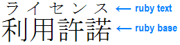
Ruby is the commonly-used name for a run of text that appears alongside another run of text (referred to as the “base”) and serves as an annotation or a pronunciation guide associated with that run of text.
Example of ruby used in Japanese (simple case)
(Hopefully you're starting to see where this is going.)
So the technique works as follows:
First, place one section in an <rb> element and the other in a <rt>. For example:
<ruby>
    <rb>
        <span class="section-a">
            Section A content...
        </span>
    </rb>
    <rt>
        <span class="section-b">
            Section B content...
        </span>
    </rt>
<ruby>
Without any CSS applied, Section B will appear above Section A. By default, the font-size of Section B will be smaller (since it’s inside an <rt> block), so you may want to sort of reset it with something like this:
rt {
    font-size: inherit
}
Finally, to “flip” the content order such that Section B appears last, simply set the following CSS on <rt>.
rt {
    display: inline
}
Use it in a media query at the desired break point.
This is the content of Section A, the one which appears in the DOM first. But the DOM’s got nothin’ on these mad CSS skills.
It really is a gem of an idea.
================================================
FILE: potions/letter-spacing/index.html
================================================
Letter Spacing — Potion — Magic of CSS — Adam Schwartz
When adding letter-spacing to some text, take note of the fact that the spacing is added to the right of each letter, not between each letter.
This means that if you text-align: center text which has been letter-spaced, the letters won’t be centered unless you make a correction. There are a number of ways to do this, including applying a negative left margin, a left padding, or using text indent.
Text indent is perhaps the best method when you can guarantee your text doesn’t wrap. Otherwise, a padding or margin is probably your best bet.
This is some text which will overflow. This is some text which will overflow.
Line-height: 1
J and yjg can sometimes be cut off by overflows.
Table
Name
Description
Example Name
This is the description of Example Name. This is the description of Example Name.
This is the description of Example Name. This is the description of Example Name.
This is the description of Example Name. This is the description of Example Name.
Example Name
This is the description of Example Name. This is the description of Example Name.
This is the description of Example Name. This is the description of Example Name.
This is the description of Example Name. This is the description of Example Name.
I am a paragraph of text with a floated box inside me.
Background grid for checking alignment
When working on something with varying font sizes, it can be helpful to have a grid behind you.
Equal negative margin and padding
Click me!
Equal negative margin and padding gotcha
Sometimes you want to increase the size of a hit target without changing its position. Depending on the situation, there may be a number of ways to accomplish this. But a simple and often effective one is to apply a negative margin and padding of the same value. They sort of cancel eachother out while allowing you to increase the hit target region by the size you choose.