Repository: ckpack/vue-color
Branch: main
Commit: 053f05f462d1
Files: 59
Total size: 84.3 KB
Directory structure:
gitextract_w8xtql1h/

├── .eslintignore
├── .eslintrc.cjs
├── .gitattributes
├── .github/
│   └── workflows/
│       └── npm-publish.yml
├── .gitignore
├── .husky/
│   ├── .gitignore
│   ├── commit-msg
│   └── pre-commit
├── CHANGELOG.md
├── LICENSE
├── README.md
├── build/
│   ├── build.config.js
│   ├── build.dist.js
│   └── build.libs.js
├── commitlint.config.cjs
├── dev/
│   ├── serve.js
│   └── serve.vue
├── example/
│   └── index.html
├── jsconfig.json
├── package.json
├── scripts/
│   ├── gen-compoents.js
│   └── gen.js
├── src/
│   ├── components/
│   │   ├── alpha/
│   │   │   ├── alpha.vue
│   │   │   └── index.js
│   │   ├── checkboard/
│   │   │   ├── checkboard.vue
│   │   │   └── index.js
│   │   ├── chrome/
│   │   │   ├── chrome.vue
│   │   │   └── index.js
│   │   ├── compact/
│   │   │   ├── compact.vue
│   │   │   └── index.js
│   │   ├── editable-input/
│   │   │   ├── editable-input.vue
│   │   │   └── index.js
│   │   ├── grayscale/
│   │   │   ├── grayscale.vue
│   │   │   └── index.js
│   │   ├── hue/
│   │   │   ├── hue.vue
│   │   │   └── index.js
│   │   ├── material/
│   │   │   ├── index.js
│   │   │   └── material.vue
│   │   ├── photoshop/
│   │   │   ├── index.js
│   │   │   └── photoshop.vue
│   │   ├── saturation/
│   │   │   ├── index.js
│   │   │   └── saturation.vue
│   │   ├── sketch/
│   │   │   ├── index.js
│   │   │   └── sketch.vue
│   │   ├── slider/
│   │   │   ├── index.js
│   │   │   └── slider.vue
│   │   ├── swatches/
│   │   │   ├── index.js
│   │   │   └── swatches.vue
│   │   └── twitter/
│   │       ├── index.js
│   │       └── twitter.vue
│   ├── components.js
│   ├── create.js
│   ├── defaultConfig.js
│   ├── index.js
│   ├── mixin/
│   │   └── color.js
│   ├── preset.js
│   └── utils/
│       ├── compoent.js
│       └── utils.js
└── types.d.ts
================================================
FILE CONTENTS
================================================
================================================
FILE: .eslintignore
================================================
dist/
libs/
website/
node_modules/
================================================
FILE: .eslintrc.cjs
================================================
module.exports = {
extends: [
'@antfu',
],
rules: {
'semi': 'off',
'@typescript-eslint/semi': ['error', 'always'],
'no-console': 'off',
'vue/require-explicit-emits': 'off',
'unused-imports/no-unused-vars': 'off',
},
};
================================================
FILE: .gitattributes
================================================
# Auto detect text files and perform LF normalization
* text=auto
================================================
FILE: .github/workflows/npm-publish.yml
================================================
# This workflow will run tests using node and then publish a package to GitHub Packages when a release is created
# For more information see: https://help.github.com/actions/language-and-framework-guides/publishing-nodejs-packages
name: Node.js Package
on:
push:
tags:
- '*'
jobs:
publish-npm:
runs-on: ubuntu-latest
steps:
- uses: actions/checkout@v2
- uses: actions/setup-node@v1
with:
node-version: 18
registry-url: https://registry.npmjs.org/
- run: npm install --force
- run: npm run build
- run: npm publish --access=public
env:
NODE_AUTH_TOKEN: ${{secrets.npm_token}}
- name: deploy
uses: peaceiris/actions-gh-pages@v3
with:
github_token: ${{ secrets.GITHUB_TOKEN }}
publish_dir: ./example
================================================
FILE: .gitignore
================================================
node_modules/
dist/
libs/
website/
================================================
FILE: .husky/.gitignore
================================================
_
================================================
FILE: .husky/commit-msg
================================================
#!/bin/sh
. "$(dirname "$0")/_/husky.sh"
npx --no-install commitlint --edit "$1"
================================================
FILE: .husky/pre-commit
================================================
#!/bin/sh
. "$(dirname "$0")/_/husky.sh"
npx lint-staged
================================================
FILE: CHANGELOG.md
================================================
# Changelog
All notable changes to this project will be documented in this file. See [standard-version](https://github.com/conventional-changelog/standard-version) for commit guidelines.
## [1.6.0](https://github.com/ckpack/vue-color/compare/v1.5.2...v1.6.0) (2024-07-19)
### Features
* exported ColorMixin ([dbbe373](https://github.com/ckpack/vue-color/commit/dbbe373cfcc901f5e9a72cae2f6758bcc16dad53))
### [1.5.2](https://github.com/ckpack/vue-color/compare/v1.5.0...v1.5.2) (2024-07-18)
### [1.5.1](https://github.com/ckpack/vue-color/compare/v1.5.0...v1.5.1) (2024-07-18)
### Features
Added `MIT` license to the `package.json`
## [1.5.0](https://github.com/ckpack/vue-color/compare/v1.4.1...v1.5.0) (2023-06-15)
### Features
* chrome compoent add a props named format (hex, rgb, etc) and an event update:format; fix [#28](https://github.com/ckpack/vue-color/issues/28) ([c9f3a5c](https://github.com/ckpack/vue-color/commit/c9f3a5cb1df733246f9b99c06088417c363a7d22))
### [1.4.1](https://github.com/ckpack/vue-color/compare/v1.4.0...v1.4.1) (2023-02-16)
### Bug Fixes
* update package.json ([aec3072](https://github.com/ckpack/vue-color/commit/aec30723de33d9366f3c1d1cd6cc18a18eb44b0b))
## [1.4.0](https://github.com/ckpack/vue-color/compare/v1.3.0...v1.4.0) (2023-02-16)
### Features
* add Type declarations ([213b3e2](https://github.com/ckpack/vue-color/commit/213b3e20451f4f177ec16ab3c7d0356a46cbcd61))
## [1.3.0](https://github.com/ckpack/vue-color/compare/v1.2.4...v1.3.0) (2022-11-30)
### Features
* add keyboard navigation support for swatches and twitter ([a0ff7aa](https://github.com/ckpack/vue-color/commit/a0ff7aa7cc0afe450e01416250cd61d512093dd2))
### [1.2.4](https://github.com/ckpack/vue-color/compare/v1.2.3...v1.2.4) (2022-10-17)
### Bug Fixes
* update github_token ([2c78f05](https://github.com/ckpack/vue-color/commit/2c78f055498aba5815625bf677f3b76a9fc37299))
### [1.2.3](https://github.com/ckpack/vue-color/compare/v1.2.2...v1.2.3) (2022-10-17)
### Bug Fixes
* change yarn to npm ([2ef2928](https://github.com/ckpack/vue-color/commit/2ef292831439c407de8d2218a0df0c6f3c74dd23))
### [1.2.2](https://github.com/ckpack/vue-color/compare/v1.2.1...v1.2.2) (2022-10-17)
### Bug Fixes
* upgrade node version ([2ecf716](https://github.com/ckpack/vue-color/commit/2ecf716ea1995c4af524bb7df7149464dfb20875))
### [1.2.1](https://github.com/ckpack/vue-color/compare/v1.2.0...v1.2.1) (2022-10-17)
## [1.2.0](https://github.com/ckpack/vue-color/compare/v1.1.9...v1.2.0) (2022-07-11)
### Features
* explicitly export the type as module ([5fbf273](https://github.com/ckpack/vue-color/commit/5fbf27390cb3cf7be5fedc6e8dcda3c9e9317636))
### [1.1.9](https://github.com/ckpack/vue-color/compare/v1.1.8...v1.1.9) (2022-04-12)
### Bug Fixes
* sketch presetColors alpha not work ([93ec741](https://github.com/ckpack/vue-color/commit/93ec7413e6785e19b31e5c3760001cbd3e5be91c))
### [1.1.8](https://github.com/ckpack/vue-color/compare/v1.1.7...v1.1.8) (2022-02-22)
### Bug Fixes
* tinycolor(...).isValid is not a function ([7831c54](https://github.com/ckpack/vue-color/commit/7831c54654a702b587f03007a6d4539287cdb91d))
### [1.1.7](https://github.com/ckpack/vue-color/compare/v1.1.6...v1.1.7) (2022-02-16)
### Bug Fixes
* replace CommonJS package ([6f1292f](https://github.com/ckpack/vue-color/commit/6f1292f3fe95fee68aff30e3ea45e5799247b2a1))
### [1.1.6](https://github.com/ckpack/vue-color/compare/v1.1.5...v1.1.6) (2022-02-14)
### Bug Fixes
* use replace tinycolor2 with @ctrl/tinycolor ([09bb612](https://github.com/ckpack/vue-color/commit/09bb612c50467fda655e8b6b36c16d7b120263d6))
### [1.1.5](https://github.com/ckpack/vue-color/compare/v1.1.4...v1.1.5) (2021-12-08)
### Bug Fixes
* esm result exclude vue module ([d61b120](https://github.com/ckpack/vue-color/commit/d61b120542fbf531b22a73dbfe814b99bc4ad828))
* **hue:** emit color on mouseup just like saturation does ([9d8c798](https://github.com/ckpack/vue-color/commit/9d8c798728dfd985dac3f5ef8331adadf5de929c))
### [1.1.4](https://github.com/ckpack/vue-color/compare/v1.1.3...v1.1.4) (2021-10-21)
### Bug Fixes
* repair production mode component import error ([c6aa16f](https://github.com/ckpack/vue-color/commit/c6aa16f638a72beffdf493f531cd85da85ecdfa5))
### [1.1.3](https://github.com/ckpack/vue-color/compare/v1.1.2...v1.1.3) (2021-10-15)
### [1.1.2](https://github.com/ckpack/vue-color/compare/v1.1.1...v1.1.2) (2021-10-15)
### Bug Fixes
* update peerDependencies vue version ([22d57bf](https://github.com/ckpack/vue-color/commit/22d57bf7a5fc789a357dd7f2c43870a15db48d38))
### [1.1.1](https://github.com/ckpack/vue-color/compare/v1.1.0...v1.1.1) (2021-10-14)
### Bug Fixes
* excluded dependencies module when build libs ([6b0d860](https://github.com/ckpack/vue-color/commit/6b0d860c2b2f6d07f31c195b4a93c1e7a58fc941))
* update dev serve.js ([915233d](https://github.com/ckpack/vue-color/commit/915233dc2c6602aac00d7acbf4142dfb2b2f9112))
## [1.1.0](https://github.com/ckpack/vue-color/compare/v1.0.1...v1.1.0) (2021-09-09)
### Features
* add standard-version gen changelog ([43cb18b](https://github.com/ckpack/vue-color/commit/43cb18b00b5a9f3d4a2921db6b5dcb98b47e81a8))
* pre-commit add lint-staged ([d0e7ddb](https://github.com/ckpack/vue-color/commit/d0e7ddbe7dd0ed29ce13ba23af8c766df33798cb))
* pre-commit add lint-staged ([2c63fff](https://github.com/ckpack/vue-color/commit/2c63fffcb15eefc278e3c6b2ab54622238664730))
* pre-commit add lint-staged ([31602b5](https://github.com/ckpack/vue-color/commit/31602b5d06c561392115b3d6b43f91aca9449b34))
# [1.0.0] - 2021-08-26
## Feature
Now we can import on Demand (Tree Shaking)
================================================
FILE: LICENSE
================================================
MIT License
Copyright (c) 2021 chenkai0520
Permission is hereby granted, free of charge, to any person obtaining a copy
of this software and associated documentation files (the "Software"), to deal
in the Software without restriction, including without limitation the rights
to use, copy, modify, merge, publish, distribute, sublicense, and/or sell
copies of the Software, and to permit persons to whom the Software is
furnished to do so, subject to the following conditions:
The above copyright notice and this permission notice shall be included in all
copies or substantial portions of the Software.
THE SOFTWARE IS PROVIDED "AS IS", WITHOUT WARRANTY OF ANY KIND, EXPRESS OR
IMPLIED, INCLUDING BUT NOT LIMITED TO THE WARRANTIES OF MERCHANTABILITY,
FITNESS FOR A PARTICULAR PURPOSE AND NONINFRINGEMENT. IN NO EVENT SHALL THE
AUTHORS OR COPYRIGHT HOLDERS BE LIABLE FOR ANY CLAIM, DAMAGES OR OTHER
LIABILITY, WHETHER IN AN ACTION OF CONTRACT, TORT OR OTHERWISE, ARISING FROM,
OUT OF OR IN CONNECTION WITH THE SOFTWARE OR THE USE OR OTHER DEALINGS IN THE
SOFTWARE.
================================================
FILE: README.md
================================================
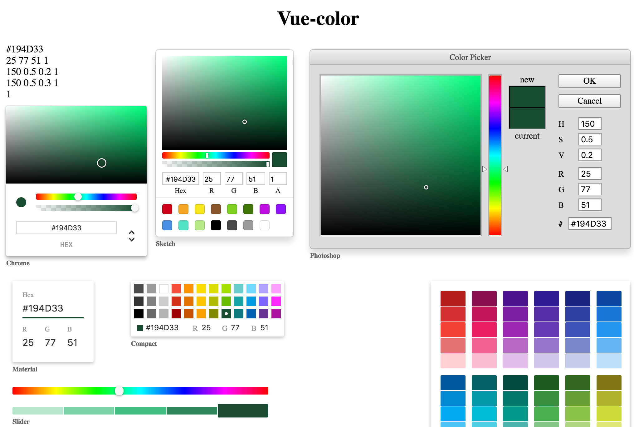
# vue-color
> Modified based on [https://github.com/xiaokaike/vue-color](https://github.com/xiaokaike/vue-color) to support vue3.0
🎨 Vue Color Pickers for Sketch, Photoshop, Chrome & more
## [Demo](https://ckpack.github.io/vue-color)
## Use case
#### On demand
We can import components we actually need, making the project smaller than otherwise.
##### Import Directly
```html
<template>
<Sketch v-model="colors"/>
</template>
<script setup>
import { ref } from 'vue';
import { Sketch } from '@ckpack/vue-color';
const colors = ref('#194D33A8'); // etc: { h: 150, s: 0.66, v: 0.30 }, { r: 255, g: 0, b: 0 }, '#194d33'
</script>
```
##### Install on Demand Globally
```js
import { createApp } from 'vue';
import App from '@/App.vue';
import { Sketch, create } from '@ckpack/vue-color';
const app = createApp(App);
app.use(create({
components: [Sketch],
}));
app.mount('#app');
```
#### Fully import
```js
import { createApp } from 'vue';
import App from '@/App.vue';
import VueColor from '@ckpack/vue-color';
const app = createApp(App);
app.use(VueColor);
app.mount('#app');
```
## [CHANGELOG](/CHANGELOG.md)
## License
vue-color is licensed under [The MIT License](LICENSE).
================================================
FILE: build/build.config.js
================================================
import path from 'path';
import resolve from '@rollup/plugin-node-resolve';
import alias from '@rollup/plugin-alias';
import vue from 'rollup-plugin-vue';
import terser from '@rollup/plugin-terser';
import postcss from 'rollup-plugin-postcss';
import commonjs from '@rollup/plugin-commonjs';
import prefixer from 'postcss-prefixer';
import { cssPrefix, name } from '../src/defaultConfig.js';
import packageJson from '../package.json' assert { type: 'json' };
const { dependencies } = packageJson;
const projectRoot = path.resolve(__dirname, '../src');
const globals = {
// Provide global variable names to replace your external imports, eg. jquery: '$'
vue: 'Vue',
};
const postcssPlugin = (options = {}) => {
const minimize = options.minimize !== false;
const exclude = options.exclude || /node_modules/;
const include = options.include || /(?<!&module=.*)\.css$/;
return postcss({
minimize,
plugins: [prefixer({
prefix: cssPrefix,
})],
exclude,
include,
extract: options.extract,
});
};
const plugins = {
alias: alias({
entries: [
{
find: '@',
replacement: projectRoot,
},
],
}),
resolve: resolve(),
terser: terser(),
vue: vue({
include: /\.vue$/,
target: 'browser',
css: false,
exposeFilename: false,
preprocessStyles: false,
cssModulesOptions: {
generateScopedName: '[local]___[hash:base64:5]',
},
}),
postcss: postcssPlugin,
commonjs: commonjs(),
};
const output = {
name,
globals,
};
const external = {
vue: ['vue'],
dependencies: Object.keys(dependencies),
};
export {
projectRoot,
plugins,
output,
external,
};
================================================
FILE: build/build.dist.js
================================================
import {
external, output, plugins, projectRoot,
} from './build.config.js';
const input = `${projectRoot}/index.js`;
const basePlugins = [
plugins.alias,
plugins.vue,
plugins.resolve,
plugins.commonjs,
];
export default [
{
input,
output: {
format: 'esm',
file: 'dist/index.js',
globals: output.globals,
},
plugins: [
...basePlugins,
plugins.postcss(),
],
external: external.vue,
},
{
input,
output: {
format: 'iife',
file: 'dist/index.min.js',
exports: 'named',
name: output.name,
globals: output.globals,
},
plugins: [
...basePlugins,
plugins.postcss(),
plugins.terser,
],
external: external.vue,
},
];
================================================
FILE: build/build.libs.js
================================================
import glob from 'glob';
import {
external, output, plugins, projectRoot,
} from './build.config.js';
const input = glob.sync('src/**/*.js', {
nodir: true,
});
const basePlugins = [
plugins.alias,
plugins.vue,
plugins.resolve,
];
export default [
{
input,
output: {
format: 'esm',
dir: 'libs/',
entryFileNames: ({ facadeModuleId }) => facadeModuleId.replace(`${projectRoot}/`, ''),
globals: output.globals,
},
plugins: [
...basePlugins,
plugins.postcss(),
],
external: [...external.vue, ...external.dependencies],
},
];
================================================
FILE: commitlint.config.cjs
================================================
module.exports = {
extends: ['@commitlint/config-conventional'],
};
================================================
FILE: dev/serve.js
================================================
import { createApp } from 'vue';
import Dev from './serve.vue';
const app = createApp(Dev);
app.mount('#app');
================================================
FILE: dev/serve.vue
================================================
<script setup>
import { ref } from 'vue';
import {
Chrome, Compact, Grayscale, Material, Photoshop, Sketch, Slider, Swatches, Twitter,
} from '../src';
const format = ref('rgb');
const colors = ref({ hsl: { h: 150, s: 0.5098039215686275, l: 0.19999999999999998, a: 0.6588235294117647 }, hex: '#194D33', hex8: '#194D33A8', rgba: { r: 25, g: 77, b: 51, a: 0.6588235294117647 }, hsv: { h: 150, s: 0, v: 0, a: 0.6588235294117647 }, oldHue: 150, a: 0.6588235294117647 });
const c = (v) => {
console.log(v);
};
</script>
<template>
<div id="app" :style="{ 'background-color': typeof colors === 'object' ? colors.hex8 : colors }">
<Chrome v-model="colors" :format="format" @update:format="c" />
<Sketch v-model="colors" />
<Compact v-model="colors" />
<Grayscale v-model="colors" />
<Material v-model="colors" />
<Photoshop v-model="colors" />
<Slider v-model="colors" />
<Swatches v-model="colors" />
<Twitter v-model="colors" />
</div>
</template>
<style>
#app > div {
margin: 30px 0;
}
</style>
================================================
FILE: example/index.html
================================================
<!DOCTYPE html>
<html lang="en">
<head>
<meta charset="UTF-8">
<meta http-equiv="X-UA-Compatible" content="IE=edge">
<meta name="viewport" content="width=device-width, initial-scale=1.0">
<title>vue-color</title>
<script src="https://unpkg.com/vue@latest/dist/vue.global.prod.js"></script>
<script src="https://unpkg.com/@ckpack/vue-color@latest/dist/index.min.js"></script>
</head>
<style>
html,body,#app{
width: 100%;
height: 100%;
margin: 0;
padding: 0;
}
.color-wrapper > div {
margin: 24px 0;
}
</style>
<body>
<div id="app">
<div class="color-wrapper" :style="{'background-color': typeof colors === 'object' ? colors.hex8 : colors}">
<Chrome v-model="colors"></Chrome>
<Compact v-model="colors"></Compact>
<Grayscale v-model="colors"></Grayscale>
<Material v-model="colors"></Material>
<Photoshop v-model="colors"></Photoshop>
<Sketch v-model="colors"></Sketch>
<Slider v-model="colors"></Slider>
<Swatches v-model="colors"></Swatches>
<Twitter v-model="colors"></Twitter>
</div>
</div>
</body>
<script>
const app = Vue.createApp({
data() {
return {
colors: '#194D33A8',
};
},
});
app.use(VueColor);
app.mount('#app');
</script>
</html>
================================================
FILE: jsconfig.json
================================================
{
"compilerOptions": {
"baseUrl": ".",
"checkJs": false,
"paths": {
"@/*": ["src/*"]
}
},
"include": ["src/**/*"],
"exclude": ["node_modules", "dist", "libs", "website"]
}
================================================
FILE: package.json
================================================
{
"name": "@ckpack/vue-color",
"version": "1.6.0",
"description": "(vue3.0) 🎨 Vue Color Pickers for Sketch, Photoshop, Chrome & more",
"repository": "https://github.com/ckpack/vue-color",
"sideEffects": false,
"type": "module",
"types": "./types.d.ts",
"main": "dist/index.js",
"module": "libs/index.js",
"unpkg": "dist/index.min.js",
"author": "chenkai",
"license": "MIT",
"keywords": [
"vue-color",
"color",
"vuejs"
],
"files": [
"dist/*",
"src/*",
"libs/*",
"types.d.ts"
],
"scripts": {
"dev": "vue-cli-service serve dev/serve.js",
"build": "npm run build:libs && npm run build:dist",
"build:libs": "rm -rf ./libs && rollup --bundleConfigAsCjs --config ./build/build.libs.js",
"build:dist": "rm -rf ./dist && rollup --bundleConfigAsCjs --config ./build/build.dist.js",
"build:style": "",
"build:website": "vue-cli-service build --dest website dev/serve.js",
"lint": "eslint --fix --ext .js,.vue ./",
"gen": "node ./scripts/gen.js",
"gen:compoents": "node ./scripts/gen-compoents.js",
"prepare": "husky install",
"release": "standard-version"
},
"devDependencies": {
"@commitlint/cli": "^17.4.3",
"@commitlint/config-conventional": "^17.4.3",
"@rollup/plugin-alias": "^4.0.3",
"@rollup/plugin-commonjs": "^24.0.1",
"@rollup/plugin-node-resolve": "^15.0.1",
"@vue/cli-service": "^5.0.8",
"@vue/compiler-sfc": "^3.2.47",
"eslint": "^8.34.0",
"@antfu/eslint-config": "0.35.2",
"glob": "^8.1.0",
"husky": "^8.0.3",
"lint-staged": "^13.1.2",
"postcss": "^8.4.21",
"postcss-prefixer": "^2.1.3",
"rollup": "^3.15.0",
"rollup-plugin-postcss": "^4.0.2",
"@rollup/plugin-terser": "^0.4.0",
"rollup-plugin-vue": "^6.0.0",
"standard-version": "^9.5.0",
"vue": "3.2.41"
},
"peerDependencies": {
"vue": "^3.2.0"
},
"dependencies": {
"material-colors": "^1.2.6",
"@ctrl/tinycolor": "^3.6.0"
},
"engines": {
"node": ">=12"
},
"lint-staged": {
"*.{js,jsx,vue}": [
"eslint --fix"
]
}
}
================================================
FILE: scripts/gen-compoents.js
================================================
import fs from 'fs';
const basePath = process.cwd();
function formatComponent(component) {
return component.split('-').map(name => name.slice(0, 1).toUpperCase() + name.slice(1)).join('');
}
function getCompoentsJS() {
const components = fs.readdirSync(`${basePath}/src/components`);
let componentsJS = '/* Do not modify the automatically generated code */\n';
componentsJS += components.map(name => `import ${formatComponent(name)} from '@/components/${name}';\n`).join('');
componentsJS += `\nconst components = [\n${components.map(name => ` ${formatComponent(name)},\n`).join('')}];\n`;
componentsJS += `\nexport {\n components,\n${components.map(name => ` ${formatComponent(name)},\n`).join('')}};\n`;
return componentsJS;
}
fs.writeFileSync(`${basePath}/src/components.js`, getCompoentsJS());
================================================
FILE: scripts/gen.js
================================================
import fs from 'fs';
function formatComponent(component) {
return component.split('-').map(name => name.slice(0, 1).toUpperCase() + name.slice(1)).join('');
}
const basePath = process.cwd();
const componentName = process.argv.slice(2).join(' ');
const formatComponentName = formatComponent(componentName);
if (!/^[a-z]+(-[a-z]+){0,}$/.test(componentName)) {
console.error(`component name is incorrect: ${componentName}\netc:\nbutton\nsome-button\nsome-button-group`);
process.exit(1);
}
if (fs.existsSync(`${basePath}/src/components/${componentName}`)) {
console.error(`component name is already exist: ${componentName}`);
process.exit(1);
}
fs.mkdirSync(`${basePath}/src/components/${componentName}`);
fs.writeFileSync(`${basePath}/src/components/${componentName}/${componentName}.vue`, `<template>
<div :class="\`\${cssPrefix}${componentName}\`">
</div>
</template>
<script>
import { cssPrefix } from '@/defaultConfig';
export default {
name: '${formatComponentName}',
setup() {
return {
cssPrefix,
};
},
};
</script>
<style lang="scss">
@import './${componentName}.scss';
</style>
`);
fs.writeFileSync(`${basePath}/src/components/${componentName}/${componentName}.scss`, `@import '../../styles/var.scss';
.${componentName} {}`);
fs.writeFileSync(`${basePath}/src/components/${componentName}/index.js`, `import ${formatComponentName} from './${componentName}.vue';
export default ${formatComponentName};
`);
// require('./gen-compoents');
================================================
FILE: src/components/alpha/alpha.vue
================================================
<script>
import checkboard from '@/components/checkboard';
export default {
name: 'Alpha',
components: {
Checkboard: checkboard,
},
props: {
value: Object,
onChange: Function,
},
computed: {
colors() {
return this.value;
},
gradientColor() {
const { rgba } = this.colors;
const rgbStr = [rgba.r, rgba.g, rgba.b].join(',');
return `linear-gradient(to right, rgba(${rgbStr}, 0) 0%, rgba(${rgbStr}, 1) 100%)`;
},
},
methods: {
handleChange(e, skip) {
!skip && e.preventDefault();
const { container } = this.$refs;
if (!container) {
// for some edge cases, container may not exist. see #220
return;
}
const containerWidth = container.clientWidth;
const xOffset = container.getBoundingClientRect().left + window.pageXOffset;
const pageX = e.pageX || (e.touches ? e.touches[0].pageX : 0);
const left = pageX - xOffset;
let a;
if (left < 0)
a = 0;
else if (left > containerWidth)
a = 1;
else
a = Math.round(left * 100 / containerWidth) / 100;
if (this.colors.a !== a) {
this.$emit('change', {
h: this.colors.hsl.h,
s: this.colors.hsl.s,
l: this.colors.hsl.l,
a,
source: 'rgba',
});
}
},
handleMouseDown(e) {
this.handleChange(e, true);
window.addEventListener('mousemove', this.handleChange);
window.addEventListener('mouseup', this.handleMouseUp);
},
handleMouseUp() {
this.unbindEventListeners();
},
unbindEventListeners() {
window.removeEventListener('mousemove', this.handleChange);
window.removeEventListener('mouseup', this.handleMouseUp);
},
},
};
</script>
<template>
<div class="vc-alpha">
<div class="vc-alpha-checkboard-wrap">
<Checkboard />
</div>
<div class="vc-alpha-gradient" :style="{ background: gradientColor }" />
<div
ref="container"
class="vc-alpha-container"
@mousedown="handleMouseDown"
@touchmove="handleChange"
@touchstart="handleChange"
>
<div class="vc-alpha-pointer" :style="{ left: `${colors.a * 100}%` }">
<div class="vc-alpha-picker" />
</div>
</div>
</div>
</template>
<style>
.vc-alpha {
position: absolute;
top: 0px;
right: 0px;
bottom: 0px;
left: 0px;
}
.vc-alpha-checkboard-wrap {
position: absolute;
top: 0px;
right: 0px;
bottom: 0px;
left: 0px;
overflow: hidden;
}
.vc-alpha-gradient {
position: absolute;
top: 0px;
right: 0px;
bottom: 0px;
left: 0px;
}
.vc-alpha-container {
cursor: pointer;
position: relative;
z-index: 2;
height: 100%;
margin: 0 3px;
}
.vc-alpha-pointer {
z-index: 2;
position: absolute;
}
.vc-alpha-picker {
cursor: pointer;
width: 4px;
border-radius: 1px;
height: 8px;
box-shadow: 0 0 2px rgba(0, 0, 0, .6);
background: #fff;
margin-top: 1px;
transform: translateX(-2px);
}
</style>
================================================
FILE: src/components/alpha/index.js
================================================
import Alpha from './alpha.vue';
import { install } from '@/utils/compoent';
Alpha.install = install;
export default Alpha;
================================================
FILE: src/components/checkboard/checkboard.vue
================================================
<script>
const _checkboardCache = {};
export default {
name: 'Checkboard',
props: {
size: {
type: [Number, String],
default: 8,
},
white: {
type: String,
default: '#fff',
},
grey: {
type: String,
default: '#e6e6e6',
},
},
computed: {
bgStyle() {
return {
'background-image': `url(${getCheckboard(this.white, this.grey, this.size)})`,
};
},
},
};
/**
* get base 64 data by canvas
*
* @param {String} c1 hex color
* @param {String} c2 hex color
* @param {Number} size
*/
function renderCheckboard(c1, c2, size) {
// Dont Render On Server
if (typeof document === 'undefined')
return null;
const canvas = document.createElement('canvas');
canvas.width = canvas.height = size * 2;
const ctx = canvas.getContext('2d');
// If no context can be found, return early.
if (!ctx)
return null;
ctx.fillStyle = c1;
ctx.fillRect(0, 0, canvas.width, canvas.height);
ctx.fillStyle = c2;
ctx.fillRect(0, 0, size, size);
ctx.translate(size, size);
ctx.fillRect(0, 0, size, size);
return canvas.toDataURL();
}
/**
* get checkboard base data and cache
*
* @param {String} c1 hex color
* @param {String} c2 hex color
* @param {Number} size
*/
function getCheckboard(c1, c2, size) {
const key = `${c1},${c2},${size}`;
if (_checkboardCache[key])
return _checkboardCache[key];
const checkboard = renderCheckboard(c1, c2, size);
_checkboardCache[key] = checkboard;
return checkboard;
}
</script>
<template>
<div class="vc-checkerboard" :style="bgStyle" />
</template>
<style>
.vc-checkerboard {
position: absolute;
top: 0px;
right: 0px;
bottom: 0px;
left: 0px;
background-size: contain;
}
</style>
================================================
FILE: src/components/checkboard/index.js
================================================
import Checkboard from './checkboard.vue';
import { install } from '@/utils/compoent';
Checkboard.install = install;
export default Checkboard;
================================================
FILE: src/components/chrome/chrome.vue
================================================
<script>
import colorMixin from '@/mixin/color';
import editableInput from '@/components/editable-input';
import saturation from '@/components/saturation';
import hue from '@/components/hue';
import alpha from '@/components/alpha';
import checkboard from '@/components/checkboard';
export default {
name: 'Chrome',
components: {
Saturation: saturation,
Hue: hue,
Alpha: alpha,
EdIn: editableInput,
Checkboard: checkboard,
},
mixins: [colorMixin],
props: {
disableAlpha: {
type: Boolean,
default: false,
},
disableFields: {
type: Boolean,
default: false,
},
format: {
type: String,
default: 'hex',
},
},
data() {
return {
fieldsIndex: 'hex',
highlight: false,
};
},
computed: {
hsl() {
const { h, s, l } = this.colors.hsl;
return {
h: h.toFixed(),
s: `${(s * 100).toFixed()}%`,
l: `${(l * 100).toFixed()}%`,
};
},
activeColor() {
const { rgba } = this.colors;
return `rgba(${[rgba.r, rgba.g, rgba.b, rgba.a].join(',')})`;
},
hasAlpha() {
return this.colors.a < 1;
},
},
watch: {
format: {
handler(val) {
this.fieldsIndex = val;
},
immediate: true,
},
},
methods: {
childChange(data) {
this.colorChange(data);
},
inputChange(data) {
if (!data)
return;
if (data.hex) {
this.isValidHex(data.hex) && this.colorChange({
hex: data.hex,
source: 'hex',
});
}
else if (data.r || data.g || data.b || data.a) {
this.colorChange({
r: data.r || this.colors.rgba.r,
g: data.g || this.colors.rgba.g,
b: data.b || this.colors.rgba.b,
a: data.a || this.colors.rgba.a,
source: 'rgba',
});
}
else if (data.h || data.s || data.l) {
const s = data.s ? (data.s.replace('%', '') / 100) : this.colors.hsl.s;
const l = data.l ? (data.l.replace('%', '') / 100) : this.colors.hsl.l;
this.colorChange({
h: data.h || this.colors.hsl.h,
s,
l,
source: 'hsl',
});
}
},
toggleViews() {
switch (this.fieldsIndex) {
case 'hex':
this.fieldsIndex = `rgb${this.disableAlpha ? '' : 'a'}`;
break;
case 'rgb':
case 'rgba':
this.fieldsIndex = `hsl${this.disableAlpha ? '' : 'a'}`;
break;
default:
this.fieldsIndex = 'hex';
break;
}
this.$emit('update:format', this.fieldsIndex);
},
showHighlight() {
this.highlight = true;
},
hideHighlight() {
this.highlight = false;
},
},
};
</script>
<template>
<div role="application" aria-label="Chrome color picker" class="vc-chrome" :class="[disableAlpha ? 'vc-chrome__disable-alpha' : '']">
<div class="vc-chrome-saturation-wrap">
<Saturation :value="colors" @change="childChange" />
</div>
<div class="vc-chrome-body">
<div class="vc-chrome-controls">
<div class="vc-chrome-color-wrap">
<div :aria-label="`current color is ${colors.hex}`" class="vc-chrome-active-color" :style="{ background: activeColor }" />
<Checkboard v-if="!disableAlpha" />
</div>
<div class="vc-chrome-sliders">
<div class="vc-chrome-hue-wrap">
<Hue :value="colors" @change="childChange" />
</div>
<div v-if="!disableAlpha" class="vc-chrome-alpha-wrap">
<Alpha :value="colors" @change="childChange" />
</div>
</div>
</div>
<div v-if="!disableFields" class="vc-chrome-fields-wrap">
<div v-show="fieldsIndex === 'hex'" class="vc-chrome-fields">
<!-- hex -->
<div class="vc-chrome-field">
<EdIn v-if="!hasAlpha" label="hex" :value="colors.hex" @change="inputChange" />
<EdIn v-if="hasAlpha" label="hex" :value="colors.hex8" @change="inputChange" />
</div>
</div>
<div v-show="['rgb', 'rgba'].includes(fieldsIndex)" class="vc-chrome-fields">
<!-- rgba -->
<div class="vc-chrome-field">
<EdIn label="r" :value="colors.rgba.r" @change="inputChange" />
</div>
<div class="vc-chrome-field">
<EdIn label="g" :value="colors.rgba.g" @change="inputChange" />
</div>
<div class="vc-chrome-field">
<EdIn label="b" :value="colors.rgba.b" @change="inputChange" />
</div>
<div v-if="!disableAlpha" class="vc-chrome-field">
<EdIn label="a" :value="colors.a" :arrow-offset="0.01" :max="1" @change="inputChange" />
</div>
</div>
<div v-show="['hsl', 'hsla'].includes(fieldsIndex)" class="vc-chrome-fields">
<!-- hsla -->
<div class="vc-chrome-field">
<EdIn label="h" :value="hsl.h" @change="inputChange" />
</div>
<div class="vc-chrome-field">
<EdIn label="s" :value="hsl.s" @change="inputChange" />
</div>
<div class="vc-chrome-field">
<EdIn label="l" :value="hsl.l" @change="inputChange" />
</div>
<div v-if="!disableAlpha" class="vc-chrome-field">
<EdIn label="a" :value="colors.a" :arrow-offset="0.01" :max="1" @change="inputChange" />
</div>
</div>
<!-- btn -->
<div class="vc-chrome-toggle-btn" role="button" aria-label="Change another color definition" @click="toggleViews">
<div class="vc-chrome-toggle-icon">
<svg
style="width:24px; height:24px"
viewBox="0 0 24 24"
@mouseover="showHighlight"
@mouseenter="showHighlight"
@mouseout="hideHighlight"
>
<path fill="#333" d="M12,18.17L8.83,15L7.42,16.41L12,21L16.59,16.41L15.17,15M12,5.83L15.17,9L16.58,7.59L12,3L7.41,7.59L8.83,9L12,5.83Z" />
</svg>
</div>
<div v-show="highlight" class="vc-chrome-toggle-icon-highlight" />
</div>
<!-- btn -->
</div>
</div>
</div>
</template>
<style>
.vc-chrome {
background: #fff;
border-radius: 2px;
box-shadow: 0 0 2px rgba(0,0,0,.3), 0 4px 8px rgba(0,0,0,.3);
box-sizing: initial;
width: 225px;
font-family: Menlo;
background-color: #fff;
}
.vc-chrome-controls {
display: flex;
}
.vc-chrome-color-wrap {
position: relative;
width: 36px;
}
.vc-chrome-active-color {
position: relative;
width: 30px;
height: 30px;
border-radius: 15px;
overflow: hidden;
z-index: 1;
}
.vc-chrome-color-wrap .vc-checkerboard {
width: 30px;
height: 30px;
border-radius: 15px;
background-size: auto;
}
.vc-chrome-sliders {
flex: 1;
}
.vc-chrome-fields-wrap {
display: flex;
padding-top: 16px;
}
.vc-chrome-fields {
display: flex;
margin-left: -6px;
flex: 1;
}
.vc-chrome-field {
padding-left: 6px;
width: 100%;
}
.vc-chrome-toggle-btn {
width: 32px;
text-align: right;
position: relative;
}
.vc-chrome-toggle-icon {
margin-right: -4px;
margin-top: 12px;
cursor: pointer;
position: relative;
z-index: 2;
}
.vc-chrome-toggle-icon-highlight {
position: absolute;
width: 24px;
height: 28px;
background: #eee;
border-radius: 4px;
top: 10px;
left: 12px;
}
.vc-chrome-hue-wrap {
position: relative;
height: 10px;
margin-bottom: 8px;
}
.vc-chrome-alpha-wrap {
position: relative;
height: 10px;
}
.vc-chrome-hue-wrap .vc-hue {
border-radius: 2px;
}
.vc-chrome-alpha-wrap .vc-alpha-gradient {
border-radius: 2px;
}
.vc-chrome-hue-wrap .vc-hue-picker, .vc-chrome-alpha-wrap .vc-alpha-picker {
width: 12px;
height: 12px;
border-radius: 6px;
transform: translate(-6px, -2px);
background-color: rgb(248, 248, 248);
box-shadow: 0 1px 4px 0 rgba(0, 0, 0, 0.37);
}
.vc-chrome-body {
padding: 16px 16px 12px;
background-color: #fff;
}
.vc-chrome-saturation-wrap {
width: 100%;
padding-bottom: 55%;
position: relative;
border-radius: 2px 2px 0 0;
overflow: hidden;
}
.vc-chrome-saturation-wrap .vc-saturation-circle {
width: 12px;
height: 12px;
}
.vc-chrome-fields .vc-input__input {
font-size: 11px;
color: #333;
width: 100%;
border-radius: 2px;
border: none;
box-shadow: inset 0 0 0 1px #dadada;
height: 21px;
text-align: center;
}
.vc-chrome-fields .vc-input__label {
text-transform: uppercase;
font-size: 11px;
line-height: 11px;
color: #969696;
text-align: center;
display: block;
margin-top: 12px;
}
.vc-chrome__disable-alpha .vc-chrome-active-color {
width: 18px;
height: 18px;
}
.vc-chrome__disable-alpha .vc-chrome-color-wrap {
width: 30px;
}
.vc-chrome__disable-alpha .vc-chrome-hue-wrap {
margin-top: 4px;
margin-bottom: 4px;
}
</style>
================================================
FILE: src/components/chrome/index.js
================================================
import Chrome from './chrome.vue';
import { install } from '@/utils/compoent';
Chrome.install = install;
export default Chrome;
================================================
FILE: src/components/compact/compact.vue
================================================
<script>
import colorMixin from '@/mixin/color';
const defaultColors = [
'#4D4D4D', '#999999', '#FFFFFF', '#F44E3B', '#FE9200', '#FCDC00',
'#DBDF00', '#A4DD00', '#68CCCA', '#73D8FF', '#AEA1FF', '#FDA1FF',
'#333333', '#808080', '#CCCCCC', '#D33115', '#E27300', '#FCC400',
'#B0BC00', '#68BC00', '#16A5A5', '#009CE0', '#7B64FF', '#FA28FF',
'#000000', '#666666', '#B3B3B3', '#9F0500', '#C45100', '#FB9E00',
'#808900', '#194D33', '#0C797D', '#0062B1', '#653294', '#AB149E',
];
export default {
name: 'Compact',
mixins: [colorMixin],
props: {
palette: {
type: Array,
default() {
return defaultColors;
},
},
},
computed: {
pick() {
return this.colors.hex.toUpperCase();
},
},
methods: {
handlerClick(c) {
this.colorChange({
hex: c,
source: 'hex',
});
},
},
};
</script>
<template>
<div role="application" aria-label="Compact color picker" class="vc-compact">
<ul class="vc-compact-colors" role="listbox">
<li
v-for="c in paletteUpperCase(palette)"
:key="c"
role="option"
:aria-label="`color:${c}`"
:aria-selected="c === pick"
class="vc-compact-color-item"
:class="{ 'vc-compact-color-item--white': c === '#FFFFFF' }"
:style="{ background: c }"
@click="handlerClick(c)"
>
<div v-show="c === pick" class="vc-compact-dot" />
</li>
</ul>
</div>
</template>
<style>
.vc-compact {
padding-top: 5px;
padding-left: 5px;
width: 245px;
border-radius: 2px;
box-sizing: border-box;
box-shadow: 0 2px 10px rgba(0,0,0,.12), 0 2px 5px rgba(0,0,0,.16);
background-color: #fff;
}
.vc-compact-colors {
overflow: hidden;
padding: 0;
margin: 0;
}
.vc-compact-color-item {
list-style: none;
width: 15px;
height: 15px;
float: left;
margin-right: 5px;
margin-bottom: 5px;
position: relative;
cursor: pointer;
}
.vc-compact-color-item--white {
box-shadow: inset 0 0 0 1px #ddd;
}
.vc-compact-color-item--white .vc-compact-dot {
background: #000;
}
.vc-compact-dot {
position: absolute;
top: 5px;
right: 5px;
bottom: 5px;
left: 5px;
border-radius: 50%;
opacity: 1;
background: #fff;
}
</style>
================================================
FILE: src/components/compact/index.js
================================================
import Compact from './compact.vue';
import { install } from '@/utils/compoent';
Compact.install = install;
export default Compact;
================================================
FILE: src/components/editable-input/editable-input.vue
================================================
<script>
export default {
name: 'EditableInput',
props: {
label: String,
labelText: String,
desc: String,
value: [String, Number],
max: Number,
min: Number,
arrowOffset: {
type: Number,
default: 1,
},
},
computed: {
val: {
get() {
return this.value;
},
set(v) {
// TODO: min
if (!(this.max === undefined) && +v > this.max)
this.$refs.input.value = this.max;
else
return v;
},
},
labelId() {
return `input__label__${this.label}__${Math.random().toString().slice(2, 5)}`;
},
labelSpanText() {
return this.labelText || this.label;
},
},
methods: {
update(e) {
this.handleChange(e.target.value);
},
handleChange(newVal) {
const data = {};
data[this.label] = newVal;
if (data.hex === undefined && data['#'] === undefined)
this.$emit('change', data);
else if (newVal.length > 5)
this.$emit('change', data);
},
// **** unused
// handleBlur (e) {
// console.log(e)
// },
handleKeyDown(e) {
let { val } = this;
const number = Number(val);
if (number) {
const amount = this.arrowOffset || 1;
// Up
if (e.keyCode === 38) {
val = number + amount;
this.handleChange(val);
e.preventDefault();
}
// Down
if (e.keyCode === 40) {
val = number - amount;
this.handleChange(val);
e.preventDefault();
}
}
},
// **** unused
// handleDrag (e) {
// console.log(e)
// },
// handleMouseDown (e) {
// console.log(e)
// }
},
};
</script>
<template>
<div class="vc-editable-input">
<input
ref="input"
v-model="val"
:aria-labelledby="labelId"
class="vc-input__input"
@keydown="handleKeyDown"
@input="update"
>
<span :id="labelId" :for="label" class="vc-input__label">{{ labelSpanText }}</span>
<span class="vc-input__desc">{{ desc }}</span>
</div>
</template>
<style>
.vc-editable-input {
position: relative;
}
.vc-input__input {
padding: 0;
border: 0;
outline: none;
}
.vc-input__label {
text-transform: capitalize;
}
</style>
================================================
FILE: src/components/editable-input/index.js
================================================
import EditableInput from './editable-input.vue';
import { install } from '@/utils/compoent';
EditableInput.install = install;
export default EditableInput;
================================================
FILE: src/components/grayscale/grayscale.vue
================================================
<script>
import colorMixin from '@/mixin/color';
const defaultColors = [
'#FFFFFF', '#F2F2F2', '#E6E6E6', '#D9D9D9', '#CCCCCC', '#BFBFBF', '#B3B3B3',
'#A6A6A6', '#999999', '#8C8C8C', '#808080', '#737373', '#666666', '#595959',
'#4D4D4D', '#404040', '#333333', '#262626', '#0D0D0D', '#000000',
];
export default {
name: 'Grayscale',
components: {
},
mixins: [colorMixin],
props: {
palette: {
type: Array,
default() {
return defaultColors;
},
},
},
computed: {
pick() {
return this.colors.hex.toUpperCase();
},
},
methods: {
handlerClick(c) {
this.colorChange({
hex: c,
source: 'hex',
});
},
},
};
</script>
<template>
<div role="application" aria-label="Grayscale color picker" class="vc-grayscale">
<ul class="vc-grayscale-colors" role="listbox">
<li
v-for="c in paletteUpperCase(palette)"
:key="c"
role="option"
:aria-label="`Color:${c}`"
:aria-selected="c === pick"
class="vc-grayscale-color-item"
:class="{ 'vc-grayscale-color-item--white': c === '#FFFFFF' }"
:style="{ background: c }"
@click="handlerClick(c)"
>
<div v-show="c === pick" class="vc-grayscale-dot" />
</li>
</ul>
</div>
</template>
<style>
.vc-grayscale {
width: 125px;
border-radius: 2px;
box-shadow: 0 2px 15px rgba(0,0,0,.12), 0 2px 10px rgba(0,0,0,.16);
background-color: #fff;
}
.vc-grayscale-colors {
border-radius: 2px;
overflow: hidden;
padding: 0;
margin: 0;
}
.vc-grayscale-color-item {
list-style: none;
width: 25px;
height: 25px;
float: left;
position: relative;
cursor: pointer;
}
.vc-grayscale-color-item--white .vc-grayscale-dot {
background: #000;
}
.vc-grayscale-dot {
position: absolute;
top: 50%;
left: 50%;
width: 6px;
height: 6px;
margin: -3px 0 0 -2px;
border-radius: 50%;
opacity: 1;
background: #fff;
}
</style>
================================================
FILE: src/components/grayscale/index.js
================================================
import Grayscale from './grayscale.vue';
import { install } from '@/utils/compoent';
Grayscale.install = install;
export default Grayscale;
================================================
FILE: src/components/hue/hue.vue
================================================
<script>
export default {
name: 'Hue',
props: {
value: Object,
direction: {
type: String,
// [horizontal | vertical]
default: 'horizontal',
},
},
data() {
return {
oldHue: 0,
pullDirection: '',
};
},
computed: {
colors() {
return this.value;
},
directionClass() {
return {
'vc-hue--horizontal': this.direction === 'horizontal',
'vc-hue--vertical': this.direction === 'vertical',
};
},
pointerTop() {
if (this.direction === 'vertical') {
if (this.colors.hsl.h === 0 && this.pullDirection === 'right')
return 0;
return `${-((this.colors.hsl.h * 100) / 360) + 100}%`;
}
return 0;
},
pointerLeft() {
if (this.direction === 'vertical')
return 0;
if (this.colors.hsl.h === 0 && this.pullDirection === 'right')
return '100%';
return `${(this.colors.hsl.h * 100) / 360}%`;
},
},
watch: {
value: {
handler(value, oldVal) {
const { h } = value.hsl;
if (h !== 0 && h - this.oldHue > 0)
this.pullDirection = 'right';
if (h !== 0 && h - this.oldHue < 0)
this.pullDirection = 'left';
this.oldHue = h;
},
deep: true,
immediate: true,
},
},
methods: {
handleChange(e, skip) {
!skip && e.preventDefault();
const { container } = this.$refs;
if (!container) {
// for some edge cases, container may not exist. see #220
return;
}
const containerWidth = container.clientWidth;
const containerHeight = container.clientHeight;
const xOffset = container.getBoundingClientRect().left + window.pageXOffset;
const yOffset = container.getBoundingClientRect().top + window.pageYOffset;
const pageX = e.pageX || (e.touches ? e.touches[0].pageX : 0);
const pageY = e.pageY || (e.touches ? e.touches[0].pageY : 0);
const left = pageX - xOffset;
const top = pageY - yOffset;
let h;
let percent;
if (this.direction === 'vertical') {
if (top < 0) {
h = 360;
}
else if (top > containerHeight) {
h = 0;
}
else {
percent = -(top * 100 / containerHeight) + 100;
h = (360 * percent / 100);
}
if (this.colors.hsl.h !== h) {
this.$emit('change', {
h,
s: this.colors.hsl.s,
l: this.colors.hsl.l,
a: this.colors.hsl.a,
source: 'hsl',
});
}
}
else {
if (left < 0) {
h = 0;
}
else if (left > containerWidth) {
h = 360;
}
else {
percent = left * 100 / containerWidth;
h = (360 * percent / 100);
}
if (this.colors.hsl.h !== h) {
this.$emit('change', {
h,
s: this.colors.hsl.s,
l: this.colors.hsl.l,
a: this.colors.hsl.a,
source: 'hsl',
});
}
}
},
handleMouseDown(e) {
this.handleChange(e, true);
window.addEventListener('mousemove', this.handleChange);
window.addEventListener('mouseup', this.handleChange);
window.addEventListener('mouseup', this.handleMouseUp);
},
handleMouseUp(e) {
this.unbindEventListeners();
},
unbindEventListeners() {
window.removeEventListener('mousemove', this.handleChange);
window.removeEventListener('mouseup', this.handleChange);
window.removeEventListener('mouseup', this.handleMouseUp);
},
},
};
</script>
<template>
<div class="vc-hue" :class="[directionClass]">
<div
ref="container"
class="vc-hue-container"
role="slider"
:aria-valuenow="colors.hsl.h"
aria-valuemin="0"
aria-valuemax="360"
@mousedown="handleMouseDown"
@touchmove="handleChange"
@touchstart="handleChange"
>
<div class="vc-hue-pointer" :style="{ top: pointerTop, left: pointerLeft }" role="presentation">
<div class="vc-hue-picker" />
</div>
</div>
</div>
</template>
<style>
.vc-hue {
position: absolute;
top: 0px;
right: 0px;
bottom: 0px;
left: 0px;
border-radius: 2px;
}
.vc-hue--horizontal {
background: linear-gradient(to right, #f00 0%, #ff0 17%, #0f0 33%, #0ff 50%, #00f 67%, #f0f 83%, #f00 100%);
}
.vc-hue--vertical {
background: linear-gradient(to top, #f00 0%, #ff0 17%, #0f0 33%, #0ff 50%, #00f 67%, #f0f 83%, #f00 100%);
}
.vc-hue-container {
cursor: pointer;
margin: 0 2px;
position: relative;
height: 100%;
}
.vc-hue-pointer {
z-index: 2;
position: absolute;
}
.vc-hue-picker {
cursor: pointer;
margin-top: 1px;
width: 4px;
border-radius: 1px;
height: 8px;
box-shadow: 0 0 2px rgba(0, 0, 0, .6);
background: #fff;
transform: translateX(-2px) ;
}
</style>
================================================
FILE: src/components/hue/index.js
================================================
import Hue from './hue.vue';
import { install } from '@/utils/compoent';
Hue.install = install;
export default Hue;
================================================
FILE: src/components/material/index.js
================================================
import Material from './material.vue';
import { install } from '@/utils/compoent';
Material.install = install;
export default Material;
================================================
FILE: src/components/material/material.vue
================================================
<script>
import editableInput from '@/components/editable-input';
import colorMixin from '@/mixin/color';
export default {
name: 'Material',
components: {
EdIn: editableInput,
},
mixins: [colorMixin],
methods: {
onChange(data) {
if (!data)
return;
if (data.hex) {
this.isValidHex(data.hex) && this.colorChange({
hex: data.hex,
source: 'hex',
});
}
else if (data.r || data.g || data.b) {
this.colorChange({
r: data.r || this.colors.rgba.r,
g: data.g || this.colors.rgba.g,
b: data.b || this.colors.rgba.b,
a: data.a || this.colors.rgba.a,
source: 'rgba',
});
}
},
},
};
</script>
<template>
<div role="application" aria-label="Material color picker" class="vc-material">
<EdIn
class="vc-material-hex"
label="hex"
:value="colors.hex"
:style="{ borderColor: colors.hex }"
@change="onChange"
/>
<div class="vc-material-split">
<div class="vc-material-third">
<EdIn
label="r"
:value="colors.rgba.r"
@change="onChange"
/>
</div>
<div class="vc-material-third">
<EdIn
label="g"
:value="colors.rgba.g"
@change="onChange"
/>
</div>
<div class="vc-material-third">
<EdIn
label="b"
:value="colors.rgba.b"
@change="onChange"
/>
</div>
</div>
</div>
</template>
<style>
.vc-material {
width: 98px;
height: 98px;
padding: 16px;
font-family: "Roboto";
position: relative;
border-radius: 2px;
box-shadow: 0 2px 10px rgba(0,0,0,.12), 0 2px 5px rgba(0,0,0,.16);
background-color: #fff;
}
.vc-material .vc-input__input {
width: 100%;
margin-top: 12px;
font-size: 15px;
color: #333;
height: 30px;
}
.vc-material .vc-input__label {
position: absolute;
top: 0;
left: 0;
font-size: 11px;
color: #999;
text-transform: capitalize;
}
.vc-material-hex {
border-bottom-width: 2px;
border-bottom-style: solid;
}
.vc-material-split {
display: flex;
margin-right: -10px;
padding-top: 11px;
}
.vc-material-third {
flex: 1;
padding-right: 10px;
}
</style>
================================================
FILE: src/components/photoshop/index.js
================================================
import Photoshop from './photoshop.vue';
import { install } from '@/utils/compoent';
Photoshop.install = install;
export default Photoshop;
================================================
FILE: src/components/photoshop/photoshop.vue
================================================
<script>
import colorMixin from '@/mixin/color';
import editableInput from '@/components/editable-input';
import saturation from '@/components/saturation';
import hue from '@/components/hue';
export default {
name: 'Photoshop',
components: {
Saturation: saturation,
Hue: hue,
EdIn: editableInput,
},
mixins: [colorMixin],
props: {
head: {
type: String,
default: 'Color Picker',
},
disableFields: {
type: Boolean,
default: false,
},
hasResetButton: {
type: Boolean,
default: false,
},
acceptLabel: {
type: String,
default: 'OK',
},
cancelLabel: {
type: String,
default: 'Cancel',
},
resetLabel: {
type: String,
default: 'Reset',
},
newLabel: {
type: String,
default: 'new',
},
currentLabel: {
type: String,
default: 'current',
},
},
data() {
return {
currentColor: '#FFF',
};
},
computed: {
hsv() {
const { hsv } = this.colors;
return {
h: hsv.h.toFixed(),
s: (hsv.s * 100).toFixed(),
v: (hsv.v * 100).toFixed(),
};
},
hex() {
const { hex } = this.colors;
return hex && hex.replace('#', '');
},
},
created() {
this.currentColor = this.colors.hex;
},
methods: {
childChange(data) {
this.colorChange(data);
},
inputChange(data) {
if (!data)
return;
if (data['#']) {
this.isValidHex(data['#']) && this.colorChange({
hex: data['#'],
source: 'hex',
});
}
else if (data.r || data.g || data.b || data.a) {
this.colorChange({
r: data.r || this.colors.rgba.r,
g: data.g || this.colors.rgba.g,
b: data.b || this.colors.rgba.b,
a: data.a || this.colors.rgba.a,
source: 'rgba',
});
}
else if (data.h || data.s || data.v) {
this.colorChange({
h: data.h || this.colors.hsv.h,
s: (data.s / 100) || this.colors.hsv.s,
v: (data.v / 100) || this.colors.hsv.v,
source: 'hsv',
});
}
},
clickCurrentColor() {
this.colorChange({
hex: this.currentColor,
source: 'hex',
});
},
handleAccept() {
this.$emit('ok');
},
handleCancel() {
this.$emit('cancel');
},
handleReset() {
this.$emit('reset');
},
},
};
</script>
<template>
<div role="application" aria-label="PhotoShop color picker" class="vc-photoshop" :class="[disableFields ? 'vc-photoshop__disable-fields' : '']">
<div role="heading" class="vc-ps-head">
{{ head }}
</div>
<div class="vc-ps-body">
<div class="vc-ps-saturation-wrap">
<Saturation :value="colors" @change="childChange" />
</div>
<div class="vc-ps-hue-wrap">
<Hue :value="colors" direction="vertical" @change="childChange">
<div class="vc-ps-hue-pointer">
<i class="vc-ps-hue-pointer--left" /><i class="vc-ps-hue-pointer--right" />
</div>
</Hue>
</div>
<div class="vc-ps-controls" :class="[disableFields ? 'vc-ps-controls__disable-fields' : '']">
<div class="vc-ps-previews">
<div class="vc-ps-previews__label">
{{ newLabel }}
</div>
<div class="vc-ps-previews__swatches">
<div class="vc-ps-previews__pr-color" :aria-label="`New color is ${colors.hex}`" :style="{ background: colors.hex }" />
<div class="vc-ps-previews__pr-color" :aria-label="`Current color is ${currentColor}`" :style="{ background: currentColor }" @click="clickCurrentColor" />
</div>
<div class="vc-ps-previews__label">
{{ currentLabel }}
</div>
</div>
<div v-if="!disableFields" class="vc-ps-actions">
<div class="vc-ps-ac-btn" role="button" :aria-label="acceptLabel" @click="handleAccept">
{{ acceptLabel }}
</div>
<div class="vc-ps-ac-btn" role="button" :aria-label="cancelLabel" @click="handleCancel">
{{ cancelLabel }}
</div>
<div class="vc-ps-fields">
<!-- hsla -->
<EdIn label="h" desc="°" :value="hsv.h" @change="inputChange" />
<EdIn label="s" desc="%" :value="hsv.s" :max="100" @change="inputChange" />
<EdIn label="v" desc="%" :value="hsv.v" :max="100" @change="inputChange" />
<div class="vc-ps-fields__divider" />
<!-- rgba -->
<EdIn label="r" :value="colors.rgba.r" @change="inputChange" />
<EdIn label="g" :value="colors.rgba.g" @change="inputChange" />
<EdIn label="b" :value="colors.rgba.b" @change="inputChange" />
<div class="vc-ps-fields__divider" />
<!-- hex -->
<EdIn label="#" class="vc-ps-fields__hex" :value="hex" @change="inputChange" />
</div>
<div v-if="hasResetButton" class="vc-ps-ac-btn" aria-label="reset" @click="handleReset">
{{ resetLabel }}
</div>
</div>
</div>
</div>
</div>
</template>
<style>
.vc-photoshop {
background: #DCDCDC;
border-radius: 4px;
box-shadow: 0 0 0 1px rgba(0,0,0,.25), 0 8px 16px rgba(0,0,0,.15);
box-sizing: initial;
width: 513px;
font-family: Roboto;
}
.vc-photoshop__disable-fields {
width: 390px;
}
.vc-ps-head {
background-image: linear-gradient(-180deg, #F0F0F0 0%, #D4D4D4 100%);
border-bottom: 1px solid #B1B1B1;
box-shadow: inset 0 1px 0 0 rgba(255,255,255,.2), inset 0 -1px 0 0 rgba(0,0,0,.02);
height: 23px;
line-height: 24px;
border-radius: 4px 4px 0 0;
font-size: 13px;
color: #4D4D4D;
text-align: center;
}
.vc-ps-body {
padding: 15px;
display: flex;
}
.vc-ps-saturation-wrap {
width: 256px;
height: 256px;
position: relative;
border: 2px solid #B3B3B3;
border-bottom: 2px solid #F0F0F0;
overflow: hidden;
}
.vc-ps-saturation-wrap .vc-saturation-circle {
width: 12px;
height: 12px;
}
.vc-ps-hue-wrap {
position: relative;
height: 256px;
width: 19px;
margin-left: 10px;
border: 2px solid #B3B3B3;
border-bottom: 2px solid #F0F0F0;
}
.vc-ps-hue-pointer {
position: relative;
}
.vc-ps-hue-pointer--left,
.vc-ps-hue-pointer--right {
position: absolute;
width: 0;
height: 0;
border-style: solid;
border-width: 5px 0 5px 8px;
border-color: transparent transparent transparent #555;
}
.vc-ps-hue-pointer--left:after,
.vc-ps-hue-pointer--right:after {
content: "";
width: 0;
height: 0;
border-style: solid;
border-width: 4px 0 4px 6px;
border-color: transparent transparent transparent #fff;
position: absolute;
top: 1px;
left: 1px;
transform: translate(-8px, -5px);
}
.vc-ps-hue-pointer--left {
transform: translate(-13px, -4px);
}
.vc-ps-hue-pointer--right {
transform: translate(20px, -4px) rotate(180deg);
}
.vc-ps-controls {
width: 180px;
margin-left: 10px;
display: flex;
}
.vc-ps-controls__disable-fields {
width: auto;
}
.vc-ps-actions {
margin-left: 20px;
flex: 1;
}
.vc-ps-ac-btn {
cursor: pointer;
background-image: linear-gradient(-180deg, #FFFFFF 0%, #E6E6E6 100%);
border: 1px solid #878787;
border-radius: 2px;
height: 20px;
box-shadow: 0 1px 0 0 #EAEAEA;
font-size: 14px;
color: #000;
line-height: 20px;
text-align: center;
margin-bottom: 10px;
}
.vc-ps-previews {
width: 60px;
}
.vc-ps-previews__swatches {
border: 1px solid #B3B3B3;
border-bottom: 1px solid #F0F0F0;
margin-bottom: 2px;
margin-top: 1px;
}
.vc-ps-previews__pr-color {
height: 34px;
box-shadow: inset 1px 0 0 #000, inset -1px 0 0 #000, inset 0 1px 0 #000;
}
.vc-ps-previews__label {
font-size: 14px;
color: #000;
text-align: center;
}
.vc-ps-fields {
padding-top: 5px;
padding-bottom: 9px;
width: 80px;
position: relative;
}
.vc-ps-fields .vc-input__input {
margin-left: 40%;
width: 40%;
height: 18px;
border: 1px solid #888888;
box-shadow: inset 0 1px 1px rgba(0,0,0,.1), 0 1px 0 0 #ECECEC;
margin-bottom: 5px;
font-size: 13px;
padding-left: 3px;
margin-right: 10px;
}
.vc-ps-fields .vc-input__label, .vc-ps-fields .vc-input__desc {
top: 0;
text-transform: uppercase;
font-size: 13px;
height: 18px;
line-height: 22px;
position: absolute;
}
.vc-ps-fields .vc-input__label {
left: 0;
width: 34px;
}
.vc-ps-fields .vc-input__desc {
right: 0;
width: 0;
}
.vc-ps-fields__divider {
height: 5px;
}
.vc-ps-fields__hex .vc-input__input {
margin-left: 20%;
width: 80%;
height: 18px;
border: 1px solid #888888;
box-shadow: inset 0 1px 1px rgba(0,0,0,.1), 0 1px 0 0 #ECECEC;
margin-bottom: 6px;
font-size: 13px;
padding-left: 3px;
}
.vc-ps-fields__hex .vc-input__label {
position: absolute;
top: 0;
left: 0;
width: 14px;
text-transform: uppercase;
font-size: 13px;
height: 18px;
line-height: 22px;
}
</style>
================================================
FILE: src/components/saturation/index.js
================================================
import Saturation from './saturation.vue';
import { install } from '@/utils/compoent';
Saturation.install = install;
export default Saturation;
================================================
FILE: src/components/saturation/saturation.vue
================================================
<script>
import { clamp } from '@/utils/utils';
export default {
name: 'Saturation',
props: {
value: Object,
},
computed: {
colors() {
return this.value;
},
bgColor() {
return `hsl(${this.colors.hsv.h}, 100%, 50%)`;
},
pointerTop() {
return `${(-(this.colors.hsv.v * 100) + 1) + 100}%`;
},
pointerLeft() {
return `${this.colors.hsv.s * 100}%`;
},
},
methods: {
handleChange(e, skip) {
!skip && e.preventDefault();
const { container } = this.$refs;
if (!container) {
// for some edge cases, container may not exist. see #220
return;
}
const containerWidth = container.clientWidth;
const containerHeight = container.clientHeight;
const xOffset = container.getBoundingClientRect().left + window.pageXOffset;
const yOffset = container.getBoundingClientRect().top + window.pageYOffset;
const pageX = e.pageX || (e.touches ? e.touches[0].pageX : 0);
const pageY = e.pageY || (e.touches ? e.touches[0].pageY : 0);
const left = clamp(pageX - xOffset, 0, containerWidth);
const top = clamp(pageY - yOffset, 0, containerHeight);
const saturation = left / containerWidth;
const bright = clamp(-(top / containerHeight) + 1, 0, 1);
this.onChange({
h: this.colors.hsv.h,
s: saturation,
v: bright,
a: this.colors.hsv.a,
source: 'hsva',
});
},
onChange(param) {
this.$emit('change', param);
},
handleMouseDown(e) {
// this.handleChange(e, true)
window.addEventListener('mousemove', this.handleChange);
window.addEventListener('mouseup', this.handleChange);
window.addEventListener('mouseup', this.handleMouseUp);
},
handleMouseUp(e) {
this.unbindEventListeners();
},
unbindEventListeners() {
window.removeEventListener('mousemove', this.handleChange);
window.removeEventListener('mouseup', this.handleChange);
window.removeEventListener('mouseup', this.handleMouseUp);
},
},
};
</script>
<template>
<div
ref="container"
class="vc-saturation"
:style="{ background: bgColor }"
@mousedown="handleMouseDown"
@touchmove="handleChange"
@touchstart="handleChange"
>
<div class="vc-saturation--white" />
<div class="vc-saturation--black" />
<div class="vc-saturation-pointer" :style="{ top: pointerTop, left: pointerLeft }">
<div class="vc-saturation-circle" />
</div>
</div>
</template>
<style>
.vc-saturation,
.vc-saturation--white,
.vc-saturation--black {
cursor: pointer;
position: absolute;
top: 0;
left: 0;
right: 0;
bottom: 0;
}
.vc-saturation--white {
background: linear-gradient(to right, #fff, rgba(255,255,255,0));
}
.vc-saturation--black {
background: linear-gradient(to top, #000, rgba(0,0,0,0));
}
.vc-saturation-pointer {
cursor: pointer;
position: absolute;
}
.vc-saturation-circle {
cursor: head;
width: 4px;
height: 4px;
box-shadow: 0 0 0 1.5px #fff, inset 0 0 1px 1px rgba(0,0,0,.3), 0 0 1px 2px rgba(0,0,0,.4);
border-radius: 50%;
transform: translate(-2px, -2px);
}
</style>
================================================
FILE: src/components/sketch/index.js
================================================
import Sketch from './sketch.vue';
import { install } from '@/utils/compoent';
Sketch.install = install;
export default Sketch;
================================================
FILE: src/components/sketch/sketch.vue
================================================
<script>
import colorMixin from '@/mixin/color';
import editableInput from '@/components/editable-input';
import saturation from '@/components/saturation';
import hue from '@/components/hue';
import alpha from '@/components/alpha';
import checkboard from '@/components/checkboard';
const presetColors = [
'#D0021B', '#F5A623', '#F8E71C', '#8B572A', '#7ED321',
'#417505', '#BD10E0', '#9013FE', '#4A90E2', '#50E3C2',
'#B8E986', '#000000', '#4A4A4A', '#9B9B9B', '#FFFFFF',
'rgba(0,0,0,0)',
];
export default {
name: 'Sketch',
components: {
Saturation: saturation,
Hue: hue,
Alpha: alpha,
EdIn: editableInput,
Checkboard: checkboard,
},
mixins: [colorMixin],
props: {
presetColors: {
type: Array,
default() {
return presetColors;
},
},
disableAlpha: {
type: Boolean,
default: false,
},
disableFields: {
type: Boolean,
default: false,
},
},
computed: {
hex() {
let hex;
if (this.colors.a < 1)
hex = this.colors.hex8;
else
hex = this.colors.hex;
return hex.replace('#', '');
},
activeColor() {
const { rgba } = this.colors;
return `rgba(${[rgba.r, rgba.g, rgba.b, rgba.a].join(',')})`;
},
},
methods: {
handlePreset(c) {
this.colorChange(c);
},
childChange(data) {
this.colorChange(data);
},
inputChange(data) {
if (!data)
return;
if (data.hex) {
this.isValidHex(data.hex) && this.colorChange({
hex: data.hex,
source: 'hex',
});
}
else if (data.r || data.g || data.b || data.a) {
this.colorChange({
r: data.r || this.colors.rgba.r,
g: data.g || this.colors.rgba.g,
b: data.b || this.colors.rgba.b,
a: data.a || this.colors.rgba.a,
source: 'rgba',
});
}
},
},
};
</script>
<template>
<div role="application" aria-label="Sketch color picker" class="vc-sketch" :class="[disableAlpha ? 'vc-sketch__disable-alpha' : '']">
<div class="vc-sketch-saturation-wrap">
<Saturation :value="colors" @change="childChange" />
</div>
<div class="vc-sketch-controls">
<div class="vc-sketch-sliders">
<div class="vc-sketch-hue-wrap">
<Hue :value="colors" @change="childChange" />
</div>
<div v-if="!disableAlpha" class="vc-sketch-alpha-wrap">
<Alpha :value="colors" @change="childChange" />
</div>
</div>
<div class="vc-sketch-color-wrap">
<div :aria-label="`Current color is ${activeColor}`" class="vc-sketch-active-color" :style="{ background: activeColor }" />
<Checkboard />
</div>
</div>
<div v-if="!disableFields" class="vc-sketch-field">
<!-- rgba -->
<div class="vc-sketch-field--double">
<EdIn label="hex" :value="hex" @change="inputChange" />
</div>
<div class="vc-sketch-field--single">
<EdIn label="r" :value="colors.rgba.r" @change="inputChange" />
</div>
<div class="vc-sketch-field--single">
<EdIn label="g" :value="colors.rgba.g" @change="inputChange" />
</div>
<div class="vc-sketch-field--single">
<EdIn label="b" :value="colors.rgba.b" @change="inputChange" />
</div>
<div v-if="!disableAlpha" class="vc-sketch-field--single">
<EdIn label="a" :value="colors.a" :arrow-offset="0.01" :max="1" @change="inputChange" />
</div>
</div>
<div class="vc-sketch-presets" role="group" aria-label="A color preset, pick one to set as current color">
<template v-for="c in presetColors">
<div
v-if="!isTransparent(c)"
:key="`!${c}`"
class="vc-sketch-presets-color"
:aria-label="`Color:${c}`"
:style="{ background: c }"
@click="handlePreset(c)"
/>
<div
v-else
:key="c"
:aria-label="`Color:${c}`"
class="vc-sketch-presets-color"
@click="handlePreset(c)"
>
<Checkboard />
</div>
</template>
</div>
</div>
</template>
<style>
.vc-sketch {
position: relative;
width: 200px;
padding: 10px 10px 0;
box-sizing: initial;
background: #fff;
border-radius: 4px;
box-shadow: 0 0 0 1px rgba(0, 0, 0, .15), 0 8px 16px rgba(0, 0, 0, .15);
}
.vc-sketch-saturation-wrap {
width: 100%;
padding-bottom: 75%;
position: relative;
overflow: hidden;
}
.vc-sketch-controls {
display: flex;
}
.vc-sketch-sliders {
padding: 4px 0;
flex: 1;
}
.vc-sketch-sliders .vc-hue,
.vc-sketch-sliders .vc-alpha-gradient {
border-radius: 2px;
}
.vc-sketch-hue-wrap {
position: relative;
height: 10px;
}
.vc-sketch-alpha-wrap {
position: relative;
height: 10px;
margin-top: 4px;
overflow: hidden;
}
.vc-sketch-color-wrap {
width: 24px;
height: 24px;
position: relative;
margin-top: 4px;
margin-left: 4px;
border-radius: 3px;
}
.vc-sketch-active-color {
position: absolute;
top: 0;
left: 0;
right: 0;
bottom: 0;
border-radius: 2px;
box-shadow: inset 0 0 0 1px rgba(0, 0, 0, .15), inset 0 0 4px rgba(0, 0, 0, .25);
z-index: 2;
}
.vc-sketch-color-wrap .vc-checkerboard {
background-size: auto;
}
.vc-sketch-field {
display: flex;
padding-top: 4px;
}
.vc-sketch-field .vc-input__input {
width: 90%;
padding: 4px 0 3px 10%;
border: none;
box-shadow: inset 0 0 0 1px #ccc;
font-size: 10px;
}
.vc-sketch-field .vc-input__label {
display: block;
text-align: center;
font-size: 11px;
color: #222;
padding-top: 3px;
padding-bottom: 4px;
text-transform: capitalize;
}
.vc-sketch-field--single {
flex: 1;
padding-left: 6px;
}
.vc-sketch-field--double {
flex: 2;
}
.vc-sketch-presets {
margin-right: -10px;
margin-left: -10px;
padding-left: 10px;
padding-top: 10px;
border-top: 1px solid #eee;
}
.vc-sketch-presets-color {
border-radius: 3px;
overflow: hidden;
position: relative;
display: inline-block;
margin: 0 10px 10px 0;
vertical-align: top;
cursor: pointer;
width: 16px;
height: 16px;
box-shadow: inset 0 0 0 1px rgba(0, 0, 0, .15);
}
.vc-sketch-presets-color .vc-checkerboard {
box-shadow: inset 0 0 0 1px rgba(0, 0, 0, .15);
border-radius: 3px;
}
.vc-sketch__disable-alpha .vc-sketch-color-wrap {
height: 10px;
}
</style>
================================================
FILE: src/components/slider/index.js
================================================
import Slider from './slider.vue';
import { install } from '@/utils/compoent';
Slider.install = install;
export default Slider;
================================================
FILE: src/components/slider/slider.vue
================================================
<script>
import colorMixin from '@/mixin/color';
import hue from '@/components/hue';
const DEFAULT_SATURATION = 0.5;
export default {
name: 'Slider',
components: {
Hue: hue,
},
mixins: [colorMixin],
props: {
swatches: {
type: Array,
default() {
// also accepts: ['.80', '.65', '.50', '.35', '.20']
return [
{ s: DEFAULT_SATURATION, l: 0.8 },
{ s: DEFAULT_SATURATION, l: 0.65 },
{ s: DEFAULT_SATURATION, l: 0.5 },
{ s: DEFAULT_SATURATION, l: 0.35 },
{ s: DEFAULT_SATURATION, l: 0.2 },
];
},
},
},
computed: {
normalizedSwatches() {
const { swatches } = this;
return swatches.map((swatch) => {
// to be compatible with another data format ['.80', '.65', '.50', '.35', '.20']
if (typeof swatch !== 'object') {
return {
s: DEFAULT_SATURATION,
l: swatch,
};
}
return swatch;
});
},
},
methods: {
isActive(swatch, index) {
const { hsl } = this.colors;
if (hsl.l === 1 && swatch.l === 1)
return true;
if (hsl.l === 0 && swatch.l === 0)
return true;
return (
Math.abs(hsl.l - swatch.l) < 0.01 && Math.abs(hsl.s - swatch.s) < 0.01
);
},
hueChange(data) {
this.colorChange(data);
},
handleSwClick(index, swatch) {
this.colorChange({
h: this.colors.hsl.h,
s: swatch.s,
l: swatch.l,
source: 'hsl',
});
},
},
};
</script>
<template>
<div role="application" aria-label="Slider color picker" class="vc-slider">
<div class="vc-slider-hue-warp">
<Hue :value="colors" @change="hueChange" />
</div>
<div class="vc-slider-swatches" role="group">
<div
v-for="(swatch, index) in normalizedSwatches"
:key="index"
class="vc-slider-swatch"
:data-index="index"
:aria-label="`color:${colors.hex}`"
role="button"
@click="handleSwClick(index, swatch)"
>
<div
class="vc-slider-swatch-picker"
:class="{ 'vc-slider-swatch-picker--active': isActive(swatch, index), 'vc-slider-swatch-picker--white': swatch.l === 1 }"
:style="{ background: `hsl(${colors.hsl.h}, ${swatch.s * 100}%, ${swatch.l * 100}%)` }"
/>
</div>
</div>
</div>
</template>
<style>
.vc-slider {
position: relative;
width: 410px;
}
.vc-slider-hue-warp {
height: 12px;
position: relative;
}
.vc-slider-hue-warp .vc-hue-picker {
width: 14px;
height: 14px;
border-radius: 6px;
transform: translate(-7px, -2px);
background-color: rgb(248, 248, 248);
box-shadow: 0 1px 4px 0 rgba(0, 0, 0, 0.37);
}
.vc-slider-swatches {
display: flex;
margin-top: 20px;
}
.vc-slider-swatch {
margin-right: 1px;
flex: 1;
width: 20%;
}
.vc-slider-swatch:first-child {
margin-right: 1px;
}
.vc-slider-swatch:first-child .vc-slider-swatch-picker {
border-radius: 2px 0px 0px 2px;
}
.vc-slider-swatch:last-child {
margin-right: 0;
}
.vc-slider-swatch:last-child .vc-slider-swatch-picker {
border-radius: 0px 2px 2px 0px;
}
.vc-slider-swatch-picker {
cursor: pointer;
height: 12px;
}
.vc-slider-swatch:nth-child(n) .vc-slider-swatch-picker.vc-slider-swatch-picker--active {
transform: scaleY(1.8);
border-radius: 3.6px/2px;
}
.vc-slider-swatch-picker--white {
box-shadow: inset 0 0 0 1px #ddd;
}
.vc-slider-swatch-picker--active.vc-slider-swatch-picker--white {
box-shadow: inset 0 0 0 0.6px #ddd;
}
</style>
================================================
FILE: src/components/swatches/index.js
================================================
import Swatches from './swatches.vue';
import { install } from '@/utils/compoent';
Swatches.install = install;
export default Swatches;
================================================
FILE: src/components/swatches/swatches.vue
================================================
<script>
import material from 'material-colors';
import colorMixin from '@/mixin/color';
const colorMap = [
'red', 'pink', 'purple', 'deepPurple',
'indigo', 'blue', 'lightBlue', 'cyan',
'teal', 'green', 'lightGreen', 'lime',
'yellow', 'amber', 'orange', 'deepOrange',
'brown', 'blueGrey', 'black',
];
const colorLevel = ['900', '700', '500', '300', '100'];
const defaultColors = (() => {
const colors = [];
colorMap.forEach((type) => {
let typeColor = [];
if (type.toLowerCase() === 'black' || type.toLowerCase() === 'white') {
typeColor = typeColor.concat(['#000000', '#FFFFFF']);
}
else {
colorLevel.forEach((level) => {
const color = material[type][level];
typeColor.push(color.toUpperCase());
});
}
colors.push(typeColor);
});
return colors;
})();
export default {
name: 'Swatches',
mixins: [colorMixin],
props: {
palette: {
type: Array,
default() {
return defaultColors;
},
},
},
computed: {
pick() {
return this.colors.hex;
},
},
methods: {
equal(color) {
return color.toLowerCase() === this.colors.hex.toLowerCase();
},
handlerClick(c) {
this.colorChange({
hex: c,
source: 'hex',
});
},
},
};
</script>
<template>
<div role="application" aria-label="Swatches color picker" class="vc-swatches" :data-pick="pick">
<div class="vc-swatches-box" role="listbox">
<div v-for="(group, $idx) in palette" :key="$idx" class="vc-swatches-color-group">
<div
v-for="c in group" :key="c"
class="vc-swatches-color-it"
:class="[{ 'vc-swatches-color--white': c === '#FFFFFF' }]"
role="option"
:aria-label="`Color:${c}`"
:aria-selected="equal(c)"
:data-color="c"
:style="{ background: c }"
tabindex="0"
@keyup.enter="handlerClick(c)"
@click="handlerClick(c)"
>
<div v-show="equal(c)" class="vc-swatches-pick">
<svg style="width: 24px; height:24px;" viewBox="0 0 24 24">
<path d="M21,7L9,19L3.5,13.5L4.91,12.09L9,16.17L19.59,5.59L21,7Z" />
</svg>
</div>
</div>
</div>
</div>
</div>
</template>
<style>
.vc-swatches {
width: 320px;
height: 240px;
overflow-y: scroll;
background-color: #fff;
box-shadow: 0 2px 10px rgba(0,0,0,.12), 0 2px 5px rgba(0,0,0,.16);
}
.vc-swatches-box {
padding: 16px 0 6px 16px;
overflow: hidden;
}
.vc-swatches-color-group {
padding-bottom: 10px;
width: 40px;
float: left;
margin-right: 10px;
}
.vc-swatches-color-it {
box-sizing: border-box;
width: 40px;
height: 24px;
cursor: pointer;
background: #880e4f;
margin-bottom: 1px;
overflow: hidden;
-ms-border-radius: 2px 2px 0 0;
-moz-border-radius: 2px 2px 0 0;
-o-border-radius: 2px 2px 0 0;
-webkit-border-radius: 2px 2px 0 0;
border-radius: 2px 2px 0 0;
}
.vc-swatches-color--white {
border: 1px solid #DDD;
}
.vc-swatches-pick {
fill: rgb(255, 255, 255);
margin-left: 8px;
display: block;
}
.vc-swatches-color--white .vc-swatches-pick {
fill: rgb(51, 51, 51);
}
</style>
================================================
FILE: src/components/twitter/index.js
================================================
import Twitter from './twitter.vue';
import { install } from '@/utils/compoent';
Twitter.install = install;
export default Twitter;
================================================
FILE: src/components/twitter/twitter.vue
================================================
<script>
import editableInput from '@/components/editable-input';
import colorMixin from '@/mixin/color';
const defaultColors = [
'#FF6900', '#FCB900', '#7BDCB5', '#00D084', '#8ED1FC', '#0693E3', '#ABB8C3',
'#EB144C', '#F78DA7', '#9900EF',
];
export default {
name: 'Twitter',
components: {
EditableInput: editableInput,
},
mixins: [colorMixin],
props: {
width: {
type: [String, Number],
default: 276,
},
defaultColors: {
type: Array,
default() {
return defaultColors;
},
},
triangle: {
default: 'top-left',
validator(value) {
return ['hide', 'top-left', 'top-right'].includes(value);
},
},
},
computed: {
hsv() {
const { hsv } = this.colors;
return {
h: hsv.h.toFixed(),
s: (hsv.s * 100).toFixed(),
v: (hsv.v * 100).toFixed(),
};
},
hex() {
const { hex } = this.colors;
return hex && hex.replace('#', '');
},
},
methods: {
equal(color) {
return color.toLowerCase() === this.colors.hex.toLowerCase();
},
handlerClick(color) {
this.colorChange({
hex: color,
source: 'hex',
});
},
inputChange(data) {
if (!data)
return;
if (data['#']) {
this.isValidHex(data['#']) && this.colorChange({
hex: data['#'],
source: 'hex',
});
}
else if (data.r || data.g || data.b || data.a) {
this.colorChange({
r: data.r || this.colors.rgba.r,
g: data.g || this.colors.rgba.g,
b: data.b || this.colors.rgba.b,
a: data.a || this.colors.rgba.a,
source: 'rgba',
});
}
else if (data.h || data.s || data.v) {
this.colorChange({
h: data.h || this.colors.hsv.h,
s: (data.s / 100) || this.colors.hsv.s,
v: (data.v / 100) || this.colors.hsv.v,
source: 'hsv',
});
}
},
},
};
</script>
<template>
<div
class="vc-twitter"
:class="{
'vc-twitter-hide-triangle ': triangle === 'hide',
'vc-twitter-top-left-triangle ': triangle === 'top-left',
'vc-twitter-top-right-triangle ': triangle === 'top-right',
}"
:style="{
width: typeof width === 'number' ? `${width}px` : width,
}"
>
<div class="vc-twitter-triangle-shadow" />
<div class="vc-twitter-triangle" />
<div class="vc-twitter-body">
<span
v-for="(color, index) in defaultColors"
:key="index"
class="vc-twitter-swatch"
:style="{
background: color,
boxShadow: `0 0 4px ${equal(color) ? color : 'transparent'}`,
}"
role="button"
tabindex="0"
@keyup.enter="handlerClick(color)"
@click="handlerClick(color)"
/>
<div class="vc-twitter-hash">
#
</div>
<EditableInput label="#" :value="hex" @change="inputChange" />
<div class="vc-twitter-clear" />
</div>
</div>
</template>
<style>
.vc-twitter {
background: #fff;
border: 0 solid rgba(0,0,0,0.25);
box-shadow: 0 1px 4px rgba(0,0,0,0.25);
border-radius: 4px;
position: relative;
}
.vc-twitter-triangle {
width: 0px;
height: 0px;
border-style: solid;
border-width: 0 9px 10px 9px;
border-color: transparent transparent #fff transparent;
position: absolute;
}
.vc-twitter-triangle-shadow {
width: 0px;
height: 0px;
border-style: solid;
border-width: 0 9px 10px 9px;
border-color: transparent transparent rgba(0, 0, 0, .1) transparent;
position: absolute;
}
.vc-twitter-body {
padding: 15px 9px 9px 15px;
}
.vc-twitter .vc-editable-input {
position: relative;
}
.vc-twitter .vc-editable-input input {
width: 100px;
font-size: 14px;
color: #666;
border: 0px;
outline: none;
height: 28px;
box-shadow: inset 0 0 0 1px #F0F0F0;
box-sizing: content-box;
border-radius: 0 4px 4px 0;
float: left;
padding: 1px;
padding-left: 8px;
}
.vc-twitter .vc-editable-input span {
display: none;
}
.vc-twitter-hash {
background: #F0F0F0;
height: 30px;
width: 30px;
border-radius: 4px 0 0 4px;
float: left;
color: #98A1A4;
display: flex;
align-items: center;
justify-content: center;
}
.vc-twitter-swatch {
width: 30px;
height: 30px;
float: left;
border-radius: 4px;
margin: 0 6px 6px 0;
cursor: pointer;
position: relative;
}
.vc-twitter-clear {
clear: both;
}
.vc-twitter-hide-triangle .vc-twitter-triangle {
display: none;
}
.vc-twitter-hide-triangle .vc-twitter-triangle-shadow {
display: none;
}
.vc-twitter-top-left-triangle .vc-twitter-triangle{
top: -10px;
left: 12px;
}
.vc-twitter-top-left-triangle .vc-twitter-triangle-shadow{
top: -11px;
left: 12px;
}
.vc-twitter-top-right-triangle .vc-twitter-triangle{
top: -10px;
right: 12px;
}
.vc-twitter-top-right-triangle .vc-twitter-triangle-shadow{
top: -11px;
right: 12px;
}
</style>
================================================
FILE: src/components.js
================================================
/* Do not modify the automatically generated code */
import Alpha from '@/components/alpha';
import Checkboard from '@/components/checkboard';
import Chrome from '@/components/chrome';
import Compact from '@/components/compact';
import EditableInput from '@/components/editable-input';
import Grayscale from '@/components/grayscale';
import Hue from '@/components/hue';
import Material from '@/components/material';
import Photoshop from '@/components/photoshop';
import Saturation from '@/components/saturation';
import Sketch from '@/components/sketch';
import Slider from '@/components/slider';
import Swatches from '@/components/swatches';
import Twitter from '@/components/twitter';
const components = [
Alpha,
Checkboard,
Chrome,
Compact,
EditableInput,
Grayscale,
Hue,
Material,
Photoshop,
Saturation,
Sketch,
Slider,
Swatches,
Twitter,
];
export {
components,
Alpha,
Checkboard,
Chrome,
Compact,
EditableInput,
Grayscale,
Hue,
Material,
Photoshop,
Saturation,
Sketch,
Slider,
Swatches,
Twitter,
};
================================================
FILE: src/create.js
================================================
import { prefix, size } from '@/defaultConfig';
function create(params = {}) {
return (app) => {
const { components, componentPrefix = prefix, componentSize = size } = params;
app.config.globalProperties.$VUI = {
size: componentSize,
prefix: componentPrefix,
};
(Array.isArray(components) ? components : Object.values(components)).forEach((component) => {
app.component(`${componentPrefix}${component.name}`, component);
});
};
}
export default create;
================================================
FILE: src/defaultConfig.js
================================================
const name = 'VueColor';
// 自定义组件前缀
const prefix = '';
const cssPrefix = '';
const size = 'medium';
export {
name,
prefix,
size,
cssPrefix,
};
================================================
FILE: src/index.js
================================================
import preset from '@/preset';
import create from '@/create';
import ColorMixin from '@/mixin/color';
export * from '@/components';
export {
preset as default,
preset as install,
create,
ColorMixin,
};
================================================
FILE: src/mixin/color.js
================================================
import { TinyColor } from '@ctrl/tinycolor';
function tinycolor(...args) {
return new TinyColor(...args);
}
function _colorChange(data, oldHue) {
const alpha = data && data.a;
let color;
// hsl is better than hex between conversions
if (data && data.hsl)
color = tinycolor(data.hsl);
else if (data && data.hex && data.hex.length > 0)
color = tinycolor(data.hex);
else if (data && data.hsv)
color = tinycolor(data.hsv);
else if (data && data.rgba)
color = tinycolor(data.rgba);
else if (data && data.rgb)
color = tinycolor(data.rgb);
else
color = tinycolor(data);
if (color && (color._a === undefined || color._a === null))
color.setAlpha(alpha || color.getAlpha());
const hsl = color.toHsl();
const hsv = color.toHsv();
if (hsl.s === 0)
hsv.h = hsl.h = data.h || (data.hsl && data.hsl.h) || oldHue || 0;
/* --- comment this block to fix #109, may cause #25 again --- */
// when the hsv.v is less than 0.0164 (base on test)
// because of possible loss of precision
// the result of hue and saturation would be miscalculated
if (hsv.v < 0.0164) {
hsv.h = data.h || (data.hsv && data.hsv.h) || 0;
hsv.s = data.s || (data.hsv && data.hsv.s) || 0;
}
if (hsl.l < 0.01) {
hsl.h = data.h || (data.hsl && data.hsl.h) || 0;
hsl.s = data.s || (data.hsl && data.hsl.s) || 0;
}
/* ------ */
return {
hsl,
hex: color.toHexString().toUpperCase(),
hex8: color.toHex8String().toUpperCase(),
rgba: color.toRgb(),
hsv,
oldHue: data.h || oldHue || hsl.h,
source: data.source,
a: color.getAlpha(),
};
}
export default {
model: {
prop: 'modelValue',
event: 'update:modelValue',
},
props: ['modelValue'],
data() {
return {
val: _colorChange(this.modelValue),
};
},
computed: {
colors: {
get() {
return this.val;
},
set(newVal) {
this.val = newVal;
this.$emit('update:modelValue', newVal);
},
},
},
watch: {
modelValue(newVal) {
this.val = _colorChange(newVal);
},
},
methods: {
colorChange(data, oldHue) {
this.oldHue = this.colors.hsl.h;
this.colors = _colorChange(data, oldHue || this.oldHue);
},
isValidHex(hex) {
return tinycolor(hex).isValid;
},
simpleCheckForValidColor(data) {
const keysToCheck = ['r', 'g', 'b', 'a', 'h', 's', 'l', 'v'];
let checked = 0;
let passed = 0;
for (let i = 0; i < keysToCheck.length; i++) {
const letter = keysToCheck[i];
if (data[letter]) {
checked++;
if (!isNaN(data[letter]))
passed++;
}
}
if (checked === passed)
return data;
},
paletteUpperCase(palette) {
return palette.map(c => c.toUpperCase());
},
isTransparent(color) {
return tinycolor(color).getAlpha() === 0;
},
},
};
================================================
FILE: src/preset.js
================================================
import create from '@/create';
import { components } from '@/components';
const preset = create({
components,
});
export default preset;
================================================
FILE: src/utils/compoent.js
================================================
import { prefix } from '@/defaultConfig';
export const install = function (app, options) {
const { componentPrefix = prefix } = options || {};
app.component(`${componentPrefix}${this.name}`, this);
};
================================================
FILE: src/utils/utils.js
================================================
export function clamp(value, min, max) {
return min < max
? (value < min ? min : value > max ? max : value)
: (value < max ? max : value > min ? min : value);
}
================================================
FILE: types.d.ts
================================================
declare module '@ckpack/vue-color' {
import type { DefineComponent } from 'vue';
import type { ColorInput, HSV, HSL, RGBA } from '@ctrl/tinycolor';
interface Payload {
a: number
hex: string
hex8: string
hsl: HSL
hsv: HSV
oldHue: number
rgba: RGBA
source: 'rgba' | 'hsl' | 'hex' | 'hsv' | 'hsva'
}
interface Props {
modelValue?: ColorInput
'onUpdate:modelValue'?: (data: Payload) => void
}
interface Context {
colorChange: Function;
isValidHex: Function
simpleCheckForValidColor: Function
paletteUpperCase: Function
isTransparent: Function
}
const Chrome: DefineComponent<Props & {
disableAlpha?: boolean
disableFields?: boolean
}, Context>;
const Compact: DefineComponent<Props & {
palette?: ColorInput[]
}, Context>;
const Grayscale: DefineComponent<Props & {
palette?: ColorInput[]
}, Context>;
const Material: DefineComponent<Props & {
value?: 'horizontal' | 'vertical'
}, Context>;
const Photoshop: DefineComponent<Props & {
head?: string
disableFields?: boolean
hasResetButton?: boolean
acceptLabel?: string
cancelLabel?: string
resetLabel?: string
newLabel?: string
currentLabel?: string
}, Context>;
const Sketch: DefineComponent<Props & {
presetColors?: ColorInput[]
disableAlpha?: boolean
disableFields?: boolean
}, Context>;
const Slider: DefineComponent<Props & {
swatches?: string[] | { s: number, l: number }[]
}, Context>;
const Swatches: DefineComponent<Props & {
palette?: ColorInput[]
}, Context>;
const Twitter: DefineComponent<Props & {
width?: string | number
defaultColors?: ColorInput[]
triangle?: 'hide' | 'top-left' | 'top-right'
}, Context>;
}
gitextract_w8xtql1h/ ├── .eslintignore ├── .eslintrc.cjs ├── .gitattributes ├── .github/ │ └── workflows/ │ └── npm-publish.yml ├── .gitignore ├── .husky/ │ ├── .gitignore │ ├── commit-msg │ └── pre-commit ├── CHANGELOG.md ├── LICENSE ├── README.md ├── build/ │ ├── build.config.js │ ├── build.dist.js │ └── build.libs.js ├── commitlint.config.cjs ├── dev/ │ ├── serve.js │ └── serve.vue ├── example/ │ └── index.html ├── jsconfig.json ├── package.json ├── scripts/ │ ├── gen-compoents.js │ └── gen.js ├── src/ │ ├── components/ │ │ ├── alpha/ │ │ │ ├── alpha.vue │ │ │ └── index.js │ │ ├── checkboard/ │ │ │ ├── checkboard.vue │ │ │ └── index.js │ │ ├── chrome/ │ │ │ ├── chrome.vue │ │ │ └── index.js │ │ ├── compact/ │ │ │ ├── compact.vue │ │ │ └── index.js │ │ ├── editable-input/ │ │ │ ├── editable-input.vue │ │ │ └── index.js │ │ ├── grayscale/ │ │ │ ├── grayscale.vue │ │ │ └── index.js │ │ ├── hue/ │ │ │ ├── hue.vue │ │ │ └── index.js │ │ ├── material/ │ │ │ ├── index.js │ │ │ └── material.vue │ │ ├── photoshop/ │ │ │ ├── index.js │ │ │ └── photoshop.vue │ │ ├── saturation/ │ │ │ ├── index.js │ │ │ └── saturation.vue │ │ ├── sketch/ │ │ │ ├── index.js │ │ │ └── sketch.vue │ │ ├── slider/ │ │ │ ├── index.js │ │ │ └── slider.vue │ │ ├── swatches/ │ │ │ ├── index.js │ │ │ └── swatches.vue │ │ └── twitter/ │ │ ├── index.js │ │ └── twitter.vue │ ├── components.js │ ├── create.js │ ├── defaultConfig.js │ ├── index.js │ ├── mixin/ │ │ └── color.js │ ├── preset.js │ └── utils/ │ ├── compoent.js │ └── utils.js └── types.d.ts
SYMBOL INDEX (19 symbols across 6 files)

FILE: scripts/gen-compoents.js
  function formatComponent (line 5) | function formatComponent(component) {
  function getCompoentsJS (line 9) | function getCompoentsJS() {

FILE: scripts/gen.js
  function formatComponent (line 3) | function formatComponent(component) {

FILE: src/create.js
  function create (line 3) | function create(params = {}) {

FILE: src/mixin/color.js
  function tinycolor (line 3) | function tinycolor(...args) {
  function _colorChange (line 7) | function _colorChange(data, oldHue) {
  method data (line 67) | data() {
  method get (line 74) | get() {
  method set (line 77) | set(newVal) {
  method modelValue (line 84) | modelValue(newVal) {
  method colorChange (line 89) | colorChange(data, oldHue) {
  method isValidHex (line 93) | isValidHex(hex) {
  method simpleCheckForValidColor (line 96) | simpleCheckForValidColor(data) {
  method paletteUpperCase (line 113) | paletteUpperCase(palette) {
  method isTransparent (line 116) | isTransparent(color) {

FILE: src/utils/utils.js
  function clamp (line 1) | function clamp(value, min, max) {

FILE: types.d.ts
  type Payload (line 5) | interface Payload {
  type Props (line 16) | interface Props {
  type Context (line 21) | interface Context {
Condensed preview — 59 files, each showing path, character count, and a content snippet. Download the .json file or copy for the full structured content (94K chars).
[
  {
    "path": ".eslintignore",
    "chars": 34,
    "preview": "dist/\nlibs/\nwebsite/\nnode_modules/"
  },
  {
    "path": ".eslintrc.cjs",
    "chars": 251,
    "preview": "module.exports = {\n  extends: [\n    '@antfu',\n  ],\n  rules: {\n    'semi': 'off',\n    '@typescript-eslint/semi': ['error'"
  },
  {
    "path": ".gitattributes",
    "chars": 66,
    "preview": "# Auto detect text files and perform LF normalization\n* text=auto\n"
  },
  {
    "path": ".github/workflows/npm-publish.yml",
    "chars": 841,
    "preview": "# This workflow will run tests using node and then publish a package to GitHub Packages when a release is created\n# For "
  },
  {
    "path": ".gitignore",
    "chars": 36,
    "preview": "node_modules/\ndist/\nlibs/\nwebsite/\n\n"
  },
  {
    "path": ".husky/.gitignore",
    "chars": 2,
    "preview": "_\n"
  },
  {
    "path": ".husky/commit-msg",
    "chars": 82,
    "preview": "#!/bin/sh\n. \"$(dirname \"$0\")/_/husky.sh\"\n\nnpx --no-install commitlint --edit \"$1\"\n"
  },
  {
    "path": ".husky/pre-commit",
    "chars": 58,
    "preview": "#!/bin/sh\n. \"$(dirname \"$0\")/_/husky.sh\"\n\nnpx lint-staged\n"
  },
  {
    "path": "CHANGELOG.md",
    "chars": 5661,
    "preview": "# Changelog\n\nAll notable changes to this project will be documented in this file. See [standard-version](https://github."
  },
  {
    "path": "LICENSE",
    "chars": 1068,
    "preview": "MIT License\n\nCopyright (c) 2021 chenkai0520\n\nPermission is hereby granted, free of charge, to any person obtaining a cop"
  },
  {
    "path": "README.md",
    "chars": 1313,
    "preview": "# vue-color \n\n> Modified based on [https://github.com/xiaokaike/vue-color](https://github.com/xiaokaike/vue-color) to su"
  },
  {
    "path": "build/build.config.js",
    "chars": 1674,
    "preview": "import path from 'path';\n\nimport resolve from '@rollup/plugin-node-resolve';\nimport alias from '@rollup/plugin-alias';\ni"
  },
  {
    "path": "build/build.dist.js",
    "chars": 753,
    "preview": "import {\n  external, output, plugins, projectRoot,\n} from './build.config.js';\n\nconst input = `${projectRoot}/index.js`;"
  },
  {
    "path": "build/build.libs.js",
    "chars": 597,
    "preview": "import glob from 'glob';\nimport {\n  external, output, plugins, projectRoot,\n} from './build.config.js';\n\nconst input = g"
  },
  {
    "path": "commitlint.config.cjs",
    "chars": 70,
    "preview": "module.exports = {\n  extends: ['@commitlint/config-conventional'],\n};\n"
  },
  {
    "path": "dev/serve.js",
    "chars": 114,
    "preview": "import { createApp } from 'vue';\n\nimport Dev from './serve.vue';\n\nconst app = createApp(Dev);\n\napp.mount('#app');\n"
  },
  {
    "path": "dev/serve.vue",
    "chars": 1041,
    "preview": "<script setup>\nimport { ref } from 'vue';\nimport {\n  Chrome, Compact, Grayscale, Material, Photoshop, Sketch, Slider, Sw"
  },
  {
    "path": "example/index.html",
    "chars": 1284,
    "preview": "<!DOCTYPE html>\n<html lang=\"en\">\n<head>\n  <meta charset=\"UTF-8\">\n  <meta http-equiv=\"X-UA-Compatible\" content=\"IE=edge\">"
  },
  {
    "path": "jsconfig.json",
    "chars": 201,
    "preview": "{\n  \"compilerOptions\": {\n    \"baseUrl\": \".\",\n    \"checkJs\": false,\n    \"paths\": {\n      \"@/*\": [\"src/*\"]\n    }\n  },\n  \"i"
  },
  {
    "path": "package.json",
    "chars": 2108,
    "preview": "{\n  \"name\": \"@ckpack/vue-color\",\n  \"version\": \"1.6.0\",\n  \"description\": \"(vue3.0) 🎨 Vue Color Pickers for Sketch, Photos"
  },
  {
    "path": "scripts/gen-compoents.js",
    "chars": 819,
    "preview": "import fs from 'fs';\n\nconst basePath = process.cwd();\n\nfunction formatComponent(component) {\n  return component.split('-"
  },
  {
    "path": "scripts/gen.js",
    "chars": 1482,
    "preview": "import fs from 'fs';\n\nfunction formatComponent(component) {\n  return component.split('-').map(name => name.slice(0, 1).t"
  },
  {
    "path": "src/components/alpha/alpha.vue",
    "chars": 3016,
    "preview": "<script>\nimport checkboard from '@/components/checkboard';\n\nexport default {\n  name: 'Alpha',\n  components: {\n    Checkb"
  },
  {
    "path": "src/components/alpha/index.js",
    "chars": 125,
    "preview": "import Alpha from './alpha.vue';\nimport { install } from '@/utils/compoent';\n\nAlpha.install = install;\nexport default Al"
  },
  {
    "path": "src/components/checkboard/checkboard.vue",
    "chars": 1757,
    "preview": "<script>\nconst _checkboardCache = {};\n\nexport default {\n  name: 'Checkboard',\n  props: {\n    size: {\n      type: [Number"
  },
  {
    "path": "src/components/checkboard/index.js",
    "chars": 145,
    "preview": "import Checkboard from './checkboard.vue';\nimport { install } from '@/utils/compoent';\n\nCheckboard.install = install;\nex"
  },
  {
    "path": "src/components/chrome/chrome.vue",
    "chars": 8893,
    "preview": "<script>\nimport colorMixin from '@/mixin/color';\nimport editableInput from '@/components/editable-input';\nimport saturat"
  },
  {
    "path": "src/components/chrome/index.js",
    "chars": 129,
    "preview": "import Chrome from './chrome.vue';\nimport { install } from '@/utils/compoent';\n\nChrome.install = install;\nexport default"
  },
  {
    "path": "src/components/compact/compact.vue",
    "chars": 2245,
    "preview": "<script>\nimport colorMixin from '@/mixin/color';\n\nconst defaultColors = [\n  '#4D4D4D', '#999999', '#FFFFFF', '#F44E3B', "
  },
  {
    "path": "src/components/compact/index.js",
    "chars": 133,
    "preview": "import Compact from './compact.vue';\nimport { install } from '@/utils/compoent';\n\nCompact.install = install;\nexport defa"
  },
  {
    "path": "src/components/editable-input/editable-input.vue",
    "chars": 2299,
    "preview": "<script>\nexport default {\n  name: 'EditableInput',\n  props: {\n    label: String,\n    labelText: String,\n    desc: String"
  },
  {
    "path": "src/components/editable-input/index.js",
    "chars": 158,
    "preview": "import EditableInput from './editable-input.vue';\nimport { install } from '@/utils/compoent';\n\nEditableInput.install = i"
  },
  {
    "path": "src/components/grayscale/grayscale.vue",
    "chars": 1979,
    "preview": "<script>\nimport colorMixin from '@/mixin/color';\n\nconst defaultColors = [\n  '#FFFFFF', '#F2F2F2', '#E6E6E6', '#D9D9D9', "
  },
  {
    "path": "src/components/grayscale/index.js",
    "chars": 141,
    "preview": "import Grayscale from './grayscale.vue';\nimport { install } from '@/utils/compoent';\n\nGrayscale.install = install;\nexpor"
  },
  {
    "path": "src/components/hue/hue.vue",
    "chars": 4937,
    "preview": "<script>\nexport default {\n  name: 'Hue',\n  props: {\n    value: Object,\n    direction: {\n      type: String,\n      // [ho"
  },
  {
    "path": "src/components/hue/index.js",
    "chars": 117,
    "preview": "import Hue from './hue.vue';\nimport { install } from '@/utils/compoent';\n\nHue.install = install;\nexport default Hue;\n"
  },
  {
    "path": "src/components/material/index.js",
    "chars": 137,
    "preview": "import Material from './material.vue';\nimport { install } from '@/utils/compoent';\n\nMaterial.install = install;\nexport d"
  },
  {
    "path": "src/components/material/material.vue",
    "chars": 2271,
    "preview": "<script>\nimport editableInput from '@/components/editable-input';\nimport colorMixin from '@/mixin/color';\n\nexport defaul"
  },
  {
    "path": "src/components/photoshop/index.js",
    "chars": 141,
    "preview": "import Photoshop from './photoshop.vue';\nimport { install } from '@/utils/compoent';\n\nPhotoshop.install = install;\nexpor"
  },
  {
    "path": "src/components/photoshop/photoshop.vue",
    "chars": 8974,
    "preview": "<script>\nimport colorMixin from '@/mixin/color';\nimport editableInput from '@/components/editable-input';\nimport saturat"
  },
  {
    "path": "src/components/saturation/index.js",
    "chars": 145,
    "preview": "import Saturation from './saturation.vue';\nimport { install } from '@/utils/compoent';\n\nSaturation.install = install;\nex"
  },
  {
    "path": "src/components/saturation/saturation.vue",
    "chars": 3182,
    "preview": "<script>\nimport { clamp } from '@/utils/utils';\n\nexport default {\n  name: 'Saturation',\n  props: {\n    value: Object,\n  "
  },
  {
    "path": "src/components/sketch/index.js",
    "chars": 129,
    "preview": "import Sketch from './sketch.vue';\nimport { install } from '@/utils/compoent';\n\nSketch.install = install;\nexport default"
  },
  {
    "path": "src/components/sketch/sketch.vue",
    "chars": 6401,
    "preview": "<script>\nimport colorMixin from '@/mixin/color';\nimport editableInput from '@/components/editable-input';\nimport saturat"
  },
  {
    "path": "src/components/slider/index.js",
    "chars": 129,
    "preview": "import Slider from './slider.vue';\nimport { install } from '@/utils/compoent';\n\nSlider.install = install;\nexport default"
  },
  {
    "path": "src/components/slider/slider.vue",
    "chars": 3570,
    "preview": "<script>\nimport colorMixin from '@/mixin/color';\nimport hue from '@/components/hue';\n\nconst DEFAULT_SATURATION = 0.5;\n\ne"
  },
  {
    "path": "src/components/swatches/index.js",
    "chars": 137,
    "preview": "import Swatches from './swatches.vue';\nimport { install } from '@/utils/compoent';\n\nSwatches.install = install;\nexport d"
  },
  {
    "path": "src/components/swatches/swatches.vue",
    "chars": 3205,
    "preview": "<script>\nimport material from 'material-colors';\nimport colorMixin from '@/mixin/color';\n\nconst colorMap = [\n  'red', 'p"
  },
  {
    "path": "src/components/twitter/index.js",
    "chars": 133,
    "preview": "import Twitter from './twitter.vue';\nimport { install } from '@/utils/compoent';\n\nTwitter.install = install;\nexport defa"
  },
  {
    "path": "src/components/twitter/twitter.vue",
    "chars": 4837,
    "preview": "<script>\nimport editableInput from '@/components/editable-input';\nimport colorMixin from '@/mixin/color';\n\nconst default"
  },
  {
    "path": "src/components.js",
    "chars": 1066,
    "preview": "/* Do not modify the automatically generated code */\nimport Alpha from '@/components/alpha';\nimport Checkboard from '@/c"
  },
  {
    "path": "src/create.js",
    "chars": 498,
    "preview": "import { prefix, size } from '@/defaultConfig';\n\nfunction create(params = {}) {\n  return (app) => {\n    const { componen"
  },
  {
    "path": "src/defaultConfig.js",
    "chars": 152,
    "preview": "const name = 'VueColor';\n// 自定义组件前缀\nconst prefix = '';\nconst cssPrefix = '';\nconst size = 'medium';\n\nexport {\n  name,\n  "
  },
  {
    "path": "src/index.js",
    "chars": 211,
    "preview": "import preset from '@/preset';\nimport create from '@/create';\nimport ColorMixin from '@/mixin/color';\n\nexport * from '@/"
  },
  {
    "path": "src/mixin/color.js",
    "chars": 2918,
    "preview": "import { TinyColor } from '@ctrl/tinycolor';\n\nfunction tinycolor(...args) {\n  return new TinyColor(...args);\n}\n\nfunction"
  },
  {
    "path": "src/preset.js",
    "chars": 141,
    "preview": "import create from '@/create';\nimport { components } from '@/components';\n\nconst preset = create({\n  components,\n});\n\nex"
  },
  {
    "path": "src/utils/compoent.js",
    "chars": 206,
    "preview": "import { prefix } from '@/defaultConfig';\n\nexport const install = function (app, options) {\n  const { componentPrefix = "
  },
  {
    "path": "src/utils/utils.js",
    "chars": 171,
    "preview": "export function clamp(value, min, max) {\n  return min < max\n    ? (value < min ? min : value > max ? max : value)\n    : "
  },
  {
    "path": "types.d.ts",
    "chars": 1972,
    "preview": "declare module '@ckpack/vue-color' {\n    import type { DefineComponent } from 'vue';\n    import type { ColorInput, HSV, "
  }
]
About this extraction
This page contains the full source code of the ckpack/vue-color GitHub repository, extracted and formatted as plain text for AI agents and large language models (LLMs). The extraction includes 59 files (84.3 KB), approximately 27.4k tokens, and a symbol index with 19 extracted functions, classes, methods, constants, and types. Use this with OpenClaw, Claude, ChatGPT, Cursor, Windsurf, or any other AI tool that accepts text input. You can copy the full output to your clipboard or download it as a .txt file.
Extracted by GitExtract — free GitHub repo to text converter for AI. Built by Nikandr Surkov.