Showing preview only (225K chars total). Download the full file or copy to clipboard to get everything.
Repository: creativetimofficial/now-ui-react-native
Branch: master
Commit: e63e6ee1db98
Files: 43
Total size: 212.3 KB
Directory structure:
gitextract_38nl344o/

├── .gitignore
├── .prettierrc
├── .watchmanconfig
├── App.js
├── CHANGELOG.md
├── ISSUE_TEMPLATE.md
├── LICENSE.md
├── README.md
├── app.json
├── assets/
│   ├── config/
│   │   └── now.json
│   └── font/
│       ├── Montserrat-Black.otf
│       └── Montserrat-Bold.otf
├── babel.config.js
├── components/
│   ├── Button.js
│   ├── Card.js
│   ├── Checkbox.js
│   ├── DrawerItem.js
│   ├── Header.js
│   ├── Icon.js
│   ├── Img.js
│   ├── Input.js
│   ├── Select.js
│   ├── Sliders.js
│   ├── Switch.js
│   ├── Tabs.js
│   └── index.js
├── constants/
│   ├── Images.js
│   ├── Theme.js
│   ├── articles.js
│   ├── index.js
│   ├── tabs.js
│   └── utils.js
├── navigation/
│   ├── Menu.js
│   └── Screens.js
├── package.json
└── screens/
    ├── Articles.js
    ├── Components.js
    ├── Home.js
    ├── Onboarding.js
    ├── Pro.js
    ├── Profile.js
    ├── Register.js
    └── Settings.js
================================================
FILE CONTENTS
================================================
================================================
FILE: .gitignore
================================================
node_modules/**/*
.expo/*
npm-debug.*
package-lock.json
yarn.lock
*.jks
*.p12
*.key
*.mobileprovision
.DS_Store
================================================
FILE: .prettierrc
================================================
{
"printWidth": 100,
"singleQuote": true
}
================================================
FILE: .watchmanconfig
================================================
{}
================================================
FILE: App.js
================================================
import React from 'react';
import { Image } from 'react-native';
import AppLoading from 'expo-app-loading';
import * as Font from 'expo-font';
import { Asset } from 'expo-asset';
import { Block, GalioProvider } from 'galio-framework';
import { NavigationContainer } from '@react-navigation/native';
import Screens from './navigation/Screens';
import { Images, articles, nowTheme } from './constants';
// cache app images
const assetImages = [
Images.Onboarding,
Images.Logo,
Images.Pro,
Images.NowLogo,
Images.iOSLogo,
Images.androidLogo,
Images.ProfilePicture,
Images.CreativeTimLogo,
Images.InvisionLogo,
Images.RegisterBackground,
Images.ProfileBackground
];
// cache product images
articles.map(article => assetImages.push(article.image));
function cacheImages(images) {
return images.map(image => {
if (typeof image === 'string') {
return Image.prefetch(image);
} else {
return Asset.fromModule(image).downloadAsync();
}
});
}
export default class App extends React.Component {
state = {
isLoadingComplete: false,
fontLoaded: false
};
// async componentDidMount() {
// Font.loadAsync({
// 'montserrat-regular': require('./assets/font/Montserrat-Regular.ttf'),
// 'montserrat-bold': require('./assets/font/Montserrat-Bold.ttf')
// });
// this.setState({ fontLoaded: true });
// }
render() {
if (!this.state.isLoadingComplete) {
return (
<AppLoading
startAsync={this._loadResourcesAsync}
onError={this._handleLoadingError}
onFinish={this._handleFinishLoading}
/>
);
} else {
return (
<NavigationContainer>
<GalioProvider theme={nowTheme}>
<Block flex>
<Screens />
</Block>
</GalioProvider>
</NavigationContainer>
);
}
}
_loadResourcesAsync = async () => {
await Font.loadAsync({
'montserrat-regular': require('./assets/font/Montserrat-Regular.ttf'),
'montserrat-bold': require('./assets/font/Montserrat-Bold.ttf')
});
this.setState({ fontLoaded: true });
return Promise.all([...cacheImages(assetImages)]);
};
_handleLoadingError = error => {
// In this case, you might want to report the error to your error
// reporting service, for example Sentry
console.warn(error);
};
_handleFinishLoading = () => {
if (this.state.fontLoaded) {
this.setState({ isLoadingComplete: true });
}
};
}
================================================
FILE: CHANGELOG.md
================================================
## [1.5.1] 2022-07-20
### Updated dependencies
- Fixed the dual header shown issue.
- Updated @react-native-masked-view/masked-view@0.2.4 to @react-native-masked-view/masked-view@0.2.6
- Updated expo@^42.0.0 to expo@45.0.0
- Updated expo-app-loading@~1.1.2 to expo-app-loading@2.0.0
- Updated expo-expo-asset@~8.3.2 to expo-asset@8.5.0
- Updated expo-font@~9.2.1 to expo-font@10.1.0
- Updated expo-module-core@^0.2.0 to expo-module-core@0.9.2
- Updated react@16.13.1 to react@17.0.2
- Updated react-native@42.0.0 to react@0.68.2
- Updated react-native-gesture-handler@^1.10.3 to react-native-gesture-handler@2.2.1
- Updated react-native-reanimated@~2.2.0 to react-native-reanimated@2.8.0
- Updated react-native-safe-area-context@3.2.0 to react-native-safe-area-context@4.2.4
- Updated react-native-screens@~3.4.0 to react-native-screens@3.11.1
- Updated react-native-svg@12.1.1 to react-native-screens@12.3.0
- Updated dev dependencies
- Updated babel-preset-expo@8.3.0 to babel-preset-expo@9.1.0
- Updated Babel Config
- Added a new plugin of react-native-reanimated/plugin
## [1.5.0] 2022-04-12
### Updated dependencies
- dependencies updated
- `expo` module core added
- `stackNavigator` and `drawerNavigation` changes (color scheme set)
- syntax update in header `Shown`
## [1.4.0] 2020 - 03 - 08
### Updated dependencies
- updated `@react-navigation/drawer@5.8.1` to `@react-navigation/drawer@5.12.4`
- updated `@react-navigation/native@5.5.0` to `@react-navigation/native@5.9.3`
- updated `@react-navigation/stack@5.4.1` to `@react-navigation/stack@5.14.3`
- updated `expo SDK@39` to `expo SDK@40`
- updated `expo-asset@8.2.0` to `expo-asset@8.2.1`
- updated `expo-font@8.3.0` to `expo-font@8.4.0`
- updated `react-native SDK@39` to `react-native SDK@40`
- updated `react-native-gesture-handler@1.7.0` to `react-native-gesture-handler@1.8.0`
- updated `react-native-safe-area-context@3.1.4` to `react-native-safe-area-context@3.1.9`
- updated `react-native-screens@2.10.1` to `react-native-screens@2.15.2`
- added `expo-app-loading@1.01`
### Updated files
- `useNativeDriver` warning solved for `Tabs.js`
## [1.3.0] 2020 - 11 - 06
### Updated dependencies
- updated `@react-native-community/masked-view@0.1.6` to `@react-native-community/masked-view@0.1.10`
- updated `expo@37` to `expo@39`
- updated `expo-asset@8.1.5` to `expo-asset@8.2.0`
- updated `expo-font@8.1.0 ` to `expo-font@8.3.0`
- updated `galio-framework@0.6.3` to `galio-framework@0.7.1`
- updated `react@16.9.0` to `react@16.13.1`
- updated `react-native SDK@37` to `react-native SDK@39`
- updated `react-native-gesture-handler@1.6.0` to `react-native-gesture-handler@1.7.0`
- updated `react-native-reanimated@1.7.0` to `react-native-reanimated@1.13.0`
- updated `react-native-safe-area-context@0.7.3 ` to `react-native-safe-area-context@3.1.4`
- updated `react-native-screens@2.2.0` to `react-native-screens@2.10.1`
- updated `react-native-svg@11.0.1` to `react-native-svg@12.1.0`
- changed the git source for react-native-modal-dropdown
### Updated files
- App.js - removed `packagerOpts` which solved Expo failed loading
- Components.js - fixed layout for ScrollView, Horizontal Gallery and Select positioning
- Header.js - fixed search input autofocusing and creating an error where the back button wouldn't work anymore keeping the user in a loop
## [1.2.0] 2020 - 06 - 20
### Updated dependencies
- updated `expo-asset@8.0.0` to `expo-asset@8.1.5`
- updated `expo-font@8.0.0` to `expo-font@8.1.0`
- updated `react-native-gesture-handler@1.5.0` to `react-native-gesture-handler@1.6.0`
- updated `react-native-reanimated@1.4.0` to `react-native-reanimated@1.7.0`
- updated `react-native-screens@2.0.0-alpha.12` to `react-native-screens@2.2.0`
- updated `react-native-safe-area-context@0.6.0` to `react-native-safe-area-context@0.7.3`
- updated `@react-native-community/masked-view@0.1.5` to `@react-native-community/masked-view@0.1.6`
- updated `react-native SDK@36.0.0` to `react-native SDK@37.0.0`
- updated `babel-preset-expo@7.0.0` to `babel-preset-expo@8.2.1`
- updated `Expo @36.0.0` to `Expo @37.0.0`
- updated `@react-navigation/native@5.0.0` to `@react-navigation/native@5.5.0`
- updated `@react-navigation/stack@5.0.0` to `@react-navigation/stack@5.4.1`
- updated `@react-navigation/compat@5.0.0` to `@react-navigation/compat@5.1.25`
- updated `@react-navigation/bottom-tabs@5.0.0` to `@react-navigation/bottom-tabs@5.5.1`
- updated `@react-navigation/drawer@5.0.0` to `@react-navigation/drawer@5.8.1`
### Updated files
- change function for fontLoading in `App.js`, this should fix the often occurrence of the error
- moved `assets/font/now.json` to `assets/config/now.json` in order to make sure there wouldn't be any issue with the build for Android
- edited `Header.js` in order to fix the Pro routing error
- edited `Screens.js` and fixed the headerless Components Screen
## [1.1.0] 2020 - 03 - 12
### Removed dependencies
- removed `react-navigation@4.0.10`
### Added dependencies
- added `@react-navigation/compat@5.0.0`
- added `@react-navigation/drawer@5.0.0`
- added `@react-navigation/native@5.0.0`
- added `@react-navigation/stack@5.0.0`
- added `@react-native-community/masked-view@0.1.5`
- added `react-native-reanimated@1.4.0`
- added `react-native-safe-area-context@0.6.0`
- added `react-native-screeens@2.0.0-alpha.12`
### Updated dependencies
- updated `expo@35.0.0` to `expo@36.0.1`
- updated `expo-asset@7.0.0` to `expo-asset@8.0.0`
- updated `expo-font@7.0.0` to `expo-font@8.0.0`
- updated `react@16.8.3` to `react@16.9.0`
- updated `babel-preset-expo@7.1.0` to `babel-preset-expo@8.0.0`
### Updated files
- changed the whole routing from `Screens.js` because `react-navigation@5.0.0` has a new dynamic API
- changed `Menu.js` for a new Drawer custom component
- changed `DrawerItem.js` for a new type of `<DrawerCustomItem />`
- changed props and variables so that the new `react-navigation` API could work with the following files: `Header.js`, `Pro.js`, `Settings.js`, `Search.js`, `Cart.js`, 'Card.js`, `Onboarding.js`
## [1.0.1] 2019-11-12
### HotFix
- small fix on responsive for Profile Page
- added pre-cache for images for a faster experience
## [1.0.0] 2019-11-11
### Initial Release
================================================
FILE: ISSUE_TEMPLATE.md
================================================
<!--
IMPORTANT: Please use the following link to create a new issue:
https://www.creative-tim.com/new-issue/now-ui-react-native
**If your issue was not created using the app above, it will be closed immediately.**
-->
<!--
Love Creative Tim? Do you need Angular, React, Vuejs or HTML? You can visit:
👉 https://www.creative-tim.com/bundles
👉 https://www.creative-tim.com
-->
================================================
FILE: LICENSE.md
================================================
MIT License
Copyright (c) 2019 Creative Tim
Permission is hereby granted, free of charge, to any person obtaining a copy
of this software and associated documentation files (the "Software"), to deal
in the Software without restriction, including without limitation the rights
to use, copy, modify, merge, publish, distribute, sublicense, and/or sell
copies of the Software, and to permit persons to whom the Software is
furnished to do so, subject to the following conditions:
The above copyright notice and this permission notice shall be included in all
copies or substantial portions of the Software.
THE SOFTWARE IS PROVIDED "AS IS", WITHOUT WARRANTY OF ANY KIND, EXPRESS OR
IMPLIED, INCLUDING BUT NOT LIMITED TO THE WARRANTIES OF MERCHANTABILITY,
FITNESS FOR A PARTICULAR PURPOSE AND NONINFRINGEMENT. IN NO EVENT SHALL THE
AUTHORS OR COPYRIGHT HOLDERS BE LIABLE FOR ANY CLAIM, DAMAGES OR OTHER
LIABILITY, WHETHER IN AN ACTION OF CONTRACT, TORT OR OTHERWISE, ARISING FROM,
OUT OF OR IN CONNECTION WITH THE SOFTWARE OR THE USE OR OTHER DEALINGS IN THE
SOFTWARE.
================================================
FILE: README.md
================================================
# [Now UI React Native](https://creativetimofficial.github.io/now-ui-react-native/docs/#) [](https://twitter.com/home?status=now-ui%20React%20Native,%20a%20cool%20NowUI%20React%20Native%20App%20Template%20%E2%9D%A4%EF%B8%8F%20https%3A//bit.ly/2KAj86H%20%23reactnative%20%23NowUI%20%23designsystem%20%23developers%20via%20%40CreativeTim)
 [](https://github.com/creativetimofficial/now-ui-react-native/issues?q=is%3Aopen+is%3Aissue) [](https://github.com/creativetimofficial/now-ui-react-native/issues?q=is%3Aissue+is%3Aclosed)

Now UI React Native is a fully coded app template built over [Galio.io](https://galio.io/?ref=creativetim), [React Native](https://facebook.github.io/react-native/?ref=creativetim) and [Expo](https://expo.io/?ref=creativetim) to allow you to create powerful and beautiful e-commerce mobile applications. We have redesigned all the usual components in Galio to make it look like Now UI's KIT, minimalistic and easy to use.
Start your development with a badass Design System for React Native inspired by Now UI KIT. If you like Now UI's KIT, you will love this react native app template! It features a huge number of components and screens built to fit together and look amazing.
### FULLY CODED COMPONENTS
Now UI React Native features over 200 variations of components like buttons, inputs, cards, navigations etc, giving you the freedom of choosing and combining. All components can take variations in colour, that you can easily modify inside our theme file.
You will save a lot of time going from prototyping to full-functional code, because all elements are implemented. We wanted the design process to be seamless, so switching from image to the real page is very easy to do.
### Components & Cards
Now UI React Native comes packed with a large number of components and cards. Putting together a mobile app has never been easier than matching together different components. From the profile screen to a settings screen, you can easily customise and build your screens. We have created multiple options for you to put together and customise into pixel perfect screens.
View [ all components/cards here](https://demos.creative-tim.com/now-ui-react-native/index.html#cards).
### Example Screens
If you want to get inspiration or just show something directly to your clients, you can jump start your development with our pre-built example screens. From onboarding screens to profile or discover screens, you will be able to quickly set up the basic structure for your React Native mobile project.
View [all screens here](https://demos.creative-tim.com/now-ui-react-native/index.html#screens).
Let us know your thoughts below. And good luck with development!
## Table of Contents
* [Versions](#versions)
* [Demo](#demo)
* [Quick Start](#quick-start)
* [Documentation](#documentation)
* [File Structure](#file-structure)
* [OS Support](#os-support)
* [Resources](#resources)
* [Reporting Issues](#reporting-issues)
* [Technical Support or Questions](#technical-support-or-questions)
* [Licensing](#licensing)
* [Useful Links](#useful-links)
## Versions
[<img src="https://github.com/creativetimofficial/public-assets/blob/master/logos/html-logo.jpg?raw=true" width="60" height="60" />](https://www.creative-tim.com/product/now-ui-kit)[<img src="https://github.com/creativetimofficial/public-assets/blob/master/logos/vue-logo.jpg?raw=true" width="60" height="60" />](https://www.creative-tim.com/product/vue-now-ui-design-system)[<img src="https://github.com/creativetimofficial/public-assets/blob/master/logos/react-logo.jpg?raw=true" width="60" height="60" />](https://www.creative-tim.com/product/now-ui-design-system-react)[<img src="https://github.com/creativetimofficial/public-assets/blob/master/logos/react-native-logo.jpg?raw=true" width="60" height="60" />](https://www.creative-tim.com/product/now-ui-react-native)[<img src="https://github.com/creativetimofficial/public-assets/blob/master/logos/angular-logo.jpg?raw=true" width="60" height="60" />](https://www.creative-tim.com/product/now-ui-dashboard-angular)
| HTML | React | Angular |
| --- | --- | --- |
| [](https://www.creative-tim.com/product/now-ui-kit) | [](https://www.creative-tim.com/product/now-ui-kit-angular) | [](https://www.creative-tim.com/product/now-ui-kit-angular)
## Demo
| Home Screen | Profile Screen | Elements Screen | Register Screen |
| --- | --- | --- | --- |
| [](https://demos.creative-tim.com/now-ui-react-native/) | [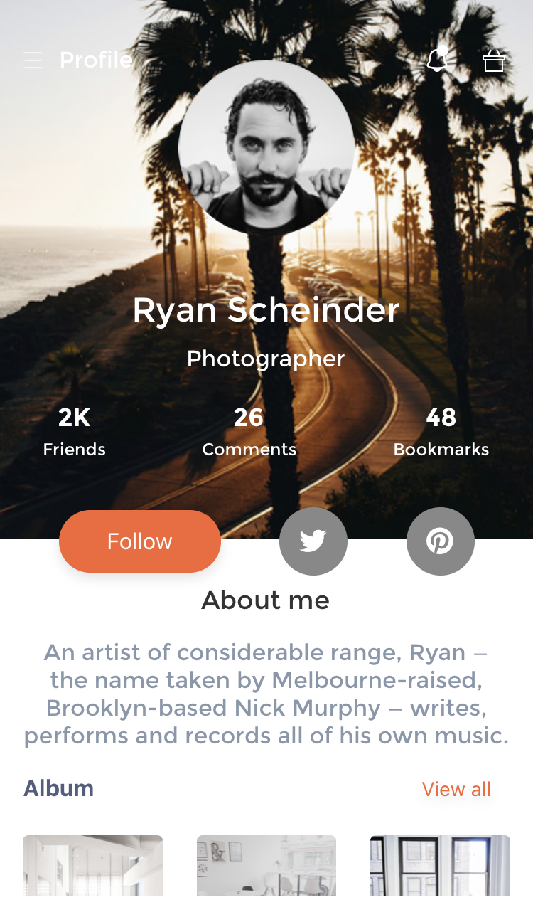](https://demos.creative-tim.com/now-ui-react-native/) | [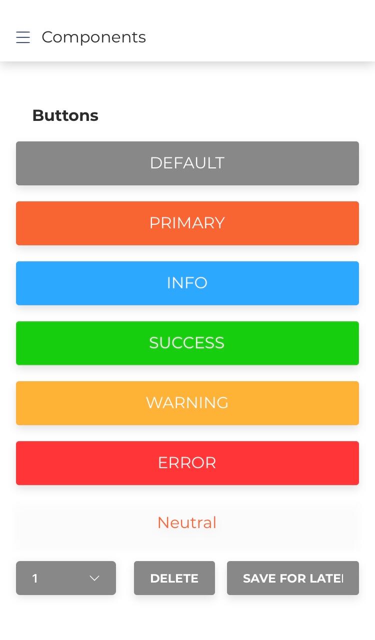](https://demos.creative-tim.com/now-ui-react-native/) | [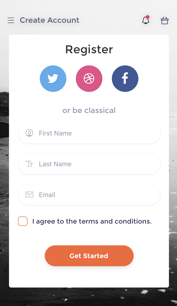](https://demos.creative-tim.com/now-ui-react-native/) |
- [Start page](https://demos.creative-tim.com/now-ui-react-native)
- [How to install our free demo](https://demos.creative-tim.com/now-ui-react-native/docs/#/install)
[View more](https://demos.creative-tim.com/now-ui-react-native)
## Quick start
- Try it out on Expo (Simulator for iOS or even your physical device if you have an Android)
- Download from [Creative Tim](https://www.creative-tim.com/product/now-ui-react-native)
## Documentation
The documentation for the Now UI React Native is hosted at our [website](https://demos.creative-tim.com/now-ui-react-native/docs/).
## File Structure
Within the download you'll find the following directories and files:
```
now-ui-react-native/
├── App.js
├── CHANGELOG.md
├── ISSUE_TEMPLATE.md
├── LICENSE.md
├── README.md
├── app.json
├── assets/
│ ├── css/
│ ├── font/
│ ├── fonts/
│ │ └── nucleo
│ ├── icon.png
│ ├── imgs/
│ ├── nuk-icons/
│ │ ├── png/
│ │ └── svg/
│ └── splash.png
├── babel.config.js
├── components/
│ ├── Button.js
│ ├── Card.js
│ ├── Checkbox.js
│ ├── DrawerItem.js
│ ├── Header.js
│ ├── Icon.js
│ ├── Img.js
│ ├── Input.js
│ ├── Select.js
│ ├── Sliders.js
│ ├── Switch.js
│ ├── Tabs.js
│ └── index.js
├── constants/
│ ├── Images.js
│ ├── Theme.js
│ ├── articles.js
│ ├── index.js
│ ├── tabs.js
│ └── utils.js
├── navigation/
│ ├── Menu.js
│ └── Screens.js
├── package.json
└── screens/
├── Articles.js
├── Components.js
├── Home.js
├── Onboarding.js
├── Pro.js
├── Profile.js
├── Register.js
└── Settings.js
```
## OS Support
At present, we officially aim to support the last two versions of the following operating systems:
[<img src="https://raw.githubusercontent.com/creativetimofficial/ct-material-kit-pro-react-native/master/assets/android-logo.png" width="60" height="60" />](https://www.creative-tim.com/product/material-kit-pro-react-native)[<img src="https://raw.githubusercontent.com/creativetimofficial/ct-material-kit-pro-react-native/master/assets/apple-logo.png" width="60" height="60" />](https://www.creative-tim.com/product/material-kit-pro-react-native)
## Resources
- Demo: <https://demos.creative-tim.com/now-ui-react-native>
- Download Page: <https://www.creative-tim.com/product/now-ui-react-native>
- Documentation: <https://demos.creative-tim.com/now-ui-react-native/docs>
- License Agreement: <https://www.creative-tim.com/license>
- Support: <https://www.creative-tim.com/contact-us>
- Issues: [Github Issues Page](https://github.com/creativetimofficial/now-ui-react-native/issues)
- [Now UI Kit](https://www.creative-tim.com/product/now-ui-design-system?ref=now-uirn-readme) - For Front End Development
- **Dashboards:**
| HTML | React |
| --- | --- |
| [](https://www.creative-tim.com/product/now-ui-dashboard) | [](https://www.creative-tim.com/product/now-ui-dashboard-react)
| Angular | Laravel |
| --- | --- |
| [](https://www.creative-tim.com/product/now-ui-dashboard-angular) | [](https://www.creative-tim.com/product/now-ui-dashboard-laravel)
## Reporting Issues
We use GitHub Issues as the official bug tracker for the Now UI React Native. Here are some advices for our users that want to report an issue:
1. Make sure that you are using the latest version of the Now UI React Native.
2. Providing us reproducible steps for the issue will shorten the time it takes for it to be fixed.
3. Some issues may be browser specific, so specifying in what browser you encountered the issue might help.
### Technical Support or Questions
If you have questions or need help integrating the product please [contact us](https://www.creative-tim.com/contact-us) instead of opening an issue.
## Licensing
- Copyright 2019 Creative Tim (https://www.creative-tim.com/)
- Licensed under MIT (https://github.com/creativetimofficial/now-ui-react-native/blob/master/LICENSE.md)
## Useful Links
- [Tutorials](https://www.youtube.com/channel/UCVyTG4sCw-rOvB9oHkzZD1w)
- [Affiliate Program](https://www.creative-tim.com/affiliates/new) (earn money)
- [Blog Creative Tim](http://blog.creative-tim.com/)
- [Free Products](https://www.creative-tim.com/bootstrap-themes/free) from Creative Tim
- [Premium Products](https://www.creative-tim.com/bootstrap-themes/premium) from Creative Tim
- [React Products](https://www.creative-tim.com/bootstrap-themes/react-themes) from Creative Tim
- [Angular Products](https://www.creative-tim.com/bootstrap-themes/angular-themes) from Creative Tim
- [VueJS Products](https://www.creative-tim.com/bootstrap-themes/vuejs-themes) from Creative Tim
- [More products](https://www.creative-tim.com/bootstrap-themes) from Creative Tim
- Check our Bundles [here](https://www.creative-tim.com/bundles?ref="now-ui-github-readme")
### Social Media
Twitter: <https://twitter.com/CreativeTim>
Facebook: <https://www.facebook.com/CreativeTim>
Dribbble: <https://dribbble.com/creativetim>
Instagram: <https://www.instagram.com/CreativeTimOfficial>
================================================
FILE: app.json
================================================
{
"expo": {
"name": "Now UI React Native",
"slug": "now-ui-react-native",
"privacy": "public",
"platforms": [
"ios",
"android"
],
"version": "1.4.0",
"orientation": "portrait",
"icon": "./assets/icon.png",
"splash": {
"image": "./assets/splash.png",
"resizeMode": "cover",
"backgroundColor": "#ffffff"
},
"updates": {
"fallbackToCacheTimeout": 0
},
"assetBundlePatterns": [
"**/*"
],
"ios": {
"supportsTablet": true
},
"description": "Now UI React Native, based on Now UI Design System. Coded by Creative Tim"
}
}
================================================
FILE: assets/config/now.json
================================================
{
"IcoMoonType": "selection",
"icons": [
{
"icon": {
"paths": [
"M96 512v512h390.4c334.4 0 395.2-3.2 416-25.6 22.4-20.8 25.6-88 25.6-486.4s-3.2-465.6-25.6-486.4c-20.8-22.4-81.6-25.6-416-25.6h-390.4v512zM256 256c0 105.6 4.8 192 9.6 192s36.8-22.4 70.4-48c33.6-27.2 68.8-48 80-48s46.4 20.8 80 48c33.6 25.6 65.6 48 70.4 48s9.6-86.4 9.6-192v-192h128v896h-544v-896h96v192zM512 185.6v120l-96-67.2-96 67.2v-241.6h192v121.6zM844.8 83.2c14.4 14.4 19.2 131.2 19.2 428.8 0 424-3.2 448-67.2 448-27.2 0-28.8-27.2-28.8-448s1.6-448 28.8-448c16 0 36.8 8 48 19.2z"
],
"attrs": [{}],
"isMulticolor": false,
"isMulticolor2": false,
"grid": 0,
"tags": ["agenda-bookmark@2x"]
},
"attrs": [{}],
"properties": {
"order": 433,
"id": 97,
"name": "agenda-bookmark2x",
"prevSize": 32,
"code": 59648
},
"setIdx": 0,
"setId": 2,
"iconIdx": 0
},
{
"icon": {
"paths": [
"M360 30.4c-128 59.2-200 177.6-200 328 0 92.8 59.2 230.4 152 352l43.2 57.6h315.2l65.6-97.6c96-140.8 128-217.6 128-318.4 0-148.8-80-272-211.2-326.4-80-33.6-214.4-32-292.8 4.8zM480 408c0 180.8-6.4 296-16 296-38.4 0-89.6-289.6-72-414.4 9.6-68.8 57.6-177.6 80-177.6 4.8 0 8 132.8 8 296zM603.2 180.8c20.8 38.4 27.2 88 27.2 195.2 0 145.6-40 328-70.4 328-9.6 0-16-115.2-16-297.6 0-305.6 4.8-326.4 59.2-225.6z",
"M384 928v96h256v-192h-256v96z"
],
"attrs": [{}, {}],
"isMulticolor": false,
"isMulticolor2": false,
"grid": 0,
"tags": ["air-baloon@2x"]
},
"attrs": [{}, {}],
"properties": {
"order": 434,
"id": 96,
"name": "air-baloon2x",
"prevSize": 32,
"code": 59649
},
"setIdx": 0,
"setId": 2,
"iconIdx": 1
},
{
"icon": {
"paths": [
"M256 48v48h-256v928h1024v-928h-256v-48c0-36.8-6.4-48-32-48s-32 11.2-32 48c0 46.4-1.6 48-80 48s-80-1.6-80-48c0-36.8-6.4-48-32-48s-32 11.2-32 48c0 46.4-1.6 48-80 48s-80-1.6-80-48c0-36.8-6.4-48-32-48s-32 11.2-32 48zM256 192c0 20.8 11.2 32 32 32s32-11.2 32-32c0-27.2 11.2-32 80-32s80 4.8 80 32c0 20.8 11.2 32 32 32s32-11.2 32-32c0-27.2 11.2-32 80-32s80 4.8 80 32c0 20.8 11.2 32 32 32s32-11.2 32-32c0-28.8 11.2-32 96-32h96v800h-896v-800h96c84.8 0 96 3.2 96 32z",
"M323.2 324.8c-80 84.8-20.8 219.2 94.4 219.2 75.2 0 126.4-54.4 126.4-129.6 0-113.6-144-171.2-220.8-89.6z",
"M582.4 558.4c-52.8 60.8-100.8 112-107.2 112-8 1.6-46.4-24-84.8-57.6-84.8-68.8-76.8-75.2-204.8 131.2l-88 144 206.4 4.8c115.2 1.6 300.8 1.6 412.8 0l206.4-4.8-118.4-214.4c-64-118.4-120-217.6-123.2-220.8s-48 44.8-99.2 105.6zM524.8 828.8c-150.4 1.6-276.8 0-281.6-3.2-4.8-6.4 27.2-64 80-142.4 4.8-9.6 43.2 11.2 84.8 46.4l75.2 60.8 86.4-94.4c46.4-52.8 84.8-104 86.4-112 0-9.6 32 41.6 70.4 112l72 128-273.6 4.8z"
],
"attrs": [{}, {}, {}],
"isMulticolor": false,
"isMulticolor2": false,
"grid": 0,
"tags": ["album-2@2x"]
},
"attrs": [{}, {}, {}],
"properties": { "order": 435, "id": 95, "name": "album", "prevSize": 32, "code": 59650 },
"setIdx": 0,
"setId": 2,
"iconIdx": 2
},
{
"icon": {
"paths": [
"M320 27.2c-102.4 36.8-257.6 196.8-292.8 299.2-33.6 100.8-35.2 270.4-1.6 368 32 94.4 155.2 230.4 256 281.6 67.2 33.6 100.8 40 230.4 40 177.6 0 257.6-32 364.8-142.4 112-113.6 139.2-187.2 139.2-361.6 0-128-6.4-163.2-38.4-227.2-46.4-91.2-145.6-190.4-241.6-240-92.8-48-307.2-57.6-416-17.6zM614.4 88c152 25.6 296 177.6 326.4 342.4 56 305.6-204.8 566.4-510.4 510.4-235.2-43.2-390.4-272-347.2-510.4 22.4-123.2 100.8-232 224-307.2 43.2-27.2 179.2-59.2 220.8-51.2 12.8 3.2 51.2 9.6 86.4 16z",
"M352 384c0 27.2 11.2 32 64 32h64v352h-64c-52.8 0-64 4.8-64 32 0 30.4 11.2 32 160 32s160-1.6 160-32c0-27.2-11.2-32-64-32h-64v-416h-96c-84.8 0-96 3.2-96 32z"
],
"attrs": [{}, {}],
"isMulticolor": false,
"isMulticolor2": false,
"grid": 0,
"tags": ["alert-circle-i@2x"]
},
"attrs": [{}, {}],
"properties": {
"order": 436,
"id": 94,
"name": "alert-circle-i2x",
"prevSize": 32,
"code": 59651
},
"setIdx": 0,
"setId": 2,
"iconIdx": 3
},
{
"icon": {
"paths": [
"M0 128c0 32 11.2 32 512 32s512 0 512-32c0-32-11.2-32-512-32s-512 0-512 32z",
"M0 512c0 32 11.2 32 512 32s512 0 512-32c0-32-11.2-32-512-32s-512 0-512 32z",
"M0 896c0 32 11.2 32 512 32s512 0 512-32c0-32-11.2-32-512-32s-512 0-512 32z"
],
"attrs": [{}, {}, {}],
"isMulticolor": false,
"isMulticolor2": false,
"grid": 0,
"tags": ["align-center@2x"]
},
"attrs": [{}, {}, {}],
"properties": {
"order": 437,
"id": 93,
"name": "align-center2x",
"prevSize": 32,
"code": 59652
},
"setIdx": 0,
"setId": 2,
"iconIdx": 4
},
{
"icon": {
"paths": [
"M0 128c0 32 11.2 32 512 32s512 0 512-32c0-32-11.2-32-512-32s-512 0-512 32z",
"M0 512c0 32 11.2 32 512 32s512 0 512-32c0-32-11.2-32-512-32s-512 0-512 32z",
"M0 896c0 32 11.2 32 512 32s512 0 512-32c0-32-11.2-32-512-32s-512 0-512 32z"
],
"attrs": [{}, {}, {}],
"isMulticolor": false,
"isMulticolor2": false,
"grid": 0,
"tags": ["align-left-2@2x"]
},
"attrs": [{}, {}, {}],
"properties": {
"order": 438,
"id": 92,
"name": "align-left-22x",
"prevSize": 32,
"code": 59653
},
"setIdx": 0,
"setId": 2,
"iconIdx": 5
},
{
"icon": {
"paths": [
"M0 464v304h80c67.2 0 80 4.8 80 28.8 0 48 67.2 99.2 129.6 99.2 60.8 0 126.4-52.8 126.4-100.8 0-24 19.2-27.2 128-27.2 123.2 0 128 1.6 128 36.8 0 52.8 48 91.2 115.2 91.2 62.4 0 108.8-38.4 108.8-92.8 0-30.4 9.6-35.2 64-35.2h64v-126.4c0-126.4 0-126.4-48-144-44.8-14.4-48-20.8-48-96v-81.6h-288v-160h-640v304zM576 464v240h-84.8c-65.6 0-92.8-8-115.2-32-38.4-43.2-137.6-43.2-176 0-17.6 19.2-49.6 32-83.2 32h-52.8v-480h512v240zM864 462.4c0 72 3.2 80 48 96 43.2 14.4 48 22.4 48 80 0 62.4-3.2 65.6-46.4 65.6-27.2 0-52.8-8-57.6-16-12.8-20.8-131.2-20.8-144 0-4.8 8-24 16-41.6 16-28.8 0-30.4-12.8-30.4-160v-160h224v78.4z"
],
"attrs": [{}],
"isMulticolor": false,
"isMulticolor2": false,
"grid": 0,
"tags": ["ambulance@2x"]
},
"attrs": [{}],
"properties": {
"order": 439,
"id": 91,
"name": "ambulance2x",
"prevSize": 32,
"code": 59654
},
"setIdx": 0,
"setId": 2,
"iconIdx": 6
},
{
"icon": {
"paths": [
"M352 67.2c-57.6 17.6-152 44.8-211.2 62.4l-108.8 32v668.8l84.8 30.4c44.8 17.6 153.6 56 238.4 84.8l156.8 54.4 155.2-54.4c86.4-28.8 195.2-67.2 241.6-84.8l83.2-30.4v-668.8l-112-33.6c-60.8-17.6-161.6-46.4-222.4-64-131.2-38.4-171.2-38.4-305.6 3.2zM657.6 147.2c70.4 17.6 126.4 38.4 126.4 44.8s-60.8 27.2-136 48l-136 36.8-136-36.8c-75.2-20.8-136-41.6-136-48 0-12.8 212.8-76.8 262.4-78.4 16-1.6 86.4 14.4 155.2 33.6zM372.8 321.6l107.2 32v270.4c0 208-4.8 272-19.2 270.4-11.2 0-96-27.2-188.8-60.8l-168-60.8-4.8-265.6-3.2-265.6 83.2 24c46.4 14.4 132.8 38.4 193.6 56zM916.8 768c-16 12.8-336 128-358.4 128-8 0-14.4-115.2-14.4-272v-270.4l108.8-32c59.2-17.6 144-41.6 187.2-54.4l80-22.4 4.8 256c1.6 140.8-1.6 262.4-8 267.2z"
],
"attrs": [{}],
"isMulticolor": false,
"isMulticolor2": false,
"grid": 0,
"tags": ["app@2x"]
},
"attrs": [{}],
"properties": { "order": 440, "id": 90, "name": "app2x", "prevSize": 32, "code": 59655 },
"setIdx": 0,
"setId": 2,
"iconIdx": 7
},
{
"icon": {
"paths": [
"M419.2 36.8c-17.6 19.2-44.8 62.4-57.6 94.4l-25.6 59.2-80-9.6c-97.6-11.2-172.8 16-185.6 70.4-14.4 56 4.8 131.2 49.6 190.4 22.4 28.8 40 60.8 40 70.4s-17.6 41.6-40 70.4c-44.8 59.2-64 134.4-49.6 190.4 12.8 54.4 88 81.6 185.6 70.4l80-9.6 33.6 72c41.6 84.8 83.2 118.4 153.6 118.4 38.4 0 60.8-12.8 91.2-52.8 20.8-27.2 44.8-70.4 49.6-96 11.2-41.6 14.4-43.2 89.6-33.6 137.6 19.2 206.4-19.2 206.4-115.2 0-64-19.2-108.8-73.6-168l-38.4-40 48-64c51.2-67.2 73.6-144 57.6-204.8-12.8-54.4-88-80-192-67.2-83.2 9.6-86.4 8-97.6-35.2-4.8-24-28.8-67.2-49.6-96-32-41.6-51.2-51.2-100.8-51.2-41.6 0-70.4 11.2-94.4 36.8zM636.8 504c1.6 108.8-3.2 196.8-11.2 204.8-16 16-203.2-84.8-284.8-155.2-38.4-33.6-41.6-41.6-22.4-64 32-38.4 276.8-187.2 297.6-180.8 9.6 3.2 17.6 83.2 20.8 195.2z"
],
"attrs": [{}],
"isMulticolor": false,
"isMulticolor2": false,
"grid": 0,
"tags": ["atom@2x"]
},
"attrs": [{}],
"properties": { "order": 441, "id": 89, "name": "atom2x", "prevSize": 32, "code": 59656 },
"setIdx": 0,
"setId": 2,
"iconIdx": 8
},
{
"icon": {
"paths": [
"M419.2 36.8c-25.6 27.2-35.2 57.6-35.2 112v75.2h-384v800h1024v-800h-384v-76.8c0-60.8-8-84.8-36.8-112-51.2-48-139.2-46.4-184 1.6zM384 336v48h256v-96h320v672h-896v-672h320v48z",
"M206.4 718.4c-30.4 32-46.4 64-46.4 96v49.6h384v-49.6c0-32-16-64-46.4-96-41.6-41.6-57.6-46.4-145.6-46.4s-104 4.8-145.6 46.4z"
],
"attrs": [{}, {}],
"isMulticolor": false,
"isMulticolor2": false,
"grid": 0,
"tags": ["badge@2x"]
},
"attrs": [{}, {}],
"properties": { "order": 442, "id": 88, "name": "badge2x", "prevSize": 32, "code": 59657 },
"setIdx": 0,
"setId": 2,
"iconIdx": 9
},
{
"icon": {
"paths": [
"M147.2 84.8l-83.2 84.8v854.4h896v-857.6l-169.6-166.4h-560l-83.2 84.8zM792 112l46.4 48h-652.8l92.8-96h467.2l46.4 48zM896 592v368h-768v-736h768v368z",
"M256 411.2c0 132.8 108.8 228.8 256 228.8s256-96 256-228.8c0-48-6.4-59.2-32-59.2-22.4 0-33.6 14.4-41.6 56-19.2 104-121.6 174.4-222.4 155.2-59.2-11.2-131.2-88-142.4-155.2-8-41.6-19.2-56-41.6-56-25.6 0-32 11.2-32 59.2z"
],
"attrs": [{}, {}],
"isMulticolor": false,
"isMulticolor2": false,
"grid": 0,
"tags": ["bag-16@2x"]
},
"attrs": [{}, {}],
"properties": { "order": 443, "id": 87, "name": "bag-162x", "prevSize": 32, "code": 59658 },
"setIdx": 0,
"setId": 2,
"iconIdx": 10
},
{
"icon": {
"paths": [
"M236.8 131.2l-236.8 126.4v190.4h1024v-188.8l-243.2-129.6c-134.4-72-259.2-128-276.8-128-17.6 1.6-137.6 59.2-267.2 129.6zM736 196.8c168 89.6 217.6 123.2 220.8 150.4l4.8 36.8h-899.2l4.8-36.8c3.2-27.2 52.8-60.8 220.8-150.4 118.4-64 219.2-115.2 224-115.2s105.6 51.2 224 115.2z",
"M0 928v96h1024v-192h-1024v96zM960 928c0 32-11.2 32-448 32s-448 0-448-32c0-32 11.2-32 448-32s448 0 448 32z"
],
"attrs": [{}, {}],
"isMulticolor": false,
"isMulticolor2": false,
"grid": 0,
"tags": ["bank@2x"]
},
"attrs": [{}, {}],
"properties": { "order": 444, "id": 86, "name": "bank2x", "prevSize": 32, "code": 59659 },
"setIdx": 0,
"setId": 2,
"iconIdx": 11
},
{
"icon": {
"paths": [
"M272 152l-72 136h-200v224h96v512h832v-512h96v-224h-200l-72-136c-70.4-136-84.8-148.8-126.4-121.6-17.6 11.2-8 38.4 44.8 136l67.2 121.6h-451.2l67.2-121.6c52.8-97.6 62.4-124.8 44.8-136-41.6-27.2-56-14.4-126.4 121.6zM960 400v48h-896v-96h896v48zM864 736v224h-704v-448h704v224z"
],
"attrs": [{}],
"isMulticolor": false,
"isMulticolor2": false,
"grid": 0,
"tags": ["basket@2x"]
},
"attrs": [{}],
"properties": { "order": 445, "id": 85, "name": "basket2x", "prevSize": 32, "code": 59660 },
"setIdx": 0,
"setId": 2,
"iconIdx": 12
},
{
"icon": {
"paths": [
"M360 30.4c-132.8 60.8-200 177.6-200 344 0 115.2-14.4 166.4-75.2 252.8-92.8 136-32 209.6 224 260.8 24 4.8 43.2 17.6 43.2 28.8s20.8 40 44.8 64c64 60.8 166.4 60.8 230.4 0 24-24 44.8-52.8 44.8-64s19.2-24 44.8-28.8c254.4-51.2 315.2-124.8 222.4-260.8-60.8-86.4-75.2-137.6-75.2-256-1.6-169.6-73.6-288-211.2-345.6-80-33.6-214.4-32-292.8 4.8zM640 104c104 52.8 145.6 137.6 156.8 310.4 8 136 27.2 196.8 86.4 272 25.6 33.6 27.2 43.2 8 60.8-91.2 91.2-667.2 91.2-758.4 0-19.2-17.6-17.6-27.2 8-60.8 59.2-75.2 78.4-136 88-273.6 4.8-104 16-153.6 43.2-195.2 81.6-132.8 235.2-180.8 368-113.6z"
],
"attrs": [{}],
"isMulticolor": false,
"isMulticolor2": false,
"grid": 0,
"tags": ["bell-55@2x"]
},
"attrs": [{}],
"properties": { "order": 446, "id": 84, "name": "bell", "prevSize": 32, "code": 59661 },
"setIdx": 0,
"setId": 2,
"iconIdx": 13
},
{
"icon": {
"paths": [
"M96 62.4c0 27.2 9.6 33.6 48 33.6h48v832h-48c-36.8 0-48 6.4-48 32 0 30.4 11.2 32 326.4 32 312 0 326.4-1.6 379.2-36.8 88-59.2 126.4-129.6 126.4-235.2 0-104-38.4-176-123.2-233.6l-51.2-33.6 35.2-35.2c28.8-28.8 35.2-52.8 35.2-145.6 0-107.2-1.6-113.6-60.8-171.2l-59.2-60.8-304-4.8c-297.6-4.8-304-4.8-304 27.2zM656 124.8c33.6 16 67.2 51.2 84.8 86.4 28.8 59.2 28.8 62.4 0 120-44.8 92.8-107.2 116.8-312 116.8h-172.8v-352h172.8c131.2 0 184 6.4 227.2 28.8zM756.8 548.8c129.6 84.8 129.6 257.6 0 342.4-35.2 24-86.4 30.4-272 33.6l-228.8 6.4v-422.4l228.8 6.4c185.6 3.2 236.8 9.6 272 33.6z"
],
"attrs": [{}],
"isMulticolor": false,
"isMulticolor2": false,
"grid": 0,
"tags": ["bold@2x"]
},
"attrs": [{}],
"properties": { "order": 447, "id": 83, "name": "bold2x", "prevSize": 32, "code": 59662 },
"setIdx": 0,
"setId": 2,
"iconIdx": 14
},
{
"icon": {
"paths": [
"M160 529.6v497.6l36.8-22.4c19.2-12.8 97.6-60.8 176-107.2l139.2-83.2 140.8 83.2c76.8 46.4 155.2 94.4 176 107.2l35.2 22.4v-995.2h-704v497.6zM800 496v400l-288-176-288 176v-800h576v400z"
],
"attrs": [{}],
"isMulticolor": false,
"isMulticolor2": false,
"grid": 0,
"tags": ["bookmark-2@2x"]
},
"attrs": [{}],
"properties": {
"order": 448,
"id": 82,
"name": "bookmark-22x",
"prevSize": 32,
"code": 59663
},
"setIdx": 0,
"setId": 2,
"iconIdx": 15
},
{
"icon": {
"paths": [
"M116.8 99.2l-116.8 97.6v827.2h1024v-827.2l-115.2-97.6-116.8-99.2h-560l-115.2 99.2zM352 416v160h320v-320h288v704h-896v-704h288v160zM608 384v128h-192v-256h192v128z"
],
"attrs": [{}],
"isMulticolor": false,
"isMulticolor2": false,
"grid": 0,
"tags": ["box-2@2x"]
},
"attrs": [{}],
"properties": { "order": 449, "id": 81, "name": "box-22x", "prevSize": 32, "code": 59664 },
"setIdx": 0,
"setId": 2,
"iconIdx": 16
},
{
"icon": {
"paths": [
"M0 192v128h1024v-256h-1024v128zM960 192v64h-896v-128h896v64z",
"M96 688v304h832v-304c0-292.8-1.6-304-32-304s-32 11.2-32 272v272h-704v-272c0-260.8-1.6-272-32-272s-32 11.2-32 304z",
"M352 560v112h320v-224h-320v112z"
],
"attrs": [{}, {}, {}],
"isMulticolor": false,
"isMulticolor2": false,
"grid": 0,
"tags": ["box@2x"]
},
"attrs": [{}, {}, {}],
"properties": { "order": 450, "id": 80, "name": "box2x", "prevSize": 32, "code": 59665 },
"setIdx": 0,
"setId": 2,
"iconIdx": 17
},
{
"icon": {
"paths": [
"M320 112v80h-320v576h352v96h320v-96h352v-576h-320v-160h-384v80zM960 480v224h-288v-96h-320v96h-288v-448h896v224z",
"M32 896v96h960v-96c0-84.8-3.2-96-32-96-27.2 0-32 11.2-32 64v64h-832v-64c0-52.8-4.8-64-32-64-28.8 0-32 11.2-32 96z"
],
"attrs": [{}, {}],
"isMulticolor": false,
"isMulticolor2": false,
"grid": 0,
"tags": ["briefcase-24@2x"]
},
"attrs": [{}, {}],
"properties": {
"order": 451,
"id": 79,
"name": "briefcase-242x",
"prevSize": 32,
"code": 59666
},
"setIdx": 0,
"setId": 2,
"iconIdx": 18
},
{
"icon": {
"paths": [
"M376 212.8c-113.6 52.8-184 164.8-184 296 0 102.4 32 179.2 104 240 54.4 48 56 54.4 56 163.2v112h320v-112c0-110.4 1.6-113.6 60.8-168 150.4-134.4 129.6-388.8-41.6-505.6-67.2-46.4-238.4-59.2-315.2-25.6zM609.6 281.6c44.8 12.8 128 113.6 142.4 172.8 20.8 92.8-4.8 169.6-78.4 235.2-44.8 40-65.6 72-65.6 100.8 0 40-3.2 41.6-96 41.6s-96-1.6-96-41.6c0-28.8-20.8-60.8-65.6-100.8-110.4-99.2-113.6-244.8-9.6-350.4 73.6-73.6 148.8-89.6 268.8-57.6z"
],
"attrs": [{}],
"isMulticolor": false,
"isMulticolor2": false,
"grid": 0,
"tags": ["bulb-63@2x"]
},
"attrs": [{}],
"properties": { "order": 452, "id": 78, "name": "bulb", "prevSize": 32, "code": 59667 },
"setIdx": 0,
"setId": 2,
"iconIdx": 19
},
{
"icon": {
"paths": [
"M131.2 36.8c-33.6 36.8-35.2 48-35.2 448s1.6 411.2 32 411.2c27.2 0 32 11.2 32 64v64h224v-128h256v128h224v-64c0-52.8 4.8-64 32-64 30.4 0 32-11.2 32-412.8 0-411.2 0-414.4-36.8-448-35.2-33.6-49.6-35.2-380.8-35.2-339.2 0-345.6 0-379.2 36.8zM825.6 76.8c9.6 6.4 22.4 27.2 28.8 46.4l11.2 36.8h-352c-272 0-353.6-4.8-353.6-20.8 0-27.2 19.2-52.8 48-64 35.2-12.8 596.8-12.8 617.6 1.6zM864 384v160h-704v-320h704v160zM864 720v112h-704v-224h704v112z"
],
"attrs": [{}],
"isMulticolor": false,
"isMulticolor2": false,
"grid": 0,
"tags": ["bus-front-12@2x"]
},
"attrs": [{}],
"properties": {
"order": 453,
"id": 77,
"name": "bus-front-122x",
"prevSize": 32,
"code": 59668
},
"setIdx": 0,
"setId": 2,
"iconIdx": 20
},
{
"icon": {
"paths": [
"M64 512v480h288v-960h-288v480zM288 512v416h-160v-832h160v416z",
"M672 512v480h288v-960h-288v480zM896 512v416h-160v-832h160v416z"
],
"attrs": [{}, {}],
"isMulticolor": false,
"isMulticolor2": false,
"grid": 0,
"tags": ["button-pause@2x"]
},
"attrs": [{}, {}],
"properties": {
"order": 454,
"id": 76,
"name": "button-pause2x",
"prevSize": 32,
"code": 59669
},
"setIdx": 0,
"setId": 2,
"iconIdx": 21
},
{
"icon": {
"paths": [
"M222.4 152c-136 100.8-198.4 238.4-187.2 419.2 8 144 41.6 220.8 136 313.6 105.6 107.2 168 131.2 340.8 131.2 124.8 0 163.2-6.4 216-35.2 83.2-43.2 179.2-140.8 220.8-220.8 38.4-76.8 54.4-259.2 28.8-353.6-24-89.6-102.4-201.6-174.4-252.8-70.4-48-91.2-51.2-105.6-14.4-8 17.6 14.4 48 76.8 102.4 100.8 91.2 142.4 177.6 140.8 304 0 112-43.2 211.2-124.8 289.6-81.6 76.8-168 112-278.4 112-224 0-403.2-177.6-403.2-401.6-1.6-126.4 40-212.8 140.8-304 62.4-54.4 84.8-84.8 76.8-102.4-14.4-36.8-38.4-33.6-104 12.8z"
],
"attrs": [{}],
"isMulticolor": false,
"isMulticolor2": false,
"grid": 0,
"tags": ["button-power@2x"]
},
"attrs": [{}],
"properties": {
"order": 455,
"id": 75,
"name": "button-power2x",
"prevSize": 32,
"code": 59670
},
"setIdx": 0,
"setId": 2,
"iconIdx": 22
},
{
"icon": {
"paths": [
"M192 48v48h-192v928h1024v-928h-192v-96h-192v96h-256v-96h-192v48zM192 208v48h192v-96h256v96h192v-48c0-44.8 3.2-48 64-48h64v160h-896v-160h64c60.8 0 64 3.2 64 48zM960 672v288h-896v-576h896v288z"
],
"attrs": [{}],
"isMulticolor": false,
"isMulticolor2": false,
"grid": 0,
"tags": ["calendar-60@2x"]
},
"attrs": [{}],
"properties": {
"order": 456,
"id": 74,
"name": "calendar-602x",
"prevSize": 32,
"code": 59671
},
"setIdx": 0,
"setId": 2,
"iconIdx": 23
},
{
"icon": {
"paths": [
"M0 560v400h1024v-800h-1024v400zM960 560v336h-896v-672h896v336z",
"M516.8 384c-139.2 83.2-132.8 316.8 9.6 392 156.8 80 337.6-25.6 337.6-196.8 0-136-89.6-227.2-224-227.2-43.2 0-92.8 12.8-123.2 32zM744 472c30.4 28.8 40 56 40 104 0 89.6-54.4 144-144 144s-144-54.4-144-144c0-89.6 54.4-144 144-144 48 0 75.2 9.6 104 40z"
],
"attrs": [{}, {}],
"isMulticolor": false,
"isMulticolor2": false,
"grid": 0,
"tags": ["camera-compact@2x"]
},
"attrs": [{}, {}],
"properties": {
"order": 457,
"id": 73,
"name": "camera-compact2x",
"prevSize": 32,
"code": 59672
},
"setIdx": 0,
"setId": 2,
"iconIdx": 24
},
{
"icon": {
"paths": [
"M32 208c0 68.8 4.8 80 32 80 25.6 0 32-11.2 32-48v-48h256v640h-80c-68.8 0-80 4.8-80 32 0 30.4 11.2 32 192 32s192-1.6 192-32c0-27.2-11.2-32-80-32h-80v-640h256v48c0 36.8 6.4 48 32 48 27.2 0 32-11.2 32-80v-80h-704v80z",
"M544 480c0 52.8 4.8 64 32 64 20.8 0 32-11.2 32-32 0-27.2 11.2-32 64-32h64v352h-48c-36.8 0-48 6.4-48 32 0 28.8 11.2 32 128 32s128-3.2 128-32c0-25.6-11.2-32-48-32h-48v-352h64c52.8 0 64 4.8 64 32 0 20.8 11.2 32 32 32 27.2 0 32-11.2 32-64v-64h-448v64z"
],
"attrs": [{}, {}],
"isMulticolor": false,
"isMulticolor2": false,
"grid": 0,
"tags": ["caps-small@2x"]
},
"attrs": [{}, {}],
"properties": {
"order": 458,
"id": 72,
"name": "caps-small2x",
"prevSize": 32,
"code": 59673
},
"setIdx": 0,
"setId": 2,
"iconIdx": 25
},
{
"icon": {
"paths": [
"M32 32c0 25.6 11.2 32 48 32 27.2 0 48 3.2 48 8 0 17.6 81.6 560 88 595.2l8 36.8h704l6.4-36.8c4.8-19.2 19.2-124.8 33.6-235.2 12.8-110.4 28.8-216 32-235.2l8-36.8-395.2-3.2-396.8-4.8-4.8-40c-11.2-108.8-14.4-112-99.2-112-68.8 0-80 4.8-80 32zM912 251.2c0 16-11.2 100.8-24 188.8s-24 169.6-24 179.2c0 16-68.8 20.8-288 20.8-158.4 0-288-3.2-288-8 0-17.6-48-339.2-56-372.8l-8-35.2h344c316.8 0 344 1.6 344 27.2z",
"M227.2 804.8c-80 84.8-20.8 219.2 94.4 219.2 75.2 0 126.4-54.4 126.4-129.6 0-113.6-144-171.2-220.8-89.6z",
"M771.2 804.8c-80 84.8-20.8 219.2 94.4 219.2 75.2 0 126.4-54.4 126.4-129.6 0-113.6-144-171.2-220.8-89.6z"
],
"attrs": [{}, {}, {}],
"isMulticolor": false,
"isMulticolor2": false,
"grid": 0,
"tags": ["cart-simple@2x"]
},
"attrs": [{}, {}, {}],
"properties": {
"order": 459,
"id": 71,
"name": "cart-simple2x",
"prevSize": 32,
"code": 59674
},
"setIdx": 0,
"setId": 2,
"iconIdx": 26
},
{
"icon": {
"paths": [
"M384 512v448h256v-896h-256v448zM576 512v384h-128v-768h128v384z",
"M768 640v320h256v-640h-256v320zM960 640v256h-128v-512h128v256z",
"M0 768v192h256v-384h-256v192z"
],
"attrs": [{}, {}, {}],
"isMulticolor": false,
"isMulticolor2": false,
"grid": 0,
"tags": ["chart-bar-32@2x"]
},
"attrs": [{}, {}, {}],
"properties": {
"order": 460,
"id": 70,
"name": "chart-bar-322x",
"prevSize": 32,
"code": 59675
},
"setIdx": 0,
"setId": 2,
"iconIdx": 27
},
{
"icon": {
"paths": [
"M544 238.4v241.6h484.8l-9.6-96c-17.6-195.2-184-361.6-377.6-379.2l-97.6-9.6v243.2zM780.8 136c76.8 51.2 145.6 150.4 158.4 225.6l9.6 54.4h-340.8v-340.8l54.4 9.6c30.4 4.8 83.2 27.2 118.4 51.2z",
"M286.4 150.4c-118.4 41.6-236.8 166.4-270.4 283.2-22.4 75.2-19.2 235.2 6.4 304 30.4 86.4 99.2 166.4 190.4 225.6 78.4 49.6 89.6 52.8 236.8 52.8 148.8 0 155.2-1.6 241.6-57.6 118.4-80 188.8-190.4 200-318.4l9.6-96h-420.8v-416h-67.2c-38.4 1.6-94.4 11.2-126.4 22.4zM416 408v200h404.8l-9.6 54.4c-19.2 121.6-158.4 254.4-289.6 280-326.4 60.8-566.4-297.6-384-572.8 56-84.8 171.2-161.6 243.2-161.6 35.2 0 35.2 3.2 35.2 200z"
],
"attrs": [{}, {}],
"isMulticolor": false,
"isMulticolor2": false,
"grid": 0,
"tags": ["chart-pie-36@2x"]
},
"attrs": [{}, {}],
"properties": {
"order": 461,
"id": 69,
"name": "chart-pie-362x",
"prevSize": 32,
"code": 59676
},
"setIdx": 0,
"setId": 2,
"iconIdx": 28
},
{
"icon": {
"paths": [
"M336 46.4c-214.4 68.8-334.4 217.6-336 409.6 0 164.8 96 294.4 281.6 379.2 62.4 28.8 110.4 36.8 230.4 38.4 129.6 3.2 171.2 9.6 276.8 52.8 68.8 27.2 129.6 49.6 136 49.6s9.6-57.6 4.8-128c-4.8-118.4-1.6-134.4 38.4-195.2 92.8-139.2 68.8-350.4-52.8-468.8-108.8-107.2-198.4-142.4-379.2-147.2-88-1.6-177.6 1.6-200 9.6zM632 120c81.6 14.4 147.2 48 212.8 110.4 118.4 110.4 137.6 244.8 52.8 379.2-40 64-49.6 97.6-49.6 168v86.4l-83.2-35.2c-67.2-27.2-110.4-33.6-206.4-30.4-145.6 4.8-220.8-12.8-321.6-76.8-139.2-88-201.6-270.4-136-395.2 30.4-59.2 115.2-139.2 182.4-172.8 56-27.2 201.6-56 252.8-48 17.6 1.6 60.8 9.6 96 14.4z"
],
"attrs": [{}],
"isMulticolor": false,
"isMulticolor2": false,
"grid": 0,
"tags": ["chat-round@2x"]
},
"attrs": [{}],
"properties": {
"order": 462,
"id": 68,
"name": "chat-round2x",
"prevSize": 32,
"code": 59677
},
"setIdx": 0,
"setId": 2,
"iconIdx": 29
},
{
"icon": {
"paths": [
"M668.8 459.2l-284.8 284.8-160-160c-152-150.4-161.6-158.4-187.2-131.2-27.2 25.6-19.2 36.8 160 216l187.2 187.2 315.2-315.2c272-272 312-318.4 294.4-339.2-12.8-14.4-25.6-25.6-32-25.6-4.8 0-137.6 128-292.8 283.2z"
],
"attrs": [{}],
"isMulticolor": false,
"isMulticolor2": false,
"grid": 0,
"tags": ["check-2@2x"]
},
"attrs": [{}],
"properties": { "order": 463, "id": 67, "name": "check-22x", "prevSize": 32, "code": 59678 },
"setIdx": 0,
"setId": 2,
"iconIdx": 30
},
{
"icon": {
"paths": [
"M320 27.2c-102.4 36.8-257.6 196.8-292.8 299.2-33.6 100.8-35.2 270.4-1.6 368 32 94.4 155.2 230.4 256 281.6 67.2 33.6 100.8 40 230.4 40 177.6 0 257.6-32 364.8-142.4 112-113.6 139.2-187.2 139.2-361.6 0-128-6.4-163.2-38.4-227.2-46.4-91.2-145.6-190.4-241.6-240-92.8-48-307.2-57.6-416-17.6zM614.4 88c152 25.6 296 177.6 326.4 342.4 27.2 145.6-9.6 268.8-113.6 380.8l-48 51.2-57.6-32c-81.6-43.2-337.6-43.2-419.2 0l-57.6 32-48-51.2c-72-76.8-97.6-126.4-113.6-217.6-33.6-188.8 48-361.6 224-470.4 43.2-27.2 179.2-59.2 220.8-51.2 12.8 3.2 51.2 9.6 86.4 16z",
"M374.4 310.4c-52.8 52.8-54.4 57.6-54.4 185.6s1.6 132.8 54.4 185.6c48 48 64 54.4 137.6 54.4s89.6-6.4 137.6-54.4c52.8-52.8 54.4-57.6 54.4-185.6s-1.6-132.8-54.4-185.6c-48-48-64-54.4-137.6-54.4s-89.6 6.4-137.6 54.4zM590.4 366.4c73.6 73.6 51.2 249.6-32 280-68.8 24-124.8 0-153.6-65.6-27.2-68.8-17.6-172.8 22.4-216 35.2-38.4 124.8-36.8 163.2 1.6z"
],
"attrs": [{}, {}],
"isMulticolor": false,
"isMulticolor2": false,
"grid": 0,
"tags": ["circle-08@2x"]
},
"attrs": [{}, {}],
"properties": {
"order": 464,
"id": 66,
"name": "profile-circle",
"prevSize": 32,
"code": 59679
},
"setIdx": 0,
"setId": 2,
"iconIdx": 31
},
{
"icon": {
"paths": [
"M368 25.6c-68.8 30.4-120 76.8-169.6 153.6-20.8 33.6-48 60.8-59.2 60.8s-46.4 25.6-76.8 57.6c-51.2 52.8-54.4 62.4-54.4 166.4 0 107.2 1.6 113.6 60.8 171.2 59.2 60.8 60.8 60.8 203.2 65.6 134.4 6.4 144 4.8 144-25.6 0-27.2-14.4-32-123.2-38.4-113.6-8-126.4-12.8-168-59.2-64-70.4-62.4-161.6 1.6-227.2 25.6-25.6 57.6-46.4 72-46.4s36.8-24 51.2-52.8c59.2-116.8 145.6-174.4 262.4-174.4 129.6 0 238.4 84.8 272 211.2 11.2 41.6 28.8 65.6 52.8 73.6 108.8 32 144 158.4 65.6 232-35.2 32-60.8 38.4-168 44.8-112 4.8-126.4 8-126.4 35.2s12.8 30.4 137.6 30.4c198.4 0 278.4-59.2 278.4-208 0-83.2-38.4-148.8-104-185.6-32-16-59.2-48-70.4-81.6-28.8-76.8-110.4-164.8-185.6-198.4-78.4-36.8-219.2-38.4-296-4.8z",
"M480 659.2v211.2l-64-62.4c-60.8-59.2-65.6-60.8-91.2-35.2-27.2 25.6-22.4 33.6 80 136l107.2 107.2 107.2-107.2c102.4-102.4 107.2-110.4 80-136-25.6-25.6-30.4-24-91.2 35.2l-64 62.4v-211.2c0-200-1.6-211.2-32-211.2s-32 11.2-32 211.2z"
],
"attrs": [{}, {}],
"isMulticolor": false,
"isMulticolor2": false,
"grid": 0,
"tags": ["cloud-download-93@2x"]
},
"attrs": [{}, {}],
"properties": {
"order": 465,
"id": 65,
"name": "cloud-download-932x",
"prevSize": 32,
"code": 59680
},
"setIdx": 0,
"setId": 2,
"iconIdx": 32
},
{
"icon": {
"paths": [
"M368 89.6c-68.8 30.4-120 76.8-169.6 153.6-20.8 33.6-48 60.8-59.2 60.8s-46.4 25.6-76.8 57.6c-51.2 52.8-54.4 62.4-54.4 166.4 0 107.2 1.6 113.6 60.8 171.2 59.2 60.8 60.8 60.8 203.2 65.6 134.4 6.4 144 4.8 144-25.6 0-27.2-14.4-32-123.2-38.4-113.6-8-126.4-12.8-168-59.2-64-70.4-62.4-161.6 1.6-227.2 25.6-25.6 57.6-46.4 72-46.4s36.8-24 51.2-52.8c59.2-116.8 145.6-174.4 262.4-174.4 129.6 0 238.4 84.8 272 211.2 11.2 41.6 28.8 65.6 52.8 73.6 108.8 32 144 158.4 65.6 232-35.2 32-60.8 38.4-168 44.8-112 4.8-126.4 8-126.4 35.2s12.8 30.4 137.6 30.4c198.4 0 278.4-59.2 278.4-208 0-83.2-38.4-148.8-104-185.6-32-16-59.2-48-70.4-81.6-28.8-76.8-110.4-164.8-185.6-198.4-78.4-36.8-219.2-38.4-296-4.8z",
"M400 504c-97.6 97.6-100.8 105.6-75.2 131.2s30.4 24 91.2-35.2l64-62.4v211.2c0 200 1.6 211.2 32 211.2s32-11.2 32-211.2v-211.2l64 62.4c60.8 59.2 65.6 60.8 91.2 35.2s22.4-33.6-75.2-131.2c-56-57.6-107.2-104-112-104s-56 46.4-112 104z"
],
"attrs": [{}, {}],
"isMulticolor": false,
"isMulticolor2": false,
"grid": 0,
"tags": ["cloud-upload-94@2x"]
},
"attrs": [{}, {}],
"properties": {
"order": 466,
"id": 64,
"name": "cloud-upload-942x",
"prevSize": 32,
"code": 59681
},
"setIdx": 0,
"setId": 2,
"iconIdx": 33
},
{
"icon": {
"paths": [
"M320 27.2c-102.4 36.8-257.6 196.8-292.8 299.2-33.6 100.8-35.2 270.4-1.6 368 32 94.4 155.2 230.4 256 281.6 67.2 33.6 100.8 40 230.4 40 177.6 0 257.6-32 364.8-142.4 112-113.6 139.2-187.2 139.2-361.6 0-128-6.4-163.2-38.4-227.2-46.4-91.2-145.6-190.4-241.6-240-92.8-48-307.2-57.6-416-17.6zM614.4 88c152 25.6 296 177.6 326.4 342.4 56 305.6-204.8 566.4-510.4 510.4-235.2-43.2-390.4-272-347.2-510.4 22.4-123.2 100.8-232 224-307.2 43.2-27.2 179.2-59.2 220.8-51.2 12.8 3.2 51.2 9.6 86.4 16z",
"M580.8 307.2l-193.6 80-81.6 201.6c-44.8 110.4-78.4 203.2-76.8 206.4 3.2 1.6 96-32 208-76.8l201.6-81.6 73.6-185.6c41.6-104 78.4-196.8 83.2-208 11.2-27.2 1.6-25.6-214.4 64zM628.8 451.2c-48 123.2-54.4 129.6-174.4 177.6l-99.2 40 40-99.2c48-120 54.4-126.4 172.8-174.4 52.8-22.4 97.6-41.6 99.2-41.6 1.6-1.6-16 43.2-38.4 97.6z"
],
"attrs": [{}, {}],
"isMulticolor": false,
"isMulticolor2": false,
"grid": 0,
"tags": ["compass-05@2x"]
},
"attrs": [{}, {}],
"properties": {
"order": 467,
"id": 63,
"name": "compass-052x",
"prevSize": 32,
"code": 59682
},
"setIdx": 0,
"setId": 2,
"iconIdx": 34
},
{
"icon": {
"paths": [
"M192 289.6c-68.8 27.2-94.4 84.8-144 318.4-57.6 267.2-60.8 328-17.6 352 49.6 25.6 72 19.2 150.4-40 56-41.6 89.6-56 137.6-56 49.6 0 70.4-9.6 102.4-48 56-65.6 126.4-65.6 182.4 0 32 38.4 52.8 48 102.4 48 48 0 81.6 14.4 137.6 56 78.4 59.2 100.8 65.6 150.4 40 41.6-22.4 40-76.8-11.2-329.6-49.6-256-64-291.2-124.8-328-67.2-41.6-137.6-38.4-208 9.6-78.4 52.8-206.4 56-259.2 6.4-40-38.4-139.2-52.8-198.4-28.8zM340.8 384c32 25.6 64 32 171.2 32s139.2-6.4 171.2-32c22.4-17.6 56-32 75.2-32 76.8 0 92.8 33.6 145.6 292.8 32 150.4 44.8 246.4 33.6 240-86.4-51.2-105.6-76.8-105.6-139.2 0-86.4-48-137.6-129.6-137.6-46.4 0-68.8 11.2-99.2 48-30.4 35.2-56 48-91.2 48s-60.8-12.8-91.2-48c-83.2-99.2-228.8-44.8-228.8 88 0 64-17.6 88-105.6 140.8-11.2 6.4-1.6-73.6 27.2-208 25.6-120 46.4-222.4 46.4-228.8s14.4-30.4 33.6-54.4c40-49.6 91.2-52.8 147.2-9.6z"
],
"attrs": [{}],
"isMulticolor": false,
"isMulticolor2": false,
"grid": 0,
"tags": ["controller-modern@2x"]
},
"attrs": [{}],
"properties": {
"order": 468,
"id": 62,
"name": "controller-modern2x",
"prevSize": 32,
"code": 59683
},
"setIdx": 0,
"setId": 2,
"iconIdx": 35
},
{
"icon": {
"paths": [
"M25.6 153.6c-38.4 36.8-38.4 680 0 716.8 20.8 22.4 88 25.6 486.4 25.6s465.6-3.2 486.4-25.6c38.4-36.8 38.4-680 0-716.8-20.8-22.4-88-25.6-486.4-25.6s-465.6 3.2-486.4 25.6zM940.8 211.2c11.2 11.2 19.2 32 19.2 48 0 27.2-27.2 28.8-448 28.8s-448-1.6-448-28.8c0-64 24-67.2 448-67.2 297.6 0 414.4 4.8 428.8 19.2zM960 400v48h-896v-96h896v48zM960 652.8c0 88-6.4 147.2-19.2 160-27.2 27.2-830.4 27.2-857.6 0-12.8-12.8-19.2-72-19.2-160v-140.8h896v140.8z"
],
"attrs": [{}],
"isMulticolor": false,
"isMulticolor2": false,
"grid": 0,
"tags": ["credit-card@2x"]
},
"attrs": [{}],
"properties": {
"order": 469,
"id": 61,
"name": "credit-card2x",
"prevSize": 32,
"code": 59684
},
"setIdx": 0,
"setId": 2,
"iconIdx": 36
},
{
"icon": {
"paths": [
"M0 96c0 30.4 11.2 32 224 32h224v736h46.4c33.6 0 51.2 9.6 57.6 32 16 51.2 86.4 96 152 96s136-44.8 152-96c8-25.6 24-32 89.6-32h78.4v-318.4l-67.2-36.8c-57.6-32-70.4-51.2-112-161.6l-48-123.2h-284.8v-160h-256c-244.8 0-256 1.6-256 32zM787.2 420.8c41.6 108.8 56 128 110.4 155.2 62.4 32 62.4 33.6 62.4 128 0 96 0 96-46.4 96-33.6 0-51.2-9.6-57.6-32-16-51.2-86.4-96-152-96s-136 44.8-152 96c-27.2 84.8-40 11.2-40-224v-257.6l228.8 9.6 46.4 124.8z"
],
"attrs": [{}],
"isMulticolor": false,
"isMulticolor2": false,
"grid": 0,
"tags": ["delivery-fast@2x"]
},
"attrs": [{}],
"properties": {
"order": 470,
"id": 60,
"name": "delivery-fast2x",
"prevSize": 32,
"code": 59685
},
"setIdx": 0,
"setId": 2,
"iconIdx": 37
},
{
"icon": {
"paths": [
"M105.6 209.6l-91.2 144 241.6 312c132.8 171.2 248 310.4 256 310.4s123.2-139.2 256-310.4l241.6-312-91.2-144-89.6-145.6h-633.6l-89.6 145.6zM582.4 523.2c-20.8 78.4-43.2 160-49.6 184-4.8 25.6-14.4 44.8-20.8 44.8s-16-19.2-20.8-44.8c-6.4-24-28.8-105.6-49.6-184l-40-139.2h220.8l-40 139.2z"
],
"attrs": [{}],
"isMulticolor": false,
"isMulticolor2": false,
"grid": 0,
"tags": ["diamond@2x"]
},
"attrs": [{}],
"properties": { "order": 471, "id": 59, "name": "diamond2x", "prevSize": 32, "code": 59686 },
"setIdx": 0,
"setId": 2,
"iconIdx": 38
},
{
"icon": {
"paths": [
"M0 512v384h1024v-768h-1024v384zM960 512v320h-896v-640h896v320z",
"M155.2 284.8c-28.8 32-54.4 6.4 232 241.6l124.8 100.8 153.6-124.8c84.8-70.4 171.2-140.8 193.6-158.4 38.4-32 38.4-33.6 9.6-59.2-28.8-27.2-36.8-22.4-185.6 99.2-84.8 70.4-161.6 128-171.2 128s-76.8-48-148.8-108.8c-196.8-161.6-179.2-150.4-208-118.4z"
],
"attrs": [{}, {}],
"isMulticolor": false,
"isMulticolor2": false,
"grid": 0,
"tags": ["email-85@2x"]
},
"attrs": [{}, {}],
"properties": { "order": 472, "id": 58, "name": "email-852x", "prevSize": 32, "code": 59687 },
"setIdx": 0,
"setId": 2,
"iconIdx": 39
},
{
"icon": {
"paths": [
"M168 22.4c-60.8 27.2-128 99.2-150.4 158.4-67.2 177.6 32 384 321.6 670.4 86.4 86.4 164.8 156.8 172.8 156.8 28.8 0 329.6-312 398.4-412.8 148.8-220.8 153.6-401.6 12.8-526.4-94.4-81.6-268.8-92.8-364.8-22.4l-46.4 35.2-48-36.8c-60.8-44.8-222.4-57.6-296-22.4zM401.6 105.6c24 11.2 57.6 41.6 75.2 65.6l32 43.2 52.8-57.6c97.6-104 233.6-108.8 324.8-14.4 118.4 124.8 72 284.8-163.2 553.6-60.8 70.4-134.4 144-161.6 164.8l-49.6 36.8-57.6-43.2c-32-24-104-99.2-161.6-164.8-227.2-265.6-273.6-424-155.2-547.2 73.6-76.8 161.6-88 264-36.8z"
],
"attrs": [{}],
"isMulticolor": false,
"isMulticolor2": false,
"grid": 0,
"tags": ["favourite-28@2x"]
},
"attrs": [{}],
"properties": {
"order": 473,
"id": 57,
"name": "favourite-282x",
"prevSize": 32,
"code": 59688
},
"setIdx": 0,
"setId": 2,
"iconIdx": 40
},
{
"icon": {
"paths": [
"M54.4 118.4l-54.4 54.4v313.6c0 350.4 8 385.6 100.8 441.6 148.8 91.2 347.2-11.2 347.2-179.2 0-59.2 12.8-83.2 49.6-96 41.6-16 64 11.2 73.6 84.8 4.8 38.4 19.2 91.2 32 115.2 72 144 321.6 140.8 396.8-3.2 19.2-38.4 24-110.4 24-363.2v-313.6l-54.4-54.4c-67.2-67.2-137.6-75.2-137.6-16 0 27.2 11.2 41.6 41.6 48 60.8 16 86.4 94.4 86.4 265.6v145.6l-48-25.6c-89.6-46.4-203.2-28.8-281.6 43.2-22.4 20.8-38.4 25.6-46.4 14.4-12.8-22.4-131.2-22.4-144 0-8 11.2-24 6.4-46.4-14.4-78.4-72-193.6-89.6-284.8-41.6l-48 25.6 4.8-176c6.4-145.6 12.8-182.4 36.8-209.6 17.6-19.2 43.2-33.6 60.8-33.6 20.8 0 28.8-11.2 28.8-40 0-60.8-68.8-54.4-137.6 14.4zM328 632c30.4 28.8 40 56 40 104 0 89.6-54.4 144-144 144s-144-54.4-144-144c0-89.6 54.4-144 144-144 48 0 75.2 9.6 104 40zM904 632c30.4 28.8 40 56 40 104s-9.6 75.2-40 104c-28.8 30.4-56 40-104 40-89.6 0-144-54.4-144-144s54.4-144 144-144c48 0 75.2 9.6 104 40z"
],
"attrs": [{}],
"isMulticolor": false,
"isMulticolor2": false,
"grid": 0,
"tags": ["glasses-2@2x"]
},
"attrs": [{}],
"properties": {
"order": 474,
"id": 56,
"name": "glasses-22x",
"prevSize": 32,
"code": 59689
},
"setIdx": 0,
"setId": 2,
"iconIdx": 41
},
{
"icon": {
"paths": [
"M320 27.2c-102.4 36.8-257.6 196.8-292.8 299.2-33.6 100.8-35.2 270.4-1.6 368 32 94.4 155.2 230.4 256 281.6 67.2 33.6 100.8 40 230.4 40 177.6 0 257.6-32 364.8-142.4 112-113.6 139.2-187.2 139.2-361.6 0-128-6.4-163.2-38.4-227.2-46.4-91.2-145.6-190.4-241.6-240-92.8-48-307.2-57.6-416-17.6z"
],
"attrs": [{}],
"isMulticolor": false,
"isMulticolor2": false,
"grid": 0,
"tags": ["globe@2x"]
},
"attrs": [{}],
"properties": { "order": 475, "id": 55, "name": "globe2x", "prevSize": 32, "code": 59690 },
"setIdx": 0,
"setId": 2,
"iconIdx": 42
},
{
"icon": {
"paths": [
"M252.8 177.6c-139.2 68.8-252.8 134.4-252.8 142.4s35.2 33.6 80 56l80 40v188.8c0 185.6 1.6 190.4 44.8 232 64 60.8 164.8 91.2 307.2 91.2s243.2-30.4 307.2-91.2c43.2-41.6 44.8-46.4 44.8-232v-188.8l80-40c43.2-22.4 80-48 80-56 0-12.8-499.2-275.2-515.2-270.4-3.2 0-118.4 57.6-256 128zM680 227.2c92.8 46.4 168 88 168 92.8s-75.2 46.4-168 92.8l-168 83.2-168-83.2c-92.8-46.4-168-88-168-92.8 0-6.4 308.8-169.6 331.2-174.4 3.2-1.6 80 36.8 172.8 81.6zM656 520l144-72v142.4c0 116.8-4.8 148.8-32 180.8-60.8 78.4-305.6 108.8-435.2 54.4-91.2-38.4-108.8-76.8-108.8-236.8v-140.8l288 144 144-72z"
],
"attrs": [{}],
"isMulticolor": false,
"isMulticolor2": false,
"grid": 0,
"tags": ["hat-3@2x"]
},
"attrs": [{}],
"properties": { "order": 476, "id": 54, "name": "hat-32", "prevSize": 32, "code": 59691 },
"setIdx": 0,
"setId": 2,
"iconIdx": 43
},
{
"icon": {
"paths": [
"M264 30.4c-144 67.2-200 174.4-200 384 0 116.8-6.4 155.2-32 196.8-46.4 75.2-43.2 214.4 4.8 286.4 57.6 86.4 131.2 126.4 228.8 126.4h86.4v-544h-81.6c-44.8 0-96 8-113.6 17.6-33.6 17.6-33.6 16-24-102.4 9.6-134.4 35.2-196.8 107.2-257.6 67.2-54.4 110.4-65.6 272-65.6s204.8 11.2 272 65.6c72 60.8 97.6 123.2 107.2 257.6 9.6 118.4 9.6 120-24 102.4-17.6-9.6-68.8-17.6-113.6-17.6h-81.6v544h86.4c97.6 0 171.2-40 228.8-126.4 48-72 51.2-211.2 4.8-286.4-25.6-41.6-32-80-32-196.8 0-209.6-56-316.8-200-384-91.2-43.2-404.8-43.2-496 0z"
],
"attrs": [{}],
"isMulticolor": false,
"isMulticolor2": false,
"grid": 0,
"tags": ["headphones-2@2x"]
},
"attrs": [{}],
"properties": {
"order": 477,
"id": 53,
"name": "headphones-22x",
"prevSize": 32,
"code": 59692
},
"setIdx": 0,
"setId": 2,
"iconIdx": 44
},
{
"icon": {
"paths": [
"M89.6 456c17.6 233.6 36.8 428.8 43.2 433.6 16 16 336 102.4 379.2 102.4s363.2-86.4 379.2-102.4c6.4-4.8 25.6-200 43.2-433.6l33.6-424h-912l33.6 424zM880 145.6c0 126.4-52.8 680-65.6 688-8 4.8-80 25.6-158.4 44.8l-144 38.4-144-38.4c-78.4-19.2-150.4-40-158.4-44.8-12.8-8-65.6-561.6-65.6-688v-49.6h736v49.6z",
"M259.2 363.2c4.8 78.4 11.2 142.4 11.2 144 1.6 3.2 91.2 4.8 203.2 4.8h200l-9.6 166.4-76.8 24c-65.6 20.8-84.8 20.8-152 0-56-17.6-76.8-32-80-59.2-3.2-22.4-16-35.2-36.8-35.2-25.6 0-30.4 11.2-30.4 62.4v64l112 35.2 112 36.8 112-36.8c62.4-19.2 112-36.8 113.6-38.4 0-1.6 6.4-65.6 11.2-144l11.2-139.2h-424v-160h216c204.8 0 216-1.6 216-32s-11.2-32-260.8-32h-259.2l11.2 139.2z"
],
"attrs": [{}, {}],
"isMulticolor": false,
"isMulticolor2": false,
"grid": 0,
"tags": ["html5@2x"]
},
"attrs": [{}, {}],
"properties": { "order": 478, "id": 52, "name": "html52x", "prevSize": 32, "code": 59693 },
"setIdx": 0,
"setId": 2,
"iconIdx": 45
},
{
"icon": {
"paths": [
"M0 512v448h1024v-896h-1024v448zM960 368c0 131.2-4.8 240-9.6 240s-59.2-44.8-120-100.8c-60.8-54.4-116.8-100.8-123.2-104-6.4-1.6-60.8 46.4-121.6 107.2l-110.4 112-78.4-64-76.8-65.6-94.4 81.6c-51.2 44.8-102.4 91.2-113.6 105.6-11.2 12.8-25.6 24-33.6 24s-14.4-129.6-14.4-288v-288h896v240zM836.8 619.2l123.2 107.2v169.6h-896v-36.8c0-25.6 36.8-68.8 123.2-144 67.2-59.2 128-107.2 134.4-107.2s62.4 43.2 123.2 96c62.4 52.8 118.4 96 128 96 8 0 24-11.2 35.2-24 16-19.2 11.2-30.4-27.2-62.4l-44.8-40 80-80c43.2-44.8 83.2-81.6 88-81.6 6.4 0 65.6 48 132.8 107.2z",
"M379.2 252.8c-36.8 40-35.2 136 1.6 168 40 36.8 136 35.2 168-1.6 36.8-40 35.2-136-1.6-168-40-36.8-136-35.2-168 1.6z"
],
"attrs": [{}, {}],
"isMulticolor": false,
"isMulticolor2": false,
"grid": 0,
"tags": ["image@2x"]
},
"attrs": [{}, {}],
"properties": { "order": 479, "id": 51, "name": "image2x", "prevSize": 32, "code": 59694 },
"setIdx": 0,
"setId": 2,
"iconIdx": 46
},
{
"icon": {
"paths": [
"M96 41.6c0 25.6-17.6 56-48 81.6l-48 40v860.8h1024v-860.8l-48-40c-30.4-25.6-48-56-48-81.6 0-30.4-8-41.6-32-41.6s-32 11.2-32 41.6c0 25.6-17.6 56-48 81.6-43.2 35.2-48 49.6-48 128v88l-48-41.6c-27.2-22.4-78.4-49.6-112-59.2-60.8-17.6-64-22.4-64-81.6 0-49.6-4.8-60.8-32-60.8s-32 11.2-32 60.8c0 59.2-3.2 64-64 81.6-33.6 9.6-84.8 36.8-112 59.2l-48 41.6v-88c0-78.4-4.8-92.8-48-128-30.4-25.6-48-56-48-81.6 0-30.4-8-41.6-32-41.6s-32 11.2-32 41.6zM622.4 332.8c64 32 107.2 86.4 128 158.4l16 52.8h-508.8l16-52.8c32-110.4 128-187.2 238.4-187.2 30.4 0 80 12.8 110.4 28.8zM192 640v320h-128v-640h128v320zM960 640v320h-128v-640h128v320zM640 784v176h-48c-44.8 0-48-3.2-48-64 0-52.8-4.8-64-32-64s-32 11.2-32 64c0 60.8-3.2 64-48 64h-48v-352h256v176z"
],
"attrs": [{}],
"isMulticolor": false,
"isMulticolor2": false,
"grid": 0,
"tags": ["istanbul@2x"]
},
"attrs": [{}],
"properties": { "order": 480, "id": 50, "name": "istanbul2x", "prevSize": 32, "code": 59695 },
"setIdx": 0,
"setId": 2,
"iconIdx": 47
},
{
"icon": {
"paths": [
"M688 248c-219.2 219.2-230.4 233.6-203.2 259.2 25.6 25.6 32 22.4 123.2-67.2l96-94.4 128 124.8 182.4-182.4-124.8-128 46.4-48c36.8-38.4 41.6-51.2 24-72-11.2-12.8-24-24-30.4-24-4.8 0-113.6 104-241.6 232z",
"M115.2 512c-76.8 48-115.2 120-115.2 224 0 160 96 256 256 256 156.8 0 256-102.4 256-267.2 0-91.2-41.6-168-115.2-212.8-72-43.2-209.6-43.2-281.6 0zM361.6 587.2c89.6 57.6 100.8 195.2 22.4 273.6s-177.6 80-254.4 1.6c-76.8-76.8-76.8-176 0-254.4 67.2-65.6 150.4-73.6 232-20.8z"
],
"attrs": [{}, {}],
"isMulticolor": false,
"isMulticolor2": false,
"grid": 0,
"tags": ["key-25@2x"]
},
"attrs": [{}, {}],
"properties": { "order": 481, "id": 49, "name": "key-252x", "prevSize": 32, "code": 59696 },
"setIdx": 0,
"setId": 2,
"iconIdx": 48
},
{
"icon": {
"paths": [
"M121.6 89.6c-20.8 20.8-25.6 70.4-25.6 292.8 0 251.2-3.2 275.2-41.6 368-22.4 56-38.4 123.2-35.2 152l4.8 49.6h976l4.8-38.4c3.2-20.8-12.8-89.6-35.2-153.6-38.4-107.2-41.6-137.6-41.6-380.8 0-219.2-4.8-268.8-25.6-289.6-36.8-38.4-744-38.4-780.8 0zM844.8 147.2c12.8 12.8 19.2 92.8 19.2 256v236.8h-704v-236.8c0-163.2 6.4-243.2 19.2-256 27.2-27.2 638.4-27.2 665.6 0zM897.6 792c16 43.2 30.4 84.8 30.4 91.2 0 8-187.2 12.8-417.6 12.8h-417.6l9.6-36.8c4.8-20.8 19.2-64 33.6-96l24-59.2 353.6 3.2 353.6 4.8 30.4 80z",
"M224 384v192h576v-384h-576v192zM736 384v128h-448v-256h448v128z"
],
"attrs": [{}, {}],
"isMulticolor": false,
"isMulticolor2": false,
"grid": 0,
"tags": ["laptop@2x"]
},
"attrs": [{}, {}],
"properties": { "order": 482, "id": 48, "name": "laptop2x", "prevSize": 32, "code": 59697 },
"setIdx": 0,
"setId": 2,
"iconIdx": 49
},
{
"icon": {
"paths": [
"M435.2 19.2c-11.2 11.2-19.2 62.4-19.2 115.2 0 91.2-4.8 102.4-76.8 193.6l-75.2 96-264-9.6v609.6h128c115.2 0 128-3.2 128-30.4 0-30.4 1.6-30.4 80 0 65.6 25.6 123.2 30.4 313.6 30.4 236.8 0 281.6-9.6 310.4-64 17.6-33.6 64-355.2 64-448 0-99.2-46.4-128-212.8-128h-139.2v-104c0-120-24-176-96-238.4-54.4-44.8-110.4-52.8-140.8-22.4zM569.6 152c14.4 24 28.8 89.6 33.6 168l9.6 128h134.4c73.6 0 148.8 8 166.4 16 36.8 20.8 38.4 68.8 8 294.4-27.2 208-24 206.4-281.6 198.4-174.4-4.8-211.2-11.2-291.2-48l-92.8-43.2v-294.4l112-147.2c110.4-145.6 112-147.2 112-246.4 0-94.4 1.6-97.6 32-81.6 17.6 9.6 43.2 35.2 57.6 56zM192 720v240h-128v-480h128v240z"
],
"attrs": [{}],
"isMulticolor": false,
"isMulticolor2": false,
"grid": 0,
"tags": ["like-2@2x"]
},
"attrs": [{}],
"properties": { "order": 483, "id": 47, "name": "like-22x", "prevSize": 32, "code": 59698 },
"setIdx": 0,
"setId": 2,
"iconIdx": 50
},
{
"icon": {
"paths": [
"M35.2 100.8c-80 84.8-20.8 219.2 94.4 219.2 75.2 0 126.4-54.4 126.4-129.6 0-113.6-144-171.2-220.8-89.6z",
"M352 192c0 30.4 11.2 32 336 32s336-1.6 336-32c0-30.4-11.2-32-336-32s-336 1.6-336 32z",
"M35.2 420.8c-80 84.8-20.8 219.2 94.4 219.2 75.2 0 126.4-54.4 126.4-129.6 0-113.6-144-171.2-220.8-89.6z",
"M352 512c0 30.4 11.2 32 336 32s336-1.6 336-32c0-30.4-11.2-32-336-32s-336 1.6-336 32z",
"M35.2 740.8c-80 84.8-20.8 219.2 94.4 219.2 75.2 0 126.4-54.4 126.4-129.6 0-113.6-144-171.2-220.8-89.6z",
"M352 832c0 30.4 11.2 32 336 32s336-1.6 336-32c0-30.4-11.2-32-336-32s-336 1.6-336 32z"
],
"attrs": [{}, {}, {}, {}, {}, {}],
"isMulticolor": false,
"isMulticolor2": false,
"grid": 0,
"tags": ["list-bullet@2x"]
},
"attrs": [{}, {}, {}, {}, {}, {}],
"properties": {
"order": 484,
"id": 46,
"name": "list-bullet2x",
"prevSize": 32,
"code": 59699
},
"setIdx": 0,
"setId": 2,
"iconIdx": 51
},
{
"icon": {
"paths": [
"M388.8 32c-75.2 44.8-100.8 107.2-100.8 244.8 0 100.8-4.8 123.2-33.6 148.8-129.6 113.6-123.2 379.2 11.2 505.6 174.4 163.2 468.8 107.2 568-107.2 60.8-131.2 27.2-315.2-75.2-411.2-89.6-83.2-256-118.4-364.8-76.8-38.4 14.4-41.6 11.2-41.6-30.4 0-140.8 60.8-225.6 160-225.6 67.2 0 144 60.8 144 113.6 0 22.4 11.2 30.4 40 30.4 48 0 52.8-40 16-113.6-35.2-67.2-113.6-110.4-200-110.4-43.2 0-92.8 12.8-123.2 32zM640 424c91.2 46.4 147.2 140.8 147.2 248 0 158.4-116.8 275.2-275.2 275.2-110.4 0-201.6-57.6-256-161.6-27.2-52.8-24-179.2 4.8-236.8 33.6-62.4 113.6-129.6 168-142.4 24-4.8 51.2-11.2 59.2-14.4 25.6-6.4 108.8 11.2 152 32z",
"M419.2 516.8c-52.8 56-48 142.4 12.8 192 30.4 25.6 48 56 48 81.6 0 30.4 8 41.6 32 41.6s32-11.2 32-41.6c0-25.6 17.6-56 48-81.6 97.6-81.6 44.8-228.8-81.6-228.8-38.4 0-68.8 11.2-91.2 36.8z"
],
"attrs": [{}, {}],
"isMulticolor": false,
"isMulticolor2": false,
"grid": 0,
"tags": ["lock-circle-open@2x"]
},
"attrs": [{}, {}],
"properties": {
"order": 485,
"id": 45,
"name": "lock-circle-open2x",
"prevSize": 32,
"code": 59700
},
"setIdx": 0,
"setId": 2,
"iconIdx": 52
},
{
"icon": {
"paths": [
"M140.8 89.6l-140.8 70.4v864l145.6-72 144-73.6 112 64 110.4 64 110.4-64 112-64 144 73.6 145.6 72v-864l-142.4-72-144-72-112 65.6-113.6 65.6-113.6-65.6c-62.4-36.8-113.6-65.6-115.2-64-1.6 0-65.6 32-142.4 72zM256 464v336l-192 96v-672l92.8-46.4c49.6-27.2 92.8-48 96-49.6 1.6 0 3.2 150.4 3.2 336zM480 555.2v340.8l-80-44.8-80-43.2v-680l80 44.8 80 43.2v339.2zM704 467.2v340.8l-80 43.2-80 44.8v-680l76.8-43.2c41.6-24 76.8-43.2 80-43.2 1.6-1.6 3.2 152 3.2 337.6zM960 560v336l-192-96v-672l192 96v336z"
],
"attrs": [{}],
"isMulticolor": false,
"isMulticolor2": false,
"grid": 0,
"tags": ["map-big@2x"]
},
"attrs": [{}],
"properties": { "order": 486, "id": 44, "name": "map-big2x", "prevSize": 32, "code": 59701 },
"setIdx": 0,
"setId": 2,
"iconIdx": 53
},
{
"icon": {
"paths": [
"M30.4 265.6c-17.6 20.8 14.4 59.2 230.4 275.2l251.2 251.2 251.2-251.2c240-240 251.2-254.4 224-280-25.6-27.2-38.4-17.6-251.2 195.2l-224 224-220.8-220.8c-120-120-224-219.2-228.8-219.2-6.4 0-19.2 11.2-32 25.6z"
],
"attrs": [{}],
"isMulticolor": false,
"isMulticolor2": false,
"grid": 0,
"tags": ["minimal-down@2x"]
},
"attrs": [{}],
"properties": {
"order": 487,
"id": 43,
"name": "minimal-down2x",
"prevSize": 32,
"code": 59702
},
"setIdx": 0,
"setId": 2,
"iconIdx": 54
},
{
"icon": {
"paths": [
"M480 264l-248 248 251.2 251.2c240 240 254.4 251.2 280 224 27.2-25.6 17.6-38.4-195.2-251.2l-224-224 222.4-222.4c192-193.6 220.8-227.2 203.2-248-12.8-14.4-25.6-25.6-32-25.6-4.8 0-121.6 112-257.6 248z"
],
"attrs": [{}],
"isMulticolor": false,
"isMulticolor2": false,
"grid": 0,
"tags": ["minimal-left@2x"]
},
"attrs": [{}],
"properties": {
"order": 488,
"id": 42,
"name": "minimal-left2x",
"prevSize": 32,
"code": 59703
},
"setIdx": 0,
"setId": 2,
"iconIdx": 55
},
{
"icon": {
"paths": [
"M254.4 41.6c-17.6 20.8 11.2 54.4 203.2 248l222.4 222.4-224 224c-212.8 212.8-222.4 225.6-195.2 251.2 25.6 27.2 40 16 280-224l251.2-251.2-248-248c-136-136-252.8-248-257.6-248-6.4 0-19.2 11.2-32 25.6z"
],
"attrs": [{}],
"isMulticolor": false,
"isMulticolor2": false,
"grid": 0,
"tags": ["minimal-right@2x"]
},
"attrs": [{}],
"properties": {
"order": 489,
"id": 41,
"name": "minimal-right2x",
"prevSize": 32,
"code": 59704
},
"setIdx": 0,
"setId": 2,
"iconIdx": 56
},
{
"icon": {
"paths": [
"M256 488c-235.2 235.2-246.4 249.6-219.2 275.2 25.6 27.2 38.4 16 251.2-195.2l224-224 224 224c212.8 211.2 225.6 222.4 251.2 195.2 27.2-25.6 16-40-219.2-275.2-136-136-251.2-248-256-248s-120 112-256 248z"
],
"attrs": [{}],
"isMulticolor": false,
"isMulticolor2": false,
"grid": 0,
"tags": ["minimal-up@2x"]
},
"attrs": [{}],
"properties": {
"order": 490,
"id": 40,
"name": "minimal-up2x",
"prevSize": 32,
"code": 59705
},
"setIdx": 0,
"setId": 2,
"iconIdx": 57
},
{
"icon": {
"paths": [
"M185.6 25.6c-22.4 20.8-25.6 88-25.6 486.4s3.2 465.6 25.6 486.4c36.8 38.4 616 38.4 652.8 0 22.4-20.8 25.6-88 25.6-486.4s-3.2-465.6-25.6-486.4c-36.8-38.4-616-38.4-652.8 0zM780.8 83.2c27.2 27.2 27.2 830.4 0 857.6s-510.4 27.2-537.6 0c-27.2-27.2-27.2-830.4 0-857.6s510.4-27.2 537.6 0z"
],
"attrs": [{}],
"isMulticolor": false,
"isMulticolor2": false,
"grid": 0,
"tags": ["mobile@2x"]
},
"attrs": [{}],
"properties": { "order": 491, "id": 39, "name": "mobile2x", "prevSize": 32, "code": 59706 },
"setIdx": 0,
"setId": 2,
"iconIdx": 58
},
{
"icon": {
"paths": [
"M0 384v384h256c244.8 0 256-1.6 256-32s-11.2-32-224-32h-224v-640h896v224c0 212.8 1.6 224 32 224s32-11.2 32-256v-256h-1024v384z",
"M241.6 176c-11.2 32-33.6 54.4-65.6 65.6-48 17.6-48 17.6-48 142.4s0 124.8 48 142.4c32 11.2 54.4 33.6 65.6 65.6l17.6 48h126.4c115.2 0 126.4-3.2 126.4-32s-11.2-32-91.2-32c-86.4 0-94.4-3.2-120-48-14.4-27.2-46.4-56-68.8-67.2-32-14.4-40-28.8-40-75.2s9.6-62.4 48-84.8c27.2-14.4 56-46.4 67.2-68.8 17.6-40 20.8-40 203.2-40h185.6l27.2 48c14.4 27.2 46.4 56 68.8 67.2 32 14.4 40 28.8 40 80 0 49.6 4.8 60.8 32 60.8 28.8 0 32-11.2 32-94.4 0-91.2-1.6-94.4-48-112-32-11.2-54.4-33.6-65.6-65.6l-17.6-48h-505.6l-17.6 48z",
"M419.2 292.8c-80 84.8-20.8 219.2 94.4 219.2 75.2 0 126.4-54.4 126.4-129.6 0-113.6-144-171.2-220.8-89.6z",
"M638.4 548.8l-54.4 36.8v364.8l54.4 36.8c76.8 52.8 246.4 52.8 323.2 0l54.4-36.8v-364.8l-54.4-36.8c-76.8-52.8-246.4-52.8-323.2 0z"
],
"attrs": [{}, {}, {}, {}],
"isMulticolor": false,
"isMulticolor2": false,
"grid": 0,
"tags": ["money-coins@2x"]
},
"attrs": [{}, {}, {}, {}],
"properties": {
"order": 492,
"id": 38,
"name": "money-coins2x",
"prevSize": 32,
"code": 59707
},
"setIdx": 0,
"setId": 2,
"iconIdx": 59
},
{
"icon": {
"paths": [
"M288 340.8v308.8l-96-6.4c-88-6.4-97.6-3.2-144 41.6-41.6 41.6-48 60.8-48 131.2s6.4 89.6 46.4 129.6c68.8 67.2 190.4 67.2 259.2 0l46.4-46.4v-579.2h576v233.6l-96-6.4c-88-6.4-97.6-3.2-144 41.6-41.6 41.6-48 60.8-48 131.2 0 118.4 57.6 176 176 176 70.4 0 89.6-6.4 129.6-46.4l46.4-46.4v-771.2h-704v308.8zM928 176v80h-576v-160h576v80z"
],
"attrs": [{}],
"isMulticolor": false,
"isMulticolor2": false,
"grid": 0,
"tags": ["note-03@2x"]
},
"attrs": [{}],
"properties": { "order": 493, "id": 37, "name": "note-032x", "prevSize": 32, "code": 59708 },
"setIdx": 0,
"setId": 2,
"iconIdx": 60
},
{
"icon": {
"paths": [
"M262.4 33.6c-64 17.6-171.2 121.6-217.6 209.6-30.4 57.6-36.8 92.8-36.8 228.8 0 187.2 28.8 265.6 140.8 377.6 222.4 224 604.8 193.6 785.6-60.8 67.2-96 86.4-155.2 88-272 3.2-184-60.8-275.2-219.2-310.4-68.8-16-99.2-14.4-219.2 16-75.2 19.2-145.6 30.4-153.6 24-8-4.8-11.2-33.6-4.8-64 16-83.2-3.2-129.6-59.2-148.8-28.8-9.6-51.2-17.6-52.8-16-1.6 0-24 8-51.2 16zM339.2 182.4c-6.4 140.8 52.8 169.6 251.2 120 212.8-52.8 313.6-16 353.6 128 57.6 216-140.8 467.2-390.4 492.8-214.4 22.4-430.4-144-470.4-360-28.8-158.4 17.6-294.4 134.4-403.2 94.4-86.4 128-81.6 121.6 22.4z",
"M643.2 356.8c-80 84.8-20.8 219.2 94.4 219.2 75.2 0 126.4-54.4 126.4-129.6 0-113.6-144-171.2-220.8-89.6z"
],
"attrs": [{}, {}],
"isMulticolor": false,
"isMulticolor2": false,
"grid": 0,
"tags": ["palette@2x"]
},
"attrs": [{}, {}],
"properties": { "order": 494, "id": 36, "name": "palette2x", "prevSize": 32, "code": 59709 },
"setIdx": 0,
"setId": 2,
"iconIdx": 61
},
{
"icon": {
"paths": [
"M192 272v272h-192v204.8c0 296-38.4 275.2 513.6 275.2 440 0 441.6 0 475.2-36.8 35.2-36.8 35.2-46.4 35.2-512v-475.2h-832v272zM956.8 496c-4.8 364.8-8 435.2-28.8 448-12.8 8-169.6 16-347.2 16h-324.8v-896h705.6l-4.8 432zM188.8 768c-4.8 166.4-19.2 200-75.2 179.2-43.2-16-49.6-38.4-49.6-192v-147.2h131.2l-6.4 160z",
"M352 272v112h256v-224h-256v112z",
"M608 752v112h256v-224h-256v112z"
],
"attrs": [{}, {}, {}],
"isMulticolor": false,
"isMulticolor2": false,
"grid": 0,
"tags": ["paper-2@2x"]
},
"attrs": [{}, {}, {}],
"properties": { "order": 495, "id": 35, "name": "paper", "prevSize": 32, "code": 59710 },
"setIdx": 0,
"setId": 2,
"iconIdx": 62
},
{
"icon": {
"paths": [
"M64 476.8v478.4l36.8 33.6c36.8 33.6 49.6 35.2 428.8 35.2 390.4 0 393.6 0 427.2-36.8 25.6-27.2 35.2-57.6 35.2-112v-75.2h-731.2l-9.6 65.6c-4.8 36.8-17.6 72-28.8 80-22.4 12.8-64 1.6-81.6-24-6.4-9.6-12.8-206.4-12.8-438.4v-419.2h672v336c0 324.8 1.6 336 32 336s32-11.2 32-368v-368h-800v476.8zM918.4 899.2c-6.4 20.8-19.2 41.6-28.8 48s-142.4 12.8-292.8 12.8h-276.8v-96h609.6l-11.2 35.2z"
],
"attrs": [{}],
"isMulticolor": false,
"isMulticolor2": false,
"grid": 0,
"tags": ["paper@2x"]
},
"attrs": [{}],
"properties": { "order": 496, "id": 34, "name": "paper2x", "prevSize": 32, "code": 59711 },
"setIdx": 0,
"setId": 2,
"iconIdx": 63
},
{
"icon": {
"paths": [
"M344 30.4c-198.4 92.8-272 323.2-171.2 537.6 49.6 102.4 208 321.6 289.6 398.4l49.6 48 49.6-48c80-75.2 224-275.2 281.6-388.8 91.2-182.4 65.6-363.2-67.2-480-33.6-28.8-84.8-64-113.6-75.2-76.8-32-241.6-27.2-318.4 8zM652.8 107.2c155.2 72 208 256 123.2 428.8-41.6 84.8-241.6 360-262.4 360-30.4 0-240-291.2-283.2-392-52.8-128-24-265.6 76.8-352 100.8-84.8 220.8-100.8 345.6-44.8z",
"M419.2 292.8c-80 84.8-20.8 219.2 94.4 219.2 75.2 0 126.4-54.4 126.4-129.6 0-113.6-144-171.2-220.8-89.6z"
],
"attrs": [{}, {}],
"isMulticolor": false,
"isMulticolor2": false,
"grid": 0,
"tags": ["pin-3@2x"]
},
"attrs": [{}, {}],
"properties": { "order": 497, "id": 33, "name": "pin-32x", "prevSize": 32, "code": 59712 },
"setIdx": 0,
"setId": 2,
"iconIdx": 64
},
{
"icon": {
"paths": [
"M25.6 25.6c-36.8 35.2-32 129.6 11.2 222.4 32 70.4 33.6 86.4 16 136-25.6 73.6-25.6 248 1.6 321.6 30.4 84.8 97.6 166.4 188.8 224 68.8 44.8 99.2 52.8 203.2 59.2 80 4.8 144-1.6 185.6-16 60.8-20.8 70.4-20.8 144 14.4 92.8 43.2 187.2 48 222.4 11.2 43.2-43.2 19.2-246.4-30.4-246.4-49.6 1.6-59.2 27.2-35.2 97.6 20.8 57.6 20.8 75.2 4.8 91.2-17.6 17.6-32 16-88-6.4-36.8-14.4-65.6-30.4-62.4-36.8 3.2-4.8 33.6-52.8 68.8-104 64-94.4 64-96 64-249.6 0-152-1.6-156.8-57.6-243.2-86.4-128-192-192-339.2-201.6-144-8-225.6 12.8-320 84.8-40 30.4-76.8 56-80 56-4.8 0-19.2-30.4-33.6-67.2-22.4-54.4-24-68.8-6.4-86.4 16-16 33.6-16 89.6 3.2 76.8 27.2 75.2 27.2 89.6-17.6 8-27.2 0-36.8-43.2-52.8-73.6-27.2-164.8-24-193.6 6.4zM585.6 184c115.2 24 236.8 158.4 260.8 288 24 131.2-30.4 288-123.2 353.6-30.4 20.8-41.6 14.4-150.4-72-193.6-155.2-403.2-396.8-385.6-443.2 14.4-40 144-120 217.6-132.8 64-12.8 91.2-11.2 180.8 6.4zM332.8 643.2c56 57.6 140.8 137.6 188.8 174.4 49.6 40 80 75.2 72 83.2-25.6 25.6-203.2 16-265.6-14.4-137.6-64-219.2-193.6-219.2-342.4 0-129.6 12.8-142.4 72-68.8 27.2 33.6 96 108.8 152 168z",
"M411.2 316.8c-36.8 40-35.2 136 1.6 168 40 36.8 136 35.2 168-1.6 36.8-40 35.2-136-1.6-168-40-36.8-136-35.2-168 1.6z"
],
"attrs": [{}, {}],
"isMulticolor": false,
"isMulticolor2": false,
"grid": 0,
"tags": ["planet@2x"]
},
"attrs": [{}, {}],
"properties": { "order": 498, "id": 32, "name": "planet2x", "prevSize": 32, "code": 59713 },
"setIdx": 0,
"setId": 2,
"iconIdx": 65
},
{
"icon": {
"paths": [
"M889.6 75.2c-4.8 12.8-9.6 48-9.6 78.4s-3.2 54.4-8 54.4c-4.8 0-41.6-24-83.2-54.4-107.2-75.2-180.8-94.4-315.2-86.4-129.6 8-193.6 36.8-281.6 124.8-80 80-112 142.4-123.2 241.6-9.6 78.4-8 81.6 28.8 75.2 30.4-3.2 40-17.6 49.6-72 32-188.8 235.2-328 428.8-292.8 70.4 12.8 209.6 91.2 220.8 124.8 4.8 16-14.4 19.2-91.2 9.6-96-9.6-97.6-9.6-97.6 28.8s6.4 41.6 100.8 51.2c54.4 6.4 124.8 16 156.8 20.8l57.6 8 19.2-121.6c24-171.2 22.4-196.8-12.8-206.4-19.2-4.8-35.2 1.6-40 16z",
"M889.6 531.2c-4.8 11.2-11.2 44.8-16 72-12.8 73.6-81.6 171.2-155.2 220.8-124.8 81.6-275.2 81.6-409.6-1.6-112-68.8-108.8-91.2 9.6-76.8 96 9.6 97.6 9.6 97.6-28.8s-6.4-41.6-99.2-51.2c-56-6.4-126.4-16-158.4-20.8l-57.6-8-19.2 121.6c-24 171.2-22.4 196.8 12.8 206.4 36.8 9.6 49.6-16 49.6-94.4 0-30.4 3.2-54.4 8-54.4s41.6 24 83.2 54.4c107.2 75.2 180.8 94.4 315.2 86.4 129.6-8 193.6-36.8 281.6-124.8 80-80 112-142.4 123.2-241.6 8-72 6.4-78.4-25.6-78.4-19.2 0-36.8 9.6-40 19.2z"
],
"attrs": [{}, {}],
"isMulticolor": false,
"isMulticolor2": false,
"grid": 0,
"tags": ["refresh-69@2x"]
},
"attrs": [{}, {}],
"properties": {
"order": 499,
"id": 31,
"name": "refresh-692x",
"prevSize": 32,
"code": 59714
},
"setIdx": 0,
"setId": 2,
"iconIdx": 66
},
{
"icon": {
"paths": [
"M64 512v512h416v-1024h-416v512zM416 512v448h-288v-48c0-44.8 3.2-48 64-48 52.8 0 64-4.8 64-32s-11.2-32-64-32c-60.8 0-64-3.2-64-48 0-36.8 6.4-48 32-48 20.8 0 32-11.2 32-32s-11.2-32-32-32c-25.6 0-32-11.2-32-48 0-44.8 3.2-48 64-48 52.8 0 64-4.8 64-32s-11.2-32-64-32c-60.8 0-64-3.2-64-48 0-36.8 6.4-48 32-48 20.8 0 32-11.2 32-32s-11.2-32-32-32c-25.6 0-32-11.2-32-48 0-44.8 3.2-48 64-48 52.8 0 64-4.8 64-32s-11.2-32-64-32c-60.8 0-64-3.2-64-48v-48h288v448z",
"M576 396.8v396.8l89.6 107.2c48 59.2 94.4 107.2 102.4 107.2s54.4-48 102.4-107.2l89.6-107.2v-793.6h-384v396.8zM736 480v256h-96v-512h96v256zM896 480v256h-96v-512h96v256z"
],
"attrs": [{}, {}],
"isMulticolor": false,
"isMulticolor2": false,
"grid": 0,
"tags": ["ruler-pencil@2x"]
},
"attrs": [{}, {}],
"properties": {
"order": 500,
"id": 30,
"name": "ruler-pencil2x",
"prevSize": 32,
"code": 59715
},
"setIdx": 0,
"setId": 2,
"iconIdx": 67
},
{
"icon": {
"paths": [
"M320 27.2c-102.4 36.8-257.6 196.8-292.8 299.2-33.6 100.8-35.2 270.4-1.6 368 32 94.4 155.2 230.4 256 281.6 67.2 33.6 100.8 40 230.4 40 177.6 0 257.6-32 364.8-142.4 112-113.6 139.2-187.2 139.2-361.6 0-128-6.4-163.2-38.4-227.2-46.4-91.2-145.6-190.4-241.6-240-92.8-48-307.2-57.6-416-17.6zM614.4 88c152 25.6 296 177.6 326.4 342.4 56 305.6-204.8 566.4-510.4 510.4-235.2-43.2-390.4-272-347.2-510.4 22.4-123.2 100.8-232 224-307.2 43.2-27.2 179.2-59.2 220.8-51.2 12.8 3.2 51.2 9.6 86.4 16z",
"M224 571.2c0 32 16 86.4 38.4 123.2 108.8 185.6 396.8 184 502.4-3.2 44.8-81.6 48-179.2 4.8-179.2-22.4 0-35.2 17.6-48 68.8-57.6 233.6-361.6 233.6-419.2 0-12.8-51.2-25.6-68.8-48-68.8-24 0-30.4 11.2-30.4 59.2z"
],
"attrs": [{}, {}],
"isMulticolor": false,
"isMulticolor2": false,
"grid": 0,
"tags": ["satisfied@2x"]
},
"attrs": [{}, {}],
"properties": {
"order": 501,
"id": 29,
"name": "satisfied2x",
"prevSize": 32,
"code": 59716
},
"setIdx": 0,
"setId": 2,
"iconIdx": 68
},
{
"icon": {
"paths": [
"M118.4 60.8c-33.6 70.4-33.6 192 0 254.4 12.8 24 73.6 94.4 136 156.8l113.6 110.4-43.2 44.8c-32 33.6-57.6 44.8-105.6 44.8-46.4 0-72 11.2-108.8 46.4-40 40-46.4 59.2-46.4 129.6s6.4 89.6 46.4 129.6c68.8 67.2 190.4 67.2 259.2 0 33.6-33.6 46.4-62.4 46.4-100.8 0-40 12.8-67.2 48-100.8l48-46.4 48 46.4c35.2 33.6 48 60.8 48 100.8 0 38.4 12.8 67.2 46.4 100.8 40 40 59.2 46.4 129.6 46.4s89.6-6.4 129.6-46.4c67.2-68.8 67.2-190.4 0-259.2-36.8-36.8-60.8-46.4-113.6-46.4-51.2 0-73.6-9.6-104-43.2l-36.8-44.8 126.4-131.2c72-75.2 129.6-150.4 134.4-176 6.4-24 12.8-57.6 16-73.6 6.4-35.2-20.8-137.6-48-176-17.6-25.6-36.8-9.6-193.6 171.2-94.4 112-177.6 201.6-182.4 201.6s-84.8-86.4-174.4-192c-91.2-105.6-171.2-196.8-177.6-200-6.4-4.8-25.6 19.2-41.6 52.8zM336 331.2c89.6 104 168 188.8 176 188.8s86.4-84.8 176-188.8c89.6-104 166.4-185.6 171.2-182.4 3.2 4.8 1.6 35.2-4.8 67.2-8 44.8-44.8 94.4-152 208-78.4 81.6-142.4 153.6-142.4 161.6 0 6.4 22.4 35.2 49.6 64 75.2 78.4 41.6 104-35.2 28.8l-62.4-60.8-62.4 60.8c-76.8 75.2-105.6 49.6-35.2-32 27.2-30.4 49.6-60.8 49.6-65.6 0-6.4-60.8-73.6-136-148.8-73.6-76.8-142.4-158.4-152-182.4-16-44.8-22.4-105.6-8-105.6 3.2 0 80 84.8 168 187.2z"
],
"attrs": [{}],
"isMulticolor": false,
"isMulticolor2": false,
"grid": 0,
"tags": ["scissors@2x"]
},
"attrs": [{}],
"properties": { "order": 502, "id": 28, "name": "scissors2x", "prevSize": 32, "code": 59717 },
"setIdx": 0,
"setId": 2,
"iconIdx": 69
},
{
"icon": {
"paths": [
"M489.6 188.8c-264 94.4-481.6 179.2-483.2 187.2-3.2 9.6 59.2 62.4 137.6 118.4l144 102.4v396.8l211.2-240 160 120c88 67.2 161.6 118.4 164.8 115.2 3.2-1.6 41.6-206.4 88-452.8 44.8-246.4 86.4-464 91.2-484.8 4.8-24 1.6-35.2-12.8-35.2-12.8 1.6-238.4 78.4-500.8 172.8zM836.8 518.4c-43.2 232-67.2 328-80 323.2-30.4-12.8-355.2-256-356.8-268.8 0-12.8 483.2-400 491.2-392 3.2 4.8-20.8 155.2-54.4 337.6zM720 198.4c0 12.8-384 313.6-400 313.6-19.2 0-158.4-99.2-160-112 0-4.8 124.8-52.8 275.2-107.2 313.6-112 284.8-102.4 284.8-94.4z"
],
"attrs": [{}],
"isMulticolor": false,
"isMulticolor2": false,
"grid": 0,
"tags": ["send@2x"]
},
"attrs": [{}],
"properties": { "order": 503, "id": 27, "name": "send2x", "prevSize": 32, "code": 59718 },
"setIdx": 0,
"setId": 2,
"iconIdx": 70
},
{
"icon": {
"paths": [
"M83.2 84.8c-46.4 46.4-83.2 91.2-83.2 100.8 0 33.6 153.6 166.4 193.6 166.4 24 0 59.2 19.2 83.2 44.8l43.2 44.8-152 124.8c-83.2 67.2-152 128-152 134.4s54.4 65.6 121.6 131.2l120 120 43.2-48c24-27.2 68.8-81.6 100.8-120l59.2-72 124.8 121.6c142.4 137.6 193.6 158.4 284.8 120 41.6-17.6 65.6-41.6 83.2-83.2 40-94.4 17.6-142.4-131.2-296-73.6-75.2-129.6-142.4-123.2-147.2 6.4-6.4 41.6 19.2 80 56l68.8 67.2 92.8-91.2 91.2-91.2-160-161.6c-180.8-182.4-217.6-206.4-315.2-206.4-65.6 0-172.8 48-172.8 76.8 0 6.4 35.2 48 80 91.2l80 78.4-86.4 89.6-52.8-51.2c-33.6-32-52.8-67.2-52.8-92.8 0-28.8-24-65.6-76.8-116.8-41.6-41.6-83.2-75.2-92.8-75.2-8 0-52.8 38.4-99.2 84.8zM772.8 222.4l147.2 144-36.8 36.8-35.2 36.8-360-360h68.8c65.6 0 76.8 8 216 142.4zM632 336c14.4 22.4 4.8 35.2-198.4 280l-180.8 219.2-62.4-60.8c-33.6-32-57.6-65.6-52.8-72 12.8-22.4 456-382.4 470.4-382.4 8 0 19.2 6.4 24 16zM896 798.4c0 43.2-54.4 97.6-97.6 97.6-20.8 0-83.2-48-160-121.6l-124.8-123.2 118.4-153.6 132.8 132.8c81.6 83.2 131.2 145.6 131.2 168z"
],
"attrs": [{}],
"isMulticolor": false,
"isMulticolor2": false,
"grid": 0,
"tags": ["settings-90@2x"]
},
"attrs": [{}],
"properties": {
"order": 504,
"id": 26,
"name": "settings-902x",
"prevSize": 32,
"code": 59719
},
"setIdx": 0,
"setId": 2,
"iconIdx": 71
},
{
"icon": {
"paths": [
"M384 62.4c0 86.4-24 94.4-89.6 32l-54.4-52.8-198.4 198.4 52.8 54.4c62.4 65.6 54.4 89.6-32 89.6h-62.4v256h62.4c86.4 0 94.4 24 32 89.6l-52.8 54.4 198.4 198.4 54.4-52.8c65.6-62.4 89.6-54.4 89.6 32v62.4h256v-62.4c0-86.4 24-94.4 89.6-32l54.4 52.8 198.4-198.4-52.8-54.4c-62.4-65.6-54.4-89.6 32-89.6h62.4v-256h-62.4c-86.4 0-94.4-24-32-89.6l52.8-54.4-198.4-198.4-54.4 52.8c-65.6 62.4-89.6 54.4-89.6-32v-62.4h-256v62.4zM576 128c0 46.4 8 67.2 30.4 80 44.8 24 100.8 19.2 144-9.6 33.6-24 38.4-24 68.8 6.4s30.4 35.2 6.4 68.8c-28.8 43.2-33.6 99.2-9.6 144 12.8 22.4 33.6 30.4 80 30.4 64 0 64 0 64 64s0 64-64 64c-46.4 0-67.2 8-80 30.4-24 44.8-19.2 100.8 9.6 144 24 33.6 24 38.4-6.4 68.8s-35.2 30.4-68.8 6.4c-43.2-28.8-99.2-33.6-144-9.6-22.4 12.8-30.4 33.6-30.4 80 0 64 0 64-64 64s-64 0-64-64c0-46.4-8-67.2-30.4-80-44.8-24-100.8-19.2-144 9.6-33.6 24-38.4 24-68.8-6.4s-30.4-35.2-6.4-68.8c28.8-43.2 33.6-99.2 9.6-144-12.8-22.4-33.6-30.4-80-30.4-64 0-64 0-64-64s0-64 64-64c46.4 0 67.2-8 80-30.4 24-44.8 19.2-100.8-9.6-144-24-33.6-24-38.4 6.4-68.8s35.2-30.4 68.8-6.4c43.2 28.8 99.2 33.6 144 9.6 22.4-12.8 30.4-33.6 30.4-80 0-64 0-64 64-64s64 0 64 64z",
"M398.4 398.4c-102.4 104-32 273.6 113.6 273.6s216-169.6 113.6-273.6c-36.8-36.8-60.8-46.4-113.6-46.4s-76.8 9.6-113.6 46.4z"
],
"attrs": [{}, {}],
"isMulticolor": false,
"isMulticolor2": false,
"grid": 0,
"tags": ["settings-gear-64@2x"]
},
"attrs": [{}, {}],
"properties": {
"order": 505,
"id": 25,
"name": "settings-gear-642x",
"prevSize": 32,
"code": 59720
},
"setIdx": 0,
"setId": 2,
"iconIdx": 72
},
{
"icon": {
"paths": [
"M400 120c-97.6 97.6-100.8 105.6-75.2 131.2s30.4 24 91.2-35.2l64-62.4v259.2c0 248 1.6 259.2 32 259.2s32-11.2 32-259.2v-259.2l64 62.4c60.8 59.2 65.6 60.8 91.2 35.2s22.4-33.6-75.2-131.2c-56-57.6-107.2-104-112-104s-56 46.4-112 104z",
"M128 704v320h768v-640h-128c-116.8 0-128 3.2-128 32s11.2 32 96 32h96v512h-640v-512h96c84.8 0 96-3.2 96-32s-11.2-32-128-32h-128v320z"
],
"attrs": [{}, {}],
"isMulticolor": false,
"isMulticolor2": false,
"grid": 0,
"tags": ["share-66@2x"]
},
"attrs": [{}, {}],
"properties": { "order": 506, "id": 24, "name": "share", "prevSize": 32, "code": 59721 },
"setIdx": 0,
"setId": 2,
"iconIdx": 73
},
{
"icon": {
"paths": [
"M129.6 182.4c-113.6 211.2-121.6 262.4-49.6 329.6l48 44.8v467.2h320v-224h128v224h320v-467.2l48-44.8c72-67.2 64-118.4-49.6-329.6l-96-182.4h-572.8l-96 182.4zM828.8 224c46.4 89.6 83.2 176 80 195.2-8 51.2-70.4 67.2-108.8 28.8-32-32-112-44.8-112-16 0 24-56 46.4-92.8 36.8-19.2-4.8-35.2-19.2-35.2-30.4 0-14.4-17.6-22.4-48-22.4s-48 8-48 22.4c0 11.2-12.8 25.6-28.8 28.8-35.2 9.6-99.2-12.8-99.2-35.2 0-28.8-78.4-17.6-112 16-38.4 38.4-100.8 22.4-108.8-28.8-3.2-19.2 33.6-105.6 80-195.2l84.8-160h464l84.8 160zM396.8 540.8c41.6 3.2 78.4-1.6 92.8-14.4 17.6-14.4 28.8-14.4 41.6-1.6 22.4 22.4 131.2 25.6 171.2 3.2 19.2-9.6 46.4-8 80 4.8l49.6 17.6v409.6h-192v-224h-256v224h-192v-409.6l44.8-17.6c24-9.6 54.4-12.8 67.2-8s54.4 11.2 92.8 16z"
],
"attrs": [{}],
"isMulticolor": false,
"isMulticolor2": false,
"grid": 0,
"tags": ["shop@2x"]
},
"attrs": [{}],
"properties": { "order": 507, "id": 23, "name": "shop2x", "prevSize": 32, "code": 59722 },
"setIdx": 0,
"setId": 2,
"iconIdx": 74
},
{
"icon": {
"paths": [],
"attrs": [],
"isMulticolor": false,
"isMulticolor2": false,
"grid": 0,
"tags": ["shop@2xw"]
},
"attrs": [],
"properties": { "order": 508, "id": 22, "name": "shop2xw", "prevSize": 32, "code": 59723 },
"setIdx": 0,
"setId": 2,
"iconIdx": 75
},
{
"icon": {
"paths": [
"M480 256v224h-224c-212.8 0-224 1.6-224 32s11.2 32 224 32h224v224c0 212.8 1.6 224 32 224s32-11.2 32-224v-224h224c212.8 0 224-1.6 224-32s-11.2-32-224-32h-224v-224c0-212.8-1.6-224-32-224s-32 11.2-32 224z"
],
"attrs": [{}],
"isMulticolor": false,
"isMulticolor2": false,
"grid": 0,
"tags": ["simple-add@2x"]
},
"attrs": [{}],
"properties": {
"order": 509,
"id": 21,
"name": "simple-add2x",
"prevSize": 32,
"code": 59724
},
"setIdx": 0,
"setId": 2,
"iconIdx": 76
},
{
"icon": {
"paths": ["M32 512c0 32 11.2 32 480 32s480 0 480-32c0-32-11.2-32-480-32s-480 0-480 32z"],
"attrs": [{}],
"isMulticolor": false,
"isMulticolor2": false,
"grid": 0,
"tags": ["simple-delete@2x"]
},
"attrs": [{}],
"properties": {
"order": 510,
"id": 20,
"name": "simple-delete2x",
"prevSize": 32,
"code": 59725
},
"setIdx": 0,
"setId": 2,
"iconIdx": 77
},
{
"icon": {
"paths": [
"M126.4 137.6c-17.6 20.8 4.8 48 155.2 200l174.4 174.4-176 176c-166.4 166.4-174.4 177.6-147.2 203.2 25.6 27.2 36.8 19.2 203.2-147.2l176-176 176 176c166.4 166.4 177.6 174.4 203.2 147.2 27.2-25.6 19.2-36.8-147.2-203.2l-176-176 176-176c166.4-166.4 174.4-177.6 147.2-203.2-25.6-27.2-36.8-19.2-203.2 147.2l-176 176-172.8-172.8c-94.4-94.4-176-171.2-180.8-171.2-6.4 0-19.2 11.2-32 25.6z"
],
"attrs": [{}],
"isMulticolor": false,
"isMulticolor2": false,
"grid": 0,
"tags": ["simple-remove@2x"]
},
"attrs": [{}],
"properties": {
"order": 511,
"id": 19,
"name": "simple-remove2x",
"prevSize": 32,
"code": 59726
},
"setIdx": 0,
"setId": 2,
"iconIdx": 78
},
{
"icon": {
"paths": [
"M371.2 32c-76.8 48-115.2 120-115.2 224 0 164.8 110.4 288 256 288 254.4 0 356.8-379.2 140.8-512-72-43.2-209.6-43.2-281.6 0zM603.2 99.2c131.2 64 112 283.2-30.4 353.6-52.8 25.6-64 27.2-113.6 4.8-60.8-24-100.8-73.6-121.6-148.8-20.8-68.8-4.8-128 48-180.8 65.6-64 128-72 217.6-28.8z",
"M280 630.4c-105.6 46.4-184 163.2-184 270.4 0 44.8 8 59.2 44.8 73.6 172.8 68.8 571.2 68.8 745.6-1.6 43.2-17.6 44.8-22.4 38.4-94.4-9.6-89.6-57.6-168-137.6-224-51.2-35.2-75.2-38.4-257.6-43.2-144-1.6-216 3.2-249.6 19.2zM664 688c78.4 17.6 184 123.2 184 182.4 0 35.2-9.6 41.6-91.2 59.2-118.4 24-371.2 24-488 0-83.2-17.6-92.8-24-92.8-59.2 0-56 107.2-166.4 176-182.4 76.8-17.6 235.2-17.6 312 0z"
],
"attrs": [{}, {}],
"isMulticolor": false,
"isMulticolor2": false,
"grid": 0,
"tags": ["single-02@2x"]
},
"attrs": [{}, {}],
"properties": {
"order": 512,
"id": 18,
"name": "single",
"prevSize": 32,
"code": 59727
},
"setIdx": 0,
"setId": 2,
"iconIdx": 79
},
{
"icon": {
"paths": [
"M160 32c0 30.4 11.2 32 368 32h368v432c0 420.8 0 432 32 432s32-11.2 32-464v-464h-400c-388.8 0-400 1.6-400 32z",
"M64 576v448h768v-896h-768v448zM768 576v384h-640v-768h640v384z"
],
"attrs": [{}, {}],
"isMulticolor": false,
"isMulticolor2": false,
"grid": 0,
"tags": ["single-copy-04@2x"]
},
"attrs": [{}, {}],
"properties": {
"order": 513,
"id": 17,
"name": "single-copy-042x",
"prevSize": 32,
"code": 59728
},
"setIdx": 0,
"setId": 2,
"iconIdx": 80
},
{
"icon": {
"paths": [
"M489.6 377.6c-43.2 171.2-80 310.4-81.6 307.2s-30.4-80-64-172.8c-33.6-92.8-65.6-177.6-72-190.4-8-16-30.4 9.6-73.6 83.2-60.8 104-64 107.2-129.6 107.2-57.6 0-68.8 4.8-68.8 32 0 28.8 11.2 32 96 32 89.6 0 96-3.2 120-49.6 14.4-27.2 28.8-46.4 30.4-43.2 3.2 1.6 40 102.4 81.6 220.8s81.6 222.4 88 228.8c6.4 8 38.4-92.8 70.4-224 32-129.6 67.2-265.6 76.8-300.8l16-64 67.2 227.2c36.8 124.8 70.4 230.4 75.2 236.8 6.4 4.8 44.8-44.8 88-112 76.8-118.4 80-120 147.2-120 56 0 67.2-4.8 67.2-32 0-28.8-11.2-32-94.4-32-91.2 0-96 1.6-129.6 56-19.2 30.4-40 56-46.4 56s-46.4-120-88-268.8c-43.2-147.2-81.6-272-88-278.4s-44.8 128-88 300.8z"
],
"attrs": [{}],
"isMulticolor": false,
"isMulticolor2": false,
"grid": 0,
"tags": ["sound-wave@2x"]
},
"attrs": [{}],
"properties": {
"order": 514,
"id": 16,
"name": "sound-wave2x",
"prevSize": 32,
"code": 59729
},
"setIdx": 0,
"setId": 2,
"iconIdx": 81
},
{
"icon": {
"paths": [
"M756.8 56c-46.4 12.8-118.4 40-160 60.8-64 32-94.4 36.8-184 30.4-60.8-3.2-131.2 1.6-166.4 12.8-60.8 20.8-198.4 144-198.4 179.2 0 11.2 30.4 49.6 67.2 88l67.2 68.8-28.8 59.2-27.2 59.2 142.4 140.8 140.8 142.4 59.2-27.2 59.2-28.8 68.8 67.2c38.4 36.8 75.2 67.2 84.8 67.2 35.2 0 132.8-99.2 164.8-169.6 28.8-59.2 35.2-99.2 32-196.8s3.2-134.4 28.8-187.2c44.8-83.2 84.8-241.6 84.8-324.8v-65.6l-75.2 1.6c-43.2 0-115.2 11.2-160 22.4zM720 312c100.8 100.8 100.8 104 78.4 147.2-36.8 70.4-201.6 238.4-288 294.4l-81.6 51.2-209.6-209.6 38.4-62.4c72-118.4 289.6-324.8 340.8-324.8 9.6 0 64 46.4 121.6 104z",
"M475.2 380.8c-36.8 40-35.2 136 1.6 168 40 36.8 136 35.2 168-1.6 36.8-40 35.2-136-1.6-168-40-36.8-136-35.2-168 1.6z",
"M35.2 804.8c-27.2 28.8-35.2 57.6-35.2 128v91.2h92.8c113.6 0 163.2-40 163.2-129.6 0-113.6-144-171.2-220.8-89.6z"
],
"attrs": [{}, {}, {}],
"isMulticolor": false,
"isMulticolor2": false,
"grid": 0,
"tags": ["spaceship@2x"]
},
"attrs": [{}, {}, {}],
"properties": {
"order": 515,
"id": 15,
"name": "spaceship2x",
"prevSize": 32,
"code": 59730
},
"setIdx": 0,
"setId": 2,
"iconIdx": 82
},
{
"icon": {
"paths": [
"M320 27.2c-105.6 38.4-259.2 196.8-294.4 305.6-40 120-30.4 305.6 19.2 403.2 49.6 96 148.8 195.2 240 241.6 64 32 99.2 38.4 227.2 38.4 177.6 0 257.6-32 364.8-142.4 112-113.6 139.2-187.2 139.2-361.6 0-128-6.4-163.2-38.4-227.2-46.4-91.2-145.6-190.4-241.6-240-92.8-48-307.2-57.6-416-17.6zM619.2 88c38.4 6.4 73.6 17.6 78.4 27.2 6.4 8-17.6 43.2-51.2 78.4-52.8 54.4-70.4 62.4-134.4 62.4s-81.6-8-136-64c-40-40-57.6-68.8-48-78.4 19.2-17.6 164.8-48 200-40 12.8 1.6 54.4 9.6 91.2 14.4zM195.2 379.2c52.8 51.2 60.8 68.8 60.8 132.8s-8 81.6-64 136c-40 38.4-68.8 56-78.4 48-27.2-28.8-46.4-182.4-32-260.8 25.6-137.6 28.8-139.2 113.6-56zM617.6 363.2c89.6 57.6 100.8 195.2 22.4 273.6s-177.6 80-254.4 1.6c-76.8-76.8-76.8-176 0-254.4 67.2-65.6 150.4-73.6 232-20.8zM937.6 420.8c19.2 91.2 3.2 243.2-27.2 275.2-9.6 8-38.4-9.6-78.4-48-56-54.4-64-72-64-134.4s8-81.6 59.2-132.8c33.6-33.6 67.2-59.2 76.8-56 8 3.2 24 46.4 33.6 96zM643.2 827.2c33.6 32 60.8 64 60.8 70.4 0 33.6-174.4 60.8-275.2 43.2-120-20.8-124.8-33.6-52.8-108.8 54.4-56 72-64 134.4-64s81.6 8 132.8 59.2z"
],
"attrs": [{}],
"isMulticolor": false,
"isMulticolor2": false,
"grid": 0,
"tags": ["support-17@2x"]
},
"attrs": [{}],
"properties": {
"order": 516,
"id": 14,
"name": "support-172x",
"prevSize": 32,
"code": 59731
},
"setIdx": 0,
"setId": 2,
"iconIdx": 83
},
{
"icon": {
"paths": [
"M89.6 25.6c-22.4 20.8-25.6 88-25.6 486.4s3.2 465.6 25.6 486.4c36.8 38.4 808 38.4 844.8 0 22.4-20.8 25.6-88 25.6-486.4s-3.2-465.6-25.6-486.4c-36.8-38.4-808-38.4-844.8 0zM876.8 83.2c27.2 27.2 27.2 830.4 0 857.6s-702.4 27.2-729.6 0c-27.2-27.2-27.2-830.4 0-857.6s702.4-27.2 729.6 0z"
],
"attrs": [{}],
"isMulticolor": false,
"isMulticolor2": false,
"grid": 0,
"tags": ["tablet-2@2x"]
},
"attrs": [{}],
"properties": { "order": 517, "id": 13, "name": "tablet-22x", "prevSize": 32, "code": 59732 },
"setIdx": 0,
"setId": 2,
"iconIdx": 84
},
{
"icon": {
"paths": [
"M0 220.8v219.2l576 576 219.2-220.8 220.8-219.2-576-576h-440v220.8zM648 320l256 256-164.8 163.2-163.2 164.8-512-512v-328h328l256 256z"
],
"attrs": [{}],
"isMulticolor": false,
"isMulticolor2": false,
"grid": 0,
"tags": ["tag-content@2x"]
},
"attrs": [{}],
"properties": {
"order": 518,
"id": 12,
"name": "tag-content2x",
"prevSize": 32,
"code": 59733
},
"setIdx": 0,
"setId": 2,
"iconIdx": 85
},
{
"icon": {
"paths": [
"M307.2 32c-78.4 48-115.2 120-115.2 224 1.6 48 9.6 104 20.8 124.8 17.6 32 24 33.6 51.2 14.4 24-19.2 27.2-32 14.4-84.8-20.8-86.4-11.2-126.4 41.6-180.8 78.4-76.8 177.6-76.8 256 0 52.8 54.4 62.4 94.4 41.6 180.8-12.8 52.8-9.6 65.6 16 84.8 27.2 20.8 32 17.6 49.6-22.4 11.2-24 19.2-81.6 20.8-124.8 0-94.4-40-169.6-115.2-216-72-43.2-209.6-43.2-281.6 0z",
"M377.6 217.6c-20.8 19.2-25.6 60.8-25.6 192 0 164.8 0 166.4-38.4 166.4-67.2 0-89.6 40-89.6 153.6 0 112 11.2 140.8 84.8 233.6l48 60.8h236.8c272 0 238.4 22.4 268.8-177.6 27.2-161.6 22.4-249.6-12.8-284.8-17.6-17.6-72-38.4-124.8-49.6-51.2-9.6-112-20.8-136-25.6-44.8-8-44.8-11.2-44.8-126.4 0-132.8-20.8-168-96-168-25.6 0-57.6 11.2-70.4 25.6zM476.8 412.8c4.8 145.6-9.6 132.8 176 164.8 171.2 28.8 169.6 25.6 139.2 206.4-12.8 83.2-24 156.8-24 163.2 0 8-81.6 12.8-180.8 12.8h-180.8l-49.6-65.6c-57.6-75.2-84.8-192-52.8-230.4 30.4-36.8 48-28.8 48 24 0 36.8 6.4 48 32 48 30.4 0 32-11.2 32-220.8 0-121.6 4.8-227.2 11.2-233.6 28.8-28.8 44.8 11.2 49.6 131.2z"
],
"attrs": [{}, {}],
"isMulticolor": false,
"isMulticolor2": false,
"grid": 0,
"tags": ["tap-01@2x"]
},
"attrs": [{}, {}],
"properties": { "order": 519, "id": 11, "name": "tap-012x", "prevSize": 32, "code": 59734 },
"setIdx": 0,
"setId": 2,
"iconIdx": 86
},
{
"icon": {
"paths": [
"M41.6 225.6l-41.6 32v508.8l41.6 32c62.4 49.6 112 41.6 249.6-36.8 104-59.2 126.4-67.2 142.4-48 24 28.8 132.8 28.8 156.8 0 16-19.2 38.4-11.2 142.4 48 137.6 78.4 187.2 86.4 249.6 36.8l41.6-32v-508.8l-41.6-32c-60.8-48-108.8-41.6-243.2 32-99.2 54.4-126.4 62.4-150.4 48-36.8-22.4-116.8-22.4-153.6 0-24 14.4-51.2 6.4-150.4-48-134.4-73.6-182.4-80-243.2-32zM265.6 337.6c97.6 52.8 118.4 72 118.4 104 0 33.6-6.4 38.4-64 38.4-52.8 0-64 4.8-64 32s11.2 32 64 32c56 0 64 4.8 64 35.2 0 28.8-27.2 51.2-120 104-132.8 76.8-160 81.6-184 38.4-20.8-40-20.8-379.2 0-419.2 24-43.2 52.8-38.4 185.6 35.2zM944 302.4c20.8 40 20.8 379.2 0 419.2-24 43.2-51.2 38.4-184-38.4-92.8-52.8-120-75.2-120-104 0-30.4 8-35.2 64-35.2 52.8 0 64-4.8 64-32s-11.2-32-64-32c-57.6 0-64-4.8-64-38.4 0-32 22.4-51.2 116.8-104 129.6-73.6 163.2-78.4 187.2-35.2z"
],
"attrs": [{}],
"isMulticolor": false,
"isMulticolor2": false,
"grid": 0,
"tags": ["tie-bow@2x"]
},
"attrs": [{}],
"properties": { "order": 520, "id": 10, "name": "tie-bow2x", "prevSize": 32, "code": 59735 },
"setIdx": 0,
"setId": 2,
"iconIdx": 87
},
{
"icon": {
"paths": [
"M115.2 32c-72 44.8-115.2 121.6-115.2 206.4 0 72 28.8 177.6 49.6 177.6 4.8 0 36.8-40 68.8-88 60.8-92.8 137.6-150.4 241.6-182.4 35.2-11.2 73.6-24 86.4-27.2 17.6-4.8 16-14.4-8-40-75.2-83.2-227.2-105.6-323.2-46.4z",
"M648 28.8c-68.8 43.2-97.6 80-70.4 89.6 12.8 4.8 51.2 16 86.4 27.2 104 32 180.8 89.6 241.6 182.4 32 48 64 88 68.8 88 20.8 0 49.6-105.6 49.6-177.6 0-84.8-43.2-161.6-115.2-206.4-68.8-41.6-195.2-43.2-260.8-3.2z",
"M323.2 201.6c-148.8 73.6-225.6 203.2-227.2 376 0 78.4 9.6 123.2 36.8 179.2l38.4 73.6-68.8 67.2c-65.6 64-68.8 70.4-43.2 97.6 25.6 28.8 28.8 27.2 92.8-35.2l67.2-65.6 91.2 49.6c131.2 68.8 272 68.8 403.2 0l91.2-49.6 67.2 65.6c64 62.4 67.2 64 92.8 35.2 25.6-27.2 22.4-33.6-43.2-97.6l-68.8-67.2 38.4-73.6c76.8-155.2 32-385.6-96-494.4-132.8-112-321.6-136-472-60.8zM668.8 275.2c224 104 246.4 443.2 36.8 580.8-176 115.2-408 56-497.6-128-96-198.4 9.6-425.6 220.8-481.6 88-22.4 144-16 240 28.8z"
],
"attrs": [{}, {}, {}],
"isMulticolor": false,
"isMulticolor2": false,
"grid": 0,
"tags": ["time-alarm@2x"]
},
"attrs": [{}, {}, {}],
"properties": {
"order": 521,
"id": 9,
"name": "time-alarm2x",
"prevSize": 32,
"code": 59736
},
"setIdx": 0,
"setId": 2,
"iconIdx": 88
},
{
"icon": {
"paths": [
"M192 512c0 411.2 3.2 480 22.4 468.8 48-27.2 648-460.8 648-468.8s-600-441.6-648-468.8c-19.2-11.2-22.4 57.6-22.4 468.8zM504 348.8c115.2 81.6 208 155.2 208 163.2 0 11.2-358.4 278.4-435.2 326.4-16 9.6-20.8-60.8-20.8-326.4s4.8-336 20.8-326.4c9.6 8 112 80 227.2 163.2z"
],
"attrs": [{}],
"isMulticolor": false,
"isMulticolor2": false,
"grid": 0,
"tags": ["triangle-right-17@2x"]
},
"attrs": [{}],
"properties": {
"order": 522,
"id": 8,
"name": "triangle-right-172x",
"prevSize": 32,
"code": 59737
},
"setIdx": 0,
"setId": 2,
"iconIdx": 89
},
{
"icon": {
"paths": [
"M192 64c0 27.2-11.2 32-80 32h-80v129.6c0 121.6 3.2 131.2 46.4 176 25.6 25.6 60.8 46.4 78.4 46.4 22.4 0 38.4 16 51.2 54.4 25.6 76.8 123.2 168 203.2 190.4 60.8 16 68.8 24 68.8 62.4 0 41.6-4.8 44.8-65.6 44.8-83.2 0-158.4 67.2-158.4 142.4v49.6h512v-49.6c0-75.2-75.2-142.4-158.4-142.4-60.8 0-65.6-3.2-65.6-44.8 0-38.4 8-46.4 68.8-62.4 80-22.4 177.6-113.6 203.2-190.4 12.8-38.4 28.8-54.4 51.2-54.4 17.6 0 52.8-20.8 78.4-46.4 43.2-44.8 46.4-54.4 46.4-176v-129.6h-80c-68.8 0-80-4.8-80-32 0-30.4-11.2-32-320-32s-320 1.6-320 32zM768 235.2c-1.6 187.2-19.2 254.4-84.8 320-134.4 136-368 68.8-411.2-116.8-8-33.6-16-124.8-16-203.2v-139.2h512v139.2z"
],
"attrs": [{}],
"isMulticolor": false,
"isMulticolor2": false,
"grid": 0,
"tags": ["trophy@2x"]
},
"attrs": [{}],
"properties": { "order": 530, "id": 7, "name": "trophy2x", "prevSize": 32, "code": 59738 },
"setIdx": 0,
"setId": 2,
"iconIdx": 90
},
{
"icon": {
"paths": [
"M0 432v400h240c222.4 0 240 1.6 240 30.4 0 24-17.6 30.4-115.2 38.4-168 16-192 24-179.2 65.6 6.4 17.6 11.2 35.2 12.8 36.8 0 1.6 38.4-4.8 81.6-12.8 102.4-20.8 361.6-20.8 464 0 43.2 8 81.6 14.4 81.6 12.8 1.6-1.6 6.4-19.2 12.8-36.8 12.8-41.6-11.2-49.6-177.6-65.6-99.2-8-116.8-14.4-116.8-38.4 0-28.8 17.6-30.4 240-30.4h240v-800h-1024v400zM960 432v336h-896v-672h896v336z"
],
"attrs": [{}],
"isMulticolor": false,
"isMulticolor2": false,
"grid": 0,
"tags": ["tv-2@2x"]
},
"attrs": [{}],
"properties": { "order": 529, "id": 6, "name": "tv-22x", "prevSize": 32, "code": 59739 },
"setIdx": 0,
"setId": 2,
"iconIdx": 91
},
{
"icon": {
"paths": [
"M480 46.4c0 41.6-6.4 46.4-68.8 56-36.8 6.4-104 32-148.8 57.6-124.8 70.4-195.2 172.8-236.8 339.2l-9.6 44.8h464v204.8c0 193.6 1.6 208 36.8 240 78.4 75.2 219.2 22.4 219.2-81.6 0-57.6-57.6-60.8-80-3.2-17.6 46.4-86.4 56-102.4 14.4-4.8-14.4-9.6-104-9.6-200v-174.4h233.6c214.4 0 232-1.6 224-28.8-3.2-14.4-16-56-25.6-91.2-44.8-153.6-209.6-297.6-363.2-321.6-62.4-9.6-68.8-14.4-68.8-56 0-35.2-8-46.4-32-46.4s-32 11.2-32 46.4z"
],
"attrs": [{}],
"isMulticolor": false,
"isMulticolor2": false,
"grid": 0,
"tags": ["umbrella-13@2x"]
},
"attrs": [{}],
"properties": {
"order": 528,
"id": 5,
"name": "umbrella-132x",
"prevSize": 32,
"code": 59740
},
"setIdx": 0,
"setId": 2,
"iconIdx": 92
},
{
"icon": {
"paths": [
"M739.2 100.8c-80 84.8-20.8 219.2 94.4 219.2 75.2 0 126.4-54.4 126.4-129.6 0-113.6-144-171.2-220.8-89.6z",
"M384 233.6c-62.4 56-64 60.8-38.4 89.6 27.2 28.8 28.8 28.8 81.6-22.4l52.8-51.2 59.2 57.6 59.2 59.2-76.8 81.6c-96 102.4-94.4 144 3.2 219.2 38.4 28.8 80 59.2 94.4 67.2 24 12.8 20.8 24-27.2 97.6-43.2 67.2-49.6 84.8-30.4 97.6 38.4 24 52.8 16 107.2-67.2 73.6-113.6 67.2-150.4-48-227.2-51.2-32-92.8-65.6-92.8-72s28.8-41.6 64-75.2l64-62.4 80 78.4c99.2 97.6 150.4 102.4 232 24 52.8-51.2 54.4-56 28.8-83.2-25.6-28.8-28.8-27.2-80 22.4l-52.8 51.2-172.8-171.2c-113.6-110.4-187.2-171.2-208-171.2-19.2 0-64 25.6-99.2 57.6z"
],
"attrs": [{}, {}],
"isMulticolor": false,
"isMulticolor2": false,
"grid": 0,
"tags": ["user-run@2x"]
},
"attrs": [{}, {}],
"properties": { "order": 527, "id": 4, "name": "user-run2x", "prevSize": 32, "code": 59741 },
"setIdx": 0,
"setId": 2,
"iconIdx": 93
},
{
"icon": {
"paths": [
"M35.2 164.8c-22.4 24-35.2 57.6-35.2 92.8 0 123.2 148.8 172.8 228.8 78.4 22.4-27.2 54.4-48 68.8-48 19.2 0 8 17.6-36.8 56-75.2 64-132.8 171.2-132.8 244.8 0 46.4-4.8 51.2-48 51.2h-48v256h256v-254.4l-44.8-4.8c-43.2-4.8-44.8-6.4-30.4-75.2 9.6-51.2 33.6-88 88-142.4 41.6-43.2 75.2-65.6 80-54.4 8 27.2 254.4 27.2 262.4 0 4.8-11.2 38.4 11.2 80 54.4 54.4 54.4 78.4 91.2 88 142.4 14.4 68.8 12.8 70.4-30.4 75.2l-44.8 4.8v254.4h256v-256h-48c-43.2 0-48-4.8-48-51.2 0-72-56-177.6-129.6-243.2-38.4-36.8-52.8-57.6-36.8-57.6 12.8 0 43.2 20.8 65.6 48 81.6 97.6 228.8 44.8 228.8-81.6 0-123.2-148.8-172.8-228.8-78.4-32 36.8-54.4 48-97.6 48-52.8 0-57.6-3.2-57.6-48v-48h-256v48c0 44.8-4.8 48-57.6 48-43.2 0-65.6-11.2-97.6-48-51.2-62.4-140.8-67.2-193.6-11.2z"
],
"attrs": [{}],
"isMulticolor": false,
"isMulticolor2": false,
"grid": 0,
"tags": ["vector@2x"]
},
"attrs": [{}],
"properties": { "order": 526, "id": 3, "name": "vector2x", "prevSize": 32, "code": 59742 },
"setIdx": 0,
"setId": 2,
"iconIdx": 94
},
{
"icon": {
"paths": [
"M283.2 27.2c-4.8 16-12.8 49.6-19.2 75.2-4.8 24-30.4 62.4-56 84.8l-48 40v569.6l48 40c25.6 22.4 51.2 60.8 56 84.8 25.6 110.4 4.8 102.4 248 102.4h224l9.6-44.8c19.2-91.2 27.2-105.6 72-144 41.6-33.6 46.4-48 46.4-132.8 0-83.2 3.2-94.4 32-94.4s32-11.2 32-96c0-84.8-3.2-96-32-96s-32-11.2-32-94.4c0-84.8-4.8-99.2-48-134.4-25.6-22.4-51.2-60.8-56-84.8-25.6-110.4-4.8-102.4-248-102.4-198.4 0-222.4 3.2-228.8 27.2zM768 240c19.2 12.8 24 60.8 24 272s-4.8 260.8-24 273.6c-14.4 8-126.4 12.8-268.8 11.2-196.8-3.2-248-9.6-259.2-28.8-17.6-28.8-20.8-480-3.2-505.6 6.4-9.6 22.4-22.4 35.2-27.2 41.6-14.4 470.4-11.2 496 4.8z"
],
"attrs": [{}],
"isMulticolor": false,
"isMulticolor2": false,
"grid": 0,
"tags": ["watch-time@2x"]
},
"attrs": [{}],
"properties": {
"order": 525,
"id": 2,
"name": "watch-time2x",
"prevSize": 32,
"code": 59743
},
"setIdx": 0,
"setId": 2,
"iconIdx": 95
},
{
"icon": {
"paths": [
"M320 27.2c-102.4 36.8-257.6 196.8-292.8 299.2-33.6 100.8-35.2 270.4-1.6 368 32 94.4 155.2 230.4 256 281.6 67.2 33.6 100.8 40 230.4 40 177.6 0 257.6-32 364.8-142.4 112-113.6 139.2-187.2 139.2-361.6 0-128-6.4-163.2-38.4-227.2-46.4-91.2-145.6-190.4-241.6-240-92.8-48-307.2-57.6-416-17.6zM492.8 164.8c38.4 46.4 83.2 102.4 100.8 126.4 40 56 115.2 59.2 209.6 11.2l65.6-33.6 28.8 36.8c40 54.4 60.8 190.4 43.2 289.6-22.4 121.6-100.8 230.4-222.4 304-99.2 62.4-294.4 62.4-408 3.2l-48-27.2 30.4-60.8c38.4-78.4 27.2-148.8-36.8-230.4-27.2-33.6-48-65.6-48-72s28.8-24 64-40c96-43.2 120-78.4 116.8-171.2-1.6-56-12.8-96-36.8-128-40-54.4-19.2-83.2 64-89.6 4.8 0 38.4 36.8 76.8 81.6zM275.2 203.2c67.2 75.2 52.8 152-35.2 196.8-129.6 65.6-140.8 108.8-56 224 59.2 80 67.2 110.4 38.4 161.6-19.2 38.4-36.8 28.8-86.4-49.6-73.6-115.2-78.4-321.6-11.2-430.4 30.4-51.2 100.8-129.6 115.2-129.6 6.4 0 22.4 12.8 35.2 27.2z",
"M564.8 408c-75.2 32-88 72-81.6 240 6.4 171.2 30.4 216 116.8 216 62.4 0 171.2-89.6 216-177.6 35.2-65.6 41.6-174.4 16-224-38.4-72-168-97.6-267.2-54.4zM729.6 476.8c48 32 56 81.6 25.6 152-44.8 99.2-158.4 187.2-185.6 142.4-3.2-6.4-9.6-68.8-11.2-137.6-4.8-107.2-1.6-128 25.6-147.2 32-24 116.8-30.4 145.6-9.6z"
],
"attrs": [{}, {}],
"isMulticolor": false,
"isMulticolor2": false,
"grid": 0,
"tags": ["world@2x"]
},
"attrs": [{}, {}],
"properties": { "order": 524, "id": 1, "name": "world2x", "prevSize": 32, "code": 59744 },
"setIdx": 0,
"setId": 2,
"iconIdx": 96
},
{
"icon": {
"paths": [
"M227.2 41.6c-148.8 73.6-227.2 203.2-227.2 374.4 0 243.2 174.4 417.6 414.4 416 59.2-1.6 128-11.2 153.6-22.4 48-22.4 49.6-20.8 172.8 100.8l123.2 121.6 83.2-84.8 84.8-83.2-121.6-123.2c-121.6-123.2-123.2-124.8-100.8-172.8 11.2-27.2 20.8-94.4 22.4-153.6 1.6-240-172.8-412.8-417.6-414.4-80 0-123.2 9.6-187.2 41.6zM572.8 115.2c224 104 246.4 443.2 36.8 580.8-176 115.2-408 56-497.6-128-96-198.4 9.6-425.6 220.8-481.6 88-22.4 144-16 240 28.8z"
],
"attrs": [{}],
"isMulticolor": false,
"isMulticolor2": false,
"grid": 0,
"tags": ["zoom-bold@2x"]
},
"attrs": [{}],
"properties": { "order": 523, "id": 0, "name": "zoom-bold2x", "prevSize": 32, "code": 59745 },
"setIdx": 0,
"setId": 2,
"iconIdx": 97
}
],
"height": 1024,
"metadata": { "name": "icomoon" },
"preferences": {
"showGlyphs": true,
"showQuickUse": true,
"showQuickUse2": true,
"showSVGs": true,
"fontPref": {
"prefix": "icon-",
"metadata": { "fontFamily": "icomoon" },
"metrics": { "emSize": 1024, "baseline": 6.25, "whitespace": 50 },
"embed": false
},
"imagePref": {
"prefix": "icon-",
"png": true,
"useClassSelector": true,
"color": 0,
"bgColor": 16777215,
"classSelector": ".icon"
},
"historySize": 50,
"showCodes": true,
"gridSize": 16
}
}
================================================
FILE: babel.config.js
================================================
module.exports = function (api) {
api.cache(true);
return {
presets: ['babel-preset-expo'],
plugins: [
[
'module-resolver',
{
extensions: ['.tsx', '.ts', '.js', '.json'],
},
],
'react-native-reanimated/plugin',
],
};
};
================================================
FILE: components/Button.js
================================================
import React from 'react';
import { StyleSheet } from 'react-native';
import PropTypes from 'prop-types';
import { Button } from 'galio-framework';
import nowTheme from '../constants/Theme';
class ArButton extends React.Component {
render() {
const { small, shadowless, children, color, style, fontSize, round, ...props } = this.props;
const colorStyle = color && nowTheme.COLORS[color.toUpperCase()];
const buttonStyles = [
small && styles.smallButton,
colorStyle === 'neutral'
? { backgroundColor: 'rgba(0,0,0,0)' }
: color && { backgroundColor: colorStyle },
round && { borderRadius: nowTheme.SIZES.BASE * 2 },
!shadowless && styles.shadow,
{ ...style }
];
return (
<Button
style={buttonStyles}
shadowless
textStyle={{ fontSize: fontSize || 12, fontWeight: '700' }}
{...props}
>
{children}
</Button>
);
}
}
ArButton.propTypes = {
small: PropTypes.bool,
shadowless: PropTypes.bool,
color: PropTypes.oneOfType([
PropTypes.string,
PropTypes.oneOf([
'default',
'primary',
'info',
'error',
'success',
'warning',
'simple',
'neutral'
])
])
};
const styles = StyleSheet.create({
smallButton: {
width: 75,
height: 28
}
});
export default ArButton;
================================================
FILE: components/Card.js
================================================
import React from 'react';
import { withNavigation } from '@react-navigation/compat';
import PropTypes from 'prop-types';
import { StyleSheet, Image, TouchableWithoutFeedback } from 'react-native';
import { Block, Text, theme } from 'galio-framework';
import { nowTheme } from '../constants';
class Card extends React.Component {
render() {
const {
navigation,
item,
horizontal,
full,
style,
ctaColor,
imageStyle,
ctaRight,
titleStyle
} = this.props;
const imageStyles = [full ? styles.fullImage : styles.horizontalImage, imageStyle];
const titleStyles = [styles.cardTitle, titleStyle];
const cardContainer = [styles.card, styles.shadow, style];
const imgContainer = [
styles.imageContainer,
horizontal ? styles.horizontalStyles : styles.verticalStyles,
styles.shadow
];
return (
<Block row={horizontal} card flex style={cardContainer}>
<TouchableWithoutFeedback onPress={() => navigation.navigate('Pro')}>
<Block flex style={imgContainer}>
<Image resizeMode="cover" source={item.image} style={imageStyles} />
</Block>
</TouchableWithoutFeedback>
<TouchableWithoutFeedback onPress={() => navigation.navigate('Pro')}>
<Block flex space="between" style={styles.cardDescription}>
<Block flex>
<Text
style={{ fontFamily: 'montserrat-regular' }}
size={14}
style={titleStyles}
color={nowTheme.COLORS.SECONDARY}
>
{item.title}
</Text>
{item.subtitle ? (
<Block flex center>
<Text
style={{ fontFamily: 'montserrat-regular' }}
size={32}
color={nowTheme.COLORS.BLACK}
>
{item.subtitle}
</Text>
</Block>
) : (
<Block />
)}
{item.description ? (
<Block flex center>
<Text
style={{ fontFamily: 'montserrat-regular', textAlign: 'center', padding: 15 }}
size={14}
color={"#9A9A9A"}
>
{item.description}
</Text>
</Block>
) : (
<Block />
)}
{item.body ? (
<Block flex left>
<Text
style={{ fontFamily: 'montserrat-regular' }}
size={12}
color={nowTheme.COLORS.TEXT}
>
{item.body}
</Text>
</Block>
) : (
<Block />
)}
</Block>
<Block right={ctaRight ? true : false}>
<Text
style={styles.articleButton}
size={12}
muted={!ctaColor}
color={ctaColor || nowTheme.COLORS.ACTIVE}
bold
>
{item.cta}
</Text>
</Block>
</Block>
</TouchableWithoutFeedback>
</Block>
);
}
}
Card.propTypes = {
item: PropTypes.object,
horizontal: PropTypes.bool,
full: PropTypes.bool,
ctaColor: PropTypes.string,
imageStyle: PropTypes.any,
ctaRight: PropTypes.bool,
titleStyle: PropTypes.any,
textBodyStyle: PropTypes.any
};
const styles = StyleSheet.create({
card: {
backgroundColor: theme.COLORS.WHITE,
marginVertical: theme.SIZES.BASE,
borderWidth: 0,
minHeight: 114,
marginBottom: 4
},
cardTitle: {
paddingHorizontal: 9,
paddingTop: 7,
paddingBottom: 15
},
cardDescription: {
padding: theme.SIZES.BASE / 2
},
imageContainer: {
borderRadius: 3,
elevation: 1,
overflow: 'hidden'
},
image: {
// borderRadius: 3,
},
horizontalImage: {
height: 122,
width: 'auto'
},
horizontalStyles: {
borderTopRightRadius: 0,
borderBottomRightRadius: 0
},
verticalStyles: {
borderBottomRightRadius: 0,
borderBottomLeftRadius: 0
},
fullImage: {
height: 215
},
shadow: {
shadowColor: '#8898AA',
shadowOffset: { width: 0, height: 1 },
shadowRadius: 6,
shadowOpacity: 0.1,
elevation: 2
},
articleButton: {
fontFamily: 'montserrat-bold',
paddingHorizontal: 9,
paddingVertical: 7
}
});
export default withNavigation(Card);
================================================
FILE: components/Checkbox.js
================================================
import React from "react";
import {
View,
TouchableWithoutFeedback,
StyleSheet
} from 'react-native';
import PropTypes from 'prop-types';
import Icon from 'react-native-vector-icons/Ionicons';
import {Text} from 'galio-framework'
export default class Checkbox extends React.Component {
constructor(props) {
super(props);
this.state = {
checked : props.checked || false
};
}
_onPress(_id) {
this.setState({ checked: !this.state.checked });
}
render() {
const { iconColor, textStyle, label, id, } = this.props;
const isChecked = this.state.checked;
return (
<TouchableWithoutFeedback
key={id}
onPress={() => {
this._onPress(id);
}}
>
<View
style={styles.checkboxContainer}
>
<Icon
name={isChecked ? 'md-checkbox' : 'ios-square-outline'}
size={20}
color={iconColor}
/>
<View
style={{ marginLeft: 5 }}
>
<Text style={{...textStyle}}>{'' + label}</Text>
</View>
</View>
</TouchableWithoutFeedback>
);
}
}
Checkbox.propTypes = {
id: PropTypes.string,
label: PropTypes.string,
iconColor: PropTypes.string,
checked: PropTypes.bool,
onChecked: PropTypes.func,
};
const styles = StyleSheet.create({
checkboxContainer: {
flexDirection: 'row' ,
alignItems: 'center'
},
});
================================================
FILE: components/DrawerItem.js
================================================
import { Block, Text, theme } from 'galio-framework';
import { Linking, StyleSheet, TouchableOpacity } from 'react-native';
import Icon from './Icon';
import React from 'react';
import nowTheme from '../constants/Theme';
class DrawerItem extends React.Component {
renderIcon = () => {
const { title, focused } = this.props;
switch (title) {
case 'Home':
return (
<Icon
name="app2x"
family="NowExtra"
size={18}
color={focused ? nowTheme.COLORS.PRIMARY : 'black'}
style={{ opacity: 0.5 }}
/>
);
case 'Components':
return (
<Icon
name="atom2x"
family="NowExtra"
size={18}
color={focused ? nowTheme.COLORS.PRIMARY : 'black'}
style={{ opacity: 0.5 }}
/>
);
case 'Articles':
return (
<Icon
name="paper"
family="NowExtra"
size={18}
color={focused ? nowTheme.COLORS.PRIMARY : 'black'}
style={{ opacity: 0.5 }}
/>
);
case 'Profile':
return (
<Icon
name="profile-circle"
family="NowExtra"
size={18}
color={focused ? nowTheme.COLORS.PRIMARY : 'black'}
style={{ opacity: 0.5 }}
/>
);
case 'Account':
return (
<Icon
name="badge2x"
family="NowExtra"
size={18}
color={focused ? nowTheme.COLORS.PRIMARY : 'black'}
style={{ opacity: 0.5 }}
/>
);
case 'Settings':
return (
<Icon
name="settings-gear-642x"
family="NowExtra"
size={18}
color={focused ? nowTheme.COLORS.PRIMARY : 'black'}
style={{ opacity: 0.5 }}
/>
);
case 'Examples':
return (
<Icon
name="album"
family="NowExtra"
size={14}
color={focused ? nowTheme.COLORS.PRIMARY : 'black'}
/>
);
case 'GETTING STARTED':
return (
<Icon
name="spaceship2x"
family="NowExtra"
size={18}
style={{ borderColor: 'rgba(0,0,0,0.5)', opacity: 0.5 }}
color={focused ? nowTheme.COLORS.PRIMARY : 'black'}
/>
);
case 'LOGOUT':
return (
<Icon
name="share"
family="NowExtra"
size={18}
style={{ borderColor: 'rgba(0,0,0,0.5)', opacity: 0.5 }}
color={focused ? nowTheme.COLORS.PRIMARY : 'black'}
/>
);
default:
return null;
}
};
render() {
const { focused, title, navigation } = this.props;
const containerStyles = [
styles.defaultStyle,
focused ? [styles.activeStyle, styles.shadow] : null,
];
return (
<TouchableOpacity
style={{ height: 60 }}
onPress={() =>
title == 'GETTING STARTED'
? Linking.openURL('https://demos.creative-tim.com/now-ui-pro-react-native/docs/').catch(
(err) => console.error('An error occurred', err)
)
: navigation.navigate(title == 'LOGOUT' ? 'Onboarding' : title)
}
>
<Block flex row style={containerStyles}>
<Block middle flex={0.1} style={{ marginRight: 5 }}>
{this.renderIcon()}
</Block>
<Block row center flex={0.9}>
<Text
style={{
fontFamily: 'montserrat-regular',
textTransform: 'uppercase',
fontWeight: '300',
}}
size={12}
bold={focused ? true : false}
color={focused ? nowTheme.COLORS.PRIMARY : 'black'}
>
{title}
</Text>
</Block>
</Block>
</TouchableOpacity>
);
}
}
const styles = StyleSheet.create({
defaultStyle: {
paddingVertical: 15,
paddingHorizontal: 14,
color: 'white',
},
activeStyle: {
backgroundColor: nowTheme.COLORS.WHITE,
borderRadius: 30,
color: 'white',
},
shadow: {
shadowColor: theme.COLORS.BLACK,
shadowOffset: {
width: 0,
height: 2,
},
shadowRadius: 8,
shadowOpacity: 0.1,
},
});
export default DrawerItem;
================================================
FILE: components/Header.js
================================================
import React from 'react';
import { withNavigation } from '@react-navigation/compat';
import { TouchableOpacity, StyleSheet, Platform, Dimensions, Keyboard } from 'react-native';
import { Button, Block, NavBar, Text, theme, Button as GaButton } from 'galio-framework';
import Icon from './Icon';
import Input from './Input';
import Tabs from './Tabs';
import nowTheme from '../constants/Theme';
const { height, width } = Dimensions.get('window');
const iPhoneX = () =>
Platform.OS === 'ios' && (height === 812 || width === 812 || height === 896 || width === 896);
const BellButton = ({ isWhite, style, navigation }) => (
<TouchableOpacity
style={[styles.button, style]}
onPress={() => navigation.navigate('Pro')}
>
<Icon
family="NowExtra"
size={16}
name="bulb"
color={nowTheme.COLORS[isWhite ? 'WHITE' : 'ICON']}
/>
<Block middle style={[styles.notify, { backgroundColor: nowTheme.COLORS[isWhite ? 'WHITE' : 'PRIMARY'] }]} />
</TouchableOpacity>
);
const BasketButton = ({ isWhite, style, navigation }) => (
<TouchableOpacity style={[styles.button, style]} onPress={() => navigation.navigate('Pro')}>
<Icon
family="NowExtra"
size={16}
name="basket2x"
color={nowTheme.COLORS[isWhite ? 'WHITE' : 'ICON']}
/>
</TouchableOpacity>
);
class Header extends React.Component {
handleLeftPress = () => {
const { back, navigation } = this.props;
return back ? navigation.goBack() : navigation.openDrawer();
};
renderRight = () => {
const { white, title, navigation } = this.props;
if (title === 'Title') {
return [
<BellButton key="chat-title" navigation={navigation} isWhite={white} />,
<BasketButton key="basket-title" navigation={navigation} isWhite={white} />
];
}
switch (title) {
case 'Home':
return [
<BellButton key="chat-home" navigation={navigation} isWhite={white} />,
<BasketButton key="basket-home" navigation={navigation} isWhite={white} />
];
case 'Deals':
return [
<BellButton key="chat-categories" navigation={navigation} />,
<BasketButton key="basket-categories" navigation={navigation} />
];
case 'Categories':
return [
<BellButton key="chat-categories" navigation={navigation} isWhite={white} />,
<BasketButton key="basket-categories" navigation={navigation} isWhite={white} />
];
case 'Category':
return [
<BellButton key="chat-deals" navigation={navigation} isWhite={white} />,
<BasketButton key="basket-deals" navigation={navigation} isWhite={white} />
];
case 'Profile':
return [
<BellButton key="chat-profile" navigation={navigation} isWhite={white} />,
<BasketButton key="basket-deals" navigation={navigation} isWhite={white} />
];
case 'Account':
return [
<BellButton key="chat-profile" navigation={navigation} />,
<BasketButton key="basket-deals" navigation={navigation} />
];
case 'Product':
return [
<BellButton key="chat-profile" navigation={navigation} isWhite={white} />,
<BasketButton key="basket-product" navigation={navigation} isWhite={white} />
];
case 'Search':
return [
<BellButton key="chat-search" navigation={navigation} isWhite={white} />,
<BasketButton key="basket-search" navigation={navigation} isWhite={white} />
];
case 'Settings':
return [
<BellButton key="chat-search" navigation={navigation} isWhite={white} />,
<BasketButton key="basket-search" navigation={navigation} isWhite={white} />
];
default:
break;
}
};
renderSearch = () => {
const { navigation } = this.props;
return (
<Input
right
color="black"
style={styles.search}
placeholder="What are you looking for?"
placeholderTextColor={'#8898AA'}
onFocus={() => {Keyboard.dismiss(); navigation.navigate('Pro')}}
iconContent={
<Icon size={16} color={theme.COLORS.MUTED} name="zoom-bold2x" family="NowExtra" />
}
/>
);
};
renderOptions = () => {
const { navigation, optionLeft, optionRight } = this.props;
return (
<Block row style={styles.options}>
<Button
shadowless
style={[styles.tab, styles.divider]}
onPress={() => console.log(navigation.navigate('Pro'))}
>
<Block row middle>
<Icon
name="bulb"
family="NowExtra"
size={18}
style={{ paddingRight: 8 }}
color={nowTheme.COLORS.HEADER}
/>
<Text style={{ fontFamily: 'montserrat-regular' }} size={16} style={styles.tabTitle}>
{optionLeft || 'Beauty'}
</Text>
</Block>
</Button>
<Button shadowless style={styles.tab} onPress={() => navigation.navigate('Pro')}>
<Block row middle>
<Icon
size={18}
name="bag-162x"
family="NowExtra"
style={{ paddingRight: 8 }}
color={nowTheme.COLORS.HEADER}
/>
<Text style={{ fontFamily: 'montserrat-regular' }} size={16} style={styles.tabTitle}>
{optionRight || 'Fashion'}
</Text>
</Block>
</Button>
</Block>
);
};
renderTabs = () => {
const { tabs, tabIndex, navigation } = this.props;
const defaultTab = tabs && tabs[0] && tabs[0].id;
if (!tabs) return null;
return (
<Tabs
data={tabs || []}
initialIndex={tabIndex || defaultTab}
onChange={id => navigation.setParams({ tabId: id })}
/>
);
};
renderHeader = () => {
const { search, options, tabs } = this.props;
if (search || tabs || options) {
return (
<Block center>
{search ? this.renderSearch() : null}
{options ? this.renderOptions() : null}
{tabs ? this.renderTabs() : null}
</Block>
);
}
};
render() {
const {
back,
title,
white,
transparent,
bgColor,
iconColor,
titleColor,
navigation,
...props
} = this.props;
const noShadow = ['Search', 'Categories', 'Deals', 'Pro', 'Profile'].includes(title);
const headerStyles = [
!noShadow ? styles.shadow : null,
transparent ? { backgroundColor: 'rgba(0,0,0,0)' } : null
];
const navbarStyles = [styles.navbar, bgColor && { backgroundColor: bgColor }];
return (
<Block style={headerStyles}>
<NavBar
back={false}
title={title}
style={navbarStyles}
transparent={transparent}
right={this.renderRight()}
rightStyle={{ alignItems: 'center' }}
left={
<Icon
name={back ? 'minimal-left2x' : 'align-left-22x'}
family="NowExtra"
size={16}
onPress={this.handleLeftPress}
color={iconColor || (white ? nowTheme.COLORS.WHITE : nowTheme.COLORS.ICON)}
/>
}
leftStyle={{ paddingVertical: 12, flex: 0.2 }}
titleStyle={[
styles.title,
{ color: nowTheme.COLORS[white ? 'WHITE' : 'HEADER'] },
titleColor && { color: titleColor }
]}
{...props}
/>
{this.renderHeader()}
</Block>
);
}
}
const styles = StyleSheet.create({
button: {
padding: 12,
position: 'relative'
},
title: {
width: '100%',
fontSize: 16,
fontWeight: 'bold',
fontFamily: 'montserrat-regular'
},
navbar: {
paddingVertical: 0,
paddingBottom: theme.SIZES.BASE * 1.5,
paddingTop: iPhoneX ? theme.SIZES.BASE * 4 : theme.SIZES.BASE,
zIndex: 5
},
shadow: {
backgroundColor: theme.COLORS.WHITE,
shadowColor: 'black',
shadowOffset: { width: 0, height: 2 },
shadowRadius: 6,
shadowOpacity: 0.2,
elevation: 3
},
notify: {
backgroundColor: nowTheme.COLORS.SUCCESS,
borderRadius: 4,
height: theme.SIZES.BASE / 2,
width: theme.SIZES.BASE / 2,
position: 'absolute',
top: 9,
right: 12
},
header: {
backgroundColor: theme.COLORS.WHITE
},
divider: {
borderRightWidth: 0.3,
borderRightColor: theme.COLORS.ICON
},
search: {
height: 48,
width: width - 32,
marginHorizontal: 16,
borderWidth: 1,
borderRadius: 30,
borderColor: nowTheme.COLORS.BORDER
},
options: {
marginBottom: 24,
marginTop: 10,
elevation: 4
},
tab: {
backgroundColor: theme.COLORS.TRANSPARENT,
width: width * 0.35,
borderRadius: 0,
borderWidth: 0,
height: 24,
elevation: 0
},
tabTitle: {
lineHeight: 19,
fontWeight: '400',
color: nowTheme.COLORS.HEADER
},
social: {
width: theme.SIZES.BASE * 3.5,
height: theme.SIZES.BASE * 3.5,
borderRadius: theme.SIZES.BASE * 1.75,
justifyContent: 'center'
},
});
export default withNavigation(Header);
================================================
FILE: components/Icon.js
================================================
import React from 'react';
import * as Font from 'expo-font';
import { createIconSetFromIcoMoon } from '@expo/vector-icons';
import { Icon } from 'galio-framework';
import nowConfig from '../assets/config/now.json';
const NowExtra = require('../assets/font/now.ttf');
const IconNowExtra = createIconSetFromIcoMoon(nowConfig, 'NowExtra');
class IconExtra extends React.Component {
state = {
fontLoaded: false
};
async componentDidMount() {
await Font.loadAsync({ NowExtra: NowExtra });
this.setState({ fontLoaded: true });
}
render() {
const { name, family, ...rest } = this.props;
if (name && family && this.state.fontLoaded) {
if (family === 'NowExtra') {
return <IconNowExtra name={name} family={family} {...rest} />;
}
return <Icon name={name} family={family} {...rest} />;
}
return null;
}
}
export default IconExtra;
================================================
FILE: components/Img.js
================================================
import React from "react";
import { StyleSheet, Image, Dimensions } from "react-native";
import PropTypes from "prop-types";
import { Block } from "galio-framework";
import nowUITheme from "../constants/Theme";
const { width } = Dimensions.get('screen');
class Img extends React.Component {
render() {
const { color, style, type, children, source, ...props } = this.props;
const colorStyle = color && nowUITheme.COLORS[color.toUpperCase()];
const avatarPhoto =
'https://images.unsplash.com/photo-1520271348391-049dd132bb7c?ixlib=rb-1.2.1&ixid=eyJhcHBfaWQiOjEyMDd9&auto=format&fit=crop&w=634&q=80';
const imageStyle = [
type,
{ ...style }
];
return (
<Block>
<Image
source={{ uri: avatarPhoto}}
style={type === "circle" ? [styles.round, styles.image]: type === "raised" ? [styles.raised, styles.image]: ''}
/>
</Block>
);
}
}
Img.propTypes = {
type: PropTypes.oneOfType([
PropTypes.string,
PropTypes.oneOf([
"circle",
"raised",
"circle-raised",
])
]),
source: PropTypes.string
};
const styles = StyleSheet.create({
quote: {
fontFamily: "montserrat-regular",
fontSize: 20,
borderWidth: 1,
padding: 20
},
image:{
marginBottom: 10,
marginLeft: 10,
},
round: {
width: width - nowUITheme.SIZES.BASE * 12,
height: width - nowUITheme.SIZES.BASE * 12,
borderRadius: (width - nowUITheme.SIZES.BASE * 12)/2,
},
raised:{
width: width - nowUITheme.SIZES.BASE * 12,
height: width - nowUITheme.SIZES.BASE * 12,
shadowColor: '#000',
shadowOffset: { width: 0, height: 2 },
shadowOpacity: 0.8,
shadowRadius: 2,
}
});
export default Img;
================================================
FILE: components/Input.js
================================================
import React from "react";
import { StyleSheet } from "react-native";
import PropTypes from 'prop-types';
import { Input } from "galio-framework";
import Icon from './Icon';
import { nowTheme } from "../constants";
class ArInput extends React.Component {
render() {
const { shadowless, success, error, primary } = this.props;
const inputStyles = [
styles.input,
!shadowless,
success && styles.success,
error && styles.error,
primary && styles.primary,
{...this.props.style}
];
return (
<Input
placeholder="write something here"
placeholderTextColor={nowTheme.COLORS.MUTED}
style={inputStyles}
color={nowTheme.COLORS.HEADER}
iconContent={
<Icon
size={14}
color={nowTheme.COLORS.ICON}
name="link"
family="AntDesign"
/>
}
{...this.props}
/>
);
}
}
ArInput.defaultProps = {
shadowless: false,
success: false,
error: false,
primary: false
};
ArInput.propTypes = {
shadowless: PropTypes.bool,
success: PropTypes.bool,
error: PropTypes.bool,
primary: PropTypes.bool
}
const styles = StyleSheet.create({
input: {
borderRadius: 30,
borderColor: nowTheme.COLORS.BORDER,
height: 44,
backgroundColor: '#FFFFFF'
},
success: {
borderColor: nowTheme.COLORS.INPUT_SUCCESS
},
error: {
borderColor: nowTheme.COLORS.INPUT_ERROR
},
primary: {
borderColor: nowTheme.COLORS.PRIMARY
},
shadow: {
shadowColor: nowTheme.COLORS.BLACK,
shadowOffset: { width: 0, height: 0.5 },
shadowRadius: 1,
shadowOpacity: 0.13,
elevation: 2,
}
});
export default ArInput;
================================================
FILE: components/Select.js
================================================
import React from 'react';
import { StyleSheet } from 'react-native';
import PropTypes from 'prop-types';
import ModalDropdown from 'react-native-modal-dropdown';
import { Block, Text } from 'galio-framework';
import Icon from './Icon';
import { nowTheme } from '../constants';
class DropDown extends React.Component {
state = {
value: 1
};
handleOnSelect = (index, value) => {
const { onSelect } = this.props;
this.setState({ value: value });
onSelect && onSelect(index, value);
};
render() {
const {
onSelect,
iconName,
iconFamily,
iconSize,
iconColor,
color,
textStyle,
style,
...props
} = this.props;
const modalStyles = [styles.qty, color && { backgroundColor: color }, style];
const textStyles = [styles.text, textStyle];
return (
<ModalDropdown
style={modalStyles}
onSelect={this.handleOnSelect}
dropdownStyle={styles.dropdown}
dropdownTextStyle={{ paddingLeft: 16, fontSize: 12 }}
{...props}
>
<Block flex row middle space="between">
<Text size={12} style={textStyles}>
{this.state.value}
</Text>
<Icon
name={iconName || 'minimal-down2x'}
family={iconFamily || 'NowExtra'}
size={iconSize || 10}
color={iconColor || nowTheme.COLORS.WHITE}
/>
</Block>
</ModalDropdown>
);
}
}
DropDown.propTypes = {
onSelect: PropTypes.func,
iconName: PropTypes.string,
iconFamily: PropTypes.string,
iconSize: PropTypes.number,
color: PropTypes.string,
textStyle: PropTypes.any
};
const styles = StyleSheet.create({
qty: {
width: 100,
backgroundColor: nowTheme.COLORS.DEFAULT,
paddingHorizontal: 16,
paddingTop: 10,
paddingBottom: 9.5,
borderRadius: 4,
shadowColor: 'rgba(0, 0, 0, 0.1)',
shadowOffset: { width: 0, height: 2 },
shadowRadius: 4,
shadowOpacity: 1
},
text: {
color: nowTheme.COLORS.WHITE,
fontWeight: '600'
},
dropdown: {
marginTop: 8,
marginLeft: -16,
width: 100
}
});
export default DropDown;
================================================
FILE: components/Sliders.js
================================================
import React from "react";
import { StyleSheet, Slider } from "react-native";
import PropTypes from "prop-types";
import { Text, Block } from "galio-framework";
import nowUITheme from "../constants/Theme";
class NSlider extends React.Component {
constructor(props) {
super(props);
this.state = {
value: 50
};
}
change(value) {
this.setState(() => {
return {
value: parseFloat(value)
};
});
}
convertHexToRgb(hex, alpha){
var r = parseInt(hex.slice(1, 3), 16),
g = parseInt(hex.slice(3, 5), 16),
b = parseInt(hex.slice(5, 7), 16);
if (alpha) {
return "rgba(" + r + ", " + g + ", " + b + ", " + alpha + ")";
} else {
return "rgb(" + r + ", " + g + ", " + b + ")";
}
}
render() {
const { color, style, fontSize, children, source, ...props } = this.props;
const colorStyle = color && nowUITheme.COLORS[color.toUpperCase()];
const quoteStyle = [
{ color: colorStyle },
styles.quote,
{ borderColor: colorStyle },
{ ...style }
];
return (
<Slider
step={1}
maximumValue={100}
minimumTrackTintColor={this.convertHexToRgb(colorStyle, 0.2)}
maximumTrackTintColor='#d3d3d3'
thumbTintColor={colorStyle}
value={50}
// onValueChange={this.change.bind(this)}
/>
);
}
}
NSlider.propTypes = {
color: PropTypes.oneOfType([
PropTypes.string,
PropTypes.oneOf([
"primary",
"secondary",
"info",
"error",
"success",
"warning"
])
]),
source: PropTypes.string
};
const styles = StyleSheet.create({
quote: {
fontFamily: "montserrat-regular",
fontSize: 20,
borderWidth: 1,
padding: 20
}
});
export default NSlider;
================================================
FILE: components/Switch.js
================================================
import React from "react";
import { Switch, Platform } from "react-native";
import nowTheme from "../constants/Theme";
class MkSwitch extends React.Component {
render() {
const { value, ...props } = this.props;
const thumbColor =
Platform.OS === "ios"
? nowTheme.COLORS.PRIMARY
: Platform.OS === "android" && value
? nowTheme.COLORS.SWITCH_ON
: nowTheme.COLORS.SWITCH_OFF;
return (
<Switch
value={value}
thumbColor={[
value === true
? nowTheme.COLORS.SWITCH_ON
:'#ffffff'
]}
ios_backgroundColor={"#D8D8D8"}
trackColor={{
true: "#d3d3d3",
false: Platform.OS == "ios" ? "#d3d3d3" : "#333"
}}
{...props}
/>
);
}
}
export default MkSwitch;
================================================
FILE: components/Tabs.js
================================================
import React from 'react';
import { StyleSheet, Dimensions, FlatList, Animated } from 'react-native';
import { Block, theme } from 'galio-framework';
const { width } = Dimensions.get('screen');
import nowTheme from '../constants/Theme';
const defaultMenu = [
{ id: 'music', title: 'Music', },
{ id: 'beauty', title: 'Beauty', },
{ id: 'fashion', title: 'Fashion', },
{ id: 'motocycles', title: 'Motocycles', },
];
export default class Tabs extends React.Component {
static defaultProps = {
data: defaultMenu,
initialIndex: null,
}
state = {
active: null,
}
componentDidMount() {
const { initialIndex } = this.props;
initialIndex && this.selectMenu(initialIndex);
}
animatedValue = new Animated.Value(1);
animate() {
this.animatedValue.setValue(0);
Animated.timing(this.animatedValue, {
toValue: 1,
duration: 300,
useNativeDriver: false,
}).start()
}
menuRef = React.createRef();
onScrollToIndexFailed = () => {
this.menuRef.current.scrollToIndex({
index: 0,
viewPosition: 0.5
});
}
selectMenu = (id) => {
this.setState({ active: id });
this.menuRef.current.scrollToIndex({
index: this.props.data.findIndex(item => item.id === id),
viewPosition: 0.5
});
this.animate();
this.props.onChange && this.props.onChange(id);
}
renderItem = (item) => {
const isActive = this.state.active === item.id;
const textColor = this.animatedValue.interpolate({
inputRange: [0, 1],
outputRange: [nowTheme.COLORS.TEXT, isActive ? nowTheme.COLORS.WHITE : nowTheme.COLORS.SECONDARY],
extrapolate: 'clamp',
});
const containerStyles = [
styles.titleContainer,
!isActive && { backgroundColor: nowTheme.COLORS.TABS },
isActive && styles.containerShadow
];
return (
<Block style={containerStyles}>
<Animated.Text
style={[
styles.menuTitle,
{ color: textColor },
{ fontFamily: 'montserrat-regular' },
]}
onPress={() => this.selectMenu(item.id)}>
{item.title}
</Animated.Text>
</Block>
)
}
renderMenu = () => {
const { data, ...props } = this.props;
return (
<FlatList
{...props}
data={data}
horizontal={true}
ref={this.menuRef}
extraData={this.state}
keyExtractor={(item) => item.id}
showsHorizontalScrollIndicator={false}
onScrollToIndexFailed={this.onScrollToIndexFailed}
renderItem={({ item }) => this.renderItem(item)}
contentContainerStyle={styles.menu}
/>
)
}
render() {
return (
<Block style={styles.container}>
{this.renderMenu()}
</Block>
)
}
}
const styles = StyleSheet.create({
container: {
width: width,
backgroundColor: theme.COLORS.WHITE,
zIndex: 2,
},
shadow: {
shadowColor: theme.COLORS.BLACK,
shadowOffset: { width: 0, height: 2 },
shadowRadius: 8,
shadowOpacity: 0.2,
elevation: 4,
},
menu: {
paddingHorizontal: theme.SIZES.BASE * 2.5,
paddingTop: 8,
paddingBottom: 16,
},
titleContainer: {
alignItems: 'center',
backgroundColor: nowTheme.COLORS.ACTIVE,
borderRadius: 21,
marginRight: 9,
paddingHorizontal: 10,
paddingVertical: 3,
},
containerShadow: {
shadowColor: 'black',
shadowOffset: { width: 0, height: 2 },
shadowRadius: 4,
shadowOpacity: 0.1,
elevation: 1,
},
menuTitle: {
fontWeight: '600',
fontSize: 14,
paddingVertical: 8,
paddingHorizontal: 12,
color: nowTheme.COLORS.MUTED
},
});
================================================
FILE: components/index.js
================================================
import Button from './Button';
import Card from './Card';
import DrawerItem from './DrawerItem';
import Icon from './Icon';
import Header from './Header';
import Input from './Input';
import Switch from './Switch';
import Select from './Select';
export { Button, Card, DrawerItem, Icon, Input, Header, Switch, Select };
================================================
FILE: constants/Images.js
================================================
// local imgs
const Onboarding = require('../assets/imgs/getPro-bg-1.png');
const Logo = require('../assets/imgs/now-logo.png');
const ProfileBackground = require('../assets/imgs/bg5.png');
const RegisterBackground = require('../assets/imgs/register-bg.png');
const Pro = require('../assets/imgs/bg.png');
const NowLogo = require('../assets/imgs/now-logo.png');
const iOSLogo = require('../assets/imgs/ios.png');
const androidLogo = require('../assets/imgs/android.png');
const ProfilePicture = require('../assets/imgs/profile-img.jpg');
const CreativeTimLogo = require('../assets/imgs/creative-tim-white-slim2.png');
const InvisionLogo = require('../assets/imgs/invision-white-slim.png');
const Viewed = [
require('../assets/imgs/project5.jpg'),
require('../assets/imgs/project7.jpg'),
require('../assets/imgs/project6.jpg'),
require('../assets/imgs/project4.jpg'),
require('../assets/imgs/project21.jpg'),
require('../assets/imgs/project24.jpg')
];
const Products = {
text: 'View article',
path: require('../assets/imgs/bg15.jpg')
};
export default {
Onboarding,
Logo,
ProfileBackground,
ProfilePicture,
RegisterBackground,
Viewed,
Pro,
Products,
NowLogo: NowLogo,
iOSLogo,
androidLogo,
CreativeTimLogo,
InvisionLogo
};
================================================
FILE: constants/Theme.js
================================================
const COLORS = {
DEFAULT: '#888888',
PRIMARY: '#f96332',
LABEL: '#FE2472',
INFO: '#2CA8FF',
ERROR: '#FF3636',
SUCCESS: '#18ce0f',
WARNING: '#FFB236',
SECONDARY: '#444444',
NEUTRAL: 'rgba(255, 255, 255, 0.2)',
TABS: 'rgba(222, 222, 222, 0.3)',
TEXT: '#32325D',
MUTED: '#8898AA',
INPUT: '#DCDCDC',
INPUT_SUCCESS: '#1be611',
INPUT_ERROR: '#ff3636',
ACTIVE: '#f96332',
BUTTON_COLOR: '#9C26B0',
PLACEHOLDER: '#9FA5AA',
THUMB_SWITCH_ON: '#f96332',
THUMB_SWITCH_ON: '#fff',
SWITCH_ON: '#f96332',
SWITCH_OFF: '#898989',
GRADIENT_START: '#6B24AA',
GRADIENT_END: '#AC2688',
PRICE_COLOR: '#EAD5FB',
BORDER_COLOR: '#E7E7E7',
BLOCK: '#E7E7E7',
ICON: '#172B4D',
ICON_INPUT: '#555555',
HEADER: '#2c2c2c',
BORDER: '#CAD1D7',
WHITE: '#FFFFFF',
BLACK: '#000000',
TWITTER: '#55acee',
FACEBOOK: '#3b5998',
DRIBBBLE: '#ea4c89',
LINKEDIN: '#0077B5',
PINTEREST: '#cc2127',
YOUTUBE: '#e52d27',
TUMBLR: '#35465c',
GITHUB: '#333333',
BEHANCE: '#1769ff',
REDDIT: '#ff4500',
GOOGLE: '#dd4b39'
};
const SIZES = {
BASE: 16,
FONT: 16,
OPACITY: 0.8
};
export default {
COLORS,
SIZES
};
================================================
FILE: constants/articles.js
================================================
export default [
{
title: 'Society has put up so many boundaries',
image: require("../assets/imgs/project13.jpg"),
cta: 'View article',
horizontal: true
},
{
title: 'Many limitations on what’s right',
image: require("../assets/imgs/bg40.jpg"),
cta: 'View article'
},
{
title: 'Why would anyone pick blue over?',
image: require("../assets/imgs/bg28.jpg"),
cta: 'View article'
},
{
title: 'Pink is obviously a better color',
image: require("../assets/imgs/project21.jpg"),
cta: 'View article'
},
{
title: 'The time is now for it to be okay to be',
image: require("../assets/imgs/project15.jpg"),
cta: 'View article',
horizontal: true
},
{
title: '$377',
image: require("../assets/imgs/saint-laurent.jpg"),
subtitle: 'Black Jacket',
description:
'The structured shoulders and sleek detailing ensure a sharp silhouette. Team it with a silk pocket.',
horizontal: true
},
{
title: '$299',
image: require("../assets/imgs/saint-laurent1.jpg"),
subtitle: 'Saint Laurent',
description:
'The smooth woven-wool is water resistant to ensure you stay pristine after a long-haul flight.',
horizontal: true
}
];
================================================
FILE: constants/index.js
================================================
import nowTheme from './Theme';
import articles from './articles';
import Images from './Images';
import tabs from './tabs';
import utils from './utils';
export { articles, nowTheme, Images, tabs, utils };
================================================
FILE: constants/tabs.js
================================================
export default tabs = {
beauty: [
{ id: 'popular', title: 'Popular' },
{ id: 'beauty', title: 'Beauty' },
{ id: 'fashion', title: 'Fashion' },
{ id: 'clothes', title: 'Clothes'}
],
fashion: [
{ id: 'shoes', title: 'Shoes', },
{ id: 'beauty', title: 'Beauty', },
{ id: 'fashion', title: 'Fashion', },
{ id: 'places', title: 'Places', }
],
}
================================================
FILE: constants/utils.js
================================================
import { Platform, StatusBar } from 'react-native';
import { theme } from 'galio-framework';
export const StatusHeight = StatusBar.currentHeight;
export const HeaderHeight = theme.SIZES.BASE * 3.5 + (StatusHeight || 0);
export const iPhoneX = () => Platform.OS === 'ios' && (height === 812 || width === 812);
================================================
FILE: navigation/Menu.js
================================================
import { Block, Text, theme } from 'galio-framework';
import { Dimensions, Image, Linking, ScrollView, StyleSheet, TouchableOpacity } from 'react-native';
import { DrawerItem as DrawerCustomItem, Icon } from '../components';
import Images from '../constants/Images';
import React from 'react';
import nowTheme from '../constants/Theme';
import { useSafeArea } from 'react-native-safe-area-context';
const { width } = Dimensions.get('screen');
function CustomDrawerContent({ drawerPosition, navigation, profile, focused, state, ...rest }) {
const insets = useSafeArea();
const screens = ['Home', 'Components', 'Articles', 'Profile', 'Account'];
return (
<Block style={styles.container} forceInset={{ top: 'always', horizontal: 'never' }}>
<Block style={styles.header}>
<Image style={styles.logo} source={Images.Logo} />
<Block right style={styles.headerIcon}>
<Icon name="align-left-22x" family="NowExtra" size={15} color={'black'} />
</Block>
</Block>
<Block flex style={{ paddingLeft: 8, paddingRight: 14 }}>
<ScrollView style={{ flex: 1 }} showsVerticalScrollIndicator={false}>
{screens.map((item, index) => {
return (
<DrawerCustomItem
title={item}
key={index}
navigation={navigation}
focused={state.index === index ? true : false}
/>
);
})}
<Block flex style={{ marginTop: 24, marginVertical: 8, paddingHorizontal: 8 }}>
<Block
style={{
borderColor: 'black',
width: '93%',
borderWidth: StyleSheet.hairlineWidth,
marginHorizontal: 10,
}}
/>
<Text
color={nowTheme.COLORS.BLACK}
style={{
marginTop: 30,
marginLeft: 20,
marginBottom: 10,
fontFamily: 'montserrat-regular',
fontWeight: '300',
fontSize: 12,
}}
>
DOCUMENTATION
</Text>
</Block>
<DrawerCustomItem title="GETTING STARTED" navigation={navigation} />
<DrawerCustomItem title="LOGOUT" navigation={navigation} />
</ScrollView>
</Block>
</Block>
);
}
const styles = StyleSheet.create({
container: {
flex: 1,
},
header: {
paddingHorizontal: 28,
paddingBottom: theme.SIZES.BASE,
paddingTop: theme.SIZES.BASE * 3,
justifyContent: 'center',
},
headerIcon: {
marginTop: -20,
},
logo: {
height: 40,
width: 37,
tintColor: 'black',
},
});
export default CustomDrawerContent;
================================================
FILE: navigation/Screens.js
================================================
import { Animated, Dimensions, Easing } from 'react-native';
// header for screens
import { Header, Icon } from '../components';
import { nowTheme, tabs } from '../constants';
import Articles from '../screens/Articles';
import { Block } from 'galio-framework';
import Components from '../screens/Components';
// drawer
import CustomDrawerContent from './Menu';
// screens
import Home from '../screens/Home';
import Onboarding from '../screens/Onboarding';
import Pro from '../screens/Pro';
import Profile from '../screens/Profile';
import React from 'react';
import Register from '../screens/Register';
import SettingsScreen from '../screens/Settings';
import { createBottomTabNavigator } from '@react-navigation/bottom-tabs';
import { createDrawerNavigator } from '@react-navigation/drawer';
import { createStackNavigator } from '@react-navigation/stack';
const { width } = Dimensions.get('screen');
const Stack = createStackNavigator();
const Drawer = createDrawerNavigator();
function ComponentsStack(props) {
return (
<Stack.Navigator
initialRouteName="Components"
screenOptions={{
mode: 'card',
headerShown: 'screen',
}}
>
<Stack.Screen
name="Components"
component={Components}
options={{
header: ({ navigation, scene }) => (
<Header title="Components" navigation={navigation} scene={scene} />
),
backgroundColor: '#FFFFFF',
}}
/>
</Stack.Navigator>
);
}
function ArticlesStack(props) {
return (
<Stack.Navigator
initialRouteName="Articles"
screenOptions={{
mode: 'card',
headerShown: 'screen',
}}
>
<Stack.Screen
name="Articles"
component={Articles}
options={{
header: ({ navigation, scene }) => (
<Header title="Articles" navigation={navigation} scene={scene} />
),
backgroundColor: '#FFFFFF',
}}
/>
</Stack.Navigator>
);
}
function AccountStack(props) {
return (
<Stack.Navigator
initialRouteName="Account"
screenOptions={{
mode: 'card',
headerShown: 'screen',
}}
>
<Stack.Screen
name="Account"
component={Register}
options={{
header: ({ navigation, scene }) => (
<Header transparent title="Create Account" navigation={navigation} scene={scene} />
),
headerTransparent: true,
}}
/>
</Stack.Navigator>
);
}
function ProfileStack(props) {
return (
<Stack.Navigator
initialRouteName="Profile"
screenOptions={{
mode: 'card',
headerShown: 'screen',
}}
>
<Stack.Screen
name="Profile"
component={Profile}
options={{
header: ({ navigation, scene }) => (
<Header transparent white title="Profile" navigation={navigation} scene={scene} />
),
cardStyle: { backgroundColor: '#FFFFFF' },
headerTransparent: true,
}}
/>
<Stack.Screen
name="Pro"
component={Pro}
options={{
header: ({ navigation, scene }) => (
<Header title="" back white transparent navigation={navigation} scene={scene} />
),
headerTransparent: true,
}}
/>
</Stack.Navigator>
);
}
function HomeStack(props) {
return (
<Stack.Navigator
screenOptions={{
mode: 'card',
headerShown: 'screen',
}}
>
<Stack.Screen
name="Home"
component={Home}
options={{
header: ({ navigation, scene }) => (
<Header title="Home" search options navigation={navigation} scene={scene} />
),
cardStyle: { backgroundColor: '#FFFFFF' },
}}
/>
<Stack.Screen
name="Pro"
component={Pro}
options={{
header: ({ navigation, scene }) => (
<Header title="" back white transparent navigation={navigation} scene={scene} />
),
headerTransparent: true,
}}
/>
</Stack.Navigator>
);
}
function AppStack(props) {
return (
<Drawer.Navigator
style={{ flex: 1 }}
drawerContent={(props) => <CustomDrawerContent {...props} />}
drawerStyle={{
backgroundColor: nowTheme.COLORS.PRIMARY,
width: width * 0.8,
}}
drawerContentOptions={{
activeTintcolor: nowTheme.COLORS.WHITE,
inactiveTintColor: nowTheme.COLORS.WHITE,
activeBackgroundColor: 'transparent',
itemStyle: {
width: width * 0.75,
backgroundColor: 'transparent',
paddingVertical: 16,
paddingHorizonal: 12,
justifyContent: 'center',
alignContent: 'center',
alignItems: 'center',
overflow: 'hidden',
},
labelStyle: {
fontSize: 18,
marginLeft: 12,
fontWeight: 'normal',
},
}}
initialRouteName="Home"
>
<Drawer.Screen
name="Home"
component={HomeStack}
options={{
headerShown: false,
}}
/>
<Drawer.Screen
name="Components"
component={ComponentsStack}
options={{
headerShown: false,
}}
/>
<Drawer.Screen
name="Articles"
component={ArticlesStack}
options={{
headerShown: false,
}}
/>
<Drawer.Screen
name="Profile"
component={ProfileStack}
options={{
headerShown: false,
}}
/>
<Drawer.Screen
name="Account"
component={AccountStack}
options={{
headerShown: false,
}}
/>
</Drawer.Navigator>
);
}
export default function OnboardingStack(props) {
return (
<Stack.Navigator
screenOptions={{
mode: 'card',
headerShown: false,
}}
>
<Stack.Screen
name="Onboarding"
component={Onboarding}
option={{
headerTransparent: true,
}}
/>
<Stack.Screen name="App" component={AppStack} />
</Stack.Navigator>
);
}
================================================
FILE: package.json
================================================
{
"name": "now-ui-react-native",
"version": "1.5.0",
"description": "Now UI React Native, based on Now UI Design System. Coded by Creative Tim",
"main": "node_modules/expo/AppEntry.js",
"scripts": {
"start": "expo start",
"android": "expo start --android",
"ios": "expo start --ios",
"eject": "expo eject",
"lint": "eslint *.js **/*.js"
},
"repository": {
"type": "git",
"url": "git+https://github.com/creativetimofficial/now-ui-react-native.git"
},
"dependencies": {
"@react-native-masked-view/masked-view": "0.2.6",
"@react-navigation/bottom-tabs": "6.3.1",
"@react-navigation/compat": "5.1.25",
"@react-navigation/drawer": "6.4.1",
"@react-navigation/native": "6.0.10",
"@react-navigation/stack": "6.2.1",
"expo": "45.0.0",
"expo-app-loading": "2.0.0",
"expo-asset": "8.5.0",
"expo-font": "10.1.0",
"expo-modules-core": "0.9.2",
"galio-framework": "0.8.0",
"prop-types": "15.7.2",
"react": "17.0.2",
"react-native": "0.68.2",
"react-native-gesture-handler": "2.2.1",
"react-native-modal-dropdown": "git+https://github.com/siemiatj/react-native-modal-dropdown.git",
"react-native-reanimated": "2.8.0",
"react-native-safe-area-context": "4.2.4",
"react-native-screens": "3.11.1",
"react-native-svg": "12.3.0"
},
"devDependencies": {
"babel-eslint": "10.0.3",
"babel-preset-expo": "9.1.0"
},
"keywords": [
"now react native",
"now design system",
"now app react native",
"now iOS",
"react native iOS",
"creative tim",
"now Android",
"react native ui kit",
"react native expo",
"freebie",
"react native now design",
"react native galio",
"galio now pro",
"galio react native free app",
"now expo react native",
"react native ui template"
],
"author": "Creative Tim <hello@creative-tim.com> (https://www.creative-tim.com/)",
"bugs": {
"url": "https://github.com/creativetimofficial/now-ui-react-native/issues"
},
"homepage": "https://demos.creative-tim.com/now-ui-react-native"
}
================================================
FILE: screens/Articles.js
================================================
import React from 'react';
import { ScrollView, StyleSheet } from 'react-native';
//galio
import { Block, Text, theme } from 'galio-framework';
import { articles, nowTheme } from '../constants/';
import { Card } from '../components/';
class Articles extends React.Component {
renderCards = () => {
return (
<Block style={styles.container}>
<Text size={16} style={styles.title}>
Cards
</Text>
<Card item={articles[0]} horizontal />
<Block flex row>
<Card item={articles[1]} style={{ marginRight: theme.SIZES.BASE }} />
<Card item={articles[2]} />
</Block>
<Card item={articles[3]} horizontal />
<Card item={articles[4]} full />
</Block>
);
};
render() {
return (
<Block flex>
<ScrollView showsVerticalScrollIndicator={false}>{this.renderCards()}</ScrollView>
</Block>
);
}
}
const styles = StyleSheet.create({
container: {
paddingHorizontal: theme.SIZES.BASE
},
title: {
fontFamily: 'montserrat-bold',
paddingBottom: theme.SIZES.BASE,
marginTop: 44,
color: nowTheme.COLORS.HEADER
}
});
export default Articles;
================================================
FILE: screens/Components.js
================================================
import React from 'react';
import {
ScrollView,
StyleSheet,
Dimensions,
TouchableOpacity,
Image,
Animated,
ImageBackground
} from 'react-native';
import Articles from '../screens/Articles';
// Galio components
import { Block, Text, Button as GaButton, theme } from 'galio-framework';
// Now UI themed components
import { Images, nowTheme, articles, tabs } from '../constants';
import { Button, Select, Icon, Input, Header, Switch } from '../components';
import Img from '../components/Img';
import { Card } from '../components';
const { width } = Dimensions.get('screen');
const thumbMeasure = (width - 48 - 32) / 3;
class Components extends React.Component {
constructor(props) {
super(props);
this.state = {
checkSelected: [],
'switch-1': true,
'switch-2': false,
};
}
toggleSwitch = switchId => this.setState({ [switchId]: !this.state[switchId] });
renderButtons = () => {
return (
<Block flex>
<Text size={16} style={styles.title}>
Buttons
</Text>
<Block style={{ paddingHorizontal: theme.SIZES.BASE }}>
<Block center>
<Button
textStyle={{ fontFamily: 'montserrat-regular', fontSize: 12 }}
color="default"
style={styles.button}
>
DEFAULT
</Button>
</Block>
<Block center>
<Button textStyle={{ fontFamily: 'montserrat-regular', fontSize: 12 }}
style={styles.button}
>
PRIMARY
</Button>
</Block>
<Block center>
<Button
color="info"
textStyle={{ fontFamily: 'montserrat-regular', fontSize: 12 }}
style={styles.button}
>
INFO
</Button>
</Block>
<Block center>
<Button
textStyle={{ fontFamily: 'montserrat-regular', fontSize: 12 }}
color="success"
style={styles.button}
>
SUCCESS
</Button>
</Block>
<Block center>
<Button
textStyle={{ fontFamily: 'montserrat-regular', fontSize: 12 }}
color="warning"
style={styles.button}
>
WARNING
</Button>
</Block>
<Block center>
<Button
textStyle={{ fontFamily: 'montserrat-regular', fontSize: 12 }}
color="error"
style={styles.button}
>
ERROR
</Button>
</Block>
<Block center>
<Button
textStyle={{ fontFamily: 'montserrat-regular', color: nowTheme.COLORS.PRIMARY, fontSize: 12 }}
color="neutral"
style={styles.button}
>
NEUTRAL
</Button>
</Block>
<Block row space="between">
<Block flex left style={{marginTop: 8}}>
<Select defaultIndex={1} options={['01', '02', '03', '04', '05']} />
</Block>
<Block flex>
<Button
textStyle={{ fontFamily: 'montserrat-regular', fontSize: 10 }}
small
center
color="default"
style={styles.optionsButton}
>
DELETE
</Button>
</Block>
<Block flex right>
<Button
textStyle={{ fontFamily: 'montserrat-regular', fontSize: 10 }}
center
color="default"
style={styles.optionsButton}
>
SAVE FOR LATER
</Button>
</Block>
</Block>
</Block>
</Block>
);
};
renderText = () => {
return (
<Block flex style={styles.group}>
<Text size={16} style={styles.title}>
Typography
</Text>
<Block style={{ paddingHorizontal: theme.SIZES.BASE }}>
<Text
h1
style={{
fontFamily: 'montserrat-regular',
marginBottom: theme.SIZES.BASE / 2
}}
color={nowTheme.COLORS.HEADER}
>
Heading 1
</Text>
<Text
h2
style={{
fontFamily: 'montserrat-regular',
marginBottom: theme.SIZES.BASE / 2
}}
color={nowTheme.COLORS.HEADER}
>
Heading 2
</Text>
<Text
h3
style={{
fontFamily: 'montserrat-regular',
marginBottom: theme.SIZES.BASE / 2
}}
color={nowTheme.COLORS.HEADER}
>
Heading 3
</Text>
<Text
h4
style={{
fontFamily: 'montserrat-regular',
marginBottom: theme.SIZES.BASE / 2
}}
color={nowTheme.COLORS.HEADER}
>
Heading 4
</Text>
<Text
h5
style={{
fontFamily: 'montserrat-regular',
marginBottom: theme.SIZES.BASE / 2
}}
color={nowTheme.COLORS.HEADER}
>
Heading 5
</Text>
<Text
p
style={{
fontFamily: 'montserrat-regular',
marginBottom: theme.SIZES.BASE / 2
}}
color={nowTheme.COLORS.HEADER}
>
Paragraph
</Text>
<Text style={{ fontFamily: 'montserrat-regular' }} muted>
This is a muted paragraph.
</Text>
</Block>
</Block>
);
};
renderImages = () => {
return (
<Block flex style={styles.group}>
<Text size={16} style={styles.title}>
Images
</Text>
<Block style={{ paddingHorizontal: theme.SIZES.BASE }}>
<Block middle row>
<Img type="raised"></Img>
</Block>
<Block middle row>
<Img type="circle" />
</Block>
</Block>
</Block>
);
};
renderInputs = () => {
return (
<Block flex style={styles.group}>
<Text size={16} style={styles.title}>
Inputs
</Text>
<Block style={{ paddingHorizontal: theme.SIZES.BASE }}>
<Input
primary={this.state.primaryFocus}
right
placeholder="Regular"
onFocus = {() => this.setState({primaryFocus: true})}
onBlur = {() => this.setState({primaryFocus: false})}
iconContent={<Block />}
shadowless
/>
</Block>
<Block style={{ paddingHorizontal: theme.SIZES.BASE }}>
<Input
success={this.state.successFocus}
right
shadowless
placeholder="Success"
onFocus = {() => this.setState({successFocus: true})}
onBlur = {() => this.setState({successFocus: false})}
iconContent={
<Icon size={11} color={nowTheme.COLORS.SUCCESS} name="check-22x" family="NowExtra" />
}
/>
</Block>
<Block style={{ paddingHorizontal: theme.SIZES.BASE }}>
<Input
error={this.state.errorFocus}
right
shadowless
placeholder="Error Input"
onFocus = {() => this.setState({errorFocus: true})}
onBlur = {() => this.setState({errorFocus: false})}
iconContent={
<Icon
size={11}
color={nowTheme.COLORS.INPUT_ERROR}
name="simple-remove2x"
family="NowExtra"
/>
}
/>
</Block>
<Block style={{ paddingHorizontal: theme.SIZES.BASE }}>
<Input
placeholder="Left Font Awesome Icon"
shadowless
iconContent={
<Icon
size={11}
style={{ marginRight: 10 }}
color={nowTheme.COLORS.ICON}
name="zoom-bold2x"
family="NowExtra"
/>
}
/>
</Block>
<Block style={{ paddingHorizontal: theme.SIZES.BASE }}>
<Input
right
placeholder="Icon Right"
shadowless
iconContent={
<Icon size={11} color={nowTheme.COLORS.ICON} name="single" family="NowExtra" />
}
/>
</Block>
</Block>
);
};
renderSwitches = () => {
return (
<Block flex style={styles.group}>
<Text size={16} style={styles.title}>
Switches
</Text>
<Block style={{ paddingHorizontal: theme.SIZES.BASE }}>
<Block row middle space="between" style={{ marginBottom: theme.SIZES.BASE }}>
<Text
style={{ fontFamily: 'montserrat-regular' }}
size={14}
color={nowTheme.COLORS.TEXT}
>
Switch is ON
</Text>
<Switch
value={this.state['switch-1']}
onValueChange={() => this.toggleSwitch('switch-1')}
/>
</Block>
<Block row middle space="between">
<Text
style={{ fontFamily: 'montserrat-regular' }}
size={14}
color={nowTheme.COLORS.TEXT}
>
Switch is OFF
</Text>
<Switch
value={this.state['switch-2']}
onValueChange={() => this.toggleSwitch('switch-2')}
/>
</Block>
</Block>
</Block>
);
};
renderTableCell = () => {
const { navigation } = this.props;
return (
<Block flex style={styles.group}>
<Text size={16} style={styles.title}>
Table Cell
</Text>
<Block style={{ paddingHorizontal: theme.SIZES.BASE }}>
<Block style={styles.rows}>
<TouchableOpacity onPress={() => navigation.navigate('Pro')}>
<Block row middle space="between" style={{ paddingTop: 7 }}>
<Text
style={{ fontFamily: 'montserrat-regular' }}
size={14}
color={nowTheme.COLORS.TEXT}
>
Manage Options
</Text>
<Icon name="chevron-right" family="entypo" style={{ paddingRight: 5 }} />
</Block>
</TouchableOpacity>
</Block>
</Block>
</Block>
);
};
renderNavigation = () => {
return (
<Block flex style={styles.group}>
<Text size={16} style={styles.title}>
Navigation
</Text>
<Block>
<Block style={{ marginBottom: theme.SIZES.BASE }}>
<Header back title="Title" navigation={this.props.navigation} />
</Block>
<Block style={{ marginBottom: theme.SIZES.BASE }}>
<Header
back
title="Title"
navigation={this.props.navigation}
bgColor={nowTheme.COLORS.ACTIVE}
titleColor="white"
iconColor="white"
white={true}
/>
</Block>
<Block style={{ marginBottom: theme.SIZES.BASE }}>
<Header tabs={tabs.beauty} title="Title" navigation={this.props.navigation} />
</Block>
<Block style={{ marginBottom: theme.SIZES.BASE }}>
<Header search title="Title" navigation={this.props.navigation} />
</Block>
<Block style={{ marginBottom: theme.SIZES.BASE }}>
<Header
options
search
title="Title"
optionLeft="Option 1"
optionRight="Option 2"
navigation={this.props.navigation}
/>
</Block>
</Block>
</Block>
);
};
renderSocial = () => {
return (
<Block flex style={styles.group}>
<Text size={16} style={styles.title}>
Social
</Text>
<Block style={{ paddingHorizontal: theme.SIZES.BASE }}>
<Block row center space="between">
<Block flex middle right>
<GaButton
round
onlyIcon
shadowless
icon="facebook"
iconFamily="Font-Awesome"
iconColor={theme.COLORS.WHITE}
iconSize={theme.SIZES.BASE * 1.625}
color={nowTheme.COLORS.FACEBOOK}
style={[styles.social]}
/>
</Block>
<Block flex middle center>
<GaButton
round
onlyIcon
shadowless
icon="twitter"
iconFamily="Font-Awesome"
iconColor={theme.COLORS.WHITE}
iconSize={theme.SIZES.BASE * 1.625}
color={nowTheme.COLORS.TWITTER}
style={[styles.social]}
/>
</Block>
<Block flex middle left>
<GaButton
round
onlyIcon
shadowless
icon="dribbble"
iconFamily="Font-Awesome"
iconColor={theme.COLORS.WHITE}
iconSize={theme.SIZES.BASE * 1.625}
color={nowTheme.COLORS.DRIBBBLE}
style={[styles.social]}
/>
</Block>
</Block>
</Block>
</Block>
);
};
renderCards = () => {
scrollX = new Animated.Value(0);
cards = [articles[5], articles[6]]
return (
<Block flex style={styles.group}>
<Articles />
<Block flex card center shadow style={styles.category}>
<ImageBackground
source={Images.Products['path']}
style={[
styles.imageBlock,
{ width: width - theme.SIZES.BASE * 2, height: 252 }
]}
imageStyle={{
width: width - theme.SIZES.BASE * 2,
height: 252
}}
>
<Block style={styles.categoryTitle}>
<Text size={18} bold color={theme.COLORS.WHITE}>
View article
</Text>
</Block>
</ImageBackground>
</Block>
<ScrollView
horizontal={true}
style={styles.contentContainer}
showsHorizontalScrollIndicator={false}
showsVerticalScrollIndicator={false}
scrollEventThrottle={16}
contentContainerStyle={{
width: width * 2
}}>
{cards.map((item, index) => {
return <Card key={index} item={item} full titleStyle={styles.productTitle} imageStyle={ { height: 300, width: '100%', resizeMode: 'contain' } }/>
})}
</ScrollView>
</Block>
);
};
renderAlbums = () => {
const { navigation } = this.props;
return (
<Block flex style={[styles.group, { paddingBottom: theme.SIZES.BASE * 5 }]}>
<Block style={{ marginHorizontal: theme.SIZES.BASE * 2 }}>
<Block row space="between">
<Text bold size={16} color="#333" style={{ marginTop: 3 }}>
Album
</Text>
<Button small color="transparent" textStyle={{ color: nowTheme.COLORS.PRIMARY, fontSize: 14 }}>
View All
</Button>
</Block>
<Block row space="between" style={{ marginTop: theme.SIZES.BASE, flexWrap: 'wrap' }}>
{Images.Viewed.map((img, index) => (
<Block key={`viewed-${img}`} style={styles.shadow}>
<Image resizeMode="cover" source={img} style={styles.albumThumb} />
</Block>
))}
</Block>
</Block>
</Block>
);
};
render() {
return (
<Block flex center>
<ScrollView
showsVerticalScrollIndicator={false}
contentContainerStyle={{ paddingBottom: 30, width }}
>
{this.renderButtons()}
{this.renderText()}
{this.renderInputs()}
{this.renderSwitches()}
{this.renderTableCell()}
{this.renderNavigation()}
{this.renderSocial()}
{this.renderCards()}
{this.renderAlbums()}
</ScrollView>
</Block>
);
}
}
const styles = StyleSheet.create({
title: {
fontFamily: 'montserrat-bold',
paddingBottom: theme.SIZES.BASE,
paddingHorizontal: theme.SIZES.BASE * 2,
marginTop: 44,
color: nowTheme.COLORS.HEADER
},
social: {
width: theme.SIZES.BASE * 3.5,
height: theme.SIZES.BASE * 3.5,
borderRadius: theme.SIZES.BASE * 1.75,
justifyContent: 'center'
},
group: {
paddingTop: theme.SIZES.BASE * 2
},
shadow: {
shadowColor: 'black',
shadowOffset: { width: 0, height: 2 },
shadowRadius: 4,
shadowOpacity: 0.2,
elevation: 2
},
button: {
marginBottom: theme.SIZES.BASE,
width: width - theme.SIZES.BASE * 2,
},
optionsButton: {
width: 'auto',
height: 34,
paddingHorizontal: 10,
paddingVertical: 10
},
category: {
backgroundColor: theme.COLORS.WHITE,
marginVertical: theme.SIZES.BASE / 2,
borderWidth: 0
},
categoryTitle: {
height: '100%',
paddingHorizontal: theme.SIZES.BASE,
backgroundColor: 'rgba(0, 0, 0, 0.5)',
justifyContent: 'center',
alignItems: 'center',
},
imageBlock: {
overflow: 'hidden',
borderRadius: 4,
marginHorizontal: 10
},
albumThumb: {
borderRadius: 4,
marginVertical: 4,
alignSelf: 'center',
width: thumbMeasure,
height: thumbMeasure
},
productTitle: {
color: nowTheme.COLORS.PRIMARY,
textAlign: 'center',
fontFamily: 'montserrat-bold',
fontSize: 18
}
});
export default Components;
================================================
FILE: screens/Home.js
================================================
import React from "react";
import { StyleSheet, Dimensions, ScrollView } from "react-native";
import { Block, theme, Text } from "galio-framework";
import { Card, Button } from "../components";
import articles from "../constants/articles";
const { width } = Dimensions.get("screen");
class Home extends React.Component {
renderArticles = () => {
return (
<ScrollView
showsVerticalScrollIndicator={false}
contentContainerStyle={styles.articles}
>
<Block flex>
<Card item={articles[0]} horizontal />
<Block flex row>
<Card
item={articles[1]}
style={{ marginRight: theme.SIZES.BASE }}
/>
<Card item={articles[2]} />
</Block>
<Card item={articles[3]} horizontal />
<Card item={articles[4]} full />
</Block>
</ScrollView>
);
};
render() {
return (
<Block flex center style={styles.home}>
{this.renderArticles()}
</Block>
);
}
}
const styles = StyleSheet.create({
home: {
width: width
},
articles: {
width: width - theme.SIZES.BASE * 2,
paddingVertical: theme.SIZES.BASE,
paddingHorizontal: 2,
fontFamily: 'montserrat-regular'
}
});
export default Home;
================================================
FILE: screens/Onboarding.js
================================================
import React from 'react';
import { ImageBackground, Image, StyleSheet, StatusBar, Dimensions, Platform } from 'react-native';
import { Block, Button, Text, theme } from 'galio-framework';
const { height, width } = Dimensions.get('screen');
import { Images, nowTheme } from '../constants/';
import { HeaderHeight } from '../constants/utils';
export default class Onboarding extends React.Component {
render() {
const { navigation } = this.props;
return (
<Block flex style={styles.container}>
<StatusBar barStyle="light-content" />
<Block flex>
<ImageBackground
source={Images.Onboarding}
style={{ flex: 1, height: height, width, zIndex: 1 }}
/>
<Block space="between" style={styles.padded}>
<Block>
<Block middle>
<Image source={Images.NowLogo} style={{ width: 115, height: 124, bottom: 200, position: 'absolute' }} />
</Block>
<Block>
<Block middle>
<Text
style={{
fontFamily: 'montserrat-regular', bottom: 50, position: 'absolute', letterSpacing: 2, paddingHorizontal: 20, textAlign: 'center'
}}
color="white"
size={44}
>
Now UI
React Native
</Text>
</Block>
</Block>
<Block middle row>
<Text
color="white"
size={16}
style={{ fontFamily: 'montserrat-regular' }}
>
Designed by
</Text>
<Image
source={Images.InvisionLogo}
style={{
height: 28,
width: 91,
marginLeft: theme.SIZES.BASE
}}
/>
</Block>
<Block middle row style={{ marginTop: 15, marginBottom: 30}}>
<Text
color="white"
size={16}
style={{ fontFamily: 'montserrat-regular' }}
>
Coded by
</Text>
<Image
source={Images.CreativeTimLogo}
style={{
height: 29,
width: 129,
marginLeft: theme.SIZES.BASE
}}
/>
</Block>
<Block
row
style={{
marginTop: theme.SIZES.BASE * 2.5,
marginBottom: theme.SIZES.BASE * 2
}}
>
<Button
shadowless
style={styles.button}
color={nowTheme.COLORS.PRIMARY}
onPress={() => navigation.navigate('App')}
>
<Text
style={{ fontFamily: 'montserrat-bold', fontSize: 14 }}
color={theme.COLORS.WHITE}
>
GET STARTED
</Text>
</Button>
</Block>
</Block>
</Block>
</Block>
</Block>
);
}
}
const styles = StyleSheet.create({
container: {
backgroundColor: theme.COLORS.BLACK,
marginTop: Platform.OS === 'android' ? -HeaderHeight : 0
},
padded: {
paddingHorizontal: theme.SIZES.BASE * 2,
zIndex: 3,
position: 'absolute',
bottom: Platform.OS === 'android' ? theme.SIZES.BASE * 2 : theme.SIZES.BASE * 3
},
button: {
width: width - theme.SIZES.BASE * 4,
height: theme.SIZES.BASE * 3,
shadowRadius: 0,
shadowOpacity: 0
},
gradient: {
zIndex: 1,
position: 'absolute',
bottom: 0,
left: 0,
right: 0,
height: 66
}
});
================================================
FILE: screens/Pro.js
================================================
import React from "react";
import {
ImageBackground,
Image,
StyleSheet,
StatusBar,
Dimensions
} from "react-native";
import { Block, Button, Text, theme } from "galio-framework";
const { height, width } = Dimensions.get("screen");
import nowTheme from "../constants/Theme";
import Images from "../constants/Images";
class Pro extends React.Component {
render() {
const { navigation } = this.props;
return (
<Block flex style={styles.container}>
<StatusBar hidden />
<Block flex center>
<ImageBackground
source={Images.Pro}
style={{ height, width, zIndex: 1 }}
/>
</Block>
<Block flex space="between" style={styles.padded}>
<Block middle row style={{ marginTop: -50, marginBottom: 30}}>
<Text
color="white"
size={16}
style={{ fontFamily: 'montserrat-regular' }}
>
Coded by
</Text>
<Image
source={Images.CreativeTimLogo}
style={{
height: 29,
width: 129,
marginLeft: theme.SIZES.BASE
}}
/>
</Block>
<Block middle flex space="around" style={{ zIndex: 2 }}>
<Block center style={styles.title}>
<Block>
<Text color="white" size={60} style={styles.font}>
Now UI
</Text>
</Block>
<Block row>
<Text middle color="white" size={34} style={styles.font}>
React Native
</Text>
<Block middle style={styles.pro}>
<Text size={14} color="white" style={styles.font}>
PRO
</Text>
</Block>
</Block>
</Block>
<Block row middle style={{ marginTop: theme.SIZES.BASE * 4 }}>
<Image
source={Images.iOSLogo}
style={{ height: 38, width: 82, marginRight: theme.SIZES.BASE * 1.5 }} />
<Image
source={Images.androidLogo}
style={{ height: 38, width: 140 }} />
</Block>
<Block center>
<Button
style={styles.button}
color={nowTheme.COLORS.PRIMARY}
onPress={() => navigation.navigate("Home")}
>
BUY NOW
</Button>
</Block>
</Block>
</Block>
</Block>
);
}
}
const styles = StyleSheet.create({
container: {
backgroundColor: theme.COLORS.BL
gitextract_38nl344o/
├── .gitignore
├── .prettierrc
├── .watchmanconfig
├── App.js
├── CHANGELOG.md
├── ISSUE_TEMPLATE.md
├── LICENSE.md
├── README.md
├── app.json
├── assets/
│ ├── config/
│ │ └── now.json
│ └── font/
│ ├── Montserrat-Black.otf
│ └── Montserrat-Bold.otf
├── babel.config.js
├── components/
│ ├── Button.js
│ ├── Card.js
│ ├── Checkbox.js
│ ├── DrawerItem.js
│ ├── Header.js
│ ├── Icon.js
│ ├── Img.js
│ ├── Input.js
│ ├── Select.js
│ ├── Sliders.js
│ ├── Switch.js
│ ├── Tabs.js
│ └── index.js
├── constants/
│ ├── Images.js
│ ├── Theme.js
│ ├── articles.js
│ ├── index.js
│ ├── tabs.js
│ └── utils.js
├── navigation/
│ ├── Menu.js
│ └── Screens.js
├── package.json
└── screens/
├── Articles.js
├── Components.js
├── Home.js
├── Onboarding.js
├── Pro.js
├── Profile.js
├── Register.js
└── Settings.js
SYMBOL INDEX (60 symbols across 23 files)

FILE: App.js
  function cacheImages (line 30) | function cacheImages(images) {
  class App (line 40) | class App extends React.Component {
    method render (line 55) | render() {

FILE: components/Button.js
  class ArButton (line 8) | class ArButton extends React.Component {
    method render (line 9) | render() {

FILE: components/Card.js
  class Card (line 9) | class Card extends React.Component {
    method render (line 10) | render() {

FILE: components/Checkbox.js
  class Checkbox (line 11) | class Checkbox extends React.Component {
    method constructor (line 12) | constructor(props) {
    method _onPress (line 19) | _onPress(_id) {
    method render (line 23) | render() {

FILE: components/DrawerItem.js
  class DrawerItem (line 8) | class DrawerItem extends React.Component {
    method render (line 107) | render() {

FILE: components/Header.js
  class Header (line 43) | class Header extends React.Component {
    method render (line 192) | render() {

FILE: components/Icon.js
  class IconExtra (line 10) | class IconExtra extends React.Component {
    method componentDidMount (line 15) | async componentDidMount() {
    method render (line 20) | render() {

FILE: components/Img.js
  class Img (line 10) | class Img extends React.Component {
    method render (line 11) | render() {

FILE: components/Input.js
  class ArInput (line 10) | class ArInput extends React.Component {
    method render (line 11) | render() {

FILE: components/Select.js
  class DropDown (line 10) | class DropDown extends React.Component {
    method render (line 22) | render() {

FILE: components/Sliders.js
  class NSlider (line 8) | class NSlider extends React.Component {
    method constructor (line 9) | constructor(props) {
    method change (line 16) | change(value) {
    method convertHexToRgb (line 23) | convertHexToRgb(hex, alpha){
    method render (line 35) | render() {

FILE: components/Switch.js
  class MkSwitch (line 6) | class MkSwitch extends React.Component {
    method render (line 7) | render() {

FILE: components/Tabs.js
  class Tabs (line 15) | class Tabs extends React.Component {
    method componentDidMount (line 25) | componentDidMount() {
    method animate (line 32) | animate() {
    method render (line 112) | render() {

FILE: constants/Theme.js
  constant COLORS (line 1) | const COLORS = {
  constant SIZES (line 48) | const SIZES = {

FILE: navigation/Menu.js
  function CustomDrawerContent (line 12) | function CustomDrawerContent({ drawerPosition, navigation, profile, focu...

FILE: navigation/Screens.js
  function ComponentsStack (line 28) | function ComponentsStack(props) {
  function ArticlesStack (line 51) | function ArticlesStack(props) {
  function AccountStack (line 74) | function AccountStack(props) {
  function ProfileStack (line 97) | function ProfileStack(props) {
  function HomeStack (line 131) | function HomeStack(props) {
  function AppStack (line 163) | function AppStack(props) {
  function OnboardingStack (line 233) | function OnboardingStack(props) {

FILE: screens/Articles.js
  class Articles (line 9) | class Articles extends React.Component {
    method render (line 27) | render() {

FILE: screens/Components.js
  class Components (line 28) | class Components extends React.Component {
    method constructor (line 29) | constructor(props) {
    method render (line 552) | render() {

FILE: screens/Home.js
  class Home (line 9) | class Home extends React.Component {
    method render (line 32) | render() {

FILE: screens/Onboarding.js
  class Onboarding (line 9) | class Onboarding extends React.Component {
    method render (line 10) | render() {

FILE: screens/Pro.js
  class Pro (line 16) | class Pro extends React.Component {
    method render (line 17) | render() {

FILE: screens/Register.js
  class Register (line 21) | class Register extends React.Component {
    method render (line 22) | render() {

FILE: screens/Settings.js
  class Settings (line 13) | class Settings extends React.Component {
    method render (line 53) | render() {
Condensed preview — 43 files, each showing path, character count, and a content snippet. Download the .json file or copy for the full structured content (231K chars).
[
{
"path": ".gitignore",
"chars": 113,
"preview": "node_modules/**/*\n.expo/*\nnpm-debug.*\npackage-lock.json\nyarn.lock\n*.jks\n*.p12\n*.key\n*.mobileprovision\n.DS_Store\n\n"
},
{
"path": ".prettierrc",
"chars": 47,
"preview": "{\n \"printWidth\": 100,\n \"singleQuote\": true\n}\n"
},
{
"path": ".watchmanconfig",
"chars": 3,
"preview": "{}\n"
},
{
"path": "App.js",
"chars": 2515,
"preview": "import React from 'react';\nimport { Image } from 'react-native';\nimport AppLoading from 'expo-app-loading';\nimport * as "
},
{
"path": "CHANGELOG.md",
"chars": 6236,
"preview": "## [1.5.1] 2022-07-20\n\n### Updated dependencies\n\n- Fixed the dual header shown issue.\n- Updated @react-native-masked-vie"
},
{
"path": "ISSUE_TEMPLATE.md",
"chars": 382,
"preview": "<!--\n IMPORTANT: Please use the following link to create a new issue:\n\n https://www.creative-tim.com/new-issue/now-ui-r"
},
{
"path": "LICENSE.md",
"chars": 1068,
"preview": "MIT License\n\nCopyright (c) 2019 Creative Tim\n\nPermission is hereby granted, free of charge, to any person obtaining a co"
},
{
"path": "README.md",
"chars": 11667,
"preview": "# [Now UI React Native](https://creativetimofficial.github.io/now-ui-react-native/docs/#) [ {\n api.cache(true);\n return {\n presets: ['babel-preset-expo'],\n plugins: [\n "
},
{
"path": "components/Button.js",
"chars": 1362,
"preview": "import React from 'react';\nimport { StyleSheet } from 'react-native';\nimport PropTypes from 'prop-types';\nimport { Butto"
},
{
"path": "components/Card.js",
"chars": 4628,
"preview": "import React from 'react';\nimport { withNavigation } from '@react-navigation/compat';\nimport PropTypes from 'prop-types'"
},
{
"path": "components/Checkbox.js",
"chars": 1443,
"preview": "import React from \"react\";\nimport {\n View,\n TouchableWithoutFeedback,\n StyleSheet\n} from 'react-native';\nimport PropT"
},
{
"path": "components/DrawerItem.js",
"chars": 4466,
"preview": "import { Block, Text, theme } from 'galio-framework';\nimport { Linking, StyleSheet, TouchableOpacity } from 'react-nativ"
},
{
"path": "components/Header.js",
"chars": 9238,
"preview": "import React from 'react';\nimport { withNavigation } from '@react-navigation/compat';\nimport { TouchableOpacity, StyleSh"
},
{
"path": "components/Icon.js",
"chars": 895,
"preview": "import React from 'react';\nimport * as Font from 'expo-font';\nimport { createIconSetFromIcoMoon } from '@expo/vector-ico"
},
{
"path": "components/Img.js",
"chars": 1755,
"preview": "import React from \"react\";\nimport { StyleSheet, Image, Dimensions } from \"react-native\";\nimport PropTypes from \"prop-typ"
},
{
"path": "components/Input.js",
"chars": 1721,
"preview": "import React from \"react\";\nimport { StyleSheet } from \"react-native\";\nimport PropTypes from 'prop-types';\n\nimport { Inpu"
},
{
"path": "components/Select.js",
"chars": 2172,
"preview": "import React from 'react';\nimport { StyleSheet } from 'react-native';\nimport PropTypes from 'prop-types';\nimport ModalDr"
},
{
"path": "components/Sliders.js",
"chars": 1784,
"preview": "import React from \"react\";\nimport { StyleSheet, Slider } from \"react-native\";\nimport PropTypes from \"prop-types\";\nimport"
},
{
"path": "components/Switch.js",
"chars": 820,
"preview": "import React from \"react\";\nimport { Switch, Platform } from \"react-native\";\n\nimport nowTheme from \"../constants/Theme\";\n"
},
{
"path": "components/Tabs.js",
"chars": 3687,
"preview": "import React from 'react';\nimport { StyleSheet, Dimensions, FlatList, Animated } from 'react-native';\nimport { Block, th"
},
{
"path": "components/index.js",
"chars": 321,
"preview": "import Button from './Button';\nimport Card from './Card';\nimport DrawerItem from './DrawerItem';\nimport Icon from './Ico"
},
{
"path": "constants/Images.js",
"chars": 1267,
"preview": "// local imgs\nconst Onboarding = require('../assets/imgs/getPro-bg-1.png');\nconst Logo = require('../assets/imgs/now-log"
},
{
"path": "constants/Theme.js",
"chars": 1154,
"preview": "const COLORS = {\n DEFAULT: '#888888',\n PRIMARY: '#f96332',\n LABEL: '#FE2472',\n INFO: '#2CA8FF',\n ERROR: '#FF3636',\n"
},
{
"path": "constants/articles.js",
"chars": 1245,
"preview": "export default [\n {\n title: 'Society has put up so many boundaries',\n image: require(\"../assets/imgs/project13.jp"
},
{
"path": "constants/index.js",
"chars": 207,
"preview": "import nowTheme from './Theme';\nimport articles from './articles';\nimport Images from './Images';\nimport tabs from './ta"
},
{
"path": "constants/tabs.js",
"chars": 380,
"preview": "export default tabs = {\n beauty: [\n { id: 'popular', title: 'Popular' },\n { id: 'beauty', title: 'Beauty' },\n "
},
{
"path": "constants/utils.js",
"chars": 310,
"preview": "import { Platform, StatusBar } from 'react-native';\nimport { theme } from 'galio-framework';\n\nexport const StatusHeight "
},
{
"path": "navigation/Menu.js",
"chars": 2750,
"preview": "import { Block, Text, theme } from 'galio-framework';\nimport { Dimensions, Image, Linking, ScrollView, StyleSheet, Touch"
},
{
"path": "navigation/Screens.js",
"chars": 6232,
"preview": "import { Animated, Dimensions, Easing } from 'react-native';\n// header for screens\nimport { Header, Icon } from '../comp"
},
{
"path": "package.json",
"chars": 2102,
"preview": "{\n \"name\": \"now-ui-react-native\",\n \"version\": \"1.5.0\",\n \"description\": \"Now UI React Native, based on Now UI Design S"
},
{
"path": "screens/Articles.js",
"chars": 1179,
"preview": "import React from 'react';\nimport { ScrollView, StyleSheet } from 'react-native';\n//galio\nimport { Block, Text, theme } "
},
{
"path": "screens/Components.js",
"chars": 18091,
"preview": "import React from 'react';\nimport {\n ScrollView,\n StyleSheet,\n Dimensions,\n TouchableOpacity,\n Image,\n Animated,\n "
},
{
"path": "screens/Home.js",
"chars": 1288,
"preview": "import React from \"react\";\nimport { StyleSheet, Dimensions, ScrollView } from \"react-native\";\nimport { Block, theme, Tex"
},
{
"path": "screens/Onboarding.js",
"chars": 3949,
"preview": "import React from 'react';\nimport { ImageBackground, Image, StyleSheet, StatusBar, Dimensions, Platform } from 'react-na"
},
{
"path": "screens/Pro.js",
"chars": 3289,
"preview": "import React from \"react\";\nimport {\n ImageBackground,\n Image,\n StyleSheet,\n StatusBar,\n Dimensions\n} from \"react-na"
},
{
"path": "screens/Profile.js",
"chars": 8002,
"preview": "import React from 'react';\nimport { StyleSheet, Dimensions, ScrollView, Image, ImageBackground, Platform } from 'react-n"
},
{
"path": "screens/Register.js",
"chars": 9066,
"preview": "import React from 'react';\nimport {\n StyleSheet,\n ImageBackground,\n Dimensions,\n StatusBar,\n TouchableWithoutFeedba"
},
{
"path": "screens/Settings.js",
"chars": 4491,
"preview": "import React from \"react\";\nimport {\n StyleSheet,\n FlatList,\n TouchableOpacity,\n ScrollView\n} from \"react-native\";\nim"
}
]
// ... and 2 more files (download for full content)
About this extraction
This page contains the full source code of the creativetimofficial/now-ui-react-native GitHub repository, extracted and formatted as plain text for AI agents and large language models (LLMs). The extraction includes 43 files (212.3 KB), approximately 81.7k tokens, and a symbol index with 60 extracted functions, classes, methods, constants, and types. Use this with OpenClaw, Claude, ChatGPT, Cursor, Windsurf, or any other AI tool that accepts text input. You can copy the full output to your clipboard or download it as a .txt file.
Extracted by GitExtract — free GitHub repo to text converter for AI. Built by Nikandr Surkov.