Repository: cyanharlow/purecss-gaze
Branch: master
Commit: 914dd34d69f2
Files: 3
Total size: 70.5 KB
Directory structure:
gitextract_b6drx94a/
├── README.md
├── index.html
└── style.css
================================================
FILE CONTENTS
================================================
================================================
FILE: README.md
================================================
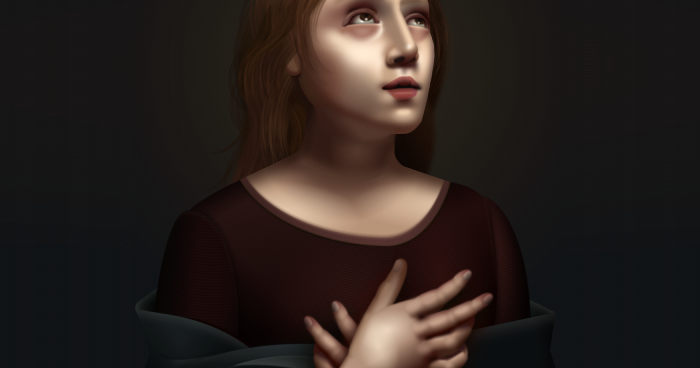
# Pure CSS Gaze
An ongoing series in which I create art using only CSS and HTML.
Inspired by Italian renaissance.
Rules I have for myself:
1. All elements must be typed out by hand
2. Only Atom text editor and Chrome Developer Tools allowed.
3. ~~SVG use is limited, and all shapes can only use hand-plotted coordinates and bezier curves - without the aid of any graphics editor.~~
(Note: at one point I was using one or two SVG elements but I eventually grew tired of them and they've since been deleted, so this rule no longer applies. No offense to SVG.)
Because of the artistic nature of this project I have not concerned myself with cross-browser-compatibility, so the live preview will most likely look laughable in anything other than chrome.
[cyanharlow.github.io/purecss-gaze](https://cyanharlow.github.io/purecss-gaze/)
================================================
FILE: index.html
================================================
PureCSS Gaze