Repository: sarmad1995/react-native-easy-content-loader
Branch: master
Commit: 559cf7f0fc22
Files: 15
Total size: 37.8 KB
Directory structure:
gitextract__o8nkhcl/
├── .github/
│ └── ISSUE_TEMPLATE/
│ └── bug_report.md
├── .gitignore
├── CHANGE_LOG.md
├── CODE_OF_CONDUCT.md
├── LICENSE
├── README.md
├── package.json
├── src/
│ ├── Bullets.tsx
│ ├── ContentLoader.tsx
│ ├── FacebookLoader.tsx
│ ├── InstagramLoader.tsx
│ ├── index.tsx
│ └── shared.tsx
├── tsconfig.json
└── tslint.json
================================================
FILE CONTENTS
================================================
================================================
FILE: .github/ISSUE_TEMPLATE/bug_report.md
================================================
---
name: Bug report
about: Create a report to help us improve
title: ''
labels: ''
assignees: ''
---
**Describe the bug**
A clear and concise description of what the bug is.
**To Reproduce**
Steps to reproduce the behavior:
1. Go to '...'
2. Click on '....'
3. Scroll down to '....'
4. See error
**Expected behavior**
A clear and concise description of what you expected to happen.
**Screenshots**
If applicable, add screenshots to help explain your problem.
**Smartphone (please complete the following information):**
- Device: [e.g. iPhone6]
- OS: [e.g. iOS8.1]
- Version [e.g. 22]
**Additional context**
Add any other context about the problem here.
================================================
FILE: .gitignore
================================================
node_modules/
lib
yarn.*
yarn.lock
================================================
FILE: CHANGE_LOG.md
================================================
## - 0.0.5
- Beta
## - 0.0.1
- Work in progress
## - 0.1.0
- Initial Release
## - 0.2.0
## BREAKING CHANGES
Changed the default Title and Paragraph height.
## FEATURES
- Added FACEBOOK style.
- Added INSTAGRAM style.
- Added Bullet style.
- Added List functionality.
- Add support for hex colors.
## - 0.2.3
## BREAKING CHANGES
No breaking changes :)
## FEATURES
- Typescript support.
- Fully typed.
- Removed extra things from npm, will be more lighter weight now.
================================================
FILE: CODE_OF_CONDUCT.md
================================================
# Contributor Covenant Code of Conduct
## Our Pledge
In the interest of fostering an open and welcoming environment, we as
contributors and maintainers pledge to making participation in our project and
our community a harassment-free experience for everyone, regardless of age, body
size, disability, ethnicity, sex characteristics, gender identity and expression,
level of experience, education, socio-economic status, nationality, personal
appearance, race, religion, or sexual identity and orientation.
## Our Standards
Examples of behavior that contributes to creating a positive environment
include:
* Using welcoming and inclusive language
* Being respectful of differing viewpoints and experiences
* Gracefully accepting constructive criticism
* Focusing on what is best for the community
* Showing empathy towards other community members
Examples of unacceptable behavior by participants include:
* The use of sexualized language or imagery and unwelcome sexual attention or
advances
* Trolling, insulting/derogatory comments, and personal or political attacks
* Public or private harassment
* Publishing others' private information, such as a physical or electronic
address, without explicit permission
* Other conduct which could reasonably be considered inappropriate in a
professional setting
## Our Responsibilities
Project maintainers are responsible for clarifying the standards of acceptable
behavior and are expected to take appropriate and fair corrective action in
response to any instances of unacceptable behavior.
Project maintainers have the right and responsibility to remove, edit, or
reject comments, commits, code, wiki edits, issues, and other contributions
that are not aligned to this Code of Conduct, or to ban temporarily or
permanently any contributor for other behaviors that they deem inappropriate,
threatening, offensive, or harmful.
## Scope
This Code of Conduct applies both within project spaces and in public spaces
when an individual is representing the project or its community. Examples of
representing a project or community include using an official project e-mail
address, posting via an official social media account, or acting as an appointed
representative at an online or offline event. Representation of a project may be
further defined and clarified by project maintainers.
## Enforcement
Instances of abusive, harassing, or otherwise unacceptable behavior may be
reported by contacting the project team at aijaz.sarmad@gmail.com. All
complaints will be reviewed and investigated and will result in a response that
is deemed necessary and appropriate to the circumstances. The project team is
obligated to maintain confidentiality with regard to the reporter of an incident.
Further details of specific enforcement policies may be posted separately.
Project maintainers who do not follow or enforce the Code of Conduct in good
faith may face temporary or permanent repercussions as determined by other
members of the project's leadership.
## Attribution
This Code of Conduct is adapted from the [Contributor Covenant][homepage], version 1.4,
available at https://www.contributor-covenant.org/version/1/4/code-of-conduct.html
[homepage]: https://www.contributor-covenant.org
For answers to common questions about this code of conduct, see
https://www.contributor-covenant.org/faq
================================================
FILE: LICENSE
================================================
MIT License
Copyright (c) 2019 Sarmad Shah
Permission is hereby granted, free of charge, to any person obtaining a copy
of this software and associated documentation files (the "Software"), to deal
in the Software without restriction, including without limitation the rights
to use, copy, modify, merge, publish, distribute, sublicense, and/or sell
copies of the Software, and to permit persons to whom the Software is
furnished to do so, subject to the following conditions:
The above copyright notice and this permission notice shall be included in all
copies or substantial portions of the Software.
THE SOFTWARE IS PROVIDED "AS IS", WITHOUT WARRANTY OF ANY KIND, EXPRESS OR
IMPLIED, INCLUDING BUT NOT LIMITED TO THE WARRANTIES OF MERCHANTABILITY,
FITNESS FOR A PARTICULAR PURPOSE AND NONINFRINGEMENT. IN NO EVENT SHALL THE
AUTHORS OR COPYRIGHT HOLDERS BE LIABLE FOR ANY CLAIM, DAMAGES OR OTHER
LIABILITY, WHETHER IN AN ACTION OF CONTRACT, TORT OR OTHERWISE, ARISING FROM,
OUT OF OR IN CONNECTION WITH THE SOFTWARE OR THE USE OR OTHER DEALINGS IN THE
SOFTWARE.
================================================
FILE: README.md
================================================
[![NPM Version][npm-image]][npm-url]
[![Downloads Stats][npm-downloads]][npm-url]

Provide a placeholder at the place which need waiting for loading,
Easy to implement and fun to use, this package is highly customizable, Please go through docs to find info :).
###
### I tried to move this package to @sarmad1995/react-native-content-loader, but seems like people are using this version a lot, so I will be maintaining this version from now, @sarmad1995/react-native-content-loader also has all the features.
## Features
- :gear: **Customizable:** Feel free to change the colors, speed, sizes, paragraphs, title and much more.
- ⚛️ **Lightweight:** Lightweight with only neccessory code.
- :tada: **Typescript:** Fully typed
## Index
- [Getting Started](#getting-started)
- [Usage](#usage)
- [Options](#options)
- [Examples](#examples)
## Getting Started
```sh
npm install react-native-easy-content-loader --save
yarn add react-native-easy-content-loader
```
## Examples
### Simple Example
```jsx
```
### With Avatar
```jsx
```
### With Loading State
```jsx
This would be rendered with loading is false
```
### Number of paragraphs
```jsx
```
### Different Widths for differnt paragrahs lines
```jsx
```
### Facebook and Instagram Style
These are also flexible and customizable
| Facebook loader | Instagram loader |
| :---------------------------------------------------------------------------------------------------------------------: | :----------------------------------------------------------------------------------------------------------------------: |
|  |  |
```jsx
import { FacebookLoader, InstagramLoader } from 'react-native-easy-content-loader';
```
### Bullets Style
```jsx
```
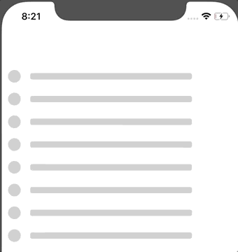
### Default Style
## It is highly customizable, please refer the options sections.
```jsx
import ContentLoader from "react-native-easy-content-loader";
;
```
| Added custom heights and widths | Same with other loaders |
| :---------------------------------------------------------------------------------------------------------------------------: | :---------------------------------------------------------------------------------------------------------------------------: |
|  |
|  |
Some more examples,
```jsx
```
```jsx
```
| Default Loader | Colored |
| :--------------------------------------------------------------------------------------------------------------------------: | :--------------------------------------------------------------------------------------------------------------------------: |
|  |  |
## Usage
```jsx
import ContentLoader, {
FacebookLoader,
InstagramLoader,
Bullets
} from "react-native-easy-content-loader";
```
```jsx
```
## Options
## These Options are common with every component,
#### **`primaryColor?: string, rgba/hex`**
Defaults to `rgba(220, 220, 220, 1)`.
#### **`secondaryColor? string, rgba/hex`**
Defaults to `rgba(200, 200, 200, 1)`.
#### **`animationDuration? number`**
Defaults to `500`. The animation transition time from primaryColor to secondaryColor
#### **`loading?: bool | null`**
Defaults to `null`, If given a bool value, when false, it will return children (Works as a wrapper component)
#### **`active? bool`**
Defaults to `false`, `true` if you want to animate the compoennt.
#### **`title? bool`**
Defaults to `true`. If you want to show the title, **Works only with ContentLoader**.
#### **`titleStyles? object`**
Add styles to title.
#### **`listSize? number`**
Defaults to `1`. If you want to render a list of loaders, **Works with all the loaders**.
#### **`avatar? bool`**
Defaults to `false`. If you want to render the avatar.
#### **`aShape? string 'circle' | 'square'`**
Defaults to `circle`. shape of the avatar, can be circle or square.
#### **`aSize? string 'default' 'small' 'large' | number`**
Defaults to `default`. can be a specific number.
#### **`reverse? bool`**
Defaults to `false`. if you want to reverse the view.
#### **`containerStyles? object`**
If you want to add style to container.
## Title specific options.
#### **`tHeight? string | number`**
Used to change the title height.
#### **`tWidth? stirng | number`**
Used to change the title width.
#### **`sTHeight? string | number`**
Used to change the secondary title height **Works with only Facebook and Instagram**.
#### **`sTWidth? string | number`**
Used to change the secondary title width **Works with only Facebook and Instagram**.
#### **`titleStyles? object`**
Add styles to title.
#### **`secondaryTitleStyles? object`**
Add styles to secondaryTitle. **Works with only Facebook and Instagram**.
## Paragraph specific options.
#### **`pHeight? string | number | array`**
Paragraph line height,
Can specify same height with single value, Or could use array for different heights, eg ['100%', 200, 300], you can use pHeight and pWidth to achieve different shapes as well,
#### **`pWidth? string | number | array`**
Paragraph line width,
Can specify same width with single value, Or could use array for different widths, eg ['100%', 200, 300]
#### **`paragraphStyles? objecct`**
Add paragraph styles
## Instagram specific options.
#### **`imageHeight? number`**
Change the height of the image
#### **`imageStyles? number`**
Add styles to image
## Release History
See CHANGE_LOG.md.
## Contributing
Feel free to contribute, this is still in beta and I have plans to include more features in future :)
[npm-image]: https://img.shields.io/npm/v/react-native-easy-content-loader.svg
[npm-url]: https://www.npmjs.com/package/react-native-easy-content-loader
[npm-downloads]: https://img.shields.io/npm/dm/rn-placeholder.svg?style=flat-square
================================================
FILE: package.json
================================================
{
"name": "react-native-easy-content-loader",
"version": "0.3.2",
"description": "easy content loader for react-native apps",
"main": "lib/index.js",
"types": "lib/index.d.ts",
"scripts": {
"build": "tsc"
},
"files": [
"lib"
],
"keywords": [
"react-native",
"react native skeleton",
"react native loader",
"react-native-content-loader",
"skeleton",
"react-native-loader",
"sarmad1995"
],
"repository": {
"type": "git",
"url": "https://github.com/sarmad1995/react-native-easy-content-loader"
},
"bugs": {
"url": "https://github.com/sarmad1995/react-native-easy-content-loader"
},
"homepage": "https://github.com/sarmad1995/react-native-easy-content-loader",
"author": "Sarmad",
"license": "MIT",
"devDependencies": {
"@types/react": "^16.0.40",
"@types/react-native": "^0.52.16",
"tslint": "^5.9.1",
"tslint-config-prettier": "^1.9.0",
"tslint-react": "^3.5.1",
"typescript": "^2.7.1"
},
"peerDependencies": {
"react": "*",
"react-native": "*"
},
"dependencies": {
"hex-to-rgba": "^2.0.1"
}
}
================================================
FILE: src/Bullets.tsx
================================================
import * as React from "react";
import { Animated, View, StyleSheet, ViewStyle } from 'react-native';
import {
getInterpolatedColor,
commonDefaultProps,
startAnimationHelper,
THeightType,
TWidthType,
CommonProps
} from './shared';
const AVATAR_SIZE = {
default: 20,
large: 30,
small: 25
};
interface Props extends CommonProps {
/**
* Used to determine the height of the main title
*/
tHeight: THeightType,
/**
* Used to determine the width of the main title
*/
tWidth: TWidthType,
/**
* add additinal avatarstyles or overwrite previous ones
*/
avatarStyles?: ViewStyle
}
class ContentLoader extends React.PureComponent {
static defaultProps: Props;
state = {
animation: new Animated.Value(0)
}
componentDidMount() {
const { active } = this.props;
if (active) {
this.startAnimation();
}
}
componentDidUpdate(prevProps) {
const { loading } = this.props;
if (prevProps.loading !== loading) {
if (loading) {
this.startAnimation();
}
}
}
startAnimation = () => {
const { animation } = this.state;
const { animationDuration } = this.props;
startAnimationHelper(animation, animationDuration);
};
render() {
const {
tHeight,
tWidth,
titleStyles,
aShape,
aSize,
avatarStyles,
reverse,
containerStyles,
loading,
listSize,
primaryColor,
secondaryColor,
children
} = this.props;
const { animation } = this.state;
const interpolatedBackground = getInterpolatedColor(animation, primaryColor, secondaryColor);
if (loading === false) {
return children || null;
}
const titleInitialStyles = {
height: tHeight,
width: tWidth
};
const avatarInitialStyles = {
height: AVATAR_SIZE[aSize] || aSize,
width: AVATAR_SIZE[aSize] || aSize,
borderRadius: aShape === 'circle' ? AVATAR_SIZE[aSize] / 2 || (aSize as any) / 2 : 3,
marginRight: reverse ? 0 : 5,
marginLeft: reverse ? 5 : 0
};
return [...Array(listSize)].map((_, index) => (
));
}
}
ContentLoader.defaultProps = {
...commonDefaultProps,
tWidth: '80%',
tHeight: 10
};
const styles = StyleSheet.create({
container: {
flexDirection: 'row',
width: '100%',
paddingHorizontal: 10,
alignItems: 'center'
},
content: {
flex: 1,
marginLeft: 10
},
avatar: {
borderRadius: 2
},
title: {
borderRadius: 3
},
paragraph: {
marginVertical: 5,
borderRadius: 3
}
});
export default ContentLoader;
================================================
FILE: src/ContentLoader.tsx
================================================
import * as React from "react";
import { Animated, View, StyleSheet, ViewStyle } from 'react-native';
import {
getInterpolatedColor,
commonDefaultProps,
startAnimationHelper,
paragraphInitialStyles,
CommonProps,
PHeightType,
PWidthType,
TWidthType,
THeightType,
} from './shared';
/**
* default content loader .
*
*
* can be customized to the needs, .
*/
interface ContentLoaderAvatar {
default: string | number,
large: string | number ,
small: string | number
}
const AVATAR_SIZE: ContentLoaderAvatar= {
default: 50,
large: 70,
small: 35
}
interface Props extends CommonProps {
/**
* Enables or disables paragraph lines.
*/
paragraph?: boolean,
/**
* Used to determine height of the paragraph line.
*/
pHeight: PHeightType,
/**
* Duration of fade animation, default = 500ms
*/
animationDuration: number,
/**
* Used to determine the width of the paragraph lines, If you want dymanic widths for each line, you can add an array
* [100,200,300]
*/
pWidth: PWidthType
/**
* Used to determine how many paragraph rows should be rendered.
*/
pRows: number,
/**
* Used to determine the width of the title.
*/
tWidth: TWidthType,
/**
* Used to determine the height of the title
*/
tHeight: THeightType,
/**
* If you want to add additional styles/overwrite styles of paragraph
*/
paragraphStyles?: ViewStyle,
/**
* If you want to add additional styles/overwrite styles of avatar
*/
avatarStyles?: ViewStyle
}
class ContentLoader extends React.PureComponent {
static defaultProps: Props;
state = {
animation: new Animated.Value(0)
};
componentDidMount() {
const { active } = this.props;
if (active) {
this.startAnimation();
}
}
componentDidUpdate(prevProps: Props) {
const { loading } = this.props;
if (prevProps.loading !== loading) {
if (loading) {
this.startAnimation();
}
}
}
private startAnimation= (): void=> {
const { animation } = this.state;
const { animationDuration } = this.props;
startAnimationHelper(animation, animationDuration);
};
render() {
const {
title,
paragraph,
pHeight,
pWidth,
pRows,
paragraphStyles,
tHeight,
tWidth,
titleStyles,
avatar,
aShape,
aSize,
avatarStyles,
reverse,
containerStyles,
loading,
listSize,
primaryColor,
secondaryColor,
children
} = this.props;
const { animation } = this.state;
const interpolatedBackground = getInterpolatedColor(animation, primaryColor, secondaryColor);
if (loading === false) {
return children || null;
}
const titleInitialStyles: ViewStyle = {
height: tHeight,
width: tWidth
};
const avatarInitialStyles: ViewStyle = {
height: (AVATAR_SIZE as any)[aSize] || aSize,
width: (AVATAR_SIZE as any)[aSize] || aSize,
borderRadius: aShape === 'circle' ? (AVATAR_SIZE as any)[aSize] / 2 || (aSize as any) / 2 : 3,
marginRight: reverse ? 0 : 10,
marginLeft: reverse ? 10 : 0
};
return [...Array(listSize)].map((_, index) => (
1 ? 20 : 0 },
styles.container,
{ flexDirection: reverse ? 'row-reverse' : 'row' },
containerStyles
]}
>
{avatar && (
)}
{title && (
)}
{paragraph && (
{[...Array(pRows)].map((_, index) => (
))}
)}
));
}
}
ContentLoader.defaultProps = {
...commonDefaultProps,
paragraph: true,
pHeight: 8,
pWidth: '80%',
pRows: 4,
tWidth: '60%',
tHeight: 15,
paragraphStyles: {}
};
const styles = StyleSheet.create({
container: {
flexDirection: 'row',
width: '100%',
paddingHorizontal: 10
},
content: {
flex: 1
},
avatar: {
borderRadius: 2
},
title: {
marginBottom: 10,
borderRadius: 3
},
paragraph: {
marginVertical: 5,
borderRadius: 3
},
paragraphContainer: {}
});
export default ContentLoader;
================================================
FILE: src/FacebookLoader.tsx
================================================
import * as React from "react";
import { Animated, View, StyleSheet, ViewStyle } from 'react-native';
import {
getInterpolatedColor,
startAnimationHelper,
commonDefaultProps,
paragraphInitialStyles,
CommonProps,
PHeightType,
PWidthType,
THeightType,
TWidthType
} from './shared';
const AVATAR_SIZE = {
default: 70,
large: 30,
small: 25
};
interface Props extends CommonProps {
/**
* Used to determine height of the paragraph line.
*/
pHeight: PHeightType,
/**
* Used to determine the width of the paragraph lines, If you want dymanic widths for each line, you can add an array
* [100,200,300]
*/
pWidth: PWidthType,
/**
* Used to determine how many paragraph rows should be rendered.
*/
pRows: number,
/**
* Add additional styles or overwrite previous ones
*/
paragraphStyles?: ViewStyle,
/**
* Used to determine the height of the main title
*/
tHeight: THeightType,
/**
* Used to determine the width of the main title
*/
tWidth: TWidthType,
/**
* Add additional styles or overwrite previous ones
*/
secondaryTitleStyles?: ViewStyle,
/**
* Used to determine the height of the secondary title
*/
sTWidth: string | number,
/**
* Used to determine the width of the secondary title
*/
avatarStyles?: ViewStyle
}
class ContentLoader extends React.PureComponent {
static defaultProps: Props;
state = {
animation: new Animated.Value(0)
};
componentDidMount() {
const { active } = this.props;
if (active) {
this.startAnimation();
}
}
componentDidUpdate(prevProps) {
const { loading } = this.props;
if (prevProps.loading !== loading) {
if (loading) {
this.startAnimation();
}
}
}
startAnimation = () => {
const { animation } = this.state;
const { animationDuration } = this.props;
startAnimationHelper(animation, animationDuration);
};
render() {
const {
pHeight,
pWidth,
pRows,
paragraphStyles,
tHeight,
tWidth,
titleStyles,
secondaryTitleStyles,
aShape,
sTWidth,
aSize,
avatarStyles,
reverse,
containerStyles,
loading,
listSize,
primaryColor,
secondaryColor,
children
} = this.props;
const { animation } = this.state;
const interpolatedBackground = getInterpolatedColor(animation, primaryColor, secondaryColor);
if (loading === false) {
return children || null;
}
const titleInitialStyles = {
height: tHeight,
width: tWidth
};
const secondaryTitleInitialStyles = {
height: tHeight,
width: sTWidth
};
const avatarInitialStyles = {
height: AVATAR_SIZE[aSize] || aSize,
width: AVATAR_SIZE[aSize] || aSize,
borderRadius: aShape === 'circle' ? AVATAR_SIZE[aSize] / 2 || (aSize as any) / 2 : 3,
marginRight: reverse ? 0 : 10,
marginLeft: reverse ? 10 : 0
};
return [...Array(listSize)].map((_, index) => (
{[...Array(pRows)].map((_, index) => (
))}
));
}
}
ContentLoader.defaultProps = {
...commonDefaultProps,
pHeight: 7,
pWidth: ['85%', '95%', '75%'],
pRows: 3,
tWidth: '50%',
tHeight: 7,
sTWidth: '30%',
paragraphStyles: {},
secondaryTitleStyles: {}
};
const styles = StyleSheet.create({
container: {
flexDirection: 'row',
width: '100%',
paddingHorizontal: 10,
alignItems: 'center'
},
content: {
flex: 1,
marginLeft: 0
},
avatar: {
borderRadius: 2,
marginLeft: 10
},
title: {
marginBottom: 12,
borderRadius: 3
},
secondaryTitle: {
marginBottom: 10,
borderRadius: 3
},
paragraph: {
marginVertical: 7,
borderRadius: 3
},
paragraphContainer: {
paddingHorizontal: 12,
marginTop: 10
}
});
export default ContentLoader;
================================================
FILE: src/InstagramLoader.tsx
================================================
import * as React from "react";
import { Animated, View, StyleSheet, ViewStyle } from 'react-native';
import {
getInterpolatedColor,
startAnimationHelper,
commonDefaultProps,
CommonProps,
THeightType,
TWidthType
} from './shared';
const AVATAR_SIZE = {
default: 60,
large: 30,
small: 25
};
interface Props extends CommonProps {
/**
* Used to determine the height of the main title.
*/
tHeight: THeightType,
/**
* Used to determine the width of the main title.
*/
tWidth: TWidthType,
/**
* Used to determine the height of secondary title.
*/
sTHeight: string | number,
/**
* Used to determine the width of secondary title.
*/
sTWidth: string | number,
/**
* add additinal imageStyles or overwrite previous ones.
*/
imageStyles?: ViewStyle,
/**
* Used to determine height of the image
*/
imageHeight: string | number,
/**
* add additional avatarStyles or overwrite them
*/
avatarStyles?: ViewStyle
/**
* add additional secondary title styles or overwrite them.
*/
secondaryTitleStyles?: ViewStyle
}
class ContentLoader extends React.PureComponent {
static defaultProps: Props;
state = {
animation: new Animated.Value(0)
}
componentDidMount() {
const { active } = this.props;
if (active) {
this.startAnimation();
}
}
componentDidUpdate(prevProps) {
const { loading } = this.props;
if (prevProps.loading !== loading) {
if (loading) {
this.startAnimation();
}
}
}
startAnimation = () => {
const { animation } = this.state;
const { animationDuration } = this.props;
startAnimationHelper(animation, animationDuration);
};
render() {
const {
imageStyles,
sTHeight,
sTWidth,
tHeight,
tWidth,
titleStyles,
secondaryTitleStyles,
aShape,
aSize,
avatarStyles,
reverse,
containerStyles,
loading,
imageHeight,
listSize,
primaryColor,
secondaryColor,
children
} = this.props;
const { animation } = this.state;
const interpolatedBackground = getInterpolatedColor(animation, primaryColor, secondaryColor);
if (loading === false) {
return children || null;
}
const imageInitialStyles = {
height: imageHeight,
width: '100%'
};
const titleInitialStyles = {
height: tHeight,
width: tWidth
};
const secondaryTitleInitialStyles = {
height: sTHeight,
width: sTWidth
};
const avatarInitialStyles = {
height: AVATAR_SIZE[aSize] || aSize,
width: AVATAR_SIZE[aSize] || aSize,
borderRadius: aShape === 'circle' ? AVATAR_SIZE[aSize] / 2 || (aSize as any) / 2 : 3,
marginRight: reverse ? 0 : 5,
marginLeft: reverse ? 5 : 0
};
return [...Array(listSize)].map((_, index) => (
));
}
}
ContentLoader.defaultProps = {
...commonDefaultProps,
sTWidth: '25%',
tWidth: '40%',
tHeight: 13,
imageHeight: 200,
imageStyles: {},
sTHeight: 7
};
const styles = StyleSheet.create({
container: {
flexDirection: 'row',
width: '100%',
paddingHorizontal: 10,
alignItems: 'center'
},
content: {
flex: 1,
marginLeft: 10
},
avatar: {
borderRadius: 2
},
title: {
marginBottom: 10,
borderRadius: 3
},
secondaryTitle: {
borderRadius: 3
},
image: {
marginVertical: 5,
borderRadius: 5
},
ImageContainer: {
paddingHorizontal: 12,
marginTop: 10
}
});
export default ContentLoader;
================================================
FILE: src/index.tsx
================================================
import ContentLoader from "./ContentLoader";
import FacebookLoader from "./FacebookLoader";
import InstagramLoader from "./InstagramLoader";
import BulletsLoader from "./Bullets";
export default ContentLoader;
export { FacebookLoader, BulletsLoader, InstagramLoader };
export const Facebook = FacebookLoader;
export const Instagram = InstagramLoader;
export const Bullets = BulletsLoader;
================================================
FILE: src/shared.tsx
================================================
import hexToRgba from 'hex-to-rgba';
import { Animated, ViewStyle } from 'react-native';
export type WidthArrayType = number | string;
export type AShapeType = 'circle'|'square';
export type ASizeType = string | number | 'small' | 'large' | 'default';
export type PHeightType = string | number | Array;
export type PWidthType = string | number | Array;
export type TWidthType = string | number;
export type THeightType = string | number;
export type AnimationType = Animated.Value | Animated.ValueXY
export type ColorType = string;
export const startAnimationHelper = (animation: AnimationType, duration: number) => {
Animated.loop(
Animated.sequence([
Animated.timing(animation, {
toValue: 1,
duration,
useNativeDriver: false
}),
Animated.timing(animation, {
toValue: 0,
duration,
useNativeDriver: false
})
])
).start();
};
export const getInterpolatedColor = (animation: Animated.Value, primaryColor: ColorType, secondaryColor: ColorType) =>
animation.interpolate({
inputRange: [0, 1],
outputRange: [
primaryColor.includes('rgb') ? primaryColor : hexToRgba(primaryColor),
secondaryColor.includes('rgba') ? secondaryColor : hexToRgba(secondaryColor)
]
});
export const paragraphInitialStyles = (index: number, pHeight: PHeightType, pWidth: PWidthType) => {
let height = pHeight;
let width = pWidth;
if ( pWidth.constructor === Array) {
width = pWidth[index] || '100%';
}
if (pHeight.constructor === Array) {
height = pHeight[index] || 8
}
return {
height,
width
};
};
export interface CommonProps {
/**
* The color of primary shade of the loader, can be rgba or hex color.
*/
primaryColor: string,
/**
* The color of secondary shade of the loader, can be rgba or hex color.
*/
secondaryColor: string,
/**
* Animation duration of the fade, default is 500.
*/
animationDuration: number,
/**
* If loading prop is used, it will render children when loading false.
* Usefull when you want to render something after loading finishes,
* just add something like loading={this.state.loading} and you can add your component as children.
*/
loading?: boolean | null,
/**
* Used to toggle animation,
* True - Animation enabled
* False - Animation disabled
*/
active?: boolean,
/**
* Enalbes or disables the title
*/
title?: boolean,
/**
* If you want to render the loaders in list, default is 1.
* If you provide more than one, it will render the loaders in a list.
*/
listSize: number,
/**
* Add addtional title styles.
*/
titleStyles?: ViewStyle,
/**
* Used to determine if avatar should be visible or not
*/
avatar?: boolean,
/**
* Used to determine the shape of avatar
* can be
* circle or square or if you want some kind of custamized shape, you can always overwrite avatarStyles
*/
aShape?: AShapeType
/**
* The size of avatar, can be default, large, small or your custom number
*/
aSize: ASizeType,
/**
* Can be used to reverse the flow,
*/
reverse?: boolean,
/**
* If you want to add additional properties or overwrite the styles of the main container.
*/
containerStyles?: ViewStyle
}
export const commonDefaultProps: CommonProps= {
primaryColor: 'rgba(220, 220, 220, 1)',
secondaryColor: 'rgba(200, 200, 200, 1)',
animationDuration: 500,
loading: null,
active: false,
title: true,
listSize: 1,
titleStyles: {},
avatar: false,
aShape: 'circle',
aSize: 'default',
reverse: false,
containerStyles: {}
};
================================================
FILE: tsconfig.json
================================================
{
"compilerOptions": {
"target": "es6",
"module": "commonjs",
"jsx": "react-native",
"removeComments": false,
"lib": ["dom", "es2015", "es2016"],
"declaration": true,
"sourceMap": true,
"outDir": "./lib",
"esModuleInterop": true,
"strict": true,
"noImplicitAny": false,
"strictNullChecks": true,
"strictFunctionTypes": true,
"strictPropertyInitialization": true,
"noImplicitThis": true,
"noUnusedLocals": true,
"noUnusedParameters": true,
"noImplicitReturns": true,
"noFallthroughCasesInSwitch": true,
"allowSyntheticDefaultImports": true,
"skipLibCheck": true
},
"exclude": ["node_modules"],
"include": ["./src/**/*.tsx", "./src/**/*.ts"],
}
================================================
FILE: tslint.json
================================================
{
"defaultSeverity": "error",
"extends": ["tslint:latest", "tslint-react", "tslint-config-prettier"],
"jsRules": {},
"rules": {
"member-access": false,
"object-literal-sort-keys": false,
"ordered-imports": false,
"interface-name": false
},
"rulesDirectory": []
}
|
Some more examples,
```jsx
```
```jsx
```
| Default Loader | Colored |
| :--------------------------------------------------------------------------------------------------------------------------: | :--------------------------------------------------------------------------------------------------------------------------: |
|  |  |
## Usage
```jsx
import ContentLoader, {
FacebookLoader,
InstagramLoader,
Bullets
} from "react-native-easy-content-loader";
```
```jsx
```
## Options
## These Options are common with every component,
#### **`primaryColor?: string, rgba/hex`**
Defaults to `rgba(220, 220, 220, 1)`.
#### **`secondaryColor? string, rgba/hex`**
Defaults to `rgba(200, 200, 200, 1)`.
#### **`animationDuration? number`**
Defaults to `500`. The animation transition time from primaryColor to secondaryColor
#### **`loading?: bool | null`**
Defaults to `null`, If given a bool value, when false, it will return children (Works as a wrapper component)
#### **`active? bool`**
Defaults to `false`, `true` if you want to animate the compoennt.
#### **`title? bool`**
Defaults to `true`. If you want to show the title, **Works only with ContentLoader**.
#### **`titleStyles? object`**
Add styles to title.
#### **`listSize? number`**
Defaults to `1`. If you want to render a list of loaders, **Works with all the loaders**.
#### **`avatar? bool`**
Defaults to `false`. If you want to render the avatar.
#### **`aShape? string 'circle' | 'square'`**
Defaults to `circle`. shape of the avatar, can be circle or square.
#### **`aSize? string 'default' 'small' 'large' | number`**
Defaults to `default`. can be a specific number.
#### **`reverse? bool`**
Defaults to `false`. if you want to reverse the view.
#### **`containerStyles? object`**
If you want to add style to container.
## Title specific options.
#### **`tHeight? string | number`**
Used to change the title height.
#### **`tWidth? stirng | number`**
Used to change the title width.
#### **`sTHeight? string | number`**
Used to change the secondary title height **Works with only Facebook and Instagram**.
#### **`sTWidth? string | number`**
Used to change the secondary title width **Works with only Facebook and Instagram**.
#### **`titleStyles? object`**
Add styles to title.
#### **`secondaryTitleStyles? object`**
Add styles to secondaryTitle. **Works with only Facebook and Instagram**.
## Paragraph specific options.
#### **`pHeight? string | number | array`**
Paragraph line height,
Can specify same height with single value, Or could use array for different heights, eg ['100%', 200, 300], you can use pHeight and pWidth to achieve different shapes as well,
#### **`pWidth? string | number | array`**
Paragraph line width,
Can specify same width with single value, Or could use array for different widths, eg ['100%', 200, 300]
#### **`paragraphStyles? objecct`**
Add paragraph styles
## Instagram specific options.
#### **`imageHeight? number`**
Change the height of the image
#### **`imageStyles? number`**
Add styles to image
## Release History
See CHANGE_LOG.md.
## Contributing
Feel free to contribute, this is still in beta and I have plans to include more features in future :)
[npm-image]: https://img.shields.io/npm/v/react-native-easy-content-loader.svg
[npm-url]: https://www.npmjs.com/package/react-native-easy-content-loader
[npm-downloads]: https://img.shields.io/npm/dm/rn-placeholder.svg?style=flat-square
================================================
FILE: package.json
================================================
{
"name": "react-native-easy-content-loader",
"version": "0.3.2",
"description": "easy content loader for react-native apps",
"main": "lib/index.js",
"types": "lib/index.d.ts",
"scripts": {
"build": "tsc"
},
"files": [
"lib"
],
"keywords": [
"react-native",
"react native skeleton",
"react native loader",
"react-native-content-loader",
"skeleton",
"react-native-loader",
"sarmad1995"
],
"repository": {
"type": "git",
"url": "https://github.com/sarmad1995/react-native-easy-content-loader"
},
"bugs": {
"url": "https://github.com/sarmad1995/react-native-easy-content-loader"
},
"homepage": "https://github.com/sarmad1995/react-native-easy-content-loader",
"author": "Sarmad",
"license": "MIT",
"devDependencies": {
"@types/react": "^16.0.40",
"@types/react-native": "^0.52.16",
"tslint": "^5.9.1",
"tslint-config-prettier": "^1.9.0",
"tslint-react": "^3.5.1",
"typescript": "^2.7.1"
},
"peerDependencies": {
"react": "*",
"react-native": "*"
},
"dependencies": {
"hex-to-rgba": "^2.0.1"
}
}
================================================
FILE: src/Bullets.tsx
================================================
import * as React from "react";
import { Animated, View, StyleSheet, ViewStyle } from 'react-native';
import {
getInterpolatedColor,
commonDefaultProps,
startAnimationHelper,
THeightType,
TWidthType,
CommonProps
} from './shared';
const AVATAR_SIZE = {
default: 20,
large: 30,
small: 25
};
interface Props extends CommonProps {
/**
* Used to determine the height of the main title
*/
tHeight: THeightType,
/**
* Used to determine the width of the main title
*/
tWidth: TWidthType,
/**
* add additinal avatarstyles or overwrite previous ones
*/
avatarStyles?: ViewStyle
}
class ContentLoader extends React.PureComponent {
static defaultProps: Props;
state = {
animation: new Animated.Value(0)
}
componentDidMount() {
const { active } = this.props;
if (active) {
this.startAnimation();
}
}
componentDidUpdate(prevProps) {
const { loading } = this.props;
if (prevProps.loading !== loading) {
if (loading) {
this.startAnimation();
}
}
}
startAnimation = () => {
const { animation } = this.state;
const { animationDuration } = this.props;
startAnimationHelper(animation, animationDuration);
};
render() {
const {
tHeight,
tWidth,
titleStyles,
aShape,
aSize,
avatarStyles,
reverse,
containerStyles,
loading,
listSize,
primaryColor,
secondaryColor,
children
} = this.props;
const { animation } = this.state;
const interpolatedBackground = getInterpolatedColor(animation, primaryColor, secondaryColor);
if (loading === false) {
return children || null;
}
const titleInitialStyles = {
height: tHeight,
width: tWidth
};
const avatarInitialStyles = {
height: AVATAR_SIZE[aSize] || aSize,
width: AVATAR_SIZE[aSize] || aSize,
borderRadius: aShape === 'circle' ? AVATAR_SIZE[aSize] / 2 || (aSize as any) / 2 : 3,
marginRight: reverse ? 0 : 5,
marginLeft: reverse ? 5 : 0
};
return [...Array(listSize)].map((_, index) => (
));
}
}
ContentLoader.defaultProps = {
...commonDefaultProps,
tWidth: '80%',
tHeight: 10
};
const styles = StyleSheet.create({
container: {
flexDirection: 'row',
width: '100%',
paddingHorizontal: 10,
alignItems: 'center'
},
content: {
flex: 1,
marginLeft: 10
},
avatar: {
borderRadius: 2
},
title: {
borderRadius: 3
},
paragraph: {
marginVertical: 5,
borderRadius: 3
}
});
export default ContentLoader;
================================================
FILE: src/ContentLoader.tsx
================================================
import * as React from "react";
import { Animated, View, StyleSheet, ViewStyle } from 'react-native';
import {
getInterpolatedColor,
commonDefaultProps,
startAnimationHelper,
paragraphInitialStyles,
CommonProps,
PHeightType,
PWidthType,
TWidthType,
THeightType,
} from './shared';
/**
* default content loader .
*
*
* can be customized to the needs, .
*/
interface ContentLoaderAvatar {
default: string | number,
large: string | number ,
small: string | number
}
const AVATAR_SIZE: ContentLoaderAvatar= {
default: 50,
large: 70,
small: 35
}
interface Props extends CommonProps {
/**
* Enables or disables paragraph lines.
*/
paragraph?: boolean,
/**
* Used to determine height of the paragraph line.
*/
pHeight: PHeightType,
/**
* Duration of fade animation, default = 500ms
*/
animationDuration: number,
/**
* Used to determine the width of the paragraph lines, If you want dymanic widths for each line, you can add an array
* [100,200,300]
*/
pWidth: PWidthType
/**
* Used to determine how many paragraph rows should be rendered.
*/
pRows: number,
/**
* Used to determine the width of the title.
*/
tWidth: TWidthType,
/**
* Used to determine the height of the title
*/
tHeight: THeightType,
/**
* If you want to add additional styles/overwrite styles of paragraph
*/
paragraphStyles?: ViewStyle,
/**
* If you want to add additional styles/overwrite styles of avatar
*/
avatarStyles?: ViewStyle
}
class ContentLoader extends React.PureComponent {
static defaultProps: Props;
state = {
animation: new Animated.Value(0)
};
componentDidMount() {
const { active } = this.props;
if (active) {
this.startAnimation();
}
}
componentDidUpdate(prevProps: Props) {
const { loading } = this.props;
if (prevProps.loading !== loading) {
if (loading) {
this.startAnimation();
}
}
}
private startAnimation= (): void=> {
const { animation } = this.state;
const { animationDuration } = this.props;
startAnimationHelper(animation, animationDuration);
};
render() {
const {
title,
paragraph,
pHeight,
pWidth,
pRows,
paragraphStyles,
tHeight,
tWidth,
titleStyles,
avatar,
aShape,
aSize,
avatarStyles,
reverse,
containerStyles,
loading,
listSize,
primaryColor,
secondaryColor,
children
} = this.props;
const { animation } = this.state;
const interpolatedBackground = getInterpolatedColor(animation, primaryColor, secondaryColor);
if (loading === false) {
return children || null;
}
const titleInitialStyles: ViewStyle = {
height: tHeight,
width: tWidth
};
const avatarInitialStyles: ViewStyle = {
height: (AVATAR_SIZE as any)[aSize] || aSize,
width: (AVATAR_SIZE as any)[aSize] || aSize,
borderRadius: aShape === 'circle' ? (AVATAR_SIZE as any)[aSize] / 2 || (aSize as any) / 2 : 3,
marginRight: reverse ? 0 : 10,
marginLeft: reverse ? 10 : 0
};
return [...Array(listSize)].map((_, index) => (
1 ? 20 : 0 },
styles.container,
{ flexDirection: reverse ? 'row-reverse' : 'row' },
containerStyles
]}
>
{avatar && (
)}
{title && (
)}
{paragraph && (
{[...Array(pRows)].map((_, index) => (
))}
)}
));
}
}
ContentLoader.defaultProps = {
...commonDefaultProps,
paragraph: true,
pHeight: 8,
pWidth: '80%',
pRows: 4,
tWidth: '60%',
tHeight: 15,
paragraphStyles: {}
};
const styles = StyleSheet.create({
container: {
flexDirection: 'row',
width: '100%',
paddingHorizontal: 10
},
content: {
flex: 1
},
avatar: {
borderRadius: 2
},
title: {
marginBottom: 10,
borderRadius: 3
},
paragraph: {
marginVertical: 5,
borderRadius: 3
},
paragraphContainer: {}
});
export default ContentLoader;
================================================
FILE: src/FacebookLoader.tsx
================================================
import * as React from "react";
import { Animated, View, StyleSheet, ViewStyle } from 'react-native';
import {
getInterpolatedColor,
startAnimationHelper,
commonDefaultProps,
paragraphInitialStyles,
CommonProps,
PHeightType,
PWidthType,
THeightType,
TWidthType
} from './shared';
const AVATAR_SIZE = {
default: 70,
large: 30,
small: 25
};
interface Props extends CommonProps {
/**
* Used to determine height of the paragraph line.
*/
pHeight: PHeightType,
/**
* Used to determine the width of the paragraph lines, If you want dymanic widths for each line, you can add an array
* [100,200,300]
*/
pWidth: PWidthType,
/**
* Used to determine how many paragraph rows should be rendered.
*/
pRows: number,
/**
* Add additional styles or overwrite previous ones
*/
paragraphStyles?: ViewStyle,
/**
* Used to determine the height of the main title
*/
tHeight: THeightType,
/**
* Used to determine the width of the main title
*/
tWidth: TWidthType,
/**
* Add additional styles or overwrite previous ones
*/
secondaryTitleStyles?: ViewStyle,
/**
* Used to determine the height of the secondary title
*/
sTWidth: string | number,
/**
* Used to determine the width of the secondary title
*/
avatarStyles?: ViewStyle
}
class ContentLoader extends React.PureComponent {
static defaultProps: Props;
state = {
animation: new Animated.Value(0)
};
componentDidMount() {
const { active } = this.props;
if (active) {
this.startAnimation();
}
}
componentDidUpdate(prevProps) {
const { loading } = this.props;
if (prevProps.loading !== loading) {
if (loading) {
this.startAnimation();
}
}
}
startAnimation = () => {
const { animation } = this.state;
const { animationDuration } = this.props;
startAnimationHelper(animation, animationDuration);
};
render() {
const {
pHeight,
pWidth,
pRows,
paragraphStyles,
tHeight,
tWidth,
titleStyles,
secondaryTitleStyles,
aShape,
sTWidth,
aSize,
avatarStyles,
reverse,
containerStyles,
loading,
listSize,
primaryColor,
secondaryColor,
children
} = this.props;
const { animation } = this.state;
const interpolatedBackground = getInterpolatedColor(animation, primaryColor, secondaryColor);
if (loading === false) {
return children || null;
}
const titleInitialStyles = {
height: tHeight,
width: tWidth
};
const secondaryTitleInitialStyles = {
height: tHeight,
width: sTWidth
};
const avatarInitialStyles = {
height: AVATAR_SIZE[aSize] || aSize,
width: AVATAR_SIZE[aSize] || aSize,
borderRadius: aShape === 'circle' ? AVATAR_SIZE[aSize] / 2 || (aSize as any) / 2 : 3,
marginRight: reverse ? 0 : 10,
marginLeft: reverse ? 10 : 0
};
return [...Array(listSize)].map((_, index) => (
{[...Array(pRows)].map((_, index) => (
))}
));
}
}
ContentLoader.defaultProps = {
...commonDefaultProps,
pHeight: 7,
pWidth: ['85%', '95%', '75%'],
pRows: 3,
tWidth: '50%',
tHeight: 7,
sTWidth: '30%',
paragraphStyles: {},
secondaryTitleStyles: {}
};
const styles = StyleSheet.create({
container: {
flexDirection: 'row',
width: '100%',
paddingHorizontal: 10,
alignItems: 'center'
},
content: {
flex: 1,
marginLeft: 0
},
avatar: {
borderRadius: 2,
marginLeft: 10
},
title: {
marginBottom: 12,
borderRadius: 3
},
secondaryTitle: {
marginBottom: 10,
borderRadius: 3
},
paragraph: {
marginVertical: 7,
borderRadius: 3
},
paragraphContainer: {
paddingHorizontal: 12,
marginTop: 10
}
});
export default ContentLoader;
================================================
FILE: src/InstagramLoader.tsx
================================================
import * as React from "react";
import { Animated, View, StyleSheet, ViewStyle } from 'react-native';
import {
getInterpolatedColor,
startAnimationHelper,
commonDefaultProps,
CommonProps,
THeightType,
TWidthType
} from './shared';
const AVATAR_SIZE = {
default: 60,
large: 30,
small: 25
};
interface Props extends CommonProps {
/**
* Used to determine the height of the main title.
*/
tHeight: THeightType,
/**
* Used to determine the width of the main title.
*/
tWidth: TWidthType,
/**
* Used to determine the height of secondary title.
*/
sTHeight: string | number,
/**
* Used to determine the width of secondary title.
*/
sTWidth: string | number,
/**
* add additinal imageStyles or overwrite previous ones.
*/
imageStyles?: ViewStyle,
/**
* Used to determine height of the image
*/
imageHeight: string | number,
/**
* add additional avatarStyles or overwrite them
*/
avatarStyles?: ViewStyle
/**
* add additional secondary title styles or overwrite them.
*/
secondaryTitleStyles?: ViewStyle
}
class ContentLoader extends React.PureComponent {
static defaultProps: Props;
state = {
animation: new Animated.Value(0)
}
componentDidMount() {
const { active } = this.props;
if (active) {
this.startAnimation();
}
}
componentDidUpdate(prevProps) {
const { loading } = this.props;
if (prevProps.loading !== loading) {
if (loading) {
this.startAnimation();
}
}
}
startAnimation = () => {
const { animation } = this.state;
const { animationDuration } = this.props;
startAnimationHelper(animation, animationDuration);
};
render() {
const {
imageStyles,
sTHeight,
sTWidth,
tHeight,
tWidth,
titleStyles,
secondaryTitleStyles,
aShape,
aSize,
avatarStyles,
reverse,
containerStyles,
loading,
imageHeight,
listSize,
primaryColor,
secondaryColor,
children
} = this.props;
const { animation } = this.state;
const interpolatedBackground = getInterpolatedColor(animation, primaryColor, secondaryColor);
if (loading === false) {
return children || null;
}
const imageInitialStyles = {
height: imageHeight,
width: '100%'
};
const titleInitialStyles = {
height: tHeight,
width: tWidth
};
const secondaryTitleInitialStyles = {
height: sTHeight,
width: sTWidth
};
const avatarInitialStyles = {
height: AVATAR_SIZE[aSize] || aSize,
width: AVATAR_SIZE[aSize] || aSize,
borderRadius: aShape === 'circle' ? AVATAR_SIZE[aSize] / 2 || (aSize as any) / 2 : 3,
marginRight: reverse ? 0 : 5,
marginLeft: reverse ? 5 : 0
};
return [...Array(listSize)].map((_, index) => (
));
}
}
ContentLoader.defaultProps = {
...commonDefaultProps,
sTWidth: '25%',
tWidth: '40%',
tHeight: 13,
imageHeight: 200,
imageStyles: {},
sTHeight: 7
};
const styles = StyleSheet.create({
container: {
flexDirection: 'row',
width: '100%',
paddingHorizontal: 10,
alignItems: 'center'
},
content: {
flex: 1,
marginLeft: 10
},
avatar: {
borderRadius: 2
},
title: {
marginBottom: 10,
borderRadius: 3
},
secondaryTitle: {
borderRadius: 3
},
image: {
marginVertical: 5,
borderRadius: 5
},
ImageContainer: {
paddingHorizontal: 12,
marginTop: 10
}
});
export default ContentLoader;
================================================
FILE: src/index.tsx
================================================
import ContentLoader from "./ContentLoader";
import FacebookLoader from "./FacebookLoader";
import InstagramLoader from "./InstagramLoader";
import BulletsLoader from "./Bullets";
export default ContentLoader;
export { FacebookLoader, BulletsLoader, InstagramLoader };
export const Facebook = FacebookLoader;
export const Instagram = InstagramLoader;
export const Bullets = BulletsLoader;
================================================
FILE: src/shared.tsx
================================================
import hexToRgba from 'hex-to-rgba';
import { Animated, ViewStyle } from 'react-native';
export type WidthArrayType = number | string;
export type AShapeType = 'circle'|'square';
export type ASizeType = string | number | 'small' | 'large' | 'default';
export type PHeightType = string | number | Array;
export type PWidthType = string | number | Array;
export type TWidthType = string | number;
export type THeightType = string | number;
export type AnimationType = Animated.Value | Animated.ValueXY
export type ColorType = string;
export const startAnimationHelper = (animation: AnimationType, duration: number) => {
Animated.loop(
Animated.sequence([
Animated.timing(animation, {
toValue: 1,
duration,
useNativeDriver: false
}),
Animated.timing(animation, {
toValue: 0,
duration,
useNativeDriver: false
})
])
).start();
};
export const getInterpolatedColor = (animation: Animated.Value, primaryColor: ColorType, secondaryColor: ColorType) =>
animation.interpolate({
inputRange: [0, 1],
outputRange: [
primaryColor.includes('rgb') ? primaryColor : hexToRgba(primaryColor),
secondaryColor.includes('rgba') ? secondaryColor : hexToRgba(secondaryColor)
]
});
export const paragraphInitialStyles = (index: number, pHeight: PHeightType, pWidth: PWidthType) => {
let height = pHeight;
let width = pWidth;
if ( pWidth.constructor === Array) {
width = pWidth[index] || '100%';
}
if (pHeight.constructor === Array) {
height = pHeight[index] || 8
}
return {
height,
width
};
};
export interface CommonProps {
/**
* The color of primary shade of the loader, can be rgba or hex color.
*/
primaryColor: string,
/**
* The color of secondary shade of the loader, can be rgba or hex color.
*/
secondaryColor: string,
/**
* Animation duration of the fade, default is 500.
*/
animationDuration: number,
/**
* If loading prop is used, it will render children when loading false.
* Usefull when you want to render something after loading finishes,
* just add something like loading={this.state.loading} and you can add your component as children.
*/
loading?: boolean | null,
/**
* Used to toggle animation,
* True - Animation enabled
* False - Animation disabled
*/
active?: boolean,
/**
* Enalbes or disables the title
*/
title?: boolean,
/**
* If you want to render the loaders in list, default is 1.
* If you provide more than one, it will render the loaders in a list.
*/
listSize: number,
/**
* Add addtional title styles.
*/
titleStyles?: ViewStyle,
/**
* Used to determine if avatar should be visible or not
*/
avatar?: boolean,
/**
* Used to determine the shape of avatar
* can be
* circle or square or if you want some kind of custamized shape, you can always overwrite avatarStyles
*/
aShape?: AShapeType
/**
* The size of avatar, can be default, large, small or your custom number
*/
aSize: ASizeType,
/**
* Can be used to reverse the flow,
*/
reverse?: boolean,
/**
* If you want to add additional properties or overwrite the styles of the main container.
*/
containerStyles?: ViewStyle
}
export const commonDefaultProps: CommonProps= {
primaryColor: 'rgba(220, 220, 220, 1)',
secondaryColor: 'rgba(200, 200, 200, 1)',
animationDuration: 500,
loading: null,
active: false,
title: true,
listSize: 1,
titleStyles: {},
avatar: false,
aShape: 'circle',
aSize: 'default',
reverse: false,
containerStyles: {}
};
================================================
FILE: tsconfig.json
================================================
{
"compilerOptions": {
"target": "es6",
"module": "commonjs",
"jsx": "react-native",
"removeComments": false,
"lib": ["dom", "es2015", "es2016"],
"declaration": true,
"sourceMap": true,
"outDir": "./lib",
"esModuleInterop": true,
"strict": true,
"noImplicitAny": false,
"strictNullChecks": true,
"strictFunctionTypes": true,
"strictPropertyInitialization": true,
"noImplicitThis": true,
"noUnusedLocals": true,
"noUnusedParameters": true,
"noImplicitReturns": true,
"noFallthroughCasesInSwitch": true,
"allowSyntheticDefaultImports": true,
"skipLibCheck": true
},
"exclude": ["node_modules"],
"include": ["./src/**/*.tsx", "./src/**/*.ts"],
}
================================================
FILE: tslint.json
================================================
{
"defaultSeverity": "error",
"extends": ["tslint:latest", "tslint-react", "tslint-config-prettier"],
"jsRules": {},
"rules": {
"member-access": false,
"object-literal-sort-keys": false,
"ordered-imports": false,
"interface-name": false
},
"rulesDirectory": []
}