[
{
"path": ".babelrc",
"content": "{\n \"presets\": [\"@babel/preset-env\", \"@babel/preset-react\"],\n \"plugins\": [\"@babel/plugin-proposal-class-properties\"]\n}\n"
},
{
"path": ".eslintignore",
"content": "*.d.ts\n"
},
{
"path": ".eslintrc.js",
"content": "const error = 2;\nconst warn = 1;\nconst ignore = 0;\n\nmodule.exports = {\n root: true,\n extends: ['eslint-config-airbnb', 'plugin:jest/recommended', 'prettier'],\n plugins: ['prettier', 'jest', 'json'],\n parser: 'babel-eslint',\n parserOptions: {\n sourceType: 'module'\n },\n env: {\n es6: true,\n node: true,\n 'jest/globals': true\n },\n rules: {\n // \"prettier/prettier\": error,\n 'no-console': ignore,\n 'react/jsx-filename-extension': ignore,\n 'react/destructuring-assignment': ignore,\n 'import/prefer-default-export': ignore,\n }\n};\n"
},
{
"path": ".github/workflows/codacy-analysis.yml",
"content": "# This workflow checks out code, performs a Codacy security scan\n# and integrates the results with the\n# GitHub Advanced Security code scanning feature. For more information on\n# the Codacy security scan action usage and parameters, see\n# https://github.com/codacy/codacy-analysis-cli-action.\n# For more information on Codacy Analysis CLI in general, see\n# https://github.com/codacy/codacy-analysis-cli.\n\nname: Codacy Security Scan\n\non:\n push:\n branches: [ version-1 ]\n pull_request:\n branches: [ version-1 ]\n\njobs:\n codacy-security-scan:\n name: Codacy Security Scan\n runs-on: ubuntu-latest\n steps:\n # Checkout the repository to the GitHub Actions runner\n - name: Checkout code\n uses: actions/checkout@v2\n\n # Execute Codacy Analysis CLI and generate a SARIF output with the security issues identified during the analysis\n - name: Run Codacy Analysis CLI\n uses: codacy/codacy-analysis-cli-action@1.1.0\n with:\n # Check https://github.com/codacy/codacy-analysis-cli#project-token to get your project token from your Codacy repository\n # You can also omit the token and run the tools that support default configurations\n project-token: ${{ secrets.CODACY_PROJECT_TOKEN }}\n verbose: true\n output: results.sarif\n format: sarif\n # Adjust severity of non-security issues\n gh-code-scanning-compat: true\n # Force 0 exit code to allow SARIF file generation\n # This will handover control about PR rejection to the GitHub side\n max-allowed-issues: 50\n\n # Upload the SARIF file generated in the previous step\n - name: Upload SARIF results file\n uses: github/codeql-action/upload-sarif@v1\n with:\n sarif_file: results.sarif\n"
},
{
"path": ".gitignore",
"content": "# See https://help.github.com/ignore-files/ for more about ignoring files.\n\n# dependencies\n/node_modules\n\n# testing\n/coverage\n\n# production\n/build\n\n# misc\n.idea\n.DS_Store\n.env.local\n.env.development.local\n.env.test.local\n.env.production.local\n\nnpm-debug.log*\nyarn-debug.log*\nyarn-error.log*\n\n/dist\n\n.vscode/settings.json\n"
},
{
"path": ".npmignore",
"content": "node_modules\ndevelop\nexample\nsrc\ndocs\n.babelrc\n.eslintrc\n.scripts\n.storybook\n"
},
{
"path": ".scripts/deployer/index.js",
"content": "var shell = require('shelljs');\r\nvar chalk = require('chalk');\r\nvar publishUtils = require('./utils');\r\nvar path = require('path');\r\nvar packageJson = require(path.resolve('./package.json'));\r\n\r\nvar OUTPUT_DIR = 'out' + Math.ceil(Math.random() * 9999);\r\n\r\nshell.echo(chalk.bold(`${packageJson.name}@${packageJson.version}\\n`));\r\n\r\n// get GIT url\r\nconsole.log(chalk.grey('=> Getting the git remote URL'));\r\nvar GIT_URL = publishUtils.exec('git config --get remote.origin.url');\r\nif (!GIT_URL) {\r\n console.log('This project is not configured with a remote git repo');\r\n process.exit(-1);\r\n}\r\n\r\n// clear and re-create the out directory\r\nshell.rm('-rf', OUTPUT_DIR);\r\nshell.mkdir(OUTPUT_DIR);\r\n\r\n// run our compile script\r\nconsole.log(chalk.grey('=> Building storybook'));\r\nif (packageJson.scripts['build-storybook']) {\r\n publishUtils.exec('npm run build-storybook -- -o ' + OUTPUT_DIR);\r\n} else {\r\n publishUtils.exec('build-storybook -o ' + OUTPUT_DIR);\r\n}\r\n\r\n// go to the out directory and create a *new* Git repo\r\nshell.cd(OUTPUT_DIR);\r\npublishUtils.exec('git init');\r\n\r\n// inside this git repo we'll pretend to be a new user\r\npublishUtils.exec('git config user.name \"GH Pages Bot\"');\r\npublishUtils.exec('git config user.email \"hello@ghbot.com\"');\r\n\r\n// The first and only commit to this new Git repo contains all the\r\n// files present with the commit message \"Deploy to GitHub Pages\".\r\npublishUtils.exec('git add .');\r\npublishUtils.exec('git commit -m \"Deploy Storybook to GitHub Pages\"');\r\n\r\n// Force push from the current repo's master branch to the remote\r\n// repo's gh-pages branch. (All previous history on the gh-pages branch\r\n// will be lost, since we are overwriting it.) We redirect any output to\r\n// /dev/null to hide any sensitive credential data that might otherwise be exposed.\r\nconsole.log(chalk.grey('=> Deploying storybook'));\r\npublishUtils.exec('git push --force --quiet ' + GIT_URL + ' master:gh-pages')\r\nshell.cd('..');\r\nshell.rm('-rf', OUTPUT_DIR);\r\n\r\nconsole.log();\r\nconsole.log(chalk.grey('=> Storybook deployed to: ') +\r\n chalk.cyan(publishUtils.getGHPagesUrl(GIT_URL)));\r\n"
},
{
"path": ".scripts/deployer/utils.js",
"content": "var shell = require('shelljs');\r\nvar chalk = require('chalk');\r\nvar parseGitUrl = require('git-url-parse');\r\n\r\nmodule.exports.exec = function exec(command) {\r\n shell.echo(chalk.grey(\" executing: \") + command);\r\n const options = { silent: true };\r\n const ref = shell.exec(command, options);\r\n if (ref.code === 0) {\r\n return ref.stdout.trim();\r\n }\r\n\r\n const message =\r\n 'Exec code(' + ref.code + ') on executing: ' + command + '\\n' +\r\n shell.stderr;\r\n\r\n throw new Error(message);\r\n};\r\n\r\nmodule.exports.getGHPagesUrl = function getGHPagesUrl(ghUrl) {\r\n var parsedUrl = parseGitUrl(ghUrl);\r\n var ghPagesUrl = 'https://' + parsedUrl.owner + '.github.io/' + parsedUrl.name + '/';\r\n return ghPagesUrl;\r\n};\r\n"
},
{
"path": ".scripts/lint.js",
"content": "const path = require('path');\r\nconst shell = require('shelljs');\r\nconst chalk = require('chalk');\r\n\r\n\r\nconst isJSON = process.argv.includes('-f') && process.argv.includes('json');\r\nconst out = isJSON ? ['-o .scripts/lintresult.json'] : [];\r\n\r\nconst lint = ['node_modules', '.bin', 'eslint'].join(path.sep);\r\nconst args = [\r\n 'src',\r\n '--ext .jsx,.js',\r\n '--color',\r\n ...process.argv.slice(2),\r\n ...out,\r\n].join(' ');\r\nconst cmd = `${lint} ${args}`;\r\n\r\nif(isJSON) {\r\n shell.echo('\\nESLint:');\r\n} else {\r\n require('./ver');\r\n}\r\nshell.echo(chalk.gray(cmd));\r\nshell.exec(cmd);\r\n\r\nif(isJSON) {\r\n shell.echo('');\r\n const lintresult = require('./lintresult.json');\r\n lintresult.forEach( val => {\r\n const err = val.errorCount;\r\n const war = val.warningCount;\r\n const fpath = path.relative(process.cwd(), val.filePath);\r\n if (err || war) {\r\n shell.echo(`${chalk.grey(fpath)} ${err ? chalk.red(`errors: ${err}` + (war ? ', ' : '')) : ''}${war ? chalk.yellow(`warnings: ${war}`) : ''}`);\r\n\r\n\r\n }\r\n })\r\n shell.rm('.scripts/lintresult.json');\r\n}\r\n"
},
{
"path": ".scripts/npm-postpublish.js",
"content": "var shell = require('shelljs');\r\nvar chalk = require('chalk');\r\nconst packageJson = require('../package.json');\r\n\r\nshell.echo(chalk.grey(`${packageJson.name}@${packageJson.version} was successfully published.`));\r\n"
},
{
"path": ".scripts/npm-prepare.js",
"content": "var path = require('path');\r\nvar shell = require('shelljs');\r\nvar chalk = require('chalk');\r\nvar babel = ['node_modules', '.bin', 'babel'].join(path.sep);\r\n\r\nrequire('./ver');\r\n\r\n\r\nconst args = '--ignore tests,stories,story.jsx,story.js src --out-dir dist --verbose';\r\nconst cmd = `${babel} ${args}`;\r\nshell.echo(chalk.gray(cmd));\r\nshell.rm('-rf', 'dist');\r\n\r\nshell.echo('');\r\nshell.echo(chalk.gray('Transpiling \\'src\\' into ES5 ...'));\r\nshell.exec(cmd);\r\nshell.echo(chalk.gray('Transpiling completed.'));\r\nshell.echo('');\r\n"
},
{
"path": ".scripts/npm-status.js",
"content": "var path = require('path');\r\nvar shell = require('shelljs');\r\nvar chalk = require('chalk');\r\nvar semver = require('semver');\r\nvar dateFormat = require('dateformat');\r\nconst packageJson = require('../package.json');\r\n\r\nconst ref = shell.exec('npm view --json', { silent: true });\r\nif (ref.code === 0) {\r\n const data = JSON.parse(ref.stdout);\r\n const lastVersion = data.version;\r\n const lastName = data.name;\r\n const lastPublish = data.time[lastVersion];\r\n const maintainers = data.maintainers.reduce((str, val) => `${str}, ${val}` );\r\n\r\n if (lastVersion === packageJson.version) {\r\n shell.echo(chalk.bold(`\\n${packageJson.name}@${packageJson.version}`));\r\n shell.echo(chalk.grey('was published to NPM at ' + dateFormat(lastPublish, 'dd-mmm-yyyy, HH:MM')));\r\n\r\n } else {\r\n const diff = semver.diff(lastVersion, packageJson.version);\r\n const verColor = diff.match(/major/) ? 'red' : diff.match(/minor/) ? 'yellow' : 'bold';\r\n\r\n shell.echo(chalk.grey('\\nthe current version: ') + chalk.white(`${packageJson.name}`) + chalk[verColor](`@${packageJson.version}`));\r\n shell.echo(chalk.grey('the latest published version: ') + chalk.white(`${lastName}@${lastVersion}`));\r\n shell.echo(\r\n chalk.grey('was published to NPM at ') +\r\n chalk.white(dateFormat(lastPublish, 'dd-mmm-yyyy, HH:MM')) +\r\n chalk.grey(` by ${maintainers}`)\r\n );\r\n }\r\n} else {\r\n if ( ref.stderr.match('npm ERR! code E404')) {\r\n shell.echo(chalk.bold(`\\n${packageJson.name}@${packageJson.version}`));\r\n shell.echo(chalk.grey('wasn\\'t published to NPM yet'));\r\n } else {\r\n console.log(ref.stderr);\r\n }\r\n}\r\n"
},
{
"path": ".scripts/run_tests/index.js",
"content": "const path = require('path');\r\nconst shell = require('shelljs');\r\nconst chalk = require('chalk');\r\n\r\nconst isMin = process.argv.includes('-R') && process.argv.includes('min');\r\nconst mocha = ['node_modules', '.bin', 'mocha'].join(path.sep);\r\n\r\nconst args = [\r\n '--require .scripts/run_tests/mocha_runner',\r\n 'src/**/tests/**/*.js',\r\n '--colors',\r\n ...process.argv.slice(2),\r\n].join(' ');\r\n\r\nconst cmd = `${mocha} ${args}`;\r\n\r\nshell.echo(`${isMin ? '\\nMocha:\\n' : ''}${chalk.grey(cmd)}`);\r\nshell.exec(cmd);\r\n"
},
{
"path": ".scripts/run_tests/mocha_runner.js",
"content": "// This is an auto generated file with React CDK.\r\n\r\nrequire('babel-core/register');\r\nrequire('babel-polyfill');\r\n\r\n// pass images\r\nrequire.extensions['.svg'] = function(){ return null; }\r\nrequire.extensions['.png'] = function(){ return null; }\r\nrequire.extensions['.gif'] = function(){ return null; }\r\nrequire.extensions['.jpg'] = function(){ return null; }\r\n\r\n\r\nvar packageJson = require('../../package.json');\r\n\r\n// Add jsdom support, which is required for enzyme.\r\nvar jsdom = require('jsdom').jsdom;\r\n\r\nvar exposedProperties = ['window', 'navigator', 'document'];\r\n\r\nglobal.document = jsdom('');\r\nglobal.window = document.defaultView;\r\nObject.keys(document.defaultView).forEach((property) => {\r\n if (typeof global[property] === 'undefined') {\r\n exposedProperties.push(property);\r\n global[property] = document.defaultView[property];\r\n }\r\n});\r\n\r\nglobal.navigator = {\r\n userAgent: 'node.js'\r\n};\r\n\r\n// Add packageJson to have it accessible from any folder\r\nglobal.packageJson = packageJson;\r\n\r\nprocess.on('unhandledRejection', function (error) {\r\n console.error('Unhandled Promise Rejection:');\r\n console.error(error && error.stack || error);\r\n});\r\n\r\n"
},
{
"path": ".scripts/ver.js",
"content": "const shell = require('shelljs');\r\nconst chalk = require('chalk');\r\nconst packageJson = require('../package.json');\r\n\r\nshell.echo(chalk.bold(`${packageJson.name}@${packageJson.version}`));\r\n"
},
{
"path": ".scripts/watch.js",
"content": "const shell = require('shelljs');\r\nconst chalk = require('chalk');\r\n\r\nshell.exec('nodemon src -e js,jsx,json --exec \"npm run status\"');\r\n"
},
{
"path": ".storybook/.themes/customTheme1.js",
"content": "import { createMuiTheme } from '@material-ui/core/styles';\nimport green from '@material-ui/core/colors/green';\nimport purple from '@material-ui/core/colors/purple';\nimport blue from '@material-ui/core/colors/blue';\nimport red from '@material-ui/core/colors/red';\nimport yellow from '@material-ui/core/colors/yellow';\n\nconst primaryGreen = green[500];\nconst accentGreen = green.A200;\nconst darkGreen = green[900];\nconst primaryPurple = purple[500];\nconst accentPurple = purple.A200;\nconst darkPurple = purple[900];\n\nexport const overridings = {\n palette: {\n primary: {\n light: accentGreen,\n main: primaryGreen,\n dark: darkGreen,\n contrastText: '#fff'\n },\n secondary: {\n light: accentPurple,\n main: primaryPurple,\n dark: darkPurple,\n contrastText: '#fff'\n }\n },\n themeName: 'Custom Light Theme'\n};\n\nexport default createMuiTheme(overridings);\n"
},
{
"path": ".storybook/.themes/customTheme2.js",
"content": "import { createMuiTheme } from '@material-ui/core/styles';\nimport green from '@material-ui/core/colors/green';\nimport purple from '@material-ui/core/colors/purple';\n\nconst primaryGreen = green[500];\nconst accentGreen = green.A200;\nconst darkGreen = green[900];\nconst primaryPurple = purple[500];\nconst accentPurple = purple.A200;\nconst darkPurple = purple[900];\n\nexport const overridings = {\n palette: {\n primary: {\n light: accentPurple,\n main: primaryPurple,\n dark: darkPurple,\n contrastText: '#fff'\n },\n type: 'dark',\n secondary: {\n light: accentGreen,\n main: primaryGreen,\n dark: darkGreen,\n contrastText: '#fff'\n }\n },\n themeName: 'Custom Dark Theme'\n};\n\nexport default createMuiTheme(overridings);\n"
},
{
"path": ".storybook/.themes/customTheme3.js",
"content": "import { createMuiTheme } from '@material-ui/core/styles';\nimport green from '@material-ui/core/colors/green';\nimport purple from '@material-ui/core/colors/purple';\nimport blue from '@material-ui/core/colors/blue';\n\nconst darkGreen = green[900];\nconst accentPurple = purple.A200;\nconst darkPurple = purple[900];\n\nexport const overridings = {\n palette: {\n primary: {\n light: accentPurple,\n main: blue[200],\n dark: darkPurple,\n },\n secondary: {\n main: darkGreen,\n },\n type: 'dark'\n },\n themeName: 'Pale Blue Theme'\n};\n\nexport default createMuiTheme(overridings);\n"
},
{
"path": ".storybook/.themes/customTheme4.js",
"content": "import { createMuiTheme } from '@material-ui/core/styles';\nimport red from '@material-ui/core/colors/red';\nimport yellow from '@material-ui/core/colors/yellow';\n\n\nexport const overridings = {\n palette: {\n primary: {\n main: yellow[500],\n contrastText: '#000'\n },\n secondary: {\n main: red[500],\n contrastText: '#fff'\n },\n type: 'dark'\n },\n themeName: 'Yellow and Red Theme'\n};\n\nexport default createMuiTheme(overridings);\n"
},
{
"path": ".storybook/.themes/customTheme5.js",
"content": "import { createMuiTheme } from '@material-ui/core/styles';\nimport blue from '@material-ui/core/colors/blue';\nimport yellow from '@material-ui/core/colors/yellow';\n\n\nexport const overridings = {\n palette: {\n primary: {\n main: yellow[500],\n contrastText: '#000'\n },\n secondary: {\n main: blue[500],\n contrastText: '#fff'\n },\n type: 'dark'\n },\n themeName: 'Yellow and Blue Theme'\n};\n\nexport default createMuiTheme(overridings);\n"
},
{
"path": ".storybook/addons.js",
"content": "import '../src/register';\nimport '@storybook/addon-actions/register';\nimport '@storybook/addon-links/register';\nimport '@storybook/addon-backgrounds/register';\n"
},
{
"path": ".storybook/config.js",
"content": "/* eslint-disable import/no-extraneous-dependencies, import/no-unresolved, import/extensions */\n\nimport { configure } from '@storybook/react';\n\nfunction loadStories() {\n require('./stories');\n}\n\nconfigure(loadStories, module);\n"
},
{
"path": ".storybook/stories.js",
"content": "import React from 'react';\n\nimport { storiesOf } from '@storybook/react';\n\nimport Button from '@material-ui/core/Button';\n\nimport { muiTheme } from '../src';\n\nimport { overridings as theme1 } from './.themes/customTheme1';\nimport { overridings as theme2 } from './.themes/customTheme2';\nimport themeF3, { overridings as theme3 } from './.themes/customTheme3';\nimport { overridings as theme4 } from './.themes/customTheme4';\nimport { overridings as theme5 } from './.themes/customTheme5';\n\nconst buttonStyle = {\n margin: 16\n};\n\nstoriesOf('Material Custom theme', module)\n .addParameters({\n backgrounds: [\n { name: 'init', value: '#FFFFFF' },\n { name: 'twitter', value: '#00aced' },\n { name: 'facebook', value: '#3b5998' }\n ]\n })\n .addDecorator(muiTheme([theme1, theme2, theme3, theme4, theme5]))\n .add('Raised buttons', () => (\n \n \n \n \n
\n ))\n .add('Outlined buttons', () => (\n \n \n \n \n
\n ))\n .add('Flat buttons', () => (\n \n \n \n \n
\n ));\n\nstoriesOf('Clone Custom theme', module)\n // .addDecorator(muiTheme([theme4, theme5]))\n .add(' Raised buttons', () => (\n \n \n \n \n
\n ));\n"
},
{
"path": "CODE_OF_CONDUCT.md",
"content": "# Contributor Covenant Code of Conduct\n\n## Our Pledge\n\nIn the interest of fostering an open and welcoming environment, we as\ncontributors and maintainers pledge to making participation in our project and\nour community a harassment-free experience for everyone, regardless of age, body\nsize, disability, ethnicity, gender identity and expression, level of experience,\nnationality, personal appearance, race, religion, or sexual identity and\norientation.\n\n## Our Standards\n\nExamples of behavior that contributes to creating a positive environment\ninclude:\n\n* Using welcoming and inclusive language\n* Being respectful of differing viewpoints and experiences\n* Gracefully accepting constructive criticism\n* Focusing on what is best for the community\n* Showing empathy towards other community members\n\nExamples of unacceptable behavior by participants include:\n\n* The use of sexualized language or imagery and unwelcome sexual attention or\nadvances\n* Trolling, insulting/derogatory comments, and personal or political attacks\n* Public or private harassment\n* Publishing others' private information, such as a physical or electronic\n address, without explicit permission\n* Other conduct which could reasonably be considered inappropriate in a\n professional setting\n\n## Our Responsibilities\n\nProject maintainers are responsible for clarifying the standards of acceptable\nbehavior and are expected to take appropriate and fair corrective action in\nresponse to any instances of unacceptable behavior.\n\nProject maintainers have the right and responsibility to remove, edit, or\nreject comments, commits, code, wiki edits, issues, and other contributions\nthat are not aligned to this Code of Conduct, or to ban temporarily or\npermanently any contributor for other behaviors that they deem inappropriate,\nthreatening, offensive, or harmful.\n\n## Scope\n\nThis Code of Conduct applies both within project spaces and in public spaces\nwhen an individual is representing the project or its community. Examples of\nrepresenting a project or community include using an official project e-mail\naddress, posting via an official social media account, or acting as an appointed\nrepresentative at an online or offline event. Representation of a project may be\nfurther defined and clarified by project maintainers.\n\n## Enforcement\n\nInstances of abusive, harassing, or otherwise unacceptable behavior may be\nreported by contacting the project team at welcome@sm-artlight.com. All\ncomplaints will be reviewed and investigated and will result in a response that\nis deemed necessary and appropriate to the circumstances. The project team is\nobligated to maintain confidentiality with regard to the reporter of an incident.\nFurther details of specific enforcement policies may be posted separately.\n\nProject maintainers who do not follow or enforce the Code of Conduct in good\nfaith may face temporary or permanent repercussions as determined by other\nmembers of the project's leadership.\n\n## Attribution\n\nThis Code of Conduct is adapted from the [Contributor Covenant][homepage], version 1.4,\navailable at [http://contributor-covenant.org/version/1/4][version]\n\n[homepage]: http://contributor-covenant.org\n[version]: http://contributor-covenant.org/version/1/4/\n"
},
{
"path": "LICENSE",
"content": "MIT License\n\nCopyright (c) 2021 Oleg Proskurin\n\nPermission is hereby granted, free of charge, to any person obtaining a copy\nof this software and associated documentation files (the \"Software\"), to deal\nin the Software without restriction, including without limitation the rights\nto use, copy, modify, merge, publish, distribute, sublicense, and/or sell\ncopies of the Software, and to permit persons to whom the Software is\nfurnished to do so, subject to the following conditions:\n\nThe above copyright notice and this permission notice shall be included in all\ncopies or substantial portions of the Software.\n\nTHE SOFTWARE IS PROVIDED \"AS IS\", WITHOUT WARRANTY OF ANY KIND, EXPRESS OR\nIMPLIED, INCLUDING BUT NOT LIMITED TO THE WARRANTIES OF MERCHANTABILITY,\nFITNESS FOR A PARTICULAR PURPOSE AND NONINFRINGEMENT. IN NO EVENT SHALL THE\nAUTHORS OR COPYRIGHT HOLDERS BE LIABLE FOR ANY CLAIM, DAMAGES OR OTHER\nLIABILITY, WHETHER IN AN ACTION OF CONTRACT, TORT OR OTHERWISE, ARISING FROM,\nOUT OF OR IN CONNECTION WITH THE SOFTWARE OR THE USE OR OTHER DEALINGS IN THE\nSOFTWARE.\n"
},
{
"path": "README.md",
"content": "[](https://app.codacy.com/gh/react-theming/storybook-addon-material-ui?utm_source=github.com&utm_medium=referral&utm_content=react-theming/storybook-addon-material-ui&utm_campaign=Badge_Grade)\n[](https://badge.fury.io/js/storybook-addon-material-ui)\n[](https://sm-react.github.io/storybook-boilerplate/?theme-ind=0&theme-sidebar=false&theme-full=false&knob-Title=Welcome%20to%20React-Theming&knob-Subtitle=Storybook%20Boilerplate%20Project&knob-Label1=Hello%20Button&knob-Label2=Hello%20Button&selectedKind=Material-UI&selectedStory=Components&full=0&down=1&left=1&panelRight=0&downPanel=sm%2Fstorybook-addon-material-ui%2Fmaterial-panel)\n\n# Storybook Addon Material-UI\n\n\n[ ](https://storybooks.js.org/docs/react-storybook/addons/addon-gallery/)\n[
 ](https://material-ui.com/styles/advanced/#theming)\n\nProvides development environment which helps creating [Material-UI Components](http://www.material-ui.com/). This is addon for [React Storybook](https://github.com/storybooks/react-storybook) which wraps your components into MuiThemeProvider. This accelerates and simplifies the [development](#getting-started-bookmark_tabs) process for Material-UI based applications.\n\nYou can use this [project's demo page](https://sm-react.github.io/storybook-boilerplate/?theme-ind=0&theme-sidebar=false&theme-full=false&knob-Title=Welcome%20to%20React-Theming&knob-Subtitle=Storybook%20Boilerplate%20Project&knob-Label1=Hello%20Button&knob-Label2=Hello%20Button&selectedKind=Material-UI&selectedStory=Components&full=0&down=1&left=1&panelRight=0&downPanel=sm%2Fstorybook-addon-material-ui%2Fmaterial-panel) to discover `Material-UI Theme Settings` for any component and create your `own new themes` right online. But to take [full advantage](#features-dizzy) of this project [run it locally](#quick-start) in your work environment.\n\n[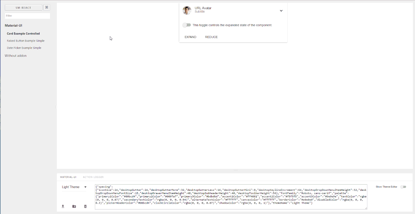](https://raw.githubusercontent.com/react-theming/storybook-addon-material-ui/master/docs/WatchMe.gif)\n\n\n## Features\n\n[](https://sm-react.github.io/storybook-boilerplate/?theme-ind=0&theme-sidebar=false&theme-full=false&knob-Title=Welcome%20to%20React-Theming&knob-Subtitle=Storybook%20Boilerplate%20Project&knob-Label1=Hello%20Button&knob-Label2=Hello%20Button&selectedKind=Material-UI&selectedStory=Components&full=0&down=1&left=1&panelRight=0&downPanel=sm%2Fstorybook-addon-material-ui%2Fmaterial-panel)\n\n- Wrapped in the theme provider. Just start to develop with base light theme.\n- Injected TapEvent Plugin. Test on mobile devices.\n- Switching themes. See how it looks in one click.\n- Creating your custom theme. By code or in visual editor.\n- Dynamic visual themes editing. Discover the all avalibale theme properties.\n- Google [material color](https://material.google.com/style/color.html#color-color-palette) palette [picker](https://github.com/sm-react/react-material-color-picker)\n- Save made changes and download in JSON file\n- Part of [React Theming](https://github.com/react-theming/react-theming). Create themable React Components.\n- Works with Storybook 3.0\n\n## Quick Start\n\nIn order to quick start with the latest `storybook-addon-material-ui` you can check out [create-material-ui-app](https://github.com/react-theming/create-material-ui-app)\n\nIt contains the working setup with:\n\n- create-react-app\n- Storybook\n- Material-UI\n- storybook-addon-material-ui\n\n---\n\n## Getting Started\n\nFirst, install the addon\n\n```shell\nnpm i storybook-addon-material-ui --save-dev\n```\n\n### Storybook 6.1\n\nAdd `storybook-addon-material-ui` to the storybook addons:\n\n```js\n//.storybook/main.js\n\nmodule.exports = {\n stories: ['../stories/**/*.stories.(js|mdx)'],\n addons: [\n 'storybook-addon-material-ui'\n ],\n};\n```\n\nAdd the decorator to storybook preview:\n\n```js\n//.storybook/preview.js\n\nimport { muiTheme } from 'storybook-addon-material-ui'\n\nexport const decorators = [\n\tmuiTheme()\n];\n\n```\n\n> Note : You can switch between the loaded themes. Out of the box, you have two base themes, but you can simply add your custom themes like this:\n```js\n//.storybook/preview.js\n\nimport { muiTheme } from 'storybook-addon-material-ui'\n\n// Create your own theme like this.\n// Note: you can specify theme name in `themeName` field. Otherwise it will be displayed by the number.\n// you can specify only required fields overriding the `Light Base Theme`\nconst newTheme = {\n themeName: 'Grey Theme',\n palette: {\n primary1Color: '#00bcd4',\n alternateTextColor: '#4a4a4a',\n canvasColor: '#616161',\n textColor: '#bdbdbd',\n secondaryTextColor: 'rgba(255, 255, 255, 0.54)',\n disabledColor: '#757575',\n accent1Color: '#607d8b',\n },\n};\n\n\nexport const decorators = [\n\tmuiTheme([newTheme])\n];\n\n```\nor even import from elsewhere\n```js\n//.storybook/preview.js\n\nimport { muiTheme } from 'storybook-addon-material-ui'\n\nimport theme1 from './src/theme/theme1'\nimport theme2 from './src/theme/theme2'\n\nexport const decorators = [\n\tmuiTheme([theme1, theme2])\n];\n\n```\n\n### Storybook 5 (and older versions)\nNow, write your stories with Material-UI Addon. By default your stories will be provided with [`Light Base Theme`](https://github.com/callemall/material-ui/blob/master/src/styles/baseThemes/lightBaseTheme.js) and [`Dark Base Theme`](https://github.com/callemall/material-ui/blob/master/src/styles/baseThemes/darkBaseTheme.js)\n\n```js\nimport React from 'react';\nimport { storiesOf, addDecorator } from '@storybook/react';\nimport {muiTheme} from 'storybook-addon-material-ui';\n\n// Import some examples from react-theming https://github.com/react-theming/react-theme-provider/blob/master/example/\nimport CardExampleControlled from '../CardExampleControlled.jsx';\nimport RaisedButtonExampleSimple from '../RaisedButtonExampleSimple.jsx';\nimport DatePickerExampleSimple from '../DatePickerExampleSimple.jsx';\n\nstoriesOf('Material-UI', module)\n// Add the `muiTheme` decorator to provide material-ui support to your stories.\n// If you do not specify any arguments it starts with two default themes\n// You can also configure `muiTheme` as a global decorator.\n .addDecorator(muiTheme())\n .add('Card Example Controlled', () => (\n \n ))\n .add('Raised Button Example Simple', () => (\n \n ))\n .add('Date Picker Example Simple', () => (\n \n ));\n```\n> Note : You can switch between the loaded themes. Out of the box, you have two base themes, but you can simply add your custom themes like this:\n\n```js\nimport React from 'react';\nimport { storiesOf, addDecorator } from '@storybook/react';\n\nimport {muiTheme} from 'storybook-addon-material-ui';\n\nimport CardExampleControlled from '../CardExampleControlled.jsx';\nimport RaisedButtonExampleSimple from '../RaisedButtonExampleSimple.jsx';\nimport DatePickerExampleSimple from '../DatePickerExampleSimple.jsx';\n\n// Create your own theme like this.\n// Note: you can specify theme name in `themeName` field. Otherwise it will be displayed by the number.\n// you can specify only required fields overriding the `Light Base Theme`\nconst newTheme = {\n themeName: 'Grey Theme',\n palette: {\n primary1Color: '#00bcd4',\n alternateTextColor: '#4a4a4a',\n canvasColor: '#616161',\n textColor: '#bdbdbd',\n secondaryTextColor: 'rgba(255, 255, 255, 0.54)',\n disabledColor: '#757575',\n accent1Color: '#607d8b',\n },\n};\n\n\n\nstoriesOf('Material-UI', module)\n .addDecorator(muiTheme([newTheme]))\n .add('Card Example Controlled', () => (\n \n ))\n .add('Raised Button Example Simple', () => (\n \n ))\n .add('Date Picker Example Simple', () => (\n \n ));\n\n\n```\n\n## Feedback\n\n**You can left your opinion about this project via anonymous [survey](https://app.qpointsurvey.com/s.aspx?c=**F2VOSpTXOlnHHqMaZKSSV5a1ylaCDoRfhut3oNCox34~**).**\n\n\n## Query string parameters\n\nAs you select themes and other options it stores in adress bar line. So this state is retained when you refresh the page and you can use direct links to the desired states.\n\n```\nhttp://localhost:9001/?theme-ind=0&theme-sidebar=true&theme-full=true\n```\n\n## CONTRIBUTING\n\n[](./.eslintrc)\n\n### Developers:\n\nOur team welcome all contributing, testing, bug fixing. If you would like\nto help contribute to the project feel free to make an issue, PR or get in touch with me.\n\n### Designers:\n\nWe would really welcome the involvement of designers in this project. We are very interested in your opinion about working with this tool, the possibility of joint work of the designer and developer as well as its appearance and capabilities\n\n#### Credits\n\n
](https://material-ui.com/styles/advanced/#theming)\n\nProvides development environment which helps creating [Material-UI Components](http://www.material-ui.com/). This is addon for [React Storybook](https://github.com/storybooks/react-storybook) which wraps your components into MuiThemeProvider. This accelerates and simplifies the [development](#getting-started-bookmark_tabs) process for Material-UI based applications.\n\nYou can use this [project's demo page](https://sm-react.github.io/storybook-boilerplate/?theme-ind=0&theme-sidebar=false&theme-full=false&knob-Title=Welcome%20to%20React-Theming&knob-Subtitle=Storybook%20Boilerplate%20Project&knob-Label1=Hello%20Button&knob-Label2=Hello%20Button&selectedKind=Material-UI&selectedStory=Components&full=0&down=1&left=1&panelRight=0&downPanel=sm%2Fstorybook-addon-material-ui%2Fmaterial-panel) to discover `Material-UI Theme Settings` for any component and create your `own new themes` right online. But to take [full advantage](#features-dizzy) of this project [run it locally](#quick-start) in your work environment.\n\n[](https://raw.githubusercontent.com/react-theming/storybook-addon-material-ui/master/docs/WatchMe.gif)\n\n\n## Features\n\n[](https://sm-react.github.io/storybook-boilerplate/?theme-ind=0&theme-sidebar=false&theme-full=false&knob-Title=Welcome%20to%20React-Theming&knob-Subtitle=Storybook%20Boilerplate%20Project&knob-Label1=Hello%20Button&knob-Label2=Hello%20Button&selectedKind=Material-UI&selectedStory=Components&full=0&down=1&left=1&panelRight=0&downPanel=sm%2Fstorybook-addon-material-ui%2Fmaterial-panel)\n\n- Wrapped in the theme provider. Just start to develop with base light theme.\n- Injected TapEvent Plugin. Test on mobile devices.\n- Switching themes. See how it looks in one click.\n- Creating your custom theme. By code or in visual editor.\n- Dynamic visual themes editing. Discover the all avalibale theme properties.\n- Google [material color](https://material.google.com/style/color.html#color-color-palette) palette [picker](https://github.com/sm-react/react-material-color-picker)\n- Save made changes and download in JSON file\n- Part of [React Theming](https://github.com/react-theming/react-theming). Create themable React Components.\n- Works with Storybook 3.0\n\n## Quick Start\n\nIn order to quick start with the latest `storybook-addon-material-ui` you can check out [create-material-ui-app](https://github.com/react-theming/create-material-ui-app)\n\nIt contains the working setup with:\n\n- create-react-app\n- Storybook\n- Material-UI\n- storybook-addon-material-ui\n\n---\n\n## Getting Started\n\nFirst, install the addon\n\n```shell\nnpm i storybook-addon-material-ui --save-dev\n```\n\n### Storybook 6.1\n\nAdd `storybook-addon-material-ui` to the storybook addons:\n\n```js\n//.storybook/main.js\n\nmodule.exports = {\n stories: ['../stories/**/*.stories.(js|mdx)'],\n addons: [\n 'storybook-addon-material-ui'\n ],\n};\n```\n\nAdd the decorator to storybook preview:\n\n```js\n//.storybook/preview.js\n\nimport { muiTheme } from 'storybook-addon-material-ui'\n\nexport const decorators = [\n\tmuiTheme()\n];\n\n```\n\n> Note : You can switch between the loaded themes. Out of the box, you have two base themes, but you can simply add your custom themes like this:\n```js\n//.storybook/preview.js\n\nimport { muiTheme } from 'storybook-addon-material-ui'\n\n// Create your own theme like this.\n// Note: you can specify theme name in `themeName` field. Otherwise it will be displayed by the number.\n// you can specify only required fields overriding the `Light Base Theme`\nconst newTheme = {\n themeName: 'Grey Theme',\n palette: {\n primary1Color: '#00bcd4',\n alternateTextColor: '#4a4a4a',\n canvasColor: '#616161',\n textColor: '#bdbdbd',\n secondaryTextColor: 'rgba(255, 255, 255, 0.54)',\n disabledColor: '#757575',\n accent1Color: '#607d8b',\n },\n};\n\n\nexport const decorators = [\n\tmuiTheme([newTheme])\n];\n\n```\nor even import from elsewhere\n```js\n//.storybook/preview.js\n\nimport { muiTheme } from 'storybook-addon-material-ui'\n\nimport theme1 from './src/theme/theme1'\nimport theme2 from './src/theme/theme2'\n\nexport const decorators = [\n\tmuiTheme([theme1, theme2])\n];\n\n```\n\n### Storybook 5 (and older versions)\nNow, write your stories with Material-UI Addon. By default your stories will be provided with [`Light Base Theme`](https://github.com/callemall/material-ui/blob/master/src/styles/baseThemes/lightBaseTheme.js) and [`Dark Base Theme`](https://github.com/callemall/material-ui/blob/master/src/styles/baseThemes/darkBaseTheme.js)\n\n```js\nimport React from 'react';\nimport { storiesOf, addDecorator } from '@storybook/react';\nimport {muiTheme} from 'storybook-addon-material-ui';\n\n// Import some examples from react-theming https://github.com/react-theming/react-theme-provider/blob/master/example/\nimport CardExampleControlled from '../CardExampleControlled.jsx';\nimport RaisedButtonExampleSimple from '../RaisedButtonExampleSimple.jsx';\nimport DatePickerExampleSimple from '../DatePickerExampleSimple.jsx';\n\nstoriesOf('Material-UI', module)\n// Add the `muiTheme` decorator to provide material-ui support to your stories.\n// If you do not specify any arguments it starts with two default themes\n// You can also configure `muiTheme` as a global decorator.\n .addDecorator(muiTheme())\n .add('Card Example Controlled', () => (\n \n ))\n .add('Raised Button Example Simple', () => (\n \n ))\n .add('Date Picker Example Simple', () => (\n \n ));\n```\n> Note : You can switch between the loaded themes. Out of the box, you have two base themes, but you can simply add your custom themes like this:\n\n```js\nimport React from 'react';\nimport { storiesOf, addDecorator } from '@storybook/react';\n\nimport {muiTheme} from 'storybook-addon-material-ui';\n\nimport CardExampleControlled from '../CardExampleControlled.jsx';\nimport RaisedButtonExampleSimple from '../RaisedButtonExampleSimple.jsx';\nimport DatePickerExampleSimple from '../DatePickerExampleSimple.jsx';\n\n// Create your own theme like this.\n// Note: you can specify theme name in `themeName` field. Otherwise it will be displayed by the number.\n// you can specify only required fields overriding the `Light Base Theme`\nconst newTheme = {\n themeName: 'Grey Theme',\n palette: {\n primary1Color: '#00bcd4',\n alternateTextColor: '#4a4a4a',\n canvasColor: '#616161',\n textColor: '#bdbdbd',\n secondaryTextColor: 'rgba(255, 255, 255, 0.54)',\n disabledColor: '#757575',\n accent1Color: '#607d8b',\n },\n};\n\n\n\nstoriesOf('Material-UI', module)\n .addDecorator(muiTheme([newTheme]))\n .add('Card Example Controlled', () => (\n \n ))\n .add('Raised Button Example Simple', () => (\n \n ))\n .add('Date Picker Example Simple', () => (\n \n ));\n\n\n```\n\n## Feedback\n\n**You can left your opinion about this project via anonymous [survey](https://app.qpointsurvey.com/s.aspx?c=**F2VOSpTXOlnHHqMaZKSSV5a1ylaCDoRfhut3oNCox34~**).**\n\n\n## Query string parameters\n\nAs you select themes and other options it stores in adress bar line. So this state is retained when you refresh the page and you can use direct links to the desired states.\n\n```\nhttp://localhost:9001/?theme-ind=0&theme-sidebar=true&theme-full=true\n```\n\n## CONTRIBUTING\n\n[](./.eslintrc)\n\n### Developers:\n\nOur team welcome all contributing, testing, bug fixing. If you would like\nto help contribute to the project feel free to make an issue, PR or get in touch with me.\n\n### Designers:\n\nWe would really welcome the involvement of designers in this project. We are very interested in your opinion about working with this tool, the possibility of joint work of the designer and developer as well as its appearance and capabilities\n\n#### Credits\n\nCreated with ❤︎ to
Storybook and
Material-UI by
Oleg Proskurin [React Theming]\n\n this.props.sendData({ themeInd })}\n />\n
\n \n \n \n Clone Theme\n \n \n \n \n \n \n \n \n {MODS_LIST.map(item => (\n \n {item.label}\n \n ))}\n \n \n {currentMode === 'palette' && (\n \n )}\n {currentMode === 'overridings' && }\n {currentMode === 'full' && }\n \n \n\n \n \n \n \n \n {'> HERE <'}\n \n \n \n \n \n \n \n \n \n );\n }\n}\n\nexport default withChannel({ EVENT_ID_INIT, EVENT_ID_DATA, EVENT_ID_BACK })(\n AddonPanel\n);\n"
},
{
"path": "src/UI/FullTheme.js",
"content": "import React from 'react';\nimport PropTypes from 'prop-types';\nimport { cx, css } from '@emotion/core';\nimport styled from '@emotion/styled';\nimport { ObjectInspector } from 'react-inspector';\nimport { MuiThemeProvider, createMuiTheme } from '@material-ui/core/styles';\n\nconst sortObjectKeys = (a, b) => {\n if (a === 'themeName') return -2;\n if (b === 'themeName') return 2;\n if (a === 'palette') return -1;\n if (b === 'palette') return 1;\n return a.charCodeAt(0) - b.charCodeAt(0);\n};\n\nconst Holder = styled('div')`\n height: 1px;\n flex-grow: 1;\n display: flex;\n flex-direction: column;\n label: PaletteHolder;\n padding: 8px;\n`;\n\nexport default ({ theme }) => (\n \n \n \n);\n"
},
{
"path": "src/UI/MuiDecorator.js",
"content": "import React from 'react';\nimport PropTypes from 'prop-types';\nimport { MuiThemeProvider, createMuiTheme } from '@material-ui/core/styles';\n\nimport withChannel from '../adk/WithChannel';\nimport { EVENT_ID_INIT, EVENT_ID_DATA, EVENT_ID_BACK } from '../config';\n\nconst currentTheme = data => {\n try {\n const theme = data.themes[data.themeInd];\n return createMuiTheme(theme);\n } catch (err) {\n return createMuiTheme({});\n }\n};\n\nconst MuiDecorator = ({ data, story }) => (\n \n {story}\n \n);\n\nexport default withChannel({ EVENT_ID_INIT, EVENT_ID_DATA, EVENT_ID_BACK })(\n MuiDecorator\n);\n"
},
{
"path": "src/UI/Overridings.js",
"content": "import React from 'react';\nimport PropTypes from 'prop-types';\nimport { cx, css } from '@emotion/core';\nimport styled from '@emotion/styled';\nimport { ObjectInspector } from 'react-inspector';\n\nconst sortObjectKeys = (a, b) => {\n if (a === 'themeName') return -2;\n if (b === 'themeName') return 2;\n if (a === 'palette') return -1;\n if (b === 'palette') return 1;\n return a.charCodeAt(0) - b.charCodeAt(0);\n};\n\nconst Holder = styled('div')`\n height: 1px;\n flex-grow: 1;\n display: flex;\n flex-direction: column;\n label: PaletteHolder;\n padding: 8px;\n`;\n\nexport default ({ theme }) => (\n \n \n \n);\n"
},
{
"path": "src/UI/Palette.js",
"content": "import React from 'react';\nimport PropTypes from 'prop-types';\nimport { cx, css } from '@emotion/core';\nimport styled from '@emotion/styled';\nimport { ObjectInspector } from 'react-inspector';\nimport { MuiThemeProvider, createMuiTheme } from '@material-ui/core/styles';\nimport MaterialColorPicker from '@usulpro/color-picker';\n\nconst sortObjectKeys = (a, b) => {\n if (a === 'themeName') return -2;\n if (b === 'themeName') return 2;\n if (a === 'palette') return -1;\n if (b === 'palette') return 1;\n return a.charCodeAt(0) - b.charCodeAt(0);\n};\n\nconst PaletteHolder = styled('div')`\n height: 1px;\n flex-grow: 1;\n display: flex;\n flex-direction: column;\n background-color: ${props =>\n props.dark ? 'hsl(0, 0%, 44%)' : 'hsl(0, 0%, 90%)'};\n color: ${props => (props.dark ? 'hsl(0, 0%, 90%)' : 'hsl(0, 0%, 44%)')};\n label: PaletteHolder;\n padding: 8px;\n position: relative;\n`;\n\nconst PickerOverlap = styled('div')`\n position: absolute;\n background-color: hsl(0, 0%, 0%, 0.8);\n left: 0px;\n right: 0px;\n top: 0px;\n bottom: 0px;\n display: flex;\n justify-content: center;\n align-items: center;\n`;\n\nconst PickerHolder = styled('div')`\n width: 70%;\n max-width: 500px;\n min-width: 250px;\n background-color: hsl(0, 0%, 50%);\n`;\n\nconst ColorInput = styled('div')`\n margin-left: 2px;\n margin-top: 8px;\n color: hsl(0, 0%, 30%);\n & input {\n margin-right: 4px;\n }\n`;\n\nexport default class Palette extends React.Component {\n static propTypes = {\n theme: PropTypes.shape()\n };\n\n\n state = {\n isPickerOpen: false,\n editColor: '',\n palette: this.props.theme.palette,\n path: []\n };\n\n prevColor = '';\n\n onChange = () => {\n this.props.onChangePalette(this.state.palette);\n };\n\n setPath = (path, isPickerOpen) => () => {\n const { palette } = this.state;\n this.setState(\n {\n path,\n editColor: createMuiTheme({ palette }).palette[path[0]][path[1]],\n isPickerOpen\n },\n () => {\n this.prevColor = this.state.editColor;\n }\n );\n };\n\n updPalette = (ev, cb) => {\n const { path, palette } = this.state;\n const editColor = ev.target.value || this.prevColor;\n const newPalette = {\n ...palette,\n [path[0]]: {\n ...palette[path[0]],\n [path[1]]: editColor\n }\n };\n this.setState({ editColor, palette: newPalette }, cb);\n };\n\n onSubmit = ev => {\n this.updPalette(ev, () => {\n this.onChange();\n this.setState({ isPickerOpen: false });\n this.prevColor = this.state.editColor;\n });\n };\n\n onReset = ev => {\n this.updPalette(ev, () => {\n this.onChange();\n this.setState({ isPickerOpen: false });\n });\n };\n\n onHover = ev => {\n this.updPalette(ev, () => {\n this.onChange();\n });\n };\n\n renderColorInput = () => (\n \n \n \n \n );\n\n renderColorSet = (colorSet, name, isDark) => {\n const { main, light, dark, contrastText } = colorSet;\n const Plate = styled('div')`\n display: flex;\n justify-content: space-between;\n height: 20px;\n margin: 2px;\n margin-bottom: ${props => (props.up ? '0px' : '2px')};\n margin-top: ${props => (!props.up ? '0px' : '2px')};\n `;\n const ColorBox = styled('div')`\n background-color: ${props => props.color || 'rgba(0, 0, 0, 0.1)'};\n width: 1px;\n flex-grow: 1;\n border: 1px solid ${isDark ? 'hsl(0, 0%, 80%)' : 'hsl(0, 0%, 44%)'};\n border: ${props => (props.color ? '' : 'none')};\n cursor: ${props => (props.color ? 'pointer' : 'text')};\n `;\n const ColorName = styled('div')`\n background-color: rgba(0, 0, 0, 0.1);\n width: 80px;\n padding-left: 4px;\n `;\n return (\n <>\n \n {name}\n \n \n \n \n \n \n \n \n {`light: ${light}`}\n \n \n {`main: ${main}`}\n \n \n {`dark: ${dark}`}\n \n \n {`contrastText: ${contrastText}`}\n \n \n \n );\n };\n\n render() {\n const { palette } = createMuiTheme({ palette: this.state.palette });\n const colorSet = name =>\n this.renderColorSet(\n palette[name],\n name,\n this.state.palette.type === 'dark'\n );\n\n return (\n \n {colorSet('primary')}\n {colorSet('secondary')}\n {colorSet('error')}\n {this.renderColorInput()}\n {this.state.isPickerOpen && (\n \n \n \n \n \n )}\n \n );\n }\n}\n"
},
{
"path": "src/Utils/index.js",
"content": "\n\nexport function copyToClipboard(text) {\n console.log(text);\n const copyText = text;\n return () => {\n console.info(copyText);\n const textElem = document.createElement('textarea');\n document.body.appendChild(textElem);\n textElem.value = text;\n textElem.select();\n\n let successful;\n try {\n successful = document.execCommand('copy');\n } catch (err) {\n console.warn('cant copy to clipboard');\n }\n textElem.remove();\n return successful;\n };\n}\n\nexport function copyToClipboardThis(text) {\n const textElem = document.createElement('textarea');\n document.body.appendChild(textElem);\n textElem.value = text;\n textElem.select();\n\n let successful;\n try {\n successful = document.execCommand('copy');\n } catch (err) {\n console.warn('cant copy to clipboard');\n }\n textElem.remove();\n return successful;\n}\n\n"
},
{
"path": "src/Utils/svg_package.js",
"content": "(function webpackUniversalModuleDefinition(root, factory) {\n if (typeof exports === 'object' && typeof module === 'object') { module.exports = factory(); } else if (typeof define === 'function' && define.amd) { define([], factory); } else if (typeof exports === 'object') { exports.svg_package = factory(); } else\t\t{ root.svg_package = factory(); }\n}(this, function () {\n return /** ****/ (function (modules) { // webpackBootstrap\n/** ****/ \t// The module cache\n /** ****/ \tconst installedModules = {};\n\n/** ****/ \t// The require function\n /** ****/ \tfunction __webpack_require__(moduleId) {\n/** ****/ \t\t// Check if module is in cache\n /** ****/ \t\tif (installedModules[moduleId])\n /** ****/ \t\t\t{ return installedModules[moduleId].exports; }\n\n/** ****/ \t\t// Create a new module (and put it into the cache)\n /** ****/ \t\tconst module = installedModules[moduleId] = {\n /** ****/ \t\t\ti: moduleId,\n /** ****/ \t\t\tl: false,\n /** ****/ \t\t\texports: {},\n /** ****/ \t\t};\n\n/** ****/ \t\t// Execute the module function\n /** ****/ \t\tmodules[moduleId].call(module.exports, module, module.exports, __webpack_require__);\n\n/** ****/ \t\t// Flag the module as loaded\n /** ****/ \t\tmodule.l = true;\n\n/** ****/ \t\t// Return the exports of the module\n /** ****/ \t\treturn module.exports;\n /** ****/ \t}\n\n\n/** ****/ \t// expose the modules object (__webpack_modules__)\n /** ****/ \t__webpack_require__.m = modules;\n\n/** ****/ \t// expose the module cache\n /** ****/ \t__webpack_require__.c = installedModules;\n\n/** ****/ \t// identity function for calling harmony imports with the correct context\n /** ****/ \t__webpack_require__.i = function (value) { return value; };\n\n/** ****/ \t// define getter function for harmony exports\n /** ****/ \t__webpack_require__.d = function (exports, name, getter) {\n /** ****/ \t\tif (!__webpack_require__.o(exports, name)) {\n /** ****/ \t\t\tObject.defineProperty(exports, name, {\n /** ****/ \t\t\t\tconfigurable: false,\n /** ****/ \t\t\t\tenumerable: true,\n /** ****/ \t\t\t\tget: getter,\n /** ****/ \t\t\t});\n /** ****/ \t\t}\n /** ****/ \t};\n\n/** ****/ \t// getDefaultExport function for compatibility with non-harmony modules\n /** ****/ \t__webpack_require__.n = function (module) {\n /** ****/ \t\tconst getter = module && module.__esModule ?\n/** ****/ \t\t\tfunction getDefault() { return module.default; } :\n/** ****/ \t\t\tfunction getModuleExports() { return module; };\n /** ****/ \t\t__webpack_require__.d(getter, 'a', getter);\n /** ****/ \t\treturn getter;\n /** ****/ \t};\n\n/** ****/ \t// Object.prototype.hasOwnProperty.call\n /** ****/ \t__webpack_require__.o = function (object, property) { return Object.prototype.hasOwnProperty.call(object, property); };\n\n/** ****/ \t// __webpack_public_path__\n /** ****/ \t__webpack_require__.p = '';\n\n/** ****/ \t// Load entry module and return exports\n /** ****/ \treturn __webpack_require__(__webpack_require__.s = 35);\n /** ****/ }([\n/* 0 */\n/** */ (function (module, exports) {\n module.exports = 'data:image/png;base64,iVBORw0KGgoAAAANSUhEUgAAADAAAAAwCAIAAADYYG7QAAAAB3RJTUUH4QEaBzIA+ze+OAAAAaBJREFUeJztl82RhiAMQHEbgBK+DqAT6ABLsAPsBEqwE+wkJbAHZ5yIQvwWZ9YD78SBn2eABIeUEnsTP/8tkNOFKLoQRRei6EIUXYgkVQGAEIIxRinVsopSyhgTQgCA+opFIQCY51kI8dSXbwgh5nmuaF0LAUBjSOoopUpOF0IA8HhgzgghLp1yoXNsOOfOuRjj1iHG6JzjnLc7XcYpF3LO4THW2svvAABrbbuTc64mlG2W1vqsgml3Om/cQch7v3flnJNXFADa9857j+c8JMZlWfb2NE3k0RZCTNPUKIQXZeyYGPFx3k9xnRhjo5BSCk84JPTXMQwDFr05Ix71N/Bar6tlByEp5d5e1/XO+JvdKuBFc6HP57O387NW4Ga3CnhRxljx2pdSe3bt24tMdu3zxIjzijGmLjSOY6PNOdsRpcMYUyod7TaMLB0b2SnbXjC4uD71TpJS0sU1PVQQSEqlqfhAy+L0LJexqQltPPXuwWyvq6+fsDhU3nutdWPApJRaa+89mUoOtewNvLuWvYEuRNGFKLoQRRei6EIUrxP6BcmQ7xzbjmd9AAAAAElFTkSuQmCC';\n/** */ }),\n/* 1 */\n/** */ (function (module, exports) {\n module.exports = 'data:image/png;base64,iVBORw0KGgoAAAANSUhEUgAAADAAAAAwCAYAAABXAvmHAAACBklEQVRoQ+1X7TEEQRB9FwEhEAEyIAIyQASIABkQASJABGSACAiBCKhXtaN253pmenau72rp+XVV19Pb773+mhkmfmYTjx8OYNUKugKuQCMDnkKNBDZfdwWaKWx08K8UWAewD+AAwAaA7Uby4uuvAD4APAB4BPCp8a9RgIGfADgFwN/LOAz+CsB1CUgJAAN+MmBbSwJV2cuByAFg8O9LZD0FimpspkCkAFgz/9WlCPOdLPOwplhfTNW1CE1SiRSACwDnWp0r7e66IFNFSvKY/4eR30sAjGtwJACWqcPgj5SAqQ67XjhiKkkA+IEb5UdqzJg2bL+q9tjVHttqP52OAdz2PyoBiJHXBJmzFVOg4DxOZc4H1snvkQC8GLXNnV7BaklhYTOecFjM9JMF8K31XmlXmjkpd3E8Az+S08kDoExblexqzBeRQm9xev/JIrZqo9mVQJBQmkeqNsqLcf/VpIjGhj2cQWjOfdQyxTmyilWCIM4yA40EcpAO+j0A9SpBdujk2aiY6T/s+xxM/WWOq4P07pgr3iBhaZ22SiVNCgWb7ApSGi7WSpSAkPndsQ+a4JwgKKu0p5cCGPt/eC/Mrc+xw5ICfXsCYWGFR/2ihx3ZDo96LpSqrbUGwFg2Te85AFN6Fc5dAQVJpiaugCm9CueugIIkUxNXwJRehXNXQEGSqcnkFfgBKMNcMdUsPWUAAAAASUVORK5CYII=';\n/** */ }),\n/* 2 */\n/** */ (function (module, exports) {\n module.exports = 'data:image/svg+xml;base64,PHN2ZyBmaWxsPSIjMDAwMDAwIiBoZWlnaHQ9IjE4IiB2aWV3Qm94PSIwIDAgMjQgMjQiIHdpZHRoPSIxOCIgeG1sbnM9Imh0dHA6Ly93d3cudzMub3JnLzIwMDAvc3ZnIj4KICAgIDxwYXRoIGQ9Ik0yMCAySDRjLTEuMSAwLTEuOTkuOS0xLjk5IDJMMiAyMmw0LTRoMTRjMS4xIDAgMi0uOSAyLTJWNGMwLTEuMS0uOS0yLTItMnptLTcgOWgtMlY1aDJ2NnptMCA0aC0ydi0yaDJ2MnoiLz4KICAgIDxwYXRoIGQ9Ik0wIDBoMjR2MjRIMHoiIGZpbGw9Im5vbmUiLz4KPC9zdmc+';\n/** */ }),\n/* 3 */\n/** */ (function (module, exports) {\n module.exports = 'data:image/svg+xml;base64,PHN2ZyBmaWxsPSIjMDAwMDAwIiBoZWlnaHQ9IjE4IiB2aWV3Qm94PSIwIDAgMjQgMjQiIHdpZHRoPSIxOCIgeG1sbnM9Imh0dHA6Ly93d3cudzMub3JnLzIwMDAvc3ZnIj4KICAgIDxwYXRoIGQ9Ik0xMiA2djNsNC00LTQtNHYzYy00LjQyIDAtOCAzLjU4LTggOCAwIDEuNTcuNDYgMy4wMyAxLjI0IDQuMjZMNi43IDE0LjhjLS40NS0uODMtLjctMS43OS0uNy0yLjggMC0zLjMxIDIuNjktNiA2LTZ6bTYuNzYgMS43NEwxNy4zIDkuMmMuNDQuODQuNyAxLjc5LjcgMi44IDAgMy4zMS0yLjY5IDYtNiA2di0zbC00IDQgNCA0di0zYzQuNDIgMCA4LTMuNTggOC04IDAtMS41Ny0uNDYtMy4wMy0xLjI0LTQuMjZ6Ii8+CiAgICA8cGF0aCBkPSJNMCAwaDI0djI0SDB6IiBmaWxsPSJub25lIi8+Cjwvc3ZnPg==';\n/** */ }),\n/* 4 */\n/** */ (function (module, exports) {\n module.exports = 'data:image/svg+xml;base64,PHN2ZyBmaWxsPSIjMDAwMDAwIiBoZWlnaHQ9IjE4IiB2aWV3Qm94PSIwIDAgMjQgMjQiIHdpZHRoPSIxOCIgeG1sbnM9Imh0dHA6Ly93d3cudzMub3JnLzIwMDAvc3ZnIj4KICAgIDxwYXRoIGQ9Ik0xNyAzSDdjLTEuMSAwLTEuOTkuOS0xLjk5IDJMNSAyMWw3LTMgNyAzVjVjMC0xLjEtLjktMi0yLTJ6bTAgMTVsLTUtMi4xOEw3IDE4VjVoMTB2MTN6Ii8+CiAgICA8cGF0aCBkPSJNMCAwaDI0djI0SDB6IiBmaWxsPSJub25lIi8+Cjwvc3ZnPg==';\n/** */ }),\n/* 5 */\n/** */ (function (module, exports) {\n module.exports = 'data:image/svg+xml;base64,PHN2ZyBmaWxsPSIjMDAwMDAwIiBoZWlnaHQ9IjE4IiB2aWV3Qm94PSIwIDAgMjQgMjQiIHdpZHRoPSIxOCIgeG1sbnM9Imh0dHA6Ly93d3cudzMub3JnLzIwMDAvc3ZnIj4KICAgIDxwYXRoIGNsaXAtcnVsZT0iZXZlbm9kZCIgZD0iTTAgMGgyNHYyNEgweiIgZmlsbD0ibm9uZSIvPgogICAgPHBhdGggZD0iTTIyLjcgMTlsLTkuMS05LjFjLjktMi4zLjQtNS0xLjUtNi45LTItMi01LTIuNC03LjQtMS4zTDkgNiA2IDkgMS42IDQuN0MuNCA3LjEuOSAxMC4xIDIuOSAxMi4xYzEuOSAxLjkgNC42IDIuNCA2LjkgMS41bDkuMSA5LjFjLjQuNCAxIC40IDEuNCAwbDIuMy0yLjNjLjUtLjQuNS0xLjEuMS0xLjR6Ii8+Cjwvc3ZnPg==';\n/** */ }),\n/* 6 */\n/** */ (function (module, exports) {\n module.exports = 'data:image/svg+xml;base64,PHN2ZyBmaWxsPSIjMDAwMDAwIiBoZWlnaHQ9IjI0IiB2aWV3Qm94PSIwIDAgMjQgMjQiIHdpZHRoPSIyNCIgeG1sbnM9Imh0dHA6Ly93d3cudzMub3JnLzIwMDAvc3ZnIj4KICAgIDxwYXRoIGQ9Ik0wIDBoMjR2MjRIMHoiIGZpbGw9Im5vbmUiLz4KICAgIDxwYXRoIGQ9Ik0xOSAzSDVjLTEuMTEgMC0yIC45LTIgMnYxNGMwIDEuMS44OSAyIDIgMmgxNGMxLjExIDAgMi0uOSAyLTJWNWMwLTEuMS0uODktMi0yLTJ6bS05IDE0bC01LTUgMS40MS0xLjQxTDEwIDE0LjE3bDcuNTktNy41OUwxOSA4bC05IDl6Ii8+Cjwvc3ZnPg==';\n/** */ }),\n/* 7 */\n/** */ (function (module, exports) {\n module.exports = 'data:image/svg+xml;base64,PHN2ZyBmaWxsPSIjMDAwMDAwIiBoZWlnaHQ9IjI0IiB2aWV3Qm94PSIwIDAgMjQgMjQiIHdpZHRoPSIyNCIgeG1sbnM9Imh0dHA6Ly93d3cudzMub3JnLzIwMDAvc3ZnIj4KICAgIDxwYXRoIGQ9Ik0xOSA1djE0SDVWNWgxNG0wLTJINWMtMS4xIDAtMiAuOS0yIDJ2MTRjMCAxLjEuOSAyIDIgMmgxNGMxLjEgMCAyLS45IDItMlY1YzAtMS4xLS45LTItMi0yeiIvPgogICAgPHBhdGggZD0iTTAgMGgyNHYyNEgweiIgZmlsbD0ibm9uZSIvPgo8L3N2Zz4=';\n/** */ }),\n/* 8 */\n/** */ (function (module, exports) {\n module.exports = 'data:image/svg+xml;base64,PHN2ZyBmaWxsPSIjMDAwMDAwIiBoZWlnaHQ9IjE4IiB2aWV3Qm94PSIwIDAgMjQgMjQiIHdpZHRoPSIxOCIgeG1sbnM9Imh0dHA6Ly93d3cudzMub3JnLzIwMDAvc3ZnIj4KICAgIDxwYXRoIGQ9Ik0xOSA2LjQxTDE3LjU5IDUgMTIgMTAuNTkgNi40MSA1IDUgNi40MSAxMC41OSAxMiA1IDE3LjU5IDYuNDEgMTkgMTIgMTMuNDEgMTcuNTkgMTkgMTkgMTcuNTkgMTMuNDEgMTJ6Ii8+CiAgICA8cGF0aCBkPSJNMCAwaDI0djI0SDB6IiBmaWxsPSJub25lIi8+Cjwvc3ZnPg==';\n/** */ }),\n/* 9 */\n/** */ (function (module, exports) {\n module.exports = 'data:image/svg+xml;base64,PHN2ZyBmaWxsPSIjMDAwMDAwIiBoZWlnaHQ9IjE4IiB2aWV3Qm94PSIwIDAgMjQgMjQiIHdpZHRoPSIxOCIgeG1sbnM9Imh0dHA6Ly93d3cudzMub3JnLzIwMDAvc3ZnIj4KICAgIDxwYXRoIGQ9Ik0wIDBoMjR2MjRIMFYweiIgZmlsbD0ibm9uZSIvPgogICAgPHBhdGggZD0iTTkuNCAxNi42TDQuOCAxMmw0LjYtNC42TDggNmwtNiA2IDYgNiAxLjQtMS40em01LjIgMGw0LjYtNC42LTQuNi00LjZMMTYgNmw2IDYtNiA2LTEuNC0xLjR6Ii8+Cjwvc3ZnPg==';\n/** */ }),\n/* 10 */\n/** */ (function (module, exports) {\n module.exports = 'data:image/svg+xml;base64,PHN2ZyBmaWxsPSIjMDAwMDAwIiBoZWlnaHQ9IjE4IiB2aWV3Qm94PSIwIDAgMjQgMjQiIHdpZHRoPSIxOCIgeG1sbnM9Imh0dHA6Ly93d3cudzMub3JnLzIwMDAvc3ZnIj4KICAgIDxwYXRoIGQ9Ik0wIDBoMjR2MjRIMHoiIGZpbGw9Im5vbmUiLz4KICAgIDxwYXRoIGQ9Ik0xNiAxSDRjLTEuMSAwLTIgLjktMiAydjE0aDJWM2gxMlYxem0zIDRIOGMtMS4xIDAtMiAuOS0yIDJ2MTRjMCAxLjEuOSAyIDIgMmgxMWMxLjEgMCAyLS45IDItMlY3YzAtMS4xLS45LTItMi0yem0wIDE2SDhWN2gxMXYxNHoiLz4KPC9zdmc+';\n/** */ }),\n/* 11 */\n/** */ (function (module, exports) {\n module.exports = 'data:image/svg+xml;base64,PHN2ZyBmaWxsPSIjMDAwMDAwIiBoZWlnaHQ9IjE4IiB2aWV3Qm94PSIwIDAgMjQgMjQiIHdpZHRoPSIxOCIgeG1sbnM9Imh0dHA6Ly93d3cudzMub3JnLzIwMDAvc3ZnIj4KICAgIDxwYXRoIGQ9Ik0wIDBoMjR2MjRIMHoiIGZpbGw9Im5vbmUiLz4KICAgIDxjaXJjbGUgY3g9IjYiIGN5PSIxOCIgZmlsbD0ibm9uZSIgcj0iMiIvPgogICAgPGNpcmNsZSBjeD0iMTIiIGN5PSIxMiIgZmlsbD0ibm9uZSIgcj0iLjUiLz4KICAgIDxjaXJjbGUgY3g9IjYiIGN5PSI2IiBmaWxsPSJub25lIiByPSIyIi8+CiAgICA8cGF0aCBkPSJNOS42NCA3LjY0Yy4yMy0uNS4zNi0xLjA1LjM2LTEuNjQgMC0yLjIxLTEuNzktNC00LTRTMiAzLjc5IDIgNnMxLjc5IDQgNCA0Yy41OSAwIDEuMTQtLjEzIDEuNjQtLjM2TDEwIDEybC0yLjM2IDIuMzZDNy4xNCAxNC4xMyA2LjU5IDE0IDYgMTRjLTIuMjEgMC00IDEuNzktNCA0czEuNzkgNCA0IDQgNC0xLjc5IDQtNGMwLS41OS0uMTMtMS4xNC0uMzYtMS42NEwxMiAxNGw3IDdoM3YtMUw5LjY0IDcuNjR6TTYgOGMtMS4xIDAtMi0uODktMi0ycy45LTIgMi0yIDIgLjg5IDIgMi0uOSAyLTIgMnptMCAxMmMtMS4xIDAtMi0uODktMi0ycy45LTIgMi0yIDIgLjg5IDIgMi0uOSAyLTIgMnptNi03LjVjLS4yOCAwLS41LS4yMi0uNS0uNXMuMjItLjUuNS0uNS41LjIyLjUuNS0uMjIuNS0uNS41ek0xOSAzbC02IDYgMiAyIDctN1YzeiIvPgo8L3N2Zz4=';\n/** */ }),\n/* 12 */\n/** */ (function (module, exports) {\n module.exports = 'data:image/svg+xml;base64,PHN2ZyBmaWxsPSIjMDAwMDAwIiBoZWlnaHQ9IjE4IiB2aWV3Qm94PSIwIDAgMjQgMjQiIHdpZHRoPSIxOCIgeG1sbnM9Imh0dHA6Ly93d3cudzMub3JnLzIwMDAvc3ZnIj4KICAgIDxwYXRoIGQ9Ik0xOSAyaC00LjE4QzE0LjQuODQgMTMuMyAwIDEyIDBjLTEuMyAwLTIuNC44NC0yLjgyIDJINWMtMS4xIDAtMiAuOS0yIDJ2MTZjMCAxLjEuOSAyIDIgMmgxNGMxLjEgMCAyLS45IDItMlY0YzAtMS4xLS45LTItMi0yem0tNyAwYy41NSAwIDEgLjQ1IDEgMXMtLjQ1IDEtMSAxLTEtLjQ1LTEtMSAuNDUtMSAxLTF6bTcgMThINVY0aDJ2M2gxMFY0aDJ2MTZ6Ii8+CiAgICA8cGF0aCBkPSJNMCAwaDI0djI0SDB6IiBmaWxsPSJub25lIi8+Cjwvc3ZnPg==';\n/** */ }),\n/* 13 */\n/** */ (function (module, exports) {\n module.exports = 'data:image/svg+xml;base64,PHN2ZyBmaWxsPSIjMDAwMDAwIiBoZWlnaHQ9IjE4IiB2aWV3Qm94PSIwIDAgMjQgMjQiIHdpZHRoPSIxOCIgeG1sbnM9Imh0dHA6Ly93d3cudzMub3JnLzIwMDAvc3ZnIj4KICAgIDxwYXRoIGQ9Ik02IDE5YzAgMS4xLjkgMiAyIDJoOGMxLjEgMCAyLS45IDItMlY3SDZ2MTJ6TTE5IDRoLTMuNWwtMS0xaC01bC0xIDFINXYyaDE0VjR6Ii8+CiAgICA8cGF0aCBkPSJNMCAwaDI0djI0SDB6IiBmaWxsPSJub25lIi8+Cjwvc3ZnPg==';\n/** */ }),\n/* 14 */\n/** */ (function (module, exports) {\n module.exports = 'data:image/svg+xml;base64,PHN2ZyBmaWxsPSIjMDAwMDAwIiBoZWlnaHQ9IjE4IiB2aWV3Qm94PSIwIDAgMjQgMjQiIHdpZHRoPSIxOCIgeG1sbnM9Imh0dHA6Ly93d3cudzMub3JnLzIwMDAvc3ZnIj4KICAgIDxwYXRoIGQ9Ik0wIDBoMjR2MjRIMFYweiIgZmlsbD0ibm9uZSIvPgogICAgPHBhdGggZD0iTTYgMTljMCAxLjEuOSAyIDIgMmg4YzEuMSAwIDItLjkgMi0yVjdINnYxMnptMi40Ni03LjEybDEuNDEtMS40MUwxMiAxMi41OWwyLjEyLTIuMTIgMS40MSAxLjQxTDEzLjQxIDE0bDIuMTIgMi4xMi0xLjQxIDEuNDFMMTIgMTUuNDFsLTIuMTIgMi4xMi0xLjQxLTEuNDFMMTAuNTkgMTRsLTIuMTMtMi4xMnpNMTUuNSA0bC0xLTFoLTVsLTEgMUg1djJoMTRWNHoiLz4KICAgIDxwYXRoIGQ9Ik0wIDBoMjR2MjRIMHoiIGZpbGw9Im5vbmUiLz4KPC9zdmc+';\n/** */ }),\n/* 15 */\n/** */ (function (module, exports) {\n module.exports = 'data:image/svg+xml;base64,PHN2ZyBmaWxsPSIjMDAwMDAwIiBoZWlnaHQ9IjE4IiB2aWV3Qm94PSIwIDAgMjQgMjQiIHdpZHRoPSIxOCIgeG1sbnM9Imh0dHA6Ly93d3cudzMub3JnLzIwMDAvc3ZnIj4KICAgIDxwYXRoIGQ9Ik00IDE4bDguNS02TDQgNnYxMnptOS0xMnYxMmw4LjUtNkwxMyA2eiIvPgogICAgPHBhdGggZD0iTTAgMGgyNHYyNEgweiIgZmlsbD0ibm9uZSIvPgo8L3N2Zz4=';\n/** */ }),\n/* 16 */\n/** */ (function (module, exports) {\n module.exports = 'data:image/svg+xml;base64,PHN2ZyBmaWxsPSIjMDAwMDAwIiBoZWlnaHQ9IjE4IiB2aWV3Qm94PSIwIDAgMjQgMjQiIHdpZHRoPSIxOCIgeG1sbnM9Imh0dHA6Ly93d3cudzMub3JnLzIwMDAvc3ZnIj4KICAgIDxwYXRoIGQ9Ik0xMSAxOFY2bC04LjUgNiA4LjUgNnptLjUtNmw4LjUgNlY2bC04LjUgNnoiLz4KICAgIDxwYXRoIGQ9Ik0wIDBoMjR2MjRIMHoiIGZpbGw9Im5vbmUiLz4KPC9zdmc+';\n/** */ }),\n/* 17 */\n/** */ (function (module, exports) {\n module.exports = 'data:image/svg+xml;base64,PHN2ZyBmaWxsPSIjMDAwMDAwIiBoZWlnaHQ9IjE4IiB2aWV3Qm94PSIwIDAgMjQgMjQiIHdpZHRoPSIxOCIgeG1sbnM9Imh0dHA6Ly93d3cudzMub3JnLzIwMDAvc3ZnIj4KICAgIDxwYXRoIGQ9Ik0xOSA5aC00VjNIOXY2SDVsNyA3IDctN3pNNSAxOHYyaDE0di0ySDV6Ii8+CiAgICA8cGF0aCBkPSJNMCAwaDI0djI0SDB6IiBmaWxsPSJub25lIi8+Cjwvc3ZnPg==';\n/** */ }),\n/* 18 */\n/** */ (function (module, exports) {\n module.exports = 'data:image/svg+xml;base64,PHN2ZyBmaWxsPSIjMDAwMDAwIiBoZWlnaHQ9IjE4IiB2aWV3Qm94PSIwIDAgMjQgMjQiIHdpZHRoPSIxOCIgeG1sbnM9Imh0dHA6Ly93d3cudzMub3JnLzIwMDAvc3ZnIj4KICAgIDxwYXRoIGQ9Ik0wIDBoMjR2MjRIMHoiIGZpbGw9Im5vbmUiLz4KICAgIDxwYXRoIGQ9Ik0xMSAxOGgydi0yaC0ydjJ6bTEtMTZDNi40OCAyIDIgNi40OCAyIDEyczQuNDggMTAgMTAgMTAgMTAtNC40OCAxMC0xMFMxNy41MiAyIDEyIDJ6bTAgMThjLTQuNDEgMC04LTMuNTktOC04czMuNTktOCA4LTggOCAzLjU5IDggOC0zLjU5IDgtOCA4em0wLTE0Yy0yLjIxIDAtNCAxLjc5LTQgNGgyYzAtMS4xLjktMiAyLTJzMiAuOSAyIDJjMCAyLTMgMS43NS0zIDVoMmMwLTIuMjUgMy0yLjUgMy01IDAtMi4yMS0xLjc5LTQtNC00eiIvPgo8L3N2Zz4=';\n/** */ }),\n/* 19 */\n/** */ (function (module, exports) {\n module.exports = 'data:image/svg+xml;base64,PHN2ZyBmaWxsPSIjMDAwMDAwIiBoZWlnaHQ9IjE4IiB2aWV3Qm94PSIwIDAgMjQgMjQiIHdpZHRoPSIxOCIgeG1sbnM9Imh0dHA6Ly93d3cudzMub3JnLzIwMDAvc3ZnIj4KICAgIDxwYXRoIGQ9Ik0wIDBoMjR2MjRIMHoiIGZpbGw9Im5vbmUiLz4KICAgIDxwYXRoIGQ9Ik0xNC41OSA4TDEyIDEwLjU5IDkuNDEgOCA4IDkuNDEgMTAuNTkgMTIgOCAxNC41OSA5LjQxIDE2IDEyIDEzLjQxIDE0LjU5IDE2IDE2IDE0LjU5IDEzLjQxIDEyIDE2IDkuNDEgMTQuNTkgOHpNMTIgMkM2LjQ3IDIgMiA2LjQ3IDIgMTJzNC40NyAxMCAxMCAxMCAxMC00LjQ3IDEwLTEwUzE3LjUzIDIgMTIgMnptMCAxOGMtNC40MSAwLTgtMy41OS04LThzMy41OS04IDgtOCA4IDMuNTkgOCA4LTMuNTkgOC04IDh6Ii8+Cjwvc3ZnPg==';\n/** */ }),\n/* 20 */\n/** */ (function (module, exports) {\n module.exports = 'data:image/svg+xml;base64,PHN2ZyBmaWxsPSIjMDAwMDAwIiBoZWlnaHQ9IjE4IiB2aWV3Qm94PSIwIDAgMjQgMjQiIHdpZHRoPSIxOCIgeG1sbnM9Imh0dHA6Ly93d3cudzMub3JnLzIwMDAvc3ZnIj4KICAgIDxwYXRoIGQ9Ik0wIDBoMjR2MjRIMHoiIGZpbGw9Im5vbmUiLz4KICAgIDxwYXRoIGQ9Ik0xMyAzYy00Ljk3IDAtOSA0LjAzLTkgOUgxbDMuODkgMy44OS4wNy4xNEw5IDEySDZjMC0zLjg3IDMuMTMtNyA3LTdzNyAzLjEzIDcgNy0zLjEzIDctNyA3Yy0xLjkzIDAtMy42OC0uNzktNC45NC0yLjA2bC0xLjQyIDEuNDJDOC4yNyAxOS45OSAxMC41MSAyMSAxMyAyMWM0Ljk3IDAgOS00LjAzIDktOXMtNC4wMy05LTktOXptLTEgNXY1bDQuMjggMi41NC43Mi0xLjIxLTMuNS0yLjA4VjhIMTJ6Ii8+Cjwvc3ZnPg==';\n/** */ }),\n/* 21 */\n/** */ (function (module, exports) {\n module.exports = 'data:image/svg+xml;base64,PHN2ZyBmaWxsPSIjMDAwMDAwIiBoZWlnaHQ9IjE4IiB2aWV3Qm94PSIwIDAgMjQgMjQiIHdpZHRoPSIxOCIgeG1sbnM9Imh0dHA6Ly93d3cudzMub3JnLzIwMDAvc3ZnIj4KICAgIDxwYXRoIGQ9Ik0wIDBoMjR2MjRIMHoiIGZpbGw9Im5vbmUiLz4KICAgIDxwYXRoIGQ9Ik00IDZIMnYxNGMwIDEuMS45IDIgMiAyaDE0di0ySDRWNnptMTYtNEg4Yy0xLjEgMC0yIC45LTIgMnYxMmMwIDEuMS45IDIgMiAyaDEyYzEuMSAwIDItLjkgMi0yVjRjMC0xLjEtLjktMi0yLTJ6bS0xIDloLTR2NGgtMnYtNEg5VjloNFY1aDJ2NGg0djJ6Ii8+Cjwvc3ZnPg==';\n/** */ }),\n/* 22 */\n/** */ (function (module, exports) {\n module.exports = 'data:image/svg+xml;base64,PHN2ZyBmaWxsPSIjMDAwMDAwIiBoZWlnaHQ9IjE4IiB2aWV3Qm94PSIwIDAgMjQgMjQiIHdpZHRoPSIxOCIgeG1sbnM9Imh0dHA6Ly93d3cudzMub3JnLzIwMDAvc3ZnIj4KICAgIDxwYXRoIGQ9Ik0wIDBoMjR2MjRIMHoiIGZpbGw9Im5vbmUiLz4KICAgIDxwYXRoIGQ9Ik0zIDE4aDE4di0ySDN2MnptMC01aDE4di0ySDN2MnptMC03djJoMThWNkgzeiIvPgo8L3N2Zz4=';\n/** */ }),\n/* 23 */\n/** */ (function (module, exports) {\n module.exports = 'data:image/svg+xml;base64,PHN2ZyBmaWxsPSIjMDAwMDAwIiBoZWlnaHQ9IjE4IiB2aWV3Qm94PSIwIDAgMjQgMjQiIHdpZHRoPSIxOCIgeG1sbnM9Imh0dHA6Ly93d3cudzMub3JnLzIwMDAvc3ZnIj4KICAgIDxwYXRoIGQ9Ik0wIDBoMjR2MjRIMHoiIGZpbGw9Im5vbmUiLz4KICAgIDxwYXRoIGQ9Ik0xMiAyQzYuNDggMiAyIDYuNDggMiAxMnM0LjQ4IDEwIDEwIDEwIDEwLTQuNDggMTAtMTBTMTcuNTIgMiAxMiAyem0wIDE4Yy00LjQyIDAtOC0zLjU4LTgtOCAwLTEuODUuNjMtMy41NSAxLjY5LTQuOUwxNi45IDE4LjMxQzE1LjU1IDE5LjM3IDEzLjg1IDIwIDEyIDIwem02LjMxLTMuMUw3LjEgNS42OUM4LjQ1IDQuNjMgMTAuMTUgNCAxMiA0YzQuNDIgMCA4IDMuNTggOCA4IDAgMS44NS0uNjMgMy41NS0xLjY5IDQuOXoiLz4KPC9zdmc+';\n/** */ }),\n/* 24 */\n/** */ (function (module, exports) {\n module.exports = 'data:image/svg+xml;base64,PHN2ZyBmaWxsPSIjMDAwMDAwIiBoZWlnaHQ9IjE4IiB2aWV3Qm94PSIwIDAgMjQgMjQiIHdpZHRoPSIxOCIgeG1sbnM9Imh0dHA6Ly93d3cudzMub3JnLzIwMDAvc3ZnIj4KICAgIDxwYXRoIGQ9Ik0wIDBoMjR2MjRIMHoiIGZpbGw9Im5vbmUiLz4KICAgIDxwYXRoIGQ9Ik0xOSAxOUg1VjVoN1YzSDVjLTEuMTEgMC0yIC45LTIgMnYxNGMwIDEuMS44OSAyIDIgMmgxNGMxLjEgMCAyLS45IDItMnYtN2gtMnY3ek0xNCAzdjJoMy41OWwtOS44MyA5LjgzIDEuNDEgMS40MUwxOSA2LjQxVjEwaDJWM2gtN3oiLz4KPC9zdmc+';\n/** */ }),\n/* 25 */\n/** */ (function (module, exports) {\n module.exports = 'data:image/svg+xml;base64,PHN2ZyBmaWxsPSIjMDAwMDAwIiBoZWlnaHQ9IjI0IiB2aWV3Qm94PSIwIDAgMjQgMjQiIHdpZHRoPSIyNCIgeG1sbnM9Imh0dHA6Ly93d3cudzMub3JnLzIwMDAvc3ZnIj4KICAgIDxwYXRoIGQ9Ik0wIDBoMjR2MjRIMHoiIGZpbGw9Im5vbmUiLz4KICAgIDxwYXRoIGQ9Ik0xMS41IDlDMTAuMTIgOSA5IDEwLjEyIDkgMTEuNXMxLjEyIDIuNSAyLjUgMi41IDIuNS0xLjEyIDIuNS0yLjVTMTIuODggOSAxMS41IDl6TTIwIDRINGMtMS4xIDAtMiAuOS0yIDJ2MTJjMCAxLjEuOSAyIDIgMmgxNmMxLjEgMCAyLS45IDItMlY2YzAtMS4xLS45LTItMi0yem0tMy4yMSAxNC4yMWwtMi45MS0yLjkxYy0uNjkuNDQtMS41MS43LTIuMzkuN0M5LjAxIDE2IDcgMTMuOTkgNyAxMS41UzkuMDEgNyAxMS41IDcgMTYgOS4wMSAxNiAxMS41YzAgLjg4LS4yNiAxLjY5LS43IDIuMzlsMi45MSAyLjktMS40MiAxLjQyeiIvPgo8L3N2Zz4=';\n/** */ }),\n/* 26 */\n/** */ (function (module, exports) {\n module.exports = 'data:image/svg+xml;base64,PHN2ZyBmaWxsPSIjMDAwMDAwIiBoZWlnaHQ9IjE4IiB2aWV3Qm94PSIwIDAgMjQgMjQiIHdpZHRoPSIxOCIgeG1sbnM9Imh0dHA6Ly93d3cudzMub3JnLzIwMDAvc3ZnIj4KICAgIDxwYXRoIGQ9Ik0wIDBoMjR2MjRIMHoiIGZpbGw9Im5vbmUiLz4KICAgIDxwYXRoIGQ9Ik0xNCAxMEgydjJoMTJ2LTJ6bTAtNEgydjJoMTJWNnptNCA4di00aC0ydjRoLTR2Mmg0djRoMnYtNGg0di0yaC00ek0yIDE2aDh2LTJIMnYyeiIvPgo8L3N2Zz4=';\n/** */ }),\n/* 27 */\n/** */ (function (module, exports) {\n module.exports = 'data:image/svg+xml;base64,PHN2ZyBmaWxsPSIjMDAwMDAwIiBoZWlnaHQ9IjI0IiB2aWV3Qm94PSIwIDAgMjQgMjQiIHdpZHRoPSIyNCIgeG1sbnM9Imh0dHA6Ly93d3cudzMub3JnLzIwMDAvc3ZnIj4KICAgIDxwYXRoIGQ9Ik0xMiA3Yy0yLjc2IDAtNSAyLjI0LTUgNXMyLjI0IDUgNSA1IDUtMi4yNCA1LTUtMi4yNC01LTUtNXptMC01QzYuNDggMiAyIDYuNDggMiAxMnM0LjQ4IDEwIDEwIDEwIDEwLTQuNDggMTAtMTBTMTcuNTIgMiAxMiAyem0wIDE4Yy00LjQyIDAtOC0zLjU4LTgtOHMzLjU4LTggOC04IDggMy41OCA4IDgtMy41OCA4LTggOHoiLz4KICAgIDxwYXRoIGQ9Ik0wIDBoMjR2MjRIMHoiIGZpbGw9Im5vbmUiLz4KPC9zdmc+';\n/** */ }),\n/* 28 */\n/** */ (function (module, exports) {\n module.exports = 'data:image/svg+xml;base64,PHN2ZyBmaWxsPSIjMDAwMDAwIiBoZWlnaHQ9IjI0IiB2aWV3Qm94PSIwIDAgMjQgMjQiIHdpZHRoPSIyNCIgeG1sbnM9Imh0dHA6Ly93d3cudzMub3JnLzIwMDAvc3ZnIj4KICAgIDxwYXRoIGQ9Ik0xMiAyQzYuNDggMiAyIDYuNDggMiAxMnM0LjQ4IDEwIDEwIDEwIDEwLTQuNDggMTAtMTBTMTcuNTIgMiAxMiAyem0wIDE4Yy00LjQyIDAtOC0zLjU4LTgtOHMzLjU4LTggOC04IDggMy41OCA4IDgtMy41OCA4LTggOHoiLz4KICAgIDxwYXRoIGQ9Ik0wIDBoMjR2MjRIMHoiIGZpbGw9Im5vbmUiLz4KPC9zdmc+';\n/** */ }),\n/* 29 */\n/** */ (function (module, exports) {\n module.exports = 'data:image/svg+xml;base64,PHN2ZyBmaWxsPSIjMDAwMDAwIiBoZWlnaHQ9IjE4IiB2aWV3Qm94PSIwIDAgMjQgMjQiIHdpZHRoPSIxOCIgeG1sbnM9Imh0dHA6Ly93d3cudzMub3JnLzIwMDAvc3ZnIj4KICAgIDxwYXRoIGQ9Ik0wIDBoMjR2MjRIMHoiIGZpbGw9Im5vbmUiLz4KICAgIDxwYXRoIGQ9Ik0xOC40IDEwLjZDMTYuNTUgOC45OSAxNC4xNSA4IDExLjUgOGMtNC42NSAwLTguNTggMy4wMy05Ljk2IDcuMjJMMy45IDE2YzEuMDUtMy4xOSA0LjA1LTUuNSA3LjYtNS41IDEuOTUgMCAzLjczLjcyIDUuMTIgMS44OEwxMyAxNmg5VjdsLTMuNiAzLjZ6Ii8+Cjwvc3ZnPg==';\n/** */ }),\n/* 30 */\n/** */ (function (module, exports) {\n module.exports = 'data:image/svg+xml;base64,PHN2ZyBmaWxsPSIjMDAwMDAwIiBoZWlnaHQ9IjE4IiB2aWV3Qm94PSIwIDAgMjQgMjQiIHdpZHRoPSIxOCIgeG1sbnM9Imh0dHA6Ly93d3cudzMub3JnLzIwMDAvc3ZnIj4KICAgIDxwYXRoIGQ9Ik0xNCAySDZjLTEuMSAwLTEuOTkuOS0xLjk5IDJMNCAyMGMwIDEuMS44OSAyIDEuOTkgMkgxOGMxLjEgMCAyLS45IDItMlY4bC02LTZ6bS0yIDE2Yy0yLjA1IDAtMy44MS0xLjI0LTQuNTgtM2gxLjcxYy42My45IDEuNjggMS41IDIuODcgMS41IDEuOTMgMCAzLjUtMS41NyAzLjUtMy41UzEzLjkzIDkuNSAxMiA5LjVjLTEuMzUgMC0yLjUyLjc4LTMuMSAxLjlsMS42IDEuNmgtNFY5bDEuMyAxLjNDOC42OSA4LjkyIDEwLjIzIDggMTIgOGMyLjc2IDAgNSAyLjI0IDUgNXMtMi4yNCA1LTUgNXoiLz4KICAgIDxwYXRoIGQ9Ik0wIDBoMjR2MjRIMHoiIGZpbGw9Im5vbmUiLz4KPC9zdmc+';\n/** */ }),\n/* 31 */\n/** */ (function (module, exports) {\n module.exports = 'data:image/svg+xml;base64,PHN2ZyBmaWxsPSIjMDAwMDAwIiBoZWlnaHQ9IjE4IiB2aWV3Qm94PSIwIDAgMjQgMjQiIHdpZHRoPSIxOCIgeG1sbnM9Imh0dHA6Ly93d3cudzMub3JnLzIwMDAvc3ZnIj4KICAgIDxwYXRoIGQ9Ik0wIDBoMjR2MjRIMHoiIGZpbGw9Im5vbmUiLz4KICAgIDxwYXRoIGQ9Ik0xOS40MyAxMi45OGMuMDQtLjMyLjA3LS42NC4wNy0uOThzLS4wMy0uNjYtLjA3LS45OGwyLjExLTEuNjVjLjE5LS4xNS4yNC0uNDIuMTItLjY0bC0yLTMuNDZjLS4xMi0uMjItLjM5LS4zLS42MS0uMjJsLTIuNDkgMWMtLjUyLS40LTEuMDgtLjczLTEuNjktLjk4bC0uMzgtMi42NUMxNC40NiAyLjE4IDE0LjI1IDIgMTQgMmgtNGMtLjI1IDAtLjQ2LjE4LS40OS40MmwtLjM4IDIuNjVjLS42MS4yNS0xLjE3LjU5LTEuNjkuOThsLTIuNDktMWMtLjIzLS4wOS0uNDkgMC0uNjEuMjJsLTIgMy40NmMtLjEzLjIyLS4wNy40OS4xMi42NGwyLjExIDEuNjVjLS4wNC4zMi0uMDcuNjUtLjA3Ljk4cy4wMy42Ni4wNy45OGwtMi4xMSAxLjY1Yy0uMTkuMTUtLjI0LjQyLS4xMi42NGwyIDMuNDZjLjEyLjIyLjM5LjMuNjEuMjJsMi40OS0xYy41Mi40IDEuMDguNzMgMS42OS45OGwuMzggMi42NWMuMDMuMjQuMjQuNDIuNDkuNDJoNGMuMjUgMCAuNDYtLjE4LjQ5LS40MmwuMzgtMi42NWMuNjEtLjI1IDEuMTctLjU5IDEuNjktLjk4bDIuNDkgMWMuMjMuMDkuNDkgMCAuNjEtLjIybDItMy40NmMuMTItLjIyLjA3LS40OS0uMTItLjY0bC0yLjExLTEuNjV6TTEyIDE1LjVjLTEuOTMgMC0zLjUtMS41Ny0zLjUtMy41czEuNTctMy41IDMuNS0zLjUgMy41IDEuNTcgMy41IDMuNS0xLjU3IDMuNS0zLjUgMy41eiIvPgo8L3N2Zz4=';\n/** */ }),\n/* 32 */\n/** */ (function (module, exports) {\n module.exports = 'data:image/svg+xml;base64,PHN2ZyBmaWxsPSIjMDAwMDAwIiBoZWlnaHQ9IjE4IiB2aWV3Qm94PSIwIDAgMjQgMjQiIHdpZHRoPSIxOCIgeG1sbnM9Imh0dHA6Ly93d3cudzMub3JnLzIwMDAvc3ZnIj4KICAgIDxwYXRoIGQ9Ik02IDE4bDguNS02TDYgNnYxMnpNMTYgNnYxMmgyVjZoLTJ6Ii8+CiAgICA8cGF0aCBkPSJNMCAwaDI0djI0SDB6IiBmaWxsPSJub25lIi8+Cjwvc3ZnPg==';\n/** */ }),\n/* 33 */\n/** */ (function (module, exports) {\n module.exports = 'data:image/svg+xml;base64,PHN2ZyBmaWxsPSIjMDAwMDAwIiBoZWlnaHQ9IjE4IiB2aWV3Qm94PSIwIDAgMjQgMjQiIHdpZHRoPSIxOCIgeG1sbnM9Imh0dHA6Ly93d3cudzMub3JnLzIwMDAvc3ZnIj4KICAgIDxwYXRoIGQ9Ik02IDZoMnYxMkg2em0zLjUgNmw4LjUgNlY2eiIvPgogICAgPHBhdGggZD0iTTAgMGgyNHYyNEgweiIgZmlsbD0ibm9uZSIvPgo8L3N2Zz4=';\n/** */ }),\n/* 34 */\n/** */ (function (module, exports) {\n module.exports = 'data:image/svg+xml;base64,PHN2ZyBmaWxsPSIjMDAwMDAwIiBoZWlnaHQ9IjE4IiB2aWV3Qm94PSIwIDAgMjQgMjQiIHdpZHRoPSIxOCIgeG1sbnM9Imh0dHA6Ly93d3cudzMub3JnLzIwMDAvc3ZnIj4KICAgIDxwYXRoIGQ9Ik0wIDBoMjR2MjRIMHoiIGZpbGw9Im5vbmUiLz4KICAgIDxwYXRoIGQ9Ik0xMi41IDhjLTIuNjUgMC01LjA1Ljk5LTYuOSAyLjZMMiA3djloOWwtMy42Mi0zLjYyYzEuMzktMS4xNiAzLjE2LTEuODggNS4xMi0xLjg4IDMuNTQgMCA2LjU1IDIuMzEgNy42IDUuNWwyLjM3LS43OEMyMS4wOCAxMS4wMyAxNy4xNSA4IDEyLjUgOHoiLz4KPC9zdmc+';\n/** */ }),\n/* 35 */\n/** */ (function (module, exports, __webpack_require__) {\n Object.defineProperty(exports, '__esModule', {\n value: true,\n });\n exports.credits = undefined;\n exports.checkBox = checkBox;\n exports.toggle = toggle;\n\n const _toggle_on = __webpack_require__(1);\n\n const _toggle_on2 = _interopRequireDefault(_toggle_on);\n\n const _toggle_off = __webpack_require__(0);\n\n const _toggle_off2 = _interopRequireDefault(_toggle_off);\n\n const _ic_announcement_black_18px = __webpack_require__(2);\n\n const _ic_announcement_black_18px2 = _interopRequireDefault(_ic_announcement_black_18px);\n\n const _ic_autorenew_black_18px = __webpack_require__(3);\n\n const _ic_autorenew_black_18px2 = _interopRequireDefault(_ic_autorenew_black_18px);\n\n const _ic_bookmark_border_black_18px = __webpack_require__(4);\n\n const _ic_bookmark_border_black_18px2 = _interopRequireDefault(_ic_bookmark_border_black_18px);\n\n const _ic_build_black_18px = __webpack_require__(5);\n\n const _ic_build_black_18px2 = _interopRequireDefault(_ic_build_black_18px);\n\n const _ic_check_box_black_24px = __webpack_require__(6);\n\n const _ic_check_box_black_24px2 = _interopRequireDefault(_ic_check_box_black_24px);\n\n const _ic_check_box_outline_blank_black_24px = __webpack_require__(7);\n\n const _ic_check_box_outline_blank_black_24px2 = _interopRequireDefault(_ic_check_box_outline_blank_black_24px);\n\n const _ic_clear_black_18px = __webpack_require__(8);\n\n const _ic_clear_black_18px2 = _interopRequireDefault(_ic_clear_black_18px);\n\n const _ic_code_black_18px = __webpack_require__(9);\n\n const _ic_code_black_18px2 = _interopRequireDefault(_ic_code_black_18px);\n\n const _ic_content_copy_black_18px = __webpack_require__(10);\n\n const _ic_content_copy_black_18px2 = _interopRequireDefault(_ic_content_copy_black_18px);\n\n const _ic_content_cut_black_18px = __webpack_require__(11);\n\n const _ic_content_cut_black_18px2 = _interopRequireDefault(_ic_content_cut_black_18px);\n\n const _ic_content_paste_black_18px = __webpack_require__(12);\n\n const _ic_content_paste_black_18px2 = _interopRequireDefault(_ic_content_paste_black_18px);\n\n const _ic_delete_black_18px = __webpack_require__(13);\n\n const _ic_delete_black_18px2 = _interopRequireDefault(_ic_delete_black_18px);\n\n const _ic_delete_forever_black_18px = __webpack_require__(14);\n\n const _ic_delete_forever_black_18px2 = _interopRequireDefault(_ic_delete_forever_black_18px);\n\n const _ic_fast_forward_black_18px = __webpack_require__(15);\n\n const _ic_fast_forward_black_18px2 = _interopRequireDefault(_ic_fast_forward_black_18px);\n\n const _ic_fast_rewind_black_18px = __webpack_require__(16);\n\n const _ic_fast_rewind_black_18px2 = _interopRequireDefault(_ic_fast_rewind_black_18px);\n\n const _ic_get_app_black_18px = __webpack_require__(17);\n\n const _ic_get_app_black_18px2 = _interopRequireDefault(_ic_get_app_black_18px);\n\n const _ic_help_outline_black_18px = __webpack_require__(18);\n\n const _ic_help_outline_black_18px2 = _interopRequireDefault(_ic_help_outline_black_18px);\n\n const _ic_highlight_off_black_18px = __webpack_require__(19);\n\n const _ic_highlight_off_black_18px2 = _interopRequireDefault(_ic_highlight_off_black_18px);\n\n const _ic_history_black_18px = __webpack_require__(20);\n\n const _ic_history_black_18px2 = _interopRequireDefault(_ic_history_black_18px);\n\n const _ic_library_add_black_18px = __webpack_require__(21);\n\n const _ic_library_add_black_18px2 = _interopRequireDefault(_ic_library_add_black_18px);\n\n const _ic_menu_black_18px = __webpack_require__(22);\n\n const _ic_menu_black_18px2 = _interopRequireDefault(_ic_menu_black_18px);\n\n const _ic_not_interested_black_18px = __webpack_require__(23);\n\n const _ic_not_interested_black_18px2 = _interopRequireDefault(_ic_not_interested_black_18px);\n\n const _ic_open_in_new_black_18px = __webpack_require__(24);\n\n const _ic_open_in_new_black_18px2 = _interopRequireDefault(_ic_open_in_new_black_18px);\n\n const _ic_playlist_add_black_18px = __webpack_require__(26);\n\n const _ic_playlist_add_black_18px2 = _interopRequireDefault(_ic_playlist_add_black_18px);\n\n const _ic_radio_button_checked_black_24px = __webpack_require__(27);\n\n const _ic_radio_button_checked_black_24px2 = _interopRequireDefault(_ic_radio_button_checked_black_24px);\n\n const _ic_radio_button_unchecked_black_24px = __webpack_require__(28);\n\n const _ic_radio_button_unchecked_black_24px2 = _interopRequireDefault(_ic_radio_button_unchecked_black_24px);\n\n const _ic_redo_black_18px = __webpack_require__(29);\n\n const _ic_redo_black_18px2 = _interopRequireDefault(_ic_redo_black_18px);\n\n const _ic_restore_page_black_18px = __webpack_require__(30);\n\n const _ic_restore_page_black_18px2 = _interopRequireDefault(_ic_restore_page_black_18px);\n\n const _ic_settings_black_18px = __webpack_require__(31);\n\n const _ic_settings_black_18px2 = _interopRequireDefault(_ic_settings_black_18px);\n\n const _ic_skip_next_black_18px = __webpack_require__(32);\n\n const _ic_skip_next_black_18px2 = _interopRequireDefault(_ic_skip_next_black_18px);\n\n const _ic_skip_previous_black_18px = __webpack_require__(33);\n\n const _ic_skip_previous_black_18px2 = _interopRequireDefault(_ic_skip_previous_black_18px);\n\n const _ic_undo_black_18px = __webpack_require__(34);\n\n const _ic_undo_black_18px2 = _interopRequireDefault(_ic_undo_black_18px);\n\n const _ic_pageview_black_24px = __webpack_require__(25);\n\n const _ic_pageview_black_24px2 = _interopRequireDefault(_ic_pageview_black_24px);\n\n function _interopRequireDefault(obj) { return obj && obj.__esModule ? obj : { default: obj }; }\n\n const images = {\n announcement: _ic_announcement_black_18px2.default,\n autorenew: _ic_autorenew_black_18px2.default,\n bookmark_border: _ic_bookmark_border_black_18px2.default,\n build: _ic_build_black_18px2.default,\n check_box: _ic_check_box_black_24px2.default,\n check_box_outline_blank: _ic_check_box_outline_blank_black_24px2.default,\n clear: _ic_clear_black_18px2.default,\n code: _ic_code_black_18px2.default,\n content_copy: _ic_content_copy_black_18px2.default,\n content_cut: _ic_content_cut_black_18px2.default,\n content_paste: _ic_content_paste_black_18px2.default,\n delete_: _ic_delete_black_18px2.default,\n delete_forever: _ic_delete_forever_black_18px2.default,\n fast_forward: _ic_fast_forward_black_18px2.default,\n fast_rewind: _ic_fast_rewind_black_18px2.default,\n get_app: _ic_get_app_black_18px2.default,\n help_outline: _ic_help_outline_black_18px2.default,\n highlight_off: _ic_highlight_off_black_18px2.default,\n history: _ic_history_black_18px2.default,\n library_add: _ic_library_add_black_18px2.default,\n menu: _ic_menu_black_18px2.default,\n not_interested: _ic_not_interested_black_18px2.default,\n open_in_new: _ic_open_in_new_black_18px2.default,\n playlist_add: _ic_playlist_add_black_18px2.default,\n radio_button_checked: _ic_radio_button_checked_black_24px2.default,\n radio_button_unchecked: _ic_radio_button_unchecked_black_24px2.default,\n redo: _ic_redo_black_18px2.default,\n restore_page: _ic_restore_page_black_18px2.default,\n settings: _ic_settings_black_18px2.default,\n skip_next: _ic_skip_next_black_18px2.default,\n skip_previous: _ic_skip_previous_black_18px2.default,\n undo: _ic_undo_black_18px2.default,\n toggle_on: _toggle_on2.default,\n toggle_off: _toggle_off2.default,\n pageview: _ic_pageview_black_24px2.default,\n };\n\n exports.default = images;\n function checkBox(isOn) {\n if (isOn) return checked_box;\n return unchecked_box;\n }\n\n function toggle(isOn) {\n if (isOn) return _toggle_on2.default;\n return _toggle_off2.default;\n }\n\n const credits = exports.credits = '\\nthis package uses:\\n- Google Material Design svg icons (https://material.io/icons/)\\n- Icons8 free png icon (https://icons8.com/)\\n';\n/** */ }),\n /** ****/ ]));\n}));\n"
},
{
"path": "src/Utils/uiTheme.js",
"content": "const uiThemeLight = {\n palette: {\n borderColor: '#e0e0e0',\n textColor: 'rgba(0, 0, 0, 0.87)',\n secondaryTextColor: 'rgba(0, 0, 0, 0.54)',\n inputTextColor: 'rgb(46, 84, 128)',\n canvas: '#ffffff',\n },\n};\n\nconst currentTheme = {\n theme: uiThemeLight,\n};\n\nexport default function getCurrentTheme() {\n return currentTheme.theme;\n}\n"
},
{
"path": "src/Utils/ui_package.jsx",
"content": "import React from 'react';\nimport PropTypes from 'prop-types';\n// import images from './svg_package';\n\nconst images = {};\n\nconst iconStyle = {\n width: 18,\n opacity: 0.6,\n marginRight: 8\n};\n\nconst buttonStyle = {\n backgroundColor: 'rgba(0, 0, 0, 0)',\n border: 'none',\n outline: 'none',\n padding: 0,\n margin: 4,\n display: 'flex',\n alignItems: 'center',\n fontFamily:\n '-apple-system, \".SFNSText-Regular\", \"San Francisco\", Roboto, \"Segoe UI\", \"Helvetica Neue\", \"Lucida Grande\", sans-serif', // eslint-disable-line\n cursor: 'pointer',\n fontSize: 12,\n textDecoration: 'none',\n color: 'black'\n};\n\nconst selectStyle = {\n ...buttonStyle,\n border: '#d9d9d9 1px solid',\n borderRadius: 2,\n backgroundColor: '#e8e8e8',\n padding: 2,\n boxShadow: '0px 0px 2px 0px rgba(0, 0, 0, 0.5)',\n fontSize: 14,\n width: '100%'\n};\n\nconst optionsStyle = {\n backgroundColor: '#fcfcfc',\n height: 50\n // border: '#2e63ac 4px solid',\n};\n\nexport function Button({ icon, label, title, onClick, compact, disabled }) {\n // const iconStyleAply = iconStyle;\n const iconOverride = !label || compact ? { margin: 0 } : {};\n // if (!label || compact) iconStyleAply.margin = 0;\n\n return (\n \n \n {(!compact && label) || ''}\n \n );\n}\n\nButton.propTypes = {\n icon: PropTypes.string,\n label: PropTypes.string,\n title: PropTypes.string,\n onClick: PropTypes.func\n};\n\nexport function Link({ icon, label, title, href }) {\n return (\n \n ![{images[icon]}]({images[icon]}) \n {label}\n \n );\n}\n\nLink.propTypes = {\n icon: PropTypes.string,\n label: PropTypes.string,\n title: PropTypes.string,\n href: PropTypes.string\n};\n\nButton.propTypes = {\n icon: PropTypes.string,\n label: PropTypes.string,\n title: PropTypes.string\n};\n\nexport function CheckBox({ checked, label, title, onToggle }) {\n const toggle = () => onToggle(!checked);\n const selectTitle = is => (is ? title[1] : title[0]);\n const titleString = typeof title === 'string' ? title : selectTitle(checked);\n\n return (\n \n );\n}\n\nCheckBox.propTypes = {\n checked: PropTypes.bool,\n label: PropTypes.string,\n title: PropTypes.oneOfType([PropTypes.string, PropTypes.array]),\n onToggle: PropTypes.func\n};\n\nexport function Toggle({ checked, label, title, onToggle }) {\n const toggle = () => onToggle(!checked);\n const selectTitle = is => (is ? title[1] : title[0]);\n const titleString = typeof title === 'string' ? title : selectTitle(checked);\n\n return (\n \n \n {label}\n \n );\n}\n\nToggle.propTypes = {\n checked: PropTypes.bool,\n label: PropTypes.string,\n title: PropTypes.oneOfType([PropTypes.string, PropTypes.array]),\n onToggle: PropTypes.func\n};\n\nexport function Dropdown({ selected, list, title, onSelect }) {\n const options = list.map((val, ind) => (\n \n ));\n const select = event => onSelect(parseInt(event.target.value, 10));\n\n return (\n \n {options}\n \n );\n}\n\nDropdown.propTypes = {\n selected: PropTypes.number,\n title: PropTypes.string,\n list: PropTypes.arrayOf(PropTypes.string),\n onSelect: PropTypes.func\n};\n\nconst paperStyle = {\n boxShadow: 'rgba(0, 0, 0, 0.2) 0px 1px 6px',\n // padding: '8px 8px 8px 16px',\n borderRadius: 2,\n boxSizing: 'border-box',\n fontFamily:\n '-apple-system, \".SFNSText-Regular\", \"San Francisco\", Roboto, \"Segoe UI\", \"Helvetica Neue\", \"Lucida Grande\", sans-serif', // eslint-disable-line\n fontSize: 12,\n marginBottom: 10\n};\n\nexport function Paper({ children, style }) {\n return
\n {label}\n \n );\n}\n\nLink.propTypes = {\n icon: PropTypes.string,\n label: PropTypes.string,\n title: PropTypes.string,\n href: PropTypes.string\n};\n\nButton.propTypes = {\n icon: PropTypes.string,\n label: PropTypes.string,\n title: PropTypes.string\n};\n\nexport function CheckBox({ checked, label, title, onToggle }) {\n const toggle = () => onToggle(!checked);\n const selectTitle = is => (is ? title[1] : title[0]);\n const titleString = typeof title === 'string' ? title : selectTitle(checked);\n\n return (\n \n );\n}\n\nCheckBox.propTypes = {\n checked: PropTypes.bool,\n label: PropTypes.string,\n title: PropTypes.oneOfType([PropTypes.string, PropTypes.array]),\n onToggle: PropTypes.func\n};\n\nexport function Toggle({ checked, label, title, onToggle }) {\n const toggle = () => onToggle(!checked);\n const selectTitle = is => (is ? title[1] : title[0]);\n const titleString = typeof title === 'string' ? title : selectTitle(checked);\n\n return (\n \n \n {label}\n \n );\n}\n\nToggle.propTypes = {\n checked: PropTypes.bool,\n label: PropTypes.string,\n title: PropTypes.oneOfType([PropTypes.string, PropTypes.array]),\n onToggle: PropTypes.func\n};\n\nexport function Dropdown({ selected, list, title, onSelect }) {\n const options = list.map((val, ind) => (\n \n ));\n const select = event => onSelect(parseInt(event.target.value, 10));\n\n return (\n \n {options}\n \n );\n}\n\nDropdown.propTypes = {\n selected: PropTypes.number,\n title: PropTypes.string,\n list: PropTypes.arrayOf(PropTypes.string),\n onSelect: PropTypes.func\n};\n\nconst paperStyle = {\n boxShadow: 'rgba(0, 0, 0, 0.2) 0px 1px 6px',\n // padding: '8px 8px 8px 16px',\n borderRadius: 2,\n boxSizing: 'border-box',\n fontFamily:\n '-apple-system, \".SFNSText-Regular\", \"San Francisco\", Roboto, \"Segoe UI\", \"Helvetica Neue\", \"Lucida Grande\", sans-serif', // eslint-disable-line\n fontSize: 12,\n marginBottom: 10\n};\n\nexport function Paper({ children, style }) {\n return {children}
;\n}\n\nPaper.propTypes = {\n children: PropTypes.node,\n style: PropTypes.shape()\n};\n\nconst tagStyle = {\n backgroundColor: 'rgb(224, 224, 224)',\n border: 'black',\n borderRadius: 11,\n display: 'flex',\n alignItems: 'center',\n fontSize: 11,\n cursor: 'pointer'\n};\n\nconst avaStyle = {\n width: 22,\n height: 22,\n borderRadius: 11,\n backgroundColor: 'rgb(188, 188, 188)',\n color: '#efefef',\n fontSize: 14,\n fontWeight: 600,\n textTransform: 'uppercase',\n display: 'inline-flex',\n alignItems: 'center',\n justifyContent: 'center'\n};\n\nexport function Tag({ label, onClick }) {\n return (\n \n
\n {label[0] || '!'}\n
\n
{label}\n
\n \n
\n \n \n \n \n \n \n \n \n \n \n \n \n \n \n \n \n \n \n \n\n \n \n \n \n Vote for the most useful features\n \n \n \n {'> HERE <'}\n \n
\n \n \n \n \n
\n \n \n );\n }\n}\n\nAddonPanel.propTypes = propTypes;\nAddonPanel.defaultProps = defaultProps;\nAddonPanel.contextTypes = contextTypes;\n"
},
{
"path": "src/components/ThemePropBlock.jsx",
"content": "import React from 'react';\nimport PropTypes from 'prop-types';\nimport Paper from '@material-ui/core/Paper';\nimport SclToggle from '../material-desktop/SclToggle';\nimport SclAvatar from '../material-desktop/SclAvatar';\n\nimport { CSS_CLASS } from '../';\nimport ThemePropItem from './ThemePropItem';\n\n\nconst propTypes = {\n settingsObj: PropTypes.object.isRequired,\n settingsName: PropTypes.string.isRequired,\n open: PropTypes.func.isRequired,\n onThemeTableOverride: PropTypes.func.isRequired,\n onSelect: PropTypes.func.isRequired,\n};\n\nconst contextTypes = {\n muiTheme: PropTypes.object.isRequired,\n};\n\nexport default class ThemePropBlock extends React.Component {\n constructor(props, ...args) {\n super(props, ...args);\n this.state = {\n toolCollapsedList: {},\n };\n this.needComponentUpdate = false;\n this.valueHandler = this.valueHandler.bind(this);\n this.onToolCollapse = this.onToolCollapse.bind(this);\n this.onSelect = this.onSelect.bind(this);\n this.renderProp = this.renderProp.bind(this);\n this.renderColl = this.renderColl.bind(this);\n }\n\n shouldComponentUpdate() {\n const f = this.needComponentUpdate;\n this.needComponentUpdate = false;\n return f;\n }\n\n onToolCollapse(val) {\n return (isCol) => {\n const { toolCollapsedList } = this.state;\n toolCollapsedList[val] = isCol;\n this.needComponentUpdate = true;\n this.setState({ toolCollapsedList });\n };\n }\n\n onSelect(sel) {\n const select = {\n selectedTable: this.props.settingsName,\n selectedProp: '',\n selectedVal: '',\n };\n const fullSelect = Object.assign(select, sel);\n this.props.onSelect(fullSelect);\n }\n\n valueHandler(propName) {\n return (event) => {\n this.needComponentUpdate = true;\n this.props.onThemeTableOverride(propName, event.target.value);\n };\n }\n\n renderProp(val, ind, isOpen, isHeader) {\n return (\n \n {isOpen ? : null}\n\n
\n );\n }\n\n renderColl() {\n const settingsObj = this.props.settingsObj;\n const keyList = Object.keys(settingsObj);\n const rowList = keyList.map((val, ind) => (this.renderProp(val, ind, this.props.open())));\n return (\n \n {this.renderProp(`${this.props.settingsName}-header`, 0, this.props.open(), true)}\n {rowList}\n
);\n }\n\n render() {\n const { settingsName, open } = this.props;\n const onSelect = this.onSelect;\n const openThis = (f) => {\n if (typeof (f) === 'undefined') return open();\n this.needComponentUpdate = true;\n open(f);\n return null;\n };\n return (\n \n \n \n\n {this.renderColl()}\n\n \n );\n }\n}\n\nThemePropBlock.propTypes = propTypes;\nThemePropBlock.contextTypes = contextTypes;\n\nfunction BlockHeader(props, context) {\n const toggleHeadStyle = {\n color: context.muiTheme.palette.primary1Color,\n fontSize: context.muiTheme.flatButton.fontSize,\n };\n const toggleOpen = () => {\n props.openThis(!props.openThis());\n };\n return (\n \n \n {/* \n\n {props.settingsName[0]}\n {props.settingsName}\n */}\n\n \n \n
\n\n \n );\n}\n\nBlockHeader.contextTypes = contextTypes;\nBlockHeader.propTypes = {\n openThis: PropTypes.func.isRequired,\n onSelect: PropTypes.func.isRequired,\n settingsName: PropTypes.string.isRequired,\n};\n"
},
{
"path": "src/components/ThemePropItem.jsx",
"content": "import React from 'react';\nimport PropTypes from 'prop-types';\nimport Tab from '@material-ui/core/Tab';\nimport Tabs from '@material-ui/core/Tabs';\nimport Slider from '@material-ui/core/Slide';\nimport MaterialColorPicker from '@usulpro/color-picker';\n\nimport { CSS_CLASS } from '../';\n\nconst propTypes = {\n val: PropTypes.string.isRequired,\n ind: PropTypes.number.isRequired,\n settingsObj: PropTypes.object.isRequired,\n valueHandler: PropTypes.func.isRequired,\n isCollapsed: PropTypes.bool.isRequired,\n onCollapsed: PropTypes.func.isRequired,\n onSelect: PropTypes.func.isRequired,\n isOpen: PropTypes.bool.isRequired,\n isHeader: PropTypes.bool.isRequired,\n};\n\nconst defaultProps = {\n val: 'val',\n ind: 7,\n settingsObj: {},\n valueHandler: () => {},\n isCollapsed: true,\n isOpen: true,\n isHeader: true,\n};\n\nconst contextTypes = {\n muiTheme: PropTypes.object.isRequired,\n};\n\nexport default class ThemePropItem extends React.Component {\n constructor(props, ...args) {\n super(props, ...args);\n\n this.onToolTogle = this.onToolTogle.bind(this);\n this.renderProp = this.renderProp.bind(this);\n }\n\n shouldComponentUpdate(nextProps) {\n return true;\n// future: shouldComponentUpdate\n// const val = this.props.val;\n// const shouldCollapsed = (nextProps.isCollapsed !== this.props.isCollapsed);\n// const shouldOpen = (nextProps.isOpen !== this.props.isOpen);\n// const shouldsettingsObj = (nextProps.settingsObj[val] !== this.props.settingsObj[val]);\n// const shouldUpdate = (shouldCollapsed || shouldOpen || shouldsettingsObj);\n// if (shouldUpdate) {\n// console.log(\n// `shouldUpdate: ${val} ${shouldCollapsed} ${shouldOpen} ${shouldsettingsObj}`\n// );\n// }\n// return shouldUpdate;\n }\n\n onToolTogle() {\n this.props.onCollapsed(!this.props.isCollapsed);\n }\n\n renderProp(isNotHeader) {\n const { palette } = this.context.muiTheme;\n const { ind, val, valueHandler, isCollapsed, isOpen, onSelect } = this.props;\n const settingsObj = this.props.settingsObj || { isNotHeader };\n const onToolTogle = this.onToolTogle;\n const styleHR = { borderBottom: `solid ${palette.borderColor} 1px` };\n return (\n \n );\n }\n\n render() {\n return (\n \n {this.renderProp(!this.props.isHeader)}\n\n
\n );\n }\n}\n\nThemePropItem.propTypes = propTypes;\nThemePropItem.defaultProps = defaultProps;\nThemePropItem.contextTypes = contextTypes;\n\nfunction PropItem(props, context) {\n const { palette } = context.muiTheme;\n const { settingsObj, val, ind, valueHandler, /* isOpen,*/ isNotHeader } = props;\n const color = typeof (settingsObj[val]) === 'string' ? settingsObj[val] : '';\n const onSelect = () => {\n const select = {\n selectedProp: val,\n selectedVal: `'${settingsObj[val]}'`,\n };\n props.onSelect(select);\n };\n return (\n \n \n \n \n \n \n \n );\n}\n\nPropItem.propTypes = {\n settingsObj: PropTypes.shape().isRequired,\n val: PropTypes.string.isRequired,\n ind: PropTypes.number.isRequired,\n onToolTogle: PropTypes.func.isRequired,\n onSelect: PropTypes.func.isRequired,\n valueHandler: PropTypes.func.isRequired,\n// isOpen: PropTypes.bool.isRequired,\n isNotHeader: PropTypes.bool.isRequired,\n};\nPropItem.contextTypes = contextTypes;\n\nfunction PropHeader(props, context) {\n const { ind, val, isNotHeader } = props;\n return (\n \n \n {isNotHeader ? ind + 1 : '#'}\n
\n \n {isNotHeader ? val : 'Prop Name'}
\n \n \n );\n}\nPropHeader.propTypes = {\n val: PropTypes.string.isRequired,\n ind: PropTypes.number.isRequired,\n isNotHeader: PropTypes.bool.isRequired,\n};\nPropHeader.contextTypes = contextTypes;\n\nfunction PropInput(props, context) {\n const { palette } = context.muiTheme;\n const { valueHandler, settingsObj, isNotHeader } = props;\n const isInt = (settingsObj === parseInt(settingsObj, 10));\n const strStyle = {\n width: isInt ? 40 : 'auto',\n textAlign: isInt ? 'right' : 'left',\n };\n return (isNotHeader ?\n :\n \n Prop Value\n \n );\n}\nPropInput.propTypes = {\n settingsObj: PropTypes.oneOfType([\n PropTypes.string,\n PropTypes.number,\n ]).isRequired,\n valueHandler: PropTypes.func.isRequired,\n isNotHeader: PropTypes.bool.isRequired,\n};\nPropInput.contextTypes = contextTypes;\n\nfunction PropTool(props, context) {\n const { palette } = context.muiTheme;\n const { isNotHeader } = props;\n const blockStyle = {\n width: 16,\n height: 16,\n marginLeft: 4,\n border: `solid 1px ${palette.borderColor}`,\n backgroundColor: isNotHeader ? props.color : 'rgba(0, 0, 0, 0)',\n cursor: isNotHeader ? 'pointer' : '',\n };\n const toolProps = {\n style: blockStyle,\n title: isNotHeader ? props.color : 'view',\n onClick: isNotHeader ? props.onTool : null,\n };\n return ;\n}\nPropTool.propTypes = {\n isNotHeader: PropTypes.bool.isRequired,\n color: PropTypes.string.isRequired,\n onTool: PropTypes.func.isRequired,\n};\nPropTool.contextTypes = contextTypes;\n\n\nfunction PropToolPicker(props, context) {\n const { settingsObj, valueHandler, onToolTogle } = props;\n const initColor = `${settingsObj}`;\n const style = {\n height: props.isCollapsed ? 0 : 200,\n transition: 'height 300ms ease 0ms',\n overflow: 'hidden',\n };\n const onSubmit = (event) => {\n valueHandler(event);\n onToolTogle();\n };\n // fixme: check onReset\n return (\n \n );\n}\nPropToolPicker.propTypes = {\n settingsObj: PropTypes.oneOfType([\n PropTypes.string,\n PropTypes.number,\n ]).isRequired,\n isCollapsed: PropTypes.bool.isRequired,\n valueHandler: PropTypes.func.isRequired,\n onToolTogle: PropTypes.func.isRequired,\n};\nPropToolPicker.contextTypes = contextTypes;\n\n// future: we will use when all components be ready\nfunction PropToolPickerFull(props, context) {\n const { settingsObj, valueHandler, onToolTogle } = props;\n const initColor = `${settingsObj}`;\n const style = {\n height: props.isCollapsed ? 0 : 200,\n transition: 'height 300ms ease 0ms',\n overflow: 'hidden',\n };\n const tabStyle = { height: 16, marginTop: -12, fontSize: 12 };\n const onSubmit = (event) => {\n valueHandler(event);\n onToolTogle();\n };\n return (\n \n
\n \n \n \n
\n \n \n \n
Tab Two
\n
\n This is another example tab.\n
\n {/*
*/}\n
\n
Tab Three
\n
\n This is a third example tab.\n
\n
\n
Tab Two
\n
\n This is another example tab.\n
\n
\n
\n
Tab Two
\n
\n This is another example tab.\n
\n
\n
\n
\n \n {`${this.props.themeName} properties`}\n \n \n \n \n Theme Settings\n {'No palette here'}
;\n\n const tablesListObj = keyList.map((val) => {\n if (typeof (themeObj[val]) === 'object' && val !== 'palette') {\n return (themePropTable(val, themeObj[val])\n );\n }\n return null;\n });\n\n const scrollStyle = {\n height: '100%',\n overflowY: 'scroll',\n };\n return (\n \n \n \n \n {paletteList}\n {tablesListObj}\n {strListNode}\n
\n
{this.props.story}
\n \n );\n }\n}\n\nMuiTheme.propTypes = propTypes;\n"
},
{
"path": "src/containers/PanelContainer.jsx",
"content": "import React from 'react';\nimport PropTypes from 'prop-types';\n\nimport { MuiThemeProvider, createMuiTheme } from '@material-ui/core/styles';\nimport * as beauti from 'js-beautify';\n\nimport AddonPanel from '../components/AddonPanel';\nimport withChannel from '../adk/WithChannel';\nimport {\n EVENT_ID_INIT,\n EVENT_ID_DATA,\n EVENT_ID_BACK,\n} from '../config';\n\nconst { document, window } = global;\nconst logger = console;\n\nconst lightBaseTheme = createMuiTheme();\n\nconst PROGRESS_STATUS = {\n 'button-clone': 'soon', // todo: [] button_clone\n 'button-download': 'done', // todo: [x] button_download\n 'button-clean': 'soon', // todo: [] button_clean\n 'textarea-edit': 'done', // todo: [x] textarea-edit\n 'textarea-update': 'done' // todo: [x] textarea-update\n};\n\nconst progressInfo = () => {\n const keys = Object.keys(PROGRESS_STATUS);\n logger.group('PROGRESS_STATUS:');\n keys.forEach(val => {\n if (PROGRESS_STATUS[val] === 'done') {\n logger.info(`${val}: ${PROGRESS_STATUS[val]}`);\n return;\n }\n logger.warn(`${val}: ${PROGRESS_STATUS[val]}`);\n });\n logger.groupEnd('PROGRESS_STATUS:');\n};\n\nconst genNameList = themesAppliedList =>\n themesAppliedList.map((val, ind) => val.themeName || `Theme ${ind + 1}`);\n\nclass PanelContainer extends React.Component {\n static propTypes = {\n store: PropTypes.shape().isRequired,\n api: PropTypes.shape().isRequired\n };\n\n constructor(props, ...args) {\n super(props, ...args);\n\n this.state = {\n isReady: false,\n isThemeInvalid: false,\n isThemeEditing: false,\n themeString: '',\n themeInd: 0,\n };\n this.isChannelData = false;\n\n // future: get from state with own theme ind\n this.muiTheme = lightBaseTheme;\n }\n\n componentDidMount() {\n // this.props.channel.on(EVENT_ID_INIT, this.onInitChannel);\n // this.props.channel.on(EVENT_ID_DATA, this.onDataChannel);\n this.props.store.connect();\n this.props.store.onData(this.onInitChannel);\n }\n\n componentDidUpdate() {\n // if (!this.isChannelData) this.props.channel.emit(EVENT_ID_DATA, nextState);\n this.querySet(this.state);\n this.dataChannelSend(this.state);\n this.isChannelData = false;\n }\n\n componentWillUnmount() {\n this.props.store.disconnect();\n // this.props.channel.removeListener(EVENT_ID_INIT, this.onInitChannel);\n // this.props.channel.removeListener(EVENT_ID_DATA, this.onDataChannel);\n }\n\n onInitChannel = initData => {\n // const _themesNameList = genNameList(initData.themesAppliedList);\n const themesNameList = genNameList(initData);\n const queryData = this.queryFetch();\n this.setState({\n themesAppliedList: initData,\n ...queryData,\n themesNameList,\n isReady: true\n });\n console.log('TCL: PanelContainer -> initData', initData);\n };\n\n onDataChannel = stateData => {\n // const stateData = JSON.parse(strData);\n const themesNameList = genNameList(stateData.themesAppliedList);\n this.isChannelData = true; // note: this state received by channel, don't need to send back\n this.setState({ ...stateData, themesNameList });\n };\n\n onThemeSelect = ind => {\n this.setState({\n themeInd: ind\n });\n };\n\n onChangeTheme = str => {\n // const str = event.target.value;\n try {\n const newTheme = JSON.parse(str);\n const themesAppliedList = this.state.themesAppliedList;\n themesAppliedList[this.state.themeInd] = newTheme;\n this.setState({\n themesAppliedList,\n isThemeInvalid: false,\n themeString: str\n });\n } catch (e) {\n this.setState({\n isThemeInvalid: true,\n themeString: str\n });\n }\n };\n\n onThemeEditing = isFocus => () => {\n const themeString = this.getCurrentTheme(1);\n this.setState({\n isThemeEditing: isFocus,\n themeString\n });\n };\n\n onToggleSideBar = f => {\n this.setState({\n isSideBarOpen: f\n });\n };\n\n onDnLoadTheme = () => {\n const uri = `data:application/json;charset=utf-8;base64,\n${window.btoa(this.getCurrentTheme(4))}`;\n const fileName =\n this.state.themesAppliedList[this.state.themeInd].themeFile ||\n 'theme.json';\n const downloadTheme = document.createElement('a');\n downloadTheme.href = uri;\n downloadTheme.download = fileName;\n\n document.body.appendChild(downloadTheme);\n downloadTheme.click();\n document.body.removeChild(downloadTheme);\n };\n\n onCloneTheme = () => {\n progressInfo(this);\n return null;\n\n // const themesAppliedList = this.state.themesAppliedList;\n // const newTheme = Object.assign({}, themesAppliedList[this.state.themeInd]); // fixme: deeper\n // newTheme.themeName = `${themesAppliedList[this.state.themeInd].themeName} clone`;\n // newTheme.themeFile = `${themesAppliedList[this.state.themeInd].themeFile}.clone`;\n // const newAppliedList = themesAppliedList.slice(0, this.state.themeInd + 1)\n // .concat(newTheme, themesAppliedList.slice(this.state.themeInd + 1));\n // const themesNameList = genNameList(newAppliedList);\n // logger.log(themesNameList);\n // this.setState({ themesAppliedList: newAppliedList, themesNameList });\n };\n\n onCleanTheme = () => {\n progressInfo(this);\n return null;\n // const themesAppliedList = this.state.themesAppliedList;\n // const newTheme = {};\n // newTheme.themeName = themesAppliedList[this.state.themeInd].themeName;\n // newTheme.themeFile = themesAppliedList[this.state.themeInd].themeFile;\n // themesAppliedList[this.state.themeInd] = newTheme;\n // const themesNameList = genNameList(themesAppliedList);\n // this.setState({ themesAppliedList, themesNameList });\n };\n\n getCurrentTheme = (indent = 2) =>\n beauti.js_beautify(\n JSON.stringify(this.state.themesAppliedList[this.state.themeInd]),\n {\n indent_size: indent,\n indent_char: ' ',\n eol: '\\n',\n end_with_newline: true\n }\n );\n\n dataChannelSend = data => {\n if (this.isChannelData) return false;\n // this.props.channel.emit(EVENT_ID_BACK, data);\n try {\n const theme = this.state.themesRenderedList[this.state.themeInd];\n this.props.store.send(theme);\n return true;\n } catch (err) {\n return false;\n }\n };\n\n queryFetch = () => {\n const themeInd = this.props.api.getQueryParam('theme-ind');\n const isSideBarOpen = this.props.api.getQueryParam('theme-sidebar');\n const isFullTheme = this.props.api.getQueryParam('theme-full');\n const data = JSON.parse(\n JSON.stringify({ themeInd, isSideBarOpen, isFullTheme })\n );\n const keys = Object.keys(data);\n keys.forEach(val => {\n data[val] = JSON.parse(data[val]);\n });\n return data;\n };\n\n querySet = state => {\n if (state.isReady) {\n const { themeInd, isSideBarOpen, isFullTheme } = state;\n const queryParams = {\n 'theme-ind': themeInd,\n 'theme-sidebar': isSideBarOpen,\n 'theme-full': isFullTheme\n };\n this.props.api.setQueryParams(queryParams);\n }\n };\n\n render() {\n return this.state.isReady ? (\n \n \n \n ) : (\n \n waiting for muiTheme decorator...\n \n );\n }\n}\n\nexport default withChannel({EVENT_ID_INIT, EVENT_ID_DATA, EVENT_ID_BACK})(PanelContainer)"
},
{
"path": "src/index.js",
"content": "export { muiTheme } from './muiTheme';\n"
},
{
"path": "src/material-desktop/SclAvatar.jsx",
"content": "import React from 'react';\nimport PropTypes from 'prop-types';\n\nimport Chip from '@material-ui/core/Chip';\nimport Avatar from '@material-ui/core/Avatar';\n\nconst defaultProps = {\n scale: 0.8,\n text: 'dummy text',\n};\n\nconst propTypes = {\n scale: PropTypes.number,\n text: PropTypes.string,\n};\n\nexport default function SclAvatar(props) {\n const style = {\n transform: `scale(${props.scale})`,\n transformOrigin: 'left',\n// left: -95 * (1 - props.scale) / 2,\n// position: 'absolute',\n };\n const chipProps = Object.assign({}, props);\n delete chipProps.text;\n return (\n \n
\n
\n\n {{props.text[0].toUpperCase()}}\n {props.text}\n \n\n
\n
\n \n
\n );\n}\nSclToggle.defaultProps = defaultProps;\nSclToggle.propTypes = propTypes;\n"
},
{
"path": "src/material-desktop/SvgButton.jsx",
"content": "import React from 'react';\nimport PropTypes from 'prop-types';\nimport IconButton from '@material-ui/core/IconButton';\n\nconst propTypes = {\n iconScale: PropTypes.number.isRequired,\n icon: PropTypes.element.isRequired,\n tooltip: PropTypes.string,\n width: PropTypes.number,\n onTouchTap: PropTypes.func,\n};\n\nconst defaultProps = {\n iconScale: 0.8,\n tooltipPosition: 'top-center',\n width: 32,\n tooltip: '',\n onTouchTap: () => {},\n};\n\n// const contextTypes = {\n// muiTheme: PropTypes.object.isRequired,\n// };\n\n\nexport default class SvgButton extends React.Component {\n constructor(props, context) {\n super(props, context);\n\n this.scaleProp = {\n style: {\n transform: `scale(${props.iconScale})`,\n width: 24,\n margin: '0 auto',\n },\n };\n this.butnProp = {\n style: {\n marginLeft: (24 - props.width) / 2,\n width: props.width,\n display: 'flex',\n justifyContent: 'center',\n overflow: 'hidden',\n },\n title: props.tooltip,\n onClick: props.onClick,\n };\n }\n\n render() {\n const icon = React.cloneElement(this.props.icon, {\n // color: this.context.muiTheme.palette.secondaryTextColor,\n });\n return (\n \n \n \n );\n }\n}\n\n\nSvgButton.propTypes = propTypes;\nSvgButton.defaultProps = defaultProps;\n// SvgButton.contextTypes = contextTypes;\n"
},
{
"path": "src/material-desktop/SvgIcon.jsx",
"content": "import React from 'react';\nimport PropTypes from 'prop-types';\n\nconst propTypes = {\n scale: PropTypes.number.isRequired,\n};\n\nconst defaultProps = {\n scale: 0.8,\n};\n\nconst contextTypes = {\n muiTheme: PropTypes.object.isRequired,\n};\n\n\nexport default class SvgIcon extends React.Component {\n constructor(props, context) {\n super(props, context);\n\n require.ensure([], (require) => {\n const Icon = require('@material-ui/core/SvgIcon');\n this.ActionHome = Icon.default;\n });\n\n this.scaleProp = {\n style: { transform: `scale(${props.scale})` },\n };\n }\n\n render() {\n return (\n \n );\n }\n}\n\n\nSvgIcon.propTypes = propTypes;\nSvgIcon.defaultProps = defaultProps;\nSvgIcon.contextTypes = contextTypes;\n"
},
{
"path": "src/muiTheme.js",
"content": "import React from 'react';\nimport { createMuiTheme } from '@material-ui/core/styles';\n\nimport { EVENT_ID_INIT, EVENT_ID_DATA, EVENT_ID_BACK } from './config';\nimport MuiDecorator from './UI/MuiDecorator';\nimport { createStore } from './adk/decorator';\n\nconst lightBaseTheme = createMuiTheme({\n typography: {\n useNextVariants: true\n }\n});\nconst darkBaseTheme = createMuiTheme({\n palette: {\n type: 'dark'\n },\n typography: {\n useNextVariants: true\n }\n});\n\nlightBaseTheme.themeName = 'Light Theme';\ndarkBaseTheme.themeName = 'Dark Theme';\n\nexport function muiTheme(themes) {\n const store = createStore(\n EVENT_ID_INIT,\n EVENT_ID_DATA,\n EVENT_ID_BACK,\n 'iframe'\n );\n\n let themesInitList = [lightBaseTheme, darkBaseTheme];\n if (themes) {\n if (Array.isArray(themes)) {\n themesInitList = themes;\n themesInitList.forEach((val, ind) => {\n if (typeof val === 'string') {\n /* note: unsupported names goes as lightBaseTheme\n if (val === lightBaseTheme.themeName) {\n themesInitList[ind] = lightBaseTheme;\n }\n */\n if (val === darkBaseTheme.themeName) {\n themesInitList[ind] = darkBaseTheme;\n } else {\n themesInitList[ind] = lightBaseTheme;\n }\n }\n });\n } else {\n themesInitList = [themes];\n }\n }\n\n store.onConnected(() =>\n store.sendInit({ themes: themesInitList, themeInd: 0 })\n );\n\n return story => {\n const storyItem = story();\n return (\n \n );\n };\n}\n"
},
{
"path": "src/preset.js",
"content": "export function managerEntries(entry = []) {\n return [...entry, require.resolve(\"./register\")]; //👈 addon implementation\n}\n"
},
{
"path": "src/register.js",
"content": "import React from 'react';\nimport addons from '@storybook/addons';\nimport AddonPanel from './UI/AddonPanel';\nimport { ADDON_ID, PANEL_ID } from './config';\n\naddons.register(ADDON_ID, api => {\n addons.addPanel(PANEL_ID, {\n title: 'Material-UI',\n render: ({ active, key } = {}) => (\n \n )\n });\n});\n"
},
{
"path": "storybook-addon-material-ui.d.ts",
"content": "import {DecoratorFunction} from \"@storybook/addons\";\nimport {Theme} from \"@material-ui/core\";\n\nexport declare function muiTheme(arg?: Array): DecoratorFunction;\n"
}
]