Repository: styleguidist/react-styleguidist Branch: master Commit: c223f9a279f4 Files: 732 Total size: 811.4 KB Directory structure: gitextract_mh5e_wbi/ ├── .editorconfig ├── .eslintignore ├── .eslintrc ├── .github/ │ ├── Code_of_Conduct.md │ ├── Contributing.md │ ├── FUNDING.yml │ ├── ISSUE_TEMPLATE/ │ │ ├── Bug_report.md │ │ ├── Feature_request.md │ │ ├── Question.md │ │ └── Support.md │ ├── Issue_Template.md │ ├── stale.yml │ └── workflows/ │ ├── coverage.yml │ ├── danger-js.yml │ ├── node.js.yml │ └── release.yml ├── .gitignore ├── .npmignore ├── .nvmrc ├── .prettierignore ├── .prettierrc ├── License.md ├── Readme.md ├── babel.config.js ├── cypress.json ├── dangerfile.ts ├── docs/ │ ├── API.md │ ├── CLI.md │ ├── Components.md │ ├── Configuration.md │ ├── Cookbook.md │ ├── Development.md │ ├── Documenting.md │ ├── GettingStarted.md │ ├── Maintenance.md │ ├── Readme.md │ ├── Thirdparties.md │ └── Webpack.md ├── examples/ │ ├── .eslintrc │ ├── basic/ │ │ ├── Readme.md │ │ ├── babel.config.js │ │ ├── package.json │ │ ├── src/ │ │ │ └── components/ │ │ │ ├── Button/ │ │ │ │ ├── Button.css │ │ │ │ ├── Button.js │ │ │ │ ├── Readme.md │ │ │ │ └── index.js │ │ │ ├── CounterButton/ │ │ │ │ ├── CounterButton.js │ │ │ │ ├── Readme.md │ │ │ │ └── index.js │ │ │ ├── Label/ │ │ │ │ ├── Label.md │ │ │ │ └── index.js │ │ │ ├── Placeholder/ │ │ │ │ ├── Placeholder.css │ │ │ │ ├── Placeholder.js │ │ │ │ ├── Readme.md │ │ │ │ └── index.js │ │ │ ├── PushButton/ │ │ │ │ ├── PushButton.css │ │ │ │ ├── PushButton.js │ │ │ │ └── index.js │ │ │ ├── RandomButton/ │ │ │ │ ├── RandomButton.css │ │ │ │ ├── RandomButton.js │ │ │ │ ├── Readme.md │ │ │ │ └── index.js │ │ │ └── WrappedButton/ │ │ │ ├── Readme.md │ │ │ ├── WrappedButton.css │ │ │ ├── WrappedButton.js │ │ │ └── index.js │ │ └── styleguide.config.js │ ├── cra/ │ │ ├── Readme.md │ │ ├── package.json │ │ ├── public/ │ │ │ └── index.html │ │ ├── src/ │ │ │ ├── App.css │ │ │ ├── App.js │ │ │ ├── App.test.js │ │ │ ├── components/ │ │ │ │ ├── Button.css │ │ │ │ ├── Button.js │ │ │ │ ├── Button.md │ │ │ │ ├── Placeholder.css │ │ │ │ ├── Placeholder.js │ │ │ │ ├── Placeholder.md │ │ │ │ ├── RandomButton.css │ │ │ │ ├── RandomButton.js │ │ │ │ └── RandomButton.md │ │ │ ├── index.css │ │ │ └── index.js │ │ └── styleguide.config.js │ ├── customised/ │ │ ├── Readme.md │ │ ├── babel.config.js │ │ ├── package.json │ │ ├── src/ │ │ │ └── components/ │ │ │ ├── Button/ │ │ │ │ ├── Button.css │ │ │ │ ├── Button.js │ │ │ │ ├── Button.json │ │ │ │ ├── Readme.md │ │ │ │ └── index.js │ │ │ ├── Placeholder/ │ │ │ │ ├── Placeholder.css │ │ │ │ ├── Placeholder.js │ │ │ │ ├── Placeholder.json │ │ │ │ ├── Readme.md │ │ │ │ └── index.js │ │ │ └── RandomButton/ │ │ │ ├── RandomButton.css │ │ │ ├── RandomButton.js │ │ │ ├── RandomButton.json │ │ │ ├── Readme.md │ │ │ └── index.js │ │ ├── styleguide/ │ │ │ └── components/ │ │ │ ├── Logo.js │ │ │ ├── SectionsRenderer.js │ │ │ └── StyleGuide.js │ │ └── styleguide.config.js │ ├── express/ │ │ ├── Readme.md │ │ ├── babel.config.js │ │ ├── package.json │ │ ├── src/ │ │ │ └── components/ │ │ │ └── CustomEndpoint/ │ │ │ ├── CustomEndpoint.js │ │ │ ├── Readme.md │ │ │ └── index.js │ │ └── styleguide.config.js │ ├── preact/ │ │ ├── Readme.md │ │ ├── babel.config.js │ │ ├── package.json │ │ ├── src/ │ │ │ └── components/ │ │ │ ├── Button/ │ │ │ │ ├── Button.css │ │ │ │ ├── Button.js │ │ │ │ ├── Readme.md │ │ │ │ └── index.js │ │ │ ├── CounterButton/ │ │ │ │ ├── CounterButton.js │ │ │ │ ├── Readme.md │ │ │ │ └── index.js │ │ │ ├── Placeholder/ │ │ │ │ ├── Placeholder.css │ │ │ │ ├── Placeholder.js │ │ │ │ ├── Readme.md │ │ │ │ └── index.js │ │ │ ├── PushButton/ │ │ │ │ ├── PushButton.css │ │ │ │ ├── PushButton.js │ │ │ │ └── index.js │ │ │ ├── RandomButton/ │ │ │ │ ├── RandomButton.css │ │ │ │ ├── RandomButton.js │ │ │ │ ├── Readme.md │ │ │ │ └── index.js │ │ │ └── WrappedButton/ │ │ │ ├── Readme.md │ │ │ ├── WrappedButton.css │ │ │ ├── WrappedButton.js │ │ │ └── index.js │ │ └── styleguide.config.js │ ├── react-native/ │ │ ├── .editorconfig │ │ ├── .gitignore │ │ ├── .watchmanconfig │ │ ├── App.js │ │ ├── README.md │ │ ├── app.json │ │ ├── babel.config.js │ │ ├── package.json │ │ ├── src/ │ │ │ ├── Root.js │ │ │ ├── Root.md │ │ │ ├── SimpleCard.js │ │ │ └── SimpleCard.md │ │ └── styleguide.config.js │ ├── sections/ │ │ ├── Readme.md │ │ ├── babel.config.js │ │ ├── docs/ │ │ │ ├── Components.md │ │ │ ├── Documentation.md │ │ │ ├── Files.md │ │ │ ├── One.md │ │ │ └── Two.md │ │ ├── package.json │ │ ├── src/ │ │ │ ├── ThemeContext.js │ │ │ ├── components/ │ │ │ │ ├── Button/ │ │ │ │ │ ├── Button.css │ │ │ │ │ ├── Button.js │ │ │ │ │ ├── Readme.md │ │ │ │ │ └── index.js │ │ │ │ ├── Label/ │ │ │ │ │ ├── Label.js │ │ │ │ │ ├── Readme.md │ │ │ │ │ └── index.js │ │ │ │ ├── MyLabel/ │ │ │ │ │ ├── Label.js │ │ │ │ │ ├── Readme.md │ │ │ │ │ └── index.js │ │ │ │ ├── Placeholder/ │ │ │ │ │ ├── Example.md │ │ │ │ │ ├── Placeholder.css │ │ │ │ │ ├── Placeholder.js │ │ │ │ │ ├── _Readme.md │ │ │ │ │ └── index.js │ │ │ │ ├── RandomButton/ │ │ │ │ │ ├── RandomButton.css │ │ │ │ │ ├── RandomButton.js │ │ │ │ │ └── index.js │ │ │ │ ├── ThemeButton/ │ │ │ │ │ ├── Readme.md │ │ │ │ │ ├── ThemeButton.css │ │ │ │ │ ├── ThemeButton.js │ │ │ │ │ └── index.js │ │ │ │ └── WrappedButton/ │ │ │ │ ├── Readme.md │ │ │ │ ├── WrappedButton.js │ │ │ │ └── index.js │ │ │ └── styles.css │ │ ├── styleguide/ │ │ │ └── CNAME │ │ └── styleguide.config.js │ ├── styled-components/ │ │ ├── Readme.md │ │ ├── babel.config.js │ │ ├── package.json │ │ ├── src/ │ │ │ ├── StyleGuideWrapper.tsx │ │ │ ├── ThemeProvider.tsx │ │ │ ├── components/ │ │ │ │ ├── Box/ │ │ │ │ │ └── Box.js │ │ │ │ ├── Button/ │ │ │ │ │ ├── Button.md │ │ │ │ │ ├── Button.tsx │ │ │ │ │ └── index.ts │ │ │ │ ├── Flex/ │ │ │ │ │ └── Flex.tsx │ │ │ │ └── Heading/ │ │ │ │ ├── Heading.md │ │ │ │ ├── Heading.tsx │ │ │ │ └── index.ts │ │ │ ├── styles.ts │ │ │ └── theme.ts │ │ ├── styleguide.config.js │ │ └── tsconfig.json │ ├── themed/ │ │ ├── Readme.md │ │ ├── babel.config.js │ │ ├── package.json │ │ ├── src/ │ │ │ └── Components/ │ │ │ ├── Button/ │ │ │ │ ├── Button.css │ │ │ │ ├── Button.js │ │ │ │ ├── Readme.md │ │ │ │ └── index.js │ │ │ └── CounterButton/ │ │ │ ├── CounterButton.js │ │ │ ├── Readme.md │ │ │ └── index.js │ │ ├── styleguide.config.js │ │ ├── styleguide.styles.js │ │ └── styleguide.theme.js │ └── webpack/ │ ├── Readme.md │ ├── babel.config.js │ ├── package.json │ ├── src/ │ │ ├── App.css │ │ ├── App.js │ │ ├── App.test.js │ │ ├── components/ │ │ │ ├── Button.css │ │ │ ├── Button.js │ │ │ ├── Button.md │ │ │ ├── Placeholder.css │ │ │ ├── Placeholder.js │ │ │ ├── Placeholder.md │ │ │ ├── RandomButton.css │ │ │ ├── RandomButton.js │ │ │ └── RandomButton.md │ │ ├── index.css │ │ └── index.js │ ├── styleguide.config.js │ └── webpack.config.js ├── package.json ├── site/ │ ├── .eslintrc.json │ ├── .gitignore │ ├── CNAME │ ├── Readme.md │ ├── docusaurus.config.js │ ├── package.json │ ├── remark.js │ ├── scripts/ │ │ ├── deploy.sh │ │ └── sync.js │ ├── sidebars.js │ └── src/ │ ├── .eslintrc.json │ ├── components/ │ │ ├── Box.js │ │ ├── Box.module.css │ │ ├── Column.js │ │ ├── Column.module.css │ │ ├── ImageLink.js │ │ ├── ImageLink.module.css │ │ ├── List.js │ │ ├── List.module.css │ │ ├── Stack.js │ │ ├── Stack.module.css │ │ ├── VideoImage.js │ │ ├── VideoImage.module.css │ │ ├── VisuallyHidden.js │ │ └── VisuallyHidden.module.css │ ├── css/ │ │ └── custom.css │ ├── pages/ │ │ ├── index.js │ │ ├── index.module.css │ │ ├── learn.js │ │ └── learn.module.css │ ├── plugins/ │ │ └── goatcounter-plugin.js │ └── theme/ │ └── DocSidebar/ │ ├── index.js │ └── styles.module.css ├── src/ │ ├── bin/ │ │ ├── .eslintrc │ │ ├── __tests__/ │ │ │ └── styleguidist.spec.js │ │ └── styleguidist.js │ ├── client/ │ │ ├── consts.ts │ │ ├── index.ts │ │ ├── polyfills.ts │ │ ├── rsg-components/ │ │ │ ├── Argument/ │ │ │ │ ├── Argument.spec.tsx │ │ │ │ ├── ArgumentRenderer.tsx │ │ │ │ ├── __snapshots__/ │ │ │ │ │ └── Argument.spec.tsx.snap │ │ │ │ └── index.ts │ │ │ ├── Arguments/ │ │ │ │ ├── Arguments.spec.tsx │ │ │ │ ├── ArgumentsRenderer.tsx │ │ │ │ ├── __snapshots__/ │ │ │ │ │ └── Arguments.spec.tsx.snap │ │ │ │ └── index.ts │ │ │ ├── Code/ │ │ │ │ ├── Code.spec.tsx │ │ │ │ ├── CodeRenderer.tsx │ │ │ │ ├── __snapshots__/ │ │ │ │ │ └── Code.spec.tsx.snap │ │ │ │ └── index.ts │ │ │ ├── ComplexType/ │ │ │ │ ├── ComplexType.spec.tsx │ │ │ │ ├── ComplexTypeRenderder.tsx │ │ │ │ └── index.ts │ │ │ ├── Components/ │ │ │ │ ├── Components.spec.tsx │ │ │ │ ├── Components.tsx │ │ │ │ ├── ComponentsRenderer.tsx │ │ │ │ ├── __snapshots__/ │ │ │ │ │ └── Components.spec.tsx.snap │ │ │ │ └── index.ts │ │ │ ├── ComponentsList/ │ │ │ │ ├── ComponentsList.spec.tsx │ │ │ │ ├── ComponentsList.tsx │ │ │ │ ├── ComponentsListRenderer.tsx │ │ │ │ └── index.ts │ │ │ ├── Context/ │ │ │ │ ├── Context.ts │ │ │ │ └── index.ts │ │ │ ├── Editor/ │ │ │ │ ├── Editor.spec.tsx │ │ │ │ ├── Editor.tsx │ │ │ │ ├── __snapshots__/ │ │ │ │ │ └── Editor.spec.tsx.snap │ │ │ │ └── index.ts │ │ │ ├── Error/ │ │ │ │ ├── Error.spec.tsx │ │ │ │ ├── ErrorRenderer.tsx │ │ │ │ ├── __snapshots__/ │ │ │ │ │ └── Error.spec.tsx.snap │ │ │ │ └── index.ts │ │ │ ├── ExamplePlaceholder/ │ │ │ │ ├── ExamplePlaceholder.spec.tsx │ │ │ │ ├── ExamplePlaceholderRenderer.tsx │ │ │ │ └── index.ts │ │ │ ├── Examples/ │ │ │ │ ├── Examples.spec.tsx │ │ │ │ ├── Examples.tsx │ │ │ │ ├── ExamplesRenderer.tsx │ │ │ │ └── index.ts │ │ │ ├── Heading/ │ │ │ │ ├── Heading.spec.tsx │ │ │ │ ├── HeadingRenderer.tsx │ │ │ │ ├── __snapshots__/ │ │ │ │ │ └── Heading.spec.tsx.snap │ │ │ │ └── index.ts │ │ │ ├── JsDoc/ │ │ │ │ ├── JsDoc.spec.tsx │ │ │ │ ├── JsDoc.tsx │ │ │ │ ├── __snapshots__/ │ │ │ │ │ └── JsDoc.spec.tsx.snap │ │ │ │ └── index.ts │ │ │ ├── Link/ │ │ │ │ ├── Link.spec.tsx │ │ │ │ ├── LinkRenderer.tsx │ │ │ │ ├── __snapshots__/ │ │ │ │ │ └── Link.spec.tsx.snap │ │ │ │ └── index.ts │ │ │ ├── Logo/ │ │ │ │ ├── Logo.spec.tsx │ │ │ │ ├── LogoRenderer.tsx │ │ │ │ ├── __snapshots__/ │ │ │ │ │ └── Logo.spec.tsx.snap │ │ │ │ └── index.ts │ │ │ ├── Markdown/ │ │ │ │ ├── Blockquote/ │ │ │ │ │ ├── Blockquote.spec.tsx │ │ │ │ │ ├── BlockquoteRenderer.tsx │ │ │ │ │ ├── __snapshots__/ │ │ │ │ │ │ └── Blockquote.spec.tsx.snap │ │ │ │ │ └── index.ts │ │ │ │ ├── Checkbox/ │ │ │ │ │ ├── Checkbox.spec.tsx │ │ │ │ │ ├── CheckboxRenderer.tsx │ │ │ │ │ ├── __snapshots__/ │ │ │ │ │ │ └── Checkbox.spec.tsx.snap │ │ │ │ │ └── index.ts │ │ │ │ ├── Details/ │ │ │ │ │ ├── Details.spec.tsx │ │ │ │ │ ├── DetailsRenderer.tsx │ │ │ │ │ ├── DetailsSummaryRenderer.tsx │ │ │ │ │ ├── __snapshots__/ │ │ │ │ │ │ └── Details.spec.tsx.snap │ │ │ │ │ └── index.ts │ │ │ │ ├── Hr/ │ │ │ │ │ ├── Hr.spec.tsx │ │ │ │ │ ├── HrRenderer.tsx │ │ │ │ │ ├── __snapshots__/ │ │ │ │ │ │ └── Hr.spec.tsx.snap │ │ │ │ │ └── index.ts │ │ │ │ ├── List/ │ │ │ │ │ ├── List.spec.tsx │ │ │ │ │ ├── ListRenderer.tsx │ │ │ │ │ ├── __snapshots__/ │ │ │ │ │ │ └── List.spec.tsx.snap │ │ │ │ │ └── index.ts │ │ │ │ ├── Markdown.spec.tsx │ │ │ │ ├── Markdown.tsx │ │ │ │ ├── MarkdownHeading/ │ │ │ │ │ ├── MarkdownHeading.spec.tsx │ │ │ │ │ ├── MarkdownHeadingRenderer.tsx │ │ │ │ │ ├── __snapshots__/ │ │ │ │ │ │ └── MarkdownHeading.spec.tsx.snap │ │ │ │ │ └── index.ts │ │ │ │ ├── Pre/ │ │ │ │ │ ├── Pre.spec.tsx │ │ │ │ │ ├── PreRenderer.tsx │ │ │ │ │ ├── __snapshots__/ │ │ │ │ │ │ └── Pre.spec.tsx.snap │ │ │ │ │ └── index.ts │ │ │ │ ├── Table/ │ │ │ │ │ ├── Table.spec.tsx │ │ │ │ │ ├── TableBodyRenderer.tsx │ │ │ │ │ ├── TableCellRenderer.tsx │ │ │ │ │ ├── TableHeadRenderer.tsx │ │ │ │ │ ├── TableRenderer.tsx │ │ │ │ │ ├── TableRowRenderer.tsx │ │ │ │ │ ├── __snapshots__/ │ │ │ │ │ │ └── Table.spec.tsx.snap │ │ │ │ │ └── index.ts │ │ │ │ ├── __snapshots__/ │ │ │ │ │ └── Markdown.spec.tsx.snap │ │ │ │ └── index.ts │ │ │ ├── Message/ │ │ │ │ ├── Message.spec.tsx │ │ │ │ ├── MessageRenderer.tsx │ │ │ │ ├── __snapshots__/ │ │ │ │ │ └── Message.spec.tsx.snap │ │ │ │ └── index.ts │ │ │ ├── Methods/ │ │ │ │ ├── Methods.spec.tsx │ │ │ │ ├── MethodsRenderer.tsx │ │ │ │ ├── __snapshots__/ │ │ │ │ │ └── Methods.spec.tsx.snap │ │ │ │ └── index.ts │ │ │ ├── Name/ │ │ │ │ ├── Name.spec.tsx │ │ │ │ ├── NameRenderer.tsx │ │ │ │ ├── __snapshots__/ │ │ │ │ │ └── Name.spec.tsx.snap │ │ │ │ └── index.ts │ │ │ ├── NotFound/ │ │ │ │ ├── NotFound.spec.tsx │ │ │ │ ├── NotFoundRenderer.tsx │ │ │ │ ├── __snapshots__/ │ │ │ │ │ └── NotFound.spec.tsx.snap │ │ │ │ └── index.ts │ │ │ ├── Para/ │ │ │ │ ├── Para.spec.tsx │ │ │ │ ├── ParaRenderer.tsx │ │ │ │ ├── __snapshots__/ │ │ │ │ │ └── Para.spec.tsx.snap │ │ │ │ └── index.ts │ │ │ ├── Pathline/ │ │ │ │ ├── Pathline.spec.tsx │ │ │ │ ├── PathlineRenderer.tsx │ │ │ │ ├── __snapshots__/ │ │ │ │ │ └── Pathline.spec.tsx.snap │ │ │ │ └── index.ts │ │ │ ├── Playground/ │ │ │ │ ├── Playground.spec.tsx │ │ │ │ ├── Playground.tsx │ │ │ │ ├── PlaygroundRenderer.tsx │ │ │ │ └── index.ts │ │ │ ├── PlaygroundError/ │ │ │ │ ├── PlaygroundError.spec.tsx │ │ │ │ ├── PlaygroundErrorRenderer.tsx │ │ │ │ ├── __snapshots__/ │ │ │ │ │ └── PlaygroundError.spec.tsx.snap │ │ │ │ └── index.ts │ │ │ ├── Preview/ │ │ │ │ ├── Preview.spec.tsx │ │ │ │ ├── Preview.tsx │ │ │ │ └── index.ts │ │ │ ├── Props/ │ │ │ │ ├── Props.spec.tsx │ │ │ │ ├── PropsRenderer.tsx │ │ │ │ ├── index.ts │ │ │ │ ├── renderDefault.tsx │ │ │ │ ├── renderExtra.tsx │ │ │ │ ├── renderType.tsx │ │ │ │ └── util.ts │ │ │ ├── ReactComponent/ │ │ │ │ ├── ReactComponent.spec.tsx │ │ │ │ ├── ReactComponent.tsx │ │ │ │ ├── ReactComponentRenderer.tsx │ │ │ │ └── index.ts │ │ │ ├── ReactExample/ │ │ │ │ ├── ReactExample.spec.tsx │ │ │ │ ├── ReactExample.tsx │ │ │ │ ├── __snapshots__/ │ │ │ │ │ └── ReactExample.spec.tsx.snap │ │ │ │ └── index.ts │ │ │ ├── Ribbon/ │ │ │ │ ├── Ribbon.spec.tsx │ │ │ │ ├── Ribbon.tsx │ │ │ │ ├── RibbonRenderer.tsx │ │ │ │ └── index.ts │ │ │ ├── Section/ │ │ │ │ ├── Section.spec.tsx │ │ │ │ ├── Section.tsx │ │ │ │ ├── SectionRenderer.tsx │ │ │ │ └── index.ts │ │ │ ├── SectionHeading/ │ │ │ │ ├── SectionHeading.spec.tsx │ │ │ │ ├── SectionHeading.tsx │ │ │ │ ├── SectionHeadingRenderer.tsx │ │ │ │ ├── __snapshots__/ │ │ │ │ │ └── SectionHeading.spec.tsx.snap │ │ │ │ └── index.ts │ │ │ ├── Sections/ │ │ │ │ ├── Sections.spec.tsx │ │ │ │ ├── Sections.tsx │ │ │ │ ├── SectionsRenderer.tsx │ │ │ │ ├── __snapshots__/ │ │ │ │ │ └── Sections.spec.tsx.snap │ │ │ │ └── index.ts │ │ │ ├── Slot/ │ │ │ │ ├── Slot.spec.tsx │ │ │ │ ├── Slot.tsx │ │ │ │ └── index.ts │ │ │ ├── StyleGuide/ │ │ │ │ ├── StyleGuide.spec.tsx │ │ │ │ ├── StyleGuide.tsx │ │ │ │ ├── StyleGuideRenderer.tsx │ │ │ │ └── index.ts │ │ │ ├── Styled/ │ │ │ │ ├── Styled.spec.tsx │ │ │ │ ├── Styled.tsx │ │ │ │ └── index.ts │ │ │ ├── TabButton/ │ │ │ │ ├── TabButton.spec.tsx │ │ │ │ ├── TabButtonRenderer.tsx │ │ │ │ └── index.ts │ │ │ ├── Table/ │ │ │ │ ├── Table.spec.tsx │ │ │ │ ├── TableRenderer.tsx │ │ │ │ ├── __snapshots__/ │ │ │ │ │ └── Table.spec.tsx.snap │ │ │ │ └── index.ts │ │ │ ├── TableOfContents/ │ │ │ │ ├── TableOfContents.spec.tsx │ │ │ │ ├── TableOfContents.tsx │ │ │ │ ├── TableOfContentsRenderer.tsx │ │ │ │ └── index.ts │ │ │ ├── Text/ │ │ │ │ ├── Text.spec.tsx │ │ │ │ ├── TextRenderer.tsx │ │ │ │ ├── __snapshots__/ │ │ │ │ │ └── Text.spec.tsx.snap │ │ │ │ └── index.ts │ │ │ ├── ToolbarButton/ │ │ │ │ ├── ToolbarButton.spec.tsx │ │ │ │ ├── ToolbarButtonRenderer.tsx │ │ │ │ ├── __snapshots__/ │ │ │ │ │ └── ToolbarButton.spec.tsx.snap │ │ │ │ └── index.ts │ │ │ ├── Tooltip/ │ │ │ │ ├── Tooltip.spec.tsx │ │ │ │ ├── TooltipRenderer.tsx │ │ │ │ └── index.ts │ │ │ ├── Type/ │ │ │ │ ├── Type.spec.tsx │ │ │ │ ├── TypeRenderer.tsx │ │ │ │ ├── __snapshots__/ │ │ │ │ │ └── Type.spec.tsx.snap │ │ │ │ └── index.ts │ │ │ ├── Usage/ │ │ │ │ ├── Usage.spec.tsx │ │ │ │ ├── Usage.tsx │ │ │ │ ├── __snapshots__/ │ │ │ │ │ └── Usage.spec.tsx.snap │ │ │ │ └── index.ts │ │ │ ├── Version/ │ │ │ │ ├── Version.spec.tsx │ │ │ │ ├── VersionRenderer.tsx │ │ │ │ ├── __snapshots__/ │ │ │ │ │ └── Version.spec.tsx.snap │ │ │ │ └── index.ts │ │ │ ├── Welcome/ │ │ │ │ ├── Welcome.spec.tsx │ │ │ │ ├── WelcomeRenderer.tsx │ │ │ │ ├── __snapshots__/ │ │ │ │ │ └── Welcome.spec.tsx.snap │ │ │ │ └── index.ts │ │ │ ├── Wrapper/ │ │ │ │ ├── Wrapper.spec.tsx │ │ │ │ ├── Wrapper.ts │ │ │ │ ├── __snapshots__/ │ │ │ │ │ └── Wrapper.spec.tsx.snap │ │ │ │ └── index.ts │ │ │ └── slots/ │ │ │ ├── CodeTabButton.tsx │ │ │ ├── IsolateButton.spec.tsx │ │ │ ├── IsolateButton.tsx │ │ │ ├── UsageTabButton.spec.tsx │ │ │ ├── UsageTabButton.tsx │ │ │ ├── __snapshots__/ │ │ │ │ ├── IsolateButton.spec.tsx.snap │ │ │ │ └── UsageTabButton.spec.tsx.snap │ │ │ └── index.ts │ │ ├── styles/ │ │ │ ├── __tests__/ │ │ │ │ ├── createStyleSheet.spec.ts │ │ │ │ └── setupjss.spec.ts │ │ │ ├── createStyleSheet.ts │ │ │ ├── index.ts │ │ │ ├── nonInheritedProps.ts │ │ │ ├── prismTheme.ts │ │ │ ├── setupjss.ts │ │ │ ├── styles.ts │ │ │ └── theme.ts │ │ └── utils/ │ │ ├── __tests__/ │ │ │ ├── __snapshots__/ │ │ │ │ ├── filterSectionsByName.spec.ts.snap │ │ │ │ ├── getAst.spec.ts.snap │ │ │ │ └── getRouteData.spec.ts.snap │ │ │ ├── compileCode.spec.ts │ │ │ ├── filterComponentExamples.spec.ts │ │ │ ├── filterComponentsByExactName.spec.ts │ │ │ ├── filterComponentsByName.spec.ts │ │ │ ├── filterComponentsInSectionsByExactName.spec.ts │ │ │ ├── filterSectionExamples.spec.ts │ │ │ ├── filterSectionsByName.spec.ts │ │ │ ├── findSection.spec.ts │ │ │ ├── getAst.spec.ts │ │ │ ├── getComponent.spec.ts │ │ │ ├── getFilterRegExp.spec.ts │ │ │ ├── getInfoFromHash.spec.ts │ │ │ ├── getPageTitle.spec.ts │ │ │ ├── getRouteData.spec.ts │ │ │ ├── getUrl.spec.ts │ │ │ ├── handleHash.spec.ts │ │ │ ├── processComponents.spec.ts │ │ │ ├── processSections.spec.ts │ │ │ ├── renderStyleguide.spec.ts │ │ │ ├── splitExampleCode.spec.ts │ │ │ └── transpileImports.spec.ts │ │ ├── compileCode.ts │ │ ├── filterComponentExamples.ts │ │ ├── filterComponentsByExactName.ts │ │ ├── filterComponentsByName.ts │ │ ├── filterComponentsInSectionsByExactName.ts │ │ ├── filterSectionExamples.ts │ │ ├── filterSectionsByName.ts │ │ ├── findSection.ts │ │ ├── getAst.ts │ │ ├── getComponent.ts │ │ ├── getFilterRegExp.ts │ │ ├── getInfoFromHash.ts │ │ ├── getPageTitle.ts │ │ ├── getRouteData.ts │ │ ├── getUrl.ts │ │ ├── handleHash.ts │ │ ├── processComponents.ts │ │ ├── processSections.ts │ │ ├── renderStyleguide.tsx │ │ ├── rewriteImports.ts │ │ ├── splitExampleCode.ts │ │ └── transpileImports.ts │ ├── loaders/ │ │ ├── __tests__/ │ │ │ ├── examples-loader.spec.ts │ │ │ ├── props-loader.spec.ts │ │ │ └── styleguide-loader.spec.ts │ │ ├── examples-loader.ts │ │ ├── props-loader.ts │ │ ├── styleguide-loader.ts │ │ └── utils/ │ │ ├── __tests__/ │ │ │ ├── .eslintrc │ │ │ ├── __snapshots__/ │ │ │ │ ├── chunkify.spec.ts.snap │ │ │ │ ├── filterComponentsWithExample.spec.ts.snap │ │ │ │ ├── getAst.spec.ts.snap │ │ │ │ ├── getComponents.spec.ts.snap │ │ │ │ ├── getProps.spec.ts.snap │ │ │ │ ├── getSections.spec.ts.snap │ │ │ │ ├── highlightCode.spec.ts.snap │ │ │ │ ├── highlightCodeInMarkdown.spec.ts.snap │ │ │ │ └── processComponent.spec.ts.snap │ │ │ ├── chunkify.spec.ts │ │ │ ├── expandDefaultComponent.spec.ts │ │ │ ├── filterComponentsWithExample.spec.ts │ │ │ ├── getAllContentPages.spec.ts │ │ │ ├── getAst.spec.ts │ │ │ ├── getComponentFiles.spec.ts │ │ │ ├── getComponentFilesFromSections.spec.ts │ │ │ ├── getComponentPatternsFromSections.spec.ts │ │ │ ├── getComponents.spec.ts │ │ │ ├── getExamples.spec.ts │ │ │ ├── getImports.spec.ts │ │ │ ├── getNameFromFilePath.spec.ts │ │ │ ├── getProps.spec.ts │ │ │ ├── getSections.spec.ts │ │ │ ├── highlightCode.spec.ts │ │ │ ├── highlightCodeInMarkdown.spec.ts │ │ │ ├── parseExample.spec.ts │ │ │ ├── processComponent.spec.ts │ │ │ ├── removeDoclets.spec.ts │ │ │ ├── requireIt.spec.ts │ │ │ ├── resolveESModule.spec.ts │ │ │ └── sortProps.spec.ts │ │ ├── chunkify.ts │ │ ├── client/ │ │ │ ├── __tests__/ │ │ │ │ ├── .eslintrc │ │ │ │ ├── evalInContext.spec.js │ │ │ │ └── requireInRuntime.spec.js │ │ │ ├── evalInContext.ts │ │ │ └── requireInRuntime.ts │ │ ├── expandDefaultComponent.ts │ │ ├── filterComponentsWithExample.ts │ │ ├── getAllContentPages.ts │ │ ├── getAst.ts │ │ ├── getComponentFiles.ts │ │ ├── getComponentFilesFromSections.ts │ │ ├── getComponentPatternsFromSections.ts │ │ ├── getComponents.ts │ │ ├── getExamples.ts │ │ ├── getImports.ts │ │ ├── getNameFromFilePath.ts │ │ ├── getProps.ts │ │ ├── getSections.ts │ │ ├── highlightCode.ts │ │ ├── highlightCodeInMarkdown.ts │ │ ├── parseExample.ts │ │ ├── processComponent.ts │ │ ├── removeDoclets.ts │ │ ├── requireIt.ts │ │ ├── resolveESModule.ts │ │ ├── slugger.ts │ │ └── sortProps.ts │ ├── scripts/ │ │ ├── __mocks__/ │ │ │ ├── build.ts │ │ │ └── server.ts │ │ ├── __tests__/ │ │ │ ├── __snapshots__/ │ │ │ │ └── make-webpack-config.spec.ts.snap │ │ │ ├── config.spec.ts │ │ │ ├── create-server.spec.ts │ │ │ ├── index.esm.spec.ts │ │ │ ├── logger.spec.ts │ │ │ ├── make-webpack-config.spec.ts │ │ │ └── server.spec.ts │ │ ├── build.ts │ │ ├── config.ts │ │ ├── consts.ts │ │ ├── create-server.ts │ │ ├── index.esm.ts │ │ ├── index.ts │ │ ├── logger.ts │ │ ├── make-webpack-config.ts │ │ ├── schemas/ │ │ │ └── config.ts │ │ ├── server.ts │ │ └── utils/ │ │ ├── StyleguidistOptionsPlugin.ts │ │ ├── __tests__/ │ │ │ ├── StyleguidistOptionsPlugin.spec.ts │ │ │ ├── findFileCaseInsensitive.spec.ts │ │ │ ├── findUserWebpackConfig.spec.ts │ │ │ ├── getUserPackageJson.spec.ts │ │ │ ├── getWebpackVersion.spec.ts │ │ │ ├── mergeWebpackConfig.spec.ts │ │ │ └── sanitizeConfig.spec.ts │ │ ├── ensureWebpack.ts │ │ ├── error.ts │ │ ├── findFileCaseInsensitive.ts │ │ ├── findUserWebpackConfig.ts │ │ ├── getUserPackageJson.ts │ │ ├── getWebpackVersion.ts │ │ ├── mergeWebpackConfig.ts │ │ └── sanitizeConfig.ts │ └── typings/ │ ├── RecursivePartial.ts │ ├── RsgComponent.ts │ ├── RsgExample.ts │ ├── RsgPropsObject.ts │ ├── RsgRequireItResult.ts │ ├── RsgSection.ts │ ├── RsgStyleguidistConfig.ts │ ├── RsgTheme.ts │ ├── dependencies/ │ │ ├── acorn-jsx.ts │ │ ├── common-dir.ts │ │ ├── deabsdeep.ts │ │ ├── deepfreeze.ts │ │ ├── findup.ts │ │ ├── github-slugger.ts │ │ ├── glogg.ts │ │ ├── listify.ts │ │ ├── mini-html-webpack-template.ts │ │ ├── q-i.ts │ │ ├── react-docgen.ts │ │ ├── strip-shebang.ts │ │ ├── stripHtmlComments.ts │ │ ├── to-ast.ts │ │ └── webpack-merge.ts │ ├── index.ts │ └── test.Classes.d.ts ├── styleguide.config.js ├── templates/ │ └── DefaultExample.md ├── test/ │ ├── apps/ │ │ ├── basic/ │ │ │ ├── package.json │ │ │ ├── styleguide.config.js │ │ │ └── webpack.config.js │ │ ├── cra/ │ │ │ └── package.json │ │ ├── defaults/ │ │ │ ├── package.json │ │ │ ├── src/ │ │ │ │ └── components/ │ │ │ │ ├── Button.js │ │ │ │ ├── Button.md │ │ │ │ └── Placeholder.js │ │ │ └── styleguide.config.js │ │ └── no-webpack/ │ │ ├── package.json │ │ └── styleguide.config.js │ ├── browser.js │ ├── classes.js │ ├── components/ │ │ ├── .eslintrc │ │ ├── Annotation/ │ │ │ └── Annotation.js │ │ ├── Button/ │ │ │ ├── Button.js │ │ │ └── Readme.md │ │ ├── Label/ │ │ │ ├── Label.md │ │ │ └── index.js │ │ ├── Placeholder/ │ │ │ ├── Placeholder.js │ │ │ ├── Placeholder.json │ │ │ ├── Placeholder.md │ │ │ └── examples.md │ │ ├── Price/ │ │ │ └── Price.js │ │ └── RandomButton/ │ │ └── RandomButton.js │ ├── cypress/ │ │ ├── .eslintrc │ │ ├── fixtures/ │ │ │ └── example.json │ │ ├── integration/ │ │ │ ├── component_spec.js │ │ │ └── core_spec.js │ │ ├── plugins/ │ │ │ └── index.js │ │ └── support/ │ │ ├── commands.js │ │ └── index.js │ ├── data/ │ │ ├── badconfig.config.js │ │ ├── styleguide.config.js │ │ ├── webpack.config.func.js │ │ └── webpack.config.js │ ├── deabsdeepSerializer.js │ ├── empty.js │ ├── jestsetup.js │ ├── raf-polyfill.js │ ├── run.build.js │ └── run.server.js ├── tsconfig.json └── tsconfig.types.json ================================================ FILE CONTENTS ================================================ ================================================ FILE: .editorconfig ================================================ # editorconfig.org root = true [*] indent_style = tab end_of_line = lf charset = utf-8 trim_trailing_whitespace = true insert_final_newline = true [*.{json,yml,md,babelrc,eslintrc,remarkrc,prettierrc}] indent_style = space indent_size = 2 ================================================ FILE: .eslintignore ================================================ node_modules examples/*/styleguide/* # this example contains typescript and has never been linted # linting it could take time. # TODO: remove this next line and fix all errors examples/styled-components lib/* src/typings/dependencies/* coverage/* travis_phantomjs/* # When ESlint looks at imports in .d.ts files, # it often duplicates automatically imports # @example: this `import { ASTNode } from 'ast-types';` # becomes this `import { ASTNode, ASTNode } from 'ast-types';` # TODO: fix tamia about this and remove this rule *.d.ts site/build/ site/.docusaurus/ ================================================ FILE: .eslintrc ================================================ { "parser": "babel-eslint", "extends": ["tamia/react", "plugin:jsx-a11y/recommended"], "env": { "browser": true, "node": true }, "plugins": ["compat", "import", "jsx-a11y"], "settings": { "import/resolver": { "node": { "extensions": [".js", ".json", ".ts"] } }, "react": { "version": "16.6" } }, "rules": { "valid-jsdoc": 0, "no-duplicate-imports": 0, "compat/compat": "error", "import/export": "error", "import/no-named-as-default-member": "error", "import/no-mutable-exports": "error", "import/no-amd": "error", "import/first": ["error", "absolute-first"], "import/no-duplicates": "error", "import/extensions": [ "error", "always", { "js": "never", "tsx": "never", "ts": "never", "mjs": "never" } ], "import/no-extraneous-dependencies": "error", "import/newline-after-import": "error", "import/prefer-default-export": "error", "import/no-named-default": "error" }, "globals": { "System": false, "classes": false, "shallow": false, "render": false, "mount": false, "cy": false }, "overrides": [ { "files": ["*.spec.js"], "rules": { "compat/compat": 0 } }, { "files": ["*.ts", "*.tsx"], "parser": "@typescript-eslint/parser", "parserOptions": { "project": "./tsconfig.json" }, "settings": { "import/resolver": { "typescript": {} } }, "plugins": ["@typescript-eslint"], "extends": ["tamia/typescript-react"] } ] } ================================================ FILE: .github/Code_of_Conduct.md ================================================ # Contributor Covenant Code of Conduct ## Our Pledge In the interest of fostering an open and welcoming environment, we as contributors and maintainers pledge to making participation in our project and our community a harassment-free experience for everyone, regardless of age, body size, disability, ethnicity, gender identity and expression, level of experience, nationality, personal appearance, race, religion, or sexual identity and orientation. ## Our Standards Examples of behavior that contributes to creating a positive environment include: - Using welcoming and inclusive language - Being respectful of differing viewpoints and experiences - Gracefully accepting constructive criticism - Focusing on what is best for the community - Showing empathy towards other community members Examples of unacceptable behavior by participants include: - The use of sexualized language or imagery and unwelcome sexual attention or advances - Trolling, insulting/derogatory comments, and personal or political attacks - Public or private harassment - Publishing others' private information, such as a physical or electronic address, without explicit permission - Other conduct which could reasonably be considered inappropriate in a professional setting ## Our Responsibilities Project maintainers are responsible for clarifying the standards of acceptable behavior and are expected to take appropriate and fair corrective action in response to any instances of unacceptable behavior. Project maintainers have the right and responsibility to remove, edit, or reject comments, commits, code, wiki edits, issues, and other contributions that are not aligned to this Code of Conduct, or to ban temporarily or permanently any contributor for other behaviors that they deem inappropriate, threatening, offensive, or harmful. ## Scope This Code of Conduct applies both within project spaces and in public spaces when an individual is representing the project or its community. Examples of representing a project or community include using an official project e-mail address, posting via an official social media account, or acting as an appointed representative at an online or offline event. Representation of a project may be further defined and clarified by project maintainers. ## Enforcement Instances of abusive, harassing, or otherwise unacceptable behavior may be reported by contacting the project team at artem@sapegin.ru. The project team will review and investigate all complaints, and will respond in a way that it deems appropriate to the circumstances. The project team is obligated to maintain confidentiality with regard to the reporter of an incident. Further details of specific enforcement policies may be posted separately. Project maintainers who do not follow or enforce the Code of Conduct in good faith may face temporary or permanent repercussions as determined by other members of the project's leadership. ## Attribution This Code of Conduct is adapted from the [Contributor Covenant][homepage], version 1.4, available at [http://contributor-covenant.org/version/1/4][version] [homepage]: http://contributor-covenant.org [version]: http://contributor-covenant.org/version/1/4/ ================================================ FILE: .github/Contributing.md ================================================ # How to contribute We love pull requests. And following these guidelines will make your pull request easier to merge. If you want to contribute but don’t know what to do, take a look at these two labels: [help wanted](https://github.com/styleguidist/react-styleguidist/issues?q=is%3Aissue+is%3Aopen+label%3A%22help+wanted%22) and [good first issue](https://github.com/styleguidist/react-styleguidist/issues?q=is%3Aissue+is%3Aopen+label%3A%22good+first+issue%22). Our [docs](https://github.com/styleguidist/react-styleguidist/tree/master/docs) and [site](https://github.com/styleguidist/site) are also far from perfect and could use a little love. ## Prerequisites - If it’s your first pull request, watch [this amazing course](http://makeapullrequest.com/) by [Kent C. Dodds](https://twitter.com/kentcdodds). - Install [EditorConfig](http://editorconfig.org/) plugin for your code editor to make sure it uses correct settings. - Fork the repository and clone your fork. - Install dependencies: `npm install`. - Read the [developer guide](https://react-styleguidist.js.org/docs/development). ## Development workflow Run Babel in watch mode: ```bash npm run compile:watch ``` Then open a new terminal and start an example style guide: ```bash npm start ``` Open [localhost:6060](http://localhost:6060) in a browser. (There are other example style guides to test particular features too, run `npm run` to see a list.) Run linters and tests: ```bash npm test ``` Or run tests in watch mode: ```bash npm run test:watch ``` To update Jest snapshots: ```bash npx jest -u ``` **Don’t forget to add tests and update documentation for your changes.** **Please update npm lock file (`package-lock.json`) if you add or update dependencies.** ## Integration tests (Cypress) First install dependencies: ```bash npm run test:cypress:pre ``` Then run Babel in watch mode: ```bash npm run compile:watch ``` Then open a new terminal and start Styleguidist server: ```bash npm run test:cypress:startServer ``` And, finally, in another separate terminal run tests: ```bash npm run test:cypress:run ``` Or open Cypress UI: ```bash npm run test:cypress:open ``` ## Other notes - If you have commit access to repository and want to make big change or not sure about something, make a new branch and open pull request. - We’re using [Prettier](https://github.com/prettier/prettier) to format JavaScript, so don’t worry much about code formatting. - Don’t commit generated files, like minified JavaScript. - Don’t change version number and change log. - If you're updating examples other then `examples/basic`, you'll need to modify your start commands: ```bash npm run start:customised # if making changes to examples/customised npm run start:sections # if making changes to examples/sections ``` See the `scripts` section of the top level [package.json](https://github.com/styleguidist/react-styleguidist/blob/master/package.json#L135) . If an example doesn't have a script just point to its config: ```bash node bin/styleguidist.js server --config examples/path/to/example/styleguide.config.js ``` ## Need help? - Join our [Gitter](https://gitter.im/styleguidist/styleguidist) or [Spectrum](https://spectrum.chat/styleguidist) chats and ask everything you need. ================================================ FILE: .github/FUNDING.yml ================================================ open_collective: styleguidist github: sapegin ko_fi: sapegin custom: https://www.buymeacoffee.com/sapegin ================================================ FILE: .github/ISSUE_TEMPLATE/Bug_report.md ================================================ --- name: "\U0001F41B Bug report" about: Something isn’t working as expected --- **Current behavior** **To reproduce** **Expected behavior** ================================================ FILE: .github/ISSUE_TEMPLATE/Feature_request.md ================================================ --- name: "\U0001F680 Feature request" about: I have a suggestion (and might want to implement myself) --- **The problem** **Proposed solution** **Alternative solutions** **Additional context** ================================================ FILE: .github/ISSUE_TEMPLATE/Question.md ================================================ --- name: "\U0001F914 Support question" about: I have a question or don’t know how to do something --- --------------^ Click “Preview”! If you have a support question, ask it on [Stack Overflow](https://stackoverflow.com/questions/tagged/react-styleguidist) using the `react-styleguidist` tag. Before submitting a new question, make sure you: - Searched existing [Stack Overflow questions](https://stackoverflow.com/questions/tagged/react-styleguidist). - Searched opened and closed [GitHub issues](https://github.com/styleguidist/react-styleguidist/issues?utf8=%E2%9C%93&q=is%3Aissue). - Read [the documentation](https://react-styleguidist.js.org/docs/getting-started). - Googled your question. ================================================ FILE: .github/ISSUE_TEMPLATE/Support.md ================================================ --- name: "\U0001F984 Support Styleguidist development" about: I want to support efforts in maintaining this community-driven project --- --------------^ Click “Preview”! Developing and maintaining an open source project is a big effort. Styleguidist isn’t supported by any big company, and all the contributors are working on it in their free time. We need your help to make it sustainable. There are two ways you can help: 1. Help develop and maintain the project: - Answer questions in [GitHub issues](https://github.com/styleguidist/react-styleguidist/issues) and [Stack Overflow](https://stackoverflow.com/questions/tagged/react-styleguidist). - Review [pull requests](https://github.com/styleguidist/react-styleguidist/pulls). - Fix bugs and add new features. - Write articles and talk about Styleguidist on conferences and meetups (we’re always happy to review your texts and slides). 2. Donate via [Open Collective](https://opencollective.com/styleguidist). ================================================ FILE: .github/Issue_Template.md ================================================ ================================================ FILE: .github/stale.yml ================================================ # Number of days of inactivity before an issue becomes stale daysUntilStale: 90 # Number of days of inactivity before a stale issue is closed daysUntilClose: 7 # Issues with these labels will never be considered stale exemptLabels: - "help wanted" # Ignore issues with an assignee exemptAssignees: true # Label to use when marking an issue as stale staleLabel: wontfix # Comment to post when marking an issue as stale. Set to `false` to disable markComment: > 😴 This issue has been automatically marked as stale because it has not had recent activity. It will be closed in a week without any further activity. Consider opening a pull request if you still have this issue or want this feature. # Comment to post when closing a stale issue. Set to `false` to disable closeComment: false ================================================ FILE: .github/workflows/coverage.yml ================================================ name: Codecov on: push: branches: - master pull_request: branches: - master jobs: report: runs-on: ubuntu-latest steps: - uses: actions/checkout@v2 - uses: actions/setup-node@v2 with: node-version: '16' cache: npm - run: npm ci - run: npm run test:coverage -- --runInBand - uses: codecov/codecov-action@v1 with: verbose: true ================================================ FILE: .github/workflows/danger-js.yml ================================================ name: Danger JS on: push: branches: - master pull_request: branches: - master jobs: check: runs-on: ubuntu-latest steps: - uses: actions/checkout@v2 - uses: actions/setup-node@v2 with: node-version: '16' cache: npm - uses: danger/danger-js@9.1.8 env: GITHUB_TOKEN: ${{ secrets.GITHUB_TOKEN }} ================================================ FILE: .github/workflows/node.js.yml ================================================ name: CI on: push: branches: - master pull_request: branches: - master jobs: lint: runs-on: ubuntu-latest steps: - uses: actions/checkout@v2 - uses: actions/setup-node@v2 with: node-version: '16' cache: npm - run: npm ci - run: npm run lint - run: npm run typecheck integration: runs-on: ubuntu-latest steps: - uses: actions/checkout@v2 - uses: actions/setup-node@v2 with: node-version: '16' - run: npm ci - run: npm run compile - name: Build all examples run: | npm run build:basic npm run build:customised npm run build:sections - name: Check that examples really works - no JS errors on load run: | npm run test:browser:pre npm run test:browser:basic npm run test:browser:customised npm run test:browser:sections - name: Run Cypress tests run: | npm run test:cypress:pre npm run test:cypress:startServer & npm run test:cypress:startServer:post npm run test:cypress:run build: runs-on: ubuntu-latest strategy: matrix: node-version: - '16' steps: - uses: actions/checkout@v2 - name: Use Node.js ${{ matrix.node-version }} uses: actions/setup-node@v2 with: node-version: ${{ matrix.node-version }} - run: npm ci - run: npm run test:jest -- --runInBand ================================================ FILE: .github/workflows/release.yml ================================================ name: Semantic Release on: push: branches: - master jobs: release: runs-on: ubuntu-latest steps: - uses: actions/checkout@v2 - uses: actions/setup-node@v2 with: node-version: '20' cache: npm - run: npm ci - run: npx semantic-release env: GITHUB_TOKEN: ${{ secrets.GITHUB_TOKEN }} NPM_TOKEN: ${{ secrets.NPM_TOKEN }} ================================================ FILE: .gitignore ================================================ node_modules/ /examples/**/styleguide/build /examples/**/styleguide/index.html /.publish/ /lib /coverage/ Changelog.md .DS_Store Thumbs.db .idea/ .vscode/ *.sublime-project *.sublime-workspace *.log .eslintcache yarn.lock /cypress/ test/cypress/screenshots/ test/cypress/videos/ stats.json /site/build/ /site/.docusaurus/ /site/docs/ ================================================ FILE: .npmignore ================================================ __tests__/ ================================================ FILE: .nvmrc ================================================ v16 ================================================ FILE: .prettierignore ================================================ examples/*/styleguide/ lib/ ================================================ FILE: .prettierrc ================================================ { "printWidth": 100, "singleQuote": true, "trailingComma": "es5", "useTabs": true, "proseWrap": "never", "overrides": [ { "files": "*.md", "options": { "printWidth": 70, "useTabs": false, "semi": false, "trailingComma": "none", "arrowParens": "avoid", "proseWrap": "never" } }, { "files": "*.{json,babelrc,eslintrc,remarkrc,prettierrc}", "options": { "useTabs": false } } ] } ================================================ FILE: License.md ================================================ # The MIT License Copyright 2017 Artem Sapegin (http://sapegin.me), contributors Permission is hereby granted, free of charge, to any person obtaining a copy of this software and associated documentation files (the 'Software'), to deal in the Software without restriction, including without limitation the rights to use, copy, modify, merge, publish, distribute, sublicense, and/or sell copies of the Software, and to permit persons to whom the Software is furnished to do so, subject to the following conditions: The above copyright notice and this permission notice shall be included in all copies or substantial portions of the Software. THE SOFTWARE IS PROVIDED 'AS IS', WITHOUT WARRANTY OF ANY KIND, EXPRESS OR IMPLIED, INCLUDING BUT NOT LIMITED TO THE WARRANTIES OF MERCHANTABILITY, FITNESS FOR A PARTICULAR PURPOSE AND NONINFRINGEMENT. IN NO EVENT SHALL THE AUTHORS OR COPYRIGHT HOLDERS BE LIABLE FOR ANY CLAIM, DAMAGES OR OTHER LIABILITY, WHETHER IN AN ACTION OF CONTRACT, TORT OR OTHERWISE, ARISING FROM, OUT OF OR IN CONNECTION WITH THE SOFTWARE OR THE USE OR OTHER DEALINGS IN THE SOFTWARE. ================================================ FILE: Readme.md ================================================
React Styleguidist **Isolated React component development environment with a living style guide** [![npm](https://img.shields.io/npm/v/react-styleguidist.svg)](https://www.npmjs.com/package/react-styleguidist) [![CI status](https://github.com/styleguidist/react-styleguidist/workflows/CI/badge.svg)](https://github.com/styleguidist/react-styleguidist.git/actions) [![Codecov](https://codecov.io/gh/styleguidist/react-styleguidist/branch/master/graph/badge.svg)](https://codecov.io/gh/styleguidist/react-styleguidist) [![Join the chat at https://gitter.im/styleguidist/styleguidist](https://badges.gitter.im/styleguidist/styleguidist.svg)](https://gitter.im/styleguidist/styleguidist?utm_source=badge&utm_medium=badge&utm_campaign=pr-badge&utm_content=badge) ![Discord](https://img.shields.io/discord/842832186914635806?logo=discord) [![Open Source Helpers](https://www.codetriage.com/styleguidist/react-styleguidist/badges/users.svg)](https://www.codetriage.com/styleguidist/react-styleguidist)
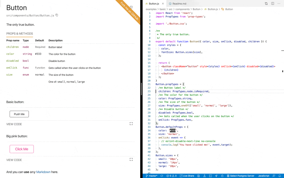
React Styleguidist is a component development environment with hot reloaded dev server and a living style guide that you can share with your team. It lists component `propTypes` and shows live, editable usage examples based on Markdown files. Check out [**the demo style guide**](https://react-styleguidist.js.org/examples/basic/). ![React Styleguidist in action](https://user-images.githubusercontent.com/1703219/74945569-51c6ad00-543b-11ea-8351-f4d86860893a.gif) [![Washing your code. A book on clean code for frontend developers](https://sapegin.me/images/washing-code-github.jpg)](https://sapegin.me/book/) ## Usage - **[Getting Started](https://react-styleguidist.js.org/docs/getting-started): install and run Styleguidist** - [Documenting components](https://react-styleguidist.js.org/docs/documenting): how to write documentation - [Locating components](https://react-styleguidist.js.org/docs/components): point Styleguidist to your React components - [Configuring webpack](https://react-styleguidist.js.org/docs/webpack): tell Styleguidist how to load your code - [Cookbook](https://react-styleguidist.js.org/docs/cookbook): how to solve common tasks with Styleguidist ## Advanced documentation - [Configuration](https://react-styleguidist.js.org/docs/configuration) - [CLI commands and options](https://react-styleguidist.js.org/docs/cli) - [Node.js API](https://react-styleguidist.js.org/docs/api) ## Examples - [Basic style guide](https://react-styleguidist.js.org/examples/basic/), [source](./examples/basic) - Style guide with sections, [source](./examples/sections) - Style guide with customized styles, [source](./examples/customised) - Style guide with custom express endpoints, [source](./examples/express) - Create React App integration, [source](./examples/cra) ## Showcase Real projects using React Styleguidist: - [Rumble Charts](https://rumble-charts.github.io/rumble-charts/) - [better-react-spinkit](http://better-react-spinkit.benjamintatum.com/) - [Semantic UI Components for React](https://hallister.github.io/semantic-react/) - [Dialog Components](https://dialogs.github.io/dialog-web-components/) - [Bulma Components](https://bokuweb.github.io/re-bulma/) - [Yammer Components](https://microsoft.github.io/YamUI/) - [More projects…](https://github.com/styleguidist/react-styleguidist/issues/127) ## Integration with other tools - Create React App — supported out of the box, see the [Getting Started](https://react-styleguidist.js.org/docs/getting-started) guide - Vue, see [Vue Styleguidist](https://github.com/vue-styleguidist/vue-styleguidist) ## Third-party tools - [snapguidist](https://github.com/styleguidist/snapguidist): snapshot testing for React Styleguidist - [react-styleguidist-visual](https://github.com/unindented/react-styleguidist-visual): automated visual testing for React Styleguidist, using Puppeteer and pixelmatch - [styleguidist-scrapper](https://github.com/livechat/styleguidist-scrapper): scrapper script for documentation generated by React Styleguidist ## Resources - [The Dream of Styleguide Driven Development](https://www.youtube.com/watch?v=JjXnmhNW8Cs) talk by [Sara Vieira](https://github.com/saravieira) - [Building React Components Library](https://skillsmatter.com/skillscasts/8140-building-react-components-library) talk by [Robert Haritonov](https://github.com/operatino) - [Say Cheese: Snapshots and Visual Testing](https://developers.livechatinc.com/blog/snapshots-visual-testing/) - [Interview with Artem Sapegin](https://survivejs.com/blog/styleguidist-interview/) about React Styleguidist. ## Change log The change log can be found on the [Releases page](https://github.com/styleguidist/react-styleguidist/releases). ## Contributing Everyone is welcome to contribute. Please take a moment to read the [contributing guidelines](.github/Contributing.md) and the [developer guide](https://react-styleguidist.js.org/docs/development). ## Sponsoring [Become a sponsor](https://opencollective.com/styleguidist#sponsor) and get your logo on our Readme on GitHub with a link to your site. [Become a backer](https://opencollective.com/styleguidist#backer) get your image on our Readme on GitHub with a link to your site. Buy Me A Coffee ## Authors and license [Artem Sapegin](http://sapegin.me) and [contributors](https://github.com/styleguidist/react-styleguidist/graphs/contributors). Logo by [Sara Vieira](https://github.com/SaraVieira) and [Andrey Okonetchnikov](https://github.com/okonet). MIT License, see the included [License.md](License.md) file. ================================================ FILE: babel.config.js ================================================ module.exports = { presets: [ [ '@babel/env', { loose: true, modules: false, useBuiltIns: 'usage', corejs: 3, }, ], '@babel/typescript', '@babel/react', ], plugins: ['@babel/plugin-proposal-class-properties'], overrides: [ { include: ['src/bin', 'src/loaders', 'src/scripts', 'src/share', 'src/typings'], exclude: ['src/loaders/utils/client'], presets: [ [ '@babel/env', { loose: true, modules: 'commonjs', useBuiltIns: 'usage', corejs: 3, targets: { node: '10', }, }, ], ], }, ], env: { test: { presets: [ [ '@babel/env', { loose: true, modules: 'commonjs', useBuiltIns: 'usage', corejs: 3, targets: { node: 'current', }, }, ], '@babel/react', '@babel/flow', ], plugins: ['@babel/plugin-proposal-class-properties'], }, }, }; ================================================ FILE: cypress.json ================================================ { "baseUrl": "http://localhost:8082", "fixturesFolder": "test/cypress/fixtures", "integrationFolder": "test/cypress/integration", "pluginsFile": "test/cypress/plugins/index.js", "screenshotsFolder": "test/cypress/screenshots", "videosFolder": "test/cypress/videos", "supportFile": "test/cypress/support/index.js", "video": false, "chromeWebSecurity": false } ================================================ FILE: dangerfile.ts ================================================ import { danger, warn } from 'danger'; const packageChanged = danger.git.modified_files.includes('package.json'); const lockfileChanged = danger.git.modified_files.includes('package-lock.json'); if (packageChanged && !lockfileChanged) { warn(`Changes were made to \`package.json\`, but not to \`package-lock.json\`. If you’ve changed any dependencies (added, removed or updated any packages), please run \`npm install\` and commit changes in package-lock.json file. Make sure you’re using npm 5+.`); } if (!packageChanged && lockfileChanged) { warn(`Changes were made to \`package-lock.json\`, but not to \`package.json\`. Please remove \`package-lock.json\` changes from your pull request. Try to run \`git checkout master -- package-lock.json\` and commit changes.`); } ================================================ FILE: docs/API.md ================================================ # Node.js API ## Initialization First, you need to initialize the API for your style guide config. Using a JavaScript object: ```javascript import styleguidist from 'react-styleguidist' const styleguide = styleguidist({ logger: { warn: console.warn, info: console.log, debug: console.log }, components: './lib/components/**/*.js', webpackConfig: { module: { rules: [ { test: /\.jsx?$/, exclude: /node_modules/, loader: 'babel-loader' }, { test: /\.css$/, use: [ 'style-loader', { loader: 'css-loader', options: { modules: true } } ] } ] } } }) ``` > **Info:** Any output is disabled by default, you may need to define your own [logger](Configuration.md#logger). Using a config file: ```javascript import styleguidist from 'react-styleguidist' const styleguide = styleguidist(require('../styleguide.config.js')) ``` Or auto searching a config file: ```javascript import styleguidist from 'react-styleguidist' const styleguide = styleguidist() ``` See all available [config options](Configuration.md). ## Methods ### `build(callback)` #### Arguments 1. `callback(err, config, stats)` (_Function_): A callback to be invoked when style guide is built: 1. `err` (_Object_): error details. 2. `config` (_Object_): normalized style guide config. 3. `stats` (_Object_): webpack build stats. #### Returns (_Compiler_): webpack `Compiler` instance. #### Example ```javascript import styleguidist from 'react-styleguidist' styleguidist(require('../styleguide.config.js')).build( (err, config) => { if (err) { console.log(err) } else { console.log('Style guide published to', config.styleguideDir) } } ) ``` ### `server(callback)` #### Arguments 1. `callback(err, config)` (_Function_): A callback to be invoked when style guide is built: 1. `err` (_Object_): error details. 2. `config` (_Object_): normalized style guide config. #### Returns (_Object_): Object containing a webpack `Compiler` instance and the React Styleguidist server #### Example ```javascript import styleguidist from 'react-styleguidist' styleguidist(require('../styleguide.config.js')).server( (err, config) => { if (err) { console.log(err) } else { const url = `http://${config.serverHost}:${config.serverPort}` console.log(`Listening at ${url}`) } } ) ``` ### `makeWebpackConfig([env])` #### Arguments 1. \[`env`=`'production'`\] (_String_): `production` or `development`. #### Returns (_Object_): webpack config. #### Example ```javascript // webpack.config.js module.exports = [ { // User webpack config }, // note that this is requiring rsg in commonjs mode // it does not need to access .default require('react-styleguidist').makeWebpackConfig() ] ``` ================================================ FILE: docs/CLI.md ================================================ # CLI commands and options ## Commands - `styleguidist server`: Run dev server. - `styleguidist build`: Generate a static HTML style guide. ## Options | Option | Description | | ----------------- | --------------------------------------------- | | `--config ` | Specify path to a config file | | `--port ` | Specify port to run the development server on | | `--open` | Open Styleguidist in the default browser | | `--verbose` | Print debug information | ## Usage Add these commands into your `package.json`’s `scripts` section: ```json { "scripts": { "styleguide": "styleguidist server", "styleguide:build": "styleguidist build" } } ``` Or run them directly from your terminal: ```bash npx styleguidist server npx styleguidist build ``` > **Tip:** [npx](https://medium.com/@maybekatz/introducing-npx-an-npm-package-runner-55f7d4bd282b) is a part of npm and will run locally-installed `styleguidist` package. ================================================ FILE: docs/Components.md ================================================ # Locating your components and organizing your style guide ## Finding components By default Styleguidist will search components using this [glob pattern](https://github.com/isaacs/node-glob#glob-primer): `src/components/**/*.{js,jsx,ts,tsx}`. It will pick up files like: - `src/components/Button.js`, - `src/components/Button/Button.js`, - `src/components/Button/index.js`. But will ignore tests: - `__tests__` folder, - files containing `.test.js` or `.spec.js` (or same for `.jsx`, `.ts` and `.tsx`). If it doesn’t work for you, create a `styleguide.config.js` file in your project’s root folder and configure the patterns to fit your project structure. For example, if your component files look like `components/Button/Button.js`, but you reexport them in `components/Button/index.js` (like `export { default } from './Button'`) to simplify imports (`components/Button` instead of `components/Button/Button`), you need to skip `index.js`: ```javascript module.exports = { components: 'src/components/**/[A-Z]*.js' } ``` > **Info:** All paths are relative to the config folder. > **Tip:** Use [ignore](Configuration.md#ignore) option to exclude some files from the style guide. > **Tip:** Use [getComponentPathLine](Configuration.md#getcomponentpathline) option to change the path you see below a component name. ## Loading and exposing components Styleguidist _loads_ your components and _exposes_ them globally for your examples to consume. ### Identifier It will try to use the `displayName` of your component as the identifier. If it cannot understand a `displayName` (for example if it is dynamically generated), it will fall back to something it can understand. In each of the following cases, the global identifier will be `Component`. | Path | Code | Styleguidist understands | | --- | --- | --- | | /whatever.js | `export default function Component() { ... }` | displayName | | /whatever.js | `export default function SomeName() { ... }`
`SomeName.displayName = 'Component';` | displayName | | /whatever.js | `export default function Component() { ... }`
`Component.displayName = dynamicNamer();` | displayName at declaration | | /component.js | `const name = 'SomeName';`
`const componentMap = {`
`[name]: function() { ... }`
`};`
`export default componentMap[name];` | Filename | | /component/index.js | `const name = 'SomeName';`
`const componentMap = {`
`[name]: function() { ... }`
`};`
`export default componentMap[name];` | Folder name | ### Default vs named exports Stylegudist will use an ECMAScript module’s `default` export or CommonJS `module.exports` if they are defined. ```javascript // /component.js export default function Component() { ... } // will be exposed globally as Component // /component.js function Component() { ... } module.exports = Component; // will be exposed globally as Component ``` If you use only named exports, Styleguidist will expose named exports from modules as follows... If there is only one named export, it will expose that. ```javascript // /component.js export function Component() { ... } // will be exposed globally as Component ``` If there are several named exports, it will expose the named export which has the same name as the understood identifier. ```javascript // /component.js export function someUtil() { ... } // will not be exposed export function Component() { ... } // will be exposed globally as Component ``` > **Caution:** If you export several React components as named exports from a single module, Styleguidist is likely to behave unreliably. If it cannot understand which named export to expose, you may not be able to access that export. ## Sections Group components into sections or add extra Markdown documents to your style guide. Each section consists of (all fields are optional): - `name` — section title. - `content` — location of a Markdown file containing the overview content. - `components` — a glob pattern string, an array of component paths or glob pattern strings, or a function returning a list of components or glob pattern strings. The same rules apply as for the root `components` option. - `sections` — array of subsections (can be nested). - `description` — A small description of this section. - `sectionDepth` — Number of subsections with single pages, only available with [pagePerSection](Configuration.md#pagepersection) is enabled. - `exampleMode` — Initial state of the code example tab, uses [exampleMode](Configuration.md#examplemode). - `usageMode` — Initial state of the props and methods tab, uses [usageMode](Configuration.md#usagemode). - `ignore` — string/array of globs that should not be included in the section. - `href` - an URL to navigate to instead of navigating to the section content - `external` - if set, the link will open in a new window - `expand` - Determines if the section should be expanded by default even when `tocMode` is set to `collapse` in general settings Configuring a style guide with textual documentation section and a list of components would look like: ```javascript // styleguide.config.js module.exports = { sections: [ { name: 'Introduction', content: 'docs/introduction.md' }, { name: 'Documentation', sections: [ { name: 'Installation', content: 'docs/installation.md', description: 'The description for the installation section' }, { name: 'Configuration', content: 'docs/configuration.md' }, { name: 'Live Demo', external: true, href: 'http://example.com' } ] }, { name: 'UI Components', content: 'docs/ui.md', components: 'lib/components/ui/*.js', exampleMode: 'expand', // 'hide' | 'collapse' | 'expand' usageMode: 'expand' // 'hide' | 'collapse' | 'expand' } ] } ``` ## Limitations In some cases Styleguidist may not understand your components, [see possible solutions](Thirdparties.md). ================================================ FILE: docs/Configuration.md ================================================ # Configuration By default, Styleguidist will look for `styleguide.config.js` file in your project’s root folder. You can change the location of the config file using `--config` [CLI](CLI.md) option. ## `assetsDir` Type: `String` or `Array`, optional Your application static assets folder will be accessible as `/` in the style guide dev server. ## `compilerConfig` Type: `Object`, default: ```javascript { // Don't include an Object.assign ponyfill, we have our own objectAssign: 'Object.assign', // Transpile only features needed for IE11 target: { ie: 11 }, transforms: { // Don't throw on ESM imports, we transpile them ourselves modules: false, // Enable tagged template literals for styled-components dangerousTaggedTemplateString: true, // to make async/await work by default (no transformation) asyncAwait: false, }, } ``` Styleguidist uses [Bublé](https://buble.surge.sh/guide/) to run ES6 code on the frontend. This config object will be added as the second argument for `buble.transform`. ## `components` Type: `String`, `Function` or `Array`, default: `src/components/**/*.{js,jsx,ts,tsx}` - when `String`: a [glob pattern](https://github.com/isaacs/node-glob#glob-primer) that matches all your component modules. - when `Function`: a function that returns an array of module paths. - when `Array`: an array of module paths. All paths are relative to config folder. See examples in the [Components section](Components.md). ## `context` Type: `Object`, optional Modules that will be available for examples. You can use it for utility functions like Lodash or for data fixtures. ```javascript module.exports = { context: { map: 'lodash/map', users: path.resolve(__dirname, 'fixtures/users') } } ``` Then you can use them in any example: ```jsx {map(users, 'name').join(', ')} ``` ## `contextDependencies` Type: `String[]`, optional Array of absolute paths that allow you to specify absolute paths of directories to watch for additions or removals of components. By default Styleguidist uses common parent directory of your components. ```javascript module.exports = { contextDependencies: [path.resolve(__dirname, 'lib/components')] } ``` ## `configureServer` Type: `Function`, optional Function that allows you to add endpoints to the underlying Express server: ```javascript module.exports = { configureServer(app) { // `app` is the instance of the express server running Styleguidist app.get('/custom-endpoint', (req, res) => { res.status(200).send({ response: 'Server invoked' }) }) } } ``` Your components will be able to invoke the URL `http://localhost:6060/custom-endpoint` from their examples. ## `dangerouslyUpdateWebpackConfig` Type: `Function`, optional > **Danger:** You may break Styleguidist by using this option, try to use [webpackConfig](#webpackconfig) option instead. Allows you to modify webpack config without any restrictions. ```javascript module.exports = { dangerouslyUpdateWebpackConfig(webpackConfig, env) { // WARNING: inspect Styleguidist Webpack config before modifying it, otherwise you may break Styleguidist console.log(webpackConfig) webpackConfig.externals = { jquery: 'jQuery' } return webpackConfig } } ``` ## `defaultExample` Type: `Boolean` or `String`, default: `false` For components that do not have an example, a default one can be used. When set to `true`, the [DefaultExample.md](https://raw.githubusercontent.com/styleguidist/react-styleguidist/master/templates/DefaultExample.md) is used, or you can provide the path to your own example Markdown file. When writing your own default example file, `__COMPONENT__` will be replaced by the actual component name at compile time. ## `exampleMode` Type: `String`, default: `collapse` Defines the initial state of the example code tab: - `collapse`: collapses the tab by default. - `hide`: hide the tab and it can´t be toggled in the UI. - `expand`: expand the tab by default. ## `getComponentPathLine` Type: `Function`, default: component filename Function that returns a component path line (displayed under the component name). For example, instead of `components/Button/Button.js` you can print `import Button from 'components/Button';`: ```javascript const path = require('path') module.exports = { getComponentPathLine(componentPath) { const name = path.basename(componentPath, '.js') const dir = path.dirname(componentPath) return `import ${name} from '${dir}';` } } ``` ## `getExampleFilename` Type: `Function`, default: finds `Readme.md` or `ComponentName.md` in the component folder Function that returns examples file path for a given component path. For example, instead of `Readme.md` you can use `ComponentName.examples.md`: ```javascript module.exports = { getExampleFilename(componentPath) { return componentPath.replace(/\.jsx?$/, '.examples.md') } } ``` ## `handlers` Type: `Function`, optional, default: [[react-docgen-displayname-handler](https://github.com/nerdlabs/react-docgen-displayname-handler)] Function that returns functions used to process the discovered components and generate documentation objects. Default behaviors include discovering component documentation blocks, prop types, and defaults. If setting this property, it is best to build from the default [react-docgen](https://github.com/reactjs/react-docgen) handler list, such as in the example below. See the [react-docgen handler documentation](https://github.com/reactjs/react-docgen#handlers) for more information about handlers. > **Note:** `react-docgen-displayname-handler` should be included. ```javascript module.exports = { handlers: componentPath => require('react-docgen').defaultHandlers.concat( (documentation, path) => { // Calculate a display name for components based upon the declared class name. if ( path.value.type === 'ClassDeclaration' && path.value.id.type === 'Identifier' ) { documentation.set('displayName', path.value.id.name) // Calculate the key required to find the component in the module exports if ( path.parentPath.value.type === 'ExportNamedDeclaration' ) { documentation.set('path', path.value.id.name) } } // The component is the default export if ( path.parentPath.value.type === 'ExportDefaultDeclaration' ) { documentation.set('path', 'default') } }, require('react-docgen-displayname-handler').createDisplayNameHandler( componentPath ) ) } ``` ## `ignore` Type: `String[]`, default: `['**/__tests__/**', '**/*.test.{js,jsx,ts,tsx}', '**/*.spec.{js,jsx,ts,tsx}', '**/*.d.ts']` Array of [glob pattern](https://github.com/isaacs/node-glob#glob-primer) that should not be included in the style guide. > **Caution:** You should pass glob patterns, for example, use `**/components/Button.js` instead of `components/Button.js`. ## `logger` Type: `Object`, by default will use `console.*` in CLI or nothing in Node.js API Custom logger functions: ```javascript module.exports = { logger: { // One of: info, debug, warn // Suppress messages info: () => {}, // Override display function warn: message => console.warn(`NOOOOOO: ${message}`) } } ``` ## `minimize` Type: `Boolean`, default: `true` If `false`, the production build will not be minimized. ## `moduleAliases` Type: `object`, optional Define aliases for modules, that you can import in your examples, to make example code more realistic and copypastable: ```javascript const path = require('path') module.exports = { moduleAliases: { 'rsg-example': path.resolve(__dirname, 'src') } } ``` ````jsx // ```jsx inside Markdown import React from 'react' import Button from 'rsg-example/components/Button' import Placeholder from 'rsg-example/components/Placeholder' ```` Check out the [webpack resolve.alias documentation](https://webpack.js.org/configuration/resolve/#resolve-alias) for available syntax. ## `mountPointId` Type: `string`, default: `rsg-root` The ID of a DOM element where Styleguidist mounts. ## `pagePerSection` Type: `Boolean`, default: `false` Render one section or component per page. If `true`, each section will be a single page. The value may depend on a current environment: ```javascript module.exports = { pagePerSection: process.env.NODE_ENV !== 'production' } ``` To isolate section’s children as single pages (subroutes), add `sectionDepth` into each section with the number of subroutes (depth) to render as single pages. For example: ```javascript module.exports = { pagePerSection: true, sections: [ { name: 'Documentation', sections: [ { name: 'Files', sections: [ { name: 'First File' }, { name: 'Second File' } ] } ], // Will show "Documentation" and "Files" as single pages, filtering its children sectionDepth: 2 }, { name: 'Components', sections: [ { name: 'Buttons', sections: [ { name: 'WrapperButton' } ] } ], // Will show "Components" as single page, filtering its children sectionDepth: 1 }, { name: 'Examples', sections: [ { name: 'Case 1', sections: [ { name: 'Buttons' } ] } ], // There is no subroutes, "Examples" will show all its children on a page sectionDepth: 0 } ] } ``` ## `printBuildInstructions` Type: `Function`, optional Function that allows you to override the printing of build messages to console.log. ```javascript module.exports = { printBuildInstructions(config) { console.log( `Style guide published to ${config.styleguideDir}. Something else interesting.` ) } } ``` ## `printServerInstructions` Type: `Function`, optional Function that allows you to override the printing of local dev server messages to console.log. ```javascript module.exports = { serverHost: 'your-domain', printServerInstructions(config, { isHttps }) { console.log(`Local style guide: http://${config.serverHost}`) } } ``` ## `previewDelay` Type: `Number`, default: 500 Debounce time in milliseconds used before rendering the changes from the editor. While typing code the preview will not be updated. ## `propsParser` Type: `Function`, optional Function that allows you to override the mechanism used to parse props from a source file. The default mechanism is using [react-docgen](https://github.com/reactjs/react-docgen) to parse props. ```javascript module.exports = { propsParser(filePath, source, resolver, handlers) { return require('react-docgen').parse(source, resolver, handlers) } } ``` ## `require` Type: `String[]`, optional Modules that are required for your style guide. Useful for third-party styles or polyfills. ```javascript module.exports = { require: [ 'babel-polyfill', path.join(__dirname, 'styleguide/styles.css') ] } ``` > **Note:** This will add a separate webpack entry for each array item. Don’t forget to add webpack loaders for each file you add here. For example, to require a CSS file you’ll need: ```javascript module.exports = { webpackConfig: { module: { rules: [ { test: /\.css$/, use: ['style-loader', 'css-loader'] } ] } } } ``` See [Configuring webpack](Webpack.md) for mode details. ## `resolver` Type: `Function`, optional Function that allows you to override the mechanism used to identify classes/components to analyze. Default behavior is to find all exported components in each file. You can configure it to find all components or use a custom detection method. See the [react-docgen resolver documentation](https://github.com/reactjs/react-docgen#resolver) for more information about resolvers. ```javascript module.exports = { resolver: require('react-docgen').resolver .findAllComponentDefinitions } ``` ## `ribbon` Type: `Object`, optional Show “Fork Me” ribbon in the top right corner. ```javascript module.exports = { ribbon: { // Link to open on the ribbon click (required) url: 'http://example.com/', // Text to show on the ribbon (optional) text: 'Fork me on GitHub' } } ``` Use the [theme](#theme) config option to change ribbon style. ## `sections` Type: `Array`, optional Allows components to be grouped into sections with a title and overview content. Sections can also be content only, with no associated components (for example, a textual introduction). Sections can be nested. See examples of [sections configuration](Components.md#sections). ## `serverHost` Type: `String`, default: `0.0.0.0` Dev server hostname. ## `serverPort` Type: `Number`, default: `process.env.NODE_PORT` or `6060` Dev server port. Can also be set via command line `--port=6060`. ## `showSidebar` Type: `Boolean`, default: `true` Toggle sidebar visibility. The sidebar will be hidden when opening components or examples in isolation mode even if this value is set to `true`. When set to `false`, the sidebar will always be hidden. ## `skipComponentsWithoutExample` Type: `Boolean`, default: `false` Ignore components that don’t have an example file (as determined by [getExampleFilename](#getexamplefilename)). These components won’t be accessible from other examples unless you [manually `require` them](Cookbook.md#how-to-hide-some-components-in-style-guide-but-make-them-available-in-examples). ## `sortProps` Type: `Function`, optional Function that sorts component props. By default props are sorted such that required props come first, optional props come second. Props in both groups are sorted by their property names. To disable sorting, use the identity function: ```javascript module.exports = { sortProps: props => props } ``` ## `styleguideComponents` Type: `Object`, optional Override React components used to render the style guide: ```javascript module.exports = { styleguideComponents: { Wrapper: path.join(__dirname, 'styleguide/components/Wrapper'), StyleGuideRenderer: path.join( __dirname, 'styleguide/components/StyleGuide' ) } } ``` See an example of [customized style guide](https://github.com/styleguidist/react-styleguidist/tree/master/examples/customised). To wrap, rather than replace a component, make sure to import the default implementation using the full path to `react-styleguidist`. See an example of [wrapping a Styleguidist component](https://github.com/styleguidist/react-styleguidist/blob/master/examples/customised/styleguide/components/SectionsRenderer.js). **Note**: these components are not guaranteed to be safe from breaking changes in React Styleguidist updates. ## `styleguideDir` Type: `String`, default: `styleguide` Folder for static HTML style guide generated with `styleguidist build` command. ## `styles` Type: `Object`, `String` or `Function`, optional Customize styles of any Styleguidist’s component using an object, a function returning said object or a file path to a file exporting said styles. See examples in the [cookbook](Cookbook.md#how-to-change-styles-of-a-style-guide). > **Tip:** Using a function allows access to theme variables like in the example below. See available [theme variables](https://github.com/styleguidist/react-styleguidist/blob/master/src/client/styles/theme.ts). The returned object folows the same format as when configured as a litteral. ```javascript module.exports = { styles: function (theme) { return { Logo: { logo: { // we can now change the color used in the logo item to use the theme's `link` color color: theme.color.link } } } } } ``` **Note:** If using a file path, it has to be absolute or relative to the config file. ## `template` Type: `Object` or `Function`, optional. Change HTML for the style guide app. An object with options to add a favicon, meta tags, inline JavaScript or CSS, etc. See [@vxna/mini-html-webpack-template docs](https://www.npmjs.com/package/@vxna/mini-html-webpack-template). ```javascript module.exports = { template: { favicon: 'https://assets-cdn.github.com/favicon.ico' } } ``` A function that returns an HTML string, see [mini-html-webpack-plugin docs](https://github.com/styleguidist/mini-html-webpack-plugin#custom-templates). ## `theme` Type: `Object` or `String`, optional Customize style guide UI fonts, colors, etc. using a theme object or the path to a file exporting such object. The path is relative to the config file or absolute. See examples in the [cookbook](Cookbook.md#how-to-change-styles-of-a-style-guide). > **Info:** See available [theme variables](https://github.com/styleguidist/react-styleguidist/blob/master/src/client/styles/theme.ts). > **Info:** Styles use [JSS](https://github.com/cssinjs/jss/blob/master/docs/jss-syntax.md) with these plugins: [jss-plugin-isolate](https://github.com/cssinjs/jss/tree/master/packages/jss-plugin-isolate), [jss-plugin-nested](https://github.com/cssinjs/jss/tree/master/packages/jss-plugin-nested), [jss-plugin-camel-case](https://github.com/cssinjs/jss/tree/master/packages/jss-plugin-camel-case), [jss-plugin-default-unit](https://github.com/cssinjs/jss/tree/master/packages/jss-plugin-default-unit), [jss-plugin-compose](https://github.com/cssinjs/jss/tree/master/packages/jss-plugin-compose) and [jss-plugin-global](https://github.com/cssinjs/jss/tree/master/packages/jss-plugin-global). > **Tip:** Use [React Developer Tools](https://github.com/facebook/react) to find component and style names. For example a component `

` corresponds to an example above. ## `title` Type: `String`, default: ` Style Guide` Style guide title. ## `tocMode` Type: `String` default: `expand` Defines if the table of contents sections will behave like an accordion: - `collapse`: All sections are collapsed by default - `expand`: Sections cannot be collapsed in the Table Of Contents Collapse the sections created in the sidebar to reduce the height of the sidebar. This can be useful in large codebases with lots of components to avoid having to scroll too far. ## `updateDocs` Type: `Function`, optional Function that modifies props, methods, and metadata after parsing a source file. For example, load a component version from a JSON file: ```javascript module.exports = { updateDocs(docs, file) { if (docs.doclets.version) { const versionFilePath = path.resolve( path.dirname(file), docs.doclets.version ) const version = require(versionFilePath).version docs.doclets.version = version docs.tags.version[0].description = version } return docs } } ``` With this component JSDoc comment block: ```javascript /** * Component is described here. * * @version ./package.json */ export default class Button extends React.Component { // ... } export default ``` ## `updateExample` Type: `Function`, optional Function that modifies code example (Markdown fenced code block). For example, you can use it to load examples from files: ```javascript module.exports = { updateExample(props, exampleFilePath) { const { settings, lang } = props if (typeof settings.file === 'string') { const filepath = path.resolve( path.dirname(exampleFilePath), settings.file ) const { file, ...restSettings } = settings return { content: fs.readFileSync(filepath, 'utf8'), settings: restSettings, lang } } return props } } ``` Use it like this in your Markdown files: ```js { "file": "./some/file.js" } ``` You can also use this function to dynamically update some of your fenced code blocks that you do not want to be interpreted as React components by using the [static modifier](Documenting.md#usage-examples-and-readme-files). ```javascript module.exports = { updateExample(props) { const { settings, lang } = props if (lang === 'javascript' || lang === 'js' || lang === 'jsx') { settings.static = true } return props } } ``` ## `usageMode` Type: `String`, default: `collapse` Defines the initial state of the props and methods tab: - `collapse`: collapses the tab by default. - `hide`: hide the tab and it can´t be toggled in the UI. - `expand`: expand the tab by default. ## `verbose` Type: `Boolean`, default: `false` Print debug information. Same as `--verbose` command line switch. ## `version` Type: `String`, optional Style guide version, displayed under the title in the sidebar. ## `webpackConfig` Type: `Object` or `Function`, optional Custom webpack config options: loaders, extensions, plugins, etc. required for your project. Can be an object: ```javascript module.exports = { webpackConfig: { module: { resolve: { extensions: ['.es6'] }, rules: [ { test: /\.scss$/, loaders: [ 'style-loader', 'css-loader', 'sass-loader?precision=10' ] } ] } } } ``` Or a function: ```javascript module.exports = { webpackConfig(env) { if (env === 'development') { return { // custom options } } return {} } } ``` > **Caution:** This option disables config load from `webpack.config.js`, load your config [manually](Webpack.md#reusing-your-projects-webpack-config). > **Danger:** `entry`, `externals`, `output`, `watch`, and `stats` options will be ignored. For production builds, `devtool` will also be ignored. > **Danger:** `CommonsChunkPlugins`, `HtmlWebpackPlugin`, `MiniHtmlWebpackPlugin`, `UglifyJsPlugin`, `TerserPlugin`, `HotModuleReplacementPlugin` plugins will be ignored because Styleguidist already includes them or they may break Styleguidist. > **Tip:** Run style guide in verbose mode to see the actual webpack config used by Styleguidist: `npx styleguidist server --verbose`. See [Configuring webpack](Webpack.md) for examples. ================================================ FILE: docs/Cookbook.md ================================================ # Cookbook ## How to use `ref`s in examples? Use `ref` prop as a function and assign a reference to a local variable: ```jsx const [value, setValue] = React.useState('') let textarea ;