Showing preview only (363K chars total). Download the full file or copy to clipboard to get everything.
Repository: widget-js/widgets
Branch: master
Commit: a934b6864603
Files: 111
Total size: 331.0 KB
Directory structure:
gitextract_ovu0z3vr/

├── .eslintcache
├── .github/
│   └── workflows/
│       └── github-page.yml
├── .gitignore
├── .npmrc
├── README.md
├── components.json
├── eslint.config.js
├── index.html
├── package.json
├── src/
│   ├── api/
│   │   ├── ai.ts
│   │   ├── pay.ts
│   │   ├── supabase.ts
│   │   └── web-widget-api.ts
│   ├── app.css
│   ├── app.tsx
│   ├── components/
│   │   ├── app-sidebar.tsx
│   │   ├── dashboard-layout.tsx
│   │   ├── login-check.tsx
│   │   ├── manager/
│   │   │   ├── deployed-widget-card.tsx
│   │   │   └── deployed-widget-list.tsx
│   │   ├── nav-main.tsx
│   │   ├── nav-user.tsx
│   │   ├── purchase-dialog.tsx
│   │   ├── setting-section.tsx
│   │   ├── team-switcher.tsx
│   │   ├── tray/
│   │   │   ├── social-links.tsx
│   │   │   └── tray-menu-item.tsx
│   │   ├── ui/
│   │   │   ├── alert-dialog.tsx
│   │   │   ├── avatar.tsx
│   │   │   ├── breadcrumb.tsx
│   │   │   ├── button.tsx
│   │   │   ├── card.tsx
│   │   │   ├── checkbox.tsx
│   │   │   ├── collapsible.tsx
│   │   │   ├── command.tsx
│   │   │   ├── dialog.tsx
│   │   │   ├── dropdown-menu.tsx
│   │   │   ├── empty.tsx
│   │   │   ├── field.tsx
│   │   │   ├── input.tsx
│   │   │   ├── item.tsx
│   │   │   ├── label.tsx
│   │   │   ├── pagination.tsx
│   │   │   ├── popover.tsx
│   │   │   ├── progress.tsx
│   │   │   ├── radio-group.tsx
│   │   │   ├── scroll-area.tsx
│   │   │   ├── select.tsx
│   │   │   ├── separator.tsx
│   │   │   ├── sheet.tsx
│   │   │   ├── sidebar.tsx
│   │   │   ├── skeleton.tsx
│   │   │   ├── slider.tsx
│   │   │   ├── sonner.tsx
│   │   │   ├── spinner.tsx
│   │   │   ├── switch.tsx
│   │   │   ├── table.tsx
│   │   │   ├── tabs.tsx
│   │   │   ├── textarea.tsx
│   │   │   └── tooltip.tsx
│   │   ├── user-avatar.tsx
│   │   └── widget-sync-item.tsx
│   ├── hooks/
│   │   ├── use-app-broadcast.ts
│   │   ├── use-app-language.ts
│   │   ├── use-app-runtime-info.ts
│   │   ├── use-cell-size-config.ts
│   │   ├── use-debounce.ts
│   │   ├── use-debug-config.ts
│   │   ├── use-ipc-listener.ts
│   │   ├── use-launch-at-startup-config.ts
│   │   ├── use-mobile.ts
│   │   ├── use-supabase-channel.ts
│   │   ├── use-user.ts
│   │   └── use-widget-package.ts
│   ├── i18n/
│   │   ├── config.ts
│   │   └── locales/
│   │       ├── en/
│   │       │   └── translation.json
│   │       └── zh/
│   │           └── translation.json
│   ├── index.css
│   ├── lib/
│   │   ├── request.ts
│   │   └── utils.ts
│   ├── main.tsx
│   ├── model/
│   │   └── app-version.ts
│   ├── pages/
│   │   ├── add/
│   │   │   ├── add-widget-page.tsx
│   │   │   └── components/
│   │   │       ├── feature-wall-list.tsx
│   │   │       ├── search-item.tsx
│   │   │       ├── widget-container.tsx
│   │   │       ├── widget-tags.tsx
│   │   │       └── zoom-image.tsx
│   │   ├── ai/
│   │   │   └── ai-page.tsx
│   │   ├── dev/
│   │   │   └── dev-page.tsx
│   │   ├── error-page.tsx
│   │   ├── packages/
│   │   │   ├── components/
│   │   │   │   └── widget-package-item.tsx
│   │   │   └── widget-package-manager-page.tsx
│   │   ├── settings/
│   │   │   ├── app-info-page.tsx
│   │   │   ├── components/
│   │   │   │   ├── app-theme-form.tsx
│   │   │   │   ├── font-family-picker.tsx
│   │   │   │   ├── theme-preview.tsx
│   │   │   │   └── theme-tags.tsx
│   │   │   ├── general-page.tsx
│   │   │   ├── proxy-page.tsx
│   │   │   └── theme-page.tsx
│   │   ├── size/
│   │   │   └── size-page.tsx
│   │   ├── tray/
│   │   │   └── tray-page.tsx
│   │   └── user/
│   │       └── profile-page.tsx
│   ├── router/
│   │   └── index.tsx
│   └── utils/
│       ├── version-utils.ts
│       └── widget-util.ts
├── tsconfig.app.json
├── tsconfig.json
├── tsconfig.node.json
└── vite.config.ts
================================================
FILE CONTENTS
================================================
================================================
FILE: .eslintcache
================================================
[{"C:\\Users\\rtuge\\Desktop\\workspace\\widgetjs\\packages\\widgets\\src\\api\\pay.ts":"1","C:\\Users\\rtuge\\Desktop\\workspace\\widgetjs\\packages\\widgets\\src\\components\\purchase-dialog.tsx":"2","C:\\Users\\rtuge\\Desktop\\workspace\\widgetjs\\packages\\widgets\\src\\pages\\ai\\ai-page.tsx":"3","C:\\Users\\rtuge\\Desktop\\workspace\\widgetjs\\packages\\widgets\\eslint.config.js":"4","C:\\Users\\rtuge\\Desktop\\workspace\\widgetjs\\packages\\widgets\\src\\api\\ai.ts":"5","C:\\Users\\rtuge\\Desktop\\workspace\\widgetjs\\packages\\widgets\\src\\api\\supabase.ts":"6","C:\\Users\\rtuge\\Desktop\\workspace\\widgetjs\\packages\\widgets\\src\\api\\web-widget-api.ts":"7","C:\\Users\\rtuge\\Desktop\\workspace\\widgetjs\\packages\\widgets\\src\\app.tsx":"8","C:\\Users\\rtuge\\Desktop\\workspace\\widgetjs\\packages\\widgets\\src\\components\\app-sidebar.tsx":"9","C:\\Users\\rtuge\\Desktop\\workspace\\widgetjs\\packages\\widgets\\src\\components\\dashboard-layout.tsx":"10","C:\\Users\\rtuge\\Desktop\\workspace\\widgetjs\\packages\\widgets\\src\\components\\login-check.tsx":"11","C:\\Users\\rtuge\\Desktop\\workspace\\widgetjs\\packages\\widgets\\src\\components\\manager\\deployed-widget-card.tsx":"12","C:\\Users\\rtuge\\Desktop\\workspace\\widgetjs\\packages\\widgets\\src\\components\\manager\\deployed-widget-list.tsx":"13","C:\\Users\\rtuge\\Desktop\\workspace\\widgetjs\\packages\\widgets\\src\\components\\nav-main.tsx":"14","C:\\Users\\rtuge\\Desktop\\workspace\\widgetjs\\packages\\widgets\\src\\components\\nav-user.tsx":"15","C:\\Users\\rtuge\\Desktop\\workspace\\widgetjs\\packages\\widgets\\src\\components\\setting-section.tsx":"16","C:\\Users\\rtuge\\Desktop\\workspace\\widgetjs\\packages\\widgets\\src\\components\\team-switcher.tsx":"17","C:\\Users\\rtuge\\Desktop\\workspace\\widgetjs\\packages\\widgets\\src\\components\\tray\\social-links.tsx":"18","C:\\Users\\rtuge\\Desktop\\workspace\\widgetjs\\packages\\widgets\\src\\components\\tray\\tray-menu-item.tsx":"19","C:\\Users\\rtuge\\Desktop\\workspace\\widgetjs\\packages\\widgets\\src\\components\\user-avatar.tsx":"20","C:\\Users\\rtuge\\Desktop\\workspace\\widgetjs\\packages\\widgets\\src\\components\\widget-sync-item.tsx":"21","C:\\Users\\rtuge\\Desktop\\workspace\\widgetjs\\packages\\widgets\\src\\hooks\\use-app-broadcast.ts":"22","C:\\Users\\rtuge\\Desktop\\workspace\\widgetjs\\packages\\widgets\\src\\hooks\\use-app-language.ts":"23","C:\\Users\\rtuge\\Desktop\\workspace\\widgetjs\\packages\\widgets\\src\\hooks\\use-app-runtime-info.ts":"24","C:\\Users\\rtuge\\Desktop\\workspace\\widgetjs\\packages\\widgets\\src\\hooks\\use-cell-size-config.ts":"25","C:\\Users\\rtuge\\Desktop\\workspace\\widgetjs\\packages\\widgets\\src\\hooks\\use-debounce.ts":"26","C:\\Users\\rtuge\\Desktop\\workspace\\widgetjs\\packages\\widgets\\src\\hooks\\use-debug-config.ts":"27","C:\\Users\\rtuge\\Desktop\\workspace\\widgetjs\\packages\\widgets\\src\\hooks\\use-ipc-listener.ts":"28","C:\\Users\\rtuge\\Desktop\\workspace\\widgetjs\\packages\\widgets\\src\\hooks\\use-launch-at-startup-config.ts":"29","C:\\Users\\rtuge\\Desktop\\workspace\\widgetjs\\packages\\widgets\\src\\hooks\\use-mobile.ts":"30","C:\\Users\\rtuge\\Desktop\\workspace\\widgetjs\\packages\\widgets\\src\\hooks\\use-supabase-channel.ts":"31","C:\\Users\\rtuge\\Desktop\\workspace\\widgetjs\\packages\\widgets\\src\\hooks\\use-user.ts":"32","C:\\Users\\rtuge\\Desktop\\workspace\\widgetjs\\packages\\widgets\\src\\hooks\\use-widget-package.ts":"33","C:\\Users\\rtuge\\Desktop\\workspace\\widgetjs\\packages\\widgets\\src\\i18n\\config.ts":"34","C:\\Users\\rtuge\\Desktop\\workspace\\widgetjs\\packages\\widgets\\src\\lib\\request.ts":"35","C:\\Users\\rtuge\\Desktop\\workspace\\widgetjs\\packages\\widgets\\src\\lib\\utils.ts":"36","C:\\Users\\rtuge\\Desktop\\workspace\\widgetjs\\packages\\widgets\\src\\main.tsx":"37","C:\\Users\\rtuge\\Desktop\\workspace\\widgetjs\\packages\\widgets\\src\\model\\app-version.ts":"38","C:\\Users\\rtuge\\Desktop\\workspace\\widgetjs\\packages\\widgets\\src\\pages\\add\\add-widget-page.tsx":"39","C:\\Users\\rtuge\\Desktop\\workspace\\widgetjs\\packages\\widgets\\src\\pages\\add\\components\\feature-wall-list.tsx":"40","C:\\Users\\rtuge\\Desktop\\workspace\\widgetjs\\packages\\widgets\\src\\pages\\add\\components\\search-item.tsx":"41","C:\\Users\\rtuge\\Desktop\\workspace\\widgetjs\\packages\\widgets\\src\\pages\\add\\components\\widget-container.tsx":"42","C:\\Users\\rtuge\\Desktop\\workspace\\widgetjs\\packages\\widgets\\src\\pages\\add\\components\\widget-tags.tsx":"43","C:\\Users\\rtuge\\Desktop\\workspace\\widgetjs\\packages\\widgets\\src\\pages\\add\\components\\zoom-image.tsx":"44","C:\\Users\\rtuge\\Desktop\\workspace\\widgetjs\\packages\\widgets\\src\\pages\\dev\\dev-page.tsx":"45","C:\\Users\\rtuge\\Desktop\\workspace\\widgetjs\\packages\\widgets\\src\\pages\\error-page.tsx":"46","C:\\Users\\rtuge\\Desktop\\workspace\\widgetjs\\packages\\widgets\\src\\pages\\packages\\components\\widget-package-item.tsx":"47","C:\\Users\\rtuge\\Desktop\\workspace\\widgetjs\\packages\\widgets\\src\\pages\\packages\\widget-package-manager-page.tsx":"48","C:\\Users\\rtuge\\Desktop\\workspace\\widgetjs\\packages\\widgets\\src\\pages\\settings\\app-info-page.tsx":"49","C:\\Users\\rtuge\\Desktop\\workspace\\widgetjs\\packages\\widgets\\src\\pages\\settings\\components\\app-theme-form.tsx":"50","C:\\Users\\rtuge\\Desktop\\workspace\\widgetjs\\packages\\widgets\\src\\pages\\settings\\components\\font-family-picker.tsx":"51","C:\\Users\\rtuge\\Desktop\\workspace\\widgetjs\\packages\\widgets\\src\\pages\\settings\\components\\theme-preview.tsx":"52","C:\\Users\\rtuge\\Desktop\\workspace\\widgetjs\\packages\\widgets\\src\\pages\\settings\\components\\theme-tags.tsx":"53","C:\\Users\\rtuge\\Desktop\\workspace\\widgetjs\\packages\\widgets\\src\\pages\\settings\\general-page.tsx":"54","C:\\Users\\rtuge\\Desktop\\workspace\\widgetjs\\packages\\widgets\\src\\pages\\settings\\proxy-page.tsx":"55","C:\\Users\\rtuge\\Desktop\\workspace\\widgetjs\\packages\\widgets\\src\\pages\\settings\\theme-page.tsx":"56","C:\\Users\\rtuge\\Desktop\\workspace\\widgetjs\\packages\\widgets\\src\\pages\\tray\\tray-page.tsx":"57","C:\\Users\\rtuge\\Desktop\\workspace\\widgetjs\\packages\\widgets\\src\\pages\\user\\profile-page.tsx":"58","C:\\Users\\rtuge\\Desktop\\workspace\\widgetjs\\packages\\widgets\\src\\router\\index.tsx":"59","C:\\Users\\rtuge\\Desktop\\workspace\\widgetjs\\packages\\widgets\\src\\utils\\version-utils.ts":"60","C:\\Users\\rtuge\\Desktop\\workspace\\widgetjs\\packages\\widgets\\src\\utils\\widget-util.ts":"61","C:\\Users\\rtuge\\Desktop\\workspace\\widgetjs\\packages\\widgets\\vite.config.ts":"62","C:\\Users\\rtuge\\Desktop\\workspace\\widgetjs\\packages\\widgets\\src\\pages\\size\\size-page.tsx":"63"},{"size":1300,"mtime":1775124929188,"results":"64","hashOfConfig":"65"},{"size":4878,"mtime":1775124610329,"results":"66","hashOfConfig":"65"},{"size":10222,"mtime":1775274604419,"results":"67","hashOfConfig":"65"},{"size":756,"mtime":1773145200570,"results":"68","hashOfConfig":"69"},{"size":1682,"mtime":1772368162180,"results":"70","hashOfConfig":"65"},{"size":515,"mtime":1771899559889,"results":"71","hashOfConfig":"65"},{"size":258,"mtime":1772368162182,"results":"72","hashOfConfig":"65"},{"size":682,"mtime":1773144567704,"results":"73","hashOfConfig":"65"},{"size":3763,"mtime":1772421333067,"results":"74","hashOfConfig":"65"},{"size":1636,"mtime":1773144571201,"results":"75","hashOfConfig":"65"},{"size":2640,"mtime":1772368162186,"results":"76","hashOfConfig":"65"},{"size":6005,"mtime":1772368162186,"results":"77","hashOfConfig":"65"},{"size":1484,"mtime":1772368162186,"results":"78","hashOfConfig":"65"},{"size":955,"mtime":1772368162186,"results":"79","hashOfConfig":"65"},{"size":2849,"mtime":1772368162186,"results":"80","hashOfConfig":"65"},{"size":550,"mtime":1772368162189,"results":"81","hashOfConfig":"65"},{"size":3101,"mtime":1772368162190,"results":"82","hashOfConfig":"65"},{"size":2660,"mtime":1772371236947,"results":"83","hashOfConfig":"65"},{"size":844,"mtime":1772368162192,"results":"84","hashOfConfig":"65"},{"size":658,"mtime":1772368162213,"results":"85","hashOfConfig":"65"},{"size":1696,"mtime":1772368162214,"results":"86","hashOfConfig":"65"},{"size":824,"mtime":1772368162216,"results":"87","hashOfConfig":"65"},{"size":1451,"mtime":1772368162217,"results":"88","hashOfConfig":"65"},{"size":856,"mtime":1772368162217,"results":"89","hashOfConfig":"65"},{"size":585,"mtime":1772368162218,"results":"90","hashOfConfig":"65"},{"size":392,"mtime":1772368162218,"results":"91","hashOfConfig":"65"},{"size":644,"mtime":1772368162219,"results":"92","hashOfConfig":"65"},{"size":606,"mtime":1772368162220,"results":"93","hashOfConfig":"65"},{"size":748,"mtime":1772368162221,"results":"94","hashOfConfig":"65"},{"size":584,"mtime":1772368162221,"results":"95","hashOfConfig":"65"},{"size":1550,"mtime":1772368162222,"results":"96","hashOfConfig":"65"},{"size":2933,"mtime":1772368162223,"results":"97","hashOfConfig":"65"},{"size":4035,"mtime":1772368162224,"results":"98","hashOfConfig":"65"},{"size":655,"mtime":1775274383807,"results":"99","hashOfConfig":"65"},{"size":804,"mtime":1772368162227,"results":"100","hashOfConfig":"65"},{"size":195,"mtime":1772368162227,"results":"101","hashOfConfig":"65"},{"size":315,"mtime":1772420673037,"results":"102","hashOfConfig":"65"},{"size":144,"mtime":1772368162233,"results":"103","hashOfConfig":"65"},{"size":6054,"mtime":1772368162234,"results":"104","hashOfConfig":"65"},{"size":766,"mtime":1772368162236,"results":"105","hashOfConfig":"65"},{"size":7667,"mtime":1775184463071,"results":"106","hashOfConfig":"65"},{"size":2709,"mtime":1773150161576,"results":"107","hashOfConfig":"65"},{"size":2019,"mtime":1772368162238,"results":"108","hashOfConfig":"65"},{"size":1010,"mtime":1773150362366,"results":"109","hashOfConfig":"65"},{"size":2604,"mtime":1773146651982,"results":"110","hashOfConfig":"65"},{"size":1051,"mtime":1772421315890,"results":"111","hashOfConfig":"65"},{"size":3208,"mtime":1772368162241,"results":"112","hashOfConfig":"65"},{"size":1534,"mtime":1772368162242,"results":"113","hashOfConfig":"65"},{"size":5656,"mtime":1772368162242,"results":"114","hashOfConfig":"65"},{"size":9310,"mtime":1775013855943,"results":"115","hashOfConfig":"65"},{"size":5502,"mtime":1775013918653,"results":"116","hashOfConfig":"65"},{"size":5771,"mtime":1774959028330,"results":"117","hashOfConfig":"65"},{"size":6422,"mtime":1775013672434,"results":"118","hashOfConfig":"65"},{"size":4458,"mtime":1772368162257,"results":"119","hashOfConfig":"65"},{"size":4277,"mtime":1772368162258,"results":"120","hashOfConfig":"65"},{"size":6389,"mtime":1775012528499,"results":"121","hashOfConfig":"65"},{"size":7144,"mtime":1772368162260,"results":"122","hashOfConfig":"65"},{"size":7541,"mtime":1772368162261,"results":"123","hashOfConfig":"65"},{"size":3831,"mtime":1775356510301,"results":"124","hashOfConfig":"65"},{"size":1109,"mtime":1772368162264,"results":"125","hashOfConfig":"65"},{"size":984,"mtime":1772368162265,"results":"126","hashOfConfig":"65"},{"size":447,"mtime":1772368162268,"results":"127","hashOfConfig":"128"},{"size":4664,"mtime":1775443912214,"results":"129","hashOfConfig":"65"},{"filePath":"130","messages":"131","suppressedMessages":"132","errorCount":0,"fatalErrorCount":0,"warningCount":0,"fixableErrorCount":0,"fixableWarningCount":0},"6w5kbo",{"filePath":"133","messages":"134","suppressedMessages":"135","errorCount":0,"fatalErrorCount":0,"warningCount":3,"fixableErrorCount":0,"fixableWarningCount":0,"source":null},{"filePath":"136","messages":"137","suppressedMessages":"138","errorCount":0,"fatalErrorCount":0,"warningCount":2,"fixableErrorCount":0,"fixableWarningCount":0,"source":null},{"filePath":"139","messages":"140","suppressedMessages":"141","errorCount":0,"fatalErrorCount":0,"warningCount":0,"fixableErrorCount":0,"fixableWarningCount":0},"hzg01x",{"filePath":"142","messages":"143","suppressedMessages":"144","errorCount":0,"fatalErrorCount":0,"warningCount":0,"fixableErrorCount":0,"fixableWarningCount":0},{"filePath":"145","messages":"146","suppressedMessages":"147","errorCount":0,"fatalErrorCount":0,"warningCount":0,"fixableErrorCount":0,"fixableWarningCount":0},{"filePath":"148","messages":"149","suppressedMessages":"150","errorCount":0,"fatalErrorCount":0,"warningCount":0,"fixableErrorCount":0,"fixableWarningCount":0},{"filePath":"151","messages":"152","suppressedMessages":"153","errorCount":0,"fatalErrorCount":0,"warningCount":0,"fixableErrorCount":0,"fixableWarningCount":0},{"filePath":"154","messages":"155","suppressedMessages":"156","errorCount":0,"fatalErrorCount":0,"warningCount":1,"fixableErrorCount":0,"fixableWarningCount":0,"source":null},{"filePath":"157","messages":"158","suppressedMessages":"159","errorCount":0,"fatalErrorCount":0,"warningCount":0,"fixableErrorCount":0,"fixableWarningCount":0},{"filePath":"160","messages":"161","suppressedMessages":"162","errorCount":0,"fatalErrorCount":0,"warningCount":1,"fixableErrorCount":0,"fixableWarningCount":0,"source":null},{"filePath":"163","messages":"164","suppressedMessages":"165","errorCount":0,"fatalErrorCount":0,"warningCount":0,"fixableErrorCount":0,"fixableWarningCount":0},{"filePath":"166","messages":"167","suppressedMessages":"168","errorCount":0,"fatalErrorCount":0,"warningCount":0,"fixableErrorCount":0,"fixableWarningCount":0},{"filePath":"169","messages":"170","suppressedMessages":"171","errorCount":0,"fatalErrorCount":0,"warningCount":0,"fixableErrorCount":0,"fixableWarningCount":0},{"filePath":"172","messages":"173","suppressedMessages":"174","errorCount":0,"fatalErrorCount":0,"warningCount":1,"fixableErrorCount":0,"fixableWarningCount":0,"source":null},{"filePath":"175","messages":"176","suppressedMessages":"177","errorCount":0,"fatalErrorCount":0,"warningCount":0,"fixableErrorCount":0,"fixableWarningCount":0},{"filePath":"178","messages":"179","suppressedMessages":"180","errorCount":0,"fatalErrorCount":0,"warningCount":0,"fixableErrorCount":0,"fixableWarningCount":0},{"filePath":"181","messages":"182","suppressedMessages":"183","errorCount":0,"fatalErrorCount":0,"warningCount":0,"fixableErrorCount":0,"fixableWarningCount":0},{"filePath":"184","messages":"185","suppressedMessages":"186","errorCount":0,"fatalErrorCount":0,"warningCount":0,"fixableErrorCount":0,"fixableWarningCount":0},{"filePath":"187","messages":"188","suppressedMessages":"189","errorCount":0,"fatalErrorCount":0,"warningCount":0,"fixableErrorCount":0,"fixableWarningCount":0},{"filePath":"190","messages":"191","suppressedMessages":"192","errorCount":0,"fatalErrorCount":0,"warningCount":0,"fixableErrorCount":0,"fixableWarningCount":0},{"filePath":"193","messages":"194","suppressedMessages":"195","errorCount":0,"fatalErrorCount":0,"warningCount":2,"fixableErrorCount":0,"fixableWarningCount":0,"source":null},{"filePath":"196","messages":"197","suppressedMessages":"198","errorCount":0,"fatalErrorCount":0,"warningCount":1,"fixableErrorCount":0,"fixableWarningCount":0,"source":null},{"filePath":"199","messages":"200","suppressedMessages":"201","errorCount":0,"fatalErrorCount":0,"warningCount":0,"fixableErrorCount":0,"fixableWarningCount":0},{"filePath":"202","messages":"203","suppressedMessages":"204","errorCount":0,"fatalErrorCount":0,"warningCount":0,"fixableErrorCount":0,"fixableWarningCount":0},{"filePath":"205","messages":"206","suppressedMessages":"207","errorCount":0,"fatalErrorCount":0,"warningCount":0,"fixableErrorCount":0,"fixableWarningCount":0},{"filePath":"208","messages":"209","suppressedMessages":"210","errorCount":0,"fatalErrorCount":0,"warningCount":0,"fixableErrorCount":0,"fixableWarningCount":0},{"filePath":"211","messages":"212","suppressedMessages":"213","errorCount":0,"fatalErrorCount":0,"warningCount":0,"fixableErrorCount":0,"fixableWarningCount":0},{"filePath":"214","messages":"215","suppressedMessages":"216","errorCount":0,"fatalErrorCount":0,"warningCount":0,"fixableErrorCount":0,"fixableWarningCount":0},{"filePath":"217","messages":"218","suppressedMessages":"219","errorCount":0,"fatalErrorCount":0,"warningCount":1,"fixableErrorCount":0,"fixableWarningCount":0,"source":null},{"filePath":"220","messages":"221","suppressedMessages":"222","errorCount":0,"fatalErrorCount":0,"warningCount":0,"fixableErrorCount":0,"fixableWarningCount":0},{"filePath":"223","messages":"224","suppressedMessages":"225","errorCount":0,"fatalErrorCount":0,"warningCount":3,"fixableErrorCount":0,"fixableWarningCount":0,"source":null},{"filePath":"226","messages":"227","suppressedMessages":"228","errorCount":0,"fatalErrorCount":0,"warningCount":3,"fixableErrorCount":0,"fixableWarningCount":0,"source":null},{"filePath":"229","messages":"230","suppressedMessages":"231","errorCount":0,"fatalErrorCount":0,"warningCount":0,"fixableErrorCount":0,"fixableWarningCount":0},{"filePath":"232","messages":"233","suppressedMessages":"234","errorCount":0,"fatalErrorCount":0,"warningCount":0,"fixableErrorCount":0,"fixableWarningCount":0},{"filePath":"235","messages":"236","suppressedMessages":"237","errorCount":0,"fatalErrorCount":0,"warningCount":0,"fixableErrorCount":0,"fixableWarningCount":0},{"filePath":"238","messages":"239","suppressedMessages":"240","errorCount":0,"fatalErrorCount":0,"warningCount":0,"fixableErrorCount":0,"fixableWarningCount":0},{"filePath":"241","messages":"242","suppressedMessages":"243","errorCount":0,"fatalErrorCount":0,"warningCount":0,"fixableErrorCount":0,"fixableWarningCount":0},{"filePath":"244","messages":"245","suppressedMessages":"246","errorCount":0,"fatalErrorCount":0,"warningCount":0,"fixableErrorCount":0,"fixableWarningCount":0},{"filePath":"247","messages":"248","suppressedMessages":"249","errorCount":0,"fatalErrorCount":0,"warningCount":0,"fixableErrorCount":0,"fixableWarningCount":0},{"filePath":"250","messages":"251","suppressedMessages":"252","errorCount":0,"fatalErrorCount":0,"warningCount":0,"fixableErrorCount":0,"fixableWarningCount":0},{"filePath":"253","messages":"254","suppressedMessages":"255","errorCount":0,"fatalErrorCount":0,"warningCount":0,"fixableErrorCount":0,"fixableWarningCount":0},{"filePath":"256","messages":"257","suppressedMessages":"258","errorCount":0,"fatalErrorCount":0,"warningCount":0,"fixableErrorCount":0,"fixableWarningCount":0},{"filePath":"259","messages":"260","suppressedMessages":"261","errorCount":0,"fatalErrorCount":0,"warningCount":0,"fixableErrorCount":0,"fixableWarningCount":0},{"filePath":"262","messages":"263","suppressedMessages":"264","errorCount":0,"fatalErrorCount":0,"warningCount":0,"fixableErrorCount":0,"fixableWarningCount":0},{"filePath":"265","messages":"266","suppressedMessages":"267","errorCount":0,"fatalErrorCount":0,"warningCount":0,"fixableErrorCount":0,"fixableWarningCount":0},{"filePath":"268","messages":"269","suppressedMessages":"270","errorCount":0,"fatalErrorCount":0,"warningCount":0,"fixableErrorCount":0,"fixableWarningCount":0},{"filePath":"271","messages":"272","suppressedMessages":"273","errorCount":0,"fatalErrorCount":0,"warningCount":0,"fixableErrorCount":0,"fixableWarningCount":0},{"filePath":"274","messages":"275","suppressedMessages":"276","errorCount":0,"fatalErrorCount":0,"warningCount":4,"fixableErrorCount":0,"fixableWarningCount":0,"source":null},{"filePath":"277","messages":"278","suppressedMessages":"279","errorCount":0,"fatalErrorCount":0,"warningCount":0,"fixableErrorCount":0,"fixableWarningCount":0},{"filePath":"280","messages":"281","suppressedMessages":"282","errorCount":0,"fatalErrorCount":0,"warningCount":0,"fixableErrorCount":0,"fixableWarningCount":0},{"filePath":"283","messages":"284","suppressedMessages":"285","errorCount":0,"fatalErrorCount":0,"warningCount":0,"fixableErrorCount":0,"fixableWarningCount":0},{"filePath":"286","messages":"287","suppressedMessages":"288","errorCount":0,"fatalErrorCount":0,"warningCount":0,"fixableErrorCount":0,"fixableWarningCount":0},{"filePath":"289","messages":"290","suppressedMessages":"291","errorCount":0,"fatalErrorCount":0,"warningCount":0,"fixableErrorCount":0,"fixableWarningCount":0},{"filePath":"292","messages":"293","suppressedMessages":"294","errorCount":0,"fatalErrorCount":0,"warningCount":0,"fixableErrorCount":0,"fixableWarningCount":0},{"filePath":"295","messages":"296","suppressedMessages":"297","errorCount":0,"fatalErrorCount":0,"warningCount":2,"fixableErrorCount":0,"fixableWarningCount":0,"source":null},{"filePath":"298","messages":"299","suppressedMessages":"300","errorCount":0,"fatalErrorCount":0,"warningCount":1,"fixableErrorCount":0,"fixableWarningCount":0,"source":null},{"filePath":"301","messages":"302","suppressedMessages":"303","errorCount":0,"fatalErrorCount":0,"warningCount":2,"fixableErrorCount":0,"fixableWarningCount":0,"source":null},{"filePath":"304","messages":"305","suppressedMessages":"306","errorCount":0,"fatalErrorCount":0,"warningCount":0,"fixableErrorCount":0,"fixableWarningCount":0},{"filePath":"307","messages":"308","suppressedMessages":"309","errorCount":0,"fatalErrorCount":0,"warningCount":0,"fixableErrorCount":0,"fixableWarningCount":0},{"filePath":"310","messages":"311","suppressedMessages":"312","errorCount":0,"fatalErrorCount":0,"warningCount":0,"fixableErrorCount":0,"fixableWarningCount":0},{"filePath":"313","messages":"314","suppressedMessages":"315","errorCount":0,"fatalErrorCount":0,"warningCount":0,"fixableErrorCount":0,"fixableWarningCount":0},"19g2b6m",{"filePath":"316","messages":"317","suppressedMessages":"318","errorCount":0,"fatalErrorCount":0,"warningCount":0,"fixableErrorCount":0,"fixableWarningCount":0},"C:\\Users\\rtuge\\Desktop\\workspace\\widgetjs\\packages\\widgets\\src\\api\\pay.ts",[],[],"C:\\Users\\rtuge\\Desktop\\workspace\\widgetjs\\packages\\widgets\\src\\components\\purchase-dialog.tsx",["319","320","321"],[],"C:\\Users\\rtuge\\Desktop\\workspace\\widgetjs\\packages\\widgets\\src\\pages\\ai\\ai-page.tsx",["322","323"],[],"C:\\Users\\rtuge\\Desktop\\workspace\\widgetjs\\packages\\widgets\\eslint.config.js",[],[],"C:\\Users\\rtuge\\Desktop\\workspace\\widgetjs\\packages\\widgets\\src\\api\\ai.ts",[],[],"C:\\Users\\rtuge\\Desktop\\workspace\\widgetjs\\packages\\widgets\\src\\api\\supabase.ts",[],[],"C:\\Users\\rtuge\\Desktop\\workspace\\widgetjs\\packages\\widgets\\src\\api\\web-widget-api.ts",[],[],"C:\\Users\\rtuge\\Desktop\\workspace\\widgetjs\\packages\\widgets\\src\\app.tsx",[],[],"C:\\Users\\rtuge\\Desktop\\workspace\\widgetjs\\packages\\widgets\\src\\components\\app-sidebar.tsx",["324"],[],"C:\\Users\\rtuge\\Desktop\\workspace\\widgetjs\\packages\\widgets\\src\\components\\dashboard-layout.tsx",[],[],"C:\\Users\\rtuge\\Desktop\\workspace\\widgetjs\\packages\\widgets\\src\\components\\login-check.tsx",["325"],[],"C:\\Users\\rtuge\\Desktop\\workspace\\widgetjs\\packages\\widgets\\src\\components\\manager\\deployed-widget-card.tsx",[],[],"C:\\Users\\rtuge\\Desktop\\workspace\\widgetjs\\packages\\widgets\\src\\components\\manager\\deployed-widget-list.tsx",[],[],"C:\\Users\\rtuge\\Desktop\\workspace\\widgetjs\\packages\\widgets\\src\\components\\nav-main.tsx",[],[],"C:\\Users\\rtuge\\Desktop\\workspace\\widgetjs\\packages\\widgets\\src\\components\\nav-user.tsx",["326"],[],"C:\\Users\\rtuge\\Desktop\\workspace\\widgetjs\\packages\\widgets\\src\\components\\setting-section.tsx",[],[],"C:\\Users\\rtuge\\Desktop\\workspace\\widgetjs\\packages\\widgets\\src\\components\\team-switcher.tsx",[],[],"C:\\Users\\rtuge\\Desktop\\workspace\\widgetjs\\packages\\widgets\\src\\components\\tray\\social-links.tsx",[],[],"C:\\Users\\rtuge\\Desktop\\workspace\\widgetjs\\packages\\widgets\\src\\components\\tray\\tray-menu-item.tsx",[],[],"C:\\Users\\rtuge\\Desktop\\workspace\\widgetjs\\packages\\widgets\\src\\components\\user-avatar.tsx",[],[],"C:\\Users\\rtuge\\Desktop\\workspace\\widgetjs\\packages\\widgets\\src\\components\\widget-sync-item.tsx",[],[],"C:\\Users\\rtuge\\Desktop\\workspace\\widgetjs\\packages\\widgets\\src\\hooks\\use-app-broadcast.ts",["327","328"],[],"C:\\Users\\rtuge\\Desktop\\workspace\\widgetjs\\packages\\widgets\\src\\hooks\\use-app-language.ts",["329"],[],"C:\\Users\\rtuge\\Desktop\\workspace\\widgetjs\\packages\\widgets\\src\\hooks\\use-app-runtime-info.ts",[],[],"C:\\Users\\rtuge\\Desktop\\workspace\\widgetjs\\packages\\widgets\\src\\hooks\\use-cell-size-config.ts",[],[],"C:\\Users\\rtuge\\Desktop\\workspace\\widgetjs\\packages\\widgets\\src\\hooks\\use-debounce.ts",[],[],"C:\\Users\\rtuge\\Desktop\\workspace\\widgetjs\\packages\\widgets\\src\\hooks\\use-debug-config.ts",[],[],"C:\\Users\\rtuge\\Desktop\\workspace\\widgetjs\\packages\\widgets\\src\\hooks\\use-ipc-listener.ts",[],[],"C:\\Users\\rtuge\\Desktop\\workspace\\widgetjs\\packages\\widgets\\src\\hooks\\use-launch-at-startup-config.ts",[],[],"C:\\Users\\rtuge\\Desktop\\workspace\\widgetjs\\packages\\widgets\\src\\hooks\\use-mobile.ts",["330"],[],"C:\\Users\\rtuge\\Desktop\\workspace\\widgetjs\\packages\\widgets\\src\\hooks\\use-supabase-channel.ts",[],[],"C:\\Users\\rtuge\\Desktop\\workspace\\widgetjs\\packages\\widgets\\src\\hooks\\use-user.ts",["331","332","333"],[],"C:\\Users\\rtuge\\Desktop\\workspace\\widgetjs\\packages\\widgets\\src\\hooks\\use-widget-package.ts",["334","335","336"],[],"C:\\Users\\rtuge\\Desktop\\workspace\\widgetjs\\packages\\widgets\\src\\i18n\\config.ts",[],[],"C:\\Users\\rtuge\\Desktop\\workspace\\widgetjs\\packages\\widgets\\src\\lib\\request.ts",[],[],"C:\\Users\\rtuge\\Desktop\\workspace\\widgetjs\\packages\\widgets\\src\\lib\\utils.ts",[],[],"C:\\Users\\rtuge\\Desktop\\workspace\\widgetjs\\packages\\widgets\\src\\main.tsx",[],[],"C:\\Users\\rtuge\\Desktop\\workspace\\widgetjs\\packages\\widgets\\src\\model\\app-version.ts",[],[],"C:\\Users\\rtuge\\Desktop\\workspace\\widgetjs\\packages\\widgets\\src\\pages\\add\\add-widget-page.tsx",[],[],"C:\\Users\\rtuge\\Desktop\\workspace\\widgetjs\\packages\\widgets\\src\\pages\\add\\components\\feature-wall-list.tsx",[],[],"C:\\Users\\rtuge\\Desktop\\workspace\\widgetjs\\packages\\widgets\\src\\pages\\add\\components\\search-item.tsx",[],[],"C:\\Users\\rtuge\\Desktop\\workspace\\widgetjs\\packages\\widgets\\src\\pages\\add\\components\\widget-container.tsx",[],[],"C:\\Users\\rtuge\\Desktop\\workspace\\widgetjs\\packages\\widgets\\src\\pages\\add\\components\\widget-tags.tsx",[],[],"C:\\Users\\rtuge\\Desktop\\workspace\\widgetjs\\packages\\widgets\\src\\pages\\add\\components\\zoom-image.tsx",[],[],"C:\\Users\\rtuge\\Desktop\\workspace\\widgetjs\\packages\\widgets\\src\\pages\\dev\\dev-page.tsx",[],[],"C:\\Users\\rtuge\\Desktop\\workspace\\widgetjs\\packages\\widgets\\src\\pages\\error-page.tsx",[],[],"C:\\Users\\rtuge\\Desktop\\workspace\\widgetjs\\packages\\widgets\\src\\pages\\packages\\components\\widget-package-item.tsx",[],[],"C:\\Users\\rtuge\\Desktop\\workspace\\widgetjs\\packages\\widgets\\src\\pages\\packages\\widget-package-manager-page.tsx",[],[],"C:\\Users\\rtuge\\Desktop\\workspace\\widgetjs\\packages\\widgets\\src\\pages\\settings\\app-info-page.tsx",["337","338","339","340"],[],"C:\\Users\\rtuge\\Desktop\\workspace\\widgetjs\\packages\\widgets\\src\\pages\\settings\\components\\app-theme-form.tsx",[],[],"C:\\Users\\rtuge\\Desktop\\workspace\\widgetjs\\packages\\widgets\\src\\pages\\settings\\components\\font-family-picker.tsx",[],[],"C:\\Users\\rtuge\\Desktop\\workspace\\widgetjs\\packages\\widgets\\src\\pages\\settings\\components\\theme-preview.tsx",[],[],"C:\\Users\\rtuge\\Desktop\\workspace\\widgetjs\\packages\\widgets\\src\\pages\\settings\\components\\theme-tags.tsx",[],[],"C:\\Users\\rtuge\\Desktop\\workspace\\widgetjs\\packages\\widgets\\src\\pages\\settings\\general-page.tsx",[],[],"C:\\Users\\rtuge\\Desktop\\workspace\\widgetjs\\packages\\widgets\\src\\pages\\settings\\proxy-page.tsx",[],[],"C:\\Users\\rtuge\\Desktop\\workspace\\widgetjs\\packages\\widgets\\src\\pages\\settings\\theme-page.tsx",["341","342"],[],"C:\\Users\\rtuge\\Desktop\\workspace\\widgetjs\\packages\\widgets\\src\\pages\\tray\\tray-page.tsx",["343"],[],"C:\\Users\\rtuge\\Desktop\\workspace\\widgetjs\\packages\\widgets\\src\\pages\\user\\profile-page.tsx",["344","345"],[],"C:\\Users\\rtuge\\Desktop\\workspace\\widgetjs\\packages\\widgets\\src\\router\\index.tsx",[],[],"C:\\Users\\rtuge\\Desktop\\workspace\\widgetjs\\packages\\widgets\\src\\utils\\version-utils.ts",[],[],"C:\\Users\\rtuge\\Desktop\\workspace\\widgetjs\\packages\\widgets\\src\\utils\\widget-util.ts",[],[],"C:\\Users\\rtuge\\Desktop\\workspace\\widgetjs\\packages\\widgets\\vite.config.ts",[],[],"C:\\Users\\rtuge\\Desktop\\workspace\\widgetjs\\packages\\widgets\\src\\pages\\size\\size-page.tsx",[],[],{"ruleId":"346","severity":1,"message":"347","line":56,"column":6,"nodeType":"348","endLine":56,"endColumn":13,"suggestions":"349"},{"ruleId":"350","severity":1,"message":"351","line":98,"column":7,"nodeType":"352","messageId":"353","endLine":98,"endColumn":21},{"ruleId":"346","severity":1,"message":"354","line":100,"column":6,"nodeType":"348","endLine":100,"endColumn":23,"suggestions":"355"},{"ruleId":"346","severity":1,"message":"356","line":63,"column":6,"nodeType":"348","endLine":63,"endColumn":12,"suggestions":"357"},{"ruleId":"346","severity":1,"message":"358","line":87,"column":6,"nodeType":"348","endLine":87,"endColumn":18,"suggestions":"359"},{"ruleId":"360","severity":1,"message":"361","line":102,"column":27,"nodeType":"362","messageId":"353","endLine":102,"endColumn":32},{"ruleId":"350","severity":1,"message":"363","line":29,"column":24,"nodeType":"352","messageId":"353","endLine":29,"endColumn":50},{"ruleId":"350","severity":1,"message":"363","line":35,"column":24,"nodeType":"352","messageId":"353","endLine":35,"endColumn":50},{"ruleId":"346","severity":1,"message":"364","line":21,"column":6,"nodeType":"348","endLine":21,"endColumn":30,"suggestions":"365"},{"ruleId":"346","severity":1,"message":"366","line":21,"column":7,"nodeType":"352","endLine":21,"endColumn":29},{"ruleId":"346","severity":1,"message":"367","line":21,"column":6,"nodeType":"348","endLine":21,"endColumn":8,"suggestions":"368"},{"ruleId":"350","severity":1,"message":"369","line":14,"column":5,"nodeType":"352","messageId":"353","endLine":14,"endColumn":55},{"ruleId":"350","severity":1,"message":"370","line":67,"column":7,"nodeType":"352","messageId":"353","endLine":67,"endColumn":26},{"ruleId":"350","severity":1,"message":"371","line":76,"column":5,"nodeType":"352","messageId":"353","endLine":76,"endColumn":21},{"ruleId":"350","severity":1,"message":"371","line":81,"column":7,"nodeType":"352","messageId":"353","endLine":81,"endColumn":24},{"ruleId":"350","severity":1,"message":"372","line":43,"column":7,"nodeType":"352","messageId":"353","endLine":43,"endColumn":57},{"ruleId":"350","severity":1,"message":"373","line":44,"column":7,"nodeType":"352","messageId":"353","endLine":44,"endColumn":55},{"ruleId":"346","severity":1,"message":"374","line":126,"column":6,"nodeType":"348","endLine":126,"endColumn":34,"suggestions":"375"},{"ruleId":"350","severity":1,"message":"371","line":23,"column":5,"nodeType":"352","messageId":"353","endLine":23,"endColumn":21},{"ruleId":"350","severity":1,"message":"376","line":24,"column":5,"nodeType":"352","messageId":"353","endLine":24,"endColumn":19},{"ruleId":"350","severity":1,"message":"377","line":25,"column":5,"nodeType":"352","messageId":"353","endLine":25,"endColumn":24},{"ruleId":"350","severity":1,"message":"378","line":26,"column":5,"nodeType":"352","messageId":"353","endLine":26,"endColumn":28},{"ruleId":"379","severity":1,"message":"380","line":60,"column":54,"nodeType":"381","messageId":"353","endLine":60,"endColumn":68},{"ruleId":"382","severity":1,"message":"383","line":63,"column":9,"nodeType":"362","messageId":"384","endLine":63,"endColumn":19},{"ruleId":"350","severity":1,"message":"363","line":37,"column":24,"nodeType":"352","messageId":"353","endLine":37,"endColumn":50},{"ruleId":"350","severity":1,"message":"385","line":43,"column":21,"nodeType":"352","messageId":"353","endLine":43,"endColumn":46},{"ruleId":"350","severity":1,"message":"386","line":44,"column":19,"nodeType":"352","messageId":"353","endLine":44,"endColumn":40},"react-hooks/exhaustive-deps","React Hook useEffect has missing dependencies: 'onOpenChange' and 'onSuccess'. Either include them or remove the dependency array. If 'onOpenChange' changes too often, find the parent component that defines it and wrap that definition in useCallback.","ArrayExpression",["387"],"react-hooks-extra/no-direct-set-state-in-use-effect","Do not call the 'set' function 'setOrder' of 'useState' directly in 'useEffect'.","CallExpression","default","React Hook useEffect has a missing dependency: 'initPurchase'. Either include it or remove the dependency array.",["388"],"React Hook useEffect has a missing dependency: 'loadPackages'. Either include it or remove the dependency array.",["389"],"React Hook useEffect has a missing dependency: 'loadHistory'. Either include it or remove the dependency array.",["390"],"react/no-array-index-key","Do not use item index in the array as its key.","Identifier","Do not call the 'set' function 'setLoginState' of 'useState' directly in 'useEffect'.","React Hook useEffect has a missing dependency: 'events'. Either include it or remove the dependency array.",["391"],"React Hook useEffect has a complex expression in the dependency array. Extract it to a separate variable so it can be statically checked.","React Hook useEffect has a missing dependency: 'options'. Either include it or remove the dependency array.",["392"],"Do not call the 'set' function 'setIsMobile' of 'useState' directly in 'useEffect'.","Do not call the 'set' function 'setUser' of 'useState' directly in 'useEffect'.","Do not call the 'set' function 'setLoading' of 'useState' directly in 'useEffect'.","Do not call the 'set' function 'setUpgradable' of 'useState' directly in 'useEffect'.","Do not call the 'set' function 'setUpgrading' of 'useState' directly in 'useEffect'.","React Hook useCallback has a missing dependency: 't'. Either include it or remove the dependency array.",["393"],"Do not call the 'set' function 'setError' of 'useState' directly in 'useEffect'.","Do not call the 'set' function 'setAppVersion' of 'useState' directly in 'useEffect'.","Do not call the 'set' function 'setHasNewVersion' of 'useState' directly in 'useEffect'.","react/prefer-use-state-lazy-initialization","To prevent re-computation, consider using lazy initial state for useState calls that involve function calls. Ex: 'useState(() => getValue())'.","NewExpression","react-naming-convention/ref-name","A ref identifier must be named 'ref' or ending in 'Ref'.","invalidRefName","Do not call the 'set' function 'setNicknameEdit' of 'useState' directly in 'useEffect'.","Do not call the 'set' function 'setAvatarEdit' of 'useState' directly in 'useEffect'.",{"desc":"394","fix":"395"},{"desc":"396","fix":"397"},{"desc":"398","fix":"399"},{"desc":"400","fix":"401"},{"desc":"402","fix":"403"},{"desc":"404","fix":"405"},{"desc":"406","fix":"407"},"Update the dependencies array to be: [onOpenChange, onSuccess, order]",{"range":"408","text":"409"},"Update the dependencies array to be: [initPurchase, open, productId]",{"range":"410","text":"411"},"Update the dependencies array to be: [loadPackages, user]",{"range":"412","text":"413"},"Update the dependencies array to be: [loadHistory, page, user]",{"range":"414","text":"415"},"Update the dependencies array to be: [events]",{"range":"416","text":"417"},"Update the dependencies array to be: [options]",{"range":"418","text":"419"},"Update the dependencies array to be: [packageName, remoteUrlInfo, t]",{"range":"420","text":"421"},[1683,1690],"[onOpenChange, onSuccess, order]",[2691,2708],"[initPurchase, open, productId]",[1731,1737],"[loadPackages, user]",[2253,2265],"[loadHistory, page, user]",[600,624],"[events]",[727,729],"[options]",[3909,3937],"[packageName, remoteUrlInfo, t]"]
================================================
FILE: .github/workflows/github-page.yml
================================================
# This workflow will do a clean installation of node dependencies, cache/restore them, build the source code and run tests across different versions of node
# For more information see: https://docs.github.com/en/actions/automating-builds-and-tests/building-and-testing-nodejs
name: Deploy CI
permissions:
id-token: write
pages: write
on:
push:
branches: [ "master" ]
pull_request:
branches: [ "master" ]
jobs:
build:
runs-on: ubuntu-latest
steps:
- name: Checkout
uses: actions/checkout@v4
- name: Use Node.js
uses: actions/setup-node@v4
with:
node-version: '22.x'
- name: Setup pnpm
uses: pnpm/action-setup@v4
with:
version: 8
- name: Build static files
id: build
run: |
pnpm install
pnpm run build
- name: Upload static files as artifact
id: deployment
uses: actions/upload-pages-artifact@v3
with:
path: dist/
deploy:
environment:
name: github-pages
url: ${{ steps.deployment.outputs.page_url }}
runs-on: ubuntu-latest
needs: build
steps:
- name: Deploy to GitHub Pages
id: deployment
uses: actions/deploy-pages@v4
================================================
FILE: .gitignore
================================================
# Logs
logs
*.log
npm-debug.log*
yarn-debug.log*
yarn-error.log*
pnpm-debug.log*
lerna-debug.log*
node_modules
dist
dist-ssr
*.local
# Editor directories and files
.vscode/*
!.vscode/extensions.json
.idea
.DS_Store
*.suo
*.ntvs*
*.njsproj
*.sln
*.sw?
================================================
FILE: .npmrc
================================================
#proxy=http://127.0.0.1:7890
================================================
FILE: README.md
================================================
<p align="center">
<a href="https://github.com/widget-js/widgets">
<img width="150" src="https://raw.githubusercontent.com/widget-js/widgets/master/screenshot/logo.png" alt="Widgets - Capable and ergonomic widgets." width="300">
</a>
<br>
桌面组件
</p>
<p align="center">
<img src="https://img.shields.io/badge/Q%E7%BE%A4-701784679-EB1923?logo=tencentqq&logoColor=white&sanitize=true" alt="Chat">
<a href="https://space.bilibili.com/207395767"><img src="https://img.shields.io/badge/-Bilibili-00A1D6?logo=bilibili&logoColor=white" alt="bilibili"></a>
<a href="https://faq.widgetjs.cn"><img src="https://img.shields.io/badge/-功能建议-2378ff?logo=vowpalwabbit&logoColor=white&sanitize=true" alt="Feedback"></a>
<a href="https://discord.gg/vwSAaRR8cT"><img src="https://img.shields.io/badge/-Discord-5865F2?logo=discord&logoColor=white" alt="discord"></a>
</p>


## 🔗预览所有组件
https://widget-js.github.io/widgets/#/

## 📖说明
这是桌面组件前端开源组件,项目还在持续完善中
Windows 10/11 客户端下载地址:
- https://www.microsoft.com/store/productId/9NPR50GQ7T53
- https://widgetjs.cn
## ▶️运行项目
1. 下载并运行桌面组件客户端
2. 克隆代码
```shell
git clone https://github.com/widget-js/widget.git
```
3. 到项目目录下载依赖
```shell
pnpm run install
```
4. 运行
```shell
pnpm run dev
```
## 📋组件列表
### AI组件包
https://github.com/rtugeek/ai
### 一键呼出AI DeepSeek/ChatGPT/Gemini
### 监控组件包
| 监控组件包 |
|:------------------------------------------------------------------------------------------------------------------:|
|  <br/>监控面板 |
|  <br/>打工能耗标签 |
|  <br/>服务器监控面板 |
### 默认组件包
| 默认组件包 | https://github.com/widget-js/widgets |
|:-----:|:--------------------------------------------------------------------------------------------------------:|
| 倒计时 |  |
| 灵动通知 |  |
| 打工进度 |  |
| 时间进度 | <img style="border: 3px solid #c3c3c31f;border-radius: 12px" src="screenshot/widget_time_progress.png"/> |
### 文件夹
https://github.com/rtugeek/grid

### iTime组件包
| iTime组件包 | https://github.com/rtugeek/itime-web |
|:--------:|:-------------------------------------------------------------------------------------------------------------------:|
| 待办事项 | 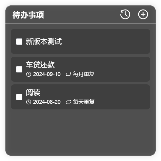 |
| Deadline | 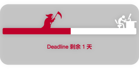 |
| 番茄钟 | 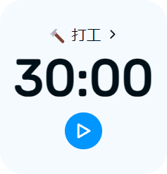 |
| 日历 |  |
### 剪切板组件包
| 剪切板组件包 | https://github.com/rtugeek/clipboard |
|:------:|:------------------------------------------------------------------------------------------------------------:|
| 剪切板 |  |
### 天气组件包
| 天气组件包 | https://github.com/rtugeek/weather |
|:-----:|:------------------------------------------------------------------------------------------:|
| 2x2 |  |
| 4x2 |  |
| 4x4 |  |
### 热点组件包
| 热点组件包 | https://github.com/widget-js/hotspot |
|:------------------------------------------------------------------------------------------------------------------:|-------------------------------------------------------------------------------------------------------------|
|  |  |
|  |  |
| 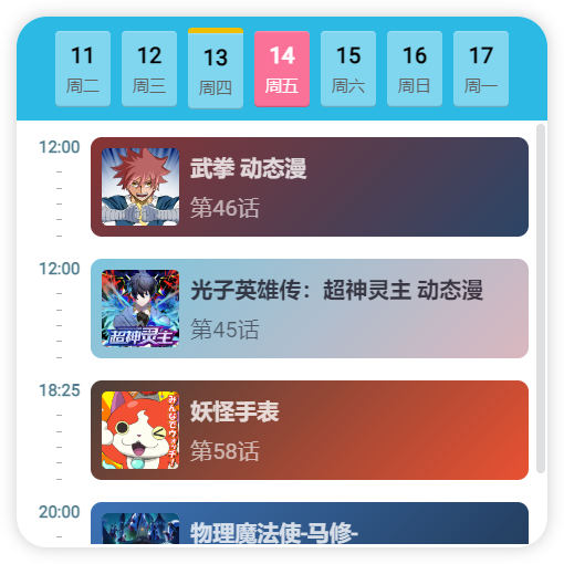 <br/>追番助手 | |
### 时钟组件包
| 时钟组件包 | https://github.com/rtugeek/clock |
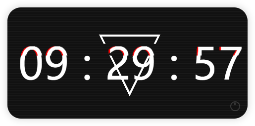
|:-------------------------------------------------------------------------------------------------------------------------:|:-----------------------------------------------------------------------------------------------------------------------:|
|  <br/>翻页时钟 |  <br/>时钟 |
|  <br/>故障时钟 |  <br/>米奇时钟 |
### 相册组件包
| 相册组件包 | https://github.com/rtugeek/photo |
|:---------------------------------------------------------------------------------------------------------:|:-----------------------------------------------------------------------------------------------------------:|
|  <br/>大头贴 |  <br/>轮播相册 |
### 趣味组件包
| 趣味组件包 | https://github.com/rtugeek/fun |
|:-------------------------------------------------------------------------------------------------------------:|:--------------------------------------------------------------------------------------------------------------------------------:|
|  <br/>电子木鱼 |  <br/>仪表盘 |
================================================
FILE: components.json
================================================
{
"$schema": "https://ui.shadcn.com/schema.json",
"style": "new-york",
"rsc": false,
"tsx": true,
"tailwind": {
"config": "",
"css": "src/index.css",
"baseColor": "neutral",
"cssVariables": true,
"prefix": ""
},
"iconLibrary": "lucide",
"rtl": false,
"aliases": {
"components": "@/components",
"utils": "@/lib/utils",
"ui": "@/components/ui",
"lib": "@/lib",
"hooks": "@/hooks"
},
"registries": {}
}
================================================
FILE: eslint.config.js
================================================
import antfu from '@antfu/eslint-config'
export default antfu({
type: 'lib',
stylistic: {
indent: 2, // 4, or 'tab'
quotes: 'single', // or 'double'
},
typescript: true,
react: true,
jsx: true,
vue: false,
jsonc: false,
yaml: false,
markdown: false,
ignores: [
'**/fixtures',
'src/components/ui/**',
],
rules: {
'curly': ['error', 'multi-line'],
'no-use-before-define': 'off',
'eqeqeq': 'off',
'unused-imports/no-unused-vars': ['error', {
caughtErrors: 'none',
argsIgnorePattern: '^_',
varsIgnorePattern: '^_',
}],
'ts/explicit-function-return-type': 'off',
'style/max-statements-per-line': ['error', {
max: 2,
}],
},
})
================================================
FILE: index.html
================================================
<!doctype html>
<html lang="en">
<head>
<meta charset="UTF-8" />
<link rel="icon" type="image/svg+xml" href="/favicon.ico" />
<meta name="viewport" content="width=device-width, initial-scale=1.0" />
<title>Widget Hub</title>
</head>
<body>
<div id="root"></div>
<script type="module" src="/src/main.tsx"></script>
</body>
</html>
================================================
FILE: package.json
================================================
{
"name": "@widget-js/react-app",
"private": true,
"version": "0.0.0",
"type": "module",
"scripts": {
"dev": "vite",
"build": "tsc -b && vite build",
"preview": "vite preview",
"lint": "eslint --cache .",
"lint:fix": "eslint --cache . --fix",
"prepare": "simple-git-hooks"
},
"dependencies": {
"@icons-pack/react-simple-icons": "^13.11.2",
"@radix-ui/react-checkbox": "^1.3.3",
"@radix-ui/react-popover": "^1.1.15",
"@supabase/auth-js": "^2.86.0",
"@supabase/supabase-js": "^2.84.0",
"@tailwindcss/vite": "^4.2.0",
"@uiw/react-color": "^2.9.5",
"@widget-js/core": "latest",
"@widget-js/react": "latest",
"@widget-js/web-api": "24.1.1-beta.70",
"axios": "^1.13.5",
"baseline-browser-mapping": "^2.10.0",
"class-variance-authority": "^0.7.1",
"clsx": "^2.1.1",
"cmdk": "^1.1.1",
"consola": "^3.4.2",
"driver.js": "^1.4.0",
"framer-motion": "^12.34.3",
"i18next": "^25.8.13",
"i18next-browser-languagedetector": "^8.2.1",
"lucide-react": "^0.575.0",
"next-themes": "^0.4.6",
"qrcode.react": "^4.2.0",
"radix-ui": "^1.4.3",
"react": "^19.2.0",
"react-dom": "^19.2.0",
"react-dropzone": "^15.0.0",
"react-i18next": "^16.5.4",
"react-medium-image-zoom": "^5.4.1",
"react-router-dom": "^7.1.5",
"react-use": "^17.6.0",
"semver": "^7.7.4",
"sonner": "^2.0.7",
"tailwind-merge": "^3.5.0",
"tailwindcss": "^4.2.0"
},
"devDependencies": {
"@antfu/eslint-config": "^7.6.1",
"@eslint-react/eslint-plugin": "^2.13.0",
"@types/node": "^24.10.13",
"@types/react": "^19.2.7",
"@types/react-dom": "^19.2.3",
"@types/semver": "^7.7.1",
"@vitejs/plugin-react": "^5.1.1",
"@widget-js/vite-plugin-widget": "24.1.1-beta.72",
"eslint": "^10.0.2",
"eslint-plugin-format": "^2.0.1",
"eslint-plugin-react-hooks": "^7.0.1",
"eslint-plugin-react-refresh": "^0.4.26",
"eslint-plugin-unicorn": "^63.0.0",
"globals": "^16.5.0",
"lint-staged": "^16.3.0",
"shadcn": "^3.8.5",
"simple-git-hooks": "^2.13.1",
"tw-animate-css": "^1.4.0",
"typescript": "~5.9.3",
"vite": "^7.3.1"
},
"simple-git-hooks": {
"pre-commit": "npx lint-staged"
},
"lint-staged": {
"*.{js,ts,tsx,vue,md}": [
"eslint --cache --fix"
]
}
}
================================================
FILE: src/api/ai.ts
================================================
import request from '@/lib/request'
export interface AiTokenHistory {
id: string
user_id: string
change_amount: number
token_remain_after: number | null
model: string | null
prompt_tokens: number | null
completion_tokens: number | null
total_tokens: number | null
cost: number | null
request_type: string | null
input_token_details: any | null
output_token_details: any | null
raw_usage: any | null
related_id: string | null
remark: string | null
create_time: string
sourcePackage?: string | null
sourcePackageName?: string | null
}
export interface AiTokenPackage {
id: string
name: string
userId: string
maxToken: number
usedToken: number
expireTime: string | null
createTime: string
productId: number | null
enable: boolean | null
updateTime: string | null
}
interface PaginationResult<T> {
data: T[]
page: string | number
pageSize: string | number
totalPage: number
total: number
}
export const AiApi = {
async getPackages(params?: { page?: number, limit?: number }): Promise<{ items: AiTokenPackage[], total: number }> {
const res = await request.get('/ai/package', { params })
const data = res as unknown as PaginationResult<AiTokenPackage>
return {
items: data.data,
total: data.total,
}
},
async getUsage(params?: { page?: number, limit?: number }): Promise<{ items: AiTokenHistory[], total: number }> {
const res = await request.get('/ai/usage', { params })
const data = res as unknown as PaginationResult<AiTokenHistory>
return {
items: data.data,
total: data.total,
}
},
}
================================================
FILE: src/api/pay.ts
================================================
import request from '@/lib/request'
export interface PayVirtualProduct {
id: number
createTime: string
updateTime: string | null
name: string
description: string | null
coverUrl: string | null
price: number
category: string
metadata: string | null
enable: boolean
}
export interface WxOrderResult {
codeUrl: string
product: PayVirtualProduct
orderId: string
}
export interface AlipayOrderResult {
orderId: string
product: PayVirtualProduct
form: string
}
export const PayApi = {
async getProducts(category: string = 'ai'): Promise<PayVirtualProduct[]> {
return request.get('https://widgetjs.cn/pay/products', {
params: { category },
})
},
async createWxOrder(productId: number): Promise<WxOrderResult> {
return request.get('https://widgetjs.cn/pay/wx/order', {
params: { productId },
})
},
async createAlipayOrder(productId: number, returnUrl: string = 'https://widgetjs.cn'): Promise<AlipayOrderResult> {
return request.post('https://widgetjs.cn/pay/alipay/order/page', null, {
params: { productId, returnUrl },
})
},
async getAlipayUrl(orderId: string): Promise<string> {
return `https://widgetjs.cn/pay/alipay/order/page?orderId=${orderId}`
},
}
================================================
FILE: src/api/supabase.ts
================================================
import { createClient } from '@supabase/supabase-js'
const anonKey = 'eyJhbGciOiJIUzI1NiIsInR5cCI6IkpXVCJ9.eyJyb2xlIjoiYW5vbiIsImlzcyI6InN1cGFiYXNlIiwiaWF0IjoxNzY0MDAwMDAwLCJleHAiOjE5MjE3NjY0MDB9.3nGFAW2q2bzxWmx1T-ycnmklITh9OcEvA1kZPXz4dBs'
const supabaseUrl = 'https://supabase.widgetjs.cn'
const supabase = createClient(supabaseUrl, anonKey)
function getStorageLink(fullPath: string) {
return `https://supabase.widgetjs.cn/storage/v1/object/public/${fullPath}`
}
export { getStorageLink, supabase }
================================================
FILE: src/api/web-widget-api.ts
================================================
import type { WidgetSearchOptions } from '@widget-js/web-api'
import request from '@/lib/request'
export const WebWidgetApi = {
search: (options: WidgetSearchOptions) => {
return request.get('/widget', {
params: options,
})
},
}
================================================
FILE: src/app.css
================================================
/* App.css cleared for Tailwind compatibility */
*{
/*user-select: none;*/
}
/* Global Scrollbar Styling matching src/components/ui/scroll-area.tsx */
::-webkit-scrollbar {
width: 10px;
height: 10px;
}
::-webkit-scrollbar-track {
background: transparent;
}
::-webkit-scrollbar-thumb {
background-color: var(--border);
border-radius: 9999px;
border: 1px solid transparent;
background-clip: content-box;
}
::-webkit-scrollbar-corner {
background: transparent;
}
================================================
FILE: src/app.tsx
================================================
import consola from 'consola'
import { useTranslation } from 'react-i18next'
import { RouterProvider } from 'react-router-dom'
import { useAppLanguage } from './hooks/use-app-language'
import { router } from './router'
import '@widget-js/react/style.css'
import './app.css'
function App() {
const { i18n } = useTranslation()
useAppLanguage({
onLoad: (lang) => {
consola.log('App language loaded:', lang)
i18n.changeLanguage(lang)
},
onChange: (lang) => {
consola.log('App language onChange:', lang)
i18n.changeLanguage(lang)
},
})
return (
<RouterProvider router={router} />
)
}
export default App
================================================
FILE: src/components/app-sidebar.tsx
================================================
'use client'
import {
User,
} from 'lucide-react'
import * as React from 'react'
import { useTranslation } from 'react-i18next'
import { useLocation, useNavigate } from 'react-router-dom'
import logo from '@/assets/images/logo.png'
import { NavMain } from '@/components/nav-main'
import { NavUser } from '@/components/nav-user'
import {
Sidebar,
SidebarContent,
SidebarFooter,
SidebarHeader,
SidebarMenu,
SidebarMenuButton,
SidebarMenuItem,
SidebarRail,
} from '@/components/ui/sidebar'
import { useAppRuntimeInfo } from '@/hooks/use-app-runtime-info'
import { useUser } from '@/hooks/use-user'
import { routes } from '@/router'
interface RouteHandle {
title: string
icon?: any
sidebarGroup?: boolean
sidebarMenu?: boolean
}
export function AppSidebar({ ...props }: React.ComponentProps<typeof Sidebar>) {
const { t } = useTranslation()
const location = useLocation()
const navigate = useNavigate()
const { simpleInfo } = useAppRuntimeInfo()
const { user, nickname, avatar } = useUser()
const userData = {
name: nickname,
email: user?.email ?? '',
avatar: user ? (avatar || logo) : undefined,
icon: !user ? User : undefined,
}
const rootRoute = routes[0]
const sidebarGroups = rootRoute.children
?.filter(route => (route.handle as RouteHandle | undefined)?.sidebarGroup)
.map((route) => {
const handle = route.handle as RouteHandle
// Handle nested routes logic
const groupPath = route.path === '/' ? '' : route.path || ''
const items = route.children
?.filter(child => (child.handle as RouteHandle | undefined)?.sidebarMenu)
.map((child) => {
const childHandle = child.handle as RouteHandle
// Handle child path: '/' as root of group
const childPath = child.path === '/' ? '' : child.path || ''
const url = `/${groupPath}${childPath ? `/${childPath}` : ''}`.replace(/\/+/g, '/')
return {
title: t(childHandle.title),
url,
icon: childHandle.icon,
isActive: location.pathname === url,
}
}) || []
return {
label: t(handle.title),
items,
}
}) || []
return (
<>
<Sidebar collapsible="none" {...props}>
<SidebarHeader>
<SidebarMenu>
<SidebarMenuItem>
<SidebarMenuButton
size="lg"
onClick={() => navigate('/setting/info')}
className="data-[state=open]:bg-sidebar-accent data-[state=open]:text-sidebar-accent-foreground"
>
<div className="flex aspect-square size-8 items-center justify-center rounded-lg bg-sidebar-primary text-sidebar-primary-foreground">
<img src={logo} alt="Widget Hub" className="size-8" />
</div>
<div className="grid flex-1 text-left text-sm leading-tight">
<span className="truncate font-semibold">{t('sidebar.widgetHub')}</span>
<span className="truncate text-xs">{(simpleInfo?.app as any)?.version ?? (simpleInfo?.app ? String(simpleInfo.app) : t('sidebar.loading'))}</span>
</div>
</SidebarMenuButton>
</SidebarMenuItem>
</SidebarMenu>
</SidebarHeader>
<SidebarContent>
{sidebarGroups.map((group, index) => (
<NavMain key={index} label={group.label} items={group.items} />
))}
</SidebarContent>
<SidebarFooter>
<NavUser user={userData} />
</SidebarFooter>
<SidebarRail />
</Sidebar>
</>
)
}
================================================
FILE: src/components/dashboard-layout.tsx
================================================
import { WindowControls } from '@widget-js/react'
import { useTranslation } from 'react-i18next'
import { Outlet, useMatches } from 'react-router-dom'
import { AppSidebar } from '@/components/app-sidebar'
import {
Breadcrumb,
BreadcrumbItem,
BreadcrumbList,
BreadcrumbPage,
} from '@/components/ui/breadcrumb'
import {
SidebarInset,
SidebarProvider,
} from '@/components/ui/sidebar'
export function DashboardLayout() {
const { t } = useTranslation()
const matches = useMatches()
// Get title from the last match that has a handle with a title
const currentMatch = matches.findLast(match => (match.handle as any)?.title)
const titleKey = (currentMatch?.handle as any)?.title
const title = titleKey ? t(titleKey) : t('dashboard.dashboard')
return (
<SidebarProvider>
<AppSidebar />
<SidebarInset className="overflow-hidden">
<header className="draggable-region flex h-[54px] shrink-0 items-center justify-between gap-2 transition-[width,height] ease-linear group-has-[[data-collapsible=icon]]/sidebar-wrapper:h-12">
<div className="flex items-center gap-2 px-4">
<Breadcrumb>
<BreadcrumbList>
<BreadcrumbItem>
<BreadcrumbPage>{title}</BreadcrumbPage>
</BreadcrumbItem>
</BreadcrumbList>
</Breadcrumb>
</div>
<WindowControls />
</header>
<div className="flex flex-1 flex-col gap-4 pt-0 overflow-y-auto">
<Outlet />
</div>
</SidebarInset>
</SidebarProvider>
)
}
================================================
FILE: src/components/login-check.tsx
================================================
import { BrowserWindowApi, NotificationApi } from '@widget-js/core'
import consola from 'consola'
import { Lock } from 'lucide-react'
import { useEffect, useState } from 'react'
import { toast } from 'sonner'
import { supabase } from '@/api/supabase'
import { Button } from '@/components/ui/button'
import {
Empty,
EmptyContent,
EmptyDescription,
EmptyHeader,
EmptyMedia,
EmptyTitle,
} from '@/components/ui/empty'
import { useSupabaseChannel } from '@/hooks/use-supabase-channel'
import { useUser } from '@/hooks/use-user'
interface LoginCheckProps {
children: React.ReactNode
}
export function LoginCheck({ children }: LoginCheckProps) {
const { user, loading: userLoading } = useUser()
const [loginState, setLoginState] = useState('')
useEffect(() => {
const storedState = localStorage.getItem('wechat_login_state')
if (storedState) { setLoginState(storedState) }
}, [])
// Handle Supabase channel for login
useSupabaseChannel(loginState ? `wechat-login-${loginState}` : '', async (payload: any) => {
consola.info(payload)
const currentSession = payload.payload.session
const loginRes = await supabase.auth.setSession(currentSession)
if (loginRes.error) {
NotificationApi.error(loginRes.error.message)
}
else {
toast.success('登录成功')
}
})
const handleLogin = () => {
const newState = crypto.randomUUID().replace(/-/g, '')
setLoginState(newState)
localStorage.setItem('wechat_login_state', newState)
BrowserWindowApi.openUrl(`https://open.weixin.qq.com/connect/qrconnect?appid=wxf91b19da281f23a9&redirect_uri=https%3A%2F%2Fwidgetjs.cn%2Fapi%2Fv1%2Fuser%2Flogin%2Fwechat%2Fcallback&response_type=code&scope=snsapi_login&state=${newState}#wechat_redirect`, {
width: 800,
height: 600,
frame: true,
transparent: false,
titleBarStyle: 'default',
})
}
if (!user && !userLoading) {
return (
<div className="flex flex-col items-center justify-center h-[60vh]">
<Empty>
<EmptyHeader>
<EmptyMedia variant="icon">
<Lock className="h-6 w-6" />
</EmptyMedia>
<EmptyTitle>需要登录</EmptyTitle>
<EmptyDescription>
请先登录账号以继续使用
</EmptyDescription>
</EmptyHeader>
<EmptyContent>
<Button onClick={handleLogin}>
立即登录
</Button>
</EmptyContent>
</Empty>
</div>
)
}
return <>{children}</>
}
================================================
FILE: src/components/manager/deployed-widget-card.tsx
================================================
import type { DeployedWidget, Widget } from '@widget-js/core'
import { DeployedWidgetApi, WidgetApi } from '@widget-js/core'
import { Code, RefreshCw, Settings, X } from 'lucide-react'
import { useEffect, useState } from 'react'
import { useTranslation } from 'react-i18next'
import {
AlertDialog,
AlertDialogAction,
AlertDialogCancel,
AlertDialogContent,
AlertDialogDescription,
AlertDialogFooter,
AlertDialogHeader,
AlertDialogTitle,
AlertDialogTrigger,
} from '@/components/ui/alert-dialog'
import { Button } from '@/components/ui/button'
import { Card, CardDescription, CardFooter, CardHeader, CardTitle } from '@/components/ui/card'
import { Checkbox } from '@/components/ui/checkbox'
import {
Tooltip,
TooltipContent,
TooltipTrigger,
} from '@/components/ui/tooltip'
import { useDebugConfig } from '@/hooks/use-debug-config'
interface DeployedWidgetCardProps {
deployedWidget: DeployedWidget
onRemove: (widget: DeployedWidget) => void
}
export function DeployedWidgetCard({ deployedWidget, onRemove }: DeployedWidgetCardProps) {
const { t, i18n } = useTranslation()
const [widget, setWidget] = useState<Widget>()
const [ignoreMouseEvents, setIgnoreMouseEvents] = useState(deployedWidget.isIgnoreMouseEvents ?? false)
const [isDebugMode] = useDebugConfig()
useEffect(() => {
WidgetApi.getWidget(deployedWidget.name).then(setWidget)
}, [deployedWidget.name])
const getLocalizedText = (text: any) => {
if (typeof text === 'string') { return text }
if (!text) { return '' }
return text[i18n.language] || text['zh-CN'] || Object.values(text)[0] || ''
}
const openSettings = () => {
if (widget?.configPagePath) {
DeployedWidgetApi.openConfigPage(deployedWidget.id)
}
}
const openDevTools = () => {
DeployedWidgetApi.openDevTools(deployedWidget.id)
}
const refresh = () => {
WidgetApi.reload(deployedWidget.id)
}
const onIgnoreMouseEventChange = (checked: boolean) => {
setIgnoreMouseEvents(checked)
WidgetApi.setIgnoreMouseEvents(deployedWidget.id, checked)
}
return (
<Card className="shadow-none bg-secondary/20 group relative gap-0 p-0">
<CardHeader className="p-2 pb-2">
<div className="flex flex-col gap-1 overflow-hidden flex-1 text-left">
{widget && (
<CardTitle className="text-sm">
{getLocalizedText(widget.title)}
</CardTitle>
)}
<CardDescription className="text-sm flex gap-2">
{deployedWidget.name}
</CardDescription>
</div>
</CardHeader>
<CardFooter className="p-2 flex flex-col gap-3 bg-muted/40 rounded-md">
<div className="flex w-full items-center gap-2">
<div className="flex items-center space-x-2 mr-auto">
<Checkbox
id={`ignore-mouse-${deployedWidget.id}`}
checked={ignoreMouseEvents}
onCheckedChange={onIgnoreMouseEventChange}
/>
<label
htmlFor={`ignore-mouse-${deployedWidget.id}`}
className="text-sm font-medium leading-none peer-disabled:cursor-not-allowed peer-disabled:opacity-70"
>
鼠标穿透
</label>
</div>
{isDebugMode && (
<Tooltip>
<TooltipTrigger asChild>
<Button variant="ghost" size="icon" className="h-8 w-8" onClick={openDevTools}>
<Code className="h-4 w-4" />
</Button>
</TooltipTrigger>
<TooltipContent>
<p>DevTools</p>
</TooltipContent>
</Tooltip>
)}
<Tooltip>
<TooltipTrigger asChild>
<Button variant="ghost" size="icon" className="h-8 w-8" onClick={refresh}>
<RefreshCw className="h-4 w-4" />
</Button>
</TooltipTrigger>
<TooltipContent>
<p>{t('tray.restartWidgets')}</p>
</TooltipContent>
</Tooltip>
{widget?.configPagePath && (
<Tooltip>
<TooltipTrigger asChild>
<Button variant="ghost" size="icon" className="h-8 w-8" onClick={openSettings}>
<Settings className="h-4 w-4" />
</Button>
</TooltipTrigger>
<TooltipContent>
<p>{t('settings.title')}</p>
</TooltipContent>
</Tooltip>
)}
<AlertDialog>
<Tooltip>
<TooltipTrigger asChild>
<AlertDialogTrigger asChild>
<Button variant="ghost" size="icon" className="h-8 w-8 hover:text-destructive">
<X className="h-4 w-4" />
</Button>
</AlertDialogTrigger>
</TooltipTrigger>
<TooltipContent>
<p>{t('manager.remove')}</p>
</TooltipContent>
</Tooltip>
<AlertDialogContent>
<AlertDialogHeader>
<AlertDialogTitle>{t('manager.confirmRemove')}</AlertDialogTitle>
<AlertDialogDescription>
{t('manager.removeDesc', { name: widget ? getLocalizedText(widget.title) : deployedWidget.name })}
</AlertDialogDescription>
</AlertDialogHeader>
<AlertDialogFooter>
<AlertDialogCancel>{t('settings.widgetPackage.cancel')}</AlertDialogCancel>
<AlertDialogAction onClick={() => onRemove(deployedWidget)}>
{t('settings.widgetPackage.confirm')}
</AlertDialogAction>
</AlertDialogFooter>
</AlertDialogContent>
</AlertDialog>
</div>
</CardFooter>
</Card>
)
}
================================================
FILE: src/components/manager/deployed-widget-list.tsx
================================================
import type { DeployedWidget } from '@widget-js/core'
import { BrowserWindowApi, DeployedWidgetApi } from '@widget-js/core'
import { useEffect, useState } from 'react'
import { useTranslation } from 'react-i18next'
import { DeployedWidgetCard } from './deployed-widget-card'
export default function DeployedWidgetList() {
const [widgets, setWidgets] = useState<DeployedWidget[]>([])
const { t } = useTranslation()
const refreshWidgets = () => {
DeployedWidgetApi.getDeployedWidgets().then(setWidgets)
}
useEffect(() => {
refreshWidgets()
BrowserWindowApi.setAlwaysOnTop(true)
// Listen for window focus to refresh list
window.addEventListener('focus', refreshWidgets)
return () => {
window.removeEventListener('focus', refreshWidgets)
}
}, [])
const removeWidget = async (widget: DeployedWidget) => {
await DeployedWidgetApi.removeDeployedWidget(widget.id)
setWidgets(prev => prev.filter(w => w.id !== widget.id))
}
return (
<div className="flex flex-col gap-2">
{widgets.map(widget => (
<DeployedWidgetCard
key={widget.id}
deployedWidget={widget}
onRemove={() => removeWidget(widget)}
/>
))}
{widgets.length === 0 && (
<div className="text-center text-muted-foreground text-xs py-4">
{t('tray.runningWidgets')}
{' '}
(0)
</div>
)}
</div>
)
}
================================================
FILE: src/components/nav-main.tsx
================================================
import type { LucideIcon } from 'lucide-react'
import { Link } from 'react-router-dom'
import {
SidebarGroup,
SidebarGroupLabel,
SidebarMenu,
SidebarMenuButton,
SidebarMenuItem,
} from '@/components/ui/sidebar'
export function NavMain({
label,
items,
}: {
label: string
items: {
title: string
url: string
icon: LucideIcon
isActive?: boolean
}[]
}) {
return (
<SidebarGroup>
<SidebarGroupLabel>{label}</SidebarGroupLabel>
<SidebarMenu>
{items.map(item => (
<SidebarMenuItem key={item.url}>
<SidebarMenuButton asChild tooltip={item.title} isActive={item.isActive}>
<Link to={item.url}>
{item.icon && <item.icon />}
<span>{item.title}</span>
</Link>
</SidebarMenuButton>
</SidebarMenuItem>
))}
</SidebarMenu>
</SidebarGroup>
)
}
================================================
FILE: src/components/nav-user.tsx
================================================
import type { LucideIcon } from 'lucide-react'
import { BrowserWindowApi, NotificationApi } from '@widget-js/core'
import consola from 'consola'
import {
ChevronsUpDown,
} from 'lucide-react'
import { useEffect, useState } from 'react'
import { useNavigate } from 'react-router-dom'
import { supabase } from '@/api/supabase'
import {
SidebarMenu,
SidebarMenuButton,
SidebarMenuItem,
} from '@/components/ui/sidebar'
import UserAvatar from '@/components/user-avatar'
import { useSupabaseChannel } from '@/hooks/use-supabase-channel'
export function NavUser({
user,
}: {
user: {
name: string
email: string
avatar?: string
icon?: LucideIcon
}
}) {
const navigate = useNavigate()
const [loginState, setLoginState] = useState('')
useEffect(() => {
const storedState = localStorage.getItem('wechat_login_state')
if (storedState) { setLoginState(storedState) }
}, [])
// Handle Supabase channel for login
useSupabaseChannel(loginState ? `wechat-login-${loginState}` : '', async (payload: any) => {
consola.info(payload)
const currentSession = payload.payload.session
const loginRes = await supabase.auth.setSession(currentSession)
if (loginRes.error) {
NotificationApi.error(loginRes.error.message)
}
else {
navigate('/user/profile')
}
})
const handleLogin = () => {
const newState = crypto.randomUUID().replace(/-/g, '')
setLoginState(newState)
localStorage.setItem('wechat_login_state', newState)
BrowserWindowApi.openUrl(`https://open.weixin.qq.com/connect/qrconnect?appid=wxf91b19da281f23a9&redirect_uri=https%3A%2F%2Fwidgetjs.cn%2Fapi%2Fv1%2Fuser%2Flogin%2Fwechat%2Fcallback&response_type=code&scope=snsapi_login&state=${newState}#wechat_redirect`, {
width: 800,
height: 600,
frame: true,
transparent: false,
titleBarStyle: 'default',
})
}
const handleClick = () => {
if (user.email) {
navigate('/user/profile')
}
else {
handleLogin()
}
}
return (
<SidebarMenu>
<SidebarMenuItem>
<SidebarMenuButton
size="lg"
className="data-[state=open]:bg-sidebar-accent data-[state=open]:text-sidebar-accent-foreground"
onClick={handleClick}
>
<UserAvatar
src={user.avatar}
alt={user.name}
className="h-8 w-8 rounded-lg bg-sidebar-primary text-sidebar-primary-foreground"
/>
<div className="grid flex-1 text-left text-sm leading-tight">
<span className="truncate font-medium">{user.name}</span>
</div>
<ChevronsUpDown className="ml-auto size-4" />
</SidebarMenuButton>
</SidebarMenuItem>
</SidebarMenu>
)
}
================================================
FILE: src/components/purchase-dialog.tsx
================================================
import type { AlipayOrderResult, PayVirtualProduct } from '@/api/pay'
import { SiAlipay } from '@icons-pack/react-simple-icons'
import { BrowserWindowApi } from '@widget-js/core'
import consola from 'consola'
import { useEffect, useState } from 'react'
import { toast } from 'sonner'
import { PayApi } from '@/api/pay'
import { supabase } from '@/api/supabase'
import { Button } from '@/components/ui/button'
import {
Dialog,
DialogContent,
DialogHeader,
DialogTitle,
} from '@/components/ui/dialog'
import { Spinner } from '@/components/ui/spinner'
interface PurchaseDialogProps {
open: boolean
onOpenChange: (open: boolean) => void
productId?: number
onSuccess?: () => void
}
export function PurchaseDialog({ open, onOpenChange, productId = 2, onSuccess }: PurchaseDialogProps) {
const [loading, setLoading] = useState(false)
const [product, setProduct] = useState<PayVirtualProduct | null>(null)
const [order, setOrder] = useState<AlipayOrderResult | null>(null)
const [payUrl, setPayUrl] = useState<string>('')
useEffect(() => {
if (!order) { return }
const channel = supabase
.channel('table-db-changes')
.on(
'postgres_changes',
{
event: 'INSERT',
schema: 'public',
table: 'ai_token_packages',
filter: `order_id=eq.${order.orderId}`,
},
(payload) => {
consola.log('Payment successful:', payload)
toast.success('支付成功!')
onOpenChange(false)
onSuccess?.()
},
)
.subscribe()
return () => {
supabase.removeChannel(channel)
}
}, [order])
const initPurchase = async () => {
try {
setLoading(true)
setProduct(null)
setOrder(null)
setPayUrl('')
// 1. Get Product Info
const products = await PayApi.getProducts('ai')
const targetProduct = products.find(p => p.id === productId)
if (!targetProduct) {
toast.error('商品不存在')
onOpenChange(false)
return
}
setProduct(targetProduct)
// 2. Create Order
const orderRes = await PayApi.createAlipayOrder(targetProduct.id, window.location.href)
setOrder(orderRes)
const url = await PayApi.getAlipayUrl(orderRes.orderId)
setPayUrl(url)
}
catch (error) {
console.error(error)
toast.error('获取购买信息失败')
onOpenChange(false)
}
finally {
setLoading(false)
}
}
useEffect(() => {
if (open) {
initPurchase()
}
else {
// Clean up when closed
setOrder(null)
}
}, [open, productId])
return (
<Dialog open={open} onOpenChange={onOpenChange}>
<DialogContent className="sm:max-w-md">
<DialogHeader>
<DialogTitle>购买套餐</DialogTitle>
</DialogHeader>
<div className="flex flex-col items-center justify-center p-4 gap-6">
{loading
? (
<div className="flex flex-col items-center gap-2 py-8">
<Spinner className="h-8 w-8" />
<p className="text-sm text-muted-foreground">正在创建订单...</p>
</div>
)
: product && order
? (
<>
<div className="text-center space-y-2">
<h3 className="font-semibold text-lg">{product.name}</h3>
<p className="text-2xl font-bold text-primary">
¥
{(product.price / 100).toFixed(2)}
</p>
{product.description && (
<p className="text-sm text-muted-foreground">{product.description}</p>
)}
</div>
<div className="flex flex-col items-center gap-4 pt-4 w-full">
<Button
onClick={() => BrowserWindowApi.openUrl(payUrl, { external: true })}
className="w-full bg-[#1677FF] hover:bg-[#1677FF]/90 text-white"
>
<SiAlipay className="mr-2 h-4 w-4" />
前往支付宝支付
</Button>
<div className="text-sm text-muted-foreground">
支付完成后,本窗口会自动刷新
</div>
</div>
</>
)
: (
<div className="py-8 text-muted-foreground">
加载失败,请重试
</div>
)}
</div>
</DialogContent>
</Dialog>
)
}
================================================
FILE: src/components/setting-section.tsx
================================================
import type { ReactNode } from 'react'
import { Separator } from '@/components/ui/separator'
interface SettingSectionProps {
title: string
children: ReactNode
}
export function SettingSection({ title, children }: SettingSectionProps) {
return (
<div className="space-y-4">
<div className="space-y-1">
<h4 className="text-sm font-medium leading-none">{title}</h4>
<Separator className="my-2" />
</div>
<div className="space-y-4 pl-1">
{children}
</div>
</div>
)
}
================================================
FILE: src/components/team-switcher.tsx
================================================
'use client'
import { ChevronsUpDown, Plus } from 'lucide-react'
import * as React from 'react'
import {
DropdownMenu,
DropdownMenuContent,
DropdownMenuItem,
DropdownMenuLabel,
DropdownMenuSeparator,
DropdownMenuShortcut,
DropdownMenuTrigger,
} from '@/components/ui/dropdown-menu'
import {
SidebarMenu,
SidebarMenuButton,
SidebarMenuItem,
useSidebar,
} from '@/components/ui/sidebar'
export function TeamSwitcher({
teams,
}: {
teams: {
name: string
logo: React.ElementType
plan: string
}[]
}) {
const { isMobile } = useSidebar()
const [activeTeam, setActiveTeam] = React.useState(teams[0])
if (!activeTeam) {
return null
}
return (
<SidebarMenu>
<SidebarMenuItem>
<DropdownMenu>
<DropdownMenuTrigger asChild>
<SidebarMenuButton
size="lg"
className="data-[state=open]:bg-sidebar-accent data-[state=open]:text-sidebar-accent-foreground"
>
<div className="bg-sidebar-primary text-sidebar-primary-foreground flex aspect-square size-8 items-center justify-center rounded-lg">
<activeTeam.logo className="size-4" />
</div>
<div className="grid flex-1 text-left text-sm leading-tight">
<span className="truncate font-medium">{activeTeam.name}</span>
<span className="truncate text-xs">{activeTeam.plan}</span>
</div>
<ChevronsUpDown className="ml-auto" />
</SidebarMenuButton>
</DropdownMenuTrigger>
<DropdownMenuContent
className="w-(--radix-dropdown-menu-trigger-width) min-w-56 rounded-lg"
align="start"
side={isMobile ? 'bottom' : 'right'}
sideOffset={4}
>
<DropdownMenuLabel className="text-muted-foreground text-xs">
Teams
</DropdownMenuLabel>
{teams.map((team, index) => (
<DropdownMenuItem
key={team.name}
onClick={() => setActiveTeam(team)}
className="gap-2 p-2"
>
<div className="flex size-6 items-center justify-center rounded-md border">
<team.logo className="size-3.5 shrink-0" />
</div>
{team.name}
<DropdownMenuShortcut>
⌘
{index + 1}
</DropdownMenuShortcut>
</DropdownMenuItem>
))}
<DropdownMenuSeparator />
<DropdownMenuItem className="gap-2 p-2">
<div className="flex size-6 items-center justify-center rounded-md border bg-transparent">
<Plus className="size-4" />
</div>
<div className="text-muted-foreground font-medium">Add team</div>
</DropdownMenuItem>
</DropdownMenuContent>
</DropdownMenu>
</SidebarMenuItem>
</SidebarMenu>
)
}
================================================
FILE: src/components/tray/social-links.tsx
================================================
import { AppApi, NotificationApi } from '@widget-js/core'
import { useCallback, useRef } from 'react'
import { useTranslation } from 'react-i18next'
import bilibili from '@/assets/images/bilibili_logo_red.png'
import douyin from '@/assets/images/douyin.png'
import githubMark from '@/assets/images/github-mark.png'
import logo from '@/assets/images/logo.png'
import qq from '@/assets/images/qq.png'
interface SocialLinksProps {
iconSize?: number
}
function useLongPress(callback: () => void, delay: number = 3000) {
const timeoutRef = useRef<number | null>(null)
const start = useCallback(() => {
timeoutRef.current = window.setTimeout(() => {
callback()
}, delay)
}, [callback, delay])
const clear = useCallback(() => {
if (timeoutRef.current) {
clearTimeout(timeoutRef.current)
timeoutRef.current = null
}
}, [])
return {
onMouseDown: start,
onMouseUp: clear,
onMouseLeave: clear,
onTouchStart: start,
onTouchEnd: clear,
}
}
export function SocialLinks({ iconSize = 20 }: SocialLinksProps) {
const { t } = useTranslation()
const handleEnableDevMode = useCallback(async () => {
NotificationApi.info(t('notification.enableDevMode'))
await AppApi.setConfig('debug', true)
}, [t])
const longPressProps = useLongPress(handleEnableDevMode, 3000)
const links = [
{
name: 'Widget',
url: 'https://widgetjs.cn/',
icon: logo,
},
{
name: 'TikTok',
url: 'https://v.douyin.com/YhuNAb8/',
icon: douyin,
},
{
name: 'QQ',
url: 'https://jq.qq.com/?_wv=1027&k=TgO2mUQe',
icon: qq,
},
{
name: 'Bilibili',
url: 'https://space.bilibili.com/207395767',
icon: bilibili,
},
{
name: 'GitHub',
url: 'https://github.com/widget-js/widgets',
icon: githubMark,
...longPressProps, // Apply long press to GitHub only
},
]
return (
<div className="flex items-center justify-start gap-[0.8rem]">
{links.map(link => (
<a
key={link.name}
href={link.url}
target="_blank"
rel="noopener noreferrer"
className="text-primary no-underline leading-none hover:opacity-80 transition-opacity"
{...(link.name === 'GitHub' ? longPressProps : {})}
>
<img
src={link.icon}
alt={link.name}
style={{ width: `${iconSize}px`, height: `${iconSize}px` }}
className="object-contain"
/>
</a>
))}
</div>
)
}
================================================
FILE: src/components/tray/tray-menu-item.tsx
================================================
import type { LucideIcon } from 'lucide-react'
import * as React from 'react'
import { cn } from '@/lib/utils'
interface TrayMenuItemProps extends React.HTMLAttributes<HTMLDivElement> {
icon: LucideIcon
label: string
}
function TrayMenuItem({ ref, className, icon: Icon, label, ...props }: TrayMenuItemProps & { ref?: React.RefObject<HTMLDivElement | null> }) {
return (
<div
ref={ref}
className={cn(
'flex flex-col items-center justify-center gap-2 px-1 py-4 rounded cursor-pointer transition-colors bg-[rgba(0,0,0,0.04)] hover:bg-[rgba(0,0,0,0.08)]',
className,
)}
{...props}
>
<Icon className="h-5 w-5 cursor-pointer" />
<span className="text-xs">{label}</span>
</div>
)
}
TrayMenuItem.displayName = 'TrayMenuItem'
export { TrayMenuItem }
================================================
FILE: src/components/ui/alert-dialog.tsx
================================================
import { AlertDialog as AlertDialogPrimitive } from 'radix-ui'
import * as React from 'react'
import { Button } from '@/components/ui/button'
import { cn } from '@/lib/utils'
function AlertDialog({
...props
}: React.ComponentProps<typeof AlertDialogPrimitive.Root>) {
return <AlertDialogPrimitive.Root data-slot="alert-dialog" {...props} />
}
function AlertDialogTrigger({
...props
}: React.ComponentProps<typeof AlertDialogPrimitive.Trigger>) {
return (
<AlertDialogPrimitive.Trigger data-slot="alert-dialog-trigger" {...props} />
)
}
function AlertDialogPortal({
...props
}: React.ComponentProps<typeof AlertDialogPrimitive.Portal>) {
return (
<AlertDialogPrimitive.Portal data-slot="alert-dialog-portal" {...props} />
)
}
function AlertDialogOverlay({
className,
...props
}: React.ComponentProps<typeof AlertDialogPrimitive.Overlay>) {
return (
<AlertDialogPrimitive.Overlay
data-slot="alert-dialog-overlay"
className={cn(
'data-[state=open]:animate-in data-[state=closed]:animate-out data-[state=closed]:fade-out-0 data-[state=open]:fade-in-0 fixed inset-0 z-50 bg-black/50',
className,
)}
{...props}
/>
)
}
function AlertDialogContent({
className,
size = 'default',
...props
}: React.ComponentProps<typeof AlertDialogPrimitive.Content> & {
size?: 'default' | 'sm'
}) {
return (
<AlertDialogPortal>
<AlertDialogOverlay />
<AlertDialogPrimitive.Content
data-slot="alert-dialog-content"
data-size={size}
className={cn(
'bg-background data-[state=open]:animate-in data-[state=closed]:animate-out data-[state=closed]:fade-out-0 data-[state=open]:fade-in-0 data-[state=closed]:zoom-out-95 data-[state=open]:zoom-in-95 group/alert-dialog-content fixed top-[50%] left-[50%] z-50 grid w-full max-w-[calc(100%-2rem)] translate-x-[-50%] translate-y-[-50%] gap-4 rounded-lg border p-6 shadow-lg duration-200 data-[size=sm]:max-w-xs data-[size=default]:sm:max-w-lg',
className,
)}
{...props}
/>
</AlertDialogPortal>
)
}
function AlertDialogHeader({
className,
...props
}: React.ComponentProps<'div'>) {
return (
<div
data-slot="alert-dialog-header"
className={cn(
'grid grid-rows-[auto_1fr] place-items-center gap-1.5 text-center has-data-[slot=alert-dialog-media]:grid-rows-[auto_auto_1fr] has-data-[slot=alert-dialog-media]:gap-x-6 sm:group-data-[size=default]/alert-dialog-content:place-items-start sm:group-data-[size=default]/alert-dialog-content:text-left sm:group-data-[size=default]/alert-dialog-content:has-data-[slot=alert-dialog-media]:grid-rows-[auto_1fr]',
className,
)}
{...props}
/>
)
}
function AlertDialogFooter({
className,
...props
}: React.ComponentProps<'div'>) {
return (
<div
data-slot="alert-dialog-footer"
className={cn(
'flex flex-col-reverse gap-2 group-data-[size=sm]/alert-dialog-content:grid group-data-[size=sm]/alert-dialog-content:grid-cols-2 sm:flex-row sm:justify-end',
className,
)}
{...props}
/>
)
}
function AlertDialogTitle({
className,
...props
}: React.ComponentProps<typeof AlertDialogPrimitive.Title>) {
return (
<AlertDialogPrimitive.Title
data-slot="alert-dialog-title"
className={cn(
'text-lg font-semibold sm:group-data-[size=default]/alert-dialog-content:group-has-data-[slot=alert-dialog-media]/alert-dialog-content:col-start-2',
className,
)}
{...props}
/>
)
}
function AlertDialogDescription({
className,
...props
}: React.ComponentProps<typeof AlertDialogPrimitive.Description>) {
return (
<AlertDialogPrimitive.Description
data-slot="alert-dialog-description"
className={cn('text-muted-foreground text-sm', className)}
{...props}
/>
)
}
function AlertDialogMedia({
className,
...props
}: React.ComponentProps<'div'>) {
return (
<div
data-slot="alert-dialog-media"
className={cn(
'bg-muted mb-2 inline-flex size-16 items-center justify-center rounded-md sm:group-data-[size=default]/alert-dialog-content:row-span-2 *:[svg:not([class*=\'size-\'])]:size-8',
className,
)}
{...props}
/>
)
}
function AlertDialogAction({
className,
variant = 'default',
size = 'default',
...props
}: React.ComponentProps<typeof AlertDialogPrimitive.Action>
& Pick<React.ComponentProps<typeof Button>, 'variant' | 'size'>) {
return (
<Button variant={variant} size={size} asChild>
<AlertDialogPrimitive.Action
data-slot="alert-dialog-action"
className={cn(className)}
{...props}
/>
</Button>
)
}
function AlertDialogCancel({
className,
variant = 'outline',
size = 'default',
...props
}: React.ComponentProps<typeof AlertDialogPrimitive.Cancel>
& Pick<React.ComponentProps<typeof Button>, 'variant' | 'size'>) {
return (
<Button variant={variant} size={size} asChild>
<AlertDialogPrimitive.Cancel
data-slot="alert-dialog-cancel"
className={cn(className)}
{...props}
/>
</Button>
)
}
export {
AlertDialog,
AlertDialogAction,
AlertDialogCancel,
AlertDialogContent,
AlertDialogDescription,
AlertDialogFooter,
AlertDialogHeader,
AlertDialogMedia,
AlertDialogOverlay,
AlertDialogPortal,
AlertDialogTitle,
AlertDialogTrigger,
}
================================================
FILE: src/components/ui/avatar.tsx
================================================
import { Avatar as AvatarPrimitive } from 'radix-ui'
import * as React from 'react'
import { cn } from '@/lib/utils'
function Avatar({
className,
size = 'default',
...props
}: React.ComponentProps<typeof AvatarPrimitive.Root> & {
size?: 'default' | 'sm' | 'lg'
}) {
return (
<AvatarPrimitive.Root
data-slot="avatar"
data-size={size}
className={cn(
'group/avatar relative flex size-8 shrink-0 overflow-hidden rounded-full select-none data-[size=lg]:size-10 data-[size=sm]:size-6',
className,
)}
{...props}
/>
)
}
function AvatarImage({
className,
...props
}: React.ComponentProps<typeof AvatarPrimitive.Image>) {
return (
<AvatarPrimitive.Image
data-slot="avatar-image"
className={cn('aspect-square size-full', className)}
{...props}
/>
)
}
function AvatarFallback({
className,
...props
}: React.ComponentProps<typeof AvatarPrimitive.Fallback>) {
return (
<AvatarPrimitive.Fallback
data-slot="avatar-fallback"
className={cn(
'bg-muted text-muted-foreground flex size-full items-center justify-center rounded-full text-sm group-data-[size=sm]/avatar:text-xs',
className,
)}
{...props}
/>
)
}
function AvatarBadge({ className, ...props }: React.ComponentProps<'span'>) {
return (
<span
data-slot="avatar-badge"
className={cn(
'bg-primary text-primary-foreground ring-background absolute right-0 bottom-0 z-10 inline-flex items-center justify-center rounded-full ring-2 select-none',
'group-data-[size=sm]/avatar:size-2 group-data-[size=sm]/avatar:[&>svg]:hidden',
'group-data-[size=default]/avatar:size-2.5 group-data-[size=default]/avatar:[&>svg]:size-2',
'group-data-[size=lg]/avatar:size-3 group-data-[size=lg]/avatar:[&>svg]:size-2',
className,
)}
{...props}
/>
)
}
function AvatarGroup({ className, ...props }: React.ComponentProps<'div'>) {
return (
<div
data-slot="avatar-group"
className={cn(
'*:data-[slot=avatar]:ring-background group/avatar-group flex -space-x-2 *:data-[slot=avatar]:ring-2',
className,
)}
{...props}
/>
)
}
function AvatarGroupCount({
className,
...props
}: React.ComponentProps<'div'>) {
return (
<div
data-slot="avatar-group-count"
className={cn(
'bg-muted text-muted-foreground ring-background relative flex size-8 shrink-0 items-center justify-center rounded-full text-sm ring-2 group-has-data-[size=lg]/avatar-group:size-10 group-has-data-[size=sm]/avatar-group:size-6 [&>svg]:size-4 group-has-data-[size=lg]/avatar-group:[&>svg]:size-5 group-has-data-[size=sm]/avatar-group:[&>svg]:size-3',
className,
)}
{...props}
/>
)
}
export {
Avatar,
AvatarBadge,
AvatarFallback,
AvatarGroup,
AvatarGroupCount,
AvatarImage,
}
================================================
FILE: src/components/ui/breadcrumb.tsx
================================================
import { ChevronRight, MoreHorizontal } from 'lucide-react'
import { Slot } from 'radix-ui'
import * as React from 'react'
import { cn } from '@/lib/utils'
function Breadcrumb({ ...props }: React.ComponentProps<'nav'>) {
return <nav aria-label="breadcrumb" data-slot="breadcrumb" {...props} />
}
function BreadcrumbList({ className, ...props }: React.ComponentProps<'ol'>) {
return (
<ol
data-slot="breadcrumb-list"
className={cn(
'text-muted-foreground flex flex-wrap items-center gap-1.5 text-sm break-words sm:gap-2.5',
className,
)}
{...props}
/>
)
}
function BreadcrumbItem({ className, ...props }: React.ComponentProps<'li'>) {
return (
<li
data-slot="breadcrumb-item"
className={cn('inline-flex items-center gap-1.5', className)}
{...props}
/>
)
}
function BreadcrumbLink({
asChild,
className,
...props
}: React.ComponentProps<'a'> & {
asChild?: boolean
}) {
const Comp = asChild ? Slot.Root : 'a'
return (
<Comp
data-slot="breadcrumb-link"
className={cn('hover:text-foreground transition-colors', className)}
{...props}
/>
)
}
function BreadcrumbPage({ className, ...props }: React.ComponentProps<'span'>) {
return (
<span
data-slot="breadcrumb-page"
role="link"
aria-disabled="true"
aria-current="page"
className={cn('text-foreground font-normal', className)}
{...props}
/>
)
}
function BreadcrumbSeparator({
children,
className,
...props
}: React.ComponentProps<'li'>) {
return (
<li
data-slot="breadcrumb-separator"
role="presentation"
aria-hidden="true"
className={cn('[&>svg]:size-3.5', className)}
{...props}
>
{children ?? <ChevronRight />}
</li>
)
}
function BreadcrumbEllipsis({
className,
...props
}: React.ComponentProps<'span'>) {
return (
<span
data-slot="breadcrumb-ellipsis"
role="presentation"
aria-hidden="true"
className={cn('flex size-9 items-center justify-center', className)}
{...props}
>
<MoreHorizontal className="size-4" />
<span className="sr-only">More</span>
</span>
)
}
export {
Breadcrumb,
BreadcrumbEllipsis,
BreadcrumbItem,
BreadcrumbLink,
BreadcrumbList,
BreadcrumbPage,
BreadcrumbSeparator,
}
================================================
FILE: src/components/ui/button.tsx
================================================
import type { VariantProps } from 'class-variance-authority'
import { cva } from 'class-variance-authority'
import { Slot } from 'radix-ui'
import * as React from 'react'
import { cn } from '@/lib/utils'
const buttonVariants = cva(
'inline-flex items-center justify-center gap-2 whitespace-nowrap rounded-md text-sm font-medium transition-all disabled:pointer-events-none disabled:opacity-50 [&_svg]:pointer-events-none [&_svg:not([class*=\'size-\'])]:size-4 shrink-0 [&_svg]:shrink-0 outline-none focus-visible:border-ring focus-visible:ring-ring/50 focus-visible:ring-[3px] aria-invalid:ring-destructive/20 dark:aria-invalid:ring-destructive/40 aria-invalid:border-destructive',
{
variants: {
variant: {
default: 'bg-primary text-primary-foreground hover:bg-primary/90',
destructive:
'bg-destructive text-white hover:bg-destructive/90 focus-visible:ring-destructive/20 dark:focus-visible:ring-destructive/40 dark:bg-destructive/60',
outline:
'border bg-background shadow-xs hover:bg-accent hover:text-accent-foreground dark:bg-input/30 dark:border-input dark:hover:bg-input/50',
secondary:
'bg-secondary text-secondary-foreground hover:bg-secondary/80',
ghost:
'hover:bg-accent hover:text-accent-foreground dark:hover:bg-accent/50',
link: 'text-primary underline-offset-4 hover:underline',
},
size: {
'default': 'h-9 px-4 py-2 has-[>svg]:px-3',
'xs': 'h-6 gap-1 rounded-md px-2 text-xs has-[>svg]:px-1.5 [&_svg:not([class*=\'size-\'])]:size-3',
'sm': 'h-8 rounded-md gap-1.5 px-3 has-[>svg]:px-2.5',
'lg': 'h-10 rounded-md px-6 has-[>svg]:px-4',
'icon': 'size-9',
'icon-xs': 'size-6 rounded-md [&_svg:not([class*=\'size-\'])]:size-3',
'icon-sm': 'size-8',
'icon-lg': 'size-10',
},
},
defaultVariants: {
variant: 'default',
size: 'default',
},
},
)
function Button({
className,
variant = 'default',
size = 'default',
asChild = false,
...props
}: React.ComponentProps<'button'>
& VariantProps<typeof buttonVariants> & {
asChild?: boolean
}) {
const Comp = asChild ? Slot.Root : 'button'
return (
<Comp
data-slot="button"
data-variant={variant}
data-size={size}
className={cn(buttonVariants({ variant, size, className }))}
{...props}
/>
)
}
export { Button, buttonVariants }
================================================
FILE: src/components/ui/card.tsx
================================================
import * as React from 'react'
import { cn } from '@/lib/utils'
function Card({ className, ...props }: React.ComponentProps<'div'>) {
return (
<div
data-slot="card"
className={cn(
'bg-card text-card-foreground flex flex-col gap-6 rounded-xl border py-6 shadow-sm',
className,
)}
{...props}
/>
)
}
function CardHeader({ className, ...props }: React.ComponentProps<'div'>) {
return (
<div
data-slot="card-header"
className={cn(
'@container/card-header grid auto-rows-min grid-rows-[auto_auto] items-start gap-2 px-6 has-data-[slot=card-action]:grid-cols-[1fr_auto] [.border-b]:pb-6',
className,
)}
{...props}
/>
)
}
function CardTitle({ className, ...props }: React.ComponentProps<'div'>) {
return (
<div
data-slot="card-title"
className={cn('leading-none font-semibold', className)}
{...props}
/>
)
}
function CardDescription({ className, ...props }: React.ComponentProps<'div'>) {
return (
<div
data-slot="card-description"
className={cn('text-muted-foreground text-sm', className)}
{...props}
/>
)
}
function CardAction({ className, ...props }: React.ComponentProps<'div'>) {
return (
<div
data-slot="card-action"
className={cn(
'col-start-2 row-span-2 row-start-1 self-start justify-self-end',
className,
)}
{...props}
/>
)
}
function CardContent({ className, ...props }: React.ComponentProps<'div'>) {
return (
<div
data-slot="card-content"
className={cn('px-6', className)}
{...props}
/>
)
}
function CardFooter({ className, ...props }: React.ComponentProps<'div'>) {
return (
<div
data-slot="card-footer"
className={cn('flex items-center px-6 [.border-t]:pt-6', className)}
{...props}
/>
)
}
export {
Card,
CardAction,
CardContent,
CardDescription,
CardFooter,
CardHeader,
CardTitle,
}
================================================
FILE: src/components/ui/checkbox.tsx
================================================
import * as CheckboxPrimitive from '@radix-ui/react-checkbox'
import { Check } from 'lucide-react'
import * as React from 'react'
import { cn } from '@/lib/utils'
function Checkbox({
className,
...props
}: React.ComponentProps<typeof CheckboxPrimitive.Root>) {
return (
<CheckboxPrimitive.Root
data-slot="checkbox"
className={cn(
'peer border-input data-[state=checked]:bg-primary data-[state=checked]:text-primary-foreground data-[state=checked]:border-primary focus-visible:border-ring focus-visible:ring-ring/50 aria-invalid:ring-destructive/20 dark:aria-invalid:ring-destructive/40 aria-invalid:border-destructive size-4 shrink-0 rounded-[4px] border shadow-xs transition-shadow outline-none focus-visible:ring-[3px] disabled:cursor-not-allowed disabled:opacity-50',
className,
)}
{...props}
>
<CheckboxPrimitive.Indicator
data-slot="checkbox-indicator"
className="flex items-center justify-center text-current transition-none"
>
<Check className="size-3.5" />
</CheckboxPrimitive.Indicator>
</CheckboxPrimitive.Root>
)
}
export { Checkbox }
================================================
FILE: src/components/ui/collapsible.tsx
================================================
'use client'
import { Collapsible as CollapsiblePrimitive } from 'radix-ui'
function Collapsible({
...props
}: React.ComponentProps<typeof CollapsiblePrimitive.Root>) {
return <CollapsiblePrimitive.Root data-slot="collapsible" {...props} />
}
function CollapsibleTrigger({
...props
}: React.ComponentProps<typeof CollapsiblePrimitive.CollapsibleTrigger>) {
return (
<CollapsiblePrimitive.CollapsibleTrigger
data-slot="collapsible-trigger"
{...props}
/>
)
}
function CollapsibleContent({
...props
}: React.ComponentProps<typeof CollapsiblePrimitive.CollapsibleContent>) {
return (
<CollapsiblePrimitive.CollapsibleContent
data-slot="collapsible-content"
{...props}
/>
)
}
export { Collapsible, CollapsibleContent, CollapsibleTrigger }
================================================
FILE: src/components/ui/command.tsx
================================================
"use client"
import * as React from "react"
import { Command as CommandPrimitive } from "cmdk"
import { SearchIcon } from "lucide-react"
import { cn } from "@/lib/utils"
import {
Dialog,
DialogContent,
DialogDescription,
DialogHeader,
DialogTitle,
} from "@/components/ui/dialog"
function Command({
className,
...props
}: React.ComponentProps<typeof CommandPrimitive>) {
return (
<CommandPrimitive
data-slot="command"
className={cn(
"flex h-full w-full flex-col overflow-hidden rounded-md bg-popover text-popover-foreground",
className
)}
{...props}
/>
)
}
function CommandDialog({
title = "Command Palette",
description = "Search for a command to run...",
children,
className,
showCloseButton = true,
...props
}: React.ComponentProps<typeof Dialog> & {
title?: string
description?: string
className?: string
showCloseButton?: boolean
}) {
return (
<Dialog {...props}>
<DialogHeader className="sr-only">
<DialogTitle>{title}</DialogTitle>
<DialogDescription>{description}</DialogDescription>
</DialogHeader>
<DialogContent
className={cn("overflow-hidden p-0", className)}
showCloseButton={showCloseButton}
>
<Command className="**:data-[slot=command-input-wrapper]:h-12 [&_[cmdk-group-heading]]:px-2 [&_[cmdk-group-heading]]:font-medium [&_[cmdk-group-heading]]:text-muted-foreground [&_[cmdk-group]]:px-2 [&_[cmdk-group]:not([hidden])_~[cmdk-group]]:pt-0 [&_[cmdk-input-wrapper]_svg]:h-5 [&_[cmdk-input-wrapper]_svg]:w-5 [&_[cmdk-input]]:h-12 [&_[cmdk-item]]:px-2 [&_[cmdk-item]]:py-3 [&_[cmdk-item]_svg]:h-5 [&_[cmdk-item]_svg]:w-5">
{children}
</Command>
</DialogContent>
</Dialog>
)
}
function CommandInput({
className,
...props
}: React.ComponentProps<typeof CommandPrimitive.Input>) {
return (
<div
data-slot="command-input-wrapper"
className="flex h-9 items-center gap-2 border-b px-3"
>
<SearchIcon className="size-4 shrink-0 opacity-50" />
<CommandPrimitive.Input
data-slot="command-input"
className={cn(
"flex h-10 w-full rounded-md bg-transparent py-3 text-sm outline-hidden placeholder:text-muted-foreground disabled:cursor-not-allowed disabled:opacity-50",
className
)}
{...props}
/>
</div>
)
}
function CommandList({
className,
...props
}: React.ComponentProps<typeof CommandPrimitive.List>) {
return (
<CommandPrimitive.List
data-slot="command-list"
className={cn(
"max-h-[300px] scroll-py-1 overflow-x-hidden overflow-y-auto",
className
)}
{...props}
/>
)
}
function CommandEmpty({
...props
}: React.ComponentProps<typeof CommandPrimitive.Empty>) {
return (
<CommandPrimitive.Empty
data-slot="command-empty"
className="py-6 text-center text-sm"
{...props}
/>
)
}
function CommandGroup({
className,
...props
}: React.ComponentProps<typeof CommandPrimitive.Group>) {
return (
<CommandPrimitive.Group
data-slot="command-group"
className={cn(
"overflow-hidden p-1 text-foreground [&_[cmdk-group-heading]]:px-2 [&_[cmdk-group-heading]]:py-1.5 [&_[cmdk-group-heading]]:text-xs [&_[cmdk-group-heading]]:font-medium [&_[cmdk-group-heading]]:text-muted-foreground",
className
)}
{...props}
/>
)
}
function CommandSeparator({
className,
...props
}: React.ComponentProps<typeof CommandPrimitive.Separator>) {
return (
<CommandPrimitive.Separator
data-slot="command-separator"
className={cn("-mx-1 h-px bg-border", className)}
{...props}
/>
)
}
function CommandItem({
className,
...props
}: React.ComponentProps<typeof CommandPrimitive.Item>) {
return (
<CommandPrimitive.Item
data-slot="command-item"
className={cn(
"relative flex cursor-default items-center gap-2 rounded-sm px-2 py-1.5 text-sm outline-hidden select-none data-[disabled=true]:pointer-events-none data-[disabled=true]:opacity-50 data-[selected=true]:bg-accent data-[selected=true]:text-accent-foreground [&_svg]:pointer-events-none [&_svg]:shrink-0 [&_svg:not([class*='size-'])]:size-4 [&_svg:not([class*='text-'])]:text-muted-foreground",
className
)}
{...props}
/>
)
}
function CommandShortcut({
className,
...props
}: React.ComponentProps<"span">) {
return (
<span
data-slot="command-shortcut"
className={cn(
"ml-auto text-xs tracking-widest text-muted-foreground",
className
)}
{...props}
/>
)
}
export {
Command,
CommandDialog,
CommandInput,
CommandList,
CommandEmpty,
CommandGroup,
CommandItem,
CommandShortcut,
CommandSeparator,
}
================================================
FILE: src/components/ui/dialog.tsx
================================================
import { XIcon } from 'lucide-react'
import { Dialog as DialogPrimitive } from 'radix-ui'
import * as React from 'react'
import { Button } from '@/components/ui/button'
import { cn } from '@/lib/utils'
function Dialog({
...props
}: React.ComponentProps<typeof DialogPrimitive.Root>) {
return <DialogPrimitive.Root data-slot="dialog" {...props} />
}
function DialogTrigger({
...props
}: React.ComponentProps<typeof DialogPrimitive.Trigger>) {
return <DialogPrimitive.Trigger data-slot="dialog-trigger" {...props} />
}
function DialogPortal({
...props
}: React.ComponentProps<typeof DialogPrimitive.Portal>) {
return <DialogPrimitive.Portal data-slot="dialog-portal" {...props} />
}
function DialogClose({
...props
}: React.ComponentProps<typeof DialogPrimitive.Close>) {
return <DialogPrimitive.Close data-slot="dialog-close" {...props} />
}
function DialogOverlay({
className,
...props
}: React.ComponentProps<typeof DialogPrimitive.Overlay>) {
return (
<DialogPrimitive.Overlay
data-slot="dialog-overlay"
className={cn(
'data-[state=open]:animate-in data-[state=closed]:animate-out data-[state=closed]:fade-out-0 data-[state=open]:fade-in-0 fixed inset-0 z-50 bg-black/50',
className,
)}
{...props}
/>
)
}
function DialogContent({
className,
children,
showCloseButton = true,
...props
}: React.ComponentProps<typeof DialogPrimitive.Content> & {
showCloseButton?: boolean
}) {
return (
<DialogPortal data-slot="dialog-portal">
<DialogOverlay />
<DialogPrimitive.Content
data-slot="dialog-content"
className={cn(
'bg-background data-[state=open]:animate-in data-[state=closed]:animate-out data-[state=closed]:fade-out-0 data-[state=open]:fade-in-0 data-[state=closed]:zoom-out-95 data-[state=open]:zoom-in-95 fixed top-[50%] left-[50%] z-50 grid w-full max-w-[calc(100%-2rem)] translate-x-[-50%] translate-y-[-50%] gap-4 rounded-lg border p-6 shadow-lg duration-200 outline-none sm:max-w-lg',
className,
)}
{...props}
>
{children}
{showCloseButton && (
<DialogPrimitive.Close
data-slot="dialog-close"
className="ring-offset-background focus:ring-ring data-[state=open]:bg-accent data-[state=open]:text-muted-foreground absolute top-4 right-4 rounded-xs opacity-70 transition-opacity hover:opacity-100 focus:ring-2 focus:ring-offset-2 focus:outline-hidden disabled:pointer-events-none [&_svg]:pointer-events-none [&_svg]:shrink-0 [&_svg:not([class*='size-'])]:size-4"
>
<XIcon />
<span className="sr-only">Close</span>
</DialogPrimitive.Close>
)}
</DialogPrimitive.Content>
</DialogPortal>
)
}
function DialogHeader({ className, ...props }: React.ComponentProps<'div'>) {
return (
<div
data-slot="dialog-header"
className={cn('flex flex-col gap-2 text-center sm:text-left', className)}
{...props}
/>
)
}
function DialogFooter({
className,
showCloseButton = false,
children,
...props
}: React.ComponentProps<'div'> & {
showCloseButton?: boolean
}) {
return (
<div
data-slot="dialog-footer"
className={cn(
'flex flex-col-reverse gap-2 sm:flex-row sm:justify-end',
className,
)}
{...props}
>
{children}
{showCloseButton && (
<DialogPrimitive.Close asChild>
<Button variant="outline">Close</Button>
</DialogPrimitive.Close>
)}
</div>
)
}
function DialogTitle({
className,
...props
}: React.ComponentProps<typeof DialogPrimitive.Title>) {
return (
<DialogPrimitive.Title
data-slot="dialog-title"
className={cn('text-lg leading-none font-semibold', className)}
{...props}
/>
)
}
function DialogDescription({
className,
...props
}: React.ComponentProps<typeof DialogPrimitive.Description>) {
return (
<DialogPrimitive.Description
data-slot="dialog-description"
className={cn('text-muted-foreground text-sm', className)}
{...props}
/>
)
}
export {
Dialog,
DialogClose,
DialogContent,
DialogDescription,
DialogFooter,
DialogHeader,
DialogOverlay,
DialogPortal,
DialogTitle,
DialogTrigger,
}
================================================
FILE: src/components/ui/dropdown-menu.tsx
================================================
import { CheckIcon, ChevronRightIcon, CircleIcon } from 'lucide-react'
import { DropdownMenu as DropdownMenuPrimitive } from 'radix-ui'
import * as React from 'react'
import { cn } from '@/lib/utils'
function DropdownMenu({
...props
}: React.ComponentProps<typeof DropdownMenuPrimitive.Root>) {
return <DropdownMenuPrimitive.Root data-slot="dropdown-menu" {...props} />
}
function DropdownMenuPortal({
...props
}: React.ComponentProps<typeof DropdownMenuPrimitive.Portal>) {
return (
<DropdownMenuPrimitive.Portal data-slot="dropdown-menu-portal" {...props} />
)
}
function DropdownMenuTrigger({
...props
}: React.ComponentProps<typeof DropdownMenuPrimitive.Trigger>) {
return (
<DropdownMenuPrimitive.Trigger
data-slot="dropdown-menu-trigger"
{...props}
/>
)
}
function DropdownMenuContent({
className,
sideOffset = 4,
...props
}: React.ComponentProps<typeof DropdownMenuPrimitive.Content>) {
return (
<DropdownMenuPrimitive.Portal>
<DropdownMenuPrimitive.Content
data-slot="dropdown-menu-content"
sideOffset={sideOffset}
className={cn(
'bg-popover text-popover-foreground data-[state=open]:animate-in data-[state=closed]:animate-out data-[state=closed]:fade-out-0 data-[state=open]:fade-in-0 data-[state=closed]:zoom-out-95 data-[state=open]:zoom-in-95 data-[side=bottom]:slide-in-from-top-2 data-[side=left]:slide-in-from-right-2 data-[side=right]:slide-in-from-left-2 data-[side=top]:slide-in-from-bottom-2 z-50 max-h-(--radix-dropdown-menu-content-available-height) min-w-[8rem] origin-(--radix-dropdown-menu-content-transform-origin) overflow-x-hidden overflow-y-auto rounded-md border p-1 shadow-md',
className,
)}
{...props}
/>
</DropdownMenuPrimitive.Portal>
)
}
function DropdownMenuGroup({
...props
}: React.ComponentProps<typeof DropdownMenuPrimitive.Group>) {
return (
<DropdownMenuPrimitive.Group data-slot="dropdown-menu-group" {...props} />
)
}
function DropdownMenuItem({
className,
inset,
variant = 'default',
...props
}: React.ComponentProps<typeof DropdownMenuPrimitive.Item> & {
inset?: boolean
variant?: 'default' | 'destructive'
}) {
return (
<DropdownMenuPrimitive.Item
data-slot="dropdown-menu-item"
data-inset={inset}
data-variant={variant}
className={cn(
'focus:bg-accent focus:text-accent-foreground data-[variant=destructive]:text-destructive data-[variant=destructive]:focus:bg-destructive/10 dark:data-[variant=destructive]:focus:bg-destructive/20 data-[variant=destructive]:focus:text-destructive data-[variant=destructive]:*:[svg]:!text-destructive [&_svg:not([class*=\'text-\'])]:text-muted-foreground relative flex cursor-default items-center gap-2 rounded-sm px-2 py-1.5 text-sm outline-hidden select-none data-[disabled]:pointer-events-none data-[disabled]:opacity-50 data-[inset]:pl-8 [&_svg]:pointer-events-none [&_svg]:shrink-0 [&_svg:not([class*=\'size-\'])]:size-4',
className,
)}
{...props}
/>
)
}
function DropdownMenuCheckboxItem({
className,
children,
checked,
...props
}: React.ComponentProps<typeof DropdownMenuPrimitive.CheckboxItem>) {
return (
<DropdownMenuPrimitive.CheckboxItem
data-slot="dropdown-menu-checkbox-item"
className={cn(
'focus:bg-accent focus:text-accent-foreground relative flex cursor-default items-center gap-2 rounded-sm py-1.5 pr-2 pl-8 text-sm outline-hidden select-none data-[disabled]:pointer-events-none data-[disabled]:opacity-50 [&_svg]:pointer-events-none [&_svg]:shrink-0 [&_svg:not([class*=\'size-\'])]:size-4',
className,
)}
checked={checked}
{...props}
>
<span className="pointer-events-none absolute left-2 flex size-3.5 items-center justify-center">
<DropdownMenuPrimitive.ItemIndicator>
<CheckIcon className="size-4" />
</DropdownMenuPrimitive.ItemIndicator>
</span>
{children}
</DropdownMenuPrimitive.CheckboxItem>
)
}
function DropdownMenuRadioGroup({
...props
}: React.ComponentProps<typeof DropdownMenuPrimitive.RadioGroup>) {
return (
<DropdownMenuPrimitive.RadioGroup
data-slot="dropdown-menu-radio-group"
{...props}
/>
)
}
function DropdownMenuRadioItem({
className,
children,
...props
}: React.ComponentProps<typeof DropdownMenuPrimitive.RadioItem>) {
return (
<DropdownMenuPrimitive.RadioItem
data-slot="dropdown-menu-radio-item"
className={cn(
'focus:bg-accent focus:text-accent-foreground relative flex cursor-default items-center gap-2 rounded-sm py-1.5 pr-2 pl-8 text-sm outline-hidden select-none data-[disabled]:pointer-events-none data-[disabled]:opacity-50 [&_svg]:pointer-events-none [&_svg]:shrink-0 [&_svg:not([class*=\'size-\'])]:size-4',
className,
)}
{...props}
>
<span className="pointer-events-none absolute left-2 flex size-3.5 items-center justify-center">
<DropdownMenuPrimitive.ItemIndicator>
<CircleIcon className="size-2 fill-current" />
</DropdownMenuPrimitive.ItemIndicator>
</span>
{children}
</DropdownMenuPrimitive.RadioItem>
)
}
function DropdownMenuLabel({
className,
inset,
...props
}: React.ComponentProps<typeof DropdownMenuPrimitive.Label> & {
inset?: boolean
}) {
return (
<DropdownMenuPrimitive.Label
data-slot="dropdown-menu-label"
data-inset={inset}
className={cn(
'px-2 py-1.5 text-sm font-medium data-[inset]:pl-8',
className,
)}
{...props}
/>
)
}
function DropdownMenuSeparator({
className,
...props
}: React.ComponentProps<typeof DropdownMenuPrimitive.Separator>) {
return (
<DropdownMenuPrimitive.Separator
data-slot="dropdown-menu-separator"
className={cn('bg-border -mx-1 my-1 h-px', className)}
{...props}
/>
)
}
function DropdownMenuShortcut({
className,
...props
}: React.ComponentProps<'span'>) {
return (
<span
data-slot="dropdown-menu-shortcut"
className={cn(
'text-muted-foreground ml-auto text-xs tracking-widest',
className,
)}
{...props}
/>
)
}
function DropdownMenuSub({
...props
}: React.ComponentProps<typeof DropdownMenuPrimitive.Sub>) {
return <DropdownMenuPrimitive.Sub data-slot="dropdown-menu-sub" {...props} />
}
function DropdownMenuSubTrigger({
className,
inset,
children,
...props
}: React.ComponentProps<typeof DropdownMenuPrimitive.SubTrigger> & {
inset?: boolean
}) {
return (
<DropdownMenuPrimitive.SubTrigger
data-slot="dropdown-menu-sub-trigger"
data-inset={inset}
className={cn(
'focus:bg-accent focus:text-accent-foreground data-[state=open]:bg-accent data-[state=open]:text-accent-foreground [&_svg:not([class*=\'text-\'])]:text-muted-foreground flex cursor-default items-center gap-2 rounded-sm px-2 py-1.5 text-sm outline-hidden select-none data-[inset]:pl-8 [&_svg]:pointer-events-none [&_svg]:shrink-0 [&_svg:not([class*=\'size-\'])]:size-4',
className,
)}
{...props}
>
{children}
<ChevronRightIcon className="ml-auto size-4" />
</DropdownMenuPrimitive.SubTrigger>
)
}
function DropdownMenuSubContent({
className,
...props
}: React.ComponentProps<typeof DropdownMenuPrimitive.SubContent>) {
return (
<DropdownMenuPrimitive.SubContent
data-slot="dropdown-menu-sub-content"
className={cn(
'bg-popover text-popover-foreground data-[state=open]:animate-in data-[state=closed]:animate-out data-[state=closed]:fade-out-0 data-[state=open]:fade-in-0 data-[state=closed]:zoom-out-95 data-[state=open]:zoom-in-95 data-[side=bottom]:slide-in-from-top-2 data-[side=left]:slide-in-from-right-2 data-[side=right]:slide-in-from-left-2 data-[side=top]:slide-in-from-bottom-2 z-50 min-w-[8rem] origin-(--radix-dropdown-menu-content-transform-origin) overflow-hidden rounded-md border p-1 shadow-lg',
className,
)}
{...props}
/>
)
}
export {
DropdownMenu,
DropdownMenuCheckboxItem,
DropdownMenuContent,
DropdownMenuGroup,
DropdownMenuItem,
DropdownMenuLabel,
DropdownMenuPortal,
DropdownMenuRadioGroup,
DropdownMenuRadioItem,
DropdownMenuSeparator,
DropdownMenuShortcut,
DropdownMenuSub,
DropdownMenuSubContent,
DropdownMenuSubTrigger,
DropdownMenuTrigger,
}
================================================
FILE: src/components/ui/empty.tsx
================================================
import type { VariantProps } from 'class-variance-authority'
import { cva } from 'class-variance-authority'
import { cn } from '@/lib/utils'
function Empty({ className, ...props }: React.ComponentProps<'div'>) {
return (
<div
data-slot="empty"
className={cn(
'flex min-w-0 flex-1 flex-col items-center justify-center gap-6 rounded-lg border-dashed p-6 text-center text-balance md:p-12',
className,
)}
{...props}
/>
)
}
function EmptyHeader({ className, ...props }: React.ComponentProps<'div'>) {
return (
<div
data-slot="empty-header"
className={cn(
'flex max-w-sm flex-col items-center gap-2 text-center',
className,
)}
{...props}
/>
)
}
const emptyMediaVariants = cva(
'flex shrink-0 items-center justify-center mb-2 [&_svg]:pointer-events-none [&_svg]:shrink-0',
{
variants: {
variant: {
default: 'bg-transparent',
icon: 'bg-muted text-foreground flex size-10 shrink-0 items-center justify-center rounded-lg [&_svg:not([class*=\'size-\'])]:size-6',
},
},
defaultVariants: {
variant: 'default',
},
},
)
function EmptyMedia({
className,
variant = 'default',
...props
}: React.ComponentProps<'div'> & VariantProps<typeof emptyMediaVariants>) {
return (
<div
data-slot="empty-icon"
data-variant={variant}
className={cn(emptyMediaVariants({ variant, className }))}
{...props}
/>
)
}
function EmptyTitle({ className, ...props }: React.ComponentProps<'div'>) {
return (
<div
data-slot="empty-title"
className={cn('text-lg font-medium tracking-tight', className)}
{...props}
/>
)
}
function EmptyDescription({ className, ...props }: React.ComponentProps<'p'>) {
return (
<div
data-slot="empty-description"
className={cn(
'text-muted-foreground [&>a:hover]:text-primary text-sm/relaxed [&>a]:underline [&>a]:underline-offset-4',
className,
)}
{...props}
/>
)
}
function EmptyContent({ className, ...props }: React.ComponentProps<'div'>) {
return (
<div
data-slot="empty-content"
className={cn(
'flex w-full max-w-sm min-w-0 flex-col items-center gap-4 text-sm text-balance',
className,
)}
{...props}
/>
)
}
export {
Empty,
EmptyContent,
EmptyDescription,
EmptyHeader,
EmptyMedia,
EmptyTitle,
}
================================================
FILE: src/components/ui/field.tsx
================================================
import type { VariantProps } from 'class-variance-authority'
import { cva } from 'class-variance-authority'
import { useMemo } from 'react'
import { Label } from '@/components/ui/label'
import { Separator } from '@/components/ui/separator'
import { cn } from '@/lib/utils'
function FieldSet({ className, ...props }: React.ComponentProps<'fieldset'>) {
return (
<fieldset
data-slot="field-set"
className={cn(
'flex flex-col gap-6',
'has-[>[data-slot=checkbox-group]]:gap-3 has-[>[data-slot=radio-group]]:gap-3',
className,
)}
{...props}
/>
)
}
function FieldLegend({
className,
variant = 'legend',
...props
}: React.ComponentProps<'legend'> & { variant?: 'legend' | 'label' }) {
return (
<legend
data-slot="field-legend"
data-variant={variant}
className={cn(
'mb-3 font-medium',
'data-[variant=legend]:text-base',
'data-[variant=label]:text-sm',
className,
)}
{...props}
/>
)
}
function FieldGroup({ className, ...props }: React.ComponentProps<'div'>) {
return (
<div
data-slot="field-group"
className={cn(
'group/field-group @container/field-group flex w-full flex-col gap-7 data-[slot=checkbox-group]:gap-3 [&>[data-slot=field-group]]:gap-4',
className,
)}
{...props}
/>
)
}
const fieldVariants = cva(
'group/field flex w-full gap-3 data-[invalid=true]:text-destructive',
{
variants: {
orientation: {
vertical: ['flex-col [&>*]:w-full [&>.sr-only]:w-auto'],
horizontal: [
'flex-row items-center',
'[&>[data-slot=field-label]]:flex-auto',
'has-[>[data-slot=field-content]]:items-start has-[>[data-slot=field-content]]:[&>[role=checkbox],[role=radio]]:mt-px',
],
responsive: [
'flex-col [&>*]:w-full [&>.sr-only]:w-auto @md/field-group:flex-row @md/field-group:items-center @md/field-group:[&>*]:w-auto',
'@md/field-group:[&>[data-slot=field-label]]:flex-auto',
'@md/field-group:has-[>[data-slot=field-content]]:items-start @md/field-group:has-[>[data-slot=field-content]]:[&>[role=checkbox],[role=radio]]:mt-px',
],
},
},
defaultVariants: {
orientation: 'vertical',
},
},
)
function Field({
className,
orientation = 'vertical',
...props
}: React.ComponentProps<'div'> & VariantProps<typeof fieldVariants>) {
return (
<div
role="group"
data-slot="field"
data-orientation={orientation}
className={cn(fieldVariants({ orientation }), className)}
{...props}
/>
)
}
function FieldContent({ className, ...props }: React.ComponentProps<'div'>) {
return (
<div
data-slot="field-content"
className={cn(
'group/field-content flex flex-1 flex-col gap-1.5 leading-snug',
className,
)}
{...props}
/>
)
}
function FieldLabel({
className,
...props
}: React.ComponentProps<typeof Label>) {
return (
<Label
data-slot="field-label"
className={cn(
'group/field-label peer/field-label flex w-fit gap-2 leading-snug group-data-[disabled=true]/field:opacity-50',
'has-[>[data-slot=field]]:w-full has-[>[data-slot=field]]:flex-col has-[>[data-slot=field]]:rounded-md has-[>[data-slot=field]]:border [&>*]:data-[slot=field]:p-4',
'has-data-[state=checked]:bg-primary/5 has-data-[state=checked]:border-primary dark:has-data-[state=checked]:bg-primary/10',
className,
)}
{...props}
/>
)
}
function FieldTitle({ className, ...props }: React.ComponentProps<'div'>) {
return (
<div
data-slot="field-label"
className={cn(
'flex w-fit items-center gap-2 text-sm leading-snug font-medium group-data-[disabled=true]/field:opacity-50',
className,
)}
{...props}
/>
)
}
function FieldDescription({ className, ...props }: React.ComponentProps<'p'>) {
return (
<p
data-slot="field-description"
className={cn(
'text-muted-foreground text-sm leading-normal font-normal group-has-[[data-orientation=horizontal]]/field:text-balance',
'last:mt-0 nth-last-2:-mt-1 [[data-variant=legend]+&]:-mt-1.5',
'[&>a:hover]:text-primary [&>a]:underline [&>a]:underline-offset-4',
className,
)}
{...props}
/>
)
}
function FieldSeparator({
children,
className,
...props
}: React.ComponentProps<'div'> & {
children?: React.ReactNode
}) {
return (
<div
data-slot="field-separator"
data-content={!!children}
className={cn(
'relative -my-2 h-5 text-sm group-data-[variant=outline]/field-group:-mb-2',
className,
)}
{...props}
>
<Separator className="absolute inset-0 top-1/2" />
{children && (
<span
className="bg-background text-muted-foreground relative mx-auto block w-fit px-2"
data-slot="field-separator-content"
>
{children}
</span>
)}
</div>
)
}
function FieldError({
className,
children,
errors,
...props
}: React.ComponentProps<'div'> & {
errors?: Array<{ message?: string } | undefined>
}) {
const content = useMemo(() => {
if (children) {
return children
}
if (!errors?.length) {
return null
}
const uniqueErrors = [
...new Map(errors.map(error => [error?.message, error])).values(),
]
if (uniqueErrors?.length == 1) {
return uniqueErrors[0]?.message
}
return (
<ul className="ml-4 flex list-disc flex-col gap-1">
{uniqueErrors.map(
(error, index) =>
error?.message && <li key={index}>{error.message}</li>,
)}
</ul>
)
}, [children, errors])
if (!content) {
return null
}
return (
<div
role="alert"
data-slot="field-error"
className={cn('text-destructive text-sm font-normal', className)}
{...props}
>
{content}
</div>
)
}
export {
Field,
FieldContent,
FieldDescription,
FieldError,
FieldGroup,
FieldLabel,
FieldLegend,
FieldSeparator,
FieldSet,
FieldTitle,
}
================================================
FILE: src/components/ui/input.tsx
================================================
import * as React from 'react'
import { cn } from '@/lib/utils'
function Input({ className, type, ...props }: React.ComponentProps<'input'>) {
return (
<input
type={type}
data-slot="input"
className={cn(
'file:text-foreground placeholder:text-muted-foreground selection:bg-primary selection:text-primary-foreground dark:bg-input/30 border-input h-9 w-full min-w-0 rounded-md border bg-transparent px-3 py-1 text-base shadow-xs transition-[color,box-shadow] outline-none file:inline-flex file:h-7 file:border-0 file:bg-transparent file:text-sm file:font-medium disabled:pointer-events-none disabled:cursor-not-allowed disabled:opacity-50 md:text-sm',
'focus-visible:border-ring focus-visible:ring-ring/50 focus-visible:ring-[3px]',
'aria-invalid:ring-destructive/20 dark:aria-invalid:ring-destructive/40 aria-invalid:border-destructive',
className,
)}
{...props}
/>
)
}
export { Input }
================================================
FILE: src/components/ui/item.tsx
================================================
import type { VariantProps } from 'class-variance-authority'
import { cva } from 'class-variance-authority'
import { Slot } from 'radix-ui'
import * as React from 'react'
import { Separator } from '@/components/ui/separator'
import { cn } from '@/lib/utils'
function ItemGroup({ className, ...props }: React.ComponentProps<'div'>) {
return (
<div
role="list"
data-slot="item-group"
className={cn('group/item-group flex flex-col', className)}
{...props}
/>
)
}
function ItemSeparator({
className,
...props
}: React.ComponentProps<typeof Separator>) {
return (
<Separator
data-slot="item-separator"
orientation="horizontal"
className={cn('my-0', className)}
{...props}
/>
)
}
const itemVariants = cva(
'group/item flex items-center border border-transparent text-sm rounded-md transition-colors [a]:hover:bg-accent/50 [a]:transition-colors duration-100 flex-wrap outline-none focus-visible:border-ring focus-visible:ring-ring/50 focus-visible:ring-[3px]',
{
variants: {
variant: {
default: 'bg-transparent',
outline: 'border-border',
muted: 'bg-muted/50',
},
size: {
default: 'p-4 gap-4 ',
sm: 'py-3 px-4 gap-2.5',
},
},
defaultVariants: {
variant: 'default',
size: 'default',
},
},
)
function Item({
className,
variant = 'default',
size = 'default',
asChild = false,
...props
}: React.ComponentProps<'div'>
& VariantProps<typeof itemVariants> & { asChild?: boolean }) {
const Comp = asChild ? Slot.Root : 'div'
return (
<Comp
data-slot="item"
data-variant={variant}
data-size={size}
className={cn(itemVariants({ variant, size, className }))}
{...props}
/>
)
}
const itemMediaVariants = cva(
'flex shrink-0 items-center justify-center gap-2 group-has-[[data-slot=item-description]]/item:self-start [&_svg]:pointer-events-none group-has-[[data-slot=item-description]]/item:translate-y-0.5',
{
variants: {
variant: {
default: 'bg-transparent',
icon: 'size-8 border rounded-sm bg-muted [&_svg:not([class*=\'size-\'])]:size-4',
image:
'size-10 rounded-sm overflow-hidden [&_img]:size-full [&_img]:object-cover',
},
},
defaultVariants: {
variant: 'default',
},
},
)
function ItemMedia({
className,
variant = 'default',
...props
}: React.ComponentProps<'div'> & VariantProps<typeof itemMediaVariants>) {
return (
<div
data-slot="item-media"
data-variant={variant}
className={cn(itemMediaVariants({ variant, className }))}
{...props}
/>
)
}
function ItemContent({ className, ...props }: React.ComponentProps<'div'>) {
return (
<div
data-slot="item-content"
className={cn(
'flex flex-1 flex-col gap-1 [&+[data-slot=item-content]]:flex-none',
className,
)}
{...props}
/>
)
}
function ItemTitle({ className, ...props }: React.ComponentProps<'div'>) {
return (
<div
data-slot="item-title"
className={cn(
'flex w-fit items-center gap-2 text-sm leading-snug font-medium',
className,
)}
{...props}
/>
)
}
function ItemDescription({ className, ...props }: React.ComponentProps<'p'>) {
return (
<p
data-slot="item-description"
className={cn(
'text-muted-foreground line-clamp-2 text-sm leading-normal font-normal text-balance',
'[&>a:hover]:text-primary [&>a]:underline [&>a]:underline-offset-4',
className,
)}
{...props}
/>
)
}
function ItemActions({ className, ...props }: React.ComponentProps<'div'>) {
return (
<div
data-slot="item-actions"
className={cn('flex items-center gap-2', className)}
{...props}
/>
)
}
function ItemHeader({ className, ...props }: React.ComponentProps<'div'>) {
return (
<div
data-slot="item-header"
className={cn(
'flex basis-full items-center justify-between gap-2',
className,
)}
{...props}
/>
)
}
function ItemFooter({ className, ...props }: React.ComponentProps<'div'>) {
return (
<div
data-slot="item-footer"
className={cn(
'flex basis-full items-center justify-between gap-2',
className,
)}
{...props}
/>
)
}
export {
Item,
ItemActions,
ItemContent,
ItemDescription,
ItemFooter,
ItemGroup,
ItemHeader,
ItemMedia,
ItemSeparator,
ItemTitle,
}
================================================
FILE: src/components/ui/label.tsx
================================================
import { Label as LabelPrimitive } from 'radix-ui'
import * as React from 'react'
import { cn } from '@/lib/utils'
function Label({
className,
...props
}: React.ComponentProps<typeof LabelPrimitive.Root>) {
return (
<LabelPrimitive.Root
data-slot="label"
className={cn(
'flex items-center gap-2 text-sm leading-none font-medium select-none group-data-[disabled=true]:pointer-events-none group-data-[disabled=true]:opacity-50 peer-disabled:cursor-not-allowed peer-disabled:opacity-50',
className,
)}
{...props}
/>
)
}
export { Label }
================================================
FILE: src/components/ui/pagination.tsx
================================================
import type { Button } from '@/components/ui/button'
import {
ChevronLeftIcon,
ChevronRightIcon,
MoreHorizontalIcon,
} from 'lucide-react'
import * as React from 'react'
import { buttonVariants } from '@/components/ui/button'
import { cn } from '@/lib/utils'
function Pagination({ className, ...props }: React.ComponentProps<'nav'>) {
return (
<nav
role="navigation"
aria-label="pagination"
data-slot="pagination"
className={cn('mx-auto flex w-full justify-center', className)}
{...props}
/>
)
}
function PaginationContent({
className,
...props
}: React.ComponentProps<'ul'>) {
return (
<ul
data-slot="pagination-content"
className={cn('flex flex-row items-center gap-1', className)}
{...props}
/>
)
}
function PaginationItem({ ...props }: React.ComponentProps<'li'>) {
return <li data-slot="pagination-item" {...props} />
}
type PaginationLinkProps = {
isActive?: boolean
} & Pick<React.ComponentProps<typeof Button>, 'size'>
& React.ComponentProps<'a'>
function PaginationLink({
className,
isActive,
size = 'icon',
...props
}: PaginationLinkProps) {
return (
<a
aria-current={isActive ? 'page' : undefined}
data-slot="pagination-link"
data-active={isActive}
className={cn(
buttonVariants({
variant: isActive ? 'outline' : 'ghost',
size,
}),
className,
)}
{...props}
/>
)
}
function PaginationPrevious({
className,
...props
}: React.ComponentProps<typeof PaginationLink>) {
return (
<PaginationLink
aria-label="Go to previous page"
size="default"
className={cn('gap-1 px-2.5 sm:pl-2.5', className)}
{...props}
>
<ChevronLeftIcon />
<span className="hidden sm:block">Previous</span>
</PaginationLink>
)
}
function PaginationNext({
className,
...props
}: React.ComponentProps<typeof PaginationLink>) {
return (
<PaginationLink
aria-label="Go to next page"
size="default"
className={cn('gap-1 px-2.5 sm:pr-2.5', className)}
{...props}
>
<span className="hidden sm:block">Next</span>
<ChevronRightIcon />
</PaginationLink>
)
}
function PaginationEllipsis({
className,
...props
}: React.ComponentProps<'span'>) {
return (
<span
aria-hidden
data-slot="pagination-ellipsis"
className={cn('flex size-9 items-center justify-center', className)}
{...props}
>
<MoreHorizontalIcon className="size-4" />
<span className="sr-only">More pages</span>
</span>
)
}
export {
Pagination,
PaginationContent,
PaginationEllipsis,
PaginationItem,
PaginationLink,
PaginationNext,
PaginationPrevious,
}
================================================
FILE: src/components/ui/popover.tsx
================================================
import { Popover as PopoverPrimitive } from 'radix-ui'
import * as React from 'react'
import { cn } from '@/lib/utils'
function Popover({
...props
}: React.ComponentProps<typeof PopoverPrimitive.Root>) {
return <PopoverPrimitive.Root data-slot="popover" {...props} />
}
function PopoverTrigger({
...props
}: React.ComponentProps<typeof PopoverPrimitive.Trigger>) {
return <PopoverPrimitive.Trigger data-slot="popover-trigger" {...props} />
}
function PopoverContent({
className,
align = 'center',
sideOffset = 4,
...props
}: React.ComponentProps<typeof PopoverPrimitive.Content>) {
return (
<PopoverPrimitive.Portal>
<PopoverPrimitive.Content
data-slot="popover-content"
align={align}
sideOffset={sideOffset}
className={cn(
'bg-popover text-popover-foreground data-[state=open]:animate-in data-[state=closed]:animate-out data-[state=closed]:fade-out-0 data-[state=open]:fade-in-0 data-[state=closed]:zoom-out-95 data-[state=open]:zoom-in-95 data-[side=bottom]:slide-in-from-top-2 data-[side=left]:slide-in-from-right-2 data-[side=right]:slide-in-from-left-2 data-[side=top]:slide-in-from-bottom-2 z-50 w-72 origin-(--radix-popover-content-transform-origin) rounded-md border p-4 shadow-md outline-hidden',
className,
)}
{...props}
/>
</PopoverPrimitive.Portal>
)
}
function PopoverAnchor({
...props
}: React.ComponentProps<typeof PopoverPrimitive.Anchor>) {
return <PopoverPrimitive.Anchor data-slot="popover-anchor" {...props} />
}
function PopoverHeader({ className, ...props }: React.ComponentProps<'div'>) {
return (
<div
data-slot="popover-header"
className={cn('flex flex-col gap-1 text-sm', className)}
{...props}
/>
)
}
function PopoverTitle({ className, ...props }: React.ComponentProps<'h2'>) {
return (
<div
data-slot="popover-title"
className={cn('font-medium', className)}
{...props}
/>
)
}
function PopoverDescription({
className,
...props
}: React.ComponentProps<'p'>) {
return (
<p
data-slot="popover-description"
className={cn('text-muted-foreground', className)}
{...props}
/>
)
}
export {
Popover,
PopoverAnchor,
PopoverContent,
PopoverDescription,
PopoverHeader,
PopoverTitle,
PopoverTrigger,
}
================================================
FILE: src/components/ui/progress.tsx
================================================
'use client'
import { Progress as ProgressPrimitive } from 'radix-ui'
import * as React from 'react'
import { cn } from '@/lib/utils'
function Progress({
className,
value,
...props
}: React.ComponentProps<typeof ProgressPrimitive.Root>) {
return (
<ProgressPrimitive.Root
data-slot="progress"
className={cn(
'bg-primary/20 relative h-2 w-full overflow-hidden rounded-full',
className,
)}
{...props}
>
<ProgressPrimitive.Indicator
data-slot="progress-indicator"
className="bg-primary h-full w-full flex-1 transition-all"
style={{ transform: `translateX(-${100 - (value || 0)}%)` }}
/>
</ProgressPrimitive.Root>
)
}
export { Progress }
================================================
FILE: src/components/ui/radio-group.tsx
================================================
import { CircleIcon } from 'lucide-react'
import { RadioGroup as RadioGroupPrimitive } from 'radix-ui'
import * as React from 'react'
import { cn } from '@/lib/utils'
function RadioGroup({
className,
...props
}: React.ComponentProps<typeof RadioGroupPrimitive.Root>) {
return (
<RadioGroupPrimitive.Root
data-slot="radio-group"
className={cn('grid gap-3', className)}
{...props}
/>
)
}
function RadioGroupItem({
className,
...props
}: React.ComponentProps<typeof RadioGroupPrimitive.Item>) {
return (
<RadioGroupPrimitive.Item
data-slot="radio-group-item"
className={cn(
'border-input text-primary focus-visible:border-ring focus-visible:ring-ring/50 aria-invalid:ring-destructive/20 dark:aria-invalid:ring-destructive/40 aria-invalid:border-destructive dark:bg-input/30 aspect-square size-4 shrink-0 rounded-full border shadow-xs transition-[color,box-shadow] outline-none focus-visible:ring-[3px] disabled:cursor-not-allowed disabled:opacity-50',
className,
)}
{...props}
>
<RadioGroupPrimitive.Indicator
data-slot="radio-group-indicator"
className="relative flex items-center justify-center"
>
<CircleIcon className="fill-primary absolute top-1/2 left-1/2 size-2 -translate-x-1/2 -translate-y-1/2" />
</RadioGroupPrimitive.Indicator>
</RadioGroupPrimitive.Item>
)
}
export { RadioGroup, RadioGroupItem }
================================================
FILE: src/components/ui/scroll-area.tsx
================================================
import { ScrollArea as ScrollAreaPrimitive } from 'radix-ui'
import * as React from 'react'
import { cn } from '@/lib/utils'
function ScrollArea({
className,
children,
...props
}: React.ComponentProps<typeof ScrollAreaPrimitive.Root>) {
return (
<ScrollAreaPrimitive.Root
data-slot="scroll-area"
className={cn('relative', className)}
{...props}
>
<ScrollAreaPrimitive.Viewport
data-slot="scroll-area-viewport"
className="focus-visible:ring-ring/50 size-full rounded-[inherit] transition-[color,box-shadow] outline-none focus-visible:ring-[3px] focus-visible:outline-1"
>
{children}
</ScrollAreaPrimitive.Viewport>
<ScrollBar />
<ScrollAreaPrimitive.Corner />
</ScrollAreaPrimitive.Root>
)
}
function ScrollBar({
className,
orientation = 'vertical',
...props
}: React.ComponentProps<typeof ScrollAreaPrimitive.ScrollAreaScrollbar>) {
return (
<ScrollAreaPrimitive.ScrollAreaScrollbar
data-slot="scroll-area-scrollbar"
orientation={orientation}
className={cn(
'flex touch-none p-px transition-colors select-none',
orientation === 'vertical'
&& 'h-full w-2.5 border-l border-l-transparent',
orientation === 'horizontal'
&& 'h-2.5 flex-col border-t border-t-transparent',
className,
)}
{...props}
>
<ScrollAreaPrimitive.ScrollAreaThumb
data-slot="scroll-area-thumb"
className="bg-border relative flex-1 rounded-full"
/>
</ScrollAreaPrimitive.ScrollAreaScrollbar>
)
}
export { ScrollArea, ScrollBar }
================================================
FILE: src/components/ui/select.tsx
================================================
'use client'
import { CheckIcon, ChevronDownIcon, ChevronUpIcon } from 'lucide-react'
import { Select as SelectPrimitive } from 'radix-ui'
import * as React from 'react'
import { cn } from '@/lib/utils'
function Select({
...props
}: React.ComponentProps<typeof SelectPrimitive.Root>) {
return <SelectPrimitive.Root data-slot="select" {...props} />
}
function SelectGroup({
...props
}: React.ComponentProps<typeof SelectPrimitive.Group>) {
return <SelectPrimitive.Group data-slot="select-group" {...props} />
}
function SelectValue({
...props
}: React.ComponentProps<typeof SelectPrimitive.Value>) {
return <SelectPrimitive.Value data-slot="select-value" {...props} />
}
function SelectTrigger({
className,
size = 'default',
children,
...props
}: React.ComponentProps<typeof SelectPrimitive.Trigger> & {
size?: 'sm' | 'default'
}) {
return (
<SelectPrimitive.Trigger
data-slot="select-trigger"
data-size={size}
className={cn(
'border-input data-[placeholder]:text-muted-foreground [&_svg:not([class*=\'text-\'])]:text-muted-foreground focus-visible:border-ring focus-visible:ring-ring/50 aria-invalid:ring-destructive/20 dark:aria-invalid:ring-destructive/40 aria-invalid:border-destructive dark:bg-input/30 dark:hover:bg-input/50 flex w-fit items-center justify-between gap-2 rounded-md border bg-transparent px-3 py-2 text-sm whitespace-nowrap shadow-xs transition-[color,box-shadow] outline-none focus-visible:ring-[3px] disabled:cursor-not-allowed disabled:opacity-50 data-[size=default]:h-9 data-[size=sm]:h-8 *:data-[slot=select-value]:line-clamp-1 *:data-[slot=select-value]:flex *:data-[slot=select-value]:items-center *:data-[slot=select-value]:gap-2 [&_svg]:pointer-events-none [&_svg]:shrink-0 [&_svg:not([class*=\'size-\'])]:size-4',
className,
)}
{...props}
>
{children}
<SelectPrimitive.Icon asChild>
<ChevronDownIcon className="size-4 opacity-50" />
</SelectPrimitive.Icon>
</SelectPrimitive.Trigger>
)
}
function SelectContent({
className,
children,
position = 'item-aligned',
align = 'center',
...props
}: React.ComponentProps<typeof SelectPrimitive.Content>) {
return (
<SelectPrimitive.Portal>
<SelectPrimitive.Content
data-slot="select-content"
className={cn(
'bg-popover text-popover-foreground data-[state=open]:animate-in data-[state=closed]:animate-out data-[state=closed]:fade-out-0 data-[state=open]:fade-in-0 data-[state=closed]:zoom-out-95 data-[state=open]:zoom-in-95 data-[side=bottom]:slide-in-from-top-2 data-[side=left]:slide-in-from-right-2 data-[side=right]:slide-in-from-left-2 data-[side=top]:slide-in-from-bottom-2 relative z-50 max-h-(--radix-select-content-available-height) min-w-[8rem] origin-(--radix-select-content-transform-origin) overflow-x-hidden overflow-y-auto rounded-md border shadow-md',
position === 'popper'
&& 'data-[side=bottom]:translate-y-1 data-[side=left]:-translate-x-1 data-[side=right]:translate-x-1 data-[side=top]:-translate-y-1',
className,
)}
position={position}
align={align}
{...props}
>
<SelectScrollUpButton />
<SelectPrimitive.Viewport
className={cn(
'p-1',
position === 'popper'
&& 'h-[var(--radix-select-trigger-height)] w-full min-w-[var(--radix-select-trigger-width)] scroll-my-1',
)}
>
{children}
</SelectPrimitive.Viewport>
<SelectScrollDownButton />
</SelectPrimitive.Content>
</SelectPrimitive.Portal>
)
}
function SelectLabel({
className,
...props
}: React.ComponentProps<typeof SelectPrimitive.Label>) {
return (
<SelectPrimitive.Label
data-slot="select-label"
className={cn('text-muted-foreground px-2 py-1.5 text-xs', className)}
{...props}
/>
)
}
function SelectItem({
className,
children,
...props
}: React.ComponentProps<typeof SelectPrimitive.Item>) {
return (
<SelectPrimitive.Item
data-slot="select-item"
className={cn(
'focus:bg-accent focus:text-accent-foreground [&_svg:not([class*=\'text-\'])]:text-muted-foreground relative flex w-full cursor-default items-center gap-2 rounded-sm py-1.5 pr-8 pl-2 text-sm outline-hidden select-none data-[disabled]:pointer-events-none data-[disabled]:opacity-50 [&_svg]:pointer-events-none [&_svg]:shrink-0 [&_svg:not([class*=\'size-\'])]:size-4 *:[span]:last:flex *:[span]:last:items-center *:[span]:last:gap-2',
className,
)}
{...props}
>
<span
data-slot="select-item-indicator"
className="absolute right-2 flex size-3.5 items-center justify-center"
>
<SelectPrimitive.ItemIndicator>
<CheckIcon className="size-4" />
</SelectPrimitive.ItemIndicator>
</span>
<SelectPrimitive.ItemText>{children}</SelectPrimitive.ItemText>
</SelectPrimitive.Item>
)
}
function SelectSeparator({
className,
...props
}: React.ComponentProps<typeof SelectPrimitive.Separator>) {
return (
<SelectPrimitive.Separator
data-slot="select-separator"
className={cn('bg-border pointer-events-none -mx-1 my-1 h-px', className)}
{...props}
/>
)
}
function SelectScrollUpButton({
className,
...props
}: React.ComponentProps<typeof SelectPrimitive.ScrollUpButton>) {
return (
<SelectPrimitive.ScrollUpButton
data-slot="select-scroll-up-button"
className={cn(
'flex cursor-default items-center justify-center py-1',
className,
)}
{...props}
>
<ChevronUpIcon className="size-4" />
</SelectPrimitive.ScrollUpButton>
)
}
function SelectScrollDownButton({
className,
...props
}: React.ComponentProps<typeof SelectPrimitive.ScrollDownButton>) {
return (
<SelectPrimitive.ScrollDownButton
data-slot="select-scroll-down-button"
className={cn(
'flex cursor-default items-center justify-center py-1',
className,
)}
{...props}
>
<ChevronDownIcon className="size-4" />
</SelectPrimitive.ScrollDownButton>
)
}
export {
Select,
SelectContent,
SelectGroup,
SelectItem,
SelectLabel,
SelectScrollDownButton,
SelectScrollUpButton,
SelectSeparator,
SelectTrigger,
SelectValue,
}
================================================
FILE: src/components/ui/separator.tsx
================================================
import { Separator as SeparatorPrimitive } from 'radix-ui'
import * as React from 'react'
import { cn } from '@/lib/utils'
function Separator({
className,
orientation = 'horizontal',
decorative = true,
...props
}: React.ComponentProps<typeof SeparatorPrimitive.Root>) {
return (
<SeparatorPrimitive.Root
data-slot="separator"
decorative={decorative}
orientation={orientation}
className={cn(
'bg-border shrink-0 data-[orientation=horizontal]:h-px data-[orientation=horizontal]:w-full data-[orientation=vertical]:h-full data-[orientation=vertical]:w-px',
className,
)}
{...props}
/>
)
}
export { Separator }
================================================
FILE: src/components/ui/sheet.tsx
================================================
'use client'
import { XIcon } from 'lucide-react'
import { Dialog as SheetPrimitive } from 'radix-ui'
import * as React from 'react'
import { cn } from '@/lib/utils'
function Sheet({ ...props }: React.ComponentProps<typeof SheetPrimitive.Root>) {
return <SheetPrimitive.Root data-slot="sheet" {...props} />
}
function SheetTrigger({
...props
}: React.ComponentProps<typeof SheetPrimitive.Trigger>) {
return <SheetPrimitive.Trigger data-slot="sheet-trigger" {...props} />
}
function SheetClose({
...props
}: React.ComponentProps<typeof SheetPrimitive.Close>) {
return <SheetPrimitive.Close data-slot="sheet-close" {...props} />
}
function SheetPortal({
...props
}: React.ComponentProps<typeof SheetPrimitive.Portal>) {
return <SheetPrimitive.Portal data-slot="sheet-portal" {...props} />
}
function SheetOverlay({
className,
...props
}: React.ComponentProps<typeof SheetPrimitive.Overlay>) {
return (
<SheetPrimitive.Overlay
data-slot="sheet-overlay"
className={cn(
'data-[state=open]:animate-in data-[state=closed]:animate-out data-[state=closed]:fade-out-0 data-[state=open]:fade-in-0 fixed inset-0 z-50 bg-black/50',
className,
)}
{...props}
/>
)
}
function SheetContent({
className,
children,
side = 'right',
showCloseButton = true,
...props
}: React.ComponentProps<typeof SheetPrimitive.Content> & {
side?: 'top' | 'right' | 'bottom' | 'left'
showCloseButton?: boolean
}) {
return (
<SheetPortal>
<SheetOverlay />
<SheetPrimitive.Content
data-slot="sheet-content"
className={cn(
'bg-background data-[state=open]:animate-in data-[state=closed]:animate-out fixed z-50 flex flex-col gap-4 shadow-lg transition ease-in-out data-[state=closed]:duration-300 data-[state=open]:duration-500',
side === 'right'
&& 'data-[state=closed]:slide-out-to-right data-[state=open]:slide-in-from-right inset-y-0 right-0 h-full w-3/4 border-l sm:max-w-sm',
side === 'left'
&& 'data-[state=closed]:slide-out-to-left data-[state=open]:slide-in-from-left inset-y-0 left-0 h-full w-3/4 border-r sm:max-w-sm',
side === 'top'
&& 'data-[state=closed]:slide-out-to-top data-[state=open]:slide-in-from-top inset-x-0 top-0 h-auto border-b',
side === 'bottom'
&& 'data-[state=closed]:slide-out-to-bottom data-[state=open]:slide-in-from-bottom inset-x-0 bottom-0 h-auto border-t',
className,
)}
{...props}
>
{children}
{showCloseButton && (
<SheetPrimitive.Close className="ring-offset-background focus:ring-ring data-[state=open]:bg-secondary absolute top-4 right-4 rounded-xs opacity-70 transition-opacity hover:opacity-100 focus:ring-2 focus:ring-offset-2 focus:outline-hidden disabled:pointer-events-none">
<XIcon className="size-4" />
<span className="sr-only">Close</span>
</SheetPrimitive.Close>
)}
</SheetPrimitive.Content>
</SheetPortal>
)
}
function SheetHeader({ className, ...props }: React.ComponentProps<'div'>) {
return (
<div
data-slot="sheet-header"
className={cn('flex flex-col gap-1.5 p-4', className)}
{...props}
/>
)
}
function SheetFooter({ className, ...props }: React.ComponentProps<'div'>) {
return (
<div
data-slot="sheet-footer"
className={cn('mt-auto flex flex-col gap-2 p-4', className)}
{...props}
/>
)
}
function SheetTitle({
className,
...props
}: React.ComponentProps<typeof SheetPrimitive.Title>) {
return (
<SheetPrimitive.Title
data-slot="sheet-title"
className={cn('text-foreground font-semibold', className)}
{...props}
/>
)
}
function SheetDescription({
className,
...props
}: React.ComponentProps<typeof SheetPrimitive.Description>) {
return (
<SheetPrimitive.Description
data-slot="sheet-description"
className={cn('text-muted-foreground text-sm', className)}
{...props}
/>
)
}
export {
Sheet,
SheetClose,
SheetContent,
SheetDescription,
SheetFooter,
SheetHeader,
SheetTitle,
SheetTrigger,
}
================================================
FILE: src/components/ui/sidebar.tsx
================================================
import type { VariantProps } from 'class-variance-authority'
import { cva } from 'class-variance-authority'
import { PanelLeftIcon } from 'lucide-react'
import { Slot } from 'radix-ui'
import * as React from 'react'
import { Button } from '@/components/ui/button'
import { Input } from '@/components/ui/input'
import { Separator } from '@/components/ui/separator'
import {
Sheet,
SheetContent,
SheetDescription,
SheetHeader,
SheetTitle,
} from '@/components/ui/sheet'
import { Skeleton } from '@/components/ui/skeleton'
import {
Tooltip,
TooltipContent,
TooltipProvider,
TooltipTrigger,
} from '@/components/ui/tooltip'
import { useIsMobile } from '@/hooks/use-mobile'
import { cn } from '@/lib/utils'
const SIDEBAR_COOKIE_NAME = 'sidebar_state'
const SIDEBAR_COOKIE_MAX_AGE = 60 * 60 * 24 * 7
const SIDEBAR_WIDTH = '16rem'
const SIDEBAR_WIDTH_MOBILE = '18rem'
const SIDEBAR_WIDTH_ICON = '3rem'
const SIDEBAR_KEYBOARD_SHORTCUT = 'b'
interface SidebarContextProps {
state: 'expanded' | 'collapsed'
open: boolean
setOpen: (open: boolean) => void
openMobile: boolean
setOpenMobile: (open: boolean) => void
isMobile: boolean
toggleSidebar: () => void
}
const SidebarContext = React.createContext<SidebarContextProps | null>(null)
function useSidebar() {
const context = React.use(SidebarContext)
if (!context) {
throw new Error('useSidebar must be used within a SidebarProvider.')
}
return context
}
function SidebarProvider({
defaultOpen = true,
open: openProp,
onOpenChange: setOpenProp,
className,
style,
children,
...props
}: React.ComponentProps<'div'> & {
defaultOpen?: boolean
open?: boolean
onOpenChange?: (open: boolean) => void
}) {
const isMobile = useIsMobile()
const [openMobile, setOpenMobile] = React.useState(false)
// This is the internal state of the sidebar.
// We use openProp and setOpenProp for control from outside the component.
const [_open, _setOpen] = React.useState(defaultOpen)
const open = openProp ?? _open
const setOpen = React.useCallback(
(value: boolean | ((value: boolean) => boolean)) => {
const openState = typeof value === 'function' ? value(open) : value
if (setOpenProp) {
setOpenProp(openState)
}
else {
_setOpen(openState)
}
// This sets the cookie to keep the sidebar state.
document.cookie = `${SIDEBAR_COOKIE_NAME}=${openState}; path=/; max-age=${SIDEBAR_COOKIE_MAX_AGE}`
},
[setOpenProp, open],
)
// Helper to toggle the sidebar.
const toggleSidebar = React.useCallback(() => {
return isMobile ? setOpenMobile(open => !open) : setOpen(open => !open)
}, [isMobile, setOpen, setOpenMobile])
// Adds a keyboard shortcut to toggle the sidebar.
React.useEffect(() => {
const handleKeyDown = (event: KeyboardEvent) => {
if (
event.key === SIDEBAR_KEYBOARD_SHORTCUT
&& (event.metaKey || event.ctrlKey)
) {
event.preventDefault()
toggleSidebar()
}
}
window.addEventListener('keydown', handleKeyDown)
return () => window.removeEventListener('keydown', handleKeyDown)
}, [toggleSidebar])
// We add a state so that we can do data-state="expanded" or "collapsed".
// This makes it easier to style the sidebar with Tailwind classes.
const state = open ? 'expanded' : 'collapsed'
const contextValue = React.useMemo<SidebarContextProps>(
() => ({
state,
open,
setOpen,
isMobile,
openMobile,
setOpenMobile,
toggleSidebar,
}),
[state, open, setOpen, isMobile, openMobile, setOpenMobile, toggleSidebar],
)
return (
<SidebarContext value={contextValue}>
<TooltipProvider delayDuration={0}>
<div
data-slot="sidebar-wrapper"
style={
{
'--sidebar-width': SIDEBAR_WIDTH,
'--sidebar-width-icon': SIDEBAR_WIDTH_ICON,
...style,
} as React.CSSProperties
}
className={cn(
'group/sidebar-wrapper has-data-[variant=inset]:bg-sidebar flex h-screen overflow-hidden w-full',
className,
)}
{...props}
>
{children}
</div>
</TooltipProvider>
</SidebarContext>
)
}
function Sidebar({
side = 'left',
variant = 'sidebar',
collapsible = 'offcanvas',
className,
children,
...props
}: React.ComponentProps<'div'> & {
side?: 'left' | 'right'
variant?: 'sidebar' | 'floating' | 'inset'
collapsible?: 'offcanvas' | 'icon' | 'none'
}) {
const { isMobile, state, openMobile, setOpenMobile } = useSidebar()
if (collapsible === 'none') {
return (
<div
data-slot="sidebar"
className={cn(
'bg-sidebar text-sidebar-foreground flex h-full w-(--sidebar-width) flex-col',
className,
)}
{...props}
>
{children}
</div>
)
}
if (isMobile) {
return (
<Sheet open={openMobile} onOpenChange={setOpenMobile} {...props}>
<SheetContent
data-sidebar="sidebar"
data-slot="sidebar"
data-mobile="true"
className="bg-sidebar text-sidebar-foreground w-(--sidebar-width) p-0 [&>button]:hidden"
style={
{
'--sidebar-width': SIDEBAR_WIDTH_MOBILE,
} as React.CSSProperties
}
side={side}
>
<SheetHeader className="sr-only">
<SheetTitle>Sidebar</SheetTitle>
<SheetDescription>Displays the mobile sidebar.</SheetDescription>
</SheetHeader>
<div className="flex h-full w-full flex-col">{children}</div>
</SheetContent>
</Sheet>
)
}
return (
<div
className="group peer text-sidebar-foreground hidden md:block"
data-state={state}
data-collapsible={state === 'collapsed' ? collapsible : ''}
data-variant={variant}
data-side={side}
data-slot="sidebar"
>
{/* This is what handles the sidebar gap on desktop */}
<div
data-slot="sidebar-gap"
className={cn(
'relative w-(--sidebar-width) bg-transparent transition-[width] duration-200 ease-linear',
'group-data-[collapsible=offcanvas]:w-0',
'group-data-[side=right]:rotate-180',
variant === 'floating' || variant === 'inset'
? 'group-data-[collapsible=icon]:w-[calc(var(--sidebar-width-icon)+(--spacing(4)))]'
: 'group-data-[collapsible=icon]:w-(--sidebar-width-icon)',
)}
/>
<div
data-slot="sidebar-container"
className={cn(
'fixed inset-y-0 z-10 hidden h-svh w-(--sidebar-width) transition-[left,right,width] duration-200 ease-linear md:flex',
side === 'left'
? 'left-0 group-data-[collapsible=offcanvas]:left-[calc(var(--sidebar-width)*-1)]'
: 'right-0 group-data-[collapsible=offcanvas]:right-[calc(var(--sidebar-width)*-1)]',
// Adjust the padding for floating and inset variants.
variant === 'floating' || variant === 'inset'
? 'p-2 group-data-[collapsible=icon]:w-[calc(var(--sidebar-width-icon)+(--spacing(4))+2px)]'
: 'group-data-[collapsible=icon]:w-(--sidebar-width-icon) group-data-[side=left]:border-r group-data-[side=right]:border-l',
className,
)}
{...props}
>
<div
data-sidebar="sidebar"
data-slot="sidebar-inner"
className="bg-sidebar group-data-[variant=floating]:border-sidebar-border flex h-full w-full flex-col group-data-[variant=floating]:rounded-lg group-data-[variant=floating]:border group-data-[variant=floating]:shadow-sm"
>
{children}
</div>
</div>
</div>
)
}
function SidebarTrigger({
className,
onClick,
...props
}: React.ComponentProps<typeof Button>) {
const { toggleSidebar } = useSidebar()
return (
<Button
data-sidebar="trigger"
data-slot="sidebar-trigger"
variant="ghost"
size="icon"
className={cn('size-7', className)}
onClick={(event) => {
onClick?.(event)
toggleSidebar()
}}
{...props}
>
<PanelLeftIcon />
<span className="sr-only">Toggle Sidebar</span>
</Button>
)
}
function SidebarRail({ className, ...props }: React.ComponentProps<'button'>) {
const { toggleSidebar } = useSidebar()
return (
<button
data-sidebar="rail"
data-slot="sidebar-rail"
aria-label="Toggle Sidebar"
tabIndex={-1}
onClick={toggleSidebar}
title="Toggle Sidebar"
className={cn(
'hover:after:bg-sidebar-border absolute inset-y-0 z-20 hidden w-4 -translate-x-1/2 transition-all ease-linear group-data-[side=left]:-right-4 group-data-[side=right]:left-0 after:absolute after:inset-y-0 after:left-1/2 after:w-[2px] sm:flex',
'in-data-[side=left]:cursor-w-resize in-data-[side=right]:cursor-e-resize',
'[[data-side=left][data-state=collapsed]_&]:cursor-e-resize [[data-side=right][data-state=collapsed]_&]:cursor-w-resize',
'hover:group-data-[collapsible=offcanvas]:bg-sidebar group-data-[collapsible=offcanvas]:translate-x-0 group-data-[collapsible=offcanvas]:after:left-full',
'[[data-side=left][data-collapsible=offcanvas]_&]:-right-2',
'[[data-side=right][data-collapsible=offcanvas]_&]:-left-2',
className,
)}
{...props}
/>
)
}
function SidebarInset({ className, ...props }: React.ComponentProps<'main'>) {
return (
<main
data-slot="sidebar-inset"
className={cn(
'bg-background relative flex w-full flex-1 flex-col',
'md:peer-data-[variant=inset]:m-2 md:peer-data-[variant=inset]:ml-0 md:peer-data-[variant=inset]:rounded-xl md:peer-data-[variant=inset]:shadow-sm md:peer-data-[variant=inset]:peer-data-[state=collapsed]:ml-2',
className,
)}
{...props}
/>
)
}
function SidebarInput({
className,
...props
}: React.ComponentProps<typeof Input>) {
return (
<Input
data-slot="sidebar-input"
data-sidebar="input"
className={cn('bg-background h-8 w-full shadow-none', className)}
{...props}
/>
)
}
function SidebarHeader({ className, ...props }: React.ComponentProps<'div'>) {
return (
<div
data-slot="sidebar-header"
data-sidebar="header"
className={cn('flex flex-col gap-2 p-2', className)}
{...props}
/>
)
}
function SidebarFooter({ className, ...props }: React.ComponentProps<'div'>) {
return (
<div
data-slot="sidebar-footer"
data-sidebar="footer"
className={cn('flex flex-col gap-2 p-2', className)}
{...props}
/>
)
}
function SidebarSeparator({
className,
...props
}: React.ComponentProps<typeof Separator>) {
return (
<Separator
data-slot="sidebar-separator"
data-sidebar="separator"
className={cn('bg-sidebar-border mx-2 w-auto', className)}
{...props}
/>
)
}
function SidebarContent({ className, ...props }: React.ComponentProps<'div'>) {
return (
<div
data-slot="sidebar-content"
data-sidebar="content"
className={cn(
'flex min-h-0 flex-1 flex-col gap-2 overflow-auto group-data-[collapsible=icon]:overflow-hidden',
className,
)}
{...props}
/>
)
}
function SidebarGroup({ className, ...props }: React.ComponentProps<'div'>) {
return (
<div
data-slot="sidebar-group"
data-sidebar="group"
className={cn('relative flex w-full min-w-0 flex-col p-2', className)}
{...props}
/>
)
}
function SidebarGroupLabel({
className,
asChild = false,
...props
}: React.ComponentProps<'div'> & { asChild?: boolean }) {
const Comp = asChild ? Slot.Root : 'div'
return (
<Comp
data-slot="sidebar-group-label"
data-sidebar="group-label"
className={cn(
'text-sidebar-foreground/70 ring-sidebar-ring flex h-8 shrink-0 items-center rounded-md px-2 text-xs font-medium outline-hidden transition-[margin,opacity] duration-200 ease-linear focus-visible:ring-2 [&>svg]:size-4 [&>svg]:shrink-0',
'group-data-[collapsible=icon]:-mt-8 group-data-[collapsible=icon]:opacity-0',
className,
)}
{...props}
/>
)
}
function SidebarGroupAction({
className,
asChild = false,
...props
}: React.ComponentProps<'button'> & { asChild?: boolean }) {
const Comp = asChild ? Slot.Root : 'button'
return (
<Comp
data-slot="sidebar-group-action"
data-sidebar="group-action"
className={cn(
'text-sidebar-foreground ring-sidebar-ring hover:bg-sidebar-accent hover:text-sidebar-accent-foreground absolute top-3.5 right-3 flex aspect-square w-5 items-center justify-center rounded-md p-0 outline-hidden transition-transform focus-visible:ring-2 [&>svg]:size-4 [&>svg]:shrink-0',
// Increases the hit area of the button on mobile.
'after:absolute after:-inset-2 md:after:hidden',
'group-data-[collapsible=icon]:hidden',
className,
)}
{...props}
/>
)
}
function SidebarGroupContent({
className,
...props
}: React.ComponentProps<'div'>) {
return (
<div
data-slot="sidebar-group-content"
data-sidebar="group-content"
className={cn('w-full text-sm', className)}
{...props}
/>
)
}
function SidebarMenu({ className, ...props }: React.ComponentProps<'ul'>) {
return (
<ul
data-slot="sidebar-menu"
data-sidebar="menu"
className={cn('flex w-full min-w-0 flex-col gap-1', className)}
{...props}
/>
)
}
function SidebarMenuItem({ className, ...props }: React.ComponentProps<'li'>) {
return (
<li
data-slot="sidebar-menu-item"
data-sidebar="menu-item"
className={cn('group/menu-item relative', className)}
{...props}
/>
)
}
const sidebarMenuButtonVariants = cva(
'peer/menu-button flex w-full items-center gap-2 overflow-hidden rounded-md p-2 text-left text-sm outline-hidden ring-sidebar-ring transition-[width,height,padding] hover:bg-sidebar-accent hover:text-sidebar-accent-foreground focus-visible:ring-2 active:bg-sidebar-accent active:text-sidebar-accent-foreground disabled:pointer-events-none disabled:opacity-50 group-has-data-[sidebar=menu-action]/menu-item:pr-8 aria-disabled:pointer-events-none aria-disabled:opacity-50 data-[active=true]:bg-sidebar-accent data-[active=true]:font-medium data-[active=true]:text-sidebar-accent-foreground data-[state=open]:hover:bg-sidebar-accent data-[state=open]:hover:text-sidebar-accent-foreground group-data-[collapsible=icon]:size-8! group-data-[collapsible=icon]:p-2! [&>span:last-child]:truncate [&>svg]:size-4 [&>svg]:shrink-0',
{
variants: {
variant: {
default: 'hover:bg-sidebar-accent hover:text-sidebar-accent-foreground',
outline:
'bg-background shadow-[0_0_0_1px_hsl(var(--sidebar-border))] hover:bg-sidebar-accent hover:text-sidebar-accent-foreground hover:shadow-[0_0_0_1px_hsl(var(--sidebar-accent))]',
},
size: {
default: 'h-8 text-sm',
sm: 'h-7 text-xs',
lg: 'h-12 text-sm group-data-[collapsible=icon]:p-0!',
},
},
defaultVariants: {
variant: 'default',
size: 'default',
},
},
)
function SidebarMenuButton({
asChild = false,
isActive = false,
variant = 'default',
size = 'default',
tooltip,
className,
...props
}: React.ComponentProps<'button'> & {
asChild?: boolean
isActive?: boolean
tooltip?: string | React.ComponentProps<typeof TooltipContent>
} & VariantProps<typeof sidebarMenuButtonVariants>) {
const Comp = asChild ? Slot.Root : 'button'
const { isMobile, state } = useSidebar()
const button = (
<Comp
data-slot="sidebar-menu-button"
data-sidebar="menu-button"
data-size={size}
data-active={isActive}
className={cn(sidebarMenuButtonVariants({ variant, size }), className)}
{...props}
/>
)
if (!tooltip) {
return button
}
if (typeof tooltip === 'string') {
tooltip = {
children: tooltip,
}
}
return (
<Tooltip>
<TooltipTrigger asChild>{button}</TooltipTrigger>
<TooltipContent
side="right"
align="center"
hidden={state !== 'collapsed' || isMobile}
{...tooltip}
/>
</Tooltip>
)
}
function SidebarMenuAction({
className,
asChild = false,
showOnHover = false,
...props
}: React.ComponentProps<'button'> & {
asChild?: boolean
showOnHover?: boolean
}) {
const Comp = asChild ? Slot.Root : 'button'
return (
<Comp
data-slot="sidebar-menu-action"
data-sidebar="menu-action"
className={cn(
'text-sidebar-foreground ring-sidebar-ring hover:bg-sidebar-accent hover:text-sidebar-accent-foreground peer-hover/menu-button:text-sidebar-accent-foreground absolute top-1.5 right-1 flex aspect-square w-5 items-center justify-center rounded-md p-0 outline-hidden transition-transform focus-visible:ring-2 [&>svg]:size-4 [&>svg]:shrink-0',
// Increases the hit area of the button on mobile.
'after:absolute after:-inset-2 md:after:hidden',
'peer-data-[size=sm]/menu-button:top-1',
'peer-data-[size=default]/menu-button:top-1.5',
'peer-data-[size=lg]/menu-button:top-2.5',
'group-data-[collapsible=icon]:hidden',
showOnHover
&& 'peer-data-[active=true]/menu-button:text-sidebar-accent-foreground group-focus-within/menu-item:opacity-100 group-hover/menu-item:opacity-100 data-[state=open]:opacity-100 md:opacity-0',
className,
)}
{...props}
/>
)
}
function SidebarMenuBadge({
className,
...props
}: React.ComponentProps<'div'>) {
return (
<div
data-slot="sidebar-menu-badge"
data-sidebar="menu-badge"
className={cn(
'text-sidebar-foreground pointer-events-none absolute right-1 flex h-5 min-w-5 items-center justify-center rounded-md px-1 text-xs font-medium tabular-nums select-none',
'peer-hover/menu-button:text-sidebar-accent-foreground peer-data-[active=true]/menu-button:text-sidebar-accent-foreground',
'peer-data-[size=sm]/menu-button:top-1',
'peer-data-[size=default]/menu-button:top-1.5',
'peer-data-[size=lg]/menu-button:top-2.5',
'group-data-[collapsible=icon]:hidden',
className,
)}
{...props}
/>
)
}
function SidebarMenuSkeleton({
className,
showIcon = false,
...props
}: React.ComponentProps<'div'> & {
showIcon?: boolean
}) {
// Random width between 50 to 90%.
const width = React.useMemo(() => {
return `${Math.floor(Math.random() * 40) + 50}%`
}, [])
return (
<div
data-slot="sidebar-menu-skeleton"
data-sidebar="menu-skeleton"
className={cn('flex h-8 items-center gap-2 rounded-md px-2', className)}
{...props}
>
{showIcon && (
<Skeleton
className="size-4 rounded-md"
data-sidebar="menu-skeleton-icon"
/>
)}
<Skeleton
className="h-4 max-w-(--skeleton-width) flex-1"
data-sidebar="menu-skeleton-text"
style={
{
'--skeleton-width': width,
} as React.CSSProperties
}
/>
</div>
)
}
function SidebarMenuSub({ className, ...props }: React.ComponentProps<'ul'>) {
return (
<ul
data-slot="sidebar-menu-sub"
data-sidebar="menu-sub"
className={cn(
'border-sidebar-border mx-3.5 flex min-w-0 translate-x-px flex-col gap-1 border-l px-2.5 py-0.5',
'group-data-[collapsible=icon]:hidden',
className,
)}
{...props}
/>
)
}
function SidebarMenuSubItem({
className,
...props
}: React.ComponentProps<'li'>) {
return (
<li
data-slot="sidebar-menu-sub-item"
data-sidebar="menu-sub-item"
className={cn('group/menu-sub-item relative', className)}
{...props}
/>
)
}
function SidebarMenuSubButton({
asChild = false,
size = 'md',
isActive = false,
className,
...props
}: React.ComponentProps<'a'> & {
asChild?: boolean
size?: 'sm' | 'md'
isActive?: boolean
}) {
const Comp = asChild ? Slot.Root : 'a'
return (
<Comp
data-slot="sidebar-menu-sub-button"
data-sidebar="menu-sub-button"
data-size={size}
data-active={isActive}
className={cn(
'text-sidebar-foreground ring-sidebar-ring hover:bg-sidebar-accent hover:text-sidebar-accent-foreground active:bg-sidebar-accent active:text-sidebar-accent-foreground [&>svg]:text-sidebar-accent-foreground flex h-7 min-w-0 -translate-x-px items-center gap-2 overflow-hidden rounded-md px-2 outline-hidden focus-visible:ring-2 disabled:pointer-events-none disabled:opacity-50 aria-disabled:pointer-events-none aria-disabled:opacity-50 [&>span:last-child]:truncate [&>svg]:size-4 [&>svg]:shrink-0',
'data-[active=true]:bg-sidebar-accent data-[active=true]:text-sidebar-accent-foreground',
size === 'sm' && 'text-xs',
size === 'md' && 'text-sm',
'group-data-[collapsible=icon]:hidden',
className,
)}
{...props}
/>
)
}
export {
Sidebar,
SidebarContent,
SidebarFooter,
SidebarGroup,
SidebarGroupAction,
SidebarGroupContent,
SidebarGroupLabel,
SidebarHeader,
SidebarInput,
SidebarInset,
SidebarMenu,
SidebarMenuAction,
SidebarMenuBadge,
SidebarMenuButton,
SidebarMenuItem,
SidebarMenuSkeleton,
SidebarMenuSub,
SidebarMenuSubButton,
SidebarMenuSubItem,
SidebarProvider,
SidebarRail,
SidebarSeparator,
SidebarTrigger,
useSidebar,
}
================================================
FILE: src/components/ui/skeleton.tsx
================================================
import { cn } from '@/lib/utils'
function Skeleton({ className, ...props }: React.ComponentProps<'div'>) {
return (
<div
data-slot="skeleton"
className={cn('bg-accent animate-pulse rounded-md', className)}
{...props}
/>
)
}
export { Skeleton }
================================================
FILE: src/components/ui/slider.tsx
================================================
import { Slider as SliderPrimitive } from 'radix-ui'
import * as React from 'react'
import { cn } from '@/lib/utils'
function Slider({
className,
defaultValue,
value,
min = 0,
max = 100,
...props
}: React.ComponentProps<typeof SliderPrimitive.Root>) {
const _values = React.useMemo(
() =>
Array.isArray(value)
? value
: Array.isArray(defaultValue)
? defaultValue
: [min, max],
[value, defaultValue, min, max],
)
return (
<SliderPrimitive.Root
data-slot="slider"
defaultValue={defaultValue}
value={value}
min={min}
max={max}
className={cn(
'relative flex w-full touch-none items-center select-none data-[disabled]:opacity-50 data-[orientation=vertical]:h-full data-[orientation=vertical]:min-h-44 data-[orientation=vertical]:w-auto data-[orientation=vertical]:flex-col',
className,
)}
{...props}
>
<SliderPrimitive.Track
data-slot="slider-track"
className={cn(
'bg-muted relative grow overflow-hidden rounded-full data-[orientation=horizontal]:h-1.5 data-[orientation=horizontal]:w-full data-[orientation=vertical]:h-full data-[orientation=vertical]:w-1.5',
)}
>
<SliderPrimitive.Range
data-slot="slider-range"
className={cn(
'bg-primary absolute data-[orientation=horizontal]:h-full data-[orientation=vertical]:w-full',
)}
/>
</SliderPrimitive.Track>
{Array.from({ length: _values.length }, (_, index) => (
<SliderPrimitive.Thumb
data-slot="slider-thumb"
key={index}
className="border-primary ring-ring/50 block size-4 shrink-0 rounded-full border bg-white shadow-sm transition-[color,box-shadow] hover:ring-4 focus-visible:ring-4 focus-visible:outline-hidden disabled:pointer-events-none disabled:opacity-50"
/>
))}
</SliderPrimitive.Root>
)
}
export { Slider }
================================================
FILE: src/components/ui/sonner.tsx
================================================
'use client'
import type { ToasterProps } from 'sonner'
import {
CircleCheckIcon,
InfoIcon,
Loader2Icon,
OctagonXIcon,
TriangleAlertIcon,
} from 'lucide-react'
import { useTheme } from 'next-themes'
import { Toaster as Sonner } from 'sonner'
function Toaster({ ...props }: ToasterProps) {
const { theme = 'system' } = useTheme()
return (
<Sonner
theme={theme as ToasterProps['theme']}
className="toaster group"
icons={{
success: <CircleCheckIcon className="size-4" />,
info: <InfoIcon className="size-4" />,
warning: <TriangleAlertIcon className="size-4" />,
error: <OctagonXIcon className="size-4" />,
loading: <Loader2Icon className="size-4 animate-spin" />,
}}
style={
{
'--normal-bg': 'var(--popover)',
'--normal-text': 'var(--popover-foreground)',
'--normal-border': 'var(--border)',
'--border-radius': 'var(--radius)',
} as React.CSSProperties
}
{...props}
/>
)
}
export { Toaster }
================================================
FILE: src/components/ui/spinner.tsx
================================================
import { Loader2Icon } from 'lucide-react'
import { cn } from '@/lib/utils'
function Spinner({ className, ...props }: React.ComponentProps<'svg'>) {
return (
<Loader2Icon
role="status"
aria-label="Loading"
className={cn('size-4 animate-spin', className)}
{...props}
/>
)
}
export { Spinner }
================================================
FILE: src/components/ui/switch.tsx
================================================
import { Switch as SwitchPrimitive } from 'radix-ui'
import * as React from 'react'
import { cn } from '@/lib/utils'
function Switch({
className,
size = 'default',
...props
}: React.ComponentProps<typeof SwitchPrimitive.Root> & {
size?: 'sm' | 'default'
}) {
return (
<SwitchPrimitive.Root
data-slot="switch"
data-size={size}
className={cn(
'peer data-[state=checked]:bg-primary data-[state=unchecked]:bg-input focus-visible:border-ring focus-visible:ring-ring/50 dark:data-[state=unchecked]:bg-input/80 group/switch inline-flex shrink-0 items-center rounded-full border border-transparent shadow-xs transition-all outline-none focus-visible:ring-[3px] disabled:cursor-not-allowed disabled:opacity-50 data-[size=default]:h-[1.15rem] data-[size=default]:w-8 data-[size=sm]:h-3.5 data-[size=sm]:w-6',
className,
)}
{...props}
>
<SwitchPrimitive.Thumb
data-slot="switch-thumb"
className={cn(
'bg-background dark:data-[state=unchecked]:bg-foreground dark:data-[state=checked]:bg-primary-foreground pointer-events-none block rounded-full ring-0 transition-transform group-data-[size=default]/switch:size-4 group-data-[size=sm]/switch:size-3 data-[state=checked]:translate-x-[calc(100%-2px)] data-[state=unchecked]:translate-x-0',
)}
/>
</SwitchPrimitive.Root>
)
}
export { Switch }
================================================
FILE: src/components/ui/table.tsx
================================================
import * as React from 'react'
import { cn } from '@/lib/utils'
function Table({ className, ...props }: React.ComponentProps<'table'>) {
return (
<div
data-slot="table-container"
className="relative w-full overflow-x-auto"
>
<table
data-slot="table"
className={cn('w-full caption-bottom text-sm', className)}
{...props}
/>
</div>
)
}
function TableHeader({ className, ...props }: React.ComponentProps<'thead'>) {
return (
<thead
data-slot="table-header"
className={cn('[&_tr]:border-b', className)}
{...props}
/>
)
}
function TableBody({ className, ...props }: React.ComponentProps<'tbody'>) {
return (
<tbody
data-slot="table-body"
className={cn('[&_tr:last-child]:border-0', className)}
{...props}
/>
)
}
function TableFooter({ className, ...props }: React.ComponentProps<'tfoot'>) {
return (
<tfoot
data-slot="table-footer"
className={cn(
'bg-muted/50 border-t font-medium [&>tr]:last:border-b-0',
className,
)}
{...props}
/>
)
}
function TableRow({ className, ...props }: React.ComponentProps<'tr'>) {
return (
<tr
data-slot="table-row"
className={cn(
'hover:bg-muted/50 data-[state=selected]:bg-muted border-b transition-colors',
className,
)}
{...props}
/>
)
}
function TableHead({ className, ...props }: React.ComponentProps<'th'>) {
return (
<th
data-slot="table-head"
className={cn(
'text-foreground h-10 px-2 text-left align-middle font-medium whitespace-nowrap [&:has([role=checkbox])]:pr-0 [&>[role=checkbox]]:translate-y-[2px]',
className,
)}
{...props}
/>
)
}
function TableCell({ className, ...props }: React.ComponentProps<'td'>) {
return (
<td
data-slot="table-cell"
className={cn(
'p-2 align-middle whitespace-nowrap [&:has([role=checkbox])]:pr-0 [&>[role=checkbox]]:translate-y-[2px]',
className,
)}
{...props}
/>
)
}
function TableCaption({
className,
...props
}: React.ComponentProps<'caption'>) {
return (
<caption
data-slot="table-caption"
className={cn('text-muted-foreground mt-4 text-sm', className)}
{...props}
/>
)
}
export {
Table,
TableBody,
TableCaption,
TableCell,
TableFooter,
TableHead,
TableHeader,
TableRow,
}
================================================
FILE: src/components/ui/tabs.tsx
================================================
'use client'
import type { VariantProps } from 'class-variance-authority'
import { cva } from 'class-variance-authority'
import { Tabs as TabsPrimitive } from 'radix-ui'
import * as React from 'react'
import { cn } from '@/lib/utils'
function Tabs({
className,
orientation = 'horizontal',
...props
}: React.ComponentProps<typeof TabsPrimitive.Root>) {
return (
<TabsPrimitive.Root
data-slot="tabs"
data-orientation={orientation}
orientation={orientation}
className={cn(
'group/tabs flex gap-2 data-[orientation=horizontal]:flex-col',
className,
)}
{...props}
/>
)
}
const tabsListVariants = cva(
'rounded-lg p-[3px] group-data-[orientation=horizontal]/tabs:h-9 data-[variant=line]:rounded-none group/tabs-list text-muted-foreground inline-flex w-fit items-center justify-center group-data-[orientation=vertical]/tabs:h-fit group-data-[orientation=vertical]/tabs:flex-col',
{
variants: {
variant: {
default: 'bg-muted',
line: 'gap-1 bg-transparent',
},
},
defaultVariants: {
variant: 'default',
},
},
)
function TabsList({
className,
variant = 'default',
...props
}: React.ComponentProps<typeof TabsPrimitive.List>
& VariantProps<typeof tabsListVariants>) {
return (
<TabsPrimitive.List
data-slot="tabs-list"
data-variant={variant}
className={cn(tabsListVariants({ variant }), className)}
{...props}
/>
)
}
function TabsTrigger({
className,
...props
}: React.ComponentProps<typeof TabsPrimitive.Trigger>) {
return (
<TabsPrimitive.Trigger
data-slot="tabs-trigger"
className={cn(
'focus-visible:border-ring focus-visible:ring-ring/50 focus-visible:outline-ring text-foreground/60 hover:text-foreground dark:text-muted-foreground dark:hover:text-foreground relative inline-flex h-[calc(100%-1px)] flex-1 items-center justify-center gap-1.5 rounded-md border border-transparent px-2 py-1 text-sm font-medium whitespace-nowrap transition-all group-data-[orientation=vertical]/tabs:w-full group-data-[orientation=vertical]/tabs:justify-start focus-visible:ring-[3px] focus-visible:outline-1 disabled:pointer-events-none disabled:opacity-50 group-data-[variant=default]/tabs-list:data-[state=active]:shadow-sm group-data-[variant=line]/tabs-list:data-[state=active]:shadow-none [&_svg]:pointer-events-none [&_svg]:shrink-0 [&_svg:not([class*=\'size-\'])]:size-4',
'group-data-[variant=line]/tabs-list:bg-transparent group-data-[variant=line]/tabs-list:data-[state=active]:bg-transparent dark:group-data-[variant=line]/tabs-list:data-[state=active]:border-transparent dark:group-data-[variant=line]/tabs-list:data-[state=active]:bg-transparent',
'data-[state=active]:bg-background dark:data-[state=active]:text-foreground dark:data-[state=active]:border-input dark:data-[state=active]:bg-input/30 data-[state=active]:text-foreground',
'after:bg-foreground after:absolute after:opacity-0 after:transition-opacity group-data-[orientation=horizontal]/tabs:after:inset-x-0 group-data-[orientation=horizontal]/tabs:after:bottom-[-5px] group-data-[orientation=horizontal]/tabs:after:h-0.5 group-data-[orientation=vertical]/tabs:after:inset-y-0 group-data-[orientation=vertical]/tabs:after:-right-1 group-data-[orientation=vertical]/tabs:after:w-0.5 group-data-[variant=line]/tabs-list:data-[state=active]:after:opacity-100',
className,
)}
{...props}
/>
)
}
function TabsContent({
className,
...props
}: React.ComponentProps<typeof TabsPrimitive.Content>) {
return (
<TabsPrimitive.Content
data-slot="tabs-content"
className={cn('flex-1 outline-none', className)}
{...props}
/>
)
}
export { Tabs, TabsContent, TabsList, tabsListVariants, TabsTrigger }
================================================
FILE: src/components/ui/textarea.tsx
================================================
import * as React from 'react'
import { cn } from '@/lib/utils'
function Textarea({ className, ...props }: React.ComponentProps<'textarea'>) {
return (
<textarea
data-slot="textarea"
className={cn(
'border-input placeholder:text-muted-foreground focus-visible:border-ring focus-visible:ring-ring/50 aria-invalid:ring-destructive/20 dark:aria-invalid:ring-destructive/40 aria-invalid:border-destructive dark:bg-input/30 flex field-sizing-content min-h-16 w-full rounded-md border bg-transparent px-3 py-2 text-base shadow-xs transition-[color,box-shadow] outline-none focus-visible:ring-[3px] disabled:cursor-not-allowed disabled:opacity-50 md:text-sm',
className,
)}
{...props}
/>
)
}
export { Textarea }
================================================
FILE: src/components/ui/tooltip.tsx
================================================
import { Tooltip as TooltipPrimitive } from 'radix-ui'
import * as React from 'react'
import { cn } from '@/lib/utils'
function TooltipProvider({
delayDuration = 0,
...props
}: React.ComponentProps<typeof TooltipPrimitive.Provider>) {
return (
<TooltipPrimitive.Provider
data-slot="tooltip-provider"
delayDuration={delayDuration}
{...props}
/>
)
}
function Tooltip({
...props
}: React.ComponentProps<typeof TooltipPrimitive.Root>) {
return <TooltipPrimitive.Root data-slot="tooltip" {...props} />
}
function TooltipTrigger({
...props
}: React.ComponentProps<typeof TooltipPrimitive.Trigger>) {
return <TooltipPrimitive.Trigger data-slot="tooltip-trigger" {...props} />
}
function TooltipContent({
className,
sideOffset = 0,
children,
...props
}: React.ComponentProps<typeof TooltipPrimitive.Content>) {
return (
<TooltipPrimitive.Portal>
<TooltipPrimitive.Content
data-slot="tooltip-content"
sideOffset={sideOffset}
className={cn(
'bg-foreground text-background animate-in fade-in-0 zoom-in-95 data-[state=closed]:animate-out data-[state=closed]:fade-out-0 data-[state=closed]:zoom-out-95 data-[side=bottom]:slide-in-from-top-2 data-[side=left]:slide-in-from-right-2 data-[side=right]:slide-in-from-left-2 data-[side=top]:slide-in-from-bottom-2 z-50 w-fit origin-(--radix-tooltip-content-transform-origin) rounded-md px-3 py-1.5 text-xs text-balance',
className,
)}
{...props}
>
{children}
<TooltipPrimitive.Arrow className="bg-foreground fill-foreground z-50 size-2.5 translate-y-[calc(-50%_-_2px)] rotate-45 rounded-[2px]" />
</TooltipPrimitive.Content>
</TooltipPrimitive.Portal>
)
}
export { Tooltip, TooltipContent, TooltipProvider, TooltipTrigger }
================================================
FILE: src/components/user-avatar.tsx
================================================
import { User } from 'lucide-react'
import { Avatar, AvatarFallback, AvatarImage } from '@/components/ui/avatar'
import { cn } from '@/lib/utils'
interface UserAvatarProps {
src?: string
alt?: string
className?: string
size?: 'default' | 'sm' | 'lg'
}
export default function UserAvatar({
src,
alt,
className,
size = 'default',
}: UserAvatarProps) {
return (
<Avatar className={cn('cursor-pointer', className)} size={size}>
<AvatarImage src={src} alt={alt} />
<AvatarFallback className="bg-transparent">
<User className="h-5 w-5 text-white" />
</AvatarFallback>
</Avatar>
)
}
================================================
FILE: src/components/widget-sync-item.tsx
================================================
import type { Widget } from '@widget-js/core'
import { WidgetApi } from '@widget-js/core'
import { Clock } from 'lucide-react'
import { useEffect, useState } from 'react'
import { useTranslation } from 'react-i18next'
import {
Item,
ItemActions,
ItemContent,
ItemDescription,
ItemHeader,
ItemTitle,
} from '@/components/ui/item'
interface WidgetSyncItemProps {
widget: Widget
}
export default function WidgetSyncItem({ widget }: WidgetSyncItemProps) {
const { i18n } = useTranslation()
const [latestSyncAt, setLatestSyncAt] = useState<string>('')
const getLocalizedText = (text: any) => {
if (typeof text === 'string') { return text }
if (!text) { return '' }
return text[i18n.language] || text['zh-CN'] || Object.values(text)[0] || ''
}
useEffect(() => {
WidgetApi.getSyncInfo(widget.name).then((it) => {
if (it && it.latestSyncTime) {
setLatestSyncAt(`${new Date(it.latestSyncTime).toLocaleString()}`)
}
else {
setLatestSyncAt('暂无同步')
}
})
}, [widget.name])
return (
<Item className="bg-muted/50 rounded-lg p-3">
<ItemContent>
<ItemHeader>
<ItemTitle>{getLocalizedText(widget.title) || widget.name}</ItemTitle>
</ItemHeader>
<ItemDescription title={widget.name} className="text-xs
gitextract_ovu0z3vr/ ├── .eslintcache ├── .github/ │ └── workflows/ │ └── github-page.yml ├── .gitignore ├── .npmrc ├── README.md ├── components.json ├── eslint.config.js ├── index.html ├── package.json ├── src/ │ ├── api/ │ │ ├── ai.ts │ │ ├── pay.ts │ │ ├── supabase.ts │ │ └── web-widget-api.ts │ ├── app.css │ ├── app.tsx │ ├── components/ │ │ ├── app-sidebar.tsx │ │ ├── dashboard-layout.tsx │ │ ├── login-check.tsx │ │ ├── manager/ │ │ │ ├── deployed-widget-card.tsx │ │ │ └── deployed-widget-list.tsx │ │ ├── nav-main.tsx │ │ ├── nav-user.tsx │ │ ├── purchase-dialog.tsx │ │ ├── setting-section.tsx │ │ ├── team-switcher.tsx │ │ ├── tray/ │ │ │ ├── social-links.tsx │ │ │ └── tray-menu-item.tsx │ │ ├── ui/ │ │ │ ├── alert-dialog.tsx │ │ │ ├── avatar.tsx │ │ │ ├── breadcrumb.tsx │ │ │ ├── button.tsx │ │ │ ├── card.tsx │ │ │ ├── checkbox.tsx │ │ │ ├── collapsible.tsx │ │ │ ├── command.tsx │ │ │ ├── dialog.tsx │ │ │ ├── dropdown-menu.tsx │ │ │ ├── empty.tsx │ │ │ ├── field.tsx │ │ │ ├── input.tsx │ │ │ ├── item.tsx │ │ │ ├── label.tsx │ │ │ ├── pagination.tsx │ │ │ ├── popover.tsx │ │ │ ├── progress.tsx │ │ │ ├── radio-group.tsx │ │ │ ├── scroll-area.tsx │ │ │ ├── select.tsx │ │ │ ├── separator.tsx │ │ │ ├── sheet.tsx │ │ │ ├── sidebar.tsx │ │ │ ├── skeleton.tsx │ │ │ ├── slider.tsx │ │ │ ├── sonner.tsx │ │ │ ├── spinner.tsx │ │ │ ├── switch.tsx │ │ │ ├── table.tsx │ │ │ ├── tabs.tsx │ │ │ ├── textarea.tsx │ │ │ └── tooltip.tsx │ │ ├── user-avatar.tsx │ │ └── widget-sync-item.tsx │ ├── hooks/ │ │ ├── use-app-broadcast.ts │ │ ├── use-app-language.ts │ │ ├── use-app-runtime-info.ts │ │ ├── use-cell-size-config.ts │ │ ├── use-debounce.ts │ │ ├── use-debug-config.ts │ │ ├── use-ipc-listener.ts │ │ ├── use-launch-at-startup-config.ts │ │ ├── use-mobile.ts │ │ ├── use-supabase-channel.ts │ │ ├── use-user.ts │ │ └── use-widget-package.ts │ ├── i18n/ │ │ ├── config.ts │ │ └── locales/ │ │ ├── en/ │ │ │ └── translation.json │ │ └── zh/ │ │ └── translation.json │ ├── index.css │ ├── lib/ │ │ ├── request.ts │ │ └── utils.ts │ ├── main.tsx │ ├── model/ │ │ └── app-version.ts │ ├── pages/ │ │ ├── add/ │ │ │ ├── add-widget-page.tsx │ │ │ └── components/ │ │ │ ├── feature-wall-list.tsx │ │ │ ├── search-item.tsx │ │ │ ├── widget-container.tsx │ │ │ ├── widget-tags.tsx │ │ │ └── zoom-image.tsx │ │ ├── ai/ │ │ │ └── ai-page.tsx │ │ ├── dev/ │ │ │ └── dev-page.tsx │ │ ├── error-page.tsx │ │ ├── packages/ │ │ │ ├── components/ │ │ │ │ └── widget-package-item.tsx │ │ │ └── widget-package-manager-page.tsx │ │ ├── settings/ │ │ │ ├── app-info-page.tsx │ │ │ ├── components/ │ │ │ │ ├── app-theme-form.tsx │ │ │ │ ├── font-family-picker.tsx │ │ │ │ ├── theme-preview.tsx │ │ │ │ └── theme-tags.tsx │ │ │ ├── general-page.tsx │ │ │ ├── proxy-page.tsx │ │ │ └── theme-page.tsx │ │ ├── size/ │ │ │ └── size-page.tsx │ │ ├── tray/ │ │ │ └── tray-page.tsx │ │ └── user/ │ │ └── profile-page.tsx │ ├── router/ │ │ └── index.tsx │ └── utils/ │ ├── version-utils.ts │ └── widget-util.ts ├── tsconfig.app.json ├── tsconfig.json ├── tsconfig.node.json └── vite.config.ts
SYMBOL INDEX (296 symbols across 89 files)

FILE: src/api/ai.ts
  type AiTokenHistory (line 3) | interface AiTokenHistory {
  type AiTokenPackage (line 24) | interface AiTokenPackage {
  type PaginationResult (line 37) | interface PaginationResult<T> {
  method getPackages (line 46) | async getPackages(params?: { page?: number, limit?: number }): Promise<{...
  method getUsage (line 55) | async getUsage(params?: { page?: number, limit?: number }): Promise<{ it...

FILE: src/api/pay.ts
  type PayVirtualProduct (line 3) | interface PayVirtualProduct {
  type WxOrderResult (line 16) | interface WxOrderResult {
  type AlipayOrderResult (line 22) | interface AlipayOrderResult {
  method getProducts (line 29) | async getProducts(category: string = 'ai'): Promise<PayVirtualProduct[]> {
  method createWxOrder (line 35) | async createWxOrder(productId: number): Promise<WxOrderResult> {
  method createAlipayOrder (line 41) | async createAlipayOrder(productId: number, returnUrl: string = 'https://...
  method getAlipayUrl (line 47) | async getAlipayUrl(orderId: string): Promise<string> {

FILE: src/api/supabase.ts
  function getStorageLink (line 7) | function getStorageLink(fullPath: string) {

FILE: src/app.tsx
  function App (line 9) | function App() {

FILE: src/components/app-sidebar.tsx
  type RouteHandle (line 26) | interface RouteHandle {
  function AppSidebar (line 33) | function AppSidebar({ ...props }: React.ComponentProps<typeof Sidebar>) {

FILE: src/components/dashboard-layout.tsx
  function DashboardLayout (line 16) | function DashboardLayout() {

FILE: src/components/login-check.tsx
  type LoginCheckProps (line 19) | interface LoginCheckProps {
  function LoginCheck (line 23) | function LoginCheck({ children }: LoginCheckProps) {

FILE: src/components/manager/deployed-widget-card.tsx
  type DeployedWidgetCardProps (line 27) | interface DeployedWidgetCardProps {
  function DeployedWidgetCard (line 32) | function DeployedWidgetCard({ deployedWidget, onRemove }: DeployedWidget...

FILE: src/components/manager/deployed-widget-list.tsx
  function DeployedWidgetList (line 7) | function DeployedWidgetList() {

FILE: src/components/nav-main.tsx
  function NavMain (line 12) | function NavMain({

FILE: src/components/nav-user.tsx
  function NavUser (line 20) | function NavUser({

FILE: src/components/purchase-dialog.tsx
  type PurchaseDialogProps (line 18) | interface PurchaseDialogProps {
  function PurchaseDialog (line 25) | function PurchaseDialog({ open, onOpenChange, productId = 2, onSuccess }...

FILE: src/components/setting-section.tsx
  type SettingSectionProps (line 4) | interface SettingSectionProps {
  function SettingSection (line 9) | function SettingSection({ title, children }: SettingSectionProps) {

FILE: src/components/team-switcher.tsx
  function TeamSwitcher (line 22) | function TeamSwitcher({

FILE: src/components/tray/social-links.tsx
  type SocialLinksProps (line 10) | interface SocialLinksProps {
  function useLongPress (line 14) | function useLongPress(callback: () => void, delay: number = 3000) {
  function SocialLinks (line 39) | function SocialLinks({ iconSize = 20 }: SocialLinksProps) {

FILE: src/components/tray/tray-menu-item.tsx
  type TrayMenuItemProps (line 5) | interface TrayMenuItemProps extends React.HTMLAttributes<HTMLDivElement> {
  function TrayMenuItem (line 10) | function TrayMenuItem({ ref, className, icon: Icon, label, ...props }: T...

FILE: src/components/ui/alert-dialog.tsx
  function AlertDialog (line 7) | function AlertDialog({
  function AlertDialogTrigger (line 13) | function AlertDialogTrigger({
  function AlertDialogPortal (line 21) | function AlertDialogPortal({
  function AlertDialogOverlay (line 29) | function AlertDialogOverlay({
  function AlertDialogContent (line 45) | function AlertDialogContent({
  function AlertDialogHeader (line 68) | function AlertDialogHeader({
  function AlertDialogFooter (line 84) | function AlertDialogFooter({
  function AlertDialogTitle (line 100) | function AlertDialogTitle({
  function AlertDialogDescription (line 116) | function AlertDialogDescription({
  function AlertDialogMedia (line 129) | function AlertDialogMedia({
  function AlertDialogAction (line 145) | function AlertDialogAction({
  function AlertDialogCancel (line 163) | function AlertDialogCancel({

FILE: src/components/ui/avatar.tsx
  function Avatar (line 6) | function Avatar({
  function AvatarImage (line 26) | function AvatarImage({
  function AvatarFallback (line 39) | function AvatarFallback({
  function AvatarBadge (line 55) | function AvatarBadge({ className, ...props }: React.ComponentProps<'span...
  function AvatarGroup (line 71) | function AvatarGroup({ className, ...props }: React.ComponentProps<'div'...
  function AvatarGroupCount (line 84) | function AvatarGroupCount({

FILE: src/components/ui/breadcrumb.tsx
  function Breadcrumb (line 7) | function Breadcrumb({ ...props }: React.ComponentProps<'nav'>) {
  function BreadcrumbList (line 11) | function BreadcrumbList({ className, ...props }: React.ComponentProps<'o...
  function BreadcrumbItem (line 24) | function BreadcrumbItem({ className, ...props }: React.ComponentProps<'l...
  function BreadcrumbLink (line 34) | function BreadcrumbLink({
  function BreadcrumbPage (line 52) | function BreadcrumbPage({ className, ...props }: React.ComponentProps<'s...
  function BreadcrumbSeparator (line 65) | function BreadcrumbSeparator({
  function BreadcrumbEllipsis (line 83) | function BreadcrumbEllipsis({

FILE: src/components/ui/button.tsx
  function Button (line 42) | function Button({

FILE: src/components/ui/card.tsx
  function Card (line 5) | function Card({ className, ...props }: React.ComponentProps<'div'>) {
  function CardHeader (line 18) | function CardHeader({ className, ...props }: React.ComponentProps<'div'>) {
  function CardTitle (line 31) | function CardTitle({ className, ...props }: React.ComponentProps<'div'>) {
  function CardDescription (line 41) | function CardDescription({ className, ...props }: React.ComponentProps<'...
  function CardAction (line 51) | function CardAction({ className, ...props }: React.ComponentProps<'div'>) {
  function CardContent (line 64) | function CardContent({ className, ...props }: React.ComponentProps<'div'...
  function CardFooter (line 74) | function CardFooter({ className, ...props }: React.ComponentProps<'div'>) {

FILE: src/components/ui/checkbox.tsx
  function Checkbox (line 7) | function Checkbox({

FILE: src/components/ui/collapsible.tsx
  function Collapsible (line 5) | function Collapsible({
  function CollapsibleTrigger (line 11) | function CollapsibleTrigger({
  function CollapsibleContent (line 22) | function CollapsibleContent({

FILE: src/components/ui/command.tsx
  function Command (line 16) | function Command({
  function CommandDialog (line 32) | function CommandDialog({
  function CommandInput (line 63) | function CommandInput({
  function CommandList (line 85) | function CommandList({
  function CommandEmpty (line 101) | function CommandEmpty({
  function CommandGroup (line 113) | function CommandGroup({
  function CommandSeparator (line 129) | function CommandSeparator({
  function CommandItem (line 142) | function CommandItem({
  function CommandShortcut (line 158) | function CommandShortcut({

FILE: src/components/ui/dialog.tsx
  function Dialog (line 8) | function Dialog({
  function DialogTrigger (line 14) | function DialogTrigger({
  function DialogPortal (line 20) | function DialogPortal({
  function DialogClose (line 26) | function DialogClose({
  function DialogOverlay (line 32) | function DialogOverlay({
  function DialogContent (line 48) | function DialogContent({
  function DialogHeader (line 82) | function DialogHeader({ className, ...props }: React.ComponentProps<'div...
  function DialogFooter (line 92) | function DialogFooter({
  function DialogTitle (line 119) | function DialogTitle({
  function DialogDescription (line 132) | function DialogDescription({

FILE: src/components/ui/dropdown-menu.tsx
  function DropdownMenu (line 7) | function DropdownMenu({
  function DropdownMenuPortal (line 13) | function DropdownMenuPortal({
  function DropdownMenuTrigger (line 21) | function DropdownMenuTrigger({
  function DropdownMenuContent (line 32) | function DropdownMenuContent({
  function DropdownMenuGroup (line 52) | function DropdownMenuGroup({
  function DropdownMenuItem (line 60) | function DropdownMenuItem({
  function DropdownMenuCheckboxItem (line 83) | function DropdownMenuCheckboxItem({
  function DropdownMenuRadioGroup (line 109) | function DropdownMenuRadioGroup({
  function DropdownMenuRadioItem (line 120) | function DropdownMenuRadioItem({
  function DropdownMenuLabel (line 144) | function DropdownMenuLabel({
  function DropdownMenuSeparator (line 164) | function DropdownMenuSeparator({
  function DropdownMenuShortcut (line 177) | function DropdownMenuShortcut({
  function DropdownMenuSub (line 193) | function DropdownMenuSub({
  function DropdownMenuSubTrigger (line 199) | function DropdownMenuSubTrigger({
  function DropdownMenuSubContent (line 223) | function DropdownMenuSubContent({

FILE: src/components/ui/empty.tsx
  function Empty (line 6) | function Empty({ className, ...props }: React.ComponentProps<'div'>) {
  function EmptyHeader (line 19) | function EmptyHeader({ className, ...props }: React.ComponentProps<'div'...
  function EmptyMedia (line 47) | function EmptyMedia({
  function EmptyTitle (line 62) | function EmptyTitle({ className, ...props }: React.ComponentProps<'div'>) {
  function EmptyDescription (line 72) | function EmptyDescription({ className, ...props }: React.ComponentProps<...
  function EmptyContent (line 85) | function EmptyContent({ className, ...props }: React.ComponentProps<'div...

FILE: src/components/ui/field.tsx
  function FieldSet (line 9) | function FieldSet({ className, ...props }: React.ComponentProps<'fieldse...
  function FieldLegend (line 23) | function FieldLegend({
  function FieldGroup (line 43) | function FieldGroup({ className, ...props }: React.ComponentProps<'div'>) {
  function Field (line 80) | function Field({
  function FieldContent (line 96) | function FieldContent({ className, ...props }: React.ComponentProps<'div...
  function FieldLabel (line 109) | function FieldLabel({
  function FieldTitle (line 127) | function FieldTitle({ className, ...props }: React.ComponentProps<'div'>) {
  function FieldDescription (line 140) | function FieldDescription({ className, ...props }: React.ComponentProps<...
  function FieldSeparator (line 155) | function FieldSeparator({
  function FieldError (line 185) | function FieldError({

FILE: src/components/ui/input.tsx
  function Input (line 5) | function Input({ className, type, ...props }: React.ComponentProps<'inpu...

FILE: src/components/ui/item.tsx
  function ItemGroup (line 9) | function ItemGroup({ className, ...props }: React.ComponentProps<'div'>) {
  function ItemSeparator (line 20) | function ItemSeparator({
  function Item (line 55) | function Item({
  function ItemMedia (line 92) | function ItemMedia({
  function ItemContent (line 107) | function ItemContent({ className, ...props }: React.ComponentProps<'div'...
  function ItemTitle (line 120) | function ItemTitle({ className, ...props }: React.ComponentProps<'div'>) {
  function ItemDescription (line 133) | function ItemDescription({ className, ...props }: React.ComponentProps<'...
  function ItemActions (line 147) | function ItemActions({ className, ...props }: React.ComponentProps<'div'...
  function ItemHeader (line 157) | function ItemHeader({ className, ...props }: React.ComponentProps<'div'>) {
  function ItemFooter (line 170) | function ItemFooter({ className, ...props }: React.ComponentProps<'div'>) {

FILE: src/components/ui/label.tsx
  function Label (line 6) | function Label({

FILE: src/components/ui/pagination.tsx
  function Pagination (line 12) | function Pagination({ className, ...props }: React.ComponentProps<'nav'>) {
  function PaginationContent (line 24) | function PaginationContent({
  function PaginationItem (line 37) | function PaginationItem({ ...props }: React.ComponentProps<'li'>) {
  type PaginationLinkProps (line 41) | type PaginationLinkProps = {
  function PaginationLink (line 46) | function PaginationLink({
  function PaginationPrevious (line 69) | function PaginationPrevious({
  function PaginationNext (line 86) | function PaginationNext({
  function PaginationEllipsis (line 103) | function PaginationEllipsis({

FILE: src/components/ui/popover.tsx
  function Popover (line 6) | function Popover({
  function PopoverTrigger (line 12) | function PopoverTrigger({
  function PopoverContent (line 18) | function PopoverContent({
  function PopoverAnchor (line 40) | function PopoverAnchor({
  function PopoverHeader (line 46) | function PopoverHeader({ className, ...props }: React.ComponentProps<'di...
  function PopoverTitle (line 56) | function PopoverTitle({ className, ...props }: React.ComponentProps<'h2'...
  function PopoverDescription (line 66) | function PopoverDescription({

FILE: src/components/ui/progress.tsx
  function Progress (line 8) | function Progress({

FILE: src/components/ui/radio-group.tsx
  function RadioGroup (line 7) | function RadioGroup({
  function RadioGroupItem (line 20) | function RadioGroupItem({

FILE: src/components/ui/scroll-area.tsx
  function ScrollArea (line 6) | function ScrollArea({
  function ScrollBar (line 29) | function ScrollBar({

FILE: src/components/ui/select.tsx
  function Select (line 9) | function Select({
  function SelectGroup (line 15) | function SelectGroup({
  function SelectValue (line 21) | function SelectValue({
  function SelectTrigger (line 27) | function SelectTrigger({
  function SelectContent (line 53) | function SelectContent({
  function SelectLabel (line 90) | function SelectLabel({
  function SelectItem (line 103) | function SelectItem({
  function SelectSeparator (line 130) | function SelectSeparator({
  function SelectScrollUpButton (line 143) | function SelectScrollUpButton({
  function SelectScrollDownButton (line 161) | function SelectScrollDownButton({

FILE: src/components/ui/separator.tsx
  function Separator (line 6) | function Separator({

FILE: src/components/ui/sheet.tsx
  function Sheet (line 9) | function Sheet({ ...props }: React.ComponentProps<typeof SheetPrimitive....
  function SheetTrigger (line 13) | function SheetTrigger({
  function SheetClose (line 19) | function SheetClose({
  function SheetPortal (line 25) | function SheetPortal({
  function SheetOverlay (line 31) | function SheetOverlay({
  function SheetContent (line 47) | function SheetContent({
  function SheetHeader (line 88) | function SheetHeader({ className, ...props }: React.ComponentProps<'div'...
  function SheetFooter (line 98) | function SheetFooter({ className, ...props }: React.ComponentProps<'div'...
  function SheetTitle (line 108) | function SheetTitle({
  function SheetDescription (line 121) | function SheetDescription({

FILE: src/components/ui/sidebar.tsx
  constant SIDEBAR_COOKIE_NAME (line 27) | const SIDEBAR_COOKIE_NAME = 'sidebar_state'
  constant SIDEBAR_COOKIE_MAX_AGE (line 28) | const SIDEBAR_COOKIE_MAX_AGE = 60 * 60 * 24 * 7
  constant SIDEBAR_WIDTH (line 29) | const SIDEBAR_WIDTH = '16rem'
  constant SIDEBAR_WIDTH_MOBILE (line 30) | const SIDEBAR_WIDTH_MOBILE = '18rem'
  constant SIDEBAR_WIDTH_ICON (line 31) | const SIDEBAR_WIDTH_ICON = '3rem'
  constant SIDEBAR_KEYBOARD_SHORTCUT (line 32) | const SIDEBAR_KEYBOARD_SHORTCUT = 'b'
  type SidebarContextProps (line 34) | interface SidebarContextProps {
  function useSidebar (line 46) | function useSidebar() {
  function SidebarProvider (line 55) | function SidebarProvider({
  function Sidebar (line 154) | function Sidebar({
  function SidebarTrigger (line 256) | function SidebarTrigger({
  function SidebarRail (line 282) | function SidebarRail({ className, ...props }: React.ComponentProps<'butt...
  function SidebarInset (line 307) | function SidebarInset({ className, ...props }: React.ComponentProps<'mai...
  function SidebarInput (line 321) | function SidebarInput({
  function SidebarHeader (line 335) | function SidebarHeader({ className, ...props }: React.ComponentProps<'di...
  function SidebarFooter (line 346) | function SidebarFooter({ className, ...props }: React.ComponentProps<'di...
  function SidebarSeparator (line 357) | function SidebarSeparator({
  function SidebarContent (line 371) | function SidebarContent({ className, ...props }: React.ComponentProps<'d...
  function SidebarGroup (line 385) | function SidebarGroup({ className, ...props }: React.ComponentProps<'div...
  function SidebarGroupLabel (line 396) | function SidebarGroupLabel({
  function SidebarGroupAction (line 417) | function SidebarGroupAction({
  function SidebarGroupContent (line 440) | function SidebarGroupContent({
  function SidebarMenu (line 454) | function SidebarMenu({ className, ...props }: React.ComponentProps<'ul'>) {
  function SidebarMenuItem (line 465) | function SidebarMenuItem({ className, ...props }: React.ComponentProps<'...
  function SidebarMenuButton (line 498) | function SidebarMenuButton({
  function SidebarMenuAction (line 548) | function SidebarMenuAction({
  function SidebarMenuBadge (line 580) | function SidebarMenuBadge({
  function SidebarMenuSkeleton (line 602) | function SidebarMenuSkeleton({
  function SidebarMenuSub (line 640) | function SidebarMenuSub({ className, ...props }: React.ComponentProps<'u...
  function SidebarMenuSubItem (line 655) | function SidebarMenuSubItem({
  function SidebarMenuSubButton (line 669) | function SidebarMenuSubButton({

FILE: src/components/ui/skeleton.tsx
  function Skeleton (line 3) | function Skeleton({ className, ...props }: React.ComponentProps<'div'>) {

FILE: src/components/ui/slider.tsx
  function Slider (line 6) | function Slider({

FILE: src/components/ui/sonner.tsx
  function Toaster (line 14) | function Toaster({ ...props }: ToasterProps) {

FILE: src/components/ui/spinner.tsx
  function Spinner (line 5) | function Spinner({ className, ...props }: React.ComponentProps<'svg'>) {

FILE: src/components/ui/switch.tsx
  function Switch (line 6) | function Switch({

FILE: src/components/ui/table.tsx
  function Table (line 5) | function Table({ className, ...props }: React.ComponentProps<'table'>) {
  function TableHeader (line 20) | function TableHeader({ className, ...props }: React.ComponentProps<'thea...
  function TableBody (line 30) | function TableBody({ className, ...props }: React.ComponentProps<'tbody'...
  function TableFooter (line 40) | function TableFooter({ className, ...props }: React.ComponentProps<'tfoo...
  function TableRow (line 53) | function TableRow({ className, ...props }: React.ComponentProps<'tr'>) {
  function TableHead (line 66) | function TableHead({ className, ...props }: React.ComponentProps<'th'>) {
  function TableCell (line 79) | function TableCell({ className, ...props }: React.ComponentProps<'td'>) {
  function TableCaption (line 92) | function TableCaption({

FILE: src/components/ui/tabs.tsx
  function Tabs (line 10) | function Tabs({
  function TabsList (line 44) | function TabsList({
  function TabsTrigger (line 60) | function TabsTrigger({
  function TabsContent (line 79) | function TabsContent({

FILE: src/components/ui/textarea.tsx
  function Textarea (line 5) | function Textarea({ className, ...props }: React.ComponentProps<'textare...

FILE: src/components/ui/tooltip.tsx
  function TooltipProvider (line 6) | function TooltipProvider({
  function Tooltip (line 19) | function Tooltip({
  function TooltipTrigger (line 25) | function TooltipTrigger({
  function TooltipContent (line 31) | function TooltipContent({

FILE: src/components/user-avatar.tsx
  type UserAvatarProps (line 5) | interface UserAvatarProps {
  function UserAvatar (line 12) | function UserAvatar({

FILE: src/components/widget-sync-item.tsx
  type WidgetSyncItemProps (line 15) | interface WidgetSyncItemProps {
  function WidgetSyncItem (line 19) | function WidgetSyncItem({ widget }: WidgetSyncItemProps) {

FILE: src/hooks/use-app-broadcast.ts
  function useAppBroadcast (line 6) | function useAppBroadcast(

FILE: src/hooks/use-app-language.ts
  type UseAppLanguageOption (line 6) | interface UseAppLanguageOption {
  function useAppLanguage (line 11) | function useAppLanguage(options?: UseAppLanguageOption) {

FILE: src/hooks/use-app-runtime-info.ts
  type SimpleAppRuntimeInfo (line 5) | type SimpleAppRuntimeInfo = Omit<AppRuntimeInfo, 'chrome' | 'node' | 'ap...
  function useAppRuntimeInfo (line 7) | function useAppRuntimeInfo() {

FILE: src/hooks/use-cell-size-config.ts
  function useCellSizeConfig (line 4) | function useCellSizeConfig() {

FILE: src/hooks/use-debounce.ts
  function useDebounce (line 3) | function useDebounce<T>(value: T, delay: number): T {

FILE: src/hooks/use-debug-config.ts
  function useDebugConfig (line 4) | function useDebugConfig(onLoad?: (debug: boolean) => void) {

FILE: src/hooks/use-ipc-listener.ts
  function useIpcListener (line 5) | function useIpcListener(channel: Channel | string, callback: (...args: a...

FILE: src/hooks/use-launch-at-startup-config.ts
  function useLaunchAtStartupConfig (line 4) | function useLaunchAtStartupConfig() {

FILE: src/hooks/use-mobile.ts
  constant MOBILE_BREAKPOINT (line 3) | const MOBILE_BREAKPOINT = 768
  function useIsMobile (line 5) | function useIsMobile() {

FILE: src/hooks/use-supabase-channel.ts
  function useSupabaseChannel (line 5) | function useSupabaseChannel(channelName: string, onCallback: (payload: a...

FILE: src/hooks/use-user.ts
  function notifyListeners (line 11) | function notifyListeners() {
  function setGlobalUser (line 15) | function setGlobalUser(user: User | null) {
  function useUser (line 47) | function useUser(onload?: (user?: User) => void) {

FILE: src/hooks/use-widget-package.ts
  function subscribe (line 13) | function subscribe(packageName: string, callback: () => void) {
  function unsubscribe (line 20) | function unsubscribe(packageName: string, callback: () => void) {
  function notify (line 30) | function notify(packageName: string) {
  function useWidgetPackage (line 34) | function useWidgetPackage(packageName: string, remoteVersion: string, re...

FILE: src/lib/utils.ts
  function cn (line 5) | function cn(...inputs: ClassValue[]) {

FILE: src/model/app-version.ts
  type AppVersion (line 1) | interface AppVersion {

FILE: src/pages/add/add-widget-page.tsx
  function AddWidgetPage (line 18) | function AddWidgetPage() {

FILE: src/pages/add/components/feature-wall-list.tsx
  function FeatureWallList (line 5) | function FeatureWallList() {

FILE: src/pages/add/components/search-item.tsx
  type SearchItemProps (line 22) | interface SearchItemProps {
  function SearchItem (line 26) | function SearchItem({ widget }: SearchItemProps) {

FILE: src/pages/add/components/widget-container.tsx
  type WidgetContainerProps (line 8) | interface WidgetContainerProps {
  function WidgetContainer (line 13) | function WidgetContainer({ widget, className }: WidgetContainerProps) {

FILE: src/pages/add/components/widget-tags.tsx
  type WidgetTagsProps (line 18) | interface WidgetTagsProps {
  function WidgetTags (line 24) | function WidgetTags({ value, onChange, className }: WidgetTagsProps) {

FILE: src/pages/add/components/zoom-image.tsx
  type ZoomImageProps (line 5) | interface ZoomImageProps {
  function ZoomImage (line 13) | function ZoomImage({ src, alt, className, onError, style }: ZoomImagePro...

FILE: src/pages/ai/ai-page.tsx
  function AiPage (line 35) | function AiPage() {

FILE: src/pages/dev/dev-page.tsx
  function DevPage (line 17) | function DevPage() {

FILE: src/pages/error-page.tsx
  function ErrorPage (line 5) | function ErrorPage() {

FILE: src/pages/packages/components/widget-package-item.tsx
  type WidgetPackageItemProps (line 18) | interface WidgetPackageItemProps {
  function WidgetPackageItem (line 23) | function WidgetPackageItem({ widgetPackage, onUninstall }: WidgetPackage...

FILE: src/pages/packages/widget-package-manager-page.tsx
  function WidgetPackageManagerPage (line 6) | function WidgetPackageManagerPage() {

FILE: src/pages/settings/app-info-page.tsx
  function AppInfoPage (line 14) | function AppInfoPage() {

FILE: src/pages/settings/components/app-theme-form.tsx
  type AppThemeFormProps (line 15) | interface AppThemeFormProps {
  function AppThemeForm (line 20) | function AppThemeForm({ value, onChange }: AppThemeFormProps) {

FILE: src/pages/settings/components/font-family-picker.tsx
  function getDefaultFonts (line 10) | function getDefaultFonts(t: any) {
  type FontFamilyPickerProps (line 16) | interface FontFamilyPickerProps {
  function FontFamilyPicker (line 22) | function FontFamilyPicker({ value, onChange, label }: FontFamilyPickerPr...

FILE: src/pages/settings/components/theme-preview.tsx
  type ThemePreviewProps (line 11) | interface ThemePreviewProps {
  function ThemePreview (line 15) | function ThemePreview({ theme }: ThemePreviewProps) {

FILE: src/pages/settings/components/theme-tags.tsx
  type ThemeTag (line 19) | interface ThemeTag {
  type ThemeTagsProps (line 122) | interface ThemeTagsProps {
  function ThemeTags (line 129) | function ThemeTags({ value, presets, onChange, onCreatePreset }: ThemeTa...

FILE: src/pages/settings/general-page.tsx
  type Language (line 22) | interface Language {
  function GeneralPage (line 34) | function GeneralPage() {

FILE: src/pages/settings/proxy-page.tsx
  function ProxyPage (line 12) | function ProxyPage() {

FILE: src/pages/settings/theme-page.tsx
  type StoredThemeTag (line 14) | interface StoredThemeTag {
  constant SELECT_THEME_STORAGE_KEY (line 20) | const SELECT_THEME_STORAGE_KEY = 'selectTheme'
  constant THEME_PRESETS_STORAGE_KEY (line 21) | const THEME_PRESETS_STORAGE_KEY = 'widget.theme.presets'
  function loadStoredThemeTags (line 23) | function loadStoredThemeTags() {
  function saveStoredThemeTags (line 48) | function saveStoredThemeTags(tags: ThemeTag[]) {
  function ThemePage (line 58) | function ThemePage() {

FILE: src/pages/size/size-page.tsx
  function SizePage (line 11) | function SizePage() {

FILE: src/pages/tray/tray-page.tsx
  function TrayPage (line 27) | function TrayPage() {

FILE: src/pages/user/profile-page.tsx
  function ProfilePage (line 27) | function ProfilePage() {

FILE: src/utils/version-utils.ts
  class VersionUtils (line 7) | class VersionUtils {
    method checkNewVersion (line 8) | static checkNewVersion(onNewVersion: (version: AppVersion) => void, on...

FILE: src/utils/widget-util.ts
  class WidgetUtil (line 3) | class WidgetUtil {
    method getSocialLinkIcon (line 4) | static getSocialLinkIcon(socialName: SocialType | string) {
Condensed preview — 111 files, each showing path, character count, and a content snippet. Download the .json file or copy for the full structured content (369K chars).
[
  {
    "path": ".eslintcache",
    "chars": 35995,
    "preview": "[{\"C:\\\\Users\\\\rtuge\\\\Desktop\\\\workspace\\\\widgetjs\\\\packages\\\\widgets\\\\src\\\\api\\\\pay.ts\":\"1\",\"C:\\\\Users\\\\rtuge\\\\Desktop\\\\"
  },
  {
    "path": ".github/workflows/github-page.yml",
    "chars": 1259,
    "preview": "# This workflow will do a clean installation of node dependencies, cache/restore them, build the source code and run tes"
  },
  {
    "path": ".gitignore",
    "chars": 253,
    "preview": "# Logs\nlogs\n*.log\nnpm-debug.log*\nyarn-debug.log*\nyarn-error.log*\npnpm-debug.log*\nlerna-debug.log*\n\nnode_modules\ndist\ndis"
  },
  {
    "path": ".npmrc",
    "chars": 29,
    "preview": "#proxy=http://127.0.0.1:7890\n"
  },
  {
    "path": "README.md",
    "chars": 8295,
    "preview": "<p align=\"center\">\n<a href=\"https://github.com/widget-js/widgets\">\n  <img width=\"150\" src=\"https://raw.githubusercontent"
  },
  {
    "path": "components.json",
    "chars": 462,
    "preview": "{\n  \"$schema\": \"https://ui.shadcn.com/schema.json\",\n  \"style\": \"new-york\",\n  \"rsc\": false,\n  \"tsx\": true,\n  \"tailwind\": "
  },
  {
    "path": "eslint.config.js",
    "chars": 722,
    "preview": "import antfu from '@antfu/eslint-config'\n\nexport default antfu({\n  type: 'lib',\n  stylistic: {\n    indent: 2, // 4, or '"
  },
  {
    "path": "index.html",
    "chars": 362,
    "preview": "<!doctype html>\n<html lang=\"en\">\n  <head>\n    <meta charset=\"UTF-8\" />\n    <link rel=\"icon\" type=\"image/svg+xml\" href=\"/"
  },
  {
    "path": "package.json",
    "chars": 2364,
    "preview": "{\n  \"name\": \"@widget-js/react-app\",\n  \"private\": true,\n  \"version\": \"0.0.0\",\n  \"type\": \"module\",\n  \"scripts\": {\n    \"dev"
  },
  {
    "path": "src/api/ai.ts",
    "chars": 1619,
    "preview": "import request from '@/lib/request'\n\nexport interface AiTokenHistory {\n  id: string\n  user_id: string\n  change_amount: n"
  },
  {
    "path": "src/api/pay.ts",
    "chars": 1250,
    "preview": "import request from '@/lib/request'\n\nexport interface PayVirtualProduct {\n  id: number\n  createTime: string\n  updateTime"
  },
  {
    "path": "src/api/supabase.ts",
    "chars": 505,
    "preview": "import { createClient } from '@supabase/supabase-js'\n\nconst anonKey = 'eyJhbGciOiJIUzI1NiIsInR5cCI6IkpXVCJ9.eyJyb2xlIjoi"
  },
  {
    "path": "src/api/web-widget-api.ts",
    "chars": 248,
    "preview": "import type { WidgetSearchOptions } from '@widget-js/web-api'\nimport request from '@/lib/request'\n\nexport const WebWidge"
  },
  {
    "path": "src/app.css",
    "chars": 481,
    "preview": "/* App.css cleared for Tailwind compatibility */\n*{\n  /*user-select: none;*/\n}\n/* Global Scrollbar Styling matching src/"
  },
  {
    "path": "src/app.tsx",
    "chars": 655,
    "preview": "import consola from 'consola'\nimport { useTranslation } from 'react-i18next'\nimport { RouterProvider } from 'react-route"
  },
  {
    "path": "src/components/app-sidebar.tsx",
    "chars": 3651,
    "preview": "'use client'\n\nimport {\n  User,\n} from 'lucide-react'\nimport * as React from 'react'\nimport { useTranslation } from 'reac"
  },
  {
    "path": "src/components/dashboard-layout.tsx",
    "chars": 1589,
    "preview": "import { WindowControls } from '@widget-js/react'\nimport { useTranslation } from 'react-i18next'\nimport { Outlet, useMat"
  },
  {
    "path": "src/components/login-check.tsx",
    "chars": 2511,
    "preview": "import { BrowserWindowApi, NotificationApi } from '@widget-js/core'\nimport consola from 'consola'\nimport { Lock } from '"
  },
  {
    "path": "src/components/manager/deployed-widget-card.tsx",
    "chars": 5830,
    "preview": "import type { DeployedWidget, Widget } from '@widget-js/core'\nimport { DeployedWidgetApi, WidgetApi } from '@widget-js/c"
  },
  {
    "path": "src/components/manager/deployed-widget-list.tsx",
    "chars": 1435,
    "preview": "import type { DeployedWidget } from '@widget-js/core'\nimport { BrowserWindowApi, DeployedWidgetApi } from '@widget-js/co"
  },
  {
    "path": "src/components/nav-main.tsx",
    "chars": 914,
    "preview": "import type { LucideIcon } from 'lucide-react'\nimport { Link } from 'react-router-dom'\n\nimport {\n  SidebarGroup,\n  Sideb"
  },
  {
    "path": "src/components/nav-user.tsx",
    "chars": 2754,
    "preview": "import type { LucideIcon } from 'lucide-react'\nimport { BrowserWindowApi, NotificationApi } from '@widget-js/core'\nimpor"
  },
  {
    "path": "src/components/purchase-dialog.tsx",
    "chars": 4611,
    "preview": "import type { AlipayOrderResult, PayVirtualProduct } from '@/api/pay'\nimport { SiAlipay } from '@icons-pack/react-simple"
  },
  {
    "path": "src/components/setting-section.tsx",
    "chars": 529,
    "preview": "import type { ReactNode } from 'react'\nimport { Separator } from '@/components/ui/separator'\n\ninterface SettingSectionPr"
  },
  {
    "path": "src/components/team-switcher.tsx",
    "chars": 3005,
    "preview": "'use client'\n\nimport { ChevronsUpDown, Plus } from 'lucide-react'\nimport * as React from 'react'\n\nimport {\n  DropdownMen"
  },
  {
    "path": "src/components/tray/social-links.tsx",
    "chars": 2561,
    "preview": "import { AppApi, NotificationApi } from '@widget-js/core'\nimport { useCallback, useRef } from 'react'\nimport { useTransl"
  },
  {
    "path": "src/components/tray/tray-menu-item.tsx",
    "chars": 817,
    "preview": "import type { LucideIcon } from 'lucide-react'\nimport * as React from 'react'\nimport { cn } from '@/lib/utils'\n\ninterfac"
  },
  {
    "path": "src/components/ui/alert-dialog.tsx",
    "chars": 5433,
    "preview": "import { AlertDialog as AlertDialogPrimitive } from 'radix-ui'\nimport * as React from 'react'\n\nimport { Button } from '@"
  },
  {
    "path": "src/components/ui/avatar.tsx",
    "chars": 2907,
    "preview": "import { Avatar as AvatarPrimitive } from 'radix-ui'\nimport * as React from 'react'\n\nimport { cn } from '@/lib/utils'\n\nf"
  },
  {
    "path": "src/components/ui/breadcrumb.tsx",
    "chars": 2351,
    "preview": "import { ChevronRight, MoreHorizontal } from 'lucide-react'\nimport { Slot } from 'radix-ui'\nimport * as React from 'reac"
  },
  {
    "path": "src/components/ui/button.tsx",
    "chars": 2451,
    "preview": "import type { VariantProps } from 'class-variance-authority'\nimport { cva } from 'class-variance-authority'\nimport { Slo"
  },
  {
    "path": "src/components/ui/card.tsx",
    "chars": 1990,
    "preview": "import * as React from 'react'\n\nimport { cn } from '@/lib/utils'\n\nfunction Card({ className, ...props }: React.Component"
  },
  {
    "path": "src/components/ui/checkbox.tsx",
    "chars": 1151,
    "preview": "import * as CheckboxPrimitive from '@radix-ui/react-checkbox'\nimport { Check } from 'lucide-react'\nimport * as React fro"
  },
  {
    "path": "src/components/ui/collapsible.tsx",
    "chars": 795,
    "preview": "'use client'\n\nimport { Collapsible as CollapsiblePrimitive } from 'radix-ui'\n\nfunction Collapsible({\n  ...props\n}: React"
  },
  {
    "path": "src/components/ui/command.tsx",
    "chars": 4818,
    "preview": "\"use client\"\n\nimport * as React from \"react\"\nimport { Command as CommandPrimitive } from \"cmdk\"\nimport { SearchIcon } fr"
  },
  {
    "path": "src/components/ui/dialog.tsx",
    "chars": 4292,
    "preview": "import { XIcon } from 'lucide-react'\nimport { Dialog as DialogPrimitive } from 'radix-ui'\nimport * as React from 'react'"
  },
  {
    "path": "src/components/ui/dropdown-menu.tsx",
    "chars": 8424,
    "preview": "import { CheckIcon, ChevronRightIcon, CircleIcon } from 'lucide-react'\nimport { DropdownMenu as DropdownMenuPrimitive } "
  },
  {
    "path": "src/components/ui/empty.tsx",
    "chars": 2445,
    "preview": "import type { VariantProps } from 'class-variance-authority'\nimport { cva } from 'class-variance-authority'\n\nimport { cn"
  },
  {
    "path": "src/components/ui/field.tsx",
    "chars": 6195,
    "preview": "import type { VariantProps } from 'class-variance-authority'\nimport { cva } from 'class-variance-authority'\nimport { use"
  },
  {
    "path": "src/components/ui/input.tsx",
    "chars": 963,
    "preview": "import * as React from 'react'\n\nimport { cn } from '@/lib/utils'\n\nfunction Input({ className, type, ...props }: React.Co"
  },
  {
    "path": "src/components/ui/item.tsx",
    "chars": 4538,
    "preview": "import type { VariantProps } from 'class-variance-authority'\nimport { cva } from 'class-variance-authority'\nimport { Slo"
  },
  {
    "path": "src/components/ui/label.tsx",
    "chars": 593,
    "preview": "import { Label as LabelPrimitive } from 'radix-ui'\nimport * as React from 'react'\n\nimport { cn } from '@/lib/utils'\n\nfun"
  },
  {
    "path": "src/components/ui/pagination.tsx",
    "chars": 2756,
    "preview": "import type { Button } from '@/components/ui/button'\nimport {\n  ChevronLeftIcon,\n  ChevronRightIcon,\n  MoreHorizontalIco"
  },
  {
    "path": "src/components/ui/popover.tsx",
    "chars": 2344,
    "preview": "import { Popover as PopoverPrimitive } from 'radix-ui'\nimport * as React from 'react'\n\nimport { cn } from '@/lib/utils'\n"
  },
  {
    "path": "src/components/ui/progress.tsx",
    "chars": 736,
    "preview": "'use client'\n\nimport { Progress as ProgressPrimitive } from 'radix-ui'\nimport * as React from 'react'\n\nimport { cn } fro"
  },
  {
    "path": "src/components/ui/radio-group.tsx",
    "chars": 1447,
    "preview": "import { CircleIcon } from 'lucide-react'\nimport { RadioGroup as RadioGroupPrimitive } from 'radix-ui'\nimport * as React"
  },
  {
    "path": "src/components/ui/scroll-area.tsx",
    "chars": 1622,
    "preview": "import { ScrollArea as ScrollAreaPrimitive } from 'radix-ui'\nimport * as React from 'react'\n\nimport { cn } from '@/lib/u"
  },
  {
    "path": "src/components/ui/select.tsx",
    "chars": 6363,
    "preview": "'use client'\n\nimport { CheckIcon, ChevronDownIcon, ChevronUpIcon } from 'lucide-react'\nimport { Select as SelectPrimitiv"
  },
  {
    "path": "src/components/ui/separator.tsx",
    "chars": 681,
    "preview": "import { Separator as SeparatorPrimitive } from 'radix-ui'\nimport * as React from 'react'\n\nimport { cn } from '@/lib/uti"
  },
  {
    "path": "src/components/ui/sheet.tsx",
    "chars": 4182,
    "preview": "'use client'\n\nimport { XIcon } from 'lucide-react'\nimport { Dialog as SheetPrimitive } from 'radix-ui'\nimport * as React"
  },
  {
    "path": "src/components/ui/sidebar.tsx",
    "chars": 21688,
    "preview": "import type { VariantProps } from 'class-variance-authority'\nimport { cva } from 'class-variance-authority'\nimport { Pan"
  },
  {
    "path": "src/components/ui/skeleton.tsx",
    "chars": 276,
    "preview": "import { cn } from '@/lib/utils'\n\nfunction Skeleton({ className, ...props }: React.ComponentProps<'div'>) {\n  return (\n "
  },
  {
    "path": "src/components/ui/slider.tsx",
    "chars": 1981,
    "preview": "import { Slider as SliderPrimitive } from 'radix-ui'\nimport * as React from 'react'\n\nimport { cn } from '@/lib/utils'\n\nf"
  },
  {
    "path": "src/components/ui/sonner.tsx",
    "chars": 1055,
    "preview": "'use client'\n\nimport type { ToasterProps } from 'sonner'\nimport {\n  CircleCheckIcon,\n  InfoIcon,\n  Loader2Icon,\n  Octago"
  },
  {
    "path": "src/components/ui/spinner.tsx",
    "chars": 331,
    "preview": "import { Loader2Icon } from 'lucide-react'\n\nimport { cn } from '@/lib/utils'\n\nfunction Spinner({ className, ...props }: "
  },
  {
    "path": "src/components/ui/switch.tsx",
    "chars": 1396,
    "preview": "import { Switch as SwitchPrimitive } from 'radix-ui'\nimport * as React from 'react'\n\nimport { cn } from '@/lib/utils'\n\nf"
  },
  {
    "path": "src/components/ui/table.tsx",
    "chars": 2438,
    "preview": "import * as React from 'react'\n\nimport { cn } from '@/lib/utils'\n\nfunction Table({ className, ...props }: React.Componen"
  },
  {
    "path": "src/components/ui/tabs.tsx",
    "chars": 3829,
    "preview": "'use client'\n\nimport type { VariantProps } from 'class-variance-authority'\nimport { cva } from 'class-variance-authority"
  },
  {
    "path": "src/components/ui/textarea.tsx",
    "chars": 760,
    "preview": "import * as React from 'react'\n\nimport { cn } from '@/lib/utils'\n\nfunction Textarea({ className, ...props }: React.Compo"
  },
  {
    "path": "src/components/ui/tooltip.tsx",
    "chars": 1817,
    "preview": "import { Tooltip as TooltipPrimitive } from 'radix-ui'\nimport * as React from 'react'\n\nimport { cn } from '@/lib/utils'\n"
  },
  {
    "path": "src/components/user-avatar.tsx",
    "chars": 632,
    "preview": "import { User } from 'lucide-react'\nimport { Avatar, AvatarFallback, AvatarImage } from '@/components/ui/avatar'\nimport "
  },
  {
    "path": "src/components/widget-sync-item.tsx",
    "chars": 1628,
    "preview": "import type { Widget } from '@widget-js/core'\nimport { WidgetApi } from '@widget-js/core'\nimport { Clock } from 'lucide-"
  },
  {
    "path": "src/hooks/use-app-broadcast.ts",
    "chars": 795,
    "preview": "import type { BroadcastEvent, BroadcastEventType } from '@widget-js/core'\nimport { BroadcastApi, Channel } from '@widget"
  },
  {
    "path": "src/hooks/use-app-language.ts",
    "chars": 1409,
    "preview": "import type { BroadcastEvent, LanguageCode } from '@widget-js/core'\nimport { AppApi, AppApiEvent } from '@widget-js/core"
  },
  {
    "path": "src/hooks/use-app-runtime-info.ts",
    "chars": 827,
    "preview": "import type { AppRuntimeInfo } from '@widget-js/core'\nimport { AppApi } from '@widget-js/core'\nimport { useEffect, useMe"
  },
  {
    "path": "src/hooks/use-cell-size-config.ts",
    "chars": 562,
    "preview": "import { AppApi } from '@widget-js/core'\nimport { useEffect, useRef, useState } from 'react'\n\nexport function useCellSiz"
  },
  {
    "path": "src/hooks/use-debounce.ts",
    "chars": 375,
    "preview": "import { useEffect, useState } from 'react'\n\nexport function useDebounce<T>(value: T, delay: number): T {\n  const [debou"
  },
  {
    "path": "src/hooks/use-debug-config.ts",
    "chars": 620,
    "preview": "import { AppApi } from '@widget-js/core'\nimport { useEffect, useRef, useState } from 'react'\n\nexport function useDebugCo"
  },
  {
    "path": "src/hooks/use-ipc-listener.ts",
    "chars": 585,
    "preview": "import type { Channel } from '@widget-js/core'\nimport { ElectronApi } from '@widget-js/core'\nimport { useEffect, useRef "
  },
  {
    "path": "src/hooks/use-launch-at-startup-config.ts",
    "chars": 725,
    "preview": "import { ApiConstants, AppApi } from '@widget-js/core'\nimport { useEffect, useRef, useState } from 'react'\n\nexport funct"
  },
  {
    "path": "src/hooks/use-mobile.ts",
    "chars": 565,
    "preview": "import * as React from 'react'\n\nconst MOBILE_BREAKPOINT = 768\n\nexport function useIsMobile() {\n  const [isMobile, setIsM"
  },
  {
    "path": "src/hooks/use-supabase-channel.ts",
    "chars": 1503,
    "preview": "import consola from 'consola'\nimport { useEffect, useMemo, useRef } from 'react'\nimport { supabase } from '@/api/supabas"
  },
  {
    "path": "src/hooks/use-user.ts",
    "chars": 2815,
    "preview": "import type { User } from '@supabase/supabase-js'\nimport { UserApi } from '@widget-js/core'\nimport consola from 'consola"
  },
  {
    "path": "src/hooks/use-widget-package.ts",
    "chars": 3901,
    "preview": "import type { RemotePackageUrlInfo } from '@widget-js/core'\nimport { NotificationApi, WidgetPackageApi } from '@widget-j"
  },
  {
    "path": "src/i18n/config.ts",
    "chars": 629,
    "preview": "import i18n from 'i18next'\nimport LanguageDetector from 'i18next-browser-languagedetector'\nimport { initReactI18next } f"
  },
  {
    "path": "src/i18n/locales/en/translation.json",
    "chars": 8513,
    "preview": "{\n  \"network\": {\n    \"failed\": \"Load failed: {{msg}}\",\n    \"offline\": \"Network offline\"\n  },\n  \"loading\": \"Loading...\",\n"
  },
  {
    "path": "src/i18n/locales/zh/translation.json",
    "chars": 6505,
    "preview": "{\n  \"network\": {\n    \"failed\": \"加载失败: {{msg}}\",\n    \"offline\": \"网络已断开\"\n  },\n  \"loading\": \"加载中...\",\n  \"manager\": {\n    \"t"
  },
  {
    "path": "src/index.css",
    "chars": 4816,
    "preview": "@import \"tailwindcss\";\n@import \"tw-animate-css\";\n@import \"shadcn/tailwind.css\";\n\n@custom-variant dark (&:is(.dark *));\n:"
  },
  {
    "path": "src/lib/request.ts",
    "chars": 769,
    "preview": "import axios from 'axios'\nimport { supabase } from '@/api/supabase'\n\nconst service = axios.create({\n  baseURL: 'https://"
  },
  {
    "path": "src/lib/utils.ts",
    "chars": 188,
    "preview": "import type { ClassValue } from 'clsx'\nimport { clsx } from 'clsx'\nimport { twMerge } from 'tailwind-merge'\n\nexport func"
  },
  {
    "path": "src/main.tsx",
    "chars": 302,
    "preview": "import { StrictMode } from 'react'\nimport { createRoot } from 'react-dom/client'\nimport { Toaster } from 'sonner'\nimport"
  },
  {
    "path": "src/model/app-version.ts",
    "chars": 137,
    "preview": "export interface AppVersion {\n  version: string\n  releaseNote: string\n  downloadUrl?: string\n  downloadLink?: string\n  f"
  },
  {
    "path": "src/pages/add/add-widget-page.tsx",
    "chars": 5844,
    "preview": "import type { WidgetSearchOptions } from '@widget-js/web-api'\nimport { AppApi, NotificationApi, WidgetApi, WidgetPackage"
  },
  {
    "path": "src/pages/add/components/feature-wall-list.tsx",
    "chars": 747,
    "preview": "import { Sparkles } from 'lucide-react'\nimport { useTranslation } from 'react-i18next'\nimport { Card, CardContent } from"
  },
  {
    "path": "src/pages/add/components/search-item.tsx",
    "chars": 7439,
    "preview": "import type { WebWidget } from '@widget-js/web-api'\nimport {\n  AppApi,\n  BrowserWindowApi,\n  DeployedWidgetApi,\n  Deploy"
  },
  {
    "path": "src/pages/add/components/widget-container.tsx",
    "chars": 2622,
    "preview": "import type { WebWidget } from '@widget-js/web-api'\nimport { WidgetApi } from '@widget-js/core'\nimport { Image as ImageI"
  },
  {
    "path": "src/pages/add/components/widget-tags.tsx",
    "chars": 1959,
    "preview": "import {\n  Bot,\n  Calendar,\n  Clock,\n  Download,\n  Gamepad2,\n  LayoutGrid,\n  Newspaper,\n  Sun,\n  TrendingUp,\n  Wrench,\n "
  },
  {
    "path": "src/pages/add/components/zoom-image.tsx",
    "chars": 1010,
    "preview": "import { useCallback, useState } from 'react'\nimport { Controlled as ControlledZoom } from 'react-medium-image-zoom'\nimp"
  },
  {
    "path": "src/pages/ai/ai-page.tsx",
    "chars": 9834,
    "preview": "import type { AiTokenHistory, AiTokenPackage } from '@/api/ai'\nimport { History, Package, ShoppingCart } from 'lucide-re"
  },
  {
    "path": "src/pages/dev/dev-page.tsx",
    "chars": 2604,
    "preview": "import { BrowserWindowApi, WidgetApi, WidgetPackageApi } from '@widget-js/core'\nimport { WebWidget } from '@widget-js/we"
  },
  {
    "path": "src/pages/error-page.tsx",
    "chars": 1051,
    "preview": "import { useTranslation } from 'react-i18next'\nimport { Link, useLocation, useRouteError } from 'react-router-dom'\nimpor"
  },
  {
    "path": "src/pages/packages/components/widget-package-item.tsx",
    "chars": 3128,
    "preview": "import type { LanguageCode, WidgetPackage } from '@widget-js/core'\nimport { useTranslation } from 'react-i18next'\nimport"
  },
  {
    "path": "src/pages/packages/widget-package-manager-page.tsx",
    "chars": 1480,
    "preview": "import { WidgetPackage, WidgetPackageApi } from '@widget-js/core'\nimport consola from 'consola'\nimport { useEffect, useS"
  },
  {
    "path": "src/pages/settings/app-info-page.tsx",
    "chars": 5487,
    "preview": "import type { AppVersion } from '@/model/app-version'\nimport { ElectronUtils, SystemApi } from '@widget-js/core'\nimport "
  },
  {
    "path": "src/pages/settings/components/app-theme-form.tsx",
    "chars": 9091,
    "preview": "import type { AppTheme, ThemeColors } from '@widget-js/core'\nimport { Sketch } from '@uiw/react-color'\nimport { useTrans"
  },
  {
    "path": "src/pages/settings/components/font-family-picker.tsx",
    "chars": 5366,
    "preview": "import { Check, ChevronsUpDown, Loader2, Search } from 'lucide-react'\nimport { useEffect, useMemo, useState } from 'reac"
  },
  {
    "path": "src/pages/settings/components/theme-preview.tsx",
    "chars": 5649,
    "preview": "import type { AppTheme } from '@widget-js/core'\nimport { useTranslation } from 'react-i18next'\nimport wallpaper from '@/"
  },
  {
    "path": "src/pages/settings/components/theme-tags.tsx",
    "chars": 6195,
    "preview": "import type { FormEvent } from 'react'\nimport { AppTheme } from '@widget-js/core'\nimport { Check, Plus } from 'lucide-re"
  },
  {
    "path": "src/pages/settings/general-page.tsx",
    "chars": 4316,
    "preview": "import { useEffect } from 'react'\nimport { useTranslation } from 'react-i18next'\nimport { SettingSection } from '@/compo"
  },
  {
    "path": "src/pages/settings/proxy-page.tsx",
    "chars": 4153,
    "preview": "import type { ProxyConfig } from '@widget-js/core'\nimport { AppApi } from '@widget-js/core'\nimport consola from 'consola"
  },
  {
    "path": "src/pages/settings/theme-page.tsx",
    "chars": 6184,
    "preview": "import type { IAppTheme } from '@widget-js/core'\nimport type { ThemeTag } from '@/pages/settings/components/theme-tags'\n"
  },
  {
    "path": "src/pages/size/size-page.tsx",
    "chars": 4477,
    "preview": "import type { BroadcastEvent } from '@widget-js/core'\nimport { DeployedWidgetApi, WidgetApiEvent } from '@widget-js/core"
  },
  {
    "path": "src/pages/tray/tray-page.tsx",
    "chars": 6949,
    "preview": "import { AppApi, BrowserWindowApi, NotificationApi, WidgetApi } from '@widget-js/core'\nimport consola from 'consola'\nimp"
  },
  {
    "path": "src/pages/user/profile-page.tsx",
    "chars": 7094,
    "preview": "import type { Widget } from '@widget-js/core'\nimport { NotificationApi, WidgetApi } from '@widget-js/core'\nimport consol"
  },
  {
    "path": "src/router/index.tsx",
    "chars": 3684,
    "preview": "import type { RouteObject } from 'react-router-dom'\nimport {\n  Bot,\n  Code2,\n  Globe,\n  Package,\n  Palette,\n  Plus,\n  Se"
  },
  {
    "path": "src/utils/version-utils.ts",
    "chars": 1079,
    "preview": "import type { AppVersion } from '@/model/app-version'\nimport { AppApi } from '@widget-js/core'\nimport axios from 'axios'"
  },
  {
    "path": "src/utils/widget-util.ts",
    "chars": 955,
    "preview": "import type { SocialType } from '@widget-js/core'\n\nexport default class WidgetUtil {\n  static getSocialLinkIcon(socialNa"
  },
  {
    "path": "tsconfig.app.json",
    "chars": 731,
    "preview": "{\n  \"compilerOptions\": {\n    \"tsBuildInfoFile\": \"./node_modules/.tmp/tsconfig.app.tsbuildinfo\",\n    \"target\": \"ES2023\",\n"
  },
  {
    "path": "tsconfig.json",
    "chars": 213,
    "preview": "{\n  \"files\": [],\n  \"references\": [\n    { \"path\": \"./tsconfig.app.json\" },\n    { \"path\": \"./tsconfig.node.json\" }\n  ],\n  "
  },
  {
    "path": "tsconfig.node.json",
    "chars": 653,
    "preview": "{\n  \"compilerOptions\": {\n    \"tsBuildInfoFile\": \"./node_modules/.tmp/tsconfig.node.tsbuildinfo\",\n    \"target\": \"ES2023\","
  },
  {
    "path": "vite.config.ts",
    "chars": 427,
    "preview": "import path from 'node:path'\nimport tailwindcss from '@tailwindcss/vite'\nimport react from '@vitejs/plugin-react'\nimport"
  }
]
About this extraction
This page contains the full source code of the widget-js/widgets GitHub repository, extracted and formatted as plain text for AI agents and large language models (LLMs). The extraction includes 111 files (331.0 KB), approximately 89.1k tokens, and a symbol index with 296 extracted functions, classes, methods, constants, and types. Use this with OpenClaw, Claude, ChatGPT, Cursor, Windsurf, or any other AI tool that accepts text input. You can copy the full output to your clipboard or download it as a .txt file.
Extracted by GitExtract — free GitHub repo to text converter for AI. Built by Nikandr Surkov.