Showing preview only (1,176K chars total). Download the full file or copy to clipboard to get everything.
Repository: RAUI-labs/raui
Branch: master
Commit: f236b369ff5a
Files: 243
Total size: 1.1 MB
Directory structure:
gitextract_g9lhrpyd/

├── .github/
│   └── workflows/
│       ├── readme.yml
│       ├── rust.yml
│       └── website.yml
├── .gitignore
├── .gitmodules
├── Cargo.toml
├── LICENSE
├── README.md
├── README.tpl
├── crates/
│   ├── _/
│   │   ├── Cargo.toml
│   │   ├── build.rs
│   │   ├── examples/
│   │   │   ├── anchor_box.rs
│   │   │   ├── app.rs
│   │   │   ├── button_external.rs
│   │   │   ├── button_internal.rs
│   │   │   ├── canvas.rs
│   │   │   ├── content_box.rs
│   │   │   ├── context_box.rs
│   │   │   ├── flex_box.rs
│   │   │   ├── flex_box_content_size.rs
│   │   │   ├── flex_box_wrapping.rs
│   │   │   ├── float_view.rs
│   │   │   ├── grid_box.rs
│   │   │   ├── horizontal_box.rs
│   │   │   ├── image_box_color.rs
│   │   │   ├── image_box_frame.rs
│   │   │   ├── image_box_image.rs
│   │   │   ├── image_box_procedural.rs
│   │   │   ├── immediate_mode.rs
│   │   │   ├── immediate_mode_access_and_tests.rs
│   │   │   ├── immediate_mode_stack_props.rs
│   │   │   ├── immediate_mode_states_and_effects.rs
│   │   │   ├── immediate_text_field_paper.rs
│   │   │   ├── input_field.rs
│   │   │   ├── navigation.rs
│   │   │   ├── options_view.rs
│   │   │   ├── options_view_map.rs
│   │   │   ├── portal_box.rs
│   │   │   ├── render_workers.rs
│   │   │   ├── resources/
│   │   │   │   └── long_text.txt
│   │   │   ├── responsive_box.rs
│   │   │   ├── responsive_props_box.rs
│   │   │   ├── retained_mode.rs
│   │   │   ├── scroll_box.rs
│   │   │   ├── scroll_box_adaptive.rs
│   │   │   ├── setup.rs
│   │   │   ├── size_box.rs
│   │   │   ├── size_box_aspect_ratio.rs
│   │   │   ├── slider_view.rs
│   │   │   ├── space_box.rs
│   │   │   ├── switch_box.rs
│   │   │   ├── tabs_box.rs
│   │   │   ├── text_box.rs
│   │   │   ├── text_box_content_size.rs
│   │   │   ├── text_field_paper.rs
│   │   │   ├── tooltip_box.rs
│   │   │   ├── tracking.rs
│   │   │   ├── variant_box.rs
│   │   │   ├── vertical_box.rs
│   │   │   ├── view_model.rs
│   │   │   ├── view_model_hierarchy.rs
│   │   │   ├── view_model_widget.rs
│   │   │   └── wrap_box.rs
│   │   └── src/
│   │       ├── import_all.rs
│   │       └── lib.rs
│   ├── app/
│   │   ├── Cargo.toml
│   │   └── src/
│   │       ├── app/
│   │       │   ├── declarative.rs
│   │       │   ├── immediate.rs
│   │       │   ├── mod.rs
│   │       │   └── retained.rs
│   │       ├── asset_manager.rs
│   │       ├── components/
│   │       │   ├── canvas.rs
│   │       │   └── mod.rs
│   │       ├── interactions.rs
│   │       ├── lib.rs
│   │       ├── render_worker.rs
│   │       └── text_measurements.rs
│   ├── core/
│   │   ├── Cargo.toml
│   │   └── src/
│   │       ├── animator.rs
│   │       ├── application.rs
│   │       ├── interactive/
│   │       │   ├── default_interactions_engine.rs
│   │       │   └── mod.rs
│   │       ├── layout/
│   │       │   ├── default_layout_engine.rs
│   │       │   └── mod.rs
│   │       ├── lib.rs
│   │       ├── messenger.rs
│   │       ├── props.rs
│   │       ├── renderer.rs
│   │       ├── signals.rs
│   │       ├── state.rs
│   │       ├── tester.rs
│   │       ├── view_model.rs
│   │       └── widget/
│   │           ├── component/
│   │           │   ├── containers/
│   │           │   │   ├── anchor_box.rs
│   │           │   │   ├── area_box.rs
│   │           │   │   ├── content_box.rs
│   │           │   │   ├── context_box.rs
│   │           │   │   ├── flex_box.rs
│   │           │   │   ├── float_box.rs
│   │           │   │   ├── grid_box.rs
│   │           │   │   ├── hidden_box.rs
│   │           │   │   ├── horizontal_box.rs
│   │           │   │   ├── mod.rs
│   │           │   │   ├── portal_box.rs
│   │           │   │   ├── responsive_box.rs
│   │           │   │   ├── scroll_box.rs
│   │           │   │   ├── size_box.rs
│   │           │   │   ├── switch_box.rs
│   │           │   │   ├── tabs_box.rs
│   │           │   │   ├── tooltip_box.rs
│   │           │   │   ├── variant_box.rs
│   │           │   │   ├── vertical_box.rs
│   │           │   │   └── wrap_box.rs
│   │           │   ├── image_box.rs
│   │           │   ├── interactive/
│   │           │   │   ├── button.rs
│   │           │   │   ├── float_view.rs
│   │           │   │   ├── input_field.rs
│   │           │   │   ├── mod.rs
│   │           │   │   ├── navigation.rs
│   │           │   │   ├── options_view.rs
│   │           │   │   ├── scroll_view.rs
│   │           │   │   └── slider_view.rs
│   │           │   ├── mod.rs
│   │           │   ├── space_box.rs
│   │           │   └── text_box.rs
│   │           ├── context.rs
│   │           ├── mod.rs
│   │           ├── node.rs
│   │           ├── unit/
│   │           │   ├── area.rs
│   │           │   ├── content.rs
│   │           │   ├── flex.rs
│   │           │   ├── grid.rs
│   │           │   ├── image.rs
│   │           │   ├── mod.rs
│   │           │   ├── portal.rs
│   │           │   ├── size.rs
│   │           │   └── text.rs
│   │           └── utils.rs
│   ├── derive/
│   │   ├── Cargo.toml
│   │   └── src/
│   │       └── lib.rs
│   ├── immediate/
│   │   ├── Cargo.toml
│   │   └── src/
│   │       └── lib.rs
│   ├── immediate-widgets/
│   │   ├── Cargo.toml
│   │   └── src/
│   │       └── lib.rs
│   ├── json-renderer/
│   │   ├── Cargo.toml
│   │   └── src/
│   │       └── lib.rs
│   ├── material/
│   │   ├── Cargo.toml
│   │   └── src/
│   │       ├── component/
│   │       │   ├── containers/
│   │       │   │   ├── context_paper.rs
│   │       │   │   ├── flex_paper.rs
│   │       │   │   ├── grid_paper.rs
│   │       │   │   ├── horizontal_paper.rs
│   │       │   │   ├── mod.rs
│   │       │   │   ├── modal_paper.rs
│   │       │   │   ├── paper.rs
│   │       │   │   ├── scroll_paper.rs
│   │       │   │   ├── text_tooltip_paper.rs
│   │       │   │   ├── tooltip_paper.rs
│   │       │   │   ├── vertical_paper.rs
│   │       │   │   ├── window_paper.rs
│   │       │   │   └── wrap_paper.rs
│   │       │   ├── icon_paper.rs
│   │       │   ├── interactive/
│   │       │   │   ├── button_paper.rs
│   │       │   │   ├── icon_button_paper.rs
│   │       │   │   ├── mod.rs
│   │       │   │   ├── slider_paper.rs
│   │       │   │   ├── switch_button_paper.rs
│   │       │   │   ├── text_button_paper.rs
│   │       │   │   └── text_field_paper.rs
│   │       │   ├── mod.rs
│   │       │   ├── switch_paper.rs
│   │       │   └── text_paper.rs
│   │       ├── lib.rs
│   │       └── theme.rs
│   ├── retained/
│   │   ├── Cargo.toml
│   │   └── src/
│   │       └── lib.rs
│   └── tesselate-renderer/
│       ├── Cargo.toml
│       └── src/
│           └── lib.rs
├── demos/
│   ├── hello-world/
│   │   ├── Cargo.toml
│   │   └── src/
│   │       ├── main.rs
│   │       └── ui/
│   │           ├── components/
│   │           │   ├── app.rs
│   │           │   ├── color_rect.rs
│   │           │   ├── content.rs
│   │           │   ├── image_button.rs
│   │           │   ├── mod.rs
│   │           │   └── title_bar.rs
│   │           ├── mod.rs
│   │           └── view_models.rs
│   ├── in-game/
│   │   ├── Cargo.toml
│   │   ├── README.md
│   │   ├── resources/
│   │   │   ├── items.json
│   │   │   └── quests.json
│   │   └── src/
│   │       ├── main.rs
│   │       ├── model/
│   │       │   ├── inventory.rs
│   │       │   ├── menu.rs
│   │       │   ├── mod.rs
│   │       │   ├── quests.rs
│   │       │   └── settings.rs
│   │       └── ui/
│   │           ├── app.rs
│   │           ├── inventory.rs
│   │           ├── mod.rs
│   │           ├── quests.rs
│   │           └── settings.rs
│   └── todo-app/
│       ├── .gitignore
│       ├── Cargo.toml
│       ├── resources/
│       │   └── fonts/
│       │       └── Roboto/
│       │           └── LICENSE.txt
│       └── src/
│           ├── main.rs
│           ├── model.rs
│           └── ui/
│               ├── components/
│               │   ├── app.rs
│               │   ├── app_bar.rs
│               │   ├── confirm_box.rs
│               │   ├── mod.rs
│               │   └── tasks_list.rs
│               └── mod.rs
├── justfile
└── site/
    ├── .gitignore
    ├── .markdownlint.yml
    ├── config.toml
    ├── content/
    │   ├── authors/
    │   │   ├── _index.md
    │   │   ├── psichix.md
    │   │   └── zicklag.md
    │   ├── blog/
    │   │   ├── _index.md
    │   │   └── new-documentation-site.md
    │   ├── docs/
    │   │   ├── _index.md
    │   │   ├── about/
    │   │   │   ├── _index.md
    │   │   │   └── introduction.md
    │   │   ├── getting-started/
    │   │   │   ├── 01-setting-up.md
    │   │   │   ├── 02-your-first-widget/
    │   │   │   │   └── index.md
    │   │   │   ├── 03-containers/
    │   │   │   │   └── index.md
    │   │   │   └── _index.md
    │   │   └── layout/
    │   │       ├── 01-layout-in-depth.md
    │   │       └── _index.md
    │   └── examples/
    │       └── _index.md
    ├── rust/
    │   ├── guide_01/
    │   │   ├── Cargo.toml
    │   │   └── src/
    │   │       └── main.rs
    │   ├── guide_02/
    │   │   ├── Cargo.toml
    │   │   └── src/
    │   │       └── main.rs
    │   └── guide_03/
    │       ├── Cargo.toml
    │       └── src/
    │           └── main.rs
    ├── static/
    │   └── .nojekyll
    └── templates/
        └── shortcodes/
            ├── code_snippet.md
            ├── include_markdown.md
            ├── rust_code_snippet.md
            ├── rustdoc_test.md
            └── toml_code_snippet.md
================================================
FILE CONTENTS
================================================
================================================
FILE: .github/workflows/readme.yml
================================================
name: Check README
on:
push:
branches: [ master ]
pull_request:
branches: [ master ]
jobs:
# Make sure that the readme has been generated from the `lib.rs` docs
# and is not out-of-sync.
check-readme:
runs-on: ubuntu-latest
container:
image: ghcr.io/msrd0/cargo-readme:latest
steps:
- uses: actions/checkout@v2
- name: Copy README
run: cp README.md README.md.ref
- name: Generate README from lib.rs
run: cargo readme > README.md
- name: Diff Generated README and Copied README
run: diff README.md README.md.ref
================================================
FILE: .github/workflows/rust.yml
================================================
name: Rust
on: [push, pull_request, workflow_dispatch]
env:
CARGO_TERM_COLOR: always
jobs:
build:
runs-on: ubuntu-latest
steps:
- name: Checkout
uses: actions/checkout@v2
- name: Install alsa and udev
run: sudo apt-get update; sudo apt-get install --no-install-recommends libasound2-dev libudev-dev
- name: Build
run: cargo build --all --features all
- name: Run tests
run: cargo test --all --features all
================================================
FILE: .github/workflows/website.yml
================================================
name: "Build & Deploy Website"
on:
push:
branches:
- master
pull_request:
jobs:
test:
runs-on: ubuntu-latest
steps:
- name: Checkout
uses: actions/checkout@master
- name: Install Just
run: curl --proto '=https' --tlsv1.2 -sSf https://just.systems/install.sh | sudo bash -s -- --to /usr/local/bin
- name: Run Website Doc Tests
run: just website-doc-tests
build:
runs-on: ubuntu-latest
if: github.ref != 'refs/heads/master'
steps:
- name: Checkout
uses: actions/checkout@master
- name: Build only
uses: shalzz/zola-deploy-action@master
env:
BUILD_DIR: site
GITHUB_TOKEN : ${{ secrets.GITHUB_TOKEN }}
BUILD_ONLY: true
build_and_deploy:
runs-on: ubuntu-latest
if: github.ref == 'refs/heads/master'
steps:
- name: Checkout
uses: actions/checkout@master
- name: Build and Deploy
uses: shalzz/zola-deploy-action@master
env:
PAGES_BRANCH: gh-pages
BUILD_DIR: site
GITHUB_TOKEN : ${{ secrets.GITHUB_TOKEN }}
================================================
FILE: .gitignore
================================================
/target
Cargo.lock
*.sh
*gitignore*
!.gitignore
================================================
FILE: .gitmodules
================================================
[submodule "site/themes/adidoks"]
path = site/themes/adidoks
url = https://github.com/RAUI-labs/raui_site_theme.git
================================================
FILE: Cargo.toml
================================================
[workspace]
members = [
"crates/*",
"demos/*",
"site/rust/guide_*"
]
resolver = "2"
================================================
FILE: LICENSE
================================================
MIT License
Copyright (C) 2025 Patryk 'PsichiX' Budzyński <https://psichix.io/>
Permission is hereby granted, free of charge, to any person obtaining a copy
of this software and associated documentation files (the "Software"), to deal
in the Software without restriction, including without limitation the rights
to use, copy, modify, merge, publish, distribute, sublicense, and/or sell
copies of the Software, and to permit persons to whom the Software is
furnished to do so, subject to the following conditions:
The above copyright notice and this permission notice shall be included in all
copies or substantial portions of the Software.
THE SOFTWARE IS PROVIDED "AS IS", WITHOUT WARRANTY OF ANY KIND, EXPRESS OR
IMPLIED, INCLUDING BUT NOT LIMITED TO THE WARRANTIES OF MERCHANTABILITY,
FITNESS FOR A PARTICULAR PURPOSE AND NONINFRINGEMENT. IN NO EVENT SHALL THE
AUTHORS OR COPYRIGHT HOLDERS BE LIABLE FOR ANY CLAIM, DAMAGES OR OTHER
LIABILITY, WHETHER IN AN ACTION OF CONTRACT, TORT OR OTHERWISE, ARISING FROM,
OUT OF OR IN CONNECTION WITH THE SOFTWARE OR THE USE OR OTHER DEALINGS IN THE
SOFTWARE.
================================================================================
Apache License
Version 2.0, January 2004
http://www.apache.org/licenses/
Copyright (C) 2025 Patryk 'PsichiX' Budzyński <https://psichix.io/>
TERMS AND CONDITIONS FOR USE, REPRODUCTION, AND DISTRIBUTION
1. Definitions.
"License" shall mean the terms and conditions for use, reproduction,
and distribution as defined by Sections 1 through 9 of this document.
"Licensor" shall mean the copyright owner or entity authorized by
the copyright owner that is granting the License.
"Legal Entity" shall mean the union of the acting entity and all
other entities that control, are controlled by, or are under common
control with that entity. For the purposes of this definition,
"control" means (i) the power, direct or indirect, to cause the
direction or management of such entity, whether by contract or
otherwise, or (ii) ownership of fifty percent (50%) or more of the
outstanding shares, or (iii) beneficial ownership of such entity.
"You" (or "Your") shall mean an individual or Legal Entity
exercising permissions granted by this License.
"Source" form shall mean the preferred form for making modifications,
including but not limited to software source code, documentation
source, and configuration files.
"Object" form shall mean any form resulting from mechanical
transformation or translation of a Source form, including but
not limited to compiled object code, generated documentation,
and conversions to other media types.
"Work" shall mean the work of authorship, whether in Source or
Object form, made available under the License, as indicated by a
copyright notice that is included in or attached to the work
(an example is provided in the Appendix below).
"Derivative Works" shall mean any work, whether in Source or Object
form, that is based on (or derived from) the Work and for which the
editorial revisions, annotations, elaborations, or other modifications
represent, as a whole, an original work of authorship. For the purposes
of this License, Derivative Works shall not include works that remain
separable from, or merely link (or bind by name) to the interfaces of,
the Work and Derivative Works thereof.
"Contribution" shall mean any work of authorship, including
the original version of the Work and any modifications or additions
to that Work or Derivative Works thereof, that is intentionally
submitted to Licensor for inclusion in the Work by the copyright owner
or by an individual or Legal Entity authorized to submit on behalf of
the copyright owner. For the purposes of this definition, "submitted"
means any form of electronic, verbal, or written communication sent
to the Licensor or its representatives, including but not limited to
communication on electronic mailing lists, source code control systems,
and issue tracking systems that are managed by, or on behalf of, the
Licensor for the purpose of discussing and improving the Work, but
excluding communication that is conspicuously marked or otherwise
designated in writing by the copyright owner as "Not a Contribution."
"Contributor" shall mean Licensor and any individual or Legal Entity
on behalf of whom a Contribution has been received by Licensor and
subsequently incorporated within the Work.
2. Grant of Copyright License. Subject to the terms and conditions of
this License, each Contributor hereby grants to You a perpetual,
worldwide, non-exclusive, no-charge, royalty-free, irrevocable
copyright license to reproduce, prepare Derivative Works of,
publicly display, publicly perform, sublicense, and distribute the
Work and such Derivative Works in Source or Object form.
3. Grant of Patent License. Subject to the terms and conditions of
this License, each Contributor hereby grants to You a perpetual,
worldwide, non-exclusive, no-charge, royalty-free, irrevocable
(except as stated in this section) patent license to make, have made,
use, offer to sell, sell, import, and otherwise transfer the Work,
where such license applies only to those patent claims licensable
by such Contributor that are necessarily infringed by their
Contribution(s) alone or by combination of their Contribution(s)
with the Work to which such Contribution(s) was submitted. If You
institute patent litigation against any entity (including a
cross-claim or counterclaim in a lawsuit) alleging that the Work
or a Contribution incorporated within the Work constitutes direct
or contributory patent infringement, then any patent licenses
granted to You under this License for that Work shall terminate
as of the date such litigation is filed.
4. Redistribution. You may reproduce and distribute copies of the
Work or Derivative Works thereof in any medium, with or without
modifications, and in Source or Object form, provided that You
meet the following conditions:
(a) You must give any other recipients of the Work or
Derivative Works a copy of this License; and
(b) You must cause any modified files to carry prominent notices
stating that You changed the files; and
(c) You must retain, in the Source form of any Derivative Works
that You distribute, all copyright, patent, trademark, and
attribution notices from the Source form of the Work,
excluding those notices that do not pertain to any part of
the Derivative Works; and
(d) If the Work includes a "NOTICE" text file as part of its
distribution, then any Derivative Works that You distribute must
include a readable copy of the attribution notices contained
within such NOTICE file, excluding those notices that do not
pertain to any part of the Derivative Works, in at least one
of the following places: within a NOTICE text file distributed
as part of the Derivative Works; within the Source form or
documentation, if provided along with the Derivative Works; or,
within a display generated by the Derivative Works, if and
wherever such third-party notices normally appear. The contents
of the NOTICE file are for informational purposes only and
do not modify the License. You may add Your own attribution
notices within Derivative Works that You distribute, alongside
or as an addendum to the NOTICE text from the Work, provided
that such additional attribution notices cannot be construed
as modifying the License.
You may add Your own copyright statement to Your modifications and
may provide additional or different license terms and conditions
for use, reproduction, or distribution of Your modifications, or
for any such Derivative Works as a whole, provided Your use,
reproduction, and distribution of the Work otherwise complies with
the conditions stated in this License.
5. Submission of Contributions. Unless You explicitly state otherwise,
any Contribution intentionally submitted for inclusion in the Work
by You to the Licensor shall be under the terms and conditions of
this License, without any additional terms or conditions.
Notwithstanding the above, nothing herein shall supersede or modify
the terms of any separate license agreement you may have executed
with Licensor regarding such Contributions.
6. Trademarks. This License does not grant permission to use the trade
names, trademarks, service marks, or product names of the Licensor,
except as required for reasonable and customary use in describing the
origin of the Work and reproducing the content of the NOTICE file.
7. Disclaimer of Warranty. Unless required by applicable law or
agreed to in writing, Licensor provides the Work (and each
Contributor provides its Contributions) on an "AS IS" BASIS,
WITHOUT WARRANTIES OR CONDITIONS OF ANY KIND, either express or
implied, including, without limitation, any warranties or conditions
of TITLE, NON-INFRINGEMENT, MERCHANTABILITY, or FITNESS FOR A
PARTICULAR PURPOSE. You are solely responsible for determining the
appropriateness of using or redistributing the Work and assume any
risks associated with Your exercise of permissions under this License.
8. Limitation of Liability. In no event and under no legal theory,
whether in tort (including negligence), contract, or otherwise,
unless required by applicable law (such as deliberate and grossly
negligent acts) or agreed to in writing, shall any Contributor be
liable to You for damages, including any direct, indirect, special,
incidental, or consequential damages of any character arising as a
result of this License or out of the use or inability to use the
Work (including but not limited to damages for loss of goodwill,
work stoppage, computer failure or malfunction, or any and all
other commercial damages or losses), even if such Contributor
has been advised of the possibility of such damages.
9. Accepting Warranty or Additional Liability. While redistributing
the Work or Derivative Works thereof, You may choose to offer,
and charge a fee for, acceptance of support, warranty, indemnity,
or other liability obligations and/or rights consistent with this
License. However, in accepting such obligations, You may act only
on Your own behalf and on Your sole responsibility, not on behalf
of any other Contributor, and only if You agree to indemnify,
defend, and hold each Contributor harmless for any liability
incurred by, or claims asserted against, such Contributor by reason
of your accepting any such warranty or additional liability.
END OF TERMS AND CONDITIONS
APPENDIX: How to apply the Apache License to your work.
To apply the Apache License to your work, attach the following
boilerplate notice, with the fields enclosed by brackets "[]"
replaced with your own identifying information. (Don't include
the brackets!) The text should be enclosed in the appropriate
comment syntax for the file format. We also recommend that a
file or class name and description of purpose be included on the
same "printed page" as the copyright notice for easier
identification within third-party archives.
Copyright [yyyy] [name of copyright owner]
Licensed under the Apache License, Version 2.0 (the "License");
you may not use this file except in compliance with the License.
You may obtain a copy of the License at
http://www.apache.org/licenses/LICENSE-2.0
Unless required by applicable law or agreed to in writing, software
distributed under the License is distributed on an "AS IS" BASIS,
WITHOUT WARRANTIES OR CONDITIONS OF ANY KIND, either express or implied.
See the License for the specific language governing permissions and
limitations under the License.
================================================
FILE: README.md
================================================
# raui
RAUI is a renderer agnostic UI system that is heavily inspired by **React**'s declarative UI
composition and the **Unreal Engine Slate** widget components system.
> 🗣 **Pronunciation:** RAUI is pronounced like **"ra"** ( the Egyptian god ) + **"oui"**
> (french for "yes" ) — [Audio Example][pronounciation].
[pronounciation]: https://itinerarium.github.io/phoneme-synthesis/?w=/%27rawi/
The main idea behind RAUI architecture is to treat UI as another data source that you transform
into your target renderable data format used by your rendering engine of choice.
## Architecture
### [`Application`]
[`Application`] is the central point of user interest. It performs whole UI processing logic.
There you apply widget tree that wil be processed, send messages from host application to
widgets and receive signals sent from widgets to host application.
### Widgets
Widgets are divided into three categories:
- **[`WidgetNode`]** - used as source UI trees (variant that can be either a component, unit or
none)
- **[`WidgetComponent`]** - you can think of them as Virtual DOM nodes, they store:
- pointer to _component function_ (that process their data)
- unique _key_ (that is a part of widget ID and will be used to tell the system if it should
carry its _state_ to next processing run)
- boxed cloneable _properties_ data
- _listed slots_ (simply: widget children)
- _named slots_ (similar to listed slots: widget children, but these ones have names assigned
to them, so you can access them by name instead of by index)
- **[`WidgetUnit`]** - an atomic element that renderers use to convert into target renderable
data format for rendering engine of choice.
### Component Function
Component functions are static functions that transforms input data (properties, state or
neither of them) into output widget tree (usually used to simply wrap another components tree
under one simple component, where at some point the simplest components returns final
_[`WidgetUnit`]'s_). They work together as a chain of transforms - root component applies some
properties into children components using data from its own properties or state.
#### States
This may bring up a question: _**"If i use only functions and no objects to tell how to
visualize UI, how do i keep some data between each render run?"**_. For that you use _states_.
State is a data that is stored between each processing calls as long as given widget is alive
(that means: as long as widget id stays the same between two processing calls, to make sure your
widget stays the same, you use keys - if no key is assigned, system will generate one for your
widget but that will make it possible to die at any time if for example number of widget
children changes in your common parent, your widget will change its id when key wasn't
assigned). Some additional notes: While you use _properties_ to send information down the tree
and _states_ to store widget data between processing cals, you can communicate with another
widgets and host application using messages and signals! More than that, you can use hooks to
listen for widget life cycle and perform actions there. It's worth noting that state uses
_properties_ to hold its data, so by that you can for example attach multiple hooks that each of
them uses different data type as widget state, this opens the doors to be very creative when
combining different hooks that operate on the same widget.
### Hooks
Hooks are used to put common widget logic into separate functions that can be chained in widgets
and another hooks (you can build a reusable dependency chain of logic with that). Usually it is
used to listen for life cycle events such as mount, change and unmount, additionally you can
chain hooks to be processed sequentially in order they are chained in widgets and other hooks.
What happens under the hood:
- Application calls `button` on a node
- `button` calls `use_button` hook
- `use_button` calls `use_empty` hook
- `use_button` logic is executed
- `button` logic is executed
### Layouting
RAUI exposes the [`Application::layout()`][core::application::Application::layout] API to allow
use of virtual-to-real coords mapping and custom layout engines to perform widget tree
positioning data, which is later used by custom UI renderers to specify boxes where given
widgets should be placed. Every call to perform layouting will store a layout data inside
Application, you can always access that data at any time. There is a [`DefaultLayoutEngine`]
that does this in a generic way. If you find some part of its pipeline working different than
what you've expected, feel free to create your custom layout engine!
### Interactivity
RAUI allows you to ease and automate interactions with UI by use of Interactions Engine - this
is just a struct that implements [`perform_interactions`] method with reference to Application,
and all you should do there is to send user input related messages to widgets. There is
[`DefaultInteractionsEngine`] that covers widget navigation, button and input field - actions
sent from input devices such as mouse (or any single pointer), keyboard and gamepad. When it
comes to UI navigation you can send raw [`NavSignal`] messages to the default interactions
engine and despite being able to select/unselect widgets at will, you have typical navigation
actions available: up, down, left, right, previous tab/screen, next tab/screen, also being able
to focus text inputs and send text input changes to focused input widget. All interactive widget
components that are provided by RAUI handle all [`NavSignal`] actions in their hooks, so all
user has to do is to just activate navigation features for them (using [`NavItemActive`] unit
props). RAUI integrations that want to just use use default interactions engine should make use
of this struct composed in them and call its [`interact`] method with information about what
input change was made. There is an example of that feature covered in RAUI App crate
(`AppInteractionsEngine` struct).
**NOTE: Interactions engines should use layout for pointer events so make sure that you rebuild
layout before you perform interactions!**
[`Application`]: core::application::Application
[`WidgetNode`]: core::widget::node::WidgetNode
[`WidgetComponent`]: core::widget::component::WidgetComponent
[`WidgetUnit`]: core::widget::unit::WidgetUnit
[`DefaultLayoutEngine`]: core::layout::default_layout_engine::DefaultLayoutEngine
[`NavSignal`]: core::widget::component::interactive::navigation::NavSignal
[`NavItemActive`]: core::widget::component::interactive::navigation::NavItemActive
[`perform_interactions`]: core::interactive::InteractionsEngine::perform_interactions
[`interact`]:
core::interactive::default_interactions_engine::DefaultInteractionsEngine::interact
[`DefaultInteractionsEngine`]:
core::interactive::default_interactions_engine::DefaultInteractionsEngine
License: MIT OR Apache-2.0
================================================
FILE: README.tpl
================================================
# RAUI [](https://crates.io/crates/raui)[](https://docs.rs/raui)
## About
{{readme}}
<!-- Docs links from the lib.rs doc string -->
[`Application`]: https://docs.rs/raui/latest/raui/core/application/struct.Application.html
[`WidgetNode`]: https://docs.rs/raui/latest/raui/core/widget/node/enum.WidgetNode.html
[`WidgetComponent`]: https://docs.rs/raui/latest/raui/core/widget/component/struct.WidgetComponent.html
[`WidgetUnit`]: https://docs.rs/raui/latest/raui/core/widget/unit/enum.WidgetUnit.html
[`DefaultLayoutEngine`]: https://docs.rs/raui/latest/raui/core/layout/default_layout_engine/struct.DefaultLayoutEngine.html
[`NavSignal`]: https://docs.rs/raui/latest/raui/core/widget/component/interactive/navigation/enum.NavSignal.html
[`NavItemActive`]: https://docs.rs/raui/latest/raui/core/widget/component/interactive/navigation/struct.NavItemActive.html
[`perform_interactions`]: https://docs.rs/raui/latest/raui/core/interactive/trait.InteractionsEngine.html#tymethod.perform_interactions
[`interact`]: https://docs.rs/raui/latest/raui/interactive/struct.DefaultInteractionsEngine.html#method.interact
[`DefaultInteractionsEngine`]: https://docs.rs/raui/latest/raui/interactive/struct.DefaultInteractionsEngine.html
## Media
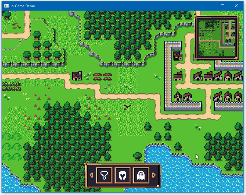
- [`RAUI + Spitfire In-Game`](https://github.com/RAUI-labs/raui/tree/master/demos/in-game)
An example of an In-Game integration of RAUI with custom Material theme, using Spitfire as a renderer.
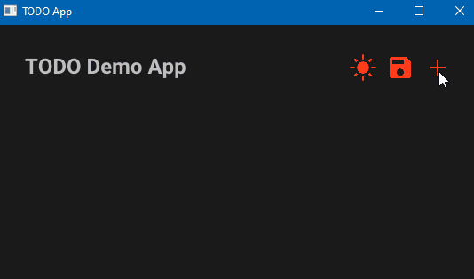
- [`RAUI Todo App`](https://github.com/RAUI-labs/raui/tree/master/demos/todo-app)
An example of TODO app with dark theme Material component library.
## Contribute
Any contribution that improves quality of the RAUI toolset is highly appreciated.
- If you have a feature request, create an Issue post and explain the goal of the feature along with the reason why it is needed and its pros and cons.
- Whenever you would like to create na PR, please create your feature branch from `next` branch so when it gets approved it can be simply merged using GitHub merge button
- All changes are staged into `next` branch and new versions are made out of its commits, master is considered stable/release branch.
- Changes should pass tests, you run tests with: `cargo test --all --features all`.
- This readme file is generated from the `lib.rs` documentation and can be re-generated by using [`cargo readme`][cargo_readme].
[cargo_readme]: https://github.com/livioribeiro/cargo-readme
## Milestones
RAUI is still in early development phase, so prepare for these changes until v1.0:
- [ ] Integrate RAUI into one public open source Rust game.
- [ ] Write documentation.
- [ ] Write MD book about how to use RAUI properly and make UI efficient.
- [ ] Implement VDOM diffing algorithm for tree rebuilding optimizations.
- [ ] Find a solution (or make it a feature) for moving from trait objects data into strongly typed data for properties and states.
Things that now are done:
- [x] Add suport for layouting.
- [x] Add suport for interactions (user input).
- [x] Create renderer for GGEZ game framework.
- [x] Create basic user components.
- [x] Create basic Hello World example application.
- [x] Decouple shared props from props (don't merge them, put shared props in context).
- [x] Create TODO app as an example.
- [x] Create In-Game app as an example.
- [x] Create renderer for Oxygengine game engine.
- [x] Add complex navigation system.
- [x] Create scroll box widget.
- [x] Add "immediate mode UI" builder to give alternative to macros-based declarative mode UI building (with zero overhead, it is an equivalent to declarative macros used by default, immediate mode and declarative mode widgets can talk to each other without a hassle).
- [x] Add data binding property type to easily mutate data from outside of the application.
- [x] Create tesselation renderer that produces Vertex + Index + Batch buffers ready for mesh renderers.
- [x] Move from `widget_component!` and `widget_hook!` macro rules to `pre_hooks` and `post_hooks` function attributes.
- [x] Add derive `PropsData` and `MessageData` procedural macros to gradually replace the need to call `implement_props_data!` and `implement_message_data!` macros.
- [x] Add support for portals - an easy way to "teleport" sub-tree into another tree node (useful for modals and drag & drop).
- [x] Add support for View-Model for sharing data between host app and UI.
================================================
FILE: crates/_/Cargo.toml
================================================
[package]
name = "raui"
version = "0.70.17"
authors = ["Patryk 'PsichiX' Budzynski <psichix@gmail.com>"]
edition = "2024"
description = "Renderer Agnostic User Interface"
readme = "../../README.md"
license = "MIT OR Apache-2.0"
repository = "https://github.com/RAUI-labs/raui"
keywords = ["renderer", "agnostic", "ui", "interface", "gamedev"]
categories = ["gui", "rendering::graphics-api"]
[features]
material = ["raui-material"]
retained = ["raui-retained"]
immediate = ["raui-immediate"]
immediate-widgets = ["raui-immediate-widgets"]
json = ["raui-json-renderer"]
tesselate = ["raui-tesselate-renderer"]
app = ["raui-app"]
all = [
"material",
"retained",
"immediate",
"immediate-widgets",
"tesselate",
"json",
"app",
]
import-all = []
[dependencies]
raui-core = { path = "../core", version = "0.70" }
[dependencies.raui-material]
path = "../material"
version = "0.70"
optional = true
[dependencies.raui-retained]
path = "../retained"
version = "0.70"
optional = true
[dependencies.raui-immediate]
path = "../immediate"
version = "0.70"
optional = true
[dependencies.raui-immediate-widgets]
path = "../immediate-widgets"
version = "0.70"
optional = true
[dependencies.raui-json-renderer]
path = "../json-renderer"
version = "0.70"
optional = true
[dependencies.raui-tesselate-renderer]
path = "../tesselate-renderer"
version = "0.70"
optional = true
[dependencies.raui-app]
path = "../app"
version = "0.70"
optional = true
[dev-dependencies]
raui-core = { path = "../core" }
raui-material = { path = "../material" }
raui-immediate = { path = "../immediate" }
raui-immediate-widgets = { path = "../immediate-widgets" }
raui-retained = { path = "../retained" }
raui-app = { path = "../app" }
raui-json-renderer = { path = "../json-renderer" }
serde = { version = "1", features = ["derive"] }
serde_json = "1"
[package.metadata.docs.rs]
features = ["all"]
================================================
FILE: crates/_/build.rs
================================================
use std::fs::File;
use std::io::Write;
use std::path::Path;
fn main() {
let mut output = String::new();
output.push_str("#![allow(ambiguous_glob_reexports)]\n");
output.push_str("#![allow(unused_variables)]\n");
visit_dirs(
Path::new("../core/src"),
"raui_core",
None,
&mut output,
&[],
);
visit_dirs(
Path::new("../material/src"),
"raui_material",
Some("material"),
&mut output,
&[],
);
visit_dirs(
Path::new("../retained/src"),
"raui_retained",
Some("retained"),
&mut output,
&[],
);
visit_dirs(
Path::new("../immediate/src"),
"raui_immediate",
Some("immediate"),
&mut output,
&[],
);
visit_dirs(
Path::new("../immediate-widgets/src"),
"raui_immediate_widgets",
Some("immediate-widgets"),
&mut output,
&[],
);
visit_dirs(
Path::new("../tesselate-renderer/src"),
"raui_tesselate_renderer",
Some("tesselate"),
&mut output,
&[],
);
visit_dirs(
Path::new("../json-renderer/src"),
"raui_json_renderer",
Some("json"),
&mut output,
&[],
);
visit_dirs(
Path::new("../app/src"),
"raui_app",
Some("app"),
&mut output,
&[
"asset_manager.rs",
"interactions.rs",
"text_measurements.rs",
],
);
let out_path = Path::new("src").join("import_all.rs");
let mut file = File::create(&out_path).expect("Failed to create import_all.rs");
file.write_all(output.as_bytes()).expect("Write failed");
}
fn visit_dirs(
dir: &Path,
prefix: &str,
feature: Option<&str>,
output: &mut String,
ignore: &[&str],
) {
for entry in std::fs::read_dir(dir).unwrap() {
let entry = entry.unwrap();
let path = entry.path();
if path.is_dir() {
if path.join("mod.rs").exists() {
let mod_path = path.strip_prefix(dir).unwrap();
let mod_name = mod_path.to_string_lossy().replace("/", "::");
if let Some(feature) = feature {
output.push_str(&format!("#[cfg(feature = \"{feature}\")]\n"));
}
output.push_str(&format!("pub use {prefix}::{mod_name}::*;\n"));
visit_dirs(
&path,
&format!("{prefix}::{mod_name}"),
feature,
output,
ignore,
);
}
} else if let Some(ext) = path.extension()
&& ext == "rs"
{
if path.file_name().unwrap() == "lib.rs" {
if let Some(feature) = feature {
output.push_str(&format!("#[cfg(feature = \"{feature}\")]\n"));
}
output.push_str(&format!("pub use {prefix}::*;\n"));
continue;
}
if path.file_name().unwrap() == "mod.rs"
|| path.file_name().unwrap() == "import_all.rs"
|| ignore.iter().any(|name| path.file_name().unwrap() == *name)
{
continue;
}
let mod_path = path.strip_prefix(dir).unwrap();
let mut mod_name = mod_path.to_string_lossy().replace("/", "::");
mod_name = mod_name.trim_end_matches(".rs").to_string();
if let Some(feature) = feature {
output.push_str(&format!("#[cfg(feature = \"{feature}\")]\n"));
}
output.push_str(&format!("pub use {prefix}::{mod_name}::*;\n"));
}
}
}
================================================
FILE: crates/_/examples/anchor_box.rs
================================================
use raui_app::app::declarative::DeclarativeApp;
use raui_core::{
make_widget,
widget::{
WidgetRef,
component::{
RelativeLayoutProps,
containers::{anchor_box::anchor_box, content_box::content_box},
image_box::{ImageBoxProps, image_box},
},
context::WidgetContext,
node::WidgetNode,
unit::content::ContentBoxItemLayout,
utils::Color,
},
};
fn preview(ctx: WidgetContext) -> WidgetNode {
// we print this widget props to show how AnchorProps values change relative to window resize.
println!("Preview props: {:#?}", ctx.props);
// we create simple colored image that fills available space just to make you see the values.
make_widget!(image_box)
.with_props(ImageBoxProps::colored(Color {
r: 1.0,
g: 0.25,
b: 0.25,
a: 1.0,
}))
.into()
}
fn main() {
// we create widget reference first so we can apply it to some widget and and reference
//that widget in another place - basically what widget reference is, it is a way to read
// some other widget ID in some other place outside the referenced widget scope.
let idref = WidgetRef::default();
let tree = make_widget!(content_box)
// we apply widget reference to the root content box so we can reference that root widget
// later in anchor box to enable it to calculate how anchor box content is lay out relative
// to the root widget - this is the most important thing to setup, because if we won't do
// that, anchor box would not be able to give its content a proper data about its layout
// relative to the referenced widget. Note that, you can reference ANY widget in the widget
// tree - it will always give you a relative location to any widget you provide.
.idref(idref.clone())
.listed_slot(
make_widget!(anchor_box)
// we pass widget reference to anchor box via RelativeLayoutProps, because anchor
// uses relative layout hook to perform calculations of relative layout box.
.with_props(RelativeLayoutProps {
relative_to: idref.into(),
})
// we apply margin to anchor box just to make it not fill entire space by default.
.with_props(ContentBoxItemLayout {
margin: 100.0.into(),
..Default::default()
})
.named_slot("content", make_widget!(preview)),
);
DeclarativeApp::simple("Anchor Box", tree);
}
================================================
FILE: crates/_/examples/app.rs
================================================
use raui_app::app::declarative::DeclarativeApp;
use raui_core::{
make_widget,
widget::{
component::{
containers::{flex_box::FlexBoxProps, vertical_box::vertical_box},
image_box::{ImageBoxProps, image_box},
text_box::{TextBoxProps, text_box},
},
unit::{
flex::FlexBoxItemLayout,
text::{TextBoxFont, TextBoxHorizontalAlign, TextBoxSizeValue},
},
utils::Color,
},
};
fn main() {
let tree = make_widget!(vertical_box)
.with_props(FlexBoxProps {
separation: 50.0,
..Default::default()
})
.listed_slot(
make_widget!(image_box).with_props(ImageBoxProps::image_aspect_ratio(
"./demos/hello-world/resources/cats.jpg",
false,
)),
)
.listed_slot(
make_widget!(text_box)
.with_props(FlexBoxItemLayout::no_growing_and_shrinking())
.with_props(TextBoxProps {
text: "RAUI application example".to_owned(),
font: TextBoxFont {
name: "./demos/hello-world/resources/verdana.ttf".to_owned(),
size: 64.0,
},
color: Color {
r: 0.0,
g: 0.0,
b: 0.5,
a: 1.0,
},
horizontal_align: TextBoxHorizontalAlign::Center,
height: TextBoxSizeValue::Content,
..Default::default()
}),
);
DeclarativeApp::simple("RAUI application example", tree);
}
================================================
FILE: crates/_/examples/button_external.rs
================================================
// Make sure you have seen `button_internal` code example first, because this is an evolution of that.
use raui_app::app::declarative::DeclarativeApp;
use raui_core::{
make_widget, pre_hooks,
widget::{
component::{
image_box::{ImageBoxProps, image_box},
interactive::{
button::{ButtonNotifyMessage, ButtonNotifyProps, button},
navigation::{NavItemActive, use_nav_container_active},
},
},
context::WidgetContext,
node::WidgetNode,
unit::image::{ImageBoxColor, ImageBoxMaterial, ImageBoxSizeValue},
utils::Color,
},
};
// we create app hook that just receives button state change messages and prints them.
fn use_app(ctx: &mut WidgetContext) {
ctx.life_cycle.change(|ctx| {
for msg in ctx.messenger.messages {
if let Some(msg) = msg.as_any().downcast_ref::<ButtonNotifyMessage>() {
println!("Button message: {msg:#?}");
}
}
});
}
#[pre_hooks(use_nav_container_active, use_app)]
fn app(mut ctx: WidgetContext) -> WidgetNode {
make_widget!(button)
.with_props(NavItemActive)
// we tell button to notify this component (send messages to it) whenever button state changes.
.with_props(ButtonNotifyProps(ctx.id.to_owned().into()))
.named_slot(
"content",
make_widget!(image_box).with_props(ImageBoxProps {
material: ImageBoxMaterial::Color(ImageBoxColor {
color: Color {
r: 1.0,
g: 0.25,
b: 0.25,
a: 1.0,
},
..Default::default()
}),
width: ImageBoxSizeValue::Exact(400.0),
height: ImageBoxSizeValue::Exact(300.0),
..Default::default()
}),
)
.into()
}
fn main() {
DeclarativeApp::simple("Button - Sending state to other widget", make_widget!(app));
}
================================================
FILE: crates/_/examples/button_internal.rs
================================================
use raui_app::app::declarative::DeclarativeApp;
use raui_core::{
make_widget, pre_hooks,
widget::{
component::{
image_box::{ImageBoxProps, image_box},
interactive::{
button::{ButtonProps, button},
navigation::{NavItemActive, use_nav_container_active},
},
},
context::WidgetContext,
node::WidgetNode,
unit::image::{ImageBoxColor, ImageBoxMaterial, ImageBoxSizeValue},
utils::Color,
},
};
// mark the root widget as navigable container to allow button to subscribe to navigation system.
#[pre_hooks(use_nav_container_active)]
fn app(mut ctx: WidgetContext) -> WidgetNode {
// button is the simplest and the most common in use navigable item that can react to user input.
make_widget!(button)
// enable button navigation (it is disabled by default).
.with_props(NavItemActive)
// by default button state of the button is passed to the content widget with
// `ButtonProps` props data, so content widget can read it and change its appearance.
.named_slot("content", make_widget!(internal))
.into()
}
fn internal(ctx: WidgetContext) -> WidgetNode {
// first we unpack button state from button props.
let ButtonProps {
// selected state means, well..widget has got selected. selection in navigation is more
// complex than that and it deserves separate deeper explanation, but in essence: whenever
// user navigate over the UI, RAUI performs selection on navigable items, navigable items
// may be nested and whenever some widget gets selected, all of its navigable parents
// receive selection event too, so there is not only one widget that might be selected at
// a time, but there might be a chain of selected items, as long as they are on the way
// toward actually selected navigable item in the widget tree.
selected,
// trigger state means navigable item got Accept event, which in context of the button
// means: button is selected and user performed "left mouse button click".
trigger,
// context state is similar to trigger state, in this case it means user performed "right
// mouse button click".
context,
..
} = ctx.props.read_cloned_or_default();
let color = if trigger {
Color {
r: 1.0,
g: 0.25,
b: 0.25,
a: 1.0,
}
} else if context {
Color {
r: 0.25,
g: 1.0,
b: 0.25,
a: 1.0,
}
} else if selected {
Color {
r: 0.25,
g: 0.25,
b: 1.0,
a: 1.0,
}
} else {
Color {
r: 0.25,
g: 0.25,
b: 0.25,
a: 1.0,
}
};
make_widget!(image_box)
.with_props(ImageBoxProps {
material: ImageBoxMaterial::Color(ImageBoxColor {
color,
..Default::default()
}),
width: ImageBoxSizeValue::Exact(400.0),
height: ImageBoxSizeValue::Exact(300.0),
..Default::default()
})
.into()
}
fn main() {
DeclarativeApp::simple("Button - Pass state to its child", make_widget!(app));
}
================================================
FILE: crates/_/examples/canvas.rs
================================================
// Make sure you have seen `render_workers` code example first, because this is an evolution of that.
use raui_app::{
Vertex,
app::declarative::DeclarativeApp,
components::canvas::{CanvasProps, DrawOnCanvasMessage, RequestCanvasRedrawMessage, canvas},
render_worker::RenderWorkerTaskContext,
third_party::spitfire_glow::{
graphics::GraphicsBatch,
renderer::{GlowBlending, GlowUniformValue},
},
};
use raui_core::{
make_widget, pre_hooks,
widget::{context::WidgetContext, node::WidgetNode, utils::Color},
};
fn use_my_canvas(ctx: &mut WidgetContext) {
ctx.life_cycle.change(|ctx| {
// canvas will send redraw request on mount and resize.
// we can react with sending drawing task message to canvas.
for msg in ctx.messenger.messages {
if msg
.as_any()
.downcast_ref::<RequestCanvasRedrawMessage>()
.is_some()
{
ctx.messenger.write(
ctx.id.to_owned(),
DrawOnCanvasMessage::function(render_task),
);
}
}
});
}
#[pre_hooks(use_my_canvas)]
fn my_canvas(mut ctx: WidgetContext) -> WidgetNode {
// we are specializing canvas widget by simply executing canvas
// widget function in place, so we have easier times sending
// drawing task to canvas by its id.
canvas(ctx)
}
fn main() {
let tree = make_widget!(my_canvas).with_props(CanvasProps {
color: Color {
r: 0.0,
g: 0.0,
b: 0.0,
a: 0.5,
},
clear: true,
});
DeclarativeApp::simple("Canvas", tree);
}
fn render_task(ctx: RenderWorkerTaskContext) {
ctx.graphics.state.stream.batch_optimized(GraphicsBatch {
shader: Some(ctx.colored_shader.clone()),
uniforms: [(
"u_projection_view".into(),
GlowUniformValue::M4(
ctx.graphics
.state
.main_camera
.world_matrix()
.into_col_array(),
),
)]
.into_iter()
.collect(),
textures: Default::default(),
blending: GlowBlending::Alpha,
scissor: None,
wireframe: false,
});
ctx.graphics.state.stream.quad([
Vertex {
position: [50.0, 50.0],
uv: [0.0, 0.0, 0.0],
color: [1.0, 0.0, 0.0, 1.0],
},
Vertex {
position: [ctx.graphics.state.main_camera.screen_size.x - 50.0, 50.0],
uv: [0.0, 0.0, 0.0],
color: [0.0, 1.0, 0.0, 1.0],
},
Vertex {
position: [
ctx.graphics.state.main_camera.screen_size.x - 50.0,
ctx.graphics.state.main_camera.screen_size.y - 50.0,
],
uv: [0.0, 0.0, 0.0],
color: [0.0, 0.0, 1.0, 1.0],
},
Vertex {
position: [50.0, ctx.graphics.state.main_camera.screen_size.y - 50.0],
uv: [0.0, 0.0, 0.0],
color: [1.0, 1.0, 0.0, 1.0],
},
]);
}
================================================
FILE: crates/_/examples/content_box.rs
================================================
use raui_app::app::declarative::DeclarativeApp;
use raui_core::{
make_widget,
widget::{
component::{
containers::content_box::content_box,
image_box::{ImageBoxProps, image_box},
},
unit::content::ContentBoxItemLayout,
utils::{Color, Rect},
},
};
fn main() {
let tree = make_widget!(content_box)
.listed_slot(
make_widget!(image_box)
.with_props(ImageBoxProps::colored(Color {
r: 1.0,
g: 0.25,
b: 0.25,
a: 1.0,
}))
.with_props(ContentBoxItemLayout {
anchors: Rect {
left: -1.0,
right: 2.0,
top: -1.0,
bottom: 2.0,
},
keep_in_bounds: true.into(),
..Default::default()
}),
)
.listed_slot(
make_widget!(image_box)
.with_props(ImageBoxProps::colored(Color {
r: 0.25,
g: 1.0,
b: 0.25,
a: 1.0,
}))
.with_props(ContentBoxItemLayout {
margin: 64.0.into(),
..Default::default()
}),
)
.listed_slot(
make_widget!(image_box)
.with_props(ImageBoxProps::colored(Color {
r: 0.25,
g: 0.25,
b: 1.0,
a: 1.0,
}))
.with_props(ContentBoxItemLayout {
anchors: Rect {
left: 0.5,
right: 0.75,
top: 0.25,
bottom: 0.75,
},
..Default::default()
}),
);
DeclarativeApp::simple("Content Box", tree);
}
================================================
FILE: crates/_/examples/context_box.rs
================================================
// Make sure you have seen `portal_box` code example first, because this is an evolution of that.
use raui_app::{
app::{App, AppConfig, declarative::DeclarativeApp},
event::{ElementState, Event, VirtualKeyCode, WindowEvent},
};
use raui_core::{
make_widget, pre_hooks,
view_model::ViewModel,
widget::{
WidgetRef,
component::{
containers::{
anchor_box::PivotBoxProps,
content_box::content_box,
context_box::{ContextBoxProps, portals_context_box},
horizontal_box::{HorizontalBoxProps, horizontal_box},
portal_box::PortalsContainer,
},
image_box::{ImageBoxProps, image_box},
},
context::WidgetContext,
node::WidgetNode,
unit::{
flex::FlexBoxItemLayout,
image::{ImageBoxColor, ImageBoxMaterial, ImageBoxSizeValue},
},
utils::Color,
},
};
const DATA: &str = "data";
fn use_app(ctx: &mut WidgetContext) {
ctx.life_cycle.mount(|mut ctx| {
ctx.view_models
.bindings(DATA, "")
.unwrap()
.bind(ctx.id.to_owned());
});
}
#[pre_hooks(use_app)]
fn app(mut ctx: WidgetContext) -> WidgetNode {
let idref = WidgetRef::default();
// we read value from view model created with app builder.
let data = ctx
.view_models
.view_model(DATA)
.unwrap()
.read::<(bool, bool, bool)>()
.unwrap();
make_widget!(content_box)
.idref(idref.clone())
.with_shared_props(PortalsContainer(idref))
.listed_slot(
make_widget!(horizontal_box)
.with_props(HorizontalBoxProps {
separation: 25.0,
..Default::default()
})
.listed_slot(
make_widget!(icon)
// clear this flex box item layout (no growing, shrinking or filling).
.with_props(FlexBoxItemLayout::cleared())
// pass context box state read from app data.
.with_props(data.0)
// set icon color.
.with_props(Color {
r: 1.0,
g: 0.25,
b: 0.25,
a: 1.0,
})
// tell context widget how to position it relative to the content widget.
.with_props(PivotBoxProps {
pivot: 0.0.into(),
align: 0.0.into(),
}),
)
.listed_slot(
make_widget!(icon)
.with_props(FlexBoxItemLayout::cleared())
.with_props(data.1)
.with_props(Color {
r: 0.25,
g: 1.0,
b: 0.25,
a: 1.0,
})
.with_props(PivotBoxProps {
pivot: 0.5.into(),
align: 0.5.into(),
}),
)
.listed_slot(
make_widget!(icon)
.with_props(FlexBoxItemLayout::cleared())
.with_props(data.2)
.with_props(Color {
r: 0.25,
g: 0.25,
b: 1.0,
a: 1.0,
})
.with_props(PivotBoxProps {
pivot: 1.0.into(),
align: 1.0.into(),
}),
),
)
.into()
}
// custom icon component composed out of icon image as its content and context image that we show
// when bool props value is true.
fn icon(ctx: WidgetContext) -> WidgetNode {
// we use `portals_context_box` to allow this context box properly calculate context widget
// relative to the portals container.
make_widget!(portals_context_box)
// pass pivot props to context box,
.with_props(ctx.props.read_cloned_or_default::<PivotBoxProps>())
.with_props(ContextBoxProps {
// read bool props value and use it to tell if context widget is gonna be shown.
show: ctx.props.read_cloned_or_default::<bool>(),
})
// put colored image box as content widget.
.named_slot(
"content",
make_widget!(image_box).with_props(ImageBoxProps {
material: ImageBoxMaterial::Color(ImageBoxColor {
color: ctx.props.read_cloned_or_default::<Color>(),
..Default::default()
}),
width: ImageBoxSizeValue::Exact(100.0),
height: ImageBoxSizeValue::Exact(100.0),
..Default::default()
}),
)
// put gray image box as context widget.
.named_slot(
"context",
make_widget!(image_box).with_props(ImageBoxProps {
material: ImageBoxMaterial::Color(ImageBoxColor {
color: Color {
r: 0.25,
g: 0.25,
b: 0.25,
a: 1.0,
},
..Default::default()
}),
width: ImageBoxSizeValue::Exact(150.0),
height: ImageBoxSizeValue::Exact(50.0),
..Default::default()
}),
)
.into()
}
fn main() {
let app = DeclarativeApp::default()
.tree(make_widget!(app))
// we use tuple of 3 bools that will represent state of individual context box.
.view_model(DATA, ViewModel::new_object((false, true, false)))
.event(move |application, event, _, _| {
let mut data = application
.view_models
.get_mut(DATA)
.unwrap()
.write_notified::<(bool, bool, bool)>()
.unwrap();
if let Event::WindowEvent {
event: WindowEvent::KeyboardInput { input, .. },
..
} = event
&& input.state == ElementState::Pressed
&& let Some(key) = input.virtual_keycode
{
match key {
VirtualKeyCode::Key1 | VirtualKeyCode::Numpad1 => {
// change state of given context box in app data.
data.0 = !data.0;
}
VirtualKeyCode::Key2 | VirtualKeyCode::Numpad2 => {
data.1 = !data.1;
}
VirtualKeyCode::Key3 | VirtualKeyCode::Numpad3 => {
data.2 = !data.2;
}
_ => {}
}
}
true
});
App::new(AppConfig::default().title("Context Box")).run(app);
}
================================================
FILE: crates/_/examples/flex_box.rs
================================================
use raui_app::app::declarative::DeclarativeApp;
use raui_core::{
make_widget,
widget::{
component::{
containers::flex_box::{FlexBoxProps, flex_box},
image_box::{ImageBoxProps, image_box},
},
unit::flex::{FlexBoxDirection, FlexBoxItemLayout},
utils::Color,
},
};
fn main() {
let tree = make_widget!(flex_box)
.with_props(FlexBoxProps {
direction: FlexBoxDirection::VerticalBottomToTop,
..Default::default()
})
.listed_slot(
make_widget!(image_box)
.with_props(ImageBoxProps::colored(Color {
r: 1.0,
g: 0.25,
b: 0.25,
a: 1.0,
}))
.with_props(FlexBoxItemLayout {
// basis sets exact size of the item in main axis.
basis: Some(100.0),
// weight of the item when its layout box has to grow.
grow: 0.5,
// weight of the item when its layout box has to shrink (0.0 means no shrinking).
shrink: 0.0,
// percentage of the item size in cross axis (here how much of horizontal space it fills).
fill: 0.75,
// tells how much to which side item is aligned when there is free space available.
align: 1.0,
..Default::default()
}),
)
.listed_slot(
make_widget!(image_box)
.with_props(ImageBoxProps::colored(Color {
r: 0.25,
g: 1.0,
b: 0.25,
a: 1.0,
}))
.with_props(FlexBoxItemLayout {
margin: 10.0.into(),
..Default::default()
}),
)
.listed_slot(
make_widget!(image_box)
.with_props(ImageBoxProps::colored(Color {
r: 0.25,
g: 0.25,
b: 1.0,
a: 1.0,
}))
.with_props(FlexBoxItemLayout {
basis: Some(100.0),
grow: 0.0,
shrink: 0.5,
fill: 0.5,
align: 0.5,
..Default::default()
}),
);
DeclarativeApp::simple("Flex Box", tree);
}
================================================
FILE: crates/_/examples/flex_box_content_size.rs
================================================
use raui_app::app::declarative::DeclarativeApp;
use raui_core::{
make_widget,
widget::{
component::{
containers::{
flex_box::{FlexBoxProps, flex_box},
size_box::{SizeBoxProps, size_box},
},
image_box::{ImageBoxProps, image_box},
text_box::{TextBoxProps, text_box},
},
unit::{
flex::{FlexBoxDirection, FlexBoxItemLayout},
image::{ImageBoxColor, ImageBoxMaterial, ImageBoxSizeValue},
size::SizeBoxSizeValue,
text::{TextBoxFont, TextBoxSizeValue},
},
utils::Color,
},
};
fn main() {
let tree = make_widget!(size_box)
.with_props(SizeBoxProps {
width: SizeBoxSizeValue::Fill,
height: SizeBoxSizeValue::Content,
..Default::default()
})
.named_slot(
"content",
make_widget!(flex_box)
.with_props(FlexBoxProps {
direction: FlexBoxDirection::VerticalTopToBottom,
..Default::default()
})
.listed_slot(
make_widget!(text_box)
.with_props(FlexBoxItemLayout::no_growing_and_shrinking())
.with_props(TextBoxProps {
text: "Hello\nWorld!".to_owned(),
font: TextBoxFont {
name: "./demos/hello-world/resources/verdana.ttf".to_owned(),
size: 64.0,
},
color: Color {
r: 0.0,
g: 0.0,
b: 0.0,
a: 1.0,
},
height: TextBoxSizeValue::Content,
..Default::default()
}),
)
.listed_slot(
make_widget!(image_box)
.with_props(FlexBoxItemLayout::no_growing_and_shrinking())
.with_props(ImageBoxProps {
height: ImageBoxSizeValue::Exact(100.0),
material: ImageBoxMaterial::Color(ImageBoxColor {
color: Color {
r: 1.0,
g: 0.5,
b: 0.0,
a: 1.0,
},
..Default::default()
}),
..Default::default()
}),
)
// this image should not be visible at all, a zero size layout.
.listed_slot(
make_widget!(image_box).with_props(ImageBoxProps::colored(Color {
r: 0.5,
g: 0.5,
b: 0.5,
a: 1.0,
})),
),
);
DeclarativeApp::simple("Flex Box - Adaptive content size", tree);
}
================================================
FILE: crates/_/examples/flex_box_wrapping.rs
================================================
use raui_app::app::declarative::DeclarativeApp;
use raui_core::{
make_widget,
widget::{
component::{
containers::{
flex_box::{FlexBoxProps, flex_box},
size_box::{SizeBoxProps, size_box},
},
image_box::{ImageBoxProps, image_box},
},
unit::{
flex::{FlexBoxDirection, FlexBoxItemLayout},
size::SizeBoxSizeValue,
},
utils::Color,
},
};
fn main() {
let tree = make_widget!(flex_box)
.with_props(FlexBoxProps {
direction: FlexBoxDirection::VerticalTopToBottom,
// Wrapping makes children fit into multiple rows/columns.
wrap: true,
..Default::default()
})
.listed_slots((0..18).map(|_| {
make_widget!(size_box)
.with_props(FlexBoxItemLayout::cleared())
.with_props(SizeBoxProps {
width: SizeBoxSizeValue::Exact(100.0),
height: SizeBoxSizeValue::Exact(100.0),
margin: 20.0.into(),
..Default::default()
})
.named_slot(
"content",
make_widget!(image_box).with_props(ImageBoxProps::colored(Color {
r: 0.25,
g: 0.25,
b: 0.25,
a: 1.0,
})),
)
}));
DeclarativeApp::simple("Flex Box - Wrapping content", tree);
}
================================================
FILE: crates/_/examples/float_view.rs
================================================
use raui_app::app::{App, AppConfig, declarative::DeclarativeApp};
use raui_core::{
make_widget, pre_hooks,
view_model::{ViewModel, ViewModelValue},
widget::{
component::{
containers::float_box::{
FloatBoxChange, FloatBoxChangeMessage, FloatBoxNotifyProps, FloatBoxProps,
FloatBoxState, float_box,
},
image_box::{ImageBoxProps, image_box},
interactive::{
float_view::float_view_control,
navigation::{NavItemActive, use_nav_container_active},
},
},
context::WidgetContext,
node::WidgetNode,
unit::{
content::ContentBoxItemLayout,
image::{ImageBoxColor, ImageBoxMaterial, ImageBoxSizeValue},
},
utils::{Color, Rect, Vec2},
},
};
const DATA: &str = "data";
const PANELS: &str = "panels";
// AppData holds list of floating panels positions and their color.
struct AppData {
panels: ViewModelValue<Vec<(Vec2, Color)>>,
}
fn use_app(ctx: &mut WidgetContext) {
ctx.life_cycle.mount(|mut ctx| {
ctx.view_models
.bindings(DATA, PANELS)
.unwrap()
.bind(ctx.id.to_owned());
});
ctx.life_cycle.unmount(|mut ctx| {
ctx.view_models
.bindings(DATA, PANELS)
.unwrap()
.unbind(ctx.id);
});
ctx.life_cycle.change(|mut ctx| {
let mut view_model = ctx
.view_models
.view_model_mut(DATA)
.unwrap()
.write::<AppData>()
.unwrap();
for msg in ctx.messenger.messages {
// We listen for float box change messages sent from `float_view_control`
// widgets and move sender panel by delta of change.
if let Some(msg) = msg.as_any().downcast_ref::<FloatBoxChangeMessage>()
&& let Ok(index) = msg.sender.key().parse::<usize>()
&& let FloatBoxChange::RelativePosition(delta) = msg.change
&& let Some((position, _)) = view_model.panels.get_mut(index)
{
position.x += delta.x;
position.y += delta.y;
}
}
});
}
#[pre_hooks(use_nav_container_active, use_app)]
fn app(mut ctx: WidgetContext) -> WidgetNode {
let view_model = ctx
.view_models
.view_model(DATA)
.unwrap()
.read::<AppData>()
.unwrap();
make_widget!(float_box)
.with_props(FloatBoxProps {
bounds_left: Some(-300.0),
bounds_right: Some(600.0),
bounds_top: Some(-300.0),
bounds_bottom: Some(400.0),
})
.with_props(FloatBoxState {
position: Vec2 { x: 0.0, y: 0.0 },
zoom: 2.0,
})
.listed_slot(
// `float_view_control` widget reacts to dragging action and sends
// that dragging movement delta to widget that wants to be notified.
// In this case, we want to notify `float_box` widget so it will
// reposition its content panels.
make_widget!(float_view_control)
.key("panning")
.with_props(NavItemActive)
// we make sure panning control fills entire area and stays
// in its bounds no matter how content gets repositioned.
.with_props(ContentBoxItemLayout {
anchors: Rect {
left: 0.0,
top: 0.0,
right: 1.0,
bottom: 1.0,
},
keep_in_bounds: true.into(),
..Default::default()
})
.named_slot(
"content",
make_widget!(image_box).with_props(ImageBoxProps::colored(Color {
r: 0.3,
g: 0.3,
b: 0.3,
a: 1.0,
})),
),
)
.listed_slots(
view_model
.panels
.iter()
.enumerate()
.map(|(index, (position, color))| {
// we also use `float_view_control` widget for panels so
// they can be dragged around float box.
make_widget!(float_view_control)
.key(index)
.with_props(NavItemActive)
.with_props(FloatBoxNotifyProps(ctx.id.to_owned().into()))
.with_props(ContentBoxItemLayout {
offset: *position,
..Default::default()
})
.named_slot(
"content",
make_widget!(image_box).with_props(ImageBoxProps {
width: ImageBoxSizeValue::Exact(200.0),
height: ImageBoxSizeValue::Exact(150.0),
material: ImageBoxMaterial::Color(ImageBoxColor {
color: *color,
..Default::default()
}),
..Default::default()
}),
)
}),
)
.into()
}
fn main() {
let panels = vec![
(
Vec2 { x: 0.0, y: 0.0 },
Color {
r: 1.0,
g: 0.5,
b: 0.5,
a: 1.0,
},
),
(
Vec2 { x: 100.0, y: 100.0 },
Color {
r: 0.5,
g: 1.0,
b: 0.5,
a: 1.0,
},
),
(
Vec2 { x: 200.0, y: 200.0 },
Color {
r: 0.5,
g: 0.5,
b: 1.0,
a: 1.0,
},
),
];
let app = DeclarativeApp::default()
.tree(make_widget!(app))
.view_model(
DATA,
ViewModel::produce(|properties| AppData {
panels: ViewModelValue::new(panels, properties.notifier(PANELS)),
}),
);
App::new(AppConfig::default().title("Float View")).run(app);
}
================================================
FILE: crates/_/examples/grid_box.rs
================================================
use raui_app::app::declarative::DeclarativeApp;
use raui_core::{
make_widget,
widget::{
component::{
containers::grid_box::{GridBoxProps, grid_box},
image_box::{ImageBoxProps, image_box},
},
unit::grid::GridBoxItemLayout,
utils::{Color, IntRect},
},
};
fn main() {
let tree = make_widget!(grid_box)
.with_props(GridBoxProps {
cols: 2,
rows: 2,
..Default::default()
})
.listed_slot(
make_widget!(image_box)
.with_props(ImageBoxProps::colored(Color {
r: 1.0,
g: 0.25,
b: 0.25,
a: 1.0,
}))
.with_props(GridBoxItemLayout {
space_occupancy: IntRect {
left: 0,
right: 1,
top: 0,
bottom: 1,
},
..Default::default()
}),
)
.listed_slot(
make_widget!(image_box)
.with_props(ImageBoxProps::colored(Color {
r: 0.25,
g: 1.0,
b: 0.25,
a: 1.0,
}))
.with_props(GridBoxItemLayout {
space_occupancy: IntRect {
left: 1,
right: 2,
top: 0,
bottom: 1,
},
..Default::default()
}),
)
.listed_slot(
make_widget!(image_box)
.with_props(ImageBoxProps::colored(Color {
r: 0.25,
g: 0.25,
b: 1.0,
a: 1.0,
}))
.with_props(GridBoxItemLayout {
space_occupancy: IntRect {
left: 0,
right: 2,
top: 1,
bottom: 2,
},
..Default::default()
}),
);
DeclarativeApp::simple("Grid Box", tree);
}
================================================
FILE: crates/_/examples/horizontal_box.rs
================================================
use raui_app::app::declarative::DeclarativeApp;
use raui_core::{
make_widget,
widget::{
component::{
containers::horizontal_box::{HorizontalBoxProps, horizontal_box},
image_box::{ImageBoxProps, image_box},
},
unit::flex::FlexBoxItemLayout,
utils::Color,
},
};
fn main() {
let tree = make_widget!(horizontal_box)
.with_props(HorizontalBoxProps {
separation: 50.0,
..Default::default()
})
.listed_slot(
make_widget!(image_box)
.with_props(ImageBoxProps::colored(Color {
r: 1.0,
g: 0.25,
b: 0.25,
a: 1.0,
}))
.with_props(FlexBoxItemLayout {
// basis sets exact width of the item.
basis: Some(100.0),
// weight of the item when its layout box has to grow in width.
grow: 0.5,
// weight of the item when its layout box has to shrink in width (0.0 means no shrinking).
shrink: 0.0,
..Default::default()
}),
)
.listed_slot(
make_widget!(image_box).with_props(ImageBoxProps::colored(Color {
r: 0.25,
g: 1.0,
b: 0.25,
a: 1.0,
})),
)
.listed_slot(
make_widget!(image_box)
.with_props(ImageBoxProps::colored(Color {
r: 0.25,
g: 0.25,
b: 1.0,
a: 1.0,
}))
.with_props(FlexBoxItemLayout {
basis: Some(100.0),
grow: 0.0,
shrink: 0.5,
..Default::default()
}),
);
DeclarativeApp::simple("Horizontal Box", tree);
}
================================================
FILE: crates/_/examples/image_box_color.rs
================================================
use raui_app::app::declarative::DeclarativeApp;
use raui_core::{
make_widget,
widget::{
component::image_box::{ImageBoxProps, image_box},
unit::image::{ImageBoxColor, ImageBoxMaterial},
utils::Color,
},
};
fn main() {
let tree = make_widget!(image_box).with_props(ImageBoxProps {
material: ImageBoxMaterial::Color(ImageBoxColor {
color: Color {
r: 1.0,
g: 0.25,
b: 0.25,
a: 1.0,
},
..Default::default()
}),
..Default::default()
});
DeclarativeApp::simple("Image Box - Color", tree);
}
================================================
FILE: crates/_/examples/image_box_frame.rs
================================================
use raui_app::app::declarative::DeclarativeApp;
use raui_core::{
make_widget,
widget::{
component::image_box::{ImageBoxProps, image_box},
unit::image::{ImageBoxFrame, ImageBoxImage, ImageBoxImageScaling, ImageBoxMaterial},
},
};
fn main() {
let tree = make_widget!(image_box).with_props(ImageBoxProps {
material: ImageBoxMaterial::Image(ImageBoxImage {
id: "./demos/in-game/resources/images/slider-background.png".to_owned(),
// enable nine-slice by setting Frame scaling.
scaling: ImageBoxImageScaling::Frame(ImageBoxFrame {
// rectangle that describes margins of the frame of the source image texture.
source: 3.0.into(),
// rectangle that describes margins of the frame of the UI image being presented.
destination: 64.0.into(),
..Default::default()
}),
..Default::default()
}),
..Default::default()
});
DeclarativeApp::simple("Image Box - Frame", tree);
}
================================================
FILE: crates/_/examples/image_box_image.rs
================================================
use raui_app::app::declarative::DeclarativeApp;
use raui_core::{
make_widget,
widget::{
component::image_box::{ImageBoxProps, image_box},
unit::image::{ImageBoxAspectRatio, ImageBoxImage, ImageBoxMaterial},
},
};
fn main() {
let tree = make_widget!(image_box).with_props(ImageBoxProps {
material: ImageBoxMaterial::Image(ImageBoxImage {
id: "./demos/hello-world/resources/cats.jpg".to_owned(),
..Default::default()
}),
// makes internal image size keeping its aspect ratio.
content_keep_aspect_ratio: Some(ImageBoxAspectRatio {
// horizontal alignment of the content relative to the horizontal free space.
horizontal_alignment: 0.5,
// vertical alignment of the content relative to the vertical free space.
vertical_alignment: 0.5,
// if set to true then content instead of getting smaller to fit inside the layout box,
// it will "leak" outside of the layout box.
outside: true,
}),
..Default::default()
});
DeclarativeApp::simple("Image Box - Image", tree);
}
================================================
FILE: crates/_/examples/image_box_procedural.rs
================================================
use raui_app::app::declarative::DeclarativeApp;
use raui_core::{
layout::CoordsMappingScaling,
make_widget,
widget::{
component::image_box::{ImageBoxProps, image_box},
unit::image::{ImageBoxMaterial, ImageBoxProcedural, ImageBoxProceduralVertex},
utils::{Color, Vec2},
},
};
fn main() {
let tree = make_widget!(image_box).with_props(ImageBoxProps {
// procedural image material allows to draw custom mesh with dedicated
// shader either from statics or from file.
// available static shaders:
// - `@pass`: simple pass through shader that ignores camera matrix.
// - `@colored`: shader that applies camera transform and color vertices.
// - `@textured`: shader that applies camera transform and texture with color vertices.
// if we want to use shader from files, assuming we have two files:
// - `path/to/shader.vs`
// - `path/to/shader.fs`
// then our id would be: `path/to/shader`.
material: ImageBoxMaterial::Procedural(
ImageBoxProcedural::new("@colored")
// if we tell material to remap vertices from its local
// coordinate space to rendered screen space.
// Here we keep mesh inside image box keeping aspect ratio.
.vertex_mapping(CoordsMappingScaling::FitToView(
Vec2 { x: 1.0, y: 1.0 },
true,
))
.quad([
ImageBoxProceduralVertex {
position: Vec2 { x: 0.5, y: 0.0 },
color: Color {
r: 1.0,
g: 0.0,
b: 0.0,
a: 1.0,
},
..Default::default()
},
ImageBoxProceduralVertex {
position: Vec2 { x: 1.0, y: 0.5 },
color: Color {
r: 0.0,
g: 1.0,
b: 0.0,
a: 1.0,
},
..Default::default()
},
ImageBoxProceduralVertex {
position: Vec2 { x: 0.5, y: 1.0 },
color: Color {
r: 1.0,
g: 1.0,
b: 0.0,
a: 1.0,
},
..Default::default()
},
ImageBoxProceduralVertex {
position: Vec2 { x: 0.0, y: 0.5 },
color: Color {
r: 0.0,
g: 0.0,
b: 1.0,
a: 1.0,
},
..Default::default()
},
]),
),
..Default::default()
});
DeclarativeApp::simple("Image Box - Procedural", tree);
}
================================================
FILE: crates/_/examples/immediate_mode.rs
================================================
// Example of immediate mode UI on top of RAUI.
// It's goal is to bring more ergonomics to RAUI by hiding
// declarative interface under simple nested function calls.
// As with retained mode, immediate mode UI can be mixed with
// declarative mode and retained mode widgets.
use raui_app::app::immediate::ImmediateApp;
use raui_core::{
Scalar,
widget::{
component::{
containers::{
horizontal_box::HorizontalBoxProps, vertical_box::VerticalBoxProps,
wrap_box::WrapBoxProps,
},
image_box::ImageBoxProps,
interactive::{
input_field::{TextInputMode, input_text_with_cursor},
navigation::NavItemActive,
},
text_box::TextBoxProps,
},
unit::{flex::FlexBoxItemLayout, text::TextBoxFont},
utils::Color,
},
};
use raui_immediate::{ImProps, apply};
use raui_immediate_widgets::core::{
containers::{content_box, horizontal_box, nav_vertical_box, wrap_box},
image_box,
interactive::{ImmediateButton, button, input_field, self_tracking},
text_box,
};
const FONT: &str = "./demos/hello-world/resources/verdana.ttf";
// app function widget, we pass application state there.
pub fn app(value: &mut usize) {
let props = WrapBoxProps {
margin: 20.0.into(),
..Default::default()
};
wrap_box(props, || {
let props = VerticalBoxProps {
separation: 50.0,
..Default::default()
};
// we can use any "immedietified" RAUI widget we want.
// we can pass Props to parameterize RAUI widget in first param.
// BTW. we should make sure to use any `nav_*` container widget
// somewhere in the app root to make app interactive.
nav_vertical_box(props, || {
let layout = FlexBoxItemLayout {
basis: Some(48.0),
grow: 0.0,
shrink: 0.0,
..Default::default()
};
// we can also apply props on all produced widgets in the scope.
apply(ImProps(layout), || {
counter(value);
let props = HorizontalBoxProps {
separation: 50.0,
..Default::default()
};
horizontal_box(props, || {
// we can react to button-like behavior by reading what
// button-like widgets return of their tracked state.
if text_button("Increment").trigger_start() {
*value = value.saturating_add(1);
}
if text_button("Decrement").trigger_start() {
*value = value.saturating_sub(1);
}
});
});
self_tracking((), |tracking| {
image_box(ImageBoxProps::colored(Color {
r: tracking.state.factor.x,
g: 0.0,
b: tracking.state.factor.y,
a: 1.0,
}));
});
});
});
}
fn text_button(text: &str) -> ImmediateButton {
// buttons use `use_state` hook under the hood to track
// declarative mode button state, that's copy of being
// returned from button function and passed into its
// group closure for children widgets to use.
// BTW. don't forget to apply `NavItemActive` props on
// button if you want to have it enabled for navigation.
button(NavItemActive, |state| {
content_box((), || {
image_box(ImageBoxProps::colored(Color {
r: if state.state.selected { 1.0 } else { 0.75 },
g: if state.state.trigger { 1.0 } else { 0.75 },
b: if state.state.context { 1.0 } else { 0.75 },
a: 1.0,
}));
text_box(TextBoxProps {
text: text.to_string(),
font: TextBoxFont {
name: FONT.to_owned(),
size: 32.0,
},
color: Color {
r: 0.0,
g: 0.0,
b: 0.0,
a: 1.0,
},
..Default::default()
});
});
})
}
fn counter(value: &mut usize) {
// counter widget is a text box wrapped in an input field.
// it works like combination of button (can be focused by
// selection/navigation) and text field (collects keyboard
// text characters when focused).
let props = (NavItemActive, TextInputMode::UnsignedInteger);
let (result, ..) = input_field(value, props, |text, state, button| {
text_box(TextBoxProps {
text: if state.focused {
input_text_with_cursor(text, state.cursor_position, '|')
} else if text.is_empty() {
"...".to_owned()
} else {
text.to_owned()
},
font: TextBoxFont {
name: FONT.to_owned(),
size: 32.0,
},
color: Color {
r: Scalar::from(button.state.trigger),
g: Scalar::from(button.state.selected),
b: Scalar::from(state.focused),
a: 1.0,
},
..Default::default()
});
});
if let Some(result) = result {
*value = result;
}
}
fn main() {
// some applciation state.
let mut counter = 0usize;
ImmediateApp::simple("Immediate mode UI", move |_| {
app(&mut counter);
});
}
================================================
FILE: crates/_/examples/immediate_mode_access_and_tests.rs
================================================
use raui_app::app::immediate::ImmediateApp;
use raui_core::widget::{
component::{image_box::ImageBoxProps, interactive::navigation::NavItemActive},
utils::Color,
};
use raui_immediate::{register_access, use_access};
use raui_immediate_widgets::core::{
containers::nav_content_box,
image_box,
interactive::{ImmediateButton, button},
};
pub fn app() {
nav_content_box((), || {
clickable_button();
});
}
pub fn clickable_button() {
if colored_button().trigger_start() {
// we use access point to some host data
let clicked = use_access::<bool>("clicked");
*clicked.write().unwrap() = true;
}
}
fn colored_button() -> ImmediateButton {
button(NavItemActive, |state| {
let props = ImageBoxProps::colored(if state.state.trigger {
Color {
r: 0.5,
g: 0.0,
b: 0.0,
a: 1.0,
}
} else {
Color {
r: 0.0,
g: 0.5,
b: 0.0,
a: 1.0,
}
});
image_box(props);
})
}
fn main() {
let mut clicked = false;
ImmediateApp::simple("Immediate mode UI - Access and tests", move |_| {
// here we register access point to some game state
let _lifetime = register_access("clicked", &mut clicked);
app();
});
}
#[cfg(test)]
mod tests {
use super::*;
use raui_core::{
interactive::default_interactions_engine::{Interaction, PointerButton},
layout::CoordsMapping,
tester::AppCycleTester,
widget::utils::Rect,
};
use raui_immediate::ImmediateContext;
#[test]
fn test_tracked_button() {
let mut tester = AppCycleTester::new(
CoordsMapping::new(Rect {
left: 0.0,
right: 1024.0,
top: 0.0,
bottom: 576.0,
}),
ImmediateContext::default(),
);
let mut mock = false;
tester
.interactions_engine
.interact(Interaction::PointerDown(
PointerButton::Trigger,
[100.0, 100.0].into(),
));
// since RAUI has deferred UI resolution, signal will take
// few frames to go through declarative layer to immediate
// layer and then back to user site.
for _ in 0..4 {
tester.run_frame(ImmediateApp::test_frame(|| {
// and here we register access point to mock data
let _lifetime = register_access("clicked", &mut mock);
app();
}));
}
assert_eq!(mock, true);
}
}
================================================
FILE: crates/_/examples/immediate_mode_stack_props.rs
================================================
use raui_app::app::immediate::ImmediateApp;
use raui_core::widget::{
component::text_box::TextBoxProps,
unit::{
flex::FlexBoxItemLayout,
text::{TextBoxFont, TextBoxHorizontalAlign},
},
utils::Color,
};
use raui_immediate::{ImProps, ImStackProps, apply, use_stack_props};
use raui_immediate_widgets::core::{containers::nav_vertical_box, text_box};
pub fn app() {
let props = TextBoxProps {
font: TextBoxFont {
name: "./demos/hello-world/resources/verdana.ttf".to_owned(),
size: 96.0,
},
color: Color {
r: 1.0,
g: 0.0,
b: 0.0,
a: 1.0,
},
..Default::default()
};
// We can create cascaded styling with stack props.
// The difference between stack props and applied props
// is that applied props are applied directly do its
// children nodes, while stack props are stacked so any
// widget in hierarchy can access the top of the props
// stack - we can easily share style down the hierarchy!
apply(ImStackProps::new(props), || {
nav_vertical_box((), || {
let layout = FlexBoxItemLayout {
basis: Some(100.0),
grow: 0.0,
shrink: 0.0,
margin: 32.0.into(),
..Default::default()
};
// These props apply only to label widgets.
apply(ImProps(layout), || {
label("Hey!");
label("Hi!");
let props = TextBoxProps {
font: TextBoxFont {
name: "./demos/in-game/resources/fonts/MiKrollFantasy.ttf".to_owned(),
size: 100.0,
},
color: Color {
r: 0.0,
g: 0.0,
b: 1.0,
a: 1.0,
},
horizontal_align: TextBoxHorizontalAlign::Center,
..Default::default()
};
// By pushing new props on stack props we override
// what's gonna be used in all chidren in hierarchy.
apply(ImStackProps::new(props), || {
label("Hello!");
label("Ohayo?");
});
});
});
});
}
pub fn label(text: impl ToString) {
// Accessing props from the stack to achieve cascading styles.
let mut props = use_stack_props::<TextBoxProps>().unwrap_or_default();
props.text = text.to_string();
text_box(props);
}
fn main() {
ImmediateApp::simple("Immediate mode UI - Stack props", |_| app());
}
================================================
FILE: crates/_/examples/immediate_mode_states_and_effects.rs
================================================
// Make sure you have seen `immediate_mode` code example first, because this is a continuation of that.
use raui_app::app::immediate::ImmediateApp;
use raui_core::widget::{
component::{
containers::wrap_box::WrapBoxProps, image_box::ImageBoxProps,
interactive::navigation::NavItemActive, text_box::TextBoxProps,
},
unit::text::TextBoxFont,
utils::Color,
};
use raui_immediate::{ImmediateOnMount, ImmediateOnUnmount, use_effects, use_state};
use raui_immediate_widgets::core::{
containers::{content_box, nav_vertical_box, wrap_box},
image_box,
interactive::{ImmediateButton, button},
text_box,
};
const FONT: &str = "./demos/hello-world/resources/verdana.ttf";
pub fn app() {
let props = WrapBoxProps {
margin: 20.0.into(),
..Default::default()
};
wrap_box(props, || {
nav_vertical_box((), || {
// `use_state` allows to keep persistent state across
// multiple frames, as long as order of calls and types
// match between frames.
let flag = use_state(|| false);
let mut flag = flag.write().unwrap();
let counter = use_state(|| 0usize);
let counter_mount = counter.clone();
if text_button("Toggle").trigger_start() {
*flag = !*flag;
}
if *flag {
// effects are passed as props, these are callbacks
// that get executed whenever RAUI widget gets mounted,
// unmounted or changed.
// There is also `ImmediateHooks` props that allow to
// apply RAUI hooks to rendered widget, useful for example
// to render effects widget with any custom behavior.
let effects = (
ImmediateOnMount::new(move || {
println!("Mounted!");
*counter_mount.write().unwrap() += 1;
}),
ImmediateOnUnmount::new(|| {
println!("Unmounted!");
}),
);
use_effects(effects, || {
label(format!("Mounted {} times!", *counter.read().unwrap()));
});
}
});
});
}
fn label(text: impl ToString) {
text_box(TextBoxProps {
text: text.to_string(),
font: TextBoxFont {
name: crate::FONT.to_owned(),
size: 32.0,
},
color: Color {
r: 0.0,
g: 0.0,
b: 0.0,
a: 1.0,
},
..Default::default()
});
}
fn text_button(text: &str) -> ImmediateButton {
button(NavItemActive, |state| {
content_box((), || {
image_box(ImageBoxProps::colored(Color {
r: if state.state.selected { 1.0 } else { 0.75 },
g: if state.state.trigger { 1.0 } else { 0.75 },
b: if state.state.context { 1.0 } else { 0.75 },
a: 1.0,
}));
text_box(TextBoxProps {
text: text.to_string(),
font: TextBoxFont {
name: crate::FONT.to_owned(),
size: 32.0,
},
color: Color {
r: 0.0,
g: 0.0,
b: 0.0,
a: 1.0,
},
..Default::default()
});
});
})
}
fn main() {
ImmediateApp::simple("Immediate mode UI - States and Effects", |_| {
app();
});
}
================================================
FILE: crates/_/examples/immediate_text_field_paper.rs
================================================
use raui_app::app::immediate::ImmediateApp;
use raui_core::widget::{
component::{containers::size_box::SizeBoxProps, interactive::navigation::NavItemActive},
unit::{size::SizeBoxSizeValue, text::TextBoxFont},
utils::Rect,
};
use raui_immediate::{ImSharedProps, apply, use_state};
use raui_immediate_widgets::{
core::containers::size_box,
material::{containers::nav_paper, interactive::text_field_paper},
};
use raui_material::{
component::interactive::text_field_paper::TextFieldPaperProps,
theme::{ThemeColor, ThemeProps, ThemedTextMaterial, ThemedWidgetProps, new_dark_theme},
};
// Create a new theme with a custom text variant for input fields.
fn new_theme() -> ThemeProps {
let mut theme = new_dark_theme();
theme.text_variants.insert(
"input".to_owned(),
ThemedTextMaterial {
font: TextBoxFont {
name: "./demos/hello-world/resources/verdana.ttf".to_owned(),
size: 24.0,
},
..Default::default()
},
);
theme
}
fn main() {
ImmediateApp::simple("Immediate mode Text Field Paper", |_| {
// Apply the custom theme for all UI widgets.
apply(ImSharedProps(new_theme()), || {
// Make navigable paper container for the text field.
// Navigable containers are required to make interactive widgets work.
nav_paper((), || {
let props = SizeBoxProps {
width: SizeBoxSizeValue::Fill,
height: SizeBoxSizeValue::Exact(50.0),
margin: 20.0.into(),
..Default::default()
};
size_box(props, || {
let props = (
TextFieldPaperProps {
hint: "> Type some text...".to_owned(),
paper_theme: ThemedWidgetProps {
color: ThemeColor::Primary,
..Default::default()
},
padding: Rect {
left: 10.0,
right: 10.0,
top: 6.0,
bottom: 6.0,
},
variant: "input".to_owned(),
..Default::default()
},
NavItemActive,
);
// Make state holding the text input value.
let text = use_state(|| "Hello!".to_owned());
// Make the text field paper with the text input state and
// override existing value on change.
let value = text_field_paper(&*text.read().unwrap(), props).0;
if let Some(value) = value {
*text.write().unwrap() = value;
}
});
});
});
});
}
================================================
FILE: crates/_/examples/input_field.rs
================================================
use raui_app::app::{App, AppConfig, declarative::DeclarativeApp};
use raui_core::{
Managed, Scalar, make_widget, pre_hooks,
view_model::{ViewModel, ViewModelValue},
widget::{
component::{
containers::vertical_box::vertical_box,
interactive::{
button::{
ButtonNotifyMessage, ButtonNotifyProps, ButtonProps, use_button_notified_state,
},
input_field::{
TextInputControlNotifyMessage, TextInputControlNotifyProps, TextInputMode,
TextInputNotifyMessage, TextInputNotifyProps, TextInputProps, TextInputState,
input_field, input_text_with_cursor, use_text_input_notified_state,
},
navigation::{NavItemActive, use_nav_container_active},
},
text_box::{TextBoxProps, text_box},
},
context::WidgetContext,
node::WidgetNode,
unit::text::{TextBoxFont, TextBoxSizeValue},
utils::Color,
},
};
const DATA: &str = "data";
const TEXT_INPUT: &str = "text-input";
const NUMBER_INPUT: &str = "number-input";
const INTEGER_INPUT: &str = "integer-input";
const UNSIGNED_INTEGER_INPUT: &str = "unsigned-integer-input";
const FILTER_INPUT: &str = "filter-input";
struct AppData {
text_input: Managed<ViewModelValue<String>>,
number_input: Managed<ViewModelValue<String>>,
integer_input: Managed<ViewModelValue<String>>,
unsigned_integer_input: Managed<ViewModelValue<String>>,
filter_input: Managed<ViewModelValue<String>>,
}
fn use_app(ctx: &mut WidgetContext) {
ctx.life_cycle.mount(|mut ctx| {
ctx.view_models
.bindings(DATA, TEXT_INPUT)
.unwrap()
.bind(ctx.id.to_owned());
ctx.view_models
.bindings(DATA, NUMBER_INPUT)
.unwrap()
.bind(ctx.id.to_owned());
ctx.view_models
.bindings(DATA, INTEGER_INPUT)
.unwrap()
.bind(ctx.id.to_owned());
ctx.view_models
.bindings(DATA, UNSIGNED_INTEGER_INPUT)
.unwrap()
.bind(ctx.id.to_owned());
ctx.view_models
.bindings(DATA, FILTER_INPUT)
.unwrap()
.bind(ctx.id.to_owned());
});
}
// we mark root widget as navigable container to let user focus and type in text inputs.
#[pre_hooks(use_nav_container_active, use_app)]
fn app(mut ctx: WidgetContext) -> WidgetNode {
let mut app_data = ctx
.view_models
.view_model_mut(DATA)
.unwrap()
.write::<AppData>()
.unwrap();
// put inputs with all different types modes.
make_widget!(vertical_box)
.listed_slot(
make_widget!(input)
.with_props(TextInputMode::Text)
.with_props(TextInputProps {
allow_new_line: false,
text: Some(app_data.text_input.lazy().into()),
}),
)
.listed_slot(
make_widget!(input)
.with_props(TextInputMode::Number)
.with_props(TextInputProps {
allow_new_line: false,
text: Some(app_data.number_input.lazy().into()),
}),
)
.listed_slot(
make_widget!(input)
.with_props(TextInputMode::Integer)
.with_props(TextInputProps {
allow_new_line: false,
text: Some(app_data.integer_input.lazy().into()),
}),
)
.listed_slot(
make_widget!(input)
.with_props(TextInputMode::UnsignedInteger)
.with_props(TextInputProps {
allow_new_line: false,
text: Some(app_data.unsigned_integer_input.lazy().into()),
}),
)
.listed_slot(
make_widget!(input)
.with_props(TextInputMode::Filter(|_, character| {
character.is_uppercase()
}))
.with_props(TextInputProps {
allow_new_line: false,
text: Some(app_data.filter_input.lazy().into()),
}),
)
.into()
}
fn use_input(ctx: &mut WidgetContext) {
ctx.life_cycle.change(|ctx| {
for msg in ctx.messenger.messages {
if let Some(msg) = msg.as_any().downcast_ref::<TextInputNotifyMessage>() {
println!("* Text input: {msg:#?}");
} else if let Some(msg) = msg.as_any().downcast_ref::<TextInputControlNotifyMessage>() {
println!("* Text input control: {msg:#?}");
} else if let Some(msg) = msg.as_any().downcast_ref::<ButtonNotifyMessage>() {
println!("* Button: {msg:#?}");
}
}
});
}
// this component will receive and store button and input text state changes.
#[pre_hooks(use_button_notified_state, use_text_input_notified_state, use_input)]
fn input(mut ctx: WidgetContext) -> WidgetNode {
let ButtonProps {
selected, trigger, ..
} = ctx.state.read_cloned_or_default();
let TextInputState {
cursor_position,
focused,
} = ctx.state.read_cloned_or_default();
let TextInputProps {
allow_new_line,
text,
} = ctx.props.read_cloned_or_default();
let mode = ctx.props.read_cloned_or_default::<TextInputMode>();
let value = text
.as_ref()
.and_then(|text| mode.process(&text.get()))
.unwrap_or_default();
// input field is an evolution of input text, what changes is input field can be focused
// because it is input text plus button.
make_widget!(input_field)
// as usually we enable this navigation item.
.with_props(NavItemActive)
// pass text input mode to the input field (by default Text mode is used).
.with_props(mode)
// setup text input.
.with_props(TextInputProps {
allow_new_line,
text,
})
// notify this component about input text state change.
.with_props(TextInputNotifyProps(ctx.id.to_owned().into()))
// notify this component about input control characters it receives.
// useful for reacting to Tab key for example.
.with_props(TextInputControlNotifyProps(ctx.id.to_owned().into()))
// notify this component about button state change.
.with_props(ButtonNotifyProps(ctx.id.to_owned().into()))
.named_slot(
"content",
// input field and input text components doesn't assume any content widget for you so
// that's why we create custom input component to make it work and look exactly as we
// want - here we just put a text box.
make_widget!(text_box).with_props(TextBoxProps {
text: if focused {
input_text_with_cursor(&value, cursor_position, '|')
} else if value.is_empty() {
match mode {
TextInputMode::Text => "> Type text...".to_owned(),
TextInputMode::Number => "> Type number...".to_owned(),
TextInputMode::Integer => "> Type integer...".to_owned(),
TextInputMode::UnsignedInteger => "> Type unsigned integer...".to_owned(),
TextInputMode::Filter(_) => "> Type uppercase text...".to_owned(),
}
} else {
value
},
width: TextBoxSizeValue::Fill,
height: TextBoxSizeValue::Exact(48.0),
font: TextBoxFont {
name: "./demos/hello-world/resources/verdana.ttf".to_owned(),
size: 32.0,
},
color: Color {
r: Scalar::from(trigger),
g: Scalar::from(selected),
b: Scalar::from(focused),
a: 1.0,
},
..Default::default()
}),
)
.into()
}
fn main() {
let app = DeclarativeApp::default()
.tree(make_widget!(app))
.view_model(
DATA,
ViewModel::produce(|properties| AppData {
text_input: Managed::new(ViewModelValue::new(
Default::default(),
properties.notifier(TEXT_INPUT),
)),
number_input: Managed::new(ViewModelValue::new(
Default::default(),
properties.notifier(NUMBER_INPUT),
)),
integer_input: Managed::new(ViewModelValue::new(
Default::default(),
properties.notifier(INTEGER_INPUT),
)),
unsigned_integer_input: Managed::new(ViewModelValue::new(
Default::default(),
properties.notifier(UNSIGNED_INTEGER_INPUT),
)),
filter_input: Managed::new(ViewModelValue::new(
Default::default(),
properties.notifier(FILTER_INPUT),
)),
}),
);
App::new(AppConfig::default().title("Input Field")).run(app);
}
================================================
FILE: crates/_/examples/navigation.rs
================================================
use raui_app::app::{App, AppConfig, declarative::DeclarativeApp};
use raui_core::{
make_widget, pre_hooks,
widget::{
component::{
containers::{
horizontal_box::{HorizontalBoxProps, horizontal_box},
vertical_box::{VerticalBoxProps, vertical_box},
},
image_box::{ImageBoxProps, image_box},
interactive::{
button::{ButtonProps, button},
navigation::{
NavAutoSelect, NavItemActive, use_nav_container_active,
use_nav_jump_direction_active,
},
},
},
context::WidgetContext,
node::WidgetNode,
unit::flex::FlexBoxItemLayout,
utils::Color,
},
};
#[pre_hooks(use_nav_container_active, use_nav_jump_direction_active)]
fn app(mut ctx: WidgetContext) -> WidgetNode {
let slots_layout = FlexBoxItemLayout {
margin: 20.0.into(),
..Default::default()
};
make_widget!(vertical_box)
.key("vertical")
.with_props(VerticalBoxProps {
override_slots_layout: Some(slots_layout.clone()),
..Default::default()
})
.listed_slot(
make_widget!(horizontal_box)
.key("horizontal")
.with_props(HorizontalBoxProps {
override_slots_layout: Some(slots_layout),
..Default::default()
})
.listed_slot(make_widget!(button_item).key("a").with_props(NavAutoSelect))
.listed_slot(make_widget!(button_item).key("b"))
.listed_slot(make_widget!(button_item).key("c")),
)
.listed_slot(make_widget!(button_item).key("d"))
.listed_slot(make_widget!(button_item).key("e"))
.into()
}
fn button_item(ctx: WidgetContext) -> WidgetNode {
make_widget!(button)
.key("button")
.merge_props(ctx.props.clone())
.with_props(NavItemActive)
.named_slot("content", make_widget!(button_content))
.into()
}
fn button_content(ctx: WidgetContext) -> WidgetNode {
let ButtonProps {
selected,
trigger,
context,
..
} = ctx.props.read_cloned_or_default();
let color = if trigger {
Color {
r: 1.0,
g: 0.25,
b: 0.25,
a: 1.0,
}
} else if context {
Color {
r: 0.25,
g: 1.0,
b: 0.25,
a: 1.0,
}
} else if selected {
Color {
r: 0.25,
g: 0.25,
b: 1.0,
a: 1.0,
}
} else {
Color {
r: 0.25,
g: 0.25,
b: 0.25,
a: 1.0,
}
};
make_widget!(image_box)
.key("image")
.with_props(ImageBoxProps::colored(color))
.into()
}
fn main() {
App::new(AppConfig::default().title("Navigation")).run(
DeclarativeApp::default()
.tree(make_widget!(app).key("app"))
.setup_interactions(|interactions| {
interactions.engine.deselect_when_no_button_found = false;
}),
);
}
================================================
FILE: crates/_/examples/options_view.rs
================================================
use raui_app::app::{App, AppConfig, declarative::DeclarativeApp};
use raui_core::{
Managed, make_widget, pre_hooks,
view_model::{ViewModel, ViewModelValue},
widget::{
WidgetRef,
component::{
containers::{
anchor_box::PivotBoxProps, content_box::content_box, portal_box::PortalsContainer,
size_box::SizeBoxProps, vertical_box::vertical_box,
},
image_box::{ImageBoxProps, image_box},
interactive::{
button::ButtonProps,
navigation::{NavItemActive, use_nav_container_active},
options_view::{OptionsViewMode, OptionsViewProps, options_view},
},
text_box::{TextBoxProps, text_box},
},
context::WidgetContext,
node::WidgetNode,
unit::{
content::ContentBoxItemLayout,
size::SizeBoxSizeValue,
text::{TextBoxFont, TextBoxHorizontalAlign, TextBoxVerticalAlign},
},
utils::{Color, Rect},
},
};
const DATA: &str = "data";
const INDEX: &str = "index";
struct AppData {
index: Managed<ViewModelValue<usize>>,
}
fn use_app(ctx: &mut WidgetContext) {
ctx.life_cycle.mount(|mut ctx| {
ctx.view_models
.bindings(DATA, INDEX)
.unwrap()
.bind(ctx.id.to_owned());
});
}
#[pre_hooks(use_nav_container_active, use_app)]
fn app(mut ctx: WidgetContext) -> WidgetNode {
let idref = WidgetRef::default();
let mut app_data = ctx
.view_models
.view_model_mut(DATA)
.unwrap()
.write::<AppData>()
.unwrap();
// We use content box marked with portals container as root to provide space
// for option views to anchor thier content into.
make_widget!(content_box)
.idref(idref.clone())
.with_shared_props(PortalsContainer(idref))
.listed_slot(
// Options view is basically a button that toggles its content anchored
// to itself. You can think of dropdown/context menus, but actually it
// can present any user widgets, not only in a list - content widget can
// be anything that takes listed slots and layouts them in some fashion.
make_widget!(options_view)
.with_props(ContentBoxItemLayout {
anchors: 0.25.into(),
margin: Rect {
left: -150.0,
right: -150.0,
top: -30.0,
bottom: -30.0,
},
..Default::default()
})
// Here we provide options view index source, which tells which option
// has to be shown.
.with_props(OptionsViewProps {
input: Some(app_data.index.lazy().into()),
})
.with_props(NavItemActive)
// Here we tell how to anchor content relatively to options box button.
.with_props(PivotBoxProps {
pivot: [0.0, 1.0].into(),
align: 0.0.into(),
})
// Additionally we might want to provide size of the content.
.with_props(SizeBoxProps {
width: SizeBoxSizeValue::Exact(300.0),
height: SizeBoxSizeValue::Exact(400.0),
..Default::default()
})
// Here we provide content widget. Preferably without existing children,
// because options will be appended, not replacing old children.
// Lists are obvious choice but you could also put slots into a grid,
// or even freeform content box to for example make a map with city
// icons to select!
.named_slot(
"content",
// Since this list will be injected into portal container, which is
// content box, we can make that list kept in bounds of the container.
make_widget!(vertical_box).with_props(ContentBoxItemLayout {
keep_in_bounds: true.into(),
..Default::default()
}),
)
// And last but not least, we provide items as listed slots.
// Each provided widget will be wrapped in button that will notify
// options view about selected option.
.listed_slot(
make_widget!(option)
.with_props("Hello".to_owned())
.with_props(NavItemActive),
)
.listed_slot(
make_widget!(option)
.with_props("World".to_owned())
.with_props(NavItemActive),
)
.listed_slot(
make_widget!(option)
.with_props("this".to_owned())
.with_props(NavItemActive),
)
.listed_slot(
make_widget!(option)
.with_props("is".to_owned())
.with_props(NavItemActive),
)
.listed_slot(
make_widget!(option)
.with_props("dropdown".to_owned())
.with_props(NavItemActive),
),
)
.into()
}
fn option(ctx: WidgetContext) -> WidgetNode {
// Since options are wrapped in buttons, we can read their button state and use it.
let ButtonProps {
selected, trigger, ..
} = ctx.props.read_cloned_or_default();
let color = if trigger {
Color {
r: 1.0,
g: 0.0,
b: 0.0,
a: 1.0,
}
} else if selected {
Color {
r: 0.0,
g: 0.0,
b: 1.0,
a: 1.0,
}
} else {
Color {
r: 0.0,
g: 0.0,
b: 0.0,
a: 1.0,
}
};
let text = ctx.props.read_cloned_or_default::<String>();
// We can also read options view mode property to render our option widget
// diferently, depending if option is shown as selected or as content item.
let text = match ctx.props.read_cloned_or_default::<OptionsViewMode>() {
OptionsViewMode::Selected => format!("> {text}"),
OptionsViewMode::Option => format!("# {text}"),
};
make_widget!(content_box)
.listed_slot(make_widget!(image_box).with_props(ImageBoxProps::colored(color)))
.listed_slot(make_widget!(text_box).with_props(TextBoxProps {
text,
font: TextBoxFont {
name: "./demos/hello-world/resources/verdana.ttf".to_owned(),
size: 32.0,
},
horizontal_align: TextBoxHorizontalAlign::Center,
vertical_align: TextBoxVerticalAlign::Middle,
color: Color {
r: 1.0,
g: 1.0,
b: 1.0,
a: 1.0,
},
..Default::default()
}))
.into()
}
fn main() {
let app = DeclarativeApp::default()
.tree(make_widget!(app))
.view_model(
DATA,
ViewModel::produce(|properties| AppData {
index: Managed::new(ViewModelValue::new(
Default::default(),
properties.notifier(INDEX),
)),
}),
);
App::new(AppConfig::default().title("Options View")).run(app);
}
================================================
FILE: crates/_/examples/options_view_map.rs
================================================
// Make sure you have seen `options_view` code example first, because this is an evolution of that.
use raui_app::app::{App, AppConfig, declarative::DeclarativeApp};
use raui_core::{
Managed, Scalar, make_widget, pre_hooks,
view_model::{ViewModel, ViewModelValue},
widget::{
WidgetRef,
component::{
containers::{
anchor_box::PivotBoxProps, content_box::content_box, portal_box::PortalsContainer,
size_box::SizeBoxProps,
},
image_box::{ImageBoxProps, image_box},
interactive::{
button::ButtonProps,
navigation::{NavItemActive, use_nav_container_active},
options_view::{OptionsViewMode, OptionsViewProps, options_view},
},
text_box::{TextBoxProps, text_box},
},
context::WidgetContext,
node::WidgetNode,
unit::{
content::ContentBoxItemLayout,
size::SizeBoxSizeValue,
text::{TextBoxFont, TextBoxHorizontalAlign, TextBoxVerticalAlign},
},
utils::{Color, Rect},
},
};
const DATA: &str = "data";
const INDEX: &str = "index";
struct AppData {
index: Managed<ViewModelValue<usize>>,
}
fn use_app(ctx: &mut WidgetContext) {
ctx.life_cycle.mount(|mut ctx| {
ctx.view_models
.bindings(DATA, INDEX)
.unwrap()
.bind(ctx.id.to_owned());
});
}
#[pre_hooks(use_nav_container_active, use_app)]
fn app(mut ctx: WidgetContext) -> WidgetNode {
let idref = WidgetRef::default();
let mut app_data = ctx
.view_models
.view_model_mut(DATA)
.unwrap()
.write::<AppData>()
.unwrap();
make_widget!(content_box)
.idref(idref.clone())
.with_shared_props(PortalsContainer(idref))
.listed_slot(
make_widget!(options_view)
.with_props(ContentBoxItemLayout {
anchors: 0.1.into(),
margin: [-200.0, -40.0].into(),
..Default::default()
})
.with_props(OptionsViewProps {
input: Some(app_data.index.lazy().into()),
})
.with_props(NavItemActive)
.with_props(PivotBoxProps {
pivot: [0.0, 1.0].into(),
align: 0.0.into(),
})
.with_props(SizeBoxProps {
width: SizeBoxSizeValue::Exact(500.0),
height: SizeBoxSizeValue::Exact(500.0),
..Default::default()
})
.named_slot(
"content",
make_widget!(content_box)
.with_props(ContentBoxItemLayout {
keep_in_bounds: true.into(),
..Default::default()
})
.listed_slot(make_widget!(image_box).with_props(ImageBoxProps::image(
"./crates/_/examples/resources/map.png",
))),
)
.listed_slot(
make_widget!(option)
.with_props("Vidence".to_owned())
.with_props(NavItemActive)
.with_props(marker_content_layout(0.1, 0.3)),
)
.listed_slot(
make_widget!(option)
.with_props("Yrale".to_owned())
.with_props(NavItemActive)
.with_props(marker_content_layout(0.6, 0.2)),
)
.listed_slot(
make_widget!(option)
.with_props("Qock".to_owned())
.with_props(NavItemActive)
.with_props(marker_content_layout(0.9, 0.6)),
)
.listed_slot(
make_widget!(option)
.with_props("Eryphia".to_owned())
.with_props(NavItemActive)
.with_props(marker_content_layout(0.3, 0.7)),
),
)
.into()
}
fn marker_content_layout(x: Scalar, y: Scalar) -> ContentBoxItemLayout {
ContentBoxItemLayout {
anchors: Rect {
left: x,
right: x,
top: y,
bottom: y,
},
margin: Rect {
left: -50.0,
right: -50.0,
top: -10.0,
bottom: -10.0,
},
align: 0.5.into(),
..Default::default()
}
}
fn option(ctx: WidgetContext) -> WidgetNode {
match ctx.props.read_cloned_or_default::<OptionsViewMode>() {
OptionsViewMode::Selected => option_selected(ctx),
OptionsViewMode::Option => option_marker(ctx),
}
}
fn option_selected(ctx: WidgetContext) -> WidgetNode {
let ButtonProps {
selected, trigger, ..
} = ctx.props.read_cloned_or_default();
let color = if trigger {
Color {
r: 1.0,
g: 0.0,
b: 0.0,
a: 1.0,
}
} else if selected {
Color {
r: 0.0,
g: 0.0,
b: 1.0,
a: 1.0,
}
} else {
Color {
r: 0.0,
g: 0.0,
b: 0.0,
a: 1.0,
}
};
let text = ctx.props.read_cloned_or_default::<String>();
make_widget!(content_box)
.listed_slot(make_widget!(image_box).with_props(ImageBoxProps::colored(color)))
.listed_slot(make_widget!(text_box).with_props(TextBoxProps {
text,
font: TextBoxFont {
name: "./demos/hello-world/resources/verdana.ttf".to_owned(),
size: 32.0,
},
horizontal_align: TextBoxHorizontalAlign::Center,
vertical_align: TextBoxVerticalAlign::Middle,
color: Color {
r: 1.0,
g: 1.0,
b: 1.0,
a: 1.0,
},
..Default::default()
}))
.into()
}
fn option_marker(ctx: WidgetContext) -> WidgetNode {
let ButtonProps {
selected, trigger, ..
} = ctx.props.read_cloned_or_default();
let color = if trigger {
Color {
r: 1.0,
g: 1.0,
b: 1.0,
a: 1.0,
}
} else if selected {
Color {
r: 0.5,
g: 0.5,
b: 0.5,
a: 1.0,
}
} else {
Color {
r: 0.0,
g: 0.0,
b: 0.0,
a: 1.0,
}
};
let text = ctx.props.read_cloned_or_default::<String>();
make_widget!(text_box)
.with_props(TextBoxProps {
text,
font: TextBoxFont {
name: "./demos/hello-world/resources/verdana.ttf".to_owned(),
size: 20.0,
},
horizontal_align: TextBoxHorizontalAlign::Center,
vertical_align: TextBoxVerticalAlign::Middle,
color,
..Default::default()
})
.into()
}
fn main() {
let app = DeclarativeApp::default()
.tree(make_widget!(app))
.view_model(
DATA,
ViewModel::produce(|properties| AppData {
index: Managed::new(ViewModelValue::new(
Default::default(),
properties.notifier(INDEX),
)),
}),
);
App::new(AppConfig::default().title("Options View")).run(app);
}
================================================
FILE: crates/_/examples/portal_box.rs
================================================
// Make sure you have seen `anchor_box` code example first, because this is an evolution of that.
use raui_app::app::declarative::DeclarativeApp;
use raui_core::{
make_widget, pre_hooks,
widget::{
WidgetRef,
component::{
RelativeLayoutProps,
containers::{
anchor_box::{
AnchorNotifyProps, AnchorProps, PivotBoxProps, anchor_box, pivot_box,
use_anchor_box_notified_state,
},
content_box::content_box,
portal_box::{PortalsContainer, portal_box},
},
image_box::{ImageBoxProps, image_box},
},
context::WidgetContext,
node::WidgetNode,
unit::{
content::ContentBoxItemLayout,
image::{ImageBoxColor, ImageBoxMaterial, ImageBoxSizeValue},
},
utils::Color,
},
};
// we use this hook that receives anchor box state change and store that in this component state.
#[pre_hooks(use_anchor_box_notified_state)]
fn app(mut ctx: WidgetContext) -> WidgetNode {
let idref = WidgetRef::default();
make_widget!(content_box)
.idref(idref.clone())
// widget rederence marked as portals container and put into root shared props for any
// portal box down the widget tree. More about how portal box works later.
.with_shared_props(PortalsContainer(idref.to_owned()))
.listed_slot(
make_widget!(anchor_box)
.with_props(RelativeLayoutProps {
relative_to: idref.to_owned().into(),
})
// we make this anchor box notify this component about anchor box state change.
.with_props(AnchorNotifyProps(ctx.id.to_owned().into()))
.with_props(ContentBoxItemLayout {
margin: 100.0.into(),
..Default::default()
})
.named_slot(
"content",
make_widget!(image_box).with_props(ImageBoxProps::colored(Color {
r: 0.25,
g: 0.25,
b: 0.25,
a: 1.0,
})),
),
)
.listed_slot(
// pivot box is used to calculate ContentBoxItemLayout that is later passed to its
// content so it works best with things like portal box which then uses that layout to
// position its content in portals container - in other words pivot box and portal box
// works best together.
make_widget!(pivot_box)
// pivot box uses AnchorProps for PivotBoxProps data to calculate a place to
// position the content relative to that area.
.with_props(ctx.state.read_cloned_or_default::<AnchorProps>())
.with_props(PivotBoxProps {
// percentage of the anchored area to position at.
pivot: 0.0.into(),
// percentage of content area to align relative to pivot position.
align: 0.75.into(),
})
.named_slot(
"content",
// portal box reads PortalsContainer from shared props and use its widget
// reference to "teleport" portal box content into referenced container widget
// (best container to use is content box) - what actually happen, RAUI sees
// portal box, unwraps it, find referenced container and injects that unwrapped
// content widget there.
make_widget!(portal_box).named_slot(
"content",
make_widget!(image_box).with_props(ImageBoxProps {
material: ImageBoxMaterial::Color(ImageBoxColor {
color: Color {
r: 1.0,
g: 0.25,
b: 0.25,
a: 1.0,
},
..Default::default()
}),
width: ImageBoxSizeValue::Exact(100.0),
height: ImageBoxSizeValue::Exact(100.0),
..Default::default()
}),
),
),
)
.listed_slot(
make_widget!(pivot_box)
.with_props(ctx.state.read_cloned_or_default::<AnchorProps>())
.with_props(PivotBoxProps {
pivot: 0.5.into(),
align: 0.5.into(),
})
.named_slot(
"content",
make_widget!(portal_box).named_slot(
"content",
make_widget!(image_box).with_props(ImageBoxProps {
material: ImageBoxMaterial::Color(ImageBoxColor {
color: Color {
r: 0.25,
g: 1.0,
b: 0.25,
a: 1.0,
},
..Default::default()
}),
width: ImageBoxSizeValue::Exact(200.0),
height: ImageBoxSizeValue::Exact(200.0),
..Default::default()
}),
),
),
)
.listed_slot(
make_widget!(pivot_box)
.with_props(ctx.state.read_cloned_or_default::<AnchorProps>())
.with_props(PivotBoxProps {
pivot: 1.0.into(),
align: 0.25.into(),
})
.named_slot(
"content",
make_widget!(portal_box).named_slot(
"content",
make_widget!(image_box).with_props(ImageBoxProps {
material: ImageBoxMaterial::Color(ImageBoxColor {
color: Color {
r: 0.25,
g: 0.25,
b: 1.0,
a: 1.0,
},
..Default::default()
}),
width: ImageBoxSizeValue::Exact(100.0),
height: ImageBoxSizeValue::Exact(100.0),
..Default::default()
}),
),
),
)
.into()
}
fn main() {
DeclarativeApp::simple("Portal Box", make_widget!(app));
}
================================================
FILE: crates/_/examples/render_workers.rs
================================================
// This example shows how to render arbitrary geometry "raw" way into a texture
// that can be used as image in the UI - useful for more demanding rendering.
use raui_app::{
Vertex,
app::declarative::DeclarativeApp,
render_worker::{RenderWorkerDescriptor, RenderWorkerTaskContext, RenderWorkersViewModel},
third_party::spitfire_glow::{
graphics::GraphicsBatch,
renderer::{GlowBlending, GlowTextureFormat, GlowUniformValue},
},
};
use raui_core::{
make_widget, pre_hooks,
widget::{
component::image_box::{ImageBoxProps, image_box},
context::WidgetContext,
node::WidgetNode,
},
};
fn use_app(ctx: &mut WidgetContext) {
ctx.life_cycle.mount(|mut ctx| {
// RenderWorkersViewModel is a special view model that stores render worker
// surfaces that we can schedule render tasks to.
let mut workers = ctx
.view_models
.view_model_mut(RenderWorkersViewModel::VIEW_MODEL)
.unwrap()
.write::<RenderWorkersViewModel>()
.unwrap();
// First we add worker with the same id as the widget id, to ensure its
// uniqueness - we can use whatever id we want, but if workers are
// intended to be personalized to widgets, it's good to use widget id.
workers.add_worker(RenderWorkerDescriptor {
id: ctx.id.to_string(),
width: 256,
height: 256,
format: GlowTextureFormat::Rgba,
color: [1.0, 1.0, 1.0, 0.0],
});
// Once we added worker, we schedule to render its content first time.
workers.schedule_task(ctx.id.as_ref(), true, render_task);
});
ctx.life_cycle.unmount(|mut ctx| {
let mut workers = ctx
.view_models
.view_model_mut(RenderWorkersViewModel::VIEW_MODEL)
.unwrap()
.write::<RenderWorkersViewModel>()
.unwrap();
// When widget is unmounted, we need to remove the worker,
// otherwise it will be left in the view model for ever.
workers.remove_worker(ctx.id.as_ref());
});
ctx.life_cycle.change(|mut ctx| {
let mut workers = ctx
.view_models
.view_model_mut(RenderWorkersViewModel::VIEW_MODEL)
.unwrap()
.write::<RenderWorkersViewModel>()
.unwrap();
// When widget is changed, we need to update the worker surface content.
workers.schedule_task(ctx.id.as_ref(), true, render_task);
});
}
#[pre_hooks(use_app)]
fn app(mut ctx: WidgetContext) -> WidgetNode {
// Show rendered worker surface as image with aspect ratio to not stretch it.
make_widget!(image_box)
.with_props(ImageBoxProps::image_aspect_ratio(ctx.id.as_ref(), false))
.into()
}
fn main() {
DeclarativeApp::simple("Render Workers", make_widget!(app));
}
// Function representing render task that will paint some surface content.
fn render_task(ctx: RenderWorkerTaskContext) {
ctx.graphics.state.stream.batch_optimized(GraphicsBatch {
shader: Some(ctx.colored_shader.clone()),
uniforms: [(
"u_projection_view".into(),
GlowUniformValue::M4(
ctx.graphics
.state
.main_camera
.world_matrix()
.into_col_array(),
),
)]
.into_iter()
.collect(),
textures: Default::default(),
blending: GlowBlending::Alpha,
scissor: None,
wireframe: false,
});
ctx.graphics.state.stream.quad([
Vertex {
position: [
ctx.graphics.state.main_camera.screen_size.x * 0.25,
ctx.graphics.state.main_camera.screen_size.y * 0.25,
],
uv: [0.0, 0.0, 0.0],
color: [1.0, 0.0, 0.0, 1.0],
},
Vertex {
position: [
ctx.graphics.state.main_camera.screen_size.x * 0.75,
ctx.graphics.state.main_camera.screen_size.y * 0.25,
],
uv: [0.0, 0.0, 0.0],
color: [0.0, 1.0, 0.0, 1.0],
},
Vertex {
position: [
ctx.graphics.state.main_camera.screen_size.x * 0.75,
ctx.graphics.state.main_camera.screen_size.y * 0.75,
],
uv: [0.0, 0.0, 0.0],
color: [0.0, 0.0, 1.0, 1.0],
},
Vertex {
position: [
ctx.graphics.state.main_camera.screen_size.x * 0.25,
ctx.graphics.state.main_camera.screen_size.y * 0.75,
],
uv: [0.0, 0.0, 0.0],
color: [1.0, 1.0, 0.0, 1.0],
},
]);
}
================================================
FILE: crates/_/examples/resources/long_text.txt
================================================
Lorem Ipsum is simply dummy text of the printing and typesetting industry. Lorem Ipsum has been the industry's standard dummy text ever since the 1500s, when an unknown printer took a galley of type and scrambled it to make a type specimen book. It has survived not only five centuries, but also the leap into electronic typesetting, remaining essentially unchanged. It was popularised in the 1960s with the release of Letraset sheets containing Lorem Ipsum passages, and more recently with desktop publishing software like Aldus PageMaker including versions of Lorem Ipsum.
================================================
FILE: crates/_/examples/responsive_box.rs
================================================
use raui_app::app::declarative::DeclarativeApp;
use raui_core::{
make_widget,
widget::{
component::{
containers::{
content_box::content_box,
responsive_box::{MediaQueryExpression, MediaQueryOrientation, responsive_box},
},
image_box::{ImageBoxProps, image_box},
text_box::{TextBoxProps, text_box},
},
unit::text::{TextBoxFont, TextBoxHorizontalAlign, TextBoxVerticalAlign},
utils::Color,
},
};
fn main() {
let tree = make_widget!(content_box)
.listed_slot(
// responsive box allows to select one of listed slot widgets to
// present, depending on which slot widget's media query expression
// passes. ordering of listed slots is important, the first one that
// passes will be used. media query expressions can be combined with
// logical operator expressions such as `and`, `or` and `not`.
// in case of default case, use `any` expression.
make_widget!(responsive_box)
.listed_slot(
make_widget!(image_box)
.key("landscape")
.with_props(MediaQueryExpression::ScreenOrientation(
MediaQueryOrientation::Landscape,
))
.with_props(ImageBoxProps::colored(Color {
r: 0.25,
g: 1.0,
b: 0.25,
a: 1.0,
})),
)
.listed_slot(make_widget!(image_box).key("portrait").with_props(
ImageBoxProps::colored(Color {
r: 0.25,
g: 0.25,
b: 1.0,
a: 1.0,
}),
)),
)
.listed_slot(make_widget!(text_box).with_props(TextBoxProps {
text: "Change window size to observe responsiveness".to_owned(),
font: TextBoxFont {
name: "./demos/hello-world/resources/verdana.ttf".to_owned(),
size: 64.0,
},
color: Color {
r: 0.25,
g: 0.0,
b: 0.0,
a: 1.0,
},
horizontal_align: TextBoxHorizontalAlign::Center,
vertical_align: TextBoxVerticalAlign::Middle,
..Default::default()
}));
DeclarativeApp::simple("Responsive Box", tree);
}
================================================
FILE: crates/_/examples/responsive_props_box.rs
================================================
// Make sure you have seen `responsive_box` code example first, because this is an evolution of that.
use raui_app::app::declarative::DeclarativeApp;
use raui_core::{
make_widget,
widget::{
component::{
containers::{
content_box::content_box,
responsive_box::{
MediaQueryExpression, MediaQueryOrientation, responsive_props_box,
},
},
image_box::{ImageBoxProps, image_box},
text_box::{TextBoxProps, text_box},
},
context::WidgetContext,
node::WidgetNode,
none_widget,
unit::text::{TextBoxFont, TextBoxHorizontalAlign, TextBoxVerticalAlign},
utils::Color,
},
};
fn widget(context: WidgetContext) -> WidgetNode {
let WidgetContext { key, props, .. } = context;
let landscape = props.read_cloned_or_default::<bool>();
let color = if landscape {
Color {
r: 0.25,
g: 1.0,
b: 0.25,
a: 1.0,
}
} else {
Color {
r: 0.25,
g: 0.25,
b: 1.0,
a: 1.0,
}
};
let text = if landscape {
"Landscape".to_owned()
} else {
"Portrait".to_owned()
};
make_widget!(content_box)
.key(key)
.listed_slot(
make_widget!(image_box)
.key("image")
.with_props(ImageBoxProps::colored(color)),
)
.listed_slot(make_widget!(text_box).with_props(TextBoxProps {
text,
font: TextBoxFont {
name: "./demos/hello-world/resources/verdana.ttf".to_owned(),
size: 64.0,
},
color: Color {
r: 0.25,
g: 0.0,
b: 0.0,
a: 1.0,
},
horizontal_align: TextBoxHorizontalAlign::Center,
vertical_align: TextBoxVerticalAlign::Middle,
..Default::default()
}))
.into()
}
fn main() {
// responsive props box allows to select listed slot with media query, but
// instead of selecting that slot as content, it only grabs its props and
// applies them to named `content` slot - this is quite useful if we have
// single kind of widget we wanna present, but its props are what's different.
let tree = make_widget!(responsive_props_box)
.listed_slot(
// since because slot widget is not used, we need use `none_widget`
// to not pollute UI with complex widgets that won't be ever used.
make_widget!(none_widget)
.with_props(MediaQueryExpression::ScreenOrientation(
MediaQueryOrientation::Portrait,
))
.with_props(false),
)
.listed_slot(make_widget!(none_widget).with_props(true))
.named_slot("content", make_widget!(widget));
DeclarativeApp::simple("Responsive Props Box", tree);
}
================================================
FILE: crates/_/examples/retained_mode.rs
================================================
// Example of retained mode UI on top of RAUI.
// It's goals are very similar to Unreal's UMG on top of Slate.
// Evolution of this approach allows to use retained mode views
// within declarative mode widgets and vice versa - they
// interleave quite seamingly.
use std::any::Any;
use raui_app::app::retained::RetainedApp;
use raui_core::{
application::ChangeNotifier,
make_widget,
widget::{
component::{
containers::{
content_box::content_box,
horizontal_box::{HorizontalBoxProps, horizontal_box},
vertical_box::{VerticalBoxProps, vertical_box},
},
image_box::{ImageBoxProps, image_box},
interactive::{
button::{ButtonNotifyMessage, ButtonNotifyProps, button},
navigation::{NavItemActive, use_nav_container_active},
},
text_box::{TextBoxProps, text_box},
},
context::{WidgetContext, WidgetMountOrChangeContext},
node::WidgetNode,
unit::{flex::FlexBoxItemLayout, text::TextBoxFont},
utils::Color,
},
};
use raui_retained::{View, ViewState, ViewValue};
const FONT: &str = "./demos/hello-world/resources/verdana.ttf";
// root view of an application.
struct AppView {
pub counter: View<CounterView>,
pub increment_button: View<Button<LabelView>>,
pub decrement_button: View<Button<LabelView>>,
}
impl ViewState for AppView {
// `on_render` method constructs declarative nodes out of
// retained node. this is similar to how Unreal's UMG builds
// Slate widgets tree. you can do here whatever you would do
// normally in RAUI widget component functions.
fn on_render(&self, mut context: WidgetContext) -> WidgetNode {
// as usual, at least root view should produce navigable
// container to enable navigation on the UI, here navigation
// being button clicks.
context.use_hook(use_nav_container_active);
make_widget!(vertical_box)
.with_props(VerticalBoxProps {
override_slots_layout: Some(FlexBoxItemLayout {
basis: Some(48.0),
grow: 0.0,
shrink: 0.0,
..Default::default()
}),
..Default::default()
})
.listed_slot(self.counter.component().key("counter"))
.listed_slot(
make_widget!(horizontal_box)
.with_props(HorizontalBoxProps {
separation: 50.0,
..Default::default()
})
.listed_slot(self.increment_button.component().key("increment"))
.listed_slot(self.decrement_button.component().key("decrement")),
)
.into()
}
fn as_any(&self) -> &dyn Any {
self
}
fn as_any_mut(&mut self) -> &mut dyn Any {
self
}
}
// counter view stores value that can notify RAUI about this
// widget being changed, so it will get re-renderred.
// if we don't wrap data that has to be observed in `ViewValue`,
// then we would need to find other way to notify RAUI app
// about the change in data whenever it happen, usually manually.
// alternatively we could use View-Model feature as we would
// normally do with RAUI, if we don't want to store host data in
// views (which is always good approach to take).
struct CounterView {
pub counter: ViewValue<usize>,
}
impl ViewState for CounterView {
fn on_render(&self, _: WidgetContext) -> WidgetNode {
make_widget!(text_box)
// to allow `ViewValue` notify RAUI app about changes,
// we need to pass its widget ref to RAUI component.
// `ViewValue` pass that widget id to change notifications.
.idref(self.counter.widget_ref())
.with_props(TextBoxProps {
text: self.counter.to_string(),
font: TextBoxFont {
name: FONT.to_owned(),
size: 32.0,
},
color: Color {
r: 0.0,
g: 0.0,
b: 0.0,
a: 1.0,
},
..Default::default()
})
.into()
}
fn as_any(&self) -> &dyn Any {
self
}
fn as_any_mut(&mut self) -> &mut dyn Any {
self
}
}
struct LabelView {
pub text: String,
}
impl LabelView {
fn new(text: impl ToString) -> Self {
Self {
text: text.to_string(),
}
}
}
impl ViewState for LabelView {
fn on_render(&self, _: WidgetContext) -> WidgetNode {
make_widget!(text_box)
.with_props(TextBoxProps {
text: self.text.to_owned(),
font: TextBoxFont {
name: FONT.to_owned(),
size: 32.0,
},
color: Color {
r: 0.0,
g: 0.0,
b: 0.0,
a: 1.0,
},
..Default::default()
})
.into()
}
fn as_any(&self) -> &dyn Any {
self
}
fn as_any_mut(&mut self) -> &mut dyn Any {
self
}
}
// button that can store `on click` callback that
// gets called whenever RAUI button detects click.
struct Button<T: ViewState> {
pub content: View<T>,
on_click: Option<Box<dyn Fn() + Send + Sync>>,
}
impl<T: ViewState> Button<T> {
fn new(content: View<T>) -> Self {
Self {
content,
on_click: None,
}
}
fn on_click(mut self, on_click: impl Fn() + Send + Sync + 'static) -> Self {
self.on_click = Some(Box::new(on_click));
self
}
}
impl<T: ViewState> ViewState for Button<T> {
fn on_change(&mut self, context: WidgetMountOrChangeContext) {
// as usual, we listen for button messages sent to this
// widget and call stored callback.
if let Some(on_click) = self.on_click.take() {
for message in context.messenger.messages {
if let Some(message) = message.as_any().downcast_ref::<ButtonNotifyMessage>()
&& message.trigger_start()
{
on_click();
}
}
self.on_click = Some(on_click);
}
}
fn on_render(&self, context: WidgetContext) -> WidgetNode {
make_widget!(button)
.with_props(NavItemActive)
// this enables RAUI interaction system to send button
// events to same widget
.with_props(ButtonNotifyProps(context.id.to_owned().into()))
.named_slot(
"content",
make_widget!(content_box)
.listed_slot(make_widget!(image_box).with_props(ImageBoxProps::colored(
Color {
r: 0.75,
g: 0.75,
b: 0.75,
a: 1.0,
},
)))
.listed_slot(self.content.component()),
)
.into()
}
fn as_any(&self) -> &dyn Any {
self
}
fn as_any_mut(&mut self) -> &mut dyn Any {
self
}
}
// here we construct application view tree out of view objects.
fn create_app(notifier: ChangeNotifier) -> View<AppView> {
// create counter view and get lazy handles to it for buttons to use.
// nice thing about lazy views is that they can be shared across
// entire application - think of them just as handles/references to
// any view you create, that can be accessed from whatever place.
let counter = View::new(CounterView {
counter: ViewValue::new(0).with_notifier(notifier),
});
let lazy_counter_increment = counter.lazy();
let lazy_counter_decrement = counter.lazy();
let increment_button = View::new(Button::new(View::new(LabelView::new("Add"))).on_click(
move || {
// we can access other views using lazy views.
*lazy_counter_increment.write().unwrap().counter += 1;
},
));
let decrement_button = View::new(Button::new(View::new(LabelView::new("Subtract"))).on_click(
move || {
let mut access = lazy_counter_decrement.write().unwrap();
*access.counter = access.counter.saturating_sub(1);
},
));
View::new(AppView {
counter,
increment_button,
decrement_button,
})
}
fn main() {
RetainedApp::simple("Retained mode UI", create_app);
}
================================================
FILE: crates/_/examples/scroll_box.rs
================================================
use raui_app::app::declarative::DeclarativeApp;
use raui_core::{
make_widget, pre_hooks,
widget::{
component::{
containers::{
scroll_box::{SideScrollbarsProps, nav_scroll_box, nav_scroll_box_side_scrollbars},
size_box::{SizeBoxProps, size_box},
vertical_box::{VerticalBoxProps, vertical_box},
wrap_box::{WrapBoxProps, wrap_box},
},
image_box::{ImageBoxProps, image_box},
interactive::{
button::{ButtonNotifyMessage, ButtonNotifyProps, button},
navigation::{NavItemActive, use_nav_container_active},
scroll_view::ScrollViewRange,
},
},
context::WidgetContext,
node::WidgetNode,
unit::{
flex::FlexBoxItemLayout,
image::{ImageBoxColor, ImageBoxMaterial},
size::SizeBoxSizeValue,
},
utils::{Color, Rect},
},
};
// we make this root widget a navigable container to let scrol box perform scrolling.
#[pre_hooks(use_nav_container_active)]
fn app(mut ctx: WidgetContext) -> WidgetNode {
make_widget!(wrap_box)
.with_props(WrapBoxProps {
margin: Rect {
left: 50.0,
right: 50.0,
top: 75.0,
bottom: 25.0,
},
..Default::default()
})
.named_slot(
"content",
make_widget!(nav_scroll_box)
// we activate scroll box navigation - it is disabled by default.
.with_props(NavItemActive)
// apply scroll view range to limit scrolling area (without it you could scroll infinitely).
.with_props(ScrollViewRange::default())
.named_slot(
"content",
// typical use of scroll box is to wrap around some kind of list but we can actually
// put there anything and scroll box will scroll that content.
make_widget!(vertical_box)
.with_props(VerticalBoxProps {
override_slots_layout: Some(FlexBoxItemLayout {
grow: 0.0,
shrink: 0.0,
..Default::default()
}),
..Default::default()
})
.listed_slot(make_widget!(item).key(0).with_props(true))
.listed_slot(make_widget!(item).key(1).with_props(false))
.listed_slot(make_widget!(item).key(2).with_props(true))
.listed_slot(make_widget!(item).key(3).with_props(false))
.listed_slot(make_widget!(item).key(4).with_props(true))
.listed_slot(make_widget!(item).key(5).with_props(false)),
)
.named_slot(
"scrollbars",
// scrollbars used here are side buttons that you can drag to scroll content on
// separate axes, but you could make a custom scrollbars component that for example
// uses single button that allows to scroll in both axes at once with dragging.
make_widget!(nav_scroll_box_side_scrollbars).with_props(SideScrollbarsProps {
size: 20.0,
back_material: Some(ImageBoxMaterial::Color(ImageBoxColor {
color: Color {
r: 0.15,
g: 0.15,
b: 0.15,
a: 1.0,
},
..Default::default()
})),
front_material: ImageBoxMaterial::Color(ImageBoxColor {
color: Color {
r: 0.85,
g: 0.85,
b: 0.85,
a: 1.0,
},
..Default::default()
}),
}),
),
)
.into()
}
fn use_item(ctx: &mut WidgetContext) {
ctx.life_cycle.change(|ctx| {
for msg in ctx.messenger.messages {
if let Some(msg) = msg.as_any().downcast_ref::<ButtonNotifyMessage>()
&& msg.trigger_start()
{
println!("Button clicked: {:?}", msg.sender.key());
}
}
});
}
#[pre_hooks(use_item)]
fn item(mut ctx: WidgetContext) -> WidgetNode {
let color = if ctx.props.read_cloned_or_default::<bool>() {
Color {
r: 0.5,
g: 0.5,
b: 0.5,
a: 1.0,
}
} else {
Color {
r: 0.25,
g: 0.25,
b: 0.25,
a: 1.0,
}
};
make_widget!(button)
.with_props(NavItemActive)
.with_props(ButtonNotifyProps(ctx.id.to_owned().into()))
.named_slot(
"content",
make_widget!(size_box)
.with_props(SizeBoxProps {
width: SizeBoxSizeValue::Fill,
height: SizeBoxSizeValue::Exact(136.0),
..Default::default()
})
.named_slot(
"content",
make_widget!(image_box).with_props(ImageBoxProps::colored(color)),
),
)
.into()
}
fn main() {
DeclarativeApp::simple("Scroll Box", make_widget!(app));
}
================================================
FILE: crates/_/examples/scroll_box_adaptive.rs
================================================
use raui_app::app::declarative::DeclarativeApp;
use raui_core::{
make_widget, pre_hooks,
widget::{
component::{
containers::{
scroll_box::{SideScrollbarsProps, nav_scroll_box, nav_scroll_box_side_scrollbars},
size_box::{SizeBoxProps, size_box},
vertical_box::{VerticalBoxProps, vertical_box},
wrap_box::{WrapBoxProps, wrap_box},
},
image_box::{ImageBoxProps, image_box},
interactive::{
navigation::{NavItemActive, use_nav_container_active},
scroll_view::ScrollViewRange,
},
text_box::{TextBoxProps, text_box},
},
context::WidgetContext,
node::WidgetNode,
unit::{
flex::FlexBoxItemLayout,
image::{
ImageBoxAspectRatio, ImageBoxColor, ImageBoxImage, ImageBoxMaterial,
ImageBoxSizeValue,
},
size::SizeBoxSizeValue,
text::{TextBoxFont, TextBoxSizeValue},
},
utils::{Color, Rect},
},
};
#[pre_hooks(use_nav_container_active)]
fn app(mut ctx: WidgetContext) -> WidgetNode {
make_widget!(wrap_box)
.with_props(WrapBoxProps {
margin: Rect {
left: 100.0,
right: 50.0,
top: 75.0,
bottom: 25.0,
},
..Default::default()
})
.named_slot(
"content",
make_widget!(nav_scroll_box)
.with_props(NavItemActive)
.with_props(ScrollViewRange::default())
.named_slot(
"content",
make_widget!(size_box)
.with_props(SizeBoxProps {
width: SizeBoxSizeValue::Fill,
// first we make sure to put content in size box that
// uses content height to make it take minimal space.
height: SizeBoxSizeValue::Content,
..Default::default()
})
.named_slot(
"content",
make_widget!(vertical_box)
.with_props(VerticalBoxProps {
// we need to make sure all items are not
// growing and shrinking to let size box
// calculate correct content size. growing
// and shrinking would make items take all
// available space, filling all container.
override_slots_layout: Some(
FlexBoxItemLayout::no_growing_and_shrinking(),
),
..Default::default()
})
.listed_slot(make_widget!(image_box).with_props(ImageBoxProps {
height: ImageBoxSizeValue::Exact(300.0),
material: ImageBoxMaterial::Image(ImageBoxImage {
id: "./crates/_/examples/resources/map.png".to_owned(),
..Default::default()
}),
content_keep_aspect_ratio: Some(ImageBoxAspectRatio {
horizontal_alignment: 0.5,
vertical_alignment: 0.5,
outside: false,
}),
..Default::default()
}))
.listed_slot(make_widget!(text_box).with_props(TextBoxProps {
text: include_str!("./resources/long_text.txt").to_owned(),
font: TextBoxFont {
name:
"./demos/hello-world/resources/verdana.ttf".to_owned(),
size: 64.0,
},
color: Color {
r: 0.0,
g: 0.0,
b: 0.5,
a: 1.0,
},
height: TextBoxSizeValue::Content,
..Default::default()
})),
),
)
.named_slot(
"scrollbars",
make_widget!(nav_scroll_box_side_scrollbars).with_props(SideScrollbarsProps {
size: 20.0,
back_material: Some(ImageBoxMaterial::Color(ImageBoxColor {
color: Color {
r: 0.15,
g: 0.15,
b: 0.15,
a: 1.0,
},
..Default::default()
})),
front_material: ImageBoxMaterial::Color(ImageBoxColor {
color: Color {
r: 0.85,
g: 0.85,
b: 0.85,
a: 1.0,
},
..Default::default()
}),
}),
),
)
.into()
}
fn main() {
DeclarativeApp::simple("Scroll Box - Adaptive content size", make_widget!(app));
}
================================================
FILE: crates/_/examples/setup.rs
================================================
use raui_core::{
application::Application,
interactive::default_interactions_engine::{
DefaultInteractionsEngine, Interaction, PointerButton,
},
layout::{CoordsMapping, default_layout_engine::DefaultLayoutEngine},
make_widget,
widget::{
component::{
containers::content_box::nav_content_box,
image_box::image_box,
interactive::{button::button, navigation::NavItemActive},
},
setup,
utils::{Rect, Vec2},
},
};
use raui_json_renderer::JsonRenderer;
fn main() {
// Create the application
let mut application = Application::default();
// We need to run the "setup" functions for the application to register components and
// properties if we want to support serialization of the UI. We pass it a function that
// will do the actual registration
application.setup(setup);
// application.setup(raui_material::setup /* and the raui_material setup if we need it */);
// Create the renderer. In this case we render the UI to JSON for simplicity, but usually
// you would have a custom renderer for your game engine or renderer.
let mut renderer = JsonRenderer { pretty: true };
// Create the interactions engine. The default interactions engine covers typical
// pointer + keyboard + gamepad navigation/interactions.
let mut interactions = DefaultInteractionsEngine::default();
// We create our widget tree
let tree = make_widget!(nav_content_box).key("app").listed_slot(
make_widget!(button)
.key("button")
.with_props(NavItemActive)
.named_slot("content", make_widget!(image_box).key("icon")),
);
// We apply the tree to the application. This must be done again if we wish to change the
// tree.
application.apply(tree);
// This scope content would need to be called every frame
{
// Telling the app to `process` will make it perform any necessary updates.
application.process();
// To properly handle layout we need to create a mapping of the screen coordinates to
// the RAUI coordinates. We would update this with the size of the window every frame.
let mapping = CoordsMapping::new(Rect {
left: 0.0,
right: 1024.0,
top: 0.0,
bottom: 576.0,
});
// we interact with UI by sending interaction messages to the engine. You would hook this up
// to whatever game engine or window event loop to perform the proper interactions when
// different events are emitted.
interactions.interact(Interaction::PointerMove(Vec2 { x: 200.0, y: 100.0 }));
interactions.interact(Interaction::PointerDown(
PointerButton::Trigger,
Vec2 { x: 200.0, y: 100.0 },
));
// We apply the application layout.
// We use the default layout engine, but you could make your own layout engine.
let mut layout_engine = DefaultLayoutEngine::<()>::default();
application.layout(&mapping, &mut layout_engine).unwrap();
// Since interactions engines require constructed layout to process interactions we
// have to process interactions after we layout the UI.
application.interact(&mut interactions).unwrap();
// Now we render the app
println!(
"{}",
application
.render::<_, String, _>(&mapping, &mut renderer)
.unwrap()
);
}
}
================================================
FILE: crates/_/examples/size_box.rs
================================================
use raui_app::app::declarative::DeclarativeApp;
use raui_core::{
make_widget,
widget::{
component::{
containers::size_box::{SizeBoxProps, size_box},
image_box::{ImageBoxProps, image_box},
},
unit::size::SizeBoxSizeValue,
utils::Color,
},
};
fn main() {
let tree = make_widget!(size_box)
.with_props(SizeBoxProps {
// takes the layout box size from its children size. content size is the default one.
width: SizeBoxSizeValue::Content,
height: SizeBoxSizeValue::Content,
..Default::default()
})
.named_slot(
"content",
make_widget!(size_box)
.with_props(SizeBoxProps {
// exact size resets layout available size into size defined here.
// it simply ignores available size and uses this one down the widget tree.
width: SizeBoxSizeValue::Exact(400.0),
height: SizeBoxSizeValue::Exact(300.0),
..Default::default()
})
.named_slot(
"content",
make_widget!(size_box)
.with_props(SizeBoxProps {
// uses layout available size defined by this widget parent node.
width: SizeBoxSizeValue::Fill,
height: SizeBoxSizeValue::Fill,
// we can additionally set margin.
margin: 50.0.into(),
..Default::default()
})
.named_slot(
"content",
make_widget!(image_box).with_props(ImageBoxProps::colored(Color {
r: 1.0,
g: 0.25,
b: 0.25,
a: 1.0,
})),
),
),
);
DeclarativeApp::simple("Size Box", tree);
}
================================================
FILE: crates/_/examples/size_box_aspect_ratio.rs
================================================
// Make sure you have seen `size_box` code example first, because this is an evolution of that.
use raui_app::app::declarative::DeclarativeApp;
use raui_core::{
make_widget,
widget::{
component::{
containers::size_box::{SizeBoxProps, size_box},
image_box::{ImageBoxProps, image_box},
},
unit::size::{SizeBoxAspectRatio, SizeBoxSizeValue},
utils::Color,
},
};
fn main() {
let tree = make_widget!(size_box)
.with_props(SizeBoxProps {
width: SizeBoxSizeValue::Fill,
height: SizeBoxSizeValue::Fill,
// enforce width to be percentage of height.
keep_aspect_ratio: SizeBoxAspectRatio::WidthOfHeight(0.5),
..Default::default()
})
.named_slot(
"content",
make_widget!(image_box).with_props(ImageBoxProps::colored(Color {
r: 1.0,
g: 0.25,
b: 0.25,
a: 1.0,
})),
);
DeclarativeApp::simple("Size Box - Keep Aspect Ratio", tree);
}
================================================
FILE: crates/_/examples/slider_view.rs
================================================
use raui_app::app::{App, AppConfig, declarative::DeclarativeApp};
use raui_core::{
Managed, make_widget, pre_hooks,
view_model::{ViewModel, ViewModelValue},
widget::{
component::{
containers::{
content_box::content_box,
horizontal_box::horizontal_box,
vertical_box::{VerticalBoxProps, vertical_box},
},
image_box::{ImageBoxProps, image_box},
interactive::{
navigation::{NavItemActive, use_nav_container_active},
slider_view::{SliderViewDirection, SliderViewProps, slider_view},
},
text_box::{TextBoxProps, text_box},
},
context::WidgetContext,
node::WidgetNode,
unit::{
content::ContentBoxItemLayout,
flex::FlexBoxItemLayout,
text::{TextBoxFont, TextBoxHorizontalAlign, TextBoxVerticalAlign},
},
utils::{Color, Rect},
},
};
const DATA: &str = "data";
const FLOAT_INPUT: &str = "float-input";
const INTEGER_INPUT: &str = "integer-input";
const UNSIGNED_INTEGER_INPUT: &str = "unsigned-integer-input";
struct AppData {
float_input: Managed<ViewModelValue<f32>>,
integer_input: Managed<ViewModelValue<i32>>,
unsigned_integer_input: Managed<ViewModelValue<u8>>,
}
fn use_app(ctx: &mut WidgetContext) {
ctx.life_cycle.mount(|mut ctx| {
ctx.view_models
.bindings(DATA, FLOAT_INPUT)
.unwrap()
.bind(ctx.id.to_owned());
ctx.view_models
.bindings(DATA, INTEGER_INPUT)
.unwrap()
.bind(ctx.id.to_owned());
ctx.view_models
.bindings(DATA, UNSIGNED_INTEGER_INPUT)
.unwrap()
.bind(ctx.id.to_owned());
});
}
#[pre_hooks(use_nav_container_active, use_app)]
fn app(mut ctx: WidgetContext) -> WidgetNode {
let mut app_data = ctx
.view_models
.view_model_mut(DATA)
.unwrap()
.write::<AppData>()
.unwrap();
make_widget!(horizontal_box)
.listed_slot(
make_widget!(input)
.with_props(FlexBoxItemLayout {
margin: 50.0.into(),
..Default::default()
})
.with_props(SliderViewProps {
input: Some(app_data.float_input.lazy().into()),
from: -10.0,
to: 10.0,
direction: SliderViewDirection::BottomToTop,
}),
)
.listed_slot(
make_widget!(vertical_box)
.with_props(VerticalBoxProps {
override_slots_layout: Some(FlexBoxItemLayout {
margin: 50.0.into(),
..Default::default()
}),
..Default::default()
})
.listed_slot(make_widget!(input).with_props(SliderViewProps {
input: Some(app_data.integer_input.lazy().into()),
from: -2.0,
to: 2.0,
..Default::default()
}))
.listed_slot(make_widget!(input).with_props(SliderViewProps {
input: Some(app_data.unsigned_integer_input.lazy().into()),
from: -3.0,
to: 7.0,
direction: SliderViewDirection::RightToLeft,
})),
)
.into()
}
fn input(ctx: WidgetContext) -> WidgetNode {
let props = ctx.props.read_cloned_or_default::<SliderViewProps>();
let percentage = props.get_percentage();
let value = props.get_value();
let anchors = match props.direction {
SliderViewDirection::LeftToRight => Rect {
left: 0.0,
right: percentage,
top: 0.0,
bottom: 1.0,
},
SliderViewDirection::RightToLeft => Rect {
left: 1.0 - percentage,
right: 1.0,
top: 0.0,
bottom: 1.0,
},
SliderViewDirection::TopToBottom => Rect {
left: 0.0,
right: 1.0,
top: 0.0,
bottom: percentage,
},
SliderViewDirection::BottomToTop => Rect {
left: 0.0,
right: 1.0,
top: 1.0 - percentage,
bottom: 1.0,
},
};
make_widget!(slider_view)
.with_props(NavItemActive)
.with_props(props)
.named_slot(
"content",
make_widget!(content_box)
.listed_slot(
make_widget!(image_box).with_props(ImageBoxProps::colored(Color {
r: 0.0,
g: 0.0,
b: 1.0,
a: 1.0,
})),
)
.listed_slot(
make_widget!(image_box)
.with_props(ContentBoxItemLayout {
anchors,
..Default::default()
})
.with_props(ImageBoxProps::colored(Color {
r: 1.0,
g: 0.0,
b: 0.0,
a: 1.0,
})),
)
.listed_slot(make_widget!(text_box).with_props(TextBoxProps {
text: value.to_string(),
horizontal_align: TextBoxHorizontalAlign::Center,
vertical_align: TextBoxVerticalAlign::Middle,
font: TextBoxFont {
name: "./demos/hello-world/resources/verdana.ttf".to_owned(),
size: 64.0,
},
color: Color {
r: 1.0,
g: 1.0,
b: 1.0,
a: 1.0,
},
..Default::default()
})),
)
.into()
}
fn main() {
let app = DeclarativeApp::default()
.tree(make_widget!(app))
.view_model(
DATA,
ViewModel::produce(|properties| AppData {
float_input: Managed::new(ViewModelValue::new(
Default::default(),
properties.notifier(FLOAT_INPUT),
)),
integer_input: Managed::new(ViewModelValue::new(
Default::default(),
properties.notifier(INTEGER_INPUT),
)),
unsigned_integer_input: Managed::new(ViewModelValue::new(
Default::default(),
properties.notifier(UNSIGNED_INTEGER_INPUT),
)),
}),
);
App::new(AppConfig::default().title("Slider View")).run(app);
}
================================================
FILE: crates/_/examples/space_box.rs
================================================
use raui_app::app::declarative::DeclarativeApp;
use raui_core::{
make_widget,
widget::{
component::{
containers::horizontal_box::horizontal_box,
image_box::{ImageBoxProps, image_box},
space_box::{SpaceBoxProps, space_box},
},
unit::flex::FlexBoxItemLayout,
utils::Color,
},
};
fn main() {
let tree = make_widget!(horizontal_box)
.listed_slot(
make_widget!(image_box).with_props(ImageBoxProps::colored(Color {
r: 1.0,
g: 0.25,
b: 0.25,
a: 1.0,
})),
)
.listed_slot(
make_widget!(space_box)
// cube spacing means we set same separation both horizontally and vertically.
.with_props(SpaceBoxProps::cube(64.0))
// we set clear flex box layout to disallow space box fluidity.
.with_props(FlexBoxItemLayout::cleared()),
)
.listed_slot(
make_widget!(image_box).with_props(ImageBoxProps::colored(Color {
r: 0.25,
g: 0.25,
b: 1.0,
a: 1.0,
})),
);
DeclarativeApp::simple("Space Box", tree);
}
================================================
FILE: crates/_/examples/switch_box.rs
================================================
use raui_app::{
app::{App, AppConfig, declarative::DeclarativeApp},
event::{ElementState, Event, VirtualKeyCode, WindowEvent},
};
use raui_core::{
make_widget, pre_hooks,
view_model::ViewModel,
widget::{
component::{
containers::switch_box::{SwitchBoxProps, switch_box},
image_box::{ImageBoxProps, image_box},
},
context::WidgetContext,
node::WidgetNode,
utils::Color,
},
};
const DATA: &str = "data";
fn use_app(ctx: &mut WidgetContext) {
ctx.life_cycle.mount(|mut ctx| {
ctx.view_models
.bindings(DATA, "")
.unwrap()
.bind(ctx.id.to_owned());
});
}
#[pre_hooks(use_app)]
fn app(mut ctx: WidgetContext) -> WidgetNode {
// we read value from view model created with app builder.
let active_index = ctx
.view_models
.view_model(DATA)
.unwrap()
.read::<usize>()
.map(|value| *value % 3)
.unwrap_or_default();
make_widget!(switch_box)
.with_props(SwitchBoxProps {
active_index: Some(active_index),
..Default::default()
})
.listed_slot(
make_widget!(image_box).with_props(ImageBoxProps::colored(Color {
r: 1.0,
g: 0.25,
b: 0.25,
a: 1.0,
})),
)
.listed_slot(
make_widget!(image_box).with_props(ImageBoxProps::colored(Color {
r: 0.25,
g: 1.0,
b: 0.25,
a: 1.0,
})),
)
.listed_slot(
make_widget!(image_box).with_props(ImageBoxProps::colored(Color {
r: 0.25,
g: 0.25,
b: 1.0,
a: 1.0,
})),
)
.into()
}
fn main() {
let app = DeclarativeApp::default()
.tree(make_widget!(app))
.view_model(DATA, ViewModel::new_object(0usize))
.event(move |application, event, _, _| {
let mut data = application
.view_models
.get_mut(DATA)
.unwrap()
.write_notified::<usize>()
.unwrap();
if let Event::WindowEvent {
event: WindowEvent::KeyboardInput { input, .. },
..
} = event
&& input.state == ElementState::Pressed
&& let Some(key) = input.virtual_keycode
{
match key {
VirtualKeyCode::Key1 | VirtualKeyCode::Numpad1 => {
// we modify app data with value that represent active switch index.
*data = 0;
}
VirtualKeyCode::Key2 | VirtualKeyCode::Numpad2 => {
*data = 1;
}
VirtualKeyCode::Key3 | VirtualKeyCode::Numpad3 => {
*data = 2;
}
_ => {}
}
}
true
});
App::new(AppConfig::default().title("Switch Box")).run(app);
}
================================================
FILE: crates/_/examples/tabs_box.rs
================================================
use raui_app::app::declarative::DeclarativeApp;
use raui_core::{
make_widget, pre_hooks,
widget::{
component::{
containers::tabs_box::{
TabPlateProps, TabsBoxProps, TabsBoxTabsLocation, nav_tabs_box,
},
image_box::{ImageBoxProps, image_box},
interactive::navigation::{NavItemActive, use_nav_container_active},
},
context::WidgetContext,
node::WidgetNode,
utils::Color,
},
};
#[pre_hooks(use_nav_container_active)]
fn app(mut ctx: WidgetContext) -> WidgetNode {
make_widget!(nav_tabs_box)
.with_props(NavItemActive)
.with_props(TabsBoxProps {
// top tabs location is default one but we can change tabs bar to be on either side of
// the tabs box area.
tabs_location: TabsBoxTabsLocation::Top,
// we set tabs basis to let tabs itself fill into the area that tabs bar gives to layout.
tabs_basis: Some(50.0),
..Default::default()
})
// we pack pairs of tab plate and its content using tuples and then put them in listed slots.
.listed_slot(WidgetNode::pack_tuple([
// first tiple item is always the tab plate that's gonna be put on tabs bar (it's gonna
// be wrapped with button component so it's better to not put other buttons in tab plate
// widget tree).
make_widget!(tab_plate)
.with_props(Color {
r: 1.0,
g: 0.25,
b: 0.25,
a: 1.0,
})
.into(),
// second tuple item is always the tab contents (all tabs contents are put into inner
// switch box so we make sure there is always only one tab content present at a time).
make_widget!(image_box)
.with_props(ImageBoxProps::colored(Color {
r: 0.75,
g: 0.25,
b: 0.25,
a: 1.0,
}))
.into(),
]))
.listed_slot(WidgetNode::pack_tuple([
make_widget!(tab_plate)
.with_props(Color {
r: 0.25,
g: 1.0,
b: 0.25,
a: 1.0,
})
.into(),
make_widget!(image_box)
.with_props(ImageBoxProps::colored(Color {
r: 0.25,
g: 0.75,
b: 0.25,
a: 1.0,
}))
.into(),
]))
.listed_slot(WidgetNode::pack_tuple([
make_widget!(tab_plate)
.with_props(Color {
r: 0.25,
g: 0.25,
b: 1.0,
a: 1.0,
})
.into(),
make_widget!(image_box)
.with_props(ImageBoxProps::colored(Color {
r: 0.25,
g: 0.25,
b: 0.75,
a: 1.0,
}))
.into(),
]))
.into()
}
fn tab_plate(ctx: WidgetContext) -> WidgetNode {
let mut color = ctx.props.read_cloned_or_default::<Color>();
if !ctx.props.read_cloned_or_default::<TabPlateProps>().active {
color.r *= 0.5;
color.g *= 0.5;
color.b *= 0.5;
}
make_widget!(image_box)
.with_props(ImageBoxProps::colored(color))
.into()
}
fn main() {
DeclarativeApp::simple("Tabs Box", make_widget!(app));
}
================================================
FILE: crates/_/examples/text_box.rs
================================================
use raui_app::app::declarative::DeclarativeApp;
use raui_core::{
make_widget,
widget::{
component::text_box::{TextBoxProps, text_box},
unit::text::{TextBoxFont, TextBoxHorizontalAlign, TextBoxVerticalAlign},
utils::Color,
},
};
fn main() {
let tree = make_widget!(text_box).with_props(TextBoxProps {
text: "RAUI\nText Box".to_owned(),
font: TextBoxFont {
name: "./demos/hello-world/resources/verdana.ttf".to_owned(),
size: 64.0,
},
color: Color {
r: 0.0,
g: 0.0,
b: 0.5,
a: 1.0,
},
horizontal_align: TextBoxHorizontalAlign::Center,
vertical_align: TextBoxVerticalAlign::Middle,
..Default::default()
});
DeclarativeApp::simple("Text Box", tree);
}
================================================
FILE: crates/_/examples/text_box_content_size.rs
================================================
use raui_app::app::declarative::DeclarativeApp;
use raui_core::{
make_widget,
widget::{
component::{
containers::horizontal_box::horizontal_box,
image_box::{ImageBoxProps, image_box},
text_box::{TextBoxProps, text_box},
},
unit::{
flex::FlexBoxItemLayout,
text::{TextBoxFont, TextBoxHorizontalAlign, TextBoxSizeValue},
},
utils::Color,
},
};
fn main() {
let tree = make_widget!(horizontal_box)
.listed_slot(
make_widget!(text_box)
.with_props(FlexBoxItemLayout {
// Disable growing and shrinking of the text box to allow it to
// take the size of its content in the list.
grow: 0.0,
shrink: 0.0,
margin: 20.0.into(),
..Default::default()
})
.with_props(TextBoxProps {
text: "RAUI\nContent Size".to_owned(),
font: TextBoxFont {
name: "./demos/hello-world/resources/verdana.ttf".to_owned(),
size: 64.0,
},
color: Color {
r: 0.0,
g: 0.0,
b: 0.5,
a: 1.0,
},
horizontal_align: TextBoxHorizontalAlign::Right,
// Setting text size to its content allows for fitting other
// widgets nicely around that text box.
width: TextBoxSizeValue::Content,
height: TextBoxSizeValue::Content,
..Default::default()
}),
)
.listed_slot(
make_widget!(image_box).with_props(ImageBoxProps::colored(Color {
r: 0.5,
g: 0.0,
b: 0.0,
a: 1.0,
})),
);
DeclarativeApp::simple("Text Box - Content Size", tree);
}
================================================
FILE: crates/_/examples/text_field_paper.rs
================================================
use raui_app::app::declarative::DeclarativeApp;
use raui_core::{
ManagedGc, make_widget, pre_hooks,
view_model::ViewModel,
widget::{
component::{
containers::size_box::{SizeBoxProps, size_box},
interactive::{
button::ButtonNotifyProps,
input_field::{TextInput, TextInputProps},
navigation::{NavItemActive, use_nav_container_active},
},
},
context::WidgetContext,
node::WidgetNode,
unit::{size::SizeBoxSizeValue, text::TextBoxFont},
utils::Rect,
},
};
use raui_material::{
component::{
containers::paper::paper,
interactive::text_field_paper::{TextFieldPaperProps, text_field_paper},
},
theme::{ThemeColor, ThemeProps, ThemedTextMaterial, ThemedWidgetProps, new_dark_theme},
};
const TEXT_INPUT: &str = "text-input";
// Create a new theme with a custom text variant for input fields.
fn new_theme() -> ThemeProps {
let mut theme = new_dark_theme();
theme.text_variants.insert(
"input".to_owned(),
ThemedTextMaterial {
font: TextBoxFont {
name: "./demos/hello-world/resources/verdana.ttf".to_owned(),
size: 24.0,
},
..Default::default()
},
);
theme
}
fn use_app(ctx: &mut WidgetContext) {
ctx.life_cycle.mount(|mut ctx| {
// Initialize the view model for the text input field.
let mut view_model = ViewModel::produce(|_| ManagedGc::new("Hello!".to_owned()));
view_model
.properties
.bindings(TEXT_INPUT)
.unwrap()
.bind(ctx.id.to_owned());
ctx.view_models.widget_register(TEXT_INPUT, view_model);
});
}
#[pre_hooks(use_nav_container_active, use_app)]
fn app(mut ctx: WidgetContext) -> WidgetNode {
let WidgetContext {
id,
mut view_models,
..
} = ctx;
// Turn the view model into a lazy TextInput for the text field props.
let text = view_models.widget_view_model_mut(TEXT_INPUT).and_then(|v| {
v.read::<ManagedGc<String>>()
.map(|v| TextInput::new(v.lazy()))
});
make_widget!(paper)
.with_shared_props(new_theme())
.listed_slot(
make_widget!(size_box)
.with_props(SizeBoxProps {
width: SizeBoxSizeValue::Fill,
height: SizeBoxSizeValue::Exact(50.0),
margin: 20.0.into(),
..Default::default()
})
.named_slot(
"content",
make_widget!(text_field_paper)
.key("name")
.with_props(TextFieldPaperProps {
hint: "> Type some text...".to_owned(),
paper_theme: ThemedWidgetProps {
color: ThemeColor::Primary,
..Default::default()
},
padding: Rect {
left: 10.0,
right: 10.0,
top: 6.0,
bottom: 6.0,
},
variant: "input".to_owned(),
..Default::default()
})
// Make input text editable.
.with_props(NavItemActive)
// Notify this widget about changes made by input text.
.with_props(ButtonNotifyProps(id.to_owned().into()))
// Pass the lazy TextInput to the text field paper to edit.
.with_props(TextInputProps {
text,
..Default::default()
}),
),
)
.into()
}
fn main() {
DeclarativeApp::simple("Text Field Paper", make_widget!(app));
}
================================================
FILE: crates/_/examples/tooltip_box.rs
================================================
// Make sure you have seen `context_box` code example first, because this is an evolution of that.
use raui_app::app::declarative::DeclarativeApp;
use raui_core::{
make_widget, pre_hooks,
widget::{
WidgetRef,
component::{
containers::{
anchor_box::PivotBoxProps,
content_box::content_box,
horizontal_box::{HorizontalBoxProps, horizontal_box},
portal_box::PortalsContainer,
tooltip_box::portals_tooltip_box,
},
image_box::{ImageBoxProps, image_box},
interactive::{
button::button,
navigation::{NavItemActive, use_nav_container_active},
},
},
context::WidgetContext,
node::WidgetNode,
unit::{
flex::FlexBoxItemLayout,
image::{ImageBoxColor, ImageBoxMaterial, ImageBoxSizeValue},
},
utils::{Color, Vec2},
},
};
// we mark app as an active navigable container to let all buttons down the tree register to the
// navigation system so they can react on mouse hovering for example.
#[pre_hooks(use_nav_container_active)]
fn app(mut ctx: WidgetContext) -> WidgetNode {
let idref = WidgetRef::default();
make_widget!(content_box)
.idref(idref.clone())
.with_shared_props(PortalsContainer(idref))
.listed_slot(
make_widget!(horizontal_box)
.with_props(HorizontalBoxProps {
separation: 25.0,
override_slots_l
gitextract_g9lhrpyd/
├── .github/
│ └── workflows/
│ ├── readme.yml
│ ├── rust.yml
│ └── website.yml
├── .gitignore
├── .gitmodules
├── Cargo.toml
├── LICENSE
├── README.md
├── README.tpl
├── crates/
│ ├── _/
│ │ ├── Cargo.toml
│ │ ├── build.rs
│ │ ├── examples/
│ │ │ ├── anchor_box.rs
│ │ │ ├── app.rs
│ │ │ ├── button_external.rs
│ │ │ ├── button_internal.rs
│ │ │ ├── canvas.rs
│ │ │ ├── content_box.rs
│ │ │ ├── context_box.rs
│ │ │ ├── flex_box.rs
│ │ │ ├── flex_box_content_size.rs
│ │ │ ├── flex_box_wrapping.rs
│ │ │ ├── float_view.rs
│ │ │ ├── grid_box.rs
│ │ │ ├── horizontal_box.rs
│ │ │ ├── image_box_color.rs
│ │ │ ├── image_box_frame.rs
│ │ │ ├── image_box_image.rs
│ │ │ ├── image_box_procedural.rs
│ │ │ ├── immediate_mode.rs
│ │ │ ├── immediate_mode_access_and_tests.rs
│ │ │ ├── immediate_mode_stack_props.rs
│ │ │ ├── immediate_mode_states_and_effects.rs
│ │ │ ├── immediate_text_field_paper.rs
│ │ │ ├── input_field.rs
│ │ │ ├── navigation.rs
│ │ │ ├── options_view.rs
│ │ │ ├── options_view_map.rs
│ │ │ ├── portal_box.rs
│ │ │ ├── render_workers.rs
│ │ │ ├── resources/
│ │ │ │ └── long_text.txt
│ │ │ ├── responsive_box.rs
│ │ │ ├── responsive_props_box.rs
│ │ │ ├── retained_mode.rs
│ │ │ ├── scroll_box.rs
│ │ │ ├── scroll_box_adaptive.rs
│ │ │ ├── setup.rs
│ │ │ ├── size_box.rs
│ │ │ ├── size_box_aspect_ratio.rs
│ │ │ ├── slider_view.rs
│ │ │ ├── space_box.rs
│ │ │ ├── switch_box.rs
│ │ │ ├── tabs_box.rs
│ │ │ ├── text_box.rs
│ │ │ ├── text_box_content_size.rs
│ │ │ ├── text_field_paper.rs
│ │ │ ├── tooltip_box.rs
│ │ │ ├── tracking.rs
│ │ │ ├── variant_box.rs
│ │ │ ├── vertical_box.rs
│ │ │ ├── view_model.rs
│ │ │ ├── view_model_hierarchy.rs
│ │ │ ├── view_model_widget.rs
│ │ │ └── wrap_box.rs
│ │ └── src/
│ │ ├── import_all.rs
│ │ └── lib.rs
│ ├── app/
│ │ ├── Cargo.toml
│ │ └── src/
│ │ ├── app/
│ │ │ ├── declarative.rs
│ │ │ ├── immediate.rs
│ │ │ ├── mod.rs
│ │ │ └── retained.rs
│ │ ├── asset_manager.rs
│ │ ├── components/
│ │ │ ├── canvas.rs
│ │ │ └── mod.rs
│ │ ├── interactions.rs
│ │ ├── lib.rs
│ │ ├── render_worker.rs
│ │ └── text_measurements.rs
│ ├── core/
│ │ ├── Cargo.toml
│ │ └── src/
│ │ ├── animator.rs
│ │ ├── application.rs
│ │ ├── interactive/
│ │ │ ├── default_interactions_engine.rs
│ │ │ └── mod.rs
│ │ ├── layout/
│ │ │ ├── default_layout_engine.rs
│ │ │ └── mod.rs
│ │ ├── lib.rs
│ │ ├── messenger.rs
│ │ ├── props.rs
│ │ ├── renderer.rs
│ │ ├── signals.rs
│ │ ├── state.rs
│ │ ├── tester.rs
│ │ ├── view_model.rs
│ │ └── widget/
│ │ ├── component/
│ │ │ ├── containers/
│ │ │ │ ├── anchor_box.rs
│ │ │ │ ├── area_box.rs
│ │ │ │ ├── content_box.rs
│ │ │ │ ├── context_box.rs
│ │ │ │ ├── flex_box.rs
│ │ │ │ ├── float_box.rs
│ │ │ │ ├── grid_box.rs
│ │ │ │ ├── hidden_box.rs
│ │ │ │ ├── horizontal_box.rs
│ │ │ │ ├── mod.rs
│ │ │ │ ├── portal_box.rs
│ │ │ │ ├── responsive_box.rs
│ │ │ │ ├── scroll_box.rs
│ │ │ │ ├── size_box.rs
│ │ │ │ ├── switch_box.rs
│ │ │ │ ├── tabs_box.rs
│ │ │ │ ├── tooltip_box.rs
│ │ │ │ ├── variant_box.rs
│ │ │ │ ├── vertical_box.rs
│ │ │ │ └── wrap_box.rs
│ │ │ ├── image_box.rs
│ │ │ ├── interactive/
│ │ │ │ ├── button.rs
│ │ │ │ ├── float_view.rs
│ │ │ │ ├── input_field.rs
│ │ │ │ ├── mod.rs
│ │ │ │ ├── navigation.rs
│ │ │ │ ├── options_view.rs
│ │ │ │ ├── scroll_view.rs
│ │ │ │ └── slider_view.rs
│ │ │ ├── mod.rs
│ │ │ ├── space_box.rs
│ │ │ └── text_box.rs
│ │ ├── context.rs
│ │ ├── mod.rs
│ │ ├── node.rs
│ │ ├── unit/
│ │ │ ├── area.rs
│ │ │ ├── content.rs
│ │ │ ├── flex.rs
│ │ │ ├── grid.rs
│ │ │ ├── image.rs
│ │ │ ├── mod.rs
│ │ │ ├── portal.rs
│ │ │ ├── size.rs
│ │ │ └── text.rs
│ │ └── utils.rs
│ ├── derive/
│ │ ├── Cargo.toml
│ │ └── src/
│ │ └── lib.rs
│ ├── immediate/
│ │ ├── Cargo.toml
│ │ └── src/
│ │ └── lib.rs
│ ├── immediate-widgets/
│ │ ├── Cargo.toml
│ │ └── src/
│ │ └── lib.rs
│ ├── json-renderer/
│ │ ├── Cargo.toml
│ │ └── src/
│ │ └── lib.rs
│ ├── material/
│ │ ├── Cargo.toml
│ │ └── src/
│ │ ├── component/
│ │ │ ├── containers/
│ │ │ │ ├── context_paper.rs
│ │ │ │ ├── flex_paper.rs
│ │ │ │ ├── grid_paper.rs
│ │ │ │ ├── horizontal_paper.rs
│ │ │ │ ├── mod.rs
│ │ │ │ ├── modal_paper.rs
│ │ │ │ ├── paper.rs
│ │ │ │ ├── scroll_paper.rs
│ │ │ │ ├── text_tooltip_paper.rs
│ │ │ │ ├── tooltip_paper.rs
│ │ │ │ ├── vertical_paper.rs
│ │ │ │ ├── window_paper.rs
│ │ │ │ └── wrap_paper.rs
│ │ │ ├── icon_paper.rs
│ │ │ ├── interactive/
│ │ │ │ ├── button_paper.rs
│ │ │ │ ├── icon_button_paper.rs
│ │ │ │ ├── mod.rs
│ │ │ │ ├── slider_paper.rs
│ │ │ │ ├── switch_button_paper.rs
│ │ │ │ ├── text_button_paper.rs
│ │ │ │ └── text_field_paper.rs
│ │ │ ├── mod.rs
│ │ │ ├── switch_paper.rs
│ │ │ └── text_paper.rs
│ │ ├── lib.rs
│ │ └── theme.rs
│ ├── retained/
│ │ ├── Cargo.toml
│ │ └── src/
│ │ └── lib.rs
│ └── tesselate-renderer/
│ ├── Cargo.toml
│ └── src/
│ └── lib.rs
├── demos/
│ ├── hello-world/
│ │ ├── Cargo.toml
│ │ └── src/
│ │ ├── main.rs
│ │ └── ui/
│ │ ├── components/
│ │ │ ├── app.rs
│ │ │ ├── color_rect.rs
│ │ │ ├── content.rs
│ │ │ ├── image_button.rs
│ │ │ ├── mod.rs
│ │ │ └── title_bar.rs
│ │ ├── mod.rs
│ │ └── view_models.rs
│ ├── in-game/
│ │ ├── Cargo.toml
│ │ ├── README.md
│ │ ├── resources/
│ │ │ ├── items.json
│ │ │ └── quests.json
│ │ └── src/
│ │ ├── main.rs
│ │ ├── model/
│ │ │ ├── inventory.rs
│ │ │ ├── menu.rs
│ │ │ ├── mod.rs
│ │ │ ├── quests.rs
│ │ │ └── settings.rs
│ │ └── ui/
│ │ ├── app.rs
│ │ ├── inventory.rs
│ │ ├── mod.rs
│ │ ├── quests.rs
│ │ └── settings.rs
│ └── todo-app/
│ ├── .gitignore
│ ├── Cargo.toml
│ ├── resources/
│ │ └── fonts/
│ │ └── Roboto/
│ │ └── LICENSE.txt
│ └── src/
│ ├── main.rs
│ ├── model.rs
│ └── ui/
│ ├── components/
│ │ ├── app.rs
│ │ ├── app_bar.rs
│ │ ├── confirm_box.rs
│ │ ├── mod.rs
│ │ └── tasks_list.rs
│ └── mod.rs
├── justfile
└── site/
├── .gitignore
├── .markdownlint.yml
├── config.toml
├── content/
│ ├── authors/
│ │ ├── _index.md
│ │ ├── psichix.md
│ │ └── zicklag.md
│ ├── blog/
│ │ ├── _index.md
│ │ └── new-documentation-site.md
│ ├── docs/
│ │ ├── _index.md
│ │ ├── about/
│ │ │ ├── _index.md
│ │ │ └── introduction.md
│ │ ├── getting-started/
│ │ │ ├── 01-setting-up.md
│ │ │ ├── 02-your-first-widget/
│ │ │ │ └── index.md
│ │ │ ├── 03-containers/
│ │ │ │ └── index.md
│ │ │ └── _index.md
│ │ └── layout/
│ │ ├── 01-layout-in-depth.md
│ │ └── _index.md
│ └── examples/
│ └── _index.md
├── rust/
│ ├── guide_01/
│ │ ├── Cargo.toml
│ │ └── src/
│ │ └── main.rs
│ ├── guide_02/
│ │ ├── Cargo.toml
│ │ └── src/
│ │ └── main.rs
│ └── guide_03/
│ ├── Cargo.toml
│ └── src/
│ └── main.rs
├── static/
│ └── .nojekyll
└── templates/
└── shortcodes/
├── code_snippet.md
├── include_markdown.md
├── rust_code_snippet.md
├── rustdoc_test.md
└── toml_code_snippet.md
SYMBOL INDEX (1743 symbols across 173 files)
FILE: crates/_/build.rs
function main (line 5) | fn main() {
function visit_dirs (line 76) | fn visit_dirs(
FILE: crates/_/examples/anchor_box.rs
function preview (line 18) | fn preview(ctx: WidgetContext) -> WidgetNode {
function main (line 33) | fn main() {
FILE: crates/_/examples/app.rs
function main (line 18) | fn main() {
FILE: crates/_/examples/button_external.rs
function use_app (line 22) | fn use_app(ctx: &mut WidgetContext) {
function app (line 33) | fn app(mut ctx: WidgetContext) -> WidgetNode {
function main (line 58) | fn main() {
FILE: crates/_/examples/button_internal.rs
function app (line 21) | fn app(mut ctx: WidgetContext) -> WidgetNode {
function internal (line 32) | fn internal(ctx: WidgetContext) -> WidgetNode {
function main (line 95) | fn main() {
FILE: crates/_/examples/canvas.rs
function use_my_canvas (line 18) | fn use_my_canvas(ctx: &mut WidgetContext) {
function my_canvas (line 38) | fn my_canvas(mut ctx: WidgetContext) -> WidgetNode {
function main (line 45) | fn main() {
function render_task (line 59) | fn render_task(ctx: RenderWorkerTaskContext) {
FILE: crates/_/examples/content_box.rs
function main (line 14) | fn main() {
FILE: crates/_/examples/context_box.rs
constant DATA (line 32) | const DATA: &str = "data";
function use_app (line 34) | fn use_app(ctx: &mut WidgetContext) {
function app (line 44) | fn app(mut ctx: WidgetContext) -> WidgetNode {
function icon (line 118) | fn icon(ctx: WidgetContext) -> WidgetNode {
function main (line 162) | fn main() {
FILE: crates/_/examples/flex_box.rs
function main (line 14) | fn main() {
FILE: crates/_/examples/flex_box_content_size.rs
function main (line 23) | fn main() {
FILE: crates/_/examples/flex_box_wrapping.rs
function main (line 20) | fn main() {
FILE: crates/_/examples/float_view.rs
constant DATA (line 27) | const DATA: &str = "data";
constant PANELS (line 28) | const PANELS: &str = "panels";
type AppData (line 31) | struct AppData {
function use_app (line 35) | fn use_app(ctx: &mut WidgetContext) {
function app (line 74) | fn app(mut ctx: WidgetContext) -> WidgetNode {
function main (line 156) | fn main() {
FILE: crates/_/examples/grid_box.rs
function main (line 14) | fn main() {
FILE: crates/_/examples/horizontal_box.rs
function main (line 14) | fn main() {
FILE: crates/_/examples/image_box_color.rs
function main (line 11) | fn main() {
FILE: crates/_/examples/image_box_frame.rs
function main (line 10) | fn main() {
FILE: crates/_/examples/image_box_image.rs
function main (line 10) | fn main() {
FILE: crates/_/examples/image_box_procedural.rs
function main (line 12) | fn main() {
FILE: crates/_/examples/immediate_mode.rs
constant FONT (line 35) | const FONT: &str = "./demos/hello-world/resources/verdana.ttf";
function app (line 38) | pub fn app(value: &mut usize) {
function text_button (line 96) | fn text_button(text: &str) -> ImmediateButton {
function counter (line 130) | fn counter(value: &mut usize) {
function main (line 165) | fn main() {
FILE: crates/_/examples/immediate_mode_access_and_tests.rs
function app (line 13) | pub fn app() {
function clickable_button (line 19) | pub fn clickable_button() {
function colored_button (line 28) | fn colored_button() -> ImmediateButton {
function main (line 50) | fn main() {
function test_tracked_button (line 73) | fn test_tracked_button() {
FILE: crates/_/examples/immediate_mode_stack_props.rs
function app (line 13) | pub fn app() {
function label (line 75) | pub fn label(text: impl ToString) {
function main (line 83) | fn main() {
FILE: crates/_/examples/immediate_mode_states_and_effects.rs
constant FONT (line 20) | const FONT: &str = "./demos/hello-world/resources/verdana.ttf";
function app (line 22) | pub fn app() {
function label (line 68) | fn label(text: impl ToString) {
function text_button (line 85) | fn text_button(text: &str) -> ImmediateButton {
function main (line 113) | fn main() {
FILE: crates/_/examples/immediate_text_field_paper.rs
function new_theme (line 18) | fn new_theme() -> ThemeProps {
function main (line 33) | fn main() {
FILE: crates/_/examples/input_field.rs
constant DATA (line 28) | const DATA: &str = "data";
constant TEXT_INPUT (line 29) | const TEXT_INPUT: &str = "text-input";
constant NUMBER_INPUT (line 30) | const NUMBER_INPUT: &str = "number-input";
constant INTEGER_INPUT (line 31) | const INTEGER_INPUT: &str = "integer-input";
constant UNSIGNED_INTEGER_INPUT (line 32) | const UNSIGNED_INTEGER_INPUT: &str = "unsigned-integer-input";
constant FILTER_INPUT (line 33) | const FILTER_INPUT: &str = "filter-input";
type AppData (line 35) | struct AppData {
function use_app (line 43) | fn use_app(ctx: &mut WidgetContext) {
function app (line 70) | fn app(mut ctx: WidgetContext) -> WidgetNode {
function use_input (line 125) | fn use_input(ctx: &mut WidgetContext) {
function input (line 141) | fn input(mut ctx: WidgetContext) -> WidgetNode {
function main (line 219) | fn main() {
FILE: crates/_/examples/navigation.rs
function app (line 27) | fn app(mut ctx: WidgetContext) -> WidgetNode {
function button_item (line 55) | fn button_item(ctx: WidgetContext) -> WidgetNode {
function button_content (line 64) | fn button_content(ctx: WidgetContext) -> WidgetNode {
function main (line 108) | fn main() {
FILE: crates/_/examples/options_view.rs
constant DATA (line 31) | const DATA: &str = "data";
constant INDEX (line 32) | const INDEX: &str = "index";
type AppData (line 34) | struct AppData {
function use_app (line 38) | fn use_app(ctx: &mut WidgetContext) {
function app (line 48) | fn app(mut ctx: WidgetContext) -> WidgetNode {
function option (line 141) | fn option(ctx: WidgetContext) -> WidgetNode {
function main (line 197) | fn main() {
FILE: crates/_/examples/options_view_map.rs
constant DATA (line 33) | const DATA: &str = "data";
constant INDEX (line 34) | const INDEX: &str = "index";
type AppData (line 36) | struct AppData {
function use_app (line 40) | fn use_app(ctx: &mut WidgetContext) {
function app (line 50) | fn app(mut ctx: WidgetContext) -> WidgetNode {
function marker_content_layout (line 121) | fn marker_content_layout(x: Scalar, y: Scalar) -> ContentBoxItemLayout {
function option (line 140) | fn option(ctx: WidgetContext) -> WidgetNode {
function option_selected (line 147) | fn option_selected(ctx: WidgetContext) -> WidgetNode {
function option_marker (line 196) | fn option_marker(ctx: WidgetContext) -> WidgetNode {
function main (line 239) | fn main() {
FILE: crates/_/examples/portal_box.rs
function app (line 32) | fn app(mut ctx: WidgetContext) -> WidgetNode {
function main (line 161) | fn main() {
FILE: crates/_/examples/render_workers.rs
function use_app (line 22) | fn use_app(ctx: &mut WidgetContext) {
function app (line 71) | fn app(mut ctx: WidgetContext) -> WidgetNode {
function main (line 78) | fn main() {
function render_task (line 83) | fn render_task(ctx: RenderWorkerTaskContext) {
FILE: crates/_/examples/responsive_box.rs
function main (line 18) | fn main() {
FILE: crates/_/examples/responsive_props_box.rs
function widget (line 25) | fn widget(context: WidgetContext) -> WidgetNode {
function main (line 76) | fn main() {
FILE: crates/_/examples/retained_mode.rs
constant FONT (line 35) | const FONT: &str = "./demos/hello-world/resources/verdana.ttf";
type AppView (line 38) | struct AppView {
method on_render (line 49) | fn on_render(&self, mut context: WidgetContext) -> WidgetNode {
method as_any (line 78) | fn as_any(&self) -> &dyn Any {
method as_any_mut (line 82) | fn as_any_mut(&mut self) -> &mut dyn Any {
type CounterView (line 95) | struct CounterView {
method on_render (line 100) | fn on_render(&self, _: WidgetContext) -> WidgetNode {
method as_any (line 123) | fn as_any(&self) -> &dyn Any {
method as_any_mut (line 127) | fn as_any_mut(&mut self) -> &mut dyn Any {
type LabelView (line 132) | struct LabelView {
method new (line 137) | fn new(text: impl ToString) -> Self {
method on_render (line 145) | fn on_render(&self, _: WidgetContext) -> WidgetNode {
method as_any (line 164) | fn as_any(&self) -> &dyn Any {
method as_any_mut (line 168) | fn as_any_mut(&mut self) -> &mut dyn Any {
type Button (line 175) | struct Button<T: ViewState> {
function new (line 181) | fn new(content: View<T>) -> Self {
function on_click (line 188) | fn on_click(mut self, on_click: impl Fn() + Send + Sync + 'static) -> Se...
method on_change (line 195) | fn on_change(&mut self, context: WidgetMountOrChangeContext) {
method on_render (line 210) | fn on_render(&self, context: WidgetContext) -> WidgetNode {
method as_any (line 232) | fn as_any(&self) -> &dyn Any {
method as_any_mut (line 236) | fn as_any_mut(&mut self) -> &mut dyn Any {
function create_app (line 242) | fn create_app(notifier: ChangeNotifier) -> View<AppView> {
function main (line 273) | fn main() {
FILE: crates/_/examples/scroll_box.rs
function app (line 32) | fn app(mut ctx: WidgetContext) -> WidgetNode {
function use_item (line 101) | fn use_item(ctx: &mut WidgetContext) {
function item (line 114) | fn item(mut ctx: WidgetContext) -> WidgetNode {
function main (line 150) | fn main() {
FILE: crates/_/examples/scroll_box_adaptive.rs
function app (line 35) | fn app(mut ctx: WidgetContext) -> WidgetNode {
function main (line 134) | fn main() {
FILE: crates/_/examples/setup.rs
function main (line 20) | fn main() {
FILE: crates/_/examples/size_box.rs
function main (line 14) | fn main() {
FILE: crates/_/examples/size_box_aspect_ratio.rs
function main (line 16) | fn main() {
FILE: crates/_/examples/slider_view.rs
constant DATA (line 30) | const DATA: &str = "data";
constant FLOAT_INPUT (line 31) | const FLOAT_INPUT: &str = "float-input";
constant INTEGER_INPUT (line 32) | const INTEGER_INPUT: &str = "integer-input";
constant UNSIGNED_INTEGER_INPUT (line 33) | const UNSIGNED_INTEGER_INPUT: &str = "unsigned-integer-input";
type AppData (line 35) | struct AppData {
function use_app (line 41) | fn use_app(ctx: &mut WidgetContext) {
function app (line 59) | fn app(mut ctx: WidgetContext) -> WidgetNode {
function input (line 106) | fn input(ctx: WidgetContext) -> WidgetNode {
function main (line 184) | fn main() {
FILE: crates/_/examples/space_box.rs
function main (line 15) | fn main() {
FILE: crates/_/examples/switch_box.rs
constant DATA (line 19) | const DATA: &str = "data";
function use_app (line 21) | fn use_app(ctx: &mut WidgetContext) {
function app (line 31) | fn app(mut ctx: WidgetContext) -> WidgetNode {
function main (line 73) | fn main() {
FILE: crates/_/examples/tabs_box.rs
function app (line 19) | fn app(mut ctx: WidgetContext) -> WidgetNode {
function tab_plate (line 93) | fn tab_plate(ctx: WidgetContext) -> WidgetNode {
function main (line 106) | fn main() {
FILE: crates/_/examples/text_box.rs
function main (line 11) | fn main() {
FILE: crates/_/examples/text_box_content_size.rs
function main (line 18) | fn main() {
FILE: crates/_/examples/text_field_paper.rs
constant TEXT_INPUT (line 28) | const TEXT_INPUT: &str = "text-input";
function new_theme (line 31) | fn new_theme() -> ThemeProps {
function use_app (line 46) | fn use_app(ctx: &mut WidgetContext) {
function app (line 60) | fn app(mut ctx: WidgetContext) -> WidgetNode {
function main (line 116) | fn main() {
FILE: crates/_/examples/tooltip_box.rs
function app (line 35) | fn app(mut ctx: WidgetContext) -> WidgetNode {
function icon (line 84) | fn icon(ctx: WidgetContext) -> WidgetNode {
function main (line 133) | fn main() {
FILE: crates/_/examples/tracking.rs
function use_app (line 20) | fn use_app(ctx: &mut WidgetContext) {
function app (line 33) | fn app(mut ctx: WidgetContext) -> WidgetNode {
function main (line 79) | fn main() {
FILE: crates/_/examples/variant_box.rs
constant DATA (line 19) | const DATA: &str = "data";
function use_app (line 21) | fn use_app(ctx: &mut WidgetContext) {
function app (line 31) | fn app(mut ctx: WidgetContext) -> WidgetNode {
function main (line 72) | fn main() {
FILE: crates/_/examples/vertical_box.rs
function main (line 14) | fn main() {
FILE: crates/_/examples/view_model.rs
constant DATA (line 20) | const DATA: &str = "data";
constant COUNTER (line 22) | const COUNTER: &str = "counter";
type AppData (line 25) | struct AppData {
function use_app (line 36) | fn use_app(ctx: &mut WidgetContext) {
function app (line 53) | fn app(mut ctx: WidgetContext) -> WidgetNode {
function main (line 81) | fn main() {
FILE: crates/_/examples/view_model_hierarchy.rs
constant DATA (line 24) | const DATA: &str = "data";
constant COUNTER (line 25) | const COUNTER: &str = "counter";
type AppData (line 27) | struct AppData {
function use_app (line 31) | fn use_app(ctx: &mut WidgetContext) {
function app (line 47) | fn app(mut ctx: WidgetContext) -> WidgetNode {
function use_trigger (line 74) | fn use_trigger(ctx: &mut WidgetContext) {
function trigger (line 100) | fn trigger(mut ctx: WidgetContext) -> WidgetNode {
function main (line 116) | fn main() {
FILE: crates/_/examples/view_model_widget.rs
constant TICK (line 18) | const TICK: &str = "tick";
constant DATA (line 20) | const DATA: &str = "data";
constant COUNTER (line 22) | const COUNTER: &str = "counter";
type AppData (line 24) | struct AppData {
function use_app (line 28) | fn use_app(ctx: &mut WidgetContext) {
function app (line 77) | fn app(mut ctx: WidgetContext) -> WidgetNode {
function main (line 105) | fn main() {
FILE: crates/_/examples/wrap_box.rs
function main (line 13) | fn main() {
FILE: crates/app/src/app/declarative.rs
type DeclarativeApp (line 17) | pub struct DeclarativeApp {
method simple (line 22) | pub fn simple(title: impl ToString, root: impl Into<WidgetNode>) {
method simple_scaled (line 26) | pub fn simple_scaled(
method simple_fullscreen (line 35) | pub fn simple_fullscreen(title: impl ToString, root: impl Into<WidgetN...
method simple_fullscreen_scaled (line 40) | pub fn simple_fullscreen_scaled(
method update (line 49) | pub fn update(mut self, f: impl FnMut(&mut Application, &mut AppContro...
method redraw (line 54) | pub fn redraw(
method event (line 62) | pub fn event(
method setup (line 71) | pub fn setup(mut self, mut f: impl FnMut(&mut Application)) -> Self {
method setup_interactions (line 76) | pub fn setup_interactions(mut self, mut f: impl FnMut(&mut AppInteract...
method view_model (line 81) | pub fn view_model(mut self, name: impl ToString, view_model: ViewModel...
method tree (line 89) | pub fn tree(mut self, root: impl Into<WidgetNode>) -> Self {
method coords_mapping_scaling (line 94) | pub fn coords_mapping_scaling(mut self, value: CoordsMappingScaling) -...
method on_init (line 101) | fn on_init(&mut self, graphics: &mut Graphics<Vertex>, _: &mut AppCont...
method on_redraw (line 105) | fn on_redraw(&mut self, graphics: &mut Graphics<Vertex>, control: &mut...
method on_event (line 109) | fn on_event(&mut self, event: Event<()>, window: &mut Window) -> bool {
FILE: crates/app/src/app/immediate.rs
type ImmediateApp (line 19) | pub struct ImmediateApp {
method simple (line 24) | pub fn simple(title: impl ToString, callback: impl FnMut(&mut AppContr...
method simple_scaled (line 28) | pub fn simple_scaled(
method simple_fullscreen (line 40) | pub fn simple_fullscreen(
method simple_fullscreen_scaled (line 48) | pub fn simple_fullscreen_scaled(
method test_frame (line 60) | pub fn test_frame<F: FnMut()>(f: F) -> ImmediateAppCycleFrameRunner<F> {
method update (line 64) | pub fn update(mut self, callback: impl FnMut(&mut AppControl) + 'stati...
method redraw (line 77) | pub fn redraw(
method event (line 85) | pub fn event(
method setup (line 94) | pub fn setup(mut self, mut f: impl FnMut(&mut Application)) -> Self {
method setup_interactions (line 99) | pub fn setup_interactions(mut self, mut f: impl FnMut(&mut AppInteract...
method coords_mapping_scaling (line 104) | pub fn coords_mapping_scaling(mut self, value: CoordsMappingScaling) -...
method on_init (line 111) | fn on_init(&mut self, graphics: &mut Graphics<Vertex>, _: &mut AppCont...
method on_redraw (line 115) | fn on_redraw(&mut self, graphics: &mut Graphics<Vertex>, control: &mut...
method on_event (line 119) | fn on_event(&mut self, event: Event<()>, window: &mut Window) -> bool {
type ImmediateAppCycleFrameRunner (line 124) | pub struct ImmediateAppCycleFrameRunner<F: FnMut()>(F);
function run_frame (line 127) | fn run_frame(mut self, tester: &mut AppCycleTester<ImmediateContext>) {
FILE: crates/app/src/app/mod.rs
constant DEBUG_VERTEX (line 32) | const DEBUG_VERTEX: &str = r#"#version 300 es
constant DEBUG_FRAGMENT (line 43) | const DEBUG_FRAGMENT: &str = r#"#version 300 es
type SharedApp (line 72) | pub(crate) struct SharedApp {
method init (line 161) | fn init(&mut self, graphics: &mut Graphics<Vertex>) {
method redraw (line 185) | fn redraw(&mut self, graphics: &mut Graphics<Vertex>, control: &mut Ap...
method event (line 308) | fn event(&mut self, event: Event<()>, window: &mut Window) -> bool {
method default (line 119) | fn default() -> Self {
FILE: crates/app/src/app/retained.rs
type RetainedApp (line 16) | pub struct RetainedApp<T: ViewState> {
method default (line 22) | fn default() -> Self {
function simple (line 31) | pub fn simple(title: impl ToString, producer: impl FnMut(ChangeNotifier)...
function simple_scaled (line 35) | pub fn simple_scaled(
function simple_fullscreen (line 47) | pub fn simple_fullscreen(
function simple_fullscreen_scaled (line 55) | pub fn simple_fullscreen_scaled(
function redraw (line 67) | pub fn redraw(
function event (line 75) | pub fn event(
function setup (line 84) | pub fn setup(mut self, mut f: impl FnMut(&mut Application)) -> Self {
function setup_interactions (line 89) | pub fn setup_interactions(mut self, mut f: impl FnMut(&mut AppInteractio...
function tree (line 94) | pub fn tree(mut self, mut producer: impl FnMut(ChangeNotifier) -> View<T...
function coords_mapping_scaling (line 101) | pub fn coords_mapping_scaling(mut self, value: CoordsMappingScaling) -> ...
function on_init (line 108) | fn on_init(&mut self, graphics: &mut Graphics<Vertex>, _: &mut AppContro...
function on_redraw (line 112) | fn on_redraw(&mut self, graphics: &mut Graphics<Vertex>, control: &mut A...
function on_event (line 116) | fn on_event(&mut self, event: Event<()>, window: &mut Window) -> bool {
FILE: crates/app/src/asset_manager.rs
type AssetAtlasRegion (line 17) | pub struct AssetAtlasRegion {
type AssetAtlas (line 25) | struct AssetAtlas {
type AssetTexture (line 30) | pub(crate) struct AssetTexture {
type AssetFont (line 38) | pub(crate) struct AssetFont {
type AssetShader (line 44) | pub(crate) struct AssetShader {
type AssetsManager (line 50) | pub(crate) struct AssetsManager {
method new (line 66) | fn new(root_path: impl Into<PathBuf>, frames_alive: usize) -> Self {
method maintain (line 77) | pub(crate) fn maintain(&mut self) {
method load (line 133) | pub(crate) fn load(&mut self, node: &WidgetUnit, graphics: &Graphics<V...
method parse_image_id (line 192) | pub(crate) fn parse_image_id(id: &str) -> (&str, Option<&str>) {
method add_texture (line 199) | pub(crate) fn add_texture(&mut self, id: impl ToString, texture: Textu...
method remove_texture (line 211) | pub(crate) fn remove_texture(&mut self, id: impl ToString) {
method try_load_image (line 250) | fn try_load_image(&mut self, id: &str, graphics: &Graphics<Vertex>, fo...
method try_load_font (line 357) | fn try_load_font(&mut self, id: &str, forever_alive: bool) {
method try_load_shader (line 385) | fn try_load_shader(&mut self, id: &str, graphics: &Graphics<Vertex>, f...
method default (line 60) | fn default() -> Self {
method image_id_and_uv_and_size_by_atlas_id (line 454) | fn image_id_and_uv_and_size_by_atlas_id(&self, id: &str) -> Option<(Stri...
method fonts (line 473) | fn fonts(&self) -> &[Font] {
method font_index_by_id (line 477) | fn font_index_by_id(&self, id: &str) -> Option<usize> {
FILE: crates/app/src/components/canvas.rs
type CanvasProps (line 26) | pub struct CanvasProps {
type RequestCanvasRedrawMessage (line 34) | pub struct RequestCanvasRedrawMessage;
type DrawOnCanvasMessage (line 37) | pub enum DrawOnCanvasMessage {
method function (line 44) | pub fn function(callback: fn(RenderWorkerTaskContext)) -> Self {
method generator (line 48) | pub fn generator(
method fmt (line 56) | fn fmt(&self, f: &mut std::fmt::Formatter<'_>) -> std::fmt::Result {
function use_canvas (line 62) | pub fn use_canvas(ctx: &mut WidgetContext) {
function canvas (line 126) | pub fn canvas(mut context: WidgetContext) -> WidgetNode {
FILE: crates/app/src/interactions.rs
type AppInteractionsEngine (line 20) | pub struct AppInteractionsEngine {
method default_single_scroll_units (line 34) | fn default_single_scroll_units() -> Vec2 {
method with_capacity (line 39) | pub fn with_capacity(
method event (line 70) | pub fn event(&mut self, event: &Event<()>, mapping: &CoordsMapping) {
method perform_interactions (line 256) | fn perform_interactions(
method default (line 28) | fn default() -> Self {
FILE: crates/app/src/lib.rs
type Vertex (line 41) | pub struct Vertex {
method apply (line 102) | fn apply(&mut self, position: [f32; 2], tex_coord: [f32; 3], color: Co...
method default (line 48) | fn default() -> Self {
constant ATTRIBS (line 58) | const ATTRIBS: &'static [(&'static str, GlowVertexAttrib)] = &[
method apply (line 84) | fn apply(&mut self, position: [f32; 2], tex_coord: [f32; 3], color: [f32...
method transform (line 90) | fn transform(&mut self, matrix: vek::Mat4<f32>) {
type TesselateToGraphics (line 109) | pub(crate) struct TesselateToGraphics<'a> {
function convert (line 124) | fn convert(&mut self, batch: TesselateBatch) -> Option<GraphicsBatch> {
function setup (line 218) | pub fn setup(app: &mut Application) {
FILE: crates/app/src/render_worker.rs
type RenderWorkerDescriptor (line 8) | pub struct RenderWorkerDescriptor {
type RenderWorkersViewModel (line 17) | pub struct RenderWorkersViewModel {
constant VIEW_MODEL (line 23) | pub const VIEW_MODEL: &str = "RenderWorkersViewModel";
method workers (line 25) | pub fn workers(&self) -> impl Iterator<Item = &str> {
method add_worker (line 29) | pub fn add_worker(&mut self, worker: RenderWorkerDescriptor) {
method add_worker_surface (line 33) | pub fn add_worker_surface(&mut self, id: impl ToString, surface: Surfa...
method remove_worker (line 40) | pub fn remove_worker(&mut self, worker: &str) {
method schedule_task (line 46) | pub fn schedule_task(
method maintain (line 59) | pub(crate) fn maintain(
type RenderWorkerTaskContext (line 117) | pub struct RenderWorkerTaskContext<'a> {
type Command (line 127) | enum Command {
FILE: crates/app/src/text_measurements.rs
type AppTextMeasurementsEngine (line 15) | pub struct AppTextMeasurementsEngine<'a> {
method measure_text (line 20) | fn measure_text(
FILE: crates/core/src/animator.rs
type AnimationError (line 15) | pub enum AnimationError {
type AnimationUpdate (line 25) | pub(crate) struct AnimationUpdate(Sender<(String, Option<Animation>)>);
method new (line 28) | pub fn new(sender: Sender<(String, Option<Animation>)>) -> Self {
method change (line 32) | pub fn change(&self, name: &str, data: Option<Animation>) -> Result<()...
type Animator (line 53) | pub struct Animator<'a> {
function new (line 61) | pub(crate) fn new(states: &'a AnimatorStates, update: AnimationUpdate) -...
function has (line 67) | pub fn has(&self, anim_id: &str) -> bool {
function change (line 73) | pub fn change(
function value_progress (line 85) | pub fn value_progress(&self, anim_id: &str, value_name: &str) -> Option<...
function value_progress_factor (line 96) | pub fn value_progress_factor(&self, anim_id: &str, value_name: &str) -> ...
function value_progress_factor_or (line 104) | pub fn value_progress_factor_or(
function value_progress_factor_or_zero (line 116) | pub fn value_progress_factor_or_zero(&self, anim_id: &str, value_name: &...
type AnimatedValueProgress (line 124) | pub struct AnimatedValueProgress {
type AnimatorStates (line 146) | pub struct AnimatorStates(
method new (line 154) | pub(crate) fn new(anim_id: String, animation: Animation) -> Self {
method in_progress (line 161) | pub fn in_progress(&self) -> bool {
method is_done (line 167) | pub fn is_done(&self) -> bool {
method has (line 173) | pub fn has(&self, anim_id: &str) -> bool {
method value_progress (line 181) | pub fn value_progress(&self, anim_id: &str, value_name: &str) -> Optio...
method value_progress_factor (line 196) | pub fn value_progress_factor(&self, anim_id: &str, value_name: &str) -...
method value_progress_factor_or (line 206) | pub fn value_progress_factor_or(
method value_progress_factor_or_zero (line 218) | pub fn value_progress_factor_or_zero(&self, anim_id: &str, value_name:...
method change (line 226) | pub fn change(&mut self, anim_id: String, animation: Option<Animation>) {
method process (line 235) | pub(crate) fn process(
type AnimatorState (line 253) | pub struct AnimatorState {
method new (line 270) | pub(crate) fn new(animation: Animation) -> Self {
method in_progress (line 285) | pub fn in_progress(&self) -> bool {
method is_done (line 291) | pub fn is_done(&self) -> bool {
method value_progress (line 299) | pub fn value_progress(&self, name: &str) -> Option<AnimatedValueProgre...
method value_progress_factor (line 314) | pub fn value_progress_factor(&self, name: &str) -> Option<Scalar> {
method value_progress_factor_or (line 320) | pub fn value_progress_factor_or(&self, name: &str, default: Scalar) ->...
method value_progress_factor_or_zero (line 326) | pub fn value_progress_factor_or_zero(&self, name: &str) -> Scalar {
method process (line 331) | pub(crate) fn process(
method include_animation (line 360) | fn include_animation(
type AnimationPhase (line 408) | struct AnimationPhase {
type Animation (line 428) | pub enum Animation {
method default (line 444) | fn default() -> Self {
type AnimatedValue (line 451) | pub struct AnimatedValue {
type AnimationMessage (line 467) | pub struct AnimationMessage(pub String);
function test_animator (line 475) | fn test_animator() {
FILE: crates/core/src/application.rs
type ApplicationError (line 68) | pub enum ApplicationError {
method from (line 74) | fn from(error: PrefabError) -> Self {
type InvalidationCause (line 85) | pub enum InvalidationCause {
type ChangeNotifier (line 94) | pub struct ChangeNotifier(Arc<RwLock<HashSet<WidgetId>>>);
method notify (line 97) | pub fn notify(&self, id: WidgetId) {
type Application (line 107) | pub struct Application {
method setup (line 172) | pub fn setup<F>(&mut self, mut f: F)
method notifier (line 179) | pub fn notifier(&self) -> ChangeNotifier {
method register_component (line 188) | pub fn register_component(&mut self, type_name: &str, processor: FnWid...
method unregister_component (line 197) | pub fn unregister_component(&mut self, type_name: &str) {
method register_props (line 206) | pub fn register_props<T>(&mut self, name: &str)
method unregister_props (line 217) | pub fn unregister_props(&mut self, name: &str) {
method serialize_props (line 223) | pub fn serialize_props(&self, props: &Props) -> Result<PrefabValue, Pr...
method deserialize_props (line 229) | pub fn deserialize_props(&self, data: PrefabValue) -> Result<Props, Pr...
method serialize_node (line 235) | pub fn serialize_node(&self, data: &WidgetNode) -> Result<PrefabValue,...
method deserialize_node (line 241) | pub fn deserialize_node(&self, data: PrefabValue) -> Result<WidgetNode...
method last_invalidation_cause (line 247) | pub fn last_invalidation_cause(&self) -> &InvalidationCause {
method dirty (line 253) | pub fn dirty(&self) -> &WidgetIdCommon {
method mark_dirty (line 259) | pub fn mark_dirty(&mut self) {
method does_render_changed (line 264) | pub fn does_render_changed(&self) -> bool {
method tree (line 270) | pub fn tree(&self) -> &WidgetNode {
method rendered_tree (line 276) | pub fn rendered_tree(&self) -> &WidgetUnit {
method layout_data (line 282) | pub fn layout_data(&self) -> &Layout {
method has_layout_widget (line 287) | pub fn has_layout_widget(&self, id: &WidgetId) -> bool {
method apply (line 293) | pub fn apply(&mut self, tree: impl Into<WidgetNode>) {
method render (line 300) | pub fn render<R, T, E>(&self, mapping: &CoordsMapping, renderer: &mut ...
method render_change (line 310) | pub fn render_change<R, T, E>(
method layout (line 327) | pub fn layout<L, E>(&mut self, mapping: &CoordsMapping, layout_engine:...
method layout_change (line 345) | pub fn layout_change<L, E>(
method interact (line 363) | pub fn interact<I, R, E>(&mut self, interactions_engine: &mut I) -> Re...
method send_message (line 372) | pub fn send_message<T>(&mut self, id: &WidgetId, data: T)
method send_message_raw (line 381) | pub fn send_message_raw(&mut self, id: &WidgetId, data: Message) {
method signals (line 391) | pub fn signals(&self) -> &[Signal] {
method consume_signals (line 398) | pub fn consume_signals(&mut self) -> Vec<Signal> {
method forced_process (line 404) | pub fn forced_process(&mut self) -> bool {
method process (line 410) | pub fn process(&mut self) -> bool {
method process_nodes_stack (line 528) | fn process_nodes_stack(
method teleport_portals (line 913) | fn teleport_portals(mut root: WidgetUnit) -> WidgetUnit {
method estimate_portals (line 924) | fn estimate_portals(unit: &WidgetUnit) -> usize {
method consume_portals (line 957) | fn consume_portals(unit: &mut WidgetUnit, bucket: &mut Vec<(WidgetId, ...
method inject_portals (line 995) | fn inject_portals(unit: &mut WidgetUnit, portals: &mut Vec<(WidgetId, ...
method node_to_prefab (line 1104) | fn node_to_prefab(&self, data: &WidgetNode) -> Result<WidgetNodePrefab...
method component_to_prefab (line 1115) | fn component_to_prefab(
method unit_to_prefab (line 1146) | fn unit_to_prefab(
method tuple_to_prefab (line 1179) | fn tuple_to_prefab(
method area_box_to_prefab (line 1188) | fn area_box_to_prefab(
method portal_box_to_prefab (line 1198) | fn portal_box_to_prefab(
method content_box_to_prefab (line 1231) | fn content_box_to_prefab(
method flex_box_to_prefab (line 1254) | fn flex_box_to_prefab(
method grid_box_to_prefab (line 1278) | fn grid_box_to_prefab(
method size_box_to_prefab (line 1301) | fn size_box_to_prefab(
method image_box_to_prefab (line 1317) | fn image_box_to_prefab(
method text_box_to_prefab (line 1332) | fn text_box_to_prefab(
method node_from_prefab (line 1351) | fn node_from_prefab(&self, data: WidgetNodePrefab) -> Result<WidgetNod...
method component_from_prefab (line 1362) | fn component_from_prefab(
method unit_from_prefab (line 1395) | fn unit_from_prefab(
method tuple_from_prefab (line 1428) | fn tuple_from_prefab(
method area_box_from_prefab (line 1437) | fn area_box_from_prefab(
method portal_box_from_prefab (line 1447) | fn portal_box_from_prefab(
method content_box_from_prefab (line 1480) | fn content_box_from_prefab(
method flex_box_from_prefab (line 1503) | fn flex_box_from_prefab(
method grid_box_from_prefab (line 1527) | fn grid_box_from_prefab(
method size_box_from_prefab (line 1550) | fn size_box_from_prefab(
method image_box_from_prefab (line 1566) | fn image_box_from_prefab(
method text_box_from_prefab (line 1581) | fn text_box_from_prefab(
method default (line 132) | fn default() -> Self {
type WidgetStackItem (line 1602) | enum WidgetStackItem {
FILE: crates/core/src/interactive/default_interactions_engine.rs
type PointerButton (line 19) | pub enum PointerButton {
type Interaction (line 25) | pub enum Interaction {
method is_none (line 35) | pub fn is_none(&self) -> bool {
method is_some (line 40) | pub fn is_some(&self) -> bool {
type DefaultInteractionsEngineResult (line 46) | pub struct DefaultInteractionsEngineResult {
method is_any (line 54) | pub fn is_any(&self) -> bool {
method is_none (line 59) | pub fn is_none(&self) -> bool {
type DefaultInteractionsEngine (line 66) | pub struct DefaultInteractionsEngine {
method with_capacity (line 87) | pub fn with_capacity(
method locked_widget (line 118) | pub fn locked_widget(&self) -> Option<&WidgetId> {
method selected_chain (line 122) | pub fn selected_chain(&self) -> &[WidgetId] {
method selected_item (line 126) | pub fn selected_item(&self) -> Option<&WidgetId> {
method selected_container (line 130) | pub fn selected_container(&self) -> Option<&WidgetId> {
method selected_button (line 137) | pub fn selected_button(&self) -> Option<&WidgetId> {
method selected_scroll_view (line 144) | pub fn selected_scroll_view(&self) -> Option<&WidgetId> {
method selected_scroll_view_content (line 151) | pub fn selected_scroll_view_content(&self) -> Option<&WidgetId> {
method focused_text_input (line 158) | pub fn focused_text_input(&self) -> Option<&WidgetId> {
method interact (line 162) | pub fn interact(&mut self, interaction: Interaction) {
method clear_queue (line 168) | pub fn clear_queue(&mut self, put_unselect: bool) {
method cache_sorted_items_ids (line 176) | fn cache_sorted_items_ids(&mut self, app: &Application) {
method cache_sorted_items_ids_inner (line 181) | fn cache_sorted_items_ids_inner(&mut self, unit: &WidgetUnit) {
method select_item (line 217) | pub fn select_item(&mut self, app: &mut Application, id: Option<Widget...
method focus_text_input (line 286) | pub fn focus_text_input(&mut self, app: &mut Application, id: Option<W...
method send_to_selected_item (line 302) | pub fn send_to_selected_item<T>(&self, app: &mut Application, data: T)...
method send_to_selected_container (line 313) | pub fn send_to_selected_container<T>(&self, app: &mut Application, dat...
method send_to_selected_button (line 324) | pub fn send_to_selected_button<T>(&self, app: &mut Application, data: ...
method send_to_focused_text_input (line 335) | pub fn send_to_focused_text_input<T>(&self, app: &mut Application, dat...
method find_scroll_view_content (line 346) | fn find_scroll_view_content(&self, id: &WidgetId) -> Option<WidgetId> {
method get_item_point (line 359) | fn get_item_point(app: &Application, id: &WidgetId) -> Option<Vec2> {
method get_selected_item_point (line 369) | fn get_selected_item_point(&self, app: &Application) -> Option<Vec2> {
method get_closest_item_point (line 373) | fn get_closest_item_point(app: &Application, id: &WidgetId, mut point:...
method find_item_closest_to_point (line 383) | fn find_item_closest_to_point(
method find_item_closest_to_direction (line 401) | fn find_item_closest_to_direction(
method find_first_item (line 431) | fn find_first_item(&self, items: &HashSet<WidgetId>) -> Option<WidgetI...
method find_last_item (line 438) | fn find_last_item(&self, items: &HashSet<WidgetId>) -> Option<WidgetId> {
method find_prev_item (line 446) | fn find_prev_item(&self, id: &WidgetId, items: &HashSet<WidgetId>) -> ...
method find_next_item (line 464) | fn find_next_item(&self, id: &WidgetId, items: &HashSet<WidgetId>) -> ...
method jump (line 482) | fn jump(&mut self, app: &mut Application, id: &WidgetId, data: NavJump) {
method find_button (line 768) | pub fn find_button(&self, app: &Application, x: Scalar, y: Scalar) -> ...
method find_button_inner (line 772) | fn find_button_inner(
method does_hover_widget (line 848) | pub fn does_hover_widget(&self, app: &Application, x: Scalar, y: Scala...
method does_hover_widget_inner (line 852) | fn does_hover_widget_inner(app: &Application, x: Scalar, y: Scalar, un...
method perform_interactions (line 900) | fn perform_interactions(
FILE: crates/core/src/interactive/mod.rs
type InteractionsEngine (line 7) | pub trait InteractionsEngine<R, E> {
method perform_interactions (line 8) | fn perform_interactions(&mut self, app: &mut Application) -> Result<R,...
function perform_interactions (line 12) | fn perform_interactions(&mut self, _: &mut Application) -> Result<(), ()> {
FILE: crates/core/src/layout/default_layout_engine.rs
type TextMeasurementEngine (line 21) | pub trait TextMeasurementEngine {
method measure_text (line 22) | fn measure_text(
method measure_text (line 31) | fn measure_text(&self, _: Vec2, _: &CoordsMapping, _: &TextBox) -> Opt...
type DefaultLayoutEngine (line 36) | pub struct DefaultLayoutEngine<TME: TextMeasurementEngine = ()> {
method default (line 41) | fn default() -> Self {
method clone (line 49) | fn clone(&self) -> Self {
function new (line 59) | pub fn new(engine: TME) -> Self {
function layout_node (line 65) | pub fn layout_node(
function layout_area_box (line 83) | pub fn layout_area_box(
function layout_content_box (line 113) | pub fn layout_content_box(
function layout_flex_box (line 207) | pub fn layout_flex_box(
function layout_flex_box_wrapping (line 223) | pub fn layout_flex_box_wrapping(
function layout_flex_box_no_wrap (line 406) | pub fn layout_flex_box_no_wrap(
function layout_grid_box (line 583) | pub fn layout_grid_box(
function layout_size_box (line 645) | pub fn layout_size_box(
function layout_image_box (line 701) | pub fn layout_image_box(&self, size_available: Vec2, unit: &ImageBox) ->...
function layout_text_box (line 724) | pub fn layout_text_box(
function calc_unit_min_width (line 758) | fn calc_unit_min_width(
function calc_content_box_min_width (line 800) | fn calc_content_box_min_width(
function calc_flex_box_min_width (line 818) | fn calc_flex_box_min_width(
function calc_horizontal_flex_box_min_width (line 831) | fn calc_horizontal_flex_box_min_width(
function calc_vertical_flex_box_min_width (line 869) | fn calc_vertical_flex_box_min_width(
function calc_grid_box_min_width (line 916) | fn calc_grid_box_min_width(
function calc_unit_min_height (line 937) | fn calc_unit_min_height(
function calc_content_box_min_height (line 979) | fn calc_content_box_min_height(
function calc_flex_box_min_height (line 997) | fn calc_flex_box_min_height(
function calc_horizontal_flex_box_min_height (line 1010) | fn calc_horizontal_flex_box_min_height(
function calc_vertical_flex_box_min_height (line 1057) | fn calc_vertical_flex_box_min_height(
function calc_grid_box_min_height (line 1095) | fn calc_grid_box_min_height(
function unpack_node (line 1116) | fn unpack_node(
function layout (line 1148) | fn layout(&mut self, mapping: &CoordsMapping, tree: &WidgetUnit) -> Resu...
FILE: crates/core/src/layout/mod.rs
type LayoutEngine (line 16) | pub trait LayoutEngine<E> {
method layout (line 17) | fn layout(&mut self, mapping: &CoordsMapping, tree: &WidgetUnit) -> Re...
type LayoutSortedItems (line 20) | struct LayoutSortedItems<'a>(Vec<(&'a WidgetId, &'a LayoutItem)>);
function new (line 23) | fn new(items: &'a HashMap<WidgetId, LayoutItem>) -> Self {
function fmt (line 31) | fn fmt(&self, f: &mut std::fmt::Formatter<'_>) -> std::fmt::Result {
type Layout (line 39) | pub struct Layout {
method fmt (line 45) | fn fmt(&self, f: &mut std::fmt::Formatter<'_>) -> std::fmt::Result {
method find (line 54) | pub fn find(&self, mut path: &str) -> Option<&LayoutItem> {
method find_or_ui_space (line 71) | pub fn find_or_ui_space(&self, path: &str) -> LayoutItem {
method virtual_to_real (line 82) | pub fn virtual_to_real(&self, mapping: &CoordsMapping) -> Self {
method real_to_virtual (line 93) | pub fn real_to_virtual(&self, mapping: &CoordsMapping) -> Self {
method rect_relative_to (line 104) | pub fn rect_relative_to(&self, id: &WidgetId, to: &WidgetId) -> Option...
type LayoutNode (line 119) | pub struct LayoutNode {
method count (line 126) | pub fn count(&self) -> usize {
type LayoutItem (line 132) | pub struct LayoutItem {
method virtual_to_real (line 139) | pub fn virtual_to_real(&self, mapping: &CoordsMapping) -> Self {
method real_to_virtual (line 147) | pub fn real_to_virtual(&self, mapping: &CoordsMapping) -> Self {
function layout (line 157) | fn layout(&mut self, mapping: &CoordsMapping, _: &WidgetUnit) -> Result<...
type CoordsMappingScaling (line 166) | pub enum CoordsMappingScaling {
type CoordsMapping (line 179) | pub struct CoordsMapping {
method new (line 197) | pub fn new(real_area: Rect) -> Self {
method new_scaling (line 201) | pub fn new_scaling(real_area: Rect, scaling: CoordsMappingScaling) -> ...
method scale (line 339) | pub fn scale(&self) -> Vec2 {
method scalar_scale (line 344) | pub fn scalar_scale(&self, max: bool) -> Scalar {
method offset (line 353) | pub fn offset(&self) -> Vec2 {
method virtual_area (line 358) | pub fn virtual_area(&self) -> Rect {
method virtual_to_real_vec2 (line 363) | pub fn virtual_to_real_vec2(&self, coord: Vec2, local_space: bool) -> ...
method real_to_virtual_vec2 (line 378) | pub fn real_to_virtual_vec2(&self, coord: Vec2, local_space: bool) -> ...
method virtual_to_real_rect (line 393) | pub fn virtual_to_real_rect(&self, area: Rect, local_space: bool) -> R...
method real_to_virtual_rect (line 412) | pub fn real_to_virtual_rect(&self, area: Rect, local_space: bool) -> R...
method default (line 191) | fn default() -> Self {
FILE: crates/core/src/lib.rs
type Scalar (line 22) | pub type Scalar = f32;
type Integer (line 23) | pub type Integer = i32;
type UnsignedInteger (line 24) | pub type UnsignedInteger = u32;
type PrefabError (line 38) | pub enum PrefabError {
type Prefab (line 48) | pub trait Prefab: Serialize + DeserializeOwned {
method from_prefab (line 49) | fn from_prefab(data: PrefabValue) -> Result<Self, PrefabError> {
method to_prefab (line 56) | fn to_prefab(&self) -> Result<PrefabValue, PrefabError> {
type LogKind (line 65) | pub enum LogKind {
type Logger (line 75) | pub trait Logger {
method log (line 81) | fn log(&mut self, _kind: LogKind, _message: &str) {}
method log (line 90) | fn log(&mut self, kind: LogKind, message: &str) {
type PrintLogger (line 87) | pub struct PrintLogger;
FILE: crates/core/src/messenger.rs
type MessageData (line 7) | pub trait MessageData: std::fmt::Debug + Send + Sync {
method clone_message (line 8) | fn clone_message(&self) -> Box<dyn MessageData>;
method as_any (line 9) | fn as_any(&self) -> &dyn Any;
method type_hash (line 11) | fn type_hash(&self) -> TypeHash {
method clone (line 17) | fn clone(&self) -> Self {
type Message (line 22) | pub type Message = Box<dyn MessageData>;
type Messages (line 23) | pub type Messages = Vec<Message>;
type MessageSender (line 26) | pub struct MessageSender(Sender<(WidgetId, Message)>);
method new (line 29) | pub fn new(sender: Sender<(WidgetId, Message)>) -> Self {
method write (line 33) | pub fn write<T>(&self, id: WidgetId, message: T) -> bool
method write_raw (line 40) | pub fn write_raw(&self, id: WidgetId, message: Message) -> bool {
method write_raw_all (line 44) | pub fn write_raw_all<I>(&self, messages: I)
type Messenger (line 54) | pub struct Messenger<'a> {
function new (line 60) | pub fn new(sender: MessageSender, messages: &'a [Message]) -> Self {
function write (line 64) | pub fn write<T>(&self, id: WidgetId, message: T) -> bool
function write_raw (line 71) | pub fn write_raw(&self, id: WidgetId, message: Message) -> bool {
function write_raw_all (line 75) | pub fn write_raw_all<I>(&self, messages: I)
FILE: crates/core/src/props.rs
type PropsSerializeFactory (line 11) | type PropsSerializeFactory =
type PropsDeserializeFactory (line 13) | type PropsDeserializeFactory =
type PropsRegistry (line 17) | pub struct PropsRegistry {
method register_factory (line 23) | pub fn register_factory<T>(&mut self, name: &str)
method unregister_factory (line 45) | pub fn unregister_factory(&mut self, name: &str) {
method serialize (line 49) | pub fn serialize(&self, props: &Props) -> Result<PrefabValue, PrefabEr...
method deserialize (line 65) | pub fn deserialize(&self, data: PrefabValue) -> Result<Props, PrefabEr...
type PropsError (line 86) | pub enum PropsError {
type PropsGroupPrefab (line 107) | pub struct PropsGroupPrefab {
type PropsData (line 128) | pub trait PropsData: Any + std::fmt::Debug + Send + Sync {
method clone_props (line 97) | fn clone_props(&self) -> Box<dyn PropsData> {
method as_any (line 101) | fn as_any(&self) -> &dyn Any {
method clone_props (line 119) | fn clone_props(&self) -> Box<dyn PropsData> {
method as_any (line 123) | fn as_any(&self) -> &dyn Any {
method clone_props (line 129) | fn clone_props(&self) -> Box<dyn PropsData>;
method as_any (line 130) | fn as_any(&self) -> &dyn Any;
method type_hash (line 132) | fn type_hash(&self) -> TypeHash {
method clone (line 138) | fn clone(&self) -> Self {
type Props (line 144) | pub struct Props(HashMap<TypeHash, Box<dyn PropsData>>);
method new (line 147) | pub fn new<T>(data: T) -> Self
method is_empty (line 156) | pub fn is_empty(&self) -> bool {
method has (line 160) | pub fn has<T>(&self) -> bool
method remove (line 168) | pub fn remove<T>(&mut self)
method remove_by_type (line 175) | pub(crate) unsafe fn remove_by_type(&mut self, id: TypeHash) {
method consume (line 179) | pub fn consume<T>(&mut self) -> Result<Box<dyn PropsData>, PropsError>
method consume_unwrap_cloned (line 190) | pub fn consume_unwrap_cloned<T>(&mut self) -> Result<T, PropsError>
method read (line 201) | pub fn read<T>(&self) -> Result<&T, PropsError>
method map_or_default (line 217) | pub fn map_or_default<T, R, F>(&self, mut f: F) -> R
method map_or_else (line 229) | pub fn map_or_else<T, R, F, E>(&self, mut f: F, mut e: E) -> R
method read_cloned (line 241) | pub fn read_cloned<T>(&self) -> Result<T, PropsError>
method read_cloned_or_default (line 248) | pub fn read_cloned_or_default<T>(&self) -> T
method read_cloned_or_else (line 255) | pub fn read_cloned_or_else<T, F>(&self, mut f: F) -> T
method write (line 263) | pub fn write<T>(&mut self, data: T)
method mutate (line 271) | pub fn mutate<T, F>(&mut self, mut f: F)
method mutate_cloned (line 282) | pub fn mutate_cloned<T, F>(&mut self, mut f: F)
method mutate_or_write (line 294) | pub fn mutate_or_write<T, F, W>(&mut self, mut f: F, mut w: W)
method with (line 309) | pub fn with<T>(mut self, data: T) -> Self
method without (line 317) | pub fn without<T>(mut self) -> Self
method merge (line 325) | pub fn merge(self, other: Self) -> Self {
method merge_from (line 331) | pub fn merge_from(&mut self, other: Self) {
method into_inner (line 335) | pub(crate) fn into_inner(self) -> HashMap<TypeHash, Box<dyn PropsData>> {
method fmt (line 341) | fn fmt(&self, f: &mut std::fmt::Formatter<'_>) -> std::fmt::Result {
method from (line 351) | fn from(data: T) -> Self {
method from (line 357) | fn from(data: &Self) -> Self {
FILE: crates/core/src/renderer.rs
type Renderer (line 8) | pub trait Renderer<T, E> {
method render (line 9) | fn render(
type RawRenderer (line 18) | pub struct RawRenderer;
method render (line 21) | fn render(
FILE: crates/core/src/signals.rs
type Signal (line 22) | pub type Signal = (WidgetId, Box<dyn MessageData>);
type SignalSender (line 28) | pub struct SignalSender {
method new (line 35) | pub(crate) fn new(id: WidgetId, sender: Sender<Signal>) -> Self {
method write (line 42) | pub fn write<T>(&self, message: T) -> bool
method write_raw (line 54) | pub fn write_raw(&self, message: Message) -> bool {
method write_raw_all (line 59) | pub fn write_raw_all<I>(&self, messages: I)
FILE: crates/core/src/state.rs
type StateError (line 8) | pub enum StateError {
type StateChange (line 14) | pub enum StateChange {
type StateUpdate (line 21) | pub struct StateUpdate(Sender<StateChange>);
method new (line 24) | pub fn new(sender: Sender<StateChange>) -> Self {
method set (line 28) | pub fn set<T>(&self, data: T) -> Result<(), StateError>
method include (line 39) | pub fn include<T>(&self, data: T) -> Result<(), StateError>
method exclude (line 51) | pub fn exclude<T>(&self) -> Result<(), StateError>
type State (line 67) | pub struct State<'a> {
function new (line 73) | pub fn new(data: &'a Props, update: StateUpdate) -> Self {
function data (line 78) | pub fn data(&self) -> &Props {
function has (line 82) | pub fn has<T>(&self) -> bool
function read (line 89) | pub fn read<T>(&self) -> Result<&'a T, StateError>
function map_or_default (line 99) | pub fn map_or_default<T, R, F>(&self, f: F) -> R
function map_or_else (line 108) | pub fn map_or_else<T, R, F, E>(&self, f: F, e: E) -> R
function read_cloned (line 117) | pub fn read_cloned<T>(&self) -> Result<T, StateError>
function read_cloned_or_default (line 127) | pub fn read_cloned_or_default<T>(&self) -> T
function read_cloned_or_else (line 134) | pub fn read_cloned_or_else<T, F>(&self, f: F) -> T
function write (line 142) | pub fn write<T>(&self, data: T) -> Result<(), StateError>
function write_with (line 149) | pub fn write_with<T>(&self, data: T) -> Result<(), StateError>
function write_without (line 156) | pub fn write_without<T>(&self) -> Result<(), StateError>
function mutate (line 163) | pub fn mutate<T, F>(&self, mut f: F) -> Result<(), StateError>
function mutate_cloned (line 177) | pub fn mutate_cloned<T, F>(&self, mut f: F) -> Result<(), StateError>
function update (line 192) | pub fn update(&self) -> &StateUpdate {
FILE: crates/core/src/tester.rs
type AppCycleFrameRunner (line 7) | pub trait AppCycleFrameRunner<T> {
method run_frame (line 8) | fn run_frame(self, tester: &mut AppCycleTester<T>);
function run_frame (line 12) | fn run_frame(self, _: &mut AppCycleTester<T>) {}
method run_frame (line 19) | fn run_frame(mut self, tester: &mut AppCycleTester<T>) {
type AppCycleTester (line 24) | pub struct AppCycleTester<T> {
function new (line 33) | pub fn new(coords_mapping: CoordsMapping, user_data: T) -> Self {
function run_frame (line 43) | pub fn run_frame(&mut self, frame_runner: impl AppCycleFrameRunner<T>) {
FILE: crates/core/src/view_model.rs
type ViewModelBindings (line 12) | pub struct ViewModelBindings {
method bind (line 29) | pub fn bind(&mut self, id: WidgetId) {
method unbind (line 34) | pub fn unbind(&mut self, id: &WidgetId) {
method clear (line 39) | pub fn clear(&mut self) {
method is_empty (line 44) | pub fn is_empty(&self) -> bool {
method is_bound (line 48) | pub fn is_bound(&self, id: &WidgetId) -> bool {
method widgets (line 52) | pub fn widgets(&self) -> impl Iterator<Item = &WidgetId> {
method common_root (line 56) | pub fn common_root(&self) -> &WidgetIdCommon {
method notify (line 60) | pub fn notify(&mut self) {
method is_notified (line 64) | pub fn is_notified(&self) -> bool {
method consume_notification (line 68) | pub fn consume_notification(&mut self) -> bool {
method rebuild_common_root (line 72) | fn rebuild_common_root(&mut self) {
method default (line 19) | fn default() -> Self {
type ViewModelProperties (line 78) | pub struct ViewModelProperties {
method unbind_all (line 83) | pub fn unbind_all(&mut self, id: &WidgetId) {
method remove (line 91) | pub fn remove(&mut self, id: &str) {
method clear (line 95) | pub fn clear(&mut self) {
method is_empty (line 99) | pub fn is_empty(&self) -> bool {
method has (line 103) | pub fn has(&self, id: &str) -> bool {
method remove_empty_bindings (line 107) | pub fn remove_empty_bindings(&mut self) {
method bindings (line 125) | pub fn bindings(
method notifier (line 132) | pub fn notifier(&mut self, id: impl ToString) -> ViewModelNotifier {
method consume_notification (line 138) | pub fn consume_notification(&mut self) -> bool {
method consume_notified_common_root (line 147) | pub fn consume_notified_common_root(&mut self) -> WidgetIdCommon {
type ViewModelNotifier (line 162) | pub struct ViewModelNotifier {
method notify (line 167) | pub fn notify(&mut self) -> bool {
type ViewModel (line 177) | pub struct ViewModel {
method new (line 183) | pub fn new<T: 'static>(object: T, properties: ViewModelProperties) -> ...
method new_object (line 190) | pub fn new_object<T: 'static>(object: T) -> Self {
method produce (line 194) | pub fn produce<T: 'static>(producer: impl FnOnce(&mut ViewModelPropert...
method borrow (line 200) | pub fn borrow<T: 'static>(&self) -> Option<ManagedRef<T>> {
method borrow_mut (line 206) | pub fn borrow_mut<T: 'static>(&mut self) -> Option<ManagedRefMut<T>> {
method lazy (line 212) | pub fn lazy<T: 'static>(&self) -> Option<ManagedLazy<T>> {
method read (line 216) | pub fn read<T: 'static>(&'_ self) -> Option<ValueReadAccess<'_, T>> {
method write (line 220) | pub fn write<T: 'static>(&'_ mut self) -> Option<ValueWriteAccess<'_, ...
method write_notified (line 224) | pub fn write_notified<T: 'static>(&'_ mut self) -> Option<ViewModelObj...
type ViewModelCollection (line 237) | pub struct ViewModelCollection {
method unbind_all (line 243) | pub fn unbind_all(&mut self, id: &WidgetId) {
method remove_empty_bindings (line 254) | pub fn remove_empty_bindings(&mut self) {
method consume_notification (line 265) | pub fn consume_notification(&mut self) -> bool {
method consume_notified_common_root (line 278) | pub fn consume_notified_common_root(&mut self) -> WidgetIdCommon {
method remove_widget_view_models (line 291) | pub fn remove_widget_view_models(&mut self, id: &WidgetId) {
type Target (line 297) | type Target = HashMap<String, ViewModel>;
method deref (line 299) | fn deref(&self) -> &Self::Target {
method deref_mut (line 305) | fn deref_mut(&mut self) -> &mut Self::Target {
type ViewModelCollectionView (line 310) | pub struct ViewModelCollectionView<'a> {
function new (line 316) | pub fn new(id: &'a WidgetId, collection: &'a mut ViewModelCollection) ->...
function id (line 320) | pub fn id(&self) -> &WidgetId {
function collection (line 324) | pub fn collection(&'a self) -> &'a ViewModelCollection {
function collection_mut (line 328) | pub fn collection_mut(&'a mut self) -> &'a mut ViewModelCollection {
function bindings (line 332) | pub fn bindings(
function view_model (line 343) | pub fn view_model(&self, name: &str) -> Option<&ViewModel> {
function view_model_mut (line 347) | pub fn view_model_mut(&mut self, name: &str) -> Option<&mut ViewModel> {
function widget_register (line 351) | pub fn widget_register(&mut self, name: impl ToString, view_model: ViewM...
function widget_unregister (line 359) | pub fn widget_unregister(&mut self, name: &str) -> Option<ViewModel> {
function widget_bindings (line 368) | pub fn widget_bindings(
function widget_view_model (line 381) | pub fn widget_view_model(&self, name: &str) -> Option<&ViewModel> {
function widget_view_model_mut (line 385) | pub fn widget_view_model_mut(&mut self, name: &str) -> Option<&mut ViewM...
function hierarchy_view_model (line 389) | pub fn hierarchy_view_model(&self, name: &str) -> Option<&ViewModel> {
function hierarchy_view_model_mut (line 406) | pub fn hierarchy_view_model_mut(&mut self, name: &str) -> Option<&mut Vi...
type ViewModelObject (line 424) | pub struct ViewModelObject<'a, T> {
function set_unique_notify (line 430) | pub fn set_unique_notify(&mut self, value: T)
type Target (line 442) | type Target = T;
method deref (line 444) | fn deref(&self) -> &Self::Target {
method deref_mut (line 450) | fn deref_mut(&mut self) -> &mut Self::Target {
type ViewModelValue (line 456) | pub struct ViewModelValue<T> {
function new (line 462) | pub fn new(value: T, notifier: ViewModelNotifier) -> Self {
function consume (line 466) | pub fn consume(self) -> T {
function set_unique_notify (line 470) | pub fn set_unique_notify(&mut self, value: T)
type Target (line 482) | type Target = T;
method deref (line 484) | fn deref(&self) -> &Self::Target {
method deref_mut (line 490) | fn deref_mut(&mut self) -> &mut Self::Target {
function fmt (line 500) | fn fmt(&self, f: &mut std::fmt::Formatter<'_>) -> std::fmt::Result {
function fmt (line 509) | fn fmt(&self, f: &mut std::fmt::Formatter<'_>) -> std::fmt::Result {
constant FOO_VIEW_MODEL (line 521) | const FOO_VIEW_MODEL: &str = "foo";
constant COUNTER_PROPERTY (line 522) | const COUNTER_PROPERTY: &str = "counter";
constant FLAG_PROPERTY (line 523) | const FLAG_PROPERTY: &str = "flag";
type Foo (line 526) | struct Foo {
method toggle (line 535) | fn toggle(&mut self) {
function test_view_model (line 542) | fn test_view_model() {
FILE: crates/core/src/widget/component/containers/anchor_box.rs
type AnchorProps (line 19) | pub struct AnchorProps {
type AnchorNotifyProps (line 29) | pub struct AnchorNotifyProps(
type AnchorNotifyMessage (line 37) | pub struct AnchorNotifyMessage {
type PivotBoxProps (line 46) | pub struct PivotBoxProps {
method default_pivot (line 63) | fn default_pivot() -> Vec2 {
method default (line 54) | fn default() -> Self {
function use_anchor_box_notified_state (line 68) | pub fn use_anchor_box_notified_state(context: &mut WidgetContext) {
function use_anchor_box (line 79) | pub fn use_anchor_box(context: &mut WidgetContext) {
function anchor_box (line 131) | pub fn anchor_box(mut context: WidgetContext) -> WidgetNode {
function pivot_point_to_anchor (line 151) | pub fn pivot_point_to_anchor(pivot: Vec2, anchor: &AnchorProps) -> Vec2 {
function pivot_to_anchor_and_align (line 176) | pub fn pivot_to_anchor_and_align(pivot: &PivotBoxProps, anchor: &AnchorP...
function pivot_box (line 180) | pub fn pivot_box(context: WidgetContext) -> WidgetNode {
FILE: crates/core/src/widget/component/containers/area_box.rs
function area_box (line 6) | pub fn area_box(context: WidgetContext) -> WidgetNode {
FILE: crates/core/src/widget/component/containers/content_box.rs
type ContentBoxProps (line 24) | pub struct ContentBoxProps {
function nav_content_box (line 36) | pub fn nav_content_box(mut context: WidgetContext) -> WidgetNode {
function content_box (line 72) | pub fn content_box(context: WidgetContext) -> WidgetNode {
FILE: crates/core/src/widget/component/containers/context_box.rs
type ContextBoxProps (line 20) | pub struct ContextBoxProps {
function context_box (line 26) | pub fn context_box(mut context: WidgetContext) -> WidgetNode {
function portals_context_box (line 85) | pub fn portals_context_box(mut context: WidgetContext) -> WidgetNode {
FILE: crates/core/src/widget/component/containers/flex_box.rs
type FlexBoxProps (line 19) | pub struct FlexBoxProps {
function nav_flex_box (line 31) | pub fn nav_flex_box(mut context: WidgetContext) -> WidgetNode {
function flex_box (line 52) | pub fn flex_box(context: WidgetContext) -> WidgetNode {
FILE: crates/core/src/widget/component/containers/float_box.rs
type FloatBoxProps (line 23) | pub struct FloatBoxProps {
type FloatBoxNotifyProps (line 37) | pub struct FloatBoxNotifyProps(
type FloatBoxState (line 46) | pub struct FloatBoxState {
method default_zoom (line 63) | fn default_zoom() -> Scalar {
method default (line 54) | fn default() -> Self {
type FloatBoxNotifyMessage (line 70) | pub struct FloatBoxNotifyMessage {
type FloatBoxChangeMessage (line 78) | pub struct FloatBoxChangeMessage {
type FloatBoxChange (line 84) | pub enum FloatBoxChange {
function use_float_box (line 90) | pub fn use_float_box(context: &mut WidgetContext) {
function nav_float_box (line 176) | pub fn nav_float_box(mut context: WidgetContext) -> WidgetNode {
function float_box (line 198) | pub fn float_box(mut context: WidgetContext) -> WidgetNode {
FILE: crates/core/src/widget/component/containers/grid_box.rs
type GridBoxProps (line 19) | pub struct GridBoxProps {
function nav_grid_box (line 29) | pub fn nav_grid_box(mut context: WidgetContext) -> WidgetNode {
function grid_box (line 50) | pub fn grid_box(context: WidgetContext) -> WidgetNode {
FILE: crates/core/src/widget/component/containers/hidden_box.rs
type HiddenBoxProps (line 10) | pub struct HiddenBoxProps(#[serde(default)] pub bool);
function hidden_box (line 12) | pub fn hidden_box(context: WidgetContext) -> WidgetNode {
FILE: crates/core/src/widget/component/containers/horizontal_box.rs
type HorizontalBoxProps (line 22) | pub struct HorizontalBoxProps {
function nav_horizontal_box (line 38) | pub fn nav_horizontal_box(mut context: WidgetContext) -> WidgetNode {
function horizontal_box (line 59) | pub fn horizontal_box(context: WidgetContext) -> WidgetNode {
FILE: crates/core/src/widget/component/containers/portal_box.rs
type PortalsContainer (line 21) | pub struct PortalsContainer(#[serde(default)] pub WidgetRef);
function portal_box (line 23) | pub fn portal_box(context: WidgetContext) -> WidgetNode {
function use_portals_container_relative_layout (line 66) | pub fn use_portals_container_relative_layout(context: &mut WidgetContext) {
FILE: crates/core/src/widget/component/containers/responsive_box.rs
type MediaQueryContext (line 15) | pub struct MediaQueryContext<'a> {
type MediaQueryOrientation (line 22) | pub enum MediaQueryOrientation {
type MediaQueryNumber (line 29) | pub enum MediaQueryNumber {
method is_valid (line 43) | pub fn is_valid(&self, value: Scalar) -> bool {
method default (line 37) | fn default() -> Self {
type MediaQueryExpression (line 56) | pub enum MediaQueryExpression {
method is_valid (line 76) | pub fn is_valid(&self, context: &MediaQueryContext) -> bool {
type ResponsiveBoxState (line 149) | pub struct ResponsiveBoxState {
function use_responsive_box (line 153) | pub fn use_responsive_box(context: &mut WidgetContext) {
function responsive_box (line 182) | pub fn responsive_box(mut context: WidgetContext) -> WidgetNode {
function responsive_props_box (line 224) | pub fn responsive_props_box(mut context: WidgetContext) -> WidgetNode {
type MediaQueryViewModel (line 271) | pub struct MediaQueryViewModel {
constant VIEW_MODEL (line 278) | pub const VIEW_MODEL: &str = "MediaQueryViewModel";
constant NOTIFIER (line 279) | pub const NOTIFIER: &str = "";
method new (line 281) | pub fn new(properties: &mut ViewModelProperties) -> Self {
FILE: crates/core/src/widget/component/containers/scroll_box.rs
type ScrollBoxOwner (line 42) | pub struct ScrollBoxOwner(
type SideScrollbarsProps (line 51) | pub struct SideScrollbarsProps {
method default (line 62) | fn default() -> Self {
type SideScrollbarsState (line 74) | pub struct SideScrollbarsState {
function use_nav_scroll_box_content (line 79) | pub fn use_nav_scroll_box_content(context: &mut WidgetContext) {
function nav_scroll_box_content (line 100) | pub fn nav_scroll_box_content(mut context: WidgetContext) -> WidgetNode {
function use_nav_scroll_box (line 113) | pub fn use_nav_scroll_box(context: &mut WidgetContext) {
function nav_scroll_box (line 136) | pub fn nav_scroll_box(mut context: WidgetContext) -> WidgetNode {
function use_nav_scroll_box_side_scrollbars (line 201) | pub fn use_nav_scroll_box_side_scrollbars(context: &mut WidgetContext) {
function nav_scroll_box_side_scrollbars (line 270) | pub fn nav_scroll_box_side_scrollbars(mut context: WidgetContext) -> Wid...
FILE: crates/core/src/widget/component/containers/size_box.rs
type SizeBoxProps (line 15) | pub struct SizeBoxProps {
function size_box (line 28) | pub fn size_box(context: WidgetContext) -> WidgetNode {
FILE: crates/core/src/widget/component/containers/switch_box.rs
type SwitchBoxProps (line 19) | pub struct SwitchBoxProps {
function nav_switch_box (line 30) | pub fn nav_switch_box(mut context: WidgetContext) -> WidgetNode {
function switch_box (line 51) | pub fn switch_box(context: WidgetContext) -> WidgetNode {
FILE: crates/core/src/widget/component/containers/tabs_box.rs
type TabsBoxTabsLocation (line 24) | pub enum TabsBoxTabsLocation {
type TabsBoxProps (line 35) | pub struct TabsBoxProps {
method to_main_props (line 69) | fn to_main_props(&self) -> FlexBoxProps {
method to_tabs_props (line 83) | fn to_tabs_props(&self) -> FlexBoxProps {
type TabsState (line 53) | pub struct TabsState {
type TabPlateProps (line 61) | pub struct TabPlateProps {
function use_nav_tabs_box (line 96) | pub fn use_nav_tabs_box(context: &mut WidgetContext) {
function nav_tabs_box (line 120) | pub fn nav_tabs_box(mut context: WidgetContext) -> WidgetNode {
FILE: crates/core/src/widget/component/containers/tooltip_box.rs
type TooltipState (line 24) | pub struct TooltipState {
function use_tooltip_box (line 30) | pub fn use_tooltip_box(context: &mut WidgetContext) {
function tooltip_box (line 49) | pub fn tooltip_box(mut context: WidgetContext) -> WidgetNode {
function portals_tooltip_box (line 97) | pub fn portals_tooltip_box(mut context: WidgetContext) -> WidgetNode {
FILE: crates/core/src/widget/component/containers/variant_box.rs
type VariantBoxProps (line 10) | pub struct VariantBoxProps {
function variant_box (line 16) | pub fn variant_box(context: WidgetContext) -> WidgetNode {
FILE: crates/core/src/widget/component/containers/vertical_box.rs
type VerticalBoxProps (line 22) | pub struct VerticalBoxProps {
function nav_vertical_box (line 38) | pub fn nav_vertical_box(mut context: WidgetContext) -> WidgetNode {
function vertical_box (line 59) | pub fn vertical_box(context: WidgetContext) -> WidgetNode {
FILE: crates/core/src/widget/component/containers/wrap_box.rs
type WrapBoxProps (line 15) | pub struct WrapBoxProps {
method default_fill (line 32) | fn default_fill() -> bool {
method default (line 23) | fn default() -> Self {
function wrap_box (line 37) | pub fn wrap_box(context: WidgetContext) -> WidgetNode {
FILE: crates/core/src/widget/component/image_box.rs
type ImageBoxProps (line 19) | pub struct ImageBoxProps {
method colored (line 34) | pub fn colored(color: Color) -> Self {
method image (line 44) | pub fn image(id: impl ToString) -> Self {
method image_aspect_ratio (line 54) | pub fn image_aspect_ratio(id: impl ToString, outside: bool) -> Self {
function image_box (line 70) | pub fn image_box(context: WidgetContext) -> WidgetNode {
FILE: crates/core/src/widget/component/interactive/button.rs
function is_false (line 15) | fn is_false(v: &bool) -> bool {
type ButtonProps (line 22) | pub struct ButtonProps {
type ButtonNotifyProps (line 37) | pub struct ButtonNotifyProps(
type ButtonNotifyMessage (line 45) | pub struct ButtonNotifyMessage {
method select_start (line 52) | pub fn select_start(&self) -> bool {
method select_stop (line 56) | pub fn select_stop(&self) -> bool {
method select_changed (line 60) | pub fn select_changed(&self) -> bool {
method trigger_start (line 64) | pub fn trigger_start(&self) -> bool {
method trigger_stop (line 68) | pub fn trigger_stop(&self) -> bool {
method trigger_changed (line 72) | pub fn trigger_changed(&self) -> bool {
method context_start (line 76) | pub fn context_start(&self) -> bool {
method context_stop (line 80) | pub fn context_stop(&self) -> bool {
method context_changed (line 84) | pub fn context_changed(&self) -> bool {
function use_button_notified_state (line 89) | pub fn use_button_notified_state(context: &mut WidgetContext) {
function use_button (line 100) | pub fn use_button(context: &mut WidgetContext) {
function button (line 163) | pub fn button(mut context: WidgetContext) -> WidgetNode {
function tracked_button (line 184) | pub fn tracked_button(mut context: WidgetContext) -> WidgetNode {
function self_tracked_button (line 189) | pub fn self_tracked_button(mut context: WidgetContext) -> WidgetNode {
FILE: crates/core/src/widget/component/interactive/float_view.rs
function use_float_view_control (line 24) | pub fn use_float_view_control(context: &mut WidgetContext) {
function float_view_control (line 78) | pub fn float_view_control(mut context: WidgetContext) -> WidgetNode {
FILE: crates/core/src/widget/component/interactive/input_field.rs
function is_false (line 19) | fn is_false(v: &bool) -> bool {
function is_zero (line 23) | fn is_zero(v: &usize) -> bool {
type TextInputProxy (line 27) | pub trait TextInputProxy: Send + Sync {
method get (line 28) | fn get(&self) -> String;
method set (line 29) | fn set(&mut self, value: String);
method get (line 36) | fn get(&self) -> String {
method set (line 40) | fn set(&mut self, value: String) {
method get (line 51) | fn get(&self) -> String {
method set (line 55) | fn set(&mut self, value: String) {
type TextInput (line 63) | pub struct TextInput(ManagedLazy<dyn TextInputProxy>);
method new (line 66) | pub fn new(data: ManagedLazy<impl TextInputProxy + 'static>) -> Self {
method into_inner (line 72) | pub fn into_inner(self) -> ManagedLazy<dyn TextInputProxy> {
method get (line 76) | pub fn get(&self) -> String {
method set (line 80) | pub fn set(&mut self, value: impl ToString) {
method fmt (line 88) | fn fmt(&self, f: &mut std::fmt::Formatter<'_>) -> std::fmt::Result {
method from (line 96) | fn from(value: ManagedLazy<T>) -> Self {
type TextInputMode (line 104) | pub enum TextInputMode {
method is_text (line 115) | pub fn is_text(&self) -> bool {
method is_number (line 119) | pub fn is_number(&self) -> bool {
method is_integer (line 123) | pub fn is_integer(&self) -> bool {
method is_unsigned_integer (line 127) | pub fn is_unsigned_integer(&self) -> bool {
method is_filter (line 131) | pub fn is_filter(&self) -> bool {
method process (line 135) | pub fn process(&self, text: &str) -> Option<String> {
method is_valid (line 151) | pub fn is_valid(&self, text: &str) -> bool {
type TextInputState (line 165) | pub struct TextInputState {
type TextInputProps (line 177) | pub struct TextInputProps {
type TextInputNotifyProps (line 189) | pub struct TextInputNotifyProps(
type TextInputControlNotifyProps (line 198) | pub struct TextInputControlNotifyProps(
type TextInputNotifyMessage (line 206) | pub struct TextInputNotifyMessage {
type TextInputControlNotifyMessage (line 214) | pub struct TextInputControlNotifyMessage {
function use_text_input_notified_state (line 219) | pub fn use_text_input_notified_state(context: &mut WidgetContext) {
function use_text_input (line 230) | pub fn use_text_input(context: &mut WidgetContext) {
function use_input_field (line 406) | pub fn use_input_field(context: &mut WidgetContext) {
function text_input (line 434) | pub fn text_input(mut context: WidgetContext) -> WidgetNode {
function input_field (line 457) | pub fn input_field(mut context: WidgetContext) -> WidgetNode {
function input_text_with_cursor (line 480) | pub fn input_text_with_cursor(text: &str, position: usize, cursor: char)...
FILE: crates/core/src/widget/component/interactive/navigation.rs
type NavAutoSelect (line 13) | pub struct NavAutoSelect;
type NavItemActive (line 18) | pub struct NavItemActive;
type NavTrackingActive (line 23) | pub struct NavTrackingActive(#[serde(default)] pub WidgetIdOrRef);
type NavTrackingNotifyProps (line 28) | pub struct NavTrackingNotifyProps(
type NavTrackingProps (line 37) | pub struct NavTrackingProps {
type NavTrackingNotifyMessage (line 48) | pub struct NavTrackingNotifyMessage {
method pointer_delta_factor (line 55) | pub fn pointer_delta_factor(&self) -> Vec2 {
method pointer_delta_unscaled (line 62) | pub fn pointer_delta_unscaled(&self) -> Vec2 {
method pointer_delta_ui_space (line 69) | pub fn pointer_delta_ui_space(&self) -> Vec2 {
method pointer_moved (line 76) | pub fn pointer_moved(&self) -> bool {
type NavLockingActive (line 85) | pub struct NavLockingActive;
type NavContainerActive (line 90) | pub struct NavContainerActive;
type NavContainerDesiredSelection (line 95) | pub struct NavContainerDesiredSelection(#[serde(default)] pub WidgetIdOr...
type NavJumpActive (line 100) | pub struct NavJumpActive(#[serde(default)] pub NavJumpMode);
type NavJumpLooped (line 105) | pub struct NavJumpLooped;
type NavType (line 108) | pub enum NavType {
type NavSignal (line 121) | pub enum NavSignal {
type NavJumpMode (line 147) | pub enum NavJumpMode {
type NavJumpMapProps (line 158) | pub struct NavJumpMapProps {
type NavDirection (line 180) | pub enum NavDirection {
type NavJump (line 192) | pub enum NavJump {
type NavTextChange (line 206) | pub enum NavTextChange {
type NavScroll (line 218) | pub enum NavScroll {
function use_nav_container (line 233) | pub fn use_nav_container(context: &mut WidgetContext) {
function use_nav_container_active (line 267) | pub fn use_nav_container_active(context: &mut WidgetContext) {
function use_nav_jump_map (line 271) | pub fn use_nav_jump_map(context: &mut WidgetContext) {
function use_nav_jump (line 331) | pub fn use_nav_jump(context: &mut WidgetContext) {
function use_nav_jump_direction_active (line 470) | pub fn use_nav_jump_direction_active(context: &mut WidgetContext) {
function use_nav_jump_horizontal_step_active (line 475) | pub fn use_nav_jump_horizontal_step_active(context: &mut WidgetContext) {
function use_nav_jump_vertical_step_active (line 482) | pub fn use_nav_jump_vertical_step_active(context: &mut WidgetContext) {
function use_nav_jump_step_pages_active (line 489) | pub fn use_nav_jump_step_pages_active(context: &mut WidgetContext) {
function use_nav_item (line 493) | pub fn use_nav_item(context: &mut WidgetContext) {
function use_nav_item_active (line 511) | pub fn use_nav_item_active(context: &mut WidgetContext) {
function use_nav_button (line 515) | pub fn use_nav_button(context: &mut WidgetContext) {
function use_nav_tracking (line 527) | pub fn use_nav_tracking(context: &mut WidgetContext) {
function use_nav_tracking_self (line 611) | pub fn use_nav_tracking_self(context: &mut WidgetContext) {
function use_nav_tracking_active_portals_container (line 618) | pub fn use_nav_tracking_active_portals_container(context: &mut WidgetCon...
function use_nav_tracking_notified_state (line 626) | pub fn use_nav_tracking_notified_state(context: &mut WidgetContext) {
function use_nav_locking (line 636) | pub fn use_nav_locking(context: &mut WidgetContext) {
function use_nav_text_input (line 663) | pub fn use_nav_text_input(context: &mut WidgetContext) {
function use_nav_scroll_view (line 677) | pub fn use_nav_scroll_view(context: &mut WidgetContext) {
function use_nav_scroll_view_content (line 691) | pub fn use_nav_scroll_view_content(context: &mut WidgetContext) {
function navigation_barrier (line 706) | pub fn navigation_barrier(mut context: WidgetContext) -> WidgetNode {
function tracking (line 720) | pub fn tracking(mut context: WidgetContext) -> WidgetNode {
function self_tracking (line 734) | pub fn self_tracking(mut context: WidgetContext) -> WidgetNode {
FILE: crates/core/src/widget/component/interactive/options_view.rs
type OptionsViewProxy (line 25) | pub trait OptionsViewProxy: Send + Sync {
method get (line 26) | fn get(&self) -> usize;
method set (line 27) | fn set(&mut self, value: usize);
method get (line 63) | fn get(&self) -> usize {
method set (line 67) | fn set(&mut self, value: usize) {
type OptionsInput (line 73) | pub struct OptionsInput(ManagedLazy<dyn OptionsViewProxy>);
method new (line 76) | pub fn new(data: ManagedLazy<impl OptionsViewProxy + 'static>) -> Self {
method into_inner (line 82) | pub fn into_inner(self) -> ManagedLazy<dyn OptionsViewProxy> {
method get (line 86) | pub fn get<T: TryFrom<usize> + Default>(&self) -> T {
method set (line 94) | pub fn set<T: TryInto<usize>>(&mut self, value: T) {
method fmt (line 104) | fn fmt(&self, f: &mut std::fmt::Formatter<'_>) -> std::fmt::Result {
method from (line 112) | fn from(value: ManagedLazy<T>) -> Self {
type OptionsViewMode (line 120) | pub enum OptionsViewMode {
type OptionsViewProps (line 129) | pub struct OptionsViewProps {
method get_index (line 136) | pub fn get_index(&self) -> usize {
method set_index (line 143) | pub fn set_index(&mut self, value: usize) {
function use_options_view (line 150) | fn use_options_view(context: &mut WidgetContext) {
function options_view (line 178) | pub fn options_view(mut context: WidgetContext) -> WidgetNode {
FILE: crates/core/src/widget/component/interactive/scroll_view.rs
function is_zero (line 14) | fn is_zero(v: &Vec2) -> bool {
type ScrollViewState (line 21) | pub struct ScrollViewState {
type ScrollViewRange (line 31) | pub struct ScrollViewRange {
method default (line 41) | fn default() -> Self {
type ScrollViewNotifyProps (line 52) | pub struct ScrollViewNotifyProps(
type ScrollViewNotifyMessage (line 60) | pub struct ScrollViewNotifyMessage {
function use_scroll_view_notified_state (line 65) | pub fn use_scroll_view_notified_state(context: &mut WidgetContext) {
function use_scroll_view (line 76) | pub fn use_scroll_view(context: &mut WidgetContext) {
FILE: crates/core/src/widget/component/interactive/slider_view.rs
function is_zero (line 21) | fn is_zero(value: &Scalar) -> bool {
type SliderViewProxy (line 25) | pub trait SliderViewProxy: Send + Sync {
method get (line 26) | fn get(&self) -> Scalar;
method set (line 27) | fn set(&mut self, value: Scalar);
method get (line 74) | fn get(&self) -> Scalar {
method set (line 78) | fn set(&mut self, value: Scalar) {
type SliderInput (line 84) | pub struct SliderInput(ManagedLazy<dyn SliderViewProxy>);
method new (line 87) | pub fn new(data: ManagedLazy<impl SliderViewProxy + 'static>) -> Self {
method into_inner (line 93) | pub fn into_inner(self) -> ManagedLazy<dyn SliderViewProxy> {
method get (line 97) | pub fn get<T: TryFrom<Scalar> + Default>(&self) -> T {
method set (line 105) | pub fn set<T: TryInto<Scalar>>(&mut self, value: T) {
method fmt (line 115) | fn fmt(&self, f: &mut std::fmt::Formatter<'_>) -> std::fmt::Result {
method from (line 123) | fn from(value: ManagedLazy<T>) -> Self {
type SliderViewDirection (line 129) | pub enum SliderViewDirection {
type SliderViewProps (line 140) | pub struct SliderViewProps {
method get_value (line 155) | pub fn get_value(&self) -> Scalar {
method set_value (line 162) | pub fn set_value(&mut self, value: Scalar) {
method get_percentage (line 168) | pub fn get_percentage(&self) -> Scalar {
method set_percentage (line 172) | pub fn set_percentage(&mut self, value: Scalar) {
function use_slider_view (line 178) | pub fn use_slider_view(context: &mut WidgetContext) {
function slider_view (line 221) | pub fn slider_view(mut context: WidgetContext) -> WidgetNode {
FILE: crates/core/src/widget/component/mod.rs
function is_false (line 22) | fn is_false(v: &bool) -> bool {
type MessageForwardProps (line 29) | pub struct MessageForwardProps {
method with_type (line 42) | pub fn with_type<T>(mut self) -> Self {
type ForwardedMessage (line 50) | pub struct ForwardedMessage {
function use_message_forward (line 55) | pub fn use_message_forward(context: &mut WidgetContext) {
type ResizeListenerSignal (line 93) | pub enum ResizeListenerSignal {
function use_resize_listener (line 99) | pub fn use_resize_listener(context: &mut WidgetContext) {
type RelativeLayoutProps (line 112) | pub struct RelativeLayoutProps {
type RelativeLayoutListenerSignal (line 120) | pub enum RelativeLayoutListenerSignal {
function use_relative_layout_listener (line 128) | pub fn use_relative_layout_listener(context: &mut WidgetContext) {
type WidgetAlpha (line 152) | pub struct WidgetAlpha(pub Scalar);
method multiply (line 161) | pub fn multiply(&mut self, alpha: Scalar) {
method default (line 155) | fn default() -> Self {
type WidgetComponent (line 167) | pub struct WidgetComponent {
method new (line 179) | pub fn new(processor: FnWidget, type_name: impl ToString) -> Self {
method key (line 192) | pub fn key<T>(mut self, v: T) -> Self
method idref (line 200) | pub fn idref<T>(mut self, v: T) -> Self
method maybe_idref (line 208) | pub fn maybe_idref<T>(mut self, v: Option<T>) -> Self
method with_props (line 216) | pub fn with_props<T>(mut self, v: T) -> Self
method maybe_with_props (line 224) | pub fn maybe_with_props<T>(self, v: Option<T>) -> Self
method merge_props (line 235) | pub fn merge_props(mut self, v: Props) -> Self {
method with_shared_props (line 241) | pub fn with_shared_props<T>(mut self, v: T) -> Self
method maybe_with_shared_props (line 253) | pub fn maybe_with_shared_props<T>(self, v: Option<T>) -> Self
method merge_shared_props (line 264) | pub fn merge_shared_props(mut self, v: Props) -> Self {
method listed_slot (line 273) | pub fn listed_slot<T>(mut self, v: T) -> Self
method maybe_listed_slot (line 281) | pub fn maybe_listed_slot<T>(mut self, v: Option<T>) -> Self
method listed_slots (line 291) | pub fn listed_slots<I, T>(mut self, v: I) -> Self
method named_slot (line 300) | pub fn named_slot<T>(mut self, k: impl ToString, v: T) -> Self
method maybe_named_slot (line 308) | pub fn maybe_named_slot<T>(mut self, k: impl ToString, v: Option<T>) -...
method named_slots (line 318) | pub fn named_slots<I, K, T>(mut self, v: I) -> Self
method remap_props (line 329) | pub fn remap_props<F>(&mut self, mut f: F)
method remap_shared_props (line 337) | pub fn remap_shared_props<F>(&mut self, mut f: F)
method fmt (line 351) | fn fmt(&self, f: &mut std::fmt::Formatter<'_>) -> std::fmt::Result {
type Error (line 370) | type Error = ();
method try_from (line 372) | fn try_from(node: WidgetNode) -> Result<Self, Self::Error> {
type WidgetComponentPrefab (line 382) | pub(crate) struct WidgetComponentPrefab {
FILE: crates/core/src/widget/component/space_box.rs
type SpaceBoxProps (line 14) | pub struct SpaceBoxProps {
method cube (line 22) | pub fn cube(value: Scalar) -> Self {
method horizontal (line 29) | pub fn horizontal(width: Scalar) -> Self {
method vertical (line 33) | pub fn vertical(height: Scalar) -> Self {
function space_box (line 38) | pub fn space_box(context: WidgetContext) -> WidgetNode {
FILE: crates/core/src/widget/component/text_box.rs
type TextBoxProps (line 19) | pub struct TextBoxProps {
function text_box (line 40) | pub fn text_box(context: WidgetContext) -> WidgetNode {
FILE: crates/core/src/widget/context.rs
type WidgetContext (line 12) | pub struct WidgetContext<'a> {
function take_named_slots (line 27) | pub fn take_named_slots(&mut self) -> HashMap<String, WidgetNode> {
function take_named_slot (line 31) | pub fn take_named_slot(&mut self, name: &str) -> WidgetNode {
function take_listed_slots (line 35) | pub fn take_listed_slots(&mut self) -> Vec<WidgetNode> {
function use_hook (line 39) | pub fn use_hook<F>(&mut self, mut f: F) -> &mut Self
function fmt (line 49) | fn fmt(&self, f: &mut std::fmt::Formatter<'_>) -> std::fmt::Result {
type WidgetMountOrChangeContext (line 61) | pub struct WidgetMountOrChangeContext<'a> {
type WidgetUnmountContext (line 72) | pub struct WidgetUnmountContext<'a> {
FILE: crates/core/src/widget/mod.rs
type WidgetIdDef (line 30) | pub struct WidgetIdDef(pub String);
method from (line 33) | fn from(data: WidgetId) -> Self {
type WidgetIdMetaParam (line 39) | pub struct WidgetIdMetaParam<'a> {
function is_flag (line 45) | pub fn is_flag(&self) -> bool {
function has_value (line 49) | pub fn has_value(&self) -> bool {
type WidgetIdMetaParams (line 55) | pub struct WidgetIdMetaParams<'a>(&'a str);
function new (line 58) | pub fn new(meta: &'a str) -> Self {
function iter (line 62) | pub fn iter(&'_ self) -> impl Iterator<Item = WidgetIdMetaParam<'_>> {
function find (line 86) | pub fn find(&'_ self, name: &str) -> Option<WidgetIdMetaParam<'_>> {
function has_flag (line 90) | pub fn has_flag(&self, name: &str) -> bool {
function find_value (line 95) | pub fn find_value(&self, name: &str) -> Option<&str> {
type WidgetId (line 109) | pub struct WidgetId {
method empty (line 117) | pub fn empty() -> Self {
method new (line 125) | pub fn new(type_name: &str, path: &[Cow<'_, str>]) -> Self {
method push (line 169) | pub fn push(&self, part: &str) -> Self {
method pop (line 200) | pub fn pop(&self) -> Self {
method is_valid (line 215) | pub fn is_valid(&self) -> bool {
method depth (line 220) | pub fn depth(&self) -> usize {
method type_name (line 225) | pub fn type_name(&self) -> &str {
method path (line 230) | pub fn path(&self) -> &str {
method key (line 239) | pub fn key(&self) -> &str {
method meta (line 248) | pub fn meta(&self) -> &str {
method part (line 257) | pub fn part(&self, index: usize) -> Option<&str> {
method part_key_meta (line 265) | pub fn part_key_meta(&self, index: usize) -> Option<(&str, &str)> {
method range (line 272) | pub fn range(&self, from_inclusive: usize, to_exclusive: usize) -> &str {
method is_subset_of (line 286) | pub fn is_subset_of(&self, other: &Self) -> bool {
method is_superset_of (line 293) | pub fn is_superset_of(&self, other: &Self) -> bool {
method distance_to (line 300) | pub fn distance_to(&self, other: &Self) -> Result<isize, isize> {
method parts (line 318) | pub fn parts(&self) -> impl Iterator<Item = &str> + '_ {
method parts_key_meta (line 325) | pub fn parts_key_meta(&self) -> impl Iterator<Item = (&str, &str)> + '_ {
method rparts (line 333) | pub fn rparts(&self) -> impl Iterator<Item = &str> + '_ {
method rparts_key_meta (line 341) | pub fn rparts_key_meta(&self) -> impl Iterator<Item = (&str, &str)> + ...
method hashed_value (line 349) | pub fn hashed_value(&self) -> u64 {
method as_ref (line 379) | fn as_ref(&self) -> &str {
method fmt (line 400) | fn fmt(&self, f: &mut std::fmt::Formatter<'_>) -> std::fmt::Result {
method fmt (line 417) | fn fmt(&self, f: &mut std::fmt::Formatter<'_>) -> std::fmt::Result {
type Error (line 423) | type Error = String;
method try_from (line 425) | fn try_from(id: WidgetIdDef) -> Result<Self, Self::Error> {
method hash (line 357) | fn hash<H: Hasher>(&self, state: &mut H) {
method eq (line 363) | fn eq(&self, other: &Self) -> bool {
type Target (line 371) | type Target = str;
method deref (line 373) | fn deref(&self) -> &Self::Target {
type Err (line 385) | type Err = ();
method from_str (line 387) | fn from_str(s: &str) -> Result<Self, Self::Err> {
type WidgetIdCommon (line 434) | pub struct WidgetIdCommon {
method new (line 449) | pub fn new(id: WidgetId) -> Self {
method include (line 456) | pub fn include(&mut self, id: &WidgetId) -> &mut Self {
method include_other (line 473) | pub fn include_other(&mut self, other: &Self) -> &mut Self {
method is_valid (line 492) | pub fn is_valid(&self) -> bool {
method parts (line 496) | pub fn parts(&self) -> Option<impl Iterator<Item = &str>> {
method path (line 502) | pub fn path(&self) -> Option<&str> {
method from_iter (line 511) | fn from_iter<T: IntoIterator<Item = &'a WidgetId>>(iter: T) -> Self {
method default (line 440) | fn default() -> Self {
type WidgetRefDef (line 521) | pub struct WidgetRefDef(pub Option<WidgetId>);
method from (line 524) | fn from(data: WidgetRef) -> Self {
type WidgetRef (line 535) | pub struct WidgetRef(#[serde(skip)] Arc<RwLock<Option<WidgetId>>>);
method new (line 538) | pub fn new(id: WidgetId) -> Self {
method write (line 542) | pub(crate) fn write(&mut self, id: WidgetId) {
method read (line 548) | pub fn read(&self) -> Option<WidgetId> {
method exists (line 556) | pub fn exists(&self) -> bool {
method from (line 572) | fn from(data: WidgetRefDef) -> Self {
method fmt (line 578) | fn fmt(&self, f: &mut std::fmt::Formatter<'_>) -> std::fmt::Result {
method eq (line 566) | fn eq(&self, other: &Self) -> bool {
type WidgetIdOrRef (line 592) | pub enum WidgetIdOrRef {
method new_ref (line 601) | pub fn new_ref() -> Self {
method is_none (line 606) | pub fn is_none(&self) -> bool {
method is_some (line 611) | pub fn is_some(&self) -> bool {
method read (line 615) | pub fn read(&self) -> Option<WidgetId> {
method from (line 625) | fn from(_: ()) -> Self {
method from (line 631) | fn from(v: WidgetId) -> Self {
method from (line 637) | fn from(v: WidgetRef) -> Self {
method fmt (line 643) | fn fmt(&self, f: &mut std::fmt::Formatter<'_>) -> std::fmt::Result {
type FnWidget (line 653) | pub enum FnWidget {
method pointer (line 659) | pub fn pointer(value: fn(WidgetContext) -> WidgetNode) -> Self {
method closure (line 663) | pub fn closure(value: impl Fn(WidgetContext) -> WidgetNode + Send + Sy...
method call (line 667) | pub fn call(&self, context: WidgetContext) -> WidgetNode {
type WidgetLifeCycle (line 676) | pub struct WidgetLifeCycle {
method mount (line 686) | pub fn mount<F>(&mut self, f: F)
method change (line 693) | pub fn change<F>(&mut self, f: F)
method unmount (line 700) | pub fn unmount<F>(&mut self, f: F)
method unwrap (line 708) | pub fn unwrap(
function none_widget (line 724) | pub fn none_widget(_: WidgetContext) -> WidgetNode {
function setup (line 728) | pub fn setup(app: &mut Application) {
function test_widget_id (line 1033) | fn test_widget_id() {
FILE: crates/core/src/widget/node.rs
type WidgetNode (line 13) | pub enum WidgetNode {
method is_none (line 22) | pub fn is_none(&self) -> bool {
method is_some (line 31) | pub fn is_some(&self) -> bool {
method as_component (line 40) | pub fn as_component(&self) -> Option<&WidgetComponent> {
method as_unit (line 47) | pub fn as_unit(&self) -> Option<&WidgetUnitNode> {
method as_tuple (line 54) | pub fn as_tuple(&self) -> Option<&[WidgetNode]> {
method props (line 61) | pub fn props(&self) -> Option<&Props> {
method props_mut (line 69) | pub fn props_mut(&mut self) -> Option<&mut Props> {
method remap_props (line 77) | pub fn remap_props<F>(&mut self, f: F)
method shared_props (line 88) | pub fn shared_props(&self) -> Option<&Props> {
method shared_props_mut (line 95) | pub fn shared_props_mut(&mut self) -> Option<&mut Props> {
method remap_shared_props (line 107) | pub fn remap_shared_props<F>(&mut self, f: F)
method pack_tuple (line 116) | pub fn pack_tuple<const N: usize>(data: [WidgetNode; N]) -> Self {
method unpack_tuple (line 120) | pub fn unpack_tuple<const N: usize>(self) -> [WidgetNode; N] {
method from (line 131) | fn from(_: ()) -> Self {
method from (line 143) | fn from(component: WidgetComponent) -> Self {
method from (line 149) | fn from(unit: WidgetUnitNode) -> Self {
method from (line 161) | fn from(data: [WidgetNode; N]) -> Self {
function from (line 137) | fn from(_: ()) -> Self {
function from (line 155) | fn from(unit: WidgetUnitNode) -> Self {
type WidgetNodePrefab (line 167) | pub(crate) enum WidgetNodePrefab {
FILE: crates/core/src/widget/unit/area.rs
type AreaBox (line 10) | pub struct AreaBox {
type Error (line 28) | type Error = ();
method try_from (line 30) | fn try_from(node: AreaBoxNode) -> Result<Self, Self::Error> {
method id (line 18) | fn id(&self) -> &WidgetId {
method get_children (line 22) | fn get_children(&self) -> Vec<&WidgetUnit> {
type AreaBoxNode (line 40) | pub struct AreaBoxNode {
method from (line 46) | fn from(data: AreaBoxNode) -> Self {
type AreaBoxNodePrefab (line 52) | pub(crate) struct AreaBoxNodePrefab {
FILE: crates/core/src/widget/unit/content.rs
type ContentBoxItemPreserveInBounds (line 15) | pub struct ContentBoxItemPreserveInBounds {
method from (line 23) | fn from(value: bool) -> Self {
type ContentBoxItemCutInBounds (line 32) | pub struct ContentBoxItemCutInBounds {
method from (line 44) | fn from(value: bool) -> Self {
type ContentBoxItemKeepInBounds (line 55) | pub struct ContentBoxItemKeepInBounds {
method from (line 63) | fn from(value: bool) -> Self {
type ContentBoxItemLayout (line 77) | pub struct ContentBoxItemLayout {
method default_anchors (line 98) | fn default_anchors() -> Rect {
method default (line 109) | fn default() -> Self {
type ContentBoxItem (line 122) | pub struct ContentBoxItem {
type Error (line 130) | type Error = ();
method try_from (line 132) | fn try_from(node: ContentBoxItemNode) -> Result<Self, Self::Error> {
type ContentBoxItemNode (line 142) | pub struct ContentBoxItemNode {
type ContentBoxContentReposition (line 148) | pub struct ContentBoxContentReposition {
method default_scale (line 165) | fn default_scale() -> Vec2 {
method default (line 156) | fn default() -> Self {
type ContentBox (line 171) | pub struct ContentBox {
type Error (line 196) | type Error = ();
method try_from (line 198) | fn try_from(node: ContentBoxNode) -> Result<Self, Self::Error> {
method id (line 186) | fn id(&self) -> &WidgetId {
method get_children (line 190) | fn get_children(&self) -> Vec<&WidgetUnit> {
type ContentBoxNode (line 222) | pub struct ContentBoxNode {
method remap_props (line 232) | pub fn remap_props<F>(&mut self, mut f: F)
method from (line 242) | fn from(data: ContentBoxNode) -> Self {
type ContentBoxNodePrefab (line 248) | pub(crate) struct ContentBoxNodePrefab {
type ContentBoxItemNodePrefab (line 265) | pub(crate) struct ContentBoxItemNodePrefab {
FILE: crates/core/src/widget/unit/flex.rs
type FlexBoxItemLayout (line 17) | pub struct FlexBoxItemLayout {
method default_fill (line 34) | fn default_fill() -> Scalar {
method default_grow (line 38) | fn default_grow() -> Scalar {
method default_shrink (line 42) | fn default_shrink() -> Scalar {
method cleared (line 46) | pub fn cleared() -> Self {
method no_growing_and_shrinking (line 55) | pub fn no_growing_and_shrinking() -> Self {
method default (line 65) | fn default() -> Self {
type FlexBoxItem (line 78) | pub struct FlexBoxItem {
type Error (line 86) | type Error = ();
method try_from (line 88) | fn try_from(node: FlexBoxItemNode) -> Result<Self, Self::Error> {
type FlexBoxItemNode (line 98) | pub struct FlexBoxItemNode {
type FlexBoxDirection (line 104) | pub enum FlexBoxDirection {
method is_horizontal (line 113) | pub fn is_horizontal(&self) -> bool {
method is_vertical (line 117) | pub fn is_vertical(&self) -> bool {
method is_order_ascending (line 121) | pub fn is_order_ascending(&self) -> bool {
method is_order_descending (line 125) | pub fn is_order_descending(&self) -> bool {
type FlexBox (line 131) | pub struct FlexBox {
type Error (line 158) | type Error = ();
method try_from (line 160) | fn try_from(node: FlexBoxNode) -> Result<Self, Self::Error> {
method id (line 148) | fn id(&self) -> &WidgetId {
method get_children (line 152) | fn get_children(&self) -> Vec<&WidgetUnit> {
type FlexBoxNode (line 186) | pub struct FlexBoxNode {
method remap_props (line 197) | pub fn remap_props<F>(&mut self, mut f: F)
method from (line 207) | fn from(data: FlexBoxNode) -> Self {
type FlexBoxNodePrefab (line 213) | pub(crate) struct FlexBoxNodePrefab {
type FlexBoxItemNodePrefab (line 232) | pub(crate) struct FlexBoxItemNodePrefab {
FILE: crates/core/src/widget/unit/grid.rs
type GridBoxItemLayout (line 17) | pub struct GridBoxItemLayout {
type GridBoxItem (line 29) | pub struct GridBoxItem {
type Error (line 37) | type Error = ();
method try_from (line 39) | fn try_from(node: GridBoxItemNode) -> Result<Self, Self::Error> {
type GridBoxItemNode (line 49) | pub struct GridBoxItemNode {
type GridBox (line 55) | pub struct GridBox {
type Error (line 80) | type Error = ();
method try_from (line 82) | fn try_from(node: GridBoxNode) -> Result<Self, Self::Error> {
method id (line 70) | fn id(&self) -> &WidgetId {
method get_children (line 74) | fn get_children(&self) -> Vec<&WidgetUnit> {
type GridBoxNode (line 106) | pub struct GridBoxNode {
method remap_props (line 116) | pub fn remap_props<F>(&mut self, mut f: F)
method from (line 126) | fn from(data: GridBoxNode) -> Self {
type GridBoxNodePrefab (line 132) | pub(crate) struct GridBoxNodePrefab {
type GridBoxItemNodePrefab (line 149) | pub(crate) struct GridBoxItemNodePrefab {
FILE: crates/core/src/widget/unit/image.rs
type ImageBoxFrame (line 16) | pub struct ImageBoxFrame {
method from (line 28) | fn from(v: Scalar) -> Self {
method from (line 39) | fn from((v, fo): (Scalar, bool)) -> Self {
type ImageBoxImageScaling (line 50) | pub enum ImageBoxImageScaling {
type ImageBoxColor (line 57) | pub struct ImageBoxColor {
type ImageBoxImage (line 65) | pub struct ImageBoxImage {
method default_tint (line 89) | fn default_tint() -> Color {
method default (line 78) | fn default() -> Self {
type ImageBoxProceduralVertex (line 100) | pub struct ImageBoxProceduralVertex {
type ImageBoxProceduralMeshData (line 112) | pub struct ImageBoxProceduralMeshData {
type ImageBoxProceduralMesh (line 122) | pub enum ImageBoxProceduralMesh {
method fmt (line 139) | fn fmt(&self, f: &mut std::fmt::Formatter<'_>) -> std::fmt::Result {
method default (line 149) | fn default() -> Self {
type ImageBoxProcedural (line 155) | pub struct ImageBoxProcedural {
method new (line 171) | pub fn new(id: impl ToString) -> Self {
method param (line 181) | pub fn param(mut self, id: impl ToString, value: Scalar) -> Self {
method image (line 186) | pub fn image(mut self, id: impl ToString) -> Self {
method mesh (line 191) | pub fn mesh(mut self, mesh: ImageBoxProceduralMesh) -> Self {
method triangle (line 196) | pub fn triangle(mut self, vertices: [ImageBoxProceduralVertex; 3]) -> ...
method quad (line 205) | pub fn quad(mut self, vertices: [ImageBoxProceduralVertex; 4]) -> Self {
method extend (line 215) | pub fn extend(
method vertex_mapping (line 232) | pub fn vertex_mapping(mut self, value: CoordsMappingScaling) -> Self {
type ImageBoxMaterial (line 239) | pub enum ImageBoxMaterial {
method default (line 246) | fn default() -> Self {
type ImageBoxSizeValue (line 252) | pub enum ImageBoxSizeValue {
type ImageBoxAspectRatio (line 259) | pub struct ImageBoxAspectRatio {
type ImageBox (line 269) | pub struct ImageBox {
type Error (line 292) | type Error = ();
method try_from (line 294) | fn try_from(node: ImageBoxNode) -> Result<Self, Self::Error> {
method id (line 286) | fn id(&self) -> &WidgetId {
type ImageBoxNode (line 316) | pub struct ImageBoxNode {
method remap_props (line 327) | pub fn remap_props<F>(&mut self, mut f: F)
method from (line 337) | fn from(data: ImageBoxNode) -> Self {
type ImageBoxNodePrefab (line 343) | pub(crate) struct ImageBoxNodePrefab {
FILE: crates/core/src/widget/unit/mod.rs
type WidgetUnitInspectionNode (line 31) | pub struct WidgetUnitInspectionNode {
type WidgetUnitData (line 39) | pub trait WidgetUnitData {
method id (line 40) | fn id(&self) -> &WidgetId;
method get_children (line 42) | fn get_children(&self) -> Vec<&WidgetUnit> {
type WidgetUnit (line 48) | pub enum WidgetUnit {
method is_none (line 62) | pub fn is_none(&self) -> bool {
method is_some (line 66) | pub fn is_some(&self) -> bool {
method as_data (line 70) | pub fn as_data(&self) -> Option<&dyn WidgetUnitData> {
method inspect (line 84) | pub fn inspect(&self) -> Option<WidgetUnitInspectionNode> {
type Error (line 97) | type Error = ();
method try_from (line 99) | fn try_from(node: WidgetUnitNode) -> Result<Self, Self::Error> {
type Error (line 115) | type Error = ();
method try_from (line 117) | fn try_from(node: WidgetNode) -> Result<Self, Self::Error> {
type WidgetUnitNode (line 127) | pub enum WidgetUnitNode {
method is_none (line 141) | pub fn is_none(&self) -> bool {
method is_some (line 145) | pub fn is_some(&self) -> bool {
method props (line 149) | pub fn props(&self) -> Option<&Props> {
method props_mut (line 161) | pub fn props_mut(&mut self) -> Option<&mut Props> {
method remap_props (line 173) | pub fn remap_props<F>(&mut self, f: F)
type Error (line 190) | type Error = ();
method try_from (line 192) | fn try_from(node: WidgetNode) -> Result<Self, Self::Error> {
method from (line 202) | fn from(_: ()) -> Self {
type WidgetUnitNodePrefab (line 231) | pub(crate) enum WidgetUnitNodePrefab {
FILE: crates/core/src/widget/unit/portal.rs
type PortalBoxSlot (line 15) | pub enum PortalBoxSlot {
type Error (line 29) | type Error = ();
method try_from (line 31) | fn try_from(node: PortalBoxSlotNode) -> Result<Self, Self::Error> {
method default (line 23) | fn default() -> Self {
type PortalBoxSlotNode (line 48) | pub enum PortalBoxSlotNode {
method default (line 56) | fn default() -> Self {
type PortalBox (line 62) | pub struct PortalBox {
type Error (line 87) | type Error = ();
method try_from (line 89) | fn try_from(node: PortalBoxNode) -> Result<Self, Self::Error> {
method id (line 72) | fn id(&self) -> &WidgetId {
method get_children (line 76) | fn get_children(&self) -> Vec<&WidgetUnit> {
type PortalBoxNode (line 100) | pub struct PortalBoxNode {
method from (line 107) | fn from(data: PortalBoxNode) -> Self {
type PortalBoxNodePrefab (line 113) | pub(crate) struct PortalBoxNodePrefab {
type PortalBoxSlotNodePrefab (line 123) | pub(crate) enum PortalBoxSlotNodePrefab {
method default (line 131) | fn default() -> Self {
FILE: crates/core/src/widget/unit/size.rs
type SizeBoxSizeValue (line 15) | pub enum SizeBoxSizeValue {
type SizeBoxAspectRatio (line 23) | pub enum SizeBoxAspectRatio {
type SizeBox (line 31) | pub struct SizeBox {
type Error (line 59) | type Error = ();
method try_from (line 61) | fn try_from(node: SizeBoxNode) -> Result<Self, Self::Error> {
method id (line 49) | fn id(&self) -> &WidgetId {
method get_children (line 53) | fn get_children(&self) -> Vec<&WidgetUnit> {
type SizeBoxNode (line 85) | pub struct SizeBoxNode {
method remap_props (line 97) | pub fn remap_props<F>(&mut self, mut f: F)
method from (line 107) | fn from(data: SizeBoxNode) -> Self {
type SizeBoxNodePrefab (line 113) | pub(crate) struct SizeBoxNodePrefab {
FILE: crates/core/src/widget/unit/text.rs
type TextBoxHorizontalAlign (line 15) | pub enum TextBoxHorizontalAlign {
type TextBoxVerticalAlign (line 23) | pub enum TextBoxVerticalAlign {
type TextBoxDirection (line 31) | pub enum TextBoxDirection {
method is_horizontal (line 40) | pub fn is_horizontal(&self) -> bool {
method is_vertical (line 44) | pub fn is_vertical(&self) -> bool {
method is_order_ascending (line 48) | pub fn is_order_ascending(&self) -> bool {
method is_order_descending (line 52) | pub fn is_order_descending(&self) -> bool {
type TextBoxFont (line 58) | pub struct TextBoxFont {
type TextBoxSizeValue (line 66) | pub enum TextBoxSizeValue {
type TextBox (line 74) | pub struct TextBox {
type Error (line 104) | type Error = ();
method try_from (line 106) | fn try_from(node: TextBoxNode) -> Result<Self, Self::Error> {
method id (line 98) | fn id(&self) -> &WidgetId {
type TextBoxNode (line 136) | pub struct TextBoxNode {
method remap_props (line 151) | pub fn remap_props<F>(&mut self, mut f: F)
method from (line 161) | fn from(data: TextBoxNode) -> Self {
type TextBoxNodePrefab (line 167) | pub(crate) struct TextBoxNodePrefab {
FILE: crates/core/src/widget/utils.rs
type Vec2 (line 8) | pub struct Vec2 {
method from (line 16) | fn from(v: Scalar) -> Self {
method from (line 22) | fn from((x, y): (Scalar, Scalar)) -> Self {
method from (line 28) | fn from([x, y]: [Scalar; 2]) -> Self {
type IntVec2 (line 37) | pub struct IntVec2 {
method from (line 45) | fn from(v: Integer) -> Self {
method from (line 51) | fn from((x, y): (Integer, Integer)) -> Self {
method from (line 57) | fn from([x, y]: [Integer; 2]) -> Self {
type Rect (line 66) | pub struct Rect {
method from (line 78) | fn from(v: Scalar) -> Self {
method from (line 89) | fn from((w, h): (Scalar, Scalar)) -> Self {
method from (line 100) | fn from([w, h]: [Scalar; 2]) -> Self {
method from (line 111) | fn from((left, right, top, bottom): (Scalar, Scalar, Scalar, Scalar)) ...
method from (line 122) | fn from([left, right, top, bottom]: [Scalar; 4]) -> Self {
method width (line 134) | pub fn width(&self) -> Scalar {
method height (line 139) | pub fn height(&self) -> Scalar {
method size (line 144) | pub fn size(&self) -> Vec2 {
type IntRect (line 156) | pub struct IntRect {
method width (line 169) | pub fn width(&self) -> Integer {
method height (line 174) | pub fn height(&self) -> Integer {
method size (line 179) | pub fn size(&self) -> IntVec2 {
method from (line 188) | fn from(v: Integer) -> Self {
method from (line 199) | fn from((w, h): (Integer, Integer)) -> Self {
type Color (line 213) | pub struct Color {
method transparent (line 236) | pub fn transparent() -> Self {
method default (line 225) | fn default() -> Self {
type Transform (line 249) | pub struct Transform {
method default_scale (line 285) | fn default_scale() -> Vec2 {
method default (line 272) | fn default() -> Self {
function lerp (line 291) | pub fn lerp(from: Scalar, to: Scalar, factor: Scalar) -> Scalar {
function lerp_clamped (line 296) | pub fn lerp_clamped(from: Scalar, to: Scalar, factor: Scalar) -> Scalar {
FILE: crates/derive/src/lib.rs
type IdentList (line 14) | struct IdentList {
method parse (line 19) | fn parse(input: ParseStream) -> Result<Self> {
function unpack_context (line 26) | fn unpack_context(ty: &Type, pat: &Pat) -> Option<Ident> {
function is_arg_context (line 44) | fn is_arg_context(arg: &FnArg) -> Option<Ident> {
function pre_hooks (line 59) | pub fn pre_hooks(attr: TokenStream, input: TokenStream) -> TokenStream {
function post_hooks (line 91) | pub fn post_hooks(attr: TokenStream, input: TokenStream) -> TokenStream {
function derive_props (line 143) | pub fn derive_props(input: TokenStream) -> TokenStream {
function derive_message (line 193) | pub fn derive_message(input: TokenStream) -> TokenStream {
FILE: crates/immediate-widgets/src/lib.rs
type ImmediateTracking (line 166) | pub struct ImmediateTracking {
method pointer_delta_factor (line 172) | pub fn pointer_delta_factor(&self) -> Vec2 {
method pointer_delta_unscaled (line 179) | pub fn pointer_delta_unscaled(&self) -> Vec2 {
method pointer_delta_ui_space (line 186) | pub fn pointer_delta_ui_space(&self) -> Vec2 {
method pointer_moved (line 193) | pub fn pointer_moved(&self) -> bool {
type ImmediateButton (line 201) | pub struct ImmediateButton {
method select_start (line 207) | pub fn select_start(&self) -> bool {
method select_stop (line 211) | pub fn select_stop(&self) -> bool {
method select_changed (line 215) | pub fn select_changed(&self) -> bool {
method trigger_start (line 219) | pub fn trigger_start(&self) -> bool {
method trigger_stop (line 223) | pub fn trigger_stop(&self) -> bool {
method trigger_changed (line 227) | pub fn trigger_changed(&self) -> bool {
method context_start (line 231) | pub fn context_start(&self) -> bool {
method context_stop (line 235) | pub fn context_stop(&self) -> bool {
method context_changed (line 239) | pub fn context_changed(&self) -> bool {
function tracking (line 250) | pub fn tracking(
function self_tracking (line 269) | pub fn self_tracking(
function button (line 288) | pub fn button(
function tracked_button (line 307) | pub fn tracked_button(
function self_tracked_button (line 326) | pub fn self_tracked_button(
function text_input (line 345) | pub fn text_input<T: ToString + FromStr + Send + Sync>(
function input_field (line 378) | pub fn input_field<T: ToString + FromStr + Send + Sync>(
function slider_view (line 416) | pub fn slider_view<T: SliderViewProxy + Clone + 'static>(
function options_view (line 453) | pub fn options_view<T: OptionsViewProxy + Clone + 'static>(
function button_paper (line 533) | pub fn button_paper(
function icon_button_paper (line 552) | pub fn icon_button_paper(props: impl Into<Props>) -> ImmediateButton {
function switch_button_paper (line 564) | pub fn switch_button_paper(props: impl Into<Props>) -> ImmediateButton {
function text_button_paper (line 576) | pub fn text_button_paper(props: impl Into<Props>) -> ImmediateButton {
function text_field_paper (line 588) | pub fn text_field_paper<T: ToString + FromStr + Send + Sync>(
function slider_paper (line 622) | pub fn slider_paper<T: SliderViewProxy + Clone + 'static>(
function numeric_slider_paper (line 659) | pub fn numeric_slider_paper<T: SliderViewProxy + Clone + 'static>(
type ImmediateTrackingProps (line 727) | pub struct ImmediateTrackingProps {
method fmt (line 733) | fn fmt(&self, f: &mut std::fmt::Formatter<'_>) -> std::fmt::Result {
type ImmediateButtonProps (line 750) | pub struct ImmediateButtonProps {
method fmt (line 756) | fn fmt(&self, f: &mut std::fmt::Formatter<'_>) -> std::fmt::Result {
type ImmediateTextInputProps (line 772) | pub struct ImmediateTextInputProps {
method fmt (line 778) | fn fmt(&self, f: &mut std::fmt::Formatter<'_>) -> std::fmt::Result {
function use_immediate_tracking (line 784) | fn use_immediate_tracking(ctx: &mut WidgetContext) {
function use_immediate_button (line 808) | fn use_immediate_button(ctx: &mut WidgetContext) {
function use_immediate_text_input (line 831) | fn use_immediate_text_input(ctx: &mut WidgetContext) {
function immediate_tracking (line 842) | pub(crate) fn immediate_tracking(mut ctx: WidgetContext) -> WidgetNode {
function immediate_self_tracking (line 847) | pub(crate) fn immediate_self_tracking(mut ctx: WidgetContext) -> WidgetN...
function immediate_button (line 852) | pub(crate) fn immediate_button(mut ctx: WidgetContext) -> WidgetNode {
function immediate_tracked_button (line 857) | pub(crate) fn immediate_tracked_button(mut ctx: WidgetContext) -> Widget...
function immediate_self_tracked_button (line 862) | pub(crate) fn immediate_self_tracked_button(mut ctx: WidgetContext) -> W...
function immediate_text_input (line 867) | pub(crate) fn immediate_text_input(mut ctx: WidgetContext) -> WidgetNode {
function immediate_input_field (line 872) | pub(crate) fn immediate_input_field(mut ctx: WidgetContext) -> WidgetNode {
function immediate_slider_view (line 877) | pub(crate) fn immediate_slider_view(mut ctx: WidgetContext) -> WidgetNode {
function immediate_button_paper (line 881) | pub(crate) fn immediate_button_paper(ctx: WidgetContext) -> WidgetNode {
function immediate_icon_button_paper (line 885) | pub(crate) fn immediate_icon_button_paper(ctx: WidgetContext) -> WidgetN...
function immediate_switch_button_paper (line 889) | pub(crate) fn immediate_switch_button_paper(ctx: WidgetContext) -> Widge...
function immediate_text_button_paper (line 893) | pub(crate) fn immediate_text_button_paper(ctx: WidgetContext) -> WidgetN...
function immediate_text_field_paper (line 897) | pub(crate) fn immediate_text_field_paper(ctx: WidgetContext) -> WidgetNo...
function immediate_slider_paper (line 901) | pub(crate) fn immediate_slider_paper(ctx: WidgetContext) -> WidgetNode {
function immediate_numeric_slider_paper (line 905) | pub(crate) fn immediate_numeric_slider_paper(ctx: WidgetContext) -> Widg...
FILE: crates/immediate/src/lib.rs
type ImmediateContext (line 22) | pub struct ImmediateContext {
method activate (line 29) | pub fn activate(context: &Self) {
method deactivate (line 42) | pub fn deactivate() {
type ImmediateStates (line 62) | struct ImmediateStates {
method reset (line 68) | fn reset(&mut self) {
method alloc (line 73) | fn alloc<T>(&mut self, mut init: impl FnMut() -> T) -> ManagedLazy<T> {
type ImmediateAccessPoints (line 94) | struct ImmediateAccessPoints {
method register (line 99) | fn register<T>(&mut self, id: impl ToString, data: &mut T) -> Lifetime {
method reset (line 106) | fn reset(&mut self) {
method access (line 110) | fn access<T>(&self, id: &str) -> ManagedLazy<T> {
type ImmediateHooks (line 123) | pub struct ImmediateHooks {
method with (line 131) | pub fn with(mut self, pointer: fn(&mut WidgetContext)) -> Self {
method with_post (line 136) | pub fn with_post(mut self, pointer: fn(&mut WidgetContext)) -> Self {
method fmt (line 143) | fn fmt(&self, f: &mut std::fmt::Formatter<'_>) -> std::fmt::Result {
function use_state (line 182) | pub fn use_state<T>(init: impl FnMut() -> T) -> ManagedLazy<T> {
function use_access (line 193) | pub fn use_access<T>(id: &str) -> ManagedLazy<T> {
function use_stack_props (line 204) | pub fn use_stack_props<T: PropsData + Clone + 'static>() -> Option<T> {
function use_effects (line 217) | pub fn use_effects<R>(props: impl Into<Props>, mut f: impl FnMut() -> R)...
function register_access (line 229) | pub fn register_access<T>(id: &str, data: &mut T) -> Lifetime {
function begin (line 240) | pub fn begin() {
function end (line 244) | pub fn end() -> Vec<WidgetNode> {
function push (line 248) | pub fn push(widget: impl Into<WidgetNode>) {
function extend (line 256) | pub fn extend(iter: impl IntoIterator<Item = WidgetNode>) {
function pop (line 264) | pub fn pop() -> WidgetNode {
function reset (line 274) | pub fn reset() {
function list_component (line 285) | pub fn list_component<R>(
function slot_component (line 302) | pub fn slot_component<R>(
function content_component (line 331) | pub fn content_component<R>(
function tuple (line 349) | pub fn tuple<R>(mut f: impl FnMut() -> R) -> R {
function component (line 357) | pub fn component(widget: impl Into<WidgetComponent>, props: impl Into<Pr...
function unit (line 361) | pub fn unit(widget: impl Into<WidgetUnitNode>) {
function make_widgets (line 365) | pub fn make_widgets(context: &ImmediateContext, mut f: impl FnMut()) -> ...
type ImmediateApply (line 374) | pub trait ImmediateApply: Sized {
method before (line 375) | fn before(self) -> Self {
method after (line 379) | fn after(self) -> Self {
method process (line 383) | fn process(self, widgets: Vec<WidgetNode>) -> Vec<WidgetNode> {
method process (line 460) | fn process(self, mut widgets: Vec<WidgetNode>) -> Vec<WidgetNode> {
method process (line 484) | fn process(self, mut widgets: Vec<WidgetNode>) -> Vec<WidgetNode> {
method process (line 498) | fn process(self, mut widgets: Vec<WidgetNode>) -> Vec<WidgetNode> {
method process (line 512) | fn process(self, mut widgets: Vec<WidgetNode>) -> Vec<WidgetNode> {
method before (line 535) | fn before(self) -> Self {
method after (line 547) | fn after(self) -> Self {
type ImKey (line 457) | pub struct ImKey<T: ToString>(pub T);
type ImIdRef (line 481) | pub struct ImIdRef<T: Into<WidgetRef>>(pub T);
type ImProps (line 495) | pub struct ImProps<T: Into<Props>>(pub T);
type ImSharedProps (line 509) | pub struct ImSharedProps<T: Into<Props>>(pub T);
type ImStackProps (line 523) | pub enum ImStackProps<T: Into<Props>> {
function new (line 529) | pub fn new(props: T) -> Self {
function apply (line 559) | pub fn apply<R>(items: impl ImmediateApply, mut f: impl FnMut() -> R) ->...
function apply_key (line 571) | pub fn apply_key<R>(key: impl ToString, f: impl FnMut() -> R) -> R {
function apply_idref (line 576) | pub fn apply_idref<R>(key: impl Into<WidgetRef>, f: impl FnMut() -> R) -...
function apply_props (line 581) | pub fn apply_props<R>(props: impl Into<Props>, f: impl FnMut() -> R) -> R {
function apply_shared_props (line 586) | pub fn apply_shared_props<R>(props: impl Into<Props>, f: impl FnMut() ->...
function stack_props (line 591) | pub fn stack_props<R>(props: impl Into<Props>, f: impl FnMut() -> R) -> R {
function immediate_effects_box (line 599) | pub(crate) fn immediate_effects_box(mut ctx: WidgetContext) -> WidgetNode {
function run (line 649) | fn run(frame: usize) {
function slider (line 682) | fn slider() {
function text_field (line 690) | fn text_field() {
function test_use_state (line 700) | fn test_use_state() {
function test_apply (line 710) | fn test_apply() {
FILE: crates/json-renderer/src/lib.rs
type JsonRenderer (line 9) | pub struct JsonRenderer {
method render (line 15) | fn render(
method render (line 30) | fn render(
FILE: crates/material/src/component/containers/context_paper.rs
type ContextPaperProps (line 28) | pub struct ContextPaperProps {
method default_margin (line 48) | fn default_margin() -> Rect {
method default_frame (line 58) | fn default_frame() -> Option<Scalar> {
method default (line 38) | fn default() -> Self {
function context_paper (line 63) | pub fn context_paper(context: WidgetContext) -> WidgetNode {
FILE: crates/material/src/component/containers/flex_paper.rs
function nav_flex_paper (line 12) | pub fn nav_flex_paper(context: WidgetContext) -> WidgetNode {
function flex_paper (line 36) | pub fn flex_paper(context: WidgetContext) -> WidgetNode {
FILE: crates/material/src/component/containers/grid_paper.rs
function nav_grid_paper (line 12) | pub fn nav_grid_paper(context: WidgetContext) -> WidgetNode {
function grid_paper (line 36) | pub fn grid_paper(context: WidgetContext) -> WidgetNode {
FILE: crates/material/src/component/containers/horizontal_paper.rs
function nav_horizontal_paper (line 12) | pub fn nav_horizontal_paper(context: WidgetContext) -> WidgetNode {
function horizontal_paper (line 36) | pub fn horizontal_paper(context: WidgetContext) -> WidgetNode {
FILE: crates/material/src/component/containers/modal_paper.rs
type ModalPaperProps (line 21) | pub struct ModalPaperProps {
method default_shadow_shown (line 29) | fn default_shadow_shown() -> bool {
method default (line 35) | fn default() -> Self {
function modal_paper (line 43) | pub fn modal_paper(context: WidgetContext) -> WidgetNode {
FILE: crates/material/src/component/containers/paper.rs
type PaperProps (line 24) | pub struct PaperProps {
type PaperContentLayoutProps (line 35) | pub struct PaperContentLayoutProps(pub ContentBoxItemLayout);
function nav_paper (line 37) | pub fn nav_paper(context: WidgetContext) -> WidgetNode {
function paper (line 41) | pub fn paper(context: WidgetContext) -> WidgetNode {
function paper_impl (line 45) | pub fn paper_impl(component: WidgetComponent, context: WidgetContext) ->...
FILE: crates/material/src/component/containers/scroll_paper.rs
type SideScrollbarsPaperProps (line 24) | pub struct SideScrollbarsPaperProps {
method default (line 34) | fn default() -> Self {
function scroll_paper (line 43) | pub fn scroll_paper(context: WidgetContext) -> WidgetNode {
function scroll_paper_side_scrollbars (line 69) | pub fn scroll_paper_side_scrollbars(context: WidgetContext) -> WidgetNode {
FILE: crates/material/src/component/containers/text_tooltip_paper.rs
function text_tooltip_paper (line 7) | pub fn text_tooltip_paper(context: WidgetContext) -> WidgetNode {
FILE: crates/material/src/component/containers/tooltip_paper.rs
type TooltipPaperProps (line 24) | pub struct TooltipPaperProps {
method default_margin (line 41) | fn default_margin() -> Rect {
method default_frame (line 51) | fn default_frame() -> Option<Scalar> {
method default (line 32) | fn default() -> Self {
function tooltip_paper (line 56) | pub fn tooltip_paper(context: WidgetContext) -> WidgetNode {
FILE: crates/material/src/component/containers/vertical_paper.rs
function nav_vertical_paper (line 12) | pub fn nav_vertical_paper(context: WidgetContext) -> WidgetNode {
function vertical_paper (line 36) | pub fn vertical_paper(context: WidgetContext) -> WidgetNode {
FILE: crates/material/src/component/containers/window_paper.rs
type WindowPaperProps (line 22) | pub struct WindowPaperProps {
method default_bar_margin (line 45) | fn default_bar_margin() -> Rect {
method default_bar_height (line 54) | fn default_bar_height() -> Option<Scalar> {
method default_content_margin (line 58) | fn default_content_margin() -> Rect {
method default (line 34) | fn default() -> Self {
function window_paper (line 63) | pub fn window_paper(context: WidgetContext) -> WidgetNode {
function window_title_controls_paper (line 110) | pub fn window_title_controls_paper(context: WidgetContext) -> WidgetNode {
FILE: crates/material/src/component/containers/wrap_paper.rs
function wrap_paper (line 10) | pub fn wrap_paper(context: WidgetContext) -> WidgetNode {
FILE: crates/material/src/component/icon_paper.rs
type IconImage (line 18) | pub struct IconImage {
type IconPaperProps (line 31) | pub struct IconPaperProps {
function icon_paper (line 40) | pub fn icon_paper(context: WidgetContext) -> WidgetNode {
FILE: crates/material/src/component/interactive/button_paper.rs
type ButtonPaperOverrideStyle (line 29) | pub enum ButtonPaperOverrideStyle {
function button_paper_content (line 37) | fn button_paper_content(context: WidgetContext) -> WidgetNode {
function button_paper (line 184) | pub fn button_paper(context: WidgetContext) -> WidgetNode {
function button_paper_impl (line 188) | pub fn button_paper_impl(component: WidgetComponent, context: WidgetCont...
FILE: crates/material/src/component/interactive/icon_button_paper.rs
function icon_button_paper (line 7) | pub fn icon_button_paper(context: WidgetContext) -> WidgetNode {
function icon_button_paper_impl (line 11) | pub fn icon_button_paper_impl(component: WidgetComponent, context: Widge...
FILE: crates/material/src/component/interactive/slider_paper.rs
type SliderPaperProps (line 29) | pub struct SliderPaperProps {
method default_background_color (line 49) | fn default_background_color() -> ThemeColor {
method default_filling_color (line 53) | fn default_filling_color() -> ThemeColor {
method default (line 39) | fn default() -> Self {
type NumericSliderPaperProps (line 61) | pub struct NumericSliderPaperProps {
function slider_paper (line 66) | pub fn slider_paper(context: WidgetContext) -> WidgetNode {
function slider_paper_impl (line 70) | pub fn slider_paper_impl(component: WidgetComponent, context: WidgetCont...
function numeric_slider_paper (line 212) | pub fn numeric_slider_paper(context: WidgetContext) -> WidgetNode {
function numeric_slider_paper_impl (line 216) | pub fn numeric_slider_paper_impl(component: WidgetComponent, context: Wi...
FILE: crates/material/src/component/interactive/switch_button_paper.rs
function switch_button_paper (line 7) | pub fn switch_button_paper(context: WidgetContext) -> WidgetNode {
function switch_button_paper_impl (line 11) | pub fn switch_button_paper_impl(component: WidgetComponent, context: Wid...
FILE: crates/material/src/component/interactive/text_button_paper.rs
function text_button_paper (line 14) | pub fn text_button_paper(context: WidgetContext) -> WidgetNode {
function text_button_paper_impl (line 18) | pub fn text_button_paper_impl(component: WidgetComponent, context: Widge...
FILE: crates/material/src/component/interactive/text_field_paper.rs
type TextFieldPaperProps (line 31) | pub struct TextFieldPaperProps {
method default_inactive_alpha (line 65) | fn default_inactive_alpha() -> Scalar {
method default_cursor (line 69) | fn default_cursor() -> Option<char> {
method default_padding (line 73) | fn default_padding() -> Rect {
method default (line 79) | fn default() -> Self {
function text_field_paper_content (line 99) | fn text_field_paper_content(context: WidgetContext) -> WidgetNode {
function text_field_paper (line 183) | pub fn text_field_paper(context: WidgetContext) -> WidgetNode {
function text_field_paper_impl (line 187) | pub fn text_field_paper_impl(component: WidgetComponent, context: Widget...
FILE: crates/material/src/component/switch_paper.rs
type SwitchPaperProps (line 16) | pub struct SwitchPaperProps {
function switch_paper (line 25) | pub fn switch_paper(context: WidgetContext) -> WidgetNode {
FILE: crates/material/src/component/text_paper.rs
type TextPaperProps (line 17) | pub struct TextPaperProps {
function text_paper (line 40) | pub fn text_paper(context: WidgetContext) -> WidgetNode {
FILE: crates/material/src/lib.rs
function setup (line 8) | pub fn setup(app: &mut Application) {
FILE: crates/material/src/theme.rs
constant DEFAULT_BACKGROUND_MIXING_FACTOR (line 15) | const DEFAULT_BACKGROUND_MIXING_FACTOR: Scalar = 0.1;
constant DEFAULT_VARIANT_MIXING_FACTOR (line 16) | const DEFAULT_VARIANT_MIXING_FACTOR: Scalar = 0.2;
type ThemeColor (line 19) | pub enum ThemeColor {
type ThemeColorVariant (line 27) | pub enum ThemeColorVariant {
type ThemeVariant (line 35) | pub enum ThemeVariant {
type ThemedWidgetProps (line 45) | pub struct ThemedWidgetProps {
type ThemeColorSet (line 55) | pub struct ThemeColorSet {
method uniform (line 65) | pub fn uniform(color: Color) -> Self {
method get (line 73) | pub fn get(&self, variant: ThemeColorVariant) -> Color {
method get_themed (line 81) | pub fn get_themed(&self, themed: &ThemedWidgetProps) -> Color {
type ThemeColors (line 87) | pub struct ThemeColors {
method uniform (line 97) | pub fn uniform(set: ThemeColorSet) -> Self {
method get (line 105) | pub fn get(&self, color: ThemeColor, variant: ThemeColorVariant) -> Co...
method get_themed (line 113) | pub fn get_themed(&self, themed: &ThemedWidgetProps) -> Color {
type ThemeColorsBundle (line 119) | pub struct ThemeColorsBundle {
method uniform (line 127) | pub fn uniform(colors: ThemeColors) -> Self {
method get (line 134) | pub fn get(&self, use_main: bool, color: ThemeColor, variant: ThemeCol...
method get_themed (line 142) | pub fn get_themed(&self, use_main: bool, themed: &ThemedWidgetProps) -...
type ThemedImageMaterial (line 148) | pub enum ThemedImageMaterial {
type ThemedTextMaterial (line 156) | pub struct ThemedTextMaterial {
type ThemedButtonMaterial (line 168) | pub struct ThemedButtonMaterial {
type ThemedSwitchMaterial (line 178) | pub struct ThemedSwitchMaterial {
type ThemedSliderMaterial (line 186) | pub struct ThemedSliderMaterial {
type ThemeProps (line 196) | pub struct ThemeProps {
method active_colors (line 225) | pub fn active_colors(mut self, bundle: ThemeColorsBundle) -> Self {
method background_colors (line 230) | pub fn background_colors(mut self, bundle: ThemeColorsBundle) -> Self {
method content_background (line 235) | pub fn content_background(mut self, id: impl ToString, material: Theme...
method button_background (line 240) | pub fn button_background(mut self, id: impl ToString, material: Themed...
method icons_level_size (line 245) | pub fn icons_level_size(mut self, level: usize, size: Scalar) -> Self {
method text_variant (line 250) | pub fn text_variant(mut self, id: impl ToString, material: ThemedTextM...
method switch_variant (line 255) | pub fn switch_variant(mut self, id: impl ToString, material: ThemedSwi...
method slider_variant (line 260) | pub fn slider_variant(mut self, id: impl ToString, material: ThemedSli...
method modal_shadow_variant (line 265) | pub fn modal_shadow_variant(mut self, id: impl ToString, color: Color)...
function new_light_theme (line 271) | pub fn new_light_theme() -> ThemeProps {
function new_light_theme_parameterized (line 278) | pub fn new_light_theme_parameterized(
function new_dark_theme (line 292) | pub fn new_dark_theme() -> ThemeProps {
function new_dark_theme_parameterized (line 299) | pub fn new_dark_theme_parameterized(
function new_all_white_theme (line 313) | pub fn new_all_white_theme() -> ThemeProps {
function new_default_theme (line 322) | pub fn new_default_theme(
function new_default_theme_parameterized (line 338) | pub fn new_default_theme_parameterized(
function color_from_rgba (line 403) | pub fn color_from_rgba(r: u8, g: u8, b: u8, a: Scalar) -> Color {
function make_colors_bundle (line 412) | pub fn make_colors_bundle(
function contrast_color (line 442) | pub fn contrast_color(base_color: Color) -> Color {
function fluid_polarize (line 451) | pub fn fluid_polarize(v: Scalar) -> Scalar {
function fluid_polarize_color (line 455) | pub fn fluid_polarize_color(color: Color) -> Color {
function make_color_set (line 464) | pub fn make_color_set(base_color: Color, lighter: Scalar, darker: Scalar...
function color_lerp (line 481) | pub fn color_lerp(from: Color, to: Color, factor: Scalar) -> Color {
FILE: crates/retained/src/lib.rs
type ViewState (line 14) | pub trait ViewState: Any + Send + Sync {
method on_mount (line 15) | fn on_mount(&mut self, context: WidgetMountOrChangeContext) {}
method on_unmount (line 16) | fn on_unmount(&mut self, context: WidgetUnmountContext) {}
method on_change (line 17) | fn on_change(&mut self, context: WidgetMountOrChangeContext) {}
method on_render (line 18) | fn on_render(&self, context: WidgetContext) -> WidgetNode;
method as_any (line 19) | fn as_any(&self) -> &dyn Any;
method as_any_mut (line 20) | fn as_any_mut(&mut self) -> &mut dyn Any;
method on_render (line 247) | fn on_render(&self, context: WidgetContext) -> WidgetNode {
method as_any (line 258) | fn as_any(&self) -> &dyn Any {
method as_any_mut (line 262) | fn as_any_mut(&mut self) -> &mut dyn Any {
type View (line 23) | pub struct View<T: ViewState> {
method default (line 30) | fn default() -> Self {
function new (line 36) | pub fn new(state: T) -> Self
function into_inner (line 47) | pub fn into_inner(self) -> Box<dyn ViewState> {
function as_dyn (line 51) | pub fn as_dyn(&'_ self) -> Option<ValueReadAccess<'_, dyn ViewState>> {
function as_dyn_mut (line 55) | pub fn as_dyn_mut(&'_ mut self) -> Option<ValueWriteAccess<'_, dyn ViewS...
function read (line 59) | pub fn read(&'_ self) -> Option<ValueReadAccess<'_, T>> {
function write (line 63) | pub fn write(&'_ mut self) -> Option<ValueWriteAccess<'_, T>> {
function lazy (line 68) | pub fn lazy(&self) -> LazyView<T> {
function component (line 78) | pub fn component(&self) -> WidgetComponent {
function widget (line 82) | pub fn widget(&self) -> FnWidget {
type LazyView (line 110) | pub struct LazyView<T: ViewState> {
method clone (line 119) | fn clone(&self) -> Self {
function as_dyn (line 128) | pub fn as_dyn(&'_ self) -> Option<ValueReadAccess<'_, dyn ViewState>> {
function as_dyn_mut (line 132) | pub fn as_dyn_mut(&'_ self) -> Option<ValueWriteAccess<'_, dyn ViewState...
function read (line 136) | pub fn read(&'_ self) -> Option<ValueReadAccess<'_, T>> {
function write (line 140) | pub fn write(&'_ self) -> Option<ValueWriteAccess<'_, T>> {
type ViewValue (line 145) | pub struct ViewValue<T> {
function new (line 152) | pub fn new(value: T) -> Self {
function with_notifier (line 160) | pub fn with_notifier(mut self, notifier: ChangeNotifier) -> Self {
function bind_notifier (line 165) | pub fn bind_notifier(&mut self, notifier: ChangeNotifier) {
function unbind_notifier (line 174) | pub fn unbind_notifier(&mut self) {
function bound_notifier (line 178) | pub fn bound_notifier(&self) -> Option<&ChangeNotifier> {
function widget_ref (line 182) | pub fn widget_ref(&self) -> WidgetRef {
type Target (line 188) | type Target = T;
method deref (line 190) | fn deref(&self) -> &Self::Target {
method deref_mut (line 196) | fn deref_mut(&mut self) -> &mut Self::Target {
type SharedView (line 206) | pub struct SharedView<T: ViewState> {
method default (line 211) | fn default() -> Self {
function new (line 219) | pub fn new(view: View<T>) -> Self {
function replace (line 225) | pub fn replace(&mut self, view: View<T>) {
function clear (line 231) | pub fn clear(&mut self) {
function read (line 237) | pub fn read(&'_ self) -> Option<ValueReadAccess<'_, View<T>>> {
function write (line 241) | pub fn write(&'_ mut self) -> Option<ValueWriteAccess<'_, View<T>>> {
FILE: crates/tesselate-renderer/src/lib.rs
type Error (line 31) | pub enum Error {
type TesselateVertex (line 38) | pub trait TesselateVertex: Pod {
method apply (line 39) | fn apply(&mut self, position: [f32; 2], tex_coord: [f32; 3], color: [f...
method transform (line 40) | fn transform(&mut self, matrix: vek::Mat4<f32>);
type TesselateBatch (line 44) | pub enum TesselateBatch {
type TesselateResourceProvider (line 65) | pub trait TesselateResourceProvider {
method image_id_and_uv_and_size_by_atlas_id (line 66) | fn image_id_and_uv_and_size_by_atlas_id(&self, id: &str) -> Option<(St...
method fonts (line 67) | fn fonts(&self) -> &[Font];
method font_index_by_id (line 68) | fn font_index_by_id(&self, id: &str) -> Option<usize>;
type TesselateBatchConverter (line 71) | pub trait TesselateBatchConverter<B> {
method convert (line 72) | fn convert(&mut self, batch: TesselateBatch) -> Option<B>;
function convert (line 76) | fn convert(&mut self, batch: TesselateBatch) -> Option<TesselateBatch> {
type TessselateRendererDebug (line 82) | pub struct TessselateRendererDebug {
type TesselateRenderer (line 86) | pub struct TesselateRenderer<'a, V, B, P, C>
function new (line 108) | pub fn new(
function push_transform (line 125) | fn push_transform(&mut self, transform: &Transform, rect: Rect) {
function push_transform_simple (line 153) | fn push_transform_simple(&mut self, rect: Rect) {
function push_matrix (line 159) | fn push_matrix(&mut self, matrix: vek::Mat4<Scalar>) {
function pop_transform (line 164) | fn pop_transform(&mut self) {
function top_transform (line 168) | fn top_transform(&self) -> vek::Mat4<Scalar> {
function make_vertex (line 172) | fn make_vertex(position: Vec2, tex_coord: Vec2, page: Scalar, color: Col...
function make_tiled_triangle_first (line 183) | fn make_tiled_triangle_first(offset: usize) -> Triangle {
function make_tiled_triangle_second (line 187) | fn make_tiled_triangle_second(offset: usize) -> Triangle {
function produce_color_triangles (line 191) | fn produce_color_triangles(&mut self, size: Vec2, scale: Vec2, data: &Im...
function produce_image_triangles (line 289) | fn produce_image_triangles(
function produce_debug_wireframe (line 485) | fn produce_debug_wireframe(&mut self, size: Vec2) {
function render_node (line 508) | fn render_node(
function debug_render_node (line 803) | fn debug_render_node(
function render (line 907) | fn render(
function raui_to_vec2 (line 925) | fn raui_to_vec2(v: Vec2) -> vek::Vec2<Scalar> {
function vec2_to_raui (line 929) | fn vec2_to_raui(v: vek::Vec2<Scalar>) -> Vec2 {
FILE: demos/hello-world/src/main.rs
function main (line 12) | fn main() {
FILE: demos/hello-world/src/ui/components/app.rs
function app (line 14) | pub fn app(context: WidgetContext) -> WidgetNode {
FILE: demos/hello-world/src/ui/components/color_rect.rs
type ColorRectProps (line 15) | pub struct ColorRectProps {
function color_rect (line 20) | pub fn color_rect(context: WidgetContext) -> WidgetNode {
FILE: demos/hello-world/src/ui/components/content.rs
function content (line 16) | pub fn content(context: WidgetContext) -> WidgetNode {
FILE: demos/hello-world/src/ui/components/image_button.rs
type ImageButtonProps (line 21) | pub struct ImageButtonProps {
function image_button (line 29) | pub fn image_button(mut context: WidgetContext) -> WidgetNode {
FILE: demos/hello-world/src/ui/components/title_bar.rs
function use_title_bar (line 23) | fn use_title_bar(context: &mut WidgetContext) {
function title_bar (line 38) | pub fn title_bar(mut context: WidgetContext) -> WidgetNode {
FILE: demos/hello-world/src/ui/view_models.rs
type AppData (line 6) | pub struct AppData {
constant VIEW_MODEL (line 11) | pub const VIEW_MODEL: &str = "app-data";
constant INPUT (line 12) | pub const INPUT: &str = "input";
method new (line 14) | pub fn new(properties: &mut ViewModelProperties) -> Self {
FILE: demos/in-game/src/main.rs
function main (line 19) | fn main() {
FILE: demos/in-game/src/model/inventory.rs
type Item (line 6) | pub struct Item {
type ItemsDatabase (line 13) | pub struct ItemsDatabase {
constant VIEW_MODEL (line 18) | pub const VIEW_MODEL: &str = "items-database";
method view_model (line 20) | pub fn view_model(database_path: impl AsRef<Path>) -> ViewModel {
type Inventory (line 33) | pub struct Inventory {
constant VIEW_MODEL (line 38) | pub const VIEW_MODEL: &str = "items";
constant OWNED (line 39) | pub const OWNED: &str = "owned";
method view_model (line 41) | pub fn view_model() -> ViewModel {
method add (line 53) | pub fn add(&mut self, id: impl ToString, count: usize) {
method remove (line 59) | pub fn remove(&mut self, id: &str, count: usize) {
method owned (line 68) | pub fn owned<'a>(
FILE: demos/in-game/src/model/menu.rs
type MenuScreen (line 4) | pub enum MenuScreen {
type Menu (line 12) | pub struct Menu {
constant VIEW_MODEL (line 17) | pub const VIEW_MODEL: &str = "menu";
constant SCREEN (line 18) | pub const SCREEN: &str = "screen";
method view_model (line 20) | pub fn view_model() -> ViewModel {
FILE: demos/in-game/src/model/quests.rs
type Quest (line 10) | pub struct Quest {
type Quests (line 14) | pub struct Quests {
constant VIEW_MODEL (line 20) | pub const VIEW_MODEL: &str = "quests";
constant COMPLETED (line 21) | pub const COMPLETED: &str = "completed";
method view_model (line 23) | pub fn view_model(database_path: impl AsRef<Path>) -> ViewModel {
method toggle (line 45) | pub fn toggle(&mut self, id: impl ToString) {
method completed (line 54) | pub fn completed(&self) -> impl Iterator<Item = (&str, &Quest)> {
method available (line 62) | pub fn available(&self) -> impl Iterator<Item = (&str, &Quest)> {
FILE: demos/in-game/src/model/settings.rs
type Settings (line 6) | pub struct Settings {
constant VIEW_MODEL (line 12) | pub const VIEW_MODEL: &str = "settings";
constant FULLSCREEN (line 13) | const FULLSCREEN: &str = "fullscreen";
constant VOLUME (line 14) | const VOLUME: &str = "volume";
method view_model (line 16) | pub fn view_model() -> ViewModel {
FILE: demos/in-game/src/ui/app.rs
function use_app (line 30) | fn use_app(context: &mut WidgetContext) {
function app (line 41) | pub fn app(mut context: WidgetContext) -> WidgetNode {
function make_theme (line 79) | fn make_theme() -> ThemeProps {
FILE: demos/in-game/src/ui/inventory.rs
function inventory (line 41) | pub fn inventory(mut context: WidgetContext) -> WidgetNode {
function inventory_item (line 130) | fn inventory_item(context: WidgetContext) -> WidgetNode {
function use_inventory (line 182) | fn use_inventory(context: &mut WidgetContext) {
FILE: demos/in-game/src/ui/quests.rs
function quests (line 32) | pub fn quests(mut context: WidgetContext) -> WidgetNode {
function tab_plate (line 82) | fn tab_plate(context: WidgetContext) -> WidgetNode {
function available_tasks (line 107) | fn available_tasks(context: WidgetContext) -> WidgetNode {
function completed_tasks (line 119) | fn completed_tasks(context: WidgetContext) -> WidgetNode {
function make_tasks_list (line 131) | fn make_tasks_list<'a>(
function quest_task (line 157) | fn quest_task(context: WidgetContext) -> WidgetNode {
function use_quests (line 175) | fn use_quests(context: &mut WidgetContext) {
FILE: demos/in-game/src/ui/settings.rs
function settings (line 38) | pub fn settings(mut context: WidgetContext) -> WidgetNode {
function use_settings (line 129) | fn use_settings(context: &mut WidgetContext) {
function option (line 149) | fn option(context: WidgetContext) -> WidgetNode {
FILE: demos/todo-app/src/main.rs
function main (line 10) | fn main() {
FILE: demos/todo-app/src/model.rs
type ThemeMode (line 9) | pub enum ThemeMode {
method toggle (line 16) | pub fn toggle(&mut self) {
type TaskProps (line 25) | pub struct TaskProps {
method new (line 33) | pub fn new(name: impl ToString) -> Self {
type AppStateSave (line 42) | struct AppStateSave {
type AppState (line 47) | pub struct AppState {
constant VIEW_MODEL (line 55) | pub const VIEW_MODEL: &str = "app-state";
constant THEME (line 56) | pub const THEME: &str = "theme";
constant TASKS (line 57) | pub const TASKS: &str = "tasks";
constant CREATING_TASK (line 58) | pub const CREATING_TASK: &str = "creating-task";
constant NEW_TASK_NAME (line 59) | pub const NEW_TASK_NAME: &str = "new-task-name";
method new (line 61) | pub fn new(properties: &mut ViewModelProperties) -> Self {
method theme (line 73) | pub fn theme(&self) -> ThemeMode {
method tasks (line 77) | pub fn tasks(&self) -> impl Iterator<Item = &TaskProps> {
method toggle_theme (line 81) | pub fn toggle_theme(&mut self) {
method creating_task (line 85) | pub fn creating_task(&self) -> bool {
method new_task_name (line 89) | pub fn new_task_name(&mut self) -> ManagedLazy<ViewModelValue<String>> {
method create_task (line 93) | pub fn create_task(&mut self) {
method add_task (line 98) | pub fn add_task(&mut self) {
method delete_task (line 108) | pub fn delete_task(&mut self, index: usize) {
method toggle_task (line 114) | pub fn toggle_task(&mut self, index: usize) {
method load (line 120) | pub fn load(&mut self) {
method save (line 129) | pub fn save(&self) {
FILE: demos/todo-app/src/ui/components/app.rs
function new_theme (line 34) | fn new_theme(theme: ThemeMode) -> ThemeProps {
function use_app (line 98) | fn use_app(context: &mut WidgetContext) {
function app (line 109) | pub fn app(mut context: WidgetContext) -> WidgetNode {
FILE: demos/todo-app/src/ui/components/app_bar.rs
function use_app_bar (line 40) | fn use_app_bar(context: &mut WidgetContext) {
function app_bar (line 74) | pub fn app_bar(mut context: WidgetContext) -> WidgetNode {
function make_tooltip_props (line 199) | fn make_tooltip_props(hint: &str) -> Props {
function make_icon_props (line 220) | fn make_icon_props(id: &WidgetId, image_id: impl ToString) -> Props {
FILE: demos/todo-app/src/ui/components/confirm_box.rs
type ConfirmBoxProps (line 35) | pub struct ConfirmBoxProps {
type ConfirmNotifyMessage (line 43) | pub struct ConfirmNotifyMessage {
function use_confirm_box (line 49) | fn use_confirm_box(context: &mut WidgetContext) {
function confirm_box (line 90) | pub fn confirm_box(mut context: WidgetContext) -> WidgetNode {
FILE: demos/todo-app/src/ui/components/tasks_list.rs
type TaskState (line 49) | struct TaskState {
function use_task (line 54) | fn use_task(context: &mut WidgetContext) {
function task (line 91) | pub fn task(mut context: WidgetContext) -> WidgetNode {
function use_tasks_list (line 191) | fn use_tasks_list(context: &mut WidgetContext) {
function tasks_list (line 202) | pub fn tasks_list(mut context: WidgetContext) -> WidgetNode {
FILE: site/rust/guide_01/src/main.rs
function main (line 3) | fn main() {
FILE: site/rust/guide_02/src/main.rs
function main (line 15) | fn main() {
function app (line 21) | pub fn app(_ctx: WidgetContext) -> WidgetNode {
FILE: site/rust/guide_03/src/main.rs
function main (line 23) | fn main() {
function app (line 28) | pub fn app(_ctx: WidgetContext) -> WidgetNode {
Condensed preview — 243 files, each showing path, character count, and a content snippet. Download the .json file or copy for the full structured content (1,181K chars).
[
{
"path": ".github/workflows/readme.yml",
"chars": 596,
"preview": "name: Check README\non:\n push:\n branches: [ master ]\n pull_request:\n branches: [ master ]\n\njobs:\n # Make sure th"
},
{
"path": ".github/workflows/rust.yml",
"chars": 462,
"preview": "name: Rust\n\non: [push, pull_request, workflow_dispatch]\n\nenv:\n CARGO_TERM_COLOR: always\n\njobs:\n build:\n runs-on: ub"
},
{
"path": ".github/workflows/website.yml",
"chars": 1130,
"preview": "name: \"Build & Deploy Website\"\non:\n push:\n branches:\n - master \n pull_request:\n\njobs:\n test:\n runs-on: ubu"
},
{
"path": ".gitignore",
"chars": 48,
"preview": "/target\nCargo.lock\n*.sh\n\n*gitignore*\n!.gitignore"
},
{
"path": ".gitmodules",
"chars": 118,
"preview": "[submodule \"site/themes/adidoks\"]\n\tpath = site/themes/adidoks\n\turl = https://github.com/RAUI-labs/raui_site_theme.git\n"
},
{
"path": "Cargo.toml",
"chars": 96,
"preview": "[workspace]\nmembers = [\n \"crates/*\",\n \"demos/*\",\n \"site/rust/guide_*\"\n]\nresolver = \"2\"\n"
},
{
"path": "LICENSE",
"chars": 11512,
"preview": "MIT License\n\nCopyright (C) 2025 Patryk 'PsichiX' Budzyński <https://psichix.io/>\n\nPermission is hereby granted, free of "
},
{
"path": "README.md",
"chars": 6959,
"preview": "# raui\n\nRAUI is a renderer agnostic UI system that is heavily inspired by **React**'s declarative UI\ncomposition and the"
},
{
"path": "README.tpl",
"chars": 4686,
"preview": "# RAUI [](https://crates.io/crates/raui)[ {\n let mut output = String::new();\n output."
},
{
"path": "crates/_/examples/anchor_box.rs",
"chars": 2646,
"preview": "use raui_app::app::declarative::DeclarativeApp;\nuse raui_core::{\n make_widget,\n widget::{\n WidgetRef,\n "
},
{
"path": "crates/_/examples/app.rs",
"chars": 1724,
"preview": "use raui_app::app::declarative::DeclarativeApp;\nuse raui_core::{\n make_widget,\n widget::{\n component::{\n "
},
{
"path": "crates/_/examples/button_external.rs",
"chars": 2067,
"preview": "// Make sure you have seen `button_internal` code example first, because this is an evolution of that.\n\nuse raui_app::ap"
},
{
"path": "crates/_/examples/button_internal.rs",
"chars": 3373,
"preview": "use raui_app::app::declarative::DeclarativeApp;\nuse raui_core::{\n make_widget, pre_hooks,\n widget::{\n compo"
},
{
"path": "crates/_/examples/canvas.rs",
"chars": 3148,
"preview": "// Make sure you have seen `render_workers` code example first, because this is an evolution of that.\n\nuse raui_app::{\n "
},
{
"path": "crates/_/examples/content_box.rs",
"chars": 2037,
"preview": "use raui_app::app::declarative::DeclarativeApp;\nuse raui_core::{\n make_widget,\n widget::{\n component::{\n "
},
{
"path": "crates/_/examples/context_box.rs",
"chars": 7244,
"preview": "// Make sure you have seen `portal_box` code example first, because this is an evolution of that.\n\nuse raui_app::{\n a"
},
{
"path": "crates/_/examples/flex_box.rs",
"chars": 2521,
"preview": "use raui_app::app::declarative::DeclarativeApp;\nuse raui_core::{\n make_widget,\n widget::{\n component::{\n "
},
{
"path": "crates/_/examples/flex_box_content_size.rs",
"chars": 3244,
"preview": "use raui_app::app::declarative::DeclarativeApp;\nuse raui_core::{\n make_widget,\n widget::{\n component::{\n "
},
{
"path": "crates/_/examples/flex_box_wrapping.rs",
"chars": 1560,
"preview": "use raui_app::app::declarative::DeclarativeApp;\nuse raui_core::{\n make_widget,\n widget::{\n component::{\n "
},
{
"path": "crates/_/examples/float_view.rs",
"chars": 6451,
"preview": "use raui_app::app::{App, AppConfig, declarative::DeclarativeApp};\nuse raui_core::{\n make_widget, pre_hooks,\n view_"
},
{
"path": "crates/_/examples/grid_box.rs",
"chars": 2265,
"preview": "use raui_app::app::declarative::DeclarativeApp;\nuse raui_core::{\n make_widget,\n widget::{\n component::{\n "
},
{
"path": "crates/_/examples/horizontal_box.rs",
"chars": 1983,
"preview": "use raui_app::app::declarative::DeclarativeApp;\nuse raui_core::{\n make_widget,\n widget::{\n component::{\n "
},
{
"path": "crates/_/examples/image_box_color.rs",
"chars": 659,
"preview": "use raui_app::app::declarative::DeclarativeApp;\nuse raui_core::{\n make_widget,\n widget::{\n component::image"
},
{
"path": "crates/_/examples/image_box_frame.rs",
"chars": 1066,
"preview": "use raui_app::app::declarative::DeclarativeApp;\nuse raui_core::{\n make_widget,\n widget::{\n component::image"
},
{
"path": "crates/_/examples/image_box_image.rs",
"chars": 1160,
"preview": "use raui_app::app::declarative::DeclarativeApp;\nuse raui_core::{\n make_widget,\n widget::{\n component::image"
},
{
"path": "crates/_/examples/image_box_procedural.rs",
"chars": 3162,
"preview": "use raui_app::app::declarative::DeclarativeApp;\nuse raui_core::{\n layout::CoordsMappingScaling,\n make_widget,\n "
},
{
"path": "crates/_/examples/immediate_mode.rs",
"chars": 5659,
"preview": "// Example of immediate mode UI on top of RAUI.\n// It's goal is to bring more ergonomics to RAUI by hiding\n// declarativ"
},
{
"path": "crates/_/examples/immediate_mode_access_and_tests.rs",
"chars": 2715,
"preview": "use raui_app::app::immediate::ImmediateApp;\nuse raui_core::widget::{\n component::{image_box::ImageBoxProps, interacti"
},
{
"path": "crates/_/examples/immediate_mode_stack_props.rs",
"chars": 2728,
"preview": "use raui_app::app::immediate::ImmediateApp;\nuse raui_core::widget::{\n component::text_box::TextBoxProps,\n unit::{\n"
},
{
"path": "crates/_/examples/immediate_mode_states_and_effects.rs",
"chars": 3621,
"preview": "// Make sure you have seen `immediate_mode` code example first, because this is a continuation of that.\n\nuse raui_app::a"
},
{
"path": "crates/_/examples/immediate_text_field_paper.rs",
"chars": 3040,
"preview": "use raui_app::app::immediate::ImmediateApp;\nuse raui_core::widget::{\n component::{containers::size_box::SizeBoxProps,"
},
{
"path": "crates/_/examples/input_field.rs",
"chars": 9385,
"preview": "use raui_app::app::{App, AppConfig, declarative::DeclarativeApp};\nuse raui_core::{\n Managed, Scalar, make_widget, pre"
},
{
"path": "crates/_/examples/navigation.rs",
"chars": 3234,
"preview": "use raui_app::app::{App, AppConfig, declarative::DeclarativeApp};\nuse raui_core::{\n make_widget, pre_hooks,\n widge"
},
{
"path": "crates/_/examples/options_view.rs",
"chars": 7720,
"preview": "use raui_app::app::{App, AppConfig, declarative::DeclarativeApp};\nuse raui_core::{\n Managed, make_widget, pre_hooks,\n"
},
{
"path": "crates/_/examples/options_view_map.rs",
"chars": 7680,
"preview": "// Make sure you have seen `options_view` code example first, because this is an evolution of that.\n\nuse raui_app::app::"
},
{
"path": "crates/_/examples/portal_box.rs",
"chars": 7031,
"preview": "// Make sure you have seen `anchor_box` code example first, because this is an evolution of that.\n\nuse raui_app::app::de"
},
{
"path": "crates/_/examples/render_workers.rs",
"chars": 4766,
"preview": "// This example shows how to render arbitrary geometry \"raw\" way into a texture\n// that can be used as image in the UI -"
},
{
"path": "crates/_/examples/resources/long_text.txt",
"chars": 574,
"preview": "Lorem Ipsum is simply dummy text of the printing and typesetting industry. Lorem Ipsum has been the industry's standard "
},
{
"path": "crates/_/examples/responsive_box.rs",
"chars": 2609,
"preview": "use raui_app::app::declarative::DeclarativeApp;\nuse raui_core::{\n make_widget,\n widget::{\n component::{\n "
},
{
"path": "crates/_/examples/responsive_props_box.rs",
"chars": 3024,
"preview": "// Make sure you have seen `responsive_box` code example first, because this is an evolution of that.\n\nuse raui_app::app"
},
{
"path": "crates/_/examples/retained_mode.rs",
"chars": 8743,
"preview": "// Example of retained mode UI on top of RAUI.\n// It's goals are very similar to Unreal's UMG on top of Slate.\n// Evolut"
},
{
"path": "crates/_/examples/scroll_box.rs",
"chars": 5756,
"preview": "use raui_app::app::declarative::DeclarativeApp;\nuse raui_core::{\n make_widget, pre_hooks,\n widget::{\n compo"
},
{
"path": "crates/_/examples/scroll_box_adaptive.rs",
"chars": 6032,
"preview": "use raui_app::app::declarative::DeclarativeApp;\nuse raui_core::{\n make_widget, pre_hooks,\n widget::{\n compo"
},
{
"path": "crates/_/examples/setup.rs",
"chars": 3536,
"preview": "use raui_core::{\n application::Application,\n interactive::default_interactions_engine::{\n DefaultInteractio"
},
{
"path": "crates/_/examples/size_box.rs",
"chars": 2140,
"preview": "use raui_app::app::declarative::DeclarativeApp;\nuse raui_core::{\n make_widget,\n widget::{\n component::{\n "
},
{
"path": "crates/_/examples/size_box_aspect_ratio.rs",
"chars": 1090,
"preview": "// Make sure you have seen `size_box` code example first, because this is an evolution of that.\n\nuse raui_app::app::decl"
},
{
"path": "crates/_/examples/slider_view.rs",
"chars": 6939,
"preview": "use raui_app::app::{App, AppConfig, declarative::DeclarativeApp};\nuse raui_core::{\n Managed, make_widget, pre_hooks,\n"
},
{
"path": "crates/_/examples/space_box.rs",
"chars": 1272,
"preview": "use raui_app::app::declarative::DeclarativeApp;\nuse raui_core::{\n make_widget,\n widget::{\n component::{\n "
},
{
"path": "crates/_/examples/switch_box.rs",
"chars": 3182,
"preview": "use raui_app::{\n app::{App, AppConfig, declarative::DeclarativeApp},\n event::{ElementState, Event, VirtualKeyCode,"
},
{
"path": "crates/_/examples/tabs_box.rs",
"chars": 3657,
"preview": "use raui_app::app::declarative::DeclarativeApp;\nuse raui_core::{\n make_widget, pre_hooks,\n widget::{\n compo"
},
{
"path": "crates/_/examples/text_box.rs",
"chars": 833,
"preview": "use raui_app::app::declarative::DeclarativeApp;\nuse raui_core::{\n make_widget,\n widget::{\n component::text_"
},
{
"path": "crates/_/examples/text_box_content_size.rs",
"chars": 2081,
"preview": "use raui_app::app::declarative::DeclarativeApp;\nuse raui_core::{\n make_widget,\n widget::{\n component::{\n "
},
{
"path": "crates/_/examples/text_field_paper.rs",
"chars": 4079,
"preview": "use raui_app::app::declarative::DeclarativeApp;\nuse raui_core::{\n ManagedGc, make_widget, pre_hooks,\n view_model::"
},
{
"path": "crates/_/examples/tooltip_box.rs",
"chars": 5150,
"preview": "// Make sure you have seen `context_box` code example first, because this is an evolution of that.\n\nuse raui_app::app::d"
},
{
"path": "crates/_/examples/tracking.rs",
"chars": 2904,
"preview": "use raui_app::app::declarative::DeclarativeApp;\nuse raui_core::{\n make_widget, pre_hooks,\n widget::{\n compo"
},
{
"path": "crates/_/examples/variant_box.rs",
"chars": 3102,
"preview": "use raui_app::{\n app::{App, AppConfig, declarative::DeclarativeApp},\n event::{ElementState, Event, VirtualKeyCode,"
},
{
"path": "crates/_/examples/vertical_box.rs",
"chars": 1974,
"preview": "use raui_app::app::declarative::DeclarativeApp;\nuse raui_core::{\n make_widget,\n widget::{\n component::{\n "
},
{
"path": "crates/_/examples/view_model.rs",
"chars": 3514,
"preview": "// Make sure you have seen `text_box` code example first, because this is an evolution of that.\n\nuse raui_app::{\n app"
},
{
"path": "crates/_/examples/view_model_hierarchy.rs",
"chars": 3703,
"preview": "// Make sure you have seen `view_model_widget` code example first, because this is an evolution of that.\n\nuse raui_app::"
},
{
"path": "crates/_/examples/view_model_widget.rs",
"chars": 3360,
"preview": "// Make sure you have seen `view_model` code example first, because this is an evolution of that.\n\nuse raui_app::app::de"
},
{
"path": "crates/_/examples/wrap_box.rs",
"chars": 791,
"preview": "use raui_app::app::declarative::DeclarativeApp;\nuse raui_core::{\n make_widget,\n widget::{\n component::{\n "
},
{
"path": "crates/_/src/import_all.rs",
"chars": 6102,
"preview": "#![allow(ambiguous_glob_reexports)]\n#![allow(unused_variables)]\npub use raui_core::animator::*;\npub use raui_core::appli"
},
{
"path": "crates/_/src/lib.rs",
"chars": 7878,
"preview": "//! RAUI is a renderer agnostic UI system that is heavily inspired by **React**'s declarative UI\n//! composition and the"
},
{
"path": "crates/app/Cargo.toml",
"chars": 983,
"preview": "[package]\nname = \"raui-app\"\nversion = \"0.70.17\"\nauthors = [\"Patryk 'PsichiX' Budzynski <psichix@gmail.com>\"]\nedition = \""
},
{
"path": "crates/app/src/app/declarative.rs",
"chars": 3451,
"preview": "use crate::{Vertex, app::SharedApp, interactions::AppInteractionsEngine};\nuse glutin::{event::Event, window::Window};\nus"
},
{
"path": "crates/app/src/app/immediate.rs",
"chars": 4372,
"preview": "use crate::{Vertex, app::SharedApp, interactions::AppInteractionsEngine};\nuse glutin::{event::Event, window::Window};\nus"
},
{
"path": "crates/app/src/app/mod.rs",
"chars": 12435,
"preview": "pub mod declarative;\npub mod immediate;\npub mod retained;\n\nuse crate::{\n TesselateToGraphics, Vertex, asset_manager::"
},
{
"path": "crates/app/src/app/retained.rs",
"chars": 3636,
"preview": "use crate::{Vertex, app::SharedApp, interactions::AppInteractionsEngine};\nuse glutin::{event::Event, window::Window};\nus"
},
{
"path": "crates/app/src/asset_manager.rs",
"chars": 16792,
"preview": "use crate::Vertex;\nuse fontdue::Font;\nuse image::EncodableLayout;\nuse raui_core::widget::{\n unit::{WidgetUnit, image:"
},
{
"path": "crates/app/src/components/canvas.rs",
"chars": 4550,
"preview": "use crate::render_worker::{\n RenderWorkerDescriptor, RenderWorkerTaskContext, RenderWorkersViewModel,\n};\nuse raui_cor"
},
{
"path": "crates/app/src/components/mod.rs",
"chars": 16,
"preview": "pub mod canvas;\n"
},
{
"path": "crates/app/src/interactions.rs",
"chars": 12042,
"preview": "use glutin::event::{\n ElementState, Event, ModifiersState, MouseButton, MouseScrollDelta, VirtualKeyCode, WindowEvent"
},
{
"path": "crates/app/src/lib.rs",
"chars": 7028,
"preview": "pub mod app;\npub(crate) mod asset_manager;\npub mod components;\npub(crate) mod interactions;\npub mod render_worker;\npub(c"
},
{
"path": "crates/app/src/render_worker.rs",
"chars": 4363,
"preview": "use crate::{AssetsManager, Vertex};\nuse spitfire_glow::{\n graphics::{Graphics, Shader, Surface},\n renderer::GlowTe"
},
{
"path": "crates/app/src/text_measurements.rs",
"chars": 2600,
"preview": "use crate::AssetsManager;\nuse fontdue::layout::{\n CoordinateSystem, HorizontalAlign, Layout, LayoutSettings, TextStyl"
},
{
"path": "crates/core/Cargo.toml",
"chars": 552,
"preview": "[package]\nname = \"raui-core\"\nversion = \"0.70.17\"\nauthors = [\"Patryk 'PsichiX' Budzynski <psichix@gmail.com>\"]\nedition = "
},
{
"path": "crates/core/src/animator.rs",
"chars": 17898,
"preview": "//! Animation engine\n//!\n//! RAUI widget components can be animated by updating and adding animations using the [`Animat"
},
{
"path": "crates/core/src/application.rs",
"chars": 64890,
"preview": "//! Application foundation used to drive the RAUI interface\n//!\n//! An [`Application`] is the struct that pulls together"
},
{
"path": "crates/core/src/interactive/default_interactions_engine.rs",
"chars": 55106,
"preview": "use crate::{\n Scalar,\n application::Application,\n interactive::InteractionsEngine,\n messenger::MessageData,\n"
},
{
"path": "crates/core/src/interactive/mod.rs",
"chars": 365,
"preview": "//! Interactivity traits\n\npub mod default_interactions_engine;\n\nuse crate::application::Application;\n\npub trait Interact"
},
{
"path": "crates/core/src/layout/default_layout_engine.rs",
"chars": 44796,
"preview": "use crate::{\n Scalar,\n layout::{CoordsMapping, Layout, LayoutEngine, LayoutItem, LayoutNode},\n widget::{\n "
},
{
"path": "crates/core/src/layout/mod.rs",
"chars": 13143,
"preview": "//! Layout engine\n\npub mod default_layout_engine;\n\nuse crate::{\n Scalar,\n widget::{\n WidgetId,\n unit"
},
{
"path": "crates/core/src/lib.rs",
"chars": 2689,
"preview": "//! RAUI core types and components\n//!\n//! The things that most users will be interested in here are the [components][wi"
},
{
"path": "crates/core/src/messenger.rs",
"chars": 3012,
"preview": "//! Widget messaging\n\nuse crate::widget::WidgetId;\nuse intuicio_data::type_hash::TypeHash;\nuse std::{any::Any, sync::mps"
},
{
"path": "crates/core/src/props.rs",
"chars": 12922,
"preview": "//! Widget property types\n\nuse crate::{Prefab, PrefabError, PrefabValue};\nuse intuicio_data::type_hash::TypeHash;\nuse se"
},
{
"path": "crates/core/src/renderer.rs",
"chars": 564,
"preview": "//! Renderer traits\n\nuse crate::{\n layout::{CoordsMapping, Layout},\n widget::unit::WidgetUnit,\n};\n\npub trait Rende"
},
{
"path": "crates/core/src/signals.rs",
"chars": 2067,
"preview": "//! Widget signals\n//!\n//! Signals are a way for widgets to send [messages][crate::messenger] to the RAUI\n//! [`Applicat"
},
{
"path": "crates/core/src/state.rs",
"chars": 4348,
"preview": "//! Widget state types\n\nuse crate::props::{Props, PropsData, PropsError};\nuse intuicio_data::type_hash::TypeHash;\nuse st"
},
{
"path": "crates/core/src/tester.rs",
"chars": 1519,
"preview": "use crate::{\n application::Application,\n interactive::default_interactions_engine::DefaultInteractionsEngine,\n "
},
{
"path": "crates/core/src/view_model.rs",
"chars": 17287,
"preview": "use crate::widget::{WidgetId, WidgetIdCommon};\nuse intuicio_data::{\n lifetime::{ValueReadAccess, ValueWriteAccess},\n "
},
{
"path": "crates/core/src/widget/component/containers/anchor_box.rs",
"chars": 5808,
"preview": "use crate::{\n MessageData, PropsData,\n messenger::MessageData,\n pre_hooks, unpack_named_slots,\n widget::{\n "
},
{
"path": "crates/core/src/widget/component/containers/area_box.rs",
"chars": 395,
"preview": "use crate::{\n unpack_named_slots,\n widget::{context::WidgetContext, node::WidgetNode, unit::area::AreaBoxNode},\n};"
},
{
"path": "crates/core/src/widget/component/containers/content_box.rs",
"chars": 3183,
"preview": "//! A generic container for content with optional clipping and transforms\n\nuse crate::{\n PropsData, make_widget, pre_"
},
{
"path": "crates/core/src/widget/component/containers/context_box.rs",
"chars": 2577,
"preview": "use crate::{\n PropsData, make_widget, pre_hooks, unpack_named_slots,\n widget::{\n component::containers::{\n "
},
{
"path": "crates/core/src/widget/component/containers/flex_box.rs",
"chars": 2198,
"preview": "use crate::{\n PropsData, Scalar, make_widget, pre_hooks,\n widget::{\n component::interactive::navigation::{\n"
},
{
"path": "crates/core/src/widget/component/containers/float_box.rs",
"chars": 7039,
"preview": "use crate::{\n MessageData, PropsData, Scalar, make_widget, pre_hooks,\n widget::{\n WidgetId, WidgetIdOrRef,\n"
},
{
"path": "crates/core/src/widget/component/containers/grid_box.rs",
"chars": 2091,
"preview": "use crate::{\n PropsData, make_widget, pre_hooks,\n widget::{\n component::interactive::navigation::{\n "
},
{
"path": "crates/core/src/widget/component/containers/hidden_box.rs",
"chars": 818,
"preview": "use crate::{\n PropsData, unpack_named_slots,\n widget::{context::WidgetContext, node::WidgetNode, unit::area::AreaB"
},
{
"path": "crates/core/src/widget/component/containers/horizontal_box.rs",
"chars": 2489,
"preview": "use crate::{\n PropsData, Scalar, make_widget, pre_hooks,\n widget::{\n component::{\n containers::f"
},
{
"path": "crates/core/src/widget/component/containers/mod.rs",
"chars": 418,
"preview": "//! Containers for other components\n\npub mod anchor_box;\npub mod area_box;\npub mod content_box;\npub mod context_box;\npub"
},
{
"path": "crates/core/src/widget/component/containers/portal_box.rs",
"chars": 2183,
"preview": "use crate::{\n PropsData, unpack_named_slots,\n widget::{\n WidgetRef,\n component::RelativeLayoutProps,"
},
{
"path": "crates/core/src/widget/component/containers/responsive_box.rs",
"chars": 9396,
"preview": "use crate::{\n PropsData, Scalar, pre_hooks, unpack_named_slots,\n view_model::{ViewModelProperties, ViewModelValue}"
},
{
"path": "crates/core/src/widget/component/containers/scroll_box.rs",
"chars": 13079,
"preview": "use crate::{\n PropsData, Scalar, make_widget, pre_hooks,\n props::Props,\n unpack_named_slots,\n widget::{\n "
},
{
"path": "crates/core/src/widget/component/containers/size_box.rs",
"chars": 1296,
"preview": "use crate::{\n PropsData, unpack_named_slots,\n widget::{\n context::WidgetContext,\n node::WidgetNode,\n"
},
{
"path": "crates/core/src/widget/component/containers/switch_box.rs",
"chars": 2169,
"preview": "use crate::{\n PropsData, make_widget, pre_hooks,\n widget::{\n component::interactive::navigation::{\n "
},
{
"path": "crates/core/src/widget/component/containers/tabs_box.rs",
"chars": 5862,
"preview": "use crate::{\n PropsData, Scalar, make_widget, pre_hooks,\n props::Props,\n widget::{\n component::{\n "
},
{
"path": "crates/core/src/widget/component/containers/tooltip_box.rs",
"chars": 2928,
"preview": "use crate::{\n PropsData, make_widget, pre_hooks,\n props::Props,\n unpack_named_slots,\n widget::{\n comp"
},
{
"path": "crates/core/src/widget/component/containers/variant_box.rs",
"chars": 788,
"preview": "use crate::{\n PropsData,\n widget::{context::WidgetContext, node::WidgetNode},\n};\nuse serde::{Deserialize, Serializ"
},
{
"path": "crates/core/src/widget/component/containers/vertical_box.rs",
"chars": 2471,
"preview": "use crate::{\n PropsData, Scalar, make_widget, pre_hooks,\n widget::{\n component::{\n containers::f"
},
{
"path": "crates/core/src/widget/component/containers/wrap_box.rs",
"chars": 1417,
"preview": "use crate::{\n PropsData, unpack_named_slots,\n widget::{\n context::WidgetContext,\n node::WidgetNode,\n"
},
{
"path": "crates/core/src/widget/component/image_box.rs",
"chars": 2742,
"preview": "use crate::{\n PropsData,\n widget::{\n component::WidgetAlpha,\n context::WidgetContext,\n node::"
},
{
"path": "crates/core/src/widget/component/interactive/button.rs",
"chars": 5372,
"preview": "use crate::{\n MessageData, PropsData, pre_hooks, unpack_named_slots,\n widget::{\n WidgetId, WidgetIdOrRef,\n "
},
{
"path": "crates/core/src/widget/component/interactive/float_view.rs",
"chars": 3130,
"preview": "use crate::{\n pre_hooks, unpack_named_slots,\n widget::{\n component::{\n containers::float_box::{\n"
},
{
"path": "crates/core/src/widget/component/interactive/input_field.rs",
"chars": 17339,
"preview": "use crate::{\n Integer, MessageData, PropsData, Scalar, UnsignedInteger, pre_hooks, unpack_named_slots,\n view_model"
},
{
"path": "crates/core/src/widget/component/interactive/mod.rs",
"chars": 141,
"preview": "pub mod button;\npub mod float_view;\npub mod input_field;\npub mod navigation;\npub mod options_view;\npub mod scroll_view;\n"
},
{
"path": "crates/core/src/widget/component/interactive/navigation.rs",
"chars": 24951,
"preview": "use crate::{\n MessageData, PropsData, Scalar, post_hooks, pre_hooks, unpack_named_slots,\n widget::{\n Widget"
},
{
"path": "crates/core/src/widget/component/interactive/options_view.rs",
"chars": 7373,
"preview": "use crate::{\n PropsData, make_widget, pre_hooks, unpack_named_slots,\n view_model::ViewModelValue,\n widget::{\n "
},
{
"path": "crates/core/src/widget/component/interactive/scroll_view.rs",
"chars": 4228,
"preview": "use crate::{\n MessageData, PropsData,\n messenger::MessageData,\n pre_hooks,\n widget::{\n WidgetId, Widg"
},
{
"path": "crates/core/src/widget/component/interactive/slider_view.rs",
"chars": 6892,
"preview": "use crate::{\n PropsData, Scalar, pre_hooks, unpack_named_slots,\n view_model::ViewModelValue,\n widget::{\n "
},
{
"path": "crates/core/src/widget/component/mod.rs",
"chars": 10577,
"preview": "pub mod containers;\npub mod image_box;\npub mod interactive;\npub mod space_box;\npub mod text_box;\n\nuse crate::{\n Messa"
},
{
"path": "crates/core/src/widget/component/space_box.rs",
"chars": 1194,
"preview": "use crate::{\n PropsData, Scalar,\n widget::{\n context::WidgetContext,\n node::WidgetNode,\n unit"
},
{
"path": "crates/core/src/widget/component/text_box.rs",
"chars": 1780,
"preview": "use crate::{\n PropsData,\n widget::{\n component::WidgetAlpha,\n context::WidgetContext,\n node::"
},
{
"path": "crates/core/src/widget/context.rs",
"chars": 2262,
"preview": "use crate::{\n animator::{Animator, AnimatorStates},\n messenger::{MessageSender, Messenger},\n props::Props,\n "
},
{
"path": "crates/core/src/widget/mod.rs",
"chars": 35695,
"preview": "//! Widget types and the core component collection\n\npub mod component;\npub mod context;\npub mod node;\npub mod unit;\npub "
},
{
"path": "crates/core/src/widget/node.rs",
"chars": 4166,
"preview": "use crate::{\n Prefab,\n props::Props,\n widget::{\n component::{WidgetComponent, WidgetComponentPrefab},\n "
},
{
"path": "crates/core/src/widget/unit/area.rs",
"chars": 1257,
"preview": "use crate::widget::{\n WidgetId,\n node::{WidgetNode, WidgetNodePrefab},\n unit::{WidgetUnit, WidgetUnitData},\n};\n"
},
{
"path": "crates/core/src/widget/unit/content.rs",
"chars": 6855,
"preview": "use crate::{\n PrefabValue, PropsData, Scalar,\n props::Props,\n widget::{\n WidgetId,\n node::{Widget"
},
{
"path": "crates/core/src/widget/unit/flex.rs",
"chars": 5686,
"preview": "use crate::{\n PrefabValue, PropsData, Scalar,\n props::Props,\n widget::{\n WidgetId,\n node::{Widget"
},
{
"path": "crates/core/src/widget/unit/grid.rs",
"chars": 3625,
"preview": "use crate::{\n PrefabValue, PropsData, Scalar,\n props::Props,\n widget::{\n WidgetId,\n node::{Widget"
},
{
"path": "crates/core/src/widget/unit/image.rs",
"chars": 9411,
"preview": "use crate::{\n PrefabValue, Scalar,\n layout::CoordsMappingScaling,\n props::Props,\n widget::{\n WidgetId"
},
{
"path": "crates/core/src/widget/unit/mod.rs",
"chars": 7242,
"preview": "pub mod area;\npub mod content;\npub mod flex;\npub mod grid;\npub mod image;\npub mod portal;\npub mod size;\npub mod text;\n\nu"
},
{
"path": "crates/core/src/widget/unit/portal.rs",
"chars": 3601,
"preview": "use crate::widget::{\n WidgetId,\n node::{WidgetNode, WidgetNodePrefab},\n unit::{\n WidgetUnit, WidgetUnitD"
},
{
"path": "crates/core/src/widget/unit/size.rs",
"chars": 2960,
"preview": "use crate::{\n PrefabValue, Scalar,\n props::Props,\n widget::{\n WidgetId,\n node::{WidgetNode, Widge"
},
{
"path": "crates/core/src/widget/unit/text.rs",
"chars": 4491,
"preview": "use crate::{\n PrefabValue, Scalar,\n props::Props,\n widget::{\n WidgetId,\n node::WidgetNode,\n "
},
{
"path": "crates/core/src/widget/utils.rs",
"chars": 6188,
"preview": "use crate::{Integer, PropsData, Scalar};\nuse serde::{Deserialize, Serialize};\n\n#[repr(C)]\n#[derive(PropsData, Debug, Def"
},
{
"path": "crates/derive/Cargo.toml",
"chars": 527,
"preview": "[package]\nname = \"raui-derive\"\nversion = \"0.70.17\"\nauthors = [\"Patryk 'PsichiX' Budzynski <psichix@gmail.com>\"]\nedition "
},
{
"path": "crates/derive/src/lib.rs",
"chars": 6267,
"preview": "extern crate proc_macro;\n\nuse proc_macro::TokenStream;\nuse quote::quote;\nuse syn::{\n DeriveInput, FnArg, Ident, ItemF"
},
{
"path": "crates/immediate/Cargo.toml",
"chars": 513,
"preview": "[package]\nname = \"raui-immediate\"\nversion = \"0.70.17\"\nauthors = [\"Patryk 'PsichiX' Budzynski <psichix@gmail.com>\"]\nediti"
},
{
"path": "crates/immediate/src/lib.rs",
"chars": 21029,
"preview": "use internal::immediate_effects_box;\nuse raui_core::{\n DynamicManaged, DynamicManagedLazy, Lifetime, ManagedLazy, Pre"
},
{
"path": "crates/immediate-widgets/Cargo.toml",
"chars": 661,
"preview": "[package]\nname = \"raui-immediate-widgets\"\nversion = \"0.70.17\"\nauthors = [\"Patryk 'PsichiX' Budzynski <psichix@gmail.com>"
},
{
"path": "crates/immediate-widgets/src/lib.rs",
"chars": 31775,
"preview": "use raui_immediate::*;\n\nmacro_rules! impl_imports {\n () => {\n #[allow(unused_imports)]\n use raui_core::"
},
{
"path": "crates/json-renderer/Cargo.toml",
"chars": 535,
"preview": "[package]\nname = \"raui-json-renderer\"\nversion = \"0.70.17\"\nauthors = [\"Patryk 'PsichiX' Budzynski <psichix@gmail.com>\"]\ne"
},
{
"path": "crates/json-renderer/src/lib.rs",
"chars": 930,
"preview": "use raui_core::{\n layout::{CoordsMapping, Layout},\n renderer::Renderer,\n widget::unit::WidgetUnit,\n};\nuse serde"
},
{
"path": "crates/material/Cargo.toml",
"chars": 520,
"preview": "[package]\nname = \"raui-material\"\nversion = \"0.70.17\"\nauthors = [\"Patryk 'PsichiX' Budzynski <psichix@gmail.com>\"]\neditio"
},
{
"path": "crates/material/src/component/containers/context_paper.rs",
"chars": 3869,
"preview": "use crate::{\n component::containers::{paper::PaperProps, wrap_paper::wrap_paper},\n theme::{ThemeColor, ThemedWidge"
},
{
"path": "crates/material/src/component/containers/flex_paper.rs",
"chars": 1414,
"preview": "use crate::component::containers::paper::paper;\nuse raui_core::{\n make_widget,\n widget::{\n component::conta"
},
{
"path": "crates/material/src/component/containers/grid_paper.rs",
"chars": 1414,
"preview": "use crate::component::containers::paper::paper;\nuse raui_core::{\n make_widget,\n widget::{\n component::conta"
},
{
"path": "crates/material/src/component/containers/horizontal_paper.rs",
"chars": 1468,
"preview": "use crate::component::containers::paper::paper;\nuse raui_core::{\n make_widget,\n widget::{\n component::conta"
},
{
"path": "crates/material/src/component/containers/mod.rs",
"chars": 264,
"preview": "pub mod context_paper;\npub mod flex_paper;\npub mod grid_paper;\npub mod horizontal_paper;\npub mod modal_paper;\npub mod pa"
},
{
"path": "crates/material/src/component/containers/modal_paper.rs",
"chars": 2533,
"preview": "use crate::theme::ThemeProps;\nuse raui_core::{\n PropsData, make_widget, unpack_named_slots,\n widget::{\n com"
},
{
"path": "crates/material/src/component/containers/paper.rs",
"chars": 7056,
"preview": "use crate::theme::{ThemeColor, ThemeProps, ThemeVariant, ThemedImageMaterial, ThemedWidgetProps};\nuse raui_core::{\n P"
},
{
"path": "crates/material/src/component/containers/scroll_paper.rs",
"chars": 4715,
"preview": "use crate::{\n component::containers::paper::paper,\n theme::{ThemeColor, ThemeProps, ThemedImageMaterial, ThemedWid"
},
{
"path": "crates/material/src/component/containers/text_tooltip_paper.rs",
"chars": 782,
"preview": "use crate::component::{containers::tooltip_paper::tooltip_paper, text_paper::text_paper};\nuse raui_core::{\n make_widg"
},
{
"path": "crates/material/src/component/containers/tooltip_paper.rs",
"chars": 2988,
"preview": "use crate::{\n component::containers::{paper::PaperProps, wrap_paper::wrap_paper},\n theme::{ThemeColor, ThemedWidge"
},
{
"path": "crates/material/src/component/containers/vertical_paper.rs",
"chars": 1450,
"preview": "use crate::component::containers::paper::paper;\nuse raui_core::{\n make_widget,\n widget::{\n component::conta"
},
{
"path": "crates/material/src/component/containers/window_paper.rs",
"chars": 4042,
"preview": "use crate::{\n component::containers::wrap_paper::wrap_paper,\n theme::{ThemeColor, ThemedWidgetProps},\n};\nuse raui_"
},
{
"path": "crates/material/src/component/containers/wrap_paper.rs",
"chars": 881,
"preview": "use crate::component::containers::paper::paper;\nuse raui_core::{\n make_widget, unpack_named_slots,\n widget::{\n "
},
{
"path": "crates/material/src/component/icon_paper.rs",
"chars": 2781,
"preview": "use crate::theme::{ThemeColor, ThemeProps, ThemedWidgetProps};\nuse raui_core::{\n PropsData, make_widget,\n widget::"
},
{
"path": "crates/material/src/component/interactive/button_paper.rs",
"chars": 7776,
"preview": "use crate::{\n component::containers::paper::PaperProps,\n theme::{ThemeColor, ThemeProps, ThemeVariant, ThemedImage"
},
{
"path": "crates/material/src/component/interactive/icon_button_paper.rs",
"chars": 801,
"preview": "use crate::component::{icon_paper::icon_paper, interactive::button_paper::button_paper};\nuse raui_core::{\n make_widge"
},
{
"path": "crates/material/src/component/interactive/mod.rs",
"chars": 153,
"preview": "pub mod button_paper;\npub mod icon_button_paper;\npub mod slider_paper;\npub mod switch_button_paper;\npub mod text_button_"
},
{
"path": "crates/material/src/component/interactive/slider_paper.rs",
"chars": 8535,
"preview": "use crate::{\n component::text_paper::{TextPaperProps, text_paper},\n theme::{ThemeColor, ThemeProps, ThemedImageMat"
},
{
"path": "crates/material/src/component/interactive/switch_button_paper.rs",
"chars": 815,
"preview": "use crate::component::{interactive::button_paper::button_paper, switch_paper::switch_paper};\nuse raui_core::{\n make_w"
},
{
"path": "crates/material/src/component/interactive/text_button_paper.rs",
"chars": 1196,
"preview": "use crate::component::{interactive::button_paper::button_paper, text_paper::text_paper};\nuse raui_core::{\n make_widge"
},
{
"path": "crates/material/src/component/interactive/text_field_paper.rs",
"chars": 5779,
"preview": "use crate::{\n component::{\n containers::paper::{PaperProps, paper},\n text_paper::{TextPaperProps, text_"
},
{
"path": "crates/material/src/component/mod.rs",
"chars": 103,
"preview": "pub mod containers;\npub mod icon_paper;\npub mod interactive;\npub mod switch_paper;\npub mod text_paper;\n"
},
{
"path": "crates/material/src/component/switch_paper.rs",
"chars": 3419,
"preview": "use crate::theme::{ThemeColor, ThemeProps, ThemedImageMaterial, ThemedWidgetProps};\nuse raui_core::{\n PropsData, Scal"
},
{
"path": "crates/material/src/component/text_paper.rs",
"chars": 3708,
"preview": "use crate::theme::{ThemeColor, ThemeProps, ThemedTextMaterial, ThemedWidgetProps};\nuse raui_core::{\n PropsData, make_"
},
{
"path": "crates/material/src/lib.rs",
"chars": 5813,
"preview": "//! Theme-able RAUI components\n\npub mod component;\npub mod theme;\n\nuse raui_core::{application::Application, widget::FnW"
},
{
"path": "crates/material/src/theme.rs",
"chars": 14552,
"preview": "use raui_core::{\n widget::{\n unit::{\n image::{ImageBoxImage, ImageBoxProcedural},\n text:"
},
{
"path": "crates/retained/Cargo.toml",
"chars": 462,
"preview": "[package]\nname = \"raui-retained\"\nversion = \"0.70.17\"\nauthors = [\"Patryk 'PsichiX' Budzynski <psichix@gmail.com>\"]\neditio"
},
{
"path": "crates/retained/src/lib.rs",
"chars": 6987,
"preview": "use raui_core::{\n Lifetime, LifetimeLazy, Managed, ValueReadAccess, ValueWriteAccess,\n application::ChangeNotifier"
},
{
"path": "crates/tesselate-renderer/Cargo.toml",
"chars": 715,
"preview": "[package]\nname = \"raui-tesselate-renderer\"\nversion = \"0.70.17\"\nauthors = [\"Patryk 'PsichiX' Budzynski <psichix@gmail.com"
},
{
"path": "crates/tesselate-renderer/src/lib.rs",
"chars": 42842,
"preview": "use bytemuck::Pod;\nuse fontdue::{\n Font,\n layout::{\n CoordinateSystem, HorizontalAlign, Layout as TextLayou"
},
{
"path": "demos/hello-world/Cargo.toml",
"chars": 281,
"preview": "[package]\nname = \"hello-world\"\nversion = \"0.1.0\"\nauthors = [\"Patryk 'PsichiX' Budzynski <psichix@gmail.com>\"]\nedition = "
},
{
"path": "demos/hello-world/src/main.rs",
"chars": 626,
"preview": "mod ui;\n\nuse crate::ui::{\n components::{app::app, content::content, title_bar::title_bar},\n view_models::AppData,\n"
},
{
"path": "demos/hello-world/src/ui/components/app.rs",
"chars": 968,
"preview": "use raui::core::{\n make_widget, unpack_named_slots,\n widget::{\n component::{\n containers::vertic"
},
{
"path": "demos/hello-world/src/ui/components/color_rect.rs",
"chars": 1043,
"preview": "use raui::core::{\n Prefab, PropsData, make_widget,\n props::PropsData,\n widget::{\n component::image_box::"
},
{
"path": "demos/hello-world/src/ui/components/content.rs",
"chars": 2750,
"preview": "use crate::ui::components::{\n color_rect::{ColorRectProps, color_rect},\n image_button::{ImageButtonProps, image_bu"
},
{
"path": "demos/hello-world/src/ui/components/image_button.rs",
"chars": 3336,
"preview": "use raui::core::{\n Prefab, PropsData, Scalar, make_widget, pre_hooks,\n props::PropsData,\n widget::{\n com"
},
{
"path": "demos/hello-world/src/ui/components/mod.rs",
"chars": 91,
"preview": "pub mod app;\npub mod color_rect;\npub mod content;\npub mod image_button;\npub mod title_bar;\n"
},
{
"path": "demos/hello-world/src/ui/components/title_bar.rs",
"chars": 3558,
"preview": "use crate::ui::view_models::AppData;\nuse raui::core::{\n make_widget, pre_hooks,\n widget::{\n component::{\n "
},
{
"path": "demos/hello-world/src/ui/mod.rs",
"chars": 41,
"preview": "pub mod components;\npub mod view_models;\n"
},
{
"path": "demos/hello-world/src/ui/view_models.rs",
"chars": 511,
"preview": "use raui::core::{\n Managed,\n view_model::{ViewModelProperties, ViewModelValue},\n};\n\npub struct AppData {\n pub i"
},
{
"path": "demos/in-game/Cargo.toml",
"chars": 306,
"preview": "[package]\nname = \"in-game\"\nversion = \"0.1.0\"\nauthors = [\"Patryk 'PsichiX' Budzynski <psichix@gmail.com>\"]\nedition = \"202"
},
{
"path": "demos/in-game/README.md",
"chars": 99,
"preview": "# In-Game UI demo\n\n## Credits\n- UI icons used: https://crusenho.itch.io/complete-gui-essential-pack"
},
{
"path": "demos/in-game/resources/items.json",
"chars": 393,
"preview": "{\n \"potion\": {\n \"name\": \"Potion\",\n \"icon\": \"resources/icons/potion.png\",\n \"buy\": 3,\n \"sel"
},
{
"path": "demos/in-game/resources/quests.json",
"chars": 202,
"preview": "{\n \"kill-5-monsters\": {\n \"name\": \"Kill 5 monsters\"\n },\n \"collect-3-potions\": {\n \"name\": \"Collect "
},
{
"path": "demos/in-game/src/main.rs",
"chars": 4366,
"preview": "mod model;\nmod ui;\n\nuse model::{\n inventory::{Inventory, ItemsDatabase},\n menu::{Menu, MenuScreen},\n quests::Qu"
},
{
"path": "demos/in-game/src/model/inventory.rs",
"chars": 2257,
"preview": "use raui::core::view_model::{ViewModel, ViewModelValue};\nuse serde::{Deserialize, Serialize};\nuse std::{collections::Has"
},
{
"path": "demos/in-game/src/model/menu.rs",
"chars": 562,
"preview": "use raui::core::view_model::{ViewModel, ViewModelValue};\n\n#[derive(Debug, Default, Clone, Copy, PartialEq, Eq)]\npub enum"
},
{
"path": "demos/in-game/src/model/mod.rs",
"chars": 67,
"preview": "pub mod inventory;\npub mod menu;\npub mod quests;\npub mod settings;\n"
},
{
"path": "demos/in-game/src/model/quests.rs",
"chars": 2105,
"preview": "use raui::core::view_model::{ViewModel, ViewModelValue};\nuse serde::{Deserialize, Serialize};\nuse std::{\n collections"
},
{
"path": "demos/in-game/src/model/settings.rs",
"chars": 684,
"preview": "use raui::core::{\n Managed, Scalar,\n view_model::{ViewModel, ViewModelValue},\n};\n\npub struct Settings {\n pub fu"
},
{
"path": "demos/in-game/src/ui/app.rs",
"chars": 8368,
"preview": "use super::{inventory::inventory, quests::quests, settings::settings};\nuse crate::model::menu::{Menu, MenuScreen};\nuse r"
},
{
"path": "demos/in-game/src/ui/inventory.rs",
"chars": 7188,
"preview": "use crate::model::inventory::{Inventory, ItemsDatabase};\nuse raui::{\n core::{\n make_widget, pre_hooks,\n "
},
{
"path": "demos/in-game/src/ui/mod.rs",
"chars": 66,
"preview": "pub mod app;\npub mod inventory;\npub mod quests;\npub mod settings;\n"
},
{
"path": "demos/in-game/src/ui/quests.rs",
"chars": 6470,
"preview": "use crate::model::quests::{Quest, Quests};\nuse raui::{\n core::{\n make_widget, pre_hooks,\n widget::{\n "
}
]
// ... and 43 more files (download for full content)
About this extraction
This page contains the full source code of the RAUI-labs/raui GitHub repository, extracted and formatted as plain text for AI agents and large language models (LLMs). The extraction includes 243 files (1.1 MB), approximately 248.7k tokens, and a symbol index with 1743 extracted functions, classes, methods, constants, and types. Use this with OpenClaw, Claude, ChatGPT, Cursor, Windsurf, or any other AI tool that accepts text input. You can copy the full output to your clipboard or download it as a .txt file.
Extracted by GitExtract — free GitHub repo to text converter for AI. Built by Nikandr Surkov.