Repository: cyanharlow/purecss-gaze
Branch: master
Commit: 914dd34d69f2
Files: 3
Total size: 70.5 KB
Directory structure:
gitextract_b6drx94a/

├── README.md
├── index.html
└── style.css
================================================
FILE CONTENTS
================================================
================================================
FILE: README.md
================================================
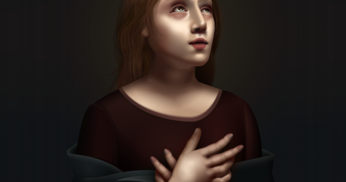
# Pure CSS Gaze
An ongoing series in which I create art using only CSS and HTML.
Inspired by Italian renaissance.
Rules I have for myself:
1. All elements must be typed out by hand
2. Only Atom text editor and Chrome Developer Tools allowed.
3. ~~SVG use is limited, and all shapes can only use hand-plotted coordinates and bezier curves - without the aid of any graphics editor.~~
(Note: at one point I was using one or two SVG elements but I eventually grew tired of them and they've since been deleted, so this rule no longer applies. No offense to SVG.)
Because of the artistic nature of this project I have not concerned myself with cross-browser-compatibility, so the live preview will most likely look laughable in anything other than chrome.
[cyanharlow.github.io/purecss-gaze](https://cyanharlow.github.io/purecss-gaze/)
================================================
FILE: index.html
================================================
<!DOCTYPE html>
<html lang="en">
<head>
<script async src="https://www.googletagmanager.com/gtag/js?id=UA-119193338-1"></script>
<script>
window.dataLayer = window.dataLayer || [];
function gtag() {
dataLayer.push(arguments);
}
gtag('js', new Date());
gtag('config', 'UA-119193338-1');
</script>
<meta charset="UTF-8">
<title>PureCSS Gaze</title>
<link href="style.css" rel="stylesheet" type="text/css">
<meta property="og:description" content="Pure CSS Oil Painting - by Diana Smith aka cyanHarlow"/>
<meta name="description" content="Pure CSS Oil Painting - by Diana Smith aka cyanHarlow"/>
<meta property="og:title" content="Pure CSS Oil Painting - by Diana Smith aka cyanHarlow">
<meta property="og:image" content="https://raw.githubusercontent.com/cyanharlow/purecss-gaze/master/preview.png">
<meta property='twitter:title' content="Pure CSS Oil Painting - by Diana Smith aka cyanHarlow"/>
<meta property="twitter:image" content="https://raw.githubusercontent.com/cyanharlow/purecss-gaze/master/preview.png">
<meta name="twitter:card" content="summary_large_image"/>
<meta name="viewport" content="width=900"/>
<meta name="author" content="Diana Smith">
<meta name="keywords" content="cyanharlow, diana, css, art"/>
</head>
<body>
<div id="linksection" class="linksection">
By Diana Smith
<span class="separator">|</span>
<a href="https://github.com/cyanharlow" target="_blank">GitHub.com/cyanHarlow</a>
<span class="separator">|</span>
<a href="http://diana-adrianne.com" target="_blank">Website</a>
<span class="separator">|</span>
Optimized for viewing in Chrome
</div>
<div class="frame">
<div class="sky">
<div class="cloud c1"></div>
<div class="cloud c2"></div>
<div class="cloud c3"></div>
<div class="cloud c4"></div>
</div>
<div class="shawl s3"></div>
<div class="shawl s4"></div>
<div class="hair behind">
<div class="strand h8"></div>
<div class="strand h9"></div>
<div class="strand h10"></div>
<div class="strand h11"></div>
<div class="strand h12"></div>
<div class="strand h13"></div>
<div class="strand h14"></div>
<div class="strand h15"></div>
<div class="strand h16"></div>
<div class="strand h17"></div>
<div class="strand h18"></div>
<div class="strand h19"></div>
<div class="strand h20"></div>
<div class="clump c1"></div>
<div class="clump c2"></div>
<div class="clump c8"></div>
<div class="clump c5"></div>
<div class="clump c6"></div>
<div class="hank h5">
<div class="strand s1"></div>
<div class="strand s2"></div>
<div class="strand s3"></div>
<div class="strand s4"></div>
<div class="strand s5"></div>
<div class="strand s6"></div>
<div class="strand s6"></div>
<div class="strand s7"></div>
<div class="strand s8"></div>
<div class="strand s9"></div>
<div class="strand s10"></div>
<div class="strand s11"></div>
<div class="strand s12"></div>
<div class="strand s13"></div>
<div class="strand s14"></div>
<div class="strand s15"></div>
</div>
<div class="clump c7"></div>
<div class="clump c9"></div>
<div class="hank h6">
<div class="strand s1"></div>
<div class="strand s2"></div>
<div class="strand s3"></div>
<div class="strand s4"></div>
<div class="strand s5"></div>
<div class="strand s6"></div>
<div class="strand s6"></div>
<div class="strand s7"></div>
<div class="strand s8"></div>
<div class="strand s9"></div>
<div class="strand s10"></div>
<div class="strand s11"></div>
<div class="strand s12"></div>
<div class="strand s13"></div>
<div class="strand s14"></div>
<div class="strand s15"></div>
</div>
<div class="hank h12">
<div class="strand s1"></div>
<div class="strand s2"></div>
<div class="strand s3"></div>
<div class="strand s4"></div>
<div class="strand s5"></div>
<div class="strand s6"></div>
<div class="strand s6"></div>
<div class="strand s7"></div>
<div class="strand s8"></div>
<div class="strand s9"></div>
<div class="strand s10"></div>
<div class="strand s11"></div>
<div class="strand s12"></div>
<div class="strand s13"></div>
<div class="strand s14"></div>
<div class="strand s15"></div>
</div>
<div class="hank h13">
<div class="strand s1"></div>
<div class="strand s2"></div>
<div class="strand s3"></div>
<div class="strand s4"></div>
<div class="strand s5"></div>
<div class="strand s6"></div>
<div class="strand s6"></div>
<div class="strand s7"></div>
<div class="strand s8"></div>
<div class="strand s9"></div>
<div class="strand s10"></div>
<div class="strand s11"></div>
<div class="strand s12"></div>
<div class="strand s13"></div>
<div class="strand s14"></div>
<div class="strand s15"></div>
</div>
<div class="hank h14">
<div class="strand s1"></div>
<div class="strand s2"></div>
<div class="strand s3"></div>
<div class="strand s4"></div>
<div class="strand s5"></div>
<div class="strand s6"></div>
<div class="strand s6"></div>
<div class="strand s7"></div>
<div class="strand s8"></div>
<div class="strand s9"></div>
<div class="strand s10"></div>
<div class="strand s11"></div>
<div class="strand s12"></div>
<div class="strand s13"></div>
<div class="strand s14"></div>
<div class="strand s15"></div>
</div>
<div class="hank h15">
<div class="strand s1"></div>
<div class="strand s2"></div>
<div class="strand s3"></div>
<div class="strand s4"></div>
<div class="strand s5"></div>
<div class="strand s6"></div>
<div class="strand s6"></div>
<div class="strand s7"></div>
<div class="strand s8"></div>
<div class="strand s9"></div>
<div class="strand s10"></div>
<div class="strand s11"></div>
<div class="strand s12"></div>
<div class="strand s13"></div>
<div class="strand s14"></div>
<div class="strand s15"></div>
</div>
<div class="hank h9">
<div class="strand s1"></div>
<div class="strand s2"></div>
<div class="strand s3"></div>
<div class="strand s4"></div>
<div class="strand s5"></div>
<div class="strand s6"></div>
<div class="strand s6"></div>
<div class="strand s7"></div>
<div class="strand s8"></div>
<div class="strand s9"></div>
<div class="strand s10"></div>
<div class="strand s11"></div>
<div class="strand s12"></div>
<div class="strand s13"></div>
<div class="strand s14"></div>
<div class="strand s15"></div>
</div>
<div class="hank h11">
<div class="strand s1"></div>
<div class="strand s2"></div>
<div class="strand s3"></div>
<div class="strand s4"></div>
<div class="strand s5"></div>
<div class="strand s6"></div>
<div class="strand s6"></div>
<div class="strand s7"></div>
<div class="strand s8"></div>
<div class="strand s9"></div>
<div class="strand s10"></div>
<div class="strand s11"></div>
<div class="strand s12"></div>
<div class="strand s13"></div>
<div class="strand s14"></div>
<div class="strand s15"></div>
</div>
<div class="clump c10"></div>
<div class="hank h10">
<div class="strand s1"></div>
<div class="strand s2"></div>
<div class="strand s3"></div>
<div class="strand s4"></div>
<div class="strand s5"></div>
<div class="strand s6"></div>
<div class="strand s6"></div>
<div class="strand s7"></div>
<div class="strand s8"></div>
<div class="strand s9"></div>
<div class="strand s10"></div>
<div class="strand s11"></div>
<div class="strand s12"></div>
<div class="strand s13"></div>
<div class="strand s14"></div>
<div class="strand s15"></div>
</div>
</div>
<div class="sleeve right"></div>
<div class="collar left"></div>
<div class="sleeve left"></div>
<div class="collar right"></div>
<div class="neck-curve"></div>
<div class="neckline">
<div class="edge"></div>
<div class="shoulders"></div>
</div>
<div class="neck"></div>
<div class="trap1"></div>
<div class="trap2"></div>
<div class="head">
<div class="face">
<div class="hairline-shadow"></div>
<div class="forehead-shadow"></div>
<div class="forehead"></div>
<div class="cheekhollow"></div>
<div class="cheek-highlight"></div>
<div class="nose-outer-highlights"></div>
<div class="nasolabial-sulcus left"></div>
<div class="nasolabial-sulcus right"></div>
<div class="uppercrease right"></div>
<div class="lashes right"></div>
<div class="lashes right2"></div>
<div class="upperlid right"></div>
<div class="eyeball right">
<div class="iris right"></div>
</div>
<div class="eyeunder right"></div>
<div class="nose-depth"></div>
<div class="nostrils-back">
<div class="naris"></div>
</div>
<div class="nostrils-front">
<div class="naris"></div>
</div>
<div class="nose-bridge"></div>
<div class="nasion"></div>
<div class="nose-side"></div>
<div class="uppercrease left"></div>
<div class="lashes left"></div>
<div class="lashes left2"></div>
<div class="upperlid left"></div>
<div class="eyeball left">
<div class="iris left"></div>
</div>
<div class="eyeunder left"></div>
<div class="outer-canthus"></div>
<div class="inner-canthus"></div>
<div class="chin-shadow"></div>
<div class="chin-indent"></div>
<div class="philtrum"></div>
<div class="orbicularis-oris"></div>
<div class="labiomental-groove"></div>
<div class="open-mouth"></div>
<div class="bottom-left-lip"></div>
<div class="bottom-right-lip"></div>
<div class="bottom-mid-lip"></div>
<div class="top-left-lip"></div>
<div class="top-right-lip"></div>
<div class="lip-tubercle"></div>
<div class="left-mouth-corner"></div>
<div class="right-mouth-corner"></div>
<div class="right-chin-shadow"></div>
<div class="right-cheek-shadow"></div>
<div class="brow right"></div>
<div class="brow-hairs right"></div>
<div class="brow left"></div>
<div class="brow-hairs left"></div>
</div>
</div>
<div class="ear"></div>
<div class="neck-transition"></div>
<div class="hair front">
<div class="strand h1"></div>
<div class="strand h2"></div>
<div class="strand h3"></div>
<div class="strand h4"></div>
<div class="strand h5"></div>
<div class="strand h6"></div>
<div class="strand h7"></div>
<div class="clump c3"></div>
<div class="scalp"></div>
<div class="hank h4">
<div class="strand s1"></div>
<div class="strand s2"></div>
<div class="strand s3"></div>
<div class="strand s4"></div>
<div class="strand s5"></div>
<div class="strand s6"></div>
<div class="strand s6"></div>
<div class="strand s7"></div>
<div class="strand s8"></div>
<div class="strand s9"></div>
<div class="strand s10"></div>
<div class="strand s11"></div>
<div class="strand s12"></div>
<div class="strand s13"></div>
<div class="strand s14"></div>
<div class="strand s15"></div>
</div>
<div class="clump c4"></div>
<div class="hank h3">
<div class="strand s1"></div>
<div class="strand s2"></div>
<div class="strand s3"></div>
<div class="strand s4"></div>
<div class="strand s5"></div>
<div class="strand s6"></div>
<div class="strand s6"></div>
<div class="strand s7"></div>
<div class="strand s8"></div>
<div class="strand s9"></div>
<div class="strand s10"></div>
<div class="strand s11"></div>
<div class="strand s12"></div>
<div class="strand s13"></div>
<div class="strand s14"></div>
<div class="strand s15"></div>
</div>
<div class="hank h2">
<div class="strand s1"></div>
<div class="strand s2"></div>
<div class="strand s3"></div>
<div class="strand s4"></div>
<div class="strand s5"></div>
<div class="strand s6"></div>
<div class="strand s6"></div>
<div class="strand s7"></div>
<div class="strand s8"></div>
<div class="strand s9"></div>
<div class="strand s10"></div>
<div class="strand s11"></div>
<div class="strand s12"></div>
<div class="strand s13"></div>
<div class="strand s14"></div>
<div class="strand s15"></div>
</div>
<div class="hank h1">
<div class="strand s1"></div>
<div class="strand s2"></div>
<div class="strand s3"></div>
<div class="strand s4"></div>
<div class="strand s5"></div>
<div class="strand s6"></div>
<div class="strand s6"></div>
<div class="strand s7"></div>
<div class="strand s8"></div>
<div class="strand s9"></div>
<div class="strand s10"></div>
<div class="strand s11"></div>
<div class="strand s12"></div>
<div class="strand s13"></div>
<div class="strand s14"></div>
<div class="strand s15"></div>
</div>
<div class="hank h8">
<div class="strand s1"></div>
<div class="strand s2"></div>
<div class="strand s3"></div>
<div class="strand s4"></div>
<div class="strand s5"></div>
<div class="strand s6"></div>
<div class="strand s6"></div>
<div class="strand s7"></div>
<div class="strand s8"></div>
<div class="strand s9"></div>
<div class="strand s10"></div>
<div class="strand s11"></div>
<div class="strand s12"></div>
<div class="strand s13"></div>
<div class="strand s14"></div>
<div class="strand s15"></div>
</div>
<div class="hank h7">
<div class="strand s1"></div>
<div class="strand s2"></div>
<div class="strand s3"></div>
<div class="strand s4"></div>
<div class="strand s5"></div>
<div class="strand s6"></div>
<div class="strand s6"></div>
<div class="strand s7"></div>
<div class="strand s8"></div>
<div class="strand s9"></div>
<div class="strand s10"></div>
<div class="strand s11"></div>
<div class="strand s12"></div>
<div class="strand s13"></div>
<div class="strand s14"></div>
<div class="strand s15"></div>
</div>
<div class="hank h16">
<div class="strand s1"></div>
<div class="strand s2"></div>
<div class="strand s3"></div>
<div class="strand s4"></div>
<div class="strand s5"></div>
<div class="strand s6"></div>
<div class="strand s6"></div>
<div class="strand s7"></div>
<div class="strand s8"></div>
<div class="strand s9"></div>
<div class="strand s10"></div>
<div class="strand s11"></div>
<div class="strand s12"></div>
<div class="strand s13"></div>
<div class="strand s14"></div>
<div class="strand s15"></div>
</div>
</div>
<div class="shawl s1">
<div class="wrinkle w2"></div>
<div class="wrinkle w3"></div>
<div class="wrinkle w4"></div>
<div class="wrinkle w5">
</div>
</div>
<div class="shawl s2"></div>
<div class="shawl s5">
<div class="wrinkle w1"></div>
</div>
<div class="shawl s6"></div>
<div class="hand h2">
<div class="wrist"></div>
<div class="thumb">
<div class="interphalangeal"></div>
</div>
<div class="palm"></div>
<div class="phalange pinky">
<div class="phalanx proximal"></div>
<div class="phalanx distal"></div>
<div class="phalanx middle"></div>
<div class="interphalangeal distal"></div>
<div class="interphalangeal proximal"></div>
<div class="metacarpophalangeal"></div>
<div class="web"></div>
</div>
<div class="phalange ring">
<div class="phalanx proximal"></div>
<div class="phalanx distal"></div>
<div class="phalanx middle"></div>
<div class="interphalangeal distal"></div>
<div class="interphalangeal proximal"></div>
<div class="metacarpophalangeal"></div>
<div class="web"></div>
</div>
<div class="phalange middle">
<div class="phalanx proximal"></div>
<div class="phalanx middle"></div>
<div class="phalanx distal"></div>
<div class="interphalangeal distal"></div>
<div class="interphalangeal proximal"></div>
<div class="metacarpophalangeal"></div>
<div class="web"></div>
</div>
<div class="phalange index">
<div class="phalanx proximal"></div>
<div class="phalanx middle"></div>
<div class="phalanx distal"></div>
<div class="interphalangeal distal"></div>
<div class="interphalangeal proximal"></div>
<div class="metacarpophalangeal"></div>
<div class="web"></div>
</div>
</div>
<div class="hand h1">
<div class="wrist"></div>
<div class="thumb">
<div class="interphalangeal"></div>
</div>
<div class="palm"></div>
<div class="phalange pinky">
<div class="phalanx proximal"></div>
<div class="phalanx distal"></div>
<div class="phalanx middle"></div>
<div class="interphalangeal distal"></div>
<div class="interphalangeal proximal"></div>
<div class="metacarpophalangeal"></div>
<div class="web"></div>
</div>
<div class="phalange ring">
<div class="phalanx proximal"></div>
<div class="phalanx distal"></div>
<div class="phalanx middle"></div>
<div class="interphalangeal distal"></div>
<div class="interphalangeal proximal"></div>
<div class="metacarpophalangeal"></div>
<div class="web"></div>
</div>
<div class="phalange middle">
<div class="phalanx proximal"></div>
<div class="phalanx middle"></div>
<div class="phalanx distal"></div>
<div class="interphalangeal distal"></div>
<div class="interphalangeal proximal"></div>
<div class="metacarpophalangeal"></div>
<div class="web"></div>
</div>
<div class="phalange index">
<div class="phalanx proximal"></div>
<div class="phalanx middle"></div>
<div class="phalanx distal"></div>
<div class="interphalangeal distal"></div>
<div class="interphalangeal proximal"></div>
<div class="metacarpophalangeal"></div>
<div class="web"></div>
</div>
</div>
<div class="canvas-texture"></div>
<div class="aged-varnish"></div>
</div>
</body>
</html>
================================================
FILE: style.css
================================================
html {
font-size: 10px;
padding: 0;
}
html, body {
margin: 0;
}
body {
background-color: #101213;
background-size: auto 1000px;
min-height: 1000px;
position: relative;
padding: 35px 0;
}
.linksection {
font-size: 12px;
text-align: center;
position: static;
padding: 0 0 36px;
font-family: 'Century Gothic', Arial, sans-serif;
color: #423730;
}
.linksection .separator {
padding: 0 5px;
}
.linksection a {
color: #584937;
}
.frame {
width: 900px;
height: 1000px;
margin: auto;
overflow: hidden;
position: relative;
background-color: #0d1a1d;
}
.frame * {
position: absolute;
filter: blur(0.5px);
}
.canvas-texture, .aged-varnish {
pointer-events: none;
width: 100%;
height: 100%;
}
.canvas-texture {
background-image: conic-gradient(#ffffff 25%, #000000 25% 50%, white 50% 75%, black 75% 100%);
filter: blur(1px);
background-size: 5px 3px;
mix-blend-mode: soft-light;
opacity: 0.25;
}
.aged-varnish {
background-color: #ecdec78f;
mix-blend-mode: multiply;
}
.frame *:after, .frame *:before {
content: "";
position: absolute;
}
.head, .hair {
left: 38%;
top: 14%;
width: 31%;
height: 37%;
transform: rotate(-3deg);
}
.hair.front {
pointer-events: none;
}
.hair.front * {
pointer-events: all;
}
.head {
background-color: #cab0a0;
background-image: linear-gradient(-76deg, #8c6756 16%, transparent 26%), linear-gradient(51deg, #6f4a41 17%, #6f413300 39%), linear-gradient(190deg, #e7c0a7 20%, #a17165 44%, #cfb19e 55%, #280a05);
color: #291a17;
border-radius: 57% 39% 27% 73% / 28% 49% 49% 36%;
clip-path: polygon(-20% -20%, 81% -20%, 96% 31%, 96% 46%, 98.25% 53%, 98.25% 59%, 97% 64%, 95% 71%, 91% 83%, 84% 100%, 69% 100%, -9% 100%);
box-shadow: inset 9px 7px 4px -1px #966a4d, 14px -47px 3px -45px #946c5b, -9px 2px 9px 4px #220f0b;
}
.face {
width: 100%;
height: 100%;
overflow: hidden;
border-radius: inherit;
}
.ear {
left: 34%;
top: 28%;
background: #673f31;
box-shadow: inset 2px -2px 5px 5px #451f19, 5px 10px 5px -6px #1f0909;
height: 11%;
width: 5%;
border-radius: 50% 50% 30% 70% / 50% 43% 12% 50%;
}
.lashes {
background-image: repeating-radial-gradient(ellipse at -30% -72%, transparent 1%, currentColor, transparent 5%, transparent 6%);
border-radius: 55% 19% 93% 0 / 93% 52% 68% 0;
clip-path: polygon(0 73%, 50% 4%, 100% 0, 100% 100%, 0 100%);
}
.head:after {
width: 100%;
height: 100%;
pointer-events: none;
border-radius: inherit;
box-shadow: inset 32px -11px 30px -31px #240c07, inset -3px -43px 16px -37px #67382b, inset 67px -10px 34px -45px #4e2f23, inset 30px -29px 20px -11px #3d130d;
}
.forehead-shadow {
top: 0%;
right: 0;
height: 34%;
width: 40%;
border-radius: 0 100% 0 0;
transform: rotate(9deg);
box-shadow: inset -10px 8px 8px -2px #704b42;
}
.forehead {
top: 15%;
left: 66%;
width: 8%;
transform: rotate(9deg);
box-shadow: 0 0 28px 18px #fbebe1;
}
.cheekhollow {
box-shadow: 0 0 38px 38px, 0 0 40px 60px #6105006b;
color: #5d372f;
background: currentColor;
width: 14%;
height: 4%;
top: 62%;
left: -4%;
border-radius: 0 18% 0 0;
transform: rotate(28deg);
}
.cheek-highlight {
left: 23%;
top: 51%;
transform: rotate(35deg);
width: 28%;
box-shadow: 0 0 20px 8px #ffedda;
}
.philtrum {
left: 76%;
top: 65%;
height: 2%;
box-shadow: 0 0 9px 3px #461919;
}
.nose-outer-highlights {
width: 24%;
height: 10%;
top: 53%;
left: 63%;
border-radius: 50%;
box-shadow: -71px -9px 24px 5px #f0dcd1, -6px 8px 26px 16px #f1e6e1, 2px 3px 30px 40px #e8bca1;
}
.nostrils-back {
border-radius: 50%;
background-color: #523523;
background-image: radial-gradient(ellipse at 43% 69%, #4e211b 49%, #905949 66%);
width: 16%;
height: 9%;
top: 54%;
left: 71%;
box-shadow: -2px 13px 8px -5px #3c0a0a;
}
.nostrils-front {
transform: rotate(-14deg);
border-radius: 50% 50% 50% 50% / 57% 50% 50% 34%;
background-color: #e3b89d;
background-image: linear-gradient(-90deg, #461c19 33%, transparent 40%), radial-gradient(ellipse farthest-corner at 44% 100%, #380d0d, 44%, rgba(60, 15, 15, 0) 58%), radial-gradient(ellipse at 61% 7%, #e0b59a 22%, #653a2c);
width: 23%;
height: 10%;
top: 52%;
left: 63%;
box-shadow: -4px 8px 5px -1px #250202d6, 0px -7px 12px 5px #a9755d, inset -5px 7px 10px -5px #9a674f;
}
.nostrils-front:after {
left: 23%;
top: 36%;
width: 21%;
box-shadow: 0 0 9px 4px #f3d3c1;
}
.nose-bridge {
width: 12%;
height: 31%;
transform: rotate(-22deg);
border-radius: 0 0 50% 50% / 0 0 13% 16%;
color: #946d5b;
background-color: #ecc8b2;
background-image: radial-gradient(circle at 51% 80%, #f5ebea 3%, #ffffff00 8%);
box-shadow: inset 0 11px 8px -3px #bd9c85, inset 5px -19px 8px -13px #551d1b, inset 3px -10px 6px 5px, -17px -6px 6px -12px #a07568;
left: 69%;
top: 29%;
}
.nasion {
left: 73%;
top: 26%;
border-radius: 95% 0 0 0;
width: 11%;
height: 7%;
transform: rotate(-34deg);
box-shadow: -9px -9px 9px -1px #e7c0a6;
}
.nose-depth {
height: 12%;
transform: rotate(-18deg);
border-radius: 0 0 50% 50% / 0 0 13% 16%;
box-shadow: 6px -12px 18px 17px #a07866;
left: 66%;
top: 38%;
}
.nose-side {
height: 20%;
transform: rotate(-18deg);
border-radius: 0 0 50% 50% / 0 0 13% 16%;
background: #ecc8b2;
box-shadow: 6px -12px 9px 11px #9c7766;
left: 70%;
top: 36%;
}
.top-left-lip {
background-color: #a74242;
background-image: linear-gradient(176deg, #a74e4e 29%, #521a1b 89%);
box-shadow: inset 14px -7px 5px -7px #2a0c10;
width: 18%;
height: 3.4%;
left: 59%;
top: 71%;
transform: rotate(-29deg);
border-radius: 8% 46% 33% 65% / 8% 58% 44% 77%;
}
.top-right-lip {
background-color: #b35656;
background-image: linear-gradient(180deg, #a04848 41%, #5d1c1d 85%, #0c0909 95%);
width: 11%;
height: 3.4%;
left: 76%;
top: 71%;
transform: rotate(50deg);
border-radius: 33% 19% 71% 36% / 51% 11% 85% 51%;
}
.lip-tubercle {
background-color: #c16060;
background-image: radial-gradient(circle at 45% 188%, #330c0d 46%, #ab5654 84%, transparent 96%);
color: #4f0c0c;
box-shadow: inset 0px -9px 4px -6px, 0 4px 4px -3px;
width: 10%;
height: 4.4%;
left: 71%;
top: 69.125%;
border-radius: 33% 19% 32% 30% / 18% 29% 70% 69%;
}
.open-mouth {
width: 23%;
height: 6%;
top: 72%;
left: 62%;
background: #0b0909;
border-radius: 50%;
}
.left-mouth-corner {
width: 8%;
left: 59%;
top: 75%;
border-bottom: 2px solid #0e0202;
border-radius: 50%;
box-shadow: 0 -4px 11px 6px #2d0101d4;
transform: rotate(8deg);
}
.right-mouth-corner {
width: 6%;
left: 81%;
top: 75.5%;
border-bottom: 2px solid #090707;
border-radius: 50%;
box-shadow: 0 -1px 4px 2px #130404, 0 -4px 10px 4px #271313;
transform: rotate(16deg);
}
.bottom-left-lip {
background-color: #a74242;
background-image: linear-gradient(38deg, #b7a8a2 15%, rgba(159, 61, 62, 0) 36%), linear-gradient(182deg, #9e4141 44%, #7e2929 80%);
width: 17%;
height: 5%;
left: 62%;
top: 76%;
transform: rotate(9deg);
border-radius: 8% 33% 37% 60% / 8% 44% 44% 92%;
}
.bottom-mid-lip {
background-image: linear-gradient(180deg, rgba(255, 255, 255, 0) 25%, rgba(255, 255, 255, 0.18), rgba(255, 255, 255, 0) 57%, #6b2323), linear-gradient(180deg, #591818, #8d3232 20%, #a74242 75%, #571818);
width: 18%;
box-shadow: inset 8px 1px 7px -3px #9a483f, inset -9px 1px 8px -3px #a04555;
height: 6%;
left: 66%;
top: 75.5%;
transform: rotate(1deg);
border-radius: 36% 33% 68% 35% / 32% 22% 55% 75%;
}
.bottom-right-lip {
background-image: linear-gradient(148deg, #a74242 56%, #6b232300 90%);
width: 8%;
height: 4%;
left: 77%;
top: 76%;
transform: rotate(-5deg);
border-radius: 8% 4% 63% 47% / 8% 4% 94% 77%;
}
.nostrils-front .naris {
width: 36%;
height: 24%;
background: #1d0d0d;
box-shadow: -3px 2px 6px -1px #130707, -6px 0px 4px -2px #c28d6b;
border-radius: 50%;
bottom: 14%;
left: 21%;
}
.nostrils-back .naris {
width: 37%;
height: 34%;
background: #0f0606;
box-shadow: -3px 7px 9px -2px #271616, -6px 2px 5px -3px #c28d6b;
border-radius: 50%;
bottom: 18%;
left: 48%;
}
.labiomental-groove {
top: 79%;
left: 72%;
width: 5%;
box-shadow: 0 9px 13px 10px #300606;
}
.orbicularis-oris {
top: 80%;
left: 61%;
width: 22%;
box-shadow: 0 0 18px 8px #e3bda8, 0 9px 15px 8px #664135;
}
.chin-indent {
width: 18%;
height: 0;
left: 64%;
top: 84%;
box-shadow: 0 0 9px 5px #6b4b43;
}
.chin-shadow {
border-radius: 50%;
color: #cca995;
background-color: #ebc8b1;
box-shadow: 0 4px 11px 6px, 0 11px 17px 6px, 0 -7px 9px 7px #97604b, 0 83px 20px 90px #977261;
top: 86%;
left: 69%;
width: 10%;
height: 4%;
filter: blur(3px);
}
.eyeball {
overflow: hidden;
}
.eyeball.left {
border-radius: 60% 40% 50% 50% / 100% 100% 0% 0%;
background-color: #778273;
background-image: radial-gradient(circle at 48% 58%, white 8%, transparent 10%), radial-gradient(circle at 50% 50%, #ffffffa6, transparent);
width: 20%;
height: 7%;
left: 38%;
top: 34%;
box-shadow: inset 11px 0px 10px -2px #401010, inset -5px 3px 2px -2px #401010, -1px -4px 2px -2px #170808;
}
.lashes.left {
left: 43%;
top: 31.5%;
width: 16%;
height: 5%;
color: #320b02f2;
}
.lashes.left2 {
left: 32%;
top: 32%;
width: 23%;
height: 5%;
transform: rotate(-24deg);
color: #4a1f1f;
}
.eyeunder.left {
border-radius: 50% / 15% 10% 70% 70%;
background-image: radial-gradient(ellipse farthest-corner at 50% -59%, #fdede4, #9745456e 56%, rgba(151, 32, 32, 0) 73%);
width: 29%;
height: 10%;
left: 33%;
top: 39.5%;
box-shadow: 0px -6px 6px -5px #090000a3, inset -6px 4px 6px -4px #ebc8b4, inset 0 17px 8px -5px #9f6055e3, -19px -6px 9px -12px #995d4d;
}
.eyeunder.left:before {
width: 100%;
height: 100%;
right: 2%;
top: -14%;
border-right: 6px solid white;
border-radius: inherit;
filter: blur(4px);
transform: rotate(15deg);
}
.eyeball.right {
border-radius: 60% 40% 50% 50% / 100% 100% 0% 0%;
background-color: #9ea99a;
background-image: radial-gradient(circle at 48% 58%, white 8%, transparent 10%), radial-gradient(circle at 24% 42%, #ffffffa6, transparent 75%);
width: 16%;
height: 5%;
left: 78%;
top: 38%;
transform: rotate(9deg);
box-shadow: inset 11px 0px 10px -2px #401010, inset -5px 3px 2px -2px #401010, 1px -4px 2px -2px #150303;
}
.eyeunder.right {
border-radius: 50% / 15% 10% 70% 70%;
background-image: radial-gradient(ellipse farthest-corner at 56% -23%, #efbfa5, #9745456e 56%, rgba(151, 32, 32, 0) 73%);
width: 18%;
height: 10%;
left: 76%;
top: 42%;
box-shadow: 2px -6px 6px -5px #554a43, inset 6px 4px 6px -2px #e9c1ab85;
transform: rotate(13deg);
}
.iris.left {
background-color: #361c0e;
background-image: linear-gradient(187deg, #0b0101 15%, transparent 45%), radial-gradient(circle at 50% 79%, #ffffffb5 14%, #ffffff00 14%), radial-gradient(ellipse at 50% 41%, #170e0e 19%, #13010100 27%, #09010100, #1b0808 76%);
left: 40%;
top: -8%;
width: 47%;
height: 67%;
border-radius: 50%;
}
.iris.right {
background-color: #361c0e;
background-image: linear-gradient(189deg, black 32%, transparent 67%), radial-gradient(circle at 39% 83%, #ffffffb5 8%, #ffffff00 10%), radial-gradient(ellipse at 46% 58%, #170e0e 19%, #13010100 27%, #09010100, #1b0808 76%);
left: 43%;
top: -43%;
width: 50%;
height: 106%;
border-radius: 50%;
}
.upperlid.left {
border-radius: 60% 40% 50% 50% / 100% 100% 0% 0%;
background-color: #4d2222;
background-image: linear-gradient(190deg, #823c30cf, #270303 80%);
width: 24%;
height: 9%;
left: 35%;
top: 32.5%;
box-shadow: inset 2px -8px 16px 2px #764646, 1px -3px 1px -3px #3b1414;
}
.lashes.right {
left: 84%;
top: 37.5%;
width: 16%;
height: 5%;
color: #130101;
}
.lashes.right2 {
left: 80%;
top: 35.5%;
width: 16%;
height: 5%;
transform: rotate(-9deg);
color: #170602f5;
}
.upperlid.right {
border-radius: 60% 40% 50% 50% / 70% 70% 30% 30%;
background-color: #3a0e0e;
background-image: linear-gradient(134deg, #672222cf, #1f0101 80%);
width: 17%;
height: 9%;
left: 78%;
top: 36%;
transform: rotate(13deg);
box-shadow: inset 2px -8px 16px 2px #764646, 1px -3px 1px -3px #3b1414;
}
.uppercrease.left {
border-radius: 60% 40% 50% 50% / 100% 100% 0 0;
background-color: #6b4236;
background-image: radial-gradient(circle at 50% 50%, #ffffff4a, transparent);
width: 28%;
height: 10%;
left: 33%;
top: 31%;
box-shadow: 0px -12px 8px -12px #0f0000, -44px -9px 30px -8px #571f1f, 0 -19px 20px -5px #380202, 16px -21px 20px 5px #5d4743, inset 0 4px 2px -2px #612b2b;
}
.uppercrease.right {
border-radius: 60% 40% 50% 50% / 100% 100% 0% 0%;
background-color: #653b34;
background-image: radial-gradient(circle at 50% 50%, #ffffff4a, transparent);
width: 20%;
height: 10%;
left: 75%;
top: 35%;
transform: rotate(9deg);
box-shadow: 5px -14px 8px -12px #0f0000, 8px -7px 20px 7px #380202, -3px -21px 14px 5px #746860;
}
.nasolabial-sulcus.left {
left: 59%;
top: 59%;
width: 12%;
height: 20%;
border-radius: 50%;
filter: blur(5px);
background: #c19983;
}
.nasolabial-sulcus.right {
left: 82%;
top: 59%;
width: 5%;
height: 20%;
border-radius: 50%;
filter: blur(5px);
transform: rotate(-8deg);
background-image: linear-gradient(180deg, #2a0b0b 23%, #c19983 46%);
}
.outer-canthus {
left: 35%;
top: 33%;
background-image: linear-gradient(124deg, #744b4b00 33%, #7d5050c4 72%);
transform: rotate(28deg);
width: 4%;
height: 8%;
border-radius: 0 0 91% 0;
box-shadow: 3px 2px 3px -1px #2c0404;
}
.inner-canthus {
left: 55.4%;
top: 37.5%;
transform: rotate(17deg);
width: 5%;
height: 2.1%;
border-radius: 0 72% 38% 0 / 50%;
box-shadow: inset -4px 0px 3px 1px #652d2d, 7px 1px 5px -1px #f7eded;
}
.neck {
top: 39%;
left: 40%;
width: 20%;
height: 21%;
background-color: #341813;
background-image: radial-gradient(ellipse at 61% 67%, #5d3830, #99676700 37%), linear-gradient(94deg, #1f0e0e 3%, #390c0c00 16%);
border-radius: 50% / 0 0 23% 20%;
transform: rotate(9deg);
color: #58362c;
box-shadow: inset 0 -50px 21px -33px, 0 33px 20px -25px;
}
.neck-curve {
top: 52%;
left: 58%;
height: 5.6%;
width: 2%;
border-radius: 0 0 0 100% / 0 0 0 50%;
color: #381d16;
border-left: 15px solid;
border-bottom: 5px solid;
}
.neck-transition {
top: 46.5%;
left: 41%;
width: 19%;
height: 5.26%;
background-image: linear-gradient(218deg, #84474700 48%, #381a16 72%), linear-gradient(182deg, #84474700 3%, #56322b 41%);
border-radius: 50% 50% 60% 40% / 0 0 100% 100%;
transform: rotate(15deg);
filter: blur(3px);
box-shadow: -20px 29px 18px -19px #2e171394, 12px 9px 15px -14px #4f2c25;
}
.right-chin-shadow {
height: 32%;
width: 1%;
right: 3%;
bottom: 0;
transform: rotate(16deg);
box-shadow: 0 0 20px 17px #321919;
}
.right-cheek-shadow {
height: 32%;
width: 1%;
right: 0%;
top: 49%;
transform: rotate(4deg);
box-shadow: 0 0 11px 10px #694646;
}
.hair.front > .strand {
opacity: 0.25;
}
.strand.h1 {
height: 38%;
width: 18%;
top: -10%;
left: 20%;
transform: rotate(49deg);
border-radius: 50%;
border-right: 6px double #612e197d;
}
.strand.h2 {
height: 27%;
width: 18%;
top: 10%;
left: 3%;
transform: rotate(30deg);
border-radius: 50%;
border-right: 6px double #612e1973;
}
.strand.h3 {
height: 27%;
width: 18%;
top: 35%;
left: -6%;
transform: rotate(-48deg);
border-radius: 50%;
border-right: 6px double #612e1973;
}
.strand.h4 {
height: 20%;
width: 18%;
top: 51%;
left: -6%;
transform: rotate(-26deg);
border-radius: 50%;
border-right: 5px double #38170b7d;
}
.strand.h5 {
height: 27%;
width: 18%;
top: 48%;
left: 2%;
transform: rotate(-30deg);
border-radius: 50%;
border-left: 7px double #2c160d7d;
}
.strand.h6 {
height: 24%;
width: 23%;
top: 44%;
left: -9%;
transform: rotate(3deg);
border-radius: 50%;
border-right: 7px double #4c25177d;
}
.strand.h7 {
height: 24%;
width: 23%;
top: 20%;
left: 4%;
transform: rotate(-17deg);
border-radius: 50%;
border-left: 7px double #5227177d;
}
.strand.h8 {
height: 47%;
width: 9%;
top: 21%;
left: -43%;
transform: rotate(16deg);
border-radius: 100% 0 0 100% / 50%;
border-left: 6px double #210d04a6;
}
.strand.h9 {
height: 38%;
width: 33%;
top: 61%;
left: -50%;
transform: rotate(3deg);
border-radius: 50%;
border-left: 7px double #210c057d;
}
.strand.h10 {
height: 39%;
width: 17%;
top: 71%;
left: -58%;
transform: rotate(31deg);
border-radius: 0 100% 100% 0 / 50%;
color: #210d02d9;
border-right: 6px double;
}
.strand.h11 {
height: 47%;
width: 33%;
top: 43%;
left: -50%;
transform: rotate(3deg);
border-radius: 100% 0 0 100% / 50%;
border-left: 7px double #1709027d;
}
.strand.h12 {
height: 51%;
width: 13%;
top: 80%;
left: -60%;
transform: rotate(29deg);
border-radius: 0 100% 100% 0 / 50%;
color: #1d0d027d;
border-right: 7px double;
}
.strand.h13 {
height: 50%;
width: 33%;
top: 66%;
left: -44%;
transform: rotate(-18deg);
border-radius: 50%;
border-left: 7px double #211009cc;
}
.strand.h14 {
height: 50%;
width: 20%;
top: 88%;
left: -53%;
transform: rotate(25deg);
border-radius: 50%;
border-left: 6px double #1f0c027d;
}
.strand.h15 {
height: 62%;
width: 15%;
top: -15%;
left: -26%;
transform: rotate(40deg);
border-radius: 100% 0 0 100% / 50%;
border-left: 6px double #1b0a037d;
}
.strand.h16 {
height: 44%;
width: 55%;
top: -15%;
left: 18%;
transform: rotate(4deg);
border-radius: 50%;
border-top: 6px double #4824177d;
}
.wrist {
width: 50%;
top: 71%;
left: -21%;
height: 39%;
background-color: #b38e7f;
box-shadow: inset 16px 6px 8px -2px #6d3d2e;
background-image: linear-gradient(186deg, #65242400 37%, #3a150f 85%), linear-gradient(90deg, #b58c8c00 39%, #a67c6f 93%);
border-radius: 9% 21% 53% 13% / 70% 2% 17% 9%;
transform: rotate(-50deg);
}
.palm {
width: 55%;
top: 40%;
height: 62%;
box-shadow: inset -8px 0px 8px -2px #612c1d;
background-image: radial-gradient(ellipse closest-side at 51% 28%, #efe0d6b5, #ffffff00 87%), radial-gradient(ellipse closest-side at 32% 45%, #e8d6c9b5, #f0e8e800 87%), linear-gradient(165deg, #60181800 53%, #3a150f 84%), linear-gradient(90deg, #7e494900 39%, #a67c6f 93%), linear-gradient(107deg, #ceb5b500, #ad8878 24%);
border-radius: 69% 21% 64% 31% / 70% 2% 17% 38%;
transform: rotate(-9deg);
}
.palm:after {
height: 48%;
left: 15%;
transform: rotate(39deg);
box-shadow: 0 0 9px 5px #a8816e;
}
.hand {
height: 26%;
width: 30%;
border-radius: 50%;
transform: rotate(-8deg);
}
.hand.h1 {
left: 50%;
bottom: 0%;
transform: rotate(-8deg);
color: #030903;
/* color: #400505; */
filter: drop-shadow(-8px 24px 13px) drop-shadow(-17px 19px 13px #400505) blur(1px);
}
.hand.h2 {
transform: rotate(27deg) scaleX(-1);
bottom: -9%;
left: 39%;
color: #020502;
filter: drop-shadow(-17px 14px 30px) drop-shadow(-17px 24px 30px) blur(1px);
}
.thumb {
border-radius: 21% 71% 31% 58% / 4% 44% 27% 60%;
background-color: #ab8877;
background-image: linear-gradient(84deg, #53181800 64%, #411c14 95%), linear-gradient(180deg, #67423c, #5e242400 50%);
height: 86%;
top: -2%;
width: 14.5%;
left: 14%;
transform: rotate(40deg);
box-shadow: inset 9px 19px 13px -1px #572a1c, inset -16px 41px 13px -23px #572a1c;
}
.thumb .interphalangeal {
left: -6%;
top: 23%;
height: 22%;
width: 42%;
background-color: #8f6857;
box-shadow: inset -3px 10px 8px -11px #502d1c, inset -9px -4px 8px -8px #956e5b, inset 13px 1px 8px -7px #562b1e, 5px 1px 5px -4px #98725f;
/* filter: blur(3px); */
border-radius: 70% 30% 70% 30% / 54% 30% 47% 43%;
transform: rotate(-8deg);
}
.thumb:after {
width: 42%;
height: 12%;
left: -3%;
top: 2%;
transform: rotate(-9deg);
border-radius: 40% 45% 47% 50% / 30% 50% 49% 9%;
background-image: linear-gradient(180deg, #795349, #5f3b31);
box-shadow: inset -2px -1px 5px 2px #44272763, 3px 0px 4px -1px #96696961;
}
.phalange {
height: 17%;
}
.phalange.index {
transform: rotate(-14deg);
width: 44%;
left: 49%;
top: 30%;
}
.phalange.index .web {
bottom: 5%;
width: 3%;
box-shadow: 0 0 6px 3px #150202, 0 0px 11px 9px #270303c7;
}
.phalange.middle {
transform: rotate(-11deg);
width: 52%;
left: 51%;
top: 47%;
}
.phalange.middle .web {
bottom: 2%;
left: 0%;
width: 7%;
box-shadow: 1px 0 5px 2px #1b0703, -3px -4px 13px 8px #330303c7;
}
.phalange.ring {
transform: rotate(-12deg);
width: 46%;
left: 46%;
top: 64%;
}
.phalange.ring .web {
bottom: -6%;
left: 13%;
width: 8%;
box-shadow: 1px 0 5px 3px #1b0703, -3px -4px 11px 10px #330303c7;
}
.phalange.pinky {
transform: rotate(-14deg);
width: 34%;
height: 15%;
left: 56%;
top: 78%;
}
.phalange.index .phalanx.proximal {
width: 47%;
height: 100%;
background-image: radial-gradient(ellipse closest-side at 50% 29%, #b3897a 62%, #2d0d07 203%);
box-shadow: inset 8px 0px 11px -6px #ac8275, inset 1px 9px 6px -6px #814240;
border-radius: 45% 50% 50% 50% / 18% 9% 29% 9%;
}
.phalange.index .phalanx.middle {
width: 41%;
height: 78%;
left: 44%;
top: -8%;
transform: rotate(-9deg);
background-image: radial-gradient(ellipse closest-side at 42% 30%, #b3897a 61%, #48251b 217%);
box-shadow: inset 1px 9px 6px -6px #814240;
border-radius: 50% 29% 90% 9% / 9% 21% 43% 2%;
}
.phalange.index .phalanx.distal {
box-shadow: inset -18px 3px 15px -7px #763434;
width: 30%;
height: 61%;
left: 78%;
top: -31%;
transform: rotate(-20deg);
overflow: hidden;
background-image: linear-gradient(172deg, #b3897a 48%, #38160c 88%);
border-radius: 24% 80% 90% 9% / 9% 51% 48% 9%;
}
.phalange.index .interphalangeal.proximal {
left: 39%;
top: 14%;
height: 63%;
width: 13%;
background: radial-gradient(ellipse closest-side at 50% 30%, #b3897a 61%, #48251b 217%);
filter: blur(3px);
border-radius: 30%;
transform: rotate(-8deg);
}
.phalange.index .interphalangeal.distal {
left: 75%;
top: -8%;
height: 53%;
width: 12%;
background: radial-gradient(ellipse closest-side at 50% 30%, #b3897a 61%, #48251b 217%);
filter: blur(3px);
border-radius: 30%;
transform: rotate(-26deg);
}
.phalange.index .phalanx.distal:after {
width: 56%;
height: 64%;
right: 0;
bottom: 0;
border-radius: 40% 45% 17% 50% / 50% 30% 9% 49%;
background-image: linear-gradient(180deg, #d4c0b878, #150b0b);
box-shadow: -4px 1px 6px 2px #2708083d;
}
.phalange.index .metacarpophalangeal {
left: -18%;
top: 9%;
height: 77%;
width: 31%;
background: radial-gradient(ellipse closest-corner at 50% 30%, #b79082 53%, #5a3327 162%);
filter: blur(3px);
border-radius: 30%;
transform: rotate(-8deg);
}
.phalange.middle .phalanx.proximal {
width: 47%;
height: 100%;
background-color: #c79f90;
background-image: radial-gradient(ellipse closest-side at 50% 29%, #c19688 59%, #310700 214%);
box-shadow: inset 1px 21px 11px -15px #6c3734;
border-radius: 8% 50% 50% 8% / 53% 9% 13% 45%;
}
.phalange.middle .phalanx.middle {
width: 41%;
height: 88%;
left: 44%;
top: 0%;
transform: rotate(-4deg);
background-image: radial-gradient(ellipse closest-side at 45% 28%, #c19688 41%, #310700 214%);
border-radius: 7% 29% 90% 9% / 40% 21% 49% 9%;
box-shadow: inset 1px 17px 11px -15px #6c3734;
}
.phalange.middle .phalanx.distal {
box-shadow: inset -24px 7px 15px -6px #763434;
width: 30%;
height: 58%;
left: 81%;
top: -9%;
transform: rotate(-10deg);
overflow: hidden;
background-image: linear-gradient(174deg, #b3897a 48%, #290b06 86%);
border-radius: 46% 53% 90% 9% / 9% 47% 63% 9%;
}
.phalange.middle .phalanx.distal:after {
width: 47%;
height: 64%;
right: 4%;
bottom: 10%;
transform: rotate(-11deg);
border-radius: 40% 45% 17% 50% / 50% 30% 9% 49%;
background-image: linear-gradient(180deg, #d4b2a861, #170909);
box-shadow: -4px 1px 6px 2px #2d0f0f66;
}
.phalange.middle .interphalangeal.proximal {
width: 6%;
height: 63%;
left: 41%;
top: 13%;
color: #613d34a8;
border-radius: 39%;
}
.phalange.middle .interphalangeal.proximal {
left: 40%;
top: 17%;
height: 63%;
width: 10%;
background: radial-gradient(ellipse closest-side at 50% 30%, #b3897a 61%, #48251b 217%);
filter: blur(3px);
border-radius: 30%;
transform: rotate(-8deg);
}
.phalange.middle .interphalangeal.distal {
left: 77%;
top: 7%;
height: 46%;
width: 12%;
background: radial-gradient(ellipse closest-side at 50% 30%, #b3897a 61%, #48251b 217%);
filter: blur(3px);
border-radius: 30%;
transform: rotate(-15deg);
}
.phalange.middle .metacarpophalangeal {
left: -13%;
top: 4%;
height: 85%;
width: 25%;
background: radial-gradient(ellipse closest-corner at 50% 30%, #bb9283 53%, #5a3327 162%);
filter: blur(3px);
border-radius: 30%;
transform: rotate(-8deg);
}
.phalange.ring .phalanx.proximal {
width: 62%;
height: 112%;
background-image: linear-gradient(190deg, #210808 15%, #c29686 27%, #906153, #431e17 66%);
box-shadow: -14px 9px 6px -10px #431e16;
border-radius: 49% 25% 23% 67% / 50% 9% 13% 49%;
}
.phalange.ring .phalanx.middle {
width: 41%;
height: 85%;
left: 51%;
top: -3%;
transform: rotate(-25deg);
background-image: linear-gradient(215deg, #381616 26%, transparent 48%), linear-gradient(180deg, #270505 5%, #bf8977, #8a6152 48%, #35150c 90%);
border-radius: 43% 28% 90% 9% / 89% 21% 32% 9%;
}
.phalange.ring .phalanx.distal {
box-shadow: inset -18px 1px 15px 0px #3a0c0c;
width: 30%;
height: 66%;
left: 76%;
top: -35%;
transform: rotate(-40deg);
background-image: linear-gradient(180deg, #330a08 48%, #442f15);
border-radius: 50% 46% 90% 9% / 9% 42% 48% 9%;
}
.phalange.ring .interphalangeal.proximal {
left: 44%;
top: 27%;
height: 63%;
width: 19%;
background: radial-gradient(ellipse closest-side at 50% 30%, #b3897a 61%, #48251b 217%);
filter: blur(3px);
border-radius: 30%;
transform: rotate(-8deg);
}
.phalange.ring .metacarpophalangeal {
left: -5%;
top: 15%;
height: 77%;
width: 25%;
background: radial-gradient(ellipse closest-side at 50% 30%, #9e7468 42%, #603a32 205%);
filter: blur(5px);
border-radius: 30%;
transform: rotate(26deg);
}
.phalange.pinky .phalanx.proximal {
width: 65%;
height: 100%;
top: 12%;
left: -22%;
transform: rotate(27deg);
background-image: linear-gradient(180deg, #351414 12%, #c29686 24%, #80584a 52%, #3a150e 78%);
box-shadow: inset 15px -1px 6px -6px #3a150e;
border-radius: 50% / 82% 9% 23% 9%;
}
.phalange.pinky .phalanx.middle {
width: 48%;
height: 90%;
left: 25%;
top: 24%;
transform: rotate(-17deg);
background-image: linear-gradient(188deg, #331313 24%, #c29686 34%, #7d5446 63%, #3a150e 88%);
box-shadow: inset -10px -6px 6px -10px #5a3430;
border-radius: 43% 29% 90% 9% / 98% 21% 32% 9%;
}
.phalange.pinky .phalanx.distal {
box-shadow: inset -5px 13px 3px -7px #1b0c0c;
width: 38%;
height: 66%;
left: 49%;
top: 2%;
transform: rotate(-59deg);
background-image: linear-gradient(223deg, #331416 43%, #7b5040 70%, #6d4a41 80%);
border-radius: 50% 46% 90% 9% / 9% 42% 48% 9%;
}
.phalange.pinky .interphalangeal.proximal {
left: 22%;
top: 51%;
height: 63%;
width: 19%;
background: radial-gradient(ellipse closest-side at 50% 30%, #b3897a 61%, #48251b 217%);
filter: blur(3px);
border-radius: 30%;
transform: rotate(-8deg);
}
.hank .strand {
border-radius: inherit;
border-left: 4px double;
border-right: 0;
color: inherit;
width: 100%;
height: 100%;
}
.hank .strand:nth-child(2n) {
height: 90%;
}
.hank .strand:nth-child(3n) {
mix-blend-mode: screen;
}
.hank .strand:nth-child(3n + 1) {
mix-blend-mode: multiply;
}
.hank .strand:nth-child(5n) {
opacity: 0.5;
}
.hank .strand.s1 {
left: 2%;
}
.hank .strand.s2 {
left: 6%;
}
.hank .strand.s3 {
left: 10%;
}
.hank .strand.s4 {
left: 10%;
}
.hank .strand.s5 {
left: 15%;
}
.hank .strand.s6 {
left: 20%;
}
.hank .strand.s7 {
left: 25%;
}
.hank .strand.s8 {
left: 30%;
}
.hank .strand.s9 {
left: 35%;
}
.hank .strand.s10 {
left: 40%;
}
.hank .strand.s11 {
left: 45%;
}
.hank .strand.s12 {
left: 50%;
}
.hank .strand.s13 {
left: 55%;
}
.hank .strand.s14 {
left: 60%;
}
.hank .strand.s15 {
left: 65%;
}
.hank.h1 {
border-radius: 100% 0 0 100% / 50% 0 0 50%;
width: 21%;
height: 75%;
top: -22%;
left: 16%;
transform: rotate(43deg);
color: #4f2a18;
/* overflow: hidden; */
}
.hank.h2 {
border-radius: 100% 0 0 100% / 50% 0 0 50%;
width: 21%;
height: 65%;
top: 6%;
left: -5%;
transform: rotate(4deg);
color: #3e1e15;
}
.hank.h3 {
border-radius: 100% 0 0 100% / 50% 0 0 50%;
width: 26%;
height: 50%;
top: 38%;
left: -29%;
transform: rotate(16deg);
color: #301710;
clip-path: polygon(0 0, 90% 9%, 135% 111%, 0 90%);
}
.hank.h4 {
border-radius: 100% 0 0 100% / 50% 0 0 50%;
width: 45%;
height: 80%;
top: -20%;
left: -29%;
transform: rotate(27deg);
color: #3c1d14;
}
.hank.h5 {
border-radius: 100% 0 0 100% / 50% 0 0 50%;
width: 29%;
height: 75%;
top: 43%;
left: -38%;
transform: rotate(-12deg);
color: #402119;
}
.hank.h6 {
border-radius: 32% 0 0 14% / 50% 0 0 50%;
width: 36%;
height: 69%;
top: 86%;
overflow: hidden;
filter: blur(1px);
left: -49%;
transform: rotate(15deg);
color: #2e1611;
}
.hank.h7 {
clip-path: polygon(5% 34%, 94% -1%, 62% 95%, 5% 96%);
border-radius: 100% 0 0 100% / 50% 0 0 50%;
width: 15%;
height: 48%;
top: 17%;
overflow: hidden;
filter: blur(1px);
left: -20%;
transform: rotate(41deg) scaleX(-1);
color: #30190be0;
}
.hank.h8 {
clip-path: polygon(5% 34%, 94% -1%, 62% 95%, 5% 96%);
border-radius: 100% 0 0 100% / 50% 0 0 50%;
width: 12%;
height: 38%;
top: 25%;
overflow: hidden;
filter: blur(1px);
left: -32%;
transform: rotate(31deg) scaleX(-1);
color: #251207e0;
}
.hank.h9 {
border-radius: 100% 0 0 100% / 50% 0 0 50%;
width: 22%;
height: 43%;
top: 79%;
left: -13%;
transform: rotate(8deg) scaleX(-1);
color: #34180a;
}
.hank.h10 {
border-radius: 100% 0 0 100% / 50% 0 0 50%;
width: 24%;
height: 72%;
top: 54%;
left: -29%;
transform: rotate(9deg);
color: #3c2115;
}
.hank.h11 {
border-radius: 100% 0 0 100% / 50% 0 0 50%;
width: 21%;
height: 66%;
top: 77%;
left: -49%;
transform: rotate(21deg) scaleX(-1);
color: #321710;
filter: blur(2px);
}
.hank.h12 {
border-radius: 100% 0 0 100% / 50% 0 0 50%;
width: 25%;
height: 56%;
top: -20%;
overflow: hidden;
left: 67%;
transform: rotate(-41deg) scaleX(-1);
color: #402315;
}
.hank.h13 {
border-radius: 100% 0 0 100% / 50% 0 0 50%;
width: 35%;
height: 73%;
top: 6%;
overflow: hidden;
left: 75%;
transform: rotate(-18deg) scaleX(-1);
color: #341b10;
}
.hank.h14 {
border-radius: 100% 0 0 100% / 50% 0 0 50%;
width: 18%;
height: 37%;
top: -24%;
/* overflow: hidden; */
left: 44%;
transform: rotate(110deg);
color: #2e1a10;
}
.hank.h15 {
border-radius: 100% 0 0 100% / 50% 0 0 50%;
width: 17%;
height: 25%;
top: -12%;
left: 70%;
transform: rotate(-62deg) scaleX(-1);
color: #3a1d10;
}
.hank.h16 {
border-radius: 100% 0 0 100% / 50% 0 0 50%;
width: 18%;
height: 38%;
top: 43%;
filter: blur(1px);
left: -43%;
transform: rotate(18deg);
color: #31190ae0;
}
.clump {
filter: blur(4px);
}
.clump.c2 {
left: -27%;
top: -11%;
width: 63%;
height: 56%;
border-radius: 90% 5%;
background-image: linear-gradient(214deg, #1b0d05 12%, #653c22, #170d08 89%);
transform: rotate(7deg);
}
.clump.c3 {
left: -8%;
top: -11%;
width: 35%;
height: 59%;
border-radius: 90% 5%;
background-image: linear-gradient(190deg, #1d0f09 7%, #442312, #673826, #2e190e, #2f191200 98%);
transform: rotate(23deg);
box-shadow: inset -20px -7px 30px 3px #421f11;
}
.clump.c4 {
left: -29%;
top: 33%;
width: 36%;
height: 57%;
border-radius: 5% 90%;
background-image: radial-gradient(ellipse at 19% 45%, #27150a 8%, #33170a63 44%, #2f191200 64%);
transform: rotate(37deg);
clip-path: polygon(-9% -9%, 109% -9%, 56% 30%, 55% 34%, 54% 45%, 57% 52%, 61% 57%, 115% 92%, -9% 109%);
}
.clump.c10 {
left: -31%;
top: 65%;
width: 36%;
height: 63%;
border-radius: 5% 90%;
background-image: linear-gradient(190deg, transparent, #210e06, #361b10, #150a05 70%, transparent);
transform: rotate(17deg);
clip-path: polygon(-9% -9%, 74% -9%, 54% 30%, 54% 34%, 56% 45%, 59% 52%, 63% 57%, 115% 92%, -9% 109%);
}
.clump.c5 {
left: -50%;
top: 30%;
width: 44%;
height: 59%;
border-radius: 1% 97%;
background-image: linear-gradient(214deg, #512c1d00, #2c1a10c9 26%, #25150b 44%, #150b07, #2f191200 96%);
transform: rotate(28deg);
/* box-shadow: inset 13px -1px 21px -6px #8a5e42; */
}
.clump.c8 {
left: 48%;
top: 71%;
width: 56%;
height: 59%;
border-radius: 1% 97%;
background-image: linear-gradient(214deg, #32170b 12%, #130905, #000000);
transform: rotate(31deg);
}
.clump.c6 {
left: -14%;
top: 66%;
width: 28%;
height: 55%;
border-radius: 5% 95%;
background-image: radial-gradient(ellipse, #351b0eb0, #251107, #2f191200 96%);
transform: rotate(26deg);
}
.clump.c7 {
left: -37%;
top: 73%;
width: 49%;
height: 69%;
background-image: linear-gradient(180deg, transparent, #211008,#1d0d06, #150a05, #2f191200 96%);
transform: rotate(-11deg);
/* box-shadow: inset 18px -4px 21px -16px #8a5e42; */
}
.clump.c9 {
left: -51%;
top: 91%;
width: 49%;
height: 69%;
background-image: linear-gradient(180deg, transparent, #211008,#2e180e, #150a05, #2f191200 96%);
transform: rotate(15deg);
}
.clump.c1 {
left: -33%;
top: -11%;
width: 139%;
height: 134%;
border-radius: 50%;
background-image: radial-gradient(ellipse at 30% 30%, #71452a, #190a04 48%);
transform: rotate(8deg);
}
.brow.left {
left: 28%;
height: 5%;
width: 30%;
top: 22%;
transform: rotate(-6deg);
filter: blur(4px);
border-top: 9px solid #654132ba;
border-right: 18px solid #65433794;
border-radius: 50% / 70% 100% 0 0;
}
.brow.left:before {
width: 61%;
box-shadow: 0 0 5px 4px #3c1c1296;
right: -8%;
top: 14%;
transform: rotate(14deg);
}
.brow.right {
transform: rotate(9deg);
left: 75.5%;
height: 3%;
width: 19%;
top: 26.5%;
filter: blur(4px);
border-top: 9px solid #654132de;
border-left: 8px solid #654132c9;
border-radius: 45% 65% 0 0 / 90% 100% 0 0;
}
.brow.right:before {
width: 61%;
box-shadow: 0 0 5px 4px #3c1c1296;
left: -8%;
top: 14%;
transform: rotate(-14deg);
}
.brow-hairs.left {
width: 32%;
height: 8%;
top: 20.15%;
left: 30%;
background-image: repeating-radial-gradient(circle at -22% 146%, transparent, transparent 1%, #c3a99a 2%, transparent, transparent 3%);
clip-path: polygon(0 59%, 50% 20%, 100% 52%, 100% 96%, 70% 60%, 30% 50%, 0 74%);
mix-blend-mode: soft-light;
}
.brow-hairs.right {
width: 20%;
height: 8%;
top: 24.5%;
left: 76%;
background-image: repeating-radial-gradient(circle at -30% -18%, transparent, transparent 2%, #99745f 3%, transparent, transparent 4%);
clip-path: polygon(18% 18%, 72% 25%, 100% 63%, 100% 84%, 70% 50%, 30% 50%, 0 74%);
}
.neckline {
transform: rotate(1deg);
top: 53%;
width: 50%;
height: 20%;
left: 23%;
border-radius: 50% 50% 30% 70% / 1% 1% 99% 99%;
clip-path: polygon(0 41%, 37% 0, 50% 0, 100% 36%, 100% 100%, 0 100%);
}
.edge {
height: 100%;
width: 100%;
bottom: 0;
border-radius: inherit;
background-color: #210909;
background-image: radial-gradient(ellipse at 66% 100%, #613333, #381c1c);
background-image: repeating-conic-gradient(from 0deg at 47% -49%, #00000026, #ffffff00 0.29%), radial-gradient(ellipse at 66% 100%, #613333, #381c1c);
background-clip: content-box;
box-shadow: 0 0 5px 1px #080b02, inset 0 0 3px 1px #251603c2;
}
.shoulders {
top: 0%;
width: 94%;
height: 91%;
left: 3%;
overflow: hidden;
background-color: #b48a76;
background-image: radial-gradient(ellipse farthest-side at 19% 79%, #dfc5b3, transparent 50%),radial-gradient(ellipse farthest-side at 109% 63%, #dfc5b3, transparent 50%), linear-gradient(176deg, #ab716b 14%, transparent 26%), radial-gradient(ellipse at 51% -42%, #351a14 30%, #6c463c 46%, transparent 63%);
border-radius: inherit;
background-clip: content-box;
box-shadow: 1px 6px 3px -3px #f1b9982e, inset 0 -5px 3px -1px #64423b75;
}
.shoulders:before {
left: 0;
top: 16%;
transform: rotate(-24deg);
height: 1%;
width: 40%;
box-shadow: 0 0 36px 20px #230c09;
}
.shoulders:after {
right: 0;
top: 20%;
transform: rotate(16deg);
height: 1%;
width: 40%;
box-shadow: 0 0 32px 24px #3e2018;
}
.collar.right {
background-color: #1c2111;
background-image: repeating-radial-gradient(circle at 21% -36%, transparent, #00000045, transparent 0.7%), linear-gradient(-90deg, #0e06015e, #3c241424, transparent 5%), radial-gradient(ellipse closest-side at 46% 38%, #381111, transparent 96%), linear-gradient(166deg, #0b0303, #2a0d0d 21%, #0d0000 65%);
box-shadow: 3px 9px 9px -3px #00000099;
height: 50%;
width: 24%;
left: 60%;
top: 59.5%;
clip-path: polygon(0 35%, 30% -9%, 110% -9%, 111% 111%, 43% 111%);
transform: rotate(-9deg);
border-radius: 2% 64% 99% 0 / 17% 16% 75% 0;
}
.collar.left {
background-color: #1b1201;
background-image: repeating-radial-gradient(circle at 124% -9%, transparent, #00000045, transparent 0.7%), linear-gradient(169deg, #0c0404d1 3%, #12060600 12%), linear-gradient(71deg, #050101e3 13%, #180a0a00 35%), radial-gradient(ellipse closest-side at 58% 65%, #3e1616, #270f0f00 96%), linear-gradient(196deg, #190a0a, #311515 21%, #190707 65%);
height: 50%;
width: 44%;
left: 21%;
top: 55.3%;
transform: rotate(-22deg);
border-radius: 44% 44% 0 0 / 6% 3% 0 0;
}
.sleeve.left {
background-color: #1b0e01;
background-image: repeating-radial-gradient(circle at 70% -19%, transparent, #00000045, transparent 1%), linear-gradient(117deg, transparent 59%, #080303 81%), linear-gradient(-85deg, transparent 52%, #070505 89%), radial-gradient(ellipse at 60% 26%, #200b0b 16%, #150707 63%);
box-shadow: inset -4px 12px 5px -10px #000000a1, inset -4px 13px 10px -12px #a2836a2e, 11px -5px 5px -6px #0000003d;
height: 50%;
width: 20%;
left: 5%;
top: 66%;
transform: rotate(1deg);
border-radius: 41% 52% 0 0 / 85% 46% 0 0;
}
.sleeve.right {
background-color: #1b0d01;
background-image: repeating-radial-gradient(circle at 100% 0%, transparent, #00000045, transparent 1%), radial-gradient(ellipse closest-side at 43% 22%, #461919 9%, #100505 189%);
box-shadow: inset -20px -47px 30px 2px #070202;
height: 50%;
width: 18%;
left: 72%;
top: 63%;
transform: rotate(-3deg);
border-radius: 26% 57% 0 0 / 0% 46% 0 0;
}
.scalp {
left: 71%;
top: 0%;
width: 0%;
height: 2%;
transform: rotate(-70deg);
/* box-shadow: 0 0 6px 2px #d7af91; */
border-radius: 50% / 90% 90% 10% 10%;
}
.cloud {
/* background-image: linear-gradient(180deg, #ffffff45, #ffffff00); */
border-radius: 50%;
}
.cloud.c1 {
left: 64%;
top: 10%;
width: 30%;
height: 13%;
opacity: 0.6;
filter: blur(20px);
}
.cloud.c2 {
left: -4%;
top: 30%;
width: 30%;
height: 19%;
opacity: 0.5;
filter: blur(16px);
}
.cloud.c3 {
left: 74%;
top: 30%;
width: 35%;
height: 22%;
filter: blur(20px);
}
.sky {
width: 100%;
height: 100%;
background-image: radial-gradient(circle farthest-side at 50% 37%, #2a221b 16%, #1b1816 56%, #101217 90%);
}
.hairline-shadow {
left: 34%;
top: -25%;
height: 47%;
transform: rotate(55deg);
box-shadow: 0 0 10px 43px #5f3127;
}
.shawl.s1 {
left: -0.5%;
top: 88%;
width: 35%;
height: 30%;
background-color: #111a1d;
background-image: radial-gradient(ellipse at 80% 30%, #010202, transparent 45%), linear-gradient(44deg, #060a0b 35%, #121a1d, transparent 79%);
box-shadow: inset -3px 12px 15px -2px #ffffff14, 3px -6px 4px -2px #100202;
border-radius: 1% 80% 0 0 / 1% 50% 0 0;
transform: rotate(9deg);
clip-path: polygon(0 0, 100% 0, 100% 100%, 0 100%, 13% 28%);
}
.shawl.s2 {
left: 67%;
top: 89%;
width: 33%;
height: 36%;
background-color: #090e10;
background-image: linear-gradient(-86deg, #000000 3%, transparent 22%);
box-shadow: inset 3px 15px 22px -2px #ffffff17, -5px -6px 4px -2px #050b10;
border-radius: 0 1% 75%;
transform: rotate(-12deg);
clip-path: polygon(0 0, 100% 0, 91% 20%, 100% 100%, 0 100%);
}
.shawl.s3 {
left: 10%;
top: 73%;
width: 33%;
height: 36%;
background-color: #101819;
background-image: linear-gradient(-186deg, #000000 3%, #121a1d21, transparent 44%);
box-shadow: inset 3px 3px 29px -2px #2b4040;
border-radius: 5% 1% 75%;
transform: rotate(-36deg);
}
.shawl.s4 {
left: 67.5%;
top: 80.5%;
width: 20%;
height: 36%;
background-color: #101819;
background-image: linear-gradient(-86deg, #000000 3%, transparent 44%);
box-shadow: inset 3px 3px 19px -2px #2a3535;
border-radius: 5% 1% 75%;
transform: rotate(26deg);
}
.shawl.s5 {
left: 10%;
top: 93%;
width: 44%;
height: 14%;
background-color: #1c282b;
background-image: linear-gradient(180deg, #dfebf70d, transparent 21%), linear-gradient(44deg, #060a0bb8 35%, #121a1d, transparent 79%);
box-shadow: 32px -4px 6px 0px #080b0c6e;
border-radius: 1%;
transform: rotate(-6deg);
border-radius: 50% / 40%;
}
.shawl.s6 {
left: 18%;
top: 95%;
width: 33%;
height: 8%;
background-color: #1a2021;
background-image: radial-gradient(ellipse at 32% 64%, #0a1112 43%, #1a202100 47%), radial-gradient(ellipse at 32% 64%, #425053 11%, #1a202100 84%);
box-shadow: inset -7px 5px 5px -3px #2d393c;
border-radius: 1%;
/* transform: rotate(-6deg); */
border-radius: 60% 40% 0 0 / 90% 90% 5% 5%;
}
.wrinkle.w1 {
left: -4%;
top: -15%;
height: 24%;
width: 29%;
border-radius: 8% 82%;
transform: rotate(-7deg);
box-shadow: inset 3px -14px 8px -12px #00000040, 4px 3px 3px -11px #00000036, 6px 12px 13px -14px #ffffff29;
}
.trap1 {
left: 32.6%;
top: 47%;
width: 7%;
height: 9%;
transform: rotate(9deg);
border-radius: 0 0 88% 0 / 0 0 60% 0;
box-shadow: 18px 15px 17px -9px #321811;
}
.trap2 {
left: 59.6%;
top: 51.7%;
width: 6%;
height: 6%;
transform: rotate(9deg);
border-radius: 0 0 0 88% / 0 0 0 60%;
box-shadow: -18px 18px 17px -7px #46251c;
}
gitextract_b6drx94a/ ├── README.md ├── index.html └── style.css
Condensed preview — 3 files, each showing path, character count, and a content snippet. Download the .json file or copy for the full structured content (76K chars).
[
  {
    "path": "README.md",
    "chars": 927,
    "preview": "# Pure CSS Gaze\n\nAn ongoing series in which I create art using only CSS and HTML.\n\nInspired by Italian renaissance. \n\nRu"
  },
  {
    "path": "index.html",
    "chars": 26040,
    "preview": "<!DOCTYPE html>\n<html lang=\"en\">\n    <head>\n        <script async src=\"https://www.googletagmanager.com/gtag/js?id=UA-11"
  },
  {
    "path": "style.css",
    "chars": 45274,
    "preview": "html {\n    font-size: 10px;\n    padding: 0;\n}\nhtml, body {\n    margin: 0;\n}\n\nbody {\n    background-color: #101213;\n    b"
  }
]
About this extraction
This page contains the full source code of the cyanharlow/purecss-gaze GitHub repository, extracted and formatted as plain text for AI agents and large language models (LLMs). The extraction includes 3 files (70.5 KB), approximately 23.5k tokens. Use this with OpenClaw, Claude, ChatGPT, Cursor, Windsurf, or any other AI tool that accepts text input. You can copy the full output to your clipboard or download it as a .txt file.
Extracted by GitExtract — free GitHub repo to text converter for AI. Built by Nikandr Surkov.