Repository: onesine/react-tailwindcss-select
Branch: master
Commit: c187e4e06963
Files: 39
Total size: 84.0 KB
Directory structure:
gitextract_exwwbg6a/

├── .eslintignore
├── .eslintrc.json
├── .gitignore
├── .npmignore
├── .prettierignore
├── .prettierrc
├── CONTRIBUTING.md
├── LICENSE
├── README.md
├── next-env.d.ts
├── next.config.js
├── package.json
├── page-components/
│   ├── Alert.jsx
│   ├── Button.jsx
│   ├── Checkbox.jsx
│   ├── Header.jsx
│   ├── Link.jsx
│   ├── SelectContainer.jsx
│   └── TailwindColors.jsx
├── pages/
│   ├── _app.js
│   └── index.js
├── postcss.config.js
├── rollup.config.js
├── src/
│   ├── components/
│   │   ├── DisabledItem.tsx
│   │   ├── GroupItem.tsx
│   │   ├── Icons.tsx
│   │   ├── Item.tsx
│   │   ├── Options.tsx
│   │   ├── SearchInput.tsx
│   │   ├── Select.tsx
│   │   ├── SelectProvider.tsx
│   │   ├── Spinner.tsx
│   │   └── type.ts
│   ├── constants/
│   │   └── index.ts
│   ├── hooks/
│   │   └── use-onclick-outside.ts
│   ├── index.css
│   └── index.tsx
├── tailwind.config.js
└── tsconfig.json
================================================
FILE CONTENTS
================================================
================================================
FILE: .eslintignore
================================================
# Folders
dist/
assets/
pages/
components/
styles/
# Files
README.md
================================================
FILE: .eslintrc.json
================================================
{
"root": true,
"env": {
"browser": true,
"es2021": true,
"node": true
},
"extends": [
"eslint:recommended",
"plugin:react/recommended",
"plugin:@typescript-eslint/recommended",
"plugin:prettier/recommended",
"plugin:react-hooks/recommended",
"next/core-web-vitals"
],
"overrides": [],
"parser": "@typescript-eslint/parser",
"parserOptions": {
"ecmaVersion": "latest",
"ecmaFeatures": {
"jsx": true
},
"sourceType": "module"
},
"settings": {
"react": {
"version": "detect"
}
},
"plugins": ["react", "@typescript-eslint", "import", "prettier", "@next/eslint-plugin-next"],
"rules": {
"indent": ["error", 4],
"linebreak-style": ["error", "unix"],
"quotes": ["error", "double"],
"semi": ["error", "always"],
"import/order": [
"error",
{
"alphabetize": {
"order": "asc",
"caseInsensitive": true
},
"newlines-between": "always"
}
],
"react/prop-types": "off",
"react/jsx-uses-react": "off",
"react/react-in-jsx-scope": "off",
"react-hooks/rules-of-hooks": "error",
"react-hooks/exhaustive-deps": "warn",
"@typescript-eslint/no-var-requires": 0,
"prettier/prettier": ["error", { "endOfLine": "auto" }, { "usePrettierrc": true }]
}
}
================================================
FILE: .gitignore
================================================
# See https://help.github.com/ignore-files/ for more about ignoring files.
# dependencies
node_modules
/.next/
/.rollup.cache/
# test coverage
coverage
# builds
build
dist
.rpt2_cache
.eslintcache
tsconfig.tsbuildinfo
# misc
.DS_Store
.env
.env.local
.env.development.local
.env.test.local
.env.production.local
.yarn
.yarnrc.yml
npm-debug.log*
yarn-debug.log*
yarn-error.log*
.vscode
.idea
================================================
FILE: .npmignore
================================================
## Folders
src
node_modules
.vscode
.idea
assets
.git
pages
page-components
styles
.next
.rollup.cache
## Files
babel.config.json
tsconfig.json
rollup.config.js
next.config.js
next-env.d.ts
.gitignore
.eslintignore
.eslintrc.json
.prettierrc
.prettierignore
.DS_Store
npm-debug.log
package-lock.json
yarn.lock
tailwind.config.js
postcss.config.js
tsconfig.tsbuildinfo
================================================
FILE: .prettierignore
================================================
# Folders
dist/
assets/
.next/
.rollup.cache/
# Files
README.md
================================================
FILE: .prettierrc
================================================
{
"semi": true,
"tabWidth": 4,
"printWidth": 100,
"singleQuote": false,
"trailingComma": "none",
"quoteProps": "as-needed",
"jsxSingleQuote": false,
"bracketSpacing": true,
"arrowParens": "avoid",
"proseWrap": "always"
}
================================================
FILE: CONTRIBUTING.md
================================================
# Contributing
Thanks for your interest in contributing to `react-tailwindcss-select`! Please take a moment to
review this document **before submitting a pull request**.
- [Pull requests](#pull-requests)
- [Installation](#installation)
- [Coding standards](#coding-standards)
- [Running playground](#running-playgrounds)
- [Before you make a Pull Request](#before-you-make-a-pull-request)
## Pull requests
**Please ask first before starting work on any significant new features.**
It's never a fun experience to have your pull request declined after investing a lot of time and
effort into a new feature. To avoid this from happening, we request that contributors create
[an issue](https://github.com/onesine/react-tailwindcss-select/issues) to first discuss any
significant new features.
## Installation
You only require a `yarn install` in the root directory to install everything you need.
```sh
yarn install
```
## Coding standards
We use `prettier` for making sure that the codebase is formatted consistently. To automatically fix
any style violations in your code, you can run:
**Using yarn**
```sh
yarn pret:fix
```
**Using npm**
```sh
npm pret:fix
```
## Running playground
We currently use `next.js` as server for live testing.
You can run the `dev` script and open your browser to `http://localhost:8888`.
See complete `props` usage in `pages/index.js` file.
**Using yarn**
```sh
yarn dev
```
**Using npm**
```sh
npm dev
```
## Before you make a Pull Request
We recommend to run these scripts in sequence before you make your commit message amd open a Pull
Request
**Let's clean the code first**
```sh
yarn pret:fix
```
**Test a build of your changes**
```sh
yarn build
```
================================================
FILE: LICENSE
================================================
MIT License
Copyright (c) 2020 Onesine
Permission is hereby granted, free of charge, to any person obtaining a copy
of this software and associated documentation files (the "Software"), to deal
in the Software without restriction, including without limitation the rights
to use, copy, modify, merge, publish, distribute, sublicense, and/or sell
copies of the Software, and to permit persons to whom the Software is
furnished to do so, subject to the following conditions:
The above copyright notice and this permission notice shall be included in all
copies or substantial portions of the Software.
THE SOFTWARE IS PROVIDED "AS IS", WITHOUT WARRANTY OF ANY KIND, EXPRESS OR
IMPLIED, INCLUDING BUT NOT LIMITED TO THE WARRANTIES OF MERCHANTABILITY,
FITNESS FOR A PARTICULAR PURPOSE AND NONINFRINGEMENT. IN NO EVENT SHALL THE
AUTHORS OR COPYRIGHT HOLDERS BE LIABLE FOR ANY CLAIM, DAMAGES OR OTHER
LIABILITY, WHETHER IN AN ACTION OF CONTRACT, TORT OR OTHERWISE, ARISING FROM,
OUT OF OR IN CONNECTION WITH THE SOFTWARE OR THE USE OR OTHER DEALINGS IN THE
SOFTWARE.
================================================
FILE: README.md
================================================
<h1 align="center" style="border-bottom: 0 white">
📦 React tailwindcss select
</h1>
<p align="center">
React-tailwindcss-select is a simple component ready to be inserted into your project <br> This component inspired by <a href="https://react-select.com">React-select</a> is a select input made with <a href="https://tailwindcss.com/">Tailwindcss</a> and <a href="https://reactjs.com">React</a>.
</p>
<p align="center">
<a href="https://github.com/onesine/react-tailwindcss-select/blob/master/LICENSE">
<img src="https://img.shields.io/npm/l/react-tailwindcss-select.svg" alt="MIT License">
</a>
<a href="https://www.npmjs.com/package/react-tailwindcss-select">
<img src="https://img.shields.io/npm/v/react-tailwindcss-select.svg">
</a>
<a href="https://github.com/yarnpkg/berry">
<img src="https://img.shields.io/badge/developed%20with-Yarn%202-blue">
</a>
</p>
## Features
- ✅ Select field for a single item
- ✅ Selection field for multiple items
- ✅ Optional button to clear the field
- ✅ Optional search for an item
- ✅ Optional deactivation of an option
- ✅ TypeScript support
- ✅ Group options
- ✅ Customization of the select field style
- ⬜ Fixed Options (multiple items select)
## Why ❔
A select with the above features is above all indispensable in many projects. On a project using
tailwindcss, when I install [react-select](https://react-select.com) or other such packages, the
style of the latter is affected by that of [tailwind](https://tailwindcss.com/).
Rather than looking for a component that uses [tailwind](https://tailwindcss.com/), I preferred to
make my own based on react-select which I like (and also because I generally like to reinvent the
wheel 😅).
<p align="center">
<img src="https://raw.githubusercontent.com/onesine/react-tailwindcss-select/master/assets/img/Screen_Shot_2022-08-04_at_17.04.09.png" alt="preview react-tailwindcss-select">
</p>
## Online Demo
You can find the online demo at [here](https://demo-react-tailwindcss-select.vercel.app/)
## Install
You can use yarn
```bash
yarn add react-tailwindcss-select
```
Or via npm
```bash
npm install react-tailwindcss-select
```
make sure you have installed the peer dependencies as well with the below versions.
```
"react": "^18.2.0"
```
## Usage
This component also exports a tiny CSS file built by tailwind. All CSS classes used in designing and
customizing the select component are all custom tailwind classes which ensures that an existing
tailwind project would not need to include this CSS file again.
### Tailwind Project
A tailwind project would only have to import the react component using
`import Select from 'react-tailwindcss-select'` and specify the component in the tailwind
configuration to generate the styles of the classes used by react-tailwindcss-select.
Use this code to add the component to the tailwind configuration
```javascript
// in your tailwind.config.js
module.exports = {
// ...
content: [
"./src/**/*.{js,jsx,ts,tsx}",
"./node_modules/react-tailwindcss-select/dist/index.esm.js"
]
// ...
};
```
### None Tailwind Project
On a project that does not use tailwind, you need to import the component's CSS as well. To do this
use these two codes: `import Select from 'react-tailwindcss-select'` and
`import 'react-tailwindcss-select/dist/index.css'`
> **Warning**
>
> In this case when you don't use tailwind on your project, think about isolating the component and
> its style so that tailwind doesn't affect the style of the elements in your project. For this, you
> can use the
> [shadow dom](https://developer.mozilla.org/en-US/docs/Web/Web_Components/Using_shadow_DOM).
Then use react-tailwindcss-select in your app:
#### With React Component
```javascript
import React from "react";
import Select from "react-tailwindcss-select";
const options = [
{ value: "fox", label: "🦊 Fox" },
{ value: "Butterfly", label: "🦋 Butterfly" },
{ value: "Honeybee", label: "🐝 Honeybee" }
];
class App extends React.Component {
constructor(props) {
super(props);
this.state = { animal: null };
this.handleChange = this.handleChange.bind(this);
}
handleChange(value) {
console.log("value:", value);
this.setState({ animal: value });
}
render() {
const { animal } = this.state;
return (
<Select
value={animal}
onChange={this.handleChange}
options={options}
/>
);
}
}
```
#### With React Hooks
```javascript
import { useState } from "react";
import Select from "react-tailwindcss-select";
const options = [
{ value: "fox", label: "🦊 Fox" },
{ value: "Butterfly", label: "🦋 Butterfly" },
{ value: "Honeybee", label: "🐝 Honeybee" }
];
const App = () => {
const [animal, setAnimal] = useState(null);
const handleChange = value => {
console.log("value:", value);
setAnimal(value);
};
return (
<Select
value={animal}
onChange={handleChange}
options={options}
/>
);
};
export default App;
```
## Theming options
**Supported themes**
To change the default theme, simply add the `primaryColor` props to your select field with the theme
value. By default, the `primaryColor` is set to `blue`
### Indigo example
```javascript
import { useState } from "react";
import Select from "react-tailwindcss-select";
const options = [
{ value: "fox", label: "🦊 Fox" },
{ value: "Butterfly", label: "🦋 Butterfly" },
{ value: "Honeybee", label: "🐝 Honeybee" }
];
const App = () => {
const [animal, setAnimal] = useState(null);
const handleChange = value => {
console.log("value:", value);
setAnimal(value);
};
return (
<Select
primaryColor={"indigo"}
value={animal}
onChange={handleChange}
options={options}
/>
);
};
export default App;
```
## Props
This table shows all the options available in react-tailwindcss-select.
| Option | Type | Default | Description |
|-----------------------------------------------|------------|--------------------|----------------------------------------------------------------------------------------|
| [`classNames`](#classNames) | `Object` | `undefined` | This prop allows you to style most of the components used by this library. |
| `isClearable` | `Boolean` | `true` | Indicates if you can empty the select field. |
| `isDisabled` | `Boolean` | `false` | Indicates if you can disable the select field. |
| `isMultiple` | `Boolean` | `false` | Indicates if you can do a multiple selection. |
| `isSearchable` | `Boolean` | `false` | Indicates if you can search the elements of the select field. |
| [`formatGroupLabel`](#formatGroupLabel) | `Function` | `null` | Allows you to use a custom rendering template for each subgroup title |
| [`formatOptionLabel`](#formatOptionLabel) | `Function` | `null` | Allows you to use a custom rendering template for each option in the list |
| `loading` | `Boolean` | `false` | Indicates if you want a loader to appear in the field. |
| `menuIsOpen` | `Boolean` | `false` | Indicates if you want the options menu to be displayed by default. |
| `noOptionsMessage` | `String` | `No results found` | Default message when there is no option in the select field. |
| [`onChange`](#onChange) | `Function` | | This callback, if present, is triggered when the select field value is modified. |
| [`onSearchInputChange`](#onSearchInputChange) | `Function` | | This callback, if present, is triggered when the search input field value is modified. |
| [`options`](#options) | `Array` | `[]` | All options or options groups available in the selection field. |
| `placeholder` | `String` | `Select...` | The placeholder shown for the select field. |
| `primaryColor` | `String` | `blue` | Default theme of the field. |
| `searchInputPlaceholder` | `String` | `Search...` | The placeholder shown for the search input field. |
| [`value`](#value) | `Object` | `null` | Current value of select field. |
### onChange
This callback, if present, is triggered when the select field value is modified. This callback takes
as a parameter the current value(s) selected. These values respect the same structure as the
elements of the options.
```js
currentValue => {
console.log("currentValue:", currentValue);
};
```
### onSearchInputChange
This callback, if present, is triggered when the search input field value is modified. This callback takes
as parameter a `React.ChangeEvent<HTMLInputElement>`.
```js
e => {
console.log("value:", e.target.value);
};
```
### options
All options are available in the select field. Each option element must have a `value` property that
serves as an identifier for the element, a `label` property that is the text that is displayed in
the options list, and an optional `disabled` property to specify whether the element is active.
```js
// default element
const options = [{ value: "fox", label: "🦊 Fox" }];
// default element with `disabled`
const options = [{ value: "fox", label: "🦊 Fox", disabled: true }];
```
#### Group item
If you want to group options you can use the following code.
```js
const options = [
{
label: "Mammal",
options: [
{ value: "Dolphin", label: "🐬 Dolphin" },
{ value: "Giraffe", label: "🦒 Giraffe" }
]
},
{
label: "Carnivore",
options: [
{ value: "Tiger", label: "🐅 Tiger" },
{ value: "Lion", label: "🦁 Lion" }
]
},
// 👉 You can put the grouped and ungrouped options together
{ value: "Zombie", label: "🧟 Zombie" }
];
```
> **Info**
>
> 👉 You can put the grouped and ungrouped options together.
### value
The current value of the select field. These objects must follow the same structure as an `options`
element. Thus, the following would work:
```js
// default element Simple Select
const value = { value: "fox", label: "🦊 Fox" };
// default element with `disabled` Simple Select
const value = { value: "fox", label: "🦊 Fox", disabled: true };
// default element Multiple Select
const value = [{ value: "fox", label: "🦊 Fox" }];
// default element with `disabled` Multiple Select
const value = [{ value: "fox", label: "🦊 Fox", disabled: true }];
```
### formatGroupLabel
`formatGroupLabel` allows you to use a custom rendering template for each subgroup title <br />
```jsx
import { useState } from "react";
import Select from "react-tailwindcss-select";
const options = [
{
label: "Mammal",
options: [
{ value: "Dolphin", label: "🐬 Dolphin" },
{ value: "Giraffe", label: "🦒 Giraffe" }
]
},
{
label: "Carnivore",
options: [
{ value: "Tiger", label: "🐅 Tiger" },
{ value: "Lion", label: "🦁 Lion" }
]
}
];
const App = () => {
const [animal, setAnimal] = useState(null);
const handleChange = value => {
console.log("value:", value);
setAnimal(value);
};
return (
<Select
value={animal}
onChange={handleChange}
options={options}
isMultiple={true}
formatGroupLabel={data => (
<div className={`py-2 text-xs flex items-center justify-between`}>
// 👉 data represents each subgroup
<span className="font-bold">{data.label}</span>
<span className="bg-gray-200 h-5 h-5 p-1.5 flex items-center justify-center rounded-full">
{data.options.length}
</span>
</div>
)}
/>
);
};
export default App;
```
> **Info**
>
> 👉 data represents each subgroup.
### formatOptionLabel
`formatOptionLabel` allows you to use a custom rendering template for each option in the list.
<br />
```jsx
import { useState } from "react";
import Select from "react-tailwindcss-select";
const options = [
{ value: "fox", label: "🦊 Fox" },
{ value: "Butterfly", label: "🦋 Butterfly" },
{ value: "Honeybee", label: "🐝 Honeybee" }
];
const App = () => {
const [animal, setAnimal] = useState(null);
const handleChange = value => {
console.log("value:", value);
setAnimal(value);
};
return (
<Select
value={animal}
onChange={handleChange}
options={options}
formatOptionLabel={data => (
<li
className={`block transition duration-200 px-2 py-2 cursor-pointer select-none truncate rounded ${
!data.isSelected
? `text-white bg-blue-500`
: `bg-blue-100 text-blue-500`
}`}
>
// data represents each option in the list
{data.label}
</li>
)}
/>
);
};
export default App;
```
> **Info**
>
> 👉 data represents each option in the list.
### classNames
As of version 1.6.0 of `react-tailwindcss-select` you can now use the `classNames` prop for styling.
> **Info**
>
> 👉 Note: this is not to be confused with the className prop, which will add a class to the component.
`classNames` takes an object with keys to represent the various inner components that `react-tailwindcss-select` is made up of.
Each key takes a callback function or a string. If a key is not filled in, the default classes of the component will be used.
#### All keys
```typescript
interface SelectProps {
// ....
classNames?: {
menuButton?: (value?: { isDisabled?: boolean }) => string;
menu?: string;
tagItem?: (value?: { item?: Option, isDisabled?: boolean }) => string;
tagItemText?: string;
tagItemIconContainer?: string;
tagItemIcon?: string;
list?: string;
listGroupLabel?: string;
listItem?: (value?: { isSelected?: boolean }) => string;
listDisabledItem?: string;
ChevronIcon?: (value?: { open?: boolean }) => string;
searchContainer?: string;
searchBox?: string;
searchIcon?: string;
closeIcon?: string;
};
// ...
}
```
#### Example of a custom style
```javascript
import { useState } from "react";
import Select from "react-tailwindcss-select";
const options = [
{ value: "fox", label: "🦊 Fox" },
{ value: "Butterfly", label: "🦋 Butterfly" },
{ value: "Honeybee", label: "🐝 Honeybee" }
];
const App = () => {
const[animal, setAnimal] =useState(null);
const handleChange = value => {
console.log("value:", value);
setAnimal(value);
};
return(
<Select
value={animal}
onChange={handleChange}
options={options}
classNames={{
menuButton: ({ isDisabled }) => (
`flex text-sm text-gray-500 border border-gray-300 rounded shadow-sm transition-all duration-300 focus:outline-none ${
isDisabled
? "bg-gray-200"
: "bg-white hover:border-gray-400 focus:border-blue-500 focus:ring focus:ring-blue-500/20"
}`
),
menu: "absolute z-10 w-full bg-white shadow-lg border rounded py-1 mt-1.5 text-sm text-gray-700",
listItem: ({ isSelected }) => (
`block transition duration-200 px-2 py-2 cursor-pointer select-none truncate rounded ${
isSelected
? `text-white bg-blue-500`
: `text-gray-500 hover:bg-blue-100 hover:text-blue-500`
}`
)
}}
/>
);
};
export default App;
```
## PlayGround
Clone the `master` branch and run commands:
```sh
# Using npm
npm install && npm dev
# Using yarn
yarn install && yarn dev
```
Open a browser and navigate to `http://localhost:8888`
## Contributing
Got ideas on how to make this better? Open an issue!
Don't forget to see [CONTRIBUTING.md](https://github.com/onesine/react-tailwindcss-select/blob/master/CONTRIBUTING.md)
## Thanks
This component is inspired by the excellent [react-select](https://react-select.com/) library by Jed
Watson.
I thank you in advance for your contribution to this project.
## License
MIT Licensed. Copyright (c) Lewhe Onesine 2022.
================================================
FILE: next-env.d.ts
================================================
/// <reference types="next" />
/// <reference types="next/image-types/global" />
// NOTE: This file should not be edited
// see https://nextjs.org/docs/basic-features/typescript for more information.
================================================
FILE: next.config.js
================================================
/** @type {import('next').NextConfig} */
const nextConfig = {
reactStrictMode: true
};
module.exports = nextConfig;
================================================
FILE: package.json
================================================
{
"name": "react-tailwindcss-select",
"version": "1.8.5",
"description": "A select input made with React js and Tailwind CSS",
"main": "dist/index.cjs.js",
"module": "dist/index.esm.js",
"types": "dist/index.d.ts",
"author": "onesine",
"license": "MIT",
"scripts": {
"watch": "rollup -c -w",
"clean": "rm -rf dist",
"tailwind-build": "tailwindcss -i ./src/index.css -o ./dist/index.css --minify",
"lint": "eslint .",
"lint:fix": "eslint --fix .",
"pret": "prettier -c .",
"pret:fix": "prettier -w .",
"format": "prettier --write './**/*.{js,jsx,ts,tsx,css,md,json}' --config ./.prettierrc",
"build": "npm run pret && npm run lint && npm run clean && rollup -c && npm run tailwind-build",
"dev": "next dev -p 8888"
},
"repository": {
"type": "git",
"url": "https://github.com/onesine/react-tailwindcss-select"
},
"keywords": [
"combobox",
"form",
"input",
"multiselect",
"react",
"react-component",
"react-tailwind",
"select",
"tailwind",
"tailwindcss",
"ui"
],
"peerDependencies": {
"react": "^18.2.0"
},
"devDependencies": {
"@rollup/plugin-commonjs": "^24.0.1",
"@rollup/plugin-node-resolve": "^15.0.1",
"@rollup/plugin-typescript": "^11.0.0",
"@tailwindcss/forms": "^0.5.2",
"@types/node": "18.14.6",
"@types/react": "^18.0.21",
"@typescript-eslint/eslint-plugin": "^5.45.0",
"@typescript-eslint/parser": "^5.45.0",
"autoprefixer": "^10.4.13",
"eslint": "^8.28.0",
"eslint-config-next": "^13.2.3",
"eslint-config-prettier": "^8.5.0",
"eslint-plugin-import": "^2.27.5",
"eslint-plugin-prettier": "^4.2.1",
"eslint-plugin-react": "^7.31.11",
"eslint-plugin-react-hooks": "^4.6.0",
"next": "^13.2.3",
"postcss": "^8.4.14",
"prettier": "^2.8.0",
"react": "^18.2.0",
"react-dom": "^18.2.0",
"rollup": "^2.77.2",
"tailwindcss": "^3.1.7",
"tslib": "^2.4.0",
"typescript": "^4.8.4"
}
}
================================================
FILE: page-components/Alert.jsx
================================================
const Alert = ({ children, title, type = "info" }) => {
return (
<div
className="bg-blue-100 border-t-4 border-blue-500 rounded-b text-blue-900 px-2 md:px-4 py-3 shadow-md"
role="alert"
>
<div className="flex">
<div className="py-0.5 md:py-1">
{type === "info" && (
<svg
className="h-5 md:h-6 h-5 md:w-6 text-blue-500 mr-2 md:mr-4"
fill="none"
stroke="currentColor"
viewBox="0 0 24 24"
xmlns="http://www.w3.org/2000/svg"
>
<path
strokeLinecap="round"
strokeLinejoin="round"
strokeWidth={2}
d="M13 16h-1v-4h-1m1-4h.01M21 12a9 9 0 11-18 0 9 9 0 0118 0z"
/>
</svg>
)}
</div>
<div>
<p className="font-bold">{title}</p>
{children}
</div>
</div>
</div>
);
};
export default Alert;
================================================
FILE: page-components/Button.jsx
================================================
const Button = ({ children, icon = null, active = false, onClick }) => {
return (
<button
onClick={onClick}
className={`transition duration-75 flex items-center space-x-2 ${
active ? "shadow bg-white" : ""
} py-1.5 lg:py-2 rounded-lg px-2 lg:px-3 text-xs lg:text-sm text-gray-600 font-bold`}
>
{icon !== null && icon === "eyes" && (
<svg
className={`w-4 h4 lg:w-5 lg:h-5 ${active ? "text-blue-500" : ""}`}
fill="none"
stroke="currentColor"
viewBox="0 0 24 24"
xmlns="http://www.w3.org/2000/svg"
>
<path
strokeLinecap="round"
strokeLinejoin="round"
strokeWidth={2}
d="M15 12a3 3 0 11-6 0 3 3 0 016 0z"
/>
<path
strokeLinecap="round"
strokeLinejoin="round"
strokeWidth={2}
d="M2.458 12C3.732 7.943 7.523 5 12 5c4.478 0 8.268 2.943 9.542 7-1.274 4.057-5.064 7-9.542 7-4.477 0-8.268-2.943-9.542-7z"
/>
</svg>
)}
{icon !== null && icon === "code" && (
<svg
className={`w-4 h4 lg:w-5 lg:h-5 ${active ? "text-blue-500" : ""}`}
fill="none"
stroke="currentColor"
viewBox="0 0 24 24"
xmlns="http://www.w3.org/2000/svg"
>
<path
strokeLinecap="round"
strokeLinejoin="round"
strokeWidth={2}
d="M10 20l4-16m4 4l4 4-4 4M6 16l-4-4 4-4"
/>
</svg>
)}
<span className={`${active ? "text-gray-700" : "text-gray-500"}`}>{children}</span>
</button>
);
};
export default Button;
================================================
FILE: page-components/Checkbox.jsx
================================================
const Checkbox = ({ children, checked, onChange, id }) => {
return (
<label htmlFor={id} className="space-x-2 inline-block mr-2">
<input
id={id}
checked={checked}
onChange={onChange}
className="rounded border-gray-300 text-blue-600 shadow-sm focus:border-blue-300 focus:ring focus:ring-offset-0 focus:ring-blue-200 focus:ring-opacity-50"
type="checkbox"
/>
<span className="text-xs font-semibold cursor-pointer">{children}</span>
</label>
);
};
export default Checkbox;
================================================
FILE: page-components/Header.jsx
================================================
const Header = ({ children }) => {
return (
<div className="flex justify-end mb-4">
<div className="bg-slate-100 p-0.5 rounded-lg flex items-center">{children}</div>
</div>
);
};
export default Header;
================================================
FILE: page-components/Link.jsx
================================================
export const DarkLink = ({ children, url }) => {
return (
<a
target="_blank"
rel="noreferrer"
className="text-slate-100 hover:underline active:text-blue-700 font-semibold"
href={url}
>
{children}
</a>
);
};
export const LightLink = ({ children, url }) => {
return (
<a
target="_blank"
rel="noreferrer"
className="hover:underline active:text-blue-700 font-semibold"
href={url}
>
{children}
</a>
);
};
================================================
FILE: page-components/SelectContainer.jsx
================================================
const SelectContainer = ({ children }) => {
return (
<div className="w-full mt-10 md:mt-14 flex items-center justify-center">
<div className="w-full md:w-3/4 lg:w-4/6 xl:w-2/4">{children}</div>
</div>
);
};
export default SelectContainer;
================================================
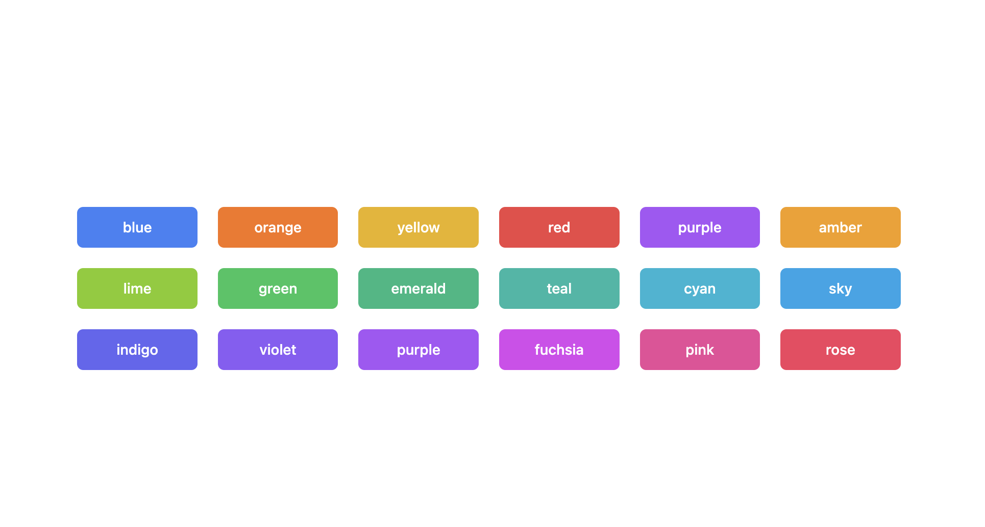
FILE: page-components/TailwindColors.jsx
================================================
const TailwindColors = ({ changeColor }) => {
return (
<div className="w-full mt-3 grid grid-cols-2 md:grid-cols-4 lg:grid-cols-6 gap-5">
<div
onClick={() => changeColor("blue")}
className="h-7 px-2 text-xs font-semibold bg-blue-500 rounded-md flex items-center justify-center text-white cursor-pointer"
>
blue
</div>
<div
onClick={() => changeColor("orange")}
className="h-7 px-2 text-xs font-semibold bg-orange-500 rounded-md flex items-center justify-center text-white cursor-pointer"
>
orange
</div>
<div
onClick={() => changeColor("yellow")}
className="h-7 px-2 text-xs font-semibold bg-yellow-500 rounded-md flex items-center justify-center text-white cursor-pointer"
>
yellow
</div>
<div
onClick={() => changeColor("red")}
className="h-7 px-2 text-xs font-semibold bg-red-500 rounded-md flex items-center justify-center text-white cursor-pointer"
>
red
</div>
<div
onClick={() => changeColor("purple")}
className="h-7 px-2 text-xs font-semibold bg-purple-500 rounded-md flex items-center justify-center text-white cursor-pointer"
>
purple
</div>
<div
onClick={() => changeColor("amber")}
className="h-7 px-2 text-xs font-semibold bg-amber-500 rounded-md flex items-center justify-center text-white cursor-pointer"
>
amber
</div>
<div
onClick={() => changeColor("lime")}
className="h-7 px-2 text-xs font-semibold bg-lime-500 rounded-md flex items-center justify-center text-white cursor-pointer"
>
lime
</div>
<div
onClick={() => changeColor("green")}
className="h-7 px-2 text-xs font-semibold bg-green-500 rounded-md flex items-center justify-center text-white cursor-pointer"
>
green
</div>
<div
onClick={() => changeColor("emerald")}
className="h-7 px-2 text-xs font-semibold bg-emerald-500 rounded-md flex items-center justify-center text-white cursor-pointer"
>
emerald
</div>
<div
onClick={() => changeColor("teal")}
className="h-7 px-2 text-xs font-semibold bg-teal-500 rounded-md flex items-center justify-center text-white cursor-pointer"
>
teal
</div>
<div
onClick={() => changeColor("cyan")}
className="h-7 px-2 text-xs font-semibold bg-cyan-500 rounded-md flex items-center justify-center text-white cursor-pointer"
>
cyan
</div>
<div
onClick={() => changeColor("sky")}
className="h-7 px-2 text-xs font-semibold bg-sky-500 rounded-md flex items-center justify-center text-white cursor-pointer"
>
sky
</div>
<div
onClick={() => changeColor("indigo")}
className="h-7 px-2 text-xs font-semibold bg-indigo-500 rounded-md flex items-center justify-center text-white cursor-pointer"
>
indigo
</div>
<div
onClick={() => changeColor("violet")}
className="h-7 px-2 text-xs font-semibold bg-violet-500 rounded-md flex items-center justify-center text-white cursor-pointer"
>
violet
</div>
<div
onClick={() => changeColor("purple")}
className="h-7 px-2 text-xs font-semibold bg-purple-500 rounded-md flex items-center justify-center text-white cursor-pointer"
>
purple
</div>
<div
onClick={() => changeColor("fuchsia")}
className="h-7 px-2 text-xs font-semibold bg-fuchsia-500 rounded-md flex items-center justify-center text-white cursor-pointer"
>
fuchsia
</div>
<div
onClick={() => changeColor("pink")}
className="h-7 px-2 text-xs font-semibold bg-pink-500 rounded-md flex items-center justify-center text-white cursor-pointer"
>
pink
</div>
<div
onClick={() => changeColor("rose")}
className="h-7 px-2 text-xs font-semibold bg-rose-500 rounded-md flex items-center justify-center text-white cursor-pointer"
>
rose
</div>
</div>
);
};
export default TailwindColors;
================================================
FILE: pages/_app.js
================================================
import "../src/index.css";
const App = ({ Component, pageProps }) => {
return <Component {...pageProps} />;
};
export default App;
================================================
FILE: pages/index.js
================================================
import Head from "next/head";
import Select from "../src";
import Header from "../page-components/Header";
import Button from "../page-components/Button";
import SelectContainer from "../page-components/SelectContainer";
import { useCallback, useEffect, useState } from "react";
import TailwindColors from "../page-components/TailwindColors";
import Checkbox from "../page-components/Checkbox";
import Alert from "../page-components/Alert";
import { DarkLink, LightLink } from "../page-components/Link";
const MANGAS = [
{
label: "SHONEN",
options: [
{ value: "One Piece", label: "🤩 One Piece", disabled: false },
{ value: "Naruto Shippûden", label: "🤭 Naruto Shippûden", disabled: false },
{ value: "Hunter x Hunter", label: "🥰 Hunter x Hunter", disabled: false }
]
},
{
label: "SHOJO",
options: [
{ value: "Orange", label: "🤩 Orange", disabled: false },
{ value: "Nana", label: "🤭 Nana", disabled: false },
{ value: "Tonari no Kaibutsu-kun", label: "🥰 Tonari no Kaibutsu-kun", disabled: false }
]
},
{
label: "SEINEN",
options: [
{ value: "Death Note", label: "🤩 Death Note", disabled: false },
{ value: "Btooom!", label: "🤭 Btooom!", disabled: false },
{ value: "Black Lagoon", label: "🥰 Black Lagoon", disabled: false }
]
},
{
label: "JOSEI",
options: [
{ value: "Nodame Cantabile", label: "🤩 Nodame Cantabile", disabled: false },
{ value: "Chihayafuru", label: "🤭 Chihayafuru", disabled: false },
{ value: "Blue", label: "🥰 Blue", disabled: false }
]
},
{ value: "Naruto Shippûden", label: "🤭 Naruto Shippûden", disabled: false },
{ value: "One Piece", label: "🤩 One Piece", disabled: false },
{ value: "Bleach", label: "🥹 Bleach", disabled: false },
{ value: "Boruto", label: "😡 Boruto", disabled: false },
{ value: "Hunter x Hunter", label: "🥰 Hunter x Hunter", disabled: false },
{ value: "Dragon Ball Z", label: "🥵 Dragon Ball Z", disabled: false },
{ value: "Fullmetal Alchemist", label: "🫡 Fullmetal Alchemist", disabled: false },
{ value: "My Hero Academia", label: "🤯 My Hero Academia", disabled: false },
{ value: "Black Clover", label: "😍 Black Clover", disabled: false }
];
const SELECT_OPTIONS = [
"isClearable",
"isSearchable",
"isMultiple",
"isDisabled",
"loading",
"isGroupOption"
];
const printAlertContent = (element, value) => {
const printText = (text, value) =>
value ? <p className="text-xs md:text-sm transition duration-75">{text}</p> : null;
switch (element) {
case "isClearable":
return printText("You can empty the field", value);
case "isSearchable":
return printText("You can search for an item in the option list", value);
case "isMultiple":
return printText("You can select several options", value);
case "isDisabled":
return printText("The field is disabled", value);
case "loading":
return printText("A loader appears on the field", value);
case "isGroupOption":
return printText("The options of the select field are grouped", value);
default:
return null;
}
};
const Home = () => {
const [options, setOptions] = useState([]);
const [loading, setLoading] = useState(false);
const [showCode, setShowCode] = useState(false);
const [value, setValue] = useState(null);
const [isClearable, setIsClearable] = useState(false);
const [isMultiple, setIsMultiple] = useState(false);
const [isSearchable, setIsSearchable] = useState(false);
const [isDisabled, setIsDisabled] = useState(false);
const [isGroupOption, setIsGroupOption] = useState(false);
const [primaryColor, setPrimaryColor] = useState("purple");
useEffect(() => {
setLoading(true);
const timer = setTimeout(() => {
setOptions(MANGAS);
setLoading(false);
}, 3000);
return () => {
clearTimeout(timer);
};
}, []);
const filterOptions = useCallback(
data => {
return data.filter(item => (isGroupOption ? "options" in item : !("options" in item)));
},
[isGroupOption]
);
const toggleShowCode = useCallback(() => {
setShowCode(!showCode);
}, [showCode]);
const dispatch = useCallback(
(type = null, action, valueData = null) => {
switch (type) {
case "isClearable":
if (action === "set") setIsClearable(valueData);
if (action === "get") return isClearable;
break;
case "isSearchable":
if (action === "set") setIsSearchable(valueData);
if (action === "get") return isSearchable;
break;
case "isMultiple":
if (action === "set") {
if (value !== null) {
setValue(null);
}
setIsMultiple(valueData);
}
if (action === "get") return isMultiple;
break;
case "isDisabled":
if (action === "set") setIsDisabled(valueData);
if (action === "get") return isDisabled;
break;
case "loading":
if (action === "set") setLoading(valueData);
if (action === "get") return loading;
break;
case "isGroupOption":
if (action === "set") {
setIsGroupOption(valueData);
}
if (action === "get") return isGroupOption;
break;
default:
break;
}
},
[isClearable, isDisabled, isGroupOption, isMultiple, isSearchable, loading, value]
);
const handleCheck = useCallback(
(value, item) => {
dispatch(item, "set", value);
},
[dispatch]
);
return (
<>
<Head>
<title>react-tailwindcss-select PlayGround</title>
</Head>
<div className="w-full min-h-screen px-5 md:px-20 lg:px-36 md:flex md:flex-col md:justify-between">
<h1 className="text-slate-600 mt-4 md:mt-8 lg:mt-20 mb-24 md:mb-8 md:text-xl lg:text-3xl text-center font-semibold">
Demo react-tailwindcss-select
</h1>
<div className="w-full">
<Header>
<Button active={!showCode} icon={"eyes"} onClick={toggleShowCode}>
Preview
</Button>
<Button active={showCode} icon={"code"} onClick={toggleShowCode}>
Code
</Button>
</Header>
<div
className={`transition duration-75 ${
showCode ? "bg-slate-800" : "bg-gray-100"
} px-2 pb-6 md:p-8 min-h-[15rem] rounded-md border md:min-h-[20rem] lg:min-h-[25rem] w-full`}
>
{showCode ? (
<div>
<h2 className="text-white mt-8 font-semibold text-xl md:text-3xl lg:text-5xl xl:text-6xl">
This part will be available soon.
</h2>
<p className="mt-3 md:mt-5 lg:mt-8 text-slate-400 text-xs md:text-sm lg:text-base">
You can access the source code of the demo project{" "}
<DarkLink url="https://github.com/onesine/demo-react-tailwindcss-select">
here
</DarkLink>
. <br />
Any contribution to the package will be welcome. You can access
the package source code{" "}
<DarkLink url="https://github.com/onesine/react-tailwindcss-select">
here
</DarkLink>
<br />
Thanks for testing{" "}
<DarkLink url="https://www.npmjs.com/package/react-tailwindcss-select">
react-tailwindcss-select
</DarkLink>{" "}
and have a nice 👋 day.
</p>
</div>
) : (
<SelectContainer>
<Select
/*classNames={{
menuButton: (state) => "flex text-sm text-gray-500 border border-gray-300 rounded shadow-sm transition-all duration-300 focus:outline-none bg-white hover:border-gray-400 focus:border-blue-500 focus:ring focus:ring-blue-500/20",
menu: "absolute z-10 w-full bg-white shadow-lg border rounded py-1 mt-1.5 text-sm text-gray-700",
listItem: ({isSelected}) => "list-none py-1.5 px-2 hover:bg-blue-500 rounded-md hover:text-white cursor-pointer",
tagItem: ({isDisabled, item}) => {
console.log("item:", item)
return 'flex space-x-2 p-0.5 rounded bg-blue-500 text-white';
}
}}*/
primaryColor={primaryColor}
options={filterOptions(options)}
onChange={value => setValue(value)}
value={value}
loading={loading}
isClearable={isClearable}
isSearchable={isSearchable}
isMultiple={isMultiple}
/*formatGroupLabel={(data) => (
<div className={`py-2 text-xs flex items-center justify-between`}>
<span className="font-bold">{data.label}</span>
<span className="bg-gray-200 h-5 h-5 p-1.5 flex items-center justify-center rounded-full">{data.options.length}</span>
</div>
)}*/
isDisabled={isDisabled}
/>
<div className="mt-2">
{SELECT_OPTIONS.map((item, index) => (
<Checkbox
id={item}
key={index}
checked={dispatch(item, "get")}
onChange={e => handleCheck(e.target.checked, item)}
>
{item}
</Checkbox>
))}
</div>
<TailwindColors changeColor={color => setPrimaryColor(color)} />
<p className="mt-3 text-center text-xs text-gray-500 font-semibold">
If you want to try a theme proposed by one of these colors. You
can click disappointed.
</p>
{(isClearable ||
isSearchable ||
isMultiple ||
isDisabled ||
loading ||
isGroupOption) && (
<div className="mt-10 transition duration-75">
<Alert title={"Information"}>
{printAlertContent("isClearable", isClearable)}
{printAlertContent("isSearchable", isSearchable)}
{printAlertContent("isMultiple", isMultiple)}
{printAlertContent("isDisabled", isDisabled)}
{printAlertContent("loading", loading)}
{printAlertContent("isGroupOption", isGroupOption)}
</Alert>
</div>
)}
</SelectContainer>
)}
</div>
</div>
<p className="text-center py-10 text-slate-500 text-sm">
Made with ❤️ by <LightLink url="https://twitter.com/LewheO">Onesine</LightLink>,
powered by <LightLink url="https://reactjs.org/">react</LightLink> and{" "}
<LightLink url="https://tailwindcss.com/">tailwindcss</LightLink>.
</p>
</div>
</>
);
};
export default Home;
================================================
FILE: postcss.config.js
================================================
module.exports = {
plugins: {
tailwindcss: {},
autoprefixer: {},
...(process.env.NODE_ENV === "production" ? { cssnano: {} } : {})
}
};
================================================
FILE: rollup.config.js
================================================
import commonjs from "@rollup/plugin-commonjs";
import resolve from "@rollup/plugin-node-resolve";
import typescript from "@rollup/plugin-typescript";
const packageJson = require("./package.json");
const options = require("./tsconfig.json");
module.exports = {
input: "src/index.tsx",
output: [
{
file: packageJson.main,
format: "cjs",
exports: "auto",
sourcemap: true
},
{
file: packageJson.module,
format: "esm",
exports: "auto",
sourcemap: true
}
],
external: ["react"],
plugins: [resolve(), commonjs(), typescript({ ...options.compilerOptions, jsx: "react" })]
};
================================================
FILE: src/components/DisabledItem.tsx
================================================
import React, { useContext } from "react";
import { SelectContext } from "./SelectProvider";
interface DisabledItemProps {
children: JSX.Element | string;
}
const DisabledItem: React.FC<DisabledItemProps> = ({ children }) => {
const { classNames } = useContext(SelectContext);
return (
<div
className={
classNames && classNames.listDisabledItem
? classNames.listDisabledItem
: "px-2 py-2 cursor-not-allowed truncate text-gray-400 select-none"
}
>
{children}
</div>
);
};
export default DisabledItem;
================================================
FILE: src/components/GroupItem.tsx
================================================
import React from "react";
import Item from "./Item";
import { useSelectContext } from "./SelectProvider";
import { GroupOption } from "./type";
interface GroupItemProps {
item: GroupOption;
primaryColor: string;
}
const GroupItem: React.FC<GroupItemProps> = ({ item, primaryColor }) => {
const { classNames, formatGroupLabel } = useSelectContext();
return (
<>
{item.options.length > 0 && (
<>
{formatGroupLabel ? (
<>{formatGroupLabel(item)}</>
) : (
<div
className={
classNames?.listGroupLabel
? classNames.listGroupLabel
: "pr-2 py-2 cursor-default select-none truncate font-bold text-gray-700"
}
>
{item.label}
</div>
)}
{item.options.map((item, index) => (
<Item primaryColor={primaryColor} key={index} item={item} />
))}
</>
)}
</>
);
};
export default GroupItem;
================================================
FILE: src/components/Icons.tsx
================================================
import React from "react";
interface Props {
className?: string;
}
export const CloseIcon: React.FC<Props> = ({ className = "" }) => {
return (
<svg
className={className}
fill="currentColor"
viewBox="0 0 20 20"
xmlns="http://www.w3.org/2000/svg"
>
<path
fillRule="evenodd"
d="M4.293 4.293a1 1 0 011.414 0L10 8.586l4.293-4.293a1 1 0 111.414 1.414L11.414 10l4.293 4.293a1 1 0 01-1.414 1.414L10 11.414l-4.293 4.293a1 1 0 01-1.414-1.414L8.586 10 4.293 5.707a1 1 0 010-1.414z"
clipRule="evenodd"
/>
</svg>
);
};
export const ChevronIcon: React.FC<Props> = ({ className = "" }) => {
return (
<svg
className={className}
fill="currentColor"
viewBox="0 0 20 20"
xmlns="http://www.w3.org/2000/svg"
>
<path
fillRule="evenodd"
d="M7.293 14.707a1 1 0 010-1.414L10.586 10 7.293 6.707a1 1 0 011.414-1.414l4 4a1 1 0 010 1.414l-4 4a1 1 0 01-1.414 0z"
clipRule="evenodd"
/>
</svg>
);
};
export const SearchIcon: React.FC<Props> = ({ className = "" }) => {
return (
<svg
className={className}
fill="none"
stroke="currentColor"
viewBox="0 0 24 24"
xmlns="http://www.w3.org/2000/svg"
>
<path
strokeLinecap="round"
strokeLinejoin="round"
strokeWidth={2}
d="M21 21l-6-6m2-5a7 7 0 11-14 0 7 7 0 0114 0z"
/>
</svg>
);
};
================================================
FILE: src/components/Item.tsx
================================================
import React, { useCallback, useMemo } from "react";
import { COLORS, DEFAULT_THEME, THEME_DATA } from "../constants";
import DisabledItem from "./DisabledItem";
import { useSelectContext } from "./SelectProvider";
import { Option } from "./type";
interface ItemProps {
item: Option;
primaryColor: string;
}
const Item: React.FC<ItemProps> = ({ item, primaryColor }) => {
const { classNames, value, handleValueChange, formatOptionLabel } = useSelectContext();
const isSelected = useMemo(() => {
return value !== null && !Array.isArray(value) && value.value === item.value;
}, [item.value, value]);
const textHoverColor = useMemo(() => {
if (COLORS.includes(primaryColor)) {
return THEME_DATA.textHover[primaryColor as keyof typeof THEME_DATA.textHover];
}
return THEME_DATA.textHover[DEFAULT_THEME];
}, [primaryColor]);
const bgColor = useMemo(() => {
if (COLORS.includes(primaryColor)) {
return THEME_DATA.bg[primaryColor as keyof typeof THEME_DATA.bg];
}
return THEME_DATA.bg[DEFAULT_THEME];
}, [primaryColor]);
const bgHoverColor = useMemo(() => {
if (COLORS.includes(primaryColor)) {
return THEME_DATA.bgHover[primaryColor as keyof typeof THEME_DATA.bgHover];
}
return THEME_DATA.bgHover[DEFAULT_THEME];
}, [primaryColor]);
const getItemClass = useCallback(() => {
const baseClass =
"block transition duration-200 px-2 py-2 cursor-pointer select-none truncate rounded";
const selectedClass = isSelected
? `text-white ${bgColor}`
: `text-gray-500 ${bgHoverColor} ${textHoverColor}`;
return classNames && classNames.listItem
? classNames.listItem({ isSelected })
: `${baseClass} ${selectedClass}`;
}, [bgColor, bgHoverColor, classNames, isSelected, textHoverColor]);
return (
<>
{formatOptionLabel ? (
<div onClick={() => handleValueChange(item)}>
{formatOptionLabel({ ...item, isSelected })}
</div>
) : (
<>
{item.disabled ? (
<DisabledItem>{item.label}</DisabledItem>
) : (
<li
tabIndex={0}
onKeyDown={(e: React.KeyboardEvent<HTMLLIElement>) => {
if (e.key === ' ' || e.key === 'Enter') {
handleValueChange(item)
}
}}
aria-selected={isSelected}
role={"option"}
onClick={() => handleValueChange(item)}
className={getItemClass()}
>
{item.label}
</li>
)}
</>
)}
</>
);
};
export default Item;
================================================
FILE: src/components/Options.tsx
================================================
import React, { useCallback, useContext, useMemo } from "react";
import { DEFAULT_THEME } from "../constants";
import DisabledItem from "./DisabledItem";
import GroupItem from "./GroupItem";
import Item from "./Item";
import { SelectContext } from "./SelectProvider";
import { Option, Options as ListOption } from "./type";
interface OptionsProps {
list: ListOption;
noOptionsMessage: string;
text: string;
isMultiple: boolean;
value: Option | Option[] | null;
primaryColor: string;
}
const Options: React.FC<OptionsProps> = ({
list,
noOptionsMessage,
text,
isMultiple,
value,
primaryColor = DEFAULT_THEME
}) => {
const { classNames } = useContext(SelectContext);
const filterByText = useCallback(() => {
const filterItem = (item: Option) => {
return item.label.toLowerCase().indexOf(text.toLowerCase()) > -1;
};
let result = list.map(item => {
if ("options" in item) {
return {
label: item.label,
options: item.options.filter(filterItem)
};
}
return item;
});
result = result.filter(item => {
if ("options" in item) {
return item.options.length > 0;
}
return filterItem(item);
});
return result;
}, [text, list]);
const removeValues = useCallback(
(array: ListOption) => {
if (!isMultiple) {
return array;
}
if (Array.isArray(value)) {
const valueId = value.map(item => item.value);
const filterItem = (item: Option) => !valueId.includes(item.value);
let newArray = array.map(item => {
if ("options" in item) {
return {
label: item.label,
options: item.options.filter(filterItem)
};
}
return item;
});
newArray = newArray.filter(item => {
if ("options" in item) {
return item.options.length > 0;
} else {
return filterItem(item);
}
});
return newArray;
}
return array;
},
[isMultiple, value]
);
const filterResult = useMemo(() => {
return removeValues(filterByText());
}, [filterByText, removeValues]);
return (
<div
role="options"
className={classNames && classNames.list ? classNames.list : "max-h-72 overflow-y-auto"}
>
{filterResult.map((item, index) => (
<React.Fragment key={index}>
{"options" in item ? (
<>
<div className="px-2.5">
<GroupItem
primaryColor={primaryColor || DEFAULT_THEME}
item={item}
/>
</div>
{index + 1 < filterResult.length && <hr className="my-1" />}
</>
) : (
<div className="px-2.5">
<Item primaryColor={primaryColor || DEFAULT_THEME} item={item} />
</div>
)}
</React.Fragment>
))}
{filterResult.length === 0 && <DisabledItem>{noOptionsMessage}</DisabledItem>}
</div>
);
};
export default Options;
================================================
FILE: src/components/SearchInput.tsx
================================================
import React, { forwardRef, useContext } from "react";
import { SearchIcon } from "./Icons";
import { SelectContext } from "./SelectProvider";
interface SearchInputProps {
placeholder?: string;
value: string;
onChange: (e: React.ChangeEvent<HTMLInputElement>) => void;
name?: string;
}
const SearchInput = forwardRef<HTMLInputElement, SearchInputProps>(function SearchInput(
{ placeholder = "", value = "", onChange, name = "" },
ref
) {
const { classNames } = useContext(SelectContext);
return (
<div
className={
classNames && classNames.searchContainer
? classNames.searchContainer
: "relative py-1 px-2.5"
}
>
<SearchIcon
className={
classNames && classNames.searchIcon
? classNames.searchIcon
: "absolute w-5 h-5 mt-2.5 pb-0.5 ml-2 text-gray-500"
}
/>
<input
ref={ref}
className={
classNames && classNames.searchBox
? classNames.searchBox
: "w-full py-2 pl-8 text-sm text-gray-500 bg-gray-100 border border-gray-200 rounded focus:border-gray-200 focus:ring-0 focus:outline-none"
}
type="text"
placeholder={placeholder}
value={value}
onChange={onChange}
name={name}
/>
</div>
);
});
export default SearchInput;
================================================
FILE: src/components/Select.tsx
================================================
import React, { useCallback, useEffect, useRef, useState } from "react";
import { COLORS, DEFAULT_THEME, THEME_DATA } from "../constants";
import useOnClickOutside from "../hooks/use-onclick-outside";
import { ChevronIcon, CloseIcon } from "./Icons";
import Options from "./Options";
import SearchInput from "./SearchInput";
import SelectProvider from "./SelectProvider";
import Spinner from "./Spinner";
import { Option, Options as ListOption, SelectProps } from "./type";
const Select: React.FC<SelectProps> = ({
options = [],
value = null,
onChange,
onSearchInputChange,
placeholder = "Select...",
searchInputPlaceholder = "Search...",
isMultiple = false,
isClearable = false,
isSearchable = false,
isDisabled = false,
loading = false,
menuIsOpen = false,
noOptionsMessage = "No options found",
primaryColor = DEFAULT_THEME,
formatGroupLabel = null,
formatOptionLabel = null,
classNames
}) => {
const [open, setOpen] = useState<boolean>(menuIsOpen);
const [list, setList] = useState<ListOption>(options);
const [inputValue, setInputValue] = useState<string>("");
const ref = useRef<HTMLDivElement>(null);
const searchBoxRef = useRef<HTMLInputElement>(null);
useEffect(() => {
const formatItem = (item: Option) => {
if ("disabled" in item) return item;
return {
...item,
disabled: false
};
};
setList(
options.map(item => {
if ("options" in item) {
return {
label: item.label,
options: item.options.map(formatItem)
};
} else {
return formatItem(item);
}
})
);
}, [options]);
useEffect(() => {
if (isSearchable) {
if (open) {
searchBoxRef.current?.select();
} else {
setInputValue("");
}
}
}, [open, isSearchable]);
const toggle = useCallback(() => {
if (!isDisabled) {
setOpen(!open);
}
}, [isDisabled, open]);
const closeDropDown = useCallback(() => {
if (open) setOpen(false);
}, [open]);
useOnClickOutside(ref, () => {
closeDropDown();
});
const onPressEnterOrSpace = useCallback(
(e: React.KeyboardEvent<HTMLDivElement>) => {
e.preventDefault();
if ((e.code === "Enter" || e.code === "Space") && !isDisabled) {
toggle();
}
},
[isDisabled, toggle]
);
const handleValueChange = useCallback(
(selected: Option) => {
function update() {
if (!isMultiple && !Array.isArray(value)) {
closeDropDown();
onChange(selected);
}
if (isMultiple && (Array.isArray(value) || value === null)) {
onChange(value === null ? [selected] : [...value, selected]);
}
}
if (selected !== value) {
update();
}
},
[closeDropDown, isMultiple, onChange, value]
);
const clearValue = useCallback(
(e: React.MouseEvent<HTMLDivElement>) => {
e.stopPropagation();
onChange(null);
},
[onChange]
);
const removeItem = useCallback(
(e: React.MouseEvent<HTMLDivElement>, item: Option) => {
if (isMultiple && Array.isArray(value) && value.length) {
e.stopPropagation();
const result = value.filter(current => item.value !== current.value);
onChange(result.length ? result : null);
}
},
[isMultiple, onChange, value]
);
const getSelectClass = useCallback(() => {
let ringColor = THEME_DATA.ring[DEFAULT_THEME];
if (COLORS.includes(primaryColor)) {
ringColor = THEME_DATA.ring[primaryColor as keyof typeof THEME_DATA.ring];
}
let borderFocus = THEME_DATA.borderFocus[DEFAULT_THEME];
if (COLORS.includes(primaryColor)) {
borderFocus =
THEME_DATA.borderFocus[primaryColor as keyof typeof THEME_DATA.borderFocus];
}
const baseClass =
"flex text-sm text-gray-500 border border-gray-300 rounded shadow-sm transition-all duration-300 focus:outline-none";
const defaultClass = `${baseClass} ${
isDisabled
? "bg-gray-200"
: `bg-white hover:border-gray-400 ${borderFocus} focus:ring ${ringColor}`
}`;
return classNames && classNames.menuButton
? classNames.menuButton({ isDisabled })
: defaultClass;
}, [classNames, isDisabled, primaryColor]);
const getTagItemClass = useCallback(
(item: Option) => {
const baseClasse = "bg-gray-200 border rounded-sm flex space-x-1";
const disabledClass = isDisabled ? "border-gray-500 px-1" : "pl-1";
return classNames?.tagItem
? classNames.tagItem({ item, isDisabled })
: `${baseClasse} ${disabledClass}`;
},
[classNames, isDisabled]
);
return (
<SelectProvider
otherData={{
formatGroupLabel,
formatOptionLabel,
classNames
}}
value={value}
handleValueChange={handleValueChange}
>
<div className="relative w-full" ref={ref}>
<div
aria-expanded={open}
onKeyDown={onPressEnterOrSpace}
onClick={toggle}
className={getSelectClass()}
>
<div className="grow pl-2.5 py-2 pr-2 flex flex-wrap gap-1">
{!isMultiple ? (
<p className="truncate cursor-default select-none">
{value && !Array.isArray(value) ? value.label : placeholder}
</p>
) : (
<>
{value === null && placeholder}
{Array.isArray(value) &&
value.map((item, index) => (
<div className={getTagItemClass(item)} key={index}>
<p
className={
classNames?.tagItemText
? classNames.tagItemText
: "text-gray-600 truncate cursor-default select-none"
}
>
{item.label}
</p>
{!isDisabled && (
<div
role="button"
tabIndex={0}
onClick={e => removeItem(e, item)}
className={
classNames?.tagItemIconContainer
? classNames.tagItemIconContainer
: "flex items-center px-1 cursor-pointer rounded-r-sm hover:bg-red-200 hover:text-red-600"
}
>
<CloseIcon
className={
classNames?.tagItemIcon
? classNames.tagItemIcon
: "w-3 h-3 mt-0.5"
}
/>
</div>
)}
</div>
))}
</>
)}
</div>
<div className="flex flex-none items-center py-1.5">
{loading && (
<div className="px-1.5">
<Spinner primaryColor={primaryColor} />
</div>
)}
{isClearable && !isDisabled && value !== null && (
<div className="px-1.5 cursor-pointer" onClick={clearValue}>
<CloseIcon
className={
classNames?.closeIcon
? classNames.closeIcon
: "w-5 h-5 p-0.5"
}
/>
</div>
)}
<div className="h-full">
<span className="w-px h-full inline-block text-white bg-gray-300 text-opacity-0" />
</div>
<div className="px-1.5">
<ChevronIcon
className={`transition duration-300 w-6 h-6 p-0.5${
open ? " transform rotate-90 text-gray-500" : " text-gray-300"
}`}
/>
</div>
</div>
</div>
{open && !isDisabled && (
<div
className={
classNames?.menu
? classNames.menu
: "absolute z-10 w-full bg-white shadow-lg border rounded py-1 mt-1.5 text-sm text-gray-700"
}
>
{isSearchable && (
<SearchInput
ref={searchBoxRef}
value={inputValue}
placeholder={searchInputPlaceholder}
onChange={e => {
if (
onSearchInputChange &&
typeof onSearchInputChange === "function"
)
onSearchInputChange(e);
setInputValue(e.target.value);
}}
/>
)}
<Options
list={list}
noOptionsMessage={noOptionsMessage}
text={inputValue}
isMultiple={isMultiple}
value={value}
primaryColor={primaryColor || DEFAULT_THEME}
/>
</div>
)}
</div>
</SelectProvider>
);
};
export default Select;
================================================
FILE: src/components/SelectProvider.tsx
================================================
import React, { createContext, useContext, useMemo } from "react";
import { ClassNames, GroupOption, Option } from "./type";
interface Store {
value: Option | Option[] | null;
handleValueChange: (selected: Option) => void;
formatGroupLabel: ((data: GroupOption) => JSX.Element) | null;
formatOptionLabel: ((data: Option) => JSX.Element) | null;
classNames?: ClassNames;
}
interface Props {
value: Option | Option[] | null;
handleValueChange: (selected: Option) => void;
children: JSX.Element;
otherData: {
formatGroupLabel: ((data: GroupOption) => JSX.Element) | null;
formatOptionLabel: ((data: Option) => JSX.Element) | null;
classNames?: ClassNames;
};
}
export const SelectContext = createContext<Store>({
value: null,
handleValueChange: selected => {
console.log("selected:", selected);
},
formatGroupLabel: null,
formatOptionLabel: null,
classNames: undefined
});
export const useSelectContext = (): Store => {
return useContext(SelectContext);
};
const SelectProvider: React.FC<Props> = ({ value, handleValueChange, otherData, children }) => {
const store = useMemo(() => {
return {
value,
handleValueChange,
formatGroupLabel:
otherData && typeof otherData.formatGroupLabel === "function"
? otherData.formatGroupLabel
: null,
formatOptionLabel:
otherData && typeof otherData.formatOptionLabel === "function"
? otherData.formatOptionLabel
: null,
classNames: otherData?.classNames || undefined
};
}, [handleValueChange, otherData, value]);
return <SelectContext.Provider value={store}>{children}</SelectContext.Provider>;
};
export default SelectProvider;
================================================
FILE: src/components/Spinner.tsx
================================================
import React, { useMemo } from "react";
import { COLORS, DEFAULT_THEME, THEME_DATA } from "../constants";
interface Props {
primaryColor?: string;
}
const Spinner: React.FC<Props> = ({ primaryColor = DEFAULT_THEME }) => {
const spinnerColor = useMemo(() => {
if (COLORS.includes(primaryColor)) {
return THEME_DATA.text[primaryColor as keyof typeof THEME_DATA.text];
}
return THEME_DATA.text[DEFAULT_THEME];
}, [primaryColor]);
return (
<svg
className={`animate-spin mr-0.5 h-5 w-5 ${spinnerColor}`}
xmlns="http://www.w3.org/2000/svg"
fill="none"
viewBox="0 0 24 24"
>
<circle
className="opacity-25"
cx="12"
cy="12"
r="10"
stroke="currentColor"
strokeWidth="4"
/>
<path
className="opacity-75"
fill="currentColor"
d="M4 12a8 8 0 018-8V0C5.373 0 0 5.373 0 12h4zm2 5.291A7.962 7.962 0 014 12H0c0 3.042 1.135 5.824 3 7.938l3-2.647z"
/>
</svg>
);
};
export default Spinner;
================================================
FILE: src/components/type.ts
================================================
import React from "react";
export interface Option {
value: string;
label: string;
disabled?: boolean;
isSelected?: boolean;
}
export interface GroupOption {
label: string;
options: Option[];
}
export type Options = Array<Option | GroupOption>;
export interface ClassNames {
menuButton?: (value?: { isDisabled?: boolean }) => string;
menu?: string;
tagItem?: (value?: { item?: Option; isDisabled?: boolean }) => string;
tagItemText?: string;
tagItemIconContainer?: string;
tagItemIcon?: string;
list?: string;
listGroupLabel?: string;
listItem?: (value?: { isSelected?: boolean }) => string;
listDisabledItem?: string;
ChevronIcon?: (value?: { open?: boolean }) => string;
searchContainer?: string;
searchBox?: string;
searchIcon?: string;
closeIcon?: string;
}
export type SelectValue = Option | Option[] | null;
export interface SelectProps {
options: Options;
value: SelectValue;
onChange: (value: SelectValue) => void;
onSearchInputChange?: (e: React.ChangeEvent<HTMLInputElement>) => void;
placeholder?: string;
isMultiple?: boolean;
isClearable?: boolean;
isSearchable?: boolean;
isDisabled?: boolean;
loading?: boolean;
menuIsOpen?: boolean;
searchInputPlaceholder?: string;
noOptionsMessage?: string;
primaryColor: string;
formatGroupLabel?: ((data: GroupOption) => JSX.Element) | null;
formatOptionLabel?: ((data: Option) => JSX.Element) | null;
classNames?: ClassNames;
}
================================================
FILE: src/constants/index.ts
================================================
export const COLORS = [
"blue",
"orange",
"yellow",
"red",
"purple",
"amber",
"lime",
"green",
"emerald",
"teal",
"cyan",
"sky",
"violet",
"indigo",
"purple",
"fuchsia",
"pink",
"rose"
];
export const DEFAULT_THEME = "blue";
export const THEME_DATA = {
bg: {
blue: "bg-blue-500",
orange: "bg-orange-500",
yellow: "bg-yellow-500",
red: "bg-red-500",
purple: "bg-purple-500",
amber: "bg-amber-500",
lime: "bg-lime-500",
green: "bg-green-500",
emerald: "bg-emerald-500",
teal: "bg-teal-500",
cyan: "bg-cyan-500",
sky: "bg-sky-500",
indigo: "bg-indigo-500",
violet: "bg-violet-500",
fuchsia: "bg-fuchsia-500",
pink: "bg-pink-500",
rose: "bg-rose-500"
},
bgHover: {
blue: "hover:bg-blue-100",
orange: "hover:bg-orange-100",
yellow: "hover:bg-yellow-100",
red: "hover:bg-red-100",
purple: "hover:bg-purple-100",
amber: "hover:bg-amber-100",
lime: "hover:bg-lime-100",
green: "hover:bg-green-100",
emerald: "hover:bg-emerald-100",
teal: "hover:bg-teal-100",
cyan: "hover:bg-cyan-100",
sky: "hover:bg-sky-100",
indigo: "hover:bg-indigo-100",
violet: "hover:bg-violet-100",
fuchsia: "hover:bg-fuchsia-100",
pink: "hover:bg-pink-100",
rose: "hover:bg-rose-100"
},
ring: {
blue: "focus:ring-blue-500/20",
orange: "focus:ring-orange-500/20",
yellow: "focus:ring-yellow-500/20",
red: "focus:ring-red-500/20",
purple: "focus:ring-purple-500/20",
amber: "focus:ring-amber-500/20",
lime: "focus:ring-lime-500/20",
green: "focus:ring-green-500/20",
emerald: "focus:ring-emerald-500/20",
teal: "focus:ring-teal-500/20",
cyan: "focus:ring-cyan-500/20",
sky: "focus:ring-sky-500/20",
indigo: "focus:ring-indigo-500/20",
violet: "focus:ring-violet-500/20",
fuchsia: "focus:ring-fuchsia-500/20",
pink: "focus:ring-pink-500/20",
rose: "focus:ring-rose-500/20"
},
borderFocus: {
blue: "focus:border-blue-500",
orange: "focus:border-orange-500",
yellow: "focus:border-yellow-500",
red: "focus:border-red-500",
purple: "focus:border-purple-500",
amber: "focus:border-amber-500",
lime: "focus:border-lime-500",
green: "focus:border-green-500",
emerald: "focus:border-emerald-500",
teal: "focus:border-teal-500",
cyan: "focus:border-cyan-500",
sky: "focus:border-sky-500",
indigo: "focus:border-indigo-500",
violet: "focus:border-violet-500",
fuchsia: "focus:border-fuchsia-500",
pink: "focus:border-pink-500",
rose: "focus:border-rose-500"
},
text: {
blue: "text-blue-500",
orange: "text-orange-500",
yellow: "text-yellow-500",
red: "text-red-500",
purple: "text-purple-500",
amber: "text-amber-500",
lime: "text-lime-500",
green: "text-green-500",
emerald: "text-emerald-500",
teal: "text-teal-500",
cyan: "text-cyan-500",
sky: "text-sky-500",
indigo: "text-indigo-500",
violet: "text-violet-500",
fuchsia: "text-fuchsia-500",
pink: "text-pink-500",
rose: "text-rose-500"
},
textHover: {
blue: "hover:text-blue-500",
orange: "hover:text-orange-500",
yellow: "hover:text-yellow-500",
red: "hover:text-red-500",
purple: "hover:text-purple-500",
amber: "hover:text-amber-500",
lime: "hover:text-lime-500",
green: "hover:text-green-500",
emerald: "hover:text-emerald-500",
teal: "hover:text-teal-500",
cyan: "hover:text-cyan-500",
sky: "hover:text-sky-500",
indigo: "hover:text-indigo-500",
violet: "hover:text-violet-500",
fuchsia: "hover:text-fuchsia-500",
pink: "hover:text-pink-500",
rose: "hover:text-rose-500"
}
};
================================================
FILE: src/hooks/use-onclick-outside.ts
================================================
import React, { useEffect } from "react";
export default function useOnClickOutside(
ref: React.RefObject<HTMLDivElement>,
handler: (e?: MouseEvent | TouchEvent) => void
) {
useEffect(() => {
const listener = (event: MouseEvent | TouchEvent) => {
if (!ref.current || ref.current.contains(event.target as Node)) {
return;
}
handler(event);
};
document.addEventListener("mousedown", listener);
document.addEventListener("touchstart", listener);
return () => {
document.removeEventListener("mousedown", listener);
document.removeEventListener("touchstart", listener);
};
}, [ref, handler]);
}
================================================
FILE: src/index.css
================================================
@tailwind base;
@tailwind components;
@tailwind utilities;
================================================
FILE: src/index.tsx
================================================
import Select from "./components/Select";
export default Select;
================================================
FILE: tailwind.config.js
================================================
/** @type {import('tailwindcss').Config} */
module.exports = {
content: [
"./pages/**/*.{js,ts,jsx,tsx}",
"./page-components/**/*.{js,ts,jsx,tsx}",
"./src/**/*.{js,ts,jsx,tsx}"
],
theme: {
extend: {}
},
plugins: [require("@tailwindcss/forms")]
};
================================================
FILE: tsconfig.json
================================================
{
"compilerOptions": {
"target": "esnext",
"lib": ["dom", "esnext"],
"module": "esnext",
"jsx": "preserve",
"moduleResolution": "node",
"forceConsistentCasingInFileNames": true,
"strict": true,
"noImplicitReturns": true,
"allowSyntheticDefaultImports": true,
"esModuleInterop": true,
"baseUrl": "src/",
"declaration": true,
"outDir": "./dist",
"inlineSources": true,
"sourceMap": true,
"rootDir": "src",
"allowJs": true,
"skipLibCheck": true,
"noEmit": true,
"incremental": true,
"resolveJsonModule": true,
"isolatedModules": true
},
"include": ["src/**/*"],
"exclude": ["node_modules"]
}
gitextract_exwwbg6a/ ├── .eslintignore ├── .eslintrc.json ├── .gitignore ├── .npmignore ├── .prettierignore ├── .prettierrc ├── CONTRIBUTING.md ├── LICENSE ├── README.md ├── next-env.d.ts ├── next.config.js ├── package.json ├── page-components/ │ ├── Alert.jsx │ ├── Button.jsx │ ├── Checkbox.jsx │ ├── Header.jsx │ ├── Link.jsx │ ├── SelectContainer.jsx │ └── TailwindColors.jsx ├── pages/ │ ├── _app.js │ └── index.js ├── postcss.config.js ├── rollup.config.js ├── src/ │ ├── components/ │ │ ├── DisabledItem.tsx │ │ ├── GroupItem.tsx │ │ ├── Icons.tsx │ │ ├── Item.tsx │ │ ├── Options.tsx │ │ ├── SearchInput.tsx │ │ ├── Select.tsx │ │ ├── SelectProvider.tsx │ │ ├── Spinner.tsx │ │ └── type.ts │ ├── constants/ │ │ └── index.ts │ ├── hooks/ │ │ └── use-onclick-outside.ts │ ├── index.css │ └── index.tsx ├── tailwind.config.js └── tsconfig.json
SYMBOL INDEX (22 symbols across 13 files)

FILE: pages/index.js
  constant MANGAS (line 12) | const MANGAS = [
  constant SELECT_OPTIONS (line 56) | const SELECT_OPTIONS = [

FILE: src/components/DisabledItem.tsx
  type DisabledItemProps (line 5) | interface DisabledItemProps {

FILE: src/components/GroupItem.tsx
  type GroupItemProps (line 7) | interface GroupItemProps {

FILE: src/components/Icons.tsx
  type Props (line 3) | interface Props {

FILE: src/components/Item.tsx
  type ItemProps (line 9) | interface ItemProps {

FILE: src/components/Options.tsx
  type OptionsProps (line 11) | interface OptionsProps {

FILE: src/components/SearchInput.tsx
  type SearchInputProps (line 6) | interface SearchInputProps {

FILE: src/components/Select.tsx
  function update (line 97) | function update() {

FILE: src/components/SelectProvider.tsx
  type Store (line 5) | interface Store {
  type Props (line 13) | interface Props {

FILE: src/components/Spinner.tsx
  type Props (line 5) | interface Props {

FILE: src/components/type.ts
  type Option (line 3) | interface Option {
  type GroupOption (line 10) | interface GroupOption {
  type Options (line 15) | type Options = Array<Option | GroupOption>;
  type ClassNames (line 17) | interface ClassNames {
  type SelectValue (line 35) | type SelectValue = Option | Option[] | null;
  type SelectProps (line 37) | interface SelectProps {

FILE: src/constants/index.ts
  constant COLORS (line 1) | const COLORS = [
  constant DEFAULT_THEME (line 22) | const DEFAULT_THEME = "blue";
  constant THEME_DATA (line 24) | const THEME_DATA = {

FILE: src/hooks/use-onclick-outside.ts
  function useOnClickOutside (line 3) | function useOnClickOutside(
Condensed preview — 39 files, each showing path, character count, and a content snippet. Download the .json file or copy for the full structured content (92K chars).
[
  {
    "path": ".eslintignore",
    "chars": 69,
    "preview": "# Folders\ndist/\nassets/\npages/\ncomponents/\nstyles/\n\n# Files\nREADME.md"
  },
  {
    "path": ".eslintrc.json",
    "chars": 1555,
    "preview": "{\n    \"root\": true,\n    \"env\": {\n        \"browser\": true,\n        \"es2021\": true,\n        \"node\": true\n    },\n    \"exten"
  },
  {
    "path": ".gitignore",
    "chars": 396,
    "preview": "# See https://help.github.com/ignore-files/ for more about ignoring files.\n\n# dependencies\nnode_modules\n/.next/\n/.rollup"
  },
  {
    "path": ".npmignore",
    "chars": 368,
    "preview": "## Folders\nsrc\nnode_modules\n.vscode\n.idea\nassets\n.git\npages\npage-components\nstyles\n.next\n.rollup.cache\n## Files\nbabel.co"
  },
  {
    "path": ".prettierignore",
    "chars": 64,
    "preview": "# Folders\ndist/\nassets/\n.next/\n.rollup.cache/\n\n# Files\nREADME.md"
  },
  {
    "path": ".prettierrc",
    "chars": 261,
    "preview": "{\n    \"semi\": true,\n    \"tabWidth\": 4,\n    \"printWidth\": 100,\n    \"singleQuote\": false,\n    \"trailingComma\": \"none\",\n   "
  },
  {
    "path": "CONTRIBUTING.md",
    "chars": 1723,
    "preview": "# Contributing\n\nThanks for your interest in contributing to `react-tailwindcss-select`! Please take a moment to\nreview t"
  },
  {
    "path": "LICENSE",
    "chars": 1063,
    "preview": "MIT License\n\nCopyright (c) 2020 Onesine\n\nPermission is hereby granted, free of charge, to any person obtaining a copy\nof"
  },
  {
    "path": "README.md",
    "chars": 18029,
    "preview": "<h1 align=\"center\" style=\"border-bottom: 0 white\">\n    📦 React tailwindcss select\n</h1>\n\n<p align=\"center\">\n    React-ta"
  },
  {
    "path": "next-env.d.ts",
    "chars": 201,
    "preview": "/// <reference types=\"next\" />\n/// <reference types=\"next/image-types/global\" />\n\n// NOTE: This file should not be edite"
  },
  {
    "path": "next.config.js",
    "chars": 121,
    "preview": "/** @type {import('next').NextConfig} */\nconst nextConfig = {\n    reactStrictMode: true\n};\n\nmodule.exports = nextConfig;"
  },
  {
    "path": "package.json",
    "chars": 2245,
    "preview": "{\n    \"name\": \"react-tailwindcss-select\",\n    \"version\": \"1.8.5\",\n    \"description\": \"A select input made with React js "
  },
  {
    "path": "page-components/Alert.jsx",
    "chars": 1298,
    "preview": "const Alert = ({ children, title, type = \"info\" }) => {\n    return (\n        <div\n            className=\"bg-blue-100 bor"
  },
  {
    "path": "page-components/Button.jsx",
    "chars": 2107,
    "preview": "const Button = ({ children, icon = null, active = false, onClick }) => {\n    return (\n        <button\n            onClic"
  },
  {
    "path": "page-components/Checkbox.jsx",
    "chars": 611,
    "preview": "const Checkbox = ({ children, checked, onChange, id }) => {\n    return (\n        <label htmlFor={id} className=\"space-x-"
  },
  {
    "path": "page-components/Header.jsx",
    "chars": 239,
    "preview": "const Header = ({ children }) => {\n    return (\n        <div className=\"flex justify-end mb-4\">\n            <div classNa"
  },
  {
    "path": "page-components/Link.jsx",
    "chars": 585,
    "preview": "export const DarkLink = ({ children, url }) => {\n    return (\n        <a\n            target=\"_blank\"\n            rel=\"no"
  },
  {
    "path": "page-components/SelectContainer.jsx",
    "chars": 276,
    "preview": "const SelectContainer = ({ children }) => {\n    return (\n        <div className=\"w-full mt-10 md:mt-14 flex items-center"
  },
  {
    "path": "page-components/TailwindColors.jsx",
    "chars": 5013,
    "preview": "const TailwindColors = ({ changeColor }) => {\n    return (\n        <div className=\"w-full mt-3 grid grid-cols-2 md:grid-"
  },
  {
    "path": "pages/_app.js",
    "chars": 137,
    "preview": "import \"../src/index.css\";\n\nconst App = ({ Component, pageProps }) => {\n    return <Component {...pageProps} />;\n};\n\nexp"
  },
  {
    "path": "pages/index.js",
    "chars": 14031,
    "preview": "import Head from \"next/head\";\nimport Select from \"../src\";\nimport Header from \"../page-components/Header\";\nimport Button"
  },
  {
    "path": "postcss.config.js",
    "chars": 168,
    "preview": "module.exports = {\n    plugins: {\n        tailwindcss: {},\n        autoprefixer: {},\n        ...(process.env.NODE_ENV =="
  },
  {
    "path": "rollup.config.js",
    "chars": 718,
    "preview": "import commonjs from \"@rollup/plugin-commonjs\";\nimport resolve from \"@rollup/plugin-node-resolve\";\nimport typescript fro"
  },
  {
    "path": "src/components/DisabledItem.tsx",
    "chars": 636,
    "preview": "import React, { useContext } from \"react\";\n\nimport { SelectContext } from \"./SelectProvider\";\n\ninterface DisabledItemPro"
  },
  {
    "path": "src/components/GroupItem.tsx",
    "chars": 1277,
    "preview": "import React from \"react\";\n\nimport Item from \"./Item\";\nimport { useSelectContext } from \"./SelectProvider\";\nimport { Gro"
  },
  {
    "path": "src/components/Icons.tsx",
    "chars": 1688,
    "preview": "import React from \"react\";\n\ninterface Props {\n    className?: string;\n}\n\nexport const CloseIcon: React.FC<Props> = ({ cl"
  },
  {
    "path": "src/components/Item.tsx",
    "chars": 3082,
    "preview": "import React, { useCallback, useMemo } from \"react\";\n\nimport { COLORS, DEFAULT_THEME, THEME_DATA } from \"../constants\";\n"
  },
  {
    "path": "src/components/Options.tsx",
    "chars": 3771,
    "preview": "import React, { useCallback, useContext, useMemo } from \"react\";\n\nimport { DEFAULT_THEME } from \"../constants\";\n\nimport "
  },
  {
    "path": "src/components/SearchInput.tsx",
    "chars": 1602,
    "preview": "import React, { forwardRef, useContext } from \"react\";\n\nimport { SearchIcon } from \"./Icons\";\nimport { SelectContext } f"
  },
  {
    "path": "src/components/Select.tsx",
    "chars": 11870,
    "preview": "import React, { useCallback, useEffect, useRef, useState } from \"react\";\n\nimport { COLORS, DEFAULT_THEME, THEME_DATA } f"
  },
  {
    "path": "src/components/SelectProvider.tsx",
    "chars": 1870,
    "preview": "import React, { createContext, useContext, useMemo } from \"react\";\n\nimport { ClassNames, GroupOption, Option } from \"./t"
  },
  {
    "path": "src/components/Spinner.tsx",
    "chars": 1193,
    "preview": "import React, { useMemo } from \"react\";\n\nimport { COLORS, DEFAULT_THEME, THEME_DATA } from \"../constants\";\n\ninterface Pr"
  },
  {
    "path": "src/components/type.ts",
    "chars": 1540,
    "preview": "import React from \"react\";\n\nexport interface Option {\n    value: string;\n    label: string;\n    disabled?: boolean;\n    "
  },
  {
    "path": "src/constants/index.ts",
    "chars": 4229,
    "preview": "export const COLORS = [\n    \"blue\",\n    \"orange\",\n    \"yellow\",\n    \"red\",\n    \"purple\",\n    \"amber\",\n    \"lime\",\n    \"g"
  },
  {
    "path": "src/hooks/use-onclick-outside.ts",
    "chars": 734,
    "preview": "import React, { useEffect } from \"react\";\n\nexport default function useOnClickOutside(\n    ref: React.RefObject<HTMLDivEl"
  },
  {
    "path": "src/index.css",
    "chars": 59,
    "preview": "@tailwind base;\n@tailwind components;\n@tailwind utilities;\n"
  },
  {
    "path": "src/index.tsx",
    "chars": 66,
    "preview": "import Select from \"./components/Select\";\n\nexport default Select;\n"
  },
  {
    "path": "tailwind.config.js",
    "chars": 299,
    "preview": "/** @type {import('tailwindcss').Config} */\nmodule.exports = {\n    content: [\n        \"./pages/**/*.{js,ts,jsx,tsx}\",\n  "
  },
  {
    "path": "tsconfig.json",
    "chars": 781,
    "preview": "{\n    \"compilerOptions\": {\n        \"target\": \"esnext\",\n        \"lib\": [\"dom\", \"esnext\"],\n        \"module\": \"esnext\",\n   "
  }
]
About this extraction
This page contains the full source code of the onesine/react-tailwindcss-select GitHub repository, extracted and formatted as plain text for AI agents and large language models (LLMs). The extraction includes 39 files (84.0 KB), approximately 19.8k tokens, and a symbol index with 22 extracted functions, classes, methods, constants, and types. Use this with OpenClaw, Claude, ChatGPT, Cursor, Windsurf, or any other AI tool that accepts text input. You can copy the full output to your clipboard or download it as a .txt file.
Extracted by GitExtract — free GitHub repo to text converter for AI. Built by Nikandr Surkov.