Showing preview only (973K chars total). Download the full file or copy to clipboard to get everything.
Repository: styleguidist/react-styleguidist
Branch: master
Commit: c223f9a279f4
Files: 732
Total size: 811.4 KB
Directory structure:
gitextract_mh5e_wbi/
├── .editorconfig
├── .eslintignore
├── .eslintrc
├── .github/
│ ├── Code_of_Conduct.md
│ ├── Contributing.md
│ ├── FUNDING.yml
│ ├── ISSUE_TEMPLATE/
│ │ ├── Bug_report.md
│ │ ├── Feature_request.md
│ │ ├── Question.md
│ │ └── Support.md
│ ├── Issue_Template.md
│ ├── stale.yml
│ └── workflows/
│ ├── coverage.yml
│ ├── danger-js.yml
│ ├── node.js.yml
│ └── release.yml
├── .gitignore
├── .npmignore
├── .nvmrc
├── .prettierignore
├── .prettierrc
├── License.md
├── Readme.md
├── babel.config.js
├── cypress.json
├── dangerfile.ts
├── docs/
│ ├── API.md
│ ├── CLI.md
│ ├── Components.md
│ ├── Configuration.md
│ ├── Cookbook.md
│ ├── Development.md
│ ├── Documenting.md
│ ├── GettingStarted.md
│ ├── Maintenance.md
│ ├── Readme.md
│ ├── Thirdparties.md
│ └── Webpack.md
├── examples/
│ ├── .eslintrc
│ ├── basic/
│ │ ├── Readme.md
│ │ ├── babel.config.js
│ │ ├── package.json
│ │ ├── src/
│ │ │ └── components/
│ │ │ ├── Button/
│ │ │ │ ├── Button.css
│ │ │ │ ├── Button.js
│ │ │ │ ├── Readme.md
│ │ │ │ └── index.js
│ │ │ ├── CounterButton/
│ │ │ │ ├── CounterButton.js
│ │ │ │ ├── Readme.md
│ │ │ │ └── index.js
│ │ │ ├── Label/
│ │ │ │ ├── Label.md
│ │ │ │ └── index.js
│ │ │ ├── Placeholder/
│ │ │ │ ├── Placeholder.css
│ │ │ │ ├── Placeholder.js
│ │ │ │ ├── Readme.md
│ │ │ │ └── index.js
│ │ │ ├── PushButton/
│ │ │ │ ├── PushButton.css
│ │ │ │ ├── PushButton.js
│ │ │ │ └── index.js
│ │ │ ├── RandomButton/
│ │ │ │ ├── RandomButton.css
│ │ │ │ ├── RandomButton.js
│ │ │ │ ├── Readme.md
│ │ │ │ └── index.js
│ │ │ └── WrappedButton/
│ │ │ ├── Readme.md
│ │ │ ├── WrappedButton.css
│ │ │ ├── WrappedButton.js
│ │ │ └── index.js
│ │ └── styleguide.config.js
│ ├── cra/
│ │ ├── Readme.md
│ │ ├── package.json
│ │ ├── public/
│ │ │ └── index.html
│ │ ├── src/
│ │ │ ├── App.css
│ │ │ ├── App.js
│ │ │ ├── App.test.js
│ │ │ ├── components/
│ │ │ │ ├── Button.css
│ │ │ │ ├── Button.js
│ │ │ │ ├── Button.md
│ │ │ │ ├── Placeholder.css
│ │ │ │ ├── Placeholder.js
│ │ │ │ ├── Placeholder.md
│ │ │ │ ├── RandomButton.css
│ │ │ │ ├── RandomButton.js
│ │ │ │ └── RandomButton.md
│ │ │ ├── index.css
│ │ │ └── index.js
│ │ └── styleguide.config.js
│ ├── customised/
│ │ ├── Readme.md
│ │ ├── babel.config.js
│ │ ├── package.json
│ │ ├── src/
│ │ │ └── components/
│ │ │ ├── Button/
│ │ │ │ ├── Button.css
│ │ │ │ ├── Button.js
│ │ │ │ ├── Button.json
│ │ │ │ ├── Readme.md
│ │ │ │ └── index.js
│ │ │ ├── Placeholder/
│ │ │ │ ├── Placeholder.css
│ │ │ │ ├── Placeholder.js
│ │ │ │ ├── Placeholder.json
│ │ │ │ ├── Readme.md
│ │ │ │ └── index.js
│ │ │ └── RandomButton/
│ │ │ ├── RandomButton.css
│ │ │ ├── RandomButton.js
│ │ │ ├── RandomButton.json
│ │ │ ├── Readme.md
│ │ │ └── index.js
│ │ ├── styleguide/
│ │ │ └── components/
│ │ │ ├── Logo.js
│ │ │ ├── SectionsRenderer.js
│ │ │ └── StyleGuide.js
│ │ └── styleguide.config.js
│ ├── express/
│ │ ├── Readme.md
│ │ ├── babel.config.js
│ │ ├── package.json
│ │ ├── src/
│ │ │ └── components/
│ │ │ └── CustomEndpoint/
│ │ │ ├── CustomEndpoint.js
│ │ │ ├── Readme.md
│ │ │ └── index.js
│ │ └── styleguide.config.js
│ ├── preact/
│ │ ├── Readme.md
│ │ ├── babel.config.js
│ │ ├── package.json
│ │ ├── src/
│ │ │ └── components/
│ │ │ ├── Button/
│ │ │ │ ├── Button.css
│ │ │ │ ├── Button.js
│ │ │ │ ├── Readme.md
│ │ │ │ └── index.js
│ │ │ ├── CounterButton/
│ │ │ │ ├── CounterButton.js
│ │ │ │ ├── Readme.md
│ │ │ │ └── index.js
│ │ │ ├── Placeholder/
│ │ │ │ ├── Placeholder.css
│ │ │ │ ├── Placeholder.js
│ │ │ │ ├── Readme.md
│ │ │ │ └── index.js
│ │ │ ├── PushButton/
│ │ │ │ ├── PushButton.css
│ │ │ │ ├── PushButton.js
│ │ │ │ └── index.js
│ │ │ ├── RandomButton/
│ │ │ │ ├── RandomButton.css
│ │ │ │ ├── RandomButton.js
│ │ │ │ ├── Readme.md
│ │ │ │ └── index.js
│ │ │ └── WrappedButton/
│ │ │ ├── Readme.md
│ │ │ ├── WrappedButton.css
│ │ │ ├── WrappedButton.js
│ │ │ └── index.js
│ │ └── styleguide.config.js
│ ├── react-native/
│ │ ├── .editorconfig
│ │ ├── .gitignore
│ │ ├── .watchmanconfig
│ │ ├── App.js
│ │ ├── README.md
│ │ ├── app.json
│ │ ├── babel.config.js
│ │ ├── package.json
│ │ ├── src/
│ │ │ ├── Root.js
│ │ │ ├── Root.md
│ │ │ ├── SimpleCard.js
│ │ │ └── SimpleCard.md
│ │ └── styleguide.config.js
│ ├── sections/
│ │ ├── Readme.md
│ │ ├── babel.config.js
│ │ ├── docs/
│ │ │ ├── Components.md
│ │ │ ├── Documentation.md
│ │ │ ├── Files.md
│ │ │ ├── One.md
│ │ │ └── Two.md
│ │ ├── package.json
│ │ ├── src/
│ │ │ ├── ThemeContext.js
│ │ │ ├── components/
│ │ │ │ ├── Button/
│ │ │ │ │ ├── Button.css
│ │ │ │ │ ├── Button.js
│ │ │ │ │ ├── Readme.md
│ │ │ │ │ └── index.js
│ │ │ │ ├── Label/
│ │ │ │ │ ├── Label.js
│ │ │ │ │ ├── Readme.md
│ │ │ │ │ └── index.js
│ │ │ │ ├── MyLabel/
│ │ │ │ │ ├── Label.js
│ │ │ │ │ ├── Readme.md
│ │ │ │ │ └── index.js
│ │ │ │ ├── Placeholder/
│ │ │ │ │ ├── Example.md
│ │ │ │ │ ├── Placeholder.css
│ │ │ │ │ ├── Placeholder.js
│ │ │ │ │ ├── _Readme.md
│ │ │ │ │ └── index.js
│ │ │ │ ├── RandomButton/
│ │ │ │ │ ├── RandomButton.css
│ │ │ │ │ ├── RandomButton.js
│ │ │ │ │ └── index.js
│ │ │ │ ├── ThemeButton/
│ │ │ │ │ ├── Readme.md
│ │ │ │ │ ├── ThemeButton.css
│ │ │ │ │ ├── ThemeButton.js
│ │ │ │ │ └── index.js
│ │ │ │ └── WrappedButton/
│ │ │ │ ├── Readme.md
│ │ │ │ ├── WrappedButton.js
│ │ │ │ └── index.js
│ │ │ └── styles.css
│ │ ├── styleguide/
│ │ │ └── CNAME
│ │ └── styleguide.config.js
│ ├── styled-components/
│ │ ├── Readme.md
│ │ ├── babel.config.js
│ │ ├── package.json
│ │ ├── src/
│ │ │ ├── StyleGuideWrapper.tsx
│ │ │ ├── ThemeProvider.tsx
│ │ │ ├── components/
│ │ │ │ ├── Box/
│ │ │ │ │ └── Box.js
│ │ │ │ ├── Button/
│ │ │ │ │ ├── Button.md
│ │ │ │ │ ├── Button.tsx
│ │ │ │ │ └── index.ts
│ │ │ │ ├── Flex/
│ │ │ │ │ └── Flex.tsx
│ │ │ │ └── Heading/
│ │ │ │ ├── Heading.md
│ │ │ │ ├── Heading.tsx
│ │ │ │ └── index.ts
│ │ │ ├── styles.ts
│ │ │ └── theme.ts
│ │ ├── styleguide.config.js
│ │ └── tsconfig.json
│ ├── themed/
│ │ ├── Readme.md
│ │ ├── babel.config.js
│ │ ├── package.json
│ │ ├── src/
│ │ │ └── Components/
│ │ │ ├── Button/
│ │ │ │ ├── Button.css
│ │ │ │ ├── Button.js
│ │ │ │ ├── Readme.md
│ │ │ │ └── index.js
│ │ │ └── CounterButton/
│ │ │ ├── CounterButton.js
│ │ │ ├── Readme.md
│ │ │ └── index.js
│ │ ├── styleguide.config.js
│ │ ├── styleguide.styles.js
│ │ └── styleguide.theme.js
│ └── webpack/
│ ├── Readme.md
│ ├── babel.config.js
│ ├── package.json
│ ├── src/
│ │ ├── App.css
│ │ ├── App.js
│ │ ├── App.test.js
│ │ ├── components/
│ │ │ ├── Button.css
│ │ │ ├── Button.js
│ │ │ ├── Button.md
│ │ │ ├── Placeholder.css
│ │ │ ├── Placeholder.js
│ │ │ ├── Placeholder.md
│ │ │ ├── RandomButton.css
│ │ │ ├── RandomButton.js
│ │ │ └── RandomButton.md
│ │ ├── index.css
│ │ └── index.js
│ ├── styleguide.config.js
│ └── webpack.config.js
├── package.json
├── site/
│ ├── .eslintrc.json
│ ├── .gitignore
│ ├── CNAME
│ ├── Readme.md
│ ├── docusaurus.config.js
│ ├── package.json
│ ├── remark.js
│ ├── scripts/
│ │ ├── deploy.sh
│ │ └── sync.js
│ ├── sidebars.js
│ └── src/
│ ├── .eslintrc.json
│ ├── components/
│ │ ├── Box.js
│ │ ├── Box.module.css
│ │ ├── Column.js
│ │ ├── Column.module.css
│ │ ├── ImageLink.js
│ │ ├── ImageLink.module.css
│ │ ├── List.js
│ │ ├── List.module.css
│ │ ├── Stack.js
│ │ ├── Stack.module.css
│ │ ├── VideoImage.js
│ │ ├── VideoImage.module.css
│ │ ├── VisuallyHidden.js
│ │ └── VisuallyHidden.module.css
│ ├── css/
│ │ └── custom.css
│ ├── pages/
│ │ ├── index.js
│ │ ├── index.module.css
│ │ ├── learn.js
│ │ └── learn.module.css
│ ├── plugins/
│ │ └── goatcounter-plugin.js
│ └── theme/
│ └── DocSidebar/
│ ├── index.js
│ └── styles.module.css
├── src/
│ ├── bin/
│ │ ├── .eslintrc
│ │ ├── __tests__/
│ │ │ └── styleguidist.spec.js
│ │ └── styleguidist.js
│ ├── client/
│ │ ├── consts.ts
│ │ ├── index.ts
│ │ ├── polyfills.ts
│ │ ├── rsg-components/
│ │ │ ├── Argument/
│ │ │ │ ├── Argument.spec.tsx
│ │ │ │ ├── ArgumentRenderer.tsx
│ │ │ │ ├── __snapshots__/
│ │ │ │ │ └── Argument.spec.tsx.snap
│ │ │ │ └── index.ts
│ │ │ ├── Arguments/
│ │ │ │ ├── Arguments.spec.tsx
│ │ │ │ ├── ArgumentsRenderer.tsx
│ │ │ │ ├── __snapshots__/
│ │ │ │ │ └── Arguments.spec.tsx.snap
│ │ │ │ └── index.ts
│ │ │ ├── Code/
│ │ │ │ ├── Code.spec.tsx
│ │ │ │ ├── CodeRenderer.tsx
│ │ │ │ ├── __snapshots__/
│ │ │ │ │ └── Code.spec.tsx.snap
│ │ │ │ └── index.ts
│ │ │ ├── ComplexType/
│ │ │ │ ├── ComplexType.spec.tsx
│ │ │ │ ├── ComplexTypeRenderder.tsx
│ │ │ │ └── index.ts
│ │ │ ├── Components/
│ │ │ │ ├── Components.spec.tsx
│ │ │ │ ├── Components.tsx
│ │ │ │ ├── ComponentsRenderer.tsx
│ │ │ │ ├── __snapshots__/
│ │ │ │ │ └── Components.spec.tsx.snap
│ │ │ │ └── index.ts
│ │ │ ├── ComponentsList/
│ │ │ │ ├── ComponentsList.spec.tsx
│ │ │ │ ├── ComponentsList.tsx
│ │ │ │ ├── ComponentsListRenderer.tsx
│ │ │ │ └── index.ts
│ │ │ ├── Context/
│ │ │ │ ├── Context.ts
│ │ │ │ └── index.ts
│ │ │ ├── Editor/
│ │ │ │ ├── Editor.spec.tsx
│ │ │ │ ├── Editor.tsx
│ │ │ │ ├── __snapshots__/
│ │ │ │ │ └── Editor.spec.tsx.snap
│ │ │ │ └── index.ts
│ │ │ ├── Error/
│ │ │ │ ├── Error.spec.tsx
│ │ │ │ ├── ErrorRenderer.tsx
│ │ │ │ ├── __snapshots__/
│ │ │ │ │ └── Error.spec.tsx.snap
│ │ │ │ └── index.ts
│ │ │ ├── ExamplePlaceholder/
│ │ │ │ ├── ExamplePlaceholder.spec.tsx
│ │ │ │ ├── ExamplePlaceholderRenderer.tsx
│ │ │ │ └── index.ts
│ │ │ ├── Examples/
│ │ │ │ ├── Examples.spec.tsx
│ │ │ │ ├── Examples.tsx
│ │ │ │ ├── ExamplesRenderer.tsx
│ │ │ │ └── index.ts
│ │ │ ├── Heading/
│ │ │ │ ├── Heading.spec.tsx
│ │ │ │ ├── HeadingRenderer.tsx
│ │ │ │ ├── __snapshots__/
│ │ │ │ │ └── Heading.spec.tsx.snap
│ │ │ │ └── index.ts
│ │ │ ├── JsDoc/
│ │ │ │ ├── JsDoc.spec.tsx
│ │ │ │ ├── JsDoc.tsx
│ │ │ │ ├── __snapshots__/
│ │ │ │ │ └── JsDoc.spec.tsx.snap
│ │ │ │ └── index.ts
│ │ │ ├── Link/
│ │ │ │ ├── Link.spec.tsx
│ │ │ │ ├── LinkRenderer.tsx
│ │ │ │ ├── __snapshots__/
│ │ │ │ │ └── Link.spec.tsx.snap
│ │ │ │ └── index.ts
│ │ │ ├── Logo/
│ │ │ │ ├── Logo.spec.tsx
│ │ │ │ ├── LogoRenderer.tsx
│ │ │ │ ├── __snapshots__/
│ │ │ │ │ └── Logo.spec.tsx.snap
│ │ │ │ └── index.ts
│ │ │ ├── Markdown/
│ │ │ │ ├── Blockquote/
│ │ │ │ │ ├── Blockquote.spec.tsx
│ │ │ │ │ ├── BlockquoteRenderer.tsx
│ │ │ │ │ ├── __snapshots__/
│ │ │ │ │ │ └── Blockquote.spec.tsx.snap
│ │ │ │ │ └── index.ts
│ │ │ │ ├── Checkbox/
│ │ │ │ │ ├── Checkbox.spec.tsx
│ │ │ │ │ ├── CheckboxRenderer.tsx
│ │ │ │ │ ├── __snapshots__/
│ │ │ │ │ │ └── Checkbox.spec.tsx.snap
│ │ │ │ │ └── index.ts
│ │ │ │ ├── Details/
│ │ │ │ │ ├── Details.spec.tsx
│ │ │ │ │ ├── DetailsRenderer.tsx
│ │ │ │ │ ├── DetailsSummaryRenderer.tsx
│ │ │ │ │ ├── __snapshots__/
│ │ │ │ │ │ └── Details.spec.tsx.snap
│ │ │ │ │ └── index.ts
│ │ │ │ ├── Hr/
│ │ │ │ │ ├── Hr.spec.tsx
│ │ │ │ │ ├── HrRenderer.tsx
│ │ │ │ │ ├── __snapshots__/
│ │ │ │ │ │ └── Hr.spec.tsx.snap
│ │ │ │ │ └── index.ts
│ │ │ │ ├── List/
│ │ │ │ │ ├── List.spec.tsx
│ │ │ │ │ ├── ListRenderer.tsx
│ │ │ │ │ ├── __snapshots__/
│ │ │ │ │ │ └── List.spec.tsx.snap
│ │ │ │ │ └── index.ts
│ │ │ │ ├── Markdown.spec.tsx
│ │ │ │ ├── Markdown.tsx
│ │ │ │ ├── MarkdownHeading/
│ │ │ │ │ ├── MarkdownHeading.spec.tsx
│ │ │ │ │ ├── MarkdownHeadingRenderer.tsx
│ │ │ │ │ ├── __snapshots__/
│ │ │ │ │ │ └── MarkdownHeading.spec.tsx.snap
│ │ │ │ │ └── index.ts
│ │ │ │ ├── Pre/
│ │ │ │ │ ├── Pre.spec.tsx
│ │ │ │ │ ├── PreRenderer.tsx
│ │ │ │ │ ├── __snapshots__/
│ │ │ │ │ │ └── Pre.spec.tsx.snap
│ │ │ │ │ └── index.ts
│ │ │ │ ├── Table/
│ │ │ │ │ ├── Table.spec.tsx
│ │ │ │ │ ├── TableBodyRenderer.tsx
│ │ │ │ │ ├── TableCellRenderer.tsx
│ │ │ │ │ ├── TableHeadRenderer.tsx
│ │ │ │ │ ├── TableRenderer.tsx
│ │ │ │ │ ├── TableRowRenderer.tsx
│ │ │ │ │ ├── __snapshots__/
│ │ │ │ │ │ └── Table.spec.tsx.snap
│ │ │ │ │ └── index.ts
│ │ │ │ ├── __snapshots__/
│ │ │ │ │ └── Markdown.spec.tsx.snap
│ │ │ │ └── index.ts
│ │ │ ├── Message/
│ │ │ │ ├── Message.spec.tsx
│ │ │ │ ├── MessageRenderer.tsx
│ │ │ │ ├── __snapshots__/
│ │ │ │ │ └── Message.spec.tsx.snap
│ │ │ │ └── index.ts
│ │ │ ├── Methods/
│ │ │ │ ├── Methods.spec.tsx
│ │ │ │ ├── MethodsRenderer.tsx
│ │ │ │ ├── __snapshots__/
│ │ │ │ │ └── Methods.spec.tsx.snap
│ │ │ │ └── index.ts
│ │ │ ├── Name/
│ │ │ │ ├── Name.spec.tsx
│ │ │ │ ├── NameRenderer.tsx
│ │ │ │ ├── __snapshots__/
│ │ │ │ │ └── Name.spec.tsx.snap
│ │ │ │ └── index.ts
│ │ │ ├── NotFound/
│ │ │ │ ├── NotFound.spec.tsx
│ │ │ │ ├── NotFoundRenderer.tsx
│ │ │ │ ├── __snapshots__/
│ │ │ │ │ └── NotFound.spec.tsx.snap
│ │ │ │ └── index.ts
│ │ │ ├── Para/
│ │ │ │ ├── Para.spec.tsx
│ │ │ │ ├── ParaRenderer.tsx
│ │ │ │ ├── __snapshots__/
│ │ │ │ │ └── Para.spec.tsx.snap
│ │ │ │ └── index.ts
│ │ │ ├── Pathline/
│ │ │ │ ├── Pathline.spec.tsx
│ │ │ │ ├── PathlineRenderer.tsx
│ │ │ │ ├── __snapshots__/
│ │ │ │ │ └── Pathline.spec.tsx.snap
│ │ │ │ └── index.ts
│ │ │ ├── Playground/
│ │ │ │ ├── Playground.spec.tsx
│ │ │ │ ├── Playground.tsx
│ │ │ │ ├── PlaygroundRenderer.tsx
│ │ │ │ └── index.ts
│ │ │ ├── PlaygroundError/
│ │ │ │ ├── PlaygroundError.spec.tsx
│ │ │ │ ├── PlaygroundErrorRenderer.tsx
│ │ │ │ ├── __snapshots__/
│ │ │ │ │ └── PlaygroundError.spec.tsx.snap
│ │ │ │ └── index.ts
│ │ │ ├── Preview/
│ │ │ │ ├── Preview.spec.tsx
│ │ │ │ ├── Preview.tsx
│ │ │ │ └── index.ts
│ │ │ ├── Props/
│ │ │ │ ├── Props.spec.tsx
│ │ │ │ ├── PropsRenderer.tsx
│ │ │ │ ├── index.ts
│ │ │ │ ├── renderDefault.tsx
│ │ │ │ ├── renderExtra.tsx
│ │ │ │ ├── renderType.tsx
│ │ │ │ └── util.ts
│ │ │ ├── ReactComponent/
│ │ │ │ ├── ReactComponent.spec.tsx
│ │ │ │ ├── ReactComponent.tsx
│ │ │ │ ├── ReactComponentRenderer.tsx
│ │ │ │ └── index.ts
│ │ │ ├── ReactExample/
│ │ │ │ ├── ReactExample.spec.tsx
│ │ │ │ ├── ReactExample.tsx
│ │ │ │ ├── __snapshots__/
│ │ │ │ │ └── ReactExample.spec.tsx.snap
│ │ │ │ └── index.ts
│ │ │ ├── Ribbon/
│ │ │ │ ├── Ribbon.spec.tsx
│ │ │ │ ├── Ribbon.tsx
│ │ │ │ ├── RibbonRenderer.tsx
│ │ │ │ └── index.ts
│ │ │ ├── Section/
│ │ │ │ ├── Section.spec.tsx
│ │ │ │ ├── Section.tsx
│ │ │ │ ├── SectionRenderer.tsx
│ │ │ │ └── index.ts
│ │ │ ├── SectionHeading/
│ │ │ │ ├── SectionHeading.spec.tsx
│ │ │ │ ├── SectionHeading.tsx
│ │ │ │ ├── SectionHeadingRenderer.tsx
│ │ │ │ ├── __snapshots__/
│ │ │ │ │ └── SectionHeading.spec.tsx.snap
│ │ │ │ └── index.ts
│ │ │ ├── Sections/
│ │ │ │ ├── Sections.spec.tsx
│ │ │ │ ├── Sections.tsx
│ │ │ │ ├── SectionsRenderer.tsx
│ │ │ │ ├── __snapshots__/
│ │ │ │ │ └── Sections.spec.tsx.snap
│ │ │ │ └── index.ts
│ │ │ ├── Slot/
│ │ │ │ ├── Slot.spec.tsx
│ │ │ │ ├── Slot.tsx
│ │ │ │ └── index.ts
│ │ │ ├── StyleGuide/
│ │ │ │ ├── StyleGuide.spec.tsx
│ │ │ │ ├── StyleGuide.tsx
│ │ │ │ ├── StyleGuideRenderer.tsx
│ │ │ │ └── index.ts
│ │ │ ├── Styled/
│ │ │ │ ├── Styled.spec.tsx
│ │ │ │ ├── Styled.tsx
│ │ │ │ └── index.ts
│ │ │ ├── TabButton/
│ │ │ │ ├── TabButton.spec.tsx
│ │ │ │ ├── TabButtonRenderer.tsx
│ │ │ │ └── index.ts
│ │ │ ├── Table/
│ │ │ │ ├── Table.spec.tsx
│ │ │ │ ├── TableRenderer.tsx
│ │ │ │ ├── __snapshots__/
│ │ │ │ │ └── Table.spec.tsx.snap
│ │ │ │ └── index.ts
│ │ │ ├── TableOfContents/
│ │ │ │ ├── TableOfContents.spec.tsx
│ │ │ │ ├── TableOfContents.tsx
│ │ │ │ ├── TableOfContentsRenderer.tsx
│ │ │ │ └── index.ts
│ │ │ ├── Text/
│ │ │ │ ├── Text.spec.tsx
│ │ │ │ ├── TextRenderer.tsx
│ │ │ │ ├── __snapshots__/
│ │ │ │ │ └── Text.spec.tsx.snap
│ │ │ │ └── index.ts
│ │ │ ├── ToolbarButton/
│ │ │ │ ├── ToolbarButton.spec.tsx
│ │ │ │ ├── ToolbarButtonRenderer.tsx
│ │ │ │ ├── __snapshots__/
│ │ │ │ │ └── ToolbarButton.spec.tsx.snap
│ │ │ │ └── index.ts
│ │ │ ├── Tooltip/
│ │ │ │ ├── Tooltip.spec.tsx
│ │ │ │ ├── TooltipRenderer.tsx
│ │ │ │ └── index.ts
│ │ │ ├── Type/
│ │ │ │ ├── Type.spec.tsx
│ │ │ │ ├── TypeRenderer.tsx
│ │ │ │ ├── __snapshots__/
│ │ │ │ │ └── Type.spec.tsx.snap
│ │ │ │ └── index.ts
│ │ │ ├── Usage/
│ │ │ │ ├── Usage.spec.tsx
│ │ │ │ ├── Usage.tsx
│ │ │ │ ├── __snapshots__/
│ │ │ │ │ └── Usage.spec.tsx.snap
│ │ │ │ └── index.ts
│ │ │ ├── Version/
│ │ │ │ ├── Version.spec.tsx
│ │ │ │ ├── VersionRenderer.tsx
│ │ │ │ ├── __snapshots__/
│ │ │ │ │ └── Version.spec.tsx.snap
│ │ │ │ └── index.ts
│ │ │ ├── Welcome/
│ │ │ │ ├── Welcome.spec.tsx
│ │ │ │ ├── WelcomeRenderer.tsx
│ │ │ │ ├── __snapshots__/
│ │ │ │ │ └── Welcome.spec.tsx.snap
│ │ │ │ └── index.ts
│ │ │ ├── Wrapper/
│ │ │ │ ├── Wrapper.spec.tsx
│ │ │ │ ├── Wrapper.ts
│ │ │ │ ├── __snapshots__/
│ │ │ │ │ └── Wrapper.spec.tsx.snap
│ │ │ │ └── index.ts
│ │ │ └── slots/
│ │ │ ├── CodeTabButton.tsx
│ │ │ ├── IsolateButton.spec.tsx
│ │ │ ├── IsolateButton.tsx
│ │ │ ├── UsageTabButton.spec.tsx
│ │ │ ├── UsageTabButton.tsx
│ │ │ ├── __snapshots__/
│ │ │ │ ├── IsolateButton.spec.tsx.snap
│ │ │ │ └── UsageTabButton.spec.tsx.snap
│ │ │ └── index.ts
│ │ ├── styles/
│ │ │ ├── __tests__/
│ │ │ │ ├── createStyleSheet.spec.ts
│ │ │ │ └── setupjss.spec.ts
│ │ │ ├── createStyleSheet.ts
│ │ │ ├── index.ts
│ │ │ ├── nonInheritedProps.ts
│ │ │ ├── prismTheme.ts
│ │ │ ├── setupjss.ts
│ │ │ ├── styles.ts
│ │ │ └── theme.ts
│ │ └── utils/
│ │ ├── __tests__/
│ │ │ ├── __snapshots__/
│ │ │ │ ├── filterSectionsByName.spec.ts.snap
│ │ │ │ ├── getAst.spec.ts.snap
│ │ │ │ └── getRouteData.spec.ts.snap
│ │ │ ├── compileCode.spec.ts
│ │ │ ├── filterComponentExamples.spec.ts
│ │ │ ├── filterComponentsByExactName.spec.ts
│ │ │ ├── filterComponentsByName.spec.ts
│ │ │ ├── filterComponentsInSectionsByExactName.spec.ts
│ │ │ ├── filterSectionExamples.spec.ts
│ │ │ ├── filterSectionsByName.spec.ts
│ │ │ ├── findSection.spec.ts
│ │ │ ├── getAst.spec.ts
│ │ │ ├── getComponent.spec.ts
│ │ │ ├── getFilterRegExp.spec.ts
│ │ │ ├── getInfoFromHash.spec.ts
│ │ │ ├── getPageTitle.spec.ts
│ │ │ ├── getRouteData.spec.ts
│ │ │ ├── getUrl.spec.ts
│ │ │ ├── handleHash.spec.ts
│ │ │ ├── processComponents.spec.ts
│ │ │ ├── processSections.spec.ts
│ │ │ ├── renderStyleguide.spec.ts
│ │ │ ├── splitExampleCode.spec.ts
│ │ │ └── transpileImports.spec.ts
│ │ ├── compileCode.ts
│ │ ├── filterComponentExamples.ts
│ │ ├── filterComponentsByExactName.ts
│ │ ├── filterComponentsByName.ts
│ │ ├── filterComponentsInSectionsByExactName.ts
│ │ ├── filterSectionExamples.ts
│ │ ├── filterSectionsByName.ts
│ │ ├── findSection.ts
│ │ ├── getAst.ts
│ │ ├── getComponent.ts
│ │ ├── getFilterRegExp.ts
│ │ ├── getInfoFromHash.ts
│ │ ├── getPageTitle.ts
│ │ ├── getRouteData.ts
│ │ ├── getUrl.ts
│ │ ├── handleHash.ts
│ │ ├── processComponents.ts
│ │ ├── processSections.ts
│ │ ├── renderStyleguide.tsx
│ │ ├── rewriteImports.ts
│ │ ├── splitExampleCode.ts
│ │ └── transpileImports.ts
│ ├── loaders/
│ │ ├── __tests__/
│ │ │ ├── examples-loader.spec.ts
│ │ │ ├── props-loader.spec.ts
│ │ │ └── styleguide-loader.spec.ts
│ │ ├── examples-loader.ts
│ │ ├── props-loader.ts
│ │ ├── styleguide-loader.ts
│ │ └── utils/
│ │ ├── __tests__/
│ │ │ ├── .eslintrc
│ │ │ ├── __snapshots__/
│ │ │ │ ├── chunkify.spec.ts.snap
│ │ │ │ ├── filterComponentsWithExample.spec.ts.snap
│ │ │ │ ├── getAst.spec.ts.snap
│ │ │ │ ├── getComponents.spec.ts.snap
│ │ │ │ ├── getProps.spec.ts.snap
│ │ │ │ ├── getSections.spec.ts.snap
│ │ │ │ ├── highlightCode.spec.ts.snap
│ │ │ │ ├── highlightCodeInMarkdown.spec.ts.snap
│ │ │ │ └── processComponent.spec.ts.snap
│ │ │ ├── chunkify.spec.ts
│ │ │ ├── expandDefaultComponent.spec.ts
│ │ │ ├── filterComponentsWithExample.spec.ts
│ │ │ ├── getAllContentPages.spec.ts
│ │ │ ├── getAst.spec.ts
│ │ │ ├── getComponentFiles.spec.ts
│ │ │ ├── getComponentFilesFromSections.spec.ts
│ │ │ ├── getComponentPatternsFromSections.spec.ts
│ │ │ ├── getComponents.spec.ts
│ │ │ ├── getExamples.spec.ts
│ │ │ ├── getImports.spec.ts
│ │ │ ├── getNameFromFilePath.spec.ts
│ │ │ ├── getProps.spec.ts
│ │ │ ├── getSections.spec.ts
│ │ │ ├── highlightCode.spec.ts
│ │ │ ├── highlightCodeInMarkdown.spec.ts
│ │ │ ├── parseExample.spec.ts
│ │ │ ├── processComponent.spec.ts
│ │ │ ├── removeDoclets.spec.ts
│ │ │ ├── requireIt.spec.ts
│ │ │ ├── resolveESModule.spec.ts
│ │ │ └── sortProps.spec.ts
│ │ ├── chunkify.ts
│ │ ├── client/
│ │ │ ├── __tests__/
│ │ │ │ ├── .eslintrc
│ │ │ │ ├── evalInContext.spec.js
│ │ │ │ └── requireInRuntime.spec.js
│ │ │ ├── evalInContext.ts
│ │ │ └── requireInRuntime.ts
│ │ ├── expandDefaultComponent.ts
│ │ ├── filterComponentsWithExample.ts
│ │ ├── getAllContentPages.ts
│ │ ├── getAst.ts
│ │ ├── getComponentFiles.ts
│ │ ├── getComponentFilesFromSections.ts
│ │ ├── getComponentPatternsFromSections.ts
│ │ ├── getComponents.ts
│ │ ├── getExamples.ts
│ │ ├── getImports.ts
│ │ ├── getNameFromFilePath.ts
│ │ ├── getProps.ts
│ │ ├── getSections.ts
│ │ ├── highlightCode.ts
│ │ ├── highlightCodeInMarkdown.ts
│ │ ├── parseExample.ts
│ │ ├── processComponent.ts
│ │ ├── removeDoclets.ts
│ │ ├── requireIt.ts
│ │ ├── resolveESModule.ts
│ │ ├── slugger.ts
│ │ └── sortProps.ts
│ ├── scripts/
│ │ ├── __mocks__/
│ │ │ ├── build.ts
│ │ │ └── server.ts
│ │ ├── __tests__/
│ │ │ ├── __snapshots__/
│ │ │ │ └── make-webpack-config.spec.ts.snap
│ │ │ ├── config.spec.ts
│ │ │ ├── create-server.spec.ts
│ │ │ ├── index.esm.spec.ts
│ │ │ ├── logger.spec.ts
│ │ │ ├── make-webpack-config.spec.ts
│ │ │ └── server.spec.ts
│ │ ├── build.ts
│ │ ├── config.ts
│ │ ├── consts.ts
│ │ ├── create-server.ts
│ │ ├── index.esm.ts
│ │ ├── index.ts
│ │ ├── logger.ts
│ │ ├── make-webpack-config.ts
│ │ ├── schemas/
│ │ │ └── config.ts
│ │ ├── server.ts
│ │ └── utils/
│ │ ├── StyleguidistOptionsPlugin.ts
│ │ ├── __tests__/
│ │ │ ├── StyleguidistOptionsPlugin.spec.ts
│ │ │ ├── findFileCaseInsensitive.spec.ts
│ │ │ ├── findUserWebpackConfig.spec.ts
│ │ │ ├── getUserPackageJson.spec.ts
│ │ │ ├── getWebpackVersion.spec.ts
│ │ │ ├── mergeWebpackConfig.spec.ts
│ │ │ └── sanitizeConfig.spec.ts
│ │ ├── ensureWebpack.ts
│ │ ├── error.ts
│ │ ├── findFileCaseInsensitive.ts
│ │ ├── findUserWebpackConfig.ts
│ │ ├── getUserPackageJson.ts
│ │ ├── getWebpackVersion.ts
│ │ ├── mergeWebpackConfig.ts
│ │ └── sanitizeConfig.ts
│ └── typings/
│ ├── RecursivePartial.ts
│ ├── RsgComponent.ts
│ ├── RsgExample.ts
│ ├── RsgPropsObject.ts
│ ├── RsgRequireItResult.ts
│ ├── RsgSection.ts
│ ├── RsgStyleguidistConfig.ts
│ ├── RsgTheme.ts
│ ├── dependencies/
│ │ ├── acorn-jsx.ts
│ │ ├── common-dir.ts
│ │ ├── deabsdeep.ts
│ │ ├── deepfreeze.ts
│ │ ├── findup.ts
│ │ ├── github-slugger.ts
│ │ ├── glogg.ts
│ │ ├── listify.ts
│ │ ├── mini-html-webpack-template.ts
│ │ ├── q-i.ts
│ │ ├── react-docgen.ts
│ │ ├── strip-shebang.ts
│ │ ├── stripHtmlComments.ts
│ │ ├── to-ast.ts
│ │ └── webpack-merge.ts
│ ├── index.ts
│ └── test.Classes.d.ts
├── styleguide.config.js
├── templates/
│ └── DefaultExample.md
├── test/
│ ├── apps/
│ │ ├── basic/
│ │ │ ├── package.json
│ │ │ ├── styleguide.config.js
│ │ │ └── webpack.config.js
│ │ ├── cra/
│ │ │ └── package.json
│ │ ├── defaults/
│ │ │ ├── package.json
│ │ │ ├── src/
│ │ │ │ └── components/
│ │ │ │ ├── Button.js
│ │ │ │ ├── Button.md
│ │ │ │ └── Placeholder.js
│ │ │ └── styleguide.config.js
│ │ └── no-webpack/
│ │ ├── package.json
│ │ └── styleguide.config.js
│ ├── browser.js
│ ├── classes.js
│ ├── components/
│ │ ├── .eslintrc
│ │ ├── Annotation/
│ │ │ └── Annotation.js
│ │ ├── Button/
│ │ │ ├── Button.js
│ │ │ └── Readme.md
│ │ ├── Label/
│ │ │ ├── Label.md
│ │ │ └── index.js
│ │ ├── Placeholder/
│ │ │ ├── Placeholder.js
│ │ │ ├── Placeholder.json
│ │ │ ├── Placeholder.md
│ │ │ └── examples.md
│ │ ├── Price/
│ │ │ └── Price.js
│ │ └── RandomButton/
│ │ └── RandomButton.js
│ ├── cypress/
│ │ ├── .eslintrc
│ │ ├── fixtures/
│ │ │ └── example.json
│ │ ├── integration/
│ │ │ ├── component_spec.js
│ │ │ └── core_spec.js
│ │ ├── plugins/
│ │ │ └── index.js
│ │ └── support/
│ │ ├── commands.js
│ │ └── index.js
│ ├── data/
│ │ ├── badconfig.config.js
│ │ ├── styleguide.config.js
│ │ ├── webpack.config.func.js
│ │ └── webpack.config.js
│ ├── deabsdeepSerializer.js
│ ├── empty.js
│ ├── jestsetup.js
│ ├── raf-polyfill.js
│ ├── run.build.js
│ └── run.server.js
├── tsconfig.json
└── tsconfig.types.json
================================================
FILE CONTENTS
================================================
================================================
FILE: .editorconfig
================================================
# editorconfig.org
root = true
[*]
indent_style = tab
end_of_line = lf
charset = utf-8
trim_trailing_whitespace = true
insert_final_newline = true
[*.{json,yml,md,babelrc,eslintrc,remarkrc,prettierrc}]
indent_style = space
indent_size = 2
================================================
FILE: .eslintignore
================================================
node_modules
examples/*/styleguide/*
# this example contains typescript and has never been linted
# linting it could take time.
# TODO: remove this next line and fix all errors
examples/styled-components
lib/*
src/typings/dependencies/*
coverage/*
travis_phantomjs/*
# When ESlint looks at imports in .d.ts files,
# it often duplicates automatically imports
# @example: this `import { ASTNode } from 'ast-types';`
# becomes this `import { ASTNode, ASTNode } from 'ast-types';`
# TODO: fix tamia about this and remove this rule
*.d.ts
site/build/
site/.docusaurus/
================================================
FILE: .eslintrc
================================================
{
"parser": "babel-eslint",
"extends": ["tamia/react", "plugin:jsx-a11y/recommended"],
"env": {
"browser": true,
"node": true
},
"plugins": ["compat", "import", "jsx-a11y"],
"settings": {
"import/resolver": {
"node": {
"extensions": [".js", ".json", ".ts"]
}
},
"react": {
"version": "16.6"
}
},
"rules": {
"valid-jsdoc": 0,
"no-duplicate-imports": 0,
"compat/compat": "error",
"import/export": "error",
"import/no-named-as-default-member": "error",
"import/no-mutable-exports": "error",
"import/no-amd": "error",
"import/first": ["error", "absolute-first"],
"import/no-duplicates": "error",
"import/extensions": [
"error",
"always",
{
"js": "never",
"tsx": "never",
"ts": "never",
"mjs": "never"
}
],
"import/no-extraneous-dependencies": "error",
"import/newline-after-import": "error",
"import/prefer-default-export": "error",
"import/no-named-default": "error"
},
"globals": {
"System": false,
"classes": false,
"shallow": false,
"render": false,
"mount": false,
"cy": false
},
"overrides": [
{
"files": ["*.spec.js"],
"rules": {
"compat/compat": 0
}
},
{
"files": ["*.ts", "*.tsx"],
"parser": "@typescript-eslint/parser",
"parserOptions": {
"project": "./tsconfig.json"
},
"settings": {
"import/resolver": {
"typescript": {}
}
},
"plugins": ["@typescript-eslint"],
"extends": ["tamia/typescript-react"]
}
]
}
================================================
FILE: .github/Code_of_Conduct.md
================================================
# Contributor Covenant Code of Conduct
## Our Pledge
In the interest of fostering an open and welcoming environment, we as contributors and maintainers pledge to making participation in our project and our community a harassment-free experience for everyone, regardless of age, body size, disability, ethnicity, gender identity and expression, level of experience, nationality, personal appearance, race, religion, or sexual identity and orientation.
## Our Standards
Examples of behavior that contributes to creating a positive environment include:
- Using welcoming and inclusive language
- Being respectful of differing viewpoints and experiences
- Gracefully accepting constructive criticism
- Focusing on what is best for the community
- Showing empathy towards other community members
Examples of unacceptable behavior by participants include:
- The use of sexualized language or imagery and unwelcome sexual attention or advances
- Trolling, insulting/derogatory comments, and personal or political attacks
- Public or private harassment
- Publishing others' private information, such as a physical or electronic address, without explicit permission
- Other conduct which could reasonably be considered inappropriate in a professional setting
## Our Responsibilities
Project maintainers are responsible for clarifying the standards of acceptable behavior and are expected to take appropriate and fair corrective action in response to any instances of unacceptable behavior.
Project maintainers have the right and responsibility to remove, edit, or reject comments, commits, code, wiki edits, issues, and other contributions that are not aligned to this Code of Conduct, or to ban temporarily or permanently any contributor for other behaviors that they deem inappropriate, threatening, offensive, or harmful.
## Scope
This Code of Conduct applies both within project spaces and in public spaces when an individual is representing the project or its community. Examples of representing a project or community include using an official project e-mail address, posting via an official social media account, or acting as an appointed representative at an online or offline event. Representation of a project may be further defined and clarified by project maintainers.
## Enforcement
Instances of abusive, harassing, or otherwise unacceptable behavior may be reported by contacting the project team at artem@sapegin.ru. The project team will review and investigate all complaints, and will respond in a way that it deems appropriate to the circumstances. The project team is obligated to maintain confidentiality with regard to the reporter of an incident. Further details of specific enforcement policies may be posted separately.
Project maintainers who do not follow or enforce the Code of Conduct in good faith may face temporary or permanent repercussions as determined by other members of the project's leadership.
## Attribution
This Code of Conduct is adapted from the [Contributor Covenant][homepage], version 1.4, available at [http://contributor-covenant.org/version/1/4][version]
[homepage]: http://contributor-covenant.org
[version]: http://contributor-covenant.org/version/1/4/
================================================
FILE: .github/Contributing.md
================================================
# How to contribute
We love pull requests. And following these guidelines will make your pull request easier to merge.
If you want to contribute but don’t know what to do, take a look at these two labels: [help wanted](https://github.com/styleguidist/react-styleguidist/issues?q=is%3Aissue+is%3Aopen+label%3A%22help+wanted%22) and [good first issue](https://github.com/styleguidist/react-styleguidist/issues?q=is%3Aissue+is%3Aopen+label%3A%22good+first+issue%22). Our [docs](https://github.com/styleguidist/react-styleguidist/tree/master/docs) and [site](https://github.com/styleguidist/site) are also far from perfect and could use a little love.
## Prerequisites
- If it’s your first pull request, watch [this amazing course](http://makeapullrequest.com/) by [Kent C. Dodds](https://twitter.com/kentcdodds).
- Install [EditorConfig](http://editorconfig.org/) plugin for your code editor to make sure it uses correct settings.
- Fork the repository and clone your fork.
- Install dependencies: `npm install`.
- Read the [developer guide](https://react-styleguidist.js.org/docs/development).
## Development workflow
Run Babel in watch mode:
```bash
npm run compile:watch
```
Then open a new terminal and start an example style guide:
```bash
npm start
```
Open [localhost:6060](http://localhost:6060) in a browser.
(There are other example style guides to test particular features too, run `npm run` to see a list.)
Run linters and tests:
```bash
npm test
```
Or run tests in watch mode:
```bash
npm run test:watch
```
To update Jest snapshots:
```bash
npx jest -u
```
**Don’t forget to add tests and update documentation for your changes.**
**Please update npm lock file (`package-lock.json`) if you add or update dependencies.**
## Integration tests (Cypress)
First install dependencies:
```bash
npm run test:cypress:pre
```
Then run Babel in watch mode:
```bash
npm run compile:watch
```
Then open a new terminal and start Styleguidist server:
```bash
npm run test:cypress:startServer
```
And, finally, in another separate terminal run tests:
```bash
npm run test:cypress:run
```
Or open Cypress UI:
```bash
npm run test:cypress:open
```
## Other notes
- If you have commit access to repository and want to make big change or not sure about something, make a new branch and open pull request.
- We’re using [Prettier](https://github.com/prettier/prettier) to format JavaScript, so don’t worry much about code formatting.
- Don’t commit generated files, like minified JavaScript.
- Don’t change version number and change log.
- If you're updating examples other then `examples/basic`, you'll need to modify your start commands:
```bash
npm run start:customised # if making changes to examples/customised
npm run start:sections # if making changes to examples/sections
```
See the `scripts` section of the top level [package.json](https://github.com/styleguidist/react-styleguidist/blob/master/package.json#L135)
. If an example doesn't have a script just point to its config:
```bash
node bin/styleguidist.js server --config examples/path/to/example/styleguide.config.js
```
## Need help?
- Join our [Gitter](https://gitter.im/styleguidist/styleguidist) or [Spectrum](https://spectrum.chat/styleguidist) chats and ask everything you need.
================================================
FILE: .github/FUNDING.yml
================================================
open_collective: styleguidist
github: sapegin
ko_fi: sapegin
custom: https://www.buymeacoffee.com/sapegin
================================================
FILE: .github/ISSUE_TEMPLATE/Bug_report.md
================================================
---
name: "\U0001F41B Bug report"
about: Something isn’t working as expected
---
**Current behavior**
<!-- A clear and concise description of what the bug is -->
**To reproduce**
<!--
Post a link to a reproducible demo repository here.
1. Fork the example project repository: https://github.com/styleguidist/example
(please don’t use the main, styleguidist/react-styleguidist, repository).
2. Modify it to reproduce the issue.
3. Push to GitHub and paste the link here.
Most likely you’ll find an issue yourself, while creating a demo.
Make sure you’re using the latest version of React Styleguidist.
💀 Issues without a demo will be closed! 💀
-->
**Expected behavior**
<!-- A clear and concise description of what you expected to happen -->
================================================
FILE: .github/ISSUE_TEMPLATE/Feature_request.md
================================================
---
name: "\U0001F680 Feature request"
about: I have a suggestion (and might want to implement myself)
---
<!-- Consider opening a pull request instead: it’s a more productive way to discuss new features -->
**The problem**
<!-- A clear and concise description of what the problem is. Ex. I'm always frustrated when [...] -->
**Proposed solution**
<!-- A clear and concise description of what you want to happen. Add any considered drawbacks. -->
**Alternative solutions**
<!-- A clear and concise description of any alternative solutions or features you’ve considered. -->
**Additional context**
<!-- Add any other context or screenshots about the feature request here. -->
================================================
FILE: .github/ISSUE_TEMPLATE/Question.md
================================================
---
name: "\U0001F914 Support question"
about: I have a question or don’t know how to do something
---
--------------^ Click “Preview”!
If you have a support question, ask it on [Stack Overflow](https://stackoverflow.com/questions/tagged/react-styleguidist) using the `react-styleguidist` tag.
Before submitting a new question, make sure you:
- Searched existing [Stack Overflow questions](https://stackoverflow.com/questions/tagged/react-styleguidist).
- Searched opened and closed [GitHub issues](https://github.com/styleguidist/react-styleguidist/issues?utf8=%E2%9C%93&q=is%3Aissue).
- Read [the documentation](https://react-styleguidist.js.org/docs/getting-started).
- Googled your question.
================================================
FILE: .github/ISSUE_TEMPLATE/Support.md
================================================
---
name: "\U0001F984 Support Styleguidist development"
about: I want to support efforts in maintaining this community-driven project
---
--------------^ Click “Preview”!
Developing and maintaining an open source project is a big effort. Styleguidist isn’t supported by any big company, and all the contributors are working on it in their free time. We need your help to make it sustainable.
There are two ways you can help:
1. Help develop and maintain the project:
- Answer questions in [GitHub issues](https://github.com/styleguidist/react-styleguidist/issues) and [Stack Overflow](https://stackoverflow.com/questions/tagged/react-styleguidist).
- Review [pull requests](https://github.com/styleguidist/react-styleguidist/pulls).
- Fix bugs and add new features.
- Write articles and talk about Styleguidist on conferences and meetups (we’re always happy to review your texts and slides).
2. Donate via [Open Collective](https://opencollective.com/styleguidist).
================================================
FILE: .github/Issue_Template.md
================================================
<!---
Thanks for using Styleguidist! Before you submit, please read the following:
Search open/closed issues before submitting since someone might have asked the same thing before:
https://github.com/styleguidist/react-styleguidist/issues?utf8=%E2%9C%93&q=is%3Aissue
Read essential documentation (all six pages):
https://react-styleguidist.js.org/docs/getting-started
Make sure you’re using the latest versions of React Styleguidist.
💀 Issues without a demo will be closed! 💀
When something isn’t working for you, include a reproducible demo:
1. Fork the example project repository: https://github.com/styleguidist/example
(please don’t use the main, styleguidist/react-styleguidist, repository).
2. Modify it to reproduce the issue.
3. Push to GitHub and paste the link here.
Most likely you’ll find an issue yourself, while creating a demo.
If you want to request a feature, consider opening a pull request instead.
Love Styleguidist? Please consider supporting us:
👉 https://opencollective.com/styleguidist
-->
================================================
FILE: .github/stale.yml
================================================
# Number of days of inactivity before an issue becomes stale
daysUntilStale: 90
# Number of days of inactivity before a stale issue is closed
daysUntilClose: 7
# Issues with these labels will never be considered stale
exemptLabels:
- "help wanted"
# Ignore issues with an assignee
exemptAssignees: true
# Label to use when marking an issue as stale
staleLabel: wontfix
# Comment to post when marking an issue as stale. Set to `false` to disable
markComment: >
😴 This issue has been automatically marked as stale because it has not had
recent activity. It will be closed in a week without any further activity.
Consider opening a pull request if you still have this issue or want this feature.
# Comment to post when closing a stale issue. Set to `false` to disable
closeComment: false
================================================
FILE: .github/workflows/coverage.yml
================================================
name: Codecov
on:
push:
branches:
- master
pull_request:
branches:
- master
jobs:
report:
runs-on: ubuntu-latest
steps:
- uses: actions/checkout@v2
- uses: actions/setup-node@v2
with:
node-version: '16'
cache: npm
- run: npm ci
- run: npm run test:coverage -- --runInBand
- uses: codecov/codecov-action@v1
with:
verbose: true
================================================
FILE: .github/workflows/danger-js.yml
================================================
name: Danger JS
on:
push:
branches:
- master
pull_request:
branches:
- master
jobs:
check:
runs-on: ubuntu-latest
steps:
- uses: actions/checkout@v2
- uses: actions/setup-node@v2
with:
node-version: '16'
cache: npm
- uses: danger/danger-js@9.1.8
env:
GITHUB_TOKEN: ${{ secrets.GITHUB_TOKEN }}
================================================
FILE: .github/workflows/node.js.yml
================================================
name: CI
on:
push:
branches:
- master
pull_request:
branches:
- master
jobs:
lint:
runs-on: ubuntu-latest
steps:
- uses: actions/checkout@v2
- uses: actions/setup-node@v2
with:
node-version: '16'
cache: npm
- run: npm ci
- run: npm run lint
- run: npm run typecheck
integration:
runs-on: ubuntu-latest
steps:
- uses: actions/checkout@v2
- uses: actions/setup-node@v2
with:
node-version: '16'
- run: npm ci
- run: npm run compile
- name: Build all examples
run: |
npm run build:basic
npm run build:customised
npm run build:sections
- name: Check that examples really works - no JS errors on load
run: |
npm run test:browser:pre
npm run test:browser:basic
npm run test:browser:customised
npm run test:browser:sections
- name: Run Cypress tests
run: |
npm run test:cypress:pre
npm run test:cypress:startServer &
npm run test:cypress:startServer:post
npm run test:cypress:run
build:
runs-on: ubuntu-latest
strategy:
matrix:
node-version:
- '16'
steps:
- uses: actions/checkout@v2
- name: Use Node.js ${{ matrix.node-version }}
uses: actions/setup-node@v2
with:
node-version: ${{ matrix.node-version }}
- run: npm ci
- run: npm run test:jest -- --runInBand
================================================
FILE: .github/workflows/release.yml
================================================
name: Semantic Release
on:
push:
branches:
- master
jobs:
release:
runs-on: ubuntu-latest
steps:
- uses: actions/checkout@v2
- uses: actions/setup-node@v2
with:
node-version: '20'
cache: npm
- run: npm ci
- run: npx semantic-release
env:
GITHUB_TOKEN: ${{ secrets.GITHUB_TOKEN }}
NPM_TOKEN: ${{ secrets.NPM_TOKEN }}
================================================
FILE: .gitignore
================================================
node_modules/
/examples/**/styleguide/build
/examples/**/styleguide/index.html
/.publish/
/lib
/coverage/
Changelog.md
.DS_Store
Thumbs.db
.idea/
.vscode/
*.sublime-project
*.sublime-workspace
*.log
.eslintcache
yarn.lock
/cypress/
test/cypress/screenshots/
test/cypress/videos/
stats.json
/site/build/
/site/.docusaurus/
/site/docs/
================================================
FILE: .npmignore
================================================
__tests__/
================================================
FILE: .nvmrc
================================================
v16
================================================
FILE: .prettierignore
================================================
examples/*/styleguide/
lib/
================================================
FILE: .prettierrc
================================================
{
"printWidth": 100,
"singleQuote": true,
"trailingComma": "es5",
"useTabs": true,
"proseWrap": "never",
"overrides": [
{
"files": "*.md",
"options": {
"printWidth": 70,
"useTabs": false,
"semi": false,
"trailingComma": "none",
"arrowParens": "avoid",
"proseWrap": "never"
}
},
{
"files": "*.{json,babelrc,eslintrc,remarkrc,prettierrc}",
"options": {
"useTabs": false
}
}
]
}
================================================
FILE: License.md
================================================
# The MIT License
Copyright 2017 Artem Sapegin (http://sapegin.me), contributors
Permission is hereby granted, free of charge, to any person obtaining a copy of this software and associated documentation files (the 'Software'), to deal in the Software without restriction, including without limitation the rights to use, copy, modify, merge, publish, distribute, sublicense, and/or sell copies of the Software, and to permit persons to whom the Software is furnished to do so, subject to the following conditions:
The above copyright notice and this permission notice shall be included in all copies or substantial portions of the Software.
THE SOFTWARE IS PROVIDED 'AS IS', WITHOUT WARRANTY OF ANY KIND, EXPRESS OR IMPLIED, INCLUDING BUT NOT LIMITED TO THE WARRANTIES OF MERCHANTABILITY, FITNESS FOR A PARTICULAR PURPOSE AND NONINFRINGEMENT. IN NO EVENT SHALL THE AUTHORS OR COPYRIGHT HOLDERS BE LIABLE FOR ANY CLAIM, DAMAGES OR OTHER LIABILITY, WHETHER IN AN ACTION OF CONTRACT, TORT OR OTHERWISE, ARISING FROM, OUT OF OR IN CONNECTION WITH THE SOFTWARE OR THE USE OR OTHER DEALINGS IN THE SOFTWARE.
================================================
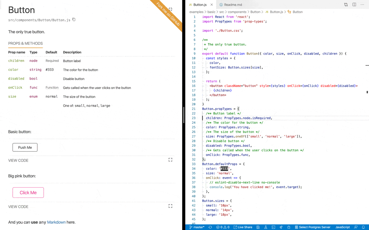
FILE: Readme.md
================================================
<div align="center" markdown="1">
<img src="https://d3vv6lp55qjaqc.cloudfront.net/items/061f0A2n1B0H3p0T1p1f/react-styleguidist-logo.png" alt="React Styleguidist" width="400">
**Isolated React component development environment with a living style guide**
[](https://www.npmjs.com/package/react-styleguidist) [](https://github.com/styleguidist/react-styleguidist.git/actions) [](https://codecov.io/gh/styleguidist/react-styleguidist) [](https://gitter.im/styleguidist/styleguidist?utm_source=badge&utm_medium=badge&utm_campaign=pr-badge&utm_content=badge)
<a href="https://discord.gg/QWsybqJDTA"></a> [](https://www.codetriage.com/styleguidist/react-styleguidist)
</div>
React Styleguidist is a component development environment with hot reloaded dev server and a living style guide that you can share with your team. It lists component `propTypes` and shows live, editable usage examples based on Markdown files. Check out [**the demo style guide**](https://react-styleguidist.js.org/examples/basic/).
[](https://sapegin.me/book/)
## Usage
- **[Getting Started](https://react-styleguidist.js.org/docs/getting-started): install and run Styleguidist**
- [Documenting components](https://react-styleguidist.js.org/docs/documenting): how to write documentation
- [Locating components](https://react-styleguidist.js.org/docs/components): point Styleguidist to your React components
- [Configuring webpack](https://react-styleguidist.js.org/docs/webpack): tell Styleguidist how to load your code
- [Cookbook](https://react-styleguidist.js.org/docs/cookbook): how to solve common tasks with Styleguidist
## Advanced documentation
- [Configuration](https://react-styleguidist.js.org/docs/configuration)
- [CLI commands and options](https://react-styleguidist.js.org/docs/cli)
- [Node.js API](https://react-styleguidist.js.org/docs/api)
## Examples
- [Basic style guide](https://react-styleguidist.js.org/examples/basic/), [source](./examples/basic)
- Style guide with sections, [source](./examples/sections)
- Style guide with customized styles, [source](./examples/customised)
- Style guide with custom express endpoints, [source](./examples/express)
- Create React App integration, [source](./examples/cra)
## Showcase
Real projects using React Styleguidist:
- [Rumble Charts](https://rumble-charts.github.io/rumble-charts/)
- [better-react-spinkit](http://better-react-spinkit.benjamintatum.com/)
- [Semantic UI Components for React](https://hallister.github.io/semantic-react/)
- [Dialog Components](https://dialogs.github.io/dialog-web-components/)
- [Bulma Components](https://bokuweb.github.io/re-bulma/)
- [Yammer Components](https://microsoft.github.io/YamUI/)
- [More projects…](https://github.com/styleguidist/react-styleguidist/issues/127)
## Integration with other tools
- Create React App — supported out of the box, see the [Getting Started](https://react-styleguidist.js.org/docs/getting-started) guide
- Vue, see [Vue Styleguidist](https://github.com/vue-styleguidist/vue-styleguidist)
## Third-party tools
- [snapguidist](https://github.com/styleguidist/snapguidist): snapshot testing for React Styleguidist
- [react-styleguidist-visual](https://github.com/unindented/react-styleguidist-visual): automated visual testing for React Styleguidist, using Puppeteer and pixelmatch
- [styleguidist-scrapper](https://github.com/livechat/styleguidist-scrapper): scrapper script for documentation generated by React Styleguidist
## Resources
- [The Dream of Styleguide Driven Development](https://www.youtube.com/watch?v=JjXnmhNW8Cs) talk by [Sara Vieira](https://github.com/saravieira)
- [Building React Components Library](https://skillsmatter.com/skillscasts/8140-building-react-components-library) talk by [Robert Haritonov](https://github.com/operatino)
- [Say Cheese: Snapshots and Visual Testing](https://developers.livechatinc.com/blog/snapshots-visual-testing/)
- [Interview with Artem Sapegin](https://survivejs.com/blog/styleguidist-interview/) about React Styleguidist.
## Change log
The change log can be found on the [Releases page](https://github.com/styleguidist/react-styleguidist/releases).
## Contributing
Everyone is welcome to contribute. Please take a moment to read the [contributing guidelines](.github/Contributing.md) and the [developer guide](https://react-styleguidist.js.org/docs/development).
## Sponsoring
[Become a sponsor](https://opencollective.com/styleguidist#sponsor) and get your logo on our Readme on GitHub with a link to your site.
<!-- prettier-ignore -->
<a href="https://opencollective.com/styleguidist/sponsor/0/website" target="_blank"><img src="https://opencollective.com/styleguidist/sponsor/0/avatar.svg"></a>
<a href="https://opencollective.com/styleguidist/sponsor/1/website" target="_blank"><img src="https://opencollective.com/styleguidist/sponsor/1/avatar.svg"></a>
<a href="https://opencollective.com/styleguidist/sponsor/2/website" target="_blank"><img src="https://opencollective.com/styleguidist/sponsor/2/avatar.svg"></a>
<a href="https://opencollective.com/styleguidist/sponsor/3/website" target="_blank"><img src="https://opencollective.com/styleguidist/sponsor/3/avatar.svg"></a>
<a href="https://opencollective.com/styleguidist/sponsor/4/website" target="_blank"><img src="https://opencollective.com/styleguidist/sponsor/4/avatar.svg"></a>
<a href="https://opencollective.com/styleguidist/sponsor/5/website" target="_blank"><img src="https://opencollective.com/styleguidist/sponsor/5/avatar.svg"></a>
<a href="https://opencollective.com/styleguidist/sponsor/6/website" target="_blank"><img src="https://opencollective.com/styleguidist/sponsor/6/avatar.svg"></a>
<a href="https://opencollective.com/styleguidist/sponsor/7/website" target="_blank"><img src="https://opencollective.com/styleguidist/sponsor/7/avatar.svg"></a>
<a href="https://opencollective.com/styleguidist/sponsor/8/website" target="_blank"><img src="https://opencollective.com/styleguidist/sponsor/8/avatar.svg"></a>
<a href="https://opencollective.com/styleguidist/sponsor/9/website" target="_blank"><img src="https://opencollective.com/styleguidist/sponsor/9/avatar.svg"></a>
<a href="https://opencollective.com/styleguidist/sponsor/10/website" target="_blank"><img src="https://opencollective.com/styleguidist/sponsor/10/avatar.svg"></a>
<a href="https://opencollective.com/styleguidist/sponsor/11/website" target="_blank"><img src="https://opencollective.com/styleguidist/sponsor/11/avatar.svg"></a>
<a href="https://opencollective.com/styleguidist/sponsor/12/website" target="_blank"><img src="https://opencollective.com/styleguidist/sponsor/12/avatar.svg"></a>
<a href="https://opencollective.com/styleguidist/sponsor/13/website" target="_blank"><img src="https://opencollective.com/styleguidist/sponsor/13/avatar.svg"></a>
<a href="https://opencollective.com/styleguidist/sponsor/14/website" target="_blank"><img src="https://opencollective.com/styleguidist/sponsor/14/avatar.svg"></a>
<a href="https://opencollective.com/styleguidist/sponsor/15/website" target="_blank"><img src="https://opencollective.com/styleguidist/sponsor/15/avatar.svg"></a>
<a href="https://opencollective.com/styleguidist/sponsor/16/website" target="_blank"><img src="https://opencollective.com/styleguidist/sponsor/16/avatar.svg"></a>
<a href="https://opencollective.com/styleguidist/sponsor/17/website" target="_blank"><img src="https://opencollective.com/styleguidist/sponsor/17/avatar.svg"></a>
<a href="https://opencollective.com/styleguidist/sponsor/18/website" target="_blank"><img src="https://opencollective.com/styleguidist/sponsor/18/avatar.svg"></a>
<a href="https://opencollective.com/styleguidist/sponsor/19/website" target="_blank"><img src="https://opencollective.com/styleguidist/sponsor/19/avatar.svg"></a>
<a href="https://opencollective.com/styleguidist/sponsor/20/website" target="_blank"><img src="https://opencollective.com/styleguidist/sponsor/20/avatar.svg"></a>
<a href="https://opencollective.com/styleguidist/sponsor/21/website" target="_blank"><img src="https://opencollective.com/styleguidist/sponsor/21/avatar.svg"></a>
<a href="https://opencollective.com/styleguidist/sponsor/22/website" target="_blank"><img src="https://opencollective.com/styleguidist/sponsor/22/avatar.svg"></a>
<a href="https://opencollective.com/styleguidist/sponsor/23/website" target="_blank"><img src="https://opencollective.com/styleguidist/sponsor/23/avatar.svg"></a>
<a href="https://opencollective.com/styleguidist/sponsor/24/website" target="_blank"><img src="https://opencollective.com/styleguidist/sponsor/24/avatar.svg"></a>
<a href="https://opencollective.com/styleguidist/sponsor/25/website" target="_blank"><img src="https://opencollective.com/styleguidist/sponsor/25/avatar.svg"></a>
<a href="https://opencollective.com/styleguidist/sponsor/26/website" target="_blank"><img src="https://opencollective.com/styleguidist/sponsor/26/avatar.svg"></a>
<a href="https://opencollective.com/styleguidist/sponsor/27/website" target="_blank"><img src="https://opencollective.com/styleguidist/sponsor/27/avatar.svg"></a>
<a href="https://opencollective.com/styleguidist/sponsor/28/website" target="_blank"><img src="https://opencollective.com/styleguidist/sponsor/28/avatar.svg"></a>
<a href="https://opencollective.com/styleguidist/sponsor/29/website" target="_blank"><img src="https://opencollective.com/styleguidist/sponsor/29/avatar.svg"></a>
[Become a backer](https://opencollective.com/styleguidist#backer) get your image on our Readme on GitHub with a link to your site.
<!-- prettier-ignore -->
<a href="https://opencollective.com/styleguidist/backer/0/website" target="_blank"><img src="https://opencollective.com/styleguidist/backer/0/avatar.svg"></a>
<a href="https://opencollective.com/styleguidist/backer/1/website" target="_blank"><img src="https://opencollective.com/styleguidist/backer/1/avatar.svg"></a>
<a href="https://opencollective.com/styleguidist/backer/2/website" target="_blank"><img src="https://opencollective.com/styleguidist/backer/2/avatar.svg"></a>
<a href="https://opencollective.com/styleguidist/backer/3/website" target="_blank"><img src="https://opencollective.com/styleguidist/backer/3/avatar.svg"></a>
<a href="https://opencollective.com/styleguidist/backer/4/website" target="_blank"><img src="https://opencollective.com/styleguidist/backer/4/avatar.svg"></a>
<a href="https://opencollective.com/styleguidist/backer/5/website" target="_blank"><img src="https://opencollective.com/styleguidist/backer/5/avatar.svg"></a>
<a href="https://opencollective.com/styleguidist/backer/6/website" target="_blank"><img src="https://opencollective.com/styleguidist/backer/6/avatar.svg"></a>
<a href="https://opencollective.com/styleguidist/backer/7/website" target="_blank"><img src="https://opencollective.com/styleguidist/backer/7/avatar.svg"></a>
<a href="https://opencollective.com/styleguidist/backer/8/website" target="_blank"><img src="https://opencollective.com/styleguidist/backer/8/avatar.svg"></a>
<a href="https://opencollective.com/styleguidist/backer/9/website" target="_blank"><img src="https://opencollective.com/styleguidist/backer/9/avatar.svg"></a>
<a href="https://opencollective.com/styleguidist/backer/10/website" target="_blank"><img src="https://opencollective.com/styleguidist/backer/10/avatar.svg"></a>
<a href="https://opencollective.com/styleguidist/backer/11/website" target="_blank"><img src="https://opencollective.com/styleguidist/backer/11/avatar.svg"></a>
<a href="https://opencollective.com/styleguidist/backer/12/website" target="_blank"><img src="https://opencollective.com/styleguidist/backer/12/avatar.svg"></a>
<a href="https://opencollective.com/styleguidist/backer/13/website" target="_blank"><img src="https://opencollective.com/styleguidist/backer/13/avatar.svg"></a>
<a href="https://opencollective.com/styleguidist/backer/14/website" target="_blank"><img src="https://opencollective.com/styleguidist/backer/14/avatar.svg"></a>
<a href="https://opencollective.com/styleguidist/backer/15/website" target="_blank"><img src="https://opencollective.com/styleguidist/backer/15/avatar.svg"></a>
<a href="https://opencollective.com/styleguidist/backer/16/website" target="_blank"><img src="https://opencollective.com/styleguidist/backer/16/avatar.svg"></a>
<a href="https://opencollective.com/styleguidist/backer/17/website" target="_blank"><img src="https://opencollective.com/styleguidist/backer/17/avatar.svg"></a>
<a href="https://opencollective.com/styleguidist/backer/18/website" target="_blank"><img src="https://opencollective.com/styleguidist/backer/18/avatar.svg"></a>
<a href="https://opencollective.com/styleguidist/backer/19/website" target="_blank"><img src="https://opencollective.com/styleguidist/backer/19/avatar.svg"></a>
<a href="https://opencollective.com/styleguidist/backer/20/website" target="_blank"><img src="https://opencollective.com/styleguidist/backer/20/avatar.svg"></a>
<a href="https://opencollective.com/styleguidist/backer/21/website" target="_blank"><img src="https://opencollective.com/styleguidist/backer/21/avatar.svg"></a>
<a href="https://opencollective.com/styleguidist/backer/22/website" target="_blank"><img src="https://opencollective.com/styleguidist/backer/22/avatar.svg"></a>
<a href="https://opencollective.com/styleguidist/backer/23/website" target="_blank"><img src="https://opencollective.com/styleguidist/backer/23/avatar.svg"></a>
<a href="https://opencollective.com/styleguidist/backer/24/website" target="_blank"><img src="https://opencollective.com/styleguidist/backer/24/avatar.svg"></a>
<a href="https://opencollective.com/styleguidist/backer/25/website" target="_blank"><img src="https://opencollective.com/styleguidist/backer/25/avatar.svg"></a>
<a href="https://opencollective.com/styleguidist/backer/26/website" target="_blank"><img src="https://opencollective.com/styleguidist/backer/26/avatar.svg"></a>
<a href="https://opencollective.com/styleguidist/backer/27/website" target="_blank"><img src="https://opencollective.com/styleguidist/backer/27/avatar.svg"></a>
<a href="https://opencollective.com/styleguidist/backer/28/website" target="_blank"><img src="https://opencollective.com/styleguidist/backer/28/avatar.svg"></a>
<a href="https://opencollective.com/styleguidist/backer/29/website" target="_blank"><img src="https://opencollective.com/styleguidist/backer/29/avatar.svg"></a>
<a href="https://www.buymeacoffee.com/sapegin" target="_blank"><img src="https://cdn.buymeacoffee.com/buttons/lato-orange.png" alt="Buy Me A Coffee" style="height: 51px !important;width: 217px !important;" ></a>
## Authors and license
[Artem Sapegin](http://sapegin.me) and [contributors](https://github.com/styleguidist/react-styleguidist/graphs/contributors).
Logo by [Sara Vieira](https://github.com/SaraVieira) and [Andrey Okonetchnikov](https://github.com/okonet).
MIT License, see the included [License.md](License.md) file.
================================================
FILE: babel.config.js
================================================
module.exports = {
presets: [
[
'@babel/env',
{
loose: true,
modules: false,
useBuiltIns: 'usage',
corejs: 3,
},
],
'@babel/typescript',
'@babel/react',
],
plugins: ['@babel/plugin-proposal-class-properties'],
overrides: [
{
include: ['src/bin', 'src/loaders', 'src/scripts', 'src/share', 'src/typings'],
exclude: ['src/loaders/utils/client'],
presets: [
[
'@babel/env',
{
loose: true,
modules: 'commonjs',
useBuiltIns: 'usage',
corejs: 3,
targets: {
node: '10',
},
},
],
],
},
],
env: {
test: {
presets: [
[
'@babel/env',
{
loose: true,
modules: 'commonjs',
useBuiltIns: 'usage',
corejs: 3,
targets: {
node: 'current',
},
},
],
'@babel/react',
'@babel/flow',
],
plugins: ['@babel/plugin-proposal-class-properties'],
},
},
};
================================================
FILE: cypress.json
================================================
{
"baseUrl": "http://localhost:8082",
"fixturesFolder": "test/cypress/fixtures",
"integrationFolder": "test/cypress/integration",
"pluginsFile": "test/cypress/plugins/index.js",
"screenshotsFolder": "test/cypress/screenshots",
"videosFolder": "test/cypress/videos",
"supportFile": "test/cypress/support/index.js",
"video": false,
"chromeWebSecurity": false
}
================================================
FILE: dangerfile.ts
================================================
import { danger, warn } from 'danger';
const packageChanged = danger.git.modified_files.includes('package.json');
const lockfileChanged = danger.git.modified_files.includes('package-lock.json');
if (packageChanged && !lockfileChanged) {
warn(`Changes were made to \`package.json\`, but not to \`package-lock.json\`.
If you’ve changed any dependencies (added, removed or updated any packages), please run \`npm install\` and commit changes in package-lock.json file. Make sure you’re using npm 5+.`);
}
if (!packageChanged && lockfileChanged) {
warn(`Changes were made to \`package-lock.json\`, but not to \`package.json\`.
Please remove \`package-lock.json\` changes from your pull request. Try to run \`git checkout master -- package-lock.json\` and commit changes.`);
}
================================================
FILE: docs/API.md
================================================
<!-- Node.js API #api -->
# Node.js API
## Initialization
First, you need to initialize the API for your style guide config.
Using a JavaScript object:
```javascript
import styleguidist from 'react-styleguidist'
const styleguide = styleguidist({
logger: {
warn: console.warn,
info: console.log,
debug: console.log
},
components: './lib/components/**/*.js',
webpackConfig: {
module: {
rules: [
{
test: /\.jsx?$/,
exclude: /node_modules/,
loader: 'babel-loader'
},
{
test: /\.css$/,
use: [
'style-loader',
{
loader: 'css-loader',
options: {
modules: true
}
}
]
}
]
}
}
})
```
> **Info:** Any output is disabled by default, you may need to define your own [logger](Configuration.md#logger).
Using a config file:
```javascript
import styleguidist from 'react-styleguidist'
const styleguide = styleguidist(require('../styleguide.config.js'))
```
Or auto searching a config file:
```javascript
import styleguidist from 'react-styleguidist'
const styleguide = styleguidist()
```
See all available [config options](Configuration.md).
## Methods
### `build(callback)`
#### Arguments
1. `callback(err, config, stats)` (_Function_): A callback to be invoked when style guide is built:
1. `err` (_Object_): error details.
2. `config` (_Object_): normalized style guide config.
3. `stats` (_Object_): webpack build stats.
#### Returns
(_Compiler_): webpack `Compiler` instance.
#### Example
```javascript
import styleguidist from 'react-styleguidist'
styleguidist(require('../styleguide.config.js')).build(
(err, config) => {
if (err) {
console.log(err)
} else {
console.log('Style guide published to', config.styleguideDir)
}
}
)
```
### `server(callback)`
#### Arguments
1. `callback(err, config)` (_Function_): A callback to be invoked when style guide is built:
1. `err` (_Object_): error details.
2. `config` (_Object_): normalized style guide config.
#### Returns
(_Object_): Object containing a webpack `Compiler` instance and the React Styleguidist server
#### Example
```javascript
import styleguidist from 'react-styleguidist'
styleguidist(require('../styleguide.config.js')).server(
(err, config) => {
if (err) {
console.log(err)
} else {
const url = `http://${config.serverHost}:${config.serverPort}`
console.log(`Listening at ${url}`)
}
}
)
```
### `makeWebpackConfig([env])`
#### Arguments
1. \[`env`=`'production'`\] (_String_): `production` or `development`.
#### Returns
(_Object_): webpack config.
#### Example
```javascript
// webpack.config.js
module.exports = [
{
// User webpack config
},
// note that this is requiring rsg in commonjs mode
// it does not need to access .default
require('react-styleguidist').makeWebpackConfig()
]
```
================================================
FILE: docs/CLI.md
================================================
<!-- CLI commands #cli -->
# CLI commands and options
## Commands
- `styleguidist server`: Run dev server.
- `styleguidist build`: Generate a static HTML style guide.
## Options
| Option | Description |
| ----------------- | --------------------------------------------- |
| `--config <file>` | Specify path to a config file |
| `--port <port>` | Specify port to run the development server on |
| `--open` | Open Styleguidist in the default browser |
| `--verbose` | Print debug information |
## Usage
Add these commands into your `package.json`’s `scripts` section:
```json
{
"scripts": {
"styleguide": "styleguidist server",
"styleguide:build": "styleguidist build"
}
}
```
Or run them directly from your terminal:
```bash
npx styleguidist server
npx styleguidist build
```
> **Tip:** [npx](https://medium.com/@maybekatz/introducing-npx-an-npm-package-runner-55f7d4bd282b) is a part of npm and will run locally-installed `styleguidist` package.
================================================
FILE: docs/Components.md
================================================
<!-- Locating components #components -->
# Locating your components and organizing your style guide
## Finding components
By default Styleguidist will search components using this [glob pattern](https://github.com/isaacs/node-glob#glob-primer): `src/components/**/*.{js,jsx,ts,tsx}`.
It will pick up files like:
- `src/components/Button.js`,
- `src/components/Button/Button.js`,
- `src/components/Button/index.js`.
But will ignore tests:
- `__tests__` folder,
- files containing `.test.js` or `.spec.js` (or same for `.jsx`, `.ts` and `.tsx`).
If it doesn’t work for you, create a `styleguide.config.js` file in your project’s root folder and configure the patterns to fit your project structure.
For example, if your component files look like `components/Button/Button.js`, but you reexport them in `components/Button/index.js` (like `export { default } from './Button'`) to simplify imports (`components/Button` instead of `components/Button/Button`), you need to skip `index.js`:
```javascript
module.exports = {
components: 'src/components/**/[A-Z]*.js'
}
```
> **Info:** All paths are relative to the config folder.
> **Tip:** Use [ignore](Configuration.md#ignore) option to exclude some files from the style guide.
> **Tip:** Use [getComponentPathLine](Configuration.md#getcomponentpathline) option to change the path you see below a component name.
## Loading and exposing components
Styleguidist _loads_ your components and _exposes_ them globally for your examples to consume.
### Identifier
It will try to use the `displayName` of your component as the identifier. If it cannot understand a `displayName` (for example if it is dynamically generated), it will fall back to something it can understand.
In each of the following cases, the global identifier will be `Component`.
| Path | Code | Styleguidist understands |
| --- | --- | --- |
| /whatever.js | `export default function Component() { ... }` | displayName |
| /whatever.js | `export default function SomeName() { ... }`<br>`SomeName.displayName = 'Component';` | displayName |
| /whatever.js | `export default function Component() { ... }`<br>`Component.displayName = dynamicNamer();` | displayName at declaration |
| /component.js | `const name = 'SomeName';`<br>`const componentMap = {`<br>`[name]: function() { ... }`<br>`};`<br>`export default componentMap[name];` | Filename |
| /component/index.js | `const name = 'SomeName';`<br>`const componentMap = {`<br>`[name]: function() { ... }`<br>`};`<br>`export default componentMap[name];` | Folder name |
### Default vs named exports
Stylegudist will use an ECMAScript module’s `default` export or CommonJS `module.exports` if they are defined.
```javascript
// /component.js
export default function Component() { ... }
// will be exposed globally as Component
// /component.js
function Component() { ... }
module.exports = Component;
// will be exposed globally as Component
```
If you use only named exports, Styleguidist will expose named exports from modules as follows...
If there is only one named export, it will expose that.
```javascript
// /component.js
export function Component() { ... }
// will be exposed globally as Component
```
If there are several named exports, it will expose the named export which has the same name as the understood identifier.
```javascript
// /component.js
export function someUtil() { ... }
// will not be exposed
export function Component() { ... }
// will be exposed globally as Component
```
> **Caution:** If you export several React components as named exports from a single module, Styleguidist is likely to behave unreliably. If it cannot understand which named export to expose, you may not be able to access that export.
## Sections
Group components into sections or add extra Markdown documents to your style guide.
Each section consists of (all fields are optional):
- `name` — section title.
- `content` — location of a Markdown file containing the overview content.
- `components` — a glob pattern string, an array of component paths or glob pattern strings, or a function returning a list of components or glob pattern strings. The same rules apply as for the root `components` option.
- `sections` — array of subsections (can be nested).
- `description` — A small description of this section.
- `sectionDepth` — Number of subsections with single pages, only available with [pagePerSection](Configuration.md#pagepersection) is enabled.
- `exampleMode` — Initial state of the code example tab, uses [exampleMode](Configuration.md#examplemode).
- `usageMode` — Initial state of the props and methods tab, uses [usageMode](Configuration.md#usagemode).
- `ignore` — string/array of globs that should not be included in the section.
- `href` - an URL to navigate to instead of navigating to the section content
- `external` - if set, the link will open in a new window
- `expand` - Determines if the section should be expanded by default even when `tocMode` is set to `collapse` in general settings
Configuring a style guide with textual documentation section and a list of components would look like:
```javascript
// styleguide.config.js
module.exports = {
sections: [
{
name: 'Introduction',
content: 'docs/introduction.md'
},
{
name: 'Documentation',
sections: [
{
name: 'Installation',
content: 'docs/installation.md',
description: 'The description for the installation section'
},
{
name: 'Configuration',
content: 'docs/configuration.md'
},
{
name: 'Live Demo',
external: true,
href: 'http://example.com'
}
]
},
{
name: 'UI Components',
content: 'docs/ui.md',
components: 'lib/components/ui/*.js',
exampleMode: 'expand', // 'hide' | 'collapse' | 'expand'
usageMode: 'expand' // 'hide' | 'collapse' | 'expand'
}
]
}
```
## Limitations
In some cases Styleguidist may not understand your components, [see possible solutions](Thirdparties.md).
================================================
FILE: docs/Configuration.md
================================================
# Configuration
By default, Styleguidist will look for `styleguide.config.js` file in your project’s root folder. You can change the location of the config file using `--config` [CLI](CLI.md) option.
## `assetsDir`
Type: `String` or `Array`, optional
Your application static assets folder will be accessible as `/` in the style guide dev server.
## `compilerConfig`
Type: `Object`, default:
```javascript
{
// Don't include an Object.assign ponyfill, we have our own
objectAssign: 'Object.assign',
// Transpile only features needed for IE11
target: { ie: 11 },
transforms: {
// Don't throw on ESM imports, we transpile them ourselves
modules: false,
// Enable tagged template literals for styled-components
dangerousTaggedTemplateString: true,
// to make async/await work by default (no transformation)
asyncAwait: false,
},
}
```
Styleguidist uses [Bublé](https://buble.surge.sh/guide/) to run ES6 code on the frontend. This config object will be added as the second argument for `buble.transform`.
## `components`
Type: `String`, `Function` or `Array`, default: `src/components/**/*.{js,jsx,ts,tsx}`
- when `String`: a [glob pattern](https://github.com/isaacs/node-glob#glob-primer) that matches all your component modules.
- when `Function`: a function that returns an array of module paths.
- when `Array`: an array of module paths.
All paths are relative to config folder.
See examples in the [Components section](Components.md).
## `context`
Type: `Object`, optional
Modules that will be available for examples. You can use it for utility functions like Lodash or for data fixtures.
```javascript
module.exports = {
context: {
map: 'lodash/map',
users: path.resolve(__dirname, 'fixtures/users')
}
}
```
Then you can use them in any example:
```jsx
<Message>{map(users, 'name').join(', ')}</Message>
```
## `contextDependencies`
Type: `String[]`, optional
Array of absolute paths that allow you to specify absolute paths of directories to watch for additions or removals of components.
By default Styleguidist uses common parent directory of your components.
```javascript
module.exports = {
contextDependencies: [path.resolve(__dirname, 'lib/components')]
}
```
## `configureServer`
Type: `Function`, optional
Function that allows you to add endpoints to the underlying Express server:
```javascript
module.exports = {
configureServer(app) {
// `app` is the instance of the express server running Styleguidist
app.get('/custom-endpoint', (req, res) => {
res.status(200).send({ response: 'Server invoked' })
})
}
}
```
Your components will be able to invoke the URL `http://localhost:6060/custom-endpoint` from their examples.
## `dangerouslyUpdateWebpackConfig`
Type: `Function`, optional
> **Danger:** You may break Styleguidist by using this option, try to use [webpackConfig](#webpackconfig) option instead.
Allows you to modify webpack config without any restrictions.
```javascript
module.exports = {
dangerouslyUpdateWebpackConfig(webpackConfig, env) {
// WARNING: inspect Styleguidist Webpack config before modifying it, otherwise you may break Styleguidist
console.log(webpackConfig)
webpackConfig.externals = {
jquery: 'jQuery'
}
return webpackConfig
}
}
```
## `defaultExample`
Type: `Boolean` or `String`, default: `false`
For components that do not have an example, a default one can be used. When set to `true`, the [DefaultExample.md](https://raw.githubusercontent.com/styleguidist/react-styleguidist/master/templates/DefaultExample.md) is used, or you can provide the path to your own example Markdown file.
When writing your own default example file, `__COMPONENT__` will be replaced by the actual component name at compile time.
## `exampleMode`
Type: `String`, default: `collapse`
Defines the initial state of the example code tab:
- `collapse`: collapses the tab by default.
- `hide`: hide the tab and it can´t be toggled in the UI.
- `expand`: expand the tab by default.
## `getComponentPathLine`
Type: `Function`, default: component filename
Function that returns a component path line (displayed under the component name).
For example, instead of `components/Button/Button.js` you can print `import Button from 'components/Button';`:
```javascript
const path = require('path')
module.exports = {
getComponentPathLine(componentPath) {
const name = path.basename(componentPath, '.js')
const dir = path.dirname(componentPath)
return `import ${name} from '${dir}';`
}
}
```
## `getExampleFilename`
Type: `Function`, default: finds `Readme.md` or `ComponentName.md` in the component folder
Function that returns examples file path for a given component path.
For example, instead of `Readme.md` you can use `ComponentName.examples.md`:
```javascript
module.exports = {
getExampleFilename(componentPath) {
return componentPath.replace(/\.jsx?$/, '.examples.md')
}
}
```
## `handlers`
Type: `Function`, optional, default: [[react-docgen-displayname-handler](https://github.com/nerdlabs/react-docgen-displayname-handler)]
Function that returns functions used to process the discovered components and generate documentation objects. Default behaviors include discovering component documentation blocks, prop types, and defaults. If setting this property, it is best to build from the default [react-docgen](https://github.com/reactjs/react-docgen) handler list, such as in the example below. See the [react-docgen handler documentation](https://github.com/reactjs/react-docgen#handlers) for more information about handlers.
> **Note:** `react-docgen-displayname-handler` should be included.
```javascript
module.exports = {
handlers: componentPath =>
require('react-docgen').defaultHandlers.concat(
(documentation, path) => {
// Calculate a display name for components based upon the declared class name.
if (
path.value.type === 'ClassDeclaration' &&
path.value.id.type === 'Identifier'
) {
documentation.set('displayName', path.value.id.name)
// Calculate the key required to find the component in the module exports
if (
path.parentPath.value.type === 'ExportNamedDeclaration'
) {
documentation.set('path', path.value.id.name)
}
}
// The component is the default export
if (
path.parentPath.value.type === 'ExportDefaultDeclaration'
) {
documentation.set('path', 'default')
}
},
require('react-docgen-displayname-handler').createDisplayNameHandler(
componentPath
)
)
}
```
## `ignore`
Type: `String[]`, default: `['**/__tests__/**', '**/*.test.{js,jsx,ts,tsx}', '**/*.spec.{js,jsx,ts,tsx}', '**/*.d.ts']`
Array of [glob pattern](https://github.com/isaacs/node-glob#glob-primer) that should not be included in the style guide.
> **Caution:** You should pass glob patterns, for example, use `**/components/Button.js` instead of `components/Button.js`.
## `logger`
Type: `Object`, by default will use `console.*` in CLI or nothing in Node.js API
Custom logger functions:
```javascript
module.exports = {
logger: {
// One of: info, debug, warn
// Suppress messages
info: () => {},
// Override display function
warn: message => console.warn(`NOOOOOO: ${message}`)
}
}
```
## `minimize`
Type: `Boolean`, default: `true`
If `false`, the production build will not be minimized.
## `moduleAliases`
Type: `object`, optional
Define aliases for modules, that you can import in your examples, to make example code more realistic and copypastable:
```javascript
const path = require('path')
module.exports = {
moduleAliases: {
'rsg-example': path.resolve(__dirname, 'src')
}
}
```
````jsx
// ```jsx inside Markdown
import React from 'react'
import Button from 'rsg-example/components/Button'
import Placeholder from 'rsg-example/components/Placeholder'
````
Check out the [webpack resolve.alias documentation](https://webpack.js.org/configuration/resolve/#resolve-alias) for available syntax.
## `mountPointId`
Type: `string`, default: `rsg-root`
The ID of a DOM element where Styleguidist mounts.
## `pagePerSection`
Type: `Boolean`, default: `false`
Render one section or component per page.
If `true`, each section will be a single page.
The value may depend on a current environment:
```javascript
module.exports = {
pagePerSection: process.env.NODE_ENV !== 'production'
}
```
To isolate section’s children as single pages (subroutes), add `sectionDepth` into each section with the number of subroutes (depth) to render as single pages.
For example:
```javascript
module.exports = {
pagePerSection: true,
sections: [
{
name: 'Documentation',
sections: [
{
name: 'Files',
sections: [
{
name: 'First File'
},
{
name: 'Second File'
}
]
}
],
// Will show "Documentation" and "Files" as single pages, filtering its children
sectionDepth: 2
},
{
name: 'Components',
sections: [
{
name: 'Buttons',
sections: [
{
name: 'WrapperButton'
}
]
}
],
// Will show "Components" as single page, filtering its children
sectionDepth: 1
},
{
name: 'Examples',
sections: [
{
name: 'Case 1',
sections: [
{
name: 'Buttons'
}
]
}
],
// There is no subroutes, "Examples" will show all its children on a page
sectionDepth: 0
}
]
}
```
## `printBuildInstructions`
Type: `Function`, optional
Function that allows you to override the printing of build messages to console.log.
```javascript
module.exports = {
printBuildInstructions(config) {
console.log(
`Style guide published to ${config.styleguideDir}. Something else interesting.`
)
}
}
```
## `printServerInstructions`
Type: `Function`, optional
Function that allows you to override the printing of local dev server messages to console.log.
```javascript
module.exports = {
serverHost: 'your-domain',
printServerInstructions(config, { isHttps }) {
console.log(`Local style guide: http://${config.serverHost}`)
}
}
```
## `previewDelay`
Type: `Number`, default: 500
Debounce time in milliseconds used before rendering the changes from the editor. While typing code the preview will not be updated.
## `propsParser`
Type: `Function`, optional
Function that allows you to override the mechanism used to parse props from a source file. The default mechanism is using [react-docgen](https://github.com/reactjs/react-docgen) to parse props.
```javascript
module.exports = {
propsParser(filePath, source, resolver, handlers) {
return require('react-docgen').parse(source, resolver, handlers)
}
}
```
## `require`
Type: `String[]`, optional
Modules that are required for your style guide. Useful for third-party styles or polyfills.
```javascript
module.exports = {
require: [
'babel-polyfill',
path.join(__dirname, 'styleguide/styles.css')
]
}
```
> **Note:** This will add a separate webpack entry for each array item.
Don’t forget to add webpack loaders for each file you add here. For example, to require a CSS file you’ll need:
```javascript
module.exports = {
webpackConfig: {
module: {
rules: [
{
test: /\.css$/,
use: ['style-loader', 'css-loader']
}
]
}
}
}
```
See [Configuring webpack](Webpack.md) for mode details.
## `resolver`
Type: `Function`, optional
Function that allows you to override the mechanism used to identify classes/components to analyze. Default behavior is to find all exported components in each file. You can configure it to find all components or use a custom detection method. See the [react-docgen resolver documentation](https://github.com/reactjs/react-docgen#resolver) for more information about resolvers.
```javascript
module.exports = {
resolver: require('react-docgen').resolver
.findAllComponentDefinitions
}
```
## `ribbon`
Type: `Object`, optional
Show “Fork Me” ribbon in the top right corner.
```javascript
module.exports = {
ribbon: {
// Link to open on the ribbon click (required)
url: 'http://example.com/',
// Text to show on the ribbon (optional)
text: 'Fork me on GitHub'
}
}
```
Use the [theme](#theme) config option to change ribbon style.
## `sections`
Type: `Array`, optional
Allows components to be grouped into sections with a title and overview content. Sections can also be content only, with no associated components (for example, a textual introduction). Sections can be nested.
See examples of [sections configuration](Components.md#sections).
## `serverHost`
Type: `String`, default: `0.0.0.0`
Dev server hostname.
## `serverPort`
Type: `Number`, default: `process.env.NODE_PORT` or `6060`
Dev server port. Can also be set via command line `--port=6060`.
## `showSidebar`
Type: `Boolean`, default: `true`
Toggle sidebar visibility. The sidebar will be hidden when opening components or examples in isolation mode even if this value is set to `true`. When set to `false`, the sidebar will always be hidden.
## `skipComponentsWithoutExample`
Type: `Boolean`, default: `false`
Ignore components that don’t have an example file (as determined by [getExampleFilename](#getexamplefilename)). These components won’t be accessible from other examples unless you [manually `require` them](Cookbook.md#how-to-hide-some-components-in-style-guide-but-make-them-available-in-examples).
## `sortProps`
Type: `Function`, optional
Function that sorts component props. By default props are sorted such that required props come first, optional props come second. Props in both groups are sorted by their property names.
To disable sorting, use the identity function:
```javascript
module.exports = {
sortProps: props => props
}
```
## `styleguideComponents`
Type: `Object`, optional
Override React components used to render the style guide:
```javascript
module.exports = {
styleguideComponents: {
Wrapper: path.join(__dirname, 'styleguide/components/Wrapper'),
StyleGuideRenderer: path.join(
__dirname,
'styleguide/components/StyleGuide'
)
}
}
```
See an example of [customized style guide](https://github.com/styleguidist/react-styleguidist/tree/master/examples/customised).
To wrap, rather than replace a component, make sure to import the default implementation using the full path to `react-styleguidist`. See an example of [wrapping a Styleguidist component](https://github.com/styleguidist/react-styleguidist/blob/master/examples/customised/styleguide/components/SectionsRenderer.js).
**Note**: these components are not guaranteed to be safe from breaking changes in React Styleguidist updates.
## `styleguideDir`
Type: `String`, default: `styleguide`
Folder for static HTML style guide generated with `styleguidist build` command.
## `styles`
Type: `Object`, `String` or `Function`, optional
Customize styles of any Styleguidist’s component using an object, a function returning said object or a file path to a file exporting said styles.
See examples in the [cookbook](Cookbook.md#how-to-change-styles-of-a-style-guide).
> **Tip:** Using a function allows access to theme variables like in the example below. See available [theme variables](https://github.com/styleguidist/react-styleguidist/blob/master/src/client/styles/theme.ts). The returned object folows the same format as when configured as a litteral.
```javascript
module.exports = {
styles: function (theme) {
return {
Logo: {
logo: {
// we can now change the color used in the logo item to use the theme's `link` color
color: theme.color.link
}
}
}
}
}
```
**Note:** If using a file path, it has to be absolute or relative to the config file.
## `template`
Type: `Object` or `Function`, optional.
Change HTML for the style guide app.
An object with options to add a favicon, meta tags, inline JavaScript or CSS, etc. See [@vxna/mini-html-webpack-template docs](https://www.npmjs.com/package/@vxna/mini-html-webpack-template).
```javascript
module.exports = {
template: {
favicon: 'https://assets-cdn.github.com/favicon.ico'
}
}
```
A function that returns an HTML string, see [mini-html-webpack-plugin docs](https://github.com/styleguidist/mini-html-webpack-plugin#custom-templates).
## `theme`
Type: `Object` or `String`, optional
Customize style guide UI fonts, colors, etc. using a theme object or the path to a file exporting such object.
The path is relative to the config file or absolute.
See examples in the [cookbook](Cookbook.md#how-to-change-styles-of-a-style-guide).
> **Info:** See available [theme variables](https://github.com/styleguidist/react-styleguidist/blob/master/src/client/styles/theme.ts).
> **Info:** Styles use [JSS](https://github.com/cssinjs/jss/blob/master/docs/jss-syntax.md) with these plugins: [jss-plugin-isolate](https://github.com/cssinjs/jss/tree/master/packages/jss-plugin-isolate), [jss-plugin-nested](https://github.com/cssinjs/jss/tree/master/packages/jss-plugin-nested), [jss-plugin-camel-case](https://github.com/cssinjs/jss/tree/master/packages/jss-plugin-camel-case), [jss-plugin-default-unit](https://github.com/cssinjs/jss/tree/master/packages/jss-plugin-default-unit), [jss-plugin-compose](https://github.com/cssinjs/jss/tree/master/packages/jss-plugin-compose) and [jss-plugin-global](https://github.com/cssinjs/jss/tree/master/packages/jss-plugin-global).
> **Tip:** Use [React Developer Tools](https://github.com/facebook/react) to find component and style names. For example a component `<LogoRenderer><h1 className="rsg--logo-53">` corresponds to an example above.
## `title`
Type: `String`, default: `<app name from package.json> Style Guide`
Style guide title.
## `tocMode`
Type: `String` default: `expand`
Defines if the table of contents sections will behave like an accordion:
- `collapse`: All sections are collapsed by default
- `expand`: Sections cannot be collapsed in the Table Of Contents
Collapse the sections created in the sidebar to reduce the height of the sidebar. This can be useful in large codebases with lots of components to avoid having to scroll too far.
## `updateDocs`
Type: `Function`, optional
Function that modifies props, methods, and metadata after parsing a source file. For example, load a component version from a JSON file:
```javascript
module.exports = {
updateDocs(docs, file) {
if (docs.doclets.version) {
const versionFilePath = path.resolve(
path.dirname(file),
docs.doclets.version
)
const version = require(versionFilePath).version
docs.doclets.version = version
docs.tags.version[0].description = version
}
return docs
}
}
```
With this component JSDoc comment block:
```javascript
/**
* Component is described here.
*
* @version ./package.json
*/
export default class Button extends React.Component {
// ...
}
export default
```
## `updateExample`
Type: `Function`, optional
Function that modifies code example (Markdown fenced code block). For example, you can use it to load examples from files:
```javascript
module.exports = {
updateExample(props, exampleFilePath) {
const { settings, lang } = props
if (typeof settings.file === 'string') {
const filepath = path.resolve(
path.dirname(exampleFilePath),
settings.file
)
const { file, ...restSettings } = settings
return {
content: fs.readFileSync(filepath, 'utf8'),
settings: restSettings,
lang
}
}
return props
}
}
```
Use it like this in your Markdown files:
```js { "file": "./some/file.js" }
```
You can also use this function to dynamically update some of your fenced code blocks that you do not want to be interpreted as React components by using the [static modifier](Documenting.md#usage-examples-and-readme-files).
```javascript
module.exports = {
updateExample(props) {
const { settings, lang } = props
if (lang === 'javascript' || lang === 'js' || lang === 'jsx') {
settings.static = true
}
return props
}
}
```
## `usageMode`
Type: `String`, default: `collapse`
Defines the initial state of the props and methods tab:
- `collapse`: collapses the tab by default.
- `hide`: hide the tab and it can´t be toggled in the UI.
- `expand`: expand the tab by default.
## `verbose`
Type: `Boolean`, default: `false`
Print debug information. Same as `--verbose` command line switch.
## `version`
Type: `String`, optional
Style guide version, displayed under the title in the sidebar.
## `webpackConfig`
Type: `Object` or `Function`, optional
Custom webpack config options: loaders, extensions, plugins, etc. required for your project.
Can be an object:
```javascript
module.exports = {
webpackConfig: {
module: {
resolve: {
extensions: ['.es6']
},
rules: [
{
test: /\.scss$/,
loaders: [
'style-loader',
'css-loader',
'sass-loader?precision=10'
]
}
]
}
}
}
```
Or a function:
```javascript
module.exports = {
webpackConfig(env) {
if (env === 'development') {
return {
// custom options
}
}
return {}
}
}
```
> **Caution:** This option disables config load from `webpack.config.js`, load your config [manually](Webpack.md#reusing-your-projects-webpack-config).
> **Danger:** `entry`, `externals`, `output`, `watch`, and `stats` options will be ignored. For production builds, `devtool` will also be ignored.
> **Danger:** `CommonsChunkPlugins`, `HtmlWebpackPlugin`, `MiniHtmlWebpackPlugin`, `UglifyJsPlugin`, `TerserPlugin`, `HotModuleReplacementPlugin` plugins will be ignored because Styleguidist already includes them or they may break Styleguidist.
> **Tip:** Run style guide in verbose mode to see the actual webpack config used by Styleguidist: `npx styleguidist server --verbose`.
See [Configuring webpack](Webpack.md) for examples.
================================================
FILE: docs/Cookbook.md
================================================
# Cookbook
## How to use `ref`s in examples?
Use `ref` prop as a function and assign a reference to a local variable:
```jsx
const [value, setValue] = React.useState('')
let textarea
;<div>
<Button onClick={() => textarea.insertAtCursor('Pizza')}>
Insert
</Button>
<Textarea
value={value}
onChange={e => setValue(e.target.value)}
ref={ref => (textarea = ref)}
/>
</div>
```
## How to exclude some components from style guide?
Styleguidist will ignore tests (`__tests__` folder and filenames containing `.test.js` or `.spec.js`) by default.
Use [ignore](Configuration.md#ignore) option to customize this behavior:
```javascript
module.exports = {
ignore: ['**/*.spec.js', '**/components/Button.js']
}
```
> **Caution:** You should pass glob patterns, for example, use `**/components/Button.js` instead of `components/Button.js`.
## How to hide some components in style guide but make them available in examples?
Enable [skipComponentsWithoutExample](Configuration.md#skipcomponentswithoutexample) option and do not add an example file (`Readme.md` by default) to components you want to ignore.
Import these components in your examples:
````jsx
// ```jsx inside Markdown
import Button from '../common/Button'
;<Button>Push Me Tender</Button>
````
Or, to make these components available for all examples:
```jsx
// styleguide.config.js
module.exports = {
require: [path.resolve(__dirname, 'styleguide/setup.js')]
}
// styleguide/setup.js
import Button from './src/components/common/Button'
global.Button = Button
```
The `Button` component will be available in every example without a need to `import` it.
## How to render React components that aren’t part of the style guide?
Import these components in your examples:
````jsx
// ```jsx or ```jsx noeditor inside Markdown
import ColorPalette from './components/ColorPalette'
;<ColorPalette />
````
## How to dynamically load other components in an example?
Although examples don’t have direct access to webpack’s `require.context` feature, you _can_ use it in a separate helper file which you require in your example code. If you wanted to create an example to load and show all your icon components, you could do this:
```js
// load-icons.js
const iconsContext = require.context('./icons/', true, /js$/)
const icons = iconsContext.keys().reduce((icons, file) => {
const Icon = iconsContext(file).default
const label = file.slice(2, -3) // strip './' and '.js'
icons[label] = Icon
return icons
}, {})
export default icons
```
````jsx
// ```jsx or ```jsx noeditor inside Markdown
import icons from './load-icons'
const iconElements = Object.keys(icons).map(iconName => {
const Icon = icons[iconName]
return (
<span key={iconName}>
{iconName}: {<Icon />}
</span>
)
})
<div>{iconElements}</div>
````
## How to display the source code of any file?
First, code examples can receive [props and settings](Documenting.md#usage-examples-and-readme-files):
```js { "file": "../mySourceCode.js" }
```
The above example adds a setting called `file` with the **relative path** to the file we want to display as value.
Second, use the [updateExample](Configuration#updateexample) config option, to detect the setting and change the content of a fenced code block:
```javascript
module.exports = {
updateExample(props, exampleFilePath) {
// props.settings are passed by any fenced code block, in this case
const { settings, lang } = props
// "../mySourceCode.js"
if (typeof settings.file === 'string') {
// "absolute path to mySourceCode.js"
const filepath = path.resolve(exampleFilePath, settings.file)
// displays the block as static code
settings.static = true
// no longer needed
delete settings.file
return {
content: fs.readFileSync(filepath, 'utf8'),
settings,
lang
}
}
return props
}
}
```
## How to set global styles for user components?
Using the [jss-global](https://github.com/cssinjs/jss-global) API you can set global styles in your config:
```javascript
module.exports = {
components: 'src/components/**/[A-Z]*.js',
styles: {
StyleGuide: {
'@global body': {
fontFamily: 'Helvetica'
}
}
}
}
```
Above, we have set `font-family: 'Helvetica';` on the body.
> **Tip:** This does not set styles on the style guide UI, for that read [How to change styles of a style guide](#how-to-change-styles-of-a-style-guide).
## How to add custom JavaScript and CSS or polyfills?
In your style guide config:
```javascript
const path = require('path')
module.exports = {
require: [
'babel-polyfill',
path.join(__dirname, 'path/to/script.js'),
path.join(__dirname, 'path/to/styles.css')
]
}
```
## How to use React Styleguidist with Preact?
You need to alias `react` and `react-dom` to `preact-compat`:
```javascript
module.exports = {
webpackConfig: {
resolve: {
alias: {
react: 'preact-compat',
'react-dom': 'preact-compat'
}
}
}
}
```
See the [Preact example style guide](https://github.com/styleguidist/react-styleguidist/tree/master/examples/preact).
## How to change styles of a style guide?
There are two config options to change your style guide UI: [theme](Configuration.md#theme) and [styles](Configuration.md#styles).
Use [theme](Configuration.md#theme) to change fonts, colors, etc.
Use [styles](Configuration.md#styles) to tweak the style of any particular Styleguidist component.
As an example:
```javascript
module.exports = {
theme: {
color: {
link: 'firebrick',
linkHover: 'salmon'
},
fontFamily: {
base: '"Comic Sans MS", "Comic Sans", cursive'
}
},
styles: {
Logo: {
// We're changing the LogoRenderer component
logo: {
// We're changing the rsg--logo-XX class name inside the component
animation: '$blink ease-in-out 300ms infinite'
},
'@keyframes blink': {
to: { opacity: 0 }
}
}
}
}
```
> **Info:** See available [theme variables](https://github.com/styleguidist/react-styleguidist/blob/master/src/client/styles/theme.ts).
> **Info:** Styles use [JSS](https://github.com/cssinjs/jss/blob/master/docs/jss-syntax.md) with these plugins: [jss-isolate](https://github.com/cssinjs/jss/tree/master/packages/jss-plugin-isolate), [jss-nested](https://github.com/cssinjs/jss/tree/master/packages/jss-plugin-nested), [jss-camel-case](https://github.com/cssinjs/jss/tree/master/packages/jss-plugin-camel-case), [jss-default-unit](https://github.com/cssinjs/jss/tree/master/packages/jss-plugin-default-unit), [jss-compose](https://github.com/cssinjs/jss/tree/master/packages/jss-plugin-compose) and [jss-global](https://github.com/cssinjs/jss/tree/master/packages/jss-plugin-global).
> **Tip:** Use [React Developer Tools](https://github.com/facebook/react) to find component and style names. For example a component `<LogoRenderer><h1 className="rsg--logo-53">` corresponds to an example above.
> **Tip:** Use a function instead of an object for [styles](Configuration.md#styles) to access all theme variables in your custom styles.
You can store all styles in a separate file to allow hot module replacement (HMR). Same goes for theme variables.
The same example above would then translate as:
In `styleguide.config,js`, objects are replaced with file paths
```javascript
module.exports = {
// ...
styles: './styleguide/styles.js',
theme: './styleguide/themes.js'
}
```
then in `./styleguide/theme.js`
```javascript
module.exports = {
color: {
link: 'firebrick',
linkHover: 'salmon'
},
fontFamily: {
base: '"Comic Sans MS", "Comic Sans", cursive'
}
}
```
and in `./styleguide/styles.js`
```javascript
module.exports = {
Logo: {
// We're changing the LogoRenderer component
logo: {
// We're changing the rsg--logo-XX class name inside the component
animation: '$blink ease-in-out 300ms infinite'
},
'@keyframes blink': {
to: { opacity: 0 }
}
}
}
```
Each modification of `theme.js` or `styles.js` will trigger a hot module replacement, updating the styleguide in the browser.
Check out the [themed example](https://github.com/styleguidist/react-styleguidist/tree/master/examples/themed) on the github repo to learn more and try it out.
```javascript
module.exports = {
styles: function (theme) {
return {
Logo: {
logo: {
// we can now change the color used in the logo item to use the theme's `link` color
color: theme.color.link
}
}
}
}
}
```
## How to use CSS animations in your style guide?
As seen in the `@keyframes` animation examples above, the animation property in CSS rules do not directly use the name of their keyframe animations because of internal keyframe scoping.
To use a CSS animation, you have to define its keyframe at the root of the renderer object. The use of `@keyframes` in styling above are good examples of this.
## How to change the layout of a style guide?
You can replace any Styleguidist React component. But in most of the cases you’ll want to replace `*Renderer` components — all HTML is rendered by these components. For example `ReactComponentRenderer`, `ComponentsListRenderer`, `PropsRenderer`, etc. — [check the source](https://github.com/styleguidist/react-styleguidist/tree/master/src/client/rsg-components) to see what components are available.
There’s also a special wrapper component — `Wrapper` — that wraps every example component. By default, it renders `children` as is but you can use it to provide custom logic.
For example, you can replace the `Wrapper` component to wrap any example in the [React Intl’s](https://github.com/yahoo/react-intl) provider component. You can’t wrap the whole style guide because every example is compiled separately in a browser.
```javascript
// styleguide.config.js
const path = require('path')
module.exports = {
styleguideComponents: {
Wrapper: path.join(__dirname, 'src/styleguide/Wrapper')
}
}
```
```jsx
// src/styleguide/Wrapper.js
import React, { Component } from 'react'
import { IntlProvider } from 'react-intl'
export default class Wrapper extends Component {
render() {
return (
<IntlProvider locale="en">{this.props.children}</IntlProvider>
)
}
}
```
You can replace the `StyleGuideRenderer` component like this:
```javascript
// styleguide.config.js
const path = require('path')
module.exports = {
styleguideComponents: {
StyleGuideRenderer: path.join(
__dirname,
'src/styleguide/StyleGuideRenderer'
)
}
}
```
```jsx
// src/styleguide/StyleGuideRenderer.js
import React from 'react'
const StyleGuideRenderer = ({
title,
version,
homepageUrl,
components,
toc,
hasSidebar
}) => (
<div className="root">
<h1>{title}</h1>
{version && <h2>{version}</h2>}
<main className="wrapper">
<div className="content">
{components}
<footer className="footer">
<Markdown
text={`Created with [React Styleguidist](${homepageUrl})`}
/>
</footer>
</div>
{hasSidebar && <div className="sidebar">{toc}</div>}
</main>
</div>
)
```
We have [an example style guide](https://github.com/styleguidist/react-styleguidist/tree/master/examples/customised) with custom components.
## How to change syntax highlighting colors?
Styleguidist uses [Prism](https://prismjs.com/) for code highlighting in static examples and inside the editor. You can change the colors using the [theme](Configuration.md#theme) config option:
```javascript
// styleguide.config.js
module.exports = {
theme: {
color: {
codeComment: '#6d6d6d',
codePunctuation: '#999',
codeProperty: '#905',
codeDeleted: '#905',
codeString: '#690',
codeInserted: '#690',
codeOperator: '#9a6e3a',
codeKeyword: '#1673b1',
codeFunction: '#DD4A68',
codeVariable: '#e90'
}
}
}
```
## How to change style guide dev server logs output?
You can modify webpack dev server logs format changing `stats` option of webpack config:
```javascript
module.exports = {
webpackConfig(env) {
if (env === 'development') {
return {
stats: {
chunks: false,
chunkModules: false,
chunkOrigins: false
}
}
}
return {}
}
}
```
## How to debug my components and examples?
1. Open your browser’s developer tools
2. Write `debugger;` statement wherever you want: in a component source, a Markdown example or even in an editor in a browser.

## How to debug the exceptions thrown from my components?
1. Put `debugger;` statement at the beginning of your code.
2. Press the  button in your browser’s developer tools.
3. Press the  button and the debugger will stop execution at the next exception.
## How to use the production or development build of React?
In some cases, you might need to use the development build of React instead of the default [production one](https://reactjs.org/docs/optimizing-performance.html#use-the-production-build). For example, this might be needed if you use React Native and make references to a React Native component’s PropTypes in your code. As React removes all PropTypes in its production build, your code will fail. By default, Styleguidist uses the development build for the dev server and the production one for static builds.
```js
import React from 'react'
import { TextInput } from 'react-native'
const CustomInput = ({ value }) => <TextInput value={value} />
CustomInput.propTypes = {
// Will fail in a static build
value: TextInput.value.isRequired
}
```
If you use code like the example above, you might see a `Cannot read property 'isRequired' of undefined` error. To avoid it, you need to tell Styleguidist to use React’s development build. To do this, set the `NODE_ENV` variable to `development` in your npm script.
```json
{
"scripts": {
"build": "cross-env NODE_ENV=development react-styleguidist build"
}
}
```
**Note:** The script above uses [cross-env](https://github.com/kentcdodds/cross-env) to make sure the environment variable is properly set on all platforms. Run `npm i -D cross-env` to add it.
## How to use Vagrant with Styleguidist?
First, read [Vagrant guide](https://webpack.js.org/guides/development-vagrant/) from the webpack documentation. Then enable polling in your webpack config:
```js
devServer: {
watchOptions: {
poll: true
}
}
```
## How to add a favicon?
Two options:
1. Put a `favicon.ico` file into the root folder of your site.
2. Use [template](Configuration.md#template) option:
```javascript
module.exports = {
template: {
favicon: 'https://assets-cdn.github.com/favicon.ico'
}
}
```
## How to add external JavaScript and CSS files?
Use [template](Configuration.md#template) option:
```javascript
module.exports = {
template: {
head: {
scripts: [
{
src: 'assets/js/babelHelpers.min.js'
}
],
links: [
{
rel: 'stylesheet',
href:
'https://maxcdn.bootstrapcdn.com/bootstrap/4.0.0/css/bootstrap.min.css'
}
]
}
}
}
```
In comparison to [require](Configuration.md#require) option, these scripts and links are run in the browser, not during webpack build process. It can be useful for side effect-causing scripts in which your components, or in this case Babel output, need to function properly.
## How to add fonts from Google Fonts?
Use [template](Configuration.md#template) and [theme](Configuration.md#theme) options:
```javascript
module.exports = {
template: {
head: {
links: [
{
rel: 'stylesheet',
href: 'https://fonts.googleapis.com/css?family=Roboto'
}
]
}
},
theme: {
fontFamily: {
base: '"Roboto", sans-serif'
}
}
}
```
## How to reuse project’s webpack config?
See in [configuring webpack](Webpack.md#reusing-your-projects-webpack-config).
## How to use React Styleguidist with Redux, Relay or Styled Components?
See [working with third-party libraries](Thirdparties.md).
## How to use React-axe to test accessibility of components?
1. Install [react-axe](https://github.com/dequelabs/react-axe).
2. Load React-axe with the style guide and run checks for each example:
```jsx
// styleguide.config.js
module.exports = {
require: [path.resolve(__dirname, 'styleguide/setup.js')]
}
// styleguide/setup.js
import React from 'react'
import ReactDOM from 'react-dom'
var context = {
include: [['[data-preview]']]
}
if (process.env.NODE_ENV !== 'production') {
var axe = require('react-axe')
axe(React, ReactDOM, 1000, undefined, context)
}
```
3. [Start your style guide server](https://react-styleguidist.js.org/docs/getting-started#3-start-your-style-guide) and open your browser’s developer tools console.
If you are using Jest for testing you can also use [jest-axe](https://github.com/nickcolley/jest-axe).
## How to change the names of components displayed in Styleguidist UI?
You might want to change your components’ names to be displayed differently, for example, for stylistic purposes or to give them more descriptive names in your style guide.
This can be done by adding [@visibleName](Documenting.md#defining-custom-component-names) tag to your component documentation.
In case you want to change components’ names in bulk, for example, based on their current name, you can use [updateDocs](Configuration.md#updatedocs) config option:
```javascript
module.exports = {
updateDocs(docs) {
if (docs && docs.displayName) {
docs.visibleName = docs.displayName.toLowerCase()
}
return docs
}
}
```
## How to re-use the types in Styleguidist?
From version 10, Styleguidist is written using TypeScript language.
It allows the maintainers to catch type mismatch before execution and gives them a better developer experience.
It also allows you to write customized style guide components using TypeScript TSX instead of JavaScript JSX.
**NOTE:** Since all files in `src/client/rsg-components` are aliased to `rsg-components` using webpack, you will have to add this alias to your `tsconfig.json` file:
```json
{
"compilerOptions": {
"baseUrl": ".",
"paths": {
// remap rsg-components/anything to its version in react-styleguidist
"rsg-components/*": [
"node_modules/react-styleguidist/lib/client/rsg-components/*"
]
}
},
"include": ["src"],
"exclude": ["node_modules"]
}
```
This way when you write the following component, TypeScript will resolve typings for client components and help you type them properly.
```ts
import Styled from 'rsg-components/Styled'
import Heading from 'rsg-components/Heading'
export default function SectionsRenderer({ children }) {
return (
<div>
{children.length > 0 && (
<div>
<Heading level={1}>Example Components</Heading>
<p>These are the greatest components</p>
</div>
)}
<DefaultSectionsRenderer>{children}</DefaultSectionsRenderer>
</div>
)
}
```
## What’s the difference between Styleguidist and Storybook?
Both tools are good and mature, they have many similarities but also some distinctions that may make you choose one or the other. For me, the biggest distinction is how you describe component variations.
With [Storybook](https://storybook.js.org/) you write _stories_ in JavaScript files:
```js
import React from 'react'
import { storiesOf } from '@storybook/react'
import { action } from '@storybook/addon-actions'
import Button from '../components/Button'
storiesOf('Button', module)
.add('default', () => (
<Button onClick={action('clicked')}>Push Me</Button>
))
.add('large size', () => <Button size="large">Push Me</Button>)
```
<video controls muted playsinline alt="Storybook demo video"><source src="https://storybook.js.org/videos/storybook-hero-video-optimized.mp4" type="video/mp4" /></video>
And with Styleguidist you write _examples_ in Markdown files:
React button component example:
```js
<Button onClick={() => console.log('clicked')>Push Me</Button>
```
Large size:
```js
<Button size="large">Push Me</Button>
```

Another important distinction is that Storybook shows only one variation of one component at a time but Styleguidist can show all variations of all components, all variations of a single component or one variation. It’s easier to create a style guide with Styleguidist but Storybook has more tools to develop components (though we’re working on that too).
| Feature | Storybook | Styleguidist |
| --- | --- | --- |
| Component examples | JavaScript | Markdown |
| Props docs | Yes | Yes |
| Public methods docs | No | Yes |
| Style guide¹ | No | Yes |
| Customizable design | No | Yes |
| Extra documentation² | No | Yes |
| Plugins | Many | [In development](https://github.com/styleguidist/react-styleguidist/issues/354) |
| React | Yes | Yes |
| Preact | Yes | Yes |
| React Native | Yes | [react-native-web](https://github.com/styleguidist/react-styleguidist/issues/675) |
| Vue | Yes | [Fork](https://github.com/vue-styleguidist/vue-styleguidist) |
¹ All components on a single page.<br> ² Include non-component documentation.
## Are there any other projects like this?
### Active
- [Catalog](https://github.com/interactivethings/catalog), create living style guides using Markdown or React.
- [Cosmos](https://github.com/react-cosmos/react-cosmos), a tool for designing encapsulated React components.
- [Docz](https://www.docz.site/), a tool for documenting your components with zero configuration and live preview.
- [React Storybook](https://storybooks.js.org/), isolate your React UI Component development from the main app.
### Inactive
- [Atellier](https://github.com/scup/atellier), a React components emulator. Last release 2016.
- [Carte Blanche](https://github.com/carteb/carte-blanche), an isolated development space with integrated fuzz testing for your components. Last release 2016.
- [React BlueKit](http://bluekit.blueberry.io/), render React components with editable source and live preview. Last release 2017.
- [React Cards](https://github.com/steos/reactcards), devcards for React. Last release 2017.
- [React Styleguide Generator](https://github.com/pocotan001/react-styleguide-generator), a React style guide generator. Last release 2017.
- [React-demo](https://github.com/rpominov/react-demo), a component for creating demos of other components with props editor. Last release 2017.
- [SourceJS](https://github.com/sourcejs/Source), a platform to unify all your frontend documentation. It has a [Styleguidist plugin](https://github.com/sourcejs/sourcejs-react-styleguidist). On hold.
================================================
FILE: docs/Development.md
================================================
<!-- Developer guide #development -->
# Developer guide
_For basics see [How to contribute](https://github.com/styleguidist/react-styleguidist/blob/master/.github/Contributing.md)._
Styleguidist isn’t an ordinary single-page app and some design decisions may look confusing to an outsider. In this guide, we’ll explain these decisions to un-confuse potential contributors.
The main thing is that we’re running two apps at the same time: user’s components and Styleguidist UI. They share a webpack configuration and have styles in the same scope (there’s only one scope in CSS). And we can control only one of these two apps: Styleguidist UI. That puts us under some restrictions:
- Our styles should not affect user component styles.
- User styles (especially global like Bootstrap) should not affect Styleguidist UI.
- `body` styles (like `font-family`) should affect user components as the user expects but not Styleguidist UI.
## How it works
Styleguidist uses [react-docgen](https://github.com/reactjs/react-docgen) to parse _source_ files (not transpiled). react-docgen finds exported React components and generates documentation based on PropTypes or Flow annotations.
Styleguidist uses Markdown for documentation: each JavaScript code block is rendered as an interactive playground with [react-simple-code-editor](https://github.com/satya164/react-simple-code-editor). To do that we extract all these code blocks using [Remark](http://remark.js.org/).
Webpack loaders (see below) generate JavaScript modules with all user components, their documentation and examples and pass that to a React app which renders a style guide.
## Webpack loaders and webpack configuration
We use webpack loaders to hot reload the style guide on changes in user components, styles and Markdown documentation. We have three loaders ([loaders](https://github.com/styleguidist/react-styleguidist/tree/master/src/loaders) folder):
- `styleguide-loader`: loads components and sections;
- `props-loaders`: loads props documentation using react-docgen;
- `examples-loader`: loads examples from Markdown files;
Styleguidist tries to load and reuse the user’s webpack config (`webpack.config.js` in project root folder). It works most of the time but has some restrictions: Styleguidist [ignores](https://github.com/styleguidist/react-styleguidist/blob/master/src/scripts/utils/mergeWebpackConfig.js) some fields and plugins because they are already included (like `webpack.HotModuleReplacementPlugin`), don’t make sense for a style guide (like `output`) or may break Styleguidist (like `entry`).
We’re trying to keep Styleguidist’s [webpack config](https://github.com/styleguidist/react-styleguidist/blob/master/src/scripts/make-webpack-config.ts) minimal to reduce clashes with the user’s configuration.
## React components
Most of StyleGuidist UI components consist of two parts: `Foo/Foo.js` that contains all logic and `Foo/FooRenderer.js` that contains all markup and styles. This allows users to customize rendering by overriding `*Renderer` component using webpack aliases (or [styleguideComponents](Configuration.md#styleguidecomponents) config option):
```js
// styleguide.config.js
const path = require('path')
module.exports = {
webpackConfig: {
resolve: {
alias: {
'rsg-components/Wrapper': path.join(
__dirname,
'lib/styleguide/Wrapper'
)
}
}
}
}
```
All Styleguidist components should be imported like this: `import Foo from 'rsg-components/Foo'` to make aliases work.
Each component folder usually has several files:
- `Foo/Foo.js` (optional for basic components);
- `Foo/FooRenderer.js`;
- `Foo/Foo.spec.js` — tests;
- `Foo/index.js` — reexport of `Foo.js` or `FooRenderer.js`.
## Styles
For styles we use [JSS](http://cssinjs.org/), it allows users to customize their style guide and allows us to ensure style isolation (thanks to [jss-isolate](http://cssinjs.org/jss-isolate/)). No user styles should affect Styleguidist UI and no Styleguidist styles should affect user components.
Use [clsx](https://github.com/lukeed/clsx) to merge several class names or for conditional class names, import it as `cx` (`import cx from 'clsx'`).
We use `Styled` higher-order component to allow theming (see [theme](Configuration.md#theme) and [style](Configuration.md#style) style guide config options). Use it like this:
```jsx
import React from 'react'
import Styled from 'rsg-components/Styled'
export const styles = ({ fontFamily, fontSize, color }) => ({
button: {
fontSize: fontSize.base,
fontFamily: fontFamily.base,
color: color.light,
'&:hover, &:active': {
isolate: false,
color: color.lightest
}
}
})
function ExamplePlaceholderRenderer({ classes }) {
return (
<button className={classes.button}>I am a styled button</button>
)
}
export default Styled(styles)(ExamplePlaceholderRenderer)
```
Check available theme variables in [src/client/styles/theme.js](https://github.com/styleguidist/react-styleguidist/blob/master/src/client/styles/theme.js).
Because of isolation and theming you need to explicitly declare `fontFamily`, `fontSize` and `color`. Add `isolate: false` to your hover styles, otherwise you’ll have to repeat base non-hover styles.
## Testing
We’re using [Jest with React Test Renderer](https://reactjs.org/docs/test-renderer.html) for testing. Put your component tests into `Component.spec.js` file in the same folder and all other tests into `__tests__/filename.spec.js`.
To test particular class names use `classes` function (available in the global namespace in tests):
```js
import { TabButtonRenderer, styles } from './TabButtonRenderer'
const props = {
classes: classes(styles)
}
it('should render active styles', () => {
const renderer = createRenderer()
renderer.render(
<TabButtonRenderer {...props} active>
pizza
</TabButtonRenderer>
)
expect(actual.toJson()).toMatchSnapshot()
})
```
================================================
FILE: docs/Documenting.md
================================================
<!-- Documenting components #documenting -->
# Documenting components
Styleguidist generates documentation for your components based on the comments in your source code, propTypes declarations, and Readme files.
> **Tip:** [See examples](https://github.com/styleguidist/react-styleguidist/tree/master/examples/basic/src/components) of documented components in our demo style guide.
## Code comments and propTypes
Styleguidist will display your components’ JSDoc comment blocks. Also, it will pick up props from propTypes declarations and display them in a table.
```javascript
import React from 'react'
import PropTypes from 'prop-types'
/**
* General component description in JSDoc format. Markdown is *supported*.
*/
export default class Button extends React.Component {
static propTypes = {
/** Description of prop "foo". */
foo: PropTypes.number,
/** Description of prop "baz". */
baz: PropTypes.oneOfType([PropTypes.number, PropTypes.string])
}
static defaultProps = {
foo: 42
}
render() {
/* ... */
}
}
```
> **Info:** [Flow](https://flowtype.org/) and [TypeScript](https://www.typescriptlang.org) type annotations are supported.
> **Tip:** You can change its behavior using [propsParser](Configuration.md#propsparser) and [resolver](Configuration.md#resolver) options.
> **Info:** Component’s `PropTypes` and documentation comments are parsed by the [react-docgen](https://github.com/reactjs/react-docgen) library. They can be modified using the [updateDocs](Configuration.md#updatedocs) function.
## Usage examples and Readme files
Styleguidist will look for any `Readme.md` or `ComponentName.md` files in the component’s folder and display them. Any code block with a language tag of `js`, `jsx`, or `javascript` will be rendered as a React component with an interactive playground. For backwards compatibility, code blocks without a language tag are also rendered in this way. It is recommended to always use the proper language tag for new documentation.
React component example:
```js
<Button size="large">Push Me</Button>
```
You can add a custom props to an example wrapper:
```js { "props": { "className": "checks" } }
<Button>I’m transparent!</Button>
```
Or add padding between examples in a block by passing the `padded` modifier:
```jsx padded
<Button>Push Me</Button>
<Button>Click Me</Button>
<Button>Tap Me</Button>
```
Or disable an editor by passing a `noeditor` modifier:
```jsx noeditor
<Button>Push Me</Button>
```
To render an example as highlighted source code add a `static` modifier:
```jsx static
import React from 'react';
```
Examples with all other languages are rendered only as highlighted source code, not an actual component:
```html
<Button size="large">Push Me</Button>
```
Any [Markdown](http://daringfireball.net/projects/markdown/) is **allowed** _here_.
> **Tip:** You can configure examples file name with the [getExampleFilename](Configuration.md#getexamplefilename) option.
> **Tip:** If you need to display some JavaScript code in your documentation that you don’t want to be rendered as an interactive playground you can use the `static` modifier with a language tag (e.g. `js static`).
## External examples using doclet tags
Additional example files can be associated with components using `@example` doclet syntax.
The following component will also have an example loaded from the `extra.examples.md` file:
```javascript
/**
* Component is described here.
*
* @example ./extra.examples.md
*/
export default class Button extends React.Component {
// ...
}
```
> **Note:** You’ll need a regular example file (like `Readme.md`) too when [skipComponentsWithoutExample](Configuration.md#skipcomponentswithoutexample) is `true`.
## Public methods
By default, any methods your components have are considered to be private and are not published. Mark your public methods with JSDoc [`@public`](http://usejsdoc.org/tags-public.html) tag to get them published in the docs:
```javascript
/**
* Insert text at cursor position.
*
* @param {string} text
* @public
*/
insertAtCursor(text) {
// ...
}
```
## Ignoring props
By default, all props your components have are considered to be public and are published. In some rare cases, you might want to remove a prop from the documentation while keeping it in the code. To do so, mark the prop with JSDoc [`@ignore`](http://usejsdoc.org/tags-ignore.html) tag to remove it from the docs:
```javascript
MyComponent.propTypes = {
/**
* A prop that should not be visible in the documentation.
*
* @ignore
*/
hiddenProp: React.PropTypes.string
}
```
## Defining custom component names
Use `@visibleName` JSDoc tag to define component names that are used in the Styleguidist UI:
```javascript
/**
* The only true button.
*
* @visibleName The Best Button Ever 🐙
*/
class Button extends React.Component {
```
The component will be displayed with a custom “The Best Button Ever 🐙” name and this will not change the name of the component used in the code of your app or Styleguidist examples.
## Using JSDoc tags
You can use the following [JSDoc](http://usejsdoc.org/) tags when documenting components, props and methods:
- [@deprecated](http://usejsdoc.org/tags-deprecated.html)
- [@see, @link](http://usejsdoc.org/tags-see.html)
- [@author](http://usejsdoc.org/tags-author.html)
- [@since](http://usejsdoc.org/tags-since.html)
- [@version](http://usejsdoc.org/tags-version.html)
When documenting props you can also use:
- [@param, @arg, @argument](http://usejsdoc.org/tags-param.html)
All tags can render Markdown.
```javascript
/**
* The only true button.
*
* @version 1.0.1
* @author [Artem Sapegin](https://github.com/sapegin)
* @author [Andy Krings-Stern](https://github.com/ankri)
*/
class Button extends React.Component {
static propTypes = {
/**
* Button label.
*/
children: PropTypes.string.isRequired,
/**
* The color for the button
*
* @see See [Wikipedia](https://en.wikipedia.org/wiki/Web_colors#HTML_color_names) for a list of color names
* @see See [MDN](https://developer.mozilla.org/en-US/docs/Web/CSS/color_value) for a list of color names
*/
color: PropTypes.string,
/**
* The size of the Button
*
* @since Version 1.0.1
*/
size: PropTypes.oneOf(['small', 'normal', 'large']),
/**
* The width of the button
*
* @deprecated Do not use! Use `size` instead!
*/
width: PropTypes.number,
/**
* Gets called when the user clicks on the button
*
* @param {SyntheticEvent} event The react `SyntheticEvent`
* @param {Object} allProps All props of this Button
*/
onClick: PropTypes.func
}
}
```
## Writing code examples
Code examples in Markdown use ES6+JSX syntax. You can use the current component without explicitly importing it:
````jsx
// ```jsx inside Button/Readme.md or Button.md
<Button>Push Me</Button>
````
> **Info:** Styleguidist uses [Bublé](https://buble.surge.sh/guide/) to run ES6 code on the frontend, it supports [most of the ES6 features](https://buble.surge.sh/guide/#unsupported-features).
To use other components, you need to explicitly `import` them:
````jsx
// ```jsx inside Panel/Readme.md or Panel.md
import Button from '../Button'
;<Panel>
<p>
Using the Button component in the example of the Panel component:
</p>
<Button>Push Me</Button>
</Panel>
````
You can also `import` other modules, like mock data:
````jsx
// ```jsx inside Markdown
import mockData from './mocks'
;<Message content={mockData.hello} />
````
Or you can explicitly import all your example dependencies, to make examples easier to copy into your app code:
````jsx
// ```jsx inside Markdown
import React from 'react'
import Button from 'rsg-example/components/Button'
import Placeholder from 'rsg-example/components/Placeholder'
````
> **Info:** `rsg-example` module is an alias defined by the [moduleAliases](Configuration.md#modulealiases) config option.
> **Caution:** You can only use `import` by editing your Markdown files, not by editing the example code in the browser.
Each example acts as a function component and you can use the `useState` Hook to handle its state.
````jsx
// ```jsx inside Markdown
const [isOpen, setIsOpen] = React.useState(false)
;<div>
<button onClick={() => setIsOpen(true)}>Open</button>
<Modal isOpen={isOpen}>
<h1>Hallo!</h1>
<button onClick={() => setIsOpen(false)}>Close</button>
</Modal>
</div>
````
If a component uses React Context, you need a context provider in the example or in a custom `Wrapper` component. See [ThemeButton example](https://github.com/styleguidist/react-styleguidist/tree/master/examples/sections/src/components/ThemeButton).
> **Tip:** If you need a more complex demo it’s often a good idea to define it in a separate JavaScript file and `import` it in Markdown.
## Limitations
In some cases Styleguidist may not understand your components, [see possible solutions](Thirdparties.md).
================================================
FILE: docs/GettingStarted.md
================================================
<!-- Getting started #getting-started -->
# Getting started with React Styleguidist
## 1. Install Styleguidist
Install webpack if you don’t have it already and aren’t using Create React App:
```bash
npm install --save-dev webpack
```
Install Styleguidist:
```bash
npm install --save-dev react-styleguidist
```
## 2. Configure your style guide
**If you’re using [Create React App](https://github.com/facebook/create-react-app) you can skip this step.**
- [Point Styleguidist to your React components](Components.md)
- [Tell Styleguidist how to load your app’s code](Webpack.md)
## 3. Start your style guide
- Run **`npx styleguidist server`** to start a style guide dev server.
- Run **`npx styleguidist build`** to build a production HTML version.
> **Tip:** We recommend [adding these commands to your `package.json`](CLI.md#usage).
## 4. Start documenting your components
See how to [document your components](Documenting.md).
## Something isn’t working?
- [Solutions for common problems and questions](Cookbook.md)
- [Configuring Styleguidist with third-party tools](Thirdparties.md)
================================================
FILE: docs/Maintenance.md
================================================
<!-- Maintainer guide #maintenance -->
# Maintainer guide
_See also [Developer guide](Development.md)._
## We need you!
Help us develop and maintain Styleguidist:
- Answer questions in [GitHub issues](https://github.com/styleguidist/react-styleguidist/issues) and [Stack Overflow](https://stackoverflow.com/questions/tagged/react-styleguidist).
- Review [pull requests](https://github.com/styleguidist/react-styleguidist/pulls).
- Fix bugs and add new features.
- Write articles and talk about Styleguidist on conferences and meetups (we’re always happy to review your texts and slides).
## Commit message conventions
We use a simplified [Angular commit message conventions](https://docs.google.com/document/d/1QrDFcIiPjSLDn3EL15IJygNPiHORgU1_OOAqWjiDU5Y/edit). This makes automated releases with [semantic-release](https://github.com/semantic-release/semantic-release) possible.
\*\*The main differences with the Angular convention is that all messages are capitalized. Commit messages are written for humans to read, so we should use text convention for humans, not for machines.
Hovewer, we commit messages should follow a ceratain structure, so they semantic-release could generate nice human-readalbe changelogs.
**The commit message** consists of a `header`, a `body`, and a `footer`:
```
<header>
<BLANK LINE>
<body>
<BLANK LINE>
<footer>
```
The `header` is mandatory and must conform to the commit message header format described below.
The `body` optional but higly recommended for most commits, except very simple ones.
The `footer` is optional.
**The commit message header** looks like this:
```
<type>: <Short summary>
│ │
│ └─⫸ Summary in present tense. Capitalized. No period at the end.
│
└─⫸ Commit type: chore|docs|feat|fix|refactor|test
```
The `<type>` and `<Short summary>` fields are mandatory.
### Type
Must be one of the following:
- `chore` — configuration change, dependencies upgrade, and so on.
- `docs` — changes to documentation only.
- `feat` — a new feature.
- `fix` — a bug fix.
- `refactor` — a code change that neither fixes a bug nor adds a feature.
- `test` — adding missing tests or correcting existing tests.
### Short summary
Use the summary field to provide a short description of the change.
- use the imperative, present tense: “change” not “changed” nor “changes”;
- always capitalize the first letter;
- no dot (.) at the end.
### Commit message body
As in the summary, use the imperative, present tense: “fix” not “fixed” nor “fixes”, but put a dot (.) at the end of each sentence.
Explain the motivation for the change: why you are making it. You could include a comparison of the previous behavior with the new behavior to illustrate the impact of the change.
### Commit message footer
The footer could contain information about breaking changes, and is also the place to reference GitHub issues, and other pull requests that this commit closes or is related to.
```
BREAKING CHANGE: <breaking change summary>
<BLANK LINE>
<breaking change description + migration instructions>
<BLANK LINE>
<BLANK LINE>
Fixes #<issue number>
```
Breaking change section should start with the phrase `BREAKING CHANGE:` (with a `:` and a space at the end, you must use ALL CAPS — _sorry but life is full of pain_) followed by a summary of the breaking change, a blank line, and a detailed description of the breaking change that also includes migration instructions.
If the commit doesn’t completely fix the issue, then use (`Refs #1234`) instead of (`Fixes #1234`).
### Commit messsage example
````
Fix: Fix missing FlowType enum values in prop description
In ef4c109b, the file `PropsRenderer.js` (located at
`src/client/rsg-components/Props/PropsRenderer.js`) was removed. In
`PropsRenderer.js`, the `renderExtra` method checked whether `getType`
for the argument to `renderExtra` was present:
```es6
function renderExtra(prop) {
const type = getType(prop);
if (!type) {
return null;
}
...
}
```
However, in ef4c109b, this method was replaced with `renderExtra.tsx`
and the condition was changed to:
```typescript
export default function renderExtra(prop: PropDescriptorWithFlow): React.ReactNode {
const type = getType(prop);
if (!prop.type || !type) {
return null;
}
```
Unfortunately, this extra condition has resulted in this method always returning `null` for a Flow typed prop as `prop.type` is always `null` as `prop.type` is never set.
This commit reverts the condition to what it was before the migration to TypeScript.
Fixes #1234
````
## Pull requests
Maintainers merge pull requests by squashing all commits and editing the commit message if necessary using the GitHub user interface.
Use an appropriate commit type. Be especially careful with breaking changes. See _Commit message conventions_ above for details.
## Releases
We’re doing automated releases with semantic-release. We’re using [milestones](https://github.com/styleguidist/react-styleguidist/milestones) to group approved pull requests that should be released together (most useful for major releases).
### Patch releases
Any commit of a `fix` type merged into the master branch, is published as a _patch_ release as soon as CI passes.

### Minor releases
Any commit of a `feat` type merged into the master branch, is published as a _minor_ release as soon as CI passes.
### Major releases
Any commit of a `feat` type with a breaking change section merged into the master branch, is published as a _major_ release as soon as CI passes.
1. Merge all pull requests from a milestone. If a milestone has more than one pull request, they should be merged and released together:
1. Create a new branch.
2. Merge all pull requests into this new branch (you can change the target branch on the pull request page and merge it using the GitHub user interface).
3. Resolve possible merge conflicts.
2. Wait until semantic-release publishes the release.
3. Edit the release notes on GitHub (see _Changelogs_ below).
4. Tweet the release!
## Changelogs
### What is a good changelog
- Changelogs are written for users, not developers.
- Changelog should show new features with code examples or GIFs.
- Changelog should make all breaking changes clear.
- Changelog should explain how to migrate to a new version if there are breaking changes.
- Commit log **is not** a changelog but can be a base for it.
Here’s a [good example of a changelog](https://github.com/styleguidist/react-styleguidist/releases/tag/v7.1.0). Check out [Keep a Changelog](https://keepachangelog.com/) for more details on good changelogs.
### What should be in a changelog
- Information about pull request authors:<br> `(#1040 by @rafaesc)`
- Open Collective link at the very top:<br> `👋 **[Support Styleguidist](https://opencollective.com/styleguidist) on Open Collective** 👋`
================================================
FILE: docs/Readme.md
================================================
# React Styleguidist Documentation
- **[Getting Started](https://react-styleguidist.js.org/docs/getting-started): install and run Styleguidist**
- [Documenting components](https://react-styleguidist.js.org/docs/documenting): how to write documentation
- [Locating components](https://react-styleguidist.js.org/docs/components): point Styleguidist to your React components
- [Configuring webpack](https://react-styleguidist.js.org/docs/webpack): tell Styleguidist how to load your code
- [Cookbook](https://react-styleguidist.js.org/docs/cookbook): how to solve common tasks with Styleguidist
---
- [Configuration](https://react-styleguidist.js.org/docs/configuration)
- [CLI commands and options](https://react-styleguidist.js.org/docs/cli)
- [Node.js API](https://react-styleguidist.js.org/docs/api)
================================================
FILE: docs/Thirdparties.md
================================================
<!-- Working with third-parties #thirdparties -->
# Working with third-party libraries
## How Styleguidist works
Styleguidist _loads_ your components (see [Loading and exposing components](Components.md#loading-and-exposing-components) for more) but it uses [react-docgen](https://github.com/reactjs/react-docgen) to _generate documentation_ which may require changes in your code to work properly.
React-docgen reads your components as static text files and looks for patterns like class or function declarations that look like React components. It does not run any JavaScript code, so, if your component is dynamically generated, is wrapped in a higher-order component, or is split into several files, then react-docgen may not understand it.
It supports components defined via `React.createClass`, ES6 classes and function components, with optional Flow and TypeScript type annotations.
In many cases you may trick Styleguidist and react-docgen by exporting both components: an enhanced component as the default export and a base component as a named export:
```javascript
import React from 'react'
import CSSModules from 'react-css-modules'
import styles from './Button.css'
// Base component will be used by react-docgen to generate documentation
export function Button({ color, size, children }) {
/* ... */
}
// Enhanced component will be used when you write <Button /> in your example files
export default CSSModules(Button, styles)
```
Each example is rendered in an independent React root. You can control React Context by defining a custom Wrapper component like this:
```javascript
// styleguide.config.js
const path = require('path')
module.exports = {
styleguideComponents: {
Wrapper: path.join(__dirname, 'src/styleguide/Wrapper')
}
}
```
Please see our [examples](https://github.com/styleguidist/react-styleguidist/tree/master/examples) and refer to [react-docgen](https://github.com/reactjs/react-docgen) documentation for more information about what types of syntax are supported.
While Styleguidist supports TypeScript out of the box, thanks to `react-docgen`, this support is limited. Consider this example:
```javascript
import Button from 'antd/es/button'
export default Button
```
Here we’re reexporting a third-party component from `node_modules`. Styleguidist won’t be able to render prop types of this component, unless we’re using `react-docgen-typescript`:
1. Install [react-docgen-typescript](https://github.com/styleguidist/react-docgen-typescript).
2. Create a `styleguide.config.js`, see [configuration](Configuration.md) reference.
3. Update your `styleguide.config.js`:
```javascript
module.exports = {
propsParser: require('react-docgen-typescript').withCustomConfig(
'./tsconfig.json'
).parse
}
```
## Using Styleguidist with other libraries
### Redux
To use Redux store with one component, import it from your Markdown example:
````jsx
// ```jsx inside Markdown
import { Provider } from 'react-redux'
import configureStore from '../utils/configureStore'
const initialState = {
app: {
name: 'Pizza Delivery'
}
}
const store = configureStore({ initialState })
;<Provider store={store}>
<App greeting="Choose your pizza!" />
</Provider>
````
To use Redux store in every component, redefine the `Wrapper` component:
```javascript
// styleguide.config.js
const path = require('path')
module.exports = {
styleguideComponents: {
Wrapper: path.join(__dirname, 'src/styleguide/Wrapper')
}
}
```
```jsx
// src/styleguide/Wrapper.js
import React, { Component } from 'react'
import { Provider } from 'react-redux'
import configureStore from '../utils/configureStore'
const initialState = {
app: {
name: 'Pizza Delivery'
}
}
const store = configureStore({ initialState })
export default class Wrapper extends Component {
render() {
return <Provider store={store}>{this.props.children}</Provider>
}
}
```
### Relay
**First, mock out Relay.** You’ll need the content from [this Gist](https://gist.github.com/mikberg/07b4006e22aacf31ffe6) for your mocked-out Relay replacement.
```js
// styleguide.config.js
const path = require('path')
const merge = require('webpack-merge')
module.exports = {
webpackConfig: merge(require('./webpack.config'), {
resolve: {
alias: {
'react-relay': path.join(
__dirname,
'src/styleguide/FakeRelay'
),
'real-react-relay': require.resolve('react-relay')
}
}
})
}
```
```js
// src/styleguide/FakeRelay.js
import Relay from 'real-react-relay'
// Copy contents from https://gist.github.com/mikberg/07b4006e22aacf31ffe6
```
**Second, provide sample data to your React components** to send actual results from your GraphQL backend:
```js
// styleguide.config.js
module.exports = {
context: {
sample: path.join(__dirname, 'src/styleguide/sample_data')
}
}
```
```js
// src/styleguide/sample_data.js
module.exports = {
object: {
// Something similar to your GraphQL results
}
}
```
````jsx
// ```jsx inside Markdown
<MyComponent object={sample.object} />
````
_Based on @mikberg’s [blog post](https://medium.com/@mikaelberg/writing-simple-unit-tests-with-relay-707f19e90129)._
### Styled-components
To show PropTypes documentation for [styled-components](https://www.styled-components.com/), you need to add the `@component` JSDoc annotation to the component export:
```jsx
import React from 'react'
import PropTypes from 'prop-types'
import styled from 'styled-components'
const SalmonButton = styled.button`
background-color: salmon;
border: 1px solid indianred;
color: snow;
`
Button.propTypes = {
children: PropTypes.node
}
/** @component */
export default SalmonButton
```
> **Caution:** Object notation isn’t supported yet, use string literals instead:
```diff
- const Button = styled.button({
- color: 'tomato'
- })
+ const Button = styled.button`
+ color: tomato;
+ `
```
> **Caution:** Other use case for calling the `styled` factory as a function, like styled-system, aren’t supported too:
```diff
- const Input = styled.input(
- css({
- boxSizing: 'border-box',
- // ...
- })
- );
```
#### Adding styled-components `ThemeProvider`
If your styled-components require a theme to render properly, add a `ThemeProvider` to your style guide.
First, create a `Provider` component:
```jsx
// src/Provider.js
import React from 'react'
import { ThemeProvider } from 'styled-components'
import theme from './theme'
export default function Provider({ children }) {
return <ThemeProvider theme={theme}>{children}</ThemeProvider>
}
```
Next, add `Provider` to your `styleguide.config.js`:
```javascript
// styleguide.config.js
const path = require('path')
module.exports = {
styleguideComponents: {
Wrapper: path.join(__dirname, 'src/Provider.js')
}
}
```
This will automatically apply your theme to your styled-components. When you open the style guide by running `npx styleguidist server`, you should see your components render as expected.
### Emotion
The usage is similar to [styled-components](#styled-components).
### Theme UI
The usage is similar to [Adding styled-components `ThemeProvider`](#adding-styled-components-themeprovider).
### Fela
Check out the [official example](https://github.com/rofrischmann/fela/tree/master/examples/example-with-styleguidist).
### CSS Modules with react-css-modules
You need to export two components: (1) unstyled React component as named export and (2) enhanced component as a default export:
```javascript
import React from 'react'
import CSSModules from 'react-css-modules'
import styles from './Button.css'
export function Button({ color, size, children }) {
/* ... */
}
export default CSSModules(Button, styles)
```
This approach will also work with [react-css-themr](https://github.com/javivelasco/react-css-themr) and other similar libraries.
### Styletron
To use Styletron store with one component, require it from your example:
````jsx
// ```jsx inside Markdown
import Styletron from 'styletron-client'
import { StyletronProvider } from 'styletron-react'
;<StyletronProvider styletron={new Styletron()}>
<App greeting="Choose your pizza!" />
</StyletronProvider>
````
To use Styletron in every component redefine the Wrapper component:
```javascript
// styleguide.config.js
const path = require('path')
module.exports = {
styleguideComponents: {
Wrapper: path.join(__dirname, 'src/styleguide/Wrapper')
}
}
```
```jsx
// src/styleguide/Wrapper.js
import React, { Component } from 'react'
import Styletron from 'styletron-client'
import { StyletronProvider } from 'styletron-react'
export default class Wrapper extends Component {
render() {
return (
<StyletronProvider styletron={new Styletron()}>
{this.props.children}
</StyletronProvider>
)
}
}
```
================================================
FILE: docs/Webpack.md
================================================
<!-- Configuring webpack #webpack -->
# Configuring webpack
Styleguidist uses [webpack](https://webpack.js.org/) under the hood and it needs to know how to load your project’s files.
_Webpack is required to run Styleguidist but your project doesn’t have to use it._
> **Note:** See [cookbook](Cookbook.md) for more examples.
## Reusing your project’s webpack config
By default, Styleguidist will try to find `webpack.config.js` in your project’s root directory and use it.
If your webpack config is located somewhere else, you need to load it manually:
```javascript
module.exports = {
webpackConfig: require('./configs/webpack.js')
}
```
Or, merge it with other options:
```javascript
module.exports = {
webpackConfig: Object.assign({}, require('./configs/webpack.js'), {
/* Custom config options */
})
}
```
> **Caution:** `entry`, `externals`, `output`, `watch`, and `stats` options will be ignored. For production builds, `devtool` will also be ignored.
> **Caution:** `CommonsChunkPlugins`, `HtmlWebpackPlugin`, `MiniHtmlWebpackPlugin`, `UglifyJsPlugin`, `TerserPlugin`, `HotModuleReplacementPlugin` plugins will be ignored because Styleguidist already includes them or they may break Styleguidist.
> **Tip:** If your loaders don’t work with Styleguidist try to make `include` and `exclude` absolute paths.
> **Note:** Babelified webpack configs (like `webpack.config.babel.js`) are not supported. We recommend to convert your config to native Node — Node 6 supports [many ES6 features](http://node.green/).
> **Tip:** Use [webpack-merge](https://github.com/survivejs/webpack-merge) for easier config merging.
## Custom webpack config
Add a `webpackConfig` section to your `styleguide.config.js`:
```javascript
module.exports = {
webpackConfig: {
module: {
rules: [
// Babel loader will use your project’s babel.config.js
{
test: /\.jsx?$/,
exclude: /node_modules/,
loader: 'babel-loader'
},
// Other loaders that are needed for your components
{
test: /\.css$/,
use: ['style-loader', 'css-loader']
}
]
}
}
}
```
> **Caution:** This option disables config load from `webpack.config.js`, see above how to load your config manually.
> **Caution:** `entry`, `externals`, `output`, `watch`, and `stats` options will be ignored. For production builds, `devtool` will also be ignored.
> **Caution:** `CommonsChunkPlugins`, `HtmlWebpackPlugin`, `MiniHtmlWebpackPlugin`, `UglifyJsPlugin`, `TerserPlugin`, `HotModuleReplacementPlugin` plugins will be ignored because Styleguidist already includes them or they may break Styleguidist.
## Create React App
[Create React App](https://github.com/facebook/create-react-app) is supported out of the box, you don’t even need to create a style guide config if your components could be found using a default pattern: all files with `.js` or `.jsx` extensions inside `src/components` or `src/Components` folders.
## Next.js
The [Next.js](https://nextjs.org/) framework abstracts away webpack for you, but it still uses webpack under the hood.
After configuring your webpack loaders in `styleguide.config.js` you will need to also configure Babel. First install all the required Babel dependencies:
```bash
npm install --save-dev babel-loader @babel/core @babel/preset-react
```
Next, you'll want to configure Babel to use the appropriate presets, here is an example `.babelrc` file:
```json
{
"presets": ["@babel/preset-react"]
}
```
That's it, notice that we don't need to install webpack as it's already included by Next.js.
## Non-webpack projects
To use features, not supported by browsers, like JSX, you’ll need to compile your code with Babel or another tool.
Let’s configure Styleguidist with Babel.
> **Info:** Babel is not required for Styleguidist or React, but likely you’ll want to use it to run your code.
First, install the Babel webpack loader:
```bash
npm install --save-dev babel-loader
```
> **Caution:** If your project doesn’t use webpack you still need to add webpack loaders for your files, otherwise Styleguidist won’t be able to load your code.
Then, add a `webpackConfig` section to your `styleguide.config.js`
```js
module.exports = {
webpackConfig: {
module: {
rules: [
{
test: /\.jsx?$/,
exclude: /node_modules/,
loader: 'babel-loader'
}
]
}
}
}
```
or create a webpack config, `webpack.config.js`:
```js
module: {
rules: [
{
test: /\.jsx?$/,
exclude: /node_modules/,
loader: 'babel-loader'
}
]
}
```
If you don’t have Babel in your project, you need to install it with two presets — [env](https://babeljs.io/docs/en/babel-preset-env) and [react](https://babeljs.io/docs/en/babel-preset-react):
```bash
npm install --save-dev @babel/core @babel/preset-env @babel/preset-react
```
And create a config file in your project’s root folder, `babel.config.js`:
```js
module.exports = {
presets: [
[
'@babel/env',
{
modules: false,
useBuiltIns: 'usage'
}
],
'@babel/react'
]
}
```
We also recommend to add a [browserslist](https://github.com/browserslist/browserslist) config to your `package.json` file like this:
```diff
+ "browserslist": [
+ ">1%",
+ "last 1 version",
+ "Firefox ESR",
+ "not dead"
+ ]
```
This will tell Babel (and some other tools) which browsers you support, so it won’t apply unnecessary transformations, making code smaller and faster.
## When nothing else works
In very rare cases, like using legacy or third-party libraries, you may need to change webpack options that Styleguidist doesn’t allow you to change via `webpackConfig` options. In this case, you can use [dangerouslyUpdateWebpackConfig](Configuration.md#dangerouslyupdatewebpackconfig) option.
> **Danger:** You may break Styleguidist using this option, use it at your own risk.
================================================
FILE: examples/.eslintrc
================================================
{
"parser": "babel-eslint",
"extends": "tamia/react",
"rules": {
"valid-jsdoc": 0,
"react/prefer-stateless-function": 0
},
"overrides": [
{
"files": ["*.ts", "*.tsx"],
"parser": "@typescript-eslint/parser",
"plugins": ["@typescript-eslint"],
"extends": [
"tamia/typescript-react"
]
}
]
}
================================================
FILE: examples/basic/Readme.md
================================================
# React Styleguidist basic example style guide
See [deployed version](https://react-styleguidist.js.org/examples/basic/).

How to start locally:
```
git clone https://github.com/styleguidist/react-styleguidist.git
cd react-styleguidist/examples/basic
npm install
npx styleguidist server
```
Then open [http://localhost:6060](http://localhost:6060) in your browser.
================================================
FILE: examples/basic/babel.config.js
================================================
module.exports = {
presets: [
[
'@babel/env',
{
modules: false,
useBuiltIns: 'usage',
corejs: 3,
},
],
'@babel/react',
],
plugins: ['@babel/plugin-proposal-class-properties'],
};
================================================
FILE: examples/basic/package.json
================================================
{
"name": "react-styleguidist-example-basic",
"description": "React styleguidist basic example",
"version": "1.0.0",
"private": true,
"homepage": "https://github.com/styleguidist/react-styleguidist",
"author": {
"name": "Artem Sapegin",
"url": "http://sapegin.me/"
},
"repository": {
"type": "git",
"url": "git://github.com/styleguidist/react-styleguidist.git"
},
"license": "MIT",
"engines": {
"node": ">=10"
},
"scripts": {
"styleguide": "styleguidist server",
"styleguide:build": "styleguidist build"
},
"dependencies": {
"dog-names": "^2.0.0",
"lodash": "^4.17.19",
"prop-types": "^15.7.2",
"react": "^17.0.2",
"react-dom": "^17.0.2",
"react-styleguidist": "^12.0.1"
},
"devDependencies": {
"@babel/core": "^7.9.0",
"@babel/plugin-proposal-class-properties": "^7.8.3",
"@babel/preset-env": "^7.9.0",
"@babel/preset-react": "^7.18.6",
"babel-loader": "^8.1.0",
"css-loader": "^6.7.1",
"file-loader": "^6.2.0",
"style-loader": "^3.3.1",
"url-loader": "^4.1.1",
"webpack": "^5.72.0"
}
}
================================================
FILE: examples/basic/src/components/Button/Button.css
================================================
.button {
padding: 0.5em 1.5em;
color: #666;
background-color: #fff;
border: 1px solid currentColor;
border-radius: 0.3em;
text-align: center;
vertical-align: middle;
cursor: pointer;
}
.button[disabled] {
opacity: 0.35;
cursor: default;
}
.checks {
background-image: linear-gradient(45deg, #f5f5f5 25%, transparent 25%),
linear-gradient(-45deg, #f5f5f5 25%, transparent 25%),
linear-gradient(45deg, transparent 75%, #f5f5f5 75%),
linear-gradient(-45deg, transparent 75%, #f5f5f5 75%);
background-size: 16px 16px;
background-position: 0 0, 0 8px, 8px -8px, -8px 0px;
}
================================================
FILE: examples/basic/src/components/Button/Button.js
================================================
import React from 'react';
import PropTypes from 'prop-types';
import './Button.css';
/**
* The only true button.
*/
export default function Button({ color, size, onClick, disabled, children }) {
const styles = {
color,
fontSize: Button.sizes[size],
};
return (
<button className="button" style={styles} onClick={onClick} disabled={disabled}>
{children}
</button>
);
}
Button.propTypes = {
/** Button label */
children: PropTypes.node.isRequired,
/** The color for the button */
color: PropTypes.string,
/** The size of the button */
size: PropTypes.oneOf(['small', 'normal', 'large']),
/** Disable button */
disabled: PropTypes.bool,
/** Gets called when the user clicks on the button */
onClick: PropTypes.func,
};
Button.defaultProps = {
color: '#333',
size: 'normal',
onClick: (event) => {
// eslint-disable-next-line no-console
console.log('You have clicked me!', event.target);
},
};
Button.sizes = {
small: '10px',
normal: '14px',
large: '18px',
};
================================================
FILE: examples/basic/src/components/Button/Readme.md
================================================
Basic button:
```jsx
<Button>Push Me</Button>
```
Big pink button:
```jsx
<Button size="large" color="deeppink">
Click Me
</Button>
```
And you _can_ **use** `any` [Markdown](http://daringfireball.net/projects/markdown/) here.
Fenced code blocks with `js`, `jsx` or `javascript` languages are rendered as a interactive playgrounds:
```jsx
<Button>Push Me</Button>
```
Add padding between examples in a block by passing a `padded` modifier (` ```jsx padded `):
```jsx padded
<Button>Push Me</Button>
<Button>Click Me</Button>
<Button>Tap Me</Button>
```
You can add a custom props to an example wrapper (` ```js { "props": { "className": "checks" } } `):
```js { "props": { "className": "checks" } }
<Button>I’m transparent!</Button>
```
Or disable an editor by passing a `noeditor` modifier (` ```js noeditor `):
```jsx noeditor
<Button>Push Me</Button>
```
To render an example as highlighted source code add a `static` modifier: (` ```js static `):
```js static
import React from 'react'
```
Fenced blocks with other languages are rendered as highlighted code:
```html
<h1>Hello world</h1>
```
Current component (like `Button` in this example) is always accessible by its name in the example code. If you want to use other components, you need to explicitly import them:
```jsx
import Placeholder from '../Placeholder'
;<Button>
<Placeholder />
</Button>
```
Or you can explicitly import everything, to make examples easier to copy into your app code:
```jsx
import React from 'react'
import Button from 'rsg-example/components/Button'
import Placeholder from 'rsg-example/components/Placeholder'
;<Button>
<Placeholder />
</Button>
```
_Note: `rsg-example` module is an alias defined by the [moduleAliases](https://react-styleguidist.js.org/docs/configuration#modulealiases) config option._
Each example's state can be accessed by React hook `useState`:
```jsx
const [isOpen, setisOpen] = React.useState(false)
;<div>
<Button
size="small"
onClick={() => setisOpen(true)}
disabled={isOpen}
>
Show Me
</Button>
{isOpen && (
<Button size="small" onClick={() => setisOpen(false)}>
Hide Me
</Button>
)}
</div>
```
You can change the default state:
```jsx
const [count, setCount] = React.useState(42)
;<Button onClick={() => setCount(count + 1)}>{count}</Button>
```
================================================
FILE: examples/basic/src/components/Button/index.js
================================================
export { default } from './Button';
================================================
FILE: examples/basic/src/components/CounterButton/CounterButton.js
================================================
import React, { Component } from 'react';
/**
* Button that counts how many times it was pressed and exposes a `@public` method to reset itself.
*/
export default class CounterButton extends Component {
constructor() {
super();
this.state = {
value: 0,
};
}
/**
* Sets the counter to a particular value.
*
* @public
* @version 1.0.5
* @param {Number} [newValue=0] New value for the counter
* @returns {string} Test
*/
set(newValue = 0) {
this.setState({
value: parseInt(newValue, 10),
});
}
/**
* Increments the counter. This method is not marked @public and is not visible in the style guide.
*/
handleIncrement = () => {
this.setState({
value: this.state.value + 1,
});
};
render() {
return (
<button className="button" onClick={this.handleIncrement}>
{this.state.value}
</button>
);
}
}
================================================
FILE: examples/basic/src/components/CounterButton/Readme.md
================================================
```js
import Button from '../Button'
let ref
;<div>
<CounterButton ref={r => (ref = r)} />
<Button size="small" onClick={() => ref.set(0)}>
Reset
</Button>
</div>
```
================================================
FILE: examples/basic/src/components/CounterButton/index.js
================================================
export { default } from './CounterButton';
================================================
FILE: examples/basic/src/components/Label/Label.md
================================================
Basic Label:
<Label>Hi there !!!</Label>
Pink background label:
<Label background="deeppink" color="white">Click Me</Label>
================================================
FILE: examples/basic/src/components/Label/index.js
================================================
import React from 'react';
import PropTypes from 'prop-types';
/**
* The only true label.
*/
export default function Label({ color, background, children }) {
const styles = {
color,
background,
padding: '.5em 1em',
borderRadius: '0.3em',
fontFamily: 'arial',
};
// eslint-disable-next-line jsx-a11y/label-has-for
return <label style={styles}>{children}</label>;
}
Label.propTypes = {
/**
* Label text.
*/
children: PropTypes.string.isRequired,
color: PropTypes.string,
background: PropTypes.string,
};
Label.defaultProps = {
color: '#333',
background: 'white',
};
================================================
FILE: examples/basic/src/components/Placeholder/Placeholder.css
================================================
.placeholder {
background: #ccc;
}
================================================
FILE: examples/basic/src/components/Placeholder/Placeholder.js
================================================
import React, { Component } from 'react';
import PropTypes from 'prop-types';
import './Placeholder.css';
/**
* Image placeholders.
*/
export default class Placeholder extends Component {
static propTypes = {
type: PropTypes.oneOf([
'animal',
'bacon',
'beard',
'bear',
'cat',
'food',
'city',
'nature',
'people',
]),
width: PropTypes.number,
height: PropTypes.number,
alt: PropTypes.string,
};
static defaultProps = {
type: 'animal',
width: 150,
height: 150,
alt: 'Photo of an animal',
};
getImageUrl() {
const { type, width, height } = this.props;
const types = {
animal: `http://placeimg.com/${width}/${height}/animals`,
bacon: `http://baconmockup.com/${width}/${height}`,
bear: `http://www.placebear.com/${width}/${height}`,
beard: `http://placebeard.it/${width}/${height}`,
cat: `http://lorempixel.com/${width}/${height}/cats`,
city: `http://lorempixel.com/${width}/${height}/city`,
food: `http://lorempixel.com/${width}/${height}/food`,
nature: `http://lorempixel.com/${width}/${height}/nature`,
people: `http://lorempixel.com/${width}/${height}/people`,
};
return types[type];
}
render() {
const { width, height, alt } = this.props;
return (
<img
className="placeholder"
src={this.getImageUrl()}
width={width}
height={height}
alt={alt}
/>
);
}
}
================================================
FILE: examples/basic/src/components/Placeholder/Readme.md
================================================
```jsx
<Placeholder type="beard" />
```
================================================
FILE: examples/basic/src/components/Placeholder/index.js
================================================
export { default } from './Placeholder';
================================================
FILE: examples/basic/src/components/PushButton/PushButton.css
================================================
.push-button {
padding: 0.5em 1.5em;
color: #666;
background-color: #fff;
border: 1px solid currentColor;
border-radius: 0.3em;
text-align: center;
vertical-align: middle;
cursor: pointer;
}
================================================
FILE: examples/basic/src/components/PushButton/PushButton.js
================================================
import React from 'react';
import PropTypes from 'prop-types';
import './PushButton.css';
/**
* An example-less button with custom display name.
* @visibleName Push Button 🎉
*/
export default function PushButton({ color, size, children }) {
const styles = {
color,
fontSize: PushButton.sizes[size],
};
return (
<button className="push-button" style={styles}>
{children}
</button>
);
}
PushButton.propTypes = {
/**
* PushButton label.
*/
children: PropTypes.string.isRequired,
color: PropTypes.string,
size: PropTypes.oneOf(['small', 'normal', 'large']),
};
PushButton.defaultProps = {
color: '#333',
size: 'normal',
};
PushButton.sizes = {
small: '10px',
normal: '14px',
large: '18px',
};
================================================
FILE: examples/basic/src/components/PushButton/index.js
================================================
export { default } from './PushButton';
================================================
FILE: examples/basic/src/components/RandomButton/RandomButton.css
================================================
.random-button {
padding: 0.5em 1.5em;
color: #666;
background-color: #fff;
border: 1px solid currentColor;
border-radius: 0.3em;
font-size: 16px;
font-weight: bold;
text-align: center;
vertical-align: middle;
cursor: pointer;
}
================================================
FILE: examples/basic/src/components/RandomButton/RandomButton.js
================================================
import React, { Component } from 'react';
import PropTypes from 'prop-types';
import sample from 'lodash/sample';
import './RandomButton.css';
/**
* Button that changes label on every click.
*/
// eslint-disable-next-line import/prefer-default-export
export class RandomButton extends Component {
static propTypes = {
/**
* List of possible labels.
*/
variants: PropTypes.array.isRequired,
};
constructor(props) {
super();
this.state = {
label: sample(props.variants),
};
}
handleClick = () => {
this.setState({
label: sample(this.props.variants),
});
};
render() {
return (
<button className="random-button" onClick={this.handleClick}>
{this.state.label}
</button>
);
}
}
================================================
FILE: examples/basic/src/components/RandomButton/Readme.md
================================================
You can `import` external files in your examples:
```jsx
import { all } from 'dog-names'
import { RandomButton } from '../RandomButton'
;<RandomButton variants={all} />
```
================================================
FILE: examples/basic/src/components/RandomButton/index.js
================================================
// eslint-disable-next-line import/prefer-default-export
export { RandomButton } from './RandomButton';
================================================
FILE: examples/basic/src/components/WrappedButton/Readme.md
================================================
Enhanced/Decorated components work as well:
```jsx
<WrappedButton>I'm a wrapped button</WrappedButton>
```
================================================
FILE: examples/basic/src/components/WrappedButton/WrappedButton.css
================================================
.wrapped-button {
padding: 0.5em 1.5em;
color: #666;
background-color: #fff;
border: 1px solid currentColor;
border-radius: 0.3em;
text-align: center;
vertical-align: middle;
cursor: pointer;
}
================================================
FILE: examples/basic/src/components/WrappedButton/WrappedButton.js
================================================
import React, { Component } from 'react';
import PropTypes from 'prop-types';
/**
* A button wrapped by a Decorator/Enhancer
*
* @version 1.0.1
* @author [Jeremy Gayed](https://github.com/tizmagik)
* @deprecated Use the [only true button](#button) instead
*/
const WrappedButton = ({ color, size, children }) => {
const styles = {
color,
fontSize: WrappedButton.sizes[size],
};
return (
<button className="wrapped-button" style={styles}>
{children}
</button>
);
};
WrappedButton.propTypes = {
/**
* Button label.
*/
children: PropTypes.string.isRequired,
/**
* The color for the button
*
* @see Check [Wikipedia](https://en.wikipedia.org/wiki/Web_colors#HTML_color_names) for a list of color names
*/
color: PropTypes.string,
/**
* The size of the Button
*
* @since Version 1.0.1
*/
size: PropTypes.oneOf(['small', 'normal', 'large']),
/**
* The width of the button
*
* @deprecated Do not use! Use size instead!
*/
width: PropTypes.number,
/**
* Gets called when the user clicks on the button
*
* @param { SyntheticEvent } event The react `SyntheticEvent`
* @return { SyntheticEvent } The `onClick` `SyntheticEvent`
*/
onClick: PropTypes.func,
/**
* A prop that should not be visible in the doc.
* @ignore
*/
ignoredProp: PropTypes.bool,
};
WrappedButton.defaultProps = {
color: '#333',
size: 'normal',
};
WrappedButton.sizes = {
small: '10px',
normal: '14px',
large: '18px',
};
const Decorator = (Composed) =>
class MyHOC extends Component {
render() {
return <Composed {...this.props} />;
}
};
export default Decorator(WrappedButton);
================================================
FILE: examples/basic/src/components/WrappedButton/index.js
================================================
export { default } from './WrappedButton';
================================================
FILE: examples/basic/styleguide.config.js
================================================
const path = require('path');
const { version } = require('./package');
module.exports = {
components: 'src/components/**/[A-Z]*.js',
defaultExample: true,
moduleAliases: {
'rsg-example': path.resolve(__dirname, 'src'),
},
ribbon: {
url: 'https://github.com/styleguidist/react-styleguidist',
},
version,
webpackConfig: {
module: {
rules: [
{
test: /\.jsx?$/,
exclude: /node_modules/,
loader: 'babel-loader',
},
{
test: /\.css$/,
use: ['style-loader', 'css-loader'],
},
],
},
},
};
================================================
FILE: examples/cra/Readme.md
================================================
# React Styleguidist Create React App example style guide

How to start locally:
```
git clone https://github.com/styleguidist/react-styleguidist.git
cd react-styleguidist/examples/cra
npm install
npx styleguidist server
```
Then open [http://localhost:6060](http://localhost:6060) in your browser.
================================================
FILE: examples/cra/package.json
================================================
{
"name": "react-styleguidist-example-cra",
"version": "1.0.0",
"private": true,
"homepage": "https://github.com/styleguidist/react-styleguidist",
"author": {
"name": "Artem Sapegin",
"url": "http://sapegin.me/"
},
"repository": {
"type": "git",
"url": "git://github.com/styleguidist/react-styleguidist.git"
},
"license": "MIT",
"engines": {
"node": ">=10"
},
"devDependencies": {
"react-scripts": "^3.2.0",
"react-styleguidist": "^9.1.16"
},
"dependencies": {
"dog-names": "^2.0.0",
"lodash": "^4.17.15",
"prop-types": "^15.7.2",
"react": "^16.10.2",
"react-dom": "^16.10.2"
},
"scripts": {
"start": "react-scripts start",
"build": "react-scripts build",
"test": "react-scripts test --env=jsdom",
"eject": "react-scripts eject",
"styleguide": "styleguidist server",
"styleguide:build": "styleguidist build"
}
}
================================================
FILE: examples/cra/public/index.html
================================================
<!doctype html>
<html lang="en">
<head>
<meta charset="utf-8">
<meta name="viewport" content="width=device-width, initial-scale=1">
<link rel="shortcut icon" href="%PUBLIC_URL%/favicon.ico">
<!--
Notice the use of %PUBLIC_URL% in the tag above.
It will be replaced with the URL of the `public` folder during the build.
Only files inside the `public` folder can be referenced from the HTML.
Unlike "/favicon.ico" or "favicon.ico", "%PUBLIC_URL%/favicon.ico" will
work correctly both with client-side routing and a non-root public URL.
Learn how to configure a non-root public URL by running `npm run build`.
-->
<title>React App</title>
</head>
<body>
<div id="root"></div>
<!--
This HTML file is a template.
If you open it directly in the browser, you will see an empty page.
You can add webfonts, meta tags, or analytics to this file.
The build step will place the bundled scripts into the <body> tag.
To begin the development, run `npm start`.
To create a production bundle, use `npm run build`.
-->
</body>
</html>
================================================
FILE: examples/cra/src/App.css
================================================
.App {
text-align: center;
}
.App-logo {
animation: App-logo-spin infinite 20s linear;
height: 80px;
}
.App-header {
background-color: #222;
height: 150px;
padding: 20px;
color: white;
}
.App-intro {
font-size: large;
}
@keyframes App-logo-spin {
from {
transform: rotate(0deg);
}
to {
transform: rotate(360deg);
}
}
================================================
FILE: examples/cra/src/App.js
================================================
/* eslint-disable */
import React, { Component } from 'react';
import logo from './logo.svg';
import './App.css';
class App extends Component {
render() {
return (
<div className="App">
<div className="App-header">
<img src={logo} className="App-logo" alt="React logo" />
<h2>Welcome to React</h2>
</div>
<p className="App-intro">
To get started, edit <code>src/App.js</code> and save to reload.
</p>
</div>
);
}
}
export default App;
================================================
FILE: examples/cra/src/App.test.js
================================================
import React from 'react';
import ReactDOM from 'react-dom';
import App from './App';
it('renders without crashing', () => {
const div = document.createElement('div');
ReactDOM.render(<App />, div);
});
================================================
FILE: examples/cra/src/components/Button.css
================================================
.button {
padding: 0.5em 1.5em;
color: #666;
background-color: #fff;
border: 1px solid currentColor;
border-radius: 0.3em;
text-align: center;
vertical-align: middle;
cursor: pointer;
}
================================================
FILE: examples/cra/src/components/Button.js
================================================
import React from 'react';
import PropTypes from 'prop-types';
import './Button.css';
/**
* The only true button.
*/
export default function Button({ color, size, children }) {
const styles = {
color,
fontSize: Button.sizes[size],
};
return (
<button className="button" style={styles}>
{children}
</button>
);
}
Button.propTypes = {
/**
* Button label.
*/
children: PropTypes.string.isRequired,
color: PropTypes.string,
size: PropTypes.oneOf(['small', 'normal', 'large']),
};
Button.defaultProps = {
color: '#333',
size: 'normal',
};
Button.sizes = {
small: '10px',
normal: '14px',
large: '18px',
};
================================================
FILE: examples/cra/src/components/Button.md
================================================
Basic button:
```jsx
<Button>Push Me</Button>
```
Big pink button:
```jsx
<Button size="large" color="deeppink">
Click Me
</Button>
```
And you _can_ **use** `any` [Markdown](http://daringfireball.net/projects/markdown/) here.
Fenced code blocks with `js`, `jsx` or `javascript` languages are rendered as an interactive playgrounds:
```jsx
<Button>Push Me</Button>
```
You can disable an editor by passing a `noeditor` modifier (` ```js noeditor `):
```jsx noeditor
<Button>Push Me</Button>
```
To render an example as highlighted source code add a `static` modifier (` ```js static `):
```js static
import React from 'react'
```
Fenced blocks with other languages are rendered as highlighted code:
```html
<h1>Hello world</h1>
```
================================================
FILE: examples/cra/src/components/Placeholder.css
================================================
.placeholder {
background: #ccc;
}
================================================
FILE: examples/cra/src/components/Placeholder.js
================================================
import React, { Component } from 'react';
import PropTypes from 'prop-types';
import './Placeholder.css';
/**
* Image placeholders.
*/
export default class Placeholder extends Component {
static propTypes = {
type: PropTypes.oneOf([
'animal',
'bacon',
'beard',
'bear',
'cat',
'food',
'city',
'nature',
'people',
]),
width: PropTypes.number,
height: PropTypes.number,
alt: PropTypes.string,
};
static defaultProps = {
type: 'animal',
width: 150,
height: 150,
alt: 'Photo of an animal',
};
getImageUrl() {
const { type, width, height } = this.props;
const types = {
animal: `http://placeimg.com/${width}/${height}/animals`,
bacon: `http://baconmockup.com/${width}/${height}`,
bear: `http://www.placebear.com/${width}/${height}`,
beard: `http://placebeard.it/${width}/${height}`,
cat: `http://lorempixel.com/${width}/${height}/cats`,
city: `http://lorempixel.com/${width}/${height}/city`,
food: `http://lorempixel.com/${width}/${height}/food`,
nature: `http://lorempixel.com/${width}/${height}/nature`,
people: `http://lorempixel.com/${width}/${height}/people`,
};
return types[type];
}
render() {
const { width, height, alt } = this.props;
return (
<img
className="placeholder"
src={this.getImageUrl()}
width={width}
height={height}
alt={alt}
/>
);
}
}
================================================
FILE: examples/cra/src/components/Placeholder.md
================================================
```jsx
<Placeholder type="beard" />
```
================================================
FILE: examples/cra/src/components/RandomButton.css
================================================
.random-button {
padding: 0.5em 1.5em;
color: #666;
background-color: #fff;
border: 1px solid currentColor;
border-radius: 0.3em;
font-size: 16px;
font-weight: bold;
text-align: center;
vertical-align: middle;
cursor: pointer;
}
================================================
FILE: examples/cra/src/components/RandomButton.js
================================================
import React, { Component } from 'react';
import PropTypes from 'prop-types';
import sample from 'lodash/sample';
import './RandomButton.css';
/**
* Button that changes label on every click.
*/
export default class RandomButton extends Component {
static propTypes = {
/**
* List of possible labels.
*/
variants: PropTypes.array.isRequired,
};
constructor(props) {
super();
this.state = {
label: sample(props.variants),
};
}
handleClick = () => {
this.setState({
label: sample(this.props.variants),
});
};
render() {
return (
<button className="random-button" onClick={this.handleClick}>
{this.state.label}
</button>
);
}
}
================================================
FILE: examples/cra/src/components/RandomButton.md
================================================
You can `import` external files in your examples:
```jsx
import { all } from 'dog-names'
;<RandomButton variants={all} />
```
================================================
FILE: examples/cra/src/index.css
================================================
body {
margin: 0;
padding: 0;
font-family: sans-serif;
}
================================================
FILE: examples/cra/src/index.js
================================================
import React from 'react';
import ReactDOM from 'react-dom';
import App from './App';
import './index.css';
ReactDOM.render(<App />, document.getElementById('root'));
================================================
FILE: examples/cra/styleguide.config.js
================================================
// Empty config file to trick Styleguidist not to use the config file from ../..
// You don't need an empty config in your project.
================================================
FILE: examples/customised/Readme.md
================================================
# React Styleguidist customized example style guide

How to start locally:
```
git clone https://github.com/styleguidist/react-styleguidist.git
cd react-styleguidist/examples/customised
npm install
npx styleguidist server
```
Then open [http://localhost:6060](http://localhost:6060) in your browser.
================================================
FILE: examples/customised/babel.config.js
================================================
module.exports = {
presets: [
[
'@babel/env',
{
debug: true,
modules: false,
useBuiltIns: 'usage',
corejs: 3,
},
],
'@babel/react',
],
plugins: ['@babel/plugin-proposal-class-properties'],
};
================================================
FILE: examples/customised/package.json
================================================
{
"name": "react-styleguidist-example-customised",
"description": "React styleguidist customised example",
"version": "1.0.0",
"private": true,
"homepage": "https://github.com/styleguidist/react-styleguidist",
"author": {
"name": "Artem Sapegin",
"url": "http://sapegin.me/"
},
"repository": {
"type": "git",
"url": "git://github.com/styleguidist/react-styleguidist.git"
},
"license": "MIT",
"engines": {
"node": ">=10"
},
"dependencies": {
"dog-names": "^2.0.0",
"lodash": "^4.17.19",
"prop-types": "^15.7.2",
"react": "^16.10.2",
"react-dom": "^16.10.2"
},
"scripts": {
"styleguide": "styleguidist server",
"styleguide:build": "styleguidist build"
},
"devDependencies": {
"@babel/core": "^7.6.4",
"@babel/plugin-proposal-class-properties": "^7.5.5",
"@babel/preset-env": "^7.6.3",
"@babel/preset-react": "^7.6.3",
"babel-loader": "^8.0.6",
"css-loader": "^3.2.0",
"react-styleguidist": "^9.1.16",
"style-loader": "^1.0.0",
"url-loader": "^2.2.0",
"webpack": "^4.41.1"
}
}
================================================
FILE: examples/customised/src/components/Button/Button.css
================================================
.root {
padding: 0.5em 1.5em;
color: #666;
background-color: #fff;
border: 1px solid currentColor;
border-radius: 0.3em;
text-align: center;
vertical-align: middle;
cursor: pointer;
}
================================================
FILE: examples/customised/src/components/Button/Button.js
================================================
import React from 'react';
import PropTypes from 'prop-types';
import s from './Button.css';
/**
* The only true button.
*/
export default function Button({ color, size, children }) {
const styles = {
color,
fontSize: Button.sizes[size],
};
return (
<button className={s.root} style={styles}>
{children}
</button>
);
}
Button.propTypes = {
/**
* Button label.
*/
children: PropTypes.string.isRequired,
color: PropTypes.string,
size: PropTypes.oneOf(['small', 'normal', 'large']),
};
Button.defaultProps = {
color: '#333',
size: 'normal',
};
Button.sizes = {
small: '10px',
normal: '14px',
large: '18px',
};
================================================
FILE: examples/customised/src/components/Button/Button.json
================================================
{
"tags": [ "atom", "interactive" ]
}
================================================
FILE: examples/customised/src/components/Button/Readme.md
================================================
Basic button:
```jsx
<Button>Push Me</Button>
```
Big pink button:
```jsx
<Button size="large" color="deeppink">
Click Me
</Button>
```
And you _can_ **use** `any` [Markdown](http://daringfireball.net/projects/markdown/) here.
Fenced code blocks with `js`, `jsx` or `javascript` languages are rendered as an interactive playgrounds:
```jsx
<Button>Push Me</Button>
```
You can disable an editor by passing a `noeditor` modifier (` ```js noeditor `):
```jsx noeditor
<Button>Push Me</Button>
```
To render an example as highlighted source code add a `static` modifier (` ```js static `):
```js static
import React from 'react'
```
Fenced blocks with other languages are rendered as highlighted code:
```html
<h1>Hello world</h1>
```
================================================
FILE: examples/customised/src/components/Button/index.js
================================================
export { default } from './Button';
================================================
FILE: examples/customised/src/components/Placeholder/Placeholder.css
================================================
.root {
background: #ccc;
}
================================================
FILE: examples/customised/src/components/Placeholder/Placeholder.js
================================================
import React, { Component } from 'react';
import PropTypes from 'prop-types';
import s from './Placeholder.css';
/**
* Image placeholders.
*/
export default class Placeholder extends Component {
static propTypes = {
type: PropTypes.oneOf([
'animal',
'bacon',
'beard',
'bear',
'cat',
'food',
'city',
'nature',
'people',
]),
width: PropTypes.number,
height: PropTypes.number,
alt: PropTypes.string,
};
static defaultProps = {
type: 'animal',
width: 150,
height: 150,
alt: 'Photo of an animal',
};
getImageUrl() {
const { type, width, height } = this.props;
const types = {
animal: `http://placeimg.com/${width}/${height}/animals`,
bacon: `http://baconmockup.com/${width}/${height}`,
bear: `http://www.placebear.com/${width}/${height}`,
beard: `http://placebeard.it/${width}/${height}`,
cat: `http://lorempixel.com/${width}/${height}/cats`,
city: `http://lorempixel.com/${width}/${height}/city`,
food: `http://lorempixel.com/${width}/${height}/food`,
nature: `http://lorempixel.com/${width}/${height}/nature`,
people: `http://lorempixel.com/${width}/${height}/people`,
};
return types[type];
}
render() {
const { width, height, alt } = this.props;
return (
<img className={s.root} src={this.getImageUrl()} width={width} height={height} alt={alt} />
);
}
}
================================================
FILE: examples/customised/src/components/Placeholder/Placeholder.json
================================================
{
"tags": [ "image" ]
}
================================================
FILE: examples/customised/src/components/Placeholder/Readme.md
================================================
```jsx
<Placeholder type="beard" />
```
================================================
FILE: examples/customised/src/components/Placeholder/index.js
================================================
export { default } from './Placeholder';
================================================
FILE: examples/customised/src/components/RandomButton/RandomButton.css
================================================
.root {
padding: 0.5em 1.5em;
color: #666;
background-color: #fff;
border: 1px solid currentColor;
border-radius: 0.3em;
font-size: 16px;
font-weight: bold;
text-align: center;
vertical-align: middle;
cursor: pointer;
}
================================================
FILE: examples/customised/src/components/RandomButton/RandomButton.js
================================================
import React, { Component } from 'react';
import PropTypes from 'prop-types';
import sample from 'lodash/sample';
import s from './RandomButton.css';
/**
* Button that changes label on every click.
*/
export default class RandomButton extends Component {
static propTypes = {
/**
* List of possible labels.
*/
variants: PropTypes.array.isRequired,
};
constructor(props) {
super();
this.state = {
label: sample(props.variants),
};
}
handleClick = () => {
this.setState({
label: sample(this.props.variants),
});
};
render() {
return (
<button className={s.root} onClick={this.handleClick}>
{this.state.label}
</button>
);
}
}
================================================
FILE: examples/customised/src/components/RandomButton/RandomButton.json
================================================
{
"tags": [ "atom", "interactive", "random" ]
}
================================================
FILE: examples/customised/src/components/RandomButton/Readme.md
================================================
You can `import` external files in your examples:
```jsx
import { all } from 'dog-names'
;<RandomButton variants={all} />
```
================================================
FILE: examples/customised/src/components/RandomButton/index.js
================================================
export { default } from './RandomButton';
================================================
FILE: examples/customised/styleguide/components/Logo.js
================================================
import React from 'react';
import PropTypes from 'prop-types';
import Styled from 'rsg-components/Styled';
import logo from './logo.svg';
const styles = ({ fontFamily, color }) => ({
logo: {
display: 'flex',
alignItems: 'center',
margin: 0,
fontFamily: fontFamily.base,
fontSize: 18,
fontWeight: 'normal',
color: color.baseBackground,
},
image: {
width: '2.5em',
marginLeft: '-0.5em',
},
});
export function LogoRenderer({ classes, children }) {
return (
<h1 className={classes.logo}>
<img className={classes.image} src={logo} alt="React logo" />
{children}
</h1>
);
}
LogoRenderer.propTypes = {
classes: PropTypes.object.isRequired,
children: PropTypes.node,
};
export default Styled(styles)(LogoRenderer);
================================================
FILE: examples/customised/styleguide/components/SectionsRenderer.js
================================================
import React from 'react';
import PropTypes from 'prop-types';
import Styled from 'rsg-components/Styled';
import Heading from 'rsg-components/Heading';
// Import default implementation from react-styleguidist using the full path
import DefaultSectionsRenderer from 'react-styleguidist/lib/client/rsg-components/Sections/SectionsRenderer';
const styles = ({ fontFamily, space }) => ({
headingSpacer: {
marginBottom: space[2],
},
descriptionText: {
marginTop: space[0],
fontFamily: fontFamily.base,
},
});
export function SectionsRenderer({ classes, children }) {
return (
<div>
{children.length > 0 && (
<div className={classes.headingSpacer}>
<Heading level={1}>Example Components</Heading>
<p className={classes.descriptionText}>These are the greatest components</p>
</div>
)}
<DefaultSectionsRenderer>{children}</DefaultSectionsRenderer>
</div>
);
}
SectionsRenderer.propTypes = {
classes: PropTypes.object.isRequired,
children: PropTypes.node,
};
export default Styled(styles)(SectionsRenderer);
================================================
FILE: examples/customised/styleguide/components/StyleGuide.js
================================================
import React from 'react';
import PropTypes from 'prop-types';
import Logo from 'rsg-components/Logo';
import Markdown from 'rsg-components/Markdown';
import Styled from 'rsg-components/Styled';
const xsmall = '@media (max-width: 600px)';
const styles = ({ font, base, light, link, baseBackground, mq }) => ({
root: {
color: base,
backgroundColor: baseBackground,
},
header: {
color: '#fff',
backgroundColor: link,
},
bar: {
display: 'flex',
alignItems: 'center',
[xsmall]: {
flexDirection: 'column',
alignItems: 'center',
},
},
nav: {
marginLeft: 'auto',
marginRight: '-0.5em',
[xsmall]: {
margin: [[10, 0, 0]],
},
},
headerLink: {
'&, &:link, &:visited': {
marginLeft: '0.5em',
marginRight: '0.5em',
fontFamily: font,
color: '#efefef',
},
'&:hover, &:active': {
color: '#fff',
cursor: 'pointer',
},
},
content: {
maxWidth: 1000,
padding: [[15, 30]],
margin: [[0, 'auto']],
[mq.small]: {
padding: 15,
},
display: 'block',
},
components: {
overflow: 'auto', // To prevent the pane from growing out of the screen
},
footer: {
display: 'block',
color: light,
fontFamily: font,
fontSize: 12,
},
});
export function StyleGuideRenderer({ classes, title, homepageUrl, children }) {
return (
<div className={classes.root}>
<header className={classes.header}>
<div className={classes.content}>
<div className={classes.bar}>
<Logo>{title}</Logo>
<nav className={classes.nav}>
<a
className={classes.headerLink}
href="https://github.com/styleguidist/react-styleguidist/tree/master/docs"
>
Docs
</a>
<a
className={classes.headerLink}
href="https://github.com/styleguidist/react-styleguidist"
>
GitHub
</a>
<a className={classes.headerLink} href="https://gitter.im/styleguidist/styleguidist">
Gitter
</a>
</nav>
</div>
</div>
</header>
<main className={classes.content}>
{children}
<footer className={classes.footer}>
<Markdown text={`Created with [React Styleguidist](${homepageUrl}) ❤️`} />
</footer>
</main>
</div>
);
}
StyleGuideRenderer.propTypes = {
classes: PropTypes.object.isRequired,
title: PropTypes.string.isRequired,
homepageUrl: PropTypes.string.isRequired,
children: PropTypes.node.isRequired,
};
export default Styled(styles)(StyleGuideRenderer);
================================================
FILE: examples/customised/styleguide.config.js
================================================
const path = require('path');
module.exports = {
title: 'Style guide example',
components: './src/components/**/[A-Z]*.js',
showSidebar: false,
theme: {
baseBackground: '#fdfdfc',
link: '#274e75',
linkHover: '#90a7bf',
border: '#e0d2de',
font: ['Helvetica', 'sans-serif'],
},
styles: function styles(theme) {
return {
Playground: {
preview: {
paddingLeft: 0,
paddingRight: 0,
borderWidth: [[0, 0, 1, 0]],
borderRadius: 0,
},
},
Code: {
code: {
// make inline code example appear the same color as links
color: theme.color.link,
fontSize: 14,
},
},
};
},
getComponentPathLine(componentPath) {
const name = path.basename(componentPath, '.js');
return `import { ${name} } from 'my-awesome-library';`;
},
// Example of overriding the CLI message in local development.
// Uncomment/edit the following `serverHost` entry to see in output
// serverHost: 'your-domain',
printServerInstructions(config) {
// eslint-disable-next-line no-console
console.log(`View your styleguide at: http://${config.serverHost}:${config.serverPort}`);
},
// Override Styleguidist components
styleguideComponents: {
LogoRenderer: path.join(__dirname, 'styleguide/components/Logo'),
StyleGuideRenderer: path.join(__dirname, 'styleguide/components/StyleGuide'),
SectionsRenderer: path.join(__dirname, 'styleguide/components/SectionsRenderer'),
},
webpackConfig: {
module: {
rules: [
{
test: /\.jsx?$/,
exclude: /node_modules/,
loader: 'babel-loader',
},
{
test: /\.css$/,
use: [
'style-loader',
{
loader: 'css-loader',
options: {
modules: true,
},
},
],
},
{
test: /\.svg$/,
loader: 'url-loader',
},
],
},
resolve: {
alias: {
// Make sure the example uses the local version of react-styleguidist
// This is only for the examples in this repo, you won't need it for your own project
'react-styleguidist': path.join(__dirname, '../../'),
},
},
},
};
================================================
FILE: examples/express/Readme.md
================================================
# React Styleguidist custom express endpoint example

How to start locally:
```
git clone https://github.com/styleguidist/react-styleguidist.git
cd react-styleguidist/examples/express
npm install
npx styleguidist server
```
Then open [http://localhost:6060](http://localhost:6060) in your browser.
================================================
FILE: examples/express/babel.config.js
================================================
module.exports = {
presets: [
[
'@babel/env',
{
debug: true,
modules: false,
useBuiltIns: 'usage',
corejs: 3,
},
],
'@babel/react',
],
plugins: ['@babel/plugin-proposal-class-properties'],
};
================================================
FILE: examples/express/package.json
================================================
{
"name": "react-styleguidist-example-express",
"description": "React styleguidist express example",
"version": "1.0.0",
"homepage": "https://github.com/styleguidist/react-styleguidist",
"author": {
"name": "Artem Sapegin",
"url": "http://sapegin.me/"
},
"repository": {
"type": "git",
"url": "git://github.com/styleguidist/react-styleguidist.git"
},
"license": "MIT",
"engines": {
"node": ">=10"
},
"dependencies": {
"lodash": "^4.17.19",
"prop-types": "^15.7.2",
"react": "^16.10.2",
"react-dom": "^16.10.2"
},
"devDependencies": {
"@babel/core": "^7.6.4",
"@babel/plugin-proposal-class-properties": "^7.5.5",
"@babel/preset-env": "^7.6.3",
"@babel/preset-react": "^7.6.3",
"babel-loader": "^8.0.6",
"css-loader": "^3.2.0",
"file-loader": "^4.2.0",
"react-styleguidist": "^9.1.16",
"style-loader": "^1.0.0",
"url-loader": "^2.2.0",
"webpack": "^4.41.1"
},
"scripts": {
"styleguide": "styleguidist server",
"styleguide:build": "styleguidist build"
}
}
================================================
FILE: examples/express/src/components/CustomEndpoint/CustomEndpoint.js
================================================
import React, { Component } from 'react';
/* eslint-disable compat/compat */
export default class CustomEndpoint extends Component {
state = { response: 'No Server Response' };
handleInvokeEndpoint = () => {
fetch('http://localhost:6060/custom', { method: 'GET' })
.then((responseObj) => responseObj.json())
.then(({ response } = {}) => this.setState({ response, error: null }))
.catch(() =>
this.setState({
response: null,
error: 'Ouch, something went wrong!',
})
);
};
render() {
return (
<div>
<div>{this.state.response}</div>
{this.state.error ? <div>{this.state.error}</div> : null}
<button onClick={this.handleInvokeEndpoint}>Invoke server</button>
</div>
);
}
}
================================================
FILE: examples/express/src/components/CustomEndpoint/Readme.md
================================================
Custom Endpoint Example
The example component invokes an endpoint added to the running styleguide server.
```js
<CustomEndpoint />
```
================================================
FILE: examples/express/src/components/CustomEndpoint/index.js
================================================
export { default } from './CustomEndpoint';
================================================
FILE: examples/express/styleguide.config.js
================================================
module.exports = {
title: 'Style guide example',
components: './src/components/**/[A-Z]*.js',
webpackConfig: {
module: {
rules: [
{
test: /\.jsx?$/,
exclude: /node_modules/,
loader: 'babel-loader',
},
{
test: /\.css$/,
use: [
'style-loader',
{
loader: 'css-loader',
options: {
modules: true,
},
},
],
},
],
},
},
configureServer(app) {
app.get('/custom', (req, res) => {
res.status(200).send({ response: 'Server invoked' });
});
},
};
================================================
FILE: examples/preact/Readme.md
================================================
# React Styleguidist Preact example style guide

How to start locally:
```
git clone https://github.com/styleguidist/react-styleguidist.git
cd react-styleguidist/examples/preact
npm install
npx styleguidist server
```
Then open [http://localhost:6060](http://localhost:6060) in your browser.
================================================
FILE: examples/preact/babel.config.js
================================================
module.exports = {
presets: [
[
'@babel/env',
{
debug: true,
modules: false,
useBuiltIns: 'usage',
corejs: 3,
},
],
'@babel/react',
],
plugins: ['@babel/plugin-proposal-class-properties'],
};
================================================
FILE: examples/preact/package.json
================================================
{
"name": "react-styleguidist-example-preact",
"description": "React styleguidist Preact example",
"version": "1.0.0",
"private": true,
"homepage": "https://github.com/styleguidist/react-styleguidist",
"author": {
"name": "Artem Sapegin",
"url": "http://sapegin.me/"
},
"repository": {
"type": "git",
"url": "git://github.com/styleguidist/react-styleguidist.git"
},
"license": "MIT",
"engines": {
"node": ">=10"
},
"dependencies": {
"dog-names": "^2.0.0",
"lodash": "^4.17.19",
"preact": "^8.5.2",
"preact-compat": "^3.19.0",
"prop-types": "^15.7.2",
"react": "^16.10.2",
"react-dom": "^16.10.2"
},
"devDependencies": {
"@babel/core": "^7.6.4",
"@babel/plugin-proposal-class-properties": "^7.5.5",
"@babel/preset-env": "^7.6.3",
"@babel/preset-react": "^7.6.3",
"babel-loader": "^8.0.6",
"css-loader": "^3.2.0",
"file-loader": "^4.2.0",
"react-styleguidist": "^9.1.16",
"style-loader": "^1.0.0",
"url-loader": "^2.2.0",
"webpack": "^4.41.1"
},
"scripts": {
"styleguide": "styleguidist server",
"styleguide:build": "styleguidist build"
}
}
================================================
FILE: examples/preact/src/components/Button/Button.css
================================================
.button {
padding: 0.5em 1.5em;
color: #666;
background-color: #fff;
border: 1px solid currentColor;
border-radius: 0.3em;
text-align: center;
vertical-align: middle;
cursor: pointer;
}
================================================
FILE: examples/preact/src/components/Button/Button.js
================================================
import React from 'react';
import PropTypes from 'prop-types';
import './Button.css';
/**
* The only true button.
*/
export default function Button({ color, size, children }) {
const styles = {
color,
fontSize: Button.sizes[size],
};
return (
<button className="button" style={styles}>
{children}
</button>
);
}
Button.propTypes = {
/**
* Button label.
*/
children: PropTypes.string.isRequired,
color: PropTypes.string,
size: PropTypes.oneOf(['small', 'normal', 'large']),
};
Button.defaultProps = {
color: '#333',
size: 'normal',
};
Button.sizes = {
small: '10px',
normal: '14px',
large: '18px',
};
================================================
FILE: examples/preact/src/components/Button/Readme.md
================================================
Basic button:
```jsx
<Button>Push Me</Button>
```
Big pink button:
```jsx
<Button size="large" color="deeppink">
Click Me
</Button>
```
And you _can_ **use** `any` [Markdown](http://daringfireball.net/projects/markdown/) here.
Fenced code blocks with `js`, `jsx` or `javascript` languages are rendered as an interactive playgrounds:
```jsx
<Button>Push Me</Button>
```
You can disable an editor by passing a `noeditor` modifier (` ```js noeditor `):
```jsx noeditor
<Button>Push Me</Button>
```
To render an example as highlighted source code add a `static` modifier (` ```js static `):
```js static
import React from 'react'
```
Fenced blocks with other languages are rendered as highlighted code:
```html
<h1>Hello world</h1>
```
================================================
FILE: examples/preact/src/components/Button/index.js
================================================
export { default } from './Button';
================================================
FILE: examples/preact/src/components/CounterButton/CounterButton.js
================================================
import React, { Component } from 'react';
/**
* Button that counts how many times it was pressed and exposes a `@public` method to reset itself.
*/
export default class CounterButton extends Component {
constructor() {
super();
this.state = {
value: 0,
};
}
/**
* Sets the counter to a particular value.
*
* @public
* @param {Number} newValue - New value for the counter.
*/
set(newValue) {
this.setState({
value: parseInt(newValue, 10),
});
}
/**
* Increments the counter. This method is not marked @public and is not visible in the style guide.
*/
handleIncrement = () => {
this.setState({
value: this.state.value + 1,
});
};
render() {
return (
<button className="button" onClick={this.handleIncrement}>
{this.state.value}
</button>
);
}
}
================================================
FILE: examples/preact/src/components/CounterButton/Readme.md
================================================
```jsx
<CounterButton />
```
================================================
FILE: examples/preact/src/components/CounterButton/index.js
================================================
export { default } from './CounterButton';
================================================
FILE: examples/preact/src/components/Placeholder/Placeholder.css
================================================
.placeholder {
background: #ccc;
}
================================================
FILE: examples/preact/src/components/Placeholder/Placeholder.js
================================================
import React, { Component } from 'react';
import PropTypes from 'prop-types';
import './Placeholder.css';
/**
* Image placeholders.
*/
export default class Placeholder extends Component {
static propTypes = {
type: PropTypes.oneOf([
'animal',
'bacon',
'beard',
'bear',
'cat',
'food',
'city',
'nature',
'people',
]),
width: PropTypes.number,
height: PropTypes.number,
alt: PropTypes.string,
};
static defaultProps = {
type: 'animal',
width: 150,
height: 150,
alt: 'Photo of an animal',
};
getImageUrl() {
const { type, width, height } = this.props;
const types = {
animal: `http://placeimg.com/${width}/${height}/animals`,
bacon: `http://baconmockup.com/${width}/${height}`,
bear: `http://www.placebear.com/${width}/${height}`,
beard: `http://placebeard.it/${width}/${height}`,
cat: `http://lorempixel.com/${width}/${height}/cats`,
city: `http://lorempixel.com/${width}/${height}/city`,
food: `http://lorempixel.com/${width}/${height}/food`,
nature: `http://lorempixel.com/${width}/${height}/nature`,
people: `http://lorempixel.com/${width}/${height}/people`,
};
return types[type];
}
render() {
const { width, height, alt } = this.props;
return (
<img
className="placeholder"
src={this.getImageUrl()}
width={width}
height={height}
alt={alt}
/>
);
}
}
================================================
FILE: examples/preact/src/components/Placeholder/Readme.md
================================================
```jsx
<Placeholder type="beard" />
```
================================================
FILE: examples/preact/src/components/Placeholder/index.js
================================================
export { default } from './Placeholder';
================================================
FILE: examples/preact/src/components/PushButton/PushButton.css
================================================
.push-button {
padding: 0.5em 1.5em;
color: #666;
background-color: #fff;
border: 1px solid currentColor;
border-radius: 0.3em;
text-align: center;
vertical-align: middle;
cursor: pointer;
}
================================================
FILE: examples/preact/src/components/PushButton/PushButton.js
================================================
import React from 'react';
import PropTypes from 'prop-types';
import './PushButton.css';
/**
* An example-less button.
*/
export default function PushButton({ color, size, children }) {
const styles = {
color,
fontSize: PushButton.sizes[size],
};
return (
<button className="push-button" style={styles}>
{children}
</button>
);
}
PushButton.propTypes = {
/**
* PushButton label.
*/
children: PropTypes.string.isRequired,
color: PropTypes.string,
size: PropTypes.oneOf(['small', 'normal', 'large']),
};
PushButton.defaultProps = {
color: '#333',
size: 'normal',
};
PushButton.sizes = {
small: '10px',
normal: '14px',
large: '18px',
};
================================================
FILE: examples/preact/src/components/PushButton/index.js
================================================
export { default } from './PushButton';
================================================
FILE: examples/preact/src/components/RandomButton/RandomButton.css
================================================
.random-button {
padding: 0.5em 1.5em;
color: #666;
background-color: #fff;
border: 1px solid currentColor;
border-radius: 0.3em;
font-size: 16px;
font-weight: bold;
text-align: center;
vertical-align: middle;
cursor: pointer;
}
================================================
FILE: examples/preact/src/components/RandomButton/RandomButton.js
================================================
import React, { Component } from 'react';
import PropTypes from 'prop-types';
import sample from 'lodash/sample';
import './RandomButton.css';
/**
* Button that changes label on every click.
*/
export default class RandomButton extends Component {
static propTypes = {
/**
* List of possible labels.
*/
variants: PropTypes.array.isRequired,
};
constructor(props) {
super();
this.state = {
label: sample(props.variants),
};
}
handleClick = () => {
this.setState({
label: sample(this.props.variants),
});
};
render() {
return (
<button className="random-button" onClick={this.handleClick}>
{this.state.label}
</button>
);
}
}
================================================
FILE: examples/preact/src/components/RandomButton/Readme.md
================================================
You can `import` external files in your examples:
```jsx
import { all } from 'dog-names'
;<RandomButton variants={all} />
```
================================================
FILE: examples/preact/src/components/RandomButton/index.js
================================================
export { default } from './RandomButton';
================================================
FILE: examples/preact/src/components/WrappedButton/Readme.md
================================================
Enhanced/Decorated components work as well:
```jsx
<WrappedButton>I'm a wrapped button</WrappedButton>
```
================================================
FILE: examples/preact/src/components/WrappedButton/WrappedButton.css
================================================
.wrapped-button {
padding: 0.5em 1.5em;
color: #666;
background-color: #fff;
border: 1px solid currentColor;
border-radius: 0.3em;
text-align: center;
vertical-align: middle;
cursor: pointer;
}
================================================
FILE: examples/preact/src/components/WrappedButton/WrappedButton.js
================================================
import React, { Component } from 'react';
import PropTypes from 'prop-types';
/**
* A button wrapped by a Decorator/Enhancer
*/
const WrappedButton = ({ color, size, children }) => {
const styles = {
color,
fontSize: WrappedButton.sizes[size],
};
return (
<button className="wrapped-button" style={styles}>
{children}
</button>
);
};
WrappedButton.propTypes = {
/**
* Button label.
*/
children: PropTypes.string.isRequired,
color: PropTypes.string,
size: PropTypes.oneOf(['small', 'normal', 'large']),
};
WrappedButton.defaultProps = {
color: '#333',
size: 'normal',
};
WrappedButton.sizes = {
small: '10px',
normal: '14px',
large: '18px',
};
const Decorator = (Composed) =>
class MyHOC extends Component {
render() {
return <Composed {...this.props} />;
}
};
export default Decorator(WrappedButton);
================================================
FILE: examples/preact/src/components/WrappedButton/index.js
================================================
export { default } from './WrappedButton';
================================================
FILE: examples/preact/styleguide.config.js
================================================
module.exports = {
components: 'src/components/**/[A-Z]*.js',
defaultExample: true,
webpackConfig: {
resolve: {
alias: {
react: 'preact-compat',
'react-dom': 'preact-compat',
},
},
module: {
rules: [
{
test: /\.jsx?$/,
exclude: /node_modules/,
loader: 'babel-loader',
},
{
test: /\.css$/,
use: [
'style-loader',
{
loader: 'css-loader',
options: {
modules: true,
},
},
],
},
],
},
},
};
================================================
FILE: examples/react-native/.editorconfig
================================================
# EditorConfig is awesome: http://EditorConfig.org
# top-most EditorConfig file
root = true
# Unix-style newlines with a newline ending every file
[*]
end_of_line = lf
insert_final_newline = true
indent_style = space
indent_size = 2
[*.gradle]
indent_size = 4
[BUCK]
indent_size = 4
================================================
FILE: examples/react-native/.gitignore
================================================
node_modules/**/*
.expo/*
npm-debug.*
*.jks
*.p12
*.key
*.mobileprovision
================================================
FILE: examples/react-native/.watchmanconfig
================================================
{}
================================================
FILE: examples/react-native/App.js
================================================
import Root from './src/Root';
export default Root;
================================================
FILE: examples/react-native/README.md
================================================
# React Styleguidist react-native example style g
gitextract_mh5e_wbi/ ├── .editorconfig ├── .eslintignore ├── .eslintrc ├── .github/ │ ├── Code_of_Conduct.md │ ├── Contributing.md │ ├── FUNDING.yml │ ├── ISSUE_TEMPLATE/ │ │ ├── Bug_report.md │ │ ├── Feature_request.md │ │ ├── Question.md │ │ └── Support.md │ ├── Issue_Template.md │ ├── stale.yml │ └── workflows/ │ ├── coverage.yml │ ├── danger-js.yml │ ├── node.js.yml │ └── release.yml ├── .gitignore ├── .npmignore ├── .nvmrc ├── .prettierignore ├── .prettierrc ├── License.md ├── Readme.md ├── babel.config.js ├── cypress.json ├── dangerfile.ts ├── docs/ │ ├── API.md │ ├── CLI.md │ ├── Components.md │ ├── Configuration.md │ ├── Cookbook.md │ ├── Development.md │ ├── Documenting.md │ ├── GettingStarted.md │ ├── Maintenance.md │ ├── Readme.md │ ├── Thirdparties.md │ └── Webpack.md ├── examples/ │ ├── .eslintrc │ ├── basic/ │ │ ├── Readme.md │ │ ├── babel.config.js │ │ ├── package.json │ │ ├── src/ │ │ │ └── components/ │ │ │ ├── Button/ │ │ │ │ ├── Button.css │ │ │ │ ├── Button.js │ │ │ │ ├── Readme.md │ │ │ │ └── index.js │ │ │ ├── CounterButton/ │ │ │ │ ├── CounterButton.js │ │ │ │ ├── Readme.md │ │ │ │ └── index.js │ │ │ ├── Label/ │ │ │ │ ├── Label.md │ │ │ │ └── index.js │ │ │ ├── Placeholder/ │ │ │ │ ├── Placeholder.css │ │ │ │ ├── Placeholder.js │ │ │ │ ├── Readme.md │ │ │ │ └── index.js │ │ │ ├── PushButton/ │ │ │ │ ├── PushButton.css │ │ │ │ ├── PushButton.js │ │ │ │ └── index.js │ │ │ ├── RandomButton/ │ │ │ │ ├── RandomButton.css │ │ │ │ ├── RandomButton.js │ │ │ │ ├── Readme.md │ │ │ │ └── index.js │ │ │ └── WrappedButton/ │ │ │ ├── Readme.md │ │ │ ├── WrappedButton.css │ │ │ ├── WrappedButton.js │ │ │ └── index.js │ │ └── styleguide.config.js │ ├── cra/ │ │ ├── Readme.md │ │ ├── package.json │ │ ├── public/ │ │ │ └── index.html │ │ ├── src/ │ │ │ ├── App.css │ │ │ ├── App.js │ │ │ ├── App.test.js │ │ │ ├── components/ │ │ │ │ ├── Button.css │ │ │ │ ├── Button.js │ │ │ │ ├── Button.md │ │ │ │ ├── Placeholder.css │ │ │ │ ├── Placeholder.js │ │ │ │ ├── Placeholder.md │ │ │ │ ├── RandomButton.css │ │ │ │ ├── RandomButton.js │ │ │ │ └── RandomButton.md │ │ │ ├── index.css │ │ │ └── index.js │ │ └── styleguide.config.js │ ├── customised/ │ │ ├── Readme.md │ │ ├── babel.config.js │ │ ├── package.json │ │ ├── src/ │ │ │ └── components/ │ │ │ ├── Button/ │ │ │ │ ├── Button.css │ │ │ │ ├── Button.js │ │ │ │ ├── Button.json │ │ │ │ ├── Readme.md │ │ │ │ └── index.js │ │ │ ├── Placeholder/ │ │ │ │ ├── Placeholder.css │ │ │ │ ├── Placeholder.js │ │ │ │ ├── Placeholder.json │ │ │ │ ├── Readme.md │ │ │ │ └── index.js │ │ │ └── RandomButton/ │ │ │ ├── RandomButton.css │ │ │ ├── RandomButton.js │ │ │ ├── RandomButton.json │ │ │ ├── Readme.md │ │ │ └── index.js │ │ ├── styleguide/ │ │ │ └── components/ │ │ │ ├── Logo.js │ │ │ ├── SectionsRenderer.js │ │ │ └── StyleGuide.js │ │ └── styleguide.config.js │ ├── express/ │ │ ├── Readme.md │ │ ├── babel.config.js │ │ ├── package.json │ │ ├── src/ │ │ │ └── components/ │ │ │ └── CustomEndpoint/ │ │ │ ├── CustomEndpoint.js │ │ │ ├── Readme.md │ │ │ └── index.js │ │ └── styleguide.config.js │ ├── preact/ │ │ ├── Readme.md │ │ ├── babel.config.js │ │ ├── package.json │ │ ├── src/ │ │ │ └── components/ │ │ │ ├── Button/ │ │ │ │ ├── Button.css │ │ │ │ ├── Button.js │ │ │ │ ├── Readme.md │ │ │ │ └── index.js │ │ │ ├── CounterButton/ │ │ │ │ ├── CounterButton.js │ │ │ │ ├── Readme.md │ │ │ │ └── index.js │ │ │ ├── Placeholder/ │ │ │ │ ├── Placeholder.css │ │ │ │ ├── Placeholder.js │ │ │ │ ├── Readme.md │ │ │ │ └── index.js │ │ │ ├── PushButton/ │ │ │ │ ├── PushButton.css │ │ │ │ ├── PushButton.js │ │ │ │ └── index.js │ │ │ ├── RandomButton/ │ │ │ │ ├── RandomButton.css │ │ │ │ ├── RandomButton.js │ │ │ │ ├── Readme.md │ │ │ │ └── index.js │ │ │ └── WrappedButton/ │ │ │ ├── Readme.md │ │ │ ├── WrappedButton.css │ │ │ ├── WrappedButton.js │ │ │ └── index.js │ │ └── styleguide.config.js │ ├── react-native/ │ │ ├── .editorconfig │ │ ├── .gitignore │ │ ├── .watchmanconfig │ │ ├── App.js │ │ ├── README.md │ │ ├── app.json │ │ ├── babel.config.js │ │ ├── package.json │ │ ├── src/ │ │ │ ├── Root.js │ │ │ ├── Root.md │ │ │ ├── SimpleCard.js │ │ │ └── SimpleCard.md │ │ └── styleguide.config.js │ ├── sections/ │ │ ├── Readme.md │ │ ├── babel.config.js │ │ ├── docs/ │ │ │ ├── Components.md │ │ │ ├── Documentation.md │ │ │ ├── Files.md │ │ │ ├── One.md │ │ │ └── Two.md │ │ ├── package.json │ │ ├── src/ │ │ │ ├── ThemeContext.js │ │ │ ├── components/ │ │ │ │ ├── Button/ │ │ │ │ │ ├── Button.css │ │ │ │ │ ├── Button.js │ │ │ │ │ ├── Readme.md │ │ │ │ │ └── index.js │ │ │ │ ├── Label/ │ │ │ │ │ ├── Label.js │ │ │ │ │ ├── Readme.md │ │ │ │ │ └── index.js │ │ │ │ ├── MyLabel/ │ │ │ │ │ ├── Label.js │ │ │ │ │ ├── Readme.md │ │ │ │ │ └── index.js │ │ │ │ ├── Placeholder/ │ │ │ │ │ ├── Example.md │ │ │ │ │ ├── Placeholder.css │ │ │ │ │ ├── Placeholder.js │ │ │ │ │ ├── _Readme.md │ │ │ │ │ └── index.js │ │ │ │ ├── RandomButton/ │ │ │ │ │ ├── RandomButton.css │ │ │ │ │ ├── RandomButton.js │ │ │ │ │ └── index.js │ │ │ │ ├── ThemeButton/ │ │ │ │ │ ├── Readme.md │ │ │ │ │ ├── ThemeButton.css │ │ │ │ │ ├── ThemeButton.js │ │ │ │ │ └── index.js │ │ │ │ └── WrappedButton/ │ │ │ │ ├── Readme.md │ │ │ │ ├── WrappedButton.js │ │ │ │ └── index.js │ │ │ └── styles.css │ │ ├── styleguide/ │ │ │ └── CNAME │ │ └── styleguide.config.js │ ├── styled-components/ │ │ ├── Readme.md │ │ ├── babel.config.js │ │ ├── package.json │ │ ├── src/ │ │ │ ├── StyleGuideWrapper.tsx │ │ │ ├── ThemeProvider.tsx │ │ │ ├── components/ │ │ │ │ ├── Box/ │ │ │ │ │ └── Box.js │ │ │ │ ├── Button/ │ │ │ │ │ ├── Button.md │ │ │ │ │ ├── Button.tsx │ │ │ │ │ └── index.ts │ │ │ │ ├── Flex/ │ │ │ │ │ └── Flex.tsx │ │ │ │ └── Heading/ │ │ │ │ ├── Heading.md │ │ │ │ ├── Heading.tsx │ │ │ │ └── index.ts │ │ │ ├── styles.ts │ │ │ └── theme.ts │ │ ├── styleguide.config.js │ │ └── tsconfig.json │ ├── themed/ │ │ ├── Readme.md │ │ ├── babel.config.js │ │ ├── package.json │ │ ├── src/ │ │ │ └── Components/ │ │ │ ├── Button/ │ │ │ │ ├── Button.css │ │ │ │ ├── Button.js │ │ │ │ ├── Readme.md │ │ │ │ └── index.js │ │ │ └── CounterButton/ │ │ │ ├── CounterButton.js │ │ │ ├── Readme.md │ │ │ └── index.js │ │ ├── styleguide.config.js │ │ ├── styleguide.styles.js │ │ └── styleguide.theme.js │ └── webpack/ │ ├── Readme.md │ ├── babel.config.js │ ├── package.json │ ├── src/ │ │ ├── App.css │ │ ├── App.js │ │ ├── App.test.js │ │ ├── components/ │ │ │ ├── Button.css │ │ │ ├── Button.js │ │ │ ├── Button.md │ │ │ ├── Placeholder.css │ │ │ ├── Placeholder.js │ │ │ ├── Placeholder.md │ │ │ ├── RandomButton.css │ │ │ ├── RandomButton.js │ │ │ └── RandomButton.md │ │ ├── index.css │ │ └── index.js │ ├── styleguide.config.js │ └── webpack.config.js ├── package.json ├── site/ │ ├── .eslintrc.json │ ├── .gitignore │ ├── CNAME │ ├── Readme.md │ ├── docusaurus.config.js │ ├── package.json │ ├── remark.js │ ├── scripts/ │ │ ├── deploy.sh │ │ └── sync.js │ ├── sidebars.js │ └── src/ │ ├── .eslintrc.json │ ├── components/ │ │ ├── Box.js │ │ ├── Box.module.css │ │ ├── Column.js │ │ ├── Column.module.css │ │ ├── ImageLink.js │ │ ├── ImageLink.module.css │ │ ├── List.js │ │ ├── List.module.css │ │ ├── Stack.js │ │ ├── Stack.module.css │ │ ├── VideoImage.js │ │ ├── VideoImage.module.css │ │ ├── VisuallyHidden.js │ │ └── VisuallyHidden.module.css │ ├── css/ │ │ └── custom.css │ ├── pages/ │ │ ├── index.js │ │ ├── index.module.css │ │ ├── learn.js │ │ └── learn.module.css │ ├── plugins/ │ │ └── goatcounter-plugin.js │ └── theme/ │ └── DocSidebar/ │ ├── index.js │ └── styles.module.css ├── src/ │ ├── bin/ │ │ ├── .eslintrc │ │ ├── __tests__/ │ │ │ └── styleguidist.spec.js │ │ └── styleguidist.js │ ├── client/ │ │ ├── consts.ts │ │ ├── index.ts │ │ ├── polyfills.ts │ │ ├── rsg-components/ │ │ │ ├── Argument/ │ │ │ │ ├── Argument.spec.tsx │ │ │ │ ├── ArgumentRenderer.tsx │ │ │ │ ├── __snapshots__/ │ │ │ │ │ └── Argument.spec.tsx.snap │ │ │ │ └── index.ts │ │ │ ├── Arguments/ │ │ │ │ ├── Arguments.spec.tsx │ │ │ │ ├── ArgumentsRenderer.tsx │ │ │ │ ├── __snapshots__/ │ │ │ │ │ └── Arguments.spec.tsx.snap │ │ │ │ └── index.ts │ │ │ ├── Code/ │ │ │ │ ├── Code.spec.tsx │ │ │ │ ├── CodeRenderer.tsx │ │ │ │ ├── __snapshots__/ │ │ │ │ │ └── Code.spec.tsx.snap │ │ │ │ └── index.ts │ │ │ ├── ComplexType/ │ │ │ │ ├── ComplexType.spec.tsx │ │ │ │ ├── ComplexTypeRenderder.tsx │ │ │ │ └── index.ts │ │ │ ├── Components/ │ │ │ │ ├── Components.spec.tsx │ │ │ │ ├── Components.tsx │ │ │ │ ├── ComponentsRenderer.tsx │ │ │ │ ├── __snapshots__/ │ │ │ │ │ └── Components.spec.tsx.snap │ │ │ │ └── index.ts │ │ │ ├── ComponentsList/ │ │ │ │ ├── ComponentsList.spec.tsx │ │ │ │ ├── ComponentsList.tsx │ │ │ │ ├── ComponentsListRenderer.tsx │ │ │ │ └── index.ts │ │ │ ├── Context/ │ │ │ │ ├── Context.ts │ │ │ │ └── index.ts │ │ │ ├── Editor/ │ │ │ │ ├── Editor.spec.tsx │ │ │ │ ├── Editor.tsx │ │ │ │ ├── __snapshots__/ │ │ │ │ │ └── Editor.spec.tsx.snap │ │ │ │ └── index.ts │ │ │ ├── Error/ │ │ │ │ ├── Error.spec.tsx │ │ │ │ ├── ErrorRenderer.tsx │ │ │ │ ├── __snapshots__/ │ │ │ │ │ └── Error.spec.tsx.snap │ │ │ │ └── index.ts │ │ │ ├── ExamplePlaceholder/ │ │ │ │ ├── ExamplePlaceholder.spec.tsx │ │ │ │ ├── ExamplePlaceholderRenderer.tsx │ │ │ │ └── index.ts │ │ │ ├── Examples/ │ │ │ │ ├── Examples.spec.tsx │ │ │ │ ├── Examples.tsx │ │ │ │ ├── ExamplesRenderer.tsx │ │ │ │ └── index.ts │ │ │ ├── Heading/ │ │ │ │ ├── Heading.spec.tsx │ │ │ │ ├── HeadingRenderer.tsx │ │ │ │ ├── __snapshots__/ │ │ │ │ │ └── Heading.spec.tsx.snap │ │ │ │ └── index.ts │ │ │ ├── JsDoc/ │ │ │ │ ├── JsDoc.spec.tsx │ │ │ │ ├── JsDoc.tsx │ │ │ │ ├── __snapshots__/ │ │ │ │ │ └── JsDoc.spec.tsx.snap │ │ │ │ └── index.ts │ │ │ ├── Link/ │ │ │ │ ├── Link.spec.tsx │ │ │ │ ├── LinkRenderer.tsx │ │ │ │ ├── __snapshots__/ │ │ │ │ │ └── Link.spec.tsx.snap │ │ │ │ └── index.ts │ │ │ ├── Logo/ │ │ │ │ ├── Logo.spec.tsx │ │ │ │ ├── LogoRenderer.tsx │ │ │ │ ├── __snapshots__/ │ │ │ │ │ └── Logo.spec.tsx.snap │ │ │ │ └── index.ts │ │ │ ├── Markdown/ │ │ │ │ ├── Blockquote/ │ │ │ │ │ ├── Blockquote.spec.tsx │ │ │ │ │ ├── BlockquoteRenderer.tsx │ │ │ │ │ ├── __snapshots__/ │ │ │ │ │ │ └── Blockquote.spec.tsx.snap │ │ │ │ │ └── index.ts │ │ │ │ ├── Checkbox/ │ │ │ │ │ ├── Checkbox.spec.tsx │ │ │ │ │ ├── CheckboxRenderer.tsx │ │ │ │ │ ├── __snapshots__/ │ │ │ │ │ │ └── Checkbox.spec.tsx.snap │ │ │ │ │ └── index.ts │ │ │ │ ├── Details/ │ │ │ │ │ ├── Details.spec.tsx │ │ │ │ │ ├── DetailsRenderer.tsx │ │ │ │ │ ├── DetailsSummaryRenderer.tsx │ │ │ │ │ ├── __snapshots__/ │ │ │ │ │ │ └── Details.spec.tsx.snap │ │ │ │ │ └── index.ts │ │ │ │ ├── Hr/ │ │ │ │ │ ├── Hr.spec.tsx │ │ │ │ │ ├── HrRenderer.tsx │ │ │ │ │ ├── __snapshots__/ │ │ │ │ │ │ └── Hr.spec.tsx.snap │ │ │ │ │ └── index.ts │ │ │ │ ├── List/ │ │ │ │ │ ├── List.spec.tsx │ │ │ │ │ ├── ListRenderer.tsx │ │ │ │ │ ├── __snapshots__/ │ │ │ │ │ │ └── List.spec.tsx.snap │ │ │ │ │ └── index.ts │ │ │ │ ├── Markdown.spec.tsx │ │ │ │ ├── Markdown.tsx │ │ │ │ ├── MarkdownHeading/ │ │ │ │ │ ├── MarkdownHeading.spec.tsx │ │ │ │ │ ├── MarkdownHeadingRenderer.tsx │ │ │ │ │ ├── __snapshots__/ │ │ │ │ │ │ └── MarkdownHeading.spec.tsx.snap │ │ │ │ │ └── index.ts │ │ │ │ ├── Pre/ │ │ │ │ │ ├── Pre.spec.tsx │ │ │ │ │ ├── PreRenderer.tsx │ │ │ │ │ ├── __snapshots__/ │ │ │ │ │ │ └── Pre.spec.tsx.snap │ │ │ │ │ └── index.ts │ │ │ │ ├── Table/ │ │ │ │ │ ├── Table.spec.tsx │ │ │ │ │ ├── TableBodyRenderer.tsx │ │ │ │ │ ├── TableCellRenderer.tsx │ │ │ │ │ ├── TableHeadRenderer.tsx │ │ │ │ │ ├── TableRenderer.tsx │ │ │ │ │ ├── TableRowRenderer.tsx │ │ │ │ │ ├── __snapshots__/ │ │ │ │ │ │ └── Table.spec.tsx.snap │ │ │ │ │ └── index.ts │ │ │ │ ├── __snapshots__/ │ │ │ │ │ └── Markdown.spec.tsx.snap │ │ │ │ └── index.ts │ │ │ ├── Message/ │ │ │ │ ├── Message.spec.tsx │ │ │ │ ├── MessageRenderer.tsx │ │ │ │ ├── __snapshots__/ │ │ │ │ │ └── Message.spec.tsx.snap │ │ │ │ └── index.ts │ │ │ ├── Methods/ │ │ │ │ ├── Methods.spec.tsx │ │ │ │ ├── MethodsRenderer.tsx │ │ │ │ ├── __snapshots__/ │ │ │ │ │ └── Methods.spec.tsx.snap │ │ │ │ └── index.ts │ │ │ ├── Name/ │ │ │ │ ├── Name.spec.tsx │ │ │ │ ├── NameRenderer.tsx │ │ │ │ ├── __snapshots__/ │ │ │ │ │ └── Name.spec.tsx.snap │ │ │ │ └── index.ts │ │ │ ├── NotFound/ │ │ │ │ ├── NotFound.spec.tsx │ │ │ │ ├── NotFoundRenderer.tsx │ │ │ │ ├── __snapshots__/ │ │ │ │ │ └── NotFound.spec.tsx.snap │ │ │ │ └── index.ts │ │ │ ├── Para/ │ │ │ │ ├── Para.spec.tsx │ │ │ │ ├── ParaRenderer.tsx │ │ │ │ ├── __snapshots__/ │ │ │ │ │ └── Para.spec.tsx.snap │ │ │ │ └── index.ts │ │ │ ├── Pathline/ │ │ │ │ ├── Pathline.spec.tsx │ │ │ │ ├── PathlineRenderer.tsx │ │ │ │ ├── __snapshots__/ │ │ │ │ │ └── Pathline.spec.tsx.snap │ │ │ │ └── index.ts │ │ │ ├── Playground/ │ │ │ │ ├── Playground.spec.tsx │ │ │ │ ├── Playground.tsx │ │ │ │ ├── PlaygroundRenderer.tsx │ │ │ │ └── index.ts │ │ │ ├── PlaygroundError/ │ │ │ │ ├── PlaygroundError.spec.tsx │ │ │ │ ├── PlaygroundErrorRenderer.tsx │ │ │ │ ├── __snapshots__/ │ │ │ │ │ └── PlaygroundError.spec.tsx.snap │ │ │ │ └── index.ts │ │ │ ├── Preview/ │ │ │ │ ├── Preview.spec.tsx │ │ │ │ ├── Preview.tsx │ │ │ │ └── index.ts │ │ │ ├── Props/ │ │ │ │ ├── Props.spec.tsx │ │ │ │ ├── PropsRenderer.tsx │ │ │ │ ├── index.ts │ │ │ │ ├── renderDefault.tsx │ │ │ │ ├── renderExtra.tsx │ │ │ │ ├── renderType.tsx │ │ │ │ └── util.ts │ │ │ ├── ReactComponent/ │ │ │ │ ├── ReactComponent.spec.tsx │ │ │ │ ├── ReactComponent.tsx │ │ │ │ ├── ReactComponentRenderer.tsx │ │ │ │ └── index.ts │ │ │ ├── ReactExample/ │ │ │ │ ├── ReactExample.spec.tsx │ │ │ │ ├── ReactExample.tsx │ │ │ │ ├── __snapshots__/ │ │ │ │ │ └── ReactExample.spec.tsx.snap │ │ │ │ └── index.ts │ │ │ ├── Ribbon/ │ │ │ │ ├── Ribbon.spec.tsx │ │ │ │ ├── Ribbon.tsx │ │ │ │ ├── RibbonRenderer.tsx │ │ │ │ └── index.ts │ │ │ ├── Section/ │ │ │ │ ├── Section.spec.tsx │ │ │ │ ├── Section.tsx │ │ │ │ ├── SectionRenderer.tsx │ │ │ │ └── index.ts │ │ │ ├── SectionHeading/ │ │ │ │ ├── SectionHeading.spec.tsx │ │ │ │ ├── SectionHeading.tsx │ │ │ │ ├── SectionHeadingRenderer.tsx │ │ │ │ ├── __snapshots__/ │ │ │ │ │ └── SectionHeading.spec.tsx.snap │ │ │ │ └── index.ts │ │ │ ├── Sections/ │ │ │ │ ├── Sections.spec.tsx │ │ │ │ ├── Sections.tsx │ │ │ │ ├── SectionsRenderer.tsx │ │ │ │ ├── __snapshots__/ │ │ │ │ │ └── Sections.spec.tsx.snap │ │ │ │ └── index.ts │ │ │ ├── Slot/ │ │ │ │ ├── Slot.spec.tsx │ │ │ │ ├── Slot.tsx │ │ │ │ └── index.ts │ │ │ ├── StyleGuide/ │ │ │ │ ├── StyleGuide.spec.tsx │ │ │ │ ├── StyleGuide.tsx │ │ │ │ ├── StyleGuideRenderer.tsx │ │ │ │ └── index.ts │ │ │ ├── Styled/ │ │ │ │ ├── Styled.spec.tsx │ │ │ │ ├── Styled.tsx │ │ │ │ └── index.ts │ │ │ ├── TabButton/ │ │ │ │ ├── TabButton.spec.tsx │ │ │ │ ├── TabButtonRenderer.tsx │ │ │ │ └── index.ts │ │ │ ├── Table/ │ │ │ │ ├── Table.spec.tsx │ │ │ │ ├── TableRenderer.tsx │ │ │ │ ├── __snapshots__/ │ │ │ │ │ └── Table.spec.tsx.snap │ │ │ │ └── index.ts │ │ │ ├── TableOfContents/ │ │ │ │ ├── TableOfContents.spec.tsx │ │ │ │ ├── TableOfContents.tsx │ │ │ │ ├── TableOfContentsRenderer.tsx │ │ │ │ └── index.ts │ │ │ ├── Text/ │ │ │ │ ├── Text.spec.tsx │ │ │ │ ├── TextRenderer.tsx │ │ │ │ ├── __snapshots__/ │ │ │ │ │ └── Text.spec.tsx.snap │ │ │ │ └── index.ts │ │ │ ├── ToolbarButton/ │ │ │ │ ├── ToolbarButton.spec.tsx │ │ │ │ ├── ToolbarButtonRenderer.tsx │ │ │ │ ├── __snapshots__/ │ │ │ │ │ └── ToolbarButton.spec.tsx.snap │ │ │ │ └── index.ts │ │ │ ├── Tooltip/ │ │ │ │ ├── Tooltip.spec.tsx │ │ │ │ ├── TooltipRenderer.tsx │ │ │ │ └── index.ts │ │ │ ├── Type/ │ │ │ │ ├── Type.spec.tsx │ │ │ │ ├── TypeRenderer.tsx │ │ │ │ ├── __snapshots__/ │ │ │ │ │ └── Type.spec.tsx.snap │ │ │ │ └── index.ts │ │ │ ├── Usage/ │ │ │ │ ├── Usage.spec.tsx │ │ │ │ ├── Usage.tsx │ │ │ │ ├── __snapshots__/ │ │ │ │ │ └── Usage.spec.tsx.snap │ │ │ │ └── index.ts │ │ │ ├── Version/ │ │ │ │ ├── Version.spec.tsx │ │ │ │ ├── VersionRenderer.tsx │ │ │ │ ├── __snapshots__/ │ │ │ │ │ └── Version.spec.tsx.snap │ │ │ │ └── index.ts │ │ │ ├── Welcome/ │ │ │ │ ├── Welcome.spec.tsx │ │ │ │ ├── WelcomeRenderer.tsx │ │ │ │ ├── __snapshots__/ │ │ │ │ │ └── Welcome.spec.tsx.snap │ │ │ │ └── index.ts │ │ │ ├── Wrapper/ │ │ │ │ ├── Wrapper.spec.tsx │ │ │ │ ├── Wrapper.ts │ │ │ │ ├── __snapshots__/ │ │ │ │ │ └── Wrapper.spec.tsx.snap │ │ │ │ └── index.ts │ │ │ └── slots/ │ │ │ ├── CodeTabButton.tsx │ │ │ ├── IsolateButton.spec.tsx │ │ │ ├── IsolateButton.tsx │ │ │ ├── UsageTabButton.spec.tsx │ │ │ ├── UsageTabButton.tsx │ │ │ ├── __snapshots__/ │ │ │ │ ├── IsolateButton.spec.tsx.snap │ │ │ │ └── UsageTabButton.spec.tsx.snap │ │ │ └── index.ts │ │ ├── styles/ │ │ │ ├── __tests__/ │ │ │ │ ├── createStyleSheet.spec.ts │ │ │ │ └── setupjss.spec.ts │ │ │ ├── createStyleSheet.ts │ │ │ ├── index.ts │ │ │ ├── nonInheritedProps.ts │ │ │ ├── prismTheme.ts │ │ │ ├── setupjss.ts │ │ │ ├── styles.ts │ │ │ └── theme.ts │ │ └── utils/ │ │ ├── __tests__/ │ │ │ ├── __snapshots__/ │ │ │ │ ├── filterSectionsByName.spec.ts.snap │ │ │ │ ├── getAst.spec.ts.snap │ │ │ │ └── getRouteData.spec.ts.snap │ │ │ ├── compileCode.spec.ts │ │ │ ├── filterComponentExamples.spec.ts │ │ │ ├── filterComponentsByExactName.spec.ts │ │ │ ├── filterComponentsByName.spec.ts │ │ │ ├── filterComponentsInSectionsByExactName.spec.ts │ │ │ ├── filterSectionExamples.spec.ts │ │ │ ├── filterSectionsByName.spec.ts │ │ │ ├── findSection.spec.ts │ │ │ ├── getAst.spec.ts │ │ │ ├── getComponent.spec.ts │ │ │ ├── getFilterRegExp.spec.ts │ │ │ ├── getInfoFromHash.spec.ts │ │ │ ├── getPageTitle.spec.ts │ │ │ ├── getRouteData.spec.ts │ │ │ ├── getUrl.spec.ts │ │ │ ├── handleHash.spec.ts │ │ │ ├── processComponents.spec.ts │ │ │ ├── processSections.spec.ts │ │ │ ├── renderStyleguide.spec.ts │ │ │ ├── splitExampleCode.spec.ts │ │ │ └── transpileImports.spec.ts │ │ ├── compileCode.ts │ │ ├── filterComponentExamples.ts │ │ ├── filterComponentsByExactName.ts │ │ ├── filterComponentsByName.ts │ │ ├── filterComponentsInSectionsByExactName.ts │ │ ├── filterSectionExamples.ts │ │ ├── filterSectionsByName.ts │ │ ├── findSection.ts │ │ ├── getAst.ts │ │ ├── getComponent.ts │ │ ├── getFilterRegExp.ts │ │ ├── getInfoFromHash.ts │ │ ├── getPageTitle.ts │ │ ├── getRouteData.ts │ │ ├── getUrl.ts │ │ ├── handleHash.ts │ │ ├── processComponents.ts │ │ ├── processSections.ts │ │ ├── renderStyleguide.tsx │ │ ├── rewriteImports.ts │ │ ├── splitExampleCode.ts │ │ └── transpileImports.ts │ ├── loaders/ │ │ ├── __tests__/ │ │ │ ├── examples-loader.spec.ts │ │ │ ├── props-loader.spec.ts │ │ │ └── styleguide-loader.spec.ts │ │ ├── examples-loader.ts │ │ ├── props-loader.ts │ │ ├── styleguide-loader.ts │ │ └── utils/ │ │ ├── __tests__/ │ │ │ ├── .eslintrc │ │ │ ├── __snapshots__/ │ │ │ │ ├── chunkify.spec.ts.snap │ │ │ │ ├── filterComponentsWithExample.spec.ts.snap │ │ │ │ ├── getAst.spec.ts.snap │ │ │ │ ├── getComponents.spec.ts.snap │ │ │ │ ├── getProps.spec.ts.snap │ │ │ │ ├── getSections.spec.ts.snap │ │ │ │ ├── highlightCode.spec.ts.snap │ │ │ │ ├── highlightCodeInMarkdown.spec.ts.snap │ │ │ │ └── processComponent.spec.ts.snap │ │ │ ├── chunkify.spec.ts │ │ │ ├── expandDefaultComponent.spec.ts │ │ │ ├── filterComponentsWithExample.spec.ts │ │ │ ├── getAllContentPages.spec.ts │ │ │ ├── getAst.spec.ts │ │ │ ├── getComponentFiles.spec.ts │ │ │ ├── getComponentFilesFromSections.spec.ts │ │ │ ├── getComponentPatternsFromSections.spec.ts │ │ │ ├── getComponents.spec.ts │ │ │ ├── getExamples.spec.ts │ │ │ ├── getImports.spec.ts │ │ │ ├── getNameFromFilePath.spec.ts │ │ │ ├── getProps.spec.ts │ │ │ ├── getSections.spec.ts │ │ │ ├── highlightCode.spec.ts │ │ │ ├── highlightCodeInMarkdown.spec.ts │ │ │ ├── parseExample.spec.ts │ │ │ ├── processComponent.spec.ts │ │ │ ├── removeDoclets.spec.ts │ │ │ ├── requireIt.spec.ts │ │ │ ├── resolveESModule.spec.ts │ │ │ └── sortProps.spec.ts │ │ ├── chunkify.ts │ │ ├── client/ │ │ │ ├── __tests__/ │ │ │ │ ├── .eslintrc │ │ │ │ ├── evalInContext.spec.js │ │ │ │ └── requireInRuntime.spec.js │ │ │ ├── evalInContext.ts │ │ │ └── requireInRuntime.ts │ │ ├── expandDefaultComponent.ts │ │ ├── filterComponentsWithExample.ts │ │ ├── getAllContentPages.ts │ │ ├── getAst.ts │ │ ├── getComponentFiles.ts │ │ ├── getComponentFilesFromSections.ts │ │ ├── getComponentPatternsFromSections.ts │ │ ├── getComponents.ts │ │ ├── getExamples.ts │ │ ├── getImports.ts │ │ ├── getNameFromFilePath.ts │ │ ├── getProps.ts │ │ ├── getSections.ts │ │ ├── highlightCode.ts │ │ ├── highlightCodeInMarkdown.ts │ │ ├── parseExample.ts │ │ ├── processComponent.ts │ │ ├── removeDoclets.ts │ │ ├── requireIt.ts │ │ ├── resolveESModule.ts │ │ ├── slugger.ts │ │ └── sortProps.ts │ ├── scripts/ │ │ ├── __mocks__/ │ │ │ ├── build.ts │ │ │ └── server.ts │ │ ├── __tests__/ │ │ │ ├── __snapshots__/ │ │ │ │ └── make-webpack-config.spec.ts.snap │ │ │ ├── config.spec.ts │ │ │ ├── create-server.spec.ts │ │ │ ├── index.esm.spec.ts │ │ │ ├── logger.spec.ts │ │ │ ├── make-webpack-config.spec.ts │ │ │ └── server.spec.ts │ │ ├── build.ts │ │ ├── config.ts │ │ ├── consts.ts │ │ ├── create-server.ts │ │ ├── index.esm.ts │ │ ├── index.ts │ │ ├── logger.ts │ │ ├── make-webpack-config.ts │ │ ├── schemas/ │ │ │ └── config.ts │ │ ├── server.ts │ │ └── utils/ │ │ ├── StyleguidistOptionsPlugin.ts │ │ ├── __tests__/ │ │ │ ├── StyleguidistOptionsPlugin.spec.ts │ │ │ ├── findFileCaseInsensitive.spec.ts │ │ │ ├── findUserWebpackConfig.spec.ts │ │ │ ├── getUserPackageJson.spec.ts │ │ │ ├── getWebpackVersion.spec.ts │ │ │ ├── mergeWebpackConfig.spec.ts │ │ │ └── sanitizeConfig.spec.ts │ │ ├── ensureWebpack.ts │ │ ├── error.ts │ │ ├── findFileCaseInsensitive.ts │ │ ├── findUserWebpackConfig.ts │ │ ├── getUserPackageJson.ts │ │ ├── getWebpackVersion.ts │ │ ├── mergeWebpackConfig.ts │ │ └── sanitizeConfig.ts │ └── typings/ │ ├── RecursivePartial.ts │ ├── RsgComponent.ts │ ├── RsgExample.ts │ ├── RsgPropsObject.ts │ ├── RsgRequireItResult.ts │ ├── RsgSection.ts │ ├── RsgStyleguidistConfig.ts │ ├── RsgTheme.ts │ ├── dependencies/ │ │ ├── acorn-jsx.ts │ │ ├── common-dir.ts │ │ ├── deabsdeep.ts │ │ ├── deepfreeze.ts │ │ ├── findup.ts │ │ ├── github-slugger.ts │ │ ├── glogg.ts │ │ ├── listify.ts │ │ ├── mini-html-webpack-template.ts │ │ ├── q-i.ts │ │ ├── react-docgen.ts │ │ ├── strip-shebang.ts │ │ ├── stripHtmlComments.ts │ │ ├── to-ast.ts │ │ └── webpack-merge.ts │ ├── index.ts │ └── test.Classes.d.ts ├── styleguide.config.js ├── templates/ │ └── DefaultExample.md ├── test/ │ ├── apps/ │ │ ├── basic/ │ │ │ ├── package.json │ │ │ ├── styleguide.config.js │ │ │ └── webpack.config.js │ │ ├── cra/ │ │ │ └── package.json │ │ ├── defaults/ │ │ │ ├── package.json │ │ │ ├── src/ │ │ │ │ └── components/ │ │ │ │ ├── Button.js │ │ │ │ ├── Button.md │ │ │ │ └── Placeholder.js │ │ │ └── styleguide.config.js │ │ └── no-webpack/ │ │ ├── package.json │ │ └── styleguide.config.js │ ├── browser.js │ ├── classes.js │ ├── components/ │ │ ├── .eslintrc │ │ ├── Annotation/ │ │ │ └── Annotation.js │ │ ├── Button/ │ │ │ ├── Button.js │ │ │ └── Readme.md │ │ ├── Label/ │ │ │ ├── Label.md │ │ │ └── index.js │ │ ├── Placeholder/ │ │ │ ├── Placeholder.js │ │ │ ├── Placeholder.json │ │ │ ├── Placeholder.md │ │ │ └── examples.md │ │ ├── Price/ │ │ │ └── Price.js │ │ └── RandomButton/ │ │ └── RandomButton.js │ ├── cypress/ │ │ ├── .eslintrc │ │ ├── fixtures/ │ │ │ └── example.json │ │ ├── integration/ │ │ │ ├── component_spec.js │ │ │ └── core_spec.js │ │ ├── plugins/ │ │ │ └── index.js │ │ └── support/ │ │ ├── commands.js │ │ └── index.js │ ├── data/ │ │ ├── badconfig.config.js │ │ ├── styleguide.config.js │ │ ├── webpack.config.func.js │ │ └── webpack.config.js │ ├── deabsdeepSerializer.js │ ├── empty.js │ ├── jestsetup.js │ ├── raf-polyfill.js │ ├── run.build.js │ └── run.server.js ├── tsconfig.json └── tsconfig.types.json
SYMBOL INDEX (472 symbols across 222 files)

FILE: examples/basic/src/components/Button/Button.js
  function Button (line 9) | function Button({ color, size, onClick, disabled, children }) {

FILE: examples/basic/src/components/CounterButton/CounterButton.js
  class CounterButton (line 6) | class CounterButton extends Component {
    method constructor (line 7) | constructor() {
    method set (line 22) | set(newValue = 0) {
    method render (line 37) | render() {

FILE: examples/basic/src/components/Label/index.js
  function Label (line 7) | function Label({ color, background, children }) {

FILE: examples/basic/src/components/Placeholder/Placeholder.js
  class Placeholder (line 9) | class Placeholder extends Component {
    method getImageUrl (line 34) | getImageUrl() {
    method render (line 50) | render() {

FILE: examples/basic/src/components/PushButton/PushButton.js
  function PushButton (line 10) | function PushButton({ color, size, children }) {

FILE: examples/basic/src/components/RandomButton/RandomButton.js
  class RandomButton (line 11) | class RandomButton extends Component {
    method constructor (line 19) | constructor(props) {
    method render (line 32) | render() {

FILE: examples/basic/src/components/WrappedButton/WrappedButton.js
  method render (line 71) | render() {

FILE: examples/cra/src/App.js
  class App (line 7) | class App extends Component {
    method render (line 8) | render() {

FILE: examples/cra/src/components/Button.js
  function Button (line 9) | function Button({ color, size, children }) {

FILE: examples/cra/src/components/Placeholder.js
  class Placeholder (line 9) | class Placeholder extends Component {
    method getImageUrl (line 34) | getImageUrl() {
    method render (line 50) | render() {

FILE: examples/cra/src/components/RandomButton.js
  class RandomButton (line 10) | class RandomButton extends Component {
    method constructor (line 18) | constructor(props) {
    method render (line 31) | render() {

FILE: examples/customised/src/components/Button/Button.js
  function Button (line 9) | function Button({ color, size, children }) {

FILE: examples/customised/src/components/Placeholder/Placeholder.js
  class Placeholder (line 9) | class Placeholder extends Component {
    method getImageUrl (line 34) | getImageUrl() {
    method render (line 50) | render() {

FILE: examples/customised/src/components/RandomButton/RandomButton.js
  class RandomButton (line 10) | class RandomButton extends Component {
    method constructor (line 18) | constructor(props) {
    method render (line 31) | render() {

FILE: examples/customised/styleguide.config.js
  method getComponentPathLine (line 33) | getComponentPathLine(componentPath) {
  method printServerInstructions (line 41) | printServerInstructions(config) {

FILE: examples/customised/styleguide/components/Logo.js
  function LogoRenderer (line 22) | function LogoRenderer({ classes, children }) {

FILE: examples/customised/styleguide/components/SectionsRenderer.js
  function SectionsRenderer (line 18) | function SectionsRenderer({ classes, children }) {

FILE: examples/customised/styleguide/components/StyleGuide.js
  function StyleGuideRenderer (line 65) | function StyleGuideRenderer({ classes, title, homepageUrl, children }) {

FILE: examples/express/src/components/CustomEndpoint/CustomEndpoint.js
  class CustomEndpoint (line 5) | class CustomEndpoint extends Component {
    method render (line 20) | render() {

FILE: examples/express/styleguide.config.js
  method configureServer (line 27) | configureServer(app) {

FILE: examples/preact/src/components/Button/Button.js
  function Button (line 9) | function Button({ color, size, children }) {

FILE: examples/preact/src/components/CounterButton/CounterButton.js
  class CounterButton (line 6) | class CounterButton extends Component {
    method constructor (line 7) | constructor() {
    method set (line 20) | set(newValue) {
    method render (line 35) | render() {

FILE: examples/preact/src/components/Placeholder/Placeholder.js
  class Placeholder (line 9) | class Placeholder extends Component {
    method getImageUrl (line 34) | getImageUrl() {
    method render (line 50) | render() {

FILE: examples/preact/src/components/PushButton/PushButton.js
  function PushButton (line 9) | function PushButton({ color, size, children }) {

FILE: examples/preact/src/components/RandomButton/RandomButton.js
  class RandomButton (line 10) | class RandomButton extends Component {
    method constructor (line 18) | constructor(props) {
    method render (line 31) | render() {

FILE: examples/preact/src/components/WrappedButton/WrappedButton.js
  method render (line 39) | render() {

FILE: examples/react-native/src/Root.js
  class Root (line 17) | class Root extends Component {
    method render (line 18) | render() {

FILE: examples/react-native/src/SimpleCard.js
  class SimpleCard (line 24) | class SimpleCard extends PureComponent {
    method render (line 41) | render() {

FILE: examples/sections/src/components/Button/Button.js
  function Button (line 9) | function Button({ color, size, children }) {

FILE: examples/sections/src/components/Label/Label.js
  function Label (line 6) | function Label() {

FILE: examples/sections/src/components/MyLabel/Label.js
  function Label (line 6) | function Label() {

FILE: examples/sections/src/components/Placeholder/Placeholder.js
  class Placeholder (line 11) | class Placeholder extends Component {
    method getImageUrl (line 36) | getImageUrl() {
    method render (line 52) | render() {

FILE: examples/sections/src/components/RandomButton/RandomButton.js
  class RandomButton (line 10) | class RandomButton extends Component {
    method constructor (line 18) | constructor(props) {
    method render (line 31) | render() {

FILE: examples/sections/src/components/ThemeButton/ThemeButton.js
  class ThemeButton (line 9) | class ThemeButton extends Component {
    method render (line 10) | render() {

FILE: examples/styled-components/src/StyleGuideWrapper.tsx
  type Props (line 5) | interface Props {

FILE: examples/styled-components/src/ThemeProvider.tsx
  type Props (line 5) | interface Props {

FILE: examples/styled-components/src/components/Button/Button.tsx
  type ButtonProps (line 5) | interface ButtonProps {

FILE: examples/styled-components/src/components/Flex/Flex.tsx
  type FlexProps (line 3) | interface FlexProps {

FILE: examples/styled-components/src/components/Heading/Heading.tsx
  type HeadingProps (line 3) | interface HeadingProps {

FILE: examples/themed/src/Components/Button/Button.js
  function Button (line 9) | function Button({ color, size, onClick, disabled, children }) {

FILE: examples/themed/src/Components/CounterButton/CounterButton.js
  class CounterButton (line 6) | class CounterButton extends Component {
    method constructor (line 7) | constructor() {
    method set (line 22) | set(newValue = 0) {
    method render (line 37) | render() {

FILE: examples/webpack/src/App.js
  class App (line 7) | class App extends Component {
    method render (line 8) | render() {

FILE: examples/webpack/src/components/Button.js
  function Button (line 9) | function Button({ color, size, children }) {

FILE: examples/webpack/src/components/Placeholder.js
  class Placeholder (line 9) | class Placeholder extends Component {
    method getImageUrl (line 34) | getImageUrl() {
    method render (line 50) | render() {

FILE: examples/webpack/src/components/RandomButton.js
  class RandomButton (line 10) | class RandomButton extends Component {
    method constructor (line 18) | constructor(props) {
    method render (line 31) | render() {

FILE: site/remark.js
  constant IGNORES (line 4) | const IGNORES = [
  constant REPLACEMENTS (line 8) | const REPLACEMENTS = {
  function link (line 18) | function link() {

FILE: site/scripts/sync.js
  constant DEST_DIR (line 7) | const DEST_DIR = 'docs';

FILE: site/src/pages/index.js
  function Feature (line 87) | function Feature({ title, subtitle, paragraphs, figure, flipped }) {
  function Resource (line 118) | function Resource({ href, title, cover }) {
  function Home (line 132) | function Home() {

FILE: site/src/pages/learn.js
  function Learn (line 114) | function Learn() {

FILE: site/src/plugins/goatcounter-plugin.js
  method injectHtmlTags (line 4) | injectHtmlTags() {

FILE: site/src/theme/DocSidebar/index.js
  constant SCRIPT_URL (line 7) | const SCRIPT_URL = 'https://media.ethicalads.io/media/client/ethicalads....
  constant PUBLISHER_ID (line 8) | const PUBLISHER_ID = 'react-styleguidist';
  function Extra (line 10) | function Extra({ path }) {
  function DocSidebar (line 45) | function DocSidebar({ showExtra, ...props }) {

FILE: src/bin/__tests__/styleguidist.spec.js
  constant BIN_PATH (line 6) | const BIN_PATH = path.resolve(__dirname, '../styleguidist.js');

FILE: src/bin/styleguidist.js
  function updateConfig (line 75) | function updateConfig(prevConfig) {
  function commandBuild (line 92) | function commandBuild() {
  function commandServer (line 119) | function commandServer() {
  function commandHelp (line 170) | function commandHelp() {
  function printServerInstructions (line 201) | function printServerInstructions(urls) {
  function printBuildInstructions (line 214) | function printBuildInstructions({ styleguideDir }) {
  function printErrorWithLink (line 223) | function printErrorWithLink(message, linkTitle, linkUrl) {
  function printErrors (line 233) | function printErrors(header, errors, originalErrors, type) {
  function printStatus (line 246) | function printStatus(text, type) {
  function printAllErrorsAndWarnings (line 261) | function printAllErrorsAndWarnings(messages, compilation) {
  function printAllErrors (line 280) | function printAllErrors(errors, originalErrors) {
  function printAllWarnings (line 290) | function printAllWarnings(warnings, originalWarnings) {
  function printStyleguidistError (line 297) | function printStyleguidistError(errors) {
  function printNoLoaderError (line 313) | function printNoLoaderError(errors) {
  function verboseLog (line 337) | function verboseLog(header, object) {

FILE: src/client/rsg-components/Argument/ArgumentRenderer.tsx
  type ArgumentProps (line 17) | interface ArgumentProps {
  type ArgumentPropsWithClasses (line 26) | type ArgumentPropsWithClasses = ArgumentProps & JssInjectedProps;

FILE: src/client/rsg-components/Arguments/ArgumentsRenderer.tsx
  type ArgumentsProps (line 17) | interface ArgumentsProps extends JssInjectedProps {

FILE: src/client/rsg-components/Code/CodeRenderer.tsx
  type CodeProps (line 16) | interface CodeProps extends JssInjectedProps {

FILE: src/client/rsg-components/ComplexType/ComplexType.spec.tsx
  function renderComponent (line 5) | function renderComponent(name = 'color', raw = 'red | blue') {

FILE: src/client/rsg-components/ComplexType/ComplexTypeRenderder.tsx
  type ComplexTypeProps (line 22) | interface ComplexTypeProps extends JssInjectedProps {
  function ComplexTypeRenderer (line 27) | function ComplexTypeRenderer({ classes, name, raw }: ComplexTypeProps) {

FILE: src/client/rsg-components/Components/Components.tsx
  type ComponentsProps (line 6) | interface ComponentsProps {

FILE: src/client/rsg-components/Components/ComponentsRenderer.tsx
  function ComponentsRenderer (line 4) | function ComponentsRenderer({ children }: { children: React.ReactNode }) {

FILE: src/client/rsg-components/ComponentsList/ComponentsList.tsx
  type ComponentsListProps (line 6) | interface ComponentsListProps {

FILE: src/client/rsg-components/ComponentsList/ComponentsListRenderer.tsx
  type ComponentsListRendererProps (line 41) | interface ComponentsListRendererProps extends JssInjectedProps {

FILE: src/client/rsg-components/Context/Context.ts
  type SlotObject (line 14) | interface SlotObject {
  type StyleGuideContextContents (line 19) | interface StyleGuideContextContents {
  function useStyleGuideContext (line 27) | function useStyleGuideContext(): StyleGuideContextContents {

FILE: src/client/rsg-components/Editor/Editor.spec.tsx
  method onChange (line 10) | onChange() {}

FILE: src/client/rsg-components/Editor/Editor.tsx
  type EditorProps (line 40) | interface EditorProps extends JssInjectedProps {
  type EditorState (line 45) | interface EditorState {
  class Editor (line 50) | class Editor extends Component<EditorProps> {
    method getDerivedStateFromProps (line 59) | public static getDerivedStateFromProps(nextProps: EditorProps, prevSta...
    method shouldComponentUpdate (line 70) | public shouldComponentUpdate(nextProps: EditorProps, nextState: Editor...
    method render (line 79) | public render() {

FILE: src/client/rsg-components/Error/ErrorRenderer.tsx
  type ErrorProps (line 23) | interface ErrorProps extends JssInjectedProps {

FILE: src/client/rsg-components/ExamplePlaceholder/ExamplePlaceholderRenderer.tsx
  type ExamplePlaceholderProps (line 25) | interface ExamplePlaceholderProps extends JssInjectedProps {
  class ExamplePlaceholderRenderer (line 29) | class ExamplePlaceholderRenderer extends Component<ExamplePlaceholderPro...
    method render (line 43) | public render() {

FILE: src/client/rsg-components/Examples/Examples.tsx
  type ExamplesRenderer (line 9) | interface ExamplesRenderer {

FILE: src/client/rsg-components/Examples/ExamplesRenderer.tsx
  type ExamplesRendererProps (line 10) | interface ExamplesRendererProps extends JssInjectedProps {

FILE: src/client/rsg-components/Heading/HeadingRenderer.tsx
  type HeadingProps (line 36) | interface HeadingProps extends JssInjectedProps, React.HTMLAttributes<HT...

FILE: src/client/rsg-components/JsDoc/JsDoc.tsx
  function getMarkdown (line 21) | function getMarkdown(props: TagProps) {
  function JsDoc (line 30) | function JsDoc(props: TagProps) {

FILE: src/client/rsg-components/Link/LinkRenderer.tsx
  type LinkProps (line 22) | interface LinkProps extends JssInjectedProps {

FILE: src/client/rsg-components/Logo/LogoRenderer.tsx
  type Props (line 15) | interface Props extends JssInjectedProps {

FILE: src/client/rsg-components/Markdown/Blockquote/BlockquoteRenderer.tsx
  type BlockquoteProps (line 18) | interface BlockquoteProps extends JssInjectedProps {

FILE: src/client/rsg-components/Markdown/Details/DetailsRenderer.tsx
  type DetailsProps (line 15) | interface DetailsProps extends JssInjectedProps {

FILE: src/client/rsg-components/Markdown/Details/DetailsSummaryRenderer.tsx
  type DetailsSummaryProps (line 22) | interface DetailsSummaryProps extends JssInjectedProps {

FILE: src/client/rsg-components/Markdown/List/ListRenderer.tsx
  type ListProps (line 25) | interface ListProps extends JssInjectedProps {

FILE: src/client/rsg-components/Markdown/Markdown.tsx
  type MarkdownProps (line 147) | interface MarkdownProps {

FILE: src/client/rsg-components/Markdown/MarkdownHeading/MarkdownHeadingRenderer.tsx
  type MarkdownHeadingProps (line 13) | interface MarkdownHeadingProps extends JssInjectedProps {

FILE: src/client/rsg-components/Markdown/Pre/PreRenderer.tsx
  type PreProps (line 29) | interface PreProps {
  type PrePropsWithClasses (line 34) | type PrePropsWithClasses = JssInjectedProps & PreProps;

FILE: src/client/rsg-components/Markdown/Table/TableBodyRenderer.tsx
  type Props (line 4) | interface Props {

FILE: src/client/rsg-components/Markdown/Table/TableCellRenderer.tsx
  type TableCellProps (line 19) | interface TableCellProps extends JssInjectedProps {

FILE: src/client/rsg-components/Markdown/Table/TableHeadRenderer.tsx
  type TableHeadProps (line 12) | interface TableHeadProps extends JssInjectedProps {

FILE: src/client/rsg-components/Markdown/Table/TableRenderer.tsx
  type TableProps (line 14) | interface TableProps extends JssInjectedProps {

FILE: src/client/rsg-components/Markdown/Table/TableRowRenderer.tsx
  type Props (line 4) | interface Props {

FILE: src/client/rsg-components/Message/MessageRenderer.tsx
  type MessageProps (line 13) | interface MessageProps extends JssInjectedProps {

FILE: src/client/rsg-components/Methods/Methods.spec.tsx
  function ColumnsRenderer (line 8) | function ColumnsRenderer({ methods }: { methods: MethodDescriptor[] }) {
  function render (line 26) | function render(methods: string[]) {

FILE: src/client/rsg-components/Name/NameRenderer.tsx
  type NameProps (line 19) | interface NameProps extends JssInjectedProps {

FILE: src/client/rsg-components/Para/ParaRenderer.tsx
  type ParaProps (line 17) | interface ParaProps extends JssInjectedProps {

FILE: src/client/rsg-components/Pathline/PathlineRenderer.tsx
  type Props (line 20) | interface Props extends JssInjectedProps {

FILE: src/client/rsg-components/Playground/Playground.tsx
  type PlaygroundProps (line 11) | interface PlaygroundProps {
  type PlaygroundState (line 26) | interface PlaygroundState {
  class Playground (line 32) | class Playground extends Component<PlaygroundProps, PlaygroundState> {
    method getDerivedStateFromProps (line 47) | public static getDerivedStateFromProps(nextProps: PlaygroundProps, pre...
    method componentWillUnmount (line 58) | public componentWillUnmount() {
    method getInitialActiveTab (line 63) | private getInitialActiveTab(): boolean {
    method render (line 74) | public render() {

FILE: src/client/rsg-components/Playground/PlaygroundRenderer.tsx
  type PlaygroundRendererProps (line 43) | interface PlaygroundRendererProps extends JssInjectedProps {

FILE: src/client/rsg-components/PlaygroundError/PlaygroundErrorRenderer.tsx
  type PlaygroundErrorProps (line 17) | interface PlaygroundErrorProps extends JssInjectedProps {

FILE: src/client/rsg-components/Preview/Preview.tsx
  type PreviewProps (line 14) | interface PreviewProps {
  type PreviewState (line 19) | interface PreviewState {
  class Preview (line 23) | class Preview extends Component<PreviewProps, PreviewState> {
    method componentDidMount (line 38) | public componentDidMount() {
    method shouldComponentUpdate (line 49) | public shouldComponentUpdate(nextProps: PreviewProps, nextState: Previ...
    method componentDidUpdate (line 53) | public componentDidUpdate(prevProps: PreviewProps) {
    method componentWillUnmount (line 59) | public componentWillUnmount() {
    method unmountPreview (line 63) | public unmountPreview() {
    method executeCode (line 77) | private executeCode() {
    method render (line 133) | public render() {

FILE: src/client/rsg-components/Props/Props.spec.tsx
  function ColumnsRenderer (line 19) | function ColumnsRenderer({ props }: { props: PropDescriptor[] }) {
  function renderJs (line 35) | function renderJs(propTypes: string[], defaultProps: string[] = []) {
  function renderFlow (line 61) | function renderFlow(propsType: string[], defaultProps: string[] = [], pr...
  function renderTypeScript (line 88) | function renderTypeScript(

FILE: src/client/rsg-components/Props/PropsRenderer.tsx
  function renderDescription (line 15) | function renderDescription(prop: PropDescriptor) {
  function renderName (line 32) | function renderName(prop: PropDescriptor) {
  function getRowKey (line 37) | function getRowKey(row: { name: string }) {
  type PropsProps (line 60) | interface PropsProps {

FILE: src/client/rsg-components/Props/renderDefault.tsx
  function renderDefault (line 8) | function renderDefault(prop: PropDescriptor): React.ReactNode {

FILE: src/client/rsg-components/Props/renderExtra.tsx
  function renderEnum (line 13) | function renderEnum(type: PropTypeDescriptor | TypeDescriptor): React.Re...
  function renderUnion (line 28) | function renderUnion(type: PropTypeDescriptor | TypeDescriptor): React.R...
  function renderShape (line 43) | function renderShape(props: Record<string, PropDescriptor>) {
  function renderExtra (line 62) | function renderExtra(prop: PropDescriptor): React.ReactNode {

FILE: src/client/rsg-components/Props/renderType.tsx
  type ExtendedPropTypeDescriptor (line 8) | interface ExtendedPropTypeDescriptor extends Omit<PropTypeDescriptor, 'n...
  function renderType (line 12) | function renderType(type: ExtendedPropTypeDescriptor): string {
  function renderAdvancedType (line 31) | function renderAdvancedType(type: PropTypeDescriptor | TypeDescriptor): ...
  function renderTypeColumn (line 47) | function renderTypeColumn(prop: PropDescriptor): React.ReactNode {

FILE: src/client/rsg-components/Props/util.ts
  function unquote (line 6) | function unquote(string?: string): string | undefined {
  type PropDescriptor (line 10) | interface PropDescriptor extends BasePropDescriptor {
  function getType (line 21) | function getType(prop: PropDescriptor): PropTypeDescriptor | TypeDescrip...
  function showSpaces (line 44) | function showSpaces(string?: string): string | undefined {
  type TypeEnumDescriptor (line 48) | interface TypeEnumDescriptor {
  type TypeLiteralDescriptor (line 54) | interface TypeLiteralDescriptor {
  type TypeSignatureDescriptor (line 60) | interface TypeSignatureDescriptor {
  type TypeUnionDescriptor (line 67) | interface TypeUnionDescriptor {
  type TypeDescriptor (line 75) | type TypeDescriptor =

FILE: src/client/rsg-components/ReactComponent/ReactComponent.tsx
  type ReactComponentProps (line 18) | interface ReactComponentProps {
  type ReactComponentState (line 25) | interface ReactComponentState {
  class ReactComponent (line 29) | class ReactComponent extends Component<ReactComponentProps, ReactCompone...
    method render (line 49) | public render() {

FILE: src/client/rsg-components/ReactComponent/ReactComponentRenderer.tsx
  type ReactComponentRendererProps (line 31) | interface ReactComponentRendererProps extends JssInjectedProps {

FILE: src/client/rsg-components/ReactExample/ReactExample.tsx
  type ReactExampleProps (line 10) | interface ReactExampleProps {
  class ReactExample (line 17) | class ReactExample extends Component<ReactExampleProps> {
    method shouldComponentUpdate (line 25) | public shouldComponentUpdate(nextProps: ReactExampleProps) {
    method getExampleComponent (line 30) | private getExampleComponent(compiledCode: string): () => any {
    method render (line 36) | public render() {

FILE: src/client/rsg-components/Ribbon/Ribbon.tsx
  function Ribbon (line 5) | function Ribbon() {

FILE: src/client/rsg-components/Ribbon/RibbonRenderer.tsx
  type RibbonProps (line 34) | interface RibbonProps extends JssInjectedProps {

FILE: src/client/rsg-components/Section/SectionRenderer.tsx
  type SectionRendererProps (line 14) | interface SectionRendererProps extends JssInjectedProps {

FILE: src/client/rsg-components/SectionHeading/SectionHeading.tsx
  type SectionHeadingProps (line 6) | interface SectionHeadingProps {

FILE: src/client/rsg-components/SectionHeading/SectionHeadingRenderer.tsx
  type SectionHeadingRendererProps (line 33) | interface SectionHeadingRendererProps extends JssInjectedProps {

FILE: src/client/rsg-components/Sections/SectionsRenderer.tsx
  type SectionsRendererProps (line 10) | interface SectionsRendererProps extends JssInjectedProps {

FILE: src/client/rsg-components/Slot/Slot.tsx
  type SlotProps (line 7) | interface SlotProps {
  function Slot (line 20) | function Slot({ name, active, onlyActive, className, props = {} }: SlotP...

FILE: src/client/rsg-components/StyleGuide/StyleGuide.tsx
  function hasSidebar (line 29) | function hasSidebar(displayMode: string | undefined, showSidebar: boolea...
  type StyleGuideProps (line 33) | interface StyleGuideProps {
  type StyleGuideState (line 46) | interface StyleGuideState {
  class StyleGuide (line 51) | class StyleGuide extends Component<StyleGuideProps, StyleGuideState> {
    method componentDidCatch (line 57) | public componentDidCatch(error: Error, info: React.ErrorInfo) {
    method render (line 64) | public render() {

FILE: src/client/rsg-components/StyleGuide/StyleGuideRenderer.tsx
  type StyleGuideRendererProps (line 61) | interface StyleGuideRendererProps extends JssInjectedProps {

FILE: src/client/rsg-components/Styled/Styled.spec.tsx
  type MockProps (line 24) | interface MockProps extends JssInjectedProps {
  class TestRenderer (line 28) | class TestRenderer extends Component<MockProps> {
    method render (line 29) | public render() {

FILE: src/client/rsg-components/Styled/Styled.tsx
  type JssInjectedProps (line 7) | interface JssInjectedProps {
  function StyleHOC (line 11) | function StyleHOC<P extends JssInjectedProps>(

FILE: src/client/rsg-components/TabButton/TabButtonRenderer.tsx
  type TabButtonProps (line 44) | interface TabButtonProps extends JssInjectedProps {

FILE: src/client/rsg-components/Table/TableRenderer.tsx
  type TableProps (line 45) | interface TableProps extends JssInjectedProps {

FILE: src/client/rsg-components/TableOfContents/TableOfContents.tsx
  type TableOfContentsProps (line 8) | interface TableOfContentsProps {
  class TableOfContents (line 15) | class TableOfContents extends Component<TableOfContentsProps> {
    method renderLevel (line 20) | private renderLevel(
    method renderSections (line 67) | private renderSections() {
    method render (line 89) | public render() {

FILE: src/client/rsg-components/TableOfContents/TableOfContentsRenderer.tsx
  type TableOfContentsRendererProps (line 40) | interface TableOfContentsRendererProps extends JssInjectedProps {

FILE: src/client/rsg-components/Text/TextRenderer.tsx
  type TextProps (line 39) | interface TextProps extends JssInjectedProps {

FILE: src/client/rsg-components/ToolbarButton/ToolbarButtonRenderer.tsx
  type ToolbarButtonProps (line 43) | interface ToolbarButtonProps extends JssInjectedProps {

FILE: src/client/rsg-components/Tooltip/Tooltip.spec.tsx
  function renderComponent (line 5) | function renderComponent(content = 'tooltip', placement?: TooltipPlaceme...

FILE: src/client/rsg-components/Tooltip/TooltipRenderer.tsx
  type TooltipPlacement (line 26) | type TooltipPlacement = 'top' | 'right' | 'bottom' | 'left';
  type TooltipProps (line 28) | interface TooltipProps extends JssInjectedProps {
  function TooltipRenderer (line 34) | function TooltipRenderer({ classes, children, content, placement = 'top'...

FILE: src/client/rsg-components/Type/TypeRenderer.tsx
  type TypeProps (line 14) | interface TypeProps extends JssInjectedProps {

FILE: src/client/rsg-components/Version/VersionRenderer.tsx
  type VersionProps (line 16) | interface VersionProps extends JssInjectedProps {

FILE: src/client/rsg-components/Welcome/WelcomeRenderer.tsx
  type WelcomeProps (line 16) | interface WelcomeProps extends JssInjectedProps {

FILE: src/client/rsg-components/Wrapper/Wrapper.ts
  type Props (line 4) | interface Props {
  class Wrapper (line 8) | class Wrapper extends Component<Props> {
    method componentDidCatch (line 14) | public componentDidCatch(error: Error) {
    method render (line 18) | public render() {

FILE: src/client/rsg-components/slots/IsolateButton.tsx
  type IsolateButtonProps (line 7) | interface IsolateButtonProps {

FILE: src/client/rsg-components/slots/UsageTabButton.tsx
  type UsageTabButtonProps (line 6) | interface UsageTabButtonProps {

FILE: src/client/rsg-components/slots/index.ts
  constant EXAMPLE_TAB_CODE_EDITOR (line 8) | const EXAMPLE_TAB_CODE_EDITOR = 'rsg-code-editor';
  constant DOCS_TAB_USAGE (line 9) | const DOCS_TAB_USAGE = 'rsg-usage';

FILE: src/client/utils/compileCode.ts
  function compileCode (line 15) | function compileCode(

FILE: src/client/utils/filterComponentExamples.ts
  function filterComponentExamples (line 12) | function filterComponentExamples(

FILE: src/client/utils/filterComponentsByExactName.ts
  function filterComponentsByExactName (line 10) | function filterComponentsByExactName(

FILE: src/client/utils/filterComponentsByName.ts
  function filterComponentsByName (line 11) | function filterComponentsByName(

FILE: src/client/utils/filterComponentsInSectionsByExactName.ts
  function filterComponentsInSectionsByExactName (line 12) | function filterComponentsInSectionsByExactName(

FILE: src/client/utils/filterSectionExamples.ts
  function filterSectionExamples (line 11) | function filterSectionExamples(section: Rsg.Section, index = -1): Rsg.Se...

FILE: src/client/utils/filterSectionsByName.ts
  function filterSectionsByName (line 12) | function filterSectionsByName(

FILE: src/client/utils/findSection.ts
  function findSection (line 11) | function findSection(

FILE: src/client/utils/getAst.ts
  type Program (line 3) | interface Program extends Node {
  constant ACORN_OPTIONS (line 7) | const ACORN_OPTIONS: Options = {
  function getAst (line 15) | function getAst(code: string): Program | undefined {

FILE: src/client/utils/getComponent.ts
  type Module (line 1) | type Module = DefaultExport | { [name: string]: any };
  type DefaultExport (line 3) | interface DefaultExport {
  function isDefaultExport (line 7) | function isDefaultExport(module: Module): module is DefaultExport {
  function getComponent (line 16) | function getComponent(module: Module, name?: string): Module {

FILE: src/client/utils/getFilterRegExp.ts
  function getFilterRegExp (line 7) | function getFilterRegExp(query: string): RegExp {

FILE: src/client/utils/getInfoFromHash.ts
  function hasDigitsOnly (line 3) | function hasDigitsOnly(item: string): boolean {
  function getInfoFromHash (line 16) | function getInfoFromHash(

FILE: src/client/utils/getPageTitle.ts
  function getPageTitle (line 16) | function getPageTitle(

FILE: src/client/utils/getRouteData.ts
  function getRouteData (line 22) | function getRouteData(

FILE: src/client/utils/getUrl.ts
  function getCurrentHashPath (line 2) | function getCurrentHashPath(
  function buildIsolatedOrNoChromeFragment (line 33) | function buildIsolatedOrNoChromeFragment({
  type GetUrlOptions (line 47) | interface GetUrlOptions {
  function getUrl (line 79) | function getUrl(

FILE: src/client/utils/handleHash.ts
  function trimHash (line 11) | function trimHash(hash: string, prependHash?: string): string {

FILE: src/client/utils/processComponents.ts
  type HrefOptions (line 4) | interface HrefOptions {
  function processComponents (line 17) | function processComponents(

FILE: src/client/utils/processSections.ts
  function processSections (line 11) | function processSections(

FILE: src/client/utils/renderStyleguide.tsx
  type StyleguideObject (line 10) | interface StyleguideObject {
  function renderStyleguide (line 25) | function renderStyleguide(

FILE: src/client/utils/rewriteImports.ts
  constant UNNAMED (line 4) | const UNNAMED = /import\s*['"]([^'"]+)['"];?/gi;
  constant NAMED (line 5) | const NAMED = /import\s*(\*\s*as)?\s*(\w*?)\s*,?\s*(?:\{([\s\S]*?)\})?\s...
  function alias (line 7) | function alias(key: string): { key: string; name: string } {
  function generate (line 17) | function generate(keys: string[], dep: string, base: string, fn: string)...

FILE: src/client/utils/splitExampleCode.ts
  function splitExampleCode (line 18) | function splitExampleCode(code: string): { head: string; example: string...

FILE: src/client/utils/transpileImports.ts
  function transpileImports (line 10) | function transpileImports(code: string): string {

FILE: src/loaders/examples-loader.ts
  constant REQUIRE_IN_RUNTIME_PATH (line 18) | const REQUIRE_IN_RUNTIME_PATH = absolutize('utils/client/requireInRuntim...
  constant EVAL_IN_CONTEXT_PATH (line 19) | const EVAL_IN_CONTEXT_PATH = absolutize('utils/client/evalInContext');
  function examplesLoader (line 21) | function examplesLoader(this: Rsg.StyleguidistLoaderContext, source: str...

FILE: src/loaders/props-loader.ts
  constant ERROR_MISSING_DEFINITION (line 17) | const ERROR_MISSING_DEFINITION = 'No suitable component definition found.';

FILE: src/loaders/styleguide-loader.ts
  constant CLIENT_CONFIG_OPTIONS (line 21) | const CLIENT_CONFIG_OPTIONS = [
  constant STYLE_VARIABLE_NAME (line 35) | const STYLE_VARIABLE_NAME = '__rsgStyles';
  constant THEME_VARIABLE_NAME (line 36) | const THEME_VARIABLE_NAME = '__rsgTheme';
  function pitch (line 39) | function pitch(this: Rsg.StyleguidistLoaderContext) {

FILE: src/loaders/utils/__tests__/getSections.spec.ts
  function filterSectionDepth (line 76) | function filterSectionDepth(section: Rsg.LoaderSection): Rsg.ConfigSecti...

FILE: src/loaders/utils/__tests__/sortProps.spec.ts
  function makeProp (line 4) | function makeProp(

FILE: src/loaders/utils/chunkify.ts
  constant PLAYGROUND_LANGS (line 7) | const PLAYGROUND_LANGS = ['javascript', 'js', 'jsx', 'typescript', 'ts',...
  constant CODE_PLACEHOLDER (line 8) | const CODE_PLACEHOLDER = '<%{#code#}%>';
  function isErrorExample (line 10) | function isErrorExample(example: any): example is ExampleError {
  function chunkify (line 22) | function chunkify(

FILE: src/loaders/utils/client/evalInContext.ts
  function evalInContext (line 13) | function evalInContext(

FILE: src/loaders/utils/client/requireInRuntime.ts
  type Module (line 1) | type Module = { [name: string]: any } | (() => any);
  type RequireMap (line 2) | type RequireMap = { [filepath: string]: Module };
  function requireInRuntime (line 9) | function requireInRuntime(requireMap: RequireMap, filepath: string): Mod...

FILE: src/loaders/utils/expandDefaultComponent.ts
  constant COMPONENT_PLACEHOLDER (line 1) | const COMPONENT_PLACEHOLDER = '__COMPONENT__';
  constant COMPONENT_PLACEHOLDER_REGEXP (line 2) | const COMPONENT_PLACEHOLDER_REGEXP = new RegExp(COMPONENT_PLACEHOLDER, '...
  function expandDefaultComponent (line 11) | function expandDefaultComponent(source: string, componentName: string): ...

FILE: src/loaders/utils/filterComponentsWithExample.ts
  function filterComponentsWithExample (line 9) | function filterComponentsWithExample(

FILE: src/loaders/utils/getAllContentPages.ts
  function getAllContentPages (line 9) | function getAllContentPages(

FILE: src/loaders/utils/getAst.ts
  constant ACORN_OPTIONS (line 6) | const ACORN_OPTIONS: Options = {
  function getAst (line 14) | function getAst(

FILE: src/loaders/utils/getComponentFiles.ts
  function getComponentFiles (line 40) | function getComponentFiles(

FILE: src/loaders/utils/getComponentFilesFromSections.ts
  function getComponentFilesFromSections (line 12) | function getComponentFilesFromSections(

FILE: src/loaders/utils/getComponentPatternsFromSections.ts
  function getComponentPatternsFromSections (line 10) | function getComponentPatternsFromSections(sections: Rsg.ConfigSection[])...

FILE: src/loaders/utils/getComponents.ts
  function getComponents (line 11) | function getComponents(

FILE: src/loaders/utils/getExamples.ts
  function getExamples (line 12) | function getExamples(

FILE: src/loaders/utils/getImports.ts
  function getImports (line 8) | function getImports(code: string): string[] {

FILE: src/loaders/utils/getNameFromFilePath.ts
  function transformFileNameToDisplayName (line 8) | function transformFileNameToDisplayName(displayName: string): string {
  function getNameFromFilePath (line 12) | function getNameFromFilePath(filePath: string): string {

FILE: src/loaders/utils/getProps.ts
  constant JS_DOC_METHOD_PARAM_TAG_SYNONYMS (line 17) | const JS_DOC_METHOD_PARAM_TAG_SYNONYMS: (keyof TagProps)[] = ['param', '...
  constant JS_DOC_METHOD_RETURN_TAG_SYNONYMS (line 18) | const JS_DOC_METHOD_RETURN_TAG_SYNONYMS: (keyof TagProps)[] = ['return',...
  constant JS_DOC_ALL_SYNONYMS (line 19) | const JS_DOC_ALL_SYNONYMS: (keyof TagProps)[] = [
  function getProps (line 58) | function getProps(doc: DocumentationObject, filepath?: string): Rsg.Temp...

FILE: src/loaders/utils/getSections.ts
  function processSectionContent (line 14) | function processSectionContent(
  function getSections (line 59) | function getSections(
  function processSection (line 75) | function processSection(

FILE: src/loaders/utils/highlightCode.ts
  constant IGNORED_LANGUAGES (line 23) | const IGNORED_LANGUAGES = ['extend', 'insertBefore', 'DFS'];
  function highlightCode (line 33) | function highlightCode(code: string, lang?: string): string {

FILE: src/loaders/utils/highlightCodeInMarkdown.ts
  function highlight (line 5) | function highlight() {
  function highlightCodeInMarkdown (line 19) | function highlightCodeInMarkdown(markdown: string): string {

FILE: src/loaders/utils/parseExample.ts
  type ExampleError (line 7) | interface ExampleError {
  function parseExample (line 13) | function parseExample(

FILE: src/loaders/utils/processComponent.ts
  function getComponentMetadataPath (line 16) | function getComponentMetadataPath(filepath: string): string {
  function processComponent (line 28) | function processComponent(

FILE: src/loaders/utils/removeDoclets.ts
  constant DOCLET_REGEXP (line 2) | const DOCLET_REGEXP = /^@(\w+)(?:$|\s((?:[^](?!^@\w))*))/gim;
  function removeDoclets (line 9) | function removeDoclets(text: string) {

FILE: src/loaders/utils/requireIt.ts
  function requireIt (line 10) | function requireIt(filepath: string): Rsg.RequireItResult {

FILE: src/loaders/utils/sortProps.ts
  function sortProps (line 11) | function sortProps(props: PropDescriptor[]) {

FILE: src/scripts/__mocks__/build.ts
  function build (line 3) | function build(

FILE: src/scripts/__mocks__/server.ts
  function server (line 3) | function server(

FILE: src/scripts/__tests__/make-webpack-config.spec.ts
  type WebpackPlugin (line 14) | type WebpackPlugin = WebpackPluginInstance | ((this: Compiler, compiler:...

FILE: src/scripts/build.ts
  function build (line 5) | function build(

FILE: src/scripts/config.ts
  constant CONFIG_FILENAME (line 11) | const CONFIG_FILENAME = 'styleguide.config.js';
  function findConfigFile (line 18) | function findConfigFile(): string | false {
  function getConfig (line 36) | function getConfig(

FILE: src/scripts/consts.ts
  constant HOMEPAGE (line 1) | const HOMEPAGE = 'https://react-styleguidist.js.org/';
  constant BUGS (line 2) | const BUGS = 'https://github.com/styleguidist/react-styleguidist/issues';
  constant DOCS_CONFIG (line 3) | const DOCS_CONFIG = 'https://react-styleguidist.js.org/docs/configuration';
  constant DOCS_COMPONENTS (line 4) | const DOCS_COMPONENTS = 'https://react-styleguidist.js.org/docs/componen...
  constant DOCS_WEBPACK (line 5) | const DOCS_WEBPACK = 'https://react-styleguidist.js.org/docs/webpack';
  constant DOCS_DOCUMENTING (line 6) | const DOCS_DOCUMENTING = 'https://react-styleguidist.js.org/docs/documen...
  constant DOCS_THIRDPARTIES (line 7) | const DOCS_THIRDPARTIES = 'https://react-styleguidist.js.org/docs/thirdp...

FILE: src/scripts/create-server.ts
  function createServer (line 6) | function createServer(

FILE: src/scripts/index.esm.ts
  method build (line 31) | build(
  method server (line 48) | server(
  method makeWebpackConfig (line 63) | makeWebpackConfig(env?: 'development' | 'production' | 'none') {

FILE: src/scripts/logger.ts
  function setupLogger (line 26) | function setupLogger(

FILE: src/scripts/make-webpack-config.ts
  constant RENDERER_REGEXP (line 17) | const RENDERER_REGEXP = /Renderer$/;
  type AliasedConfiguration (line 21) | interface AliasedConfiguration extends Configuration {

FILE: src/scripts/schemas/config.ts
  constant EXTENSIONS (line 21) | const EXTENSIONS = 'js,jsx,ts,tsx';
  constant DEFAULT_COMPONENTS_PATTERN (line 22) | const DEFAULT_COMPONENTS_PATTERN =
  type NestedThemeValue (line 32) | type NestedThemeValue = Record<string, unknown> | string;
  type StyleguidistConfigKey (line 34) | type StyleguidistConfigKey = keyof Rsg.SanitizedStyleguidistConfig;
  type ConfigSchemaOptions (line 36) | interface ConfigSchemaOptions<T> {

FILE: src/scripts/server.ts
  function server (line 6) | function server(

FILE: src/scripts/utils/StyleguidistOptionsPlugin.ts
  class StyleguidistOptionsPlugin (line 11) | class StyleguidistOptionsPlugin implements WebpackPluginInstance {
    method constructor (line 14) | public constructor(options: Rsg.SanitizedStyleguidistConfig) {
    method apply (line 39) | public apply(compiler: Compiler) {

FILE: src/scripts/utils/__tests__/mergeWebpackConfig.spec.ts
  class TerserPlugin (line 3) | class TerserPlugin {
    method apply (line 4) | public apply() {}
  class MyPlugin (line 6) | class MyPlugin {
    method apply (line 7) | public apply() {}
  class MiniHtmlWebpackPlugin (line 9) | class MiniHtmlWebpackPlugin {
    method apply (line 10) | public apply() {}

FILE: src/scripts/utils/ensureWebpack.ts
  constant MIN_WEBPACK_VERSION (line 10) | const MIN_WEBPACK_VERSION = 4;

FILE: src/scripts/utils/error.ts
  class StyleguidistError (line 1) | class StyleguidistError extends Error {
    method constructor (line 3) | public constructor(message: string, extra?: any) {

FILE: src/scripts/utils/findFileCaseInsensitive.ts
  function findFileCaseInsensitive (line 13) | function findFileCaseInsensitive(filepath: string): string | undefined {
  function clearCache (line 24) | function clearCache() {

FILE: src/scripts/utils/findUserWebpackConfig.ts
  constant CREATE_REACT_APP_WEBPACK_CONFIG_OLD (line 5) | const CREATE_REACT_APP_WEBPACK_CONFIG_OLD = 'react-scripts/config/webpac...
  constant CREATE_REACT_APP_WEBPACK_CONFIG (line 7) | const CREATE_REACT_APP_WEBPACK_CONFIG = 'react-scripts/config/webpack.co...
  constant USER_WEBPACK_CONFIG_NAMES (line 8) | const USER_WEBPACK_CONFIG_NAMES = ['webpack.config.js', 'webpackfile.js'];
  function findUserWebpackConfig (line 20) | function findUserWebpackConfig(resolve?: (input: string) => string) {

FILE: src/scripts/utils/getUserPackageJson.ts
  function getUserPackageJson (line 8) | function getUserPackageJson() {

FILE: src/scripts/utils/getWebpackVersion.ts
  function getWebpackVersion (line 6) | function getWebpackVersion() {

FILE: src/scripts/utils/mergeWebpackConfig.ts
  constant IGNORE_SECTIONS (line 6) | const IGNORE_SECTIONS = ['entry', 'externals', 'output', 'watch', 'stats...
  constant IGNORE_SECTIONS_ENV (line 7) | const IGNORE_SECTIONS_ENV: Record<string, string[]> = {
  constant IGNORE_PLUGINS (line 14) | const IGNORE_PLUGINS = [
  type MetaConfig (line 34) | type MetaConfig = Configuration | ((env?: string) => Configuration);
  function mergeWebpackConfig (line 48) | function mergeWebpackConfig(

FILE: src/scripts/utils/sanitizeConfig.ts
  function isDirectory (line 39) | function isDirectory(pathString: string): boolean {
  function sanitizeConfig (line 58) | function sanitizeConfig<T extends Record<string, any>>(

FILE: src/typings/RecursivePartial.ts
  type RecursivePartial (line 9) | type RecursivePartial<T> = {

FILE: src/typings/RsgComponent.ts
  type ExpandMode (line 5) | type ExpandMode = 'expand' | 'collapse' | 'hide';
  type BaseComponent (line 7) | interface BaseComponent {
  type Component (line 19) | interface Component extends BaseComponent {
  type LoaderComponent (line 37) | interface LoaderComponent extends BaseComponent {

FILE: src/typings/RsgExample.ts
  type MarkdownExample (line 1) | interface MarkdownExample {
  type CodeExample (line 7) | interface CodeExample {
  type RuntimeCodeExample (line 14) | interface RuntimeCodeExample extends CodeExample {
  type Example (line 18) | type Example = RuntimeCodeExample | MarkdownExample;

FILE: src/typings/RsgPropsObject.ts
  type MethodWithDocblock (line 4) | interface MethodWithDocblock extends MethodDescriptor {
  type TempPropsObject (line 8) | interface TempPropsObject extends DocumentationObject {
  type PropsObject (line 16) | interface PropsObject extends Omit<TempPropsObject, 'props'> {

FILE: src/typings/RsgRequireItResult.ts
  type RequireItResult (line 3) | interface RequireItResult {

FILE: src/typings/RsgSection.ts
  type BaseSection (line 5) | interface BaseSection {
  type ProcessedSection (line 18) | interface ProcessedSection extends BaseSection {
  type Section (line 29) | interface Section extends ProcessedSection {
  type TOCItem (line 41) | interface TOCItem extends ProcessedSection {
  type ConfigSection (line 56) | interface ConfigSection extends BaseSection {
  type LoaderSection (line 66) | interface LoaderSection extends BaseSection {

FILE: src/typings/RsgStyleguidistConfig.ts
  type OptionsType (line 15) | type OptionsType = {
  type StyleguidistLoaderContext (line 21) | interface StyleguidistLoaderContext extends LoaderContext<OptionsType> {
  type BaseStyleguidistConfig (line 25) | interface BaseStyleguidistConfig {
  type ProcessedStyleguidistConfig (line 96) | interface ProcessedStyleguidistConfig extends BaseStyleguidistConfig {
  type ProcessedStyleguidistCSSConfig (line 102) | type ProcessedStyleguidistCSSConfig = Pick<ProcessedStyleguidistConfig, ...
  type SanitizedStyleguidistConfig (line 105) | interface SanitizedStyleguidistConfig extends BaseStyleguidistConfig {
  type StyleguidistConfig (line 114) | interface StyleguidistConfig

FILE: src/typings/RsgTheme.ts
  type Theme (line 6) | interface Theme {

FILE: src/typings/dependencies/deabsdeep.ts
  type Options (line 2) | interface Options {

FILE: src/typings/dependencies/github-slugger.ts
  class Slugger (line 2) | class Slugger {

FILE: src/typings/dependencies/glogg.ts
  type GloggLogger (line 2) | interface GloggLogger {

FILE: src/typings/dependencies/listify.ts
  type ListifyOptions (line 2) | interface ListifyOptions {

FILE: src/typings/dependencies/react-docgen.ts
  type Handler (line 6) | type Handler = (documentation: Documentation, path: NodePath) => void;
  type Documentation (line 8) | interface Documentation {
  type TagObject (line 18) | interface TagObject extends Omit<Tag, 'description'> {
  type TagParamObject (line 22) | interface TagParamObject extends TagObject {
  type TagProps (line 28) | interface TagProps {
  type PropTypeDescriptor (line 43) | interface PropTypeDescriptor {
  type PropDescriptor (line 72) | interface PropDescriptor {
  type MethodDescriptor (line 81) | interface MethodDescriptor {
  type DocumentationObject (line 91) | interface DocumentationObject {
  type Options (line 102) | interface Options {
  type Handler (line 155) | type Handler = (documentation: Documentation, path: DisplaNameHandlerNod...

FILE: src/typings/dependencies/webpack-merge.ts
  type MetaConfig (line 4) | type MetaConfig = Configuration | ((env?: string) => Configuration);
  type mergeFunction (line 5) | type mergeFunction = (...configs: MetaConfig[]) => Configuration;
  type customizeArrayFuntion (line 6) | type customizeArrayFuntion = () => any[];
  type WebpackMergeOptions (line 7) | interface WebpackMergeOptions {

FILE: test/browser.js
  function onerror (line 19) | async function onerror(err) {

FILE: test/components/Button/Button.js
  function Button (line 7) | function Button({ color, size, children }) {

FILE: test/components/Label/index.js
  function Label (line 7) | function Label({ color, background, children }) {

FILE: test/components/Placeholder/Placeholder.js
  class Placeholder (line 11) | class Placeholder extends Component {
    method getImageUrl (line 40) | getImageUrl() {
    method makeABarrelRoll (line 56) | makeABarrelRoll() {
    method render (line 60) | render() {

FILE: test/components/Price/Price.js
  function Price (line 12) | function Price(props) {

FILE: test/components/RandomButton/RandomButton.js
  class RandomButton (line 8) | class RandomButton extends Component {
    method constructor (line 16) | constructor(props) {
    method render (line 29) | render() {

FILE: test/deabsdeepSerializer.js
  constant MASK (line 5) | const MASK = '~';
  constant DIRNAME (line 6) | const DIRNAME = getRootDir();
  function deabsDeep (line 17) | function deabsDeep(obj, options) {
  function getRootDir (line 32) | function getRootDir(dir) {
  function mapObj (line 39) | function mapObj(obj, fn, seen) {
  constant KEY (line 76) | const KEY = '__JEST_SERIALIZER_DEABSDEEP__';
  method test (line 79) | test(val) {
  method print (line 82) | print(val, serialize) {
Condensed preview — 732 files, each showing path, character count, and a content snippet. Download the .json file or copy for the full structured content (958K chars).
[
{
"path": ".editorconfig",
"chars": 241,
"preview": "# editorconfig.org\nroot = true\n\n[*]\nindent_style = tab\nend_of_line = lf\ncharset = utf-8\ntrim_trailing_whitespace = true\n"
},
{
"path": ".eslintignore",
"chars": 564,
"preview": "node_modules\nexamples/*/styleguide/*\n# this example contains typescript and has never been linted\n# linting it could tak"
},
{
"path": ".eslintrc",
"chars": 1653,
"preview": "{\n \"parser\": \"babel-eslint\",\n \"extends\": [\"tamia/react\", \"plugin:jsx-a11y/recommended\"],\n \"env\": {\n \"browser\": tru"
},
{
"path": ".github/Code_of_Conduct.md",
"chars": 3213,
"preview": "# Contributor Covenant Code of Conduct\n\n## Our Pledge\n\nIn the interest of fostering an open and welcoming environment, w"
},
{
"path": ".github/Contributing.md",
"chars": 3279,
"preview": "# How to contribute\n\nWe love pull requests. And following these guidelines will make your pull request easier to merge.\n"
},
{
"path": ".github/FUNDING.yml",
"chars": 106,
"preview": "open_collective: styleguidist\ngithub: sapegin\nko_fi: sapegin\ncustom: https://www.buymeacoffee.com/sapegin\n"
},
{
"path": ".github/ISSUE_TEMPLATE/Bug_report.md",
"chars": 762,
"preview": "---\nname: \"\\U0001F41B Bug report\"\nabout: Something isn’t working as expected\n---\n\n**Current behavior**\n\n<!-- A clear and"
},
{
"path": ".github/ISSUE_TEMPLATE/Feature_request.md",
"chars": 684,
"preview": "---\nname: \"\\U0001F680 Feature request\"\nabout: I have a suggestion (and might want to implement myself)\n---\n\n<!-- Conside"
},
{
"path": ".github/ISSUE_TEMPLATE/Question.md",
"chars": 700,
"preview": "---\nname: \"\\U0001F914 Support question\"\nabout: I have a question or don’t know how to do something\n---\n\n--------------^ "
},
{
"path": ".github/ISSUE_TEMPLATE/Support.md",
"chars": 974,
"preview": "---\nname: \"\\U0001F984 Support Styleguidist development\"\nabout: I want to support efforts in maintaining this community-d"
},
{
"path": ".github/Issue_Template.md",
"chars": 1036,
"preview": "<!---\n\nThanks for using Styleguidist! Before you submit, please read the following:\n\nSearch open/closed issues before su"
},
{
"path": ".github/stale.yml",
"chars": 799,
"preview": "# Number of days of inactivity before an issue becomes stale\ndaysUntilStale: 90\n\n# Number of days of inactivity before a"
},
{
"path": ".github/workflows/coverage.yml",
"chars": 441,
"preview": "name: Codecov\n\non:\n push:\n branches:\n - master\n pull_request:\n branches:\n - master\n\njobs:\n report:\n "
},
{
"path": ".github/workflows/danger-js.yml",
"chars": 394,
"preview": "name: Danger JS\n\non:\n push:\n branches:\n - master\n pull_request:\n branches:\n - master\n\njobs:\n check:\n "
},
{
"path": ".github/workflows/node.js.yml",
"chars": 1551,
"preview": "name: CI\n\non:\n push:\n branches:\n - master\n pull_request:\n branches:\n - master\n\njobs:\n lint:\n runs-"
},
{
"path": ".github/workflows/release.yml",
"chars": 423,
"preview": "name: Semantic Release\n\non:\n push:\n branches:\n - master\n\njobs:\n release:\n runs-on: ubuntu-latest\n\n steps"
},
{
"path": ".gitignore",
"chars": 334,
"preview": "node_modules/\n/examples/**/styleguide/build\n/examples/**/styleguide/index.html\n/.publish/\n/lib\n/coverage/\nChangelog.md\n."
},
{
"path": ".npmignore",
"chars": 11,
"preview": "__tests__/\n"
},
{
"path": ".nvmrc",
"chars": 4,
"preview": "v16\n"
},
{
"path": ".prettierignore",
"chars": 28,
"preview": "examples/*/styleguide/\nlib/\n"
},
{
"path": ".prettierrc",
"chars": 498,
"preview": "{\n \"printWidth\": 100,\n \"singleQuote\": true,\n \"trailingComma\": \"es5\",\n \"useTabs\": true,\n \"proseWrap\": \"never\",\n \"ov"
},
{
"path": "License.md",
"chars": 1106,
"preview": "# The MIT License\n\nCopyright 2017 Artem Sapegin (http://sapegin.me), contributors\n\nPermission is hereby granted, free of"
},
{
"path": "Readme.md",
"chars": 15686,
"preview": "<div align=\"center\" markdown=\"1\">\n\n<img src=\"https://d3vv6lp55qjaqc.cloudfront.net/items/061f0A2n1B0H3p0T1p1f/react-styl"
},
{
"path": "babel.config.js",
"chars": 935,
"preview": "module.exports = {\n\tpresets: [\n\t\t[\n\t\t\t'@babel/env',\n\t\t\t{\n\t\t\t\tloose: true,\n\t\t\t\tmodules: false,\n\t\t\t\tuseBuiltIns: 'usage',\n"
},
{
"path": "cypress.json",
"chars": 377,
"preview": "{\n \"baseUrl\": \"http://localhost:8082\",\n \"fixturesFolder\": \"test/cypress/fixtures\",\n \"integrationFolder\": \"test/cypres"
},
{
"path": "dangerfile.ts",
"chars": 779,
"preview": "import { danger, warn } from 'danger';\n\nconst packageChanged = danger.git.modified_files.includes('package.json');\nconst"
},
{
"path": "docs/API.md",
"chars": 3012,
"preview": "<!-- Node.js API #api -->\n\n# Node.js API\n\n## Initialization\n\nFirst, you need to initialize the API for your style guide "
},
{
"path": "docs/CLI.md",
"chars": 1075,
"preview": "<!-- CLI commands #cli -->\n\n# CLI commands and options\n\n## Commands\n\n- `styleguidist server`: Run dev server.\n- `stylegu"
},
{
"path": "docs/Components.md",
"chars": 6077,
"preview": "<!-- Locating components #components -->\n\n# Locating your components and organizing your style guide\n\n## Finding compone"
},
{
"path": "docs/Configuration.md",
"chars": 22432,
"preview": "# Configuration\n\nBy default, Styleguidist will look for `styleguide.config.js` file in your project’s root folder. You c"
},
{
"path": "docs/Cookbook.md",
"chars": 23385,
"preview": "# Cookbook\n\n## How to use `ref`s in examples?\n\nUse `ref` prop as a function and assign a reference to a local variable:\n"
},
{
"path": "docs/Development.md",
"chars": 5969,
"preview": "<!-- Developer guide #development -->\n\n# Developer guide\n\n_For basics see [How to contribute](https://github.com/stylegu"
},
{
"path": "docs/Documenting.md",
"chars": 9150,
"preview": "<!-- Documenting components #documenting -->\n\n# Documenting components\n\nStyleguidist generates documentation for your co"
},
{
"path": "docs/GettingStarted.md",
"chars": 1103,
"preview": "<!-- Getting started #getting-started -->\n\n# Getting started with React Styleguidist\n\n## 1. Install Styleguidist\n\nInstal"
},
{
"path": "docs/Maintenance.md",
"chars": 6943,
"preview": "<!-- Maintainer guide #maintenance -->\n\n# Maintainer guide\n\n_See also [Developer guide](Development.md)._\n\n## We need yo"
},
{
"path": "docs/Readme.md",
"chars": 804,
"preview": "# React Styleguidist Documentation\n\n- **[Getting Started](https://react-styleguidist.js.org/docs/getting-started): insta"
},
{
"path": "docs/Thirdparties.md",
"chars": 8843,
"preview": "<!-- Working with third-parties #thirdparties -->\n\n# Working with third-party libraries\n\n## How Styleguidist works\n\nStyl"
},
{
"path": "docs/Webpack.md",
"chars": 5973,
"preview": "<!-- Configuring webpack #webpack -->\n\n# Configuring webpack\n\nStyleguidist uses [webpack](https://webpack.js.org/) under"
},
{
"path": "examples/.eslintrc",
"chars": 321,
"preview": "{\n\t\"parser\": \"babel-eslint\",\n\t\"extends\": \"tamia/react\",\n\t\"rules\": {\n\t\t\"valid-jsdoc\": 0,\n\t\t\"react/prefer-stateless-functi"
},
{
"path": "examples/basic/Readme.md",
"chars": 482,
"preview": "# React Styleguidist basic example style guide\n\nSee [deployed version](https://react-styleguidist.js.org/examples/basic/"
},
{
"path": "examples/basic/babel.config.js",
"chars": 209,
"preview": "module.exports = {\n\tpresets: [\n\t\t[\n\t\t\t'@babel/env',\n\t\t\t{\n\t\t\t\tmodules: false,\n\t\t\t\tuseBuiltIns: 'usage',\n\t\t\t\tcorejs: 3,\n\t\t"
},
{
"path": "examples/basic/package.json",
"chars": 1116,
"preview": "{\n \"name\": \"react-styleguidist-example-basic\",\n \"description\": \"React styleguidist basic example\",\n \"version\": \"1.0.0"
},
{
"path": "examples/basic/src/components/Button/Button.css",
"chars": 590,
"preview": ".button {\n\tpadding: 0.5em 1.5em;\n\tcolor: #666;\n\tbackground-color: #fff;\n\tborder: 1px solid currentColor;\n\tborder-radius:"
},
{
"path": "examples/basic/src/components/Button/Button.js",
"chars": 997,
"preview": "import React from 'react';\nimport PropTypes from 'prop-types';\n\nimport './Button.css';\n\n/**\n * The only true button.\n */"
},
{
"path": "examples/basic/src/components/Button/Readme.md",
"chars": 2335,
"preview": "Basic button:\n\n```jsx\n<Button>Push Me</Button>\n```\n\nBig pink button:\n\n```jsx\n<Button size=\"large\" color=\"deeppink\">\n Cl"
},
{
"path": "examples/basic/src/components/Button/index.js",
"chars": 36,
"preview": "export { default } from './Button';\n"
},
{
"path": "examples/basic/src/components/CounterButton/CounterButton.js",
"chars": 861,
"preview": "import React, { Component } from 'react';\n\n/**\n * Button that counts how many times it was pressed and exposes a `@publi"
},
{
"path": "examples/basic/src/components/CounterButton/Readme.md",
"chars": 177,
"preview": "```js\nimport Button from '../Button'\nlet ref\n;<div>\n <CounterButton ref={r => (ref = r)} />\n <Button size=\"small\" onCl"
},
{
"path": "examples/basic/src/components/CounterButton/index.js",
"chars": 43,
"preview": "export { default } from './CounterButton';\n"
},
{
"path": "examples/basic/src/components/Label/Label.md",
"chars": 135,
"preview": "Basic Label:\n\n <Label>Hi there !!!</Label>\n\nPink background label:\n\n <Label background=\"deeppink\" color=\"white\">Cl"
},
{
"path": "examples/basic/src/components/Label/index.js",
"chars": 592,
"preview": "import React from 'react';\nimport PropTypes from 'prop-types';\n\n/**\n * The only true label.\n */\nexport default function "
},
{
"path": "examples/basic/src/components/Placeholder/Placeholder.css",
"chars": 36,
"preview": ".placeholder {\n\tbackground: #ccc;\n}\n"
},
{
"path": "examples/basic/src/components/Placeholder/Placeholder.js",
"chars": 1378,
"preview": "import React, { Component } from 'react';\nimport PropTypes from 'prop-types';\n\nimport './Placeholder.css';\n\n/**\n * Image"
},
{
"path": "examples/basic/src/components/Placeholder/Readme.md",
"chars": 40,
"preview": "```jsx\n<Placeholder type=\"beard\" />\n```\n"
},
{
"path": "examples/basic/src/components/Placeholder/index.js",
"chars": 41,
"preview": "export { default } from './Placeholder';\n"
},
{
"path": "examples/basic/src/components/PushButton/PushButton.css",
"chars": 199,
"preview": ".push-button {\n\tpadding: 0.5em 1.5em;\n\tcolor: #666;\n\tbackground-color: #fff;\n\tborder: 1px solid currentColor;\n\tborder-ra"
},
{
"path": "examples/basic/src/components/PushButton/PushButton.js",
"chars": 723,
"preview": "import React from 'react';\nimport PropTypes from 'prop-types';\n\nimport './PushButton.css';\n\n/**\n * An example-less butto"
},
{
"path": "examples/basic/src/components/PushButton/index.js",
"chars": 40,
"preview": "export { default } from './PushButton';\n"
},
{
"path": "examples/basic/src/components/RandomButton/RandomButton.css",
"chars": 239,
"preview": ".random-button {\n\tpadding: 0.5em 1.5em;\n\tcolor: #666;\n\tbackground-color: #fff;\n\tborder: 1px solid currentColor;\n\tborder-"
},
{
"path": "examples/basic/src/components/RandomButton/RandomButton.js",
"chars": 728,
"preview": "import React, { Component } from 'react';\nimport PropTypes from 'prop-types';\nimport sample from 'lodash/sample';\n\nimpor"
},
{
"path": "examples/basic/src/components/RandomButton/Readme.md",
"chars": 174,
"preview": "You can `import` external files in your examples:\n\n```jsx\nimport { all } from 'dog-names'\nimport { RandomButton } from '"
},
{
"path": "examples/basic/src/components/RandomButton/index.js",
"chars": 104,
"preview": "// eslint-disable-next-line import/prefer-default-export\nexport { RandomButton } from './RandomButton';\n"
},
{
"path": "examples/basic/src/components/WrappedButton/Readme.md",
"chars": 108,
"preview": "Enhanced/Decorated components work as well:\n\n```jsx\n<WrappedButton>I'm a wrapped button</WrappedButton>\n```\n"
},
{
"path": "examples/basic/src/components/WrappedButton/WrappedButton.css",
"chars": 202,
"preview": ".wrapped-button {\n\tpadding: 0.5em 1.5em;\n\tcolor: #666;\n\tbackground-color: #fff;\n\tborder: 1px solid currentColor;\n\tborder"
},
{
"path": "examples/basic/src/components/WrappedButton/WrappedButton.js",
"chars": 1632,
"preview": "import React, { Component } from 'react';\nimport PropTypes from 'prop-types';\n\n/**\n * A button wrapped by a Decorator/En"
},
{
"path": "examples/basic/src/components/WrappedButton/index.js",
"chars": 43,
"preview": "export { default } from './WrappedButton';\n"
},
{
"path": "examples/basic/styleguide.config.js",
"chars": 546,
"preview": "const path = require('path');\nconst { version } = require('./package');\n\nmodule.exports = {\n\tcomponents: 'src/components"
},
{
"path": "examples/cra/Readme.md",
"chars": 415,
"preview": "# React Styleguidist Create React App example style guide\n\n"
},
{
"path": "examples/cra/src/components/Button.css",
"chars": 194,
"preview": ".button {\n\tpadding: 0.5em 1.5em;\n\tcolor: #666;\n\tbackground-color: #fff;\n\tborder: 1px solid currentColor;\n\tborder-radius:"
},
{
"path": "examples/cra/src/components/Button.js",
"chars": 633,
"preview": "import React from 'react';\nimport PropTypes from 'prop-types';\n\nimport './Button.css';\n\n/**\n * The only true button.\n */"
},
{
"path": "examples/cra/src/components/Button.md",
"chars": 746,
"preview": "Basic button:\n\n```jsx\n<Button>Push Me</Button>\n```\n\nBig pink button:\n\n```jsx\n<Button size=\"large\" color=\"deeppink\">\n Cl"
},
{
"path": "examples/cra/src/components/Placeholder.css",
"chars": 36,
"preview": ".placeholder {\n\tbackground: #ccc;\n}\n"
},
{
"path": "examples/cra/src/components/Placeholder.js",
"chars": 1378,
"preview": "import React, { Component } from 'react';\nimport PropTypes from 'prop-types';\n\nimport './Placeholder.css';\n\n/**\n * Image"
},
{
"path": "examples/cra/src/components/Placeholder.md",
"chars": 40,
"preview": "```jsx\n<Placeholder type=\"beard\" />\n```\n"
},
{
"path": "examples/cra/src/components/RandomButton.css",
"chars": 239,
"preview": ".random-button {\n\tpadding: 0.5em 1.5em;\n\tcolor: #666;\n\tbackground-color: #fff;\n\tborder: 1px solid currentColor;\n\tborder-"
},
{
"path": "examples/cra/src/components/RandomButton.js",
"chars": 679,
"preview": "import React, { Component } from 'react';\nimport PropTypes from 'prop-types';\nimport sample from 'lodash/sample';\n\nimpor"
},
{
"path": "examples/cra/src/components/RandomButton.md",
"chars": 127,
"preview": "You can `import` external files in your examples:\n\n```jsx\nimport { all } from 'dog-names'\n;<RandomButton variants={all} "
},
{
"path": "examples/cra/src/index.css",
"chars": 60,
"preview": "body {\n\tmargin: 0;\n\tpadding: 0;\n\tfont-family: sans-serif;\n}\n"
},
{
"path": "examples/cra/src/index.js",
"chars": 168,
"preview": "import React from 'react';\nimport ReactDOM from 'react-dom';\nimport App from './App';\nimport './index.css';\n\nReactDOM.re"
},
{
"path": "examples/cra/styleguide.config.js",
"chars": 132,
"preview": "// Empty config file to trick Styleguidist not to use the config file from ../..\n// You don't need an empty config in yo"
},
{
"path": "examples/customised/Readme.md",
"chars": 388,
"preview": "# React Styleguidist customized example style guide\n\n;\n\nmodule.exports = {\n\ttitle: 'Style guide example',\n\tcomponents: './src/components/**/[A-Z]"
},
{
"path": "examples/express/Readme.md",
"chars": 414,
"preview": "# React Styleguidist custom express endpoint example\n\n\n\n"
},
{
"path": "examples/react-native/app.json",
"chars": 607,
"preview": "{\n \"expo\": {\n \"name\": \"react-styleguidist-example-react-native\",\n \"slug\": \"react-styleguidist-example-react-nativ"
},
{
"path": "examples/react-native/babel.config.js",
"chars": 103,
"preview": "module.exports = function (api) {\n\tapi.cache(true);\n\treturn {\n\t\tpresets: ['babel-preset-expo'],\n\t};\n};\n"
},
{
"path": "examples/react-native/package.json",
"chars": 1040,
"preview": "{\n \"main\": \"node_modules/expo/AppEntry.js\",\n \"scripts\": {\n \"start\": \"expo start\",\n \"android\": \"expo start --andr"
},
{
"path": "examples/react-native/src/Root.js",
"chars": 958,
"preview": "import React, { Component } from 'react';\n// eslint-disable-next-line import/extensions\nimport { StyleSheet, Text, Scrol"
},
{
"path": "examples/react-native/src/Root.md",
"chars": 17,
"preview": "```\n<Root />\n```\n"
},
{
"path": "examples/react-native/src/SimpleCard.js",
"chars": 1242,
"preview": "import React, { PureComponent } from 'react';\n// eslint-disable-next-line import/extensions\nimport { StyleSheet, Text, V"
},
{
"path": "examples/react-native/src/SimpleCard.md",
"chars": 556,
"preview": "Basic use example:\n\n```jsx\nconst Text = require('react-native').Text\n;<SimpleCard title=\"Basic Card\">\n <Text>Basic exam"
},
{
"path": "examples/react-native/styleguide.config.js",
"chars": 1188,
"preview": "const webpack = require('webpack');\n\nmodule.exports = {\n\trequire: ['@babel/polyfill'],\n\tcomponents: 'src/**/[A-Z]*.js',\n"
},
{
"path": "examples/sections/Readme.md",
"chars": 417,
"preview": "# React Styleguidist example style guide with sections\n\n {\n\treturn <span>Hello React!</"
},
{
"path": "examples/sections/src/components/Label/Readme.md",
"chars": 75,
"preview": "Should use the `fantasy` font inherited from `body`:\n\n```jsx\n<Label />\n```\n"
},
{
"path": "examples/sections/src/components/Label/index.js",
"chars": 35,
"preview": "export { default } from './Label';\n"
},
{
"path": "examples/sections/src/components/MyLabel/Label.js",
"chars": 150,
"preview": "import React from 'react';\n\n/**\n * Simple text label.\n */\nexport default function Label() {\n\treturn <span>I am a duplica"
},
{
"path": "examples/sections/src/components/MyLabel/Readme.md",
"chars": 75,
"preview": "Should use the `fantasy` font inherited from `body`:\n\n```jsx\n<Label />\n```\n"
},
{
"path": "examples/sections/src/components/MyLabel/index.js",
"chars": 35,
"preview": "export { default } from './Label';\n"
},
{
"path": "examples/sections/src/components/Placeholder/Example.md",
"chars": 131,
"preview": "Extra example file linked via `@example` doclet:\n\n```jsx\nimport Placeholder from '../Placeholder'\n;<Placeholder type=\"be"
},
{
"path": "examples/sections/src/components/Placeholder/Placeholder.css",
"chars": 36,
"preview": ".placeholder {\n\tbackground: #ccc;\n}\n"
},
{
"path": "examples/sections/src/components/Placeholder/Placeholder.js",
"chars": 1406,
"preview": "import React, { Component } from 'react';\nimport PropTypes from 'prop-types';\n\nimport './Placeholder.css';\n\n/**\n * Image"
},
{
"path": "examples/sections/src/components/Placeholder/_Readme.md",
"chars": 40,
"preview": "```jsx\n<Placeholder type=\"beard\" />\n```\n"
},
{
"path": "examples/sections/src/components/Placeholder/index.js",
"chars": 41,
"preview": "export { default } from './Placeholder';\n"
},
{
"path": "examples/sections/src/components/RandomButton/RandomButton.css",
"chars": 239,
"preview": ".random-button {\n\tpadding: 0.5em 1.5em;\n\tcolor: #666;\n\tbackground-color: #fff;\n\tborder: 1px solid currentColor;\n\tborder-"
},
{
"path": "examples/sections/src/components/RandomButton/RandomButton.js",
"chars": 679,
"preview": "import React, { Component } from 'react';\nimport PropTypes from 'prop-types';\nimport sample from 'lodash/sample';\n\nimpor"
},
{
"path": "examples/sections/src/components/RandomButton/index.js",
"chars": 42,
"preview": "export { default } from './RandomButton';\n"
},
{
"path": "examples/sections/src/components/ThemeButton/Readme.md",
"chars": 575,
"preview": "An example of using React Context with a component:\n\n```jsx\nimport ThemeContext from '../../ThemeContext.js'\n\nconst [the"
},
{
"path": "examples/sections/src/components/ThemeButton/ThemeButton.css",
"chars": 337,
"preview": ".ThemeButton {\n\tpadding: 0.5em 1.5em;\n\tborder: 1px solid currentColor;\n\tborder-radius: 0.3em;\n\tfont-size: 16px;\n\tfont-we"
},
{
"path": "examples/sections/src/components/ThemeButton/ThemeButton.js",
"chars": 636,
"preview": "import React, { Component } from 'react';\nimport PropTypes from 'prop-types';\nimport ThemeContext from '../../ThemeConte"
},
{
"path": "examples/sections/src/components/ThemeButton/index.js",
"chars": 41,
"preview": "export { default } from './ThemeButton';\n"
},
{
"path": "examples/sections/src/components/WrappedButton/Readme.md",
"chars": 223,
"preview": "react-docgen is not able to parse prop types of enhanced components that are imported from other files. Styleguidist wil"
},
{
"path": "examples/sections/src/components/WrappedButton/WrappedButton.js",
"chars": 275,
"preview": "import React from 'react';\nimport Button from '../Button';\n\nconst dummyWrapper = (WrappedComponent) => (props) => <Wrapp"
},
{
"path": "examples/sections/src/components/WrappedButton/index.js",
"chars": 43,
"preview": "export { default } from './WrappedButton';\n"
},
{
"path": "examples/sections/src/styles.css",
"chars": 960,
"preview": "/* Styles that should be inherited from body */\nbody {\n\tfont-family: fantasy;\n}\n\n/* All HTML tags except div and span to"
},
{
"path": "examples/sections/styleguide/CNAME",
"chars": 26,
"preview": "react-styleguidist.js.org\n"
},
{
"path": "examples/sections/styleguide.config.js",
"chars": 2605,
"preview": "const path = require('path');\n\nmodule.exports = {\n\ttitle: 'React Style Guide Example',\n\tpagePerSection: true,\n\t// tocMod"
},
{
"path": "examples/styled-components/Readme.md",
"chars": 343,
"preview": "# Example of React Styleguidist using styled-components (and Emotion) with TypeScript\n\nHow to start locally:\n\n```\ngit cl"
},
{
"path": "examples/styled-components/babel.config.js",
"chars": 250,
"preview": "module.exports = {\n\tpresets: [\n\t\t[\n\t\t\t'@babel/env',\n\t\t\t{\n\t\t\t\tmodules: false,\n\t\t\t\tuseBuiltIns: 'usage',\n\t\t\t\tcorejs: 3,\n\t\t"
},
{
"path": "examples/styled-components/package.json",
"chars": 1546,
"preview": "{\n \"name\": \"react-styleguidist-example-styled-components\",\n \"description\": \"React styleguidist styled-components examp"
},
{
"path": "examples/styled-components/src/StyleGuideWrapper.tsx",
"chars": 424,
"preview": "import React, { ReactNode } from 'react';\nimport ThemeProvider from './ThemeProvider';\nimport GlobalStyle from './styles"
},
{
"path": "examples/styled-components/src/ThemeProvider.tsx",
"chars": 393,
"preview": "import React, { ReactNode } from 'react';\nimport { ThemeProvider } from 'styled-components';\nimport theme, { inverted } "
},
{
"path": "examples/styled-components/src/components/Box/Box.js",
"chars": 185,
"preview": "import styled from 'styled-components';\nimport PropTypes from 'prop-types';\n\nconst Box = styled.div``;\n\nBox.propTypes = "
},
{
"path": "examples/styled-components/src/components/Button/Button.md",
"chars": 584,
"preview": "### React Styleguidist styled-components TypeScript\n\nSecondary and primary buttons:\n\n```jsx harmony\n<Button>Push me</But"
},
{
"path": "examples/styled-components/src/components/Button/Button.tsx",
"chars": 1563,
"preview": "import React, { ReactNode } from 'react'\nimport styled from 'styled-components';\nimport { themeGet } from 'styled-system"
},
{
"path": "examples/styled-components/src/components/Button/index.ts",
"chars": 35,
"preview": "export { default } from './Button'\n"
},
{
"path": "examples/styled-components/src/components/Flex/Flex.tsx",
"chars": 180,
"preview": "import styled from \"@emotion/styled\";\n\ninterface FlexProps {\n bool: boolean\n}\n\nconst Flex = styled('div')<FlexProps>`"
}
]
// ... and 532 more files (download for full content)
About this extraction
This page contains the full source code of the styleguidist/react-styleguidist GitHub repository, extracted and formatted as plain text for AI agents and large language models (LLMs). The extraction includes 732 files (811.4 KB), approximately 242.8k tokens, and a symbol index with 472 extracted functions, classes, methods, constants, and types. Use this with OpenClaw, Claude, ChatGPT, Cursor, Windsurf, or any other AI tool that accepts text input. You can copy the full output to your clipboard or download it as a .txt file.
Extracted by GitExtract — free GitHub repo to text converter for AI. Built by Nikandr Surkov.